#i made a handwriting font for this. fun fact.
Explore tagged Tumblr posts
Text
short n' sweet ♡ valentines day special adrien ( delinquent oc ) x student president m reader


ⓘ fluff fluff fluff ! jealous adrien , reader gets confessed to by a girl
A day where cupid strings his bow and aims his arrow at couples is the day you spend the most time stringing up heart decorations around the school. Its only a few small splashes of pink ribbons and red hearts since Valentines isn't a huge thing—some people simply don't enjoy it as much as Christmas or others—but it's a nice opportunity to liven up the school with some fun flare.
For the most part, you can see cheesy couples receive bouquets neatly arranged into something pretty for their partner or love letters being handed out the old-fashioned way. You weren't a big celebrator seeing as you didn't have a romantic partner. Of course the occasional chocolates being given to friends was a tradition you practised when nobody bothered to give you a flower or a sweet confession.
But this year was different.
After finishing the decorations, you took the time to wander the grounds before returning to your councillor room. It was early enough for the walk to be rather peaceful with the occasional wave to people you knew when they walked by. Reaching the room you, place your hand on the doorknob, twisting it until it makes that click before a hand plants on your shoulder.
“Been awhile.”
You turn your head to see him in the flesh. Adrien, with that shit-eating grin. It was completely out of character for him to show up so early—or show up at all. That fact alone sent shivers down your spine. A coincidence that he shows up bright and early on valentines day?
“Bit late but,” Adrien takes a moment to exhale before his eyes meet yours.
“Will you be my valentines?”
You stand there, blankly staring at him. No flowers, no chocolates and certainly no handwritten love letter stamped with a wax seal as you were wishing for. He couldn't have been this unromantic. For all you knew, Adrien was just some ill-mannered guy who weaseled his way into your life thinking he had you wrapped around his finger just because you two 'hooked up' underneath the staircase.
“No.” Short and sharp; unintentional or not. Sure you liked him, a little more than you'd ever wanted to admit, but Valentines was meant to be unrealistically romantic, a day where you can feel like you're living in those old romance films.
“What?” You could hear the confusion in Adrien's voice as he watches you brush past him and slam the door infront of his face, drowning out his complaints through the door.

That whole ordeal in the morning definitely wilted your mood. The entire morning session of classes felt like a drag as if time was purposefully going slower each time you glanced at the clock.
You were probably the first person to leave the classroom when you were dismissed, rushing out to your locker to reunite with your friends in hopes of charging your social battery.
“Hey— prez? I have, um, something for you.” The nickname felt like deja vu, like you've been called it countless times by a certain someone. But it wasn't him; it was a girl around your age or even younger. In her hands was a square, pink box with 'milk chocolate' printed in a cursive font. Her face was flushed pink and it looked as though if she met eyes with you, she'd melt under your gaze. On top of the chocolates was a pretty letter with equally pretty handwriting.
It undoubtedly made you smile even if it was just a little.
You accepted her gift, making sure you flashed a polite smile at her before watching her scurry off like it had been the hardest thing of her life to come up to you like that. It was charming in a way. You skimmed the letter which was mainly just her stating her appreciation for you and how she wanted to get to know you better with her name signed at the bottom with a small heart next to it.
A few of your friends who had just made it out of class had witnessed the whole scene, patting your back and pawing at the chocolates like hyenas. It wouldn't hurt to share the love, especially when your friends seemed like they'd die without sugar.
You let them all take one before sealing the box and placing it in your locker for later, you pocketed the note just so you didn't accidentally lose it or have it slip out.
Come to think of it, the more the day went by, the more you noticed a lack of Adrien. Usually he'd make an appearance by now, whether that was to stare at you with a smirk while you walked by eachother or to 'accidentally' brush your arm on any opportunity he got.
You made nothing of it though, it was probably because he thought today was boring—given all the couples would boast their affection towards eachother in the hallways—and decided to skip. It was typical of him to do so. But it still weighed in your mind all the way until the home bell rung.
Your locker was the last stop before you could go home, opening the metal door to see that your box of chocolates were gone; replaced.

Godiva chocolates in the shape of a heart, a letter sealed in an envelope, and a bouquet of flowers that look strangely like the ones from the school garden was neatly arranged in your locker.
“Do you like it?” You practically jump out your skin as your turn to see the man you haven't seen the while day.
“You put this here?” You ask, looking back at the gifts stuffed in your locker.
“Who else would— nevermind don't answer that.” You could tell from the furrowed set of his eyebrows that he was pissed off about something, like it bothered him enough to replace the chocolates you were given.
“I thought that maybe you didn't like how forward I was this morning.” It was one of those rare occasions where Adrien wouldn't have that cocky look on his face or that teasing lilt to his tone. He wore an almost shy expression, like he wasn't used to giving gifts this romantic.
“Seeing as you liked that girl's gift so much.” You could hear the venom roll off his tongue when he said that.
You glance down at what Adrien gave you. Godiva wasn't a cheap brand and those flowers would probably have taken Adrien awhile to personally pick and choose the ones you liked to plant in the gardens. Your heart flutters at the thought that maybe Adrien was gone the whole day because he was trying to pick up gifts for you, all cause he felt a little guilty.
“I know its over the top but—” “I like it.”
He pauses and stares down at you like its the most baffling thing in the world to hear you say 'I like it.' You look up at him, and you can't hold your smile back—this time, you smile wholeheartedly.
“Thanks, Adrien,” You look both ways to see if anyone was watching and you lean up to kiss just shy of his lips on the corners of his mouth. It was a quick peck as you almost instantly pulled back to pack up your things and walk past him.
He stands there, frozen in place before his own fingers touch his face, grazing over the spot you kissed him at.
There's a sharp bang of his fist against the neighbouring lockers as he internally crumbles, holding his face like he needed to shield what was left of your fleeting kiss.
A victory perhaps?

a / n ; dividers made by anitalenia , and the gift graphics are made by my dearest anby !
#servicpop — fics/drabbles#servicpop — ocs#bottom male reader#oc x male reader#sub male reader#male reader#x bottom male reader#mlm nsft#uke male reader#top character#amab reader
531 notes
·
View notes
Text
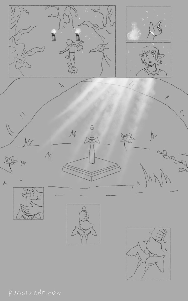
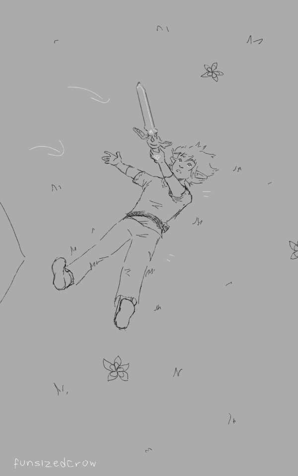
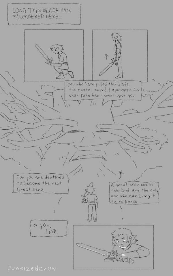
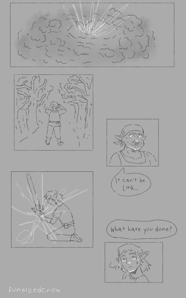

the boy and the sword
#i made a handwriting font for this. fun fact.#my art#botw#breath of the wild#loz botw#link#link loz#link botw#botw fanart#comics#im not drawing the great deku tree ever again btw. i hate drawing trees. why did i do this.#basically i read that paragraph in creating a champion and i saw this in a vision i tried writing it but sometimes#u have to actually draw things. so here. sorry r v b fans who follow me i cannot stop thinking abt botw/totk link#i need someone to talk to abt it. besides my sister.
32 notes
·
View notes
Text

mahalabia
#david hammond#ray de la costa#another one from OCtober!#fun fact i made his handwriting into a font#the recipe behind this one is eton mess#which he enjoys a whole lot too
328 notes
·
View notes
Note
Is it okay to ask what font you use for your comic dialogue? It looks like an exact fit for what I wanna do!
Sorry if you were asked this before.
Hello! No worries, I'm always happy to answer stuff, especially if an ask is buried deep in my blog.

So I made my comic font years ago on a website called "myscriptfont" that no longer exists. It's my handwriting! I made it like what... eight years ago?? Holy smokes. I think font technology has advanced past this but I'm too sentimental to change it after so long haha.
I don't know if I'd give it out though, not just because it's pretty personal to me but it's kinda janky. The 'i's and exclamation marks get pretty close together, the (") quotation marks don't work correctly, and ellipses act weird and I have to space them out manually. I know its quirks and how to work with them but I imagine it'd be frustrating for others. And there's probably a way for me to fiddle with those kinds of settings but I haven't tried yet.
If you want to make your own though, the site I made it on turned into the website "calligraphr" and I believe you can make one font for free when you register!

But if you want my Kirby "Forgotten Language" handwritten font, I put it here for free. :) I made that one on Calligraphr a year ago so it should work great! It's got newfangled font technology!
#I hope this helps!!#fun Jojo fact:#I named my handwriting font 'Dulcimer' after the protagonist of my very first digital comic. :3 that definitely makes me sentimental ha#but if there's a kind request for my handwriting font that would change someones life-#I would try to see what I can do about making an updated version for people to use?#it's flattering that people like my handwriting haha I got made fun of for having weird handwriting in my family lol#roleswap bonus features#ask#reference#font
30 notes
·
View notes
Text

OwO whats this? a meet the artist thingy??
this was a bitch to make since my self perception is flimsy at best, but yeah! thats me (i guess)
#fun fact! one half of the text is my handwriting and the other is a font i made w my handwriting a while back.#also this was really a trust the process thing like whewww i almost gave up on it#my art#digital art#artists on tumblr#meet the artist#original art
42 notes
·
View notes
Text
Prologue - Part 1

{And it begins. May the story of our humble beginnings strike awe into your wild-beating heart}
#thymoons#clangen#clangen comic#warrior cats#clan generator#thymeclan#hope you all enjoy :D#God I had so much fun drawing the reps of the groups#Also just to clear up potential confusion this is not a sparklecat clangen#all will make sense in time...#Also fun fact this was not originally the first page!#I lost motivation so fast for the initial first page so made this one#but this one has a whole different format so I have to scrap og page 1s work :')#also dont mind my shitty handwriting-#Its probably temporary until I make a nice font#probably
23 notes
·
View notes
Text
actually i'm curious.
#barks#polls#i'll rb this in the morning because i know most of the world is asleep rn#but fun fact the 'clear font' is still hand made by me i just started to collect/tune the letters#because handwriting long sentences was legit damaging my wrists because i could spend hours on it#needing it to 'be perfect' because of the illnesses yknow how it is
29 notes
·
View notes
Text
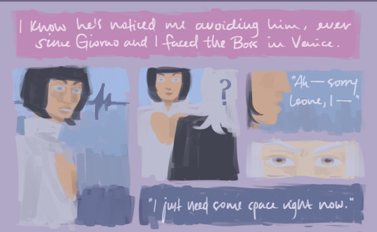

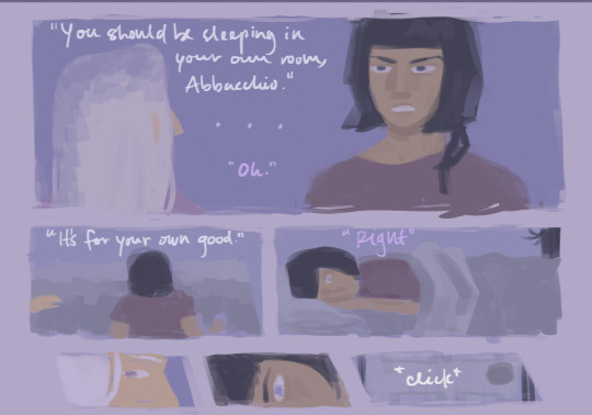
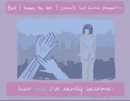
Februabba day 12 - Secrets / Rain
I always thought Bucciarati would push Abbacchio away in their last days, after his body dies, because he knows otherwise Abbacchio will find out he's dead, and I guess he feels like being distant from him now will make it easier for Abbacchio to deal with his death when he's gone. (It won't).
@heritage-februabba
Comic text:
I know he's noticed me avoiding him, ever since Giorno and I faced the Boss in Venice.
"Ah—sorry Leone, I—"
"I just need some space right now."
Of course it hurts, being so cold to him. . .
"Leone?"
"STOP!"
"You should be sleeping in your own room, Abbacchio."
. . .
"Oh."
"It's for your own good."
"Right."
*click*
But I have to be. I can't let him know—
how cold I've really become.
#heritagefebruabba23#everendbs februabba#februabba 2023#februabba#I hope the image sizes arent too weird#I drew it as two 2:3 pages but then thought I should crop it into smaller pieces so it's easier to read on mobile hopefully#leone abbacchio#bruno bucciarati#jjba#jojos bizarre adventure#fun fact for this one is that it was actually the first thing I did for februabba#I think I did this the first week of January lol and then didnt touch it since#golden wind spoilers#jojo part 5#also hope its legible since I handwrote this one#the other one I did I typed#but i made this before id downloaded that font lol#the font i used for the morning comic is gunny rewritten#i just thought it looked shockingly like my handwriting lmao#my art tag 💘
159 notes
·
View notes
Note
Hey, love the post you make about obscure disabilities. Could you make/ have you made about dysgraphia?
Sure. This will be my post for disability pride month tomorrow. Which I'm posting now because I don't have the spoons to schedule it for tomorrow.
I hope you don't mind I turn this into a combo one because I have a hard time mentally processing one of these conditions without understanding all three.
(Obligatory I do not have any of these conditions. This is not meant to be a diagnostic tool. Please do your own research. I'm only answering a question that was asked of me and it's really hard for me to explain one of these without explaining all of the similar conditions to differentiate them.)
And I hope that you don't mind my poorer language skills right now I'm recovering from a server sinus headache I've had all day.
Dyslexia vs Dyscalculia vs Dysgraphia (bonus round Dyspraxia)
These issues have like, a 30% comorbidity rate. So if you have one there's a 30% chance you'll have either of the others. People with conditions may be perceived as "slow" but they are not intellectual disabilities (Not that there's nothing wrong with intellectual disabilities. I'm just pointing it out because people will say "you can't have dyslexia. You're so smart.")
But the fact that they're comorbid and often comorbid with autism and adhd causes some misunderstandings around the conditions because people think they have one condition and attribute all of their issues to the one condition with no knowledge that its not just one condition they're expressing.
Dyslexia
Dyslexia is characterized by the limited processing and comprehension of graphic symbols, particularly those regarding language. People with it have poor reading skills, flipping letter sequences and words, and poor handwriting. Although it is a learning disability, it's important to note that dyslexia does not impact a person's intelligence, although they may seem slower due to poor language processing skills. (There's nothing wrong with disabilities that impact intelligence, I just don't want people saying "he can't be dyslexic because he's so smart".)
Many representations of dyslexia often exhibit letters tap dancing across the page, shape shifting, and doing backflips. It's important to note that these are incorrect representations, because it's really hard to give a visual representation of what people with dyslexia experience. However, it's really harmful to express dyslexia in this fashion as it leads to people thinking that they don't have dyslexia when they actually do.
As I understand it, dyslexia is the eyes/ brain being able to flow seamlessly when reading large blocks of text. Ways to combat this is cut out a strip to block off lines when you read them. Use a highlighted strip of paper to highlight lines as you read them.
Fun fact, there's a few fonts that space the letters well enough and differentiate similar letters enough that make it easier to read. Comic Sans font is the most widely accessible accessibility tool for dyslexic people as it's one of the easy to read fonts that on every machine. (These accessibility tools have proven to make everyone read faster, dyslexia or no. But people with dyslexia have found them instrumentalin functioning. )
Another fun fact. Rick Riordan wrote Lightning Thief so that his dyslexic son could have representation in a character that had the same disability as him.
Dyscalculia
Dyscalculia is often called "math dyslexia". People with Dyscalculia have issues with numbers. They have poor math skills, issues interpreting graphs, issues doing basic arithmetic, issues understanding things like place value, issues understanding time especially when it comes to reading an analog clock, and issues seeing patterns. This often causes a high level of anxiety around math. Some reports say these people have issues with directions, remembering locations, and reading maps (though research is inconsistent on that one).
Dysgraphia
Dysgraphia is easy to mix up with dyslexia, which is why I needed to write all these out. Where dyslexia is difficulty reading. Dysgraphia is difficulty writing. Symptoms include difficulty writing words, expressing thoughts in written form, and organizing and processing your thoughts. This can cause issues with social communication for obvious reasons.
These people also may have fine motor perception issues, writing in a straight line, spacing their letters correctly, etc. Especially fine motor skills around writing. They may also have issues with grammar, punctuation, and capitalization.
Bonus Round:
Dyspraxia
This one gets mixed with dyslexia two. Dyspraxia is issues with spacial awareness. They often say they can't tell where their limbs are in space. They may have issues with coordination, walking in a straight line, and balance. It's very hard for me to conceptualize, but people that have it may say that they bang their limbs against things due to poor spacial awareness. Which honestly, relatable. I've slammed me calf into a door before. And my shoulder blade. How? Good question.
These people have issues in social situations because their entire focus will be on their coordination, not making a mess, and not making a fool of themselves, etc. Their issues actually get better when they drink because the stress of sucked situations makes it worse and alcohol loosens them up. (I'm not advocating for drinking, but saying that the issues resolving when your drink validates your dyspraxia, not invalidates it.)
I think a lot of people that know of the condition may think people with low depth perception have dyspraxia. A lot of people have told me they think I have dyspraxia because my lack of depth perception negatively impacts my spacial awareness.
-fae
#disability#disability pride month#disabilties#disability awareness#disability pride#disability awareness month#dyslexia#dyspraxia#dysgraphia#dyscalculia#adhd autism
264 notes
·
View notes
Text
Jake's Halloween Night Series fun/random fact and details
All of the plants in Reid's house are plastic except for the ones in his room, which are wilted and dying. Reid tried to copy Grin in different aspects but he lacks a "green thumb" and all the plants he takes care of end up dying.


2. Most horror movie references in the game were intentional: The yellow raincoat from IT, the door breaking for The Shining, the lake to Friday 13, etc. The key in the bathtub was an accidental reference, at the moment of designing the puzzle I forgot that's one of the keys in the Saw movie.


3. All the party guests in CHN have names of horror characters except for Catrina, Hope n Reid:
John - John Kramer/Jigsaw Mike - Michael Myers Pamela - Pamela Voorhees/Jason's mom Fred - Freddy Krueger Hope if you take the P is Hoe (the bimbo stereotype) Reid Harris sounds similar to Red Herring
4. Bellow the forest painting there is a small easter egg to The Mushroom Killer, the slasher game I was originally working on until I took a break in October to work on JHN. The painting itself is also a reference to the setting of the game.


5. I came up with the idea of Jake touching/scratching/picking at his neck scar after myself, I have the (kinda bad) habit of picking at my own neck or just scratching it when my hands have nothing to do.
This is also a habit he developed after dying :)


6. Jake colors are orange + green while Cat is the complementary colors purple + blue. At the same time orange + purple are classic Halloween colors, with Jake represented by a pumpkin and Catrina by a black cat. They are opposites but at the same time complement each other, they are tied together.
7. In JHN walking around the present house, you can vaguely piece together Jake's last night by following the bloody footsteps, stains, and broken furniture.
At the moment I made this post I forgot to include his bedroom, where he enters and writes a message to himself on the chest "keep keys safe".


8. Jake is left handed, but I haven't had much chance to show it aside with how he holds his ax. It's one of the random traits I picked when I first made him and the one that I have to pay attention to because I am right handed, so I always default to drawing all my characters right handed too.
9. A bit about Reid

10. For Jake's notes I wanted his handwriting to reflect his personality, so I tried to follow graphology articles to try to portray his personality in how he writes and then made a special font to keep it consistent. I don't know graphology, so I am not sure I did manage to portray him correctly tho.

11. I really enjoy putting lots of details that won't make sense until later in the series :) Especially in places where they seem gratuitous or just an aesthetic choice.

12. Looking for a name for the Final Girl I found out Catrina means "pure/virgin", but also La Catrina is a skeleton lady used to represent Dia de Muertos, which I see as a representation of the dead visiting the world of the living. Plus she can be Cat, with the symbol of a black cat tied to Halloween
13. A bit of foreshadowing for the third game (if everything goes according to plan).


That's all, hope you enjoyed <3
#horror#jake's halloween night#catrina's halloween nightmare#indie horror game#long post#my games#JHN Spoilers#CHN Spoilers#well that was a lot
18 notes
·
View notes
Text
Penciled Lines by BecausePlot
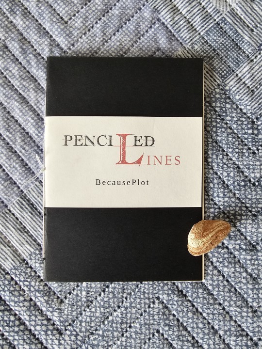


Fun fact: I intended for this to be completed at around the same time as my r/place Reddit bind.
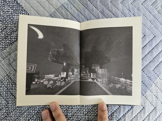
But stuff got in the way and this somehow got delayed by over a week. A 16-page booklet.
Ironic, isn't it?
So along the way of doing my r/place Reddit bind, I stumbled upon a small fic that provided a good distraction - good enough to bind, in fact. But I also discovered another fic that piqued my interest, one concerning a minecraft server called the QSMP.
I have known of the server and followed the events there, but from a distance; between Hermitcraft, Decked Out, Rancher Duo, and my love for SBI, I didn't have enough time to get as deeply invested into lore as before. With that said, my love for Philza has made me very much aware of his QSMP shenanigans and I wanted to find out if there are good fics about him and his government-assigned partner, Missa.
And lo and behold, I found one!
As said before, this booklet is 16 pages. The main cover is just 2 paper layers (one layer of black cardstock and another of black color paper) on one another. The main font is Liberation Serif, with the title and drop cap in Handwriting Draft. As is my style, I added-in pictures at the opening and ending pages to set the theme and mood of the story.
All in all, despite the delay I find this bind to be a refreshing work after the laborious effort of the previous Reddit book.
Thanks to @becauseplot for writing this fic!

#QSMP#philza#philza minecraft#missasinfonia#missa#qsmp missa#qsmp philza#death duo#pissa#QSMP Pissa#MCYT#bookbinding#ficbinding#fanbinding#my bookbinds#MCYTblr
131 notes
·
View notes
Text
{Kimtaegis' GFX Breakdowns, Ep. 2: ↳ Rainy Days 1st Anniversary}
a little insight into the editing of the set, featuring texture, brush and mixed media extravaganza
.... Can you believe it's been a year and that I literally started this the week the mv came out and then abandoned it over and over again??? ANYWAY
Since the song is all about yearning and missing someone, I went with an "old memories" (letters, postcards, notes) kind of vibe and of course also incorporated the rain theme in several different ways. For a nostalgic, heartbroken look, black and white plus dirty ripped up paper always works in my opinion. Now all the paper rips, torn edges, creases and water stains you see weren't there from the start; using brushes and adding, masking and blending textures, I made the photos, letters and papers look like they've been touched hundreds of times like a sad lover would </3 Here's a comparison so you can see how much that affected the look (I couldn't disable all the rough edge masks for this or the general rectangle form would've been gone too, but you get the idea):


Another detail I love is the colour bleed in the last one, picking up that water theme again!

The rain in that panel is made up of 10 individual pictures with ten 10 rain brush variations.
The most fun and interesting thing is probably the fact that the middle panel’s folded paper is actually made from paper scans! I never thought I would spend a concerning amount of time thinking about how to fold a paper prettily, but it took several attempts until I was satisfied with how it would open up with each unfold. This is how some of the raw scans looked like:


And some fun facts at the end: I don’t like my handwriting, so I used a font throughout. And funnily enough, they later used the excact same font in Taehyung's Dicon photobook! I'm glad the professional editors agreed that it totally fits the Layover era vibe, lol. (They probably had the full, paid version, though - I had to replace all the apostrophes with another font so they would show up....). I initially wanted to include many more mixed media elements but sadly my printer and scanner aren't particularly great, and I also didn't have sturdy enough paper for what I was planning to do. Namely stitching and sewing paper with yarn! I did try, though, and ended up ramming a needle into my finger and nearly fainting at a family gathering. The fruitless sacrificies I made for this. Embarrassing.
19 notes
·
View notes
Text

🌿 Infusing Joy into Your Days: A Multifaceted Guide
1. Sensory Joy (Engaging Your Senses Fully)
Touch: Wrap yourself in a soft blanket, wear your favorite cozy socks, or apply a scented lotion.
Smell: Light a candle, brew tea or coffee just for the aroma, or walk past a bakery and breathe it in.
Taste: Try a new fruit, make a fun snack plate (cheese, nuts, fruit, chocolate), or eat something nostalgic.
Sight: Change your laptop wallpaper to something inspiring, tidy up a small corner, or watch the sunset.
Sound: Play white noise, ASMR, or ambient café sounds when working. Sing in the shower (or hum if that’s easier).
🚀 2. Automotive & Motorsports Joy (Because You’re a Gearhead!)
Watch a classic F1 race or a legendary battle (Senna vs. Prost, Alonso's best defenses, etc.).
Listen to team radios—chaotic, funny, or emotional moments.
Sketch or design a dream car livery or create a fantasy motorsport team.
Watch car restoration videos or How It’s Made episodes on automotive tech.
Play a racing game, even casually—Forza, Gran Turismo, or even something simpler.
Read about a lesser-known motorsports history moment.
Find a weird car fact and share it somewhere (even if it’s just a journal entry).
📚 3. Intellectual Joy (Stimulating Curiosity & Learning for Fun)
Watch a TED Talk or a YouTube mini-doc on a topic outside of your field.
Read one interesting paragraph from a philosophy or science book.
Try explaining a concept (F1 aerodynamics? EV batteries? Climate policy?) in the simplest terms possible.
Listen to an audiobook while lying down with your eyes closed.
Learn one random word in a new language.
Write a small note on something fascinating you learned today.
🖋️ 4. Creative Joy (No Pressure, Just Play)
Write something purely for yourself—a mini poem, a journal entry, or a character sketch.
Doodle, even if it’s silly. Try drawing a tiny F1 car in the margins of your notes.
Make an aesthetic mood board for your ideal study space, dream travel spot, or even F1 team livery.
Play with fonts and handwriting—try calligraphy or make your notes look artistic.
Take a random photo during your day—anything that catches your eye.
Try a short, fun writing prompt: “If I could time travel to any moment in motorsports history, I’d go to…”
🏃♀️ 5. Movement & Physical Joy (Without Pressure)
Dance to one high-energy song before getting to work.
Stretch for 2 minutes between tasks.
Go for a non-goal-oriented walk—just observe what’s around you.
Try “barefoot grounding” if you’re outside—just standing on grass for a bit.
Do a few neck and shoulder rolls (especially if you’re at your desk for hours).
If you’re really tired, just lay on the floor and exist for a few minutes.
💬 6. Connection Joy (Finding Light in Relationships & Conversations)
Send a voice note to a friend instead of typing.
Comment something meaningful on a post that resonated with you.
Ask someone an interesting question—something beyond “how are you?”
Revisit an old conversation that made you laugh.
If you don’t have the energy to reply to messages, just react with an emoji—it still counts.
Write a letter (even if you never send it).
🌿 7. Nature Joy (Even in Small Doses)
Step outside for 5 minutes just to breathe.
Sit by a window with sunlight for a few minutes.
Pick up a leaf or rock that looks interesting and just observe it.
Watch birds or clouds for a bit—no overthinking, just look.
Bring a small plant into your space, or just Google pictures of beautiful forests.
🍵 8. Restorative Joy (Gentle, Nourishing Activities)
Have a “cozy reset” moment—change into comfy clothes, grab a warm drink, and do something low-energy.
Take a guilt-free nap (even if it’s just closing your eyes for 10 minutes).
Put on an eye mask and just lie down with calming music.
Watch an old comfort show or re-read a passage from a favorite book.
Have a slow, distraction-free meal���fully enjoy each bite.
🎉 9. Joy Through Play (Bringing Back Lightness & Fun)
Do a small, silly challenge—how fast can you type the alphabet?
Find a random trivia fact and drop it into a conversation.
Play a quick online game (Wordle? GeoGuessr? A car quiz?).
Look up weird world records just for fun.
Try a silly filter on your camera just to make yourself laugh.
💖 10. Gratitude & Perspective Joy (Reframing & Finding Lightness)
Write down one thing that went well today (even if it’s just “I got out of bed”).
List three things you’re grateful for—big or small.
Think of one past version of yourself who would be proud of how far you’ve come.
When feeling overwhelmed, ask: “Will this matter in a year?”
#studyblr#stem academia#women in stem#mental illness#mental health#positive mental attitude#study blog
5 notes
·
View notes
Text
` >w0 ~ ☆ PINNED POST - (📌):
∷ IM NICO!! im 20! huge nerd and i like to watch anime, Listen to music, Decorate!! and draw!!
∷ OK FUN FACTS : I LOVE ALIENS. Im a furry/therian (Wolf/Deer theiran, Considering cat therian aswell but idk) im mentally ill but getting help!! i have AUTISM & ADHD. I like NATURE and i want to be a nature photographer someday!
∷ my favs!!! (BIG INTERESTS HIGHLIGHTED!!) : SONIC , JJK, DUNGEON MESHI, CHAINSAW MAN, TBHK , MHA, OTHER TOTALLY AWESOME ANIMES ! SPARKLES + RAINBOWS, HOMESTUCK (loose interest but i love vriska) FNAF, WARRIOR CATS, ANIMAL JAM, ART, ROBLOX, PROJECT SEKAI, VOCALOID. SPECIFICALLY MIKU!! SPLATOON , ZENLESS ZONE ZERO, HONKAI STAR RAIL, OTHER GATCHA GAMES ANIMAL CROSSING NEW HORIZONS, CARTOONS + EARLY 2000S STUFF, JPOP, NITW, UNICORNOS, DEMON SLAYER, PERSONA 3 RELOAD AND PERSONA 5, POKEMON.
i never shut up abt my interests but if you like the same stuff as me PLS FOLLOW MEE AND LETZ BE FRIENDS :]. ^_^!!

∷ - ☣️ im BIGAY and BIGENDER. + NONBINARY AND on the ACEARO SPECTRUM !! I am transmasc too !
im highly suspected to be Schizoaffective, aswell and it made it hard for me to interact with other people before i was medicated so if i dont check in as often , its because i dont have a sense of relationship degration lol but ping or dm me if youd like to chat!!
I am also getting help and hashtag unbothered lol dont be mean/invasive is all i ask
I ALSO HAVE DYSLEXIA/DYSGRAPHIA AND DISCALCULIA!! I dont like being joked around with and called stupid or illiterate if i mispell a word or my handwriting in something looks bad + not getting math. I promise you i am very smart
but please refrain unless you get permission to make jokes like this!! it makes me sad.
PLEASE DO NOT USE FANCY / COMPLICATED FONTS / TYPING QUIRKS AROUND ME , ESPECIALLY WITH NO TRANSLATION SOBS. i cannot read them !! i do not want to play mental gymnastics in order to read something!!! its very annoying. they are extremely innaccessible not only to me and other people who are dyslexic etc! but folks who use SCREENREADERS. please REFRAIN from using typing quirks /fancy fonts in potential asks or other stuff as such on my blog!! thanks ^_^.
SIDE ACCOUNTS!!
- Personal side blog ! @sylvie-onii
- Im also on BLUESKY !
https://bsky.app/profile/batnovaux.bsky.social
^_^ ☆ ty for reading !! bye !! :33
4 notes
·
View notes
Note
Idk my assumption with your art is "damn this person probably has INSANE handwriting"
A fun fact about my illustrations & graphics is that a lot of the words you see in the pictures were either hand-lettered by me or made with fonts created by me (in which I drew the letters). Not all of them, sometimes I'll toss a pretty font in there that I got elsewhere.
They're still a little different from my actual handwriting, which is very round and slightly messy with my right and very neat and orderly with my left. And yeah, both hands write very well thanks to me breaking myself so many times (most recently in 2021, so not even long ago).
[Make a super specific assumption about me based on my art style?]
#my parents joke they can request different fonts when i write something it's kind of funny#because yeah i can do calligraphy but also you get different writing with each hand#asks#anon#seraphina.txt
2 notes
·
View notes
Text
happy one year to my hypnospace comic!
(and one day, just pretend i had this up yesterday shhhhh)
here's a little series of fun facts about making it
- started as a poem. i wanted to make a Millenium Anthem animatic and/or write a fic (i ended up doing the latter) but this came to me in the meantime and, being hyperfixated and eager to make something about it, it developed into a comic.
- that said, i was deep in the throes of an art burnout. i tend to make a lot of art around the new year, usually due to being in multiple gift exchanges, as well as working on my own things during winter break since i don't usually have the time to during school, and that wears me out. both this year and last i struggled with having energy to draw. however, i'd just recently found out a style that was pretty easy to work in even in that state: polygonal! so the comic is pixel polygons.
- the comic actually sort of ties into (and is directly quoted in the summary of) the aforementioned fic i wrote—which is called "do(n't) be afraid"—as evidenced by the focus on the HSPD badge as well as the Enforcer being almost a self-insert
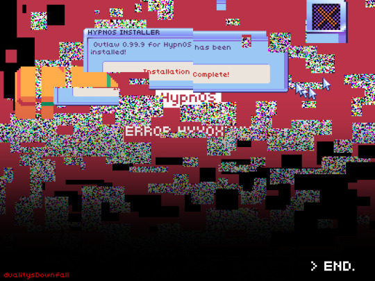
- the typography is done by hand. i looked at the game's font file for the standard font and copied it. to this day i can pretty reliably just. handwrite in hypnospace font with the pixel pen. and i do! it's very space efficient!
- the dithering is also done by hand, because i'm a madlad. well, for each pattern i did like a portion by hand and then copy-pasted it until i covered as much area as i needed to, because i'm a madlad but i'm not a masochist. and then when i needed it again i just copied and pasted the layer and used a clipping mask to change its color. now though i have that big pixel brush pack on clip studio paint. so i won't be needing to do that again anytime soon.
- in panel 3 we see the Enforcer's face as well as glasses on their desk. like i said. pretty much a self insert. we also see their computer and hypnospace headband; i studied that intro video for this but between not seeing it a whole lot and the artstyle i was using being really simplified, i'm probably missing something lol
- in panel 4 we see dylan merchant at his desk. there's a calendar behind him. i actually looked up what day of the week was december 31, 1999 so i could circle it. it was a friday.
- the girl in panel 5 is supposed to be rebekah, the girl who likes squisherz and won the fan art contest but didn't get to find out because her dad took away her hypnospace headband. there's only one small picture of her to go off of, though.
- panels 7 and 8, which can also go together as one tall panel, were fucking FUN. what i did for the glitchy static bits was i made various clusters of black rectangles, each cluster on a different layer so i could copy and rotate them to fill more space. then on a clipping mask i used airbrush without antialiasing in white, RGB, and CMY. boom, static pattern. the elements from the game (the error message window, the cursors, the car) i had to copy by hand. see, the wiki doesn't have many screenshots, and if you try to screenshot the game or a video of it then it scrungles your image clarity. so i had to take those screenshots, eyedrop the colors from there, and then do such riveting and time efficient (that's a joke, it took forever) tasks as Count Pixels So Everything Is The Right Size. which for the shiny new HypnOS 2000 look was painstaking. look at those gradients. gradients everywhere. it was worth the work because it looks fantastic but man. and then to scrungle those elements i just used the rectangular selection tool, grabbed arbitrary bits and pieces of the things and Moved Them Elsewhere.
oh yeah babey
12 notes
·
View notes