#i love typographical symbols
Text
An analysis of some BL logos
[Adapted from something I wrote in Thai]

Last Twilight
The logo uses an opacity gradient for the characters, the characters would gradually fade, both the Thai and English title, with the word "twilight" being the only word to not fade. The fade probably represents Day's losing vision, with twilight being the only word that is not fading, might be a representation of the Last Twilight (book in the series), where twilight is the last fleeting moments where the body doesn't fade away.
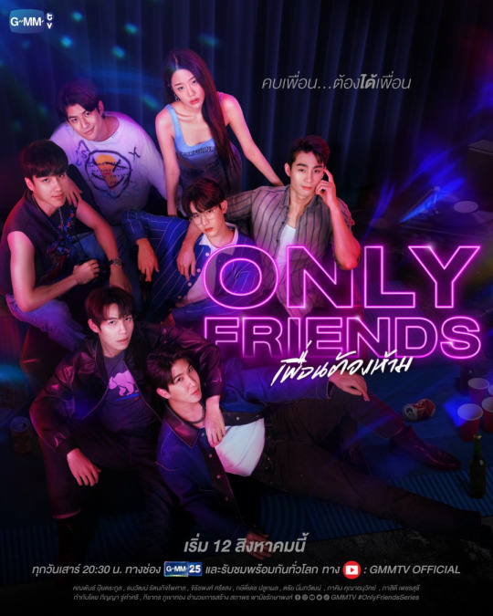
Only Friends
[I think I'm kinda bullshiting this part]
The logo of this series replicates the neon sign of the YOLO pub, the centre of the story, the purple probably symbolises queerness. The size of the word "only" symbolises one of the core ideas of the story, in an attempt the balance sexual desire and friendship, their relationship became so entangled and complicated that they can't be "only" friends anymore.

My School President
The san-serif characters used in the logo is an attempt at replicating children's handwriting, as such the characters have a messy and uneven look, but make no mistake, the characters are expertly done, the space and shape of character fit with each other for the most part, despite the different stroke widths and typographical tradition. The colours used are cyan, greenish yellow and white, all real chalk colours you would find in schools. The finishing touch of the heart in lieu of the negative space in the ธ of the word "president" indicating the love of Gun for Tinn is such a good way to show the series easy going, puppy love and a slight playfulness.

The Eclipse
คาธ "Khat" (The Thai title) means catching or swallowing, used in the context of natural occurrences such as a solar eclipse สุริยคาธ "Suriyakhat" (alternative form of สุริยคราส "Suriyakhrat," the word for solar eclipse), symbolising the story of Rahu swallowing the sun or moon during a eclipse. Therefore it is not surprising that the logo's background is a sun during an eclipse with the title written out in a san-serif font with the terminals being rounded into an angle. The text is made to look like an eclipse as well. The style of the text probably symbolises the authoritarian nature of Thai schools, the fact that they used a modern style of lettering (san-serif) is probably a symbol that authoritarianism still exists in Thai school, even if the edge is dulled a bit with insubstantial reform.

1000 Stars
The thread that links Tian and Phupha is Torfun's diary, the usage of handwritten style of text for the title symbolises this thread well. The show's creators have made a wise decision of not incorporating any stars into the logo as the stars are of lesser importance to the story. The stars counting wish could not make Phupha and Tian's love suddenly appear, their love happened on their own, not by some divine miracle. Using stars for the logo would only be a visual wordplay, rather than emphasising the essence of the story
15 notes
·
View notes
Text
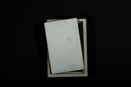
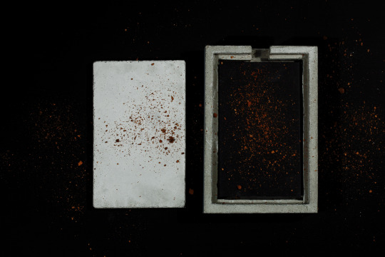
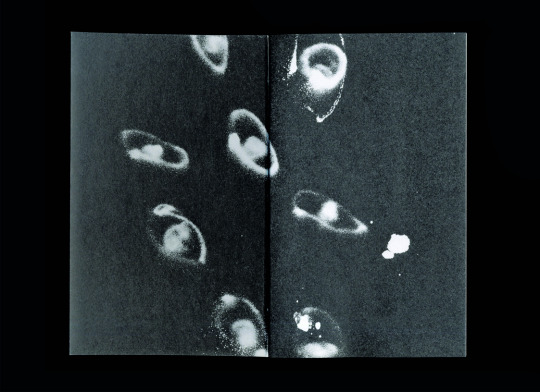
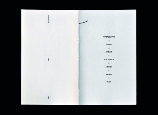
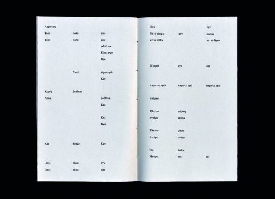
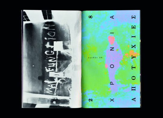
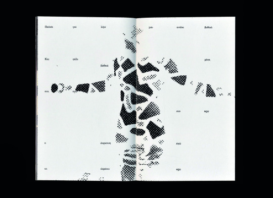
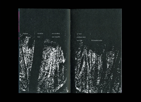
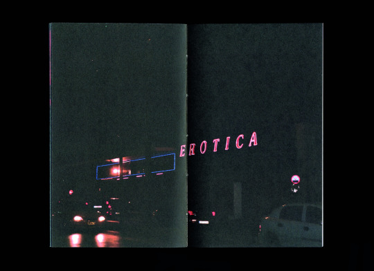
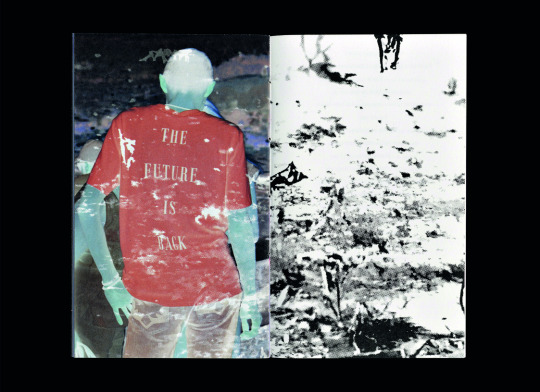
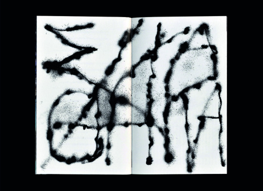
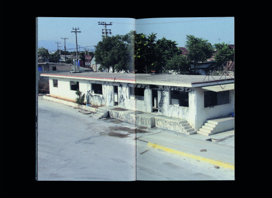
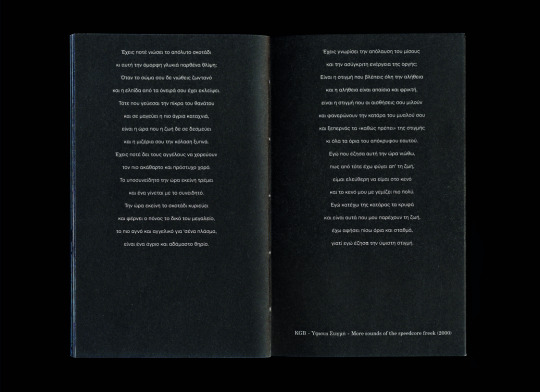
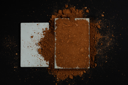
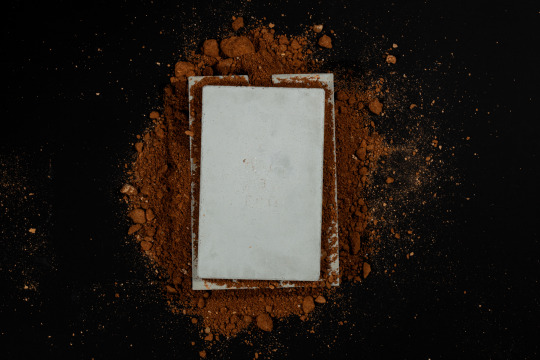
Spreads and photography of my book “EGOΕΓΩ - a concrete diary” I designed on the occasion of my Bachelor studies.
Some words on that:
The work “EGOΕΓΩ - a concrete diary” is a product of personal concerns and searches. The reason for the creation of this project was my need to record as freely as possible, things that concern me in recent years, to compose them in a homogenized project which in its final stage will be presented to a wider audience. In this project I have a dual role, that of designer and that of client. The purpose of the project is to delve into design based on a specific concept and to train myself in time management and decision making. In a second phase, since some applications are the product of collaboration, I develop my organizational and communication skills in the context of the execution of the work, skills important for my professional career. Finally, the importance of collaboration and the DIY (do it yourself) philosophy is highlighted.
This idea stems from my personal involvement in various fields of applied arts, my love for collecting printed material and my obsession with photographing everything that happens around me. The methodology of developing the work is based on the combination of photography, illustration and typography. I tried to delve deeper through the applications into the use of different materials in order to experiment with new textures and test the limits of both my creativity/inventiveness and the limitations of the methods I chose. The creative thinking behind the work deals with the individual as a unit and as a member of the society. Through storytelling I try to suggest internal dilemmas, concerns, insecurities, fears and emotions of all kinds that shape us. There are references to memories and grievances, things that lead us on an endless journey of understanding what takes precedence, our self or our ego?! These questions are based on real thoughts and situations either my own or my people's.
The approach to the message I seek to convey is getting shape through the narration of a familiar circumstance in the presence of a plethora of symbolisms. The circumstance I refer to is the simulation of a “burial” and it is on this practice that the structure of the presentation of the work in the university's premises has been based. I chose this parallelism because this situation is an event that concerns the lives of all individuals, it is an honest moment of expression for the participants and despite the lack of justice that sometimes weighs it down, it remains the most fair event in our lives. In the case of EGOΕΓΩ, the individual is represented by the book. Anyone who comes close either out of curiosity or natural attraction and opens its pages is confronted with its content. Images and texts spill over the edges of the pages like repressed thoughts. The book closes, perhaps it will open again, but to do so requires hands to grasp it and a will to understand. Finally, with each touch it is given a new life. With the end of this era a new one is born. New bonds are created, solidarity. Understanding and empathy. Perhaps even some new friendship. In such an intense moment the feelings that are born merge and bring to the surface something new, stronger and ready to move on. In other words, just as a cycle closes and through it we gain resources for the next phase, so in our case, this presentation is an end and a beginning, a transition to something else.
The explanation of the name EGOΕΓΩ clearly touches on the "battle" between our self and our "ego", predisposing the observer to what is to follow and the logo is fully typographic in order to highlight the two words (EGO and ΕΓΩ). Schematically, it is the form of a person, very abstract. The purpose of this decision is not just to make the design interesting but to capture the two aspects of ourselves, "EGO" and "EΓΩ".
Project supervisor: Anna Altouva
Published by Brick Home Studio, in Athens, June 2023
Edition of 34
11 X 18 cm, 92 pages
Digital offset printing: Fotolio S.A.
Handmade coptic binding: Brick Home Studio
Cover: 1190gsm total black bookbinding paper / Body: Munken Print white 115 gsm
Photography and scans: Christos Kotsinis
Concrete case: Sergios Fotiadis (We design)
#2022#2023#graphic design#visual communication#concrete poetry#editorial design#art book#a concrete diary
7 notes
·
View notes
Text

Lipbalm
Her dry lips are the symbol of wintery love — Nish
Lipbalm, One-shot story by Eribin
A/N: hi! This is Eribin. I am not a real writer, doing this as my past time. English is not my first language so bear with my English. There’s a lot of grammatical and typographical errors. This is just a fiction from my delusions 😆
Cast:
Charm
Riku
————————————————————————
Charm’s POV
Me and Riku, my boyfriend of 1 year and 2 months, were sitting in a hammock facing the beach. The air was salty and warm. But I liked it.

We are here just to freshen up our minds. The semester just ended two days ago, and we decided to go travel during our semester break.
We're just outside of our rental villa, watching the sun set. I love this place so much because there's almost no one aside from us. There are a few, but this is still a catch!
No one dares to talk. Maybe because we were so tired doing the water activities earlier. We're contented watching some kids play on the shore. The sound of waves makes my mind calm, plus the giggling of the kids. This is like music to my ear. I closed my eyes and felt the wind. This is so refreshing! I wish everyone felt what I feel right now.
“Water? Your lips are cracked, Charm. You look dehydrated,” Riku said, handing me a water bottle. I smacked my lips, and sure enough, my lips were cracked and dry. I didn’t notice! Ohmy! Maybe because I was exposed to the sun so much? I took the bottle and drank half of it. But still, it’s not enough. I don’t want to peel it off because it will bleed for sure.
Good thing I have a little lip balm on my wallet key ring. I applied it all over my lips and smacked it to apply it evenly. Making some smacking sounds that made Riku turned his gaze to me.
Since it’s a bit sticky, I'm still smacking my lips together, and I looked over at Riku and caught him looking at me. He was mesmerized and dazed. He looked away and swallowed unconsciously.
“Stop doing that, Charm,” he simply said, taking the bottle from my side and drank the remaining water.
“Eh? Doing what? ” I innocently asked. Sometimes I don’t understand Riku. Him and his confusing words. Why doesn’t he just say it directly?

He once looked at me, and his jaw clenched. It looks like he’s restraining himself from doing anything.
“You little fox..” he said, cupped my face in his direction, and kissed my lips fully, gently, and lovingly. He moved his lips, and I just found myself responding to his kisses. He leaned a little bit to have better access to my face and kissed me deeply. We’ve kissed before, many times! but not like this. His kisses make me happy, but right now, I don’t know what to feel more than happiness.
He pulled back, and he was still staring at me while licking his lips. Holycow! That’s— that’s hot. I only gave him a breathy laugh and looked away. Ohmy! Don’t you say, Charm, that you’re embarrassed about it? He’s your boyfriend, for fvxx sake.
“Mint chocolate? ” He asked. You just smiled at him. I don’t like strawberry or cherry-flavored lip balms. I want to be unique from other girls. He also smiled at me and cupped my face once more.
“I guess mint chocolate will be my favorite” he said in low husky voice, and claimed my lips.

The end ❤️
#love#fangirl#exile tribe#the rampage#the rampage from exile tribe#boyfriend#riku#riku aoyama#oneshot#story#shortstory#author#lip balm
6 notes
·
View notes
Text
Transform Your Business with a Stunning Logo Design!

<<Hire the Logo Designer Now>>
Let’s build the perfect logo for your brand
First impressions are important. Your logo is on every page of your website, the main element for your branding an integral part of your marketing material. It’s a symbol that represents everything you stand for.
So we better make sure it’s amazing
My journey as a minimal, modern logo and brand designer has helped thousands of businesses attract more clients and build their reputations. It’s what I love and I’d love to work with you.
<<Hire the Logo Designer Now>>
About Me
1100+ clients from 65 countries
Fluent English speaker
Qualified Graphic Designer
Experienced Seller
Excellent Communication Skills
<<Hire the Logo Designer Now>>
WHY CHOOSE MY SERVICES?
Thousands of Super Satisfied Clients Worldwide
Professional, unique, minimal, and fresh ideas
300dpi Files (Maximum Print Quality)
4000 x 4000px Files With JPG/PNG/PDF/AI/PSD/SVG Available
100% Satisfaction
Quick Reply
Money-Back Guarantee
Unlimited Revisions
Committed to reaching a perfect end result
I will do also as per your requirements: -
Minimalist logo | Modern | Unique | 3d | Flat | Minimal | Luxury | Mascot | Custom | Feminine | Text-based logo | Signature | Vintage | Typographic | Hand drawn logo design
<<Hire the Logo Designer Now>>
0 notes
Text

As we have segwayed from the typographic abstraction project into the voting poster, I have recognized how visual aspects come together into a coherent space. I particularly loved the class that we combined each unique letter box into one class masterpiece, having placed our works and others into spaces, often because they "just make sense". Having read about the work of Jeroen Barendse in chapter 4 of our book this week, I found parallels between our project and his vast city-mapped installations, as the intricate details and plotting of change over time appears abstracted too. It fascinates me that constructs and symbols we use can be reconfigured in ways that they become simply art.
Not only do the designers in our reading employ stories, irony, and references to collectives of the past, but they are motivated to instill inspiration around a concept, rather than the traditional advertisement poster. This made me excited for the GoTV poster brainstorming. I wanted to pursue a quote that I found touching yet challenging, and landed on the one discussing women's voting against budget cuts in feminist programs. To extend this idea in my own way, I sketched women both occupying space and expressing anger. This serves as an antithesis to the role we often play in American society, and I hope that the poster will instill a confidence and call to action for women who see it and identify with it.
0 notes
Text
LH: Final Outcome (LO2+LO4)


Final Outcome
These are the final spreads for my ISTD brief (Linguistic Hybridity). I tried to incorporate all of the advice that I received during critical reflection with my peers and my tutors. I decided to get rid of the images and let the type stand out. By using two different colours, red to symbolise love and black to symbolise war, and two different languages (Hindi and English) I feel like I've managed to typographically represent colonisation.
I've also used a blend of 3 different typefaces, each of which is symbolic of either love or war. The tiny illustrations at the bottom of the page enhance the narrative by romanticising the idea of colonisation as a dark love story.
0 notes
Text

Pictured above is one of my earliest sketches for the Same Difference project which attempts to incorporate elements discussed in this week's chapter on time and movement in typography. My absolute favorite part of these weekly readings, is seeing the curation of typographic works featured in the book. An art piece titled "Understand Music" from the designer Florian Geyer stuck out to me in particular. The pages have a simple color palette including the beige paper and a grey scale of tints and shades which are created by the motion of texts, lines, and other symbols. In one of my favorite scenes, musical notes appear to be lifting off of the page almost as if we can feel the sound waves causing them to rise. The various blurs create a gradient of grey, and I love that it is the speed and movement of the sound itself creating the visual color effect. Designs like this one demand to be interacted with, as the viewer experiences audible, visual, and sensory messages to the brain. These designs take thought, intentionality, and careful consideration when gridding out where and when text will appear. I think it would be extremely fun to play with the dichotomy of creating sounds from visual messages.
0 notes
Text
Octoþorpe
@redpanda411
#octothorpe#be the random post chaos you want to see in the world#i love typographical symbols#typography#roomie shenanigans
2 notes
·
View notes
Text

Map of the World by @seperis
[Click on the pictures for better resolution.]
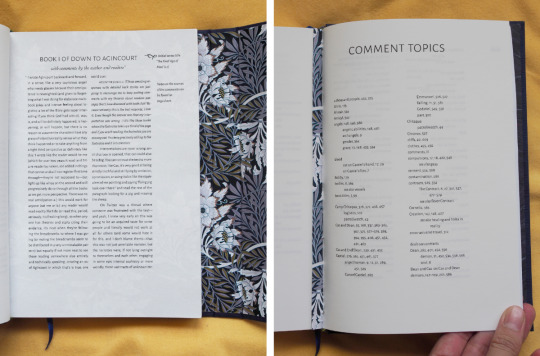
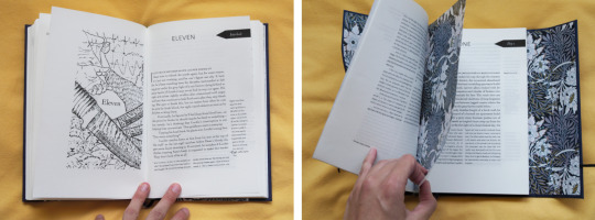
I read Map for the first time last year, and a couple months later decided to already reread it. The first time around, you're dropped into this story without knowing what's going on in terms of either the character dynamics or the setting, and it's like a puzzle you get to try to figure out. It's delightful! The second time around, you start out with a lot more puzzle pieces at hand (but absolutely not all of them yet!) and you manage to connect so many more dots. (I swore to myself to not go overboard and still ended up with a ten-way colour-coding system with stickers and writing margin notes. More recently, I decided to read all the comments on the Map AO3 pages, and they are so much fun to read! So many readers have shared really insightful observations, and the author has written a lot of very interesting replies as well. But having to switch back and forth between the story and the comment section is a bit of a bother, and I sensed an interesting typographical challenge, and that's how I found myself typesetting the fic again while adding foot- and margin notes to my heart's content. The book ended up being so long though that I decided to split it into two parts :-)
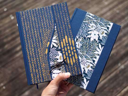
As for the cover of the first half: Each of the DTA fics introduces you---and the main characters---to a new, larger part of the world. In Map, the focus lies on Cas's cabin as the foundation for the relationship between the two main characters is laid, so Dean and the reader have to open the bead curtain together to get to that part of the story. If I ever get around to giving a similar treatment to the other fics in the series, the cover design would continue correspondingly: opening the gate to Chitaqua for Stars, entering Ichabod's main square for Lights, and stepping through one of the paintings in the white room for Game.
[Typesetting and crafting notes under the cut]
⁂
Typesetting
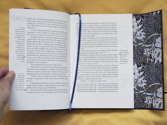
Okay so the thing is I love very involved typesetting. It's neat to look at, fun to plan (or as a reader, try to reverse engineer the typesetter's decisions), allows you to be a bit of a control freak about all details etc etc. The point of this typesetting project was to include lots and lots of commentary, so my priorities were:
maintain a clear visual distinction between the text and the comments
make the comments easy to read
keep the comments close to the lines they refer to
I used a combination of footnotes and margin notes to make the most of the available space. Margin notes are used whenever a comment is short enough; footnotes otherwise. Fortunately, I was able to typeset the text in such a way that there's no more than one new footnote per page, so I got away with just reusing the degree symbol ° to introduce footnotes and didn't have to work with a numbering system. Most margin notes refer to specific lines as well and here I got to add my favourite little typesetting detail: a manicule :) I based its design on this hand-drawn one.
Other notes: The longest comment is nearly 5 full pages long and is a comment thread about Dean not realizing how laundry works at Chitaqua lol.
I also wanted to prioritize reading comfort, so the margins are rather generous and based on the canons of page construction, and the leading is relatively generous: the body text is set in 11/14 and the comments in 8/12. The drawback is that this means I ended up with a lot more pages than planned (over six hundred). I also don't love that the baselines of the body text and the comments only line up every 6/7 lines, but every other leading option I tried out ended up making the text harder to read---can't have everything at once I guess.
I decided to not include any headers and footers since I think they'd only have made the page appear more crammed without actually adding a lot of useful information. Instead, the page numbers are in the margins, sharing a baseline with the topmost line of text. The beginning of each chapter and/or day is still easy to find since those black tab-like day number indicators extend all the way to the fore-edge:

2. The text block
I wanted these books to have a nice 2:3 (14 cm × 21 cm) page ratio, which meant I needed to trim the fore edge. I had a bit of a paper trimming disaster with another book last week, but for these books I found a method that worked better for me: Use the blade of the cutter to line up the end of the ruler with the spine of the signature at the head of the page, use the cutter to make a tiny cut at the 14 cm mark, repeat at the bottom of the page, and then use the marks you made as a guideline for where to place the ruler to actually cut away the edge.

This is the first time I sewed a book on tapes. I didn't have bona fide bookbinding tape and just used some leftover non-stretchy woven cotton tape (width: 1.5 cm) I had lying around. I followed the video tutorial by DAS. I don't have a sewing frame, but the tape was fairly stiff, so just letting about 2 cm of the tape protrude at the top worked like a charm.
3. Headbands
I followed the two-colour headband instructions by DAS and used a leather band with a diameter of ~1.5 mm as well as some three-ply thread that I got by separating a six-ply embroidery thread. This worked pretty well---the stiff leather band was easier to work with than the shoelace I used last time (mostly because of its even circumference). The slightly tricky thing about the embroidery thread is that the different strands sometimes try to bunch up on top of one another instead of lying flat, but I'm happy with the results. Per headband, the ideal length to work with for this kind of thread and a text block spine width of 23--25 mm was ~30 cm for the green one and ~55 cm for the blue one.
After finishing the headbands, I glued some (80 GSM) paper to the spine---but only between the tapes, to sliightly even out that difference.
4. The case
I followed DAS's video on the square back bradel binding.
The straightforward case:
Front & back: 216 mm x 140 mm
Spine: 23 mm (text block) / 26 mm (case)
Hinge: 7 mm
For the cloth-to-paper ratio of the half binding, I just picked what looked good rather than following the general ratio recommendations. Before gluing on the paper, I used a blue pen to make a couple subtle marks on the bookcloth, which helped a lot while trying to quickly place the paper.
To case in the book, I found it easiest to add a little glue to the spine edge of the back cover, put in the text block and do some quick readjustments, shut the book, let it dry for a few minutes, and then paste down the rest of the back endpaper (maybe in two or three more goes---add glue to the next couple cm, go wild with the bonefolder, repeat). Add glue to all of the front endpaper, shut the book, open it again, go wild with the bonefolder to smooth everything out, done.
For the wrap-around case, I ended up just winging it. It's mostly a square back bradel binding though.
Front, left: 216 mm × 102 mm (at the top)
Back: 216 mm × 145 mm
Spine: 25 mm (text block) / 28 mm (case)
Fore-edge piece: 19 mm
Front, right: 42 mm
The fore-edge piece is thinner than the spine piece since, unlike the latter, it's directly wedged between two pieces of bookboard, and the text block is thicker at the spine than at the fore-edge. I had initially tried making the spine and the wrap-around section level, but that looked a bit silly since you could see the gap between the text block and the right part of the cover.
For the wrap-around part, I glued the back, the fore-edge piece, and the right part of the front cover to a piece of paper (80 GSM), with one board width (2 mm) in between. In retrospect, I should've maybe added 0.5 mm to the hinge between the fore-edge piece and the front so it shuts more easily.
To secure the leather straps with the clasp, I cut two grooves into the bookboard: (Ignore that I obviously only thought of that after I'd already glued the bookcloth to the board, and also ignore the remnants of some paper that are glued to the right edge of the back cover...)
I cut out a couple small bookcloth triangles and used them to fill in the gaps along the back of the curved edge.
I painted on the cover design with some acrylic paint---super fiddly and it took forever, and unfortunately I only did it after casing in the book---before would've been easier. Oh well! I used a pencil to draw guide lines; fortunately it can just be erased from the cloth without leaving a mark or damaging the (dried) paint. (I tried this out on a scrap piece of bookcloth beforehand.)
⁂
In conclusion:
DTA, my beloved
Comments, my beloved
Involved typesetting and crafting projects, my beloved
#down to agincourt#dta#bookbinding#book design#mission update#crafts tag#this was so much work but i'm so happy with how it turned out :)
793 notes
·
View notes
Text
Aro Culture (Part 9)


Part 9 - we’ve reached the end folks. This has been a (longer than expected) journey but I’m so grateful I had the chance to share it with all of you. I know there are a lot more of you than the last time I posted haha, so hi and welcome to my comics lol 🥰
Ive been dreaming of having some aro stickers to help express my identity in run ways, so I decided to take matters into my own hands last week. I figured I’d share it as a DIY freebie (personal use only) since I know how frustrating it is to ship internationally 💚 Please, if you like the stickers, share this post!! It really helps my account :) also if any of you do end up printing some out please tag me If you post them!! I’d love to see 👀
The link to the stickers: /EDIT: link is now in bio, was broken here
Author’s Note: The link is in my Carrd, but you can also get the stickers here.
P.S: My health has been in somewhat of a questionable state these past few weeks - nothing serious, dw, but neurologically I have a few concerns that are taking a while to go through the medical system 😢 I’m really struggling to keep up with school because of it. I am like 85% done the next batch of comics, so hopefully I can tide this account over until December (exams done). But in the case I cannot, I hope y’all take care (especially those of you in the states rn) and we’ll see where things take us.
💚💚💚
[Image Description:
Slide 1: Celia holds the submission bowl in front of her. “Even though we’re young, I feel our community is vibrant and beautiful”
Slide 2: Celia standing in holding a cacti, surrounded by elements shown in previous parts of the comic series: A barn own gryphon, a frog, a few more cacti/succulents and a quiver of arrows. “I think aro culture is pretty neat.”
Slide 3: Title slide. Text says “Bonus”
Slide 4: An assortment of stickers, including hearts, flags, and circular badges with aromantic flags. A few gryphon stickers as well. Text: “Free Stickers! Link to the stickersheet in the description! Personal use only [heart symbol].”
Slide 5: An assortment of typographic stickers, reading “No Romo”, “Romance? No thanks.” and “Romance is optional”. Text: “Free Stickers! Link to the stickersheet in the description! Personal use only [heart symbol].” ]
199 notes
·
View notes
Photo
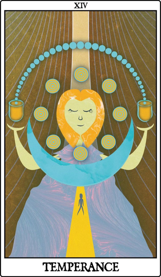
Temperance. Art by Katie Edwards, from The Leeds Tarot Card Project.
“I found out about the Leeds Tarot project through Kristy Greenwood (love her)! She created a beautiful Strength card.
My Mum used to read tarot cards lots when we were younger, so I was really excited to design a card.😇
I am still finding my feet as an illustrator. I’ve been a graphic designer for the last 16 years + but I only started drawing again last year, mainly as a way of dealing with anxiety. My doodles grew and I have fallen in love with drawing again!
My illustrative work usually has a cartoon, pop art, or typographical approach. Circles make a regular appearance in my stuff, so I knew I wanted to find a way to incorporate them in my tarot card design.
In general the Temperance Tarot card signifies balance, peace, patience and moderation. The use of circle symbols predates recorded history and also symbolises cosmological order and balance.
They are perfect for the temperance card!
I used the circles within a harmony symbol to symbolise; harmony, divinity (usually represented by an angel) and peace. I used the gown to represent the middle road / moderation and to stay grounded.”
6 notes
·
View notes
Text
Mid-year book tag
Thank you so much for tagging me, @fluencylevelfrench! 💜
Amount of books you've read so far: 19
Best book you’ve read so far in 2022: Atlas der verlorenen Sprachen by Rita Mielke
Best sequel you’ve read so far in 2022: El dominio mundial: Elementos del poder y claves geopolíticas by Pedro Baños Bajo
New release you haven’t read yet but want to: House of Sky and Breath by Sarah J. Maas (Although I haven’t yet read the first part.)
Most anticipated release for the second half of the year: A Court of Thorns and Roses #5 by Sarah J. Maas (Although it is not confirmed that it will be released this year 😕)
Biggest surprise favorite new author (debut or new to you): I loved John McWhorter’s Our Magnificent Bastard Tongue: The Untold History of English and can’t wait to read something else by him.
Newest fictional crush: None, I’ve been reading mainly nonfiction.
Book that made you cry: Cien años de soledad by Gabriel García Márquez made me drop a tear.
Book that made you happy: Linguistics for Dummies by Rose-Marie Dechaine, Strang Burton, and Eric Vatikiotis-Bateson
Most beautiful book you’ve bought so far this year (or received): Lonely Planet’s Guide to Life by Lonely Planet (I got it for Christmas.)
What books do you need to read by the end of the year? I need to read 40 books (besides the one I’m currently reading) to meet my Goodreads goal. According to my TBR list, they are the following:
Fifty Inventions That Shaped the Modern Economy by Tim Harford
Gefährlicher Einkauf by Volker Borbein
Language Families of the World by John McWhorter
The Third Pillar: How Markets and the State Leave the Community Behind by Raghuram G. Rajan
Grenzverkehr am Bodensee by Felix & Theo
Why I’m No Longer Talking to White People About Race by Reni Eddo-Lodge
Dermo!: The Real Russian Tolstoy Never Used by Edward Topol
Language Interrupted: Signs of Non-Native Acquisition in Standard Language Grammars by John McWhorter
The Importance of Being Earnest by Oscar Wilde
Dirty Russian: Everyday Slang from “What’s Up” to “F*%# Off!” by Erin Coyne
Predicting New Words: The Secrets of Their Success by Allan Metcalf
Jeder ist käuflich by Marie-Claire Lohéac-Wieders
Pop Culture Russia!: Media, Arts, and Lifestyle by Birgit Beumers
Ukraine in Conflict: An Analytical Chronicle by David R. Marples
Kalt erwischt in Hamburg by Cordula Schurig
Brave New World by Aldous Huxley
Lea? Nein danke! by Franz Specht
Shady Characters: The Secret Life of Punctuation, Symbols & Other Typographical Marks by Keith Houston
Liebe bis in den Tod by Christian Baumgarten
Streetwise Russian: Speak and Understand Everyday Russian by Jack Franke
Mord auf dem Golfplatz by Felix & Theo
How to Save Your Planet One Object at a Time by Tara Shine
A Darker Shade of Magic by V.E. Schwab
Sicher ist nur eins by Franz Specht
A Gathering of Shadows by V.E. Schwab
Tödlicher Irrtum by Volker Borbein
A Conjuring of Light by V.E. Schwab
Siegfrieds Tod by Franz Specht
The Secret Life of Bees by Sue Monk Kidd
Tatort Frankfurt by Felix & Theo
Mrs. Dalloway by Virginia Woolf
Tod in der Oper by Volker Borbein
Children of Blood and Bone by Tomi Adeyemi
Tödlicher Cocktail by Volker Borbein
Children of Virtue and Vengeance by Tomi Adeyemi
Till Eulenspiegel byErich Kästner
My Fourth Time, We Drowned by Sally Hayden
Flame in the Mist by Renée Ahdieh
Tödlicher Schnee by Felix & Theo
I Am Malala: The Story of the Girl Who Stood Up for Education and Was Shot by the Taliban by Malala Yousafzai
I’m tagging @guillemelgat and @tealingual (if they want to) :)
5 notes
·
View notes
Text


I have created an exercise in intuition. Using the black hole rug as the place (or stage) to observe the phenomenon. Using the starting point of Butoh: becoming an empty vessel. Just observe whatever phenomenon or idea that comes through intuition(or the black hole). After the first attempt so got an idea of changing out letters in an old typing machine. I need a new symbol to be able to write what I wish to write. I can cast my own little typographical plate and switch out one in the machine. Before I got so far, I am getting to know this new medium and machine. And I am in love with it. It has so many limitations and that’s just what I need. I am currently using it to write flow text, stream of consciousness, which fits the reason of making the black hole. I also am trying to draw with it. Bending space (the flat paper).


4 notes
·
View notes
Text
Hanakotoba (花言葉)
- Tsumugi Tsukioka × Yume Character
— the Japanese form of "language of flowers".
— Episode 1 starts after the cut.
— Not proofread. Therefore, I apologize for the typographical errors and wrong grammars.

Shion or Aster Tatarius in Japanese flower language, it means "remembrance" or "I won't forget". (Wikipedia)

The sun, the gentle breeze, and the cicadas along with the field of flowers. Tsumugi watched her with loving eyes as she took a closer look at the purple flowers.
"These flowers are so beautiful." She whispered sofly as she gazed at the purple flowers.
"Those are called Shion and in flower language they mean 'I won't forget." The male said as if he already knew that the women would ask.
"Then this flowers symbolizes my feelings and my memories of you." She looked at Tsumugi with a sweet and gentle smile.
"Of me?" Tsumugi asked confused.
"Yes, because I don't want to forget everthing about you and I won't let myself forget. You are the best thing that happened to me." She smiled with a lonely yet content smile.
The male felt his cheeks flush and looked away and muttered, "You're always so sly. But, I'm the same, I don't want to forget."
——————————
Tsumugi's eyes fluttered as he heard the sound of his alarm as well as the sound of his roomate getting ready. Ah, was he dreaming of something before he woke up? He can't remember but he feels warm and sense longingness.
"Oi Tsumugi, wake up. It's time for morning practice." Tasuku Takato, a member of Winter troupe in Mankai Company as well as Tsumugi's childhood friend, said as he noticed Tsumugi waking up.
"Good Morning, Taachan..." Tsumugi Tsukioka, the leader of Winter troupe greets Tasuku still half asleep.
"I already told you to stop calling me that. Anyway, I'm going ahead." Tasuku said and left Tsumugi alone to get ready.
As Tsumugi starts getting ready he bumps in his desk and a book fell off. He picked it up, placed it back to it's usual place but something fell without him noticing. It was a bookmark with Shion pressed flowers in it.
——————————
The day passed for Tsumugi, there is nothing unusual. The dorm is just as lively and noisy as usual, but somehow he feels lonely it was as if he's yearning and finding something that used to be there but not anymore. He can't find out what is it though, no matter how hard he tries to think and remember, he just can't. Some of the members notice the small change in Tsumugi's behavior, and some thought that it's just him being the acting idiot like he usually is.
"Good afternoon Tsukioka." A voice suprised Tsumugi as he stares at the Shion flowers that just bloomed in the dorms garden.
"Guy-san, good afternoon." The male greets the newly arrived male.
"Is there something wrong?" Guy ask the male as he too looked at the newly bloomed flowers.
"There is nothing wrong, I'm just thinking about something. I just can't figure it out though." Tsumugi answered honestly not wanting to make the other worry more.
"I don't know what it is but, we are here to listen. Takato is also worried." Guy said
"Sorry for making you all worry but I'm really fine. And thank you Guy-san." Tsumugi thanked Guy and they continue sitting comfortably in silence as the suns light disappears.
—At the same time in different location.
She once again hear the sounds of the cicadas, she looked outside the window and saw the moon is already out, providing light in the darkness of the night. She stood up and put her book down.
"The Shion are in bloom once more, so is the loneliness in my heart and yearns for your love." She whispered in the thin air.
She stared at the book she just putted down, eyes filled with loneliness and yearning. Oh how she wish to see him once more. She doesn't want to be in the way of his growth and resolve, so she stepped away. 3 years ago, they both ended their relationship and not once they have spoken in those years. And every once in a while, she stares up at the moon and remember the happy days they have. What a lovely memory, she just want to bask in those memories forever if she can. Even if years already went by, she still sounds like a young girl inlove whose lover left her alone and broken, but she knew she can't act amd feel like, because that's not what happened. They both went seperate ways in peace. Also, Tsumugi isn't the only one who made a resolve and chased his dreams, she have to work hard too.
"Ame, are you done packing your things?" A man knocked in her door.
"I'm almost finish. I'm just taking a small break, Dad." The man who she addressed as her father nodded and left her alone to pack, "Veludo Way, never thought that Dad will personally suggest we move there. But that's not really important now is it? I better finish this now or else Dad might leave me behind tomorrow." she said as she picked up the book from earlier and placed it inside one of the boxes.

Masterlist || Next Episode.
Author's Note:
The first episode of Hanakotoba (花言葉) Act 1 is here!! I actually found this quite hard to write maybe it's because I want the characters to stay as they are in their original set-up for a more realistic feels (in my opinion). And I also want this to be kind of a long chapter that reveals what it needs to show but still keeping the female lead, Ame , mysterious and the flow interesting. And I still have alot of twist and turns that will be soon revealed as the story goes on, and I hope that I can reach all of your expectations. As well as provide a story that isn't boring and exagerated in any way. Also, I will *try* to update every 2-3 days but sometimes it might take longer because I want to provide quality and keep things original. Thank you so much for reading!!
With much love, Al.
#a3!#a3! act! addict! actors!#a3 act addict actors#tsukioka tsumugi#tsumugi tsukioka#a3! tsumugi#a3! tsumugi x reader#a3! x reader#yume character#al writes#Hanakotoba (花言葉)#a3! au#winter troupe#fuyugumi#mankai company#mankai#mankai a3!
15 notes
·
View notes
Text
5 works tag game
Rules: it’s time to love yourselves! choose your 5 (ish) favorite works you created in the past year (fics, art, edits, etc.) and link them below to reflect on the amazing things you brought into the world in 2020. tag as many writers/artists/etc. as you want (fan or original) so we can spread the love and link each other to awesome works!
tagged by @ogaferoga and @kneworder, thanks guys!
5. tua s2 moments that were totally all in the show i swear
this was pretty fun to draw, and i’m happy with how recognizable everyone is (especially vanya). also fun fact: aside from a couple duplications of letters i’d already done, i freehanded all the text for some reason. none of those are real fonts, which i’m sure any actual typographers following me will be relieved to know
4. salvage zuko
i didn’t even finish this and i’m still giving it a spot on the list, even over one of the comics i made, just because it makes me so happy :) salvage might be my favorite fanfic ever (honestly all of @muffinlance‘s works are worth reading and i will continue to shill for her at every reasonable opportunity) and i’m just generally very pleased how this turned out
3. a dawning revelation
to this day i still don’t quite know what possessed me to make this comic. it was as close to an impulse decision as something that takes 50+ hours of work can even be, i’d never done anything like it before, and i had no reason to believe it would get any engagement, as i had literally two followers at time of posting. it’s still my post popular post, and i still smile every time someone leaves a comment on it. whatever drove me to make this, i’m really glad i did, because this disaster of a year was made just that much better by the chance to actually show people the art i make for the first time in my life. relatedly, i want to take a moment to say to everyone who leaves comments on anything creators make: thank you so much, seriously. not just on behalf of the artists and writers but also on behalf of the other people who like the things they make, you’re a big part of why they keep making things.
2. constellation map theatrics
you know what, i don’t even have much to say about this one. i just get an inexpressible amount of joy from looking at stars and based on the responses i’ve gotten to this comic this may be the first time i’ve successfully conveyed that feeling to other people
1. they couldn’t sleep
this one might hold the record for the closest i’ve ever gotten to creating exactly the image i had in my head. it might have something to do with how much more symbolism there is in this one than i usually include in my drawings, or how vividly i could picture the emotion i wanted to get across. it could also be because i’d just learned about ambient occlusion and finally put some actual thought into how lighting works. who’s to say, really
i have absolutely no idea who has and hasn’t been tagged already, but @deuynndoodles @wastefulreverie @wintermoth @actualdannyfenton @anthropwashere @prince-liest @isono-s-den
#mumbling#hi first tag game here hopefully i did everything right#what a year it’s been#uh also if the links are weird lmk please this site is after blood
17 notes
·
View notes
Text
Hello everyone! The Zodiac makes for such great mythology and symbolism so I am diving into it for inspiration for creating some new artwork.
Here’s an illustration for all the lovely Capricorns out there. It being Capricorn season and all that :)
I’ve used the typographic icon / symbol for Capricorn (♑︎) and created it into an illustrated landscape of sorts, just working with the symbolism of the sign.
For those who didn’t know, Capricorn’s mythological symbol is the sea goat, which is half goat, half fish! Although it is an earth sign it does have this unusual connection to the sea. Hence the fish tail and waves. I’ve also included other capricorn symbolism such as the mountains, goats and all the seasonal symbolism. It being a cold time of year I’ve included lots of snow, frost and frozen ground! But as it’s just after the winter solstice (the darkest point of the year) there’s also the promise of spring not far off - so I have included the humble snowdrop in here… have you seen any snowdrops yet?
As the ruler of Capricorn is Saturn, one of Saturn's main colour associations is dark blue hence the navy background - I have also used a bit of green to symbolise the earth element. The blues also relay the sea goat connection as well as the icy landscape and mountains (rock and stone being very Capricornian!). And white of course, for the snow and ice so prevalent in the middle of winter.
So whilst it’s a difficult and cold time of year, we should celebrate the beauty of winter, and of course, we have some of our main festivities at this time of year (Xmas, new year!), as well as the animals and plants having a time to rest and hibernate - so it’s not all just freezing cold! It’s also a time of rest in preparation to come back to life again in spring time.
I wish you a wonderful rest of Capricorn season! :)
#capricorn #capricornseason #capricornsymbol #capricornpattern #januaryillustration #capricornillustration #capricornart #capricorndesign #winterlandscape #winterpattern #winterillustration #saturn #blueandwhite #icy #iceillustration #snowillustration
#snowart #printandpattern #winterwonderland
instagram
#capricorn#capricornart#capricornpicture#capricorn picture#capricorn symbol#sun in capricorn#capricorn saturn#saturn in capricorn#winter art#capricorn glyph#sea goat#capricorn sea goat#capricorn mythology#capricorn venus#venus in capricorn#capricorn love#zodiac art#zodiac capricorn
3 notes
·
View notes
Last Seen Blogs

peter7991-blog
badblog

peterfodormdfacs
New Vision Counseling & Consulting | OKC - Edmond

elbartono-blog
butt kickers of the fantasic

homellc5
Home.llc

faeinth-wildflow-blog
Faeinth-Wildflow