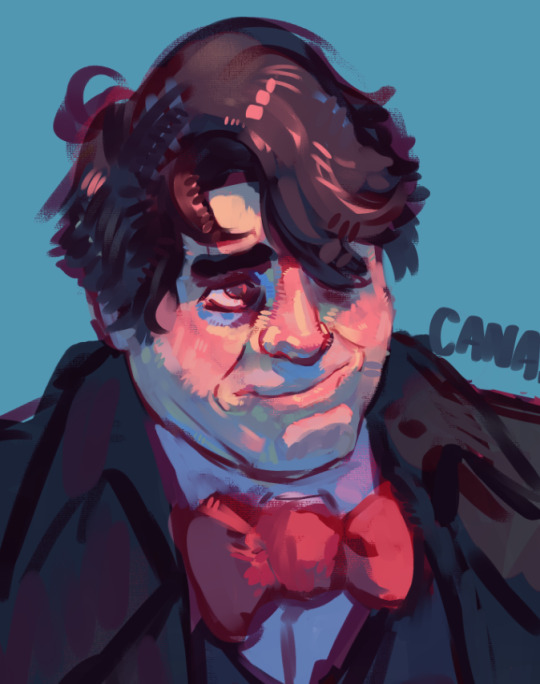
#i love playing with palettes and making using the idea of values to get the idea across
Explore tagged Tumblr posts
Visit Tumblr Blog
Explore Tumblr blogs with no restrictions, modern design and the best experience.
Last Seen Tumblr Blogs


Fun Fact
China blocked Tumblr because of pornography and censorship problems in 2013.
Text
Supe Preference: How They Propose
Requested: I know you already did a preference with how they propose but please please please do this with the supes! I think it would be amazing. thank you thank you thank you ♥️♥️♥️ - anon
A/N: I hope you like it my love!!! This was so fun to write, I love exploring their characters!!! Feedback is always appreciated 💕

Homelander makes sure he's got a crowd with his supporters when he pulls out a ring and gets on one knee, asking you to marry him. There are cameras and reporters there, too. They will run stories about the most powerful man in the world finding his one true love, the sparkle in his eyes when he looks at you, the faulter in his voice when he asks you. Everyone who saw it for themselves says it was the most romantic speech they've ever heard. This will do great for his public support and image. His fans are all about traditional values. Homelander staying a bachelor makes his fans antsy, nervous, like he can't settle down. Now he's doing that. You, John, and Ryan will be the perfect little family. An instant family, actually. People cheer and whistle and cry. You say yes, because there is no other choice. And you hug and kiss, and he directs you were to look and what questions to answer like when the wedding will be or the color palette you'll choose. He makes jokes and quips that everyone laughs at.

The Deep asks you to marry him on television. You were placed together because you have fantastic ratings, and he could use a little boost in the public eye. You haven't been "dating" for very long but, as he puts it in his speech, he doesn't need to have known you for a long time to know that you're the one for him. You smile, and even she'd a few tears before putting the ring on and kissing him. You're not actually getting married, at least not legally, but Ashley already has color swatches and flowers and venues. It'll be the wedding of the century. You make sure, behind closed doors, he doesn't get the wrong idea. You put on a good act. You're smart and stunning, and you could have any Supe you want. When the inevitable divorce happens, you'll come out the better for it. Interviews, book deals, and talk shows. You'll ruin him. You just have to get through the next few months without any hiccups. You have to make sure he doesn't do anything stupid or vulgar. That, in itself, is a full-time job. You talk through grit teeth in your smile, telling him not to fuck this up for you.

A-Train does it out of desperation. You and Reggie were high school sweethearts. You were together when he was let in the The Seven, and you've stayed with him through every bump in the road. When things with Homelander get really tough, really scary, Reggie pops the question. It's not the most romantic drive for the proposal, but if anything ever happened to him because of Vought and Homelander he wants you to have access to everything he'd leave behind. All the money, the deals, everything. You can only get that through marriage. He loves you, he's loved you forever, but he does this not solely out of love. He can't. This decision is too big and has too much weight. He has to protect you, to save you from what he's had to deal with. You don't know any of this about the engagement though, so you say yes, proclaiming it one of the happiest days of your life. You understand some of the tension, but Reggies too afraid to go into detail. You'd worry too much. He can't do that to you.

Maeve blurts it out during a fight. You're tired of being hidden. You're tired of keeping things so low-key, rescheduling because she has to go play house with Homelander. You're both yelling at one another when she asks you if you want to marry her. Of course you do, you say, angry that she would think anything different. Then let's get married, she yells. Fine! She storms off into the linen closet where the small box sits between two towels. You hated them and said they were too scratchy. You never would have looked there. She hands it to you, and when you open it, you're speechless. You always said things about jewelery in passing: silver or gold, the cuts you like, the gems if diamonds aren't your thing. You're angry and then you're not. It's a lot to think about (knowing you and Maggie could never go public, it would put you and her in far too much danger) and yet, the answer is so clear. Yes. Yes you want to spend the rest of your life with her. That's all you've ever wanted.

Firecracker asks you live on her show. You always knew she'd want to include her fans. They're a big part of her life, her popularity, and a huge reason why she's even part of The Seven. Her audience has heard stories about you from the beginning. They heard all about your first date, how cute she thought you were. It's only right they be included in this. So, under the idea that you're doing an interview about being in a relationship with one of The Seven members, you agree. When she asks you, you're speechless. Everyone is cheering and whistling. Of course it's a yes! That episode of her show goes pretty viral. Some of her fans are upset and turn on her, but for the most part they're all happy you're now engaged. Ashley is happy, too. Misty's ratings haven't been great as of late, but this stunt makes her a fan favorite all over again. Her audience agrees with the traditional values of marriage, family, etc.

Soldier Boy always wanted to get married, settle down with a white pickett fence, and a couple of kids. He certainly thought it would have been sooner than this, but he's still young, and he wouldn't have found you if everything hadn't happened. Still, it's been on his mind. He sees you with him in that house, with those kids. There's one thing to be grateful for out of all this. Ben isn't a huge romantic. You're not expecting rose petals and candles. Instead, he rolls over in bed one lazy morning and pops the question. You think he's joking, saying that's not funny when it's something you wanted forever. He's serious, though. He's got the ring and everything. It takes you a minute to realize this is all real. Of course, you say yes! When you do, he attacks you in kisses, grinning from ear to ear. You go out and celebrate, drinking until the room spins, telling anyone who will listen that you're getting married.

Sister Sage comes to you with a list of pros and cons. Some are big, like the commitment of marriage and the issues behind the traditional values. Others are relatively small to you, like the number of books she'd bring with her when you got a place together. You and Sage have been together a long time. You know she has thousands of books, you know she's thoughtful about everything except her own messiness, her own chaos. It's up to you to decide. She leaves her list with you, but before she can step through the door you're already saying yes, explaining your feelings about the whole situation. You love her. You know she has faults, God knows you have yours. And she still loves you not despite them, but because of them. She wasn't really expecting you to say yes, at least so immediately, so you'll have to wait on the ring. It was the easiest yes of your life.
#requested#homelander#homelander x reader#reggie franklin#reggie franklin x reader#the deep#the deep x reader#maggie shaw#maggie shaw x reader#misty knight#misty knight x reader#soldier boy#soldier boy x reader#sister sage#sister sage x reader#the boys#the boys x reader#a train#a train x reader#firecracker#firecracker x reader#queen maeve#queen maeve x reader#prefrence
301 notes
·
View notes
Note
Hey. I've got a few questions about Heroes Paradox and your art stuff.....
Im very slowly working on my own Links Meet AU and Im slowly working on my lineup for them, character design, etc.
Since you are (Im so serious) one of the BEST artists I know, do you have any advice for designs and/or how to really do a lineup? I'm fairly new (AKA very new) at art (Although Im a fairly good artist, actually) and I don't know a lot with Tumblr posting, art making etc.
If you don't mind, what advice or anything else would you give?
Thanks SO much!
- Legend's Legacy AU (AKA Link to the Random)[AKA a very worried person]
(Hopefully that all made sense?)
[Also I do love your art, hope you know!)
NOW ANSWERING THE CORRECT ASK
Aww tysm! I feel honored haha.
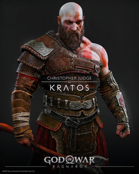
Well it really depends, most people forget that the character design really depends on the kind of media your story develops. For example, if you have a 3D model you can go wild, be detailed, have a lot of unnecessary but pleasant trinkets like this examples, genshin the patient zero of overly detailed and complex characters and good of war.
you can be as detailed as you want because you don’t need to draw them over and over and over again! but when you are designing characters for comics or cartoons you need to keep it simple.


For example, kishimoto originally designed Naruto to be always wearing those glasses, but he thought it would be too much effort to draw them everytime and he came up with the idea of the ninja bands to get rid of Naruto's goggles.
Because if you are drawing something over and over again you want to keep it as simple as possible.
That also includes the color palettes It’s hard to balance the “I don’t want to add to much detail but I don’t what to make it that complex”
For that I recommend play with the values of one color, like my ravio design it’s basically only purple, blue, yellow and green lol but just using different values.
Also something really important is trying to express what they are in their design for example I had to struggle a lot to make them different designs because Link looks almost the same every time lol but I tried to emphasize the things that make them different from each others
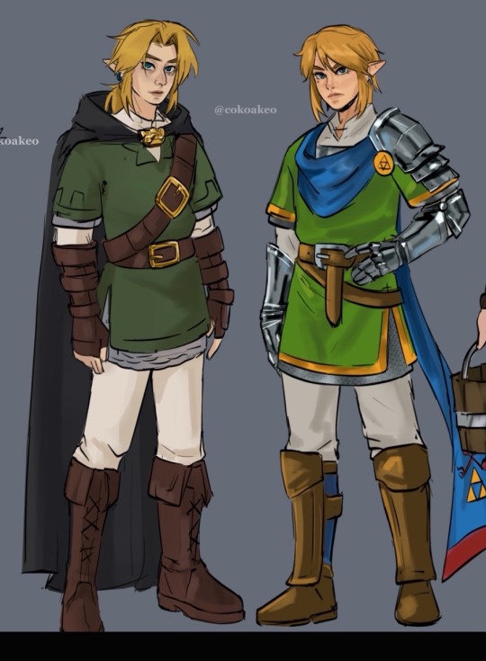
For example the “traveler loner” for time and Knight, captain vibe for Wars. (I tried)
54 notes
·
View notes
Note
do you have any tips for looking more androgynous/masculine for someone afab? 💕
(Did I send in this question?)
I have been wondering this myself for so long lmao, but lately I feel like I figured it out!
I also think it’s important to say that you do androgyny and masculinity the way you want to, the way that makes you feel most comfortable! It does not have to be society’s definitions of them.
Thrift pieces you like and want to experiment with! I love thrifting.. I live at Value Village.. I think thrifting is fantastic for exploring and experimenting with many choices of clothes for cheap! And you can exchange them if you don’t like them! I like to browse in the Men’s section for masculine shirts and pants. I only browse the small sizes, and I’m careful with medium sizes because I’ve made the mistake in the past of buying too big, and it’ll be a piece I love but does not fit me well.
I actually love Pinterest~. It’s so helpful to compile all your inspirations onto one board, and when you click a post, it shows you similar posts, and unf it’s so helpful for finding variety of the same idea. I have a board titled “Style” and it’s style inspiration for myself. It also acts as a list of clothes to seek and thrift. If I’m struggling to figure out an outfit for a munch or play party, I scroll through it for ideas!
TikTok. I don’t use TikTok but a lot of re-uploads are on Pinterest, and there are some really helpful tutorials for makeup, contouring, and styling that have helped me!
Contouring. I actually love makeup, still kind of an amateur but I’m super interested in learning how to do it better! A past play partner has gifted me a contouring kit [Mac - Studio Fix Sculpt and Shape Contour Palette] to help me present more masculine. Still learning how to use it, though I like to define my cheek hollows, under the eyebrows, nose bridge, and jawline.
Working out, building muscle. Clay says I look super masculine from behind with my back and shoulder muscles~ ᕙ(ò ω ó)ᕗ✧
Wear a binder. If you want! Make sure you bind safely! I do own a binder, I haven’t worn it in years though. I prefer sports bras or nipple pasties, sometimes I can get away with bare depending on the shirt fabric.
Masculine hairstyle! Putting this one last because it shouldn’t be a priority to make drastic changes to yourself (unless you want to). I do have short hair and an undercut; it is purposely cut and shaven masculine! Longer hair can be masculine too!
@august_skyz is goals… they also do a fem and masc makeup tutorial!
#hope something here is helpful to you! :)#my posts#katchleeifyoucan#answered#ask#non anon#queer#masculine#androgynous#video
12 notes
·
View notes
Note
any tips for the way you color your abstract portraits? (Like the recent metal gear solid one)
HI UHH i just checked inboxes now! I’d love to answer this! I’m not sure which piece you’re referring to but I can still answer.
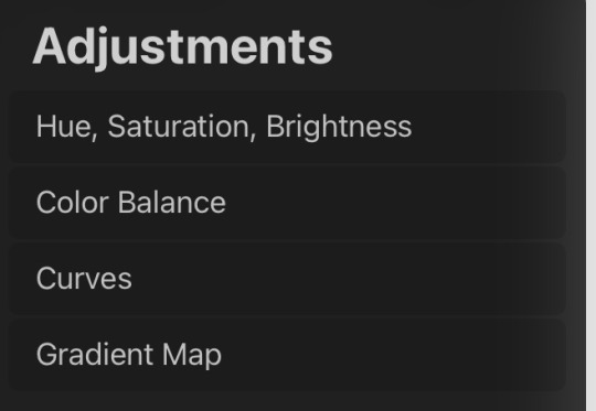
To usually get my colors I 1. Go on Pinterest and look to see how other illustrators color, sometimes colorpicking, but seeing how they apply color and what palettes. I highly recommend saving drawings with colors you like.
2. I always mess with ALL the adjustment layers on procreate here. You might surprise yourself if you just mess around with these options. Curves can really alter an image. Just have fun with these! Keep in mind if you have an overall palette. Layer modes also help but I don’t use them as often as adjustments such and curves or gradient map. I try to keep my images dull and add pops of color (value is what really makes color look good and pop In areas) for my double Kaz abstract painting I had an overall color idea. But uniformed and changed the colors better through curves n stuff.
3. I also pop my image into photoshop sometimes and apply filters and play with them, I’d say don’t rely on this but it can give Insp for colors
10 notes
·
View notes
Text
Mini “Wish” analysis and rant:
Don’t get me wrong, I think that both of Asha’s designs are beautiful. The thing is… when I look at her canon design in “Wish,” my mind just immediately goes to Isabella Madrigal. Now, I am not an expect in character and costume design. However, what I do know is that designs should be unique—to be able to stand out and only be recognizable to that specific character. Think Cinderella’s glass slippers, Mulan with her military armor, and Tiana with her lily pad dress.
And that’s only design wise… each princess has a specific set of values and traits that make them unique (or at least they did). Belle sees the good that lies beneath a person’s exterior, Ariel is curious about the world around her, Jasmine is confident and will stand up for herself. These only name a FEW and barely begin to scratch the surface.
But here’s where we find a problem… To put it bluntly, Asha is not memorable. Nothing about the movie really is expect for the fact that everyone agrees it could have been way better. Asha’s personality does not make sense, being a mix of the “adorkable” at the beginning then calm and collected after she meets Magnifico. A character can obviously have growth in their personality (e.g. a character that was shy and timid growing to become a confident leader). Asha’s character, however, just throws you off. Sure, she can be fun and joke around, but that is different from the forced trope her character became. This can further be seen by her character design.
Purple was used as the main color palette for Rapunzel and Isabella. However, both are done different. While Isabella’s palette is a softer lavender with floral embellishments, Rapunzel’s is vibrant with puffed sleeves and ties. The outfits represent the characters personality. Asha’s is kind of a mixture of the two… but more simplified. And when I say simplified… it’s bland. Practically no details that draw your eye.
Asha deserves uniqueness with a design of her own. She should stand out in the lineup of princesses… really all I can say is that, well, she has a goat. (AND BOY DO I DISLIKE THAT TALKING MENACE! GIVE ME BIBBLE ANY DAY!) I will say that I really love the idea of having a contract between Asha’s darker “night” colors and Star’s brightness. Asha gives me calm, regal vibes while Star exudes bouncing, curious joy. But I still think this could be better achieved through a different design. Perhaps, sticking with the theme, a dark shade of blue to play off the night sky? I do adore both the braids she has in canon as well as the frizzy, free hair she had in her concept art. But just look at the colors of the original art! Completely set apart and pull together beautiful variety… just like the sunset!
#wish movie#disney wish#asha#wish asha#starboy#asha and starboy#asha x star#character design#character analysis#wish rewrite#bring back love stories#bring back romance#mini rant
21 notes
·
View notes
Text
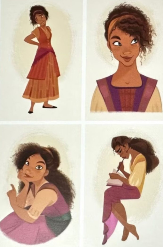
Lina (my self-insert) in the AE/Xianzhou verse
As last time, just a quick layer of simple color(s) to get an idea of her palette. I thought about making the cardigan blue to match the other design but I love how the orange colors fit her and maybe the distinction in color palettes is a nice touch too(also when considering her ship).
The cardigan is also see-through, which was a bit more difficult to achieve without really going into the layers and values of the colors.
The anklet-thingie around her leg is actually something she gets later down the line of her story but it is important (to her) and it does have a meaning. Although, this meaning plays with a theory I haven't fully decided yet whether or not to actually use it. But even if not, the meaning remains the same ;)
Oh, and she wears (most of) her hair tied up in this verse :3
As always, feel free to ask if you have any questions <3
Hope you like her <3
Amphoreus verse Lina
9 notes
·
View notes
Note
Since you've watched a lot of kdrama, what are common things you've seen in kdrama that have been consistently ported into K-BL, and what is your assessment of that approach?
Ooh, interesting question. So first, let's acknowledge a few things:
Korean bl is short format, with even the longest shows (Light on Me, The Eighth Sense) not even half the length of a standard kdrama (16-20 hours), and most clocking in around 2-4 hours
Kbl operates under much smaller budgets and significant constraints around casting as compared to mainstream kdrama
Kbl often draws from webtoons and manwha and mostly does not have the kind of auteur writers and directors behind it that you get in kdrama (Hwang Da-Seul is the most consistent creator in genre with Where Your Eyes Linger, Blueming, To My Star)
All that said, there are a few features of mainstream kdrama that have definitely ported over into kbl despite these constraints:
Slick production values and strong use of setting and color: even the cheapest kbls still look decent, and there is always intentionally behind the setting and use of color palettes to set the tone and feel. Korea has a very well-developed film industry and it shows. Color Rush, Semantic Error and Blueming were fantastic examples of this: even within more familiar school romances, the settings felt specific and the use of color to communicate character and themes was striking. I also think often of Our Dating Sim and Choco Milk Shake and the very effective characterization work achieved through design of the apartments.
Sound production and music on point: the home of kpop is not going to be caught sleeping on the OSTs. Nearly every production has original songs and given the leads of these shows are usually idols, they're often the ones on the tracks. And when they use music that is not original, like in The Eighth Sense, it's a very intentional choice to set mood and tone. Korea is not going to let a boy who can't actually sing take the mic (*side eyes Thailand*). To My Star is a great example of memorable OSTs even in a fairly low budget production, and Wish You and Sing My Crush showed us what kbl can do when it decides to bring the full kpop treatment to bear.
A keen understanding of the international audience: kdrama production is a big part of South Korea's explicit goals to take the global media landscape by storm, and kbl is included in that. It's not a coincidence that Korea decided to step up its game in this arena shortly after Thai bl exploded (shoutout to 2gether and pandemic lockdowns). Kbl follows trends and explicitly caters to international audiences in a way jbl does not. The Eighth Sense was basically a case study in marrying kdrama sensibilities and western aesthetics for maximum international attention.
Second leads and valorization of unrequited love: you and I have discussed this one a lot because this is a feature of kdramas that will never die and that kbls also clearly love. Korea loves a one-sided love story and culturally, there is a certain dignity afforded to owning your feelings and being honest with the object of your affection, even when there is no hope of reciprocation. Often second leads don't get the guy/girl because they hesitate or hide their feelings until it's too late: the trope is used to underline the important of honesty and effort as well as providing a catalyst for the main lead to make their move. In Korean culture, the trying is what matters much more than the succeeding. We are meant to like most second leads and see them as honorable and dignified for their sincere feelings toward the protagonist. Second lead syndrome is a thing for a reason. It's also just a cheap and easy way to create drama so you'll often see it in the lower budget kbls. Second leads showed up recently in kbls like The Tasty Florida, Jun & Jun, Oh! Boarding House, Bon Appetit, etc. We also sometimes see kbls playing with the idea of unrequited love in the main pairing that is actually requited, like in Our Dating Sim.
Love triangles: relatedly, Korea loves them a love triangle, and they are uniquely good at doing it well when they want to. Light on Me is a fantastic example of a narrative where you can legitimately see the protagonist liking and ending up with both the main and second lead. And that is rooted in the way the narrative treats Daon with dignity even as it punishes him for his hesitation in reciprocating Taekyung's feelings (see above). When you have a strong second lead who engenders real sympathy with the audience, love triangle excellence is achieved.
Workplace romances: kdrama loves workplace romances, and we have seen kbl start to move into that space recently with shows like Roommates of Poongdock 304, Love Mate, Our Dating Sim, Jun & Jun, and The New Employee. Kdrama workplace romances run the gamut, but they often feature chaebol characters paired with a "normal" aka not wealthy person, and we are starting to see that more in the bl genre as well, as we discussed a bit yesterday. I believe @nieves-de-sugui commented on your post about how the rich/poor romance fantasy trend in recent bl may be coming in from kdrama. I think there's some truth to that, but really it's a foundational romance trope that predates kdrama by literal centuries, and is absolutely rooted in heteronormative patriarchal dynamics that assume men are breadwinners and caretakers for women (translated to seme/uke dynamics in bl). Often in kdrama the chaebol character is unable to live an authentic life due to the demands of filial piety and the expectations tied to their wealth, and I do think that dynamic is ripe for enrichment when you layer on gay identity in a homophobic society. But that requires shows leaving the no homophobia bubble, which few kbls have done.
Physical intimacy squarely in the middle space: comparing to heat levels we see across the spectrum of dramas, I think kdrama and kbl are pretty consistent in that they tend to land right in the middle of the spectrum. It's rare to see straight up dead fish kisses from romantic leads anymore (though it still happens, wincing at Unintentional Love Story), but they are also not going to be serving authentic sex scenes. What you get instead is very pretty open-mouthed kissing that feels more realistic than, for instance, the pure jbl lane, but still polished and aesthetically pleasing. Think Semantic Error, Blueming, Roomates of Poongdock 304, Love Mate, To My Star 2, Jun & Jun. This seems to be where the genre is landing and I don't expect heat levels to get any higher for kbl, as this is right in line with mainstream kdrama. The Eighth Sense offered a less polished version of intimacy that felt right in line with its grittier sensibilities.
So, after that long list, on to your second question: my assessment of this approach is that kbls are doing fairly well for themselves when you consider the constraints they are operating under. Look at a show like Love Tractor stacked up against something like Hometown Cha Cha Cha. These are both based in the classic romance trope of a city slicker coming to the country and falling in love with a humble working person. But where HCCC has 16 hours to build a quasi-enemies to lovers narrative with a rich community of side characters, LT has 3.5 hours to achieve the same thing. So it makes sense that it would fall back on well-worn tropes and story beats it knows the audience will recognize to help save time. These shortcuts help the audience ground themselves and get invested in the stories quickly.
One thing I'll say is that kbl mostly stays in the romcom lane with very occasional ventures into melo, and despite what casual observers think, kdrama actually has a lot more to offer than that. It's a giant world with stories based in every possible genre, tone, and style, and Korean media is particularly adept at embedding romance plots that actually work in all kinds of stories including action thrillers, horror, crime narratives, mysteries, supernatural and fantasy epics. I'd love to see kbl try this, though of course it would require the resources and runtime to do it successfully. Here's hoping they get the chance.
#bestie i hope you wanted a dissertation#because i have zero chill on this topic#kdrama#korean bl#shan answers
87 notes
·
View notes
Note
how do you pick out such cool colors and outfits?!? :000 i love your art :3
HIII, THANKS KNOWING YOU ENJOY JT MAKES ME SO HAPPY AWAWAWAWAW😭❤️❤️
Also, I'm sorry if answers will disappoint you but I don't have a thought behind color picking. Truth is lately I've been just using colors I like, trying to make them fit to the overall vibe of the drawing.
For example, in the vamp marla drawings I used a dark moldy orange cause it reminded me of rust and decay, and with that I added some tilted bright magenta lines to contrast it and make it pop. That's it. And to figure them out I just kept modifying the hue until I liked the combination. So I guess, play around with colors, be silly :3
Oh also lines and halftones play a big role in my drawings. I don't like having many elements of the same value one next to the other, cause they don't make each other stand out. (imagine a plain outfit with EVERYTHING black. Nothing else. Kinda boring).
I try in fact to put dark areas next to brighter ones so their shapes are more distinct to the sight (the eyes in the drawing for example wouldn't be so visible if there wasn't the dark eyeshadow to drag your eyes towards them. The hair has subtle black lines as texture while the skin has halftones, this makes the brain perceive them as different).
Now for the outfits...well, since the past months I've been drawing the same 3 blorbos in their canon fits, soooo use reference I would say... referencing things is always the best thing you can do, from fits and especially colors if you're trying to obtain a certain mood or atmosphere (and I be forgetting cause I'm lazy but don't be like me 💥).
I did design the following fits out of raw imagination, but I needed some reference for cowboy and pirate fits on pinterest.
In these cases I tried to add some recurring patters for each of them.
Narrator has many horizontal lines going on on the pants (design and the dangly things on the side) while also having like two belts and a string. More lines yippie!
With marla I went with earrings matching the necklace, while also adding lace (is that how it's called??) on the rims of her top, glove things and collar. For her top and skirt I went with vertical lines that are also present on her stockings while cloak/scarf has those repeating things at the end (me when I don't know clothing vocabulary).
Tyler has kinda the more boring fit cause I was getting tired. I was trying to go with items of the upper body being tighter while having large pants with bug boots, kinda triangle shaped, but ehh I need to work more on that. Reoccurring would be the flowy clothes folds cause I view them as soft materials contrasted with a more rough vest. I tried to add on that soap bubbles patterns but it's kind of a weak effect so fnenrne.
Again. Reference. And taking breaks between designs cause your brain at some point has enough of your ideas.
Uhmm idk if all this yapping in an okay answer for you, I spent all afternoon trying to analyze my drawings and I was going insane. But I thank you for asking cause you made me realize I should adapt to a stable technique huehue =w=
Also for school work, when I need to pick colors, the website I linked below is the tool I always use. You can search for an already existing palette or generate a random one u.u
Lmk if you wanna know anything else, I'll try my best to answer. Have a great day <3
7 notes
·
View notes
Note
your soul design is so yumilicious I need all the details now on my dinner plate
fr tho I want to know all the soul design lore how did you create such a creature /vpos
OKOKOHHHHHHOKOK BUCKLE IN. YOU’RE GONNA GET THE FULL DESIGN PROCESS
I struggled the most with Soul ngl. I couldn’t really think of anything I could add that would differentiate him from the fanon standard. I’m a lil upset I couldn’t think of something more original, but nonetheless he turned out quite lovely !!!
I started with the color picking. I was very insistent on making everyone’s colors proportional to eachother. The main colors should have (about) the same saturation/brightness, contrasting colors that are the exact opposite hue of the main color, respective black/grey/white values (soul’s ‘grey’ color is more teal bc color theory but yea), shit like that i guess. The final palette is on the right, it’s what I use today.
Soul never got fully fleshed out concept sheets like the other two. I guess my brain just filled in the rest of the gaps without having to draw them. (I apologize for never finishing these btw. It’s been months man. I hope the blorbo doodles in the corner make up for it) The second image was done a lot later than the first btw. Idk if that matters but I’m bringing it up anyway.
His fit inspo came mostly from Pinterest. I just compiled a bunch of shit I think he’d wear. Plus a majestic cape because it makes him look plenty more epic.
OK MOVING ON. I decided that his main gimmick would be my take on his shaded side. The idea was to make it represent dissonance, and how it affects Soul. The shadow is basically just this fuckin void. It has no physical form, and you can just stick your hand in there if you’d like (he sometimes stores the trident there). However I wouldn’t recommend it. The feeling is indescribable, but very uncomfortable. The void has a life of it’s own in a way. It does not stay confined within the Soul’s physical form (or in my case, his lineart). When conflict is at a high, like, tridential regicide level high, the void will get very close to fully overtaking him. It only fully disappears once true concord is reached, and starts reforming when the next cycle starts.
Also, the mask !!!!! Throughout cacophony, Soul is having a huge fucking identity crisis and shit. He doesn’t really have a physical organ like the other two. He doesn’t know why he’s here, or what he did to deserve this, or why nothing he’s trying works, and just. What is he if he’s failing at his main purpose???? I think because of this, he doesn’t like showing his face around the other two. He needs to assert is power, and thinks that showing his face will make him come of softer and less of someone to obey, if that makes sense. He only really takes it off when he’s alone in his room or pocket dimension (still trying to decide if they have a mock ‘apartment’, or ever did at one point). But once he has the character arc in Two Wuv, it permanently comes off !!! Wahoo!!!!!!! If only the next cycle weren’t to start, resetting his newfound self image to its previous state !!!!!!!!!!
Ok this is getting long im putting a read more thing
This image was very helpful for designing the tine shapes!! Guess which one is Soul’s !!!!!! (Spoiler alert, im pretty sure its either the 2nd or 6th ones in the 2nd row. However i genuinely dont remember. This may not even be the right image)
Soul also has a strange tie with eyes. If the halves have pissed him off to the point of no return, he does this fuckin analog horror stare that freaks the shit out of them (although heart cant see he remembers it very well. Plus, he just k n o w s that extra eye is there). I haven’t really played around with this, but I like the idea of a freakishly absurd amount of eyes hidden within the shadow. I should maybe like. Draw that sometime.
Also, expect a Soil patch update in the future!! I’d like to make his fangs more deranged, and maybe add an earth pattern to the cape. Right now, he has no symbols on him that represent him in the astronomy metaphor.
Uhhhh i hoped this helped??? If i missed anything you were hoping to know about, do let me know !!!!!!!
#i need a tag for posts like this#i shall call it#design lore#cj rambling#chonny jash#cccc#chonnys charming chaos compendium#taps asks#cj soul
46 notes
·
View notes
Photo
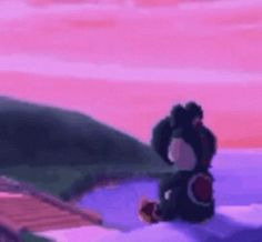
Periodically this posts nukes my notifs and I wonder if giving additional info would even be worth it, but I figure it doesn’t hurt to add, I’m not forcing anyone to read it. Maybe archivists will like it. The way things for the web were built are done differently due to the changes in technical limitations— details nobody would realize unless you were from that time. But, maybe fan motivations could be similar? Hah, idk. It was normal for anime fandom online to go to a lot of trouble for our content— as my best friend puts it, “We all fucking walked 15 miles uphill in the snow for anime fandom, that was standard!” and a lot of people who have been online as anime fans since the 90s know each other or at least know each others’ work. (Hey everyone— I’m PIMoSDL from the Ranma ML. Anyone still alive? Hahaha.)
This gif was inspired by an even older dancing Lum gif (transparent background, Lum facing forward, the dance from the Lum’s Love Song ending from Urusei Yatsura, I can’t seem to find that gif anywhere and have no idea who made it), which was on a buddy’s Ranma site that’s long gone. As a new webmaster I wanted an animated gif on my anime site too, because animated gifs were cutting edge, but it HAD to be one I made myself! From OUR fandom! It HAD to have a transparent background because that was more immersive, and I wanted everything on my anime site to be content I produced (it was the first English Ranma and Akane shipper shrine ever; even back then my first foray was into fandom because of ship wars, hahaha. I had a whole fucking career as a web designer because I shipped Ranma and Akane.)
I had to jam the card onto the motherboard with my foot (don’t do this) because it was too hard for me to push in. My boyfriend (who bought me the card after I asked how to get screencaps onto a computer “like those college kids do”) bought it at a computer show; we were still mostly limited to local options for many specialty purchases. Also, I married that guy and we have two kids now 🤍
The first adapter (A/V adapter) didn’t work, so he brought me a coax adapter (hence— static on the screen caps)
You could not just hit “print screen” to get screenshots of video back then. I had to export screen caps from the capture software and use the pause on my VCR if I wanted specific frames. I was lucky enough to have a frame-by-frame feature on my VCR but it left even more lines and static on the frames compared to just playing video and hitting the “capture” button in my software. There was no choice but to redraw everything.
The version of Photoshop that I had was 4.0. It didn’t even have a tool to make rounded corners or rounded corner vector paths, so it sure as hell didn’t have an animation panel/animated gif export 😆
The frames were made in Paint Shop Pro. It was saved to .gif in a separate program (forgot which) where I had to manually enter the hex values for the color palette because I didn’t understand why t f it was messing around with my colors and adding “dots.” I freaked out a bit and had to manually fix all the “dots” that were added from dithering
This was my first gif. I tried my best to make it as small as I knew how to (which was already a relevant professional skill back then, since most people downloaded graphics over a 14.4 modem; 14kb a second. A web page that took up 1mb was about the most you wanted to make— I was working as a fledgling web dev after school for a local company and was learning all this stuff at the time, using my Ranma site as a test grounds for any new tech I was learning. The site’s still up and the last time I edited it was when frames were still in vogue, it’s been a minute lol)
This gif helped make, and outlived, my entire career as a web designer. Companies always change their web presence, so it’s survived past anything I ever made professionally, and it’s loved more than any stupid corporate junk I made, hahaha
THANK YOU BING IMAGE SEARCH. Thought I lost this! 8D
I made this in 1996. To make it back then was a million times harder than it would have been today: screen capped each frame in the loop by hooking up my VCR to my TV capture card (it was this external monstrosity with a separate power cord XD). The screen caps had bad color, were blurry, and full of static so I redrew each frame pixel by pixel with a mouse (wasn’t so good at image editing programs back then). XD;;
Of course, it got lost over time because I made that thing like 203498203489 computers ago, so I’m glad people jacked it from my site back in the day. XD
35K notes
·
View notes
Note
You have any advice on how to color your work, your art is amazing!
After two years I finally reply to you hi anon hi <3 <3 now I think that this was sent when I was more active with using Rebelle (still love it, but don't use it as much these days!) - back then it was a lot of pure colour theory and eyeballing which I've honestly since forgotten a lot of lol but bear with me here. I'll throw down a step by step as to how I do my stuff nowadays in the latter half of this post.
first off this video is a super helpful watch.
youtube
also read james gurney's colour and light, even if just skimming through it.
also also get familiar with the different colour zones of the face lol
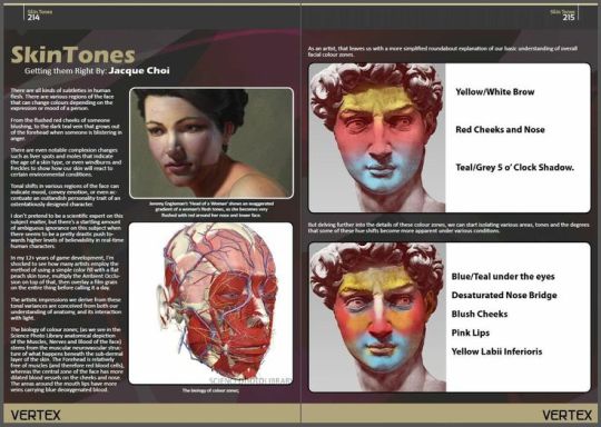
also also also get familiar with the planes of the face, they'll help a lot when it comes to rendering out shadows and light. Love using this reference tool here.
now, for the things I keep an eye out for...
knowing your basic colour theory, complimentary colours, etc etc
playing around with colour, not being scared to make mistakes because hey I can just start a new layer lol not the end of the world if some colours end up looking ugly. Don't be afraid to copy/paste your sketch and play around with different rough colours to get a good idea of what you're looking for.
going into it with a few colours in mind that I'd blend everything from to make it all cohesive. choosing 4 or 5 specific shades and blending everything from that, typically avoiding pure black or white. In rebelle I'd typically blend those colours myself to get all the other hues and tones I needed just using the palette mixer, just like real paints
lots of flipping between grayscale and full colour to get a good sense of values, not being scared to darken or lighten areas as needed
I have a tendency to only focus on rendering one side or the other, so to speak -- leaving the shadowed parts fairly detail-less and focusing all of my rendering in the light side, or vice versa
I tend to designate one colour to be 'the dark' or 'the light'-- typically a dark teal or light yellow with most of my stuff lol -- and use that base colour in all of the shadows/highlights on a piece
keeping in mind the way different colours and lights will reflect off of surfaces and hit other surfaces? not the best with this one admittedly but never be afraid to take some colours from the hair and brush it onto the face, colours from the face and brush it into the hair, colours from the background and brush it onto everything, etc etc
I'm still using a lot of saturated colours even in the shadows ; I'm typically not introducing a lot of grays or blacks into a piece, even in the shadows. While of course my shadows are darker than the lights, I mostly distinguish them by colours -- once again, one colour being the 'dark!'
remember that the areas of highest contrast are where your eyes will be drawn to. i tend to tone down the contrast away from parts that aren't quite as vital to the drawing
most people seem to like to add shadows selectively over the piece, but I instead like to carve out the light. Cover the whole image in shadow using a multiply layer, and then erasing where the light is hitting.
layering layering layering, playing with undertones! colour in large swaths of the face with a colour that you want to have show through, building up layers of colour on top of that.
whenever I mix a new colour for something -- i.e to darken part of the eyes -- I try not to only use it in only one spot. I add a hint of it into some strands of hair, a subtle touch of it into some of the shadows. Otherwise I feel like the colour stands out too much and looks disjointed, like it doesn't belong.
don't feel like everything has to be fully smoothed out! Feel free to keep parts of it rough! Keep raw texture showing through!
When I'm adding in undertones, I go for yellow around the nose, forehead, and corner of mouth ; blues around the jaw and under the eyes ; reds over the cheeks, nose, and ears. your character is gonna look like a clown but i promise just trust the process lol
I also like adding in darker or more saturated colours around the edges of hard transitions between light and shadow to help really distinguish the values.
NOW FOR THE ACTUAL STEP-BY-STEP... GUIDE? PART OF IT.
In CSP I've got it down to more of a formula than anything. I start off with a real rough sketch, chunky brush, just trying to figure out where everything is going ; I refine any facial details but I'm not too worried about having the likeness spot on exact at this point. Lots of lasso tooling things around. Typically I do this all on one layer, but sometimes I'll let myself have a second layer with a more refined sketch that I work from instead. At this point I do one of two things
I make a layer below the sketch layer and fill it with local colours - the 'pure' colours of the objects. I set the sketch layer to multiply, lower the opacity a tad, and merge it down; or
I make a layer above the sketch layer, fill it with local colours covering the sketch, lower the opacity of the layer, and use a colour that's a shade or two darker than the local colours to roughly refine the outlines of the sketch. Bring the opacity back up to normal, merge down.
I've added in the undertones of the face at this point -- those yellows, reds, and blues -- and I'm working with only one layer. I'm still tweaking the features, lasso tooling things around, carving out edges that don't sit right, filling in any gaps in the painting with colour to hide the holes.
and then, once everything's roughly where I want it, I'll start playing around with multiply & overlay layers. Sometimes I use soft light instead of overlay, I just go by feel. I mess around with colour schemes to see what I like best, and sometimes I'll completely erase the lighting and shadows and try different lighting angles.
I make a new multiply layer, mess with the opacity to my liking, clip/mask it to the layer below, and go to town. I'll typically fill the whole layer with a colour I want for the shadows, carve out the lights, and then come in with an overlay layer that I selectively fill in where the light hits the character's face. Don't be scared if it overlaps the multiply shadows, it adds more colour variety to work with.
Merge the multiply layer down into the base layer. Merge the overlay layer down as well. And then I just... start going to town.
I ended up using a light blue multiply layer and pink overlay layer. I take the colour I used on the multiply layer, and directly apply it to different parts of the shadows to help the colours pop ; same with taking the colour I used on the overlay layer and the highlights. I like to put special focus around the eyes when I'm bringing in said colours.
99% of the time at this point I'm just colour picking from different parts of the painting, not bothering to select new colours from the colour wheel unless I've gotta start pushing my values a bit should details get muddy ; typically done by colour-picking an outline colour and dropping it in value a little bit. I take colours from the highlights and mix them into the shadows and vice versa, help harmonize the colours a bit. I'll colour pick from the face and add those colours into the hair even.
After that it's sort of just... rendering it all out. Paint the rest of the owl?
Sometimes I'll hit the highlights or shadows with another correction layer to try and push the value contrast further if I feel like it isn't quite enough.
I use the same brush throughout the whole thing -- I'm using CSP's default thick oil paint brush, that's had the dual brush mode enabled and the colour jitter toned right down because I found it lagged my computer ✌️
------
p.s don't be afraid to reference the methods that traditional artists use! Look at how they do brush-strokes, lighting, colours, layer things all together!
p.s.s also don't be afraid to fuck up lol. experiment with new colours and lighting schemes. play with colours that you don't like playing with. push yourself even if you think it's gonna suck. sometimes pieces need you to take multiple passes to it before you get something that sticks
also this is not the be all end of all advice do whatever your heart desires lol this is just how I do things ✌️🐛
2 notes
·
View notes
Text
A YouTuber channel I watch by Hannah Louise Poston recommended this makeup artist called Terry Barber, whose work it turns out I had already found on tumblr and thought was rlly cool.
Anyway so this guy made an eyeshadow palette with Mac and it’s inspired me to think of makeup in the same way. I do think there’s a bit of overlap in our approach, keeping to single eyeshadows and preferring diffused finishes. But maybe that’s also just the trend atm.
So I wanna come up with a palette like this one from my Nars single eyeshadows. His one is quite neutral with no real colourful pops. I think my one would have a few colourful pops, maybe of blue and green.
It’s more so the idea of curating a palette for myself that works for the type of makeup I do. And it’s also about taking my makeup seriously as an art form where I have tastes and I can take myself seriously. Because usually I just devalue my makeup and think it’s me putting silly colours on my face, but it actually does have meaning to me, and it does express things.
I love the understated nature of Terry’s palette. It’s asking you to appreciate the nuances of each colour separately, without blending them together to create highly constructed looks. And that’s how I see makeup as well — it’s about honing in on a colour and playing with texture.
So the question becomes if I had the opportunity to make a palette like that one, to curate a selection of single shadows that summarise my creative vision, what would it be?
I don’t want to be too focused on the idea of « neutrals » like Terry seems to be. I don’t really do a lot of neutrals now I think about it — I sort of don’t see the point. Go big or go home Lel
So, if I had my selection, what would it be?
Probably a lot of metallics, because they’re easy to work into more mattes or more metallic. I’d have a lot of contrasting tones, like rich colours with light colours (e.g. I’d pair a dark cranberry with smth like Mac Nylon to sheer it out plus the gold would add a rlly nice complexity).
I’d definitely put in the MUFE metallic white, Nars Biarritz, some kind of gloss product that you can mix with the eyeshadows, a rich berry (I rlly like that Mac cranberry shade), maybe two golds (a light, whiter one (depending on how Isla Bonita shows up, maybe that) and a richer one, similar to Palemetto from Summer Unrated but a bit less warm — maybe more of an antique greenish gold. So, maybe if you layered palmetto with a similarly textured midtone green, like Joie de Glitz. OFC there would have to be some blues thrown in there, like the MUFE metallic one and Mac Cobalt. Would I put in that Mac dark blue I found online? Potentially. I would probably use it to replace the MUFE one and just have that as the only blue (controversial). There’d defs be a lavender/ purple. Except maybe that purple could come from something like Chile, with its different reflects rather than a straight purple. Because sultan is definitely purple, but I find it’s just a bit too straight purple for me — it doesn’t have that complexity I seek. If I was going to have a perfect purple, it would be something like Chile but more consistently purple, without such a grey base.
There would also have to be something like Nars Zambezi in there (even though I can’t get my hands on Zambezi to save my life). I love the frost finish of it. Maybe Mecca Max Wannabe is closest? Honestly, this colourful section is sounding a lot like Cap Ferrat.
Would we have many coppers? To be honest, probably not. I’d want maybe one frost finish medium copper. Something like Guayaquil, but I’ve always felt Guayaquil to be too warm and too dark — too boldly copper. I’d want something a bit more muted, a bit closer in colour value to my skin tone. Maybe something like Lahore but given a bit more base with something warmer like Persia? Or maybe Lahore mixed with Ishta! That would be interesting, although it might pull it a bit too ruddy and scary zombie eye.
Im excited to see how Nars domination turns out. Because im sort of hoping its not as vibrant as I think it might be. Yes there’s a place for a bright fuchsia, but im sort of hoping its more of a wearable shade. Yes I can blend it out and work with it, but I don’t want to have to jump through hoops. I’m hoping it will be sort of a less intense version of Fatale.
If we look at the colour wheel, I want to cover most areas in some capacity, but with an interesting take on the colour tones. I don’t want to do a straight anything.
Maybe I’d take Nars’ advice and mix warm and cool tones. But personally I’ve been trying to mix complementary colours to get a sort of edgy clashing look. Although idk how well it actually works out.
So, what have we learnt from this exercise?
I really only need one blue eyeshadow plus a white to blend it out with. I don’t actually like purple as much as I thought I did, and much prefer a ruddy cranberry colour instead. I don’t like straight colour eyeshadows and prefer ones with a bit more colour complexity.

0 notes
Link
0 notes
Text
HUD improvements
As my HUD is fairly empty, I've decided it should be the first thing to be redesigned. As TETRIS had a similar problem to me with its gameplay area and screen space, I'll be using them as inspiration
My first decision was to update the text. As I can't make fonts, I elected to use the same system as I did for health in Tempting Fate, using sprites. I recreated the code and began working on my sprites
Originally, they had little starts and moons. However, they just made it look infected so I cut them from the design. The gradient is to stay consistent with my game's palette.
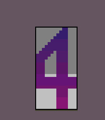
For whatever reason, the number displayed was 1 higher than the value of lives left so I bodged it and had them direct to a number 1 lower. I didn't like this solution but it did work
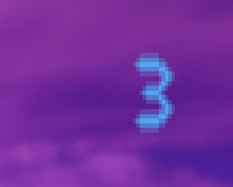
My display for the text initially looked like this, with a gold border. However, it just didn't work with my game so I went for a luminescant blue
I still hate this. I tried reducing the number to a neon sign but it just doesn't work
So, if I can't make a good HUD, I won't. There won't be a HUD - at least in widget form. That's right, I'm making a 3D one. God help me.
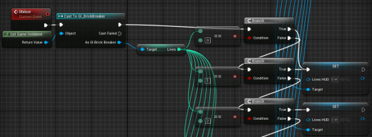
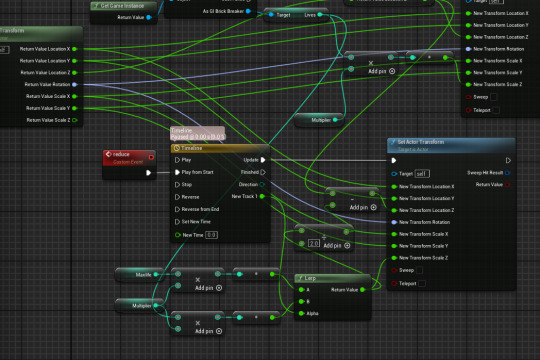
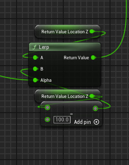
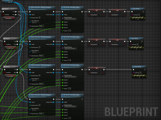
For my first 3D HUD item, I'll need a life counter in the form of a bar. This will need to get the current life count, set the bar to a corresponding height and lerp to a smaller height when an event is called.
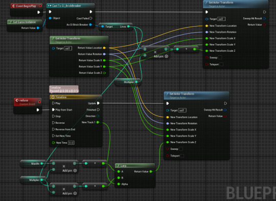
This code is a mess but it works as intended. i had a little issue about it lerping from 0, but that was because I hadn't set a default value for the max health. Now, I just need to reuse the code from Shipping Delay on the crane's rope to make it seem like one side of the cube is going down.
I tried doing it myself. It didn't work.
BUT THIS DID. I realised my rope in Shipping Delay used a different way of doing this, that I hadn't used a lerp node for moving the cube, and that it actually was moving, just not enough. Now it's done, I really like how it looks :D
alright it wasn't perfect. When the player's life count reaches 0, the bar bugs out - it goes back from 2 to 1, but without going up so both top and bottom move. Basically, it looks weird.
I have identified the problem. The life count REALLY doesn't want to go to 0. It will go 3-2, 2-1 and then 1-1. WHY? I DON'T KNOW. Correction: its perfectly happy goinng to 0. It just hates going down a third time.
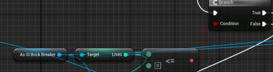
Changing this check in my killbox DOES kind of fix it. The player does have 4 lives, and the last animation does play the previous one, but it's in the right place again. Huh
I FIXED IT KIND OF My solution is foul but it DOES work. I copied the code form the false tree into the true tree after the life check in my killbox and added an open level node. This solution is terrible, but you wouldn't know that by the gameplay.
look at that health bar go
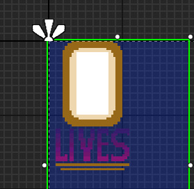
I've added a small fram around the block to help get an idea of scale for how many lives are left
Sam gave me the idea to implement a colour system - I plan to do this by lerping between differend colour variables
'what did it cost you' 'everything' oh who am I kidding I love this. It's awful. It also works - it goes from blue to green, green to yellow, and a backup yellow to blue one in case I mess something up.
This, however, doesn't work. As I sit here typing this, I just realised why. These nodes happpen on update from the timeline, so I need to ensure they aren't happening every tick of the animation.
I showed my code to Jake. After about 10 minutes of suffering and trying to understand what I was doing and why, he showed that I could just use the above nodes instead. Then we spoke about Yugoslavia, but that's unrelated. At any rate, I now know a prettier way of writing that code
As for the little heart below the bar, I tried making it pulsate but this didn't work. I also swapped it out for an image of an actual human heart. Alas, i have reverted both as neither worked.
Adding this code to my heart sprite should have allowed it to shake, and switch the sprite to a more broken one, but for whatever reason it went too far left. I fixed this in the image below.
This was then duplicated for the other heart sprites.
0 notes
Text
Week 4 Devlog
Closing in on a single gameplay loop. Let's see what everyone's been doing... Ellie: This week I started the basic prototype for our third gameplay system: the part where you actually make the game. This involved creating a written wire frame for what this screen will look like, and then starting to add the moving pieces that will make it, y'know, play. This is kinda all I did this week so I'll attach a picture of the current scene. I'm sorry that it is so ugly, I truly am. I am shockingly inept at visual art and I surprise myself with that every time I try to make anything look good. The idea behind this system, for those not in the know, is that you drag your developers to different tasks and their stats will impact how long it takes to complete those tasks, comparable to real time. This lovely image depicts the developer pane on the left, and what is definitely a spreadsheet on the right. A lot of values aren't filled in yet, but I will get those this next week.
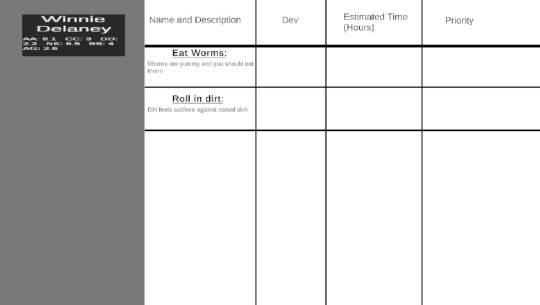
Seth:
This past week I've done several things (wow!) I completely finished the developer stat generation and wrote some functions to apply Ellie (rea)'s post samples to developers with the right personality traits. I also wrote the code that allows you to slice and dice a developer on the table! That's what you'll have to do after you kill a developer before you can use their limbs :) With that done, all that there really is left to do for our Poaching Talent and Team Building systems is to do some linking together, and then we'll officially have a Game Where You Kill People And Take Them Apart. That's like halfway there! Woohoo!
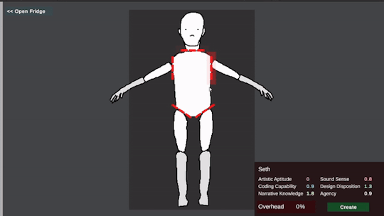
Miles: I’ll be so real I flopped hard this week. But I did push myself to get at least the team building body art ready. Which it is! I’ve been wrestling with what the best way to set up randomly generated skin tones is, too. I think I will do some research into 2D/UI shaders and what gradient mapping capabilities there are in Unity. Seems like a helpful thing to know and for this project it could be fun to kick around various kinds of palette overlays depending on the mood of the scene. Maybe I am crazy.
1 note
·
View note
Text
N64 Game
My third board with the idea of making another N64/PS1 game like a couple of my previous projects. I started with adding a lot of images on the level design in Spyro (released on the PS1) because of the colour palette. I love the Skyboxes and the blend between cold and warm colours. From this, I started adding images from actual N64/PS1 games because I wanted some direct inspiration from the originals. A lot of the images I started to add at this point we're all combinations of both using a more nonsensical, vaporwave aesthetic. Through the majority of the middle, I began to add retro renders or pictures that used a lot of film grain and darker colours, as well as some beach settings that used bright contrasting colours and sharp layering to make some really strange artwork. The reason I added this was just because I began to realise what I wanted this game to look like, which was a modern, N64/PS1 style coastal vaporwave aesthetic. This eventually lead me into these retro games that already looked similar to what I was envisioning, such as the Kirby fountain of dreams. After this, I’d pinned my ideas down to the old animal crossing games, specifically those with a beach and sunset. I realised this is what I wanted for my game, in more of a openworld, 3rd person style to give myself and the players more freedom.
The main art style I’m looking at from this, is all of the pink, purple and orange, low poly renders, reminiscent of the PS1/N64 games. Off of this I also want to explore the coastal themes shown at the top just because I love the warmth and coziness that comes from it.
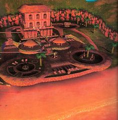
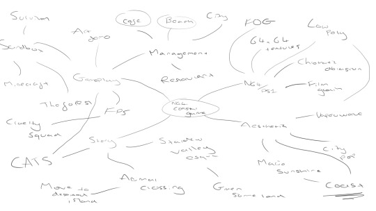
The themes for this mind map were: Gameplay, N64/Ps1, story and Aesthetic. Starting off with N64/PS1, which I chose because it is extremely important to get right if I want this game to feel as it should. The first thing to consider when making a game in this style is that it needs to look like it has limitations, because the older consoles would have. 64x64 res textures are a good way to achieve this, where you can pixelate a full res texture and use that instead. Aside from this, all of the models are going to have to be low poly to achieve the look, because rendering engines at that time were limited to a lower poly count. Chromatic aberration is the effect that refracts light around the edges of objects, although this effect would have been seen through the CRTV and not the game itself, It would mean a lot of unnecessary hassle to get this playing on one of those. The film grain adds noise to the screen, even just a subtle one can have a more retro or warming effect on a game. Similarly to the chromatic aberration, this would have originally been through the CRTV but can be replicated in the unreal engine post processing. What a lot of games look over when trying to replicate something like this is the fog. Older consoles needed to use fog on third party games so they rendered properly. Onto Aesthetic, which I used to try and gauge what type of atmosphere I wanted to set for my game. I picked vaporwave because I have been really obsessed with city pop and 80’s Japan recently, vaporwave is a more modernised take on that aesthetic. I was also looking into mario sunshine for one of the bigger inspirations, aesthetic wise, because it is based by the coast and looks extremely similar to what I’ve been picturing. I put down story because I haven’t been able to add much story to my previous games in this style because of my obsession with making it accurate. Because it's a island management game, there needs to be some context for how you get to be in that position of power, because of this i’ve put down animal crossing, they handle those introductions extremely well. SOmething like stardew valley would also be a good start to the game, inheriting the land through a late family member. I like the idea of it having sentimental value. I had a couple different ideas for the gameplay if the island management didn’t work out. I think a cafe or city management game would be an awesome idea.
0 notes