Don't wanna be here? Send us removal request.
Text
gameplay video
:3 i guess
guess who forgot to set my mouse to be visible
0 notes
Text
Accessibility
During the creation of my setting page, I realised I ought to implement a colourblind setting. I eventually came across the below tutorial and found that UE5 has colourblind modes, which showed a number of problems
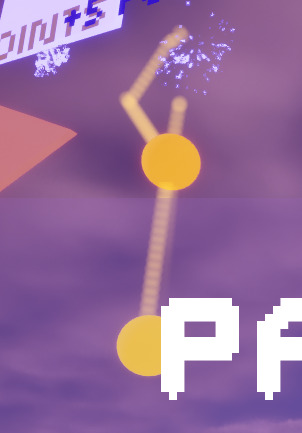
to someone with Deuteranope or Protanope colourblindness, this is how the orange and yellow balls look. Nearly identical. As such, I had to make the orange ball darker to the point where I could differentiate them in balck-and-white.

Lowered the emissive value, better.
youtube

This is how I toggled the colourblindness mode - the branch at the start is to make sure that when the int goes over 4, it is reset so the text goes from none, green, red, blue and back to none

This is how I changed the severity using the slider. Of course, the colour changes too because I really like how it looks
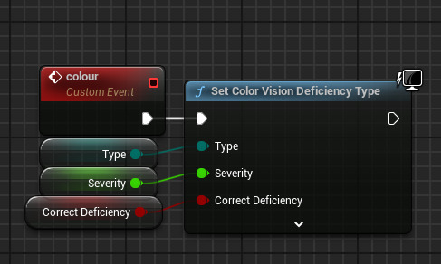
This is what actually sets the colourblind mode

And this is how I set the text displaying the colourblindness mode.
0 notes
Text
Technical Difficulties
Wednesday was a write-off. I achieved nothing. I struggled to actually open the editor [I/O device errors, my funny box not registering or needing to be repaired] and when I did, the FPS kept jumping and it suffered from lag spikes to the point where actually using the editor was unfeasable.
The issue has not resolved itself. However, I found the copying the files to the PC's hard drive and running it there led to it opening and operating just fine - which raises more concerns over my hard drive, but at least i can continue my work now.
0 notes
Text
Customisation and Settings
After having Reece and Louis playtest my game [apparently funny sounds and flashing lights make them happy], it was suggested that I add customisation - maybe integrate it into a start screen. I wasn't convinced until they stated I could add a skin that's just the flag of Finland so now I feel I need to do this.

This is my start menu. Why yes it is stupid, but it won't stay like this. clicking on the middle button opens the first level, but I needed the player to not be able to control anything in the background so I made the default level a copy of the previous ones, but empty. I then ran into my next issue - what would load the start screen?
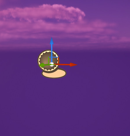
This is fred

No, really.


And this is what fred does. Because fred [he prefers you don't capitalise the F] is always in the placeholder level, as soon as the game starts he can cause the GI to make a start screen widget. This is removed when the game starts of course

This prevents the player from interacting with the camera and is reset in the game instance. I learnt about this via the post below

I had a problem where the bat would only move if the left mouse button was being held down, but when i changed Set Input Mode Game And UI to just Game Only, this fixed it - i don't know why, but i won't complain.
Next up is customisation. oh god.

this is how i control what skin is displayed in the little display thing - it's controlled by the game instance so it is universal and persists between levels.


This will be how I have my displays slide - I will also need to spawn another one in, but that's a problem for when this works. I just need to implement this into the actual customisation screen.

I came to the conclusion that what I was doing was far too complicated - instead, everything would be in the widget.

This is how I changed the material,

and this is how I set it in the ball. This actually did work, but adding a texture [such as the Finnish flag] makes the ball's jerky rotation extremely apparent, which may need to be fixed. At any rate, I actually have a customisation system now somehow.
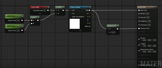
This is how Louis got my map textures to map properly onto a sphere, so now I can have a ball with the Finnish flag instead of a quarter of the sphere being blue lol

Unfortunately due to how the texture is stretched, the materials themselves look kinda weird lol
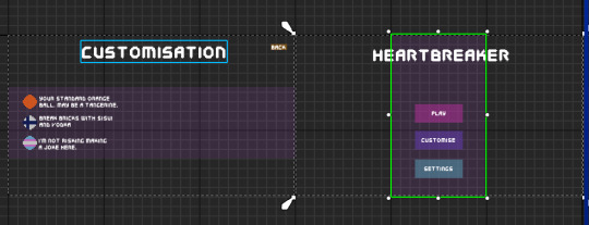
This is the slightly more polished version. I've added the appropriate font, colours and text. The buttons still work but they're just invisible so I'll need to implement an audio cue when clicked. I also finally reintroduced the transparent purple block HUD from the tutorial in a way I like, and different colour backgrounds for play, settings etc to help visibility. I also added little notes at the skins and sprites corresponding to the texture, I also have space for 3 more so I can have 6 skins total. i just don't know what they will be.
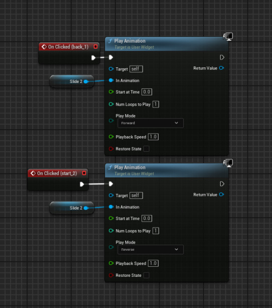
Next, I added a similar animation to the slide left to show the settings screen. This exists for those who may want a lower sensetivity, audio controller or colourblind mode.
The next thing I added was a [placeholder] slider for mouse sensitivity since I already had a system for it. However, it didn't move. This could be due to it being unable to actually change the variable, or the mouse not being able to do anything.
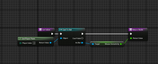
However, using the below tutorial, I got it working. I figured that, since I couldn't do anything in the slider, I could set the sensetivity outside of the slider from it's value
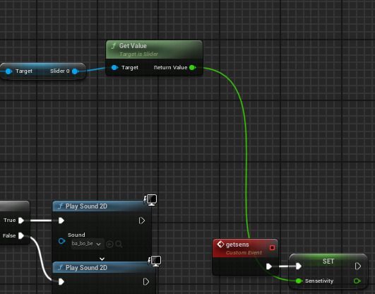
This is in the game instance - it is called when the back animation plays in the widget

And I added this to my bat to utilise the sensetivity. I'm really happy this works, I just need to make the slider look better now.
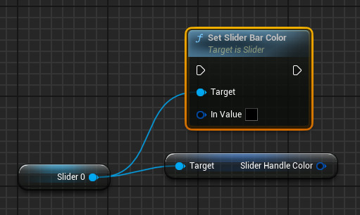
I CAN MAKE THE SLIDER'S HANDLE GRADIENT HAHAHAHAAAAA Y E S
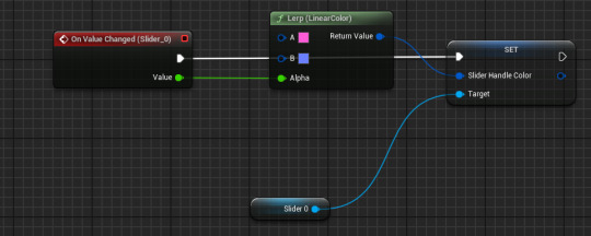
oh
is it actually that easy?
like this works, i just expected it to be harder. i suppose its just one of those days :D yippee

As the scale is from 0.01 to 2 not 0 to 1 [as with lerps], I had to divide the scale by 2 to make the colours properly fit the scale but I love how this looks.
I tried making a volume slider but despite using the above tutorial, nothing was going in and I just didn't understand. Besides, the volume can be turned down outside of the game.
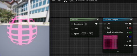
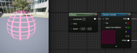
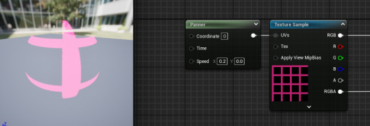
These are some of the grid sizes I tried for the last material, finally reusing my panner material. However, as they were on a far smaller object, the sizes needed to be different

The one I selected was 4x4 squares on 30x30 grid, this gave the sphere enough shape whilst keeping the grid fairly visible
I still don't like the TF2's texture

it just looks like an eye. Even moreso than the actual eye itself

Behold. Yugoslavia. I chose the Yugoslav flag soley because Yugoslav history interests me, and because if I ask people what the flag is, I'll likely hear, Dutch, French, Russian and Paraguyan which amuses me :3
0 notes
Text
Multiplier brickke
On Reece's suggestion, I began working on a brick that will increase the score multiplier. This will be, like the moving brick, special and such will be assigned via a tag.

This is where the brick will be.
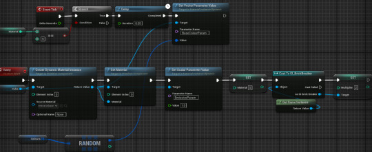
This is how I set the material to appear like the score, flickering between a set of colours. The problem was that I had no infrastructure for a multiplier so had to hud for where i was adding score.

Here is how i implemented amultiplier - it's stored and reset in the game instance as otherwise it wouldn't apply to the other bricks in the level. Unfortunately, it doesn't do anything.
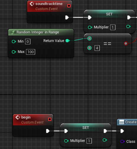
I'd imagine this was due to the game instance overriding the brick as they were set at the same time - this was changed by adding a delay in the brick.
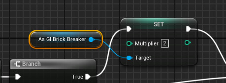
No, it was not the issue. The issue was I am an idiot and didn't set the multiplier to come into effect when the brick is destroyed - this has since been fixed.


This is how I displayed the multiplier - the text would only show if it was higher than 1, and would flicker like the score when you destroy a brick. Unfortunately, the text was so long it went into the arena and it was pretty distracting - I'll have to redesign how this is displayed.

This is an improvement, but maybe I should have it appear like the '+5 points' thing

there, that works.
I also had the realisation that the multiplier may be more balanced [and easier to work with] if it gave maybe 30 seconds of double points - maybe playing a fast-paced melody like when you get a star in Mario Kart Wii, the best incarnation of Mario Kart.


Well, that was easy.
I then added this to play when the brick is destroyed - initally i wasn't sure how it would sound or if it would be too long, but it worked really well in game.
0 notes
Text
Brickke Movement
The next thing I felt I should implement was adding the ability for bricks to move. The issue was I didn't want them all to move, so I utilised tags

'slide' bricks will lerp between two spheres, and if a brick doesn't have the relevant tag then it will delete the spheres and function normally - this worked as intended.

And this processes actually moving the bricks. Initially, I used a curve [shown by the first track on each timeline] but this just didn't pan out - it looked off as it slow at one end and fast at the other.
After testing, I came to the conclusion I could not use this. There was a little lag - not too much but enough to be noticeable and it really screwed with the hitboxes, sometimes an outright miss constituting a hit or the ball being blocked by invisible bricks.
0 notes
Text
Once again making new levels dear lord

This was the first rendition of playing around to make a new level, hollowing it out this time. Unfortunately I didn't like how this looked - likely due to it looking like a mouth

This was my revision - I like how it looks a lot more, but I feel I should add more blocks.
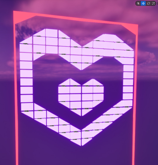
This is definitely an improvement but the side walls look too thin.

absolutely not. Far too thick.
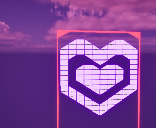
An improvement, but the distances are too varied.
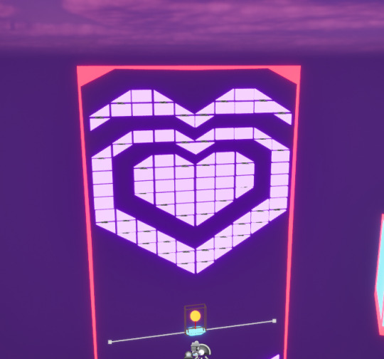
I don't know what I was doing with this but i don't like it. I reverted it to the previous post, and I intend on keeping it like that.

I eventuallu lowered the inner heart, cut off the top bits of the outer one and raised it all. I'm finally happy with how all this looks as the distances between the inner and outer heart seem consistent enough now.
0 notes
Text
Audio
The next thing I needed for my game was audio
This was the first clip I used. I put both this and in my fadeout and a reversed version made in adobe audition in the fadein as the length and vibrato worked well
I then added this as my soundtrack, beginning and looping in the gamemode instance. Unfortunately, as this is my game, there's a 1 in 100 chance that it will play Scatman's World by Scatman John. I get that it's a meme song now but it has a nice message and I respect the Scatman. Anyway.
I used this as my block destruction sound effect
And this as my sfx for when a health block is destroyed
This for when a ballspawn is destroyed
This is for when a heavy brick is destroyed as it feels a ot heavier
I implemented anoth destruction sound effect - this time for the health blocks. However, now I knew what a Select was, I didn't need to use a bunch of branches - I could simply add entries for each value.
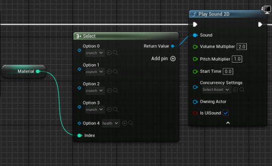
This is the sound effect I used for my player death - originally it would only play on a loss, but given the other sound effects and audioscape, I elected to have it play on a death
This is the sound effect used for when a ball cbounces off the bat.
Behold, the sound effect for hitting a gold block. Honestly it's a little too loud but overall I'm ok with it - I can change its volume later.
0 notes
Text
Creating a background
It had been suggested that I add a background for my game. The only real kind I was ever going to add was vaporwave.
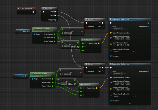
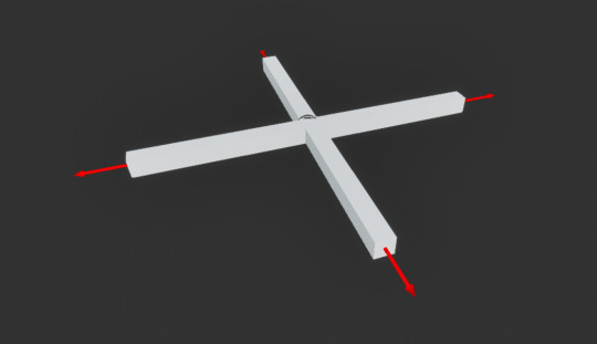
First I created a cross and added code that would make them form a grid. Although this worked going right, it didn't work going left. I thought this was due to it getting the location from spawned crosses but that doesn't make any sense.
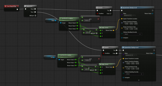
Having both lines of the sequence causes an infinite loop apparently. I fear this may be due to one spawning on the left, attempting to spawn one on the right, which would then spawn one on the left etc.
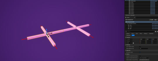
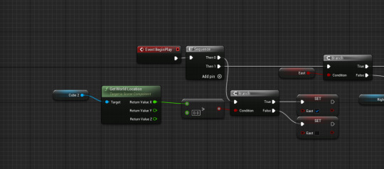
Using a pair of crosses with a centeral cube to see whether the cross ws further left or right, and spawning a cross accordingly, did work. Now a whole row of crosses spawns on both sides.

and this crashes the game.
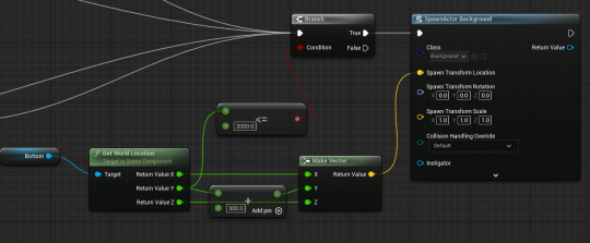
and this works perfectly fine. Sure, ok. I don't know why and i'm too scared to guess.
However, having the crosses in-game makes it run notably slower. This was fixed by adding a Do Once node to the start - I don't know why this was nescessary but it seems to have worked.
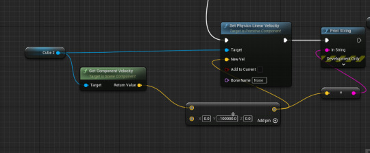
My next issue was getting the cross to move. This did nothing, and neither did adding a projectile movement component. I also found that the crosses were stacked onto each other which is concerning.
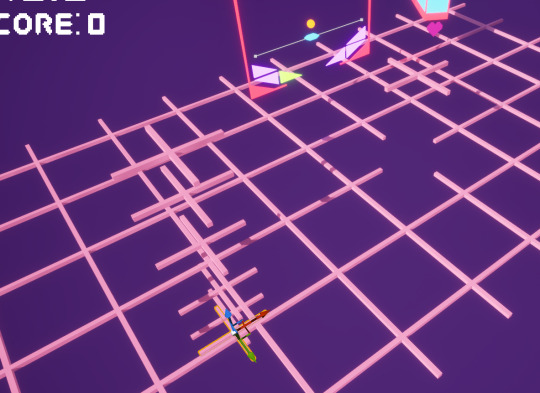
well, some were stacked. What the hell.

In the end i just used a material panner. Issue is, it doesn't have the same effect as the black bit should be transparent.
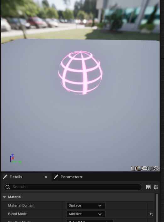
Apparently setting the blend mode as additive works?? Thank you forums goddamn.
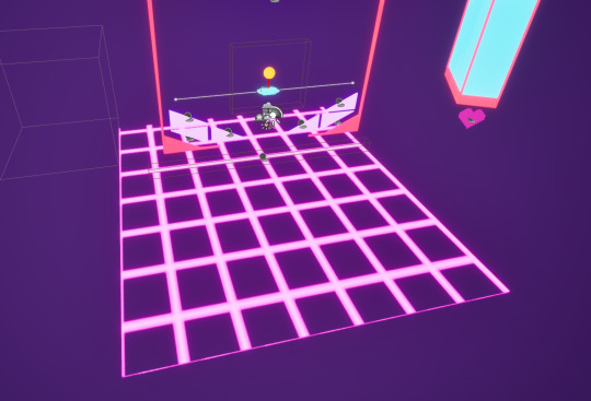
The principle works, now I need to tweak colour and size.
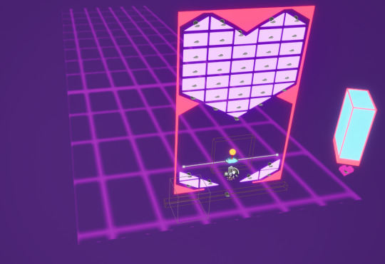
I lengthened it so that it would stretch into the horizon more, changed the colour and lowered the emissive value so that it would blend in better to the background and be less distracting. Although I'm not happy with how blurry it is, I find it ok
[blur was fixed by applying paper 2d settings. I'm an idiot]

I actually don't know if i prefer it like this. I guess I'll find out.
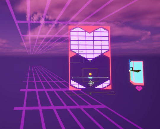
I started playing around with my grids and added one on top - I like it, but I really need to tone down the opacity.
I eventually decided to completely cut the grids altogther. I liked them in concept, but they add little to the game whilst being too distracting - nevermind the motion sickness they may cause.
0 notes
Text
Level design, once again
The next level i designed wasn't great

There was no real thought process to this, I just had an idea and then I made it. But it did give me a better idea

Why not make the Heart Like A Hand Grenade?
0 notes
Text
Ball pickup
In an effort to make precision shots easier, I've deicded to give the player the ability to pick the ball up with the bat. This should also help negate instances of the ball getting trapped and permenantly slowed.

This is how I programmed it, checking if the ball is within a hitbox and lerping it to where it spawns. This alongside the timeline exist just to make it look smoother when grabbing the ball rather than it just teleporting. Although this works, it feels inconsistent - it works at the start, but doesn't work as well at angles or late-game for some reason.

This is the hitbox. It's definitely generous enough to be consistent, and yet it itsn't.
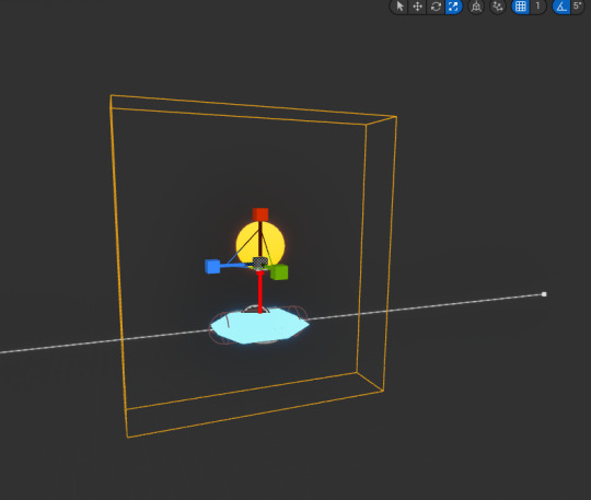
I made the hitbox unnescessarily big and it felt genuinely better to use with the added generosity. It definitely feels more consistent and the ability to grab balls from just below the bat is nice. I might keep it this way.

To prevent the ball getting stuck super slow, I also added this. I don't know if this does work since it's a pretty rare occurance but it should. I think.
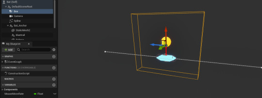
THIS IS WHY THE PICKUP WAS INCONSISTANT THE HITBOX WASN'T ATTATCHED TO THE ANCHOR SO IT NEVER MOVED

After making the hitbox a child of the anchor, I resized it to make it more reasonable. The pickup now works exactly as intended.
0 notes
Text
Health Brickke
One of the answers to my questionnaire was that I could add a brickke that gives the player another life. This should help balance out the difficulty a little. The first thing I did was, as for the rest of the funny brickkes, make a new material and add code to set it in the brickke itself.
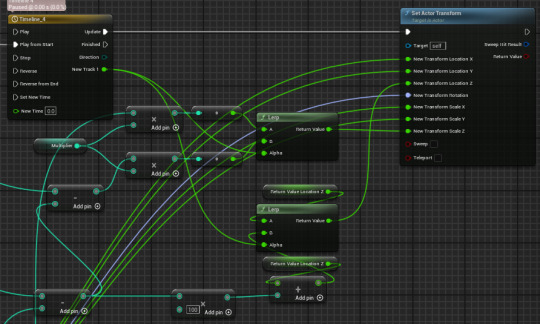
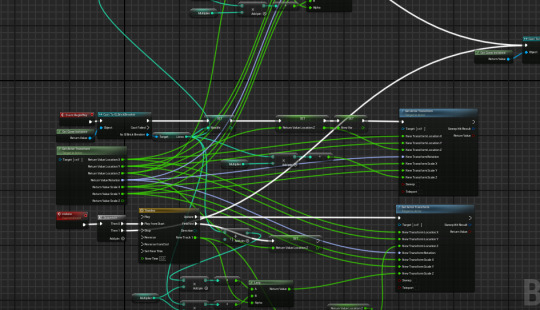
And then i had to fix the animation. See, the problem is that the amount its increasing to in the scale and location can be different so i don't get to use the code i used previously for the life bar. This did NOT work, so i decided to get rid of it all and rewrite the code.
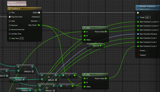
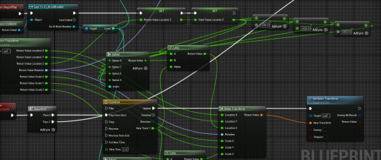
After a lot of suffering, this pretty much works. My issue was that Return Value Z was being set after the bar decreased, so it would ALWAYS be 100 less than what I need. My only issue now is that it moves normally in accordance with the timeline, but the size increases immediately. For some reason.
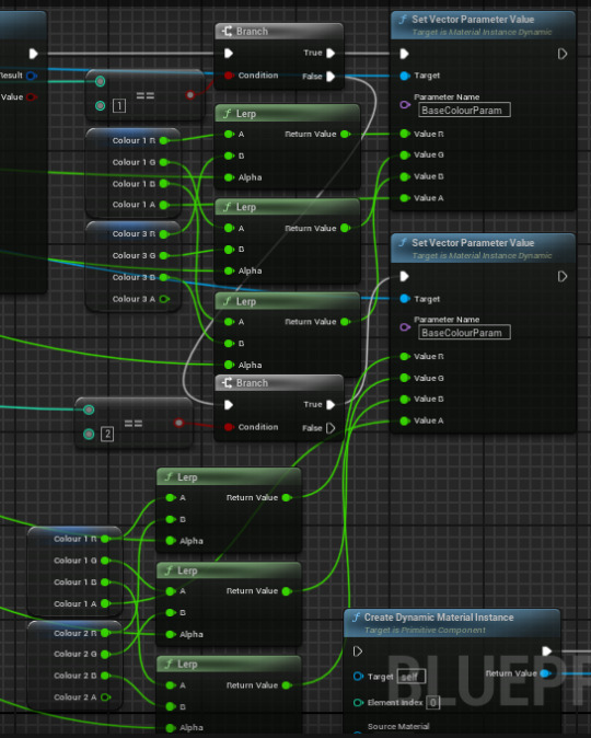
Now the colours are fixed. I have the same issue as with the size in that it occurs immediately. I also HATE having to program it like this but I'm too tired to think of a different way so this will have to suffice. Unfortunately.

wow, the green is a lot brighter than the rest despite having the same luminosity. I'll have to turn that down
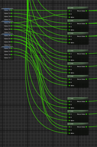
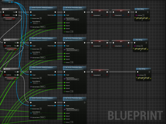
I have removed all of this MESS of code so I had a way of dealing with the changing colour and size on my healthbar. This is it now.

good lord. It works a bit differently, now flashing yellow [?????] but it works and GOD is it neater
I even replaced the code two images above triggered by the health brickke which causes to pulsate when triggered if at full health. Not the intent, but a nice effect. I'll keep it.
ill fix this later though.
I LIED, YOU FOOL. I FIXED IT LIKE A MINUTE LATER
Yeah so the mess of code is no longer as foul. Hell yeah!
OH YEAH I AM SO GOOD WAHOOOOOOOOOOOO
so all in all, i think i did well.

This is also the redone code for my heart sprite, using the same code as my healthbar as the sprite wasn't being repaired.
0 notes
Text
Various tweaks

I changed the shape of the bat to a more geometric shape as I just preferred how it looked

I also cut out the lower section of the arena to make the game a little more difficult. I also got rid of the corners but that felt unfair.

Reece created a particle effect for when the bricks are destroyed. i applied my brickke material to it [I didn't know how to set the material to a variable and then change it] and plugged it into the brickke itself

I was worried that destroying actor would destroy the particle effect before it played and changing the visibility would create a ghost box, until i realised I could just destroy the cube itself. I amaze myself frankly.

I also created an orange copy for when the spawned balls are destroyed, but I had to have every other component manually destroyed otherwise they just stay perfectly still and do nothing.

That 'destroy component' node just crashed UE5. the ball got lodget, constantly trying to destroy a brick that had already been destroyed. Whoops.
0 notes
Text
Score display
The second part of my missing HUD was the score and high score.
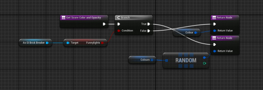

I reused the code for the score and high score from the tutorial, but I wanted the number to light up when it increased, so this is what I did. Whenever a brick is hit [should be on destroyed, I'll move the funnylights thing behind the True branch], a boolean is true and as a result, the lights go funny. everything regarding widgets is easier now I know I can create and control them from my instance.
As it turns out, everything works keeping the funnylights where they are - shifting to the True branch stops the lights from activating on any level past 1. For some reason.

I used a similar system to the score's lights for the lights on the high score, but these only light up on a respawn - it knows this by activating on level reset if the score isn't 0
My HUD is now complete, AND on schedule!
0 notes
Text
Level display
The main reason I only have a health display is because I couldn't find a way of displaying everything else and keep it all looking as good. Regarding my level display, it doesn't need to stay on screen - I can have it just pop up when starting a new level.
The first thing I did was add thin black bars covering the entire screen. I then manually added a layered animation where they would grow in thickness from 0.25 to 1.5, and the opacity would scale from 0 to 1. Every other bar would have a 1 second delay, hence the 'layered' bit. Unfortunately I forgot to actually make them disappear at the end, so I went about fixing this. About a quarter of the way in, I realised I had not beeen doing the same to the scale so I spammed control-z, then UE5 decided to autosave

It stayed like this. And then crashed. I have removed the entire animation because i genuinely do not care anymore and i regret even thinking about it. oh god its happening again
After that debacle I came to two realisations. 1 - I am unfathomably stupid. 2 - I can just use an image with the texture of a hell of a lot of bars instead. And it worked.
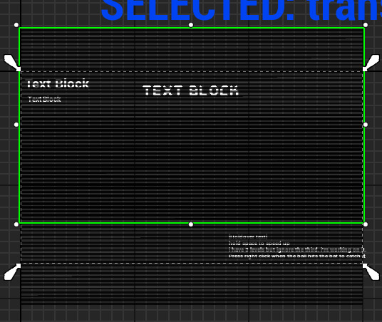
I made a 1px wide texture of black and transparent, and applied it to two images. Since I couldn't apply a fade in a direction without obscuring the text below, I decided to move the images as I changed their opacity. It creates a different effect but god is it easier to deal with. However, as soon as the animation finishes it disappears - it should reverse to load the next level. I realised this was probbaly due to the level being loaded during the animation, resetting it. My best bet would be to have the screen black by default, it transition when the level loads, and transition back to black when the game is over.
I DID IT
Turns out, you can create widgets in game instances. I shifted my widget code from the player to the instance and, after a bit of tweaking, it actually worked oh my god

I originally used a Do Once node and a boolean check but these broke it - so i took them out to see what would happen and it actually worked good lord.
Next, I had to make the text for the level counter. I reused the code from the tutorial, casting to the game instance and looked through a few fonts for a thematically appropriate one. These were the fonts I narrowed it down to, and eventually selected E4 Digital Arcade as it was the thickest and most readable whilst being in keeping with the arcade feel.

The first thing I did for my level display was set the colours to a random array of colours taken from the game. I was actually going to change it every 1/4 second or so but I'm happy with how this looks. My next problem is that the level display updates immediately - I need it to update after the transition as that's the point between the two.

This was as simple as adding to instead of incrementing level in the instance, and incrementing it after the transition. Huh, neat

This is my animation. I encountered a problem where the text would blur when scaled up. Although there doesn't appear to be a fix, the below post suggested I set the text size to really big, then scale it down in the animation immediately - which very much worked. The animation also reverses once complete using a Get Play Length plugged into a Delay. I'm VERY happy with this The opacity track was a suggestion from Reece I'd forgotten to implement - the flashing text was a bit abrasive, so fading it in long enough to read it then fading it out at all the beginning of the level fixed this.
0 notes
Text
Adding actual heart meshes
For future levels, I realised I'd probably need an actual heart blueprint, rather than only relying on larger ones made from separated bricks. It took a few minutes to create but then I encountered a problem. The material wouldn't change when hit

This is how I first tried to fix the issue - using an array of the meshes. However it has just occured to me I never actually ADDED the meshes to the array.

I'm so sorry.
I couldn't dynamically add meshes in the blueprint to an array, and none of the posts worked so I did it manually and I hate it. It does work though.
0 notes
Text
Playtesting, data and SMART targets
god i love data
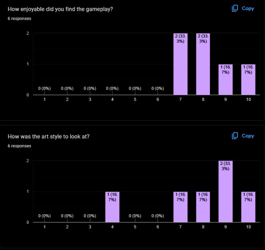

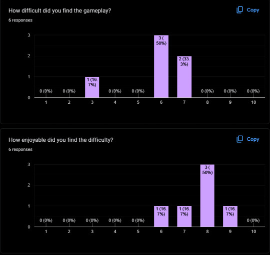
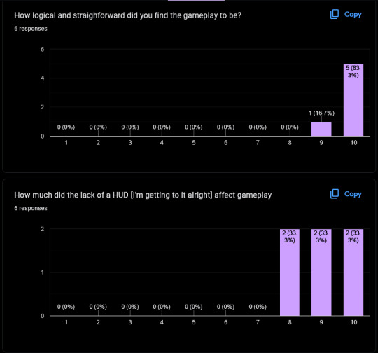
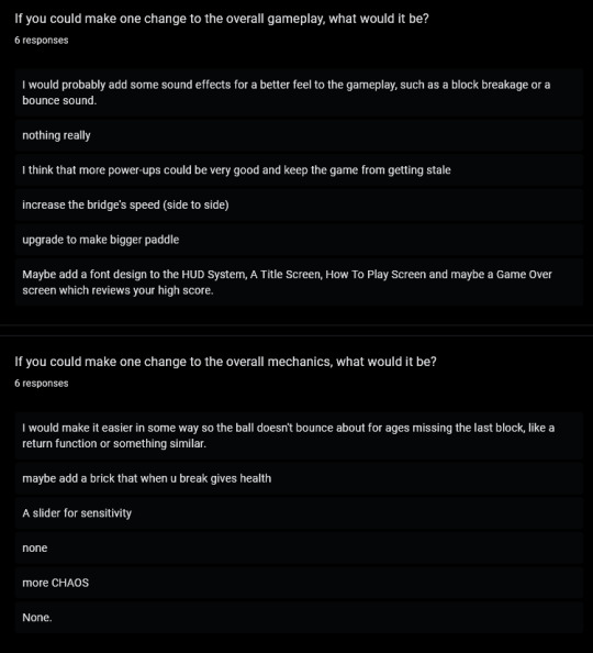


These are the responses I got to my questionnaire after playing. It has given me ideas for a number of adjustments and improvements. Some I'd planned to add, like a score display and sfx, but some [such as intro/game over screens or a slider for sensetivity] I hadn't considered
Target 1 -
Finish working on my HUD. This will require having a score, high score and level display on screen at all times [or, for the level, when relevant]. Due to the small size of this addition, I'd imagine this will only take a day or two. This target alligns with my goal of creating a game that both has mechanical depth and visual cohesion, but is still understandable and readable.
Target 2 -
Manage how dull the endgame can be, due to how frustrating it can be to get the last brick. This should be done through level redesigns that increase line-of-sight to bricks, alongside a pickup mechanic. This wilol help keep the player engaged and cut out time spent observing, rather than playing, the game. I have allocated for this to be done tomorrow, which should be all the time required.
Target 3 -
Implement more variation. This will be through a powerup system and/or bricks that provide health or a temporary boost to the size of the bat. This provides an incentive for the player to engage with the game and think about their actions. I aim to add 2 bricks that affect the player this way, and 3 powerups, taking a total of 2-3 days, which I will allocate for next week.
0 notes