#i love it when artists put their signature in the illustration like this
Explore tagged Tumblr posts
Text
The Master And Margarita Jacket
(Matthew Sweet’s Doctor Who version…but with a frisson of Bulgakov’s)
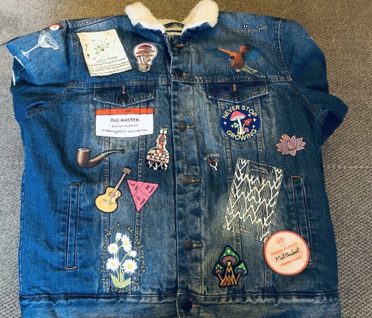
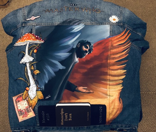
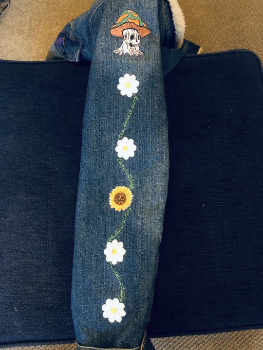
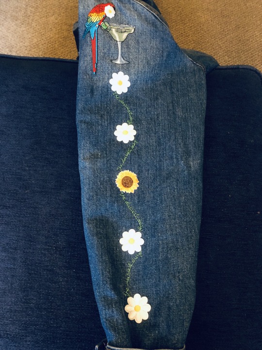
It’s done! With every bit of unphotographical glittery metallic paint that I can’t capture on camera even if my iphone skills weren’t rubbish.
@spoonietimelordy, @rearranging-deck-chairs, @bearinabandana and everyone else who Did The Reading of that one ‘I Am The Master’ novel but I’ve forgotten to tag because i’m so sleep deprived i can’t think any more but hopefully other people will, assemble!
Detailed closeups and explanations (with some spoilers) below:
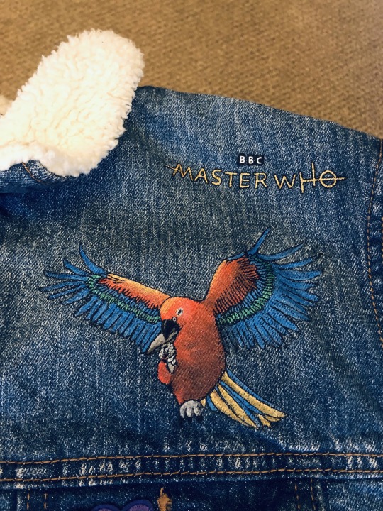
Starting front top right side (face on). -Margarita herself, biting a mushroom. A more Cockatoo beak than Macaw, with red face instead of white, to make what exactly she is more mysterious. -The Master Who logo here is just gold, any shading didn’t look right when it was so thin.
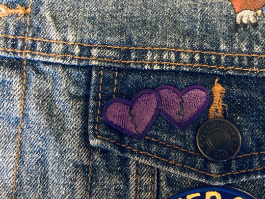
Front top right pocket. Purple, of course.
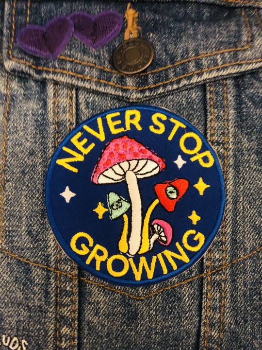
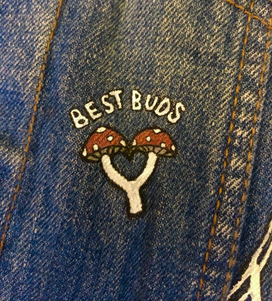
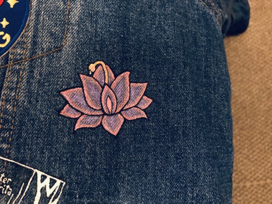
-Next section down are these three. The ‘Never Stop Growing’ patch is my second favourite patch of the bunch. So many Master Themes, and plot relevant. -Then the little ‘Best Buds’ with the heart in the middle. I was inordinately proud of that idea. (Buds, budding, bigenerated vibe). -And then ‘Obscene Lotus’. That’s mentioned early in the book, and while it’s just described as a big purplish lotus, there’s so much sexual charging in that scene that, well, you gotta.
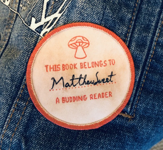
Me, reusing the ‘budding’ pun in a different capacity? It’s more likely than you think.
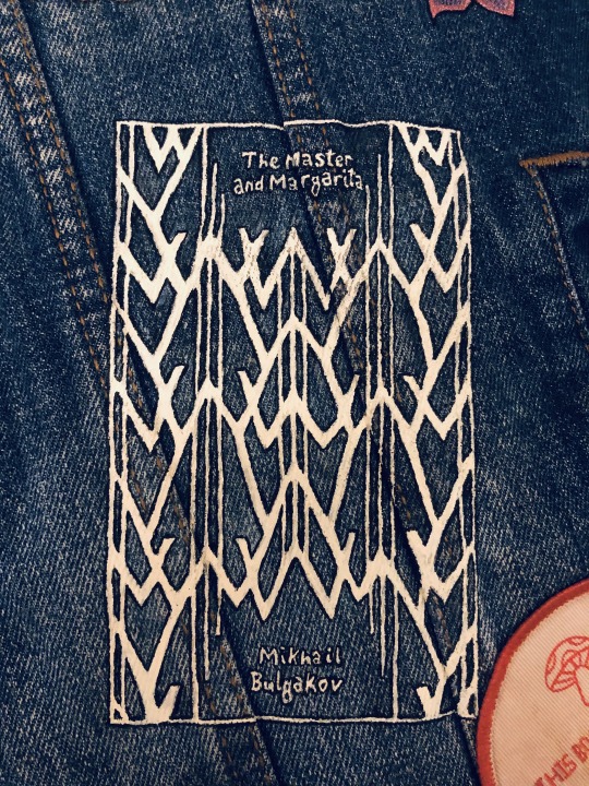
-The cover of the Penguin Clothbound Classic version of the original The Master And Margarita, that took multiple days to complete and so much agony. -The patch is a blank one that I bought, then painted the design to look like one of those stamps people sometimes put in books. Painted the border the same colour, then tea-stained it to look like old paper. Certainly in real life the colour comes out nicely. I couldn’t find his autograph (and sadly there’s an unrelated artist with the same name lol) but he got his doctorate in Wilkie Collins so I just looked up examples of that guy’s writing and tried to give it a bit of that vibe. Hopefully it’s the thought that counts. But hey, if anyone ever meets him and gets me a signature sample I can just redo it.

General mushroom patch - I like the fire kind of vibe and the looming.
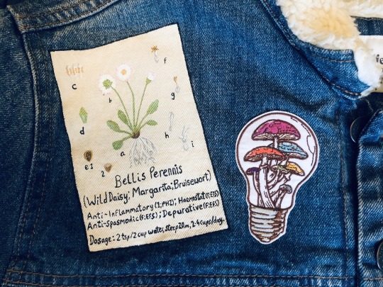
To the other side!
So. You’re asking what’s with the daisy theme. Fair. So Margarita is also another name for a daisy in some languages. I choose to lean into that because it’s also the widely known symbol of Three - with that scene where he talks to Jo and recounts how a hermit living on a mountain helped dispel his depression by getting him to focus on the beauty of the flower (“and it was the most daisiest daisy”). Given that Three is essentially a character in the book, this felt like the vibe we’re going for. It’s perennial. It also is a healer of bruises and wounds, how can that not be relevant meta wise too to the Master’s new companion, hm? And okay yes, Mikhail does say he’s not a botanist, but if you can think of another way to get that message across other than botanical illustration page…
I like the patch because lightbulb, idea, full of mushrooms etc.
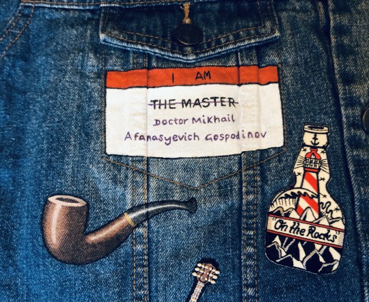
-‘I Am The Master’ being the name of the book the story is contained in, plus Fun With Identity. -Next the one bit of Real Art that I attempted to copy in glittery acrylics - Magritte’s ‘The Treachery Of Images’ or more commonly known ‘Ceci n’est pas une pipe’. The story not only of the Master’s experiences recently, but the story’s themes of hallucinations and deceptions; as well as being the symbol of Russian!Brigadier. -This patch is great isn’t it? A play on the Master’s apparent alcoholism or Russian blending in as you prefer, and of course, The Lighthouse of Martin!Doctor fame.
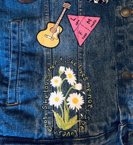
-Mikhail’s guitar for playing Brown Sugar and other ominous inference songs. -The formula triangle of Love, Food, and Music (I couldn’t think of a self-evident way to show his approach to food - Russian dumplings are, well, not exactly distinct). On its side so the glittery pink triangle points in a certain direction because he’s escaped places and I can do ominous inferences too Sweet. -Maybe controversial? There is a failed love story component in here though, that I just couldn’t leave unmarked. The Doctor, K’vo, and Jo all have their parts to play in that.
Now for the arms:
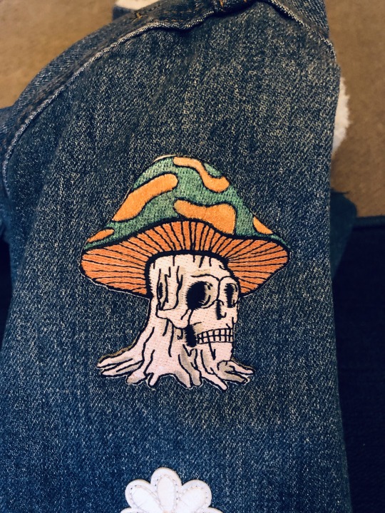
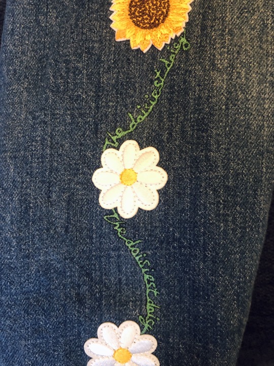
Here’s the right-side looking-on arm. -I repainted this mushroom patch to be the orange and green of K’vo’s. -You’ve already seen the long image of it above, so here’s just a snippet closeup of the motif that goes along both arms. Daisies linked in a chain with the words ‘daisiest daisy’ (if you wonder why everything’s outlined by the way, a) i like the style, and b) it makes glitter infinitely more legible and clearer to see if there’s a dark matt border around it breaking it up, especially with something as variable coloured as denim). There’s the sunflower in the middle because Margarita loves her sunflower seeds.
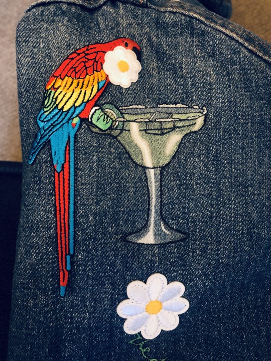
This is the other arm. Margarita holding a margarita in a margarita. What’s more to add? I used my shittest white (mixed with my fabric medium as everything else has been at every step) rather than @yesokayiknow’s excellent suggestion of Liquitex, which has saved me everywhere else, including those light patches. But here shitty kids basics acrylic is translucent enough to do some excellent work pretending to be glass and ice. The parrot patch has been altered to make the beak entirely black and her face red instead of macaw white, to keep her species ambiguous as literary theme demands.
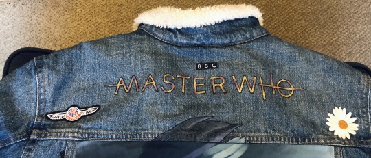
To the back!
This Master Who logo is bigger, so it has the Master’s purple highlights like bruising.

Here is a small UNIT patch I modified to be a Russian one, globe focused on their continent (roughly). Sweet just translated the word ‘unit’ for Russian!Brigadier’s group, and the text is the re-cyrilliced version of that.
Skipping to the bottom…
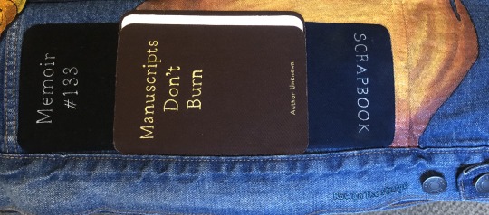
Here referencing O’s collection of Doctor Information, Sweet adding to that with having distinct scrapbooks. ‘Manuscripts Don’t Burn’ is a line from Bulgakov’s The Master And Margarita (spoken by Satan in fact, mhmm) and became something of a rallying cry for oppressed Russian artists. I have ‘Author Unknown’ for the obvious meta with his and the Doctor’s memories, and likewise, the fact that flames are clearly present and burning lets the viewer come to whatever conclusion they like. #133 was chosen for the simple fact that in my copy of Bulgakov’s novel, and the one depicted on the front of the jacket, it is page 133 which starts the chapter The Hero Enters, where we meet The Master who has renounced all other names (who is very much, as Interference notes, the Doctor). They are glitter paint titles done on Hemline repair patches, black, brown, white, and navy blue. I know anything too painty on that area of the back will risk a lot of wear, and these are easily replaced when necessary (if still hours of lettering).
To the left most side…
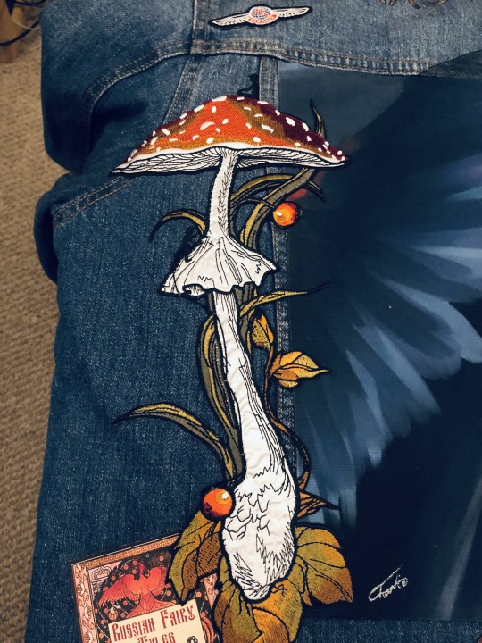
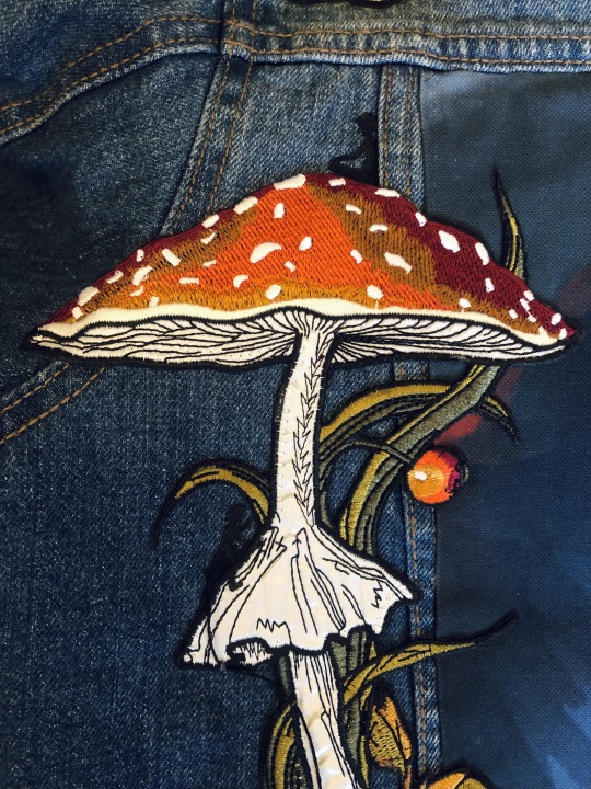
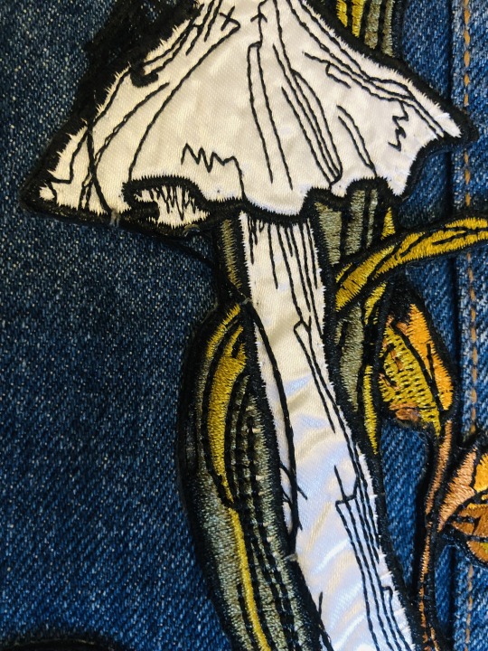
This was the most expensive patch I bought, £12. But worth it. The mushroom stalk is silk.
Here I depicted in silhouette the scene of the Master climbing up to the Doctor on the giant mushroom. I chose silhouette so as not to draw the eye too much. I also added some 2ply black-black glitter cotton as part of his climbing equipment, attached on by some silver stitches for the…things I can’t remember the name of. It gives it a bit more 3D effect, but also keeps the thread close enough it shouldn’t pull on anything.
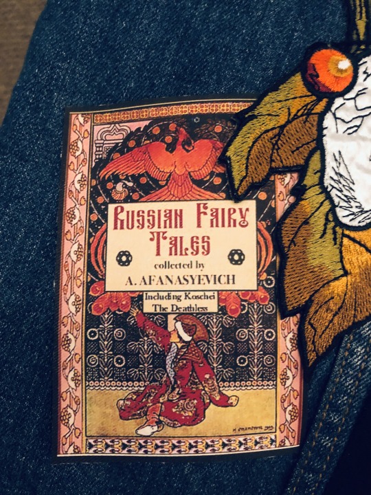
And at its base we have a reference to Mikhail’s chosen middle name. I chose to believe it’s relevant, Sweet’s too deep into this for it not to be. This is a cover I edited to highlight the namesake who actually travelled Russia and collected the tales of this book, and indeed, it does include the story of Koschei The Deathless. I edited the robe to be red instead of its original yellow, and added the quintessential Time Lord collar. But I think it’s perfectly passable. This is iron on transfer paper (dark) onto a very light grey polycotton to turn it into a patch. It…*cough* hasn’t had its edges finished or strictly been attached yet, but that’s a bit of handwork I can do as and when.
So finally back up to the middle
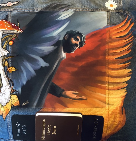
I’ve expanded out @spoonlesss-artbook fantastic angel-winged Margarita’s Master art. The Redbubble bag was only that big as it was (hemmed with bostik fabric glue like a true pro and attached as a panel) so it cut off a little, and it didn’t go the whole way anyway, so now we get some endings of the feathers, some all the way up to the arm of the jacket. I tried to blend it into the fire, one creature of both. And trying to get a multidimensional feel, boundary breaking. And again, very glittery irl so plays very well with the fire theme. It was fun when it came to colour-matching particularly the blue wing at the top, because the glitter gives it a bit of a sheen. I blunted it with a few careful washes of black so it still sparkles but is the right colour in most angles.
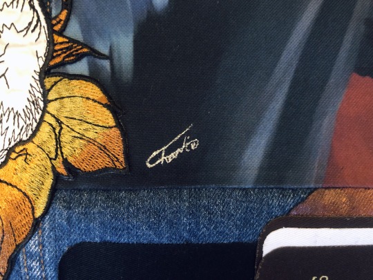
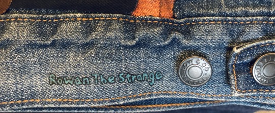
The Redbubble edit cuts @spoonietimelordy’s signature, so I copied it from the original and moved it over to the left side in some sparkly silver. Also internet doxxing my real life self on the bottom of the back as my own signature.
Doesn’t look like the sort of thing that would take weeks when you see it all together, but I’m really happy with it. I’m so grateful for everyone who’s shown their brilliant art to me and shared posts about painting all these years, cus it allowed me to absorb stuff and let me come out of the gate swinging! It feels thoroughly addictive. Even if I only know ‘use tiny brush’ for almost everything and glitter metallic is great for hiding sins. (And a ‘Ha!’ in the face of my mother keeping me away from it my whole life because of mess - I never got even a single speck on any clothes that wasn’t this jacket. I could’ve been doing this for years rather than just picking up a brush at the age of thirty-damn-one. But at least I’ve got it now).
And thanks to Matthew Sweet for feeding the worms in my brain too.
#the master and margarita#i am the master#matthew sweet#doctor who#dw fanart#the master#dhawan!master#jacket painting#mine#:)#(and you never ask a gentleman how much his patches cost)
100 notes
·
View notes
Text
Slugblaster GOTY Edition just achieved its funding goal today, securing a second printing of a new hardcover edition with Mythworks Publishing (publishers of CBR + PNK and The Wildsea).
I wanted to take some time to talk about why I love this game so much. I was lucky enough to grab a copy of the first printing and also got to do some writing and proof reading for the game.
The Premise is Sick as Hell
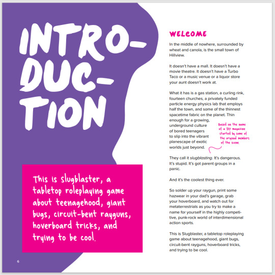
Mikey, the author, has thought about this game and the world a lot, and it shows. The game is lousy with style, from the writing to the layout to the art. But the premise itself is a fun and compelling sandbox where you are encouraged to push your character into taking risks, lying to your friends and parents, getting in trouble, getting hurt, and then getting better. It's everything good about coming of age stories, sci-fi tales of the multiverse, and fiction first RPGs.
Innovative Design
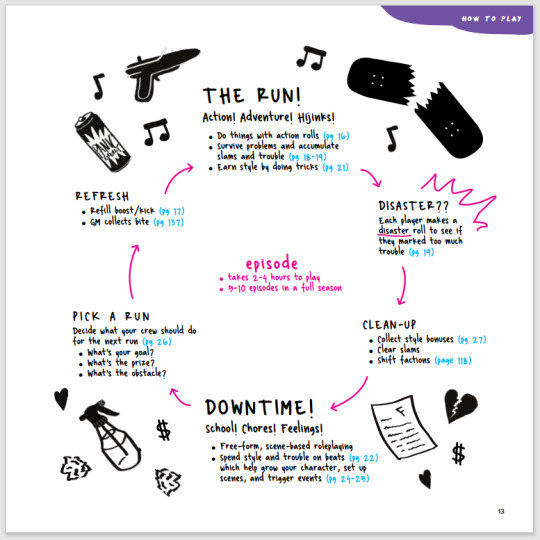
Slugblaster is based on the Blades in the Dark RPG rules, and does a lot to change up everything from the cycle of play to the action roll. It replicates the score-downtime-score cycle but moves and modifies the rules in ways that create thrilling and dangerous runs, heart felt downtime scenes that cannot be avoided, and natural conflict that will be resolved one way or another.
Rolling dice is easy and fun, with every playbook able to take risks and modify the rules in their favour. Not only that but each character gets a signature device, like a negafriction sword or a hardlight board, that gives them an edge when doing hoverboard tricks or fleeing creatures like math panthers.
Incredible Writing
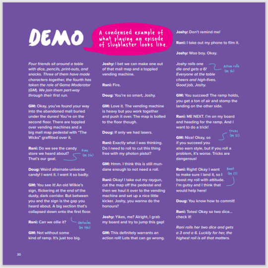
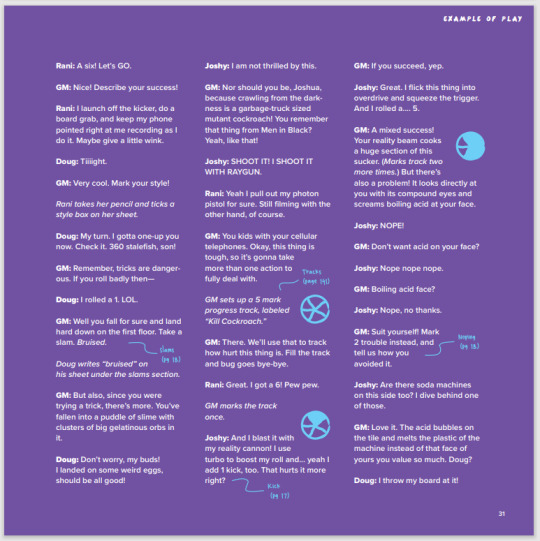
This is hard to showcase but I'll just show the first few pages of the first example of play in the book. Mikey has a talent for writing and comedy, and absolutely everything in the book, from the rules to the playbooks to the examples and creatures, are easy to read and laugh out loud hilarious. Even if you never get a chance to play it, you won't regret owning a copy, just so you can get a smile on your face when you need it.
Amazing Art

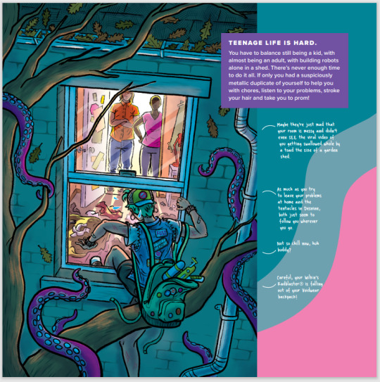
Mikey has put together a murder's row of artists for this game. It's colourful and cartoony and does a great job of communicating the early 90's era that Slugblaster inhabits. The second edition is gonna get even more art, with maps you can use to illustrate the different worlds you'll explore.
Additional Goodies
This new second edition of the game comes with all sorts of awesome add-ons if you want 'em. Things like:
dice
stickers
a pizza box GM screen
maps
custom fingerboards
a dang skateboard
So please do check it out, spread the word, let your weird ttrpg friends know about Slugblaster.
48 notes
·
View notes
Text
Info Post - Requests Open!
Hello! It's @nocturnalfandomartist. I know I don't really need another sideblog, but I decided it would be better to organize everything if I made this one. I always find myself making more paper doodles than finished work, but I don't want it drowning out my finished pieces. So, I'll be using this blog to post WIPs and sketches! I needed a more casual blog for silliness, anyway. Expect the pfp to change a lot.
Navigation:
#nocturnaldoodles
Sketches and other doodles on paper.
#aufridays
On Fridays, I post a sketch + some info on one of my aus because I can't immediately write a fic for all 100 of them.
#wip
Works in progress.
#loz untold myths
Sketches related to @loz-untold-myths, my LoZ fangame concept blog.
#myth plotting
Posts of sketched planning and concept art for Untold Myths (see above).
#asks
Answering asks.
#notdoodles
Not art.
Finally, I will be using a signature watermark on these sketches rather than a handle watermark.
Requests
I will accept requests, with a few guidelines.
Main Rules:
No NSFW (adult content), I can't handle that sort of thing. I WILL take somewhat gore-y requests (within reason) and tag them accordingly.
No problematic ships, I'm not comfortable with them.
I usually try to avoid crossovers.
Do not expect me to get to your request right away! I may not accept all of them, either. Life is busy some days!
I try to post once daily, so usually I'll go through requests one at a time. For some ideas, I have to let it marinate in my brain before I know how I wanna go about drawing it.
I will not draw OCs by request. I occasionally like to draw them as gifts for my friends, but that's it.
Avoid sending in requests that should be commissions. Artists should be compensated for illustrating something highly detailed or specific - especially comics! Go support an artist you like by commissioning them. ^^
Fandoms I will accept:
Super Mario Bros.
The Legend of Zelda (including my aus in @loz-untold-myths)
Slay The Princess
Little Nightmares
Pokémon
Sonic the Hedgehog
Spy x Family
Portal
Adventure Time
Steven Universe
Castle in the Sky, Howl's Moving Castle
Undertale
Deltarune
FnaF
Arcane
Romantic ships I tend to accept:
Starred my favorite ones to draw. :)
Zelink (Hylink, Telink, Shink, Hildavio) ✨️
Mareach
The Shifting Quiet ✨️
Soniauru
Luaisy
Monix ✨️
Silvaze
Sonamy
Tailsmo
Petrigrof
Fintress
Twiyor ✨️
Gregrose
Bispearl
Garnet
Stevonnie
Timebomb
Platonic/familial relationships I love drawing:
Ilia and TP Link
PH Link and Linebeck
ST Link and Alfonzo
Sonia and TOTK Zelda
Urbosa and BotW Zelda
TOTK Zelda and Riju
AoC Zelda and Terrako
Mario and Luigi
Six and the Raincoat Girl
Shadow and Amy
Blaze and Sonic
Cream and Cosmo
Cream and Amy
Amy and Blaze
Most combinations of Sonic characters, tbh.
Finn and Jake
Anyone's Mystery Dungeon team!
Note: I will take requests for any and all platonic pieces! Friendships between characters are so underrated.
Other Note: I especially love drawing The Legend of Zelda (all games) and Little Nightmares.
TLoZ AU Fridays!
Here's a list of all the AUs I have posted for AU Fridays:
Overthrown
Oracle of Secrets
Find more AUs at @loz-untold-myths! If you'd like to ask anything relating to either sets of AUs (with a doodle for an answer!) put a little ✨️ in front of the ask! Makes it easier for me to filter between requests in the ask box when it gets a bit crowded.
16 notes
·
View notes
Text
rating luke cards solely based on how handsome peanut looks in them
dear reader, come with me on this magical journey through a 1.6k word long post where i arbitrarily rank the visual renditions of tot's best character: peanut pearce the myna bird
-
basic tier: he looks lovely, but there are things that could be improved
last CG of SSR Peaceful Place and the first two CGs of SSR Shape Of You: basic teardrop shape
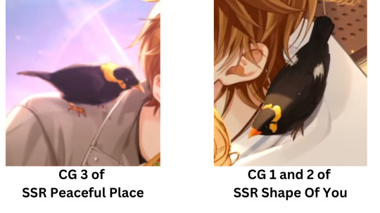
these are good peanuts, but ive put them in this Basic Tier because they default to the Basic Teardrop shape of how birds look when theyre just chilling, wings closed and pose perched. the overall shape is also kept generally smooth without much texture.
essentially, to me, this is the bird equivalent of 🧍♂️. nice to look at, but could definitely do with some flair, yknow?
first two CGs of SSR Under The Milky Way: now THIS is a basic pose with some FLAIR. alas, it's still basic tho
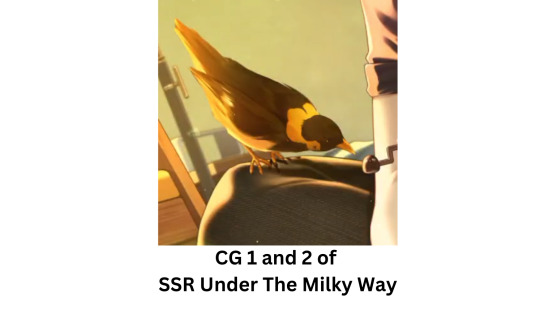
while hes still in the basic teardrop, there’s more Personality happening here: his body is angled in a way that shows his curious demeanor examining the tiny peanut blob handle luke made, the lighting and coloring shows off a more textured rendition of his plumage, his folded wings dont blend with the rest of his body thus giving him more depth.
it’s a GREAT basic pose!
if the previous peanuts were like 🧍♂️
this peanut is like ✨🧍♂️✨
third CG of SSR Twinkling Eyes: obscured by luke's (granted, beautiful) big head

i like how peanut looks here but it wouldve been nice if the fairy house window were just a bit bigger, or maybe the placement of all the things in this CG cld have been moved to allow peanut some more visibility, especially given how prominent peanut’s Role is in the story of this card. as it is though, he still seems to be in a basic pose, but i like how the lighting differentiates the parts of his body instead of being just one big smooth black teardrop.
also, this CG gets points here because peanut looks extra chunky.
and lastly a special case for this tier...
the third CG of SSR Perfect Partner: PEANUT IS THAT YOU??
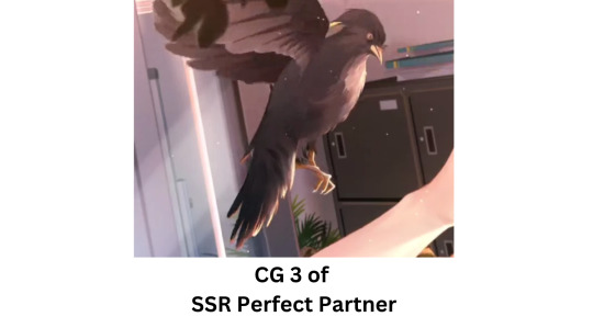
originally, i wanted to put Perfect Partner-peanut in the Better Tier, because i really appreciate his fluffiness here, his open wings, and that the animation for this CG shows him flapping his wings. however, Perfect Partner-peanut is also very much a Proto-peanut.
Perfect Partner is among the roster of regular banner SSRs, and thus one of the very first cards available in game and probably one of the very first ones illustrated, and it shows in peanut a lot. he looks different.
i figure the artists were still getting a feel of either 1) how to draw birds or 2) what Kind of myna bird they wanted peanut to be. there are a lot of kinds of mynas, with their defining characteristics usually in the shape of the yellow face markings and also other plumage colorings, like in the wings.
here, peanut is lacking his specific kind of signature yellow markings that he has in all the other cards, where the yellow is visible under the eye and then looping around the back of the head. Perfect Partner-peanut instead has his yellow marking Just on the nape. additionally, peanut’s eyes here arent the beady little black we usually see, and are instead black with yellow lining. and lastly, all these factors make him look much wilder than the usual peanut we see in later cards.
usual peanut is rounder, a bit more simplified and smoother (in terms of texture), and all in all he just looks friendlier. Friend Shaped. meanwhile, Perfect Partner-peanut with his beak detail, feather coloring/texturing, open talons that are posed like hes gonna GETCHA make for a more intimidating look.
basically, Perfect Partner-peanut looks to me like beta design peanut. and thats alright! i still love him dearly! but it is jarring when you start to look at the details, and that unfamiliarity makes this peanut rendition one that still couldve had some improvement
peanut in all the other cards: who are you?
Perfect Partner-peanut: im you but i look like i could kill a man. or worse…a pigeon.
-
better tier: NOW we're getting some good bird visuals
first two CGs of SSR Peaceful Place: VERY GOOD BASIC POSE
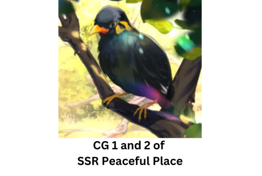
okay so if the first few basic peanuts were like 🧍♂️
and then the Under The Milky Way basic peanut was like ✨🧍♂️✨
THIS basic peanut is like 🌈✨🧍♂️✨🌈
IT’S ABOUT THE IRIDESCENCE!!!!!! his wings and body are still differentiated in the rendering, the lighting bounces off of his plumage in a very nice way, and hes FLUFFY LOOKING!!
unseen in the above image is also how lovely peanut’s animation is here—which i didnt make into a GIF because im scared tumblr will eat this post for the 87494837568th time if i tried to put a GIF in—where peanut’s head endearingly tilts and moves in a curious and interested-in-what-birddadluke-is-doing way. and the movement is really dang fluid too, who was the 2d rigger in charge of animating this peanut?? i hope they have a good day today. this is a really good peanut and i like him very much
both CGs of MR Entrusted Feelings: the real love interest is peanut
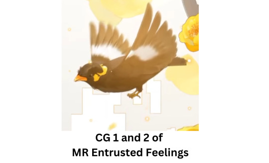
it’s from here onwards that you may observe that ive got a bias for peanut renditions that have him with his wings open and flying. and im very right to have that bias cuz hes a BIRD OF FLIGHT, it’s lovely to see him doing what birds of flight do best! FLYYYY!!! that being said, this peanut didnt get into the Best Tier because his fly animation is a tad too jelly-like for me; it’s fluid and smooth but slightly off cuz it doesnt seem like his wings have uh…Bones. which is important for birds to have, if they wanna be doing stuff.
still, i like this peanut enough to put it Better Tier because hes so adorable!! hes hovering, his body is beautifully rotund, and his Visage is so enrapturing that hes who mc is focusing on and looking at in this card! she isnt looking at luke, shes looking at PEANUT!
you better watch out, luke…ur bird might just get ur girl
both CGs of R Gaze: 👏STRUT! YOUR! STUFF! 👏
now, at first glance, this card seems to follow the basic teardrop pose again with no flair….until you swap through both CGs of the card quickly. because not only does luke strike a pose in here, but pEANUT DOES TOO!!!!

literally just for that, this card ended up in the better tier. hes Feeling It.
both CGs of R Reunion: sorry my owner is a pathetic wet dog of a man
following the thread of R card peanuts that get so much better when you flip through the CGs, this is a good one. while the visuals are basic, the visual storytelling within it happening when u go through the CGs is IMMACULATE.
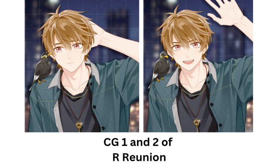
peanut looks like he was giving luke a peptalk so luke will stop being so nervous, like “get it together, dad, act cool,” and then luke fails at acting cool so peanut looks into the camera like “yes i know hes still cringefail but hes cute, right? give him a chance!” wonderful amazing never been done before. we love a bird that doubles as a wingman (pun INTENDED)
first CG of R Partner: TAKE A GANDER AT THOSE WINGS!!!
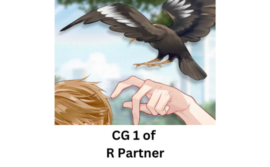
we’re going to skip over CG 2 of this card because it’s just another basic teardrop but
while this isnt my favorite depiction of peanut As A Whole, this is definitely my favorite depiction of his WINGSSSSSS
theyre so majestically and gorgeously spread out, the back wing is so beautifully articulated at the joints showing the Real shape of a wing (whereas a lot of visual renditions tend to treat wings as just this One Big Flappy Thing, instead of these cool foldable beauties we see here), the FLUFFINESS AND ROUNDNESS OF THE FEATHER EDGES, and how you can cleARLY see the layering of the feathers in the coloring, the primaries and secondaries clearly different from the coverts, IT’S ALL SO GOOD!!! literally the only reason why this isnt my top favorite is because we cant see his beautiful face. but please know that this one is SUCH a close second
-
that leaves us to the last one…and this last card is actually the reason i made this whole post in the first place. only one card managed to charm, bewitch, and beguile me, managed to delight everything i love to see in a visual rendition of a bird
best tier: second cg of R Following The Wind
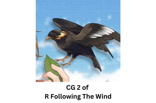
even if this was the card that inspired me to make this post, i hadnt planned to make this my top fave. i saw this card and was struck by handsome he was and wanted to go through everything else and this one just so happened to STILL end up on top. Why?
full body seen and nothing is obscured from view, his cute little talons are spread out too
wonderful texturing and not just a single smooth black tear drop
wings spread out doing some Great flying AND the wings are articulated at the joints to show the lovely shape of how wings are
coloring on the feathers is clear in the different type of wing feathers present
AND
HES
CHONKY
so it’s currently my top favest peanut-in-a-card of all time. THAT! IS! ALL!
-
so there you have it. every luke card that has peanut in it ranked based on how much i enjoy how peanut looks in it. my concluding thought is that i hope we see peanut more, i never get enough of seeing that little guy.
fly high, fellow peanut enjoyers.
#tears of themis#do not take me as an expert. simply as an enthusiast. thank you for listening to my tedtalk#tot peanut#luke pearce
129 notes
·
View notes
Note
i love your review of elvis. i had previously kind of resisted seeing baz's films, just having the impression that they were going to be Too Much for me, but when i heard he was tackling an elvis film, i thought the energies seemed to fit, even though i didn't know much about either man. but if his other films have that same effect of worming under your skin, i need to watch them all. i saw elvis four times in theaters and haven't stopped thinking about it/elvis for a single day since, it's outrageous. i think it makes so much sense to have an outside narrator of elvis' story drive the film. austin shows us the dynamic complexity of elvis through his every movement, but the film and the colonel and the audience are still crying to cage him into that still-life image, inserting distance between us and him. i think the film is always thinking about whether that distance is necessary to actually "love" a person you don't know, but that is the same question that paralyzed elvis with fear. his deep sense of isolation was always fighting against his love for other people and his longing to be on the ground with them, but he sensed that he couldn't let anyone see how much he was struggling lest they pull away. i keep thinking about how the first lyric we hear is "oh, let our love survive," and the film is like ... how much are you going to suffer to keep it going? and who tricked you into thinking you didn't deserve to be loved without giving so much of yourself away? it definitely works as a reflection on hollywood and culture, but it becomes more deeply personal and compassionate toward elvis the more you know about him. <3
chelsea! first of all, i never did take a moment to say how glad i am to see you again and to have you here <333
baz's signature is doing The Most and giving softly dreamy to intensely spliced energy to The Aesthetic, but he somehow manages this in a way that ends up being emotionally affecting and clings to you after viewing. (i think his only film i haven't seen is Australia.) he has a very specific signature and style influenced by his passion for dance/music/fashion, and it's fun seeing how he decides to express that and utilize it as an essential aspect of the storytelling, plus catherine martin makes such beautiful costumes for everything that are illustrative of character and design in such a rich way. i definitely understand why you might have thought his films would be a lot! but since you did enjoy elvis, i wouldn't hesitate to encourage you to give his others a try! moulin rouge remains a particular nostalgic favorite to me (i used to have a moulin rouge poster on my door as a teenager, i still remember my dad buying it for me in the mall. it was one of thee movies for me in high-school. my ex-best friend and i used to blast the soundtrack on repeat, one time during lunch in the classroom we used to hide out in, he jumped on a table to reenact ewan mcgregor singing your song. when i was first very ill, it was a movie i put on a lot. i'm sure this reveals something about me spiritually lol).
something with baz's style that comes through is the incandescent power of music and its deep connection to us. music is always almost like its own character, and he plays with interjecting those anachronistic pieces to give the stories a modernist edge while still staying rooted in their own times, which is very interesting! i loved the strong mix of elvis' own music with the honor to the gospel/r&b/black artists who influenced and inspired him, further mixed with artists he himself inspired and who are creating work now. it made those threads so potent and alive. you're right that the energies match well.
you described this beautifully, i honestly think reading this helped me sort through some of my thoughts and put parts of the film into better context! we have that distance because we're constantly observing, as an audience even when we do feel that sense of love and admiration/appreciation for an artist, there's also a certain complicity because we can never actually know them, and we do inherently want something from them. we can never be undemanding of them as humans, it's that tension where we cherish the art, but we're also by necessity consumers of it. we can't help but be part of the pressure and the noise, even when we try our best to exercise that with empathy for a person. there is an uncrossable distance.
austin shows us the dynamic complexity of elvis through his every movement, but the film and the colonel and the audience are still crying to cage him into that still-life image !!! exactly, and that's what i was referring to a bit in how the idea of an everlasting image haunts me at times, because that can never be a fully realized acknowledgment of anyone. the indelible iconography of it all becomes so much bigger than life that if we want to find the humanistic reality again, it takes some excavation. that's fascinating and heartbreaking to me.
the predatory nature of that framing device gives a lingering sadness to it too, where we are put both into the perspective of our place as audience members, but we also become emotionally connected to the person elvis was and have that reaction of sorrow. i kept wishing desperately that i could protect him from all the things. the ending as well, when it confronts that concept of "love" between an artist and their fans, and how massive that is, how it's intoxicating and enriching, but can also be corrosive. it's difficult and it's moving and it's complicated to navigate.
i think the film is always thinking about whether that distance is necessary to actually "love" a person you don't know, but that is the same question that paralyzed elvis with fear. his deep sense of isolation was always fighting against his love for other people and his longing to be on the ground with them, but he sensed that he couldn't let anyone see how much he was struggling lest they pull away. yes, VERY much so. he tried so hard to conceal that hurt and those struggles because people depended on him, but also because he depended on them too and understandably feared the loss of that love.
the use of suspicious minds as the film's overarching theme was perfect. it totally reframed its meaning and made it speak to both his inner and outer life, to the weight of that fame and love and need.
the film is like ... how much are you going to suffer to keep it going? and who tricked you into thinking you didn't deserve to be loved without giving so much of yourself away? it definitely works as a reflection on hollywood and culture, but it becomes more deeply personal and compassionate toward elvis the more you know about him. absolutely. it's a big question and often sadly a universal one regarding culture and consumption, the expectations put on famous artists to give and give continuously without breaking or showing the cracks (which is impossible and harmful), the demands when such a bright spotlight becomes searing, the strain that comes even from adoration because it's not wholly real. it also subtly questions our fascination with that suffering without exploiting it for visceral shock value. i really appreciate the way the film handled the ending, for example, giving us enough without ever being cruel or relishing in the tragedy for the sake of it. the compassion there is so central.
i knew a bit about him personally, and was familiar with many of his biggest hits, just by virtue of cultural osmosis and the long-held interest i have in older films/music, but the film made me want to do deeper dives into the personal story and the deeper cuts of the music, and i'm loving exploring that, which makes it even more wonderful to be able to share with you! thank you for posting about him and the film because it's what sparked my interest even further to watch it! i've caught up on a lot of movies over the past couple of weeks, but i think elvis had the biggest impact on me, both in thinking about it and the expanse of its themes, and emotionally in feeling both for him and for the magic that exists in the way music keeps living forever. 💗
#joons#letterbox#this was such a joy to read thank you for sending it to me!#elvis#also not to expose sw*ftie brainrot but i keep thinking about the themes of elvis and dear reader#we're caught in a trap; i can't walk out; because i love you too much baby#if it feels like a trap you're already in one#you don't have to answer just 'cause they asked you#i wander through these nights; i prefer hiding in plain sight#my fourth drink in my hand; these desperate prayers of a cursed man#no one sees when you lose when you're playing solitaire#you should find another guiding light but i shine so bright#idk i could write a lot about this lol the thematic parallels hit me hard
12 notes
·
View notes
Text
I am YEG Arts: Ray Dak Lam
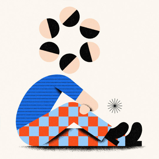
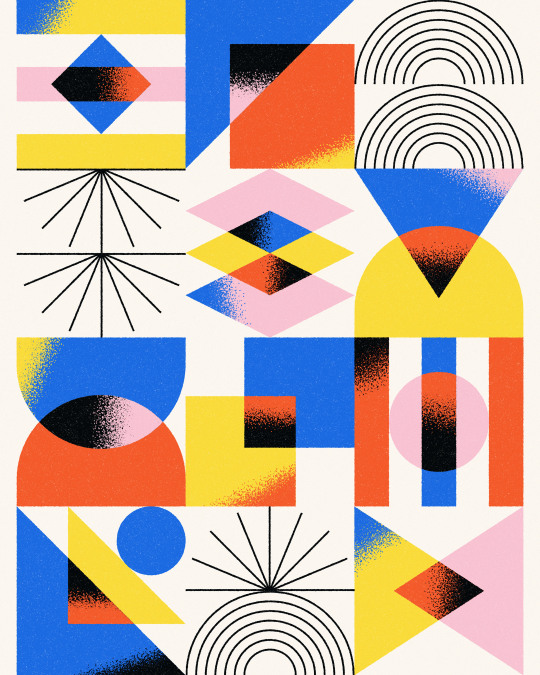
Since taking the plunge into freelancing, Ray Dak Lam has made big waves as a graphic designer and illustrator. Known best for his signature geometric designs and vibrant colour palette, Ray is sought after locally and internationally with some big-name clients under his belt. In just a few years as a freelancer, Ray has embraced new opportunities from his first mural project to taking part in Adobe’s Global Creator series — this week’s I am YEG Arts story puts the spotlight on Ray Dak Lam.
Tell us a little bit about yourself and about why you’ve made Edmonton your home.
I'm an illustrator and designer from Edmonton. I graduated from the MacEwan Design Studies program in 2014. I got my creative career started working at a couple of advertising agencies and at a smaller design agency. Since then, I’ve become a full-time freelancer — that's what I've been doing for the past few years. I really like the creative freedom of freelancing, and that I get to explore more of my own personal style as well as choose my own clients and hours.
I was born in Edmonton and have lived here all my life. All my friends and family are here, I feel like Edmonton will always be my home. Edmonton has also shaped who I am as an artist in many ways — the people, especially those I went to school with and have worked with, all my coworkers, friends and experiences growing up — I think it all inevitably influences the subject matter in my work and the themes that I introduce into my illustrations. And now I hope to contribute what I can to the city's creative culture.

What drew you to graphic design and illustration? How did you get your start?
During my first year of high school, I took a graphic arts program, and my very first project was to recreate a font or typeface. It was through typography that I discovered my love for graphic design. And that's when I began considering it as a career for myself. As for illustration, drawing has always been part of my life. I was always drawing as a kid, and I was never really good at any other subjects in school. Art was the only subject that I was passionate about. It is what motivated me and pushed me to pursue it all through childhood until now.
Tell us about someone who mentored you or helped set you on your path.
One of my first mentors was Andrew Benson. I worked with him at my first job at an advertising agency. He taught me a lot about branding, design, and the advertising industry in general. He’s passionate about print design and illustration and taught me their importance when it comes to design. He really inspired me when he went off to start his own studio and I hoped for myself I could follow in his footsteps.
Tell us about a big professional risk that you have taken and how it has influenced where you are today.
I would say taking the leap into full-time freelancing. It was scary in the beginning. I got laid off during the beginning of the pandemic from my advertising agency job. And at least for me, it was hard to find another full-time position. I was only able to land various short-term contracts, and some freelance projects here and there. In that moment I saw it as an opportunity to try this freelancing thing full-time since it has always been a dream of mine.
The pandemic and getting laid off were the push I needed to take the full leap into freelancing. It really changed my career for the better and it has opened up a lot of opportunities that I never would have thought possible. I have had a chance to work with and collaborate with a lot of clients that I had thought were unattainable. And I’ve gotten to collaborate with many other incredibly talented designers and creative people in Edmonton.
Who's someone inspiring you right now?
Someone who is really inspiring me right now is an illustrator from Vancouver, Tom Froese, he makes Skillshare courses, through which he teaches his approach to commercial illustration; YouTube videos, podcasts — all on the topic of illustration, and aimed at people interested in the creative industry. I've done a couple of his Skillshare courses and I'm attending one of his workshops at the RGD DesignThinkers conference coming up May 30 -31 in Vancouver.
He inspired me to find a focus and explore it as deeply as I can. His style has a very distinctive voice and he mentioned in his videos that it was the result of repeating a set of techniques over and over again once he found something that worked for him, so this really inspired me to seek a similar path for myself in terms of finding my own unique stylistic voice.
What does your creative process look like? Where or how do you usually begin?
For me, it always begins in my sketchbook. I try to bring my sketchbook with me anywhere and everywhere I can. Especially when I'm traveling, during those long plane rides and train rides where I can just let my mind wander and draw freely — whatever comes to mind. After that I pick my favorite sketches and vectorize the artwork, then bring it into Photoshop where I use my drawing tablet to add texture to bring more of my own personality to the artwork.
I enjoy creating abstract and geometric compositions because it's a meditative and calming process for me. I started a personal project during the pandemic called "Shape Studies", and it's been an ongoing project ever since. With a focus on the fundamental elements of shape, line, and colour, I explore freely within those basic fundamentals to create the most interesting compositions that I possibly can. I also use similar principles of geometry and abstraction when I'm illustrating other subject matter, such as animals, landscapes, people, etc. I'll continuously remove any unnecessary details and distill them into their most essential and fundamental forms.

Tell us about one of the most exciting projects or opportunities you've had.
One of the most exciting opportunities I had last year was the chance to collaborate with Adobe on their Global Creator series. It was a series where they featured different artists from around the world and they decided to feature me. They had me self-shoot a ton of footage around my studio, capture shots around Edmonton, and create a short tutorial explaining some of the techniques that I use to create my illustrations.
It was both exciting and nerve wracking appearing on video, but I'm glad I did the project because I love the way it turned out in the end.
Tell us about a favourite local project and a favourite international project.
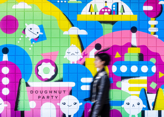
One of my favourite local projects was for Doughnut Party. They had me create a mural for their Ritchie location. I collaborated with Jennifer Konanz — she's a local mural and sign painter. She's incredibly talented and I feel grateful to have collaborated with her. She helped translate my artwork into a large-scale mural. It was really cool to see my artwork on such a large scale, which I don't get to see very often.
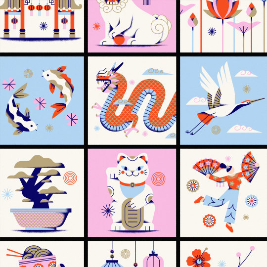
A favourite international project would be a commission for GoDaddy to create a set of illustrations centered around Asian Heritage Month and Lunar New Year. The project was really special to me because I got to express my own cultural background and upbringing as an Asian Canadian. Also, it was fun to illustrate dragons and dumplings in my own style.

What are you currently working on and what do you hope to explore next?
I've just completed the 36 days of type challenge on Instagram yesterday and it was really satisfying to see it through from start to finish! The project invites designers, illustrators and artists from all over the world to create a letter or number each day for 36 days straight. It was my first time taking part in the challenge. I really love to explore creatively, and I feel it’s important to work outside of client deadlines and budgets. It’s somewhere I can freely express my voice and craft and refine my style.
It was great seeing all of the other work from artists and designers that I follow, as well as discovering new artists to follow. Freelancing can be isolating at times, so participating in this challenge made me feel like I was part of this larger community all undertaking this daily activity together.
What excites you most about the Edmonton arts scene right now?
All the projects centered around Edmonton's Chinatown like Chinatown Greetings, created by Emily Chu and Shawn Tse, and Jordon Hon’s A Portrait of Chinatown documentary series. And many other creative projects that are supported by the Chinatown Transformation Collaborative (CTC). All these projects play a really important role in the revitalization of Edmonton's Chinatown. It's really inspiring to see so many people from different creative backgrounds coming together for a common cause.
Want more YEG Arts Stories? We’ll be sharing them here and on social media using the hashtag #IamYegArts. Follow along! You can keep up with Ray on Instagram, Behance, Dribbble or visit his website.

About Ray Dak Lam
Ray Dak Lam is a designer and illustrator from Edmonton, Canada. His work is characterized by its simplicity, utilizing vibrant colours and bold geometric forms as the basis for direct, communicative imagery. He works primarily on brand and illustration focused projects with clients around the world, such as Asana, GoDaddy, and McDonald's.
3 notes
·
View notes
Text
[INTERVIEW] Wonho And The Infinite Blue
If you grew up in India, during the ’90s or in decades preceding that time, there’s a good chance you’ve come across a blue inland letter. It might be an almost forgotten form of communication now, but that humble one-sheet, foldable form flew across every part of the country, from the biggest cities to the smallest villages. This writer was in boarding school, high up in the Himalayas, aged 10, and would curl up every week to write home. That blue letter was always filled with the love and longing that came from a very young, wistful heart, sitting far away from family. Wonho was told this story, as we sat down across time zones on Zoom to discuss his latest E.P, Blue Letter — a name that triggered these bittersweet memories. As he listened, intently, his expression was a mixture of sincerity, understanding and endearment. It’s very clear that this is someone who really gets the poignancy of emotion. “Woah! Thank you so much for sharing that story,” Wonho smiled. “It actually makes me really glad that I have this album coming out.”
Sincerity is an adjective that is so particular to Wonho — something his loyal fanbase WeNee (short for We Are New Ending) will attest to. It’s evident in the music he makes; he’s deeply committed to production, lyrics and performance in equal parts. Wonho is an acclaimed artiste in a musical landscape that isn’t just confined to South Korea — the artistes who dominate that industry are bonafide global stars, and for good reason. He’s been solo since departing from Monsta X in 2019 for reasons that have been amply and unequivocally cleared and put to rest. Wonho’s debut EP, Love Synonym Pt. 1: Right For Me released in September 2020, with the sexy, crisp title track, Open Mind. It also featured Losing You, which is an intimate, heartfelt missive to his fans. The E.P’s second half, Love Synonym Pt. 2: Right For Us arrived in February this year — a triumph, arranged across genres. There was a fantastic, audacious collaboration with singer-songwriter Kiiara called Ain’t About You, and Lose, the opener, had Wonho flexing his abilities as a singer and producer in an entirely new light. Each offering provided a new definition of love — freedom, hope, new beginnings.
Blue Letter provides deeper insight into Wonho’s heart and mind. This isn’t a new era for him, though. He has an entirely different take on the K-industry definition of a comeback — where both image and style follow a particular concept. “Instead of me coming into a new era, I think it's like my endless story. It's my music. My music is my endless story. So, instead of me establishing an era per se, I think it's just a continuous process,” he explains, sitting comfortably, breaking often into an easy smile, dressed in a simple black shirt and leather jacket, blonde hair highlighting his almost poreless skin. His album art also hints at the episodic nature of his sonic voyage. Both parts of Love Synonym had blue sleeves, all in different shades, as does this mini album. “When I look at my fans, they remind me of the colour blue. I just see the colour when I look at them. So that has become kind of like my signature colour. So, I've been using blue in my albums as well. And, for this album, I want it to convey my genuine feelings and I thought blue was the perfect colour to do so,” he states, describing blue as the personification of his current state of mind; ruminations he’s arrived at, through the last two years.
Think of a blue ocean, connecting every single one of us, across continents. It separates us, echoing a sense of isolation and loneliness. But the ocean also symbolises a need to dive into adventure, into experiences — the great, infinite blue. That, in a nutshell, is the sense Wonho wants to convey with Blue Letter. It’s a grateful letter, of sorts, to life, music and his fans, linking all these beautiful metaphors and ideas together, like a cypher. “Being thankful and loving my fans are just the basics of my state of mind. But then, again, through the album, I want to show a more genuine side of me by talking about my feelings and my thoughts. I hope that it could both encourage my fans and give them courage,” he says, summarising the central message. Consider the introduction — Seasons and Patterns. It sets the tone, illustrating waves of time, through piano keys that swell up and wash over the listener. “I think through my Intro: Seasons and Patterns, I can really show different feelings such as when I wrote the songs for Love Synonym Pt. 1 and Pt. 2. I wanted to convey that there's an expression … like patterns in love,” he muses. “Like if there were patterns in love, how would that sound in music? I wanted to express that in the Intro. And the overarching theme of the whole album is love, so I thought it was the right start to start the album.”
Blue, the focus track, asks the question, “Can you feel, feel the blue?” When people usually talk about “feeling blue”, they’re usually referring to feeling low, sad or depressed, linking to the sense of isolation mentioned above. In Wonho’s world though, the lyrics take on a more hopeful tone, opening with, “Diving into the blindingly bright blue. Don’t stop me. I’m fine, enjoying this feeling...:” Providing context, he says, “So yes, feeling blue means feeling depressed, right? I wanted to talk about feeling depressed and how it's important to accept it as is and then seize it, when you can. I want to talk about that attitude through my title track, Blue. I want to say that you're not alone if you ever feel blue or depressed.” It’s a beautiful thought; a way to honour dreams and rise above negativity.
Read full interview on femina.in
54 notes
·
View notes
Text
Walls Masterpost
It’s the 28th of pride month, and fitting to post this now. The soul of Walls is the unabashed, fierce, tender, and brave love of a man who has shown for years that he is proud. This album isn’t a cohesive story line, nor do I think it’s even the album Louis envisioned himself putting out. He only flirts with true indie music like that of his idols; Always You is a pop masterpiece, TOU is a ballad, and Perfect Now a love song in the style of Little Things. The album is a collection of letters each addressed to a singular recipient, personal, self-searching, blunt, too vulnerable to be easy listening (if you really listen). Walls shows us the scope of Louis’ capacity for love. It’s the culmination of years of pain, heartbreak, and hope, written with the raw honestly of an archeologist stumbling upon his own personal memoirs.
Please feel free to ask questions if any of the technical stuff is confusing, and remember these are my interpretations as a classically trained musician. I will use the name “Subject” for the implied “you” in each of Louis’ songs.
Kill My Mind: in F minor. The verses are i VII IV, the tiny bridge IV III I (?), and the chorus is VII IV I, repeat.
There are two oddities about this. First, in a natural minor key, the forth chord is minor (iv) but Louis keeps this B flat chord in major, changing the D flat to a D natural. Secondly, in the chorus, Louis changes from using a minor one chord to a major one. He raises the A flat to an A natural as he sings “Raise my body [A natural here] back to life.” This bit of text painting not only illustrates his words, but lends the song an off kilter feel, confusing the key signature between F minor and B flat Major (which has an A and D natural).
Kill My Mind is Louis’ only ‘drugs’ song on the album, and I say that both because the metaphor is obvious and because he uses that obvious metaphor to compare addiction to a relationship. It reminds me, lyrically, of Back To You, and, like that song, could easily be interpreted as about a controlling force in his life on whom he’s become dependent, or a lover.
Don’t Let It Break Your Heart: this is easily in the key of B flat Major. The verses are I IV vi 6/4 V 6/4, the bridge vi vi V IV vi V, the chorus same as the verses, I IV vi 6/4 V 6/4.
This is Louis’ most hopeful track, and is so clearly about grief. Much has been made of the first line “on our way to twenty seven” being a reference to the 27 Club, a cultural phenomenon of icons/musicians/artists that die at that age due to fame/high risk lifestyle, but Louis then says they’re “doing better,” implying that both he and Subject are in this category. The rest of the song is him counseling and comforting Subject, empathizing with the hurt of loss, encouraging Subject, “Don’t let it kill you even when it hurts like hell.” He knows this pain, knows it deep, and knows that it takes time to heal.
Two Of Us: IV I V iv V IV I V vi V. This progression is the same for both verses and chorus. The bridge is a bit hard to decipher as it moves in 3rds and not triads, something like IV V vi V vi V.
Not much needs to be said about this song. It’s Louis’ beautiful ode to his mom, and he sings it with incredible vulnerability and heart.
We Made It: this is the revolving door song. One progression is used, IV I V iii, and repeats from start to finish. It keeps reminding me of Coldplay.
What’s interesting is that each chord functions as the subdominant or leading chord of the next, basically spinning us ever forwards so we never stop on a tonic home base. The E flat IV chord leads to the B flat I, the B flat I then functions as a IV chord to the V chord (F Major), then the D minor III chord functions as a major VII leading to a I of E flat (the beginning IV chord we started with in B flat Major) and the cycle repeats.
Louis leaked part of this song several years ago, and a line about moonlight replaced the “met you at your uni” section, interestingly. “Playing something pop’y on the same four chords, used to worry bout it but I don’t no more.” Young love. He remembers how it tasted. Subject was high on what? Adrenaline? Orgasm? It’s a tender reminiscence with a hint of tragedy, “don’t know why they put this all on us when were so young.”
Too Young: in E Major, the verses and chorus are IV I V vi (the vi is omitted at the cadences), the bridge is vi I V IV I V.
Louis is once again looking back, regretful. Louis doesn’t speak in metaphors, the lyrics are to the point and precise. He’s hurt Subject, he’s given in to pressures, he’s cut subject off... the “2 years since I’ve seen your face” of course doesn’t fit the chronology of the album, but rather of his public life, as does the previous song’s line of “met you at your uni.” It’s interesting, then, that while Louis takes the blame for so much, he still says ‘we were too young’ and not ‘I was too young,’ implying that Subject was at least partly to blame for the hurt too, if only by fault of immaturity.
Walls: This is in B Major. The chord progression for verses is
vi I vi I, V [V7 with the melody note on the E natural] IV V V7 II IV i6 (passing chord)
chorus, IV I V I6, IV I V III6 vi V II6 Vi ii I (IV I passing chords)
bridge, IV vi V, IV vi V, Vi vi III6 vi V II (this holds over til chorus)
This is Louis’ tour de force. Walls is as complex as it is beautiful. His use of Major II chords, altered from a normal ii chord in Major key signatures, and his use of a Major III chord (which, again, is minor in Major key signatures) adds an unconventional twist. The opening and closing lyrics, “nothing wakes you up like waking up alone,” are set against a sparse vi I; but you see the vi chord doesn’t normally go to I, usually ii, IV, and V have that role, so by using a vi to I Louis is showing us the tonic alone, nothing ‘surrounding’ it. This song is so complex and layered, and I would argue it’s the one song besides OTB that is ripe for poetic interpretation; on first glance the lyrics seem so obvious, but there’s the music video to consider, the metaphor of him being left alone, high on a wall that has not fallen down, a blank name tag on his chest. The door opening to a desert on one side and a bullseye masquerade on the other has no happy implications, yet Louis has become a man through it all, he says, and he has no regrets about letting his walls crumble for love, damn the consequences he’s suffered.
Habit: in G Major, the verses are I ii IV I, the bridge vi V IV I vi V IV ii7, the chorus I ii IV (vi V added when leading to next verse). Interestingly, in the verse that says “come so far from Princess Park,” the repeated line “in front of me, in front of me” adds two chords to the verse, between the IV and I, a vi and V.
Like in too young, this is an apology, and Louis lays out his sins plainly. And while it’s unequivocal, we can see the extenuating circumstances: “took some time ‘cause I ran out of energy playing someone I heard I’m supposed to be.” There is no more damning line of lyrics. Louis has been exhausted holding some line, an invisible current through his music that he never truly addresses, yet always its there, a background character, a force of cruel divinity. “Don’t know why they put this all on us when were so young.” “I’m too far gone to pray.”
Always You: This song could conquer radio in half a heartbeat, given a chance. It’s in E Major, verses are I vi IV, chorus is I vi IV, the same.
This is world tour of missing Subject, this is Miss You but rephrased, reworked, gone from punk to pop princess. We have Amsterdam, Tokyo, LAX, Heathrow, which speak for themselves. “My baby,” Louis quotes over and over. He’s been “chasing a high,” and I’m reminded of the high in We Made It, “baby you were still high.” Orgasm? Adrenaline? Love?
Fearless: A minor. Verses, i VII VI (added VI VII when leading back to verse), bridge is i V VI (III VII passing chords can be heard) i V VI VII
Now the very short chorus (”fearless, fearless,”) is, if we stick to A minor, III, III4/2, i, VI. I think, however, that at this point the piece modulates, going from A minor to C Major, (A minor is the relative minor of C Major, which means that the two keys share a key signature and can go into and out of each other easily) making the progressions I I4/2 (4/2 is an inversion of a 7th chord) vi IV. Now to add complexity on top of that, having a I7 chord is incredibly unusual, so I wouldn’t label it that, I would label it a V4/2 of IV, meaning that C7 chord functions as a cadential chord leading to F, or the IV chord, of C Major. This is all rather complicated, but knowing how it was constructed shows the song’s complexity. The final “fearless, fearless” progression then is: I, V4/2 of IV, vi, VI.
In this song I believe Louis’ Subject is himself. it’s a song about fame and anxiety and the lost innocence (and gutsiness) of youth. It’s a brutal song that I doubt Louis would write to anyone besides himself given how he focuses solely on his own faults and doesn’t lay anything at the feet of his other Subjects. The laughing children heard fist and last are a cutting effect.
Perfect Now: D Major. Verses, I I7 [again this is technically a V7 of IV, and functions as that since it leads to IV] IV6/4 iv6/4
bridge, iii vi ii vi
chorus, IV V I IV V I, IV V I IV I
second bridge, V vi IV I, V vi IV vi (then to chorus)
This is a strange little song, perhaps its most unusual quirk being the switch from a Major IV chord to a minor iv chord in the verse. The Subject in this song loves to dance, and I’m reminded of KMM. Subject isn’t just not feeling pretty, they’re depressed, they are reticent to be looked upon (”don’t hide away”) they are a crown-less queen, and tears are the norm. Subject has a platform - everyone is looking at them - and is a scene stealer, charismatic without trying. I’ve attempted and failed to understand this song in any way other than that Subject is dealing with dysphoria, and that this is Louis’ ode to their perfection, an affirmation of an identity that perhaps can only be realized in private. It is in this interpretation that the Major to minor flip of the 4 chord makes me absolutely crumble into pieces.
Defenceless: C flat Major (a most unusual key for a pop song). Verses are I V6 vi IV, bridge IV vi I V, chorus is IV vi I V (the falsetto second bridge is the same)
Defenceless is Louis at his most honest. Who writes these lyrics in a pop song? “You don’t have to keep on being strong for me and you,” “just want to be loved by you,” “you don’t have a thing to prove,” “I’m too tired to be tough,” “Wish I didn’t need so much of you.” A moth to a flame is different from a moth to a light; immolation is a theme in love stories. This is too honest for a love song, and it feels intrusive just to listen. Louis has a deep love for Subject, an abiding care and need for them.
Only The Brave: E flat Major. Verse, I (IV I) IV I, I (IV I) IV I
Chorus is vi V IV I [ii iii IV V OR IV V IV V, I can’t determine because of the movement in 3rds] I
This song. I can only compare it to when I used to cry when I’d see speeches about gay love; I never understood why, but I just knew, in my heart, before my brain had figured it out yet, that I was the same. This song is that. It is so intrinsically gay, the metaphors are woven in every word, every nuance. Burn history, break rules, cry like a fool, close enough to touch... the church of burnt romances. “I’m too far gone to pray.” Love is only for the brave. Of course it takes a great deal of bravery to love anything completely, to face the prospect of loss knowing how that love will rip you apart. And in the end, some might say from the cradle to the grave you are ultimately alone. Yet Louis knows better than any that those you love are always with you, “even when I’m on my own, I know I won’t be alone.” I believe this song is Louis’ concluding thesis to an album filled to the brim with anecdotes of his own love, a gift to us speaking of the commonality he shares with the wider community, a history of brave love, of loneliness, of too many dying stars in the sky. The tall tales, only hello hello, no goodbye; we don’t focus on the goodbyes. We tell our stories with happy endings, but love, sometimes it doesn’t have those, for some of us it’s a solo song.
Louis Tomlinson, I’m sure there’s not a chance in a million you’ll ever read this but, if you do, I see you, we see you. You are so loved. Thank you for this album, thank you for giving us this gift of love. Continue your artistic journey and follow your heart. We’ll be here, because for us, it’s Always You.
355 notes
·
View notes
Text
Book of the month / 2021 / 04 April
I love books. Even though I hardly read any. Because my library is more like a collection of tomes, coffee-table books, limited editions... in short: books in which not "only" the content counts, but also the editorial performance, the presentation, the curating of the topic - the book as a total work of art itself.
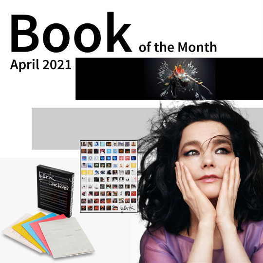
björk :archives. A retrospective
Klaus Biesenbach
Monograph / 2015 / Schirmer/Mosel Publishing House
Iceland, the land of geysers, the largest volcanic island on the planet. Home of the Icelandic pony with its exclusive gait of the tölt and the most active literary community in the world. Soccer mecca and most sparsely populated country in Europe. Icelandic names - for example the highest mountain Hvannadalshnúkur - are hardly pronounceable, although the alphabet does not even know many common letters such as C, W, Q and Z. There is a separate holiday for seafarers and a division of time into 3-hour periods starting at midnight. 16 German cities each have more inhabitants than all of Iceland, which has therefore its own dating app to prevent relatives who are biologically too close from mating. It's a fascinating country.
Given the size of the country, it's probably no wonder that Iceland's pop cultural influence internationally is rather limited. Despite the Nobel Prize for Literature winner Halldór Laxness, whose work I don't know, and the crime series The Valhalla Murderers, which I know thanks to Netflix. But wait - wasn't there something else? Yes, that's right, Iceland has a globally successful Gesamtkunstwerk named Björk. Her contributions to music, video, film, fashion and art have influenced a generation worldwide.
Björk Guðmundsdóttir, born in Reykjavík in 1965, has made a name for herself as a singer, music producer, composer, songwriter and actress with a broad interest in different types of music, including pop music, electronic music, trip-hop, alternative rock, jazz, folk music and classical music. To date, she has sold over 20 million albums worldwide. Certainly not only because of the seemingly endless variability of her compositions, but also because of her voice, which one can confidently call unmistakable. She causes goose bumps, whether you like her music or not.
Little Björk attended music school at the age of five and was taught singing, piano and flute, among other things, for ten years. One of the teachers sent a recording of her singing the song "I Love To Love" by Tina Charles to a radio station. The broadcast was heard and liked by an employee of the Icelandic record publisher Fálkinn and subsequently offered her a recording contract - when she was eleven years old. With the help of her stepfather, who played guitar, she recorded her first album. It contained various Icelandic children's songs and cover versions of popular titles, such as "Fool on the Hill" by the Beatles. The album became a great national success.
At 14, Björk formed the girl punk group Spit and Snot, the maximum contrast program to the children's songs. This was followed by the fusion jazz group Exodus, later Tappi Tíkarrass and Kukl (Icelandic for witchcraft), with whom she developed her signature vocal style. First foreign tours to England and West Berlin followed. Then in 1986 came the formation of the band Pukl, later renamed The Sugarcubes. The first single brought respectable success in England and USA, The Sugarcubes reached cult status. The first record deal with Elektra Records led to the album "Life's too good" in 1988, making them the first Icelandic band ever to become world famous.
The transformation into a total work of art began in 1992 at the latest with Björk's move to London. The first solo album, appropriately named "Debut," became the album of the year according to New Musical Express. Now even Madonna wanted to have a whole album written by Björk, but it remained with the title track "Bedtime Story", she remained true to herself and her love of experimentation. The New York based news magazine "Time" named her the "high priestess of art" and in 2015 put her on the list of the 100 most influential people on earth. She rounded off her visual extravaganza, that even her wardrobe was prominently featured in the major retrospective at New York's Museum of Modern Art (MoMA).
Schirmer/Mosel Verlag is an art book publisher in Munich founded in 1974 by Lothar Schirmer and the commercial artist Erik Mosel. Schirmer became friends with artists such as Cy Twombly and Joseph Beuys at a young age and began collecting their works. By buying and reselling art prints and drawings, he earned the start-up capital for his publishing house. With his publishing debut, he ensured the rediscovery of August Sander, a visual artist of the Weimar Republic. There were various publishing collaborations with the MoMA, and in 2015 there was also the retrospective mentioned above. And of course, in keeping with the protagonist, the publication had to become a work of art itself.
"björk :archives" comes in an elegant slipcase containing six parts: four booklets, a paperback and a folded catalogue raisonné poster with the covers of all Björk albums. A closer look is worthwhile: first there is a thematic introduction by the editor and exhibition curator at the MoMA, Klaus Biesenbach. Then an illustrated essay by Alex Ross, music critic of the New Yorker, which deals with Björk's creative dissolution of musical and aesthetic boundaries. Another by Nicola Dibben, professor of musicology at the University of Sheffield, on Björk's creativity and collaborations. And the collected e-mail correspondence similar to a pen pal relationship between Björk and American publicist, philosopher and literary scholar Timothy Morton.
The book itself, the centerpiece of the edition, is about Björk's seven major albums and the characters she created for them. Poetic texts by Icelandic author Sjón, with whom Björk has long collaborated, are joined by a veritable treasure trove of illustrations: Photos of live performances, stills from the music videos of masters like Michel Gondry or Spike Jonze, Björk in stunning costumes by designers like Hussein Chalayan or Alexander McQueen, and PR shots by star photographers like the duo Inez van Lamsweerde & Vinoodh Matadin or provocateur Araki.
The design of the publication quotes music scores and comes from the renowned Parisian design studio M/M. It all adds up to an extraordinary visual masterpiece, a tribute to the magical world of Björk. And that at an hardly believable price of € 19.80. A reviewer on Amazon (no, you shouldn't shop there - support local businesses!) sums it up: "This is a collection of art, stories and references very well organized and assembled with care. The price does absolutely not represent how valuable this product is, I am positively surprised." Positively surprising - that could truly be Björk's mission statement.
Björk's music itself is so rich in pictorial statements that it doesn't really need any exuberantly creative videos to go with it. Therefore, according to Slant Magazine, her best video is her first, relatively simple one: "Big Time sensuality" from her "Debut" album purely shows her joy in music. Here's the link:
https://youtu.be/-wYmq2Vz5yM
youtube
#book#book review#björk guðmundsdóttir#björk#the sugarcubes#iceland#schirmer Mosel#MoMA#museum of modern art#new york city#retrospective#Klaus biesenbach#gesamtkunstwerk#Voice#cult#singer songwriter#music#Reykjavik#Youtube
21 notes
·
View notes
Photo

Ch.727, pg.4
Glasses count - 13
Outfit count - 5
Including Monet’s standard outfit, Monet now has a total of six outfits (not counting her outfit from when she was a child, I feel like that’d be cheating since of course her child self had a different wardrobe). Considering how little screen time Monet has, it’s pretty impressive that she has six distinct outfits whereas most characters probably only have two or three
To be fair, I think in Monet’s case the different outfits are meant to help illustrate the passage of time:
Royal attendant outfit - 10 years ago, Monet has not yet met Law or even Caesar, still has human limbs
Knee-length pants (ch.686, pg.5) - the first two children, Mocha and Sind, are brought to Punk Hazard and deceived by Caesar (who, notably, always wears the same outfit in these flashbacks); Law has not come to Punk Hazard yet, Monet still has human limbs
Striped tank top (ch.686, pg.6) - a new batch of children is brought in, the earlier children have started to grow; based on the children’s relative sizes, this is either the third or fourth batch of children; Law still hasn’t come to Punk Hazard, Monet still has her human limbs and her Jolly Roger tattoo is visible
Solid green tank top (ch.686, pg.6) - Still no Law, Monet’s limbs are human, BUT her tattoo is no longer visible: was her tattoo visible when Mocha and Sind were brought to Punk Hazard? Did she only just start hiding her tattoo recently? Why? And was it with makeup or by other means?
Blue dress with jagged patterns (ch.666, pg.6) - Law arrives at Punk Hazard; Monet still has human limbs, and her tattoo is still missing; the lack of any scar tissue implies that the tattoo was not removed, so it was most likely hidden by makeup
“Happy” tank top and orange striped pants (ch.662, pg.12) - Monet’s standard outfit; Law’s surgery has been performed, Monet’s tattoo has been permanently removed by nature of that section of her arm being replaced with a wing
You may notice that there are other context clues to help understand the timeline, notably the children, her tattoo, and Law’s presence, so strictly speaking there was no need to use her outfits as a guide. Any other artist would have just used a base outfit consistently, and I’m pretty sure other minor characters have had similar timeline jumps that didn’t give them as much variety in clothing
I might just not be remembering because I don’t care about other characters as much, but still, six outfits in such a short span of time? Hell, half of them were in a span of two pages! It just feels like Oda put a lot of energy into Monet’s design, and that has to count for something
As for this outfit in particular, I don’t personally love it, but we know it isn’t Monet’s style because she’s currently working as an attendant for Dressrosa’s royal family, implying that this is her uniform. Especially sad is that with her hair tied up like that in her bonnet is that her signature ahoge is missing. Very sad
God, even with that silly uniform, she’s so pretty...
3 notes
·
View notes
Note
*opens door* I keep forgetting to drop by in your asks, so I'm gonna do it now: I'M LOVE WITH YOUR NEW THEME! Although, I'll miss the sweet, summer peach tea vibes I got from the old appearance (to me, it was your signature look), but the soothing, spring lavender aura I'm getting from this new look never fails to put me in a good mood. And GOD I keep forgetting how talented you are as an illustrator. That Devil!Izuku banner is sending me on a nostalgia trip from when I fangirled at you for your artistic talent. ~Denise
AHHHH DENISE I’M SO GLAD YOU LIKE MY NEW THEME!! 🥰
I worked hard to make it look how I wanted since I’m so partial to the sweet summery peach (I’d had it so long I got attached) and I agree that it’s my signature! But I want to try some different things and I’m glad you like this one! Hehskejejrnrnr I know I don’t share my art much and I get so blushy when people compliment it. AND YES I REMEMBER YOU FANGIRLING SHJRJFJDJRD 😳💜🙈 (Gosh it was almost a year ago I think.)
Thank you for sending me this, and being so sweet, a n d just existing because I smiled so big when I saw that you’d sent in an ask. I always love your asks. (your ideas in asks always end up getting saved for later so I can do them justice 🤭)
11 notes
·
View notes
Text
Ranking my favorite characters of each of my favorite animes / mangas
For the record: I don't own any of the following artworks bellow. All the credit go for their own original artists
Top 10: Olivier Mira Armstrong (Fullmetal Alchemist)
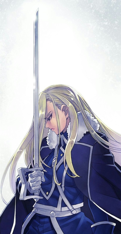
Olivier Mira Armstrong (オリヴィエ・ミラ・アームストロング, Orivie Mira Āmusutorongu), also known as Major General Armstrong is the primary heir to the illustrious Armstrong family, the commanding officer charged with the protection of Amestris' northern border at Fort Briggs and the older sister of Alex Louis Armstrong. Olivier is a severe woman who has a fearsome and commanding presence where she is harsh with her subordinates and peers and coldly merciless to her enemies, the deceptively beautiful woman's schadenfreude has earned her the nickname "Ice Queen" among the Briggs soldiers. Sharp-tongued and highly combative, Olivier is no stranger to furious chastisements and bursts of fiery violence, especially toward those who fail to live up to her high standards and staunch adherence to the "survival of the fittest" philosophy.
Top 9: Mikasa Ackerman (Attack On Titan)
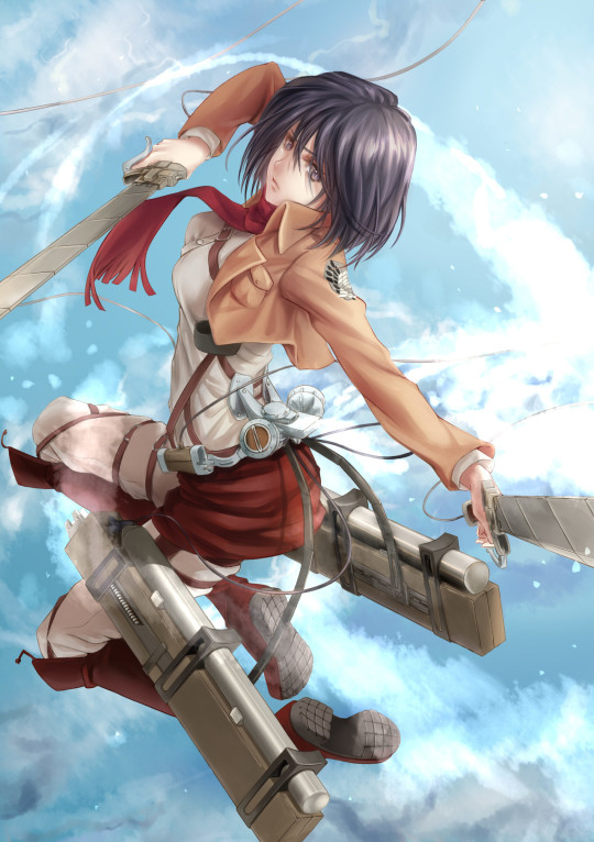
Mikasa Ackerman (ミカサ・アッカーマン Mikasa Akkāman) is the adoptive sister of Eren Yeager and one of the two deuteragonists of the series, along with Armin Arlert.
After her biological parents were murdered by human traffickers, Mikasa was rescued by Eren Yeager and lived with him and his parents, Grisha and Carla, before the fall of Wall Maria. Though she desires only to live a peaceful life, Mikasa entered into the military—where she is considered the best soldier among the 104th Training Corps. She later enlists in the Survey Corps to follow and protect Eren, becoming one of its greatest assets. She is currently serving as an officer (上官 Jōkan) in the Corps. Mikasa cares deeply for her friends and caretakers, seeing them as the last remnants of a family she cannot afford to lose. Mikasa also appears to have a soft spot for children, and she has a strong sense of right and wrong, doing everything she can to make her most impulsive friends to follow what she thinks is the right track. Despite that, she knows well that she cannot always sway them in decisions and makes it a point to follow them whenever they go, just so that she can be around to help out when trouble arises.
Top 8: Kamina (Gurren Lagann)
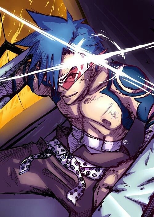
Kamina (カミナ, Kamina) was a young man from Jeeha Village, the founder and first leader of Team Gurren and deuteragonist of the first arc of Tengen Toppa Gurren Lagann. At first glance, Kamina is boisterous, hotheaded and arrogant. He demands recognition and seems hungry for greatness, illustrated in his tendency to call himself "the Mighty Kamina" and his signature catchphrase, "Just who the Hell do you think I am?!" He is an undeterred idealist, often to the point of ignorance; Yoko has described him as "a man of unlimited stupidity." Kamina is also very perverted, declaring that the urge to stare at beautiful women is the definition of a man.
However, Kamina is also extremely determined and never lets anything keep him down for long. Even discovering that his father was dead only made him solemn for a night or two (visibly at least). He is also devoted to defending and supporting his friends and loved ones, fighting with all his strength to protect them. In turn, he is very charismatic in the heat of battle, able to inspire even the timid Simon to accomplish great feats and almost single-handedly set the foundations for Team Dai-Gurren.
Despite his often brazen and practically insane actions, Kamina is fairly insightful, as his bombast and seemingly blind confidence usually mask his true intelligence in planning and combat. He even personally admits that his bravado and fearlessness is mostly a device he uses to hide his own worries and to support others, and that he thinks people like Simon are the real heroes.
Top 7: Sebas Tian (Overlord)
Sebas Tian (セバス・チャン), alas "The Iron Butler", is the head butler of the Great Tomb of Nazarick with several manservants and other butlers under his command. He was created by Touch Me. He is also the leader of the Pleiades Six Stars.
Although he is not one of the Floor Guardians, his power closely rivals theirs. In a way, he is independent of their chain of command. He originally served as Nazarick's last line of defense alongside the Pleiades on the 9th Floor, to give time for the guild, Ainz Ooal Gown, to prepare for their final stand in the Throne Room. Like his creator, Touch Me, Sebas Tian has a great deal of personal justice. Unlike many other denizens in Nazarick, he does not completely despise humans or see them as inferior creatures. Instead, he believes that some humans are good people and it is the duty of the strong to protect the weak. However, humans with an ugly nature disgust him and he will not hesitate to kill anyone who dares to oppose Nazarick. Sebas has a stoic nature, but also tends to question his own actions whether it was right or wrong of him to do them contrary to his master's order. Not sure why he does it, Sebas does believe that Touch Me's will is what encouragingly motivates him to act the way he does and that it conflicts with the will of his current master.
Top 6: Brago (Gash Bell)

Brago (ブラゴ, Burago), alongside his partner and bookkeeper Sherry Belmont, are considered the rivals of the main characters Zatch Bell and Kiyo Takamine, even though the teams fought a relatively small amount of times. Since their first appearance, they were one of the most powerful teams in the series, and have been seen burning more spellbooks than any other one. Brago is very quiet and is rarely seen socializing with other mamodos, he is often described as being "strong and cool". He is often seen crossing his arms or sticking them in his pockets. Not much is revealed about his life or personality, other than he resents weakness and especially requiring a human's help to win the demon kingship. However, despite often complaining that Sherry is too weak to help him, he thanks her for all that she has done for him in the final battle. He is extremely strong, often defeating other mamodo teams without even requiring the use of spells; because of his strength, which was gained from undergoing special elite training, many mamodo have come to fear him as one of the strongest. Brago's specialty is Gravity Magic.
Top 5: Guts (Berserk)
Guts (ガッツ Gattsu) , renowned as the "Black Swordsman", is a former mercenary and branded wanderer who travels the world in a constant internal struggle between pursuing his own ends and protecting those dear to him.
At one time driven solely by his will to survive, Guts finds purpose in life upon joining the Band of the Falcon, greatly helping in the faction's storied successes during the Hundred-Year War as captain of the band's raiders. He eventually becomes dissatisfied with clinging on to Griffith's dream, and departs from the band in pursuit of his own. Following the horrors of the Eclipse prompted by Griffith, Guts embarks on a two-year war against the God Hand and apostles, becoming increasingly embittered on his one-track quest for retribution. He in time realizes protecting his regressed lover is more important to him, as well as something he cannot do alone, and thus seemingly abandons his quest for revenge while fostering camaraderie with his new companions. Known for his air of austerity, Guts is a gruff, cynical man holding an overall bleak outlook on life. This is a consequence of enduring waves of suffering and numerous betrayals since his youth, with nearly all highlights of his life having, in time, become lows. In spite of his guarded, brooding exterior, he shows a more easygoing, compassionate side around the people he trusts, appearing markedly less unsociable and distant, though still retaining his dry candidness. Even as his inner darkness festers deep within him and its temptation becomes increasingly harder to resist, he retains his empathy and compassion, refusing to completely discard his humanity.
Top 4: Akemi Homura (Puella Magi Madoka Magica)
Homura Akemi (暁美 ほむら Akemi Homura) is one of the main characters in the Puella Magi Madoka Magica series. Ever since her arrival at Mitakihara Middle School, Homura is immediately depicted as being very intelligent, athletic, distant, and cold. It is revealed in episode four that she is only like this because she has seen so much suffering during her tenure as a magical girl. Because of this, she does not want Madoka Kaname to become a magical girl and tries to do anything in order to stop her from making a wish with Kyubey, going as far as to attempt to injure and even kill the cat-like creature. Despite her cold attitude towards others, she still very much cares for Madoka, as it is her sole objective to protect her due to the countless amount of blood, sweat, and tears she has shed over her jumps in time. Despite being regarded as emotionless by Sayaka Miki, Homura is far from it. Although she does not easily show signs of remorse, sadness, or pity, it is only because she had grown used to the suffering around her, and must put up a strong front to continue fighting for her goal. Homura herself has stated that she always feels badly with each life she's unable to save or alter, but nevertheless, it does not slow her down from staying true to her main objective in saving Madoka Kaname.
Top 3: Grimmjow Jaegerjaquez (Bleach)
Grimmjow Jaegerjaquez (グリムジョー・ジャガージャック, Gurimujō Jagājakku) is an Arrancar and was the Sexta (6th) Espada in Sōsuke Aizen's affiliated army. While appearing to be a laid-back individual, Grimmjow possesses a brutal, impulsive, and excessively violent personality alongside a lethally short temper. However, despite his aggression and obvious blood lust in battle, Grimmjow possesses a feral cunning and has a knack for quickly exploiting any opening his opponent reveals. In addition, he is blunt, sarcastic and quite sadistic, revealing a psychotic grin or laughing maniacally whenever he becomes excited. He is also very rude and quite disrespectful. Grimmjow uses none of the honorifics in the Japanese language, except when addressing Aizen (though he is quick to discard the formality when Aizen is not around), and refers to Orihime Inoue as woman in conversation. Grimmjow displays little respect for authority and says whatever is on his mind, regardless of whether or not it is appropriate. However, he does have some form of a code of honor, as he is unwilling to fight an injured Ichigo, bringing Orihime to heal him beforehand so that their battle will be a fair one, though he also wants to defeat Ichigo when he is at full strength.He also saves Orihime from Loly Aivirrne and Menoly Mallia, who were beating her up, to repay the debt of restoring his arm, though he immediately demands another favor afterwards.
Top 2: Kujo Jotaro (JoJo's Bizarre Adventure)
Jotaro Kujo (空条 承太郎 , Kūjō Jōtarō) is the protagonist of Part 3 and also appears in Parts 4-6. Jotaro is the third and most recurring JoJo of the JoJo's Bizarre Adventure series.
Jotaro is a delinquent who lives an ordinary life until the Joestar Family's old enemy, DIO, returns. Jotaro travels to Egypt in order to save his mother and stop the Vampire once and for all.
Wielding the incredibly powerful Star Platinum, Jotaro is the first JoJo introduced with a Stand, and is among the most well-known characters of the series. Jotaro is introduced as a rough delinquent, but he has a gentle heart, and is loyal to those he likes. He is highly perceptive, intelligent and quick-witted while keeping a perpetually cool, slightly neutral or disinterested attitude. Jotaro's most noticeable trait is his seemingly aloof nature. He is a quiet individual, often satisfied with expressing himself in short phrases. While he was shown to be mildly anxious when something unanticipated happens, Jotaro almost never goes as far as to lose his cool.
Top 1: Charlotte Katakuri (One Piece)
Charlotte Katakuri ( シャーロット・カタクリ , Shārotto Katakuri) is the second son and third child of the Charlotte Family and the elder triplet brother of Daifuku and Oven. He is also one of the Three Sweet Commanders of the Big Mom Pirates and serves as Totto Land's Minister of Flour (粉大臣, Kona Daijin), governing over Komugi Island.
Due to his actions and role, he is the secondary antagonist in the second half of the Whole Cake Island Arc. Katakuri has a very serious, no-nonsense demeanor, caring greatly about his crew and family's objectives. With his heightened Kenbunshoku Haki allowing him to see a little bit into the future and make smart judgement calls, he is dedicated to efficiently dealing with all possible threats within his vicinity, and is thus among the few Charlotte children that can be seen taking action without instructions from Big Mom herself. Katakuri is a pragmatic individual who puts efficiency above almost everything else, to the point of being considered a perfectionist. He rarely brags about his abilities, instead being rather focused on accomplishing his goals as fast as possible, intercepting and defeating his enemies in a quick, effective manner while prioritizing the elimination of threats he perceives as potentially serious, going as far as taking extra steps to ensure they are stopped in case his mother and siblings fail to do so. He is also capable of extreme brutality as shown when he pondered on how he should maim Luffy with his trident. Though ruthless to opponents, he is extremely caring towards his family and subordinates. Katakuri is also a honorable man who dislikes other people interfering with his fights. Though he considers Luffy his enemy and desires to eliminate him personally before he can become a threat, he wishes to defeat him fairly. After discovering that Flampe was the one attacking Luffy and lowering his performance in the fight, Katakuri injured himself in the same spot he injured Luffy to compensate and angrily shouted at Flampe for interfering in his fight.
#anime#fanart#Charlotte Katakuri#Grimmjow Jaegarjaquez#Kujo Jotaro#Akemi Homura#Guts Berserk#Brago#Sebas Tian#Kamina#Mikasa Ackerman#Olivier Mira Armstrong#One Piece#Bleach#Jojo's Bizarre Adventure#Puella Magi Madoka Magica#Berserk#Berserk Manga#Zatch Bell#Gash Bell#Konjiki No Gash Bell#Overlord#Tengen Toppa Gurren Lagann#Gurren Lagann#Attack On Titan#Shingeki No Kyojin#Fullmetal Alchemist#Fullmetal Alchemist Brotherhood
69 notes
·
View notes
Text
200926 SuperM Open Up About The Encouraging Message Behind Their New Album "Super One"
The group's members are some of the most skilled performers in K-pop history; Kai and Baekhyun are from Exo, Taemin is from Shinee, and Lucas, Taeyong, Mark, and Ten are from NCT and its Chinese sub-unit WayV, respectively.
When they join forces as SuperM, however, the result is incendiary — otherworldly vocals mesh with indomitable rapping to create powerful performances that leave viewers reeling long after the group has left the stage. Don't believe me? Just watch the group perform their breakneck power anthem "100" and prepare to feel absolutely exhilarated.
It's been less than a year since their debut, but SuperM has already made history by becoming the first K-pop group to debut at No. 1 on the Billboard 200 album chart with the release of their debut EP SuperM — The 1st Mini Album. It's an achievement that youngest member Mark credits in part to their fans, who banded together from multiple fandoms to support their debut; it was also a great source of inspiration for SuperM to work even harder so their next album would be even better than the last.
Now, SuperM is back with their first full-length album, Super One, out Sept. 25.
AKA, today! With the world currently under lockdown due to the pandemic, it was SuperM's desire to create an album that would give fans encouragement and, according to Kai, "take [them] to a place of hope." The 15-track album still includes the group's signature powerful sound with songs like "One" and "100," but also highlights the softer side of SuperM with tracks like the gospel-infused "Better Days" and funky "Together at Home" too.
We sat down with SuperM in a roundtable interview to discuss their new album, Super One, and how they hope its overall message of coming together will bring comfort to fans around the world during the pandemic.
1. After the release of your first EP debuting at No. 1 on the Billboard Hot 200 chart, did you feel any sort of pressure while preparing to release this album?
Mark: It was our first EP release, you know? So to have that No. 1 achievement itself was an honor. It was our first EP as SuperM and to have our fans really combine their strength to support us really felt great, so it motivated us to really work harder on this album. We put double the amount of effort we put in on our last album into this album, so we believe that the quality went up that much as well. We can’t wait for fans to listen to Super One too now.
2. What made you decide to combine two songs together to make your title track "One?" It feels reminiscent of Shinee's song "Sherlock!"
Taemin: When I recorded “Sherlock” with Shinee back in the day, it was one of the first times we were doing this [type of hybrid song creation], so it felt very experimental. At that time, I was a little worried about how it would end up sounding at the end of the recording process, but I think after recording [this kind of song] with “Sherlock,” I was able to see how this song would come to be as “One.” A lot of people might think that mixing two songs together is quite tall of a task, but we were able to do it and I’m really happy with the results.
3. What’s your favorite track on the new album?
Baekhyun: “Big Chance” is my favorite. I personally like taking big chances and looking for big opportunities, so just the title itself caught my attention.
Taemin: I would probably say “Wish You Were Here.” I actually think this would’ve been a great title track as well. I personally think all of the members did a great job in recording [this song] and I love how it sounds. This song is actually one that’s more unexpected from SuperM, because audiences usually expect a performance-heavy song and I think the message within it is one that really brings the whole album together and conveys the message that we’re hoping to convey with Super One.
Kai: “Tiger Inside” is one of my favorites because when you listen to it, you just feel energized and you feel that strength coming from the song. And I feel like it’s a song that showcases all of the members really well.
Mark: I honestly really like “Wish You Were Here” as well, but I’m going to say that I really like “Infinity” right now. "One" is a song that combines “Infinity” and “Monster,” but I feel like “Infinity” has its own story and dynamic and you can feel a different side [of it] than you can feel from “One” when you listen to it.
Taeyong: I'll pick “Together at Home,” because I like that message. Overcome this situation and—
Mark: Netflix.
Taeyong: And just Netflix.
Lucas: My personal favorite is “So Long” because the melody is really addictive, like once you listen to it, it hooks you right away. I really think it’s a song that fans will all appreciate.
Ten: “Infinity!” Like Mark said, the dynamics and storytelling were outstanding on that track. Also, I was so lucky that I got to try this rap/vocal kind of style that I had been wanting to try for a long time on “Infinity,” so I enjoyed recording it very much.
4. What is something you learned about yourself while creating Super One?
Baekhyun: One of the new things that I learned while preparing for this album in particular was that we were able to stretch our limits even more. As you know, we released "100," "Tiger Inside," and now we’re releasing the title track “One." Each of these songs has such a great concept and choreography — just putting all of that together was really challenging, to be honest. I think that was something that I learned when we were able to come together as a group and face that together.
5. Given that each member comes from another major group, how do you make sure that each member has their moment to shine on Super One?
Lucas: Visually, we all have different aesthetics that go along with our individual styling and I think that kind of points to each of our charms. In our upcoming music video for “One,” we all had different designs and colors, but it all still stayed connected. I feel like through those points that we give out through our art that it adds a charm for each of us.
6. Super One features a wider variety of musical styles and influences than your first album. How do you feel SuperM’s musical identity has grown with this new album?
Taemin: I would say that while putting together this album, we were able to [bring a greater sense of] harmony between the members than we did initially. Everyone is just so skilled, but with this album, we were able to experiment more and try out these different genres and see how it all comes together.
8. Which song on the album have you personally come to fall even more in love with in time, and what made you fall in love with it?
Ten: I would choose our ballad song “Better Days” because at first when I listened to the song, it sounded kind of old — seriously, it sounds like it’s from the '90s, a very old pop song. But after we recorded, I realized the song goes well with us and the concept we want to release because the lyrics are very healing. I think when you listen to “Better Days” you can get that energy that us together, we can make a better day.
9. SuperM has all of these modes of transportation that are featured throughout your music videos. At a time when we can’t travel and the world is kept apart, what does this represent to you and how do you want it relayed through the album?
Kai: If you look at our past music videos, there are helicopters, tanks, and a lot of cars. I think that goes really well with SuperM’s concept as a group. That’s why those modes of transportation were kind of illustrated through our music videos in our past songs. We can’t really travel right now because of the pandemic and everything that’s going on, but we really hope that, just like these modes of transportation take you somewhere, that this album can be that mode of transportation to take you to a place of hope and to a higher place where everyone can enjoy themselves and be happy.
10. Looking back on all of your journeys so far, what is one event that you considered a failure at the time, but now you feel it ultimately led to your success today?
Taeyong: As artists, when we start out our careers, I can’t help but feel like a lot of the moments that we go through feel like we’re still trying to get there, or like we’re not fully there yet. There are a lot of moments where it might have felt like a failure, but actually everything was a step to build up to what we have now.
Mark: When I first debuted, my hair was very short, so my bangs were above my eyebrow by like four inches and I honestly hated it during my debut. But coming back to it now, I feel like it was alright.
Taeyong: It was cute!
Mark: It was appropriate just for that age, you know! Just for that time in my life.
Ten: Like Mark, mine is the same. During the debut days like “The 7th Sense,” when I saw my own hair, I was like: “This is not going to work out.” But now I miss it so much; I’ve got to get it soon!
Mark: Hair is an important factor for a debut for us!
11. Mark and Taeyong, you both wrote and produced on the last two albums. When you're writing a song like "100" or "Together at Home," what is your creative process like?
Mark: Most importantly, I feel like whenever we have to create or produce something for our raps and rap making, the main theme and the meaning are what’s most important. This particular album, for “100” or any other song, the main meaning for the whole album is to really bring hope and to encourage people that unison is the only way for us to get through this and through all of our problems. So we kind of used that theme, in a way, to interpret each and every song. So for “Together at Home,” we really felt like, we’re all staying together at home, so what are the benefits and what are the goods that we can bring out of this? What are the ways that we can connect through our songs while we stay at home and everything? So I feel like that process worked for every other song and we enjoyed that while making the raps as well.
Taeyong: Also, the most important thing is the performances. This time, Taemin hyung fixed our choreography [so it has] more detail. I think, this time, our performance is really dope and great and untouchable. I think I’m very excited — please look forward to it. Thank you!
12. What is the key ingredient needed to transform a song into a SuperM song?
Kai: Each member's individual charms are a main ingredient, but if I had to add one more spoonful, it would be the producing and direction of our executive producer Lee Soo Man. As you know, SuperM is a group that is really strong with its performances, so that’s a really key ingredient that’s needed when making a SuperM song.
13. And finally, how has SuperM evolved since your debut together?
Baekhyun: With this new album, especially just the process of recording it, we were able to emphasize the message within the album. All of the songs have their own message, but Super One is all about unity and being unified. I think in terms of the sound of the music itself, we wanted to make sure to relay a message of positivity rather than just focus only solely on the performance. This was an album where we were able to focus on the messaging more, so I think we’ve matured in that sense.
Emelyn Travis @ Buzzfeed
29 notes
·
View notes
Photo
(Casey Here!)
As much D&D as I play, you'd imagine I would eventually get around to illustrating some of their most iconic monsters! Which is to say, the ones that I personally find the most iconic. Which is to say, the ones I memorized when I was reading my dad's monster manual at age nine. Purple worm - Sandworms never go out of style. I've seen a lot of rad designs for this bugger over the editions, but I favor the slightly less reptilian older takes for this particular critter. It's kinda basic, but sometimes that's what you want. It's like a shark or a crocodile: Just flat out unchanged across the ages. Hook horror - I've heard it rumored that Gygax used a small Gigan figure to represent this monster. I can't verify that, but it definitely sounds right. Hook horrors are one of the very first things you meet when you play around in the caves, and they kind of remind me of the Father Deep monsters of the Hork Bajir homeworld that way. Mind flayer - Mind flayers! Basically, take all of your Dracula conventions and dip them in a fresh coat of Lovecraft. There's that old "decadent aristocratic upper caste system who literally eats the poor, but still somehow comes across as less evil than the actual real life 1%" setup that will never stop being relevant. Though personally, I see mind flayers as the first alternative for folks who want to play that monster-who-feels-the-urge-to-eat-their-friends-but-refuses-to-do-it shtick but don't want to deal with vampire baggage. You know, the furry option! ... Slimy? Rubbery? Do we have a word for anthro-cephalopods? I'm only a casual furry. Gelatinous cube - I'm not apologizing for giving this one a slot. Froghemoth - So, back when I participated in my very first long-term campaign, I played a druid. You've met Talia before. Naturally, I was chomping at the bit for the day I finally got to turn her into a froghemoth, and celebrated the day my wish was finally granted and she was allowed to chug human-supremacist-cultists like popcorn. Yeah, okay, the froghemoth is one of the classic vore-monsters. But it's a charming design in its own right. Kind of a freaky Hanna Barbara critter, like you'd see Space Ghost fighting. No matter how many artists draw it, they can never shake that inherent goofiness that third edition tried so hard to purge. I would probably cram them somewhere onto Fronterra if I was sure they were public domain. As is, I'm 99% certain that this is what Visser Three turned into when he ate Elfangor. Tarrasque - D&D's original kaiju! Kind of just takes the name and nothing else when it comes to its mythological origins, but I don't mind. The Tarrasque is that endgame "let's test the players" final boss monster... Or at least it's supposed to be. My DM reskinned it for our final Pathfinder session, and one of the PCs still nearly killed it in a single turn. Also, he let Talia turn into one, so maybe Pathfinder is just bullshit? Regardless, the Tarrasque has one of those simple, iconic designs. I've heard rumors it was based on the concept art for Fallout's deathclaws, and like the Gigan-figure, I can't verify this in any way. With its reptilian features, twin horns, spiny carapace and grabby fingies, it has an undeniable lizardlike quality that I can't help but find charming. Kinda feels like a more refined version of Zilla? Though for an insatiable eating machine, I notice a lot of artists give it very little belly to work with. Come on, this guy eats entire cities! Give him somewhere to put it! Rust monster - An icon of icons, the rust monster! Drawing its origin from a bizarre Chinese "dinosaur" toy, later designs have made it more insectoid in appearance, but never feeling QUITE like anything Earthly. It's the four limbs. Between the four limbs and the tail, it's hard to tell if it's an arthropod mimicking a vertebrate or the other way around. I'm pretty sure this is part of what inspired my ossaderm creatures for Fronterra. Also, Ryla can turn into one in our campaign. I have no shortage of havoc to wreak when the opportunity comes. Behir - Dragons in D&D are kind of... extra. Godlike beings, paragons of whatever personality trait they represent. Whenever there's something uber powerful in D&D, it gets compared to dragons. It makes them kind of unapproachable. Behirs provide all the essentials of a dragon - Serpentine body, scaly skin, horns, sapience, breath weapon, taste for human flesh - wrapped up in a smaller, weirder, IMO cooler package. You know, your Lambton Worms. A lot easier to port in and out of adventures, a lot less of an event when they show up, but still a formidable force in their own right. I like the behir. The behir knows how to taunt me just the right amount. Bulette - Another Chinese "dinosaur" figure monster, the bulette is actually another one I associate with Talia. Whenever we faced a problem that didn't have a glaringly and immediately obvious solution, she would turn into a bulette, whether it was for beating up robots, digging through obstacles, trampling smurfs, navigating labyrinths, distracting slashers with cute dog tricks... it was kind of her signature form. But shenanigans aside, the bulette is just an excellent monster. While the "land shark" shtick may be common, there's a lot more going on with the bulette's design. It's rumored to be a mad wizard's creation, as he combined a snapping turtle with an armadillo and mixed in a helping of demon blood to taste. Personally, I always considered that to be a neat little rumor to flesh out the world, but never assumed it to be true. The bulette just feels too naturalistic for that. Like some kind of protomammal or crocodylomorph, or weird triassic monstrosity. Magic and demons and dragons and so on DO affect the ecosystem. I always figured the bulette was just something that evolved to compete in this new biosphere. Owlbear - This one, on the other hand, I fully believe the "mad wizard was bored" explanation. Another chinasaur critter, the owlbear is frequently made fun of. What makes it scarier than a regular bear? It can't fly, so why have owl parts at all? Why trade fangs for a beak in what is at best a latural move? Well, first of all, fuck you, owls are creepy motherfuckers, and that alone is enough to justify it. But secondly, that's part of its charm. Besides some improved vision, the owl DOESN'T make it more dangerous. What makes the owlbear dangerous is that it's an insane, Frankensteinian monstrosity roaming uncontrolled through the wilderness! It doesn't need weaponry, its sheer temperament is enough to make it a worthy opponent. Sure, the practical threat might not be hugely above that of a bear, but storytelling isn't about numbers. Any asshole can go outside and get eaten by a bear. The owlbear is part of this world. The owlbear is a reminder of what magic can do. Someone somewhere actually made this thing, for whatever reason, and now the world is irrevocably changed because of it. Owlbears go beyond practicality. They bring the lore! Also, bears don't have very good eyesight, so the big owl eyes probably make them better hunters. Flumph - Is that a Japanese-style martian? Do we just have aliens in D&D? Dear lord, I love them! Okay, the flumph has got a sizable hatedom. And that hatedom can eat my ass, because the flumph is precious and perfect just the way it is! Flumphs are designed as a sort of sidekick-type creature. They're not very good fighters, but they bring knowledge and lore to the table. Whether they're aliens from some far off star, seeking your aid to prevent catastrophe, or psionic natives of the Underdark eager to bask in your positivity and hopefully stick it to the tyrants they're forced to share real estate with. My group generally treats them as straight up aliens, benevolent but strange. Course, we're all pretty strange, so we get along just fine. Otyugh - Okay so, the aberration creature type implies that this is something from another world that doesn't belong. And yet otyughs, which are aberrations, are an essential part of this world's ecosystem? Okay, I can buy the idea that an alien organism adapted to our world and is now a key part of it. Fronterra's got a TON of that. It just feels like after a point, the otyugh would be considered a beast? Otyughs are great. Every ecosystem needs a decomposer, and every fantasy story needs at least one dive into the sewers. Otyughs provide both, and are intelligent enough to keep the plot moving if it hits a snag. There's always going to be garbage, refuse, carrion, decay, things that need to be broken down and processed. Carrion crawler - The carrion crawler is pretty similar to the otyugh in that it's technically not considered a beast, and therefor must have its origins elsewhere, but feels so integrated into the ecosystem that it just feels like it belongs. They usually can't talk, so they're not just reskinned otyughs, but I still consider them pretty essential. Otyughs find a singular spot where waste is dumped and shovel it down at their leisure, while carrion crawlers skulk through the tunnels, actively seeking their food. The crawler got one of the most radical redesigns on the transition from second to third edition, but I can't really choose a single favorite. The oldschool tentacle-faced cutworm looks like it could be a real animal, while the googly-eyed Halloween decoration feels like it could be from another world, merely having set up shop here. Could there name apply to two wholly different creatures? If so, then I'm not sure which one mine would be considered. I kinda mashed them together into something that doesn't quite feel like either. But I like it for what it is. Maybe I'll sneak it onto Fronterra. Aboleth - Tentacled, telepathic sea creatures who turn humans into slimy minions, who remember everything their race has ever seen, and who are always plotting something behind the scenes. Yeah, the aboleths really crank up the Lovecraft elements. Actually, between the mind flayers, the flumphs and the aboleths, even the most oldschool D&D covered quite a few essential Lovecraftian bases. The flayers are your corrupt yet still recognizable humanoids who can be considered truly evil, the flumphs are benevolent-yet-bizarre guardians who know more than you, and the aboleths are the truly unknowable, sinister intellects. The fact that they can barely function on land honestly only adds to that, IMO. They're inherently difficult for a party to reach, and they offer some nice underwater adventure seeds. Not enough adventures go underwater. There's this perception that the ocean is bad for storytelling because so many writers lack the creativity to make it work. I wanna run an underwater adventure now. Beholder - Icon of icons! THE D&D monster! The beholder! Paranoid, jumpy, always five steps ahead and twenty steps perpendicular! Beholds are fun in just about every way. Between their wacky, diverse designs, their elaborate lairs, their eccentric personalities, their bizarre powers, you're never gonna run out of fun with beholders. Remorhaz - It's always been a thing that bothered me with environment-based monsters. Why does the ice monster who lives in the cold use ice as a weapon? Aren't most of the things it encounters going to be resistant to the cold? Sure, a cone of cold will still kill a polar bear, but a lot of the monsters in the tundra are outright immune to cold. A while dragon's not going to get much use out of its breath weapon fighting frost worms and frost giants. That's one reason the remorhaz sticks out to be. We have an icy tundra beast whose insides are a scorching furnace, which it can intensify and weaponize as it sees fit. Which also conveniently explains why its design - a sort of cobra-esque centipede - invokes warm-weather creatures, despite its icy environment. It's a nice subversion of the usual tropes, plus it's just a memorable, cool looking critter to begin with. On a smaller note, the remorhaz feels like a good loophole for Ryla's "no cold weather morphs" rule. Turning into something elementally affiliated with ice is no good, but a non-magical monster that survives the cold by superheating its insides? That seems perfectly viable to me!
#RiftWitch#My art#D&D#DND#Dungeons & Dragons#D&D monsters#Purple worm#hook horror#mind flayer#illithid#bulette#froghemoth#tarrasque#rust monster#behir#owlbear#flumph#carrion crawler#aboleth#beholder#remorhaz
95 notes
·
View notes
Text
Subculture in Design: Through Kpop Subculture-Deylin Patel
Introduction
The main topic hat will discussed in this essay is Subculture in design. When people think about subculture they think about what that subculture have to do with design, what impact does it have on the design world. The only way to understand why subculture in design is really needed is to see if it has been applied to a certain subculture and how it has influenced design or not. This essay with argue if Kpop subculture in design is important and the influence it has on graphic design. The essay will show his by defining what subculture is and what Kpop subculture is. The characteristics of Kpop subculture, as well as the characteristics of Kpop subculture’s style in graphic design. To support my argument the essay will cover how Kpop has influenced the graphic design in the styles of designing. The examples that will be discussed with make decide weather Kpop subculture has either helped design or not.
2. Defining Subculture in Design
To understand what Subculture in Design is we need to understand the definitions of what subculture is and design. The meaning of subculture is when ideas, art, the way of life that a group of people within society are different to other people of society.(Definition of subculture, 2021) this basically means that people are different in the way they are because of the ideals of the subculture. The meaning of design is is to have a particular purpose or intention in view of an individual or group. (Merriam-Webster Dictionary, 2021). Understanding what subculture and design is we can know put them together we then understand that we can say that subculture can be connected through values, in the way of design we can then decide what works with the style of the subculture, thus making that different subcultures might have the same sign for something but they mean something else. This is when a designer needs to understand the context of what happens. (Design & Subculture, 2021).
To focus on the subculture of design I will be looking at Kpop as the subculture to argue if it impacts design or not. The meaning of the Kpop subculture is an international music genre that has different music styles that began in South Korea. (Spatichia & Otolorin, n.d.) Kpop has become a huge part of the music world. The thing that makes Kpop different from the normal kind of music is that they have a particular design style that they use for what they want to do.
The Characteristics of Kpop subculture
Before one goes into Subculture in Design, we must understand the characteristics of what Kpop. These characteristics include large groups which means that the music group is from four people to about 23 members, this is mainly because they want fans to have different people to look and support. They have a hybrid sound which makes use of he traditional Korean music elements with the influence of jazz, soul, hiphop and funk, this is what makes their style of music so interesting. They have a Unique style which relates to fashion design this helps in that the style of clothing that they go for will influence design in many different ways.(MasterClass, 2021)
Now knowing what the definitions are and what the characteristics are it makes it clear that Kpop can very much be an influence on graphic design in that they have different views on how they do things and they have a connection to design to make them different from other subcultures. This is shown with how they produce their music videos, it is shown that they have themes and stories that are about unrequited love and coming to age and the other things that happen in life. (Lee, 2019)
This helps me as a designer in that I can argue that Kpop subculture is something that subculture in design can help with graphic design and make a difference in the way we think about subcultures and the design style they bring.
3. The significance of Subculture in design in identifying and solving a design problem
The significance of Kpop subculture in terms of it being used in graphic design. This is made significant in that Kpop’s art is influenced by Pop Art in terms of the art and illustration. Kpop uses the idea of sleeky minimal deign work, this is shown by the work of different artists playing with photography, typography, colour, illustration. When wanting to understand the style that makes graphics important is that it has a very different take on the use of different elements to make the design stand out.
Some unique characteristics of Kpop design is the ability to tel a story, this is mainly shown in the music videos of Kpop, the idea of making something a story of something is important in that as designers we need to think about how will the subcultures influence the way the work is done and influence the way design thinking goes with everything that has been done. Kpop’s idea of making the subject matter light they have a unique way of making it look amazing in tat the viewer can be part of that journey.
Kpop also keeps in mind who the audience is and who they are advertising to and how they market themselves. This helps with social media in that when graphic designers need to look for ideas on how to promote new ideas they need to make sure that they follow the tight ideas of who will people see and what they think of them.
Kpop design is also very particular in the way they use colour. They make sure that they have captured the right amount of attention. This achieved in that they make somethings stand out in some cases but in others they make it over colourful that they make it look like a dream party filled of colour. They also make use of black and which which can also mean a lot depending on what they want to achieve.
The most important trait that stands out of Kpop and graphic design is the use of the design principles. This is because they make use of good balance, positioning, symmetrically and visual balance and unity as well as using the idea of persecutive in their work. (White, 2016)
With all this the idea of Pop art comes in, in that Kpop artists and designers think about how to make the audience feel as if they are the best and they are the ones that everyone needs to see.
This brings us back to the idea that subculture in design is important in for graphic design. Thus saying that the ideas that Kpop subculture is a strong example to show that they think in creative and unique ways that they are not just a subculture that dresses a certain way or creates music in its own style but it rather creates a place that makes them think in a designer way to make design more easy on the eye for everyone.
4. Examples of successful application of Subculture in Design through Kpop in spatial design
When looking at examples of how the techniques of subculture came into existence in the albums of Kpop albums is that they used colour, typography and photography .
Figure 1 - Poster (Lee, 2019)
When looking at this poster one gets the feeling of balance and good use of colour and harmony. This is because the use of how the idea of the subculture is still evident in the work. The application of the use of typography makes one look at the image and makes them interested in away.
Figure 2 - Flashmo Instagram (Lee, 2019)
When looking at this image we can see the idea of pop art being used. In terms of the Kpop subculture it shows that they also took inspiration form the west and took the idea of using typography and a pop art take on creating this new type of design. Which is something graphic designer would do and see how to make it fit with the idea of how things work and get made.
Figure 3- CD cover (Lee,2019)
In this CD cover we can see different elements with use of colour and photography and very little typography. The way that design is used to show the subculture for what it is and what it stands for. The colours and photography makes one want to see what is happening and what will happen next.
The application of all the examples help to create a feel that graphic design has a part to play in designing covers and ideas to make the message that Kpop artist want to show off. The whole idea that being Subculture in Design is important and it is also very important to make ideas and traits in to design.
5. Conclusion
As a whole for my argument I can agree that Subculture in design is important. Thus saying that subculture can bring about new ideas and influences in the way we work and do things as designers. The exploration of subcultures and design is that subcultures have an influence in the way we think and look at design. With going into depth of graphic design in Kpop culture shows that design is used in different ways but it can always be connected when one looks and analysis’s the fine detail in what they do. The final argument is that subcultures need to be taught on how things are and how designers can apply the thoughts and ideas of subcultures in their design work. Subculture in design is important and it makes the world of showing things in different ways can open doors for people. Graphic design might not be the core components of Kpop but it can start becoming one of the factors.
Reference List
Definition of subculture. (2021, March 10). Collinsdictionary.com; HarperCollins Publishers Ltd. https://www.collinsdictionary.com/dictionary/english/subculture
Design & Subculture. (2021, March 10). Blogspot.com. http://globaldesignstudies.blogspot.com/2009/10/design-subculture.html
Lee, G. (2019, May). How to design for K-pop: the design queen for BTS on branding idol chart-killers. Digital Arts. https://www.digitalartsonline.co.uk/features/graphic-design/how-to-design-k-pop-bts/
MasterClass. (2021, January 14). All About K-Pop: Inside K-Pop’s History and Signature Sound. MasterClass; MasterClass. https://www.masterclass.com/articles/what-is-kpop#what-are-the-characteristics-of-kpop
Merriam-Webster Dictionary. (2021). Merriam-Webster.com. https://www.merriam-webster.com/dictionary/design
Spatichia, D., & Otolorin, M. (n.d.). K-pop Subculture International Impact K-pop Subculture International Impact. Retrieved March 10, 2021, from https://scholarshare.temple.edu/bitstream/handle/20.500.12613/472/p15037coll12_2705.pdf?sequence=1&isAllowed=y
White, J. Z. (2016, June 28). What k-pop can teach us about design. FreeCodeCamp.org; freeCodeCamp.org. https://www.freecodecamp.org/news/what-k-pop-can-teach-us-about-design-6253a85f469c/
4 notes
·
View notes
Text
Life Painting- Artist Research
At the start of our life painting session, we looked through some artists that Gunther had recommend. Here are some paintings that I found particularly interesting.
Nijdeka Akunyili Crosby
Njideka incorporates multiple historical, political and personal references from her country of birth, depicting herself, her husband and her family in their everyday life. - Kang, 2017.

Mother and Child. 2016. Acrylic, transfers, coloured pencil, collage and commemorative fabric on paper. 96 in.× 123.96 in.
I love the use of contrasting patterns and prints within this piece. The composition is also striking, the main subject has her back turned away from the viewer but still drawing attention. The eye is then led to a more traditional portrait of the mother and child. I was also intrigued by the use of space and depth, which the eye is also drawn to the open door and corridor.

The Beautyful Ones, series #2. 2013. Acrylic, transfers, coloured pencil and pastel on paper. 5.1ft x 3.5ft.

Cassava Gardens. 2015. Acrylic, transfers, coloured pencil, charcoal and commemorative fabric on paper. 6 ft.× 5 ft.
I was particularly drawn to these pieces due to the integration of plant imagery, a theme that has appeared throughout my work on this foundation. In The Beautyful ones #2, I love the composition of rectangular shapes and the contrast of photo transfer and solid colour for the background. This has made me think about that a graphic style of composition can be interesting in portraits. I also love how plant imagery was explored further with Cassava Gardens, where photo transfers of people’s faces are visible on the plants. This could be an interesting concept to explore during my own final major project through experiments.

Janded, 2012. Acrylic, oil, and collage on canvas. 24 × 20 in61 × 50.8 cm
I was also drawn to this piece as it is different from Akunyili-Crosby’s signature style. The minimum use of colour, dark background and focus on tonal values creates a striking, sombre portrait- a complete contrast from the previous work mentioned.
I have also previously referenced some of the artist paintings during the self portrait module from autumn term.
Hurvin Anderson

Peter's Series: Back, 2008. Oil on Canvas.

Nalia (Movement), 2010. Acrylic on paper layered on board
I was drawn to Anderson’s portraits, particularly his use of colour and the looser form behind the subject to depict movement in Nalia. Gunther also pointed out some of Anderson’s plant paintings, which were right up my street! I was so inspired by his plant paintings that I wanted to experiment creating a painting with a similar style in my Studio Practice session, more details here.
Paula Rego

Snow White swallows the Poisoned Apple, 1995. Pastel on Paper.
In Swallows The Poison Apple, Paula Rego revises the tale of Snow White to expose the fallible value of youth. Dressed in traditional Disney garb, this Snow White isn’t a beautiful princess, but a middle-aged woman. Pictured moments after eating the poison apple, she lays sprawled amidst overturned furniture, suggesting painful and violent demise. Clutching her skirts, she alludes to her sexual nature, as if clinging to something slipping away. Her body lies between a blanket adorned with spring blossoms, and a sinister backdrop of red and black. Rego illustrates the conflict of reality encroaching on the socially imposed myths of female worth, construing aging as both a physical and psychological violation.
-Analysis from SaatchiGallery.com

Dancing Ostriches, 1995. Pastel on Paper.
The ostrich women may tempt or pursue men, but these are pictures of states of mind rather than narration; the most 'abstract', in the imaginative sense, of her career so far.
- Analysis from SaatchiGallery.com
With these portraits Rego drew inspiration from fairy tales and fables and presents a dark, sombre approach. In Swallows [...] the reference of the icon costume from Disney’s interpretation of Snow White juxtaposes as a young princess is juxtaposed of the subject being a middle age woman and not seen as ‘beautiful and youthful’ anymore. The painting explores ideas of aging and beauty, that you become less desirable according to society and that in itself is a metaphorical death as well as literal for the subject in the painting. As with Dancing Ostriches I found the pose of the woman to be elaborate yet stilted, almost uncomfortable. The slightly bemused look of the woman suggests that she is aware she is putting on a show or the need to despite being uncomfortable. Both her paintings evokes feelings of sadness and reflecting dark undertone of societal pressures that women can be put under.
Neo Rauch

Der Felsenwirt, 2014.
Rauch is widely celebrated for his visually captivating compositions that bring together the traditions of figurative painting and surrealism into an entirely new kind of aesthetic experience.
- Mark Westall, FAD Magazine
I was intrigued by Rauch’s use of restricted colour palette, particularly the contrast of the pink against the grey. His composition is also interesting to note, where the canvas is usually full of people and surreal icongraphy to create a figurative yet surreal scene. I’ll admit I don’t find his paintings as visually appealing but in terms of layers and depth there is a lot to be explored. The artist has also ‘[...] develop[ed] his own unique style of figurative painting that was distinct from both the socialist realist aesthetic of his native East Germany and the neo-expressionist styles that were popular at the time in the West.’ (Westall, 2019), providing his paintings with a rich historical and political context despite being a fabricated scene.
Reflection
Conducting this research has been quite insightful. The above artists have challenged notions of traditional portraits through colour, style and compositions. Rego’s use of fairy tales to base her portraits reminded me when I had use Greek Mythology as part of my self portrait module. I was also particularly inspired by Hurvin’s Anderson’s less figurative figures within his portraits and this would be something I would like to experiment with at some point. Although I need more practice with my technical skills, I would also love to be paint more 3D forms and depth like Akunyii Crosby.
Bibliography
Akunyili Crosby, N. 2021. Njideka Akunyili Crosby. [ONLINE] Available at: http://www.njidekaakunyilicrosby.com/. [Accessed 25 April 2021].
Kang, V. TRENDLAND | Online Trend News. 2021. Njideka Akunyili Crosby’s Paintings. [ONLINE] Available at: https://trendland.com/njideka-akunyili-crosbys-paintings/. [Accessed 25 April 2021].
Saatchi Gallery. 2021. Paula Rego - Artist - Saatchi Gallery. [ONLINE] Available at: https://www.saatchigallery.com/artist/paula_rego. [Accessed 04 May 2021].
Westall, M. 2019. New Neo Rauch Propaganda - FAD Magazine. [ONLINE] Available at: https://fadmagazine.com/2019/03/20/new-neo-rauch-propaganda/. [Accessed 04 May 2021].
3 notes
·
View notes