#i love breaking stuff down like this
Explore tagged Tumblr posts
Text
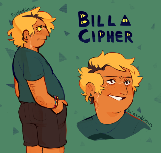
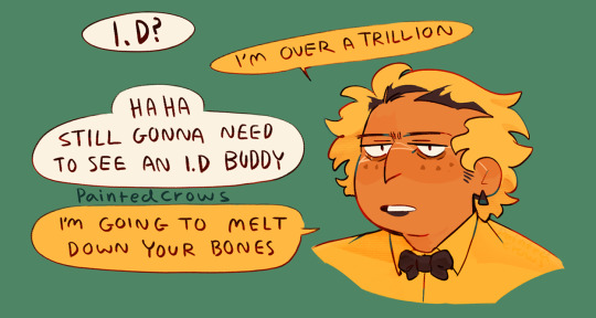
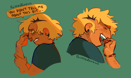
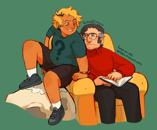
Human Bill! I wanna put him in a microwave
Bonus-ish: Really liked the flats on this one!
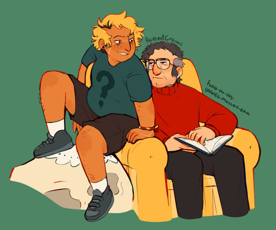
#In my mind he is like physically 30-35. The Axolotl (praise) just gave him terrible case of baby face#He only has the 2nd friendship braclet in the first one because it takes YEARS for Mabel to trust him enough to give him one#first is maybe from Ford and doubles as a location tracker. Not sure yet. And Bill gets a little Missy dialogue as a treat.#these were meant to be calm down doodling to take a break from some background heavy stuff I gotta finish. but then I got carried away#I love when Human Bill designs are fat. defo Inspired by 1spooky2me! I adore their bill. as well as MANY other beautiful designs ive seen#gravity falls#GF fanart#fan art#fanart#bill cipher#human bill cipher#human bill design#human!bill#human bill au#handyman bill ajacent I suppose#implied billford. But trust. Ford is making terrible decisions here#ford pines#stanford pines#grunkle ford#my art#artists on tumblr
922 notes
·
View notes
Note
hope you feel better soon!

I am riddled with ailments, but I stay silly!
#ask#non mdzs#My health journey has been: Hernia -> acid reflux -> Vocal pain due to aforementioned reflux -> chest infection.#I'm terrified to know what's about to hit me next. Please let it be something kind. PLEASE.#The consequence of living with linguists is that you'll wake up with a wacked up voice -#suddenly you're sitting you down in front of a program called something like Praat having your shimmer and jitter levels calibrated.#They gave me a GRBAS of 33012. I have a fun thing called a pitch break where a whole octave just does not exist.#My vocal pain was bad enough I ended up seeing a speech pathologist and that whole experience was super neat!#I learnt a lot about voice - to be honest I might make a little comic on it after some more research. Fascinating stuff.#For example; your mental perception of our voice modulates the muscles of the vocal folds and larynx.#meaning that when you do have changes (inflammation = more mass = lower frequency)#your brain automatically attempts to correct it to what it 'should sound like'. Leading to a lot more vocal strain and damage!#And it gets really interesting for trans voice care as well - because the mental perception of one's voice isn't based on an existing sampl#So a good chunk of trans voice training is also done with the idea of finding one's voice and retraining the brain to accept it. Neat!#Parkinsonial Voice also has this perception to musculature link! The perception is that they are talking at a loud/normal volume#but the actual voice is quite breathy and weak. So vocal training works on practicing putting more effort into the voice#and retraining the brain to accept the 'loud' voice as 'normal'.#Isn't the human body fascinating?#Anyhow; Now I have vocal exercises and strategies to reduce strain and promote healing.#Which is a lot better than my previous strategy of yelling AAAH in my car until my 'voice smoothed out'.#You can imagine the horror on the speech path's face. I am an informed creature now.#I'm my own little lab rat now. I love learning and researching. Welcome to my tag lab. Class is dismissed.#I'll be back later with a few more answered asks </3 despite everything I'm still going to work and I need the extra sleep.#Thank you for the well wishes! And if you read all of that info dump; thank you for that as well!
438 notes
·
View notes
Text
So this is gonna be a bit of a "hear me out" moment, but I posted this specifically during the episode "Moral Decay" (again, stay with me here). I'm sure I can point to other examples, and maybe I will someday, but for now I might as well point out what inspired me to say this.
If you haven't seen PPG in a while or don't know the show, "Moral Decay" is an episode with arguably some preeeeeetty bad character writing in the episode as a whole (especially for Buttercup, and that's another rant), but there are still things about it I do like.
What inspired this comment was the very beginning of the episode. You see, when you have a cast of multiple main characters, you want to make sure that they're very distinct from one another. After all, if three characters are sharing the spotlight and two of them are incredibly similar to one another, then This is something that Powerpuff Girls absolutely SHINES at, especially visually, but for the sake of this ramble, through the character writing.
Now how do you set characters apart from a writing perspective? You put them up against the same situation and see what they do and how they feel.
Which brings us to Moral Decay (which you can watch here, courtesy of CN uploading the episodes on YT)
The episode starts with the girls cleaning the house. And the first lines of dialogue set up the way everyone's reaction to this (a little bit of telling rather than showing, but between the pulpiness of PPG and the quicker pacing, it's forgivable)
Buttercup really doesn't like cleaning and is grumpy for most of it, Bubbles is doing the cleaning because she legitimately thinks it's fun, and Blossom is happy to get the work done, but very much has her eyes on the prize, since the Professor promised a surprise if they clean the house up. Blossom's motivations are even reinforced when they do bring the Professor up and Blossom drops like 80 hints.
I dunno, it was really simple and basic character writing, but it really did it for me (even if the rest of the episode didn't)
Man, Powerpuff Girls really has some of the best character writing
#i love breaking stuff down like this#like i did with the portal level#maybe ill do more of these later
222 notes
·
View notes
Text
why Aurora's art is genius
It's break for me, and I've been meaning to sit down and read the Aurora webcomic (https://comicaurora.com/, @comicaurora on Tumblr) for quite a bit. So I did that over the last few days.
And… y'know. I can't actually say "I should've read this earlier," because otherwise I would've been up at 2:30-3am when I had responsibilities in the morning and I couldn't have properly enjoyed it, but. Holy shit guys THIS COMIC.
I intended to just do a generalized "hello this is all the things I love about this story," and I wrote a paragraph or two about art style. …and then another. And another. And I realized I needed to actually reference things so I would stop being too vague. I was reading the comic on my tablet or phone, because I wanted to stay curled up in my chair, but I type at a big monitor and so I saw more details… aaaaaand it turned into its own giant-ass post.
SO. Enjoy a few thousand words of me nerding out about this insanely cool art style and how fucking gorgeous this comic is? (There are screenshots, I promise it isn't just a wall of text.) In my defense, I just spent two semesters in graphic design classes focusing on the Adobe Suite, so… I get to be a nerd about pretty things…???
All positive feedback btw! No downers here. <3
---
I cannot emphasize enough how much I love the beautiful, simple stylistic method of drawing characters and figures. It is absolutely stunning and effortless and utterly graceful—it is so hard to capture the sheer beauty and fluidity of the human form in such a fashion. Even a simple outline of a character feels dynamic! It's gorgeous!
Though I do have a love-hate relationship with this, because my artistic side looks at that lovely simplicity, goes "I CAN DO THAT!" and then I sit down and go to the paper and realize that no, in fact, I cannot do that yet, because that simplicity is born of a hell of a lot of practice and understanding of bodies and actually is really hard to do. It's a very developed style that only looks simple because the artist knows what they're doing. The human body is hard to pull off, and this comic does so beautifully and makes it look effortless.
Also: line weight line weight line weight. It's especially important in simplified shapes and figures like this, and hoo boy is it used excellently. It's especially apparent the newer the pages get—I love watching that improvement over time—but with simpler figures and lines, you get nice light lines to emphasize both smaller details, like in the draping of clothing and the curls of hair—which, hello, yes—and thicker lines to emphasize bigger and more important details and silhouettes. It's the sort of thing that's essential to most illustrations, but I wanted to make a note of it because it's so vital to this art style.
THE USE OF LAYER BLENDING MODES OH MY GODS. (...uhhh, apologies to the people who don't know what that means, it's a digital art program thing? This article explains it for beginners.)
Bear with me, I just finished my second Photoshop course, I spent months and months working on projects with this shit so I see the genius use of Screen and/or its siblings (of which there are many—if I say "Screen" here, assume I mean the entire umbrella of Screen blending modes and possibly Overlay) and go nuts, but seriously it's so clever and also fucking gorgeous:
Firstly: the use of screened-on sound effect words over an action? A "CRACK" written over a branch and then put on Screen in glowy green so that it's subtle enough that it doesn't disrupt the visual flow, but still sticks out enough to make itself heard? Little "scritches" that are transparent where they're laid on without outlines to emphasize the sound without disrupting the underlying image? FUCK YES. I haven't seen this done literally anywhere else—granted, I haven't read a massive amount of comics, but I've read enough—and it is so clever and I adore it. Examples:


Secondly: The beautiful lighting effects. The curling leaves, all the magic, the various glowing eyes, the fog, the way it's all so vividly colored but doesn't burn your eyeballs out—a balance that's way harder to achieve than you'd think—and the soft glows around them, eeeee it's so pretty so pretty SO PRETTY. Not sure if some of these are Outer/Inner Glow/Shadow layer effects or if it's entirely hand-drawn, but major kudos either way; I can see the beautiful use of blending modes and I SALUTE YOUR GENIUS.
I keep looking at some of this stuff and go "is that a layer effect or is it done by hand?" Because you can make some similar things with the Satin layer effect in Photoshop (I don't know if other programs have this? I'm gonna have to find out since I won't have access to PS for much longer ;-;) that resembles some of the swirly inner bits on some of the lit effects, but I'm not sure if it is that or not. Or you could mask over textures? There's... many ways to do it.
If done by hand: oh my gods the patience, how. If done with layer effects: really clever work that knows how to stop said effects from looking wonky, because ugh those things get temperamental. If done with a layer of texture that's been masked over: very, very good masking work. No matter the method, pretty shimmers and swirly bits inside the bigger pretty swirls!
Next: The way color contrast is used! I will never be over the glowy green-on-black Primordial Life vibes when Alinua gets dropped into that… unconscious space?? with Life, for example, and the sharp contrast of vines and crack and branches and leaves against pitch black is just visually stunning. The way the roots sink into the ground and the three-dimensional sensation of it is particularly badass here:

Friggin. How does this imply depth like that. HOW. IT'S SO FREAKING COOL.
A huge point here is also color language and use! Everybody has their own particular shade, generally matching their eyes, magic, and personality, and I adore how this is used to make it clear who's talking or who's doing an action. That was especially apparent to me with Dainix and Falst in the caves—their colors are both fairly warm, but quite distinct, and I love how this clarifies who's doing what in panels with a lot of action from both of them. There is a particular bit that stuck out to me, so I dug up the panels (see this page and the following one https://comicaurora.com/aurora/1-20-30/):

(Gods it looks even prettier now that I put it against a plain background. Also, appreciation to Falst for managing a bridal-carry midair, damn.)
The way that their colors MERGE here! And the immense attention to detail in doing so—Dainix is higher up than Falst is in the first panel, so Dainix's orange fades into Falst's orange at the base. The next panel has gold up top and orange on bottom; we can't really tell in that panel where each of them are, but that's carried over to the next panel—
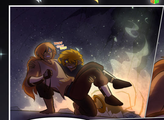
—where we now see that Falst's position is raised above Dainix's due to the way he's carrying him. (Points for continuity!) And, of course, we see the little "huffs" flowing from orange to yellow over their heads (where Dainix's head is higher than Falst's) to merge the sound of their breathing, which is absurdly clever because it emphasizes to the viewer how we hear two sets of huffing overlaying each other, not one. Absolutely brilliant.
(A few other notes of appreciation to that panel: beautiful glows around them, the sparks, the jagged silhouette of the spider legs, the lovely colors that have no right to make the area around a spider corpse that pretty, the excellent texturing on the cave walls plus perspective, the way Falst's movements imply Dainix's hefty weight, the natural posing of the characters, their on-point expressions that convey exactly how fuckin terrifying everything is right now, the slight glows to their eyes, and also they're just handsome boys <3)
Next up: Rain!!!! So well done! It's subtle enough that it never ever disrupts the impact of the focal point, but evident enough you can tell! And more importantly: THE MIST OFF THE CHARACTERS. Rain does this irl, it has that little vapor that comes off you and makes that little misty effect that plays with lighting, it's so cool-looking and here it's used to such pretty effect!
One of the panel captions says something about it blurring out all the injuries on the characters but like THAT AIN'T TOO BIG OF A PROBLEM when it gets across the environmental vibes, and also that'd be how it would look in real life too so like… outside viewer's angle is the same as the characters', mostly? my point is: that's the environment!!! that's the vibes, that's the feel! It gets it across and it does so in the most pretty way possible!
And another thing re: rain, the use of it to establish perspective, particularly in panels like this—

—where we can tell we're looking down at Tynan due to the perspective on the rain and where it's pointing. Excellent. (Also, kudos for looking down and emphasizing how Tynan's losing his advantage—lovely use of visual storytelling.)
Additionally, the misting here:
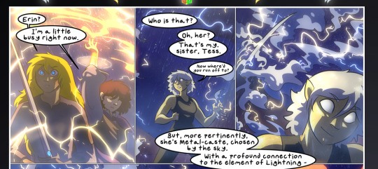
We see it most heavily in the leftmost panel, where it's quite foggy as you would expect in a rainstorm, especially in an environment with a lot of heat, but it's also lightly powdered on in the following two panels and tends to follow light sources, which makes complete sense given how light bounces off particles in the air.
A major point of strength in these too is a thorough understanding of lighting, like rim lighting, the various hues and shades, and an intricate understanding of how light bounces off surfaces even when they're in shadow (we'll see a faint glow in spots where characters are half in shadow, but that's how it would work in real life, because of how light bounces around).
Bringing some of these points together: the fluidity of the lines in magic, and the way simple glowing lines are used to emphasize motion and the magic itself, is deeply clever. I'm basically pulling at random from panels and there's definitely even better examples, but here's one (see this page https://comicaurora.com/aurora/1-16-33/):

First panel, listed in numbers because these build on each other:
The tension of the lines in Tess's magic here. This works on a couple levels: first, the way she's holding her fists, as if she's pulling a rope taut.
The way there's one primary line, emphasizing the rope feeling, accompanied by smaller ones.
The additional lines starbursting around her hands, to indicate the energy crackling in her hands and how she's doing a good bit more than just holding it. (That combined with the fists suggests some tension to the magic, too.) Also the variations in brightness, a feature you'll find in actual lightning. :D Additional kudos for how the lightning sparks and breaks off the metal of the sword.
A handful of miscellaneous notes on the second panel:
The reflection of the flames in Erin's typically dark blue eyes (which bears a remarkable resemblance to Dainix, incidentally—almost a thematic sort of parallel given Erin's using the same magic Dainix specializes in?)
The flowing of fabric in the wind and associated variation in the lineart
The way Erin's tattoos interact with the fire he's pulling to his hand
The way the rain overlays some of the fainter areas of fire (attention! to! detail! hell yeah!)
I could go on. I won't because this is a lot of writing already.
Third panel gets paragraphs, not bullets:
Erin's giant-ass "FWOOM" of fire there, and the way the outline of the word is puffy-edged and gradated to feel almost three-dimensional, plus once again using Screen or a variation on it so that the stars show up in the background. All this against that stunning plume of fire, which ripples and sparks so gorgeously, and the ending "om" of the onomatopoeia is emphasized incredibly brightly against that, adding to the punch of it and making the plume feel even brighter.
Also, once again, rain helping establish perspective, especially in how it's very angular in the left side of the panel and then slowly becomes more like a point to the right to indicate it's falling directly down on the viewer. Add in the bright, beautiful glow effects, fainter but no less important black lines beneath them to emphasize the sky and smoke and the like, and the stunningly beautiful lighting and gradated glows surrounding Erin plus the lightning jagging up at him from below, and you get one hell of an impactful panel right there. (And there is definitely more in there I could break down, this is just a lot already.)
And in general: The colors in this? Incredible. The blues and purples and oranges and golds compliment so well, and it's all so rich.
Like, seriously, just throughout the whole comic, the use of gradients, blending modes, color balance and hues, all the things, all the things, it makes for the most beautiful effects and glows and such a rich environment. There's a very distinct style to this comic in its simplified backgrounds (which I recognize are done partly because it's way easier and also backgrounds are so time-consuming dear gods but lemme say this) and vivid, smoothly drawn characters; the simplicity lets them come to the front and gives room for those beautiful, richly saturated focal points, letting the stylized designs of the magic and characters shine. The use of distinct silhouettes is insanely good. Honestly, complex backgrounds might run the risk of making everything too visually busy in this case. It's just, augh, so GORGEOUS.
Another bit, take a look at this page (https://comicaurora.com/aurora/1-15-28/):
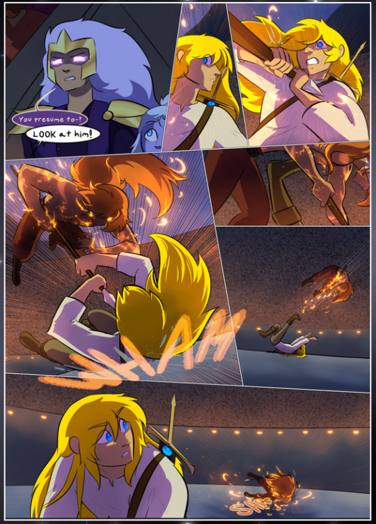
It's not quite as evident here as it is in the next page, but this one does some other fun things so I'm grabbing it. Points:
Once again, using different colors to represent different character actions. The "WHAM" of Kendal hitting the ground is caused by Dainix's force, so it's orange (and kudos for doubling the word over to add a shake effect). But we see blue layered underneath, which could be an environmental choice, but might also be because it's Kendal, whose color is blue.
And speaking off, take a look at the right-most panel on top, where Kendal grabs the spear: his motion is, again, illustrated in bright blue, versus the atmospheric screened-on orange lines that point toward him around the whole panel (I'm sure these have a name, I think they might be more of a manga thing though and the only experience I have in manga is reading a bit of Fullmetal Alchemist). Those lines emphasize the weight of the spear being shoved at him, and their color tells us Dainix is responsible for it.
One of my all-time favorite effects in this comic is the way cracks manifest across Dainix's body to represent when he starts to lose control; it is utterly gorgeous and wonderfully thematic. These are more evident in the page before and after this one, but you get a decent idea here. I love the way they glow softly, the way the fire juuuust flickers through at the start and then becomes more evident over time, and the cracks feel so realistic, like his skin is made of pottery. Additional points for how fire begins to creep into his hair.
A small detail that's generally consistent across the comic, but which I want to make note of here because you can see it pretty well: Kendal's eyes glow about the same as the jewel in his sword, mirroring his connection to said sword and calling back to how the jewel became Vash's eye temporarily and thus was once Kendal's eye. You can always see this connection (though there might be some spots where this also changes in a symbolic manner; I went through it quickly on the first time around, so I'll pay more attention when I inevitably reread this), where Kendal's always got that little shine of blue in his eyes the same as the jewel. It's a beautiful visual parallel that encourages the reader to subconsciously link them together, especially since the lines used to illustrate character movements typically mirror their eye color. It's an extension of Kendal.
Did I mention how ABSOLUTELY BEAUTIFUL the colors in this are?
Also, the mythological/legend-type scenes are illustrated in familiar style often used for that type of story, a simple and heavily symbolic two-dimensional cave-painting-like look. They are absolutely beautiful on many levels, employing simple, lovely gradients, slightly rougher and thicker lineart that is nonetheless smoothly beautiful, and working with clear silhouettes (a major strength of this art style, but also a strength in the comic overall). But in particular, I wanted to call attention to a particular thing (see this page https://comicaurora.com/aurora/1-12-4/):
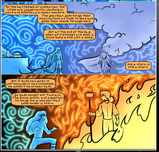
The flowing symbolic lineart surrounding each character. This is actually quite consistent across characters—see also Life's typical lines and how they curl:
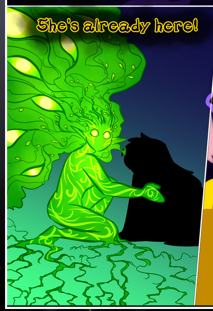
What's particularly interesting here is how these symbols are often similar, but not the same. Vash's lines are always smooth, clean curls, often playing off each other and echoing one another like ripples in a pond. You'd think they'd look too similar to Life's—but they don't. Life's curl like vines, and they remain connected; where one curve might echo another but exist entirely detached from each other in Vash's, Life's lines still remain wound together, because vines are continuous and don't float around. :P
Tahraim's are less continuous, often breaking up with significantly smaller bits and pieces floating around like—of course—sparks, and come to sharper points. These are also constants: we see the vines repeated over and over in Alinua's dreams of Life, and the echoing ripples of Vash are consistent wherever we encounter him. Kendal's dream of the ghost citizens of the city of Vash in the last few chapters is filled with these rippling, echoing patterns, to beautiful effect (https://comicaurora.com/aurora/1-20-14/):
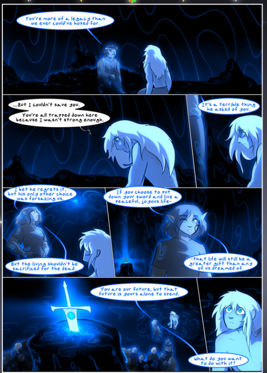
They ripple and spiral, often in long, sinuous curves, with smooth elegance. It reminds me a great deal of images of space and sine waves and the like. This establishes a definite feel to these different characters and their magic. And the thing is, that's not something that had to be done—the colors are good at emphasizing who's who. But it was done, and it adds a whole other dimension to the story. Whenever you're in a deity's domain, you know whose it is no matter the color.
Regarding that shape language, I wanted to make another note, too—Vash is sometimes described as chaotic and doing what he likes, which is interesting to me, because smooth, elegant curves and the color blue aren't generally associated with chaos. So while Vash might behave like that on the surface, I'm guessing he's got a lot more going on underneath; he's probably much more intentional in his actions than you'd think at a glance, and he is certainly quite caring with his city. The other thing is that this suits Kendal perfectly. He's a paragon character; he is kind, virtuous, and self-sacrificing, and often we see him aiming to calm others and keep them safe. Blue is such a good color for him. There is… probably more to this, but I'm not deep enough in yet to say.
And here's the thing: I'm only scratching the surface. There is so much more here I'm not covering (color palettes! outfits! character design! environment! the deities! so much more!) and a lot more I can't cover, because I don't have the experience; this is me as a hobbyist artist who happened to take a couple design classes because I wanted to. The art style to this comic is so clever and creative and beautiful, though, I just had to go off about it. <3
...brownie points for getting all the way down here? Have a cookie.
#aurora comic#aurora webcomic#comicaurora#art analysis#...I hope those are the right tags???#new fandom new tagging practices to learn ig#much thanks for something to read while I try to rest my wrists. carpal tunnel BAD. (ignore that I wrote this I've got braces ok it's fine)#anyway! I HAVE. MANY MORE THOUGHTS. ON THE STORY ITSELF. THIS LOVELY STORY#also a collection of reactions to a chunk of the comic before I hit the point where I was too busy reading to write anything down#idk how to format those tho#...yeet them into one post...???#eh I usually don't go off this much these days but this seems like a smaller tight-knit fandom so... might as well help build it?#and I have a little more time thanks to break so#oh yes also shoutout to my insanely awesome professor for teaching me all the technical stuff from this he is LOVELY#made an incredibly complex program into something comprehensible <3#synapse talks
786 notes
·
View notes
Text

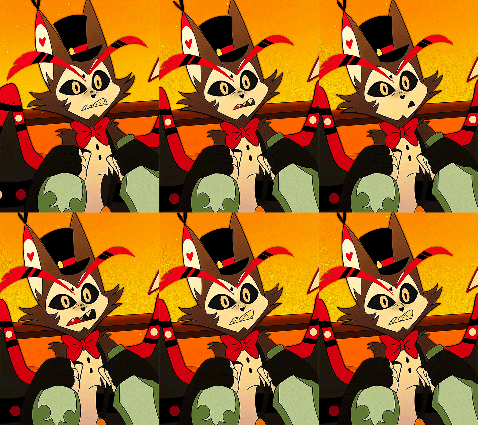

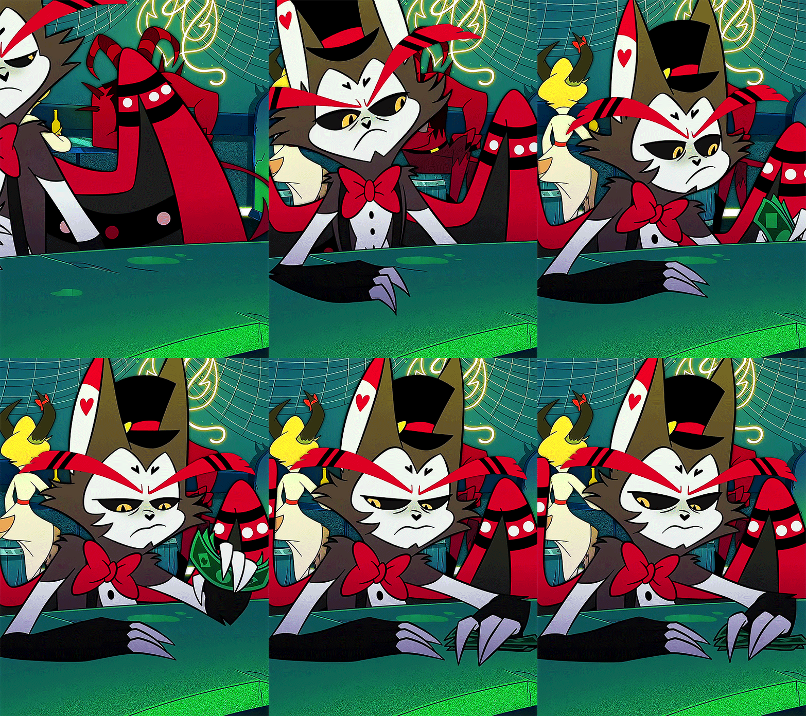


HUSK, Hotel Bartender & Concierge | 1x04 - Masquerade
"Oh, I FORGOT — you're the wise-old bartender who's seen it all! Get the fuck over yourself and pour me a real drink."
#hazbin hotel#husk#husk hazbin hotel#hazbin husk#hazbin hotel edit#masquerade#my gifs#character spotlight#Certified Redemption ☑︎#hello hi i'm in love with the kitty man like actually#he NEEDS more screentime in s2 in fact he needs his own episode#PLS PLS she confirmed that we're gonna get to know some (but not all) of the character's backstories in s2 PLEASE LET HUSK BE ONE OF THEM#I'LL ACTUALLY DIE THANK YOU#alright i'm coming back to these tags to point stuff out#first off - the fact that he closes his eyes and shakes his head and reaches up to hold his suspenders before offering actual help#physically hyping himself up to lend a hand even though his whole thing is having an empty shell of a heart - apparently.#AAAAAA#but ALSO#holding his suspenders - self soothing gesture possibly? he knows lending a hand could give way to vulnerability on his end regardless if h#even shares personal information about himself or not - at the BARE MINIMUM he is saying ''look. i care a little. okay?'' by even OFFERING#help to begin with. AND OTHER THING!!!!!!!#the fact that he himself bitched and moaned earlier that episode about how EVERYONNEEE likes to bitch to the bartender#and he talks about how he knows everything about everyone seemingly against his better wishes#it's all part of the job he's forced to do#so you could also look at him shaking his head as a way for him to literally ''shake off'' that attitude because again. HE CARES.#even if it's just a little.#then GODDDDD his reaction to angel breaking down. the way he softens. his ears go down. he looks to the ground.#his ''old crusty heart'' was actually touched - not in the happy way of course. it was pain. struck with sympathy and remorse.#LISTEN I LOVE THIS GOD DAMN CAT OKAY
395 notes
·
View notes
Text
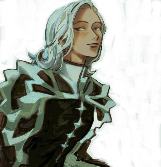
sry i dont know what 2 draw anymore T_T . elendira portrait #999
#trigun#trigun maximum#elendira#elendira the crimsonnail#my art#im sure u can see it but ive been so uninspired w art lately T_T#ive tried to remedy it by just looking and observing. breaking down other works that i want 2 take direction from#but i tjknk its like . just jamming ME UPPP#and now im tjinking Too much ab it and psyching myself out#help me sorry i blow up the tags on every drawing i post ab my art struggles😭😭#its like im whispering in here thouggh. just talking 2 myself and no one has 2 know except the ppl dealing w the same feelings#HAJAHA#anyways. i drew this just to say i finally drew smth agajn and im just going to be ok w it#like sure its not exciting but i like the colors and that shld be enough . OK !!!!#smth smth saw a post that talked ab how u get too in ur Head about this and then u dont share stuff and it becomes cyclical#and youll never get anywhere unless u just throw ur hands in the air and let it Be .#creating 4 the sake of creating . love and joy in sharing what we made and what we like#YAAAY#and bc i love elendira so much.. my go to girlie 4 art block#i need to draw her in fight scenes . i need 2 make art of her like sweaty and bloody yah . clenching my fist#maybe a livio fight scene bc i love it so much T_T
1K notes
·
View notes
Note
gojo would kill your work husband. but if he were the work husband, that's a different story
REAL!! he’s such a hypocrite because if someone mentioned you had a work husband, his entire world would stop and he wold devise the absolute worst plans to make sure that your co-worker, everyone at your job, and everyone in the next building over knew that he was happily committed to you
but if he is the work husband, he’s very........ dutiful in his role. there’s a loose office/lawyer au in my head where satoru is your secretary, and for all intents and purposes, your personal assistant, and he’s good at his job, but mostly because he considers his job to be pleasing you. he has coffee for you when you arrive, he moves your schedule around without you asking, he has answers to questions before you can even ask them, he has fresh flowers on your desk weekly, pokes into your meetings to pretend to hand you a file that’s really just maybe a single document in a manilla folder with candy on top of it—he’s made himself your business, your partner; he’s made himself irreplaceable, and he loves to remind everybody of that fact.
he’s also extremely loyal. sure, he could day a week’s worth of work done in about a day, but that doesn’t mean he’ll just use his talents for anybody. he’s your secretary, so he’s at your beck and call, and everyone knows it. they know he’s the best, but also that he’s off limits—not because you won’t share him, but because satoru won’t let himself be shared.
he also extends his duties beyond work, of course. when he hands you a print out of your schedule for the day and you’re confused by the three-hour block of time you have in the middle of the day, satoru just helps you shrug your coat of your shoulders and smiles, “that’s for the lunch date you have with me, of course!” hanging up your coat in your closet for you, “i’m paying, see you soon, sweets.” and because you’re great at your job, and satoru helps you be great, nobody really questions when the two of you have time for a 13-course tasting menu at 1pm on a tuesday afternoon. and if they did, all satoru would say that you two had a lovely date
#anonymous#he's like donna from suits but worse because he's like if harvey were donna LOL#i have soooooo much to say about him#he doesn't really Have to work he's a nepotism baby supreme#but he met you maybe in undergrad? and he's been obsessed w you since#he knows youre a workaholic so he's dutifully sat by your side all these years through college through grad/professional school#and when you told him you got to hire your own assistant he was the very first applicant#because getting paid to spend his days with you and take care of you? he was already doing that for free might as well make it official#everyone in the office knows satoru loves you except you honestly#he probably has his own masters/JD but elects to be your assistant anyway bc that's so much more fun#what he Really wants to be a househusband but first he's gotta ask you out and propose and all that good stuff (cue him rolling his eyes#and going on about formalities and boring systems and blah blah blah)#also in the office au in my head: nanami (also senior partner) higuruma ofc <3 beloved (managing partner) and TOJI!#WALK WITH ME!#its honestly probably satoru's influence that gets toji into law... as someone who so feverently broke it in the past#idk maybe there's a megumi situation that makes gojo be like yk if ur this good at skirting/breaking the law youd probably be half decent#at enforcing it... or at least helping other people get around it too#and so lawyer toji is born#does he screw around w the rich people who r stupid w their money? absolutely#but you nanami and higuruma just let it be bc he brings in those settlements better than anybody else....#hmmm... i kinda wanna make megumi somebody's associate but also..... yuuta.....#i think i just like sticking yuuta in a tie if im being real#but anyway... satoru is your Work Husband and everyone knows he wants to be your real husband#but they just let it slide bc rumour has it even tho hes just a secretary hes got equity in the firm?? and besides that his heart eyes give#away his hopeless devotion from a mile away#the day you actually start seeing somebody outside of work... oh theyre in for Trouble#satoru x reader#him dragging you out of ur office late at night and u protesting so he just. puts u over his shoulder#and ur telling him to let u down but he's insisting u go home and then nanami pops out of his office#and ur like wait nanami this isnt what it looks like but he's so dead in the eyes when he just sighs
309 notes
·
View notes
Text
Hi yes more unhinged penelope pleaseeee.
#epic the musical#Penelope#Post-canon my beloved#Penelope is beyond paranoid about walking around her own home#Penelope who has a break down when she goes to weave#Penelope you looses her goddamn mind if odysseus so much as steps out of the room without her#Penelope with shiny new (trustworthy) maids setting test after test because what if they're /not/#Penelope who sleeps with the door barricade and with a knife just in case#Penelope who lies and tricks just as much as odysseus does#And on the not angsty spectrum#Penelope who refuses to sit on any chair but her husband's lap ever again#Penelope who has not let go of odysseus's hand in 12 days and yes telemachus it is necessary#And in fact I'm going to glue our hands together odysseus if you asked Athena to melt our hands together#She would do it right? Right let's go ask right now yes I'm serious odysseus it's cool I'm into it#If you guys haven't read zarnzarn's stuff you absolutely should it's so so good and she writes penelope so well#Odypen#odysseus x penelope#Telemachus sitting there like :) I love my parents so much my dad is so cool :) but also. I don't really want to walk in on them making out#I just have a lot of feelings of penelope also need tender care and love and to be taken care of
48 notes
·
View notes
Text
not to step where i dont belong but why do i see shippers and saiki aroace truthers beefing all the time ... guys :( .. guys PLEASE .. WE CAN HAVE BOTH. I WANTS BOTH CAKES.
#as a saiki aroace truther myself its impossible to deny his relationship with Kokomi#like theres SOMETHING there#they are CLOSE#besties or dating guys its anyones guess#saiki to me is def aroace but that doesnt mean he isnt close with people. he loves his friends. sees them as family.#i just think his perception of romance is Different#this also goes for most other ships with him too#a lot of that stuff gets lost in our traditional views of romance tbh even though that complexity makes it so so interesting#idk i think his like. apathy. is so key to him#a core trait hes trained into himself thatll take time to break down. let himself be more emotional. in his own way.#i want that to be in my damn romance !!!#PLEASEE#anyways i lost the plot a little bit#guys we can have ships and aroace people !!#two cakes !! two cakes !!#will admit tho i havent finished the show yet cus ive been Scared. ik ill be devistated when i finish watching so im putting it off#for the record i am on season 2. in the middle of it#how he uses romance as a tool actually is kinda supporting this. he just doesnt view it as the same as others. THAT IS INTERESTING TO ME MA#I LOVE IT BRO#anyways snzzzz#saiki k#saiki no psi nan
56 notes
·
View notes
Text
I actually really want Eugene to officiate the Varigo wedding because one, it’s not a very official or proper wedding. If anything, it’s something Rapunzel and Varian put together in one week and is essentially just a giant party where they blow stuff up and eat cake. Varian totally asks Eugene thirty minutes beforehand if he will officiate and after five minutes of sobbing, he agrees.
And two, because I want him to say this line-
“It has been a joy to watch your distracting childish rivalry turn into a distracting childish courtship, which will undoubtedly turn into a distracting childish marriage.”
#B99 mixed with tangled has so much potential#I can absolutely see Varian wanting a wedding but not wanting to put a ton of effort into it so he enlists Rapunzel’s help#Hugo doesn’t really care (secretly he loves it)#Ruddiger and Olivia are the ring bearers#Lance is in charge of all the food preparation#Eugene is on keeping everyone sane duty (he’s also everyone’s right hand man during prep and he’s also weirdly particular ab the decor)#and Raps is in charge of pretty much everything else#Her baby brothers wedding has to go absolutely perfectly#Okay now I need content about Rapunzel stressing herself out for a few days because Varian only gave her like a week to prepare#And she needs everything to be perfect because she loves him so much and he’s done so much for her#And he worked so hard on her wedding#And so much little stuff goes wrong and she breaks down and Varian is just like#“Raps it’s perfect thank you”#🥹🥹🥹#And the rest of the week is enjoyable and fun now that she knows that Varian will love whatever she does#and that he put her in charge for a reason#Oh my gosh the mother-son dance Hugo dances with Donella and Varian dances with Rapunzel wah#And the father son ofc Varian dances with Quirin but fuck it Eugene and Hugo dance#And then they swap#Found family my beloved#tts#tangled the series#rapunzel's tangled adventure#varian#eugene fitzherbert#rapunzel#hugo vat7k#hugo rottewange#team awesome#varigo
137 notes
·
View notes
Text
LBH / SJ as parallels makes me crazy bc on one hand there's the themes of personal responsibility and the hard work necessary for taking agency for your choices and them being what shapes the kind of life that is reachable but on the other SJ was literally replaceable by the narrative and even when he did sporadically try to be Good it always blew up on him / never knew anything else and so was unable to be anything else.
VS LBH was not / protagonist halo / literal bloodline superiority / did at least know love which is what made him able to transcend the world by knowing the abuse he faced was something wrong and not something natural. Anyway
#like on one hand yes... but also the only forever doomed guys being qijiu its like man ok the systemic issues were never addressed huh...#love saves all except it is only freely available to those deemed already worthy. or smth idk#mine#shen jiu#like on one hand hes a bitch and the meow meowification can be kind of much. but also man.#also like i know demons exist as another metaphor for outsiders / those abandoned by mainstream society but the whole OOP game breaking#inherited power bloodline stuff is just always a trope i think is boring like sorry i can never get into characters like that#sj important to the plot as a villain to the pt heavenly intervention had to come down and fill him in with some other guy when he died#his role was important shen qingqiu was important the scum villain was important. but not him lol
31 notes
·
View notes
Text
there is a lot of “soap's happy attitude is a mask he hides behind” or interpretations where he is still kinda naive and hasn’t become jaded by the world yet.
personally tho (and this can work with him hiding a lot of pain) i like to think he chose his happiness and attitude. there is no way price would have recruited a wide-eyed soldier for the 141, he needs people who know their shit and innocence can get you killed fast with their job.
no soap is fully aware of the realities of his occupation, not as jaded as ghost is for sure, but he knows whats up.
he also might carry a shit ton of pain with him, hell the way i hc him he’s gay and in the army which alone is trying to say the least, he’s probably from a catholic background (as he’s from Glasgow) which also generally means a “fun” time growing up as a gay person.
so soap seeing the world around him as it is, and still choosing not to become spiteful, instead doing what he thinks is best and to be kind, positive and loyal despite all that he sees, experienced and grew up with is such a powerful move on his part.
it’s absolutely the kind of attitude a man would need to approach the ghost with a smile and bump to the shoulder committed to “get a win”
it’s exactly the kind of man that could break ghost out of his shell too.
#i love this hc bc it makes it even more heart-wrenching when he does break down#like this is a strong af man but right now even he can't see a silver lining#deliciious stuff#johnny soap mactavish#simon ghost riley#captain john price#ghostsoap#soapghost#cod mwii#cod hc
607 notes
·
View notes
Text
hey folks, things haven’t been going very smoothly around here so i’m gonna be on tumblr hiatus until I finish the yunwoosan oneshot; at that point i’ll take stock of the situation and see where i go from there
#igby’s chatter#dw even if i decide to fully step back from tumblr then i’ll still drop a link to the fic on ao3 here#i’d like to keep using this webbed hellsite but idk i gotta figure some stuff out#it’s just kinda undeniable by now that my energy levels & general mental/physical health are easier to manage when i’m on a tumblr break#and i love this place & the ppl here so i don’t wanna let go of it but i can’t keep throwing myself against a wall either#idk i just gotta test out what happens if i take a longer break; see if the ups-and-downs stabilise a bit
20 notes
·
View notes
Text


Dave and Johnny, would have postes Charles but I didnt get to finish and was debating if posting or not posting bc of that reason qkdjqksns. For some reason i couldnt manage drawing a cute smiling Dave and instead had to like "He's been trapped inside this small pot inside this ship, alone, for who knows how long. He's not okay" and yeah, things happen
Bonus: Burt is not a danger! In my eyes he did help Dave, and not all toppats are bad people, i just found him like the one who tried to take care of Dave, and tried to free him because he knew that was torture, to have a man imprisoned, with no human(stick?) contact, [consider this mostly as a friendship art than ship art, bc of some context I dont feel brave enough to sharexdd]

And

#i fucking love drawing different eye types for each design#okey thats it#i drew these hours ago i juwt had to take a break bc i was playing a lot with how to design Charles#anyways#ITS NOT SHIP ART!!#i think i'll just make a sideblog or whenever my anxiety is down i'll explain it#like I've been cooking stuff that involves Dave Johnny Rupert and Burt#bc yeah but too shy share#and bc friends know me as the angst lord#and boi do i love mixing up angst + romance#like fuck yeah#Rupert wears small heels to feel taller nobody changes my mind#thsc#thsc fanart#dave panpa#johnny panzer#the henry stickmin collection#thsc burt curtis#rupert price
40 notes
·
View notes
Text
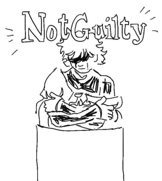
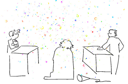
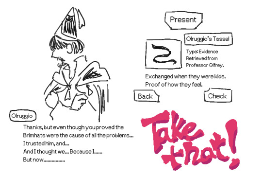
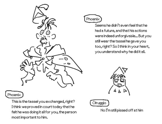
when an obsessed orufrey person plays ace attorney for the first time in a while
#witch hat tag#orufrey#you know those times when the defendant is still in shambles at the end of a case because it was not a clear-cut thing#but you get to present one Special Sentimental piece of evidence that proves not all is lost#qifrey's breakdown would be like... he turns up calm and pleasant like dahlia kristoph gant etc but very quickly:#well first he's hiding his scar so you have to use the bracelet and also you find out about the seal on his hat using that.#eventually he is throwing water that comes out of nowhere like that coffee prosecutor guy. and his cape starts billowing#the more he breaks down his neck thingies start coming undone btw. To represent his descent into guilt and his LIES becoming undone.#course as the player i have already used my magatama and seen his 35894 psychelocks. but theyre those BLACK psychelocks#representing his repressed memories taken by the brimhats. also his glasses shatter out of nowhere when you keep presenting evidence#and tartah's testimony etc. and the player is like UHH this guy is A PUPPET MASTER but coco's heartfelt testimony commands the tone#and of course he's someone who has been twisted and damaged by trauma like adrian andrews. the mastermind is of course the brimhats#only me with my magatama knows that... only i can do it. It has to be me.....#just like how as the reader i can see everything about qifrey and i can hold him dear as much as i judge him#whereas if i were oru things would not be ok unless memories can be restored and mentally ill decisions can be illuminated#WELL ANYWAY !!!!! what i appreciate about ace attorney is its ability to mix silliness with seriousness#i cant usually make jokes about serious heavy heartbreaking stuff in witch hat because it is all very intense emotions for me#but i appreciate ace attorney's mix of sincerity and psychological pain and the inherent silliness to being a character in a situation#so.....Get Iguin on the stand. Now. BAILIFF.. TAKE OFF THE MASK#i would most love to be able to prove qifrey's eyesight is failing. hed be like I have no reason to pursue the brimhats (smiles pleasantly)#and it would be like You're lowering your gaze.. proof that the court lighting is too harsh for you..!#his glasses would crack at that moment btw. I used apollo's bracelet and saw the glyphs on the glass.#I know all about u. and i will save u
129 notes
·
View notes
Text

I don't believe liking immoral and downright evil characters says anything about you as a person, but I think acting like this definitely does.
"The HH fanbase will defend Valentinoto the moon and back" this and "Val is praised by a majority of the fandom" that, except said majority of the fandom fucking HATES that moth and fans have been harassed, had their art scribbled on to "fix" it, repeatedly called "rapist apologists" and "abuse romanticisers", get questioned or accused about condoning him irl, received graphic death/rape threats and are in general mistreated by the fandom. A Val cosplayer was mistreated and had a gun pulled on them IN REAL LIFE not even a year ago. Even the VA got repeatedly asked or assumed to be like the character he plays because "why else would he want to voice a rapist??" and told they deserve for choosing that role (fucking WILD btw). People that like Valentino as a character are the minority of the fandom, and even there NO ONE defends him. We all realise he's a disgusting individual whose actions shouldn't be defended in any capacity. What kinda bullshit lie is that?
I'm also in the Mouthwashing fandom, and it too has a bunch of issues. Infantilising Curly and minimising his actions, making Swansea to be better than he actually is and ignoring that he knew of the SA, people still debating or not realising that Jimmy raped Anya in the first place, shipping Jimmy and Curly (which isn't even a bad thing or a real problem but this person would see it that way), ect. But sure, conveniently don't bring that up. Anything for the Hazbin Hotel hate, right 💀


These next comments especially piss me off (nevermind how they're talking about an abuse survivor which is gross already). This might be a hot take and I don't care if that's the case, but I think people refusing to call Jimmy by name and excluding him from the cast is not show of a "good" fandom, actually. Jimmy has a lot more to him besides being a rapist. Rape culture, toxic masculinity, capitalistic exploitation, misogyny, male dominance-- there's sooo much more to explore and discuss about his character besides him being a rapist. And he's an incredibly disturbing character in a fucking horror game. If you can only refer to him by some stupid nickname (which takes away the seriousness of his character imo), ignore the significance of his role and themes in the story and the rest of his character and reduce him to a single trait that's BAD. That's not a good thing, and in fact, probably makes you worse than the people that do like his character because they can at least separate fiction and reality and not scrap well written disturbing characters for the sake of "comfort" or moral standing (again, in a horror game of all things). People shouldn't feel bad for liking Jimmy because he's a very good character, and ignoring that completely and acting like there aren't people who could like him... kinda sucks?
Moving over, Valentino is not and has NEVER been portrayed in a positive light in the show. I can't wrap my head around people that genuinely think that. Whenever I hear people say that the arguments I always see are "he shouldn't be attractive" and "he's just a cartoon villain" and "he acts silly and quirky even tho he's a rapist" among other things, and I don't think these people realise they're spouting eugenics bullshit and demonstrating that they don't know anything about his character simultaneously. No, Valentino isn't a "positive" portrayal of a rapist because he's attractive (way to tie morality to appearance btw). No, Valentino isn't a positive portrayal of a rapist because he acts goofy and funny and silly. Those traits are intentional and important to his character. Val is the Overlord of lust and depravity, hell's most famous pimp. His beauty is how he lures in unsuspecting sinners, and his personality is how he gains their trust and gets them to sell their souls for him to exploit (notice how Angel signed his soul away willingly). He's supposed to be appealing. He's supposed to be charming. He's entire persona is meant to be disarming. If he were like Jimmy or just a one-note unlikeable guy, his position in the show and his relationships with the characters wouldn't make sense, so he isn't. That doesn't make him a more positive portrayal or anything, it just means he's more fleshed out and written more complex than you want him to be. He's a very real depiction of an abuser, of their two-faced nature and how being attractive and charming to others doesn't make you less of an abusive monster to someone else. For context, I have been abused by someone extremely similar to Val, so his depiction feels very real to me and it's extremely tiring seeing a bunch of assholes who have probably not even seen the show or have been abused act like he's "romanticised" or "unrealistic" or "bad" simply because he was written by Vivziepop (who's ALSO an SA survivor like what is wrong with you 💀).
This is a broader point and not entirely related to this specific case, but we don't give people shit like this over people liking murderers and serial killers-- acting like all a sudden liking a rapist character says something negative about their writing or about the people that like them is INCREDIBLY stupid. People don't talk like this about Alastor and Vox-- who are both VERY despicable people. Both of them are also abusers among other horrible things, but they're not (or at least Alastor isn't) rapists so they're "not as bad". This is a sentiment I see all the time in both the fandom and hatedom whenever Valentino discourse comes back up, and this line of logic that rapists are a unique evil that can't be liked as characters in fiction but murderers and cannibals and serial killers are totally Ok is so dangerous and backwards. Liking evil characters says nothing about you as a person aside from the fact that you're a freak in the fun way. Liking evil characters but then going after others who do as well because you consider their character "too evil" and watering down the crimes of yours to justify liking them says a lot about you tho. Saying that the characters you like says something negative you in general does too.
We seriously need to stop bringing morality into fiction and saying that "normal" people wouldn't like certain immoral characters. We need to stop ostracising people for their "problematic" ships, proudly brag about ostracising them and justify it by calling them "weirdos". We need to stop saying villains are "badly written" because they're not written how YOU want them to be written, regardless of whether or not that opinion is valid (which in this case it isn't). We need to stop putting fandoms in some weird competition with each other about how characters are written and spit on people who actually enjoy them, are comforted by them or felt seen by them (gestures at the whole Angel dust situation barely a week ago). And honestly we need to stop giving attention to people like this, who spread a false narrative and kick others down for being fans of a media they don't like or know squat about for whatever reason. Who spread lies about the media or fandom in question in way that's blatantly in bad faith.
This crappy post is sitting a 17k while I'm typing this. The way people can just say ANYTHING about Hazbin Hotel and its fandom-- doesn't matter if it's valid or true or if they watched the show or know anything about the fandom at all, it just has to be negative-- and others will eat it up no questions asked needs to be studied at this point. We saw that in the months the show first aired. We saw that with the Angel Dust video. We're seeing this again here. I don't think we should be harassing anybody over fiction and in general (and needless to say don't harass any of these people) but calling out bad actors who pull shit like this more often and making it uncool to shittalk Hazbin Hotel and its fandom (and any fandom from unapologetically dark media where the people deal with enough bullshit already) for no reason and in bad faith is a change I'd be down with. Like, wash your mouth of its name and disappear into the shadow realm, goddamnit.
#hazbin hotel#mouthwashing#hazbin hotel valentino#jimmy mouthwashing#hazbin hotel angel dust#fandom discourse#fandom discussion#head in my fucking hands#on that note this is the straw that breaks the camel's back for me i'm going private and then on a blocking spree again#i'm so sick of seeing these people whenever their posts blow up like go away and stay gone#“hh fans defend val” “angel dust is bad rep” “the rape is just a fetish” shut the FUCK up oh my god just shut up all of you 💀#i'm so sick and tired of seeing that all the time if you can't fucking read for shit then say so stop making stuff up#i'm sorry for being so harsh kinda but i've seen 1000 too many people repeating that stupid drivel#what upsets me even more is that almost every val fan i've encountered is an abuse survivor themselves and they already treated so horribly#so seeing people who aren't even in the fandom lie that they “defend” his actions and making it easier to be shitty to them is... uggggghhh#ugh it's so gross and i hate how people just agree with them because it's hazbin hotel specifically like uugghh#i woke up to this my page and my tired ass felt petty enough to write this down as a response cuz actually fuck that noise#especially seeing the comments on that post like god i know i should love my neighbour but said neighbours are making it so difficult#does any of this even make sense i wrote this on the fly without planning it beforehand#whatever i'm really tired so pardon any grammar mistake i'll get them later maybe#momento rambles
16 notes
·
View notes