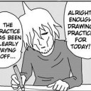
#i like the layout concept though thats nice
Explore tagged Tumblr posts
Visit Tumblr Blog
Explore Tumblr blogs with no restrictions, modern design and the best experience.
Last Seen Tumblr Blogs


Fun Fact
Total funding amounts to $125.3M.
Text

I will likely never get to do anything with her
#the band ghost#nameless ghoul oc#i mostly wanted practice making a character sheet ish thingy#and by god i got that#had to work hard for her colors which is not usually a problem for me#and the silhouette flip like if your character doesnt have a tail then bam its done and no one will notice the small problems#but it doesnt work with a tail if you want perspective i had to redraw/move her tail around to make it look right so. learned that very much#i like the layout concept though thats nice#i have a whole backstory for her. she was part of a group summon and it all went fine except that one person was missing and they ended up#with a statue. she was too terrified to talk to anyone so she got left there and after it sounded empty she reverted and found some place to#hide in the gardens. so she lives there now. and ruins a lot of socks. and helps with the plants not that anyone knows that. and panics and#turns to stone if anyone walks by. so everyone does realize theres a moving shifting statue in the abbey but no one is sure what to do about#that. doesnt speak much if at all. doesnt steal a new shirt bc people notice if those go missing unlike socks. has anxiety bitch face also#yeah. and like. i dont know what a fandom is and i certainly dont know what a music is and thats why ill likely not do anything with her#which kinda sucks. but i still made her a character sheet cause she wont leave me alone. and for the practice#cause if i think about doing a sheet for story ocs i get all perfectionist and it doesnt happen#the luck thing is that she kinda thinks being summoned was a curse#im gonna shut up now
7 notes
·
View notes
Note
How do you go about designing the interiors/layout the backgrounds for your comics? They’re very intricate and stunning to look at! Do you make concept art? Use in-game or comic structures?
I’m especially impressed with the look of that Stardust Speedway space bar in TDSO, what was the creative process behind that one?
Hey, thanks! I've been trying to work on backgrounds more recently so thats super nice to here! I'll ramble a little bit and try explaining how I do it (apologies for the long post I'll hide it under a read more!)
Landscapes or outdoorsie areas I usually just freehand, but anything with buildings I use grids and stuff. I love interior design games or anything that lets you decorate so I've plenty practice just setting up scenes from that, but I use references and usually do a floorplan while thumbnailing so I can sort of play set designer. For individual pieces I try to draw from scratch or have really basic room grids set up, since I wont have to draw the same background like 20 times I can spend more time on it.
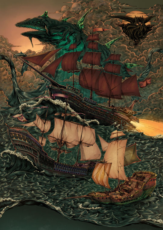
Heres the concept art I did for my big pirate drawing I did a while back, for this I did all of that background work from scratch. I used a ton of references and then just planned it all out by developing thumbnails and smoothing it out.
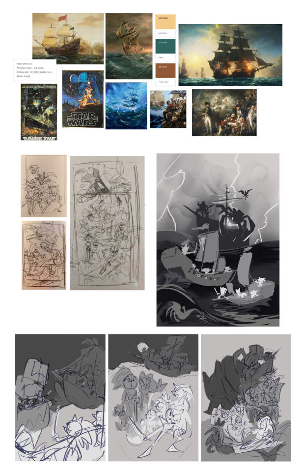
For comics though, to keep myself sane I've started using the sims 4 game to like create rooms and I pose them around and screenshot stuff, I usually use stand-in objects then draw over them to match the comic background. For the Stardust space bar I looked up the references from Sonic X as that's where it's from, and basically just re-created the shape of the building to use as a base - the bar was already designed so I'm just figuring out the proportions really.
Heres some pics of my notes and a screenshot I've used for TDSO to show u how I do that too! I do all my planning on paper then just use the sims to re-create what I've drawn in 3d!


The sims 4 base game is free to download so it's def super useful for cheesing it quickly for comics, but if ur looking for more specifics to properly learn perspective I highly recommend Understanding Comics by Scott McCloud (I think that's the one I'm thinking of lmao) it has a ton of good comic tips but the perspective section has helped me massively while I've been figuring this all out!
#ask#oriontag#this was so long im sorry but I realised I've never gotten to share these notes before! exciting haha
31 notes
·
View notes
Photo
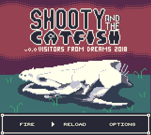


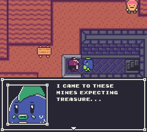

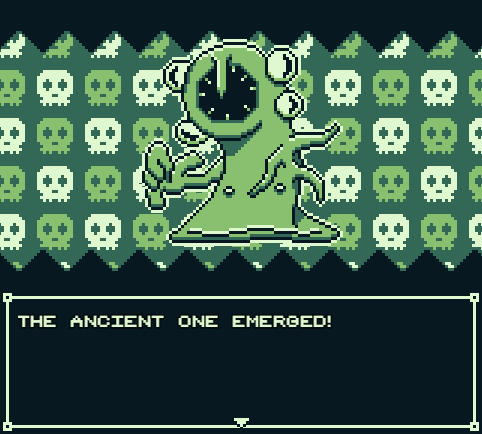
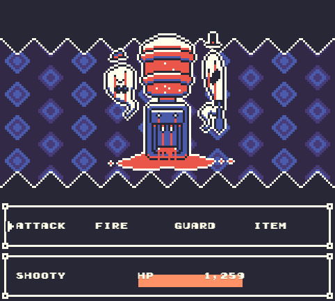
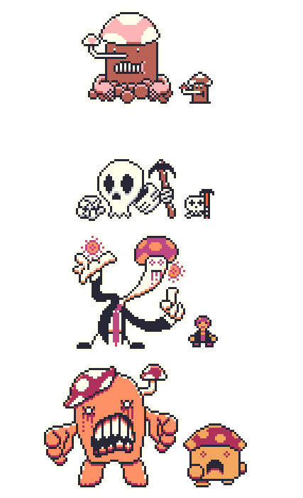
November’s Featured Game: Shooty and the Catfish
DEVELOPER(S): Daniel ENGINE: RPGMaker MV GENRE: Adventure, RPG WARNINGS: Course Language, Gore SUMMARY: Shooty and the Zaat are a dynamic duo solving monstrous mysteries!
Play the demo here!
Our Interview With The Dev Team Below The Cut!
Introduce yourself! Sure! So my name is Daniel, I guess technically I am an animator. I started out making flash cartoons around 2000 just for fun and became a professional animator in the advertising space around 2007. I have been working in media ever since, both in studios and as a contractor working under the Visitors From Dreams label which is also the label I use for my game development. I started dabbling with RPG Maker in around 2002 but I never got very far. Once I got into the media industry I wanted to pick it up again but with Mac being what almost all my work was done on, at home and in studio I didnt get the chance to actually get into it properly again until MV released, infact I was so excited that I purchased MV the day it dropped and immediately begun development on my first title Flatwoods. Ironically Shooty and the Catfish was developed on a PC, but I digress.
What is your project about? What inspired you to create your game initially? *Daniel: Shooty and the Catfish is set up pretty simply. The 2 lead characters, Shooty and Zaat run a sort of monster investigation unit out of their home. They get calls to different desitinations to deal with different monster problems. I really wanted it to feel like it was set up in a similar way to a lot of cartoons from the 80s, where every episode had a pretty similar but still managed to feel like a little self contained adventure. I have thrown in some little elements of an larger narrative but they are light until the final episode. Originally the series was pitched to Frederator for Cartoon Hangover, it got a little ways into early development but then Youtube changed its algorythm and animation on the platform became a struggle and the project was dropped. I didnt want to waste all the work I had done on the concepts and so I eventually tried to find a way to work them into a game, its taken me quite a few years to get as far as I have with development, but I would be even further back if I had tried to animate it all alone. I created Flatwoods to try and get a small project out, you know, to get some experience with the engine, little did I know how much more I had to learn!
How long have you been working on your project? *Daniel: I pitched Shooty and the Catfish back in 2013 from memory, but it didn't start to take shape as the project you currently see until the last 12 months. In that sense I am incredibly happy with how quickly the game has come together.
Did any other games or media influence aspects of your project? *Daniel: So many things have influenced my work its not funny... Where do I even start? Shooty and Zaat have a bit of a Finn and Jake thing going since when the project was originally pitched to Frederator and thats what they were looking for at the time. Resident Evil 4 (the closest any game has ever come to perfection imo) was the inspiration for the games ammo based combat system. Demons Souls originally derailed the project when I tried to emulate its non linear hub based design (you will notice the demo takes place on a single island instead), that created all kinds of balancing issues though so thats all been stripped back and is what lead to the decision to make the game episodic instead. One element from Demons Souls that remains in the game is a diverse mix of linear and looping level designs when it comes to mapping. The game also features towns that have layouts based on unused maps from the Pokemon GS 97 Spaceworld demo since they never made it into any of the actual games in the series. Pokemon GS also influenced the games visuals. I'm not a big RPG guy, but I played a hell of a lot of Pokemon growing up and Gen 2 is still my favorite. Trying to get MV to emulate the limitations of the Game Boy Color was quite the hurdle, I still cant believe I got it working as well as it is. I also have a lot of cameos from other peoples RPGM games, so there's that. Its a big ol' mixing pot of ideas and inspirations.
Have you come across any challenges during development? How have you overcome or worked around them? *Daniel: Countless, the biggest challenge is always scope though. I originally wanted the game to be like 3 hours long tops, now its well in excess of that and that's before I have even put in meaningful NPC interactions. That's why I have decided to break the game up into episodes, each one should be around an hour which is much more my jam. I don't have a lot of free time so I tend to gravitate towards games that are tight and short, I think that's why I am so determined to keep this game in nice manageable chunks. Now that the game is shorter I don't need levelling so I am starting to tone down the RPG elements. One change always leads to another, but episode one is getting damn close to completion. I say this before I have even had the chance to announce the game's going to be episode on my own blog, ha ha. Episode 1 January, The Great Spore Chore! Keep your eyes out for it!
Have any aspects of your project changed over time? How does your current project differ from your initial concept? *Daniel: As mentioned above a lot has changed, I feel the biggest change was when I tried to move the game from being episodic into one adventure after playing through a bunch of other RPGM games for ideas, it all started to feel a bit aimless and the storytelling techniques I had planned when it was episodic weren't translating well as the game progressed. So I guess now the game is episodic again we have come full circle! So many ideas seemed good on paper but ended up not really being fun or adding anything in practice. Oh yeah, and the transition from Game Boy green to color was a big one based on feedback from the demo. Some people were finding it hard to tell what elements were interactable, doors in particular, I hope that color has helped minimize that issue. Key items will also have an animation on them so they are hard to miss. I'm not a fan of hunting for items in big maps, it's certainly not something I want to subject people too in my own projects.
What was your team like at the beginning? How did people join the team? If you don’t have a team, do you wish you had one or do you prefer working alone? *Daniel: This project has had a few key people involved. Outside of myself I have worked with 2 musicians. One is an old school friend who did music for my animations back in the early 2000's. He has contributed a bunch of really cool EDM which makes up most of the games OST. On top of that there is also a number of optional bosses (one per episode) that have music composed by Secret Agent Ape who worked on Soma Spirits and a bunch of other upcoming games. I have been really lucky to get to work with such rad dudes.
What is the best part of developing the game? *Daniel: I love designing enemy battlers, my process usually involves me drawing a weird shape, sticking some eyes and a big goofy nose on it and trying to come up with a stupid pun to use for a name while listening to bands like Yes or Klaatu. It's bliss. I have a lot of people ask me why I have limited myself in terms of resolution and color palette, and it comes down to one of the important things I told myself when I got into game making as a hobby was that I would stop if it ever started to feel like work. I spend my days doing heavy visual effects and compositing, sometimes doing complex character animation. I want to keep that stuff as far away from my game development as possible. Ironically working within the incredibly restrictive limitations of the Game Boy has ended up being incredibly liberating and keeps things feeling fun as opposed to feeling like more of what I do all day to pay the bills.

Do you find yourself playing other RPG Maker games to see what you can do with the engine, or do you prefer to do your own thing? *Daniel: I always enjoy checking out demo's of upcoming games. Both Heartbeat and Virgo and the Zodiac's demos blew me away from a technical standpoint on the MV front. I still find it hard to believe those demos were made with the same engine I'm using. I guess it really shows what can be done when the engine is in capable hands. I wish I had more time to play actual full releases, I mean Jimmy and the Pulsating Mass just came out and I have no idea when, if ever I will have the free time to play it because its such a commitment. I feel like I am missing out on some great stuff.
Which character in your game do you relate to the most and why? (Alternatively: Who is your favorite character and why?) *Daniel: I guess I relate to different characters in different ways. Slim Grim is the one who hands out assignments to Shooty and Zaat, he is pretty much done with life, over people and the world itself, I think thats something we all have a bit of inside of us. Shooty is a very positive individual, his solutions to most problems is a bullet with a smile, and I think theres a bit of that in all of us as well. Zaats a bit of a cheeky smart arse, so I guess in a lot of ways I am most like her as a person. One of the episodes also features Gerkinman who is and has been a sort of self insert in my work since 2001 so I guess technically I relate to him most... ha ha, but thats cheating!

Looking back now, is there anything that regret/wish you had done differently? *Daniel: I wish I had done a better job keeping the project focused. I feel like a good few months were spent making the game bigger in ways it didnt need to be.
Once you finish your project, do you plan to explore the game’s universe and characters further in subsequent projects, or leave it as-is? *Daniel: All of my games are loosely connected, taking place in the same world. None of them tie directly into each other, im not big on the cinematic universe concept that seems so popular right now, but events in my previous 2 releases and the 5 planned episodes of Shooty and the Catfish are loosely connected in ways people who take the time to look can find. They are also tied into around 17 years worth of animated shorts I have released. I have no plans on stopping now!
What do you look most forward to upon/after release? *Daniel: Well, theres quite a few things... Mapping for all 5 episodes (outside of towns) is complete, so when Episode 1 is done I will be immediately rolling into Episode 2. I am aiming to have an episode out every 2 months which should be doable with so much of the game already finished. I also have a couple of short films I am looking forward to being able to invest some time into, things have slowed down in recent months due to freelance but I am eager to get to animate some of my own work again. I am also eager to see the comments sections on Lets Plays. Both Flatwoods and Hazmat got a bit of Lets Play action and a couple of those have some pretty substantial comment sections. The amount of theories people try to put together for these projects is staggering. I could never write something as entertaining as what the speculations in these comment sections contain in terms of what my games mean, it cracks me up and I find it quite flattering that random people have put more thought into elements of my stories then I have. Makes me want to keep things deliberately vague just to encourage more of it. Lastly I will be releasing all the build files for the project so if anyone wants to make fangames or whatever they have direct access to all of the core files used to build the games. Im a big fan of the concept of a mod community, and while RPGM doesnt exactly allow for that, id love to see people do similar things to my work as whats been done with a lot of LISA fan games.

Is there something you’re afraid of concerning the development or the release of your game? *Daniel: I don't know about being afraid exactly. I am curious about how my business model for the episodic releases will go over. I was planning on releasing them at $1 an episode and $4 for the bundle when it's all complete. I know some people think thats still charging too much, but some people have also told me im not charging enough and that it lowers price standards accross the board for RPGM content. The way I see it if I can cover the costs of Steam and the music I commissioned then I've done alright since this project was for fun, but that's just me.
Do you have any advice for upcoming devs? *Daniel: Just keep at it and set yourself small goals. If your working on a big project break it up into manageable sections. Take things one map at a time, ya know what I mean?
Question from last month's featured dev @overcast-rpg: If you could choose an RPG Maker gamedev to release another game; which one would you choose and why? *Daniel: Oh that's an easy one, The Catamites. I love Space Funeral, it's easily my favorite game made in the engine, and while The Catamites has developed countless games since its release, they have all been in other engines. It would be fun to see them return to the engine after all they have learned about game design since Space Funeral's release and to see what they would do.
We mods would like to thank Daniel for agreeing to our interview! We believe that featuring the developer and their creative process is just as important as featuring the final product. Hopefully this Q&A segment has been an entertaining and insightful experience for everyone involved!
Remember to check out Shooty and the Catfish if you haven’t already! See you next month!
- Mods Gold & Platinum
#rpg maker#rpg maker games#indie games#free games#pixel games#shooty and the catfish#games#gotm#game of the month#november#november 2018#inktober 2018#gotm 2018#game making#game development
377 notes
·
View notes
Text
New Design Concepts
Here is my new design concepts:
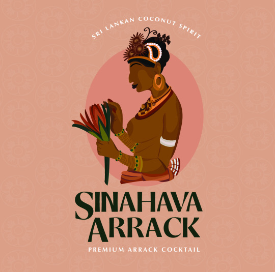
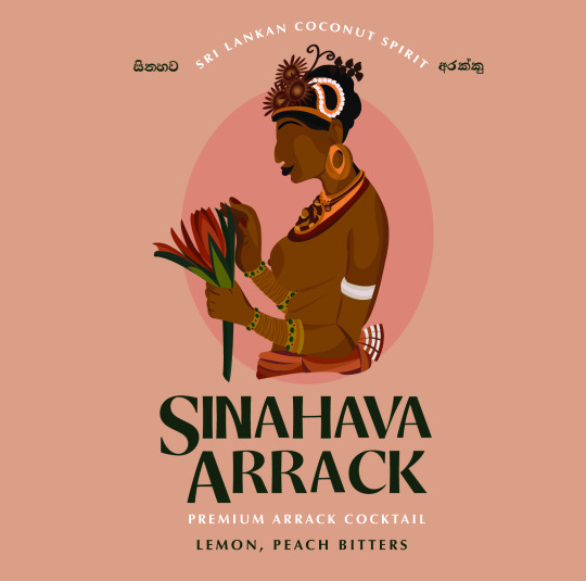
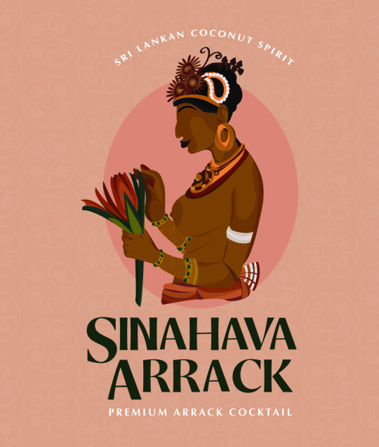
I redesigned the painting from my previous post of the women with a lotus flower painted on the Sigiriya Cave. These women were depicted as supernatural beings they are portrayed with flowers to shower upon humans below. They were intended to evoke a sense of wonderment and to project the opulence and grandeur of Kasyapa the all-powerful god-king. They are a celebration of beauty. Some say they are celestial nymphs carrying flowers to shower upon kings and mortals below. Others suggest that they are queens and concubines of Kasyapa’s harem.
One things for sure is that these paintings are fascinating and show the Sri Lankan art form, from ancient times. I have always loved the way these artists would create these women in such a way that is so distinct to Sri Lanka.
Going back to these concepts, I changed up my whole layout. I changed my brand name from it being basic to having a bit more style to it. Making the "S" and the "A" larger and having that underneath the image. This looks much better and is one of the first things a buyer would see after the illustration.
With the flavours, I am debating weather to have it on the main label or on the label that would be wrapped around the neck of the bottle?
Colour wise, I think this nude peach/brown is really nice is suits the skin tone top of the drawing and doesn't drown the image. I do want to try a darker background though and even add some floral patterns too. I did add a round floral pattern in the background in few of the concepts with a low opacity. I think it looked good but a bit too light when I printed it. But I was thinking to have that pattern used on the label that will go over the cap or around the neck of the bottle, which will also be foiled.
Back to the illustration, since the women is wearing gold jewellery I want to foil that or possibly deboss it in gold. I am also not sure if I should foil the brand name or not, but thats something I will do once i get back to uni. I will foil the borders too.
With the shape of the label, I placed the design in three different sizes. One was my original size was more square like. This shape felt too boring and. The second one with a rectangle/square shape with a dome placed in the middle. This label shape felt like it was depicting a temple with its dome shape in my eyes. The third one I made it longer. I asked my friends outside of uni what their thoughts were on my old label designs size wise, and the all said it could be longer.
My next step is to start and finish my other to designs and get those sussed out so when I comeback I can try foiling and prototyping.
0 notes
Note
1, 2, 17, honestly all of them if you’re up to it
1 - already answered
2. Do you have a personal favourite among your OCs?
L O R D T jupiter fuck man got damn id die for jupiter
3. Have you ever adopted a character or gotten a character from someone else?
i have adopted characters before, but ive never done anything with them, and i have received characters Back from people but besides that nah
4. A character you rarely talk about?
HI PLEASE I BEG OF YOU ASK ABOUT THE GODS PLE AS E IM DYING
5. If you could make only one of your OCs popular/known, who would it be?
fuck uh.. honestly if its only semi popular would i do this bc being Well Known would be nice, yeah, but.. it scares me? idk but uh probably leo or aero, theyre two boys i hold close to my heart
6. Two OCs of yours that look alike despite not being related?
:) eldur and leo kinda? idk i try not to make any of them look alike rip
7. Are your OCs part of any story or stories?
YES! theyre actually all part of one universe called cooking with demons! i have a whole game planned out for the man cast kinda? but all in all its all set within one universe, with multiple different stories occurring within it jhfdksg
8 - already answered
9. Would you ever be willing to give any of your OCs to someone else?
unless specfifically made for them upon request, no. ive already tried that once and it lead to me losing any and all control i had over my characters. At this moment, i only “share” a few ocs with my boyfriend @coffee-burglar and even then, its taken almost a year to even be able to do that
10. Introduce an OC with a complicated design?
uh, all of them are kinda complicated for me, but as of right now, that would go to leos full form. (if u want a ref hmu and ill post it, but it wont be my art)
11. Is there any OC of yours you could describe as a “sunshine”?
like a ray of sunshine? yeah! angel and stitch would fit perfectly for that!
12. Name an OC that isn’t yours but who you like a lot
@coffee-burglar their oc chrome n koh, or derek but thats bc im a hoe
13. Do you have any troublemaker OCs?
aero, jhor, innis, leo are all trouble makers to some degree, leo being the most trouble some
14. Introduce an OC with a tragic backstory
uhhhh fuck what counts as tragic?
i guess id have to say leo or jupiter mostly, but eldur fits too
15. Do you like to talk about your OCs with other people?
if youd let me i would yell about these fucks for hours on end, ive done it
16. Which one of your OCs would be the best at biology (school subject)?
the best but wouldnt enjoy it: Jupiterthe best and would absolutely enjoy it: colby
17. Any OC OTPs?
stitch/lavaaero/kohcolby/derek/inniswill/happiness aeyr/Eberictderek/Xhaztolleo/eldur
18. Any OC crackships?
jhfkdfsjghdfkjhgdkfjsgl i never talk abt it but will/aero is fucking A+
19. Introduce an OC that means a lot to you (and explain why)
ah,, leo. i originally made him to project the worst in myself onto, and because of that ive made his life a living shit hole. but,, recently ive been hell bent on giving him a good ending, one where he heals, and lives his life ok, where he finally, finally has a chance to be happy and get help. its,, kind of been a tiny growing point for me? he just, means a lot to me because of that haha
20. Do any of your OCs sing? If they sing, care to share more details (headcanon voice, what kind of songs they like etc)?
uhhh all of their voice claims are songs n such but only a few of them actually sing in canon! heres the voice claims of the ones who do sing:
Aero - thats his voice, but hed probably more likely to sing Something Like ThisAngelStitch - this is her voice! but shed be much more likely to sing something a lot more upbeat, kind of like thisColby (its jeremy from bmc jghfdkg)
and one i dont have a voice claim for yet that does sing canonically is Sycamore!
21. Your most artistic OC
!!!! oh thatd easily be will! hes nothing professional at all, but he does enjoy drawing and making diy type projects :0c hazels also artistic but with food :0c but what would you expect from a kitchen witch
22. Is there any OC of yours people tend to mischaracterize? If yes, how?
Hi My Names Skinny Penis And No One Has Ever Even Looked At My Ocs For More Than Two Seconds
23. Introduce OC that has changed from your first idea concerning what the character would be like?
lordt all of them would fit that, but the one thats changed the most? lordy thatd probably be will! he used to be a persona that was mostly only interested in dying and getting fucked, but now hes? evolved into a fully fledged character, and has even changed from being human lmao
24. If you could meet one OC of yours, who would it be and why?
jupiter, simply because he is The Biggest Comfort i have. hes,,, really important to me and i love him a lot
25. The OC that resembles you the most (same hobby, height, shared like/dislike for something etc?)
:) its bold of you to assume they dont all resemble me in some way. the most though? damian. lazy motherfucker with 200 emotional issues and no motivation to fix any of them
26. Have you ever had to change your OC’s design or something else about them against your will?
…yeah.
27. Any OCs that were inspired by a certain song?
Nope, most tend to be born from ideas spawned by me n my bf concepting about my ocs, and what would happen if this thing happened? yknow?
28. Your most dangerous OC?
He has yet to be revealed >:)c his names icarus
29. Which one of your OCs would go investigate an abandoned house at night without telling anyone they’re going?
INNIS, GOD INNIS WOULD AND HED PROBABLY DIE
30. Which one of your OCs would most likely have a secret stuffed animal collection?
secret: damiannot so secret: colby
31. Pick one OC of yours and explain what their tumblr blog would be like (what they reblog, layout, anything really)
uHHhhHh
damian would probably have a very shitty coded blog theme (or default) and would genuinely only reblog shitty, abstract memes, and nice food recipes for hazel to make him
32. Which one of your OCs would be the most suitable horror game protagonist and why?
protagonist? if youre going for the scared baby, colby. if ur going for the stoic “thats weird but ok” one, innis or aero.antagonist tho???? Leo and angelica :)
33. Your shyest OC?
uh, a oc thats genuinely shy and not just anxiety filled? angel :0c shes had a very limited interaction pool with anything thats not other angels so she tends to shy away from others bc she really, really doesnt want to get into awkward situations
34. Do you have any twin characters?
Jupiter and leo!
35. Any sibling characters?
Jupiter, leo, angelica, damian, eldur
jupiter, leo, damian, and angelica are all related via their dad, while eldur is related to damian via their mom
36. Do you have OC pairs where the other part belongs to someone else (siblings, lovers, friends etc)?
uhh if im understanding this question right yeah i do! derek, koh, n a lot of others belong to @coffee-burglar ! ive just roped them into my universe dkjfhkdjgh
37. Introduce an OC who is not quite human
Op All Of My Characters Are Inhuman
38. Which one of your OCs would be the best dancer?
surprisingly? aero! hes got really good rhythm and can actually dance really well, its kinda scary
39. Introduce any character you want
:)))))))))))))))))))))))))))))))))))))))))) Ill let yall have a choice, pick one
1.) Lust2.) Greed
40. Any fond memories linked to your characters? Feel free to share!
fond?? uh,, not really. but damian does have a very important memory attached to him.
tw for suicide ment hjgkdfs
with damian, i created him after i tried to kill myself and was stuck in a mental hospital. i had just finished reaing the first shadowhunters book, and decided to try and draw the first demon(???? was that what he was?? im a dumbass and its been over 2 years) you met, which had bright blue hair and if i remember correctly, electric green eyes? but yeah. i made him to cope with all the mental stress i had while being forced to be in that hospital, and hes become very close to my heart because of that
41. Has anyone drawn fanart of your OCs? If yes, maybe show a picture or two here (remember sources & permissions!)
!!!!!!!!! yeah!!! my boyfriends drawn damian and most of my characters bgjkfdhgkfdsgl but one i do hold close to my heart (bc at the time, i barely knew them) was when @stuck-in-the-ghost-zone drew aeyr! it made me really happy tbh. i still have it saved to my phone actually!!!
42. Which one of your OCs would be the most interested in Greek gods?
uhhhh,,, provided that they found a way to get anything involving earth and their beliefs itd probably be either angel or colby. angel enjoys learning anything and everything she can, while colby enjoys hearing about the Tea™ that comes with greek shit
43. Do you have any certain type when you create your OCs? Do you tend to favour some certain traits or looks? It’s time to confess
lordt ok
i really just? enjoy making demons really, or anything that doesnt quite fit “conveniently attractive” in at least one form they have. (i also favor making guys bc im Gay)
44. Something you like about your OCs in general
how well theyre coming together, for so long, their stories have been little fractures and pieces that never fit together. Fragments. but now, theyre almost fully put together and its… wonderful to see
45. A character you no longer use?
a hi have.. one. their name was angel aura, a steven universe oc. i got rid of them because of too many.. bad things.
46. Has anyone ever told you that you treat your OCs badly?
not directly, but yes. it.. actually helped me give a lot of them a ok life, or at least a good ending
47. Has anyone ever (friendly) claimed any of your OCs as their child?
@coffee-burglar eldur, colby, will n a few others lmao
48. OC who is a perfect cinnamon roll, too good for this world, too pure
ELDUR GOD ELDUR PLEASE SOMEONE GIVE THIS KID BACK TO HIS MOM
49. Which one of your OCs would most likely enjoy memes
damian
50. Give me the good ol’ OC talk here. Talk about anything you want
ghjkfgkfdhgklfjhglkjdfhgslfjdgh give me a actual thing to talk about bc im dying op
12 notes
·
View notes
Text
9 Suggestions for Designing an E mail Signature in 2019
It’s no secret that electronic mail signatures have a serious influence on this planet of electronic mail advertising and marketing. It’s additionally clear that they’re one of many best methods to re-engage together with your current prospects, with out spending any (or little or no) cash.
Profitable companies are utilizing the untapped energy of their electronic mail signatures as a result of they know that choices are all about prioritizations primarily based on invested effort vs profit.
Let’s check out how one can revamp your electronic mail signature for 2019 to offer it that “pop” issue.
1. Create Your Signature with Cellular in Thoughts
It’s superb how many individuals utterly skip over this step, with out understanding the implications. Mobiles account for 46% of all electronic mail opens, that means that testing your electronic mail signature for cellular compatibility is crucial.
A typical false impression is that your electronic mail signature will probably be appropriate throughout all electronic mail shoppers. The unhappy reality is…it received’t. Though I might like to blame Outlook for this, the reason being really that almost all electronic mail shoppers (cellular included) use totally different HTML rendering engines and which means all of them show electronic mail signatures in a different way.
As well as, cellular screens are a lot smaller than PC shows, and so they additionally use scaling. Due to this, vertical layouts work a lot better on mobiles. Utilizing a large format on cellular units may cause your signature to look squashed and the pictures to be scaled up which makes them look blurry.
2. Embrace Solely Important Particulars
The main points a school scholar contains of their signature will probably be so much totally different to the small print a lawyer contains. Solely embody the small print that are related to you. For instance, if you happen to’re a school scholar, you’ll most likely embody the college you’re attending and the topic you’re finding out. You wouldn’t embody these particulars if you happen to’re a lawyer.
Most individuals aren’t thinking about understanding your favourite band, or shade. Your electronic mail signature ought to embody the data wanted to contact you, and some other related data. When you’re not sure, ask your self “Would I give that data to a enterprise affiliate I had simply met?”.
Listed below are the most well-liked fields to incorporate in your electronic mail signature:
Full Identify
Job Place
Firm
Cellular Cellphone Quantity
Workplace Cellphone Quantity
Workplace Deal with
Profile Image and/or Emblem (or each)
Social Icons (elective, however beneficial)
Promotional Banner (elective)
Disclaimer (elective)
Particulars which aren’t wanted solely bloat the signature and make it laborious on your recipient to search out the small print they really want.
3. Contemplate Fonts
A font can utterly change the appear and feel of an electronic mail signature. The identical could be mentioned for the colours and spacing. You must by no means use a number of fonts in your electronic mail signature. The one exception is that if your emblem makes use of a unique font to your signature.
By way of font sizes, you shouldn’t have greater than 2-Three totally different sizes all through your complete signature.
4. Use Colours Which Mirror Your Model
Like fonts, preserve your choice to round 2-Three totally different colours. Any extra and also you danger creating that “rainbow electronic mail signature”.
It’s necessary that the colours match your emblem as a lot as potential. In any other case, your emblem can look misplaced, or your signature might have that “template” look which you don’t need.
5. Use Stunning Photographs
In sales-based roles (corresponding to actual property brokers) the place you’re dealing straight with the general public, utilizing a picture of your face can add a private contact to your signature. When you’re not too keen on utilizing a profile image in your signature, you possibly can simply use your organization emblem.
Solely use good high quality pictures which have been professionally taken.
Use PNG or JPEG kind pictures for max compatibility and at all times make sure you compress them utilizing a software like TinyPNG.
PNG’s work greatest for logos and while you want transparency in your pictures. JPEG’s are greatest for profile photos the place the colour high quality must be good.
Keep away from utilizing GIF animations (extra on this later).
6. Tweak the Spacing
Behind each nice trying electronic mail signature is constant spacing. When you’ve obtained 10 pixels of spacing above the contact data, then it’s best to have the identical spacing underneath the contact data too. The identical goes for all sections of the signature.
Constant spacing makes the signature look skilled and clear, even at a fast look. It additionally makes it simpler to identify data that you simply’re looking for.
7. Maintain an Eye on Measurement
With electronic mail signatures, there’s 2 sizes to test. The scale in pixels, and the scale in kilobytes (KB).
Measurement in Pixels
The scale in pixels determines visually how massive your signature is, and whether or not it’ll match cellular screens. Remember the fact that narrower signatures look higher on mobiles due to display screen sizes and scaling.
For desktops and bigger display screen sizes that don’t use scaling, the beneficial most electronic mail signature dimension is 700(w) x 300(h) pixels.
For cellphones which have smaller screens that use scaling, the beneficial most electronic mail signature dimension is 320(w) x 600(h) pixels.
Checking the scale of your signature is so simple as opening your signature in an online browser like Google Chrome, proper clicking on it and clicking examine ingredient. You must then be capable of hover over the outer most desk, and it ought to present you the peak and width of the signature.
Measurement in KB
The scale in KB is the quantity of disk house the e-mail signature will take up when it’s saved on a mail server. When you ship roughly 30 emails a day, your electronic mail signature will probably be saved 30 occasions in your server, which may take up invaluable house in the long term. And that’s solely with you sending emails. You probably have a number of workers sending emails, it will probably add up in a short time.
You must purpose to maintain your electronic mail signature underneath 50KB in dimension. There usually isn’t a have to have an electronic mail signature that’s any bigger (even if in case you have a promotional banner).
8. Check Your E mail Signature for Compatibility
Keep in mind earlier we touched with reference to electronic mail signature compatibility? To make sure your signature seems the identical in all electronic mail shoppers, you should cross check it between all the favored electronic mail shoppers. Simply because your signature seems good in Outlook, doesn’t imply it’ll look good in Gmail.
That is an instance of how cross testing ought to be finished:
Sending from Outlook 2013 to Gmail
Sending from Outlook 2016 to Gmail
Sending from Gmail to Outlook 2013
Sending from Gmail to Outlook 2016
…and so forth.
Hopefully, now you possibly can see what an infinite process cross testing could be if need your signature to be appropriate with the highest 10 electronic mail shoppers. Simply because you’ve gotten finished cross testing, it doesn’t imply that your electronic mail signature will work flawlessly in all electronic mail shoppers. For instance, Gmail inserts gaps beneath pictures, and there may be nothing you are able to do about it.
Generally you possibly can repair compatibility points, different occasions you merely can’t.
9. Issues You Shouldn’t Do
Don’t make your complete electronic mail signature a picture
When you’re contemplating making a elaborate electronic mail signature, however you possibly can’t do it utilizing HTML + CSS, then both change the design so it may be coded, or don’t do it in any respect.
No matter you do, don’t make your complete electronic mail signature a picture, as the scale (in KB) is often massive and your recipients received’t be capable of copy your cellphone quantity or different particulars out of it.
Mainly, it screams “I care extra about seems, than I do about performance”.
Additionally, you possibly can’t do cut up testing on issues like CTA buttons, and you may’t simply make modifications to the signatures.
Don’t Over Complicate the Design
A easy design goes a good distance. Don’t consider your signature as needing to cram as a lot data into it as potential. Easy designs are simpler to code, and still have a a lot larger likelihood of trying constant throughout all mail shoppers.
Don’t Insert GIF Animations
Animations are enjoyable to have a look at, however more often than not they don’t work with electronic mail signatures. Along with probably being perceived as immature, animations don’t at all times technically work with electronic mail shoppers.
Some electronic mail shoppers convert GIF animations to nonetheless pictures. So, if in case you have an animation of your head shifting round, your recipient may see a nonetheless picture of the facet of your head…not look.
Don’t Use Inspirational Quotes
There isn’t sufficient room for them, and the concept is to maintain your electronic mail signature clear and litter free. Keep away from utilizing quotes in electronic mail signatures, until it’s one thing like a CEO quote that enhances the model picture.
Conclusion
Creating an electronic mail signature is kind of straight ahead so long as you retain the following tips in thoughts. Hopefully, now try to be absolutely outfitted to make a very nice trying electronic mail signature that will probably be appropriate and on the similar time have all of the options you need.
Featured picture through DepositPhotos.
Supply hyperlink
source https://webart-studio.com/9-suggestions-for-designing-an-e-mail-signature-in-2019/
0 notes
Photo
Human Actions - Illustration
Drinking
A focus on a bottle that was used in my photograms became apparent in my illustrations too. I needed something other than cereal. The bottle can be used in the human action of drinking, it’s part of Maslow’s Hierarchy of Needs which is part of the physiological need; shared by food too (cereal).
Just something to consider, I need to identify why i draw characters wearing missing shoes or reasons for their attitude. They do have a confident, smug or arrogant mood. They seem to be chill or confident anyway. Maybe i’ve subconsciously illustrated my own moods or other peoples moods. I see people around me, more than i get to see my own face. So i’m inspired by whats around me surely.
I have friends ages 16 - 21 who I see frequently and we all have similar taste in fashion. Also the 1980s/90s retro fashion is recurring in teens.
I do really like the aesthetic of retro clothing, possibly because it was once popular, and has a great appearance; but now it’s grown back into fashion because you can find vintage charity shops dotted around all towns. And you can go on ebay and depop and purchases a nice branded retro piece of clothing for half the price of something popular today, and materials are getting cheap and less durable. It’s not just because some vintage accessories are cheaper, it also has a great look. Just something that isn’t popular and unique looks great, because it’s new.
We all get bored of repetitiveness and when you recognise something is new, we get a positive emotion from it. Like listening to a new song that you found; you play it on repeat because it sounds great and it’s a new melody. Everything is ephemeral and sometimes the ephemeral things can recur.
When you have a strong passion for something, it becomes a trait, it stays with you for your life it may even become a stronger than it currently is. I’ve always loved to draw and be creative, but it’s just until i became 18 that i was interested in pretty much anything creative.
I am curious about cinematography and directors; even though i don’t direct or have an interest in filming. I admire work that requires a creative mind. If i watch an animated film, I get distracted by the fact that I can see the efforts in order to create this visual. Or if something is choreographed in a great manner, i just get inspired by the use of shots and visuals.
I have friends that don’t pick up on certain things like the use of camera shots or don’t look at things the same way. I only really started getting inspired by films, comics, games, music until now. I started reading ‘Tank Girl’ as i loved the illustration style of Jamie Hewlett, furthermore the narrative and delivery of story is so compelling and action packed.
I always just think about maybe one day I can publish a comic or be part of a big company designing a game or concept design.
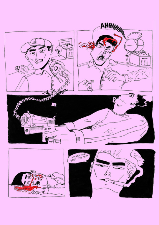
Sequence ‘Gun Shot’
This sequence features a graphic action in a form of a sequence. So first off thats look at this piece. It’s all in comic panels, however some visuals merge into each other’s panels; by doing this it was a close link to merging which is a process within collage.
I used onomatopoeias as a way to create sound and to reflect an emotion of distress from the gun shot victim. It’s also inspired by the use of typeface in the image and communication workshop too, so they both have an influence on the use of words.
The layout of the “SWOOOO0000ooosh” shows us where exactly the bullet travels and the source of the bullet.
The layout of “Ahhhhhh” slowly decreases in size, which visually represents how the noise also lowers in volume.
I feel as though i can create a series of different actions in the form of sequenced panels like this example, presented in an a4/a5 zine.
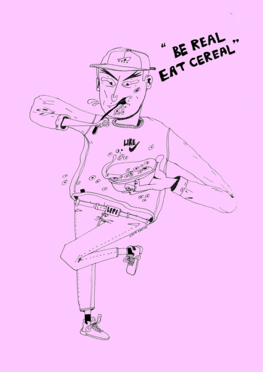
“Be real, Eat cereal
I drew this whilst eating breakfast before college, it was cheerios too, which inspired myself to draw my own action into one of my characters
This piece has a relation to other experiments in my sketchbook. I was illustrating the action of eating cereal and as doing so, i was thinking about the Image and Communication workshop, where we made a sentence relating to our work out of typeface and backgrounds that were printed in a previous workshop.
I thought about slogans, as they are relevant to what they want to sell, however it can be a fun way of advertising or creating a jingle. I thought about words that ended in “real” because of ‘ce-real’. Immediately the word “real” appeared. So then i thought of what i could say.
The character is eating cereal, so I thought i’d include eat cereal and another line for my slogan. I was thinking of a positive image and “Be real, eat cereal” became a slogan. It’s short and sweet and has a good message, however it might suggest to those who don’t eat cereal that they’re not real?
Being real is another way of saying “be serious, be honest, be realistic” it’s something you say to someone when you need them to respond to yourself positively and to get them to act honestly or seriously. So “Be real, eat cereal” is a way to say “eat the cereal, be realistic, it’s part of your daily servings”
Illustration Style
I know my style is distinctive, however the style developed in April/May when creating a comic in my last final major project which was about gang crime in the 1980s in London. I was inspired by ‘1988 Akira’ and the style grew from inspiration around me, I watch a lot of adult swim animated series, and have a great interest in retro fashion and the recurring fashion trends which led to my characters to be wearing branded clothing. What I draw is also a reflection on my life in some ways, however If it’s about violence or drugs then that’s not the case. I just enjoy illustrating fun characters with 1980s/90s fashion in a distinct style too.
I’m not too sure whether I have to base my style on something like another artist, however I know that i should get inspired by another one’s processes. Mimicking a style is like trying to act the same as someone else. I’d happily do observation if thats considered a style; but I usually reject the observational process as i don’t consider it to be fun, looking at something and drawing it.
0 notes
Text
Evaluation
14/05/17
- Evaluating and reflecting upon my thoughts and the design processes of both projects.
When this brief was launched, I was most excited for this because its a field that I’m most interested in. Choosing a talk admittedly was a long process at first, as I took notes though each talk, picking out bits that I found interesting and now I could incorporating a visual concept. After sometime, I selected the building TED talk because I felt that I could create some nice imagery for my editorial spreads. After noting down ideas for some visuals, I was drawn to the idea of a buildings perspective as well as thinking about the brutalist architectural movement, which was the theoretical side to my research. My visualisation research consisted of artists and designers as well as architects that utilise this idea of a simplistic architectural style which would then help influence the photos I would be taking in order to create my line drawings from. I was inspired to approach the brief this way because I thought that by incorporating simplistic imagery wouldn't distract so much from the typography going alongside, thus making it a balanced set of spreads. By using a line drawing meant that the architectural structure would show through effectively. In terms of layout ideas, my research consisted of mostly magazine examples containing a monochromatic approach as well as spreads that incorporated architectural imagery. Admittedly, at the beginning of when the title sequence brief was handed out, my research was not very focused as I needed time to investigate the different artistic approaches that could be created. Selecting a short story and transforming that story into a thirty second title sequence was something I was not comfortable with at first due to animation not being a field that I’m most confident in unlike editorial design; a field that I thoroughly enjoy. However, despite this obstacle, I continued researching for inspiration and it wasn't until my ideas for imagery that my research became more relevant to my approach. Research that consisted of dark and eery setting and atmosphere was what shaped my design decisions for this brief. Although, initially my approach was to be in a silhouette or collaged style but quickly went off this concept. Title sequences that contained the idea of a fairytale context alongside serif typefaces were the main ideas and inspirations behind the creative approach and pathway I took in the end.
Initially, the design of my magazine was to be only monochromatic. However, through the help and feedback of group and one to tutorials, it was then advised that I should experiment with spot colouring as the spreads could look a little too flat and non-dimensional. Changes to my spreads that I made were mostly to do with the overall layout and composition of my chosen text and how its relationship to the image was very important. A major change was of course the colour spotting as well treating my spreads as double spreads in order so that they could compliment each other effectively. In particular trying to have my imagery bleed across the two pages so that the spreads didn't feel as restricted. A major change that developed my spreads was definitely utilising the coloured lines to guide my pull quotes which changed my design of the layout completely as well as the general aesthetic. As a result of these changes and alterations that I made meant that my spreads development proved stronger each time over the duration of this brief. Like with the editorial brief, over the duration of the sequence brief, it only underwent a few changes. Firstly, making sure my imagery was dark enough in order to communicate the eery atmosphere and feeling of the story and since the ending was positive, it was advised that the last scene should be brighter than the other scenes. Another change was to focus on smoother transitions and to ensure that the last scene was not showing through throughout the animation as it was becoming a mild distraction and not making sense. Another change I had to think about and alter was the typography; the positioning of each phrase I chose for the video were all different, making it seem very mismatched. It was also advised to add the possibility of a drop shadow to make the type stand out a little more to the viewer. Making all these changes has made my development process thorough, and has made me evaluate my progress effectively.
As this was a creative field I was largely interested in, I managed my time extremely well in order to create an outcome that I was sufficiently happy with. I used the miniature deadlines in our handbook to ensure that I was producing the required work for my tutorial sessions. I tried to print off my prints at regular intervals to ensure that I was gaining an accurate perspective of the progress my designs were going through. As the project went on, the time was easier to manage as by that point, I was only having to make minor changes to my spreads. I was also maintaining my research at this time too to save time right before the critique. Time management again alongside the editorial brief, was not too much of an issue, except for this brief I made sure I gave myself plenty of time to produce an outcome that I would be happy with as I was not familiar with after effects, whereas for the editorial brief, I was comfortable with the programme but wanted plenty of time to experiment. Initially, I was a little concerned about how much time I had to go myself in order to create my title sequence but I pleasantly surprised myself. I wanted to leave a sufficient amount of time to look up and research the techniques I wanted to use before adding them to my sequence. Again, I found as it got towards the critique, because I had a solid idea and knew what needed changing, I never had to rush any elements of my title sequence. Thankfully, both projects didn't cause a lot of stress time wise.
Throughout the duration of the editorial brief, we underwent group tutorials as well as the final critique. By receiving constructive advice and feedback from fellow peers, it helped me to understand where the improvements were most needed. I felt that feedback was the most important at the beginning of this project because thats where the ideas need to be most developed before the designing can begin. Since I had gained solid ideas for imagery and had already gathered an idea for layout and composition, my feedback was already very positive at this stage. In addition to that, receiving the feedback also helped to aid my general progress of the project and I treated it as almost milestones to help get to where I needed to be each week. In terms of feedback, having the tutorials, both group and one to one helped me greatly, especially as this brief being a 30 second moving image piece was most definitely out of my comfort zone. I made sure to write down every single comment and improvement I needed to make to make sure that my final outcome was most effective and to a standard that I was happy with. Having made the suggested changes to my title sequence helped to gain more confidence with my ability to this brief. I felt that overtime i responded to any feedback I was given, it was a definite learning curve. Both projects generally well received advice and feedback which helped aid my development process.
Admittedly, there aren't many aspects to my design process that I felt needed more practice. I was comfortable with both the brief and using indesign in order to create my spreads. Maybe the possibility of trying not to make my spreads layouts as heavy as they started out to be. I felt that maybe I was trying to hard and that less is more the majority of the time, whereas, having to produce a 30 second video or animation was difficult in my eyes and so a result I think an area that I would want to improve is simply broadening my horizons in the moving image field. I would like to gain better, more effective skills in after effects too, as I may have played it too safe with my video but nevertheless, I was happy with what I had achieved. I want to able to produce a more complex and challenge outcome next time we are set a moving image piece in the near future. Also I think by simply playing with more effects, Im starting to broaden my technical ability too.
A large aspect and something I will take on board for future layout projects is that less is more. Having too much on the page makes it more difficult to work with and therefore the design process becomes much harder. Once I took out many of the design elements and narrowed down my choices, I was much more pleased with my outcomes. I learnt a few new things in our indesign session such as looking at paragraph and character stylings and to just think about the smallest typorgraphicall elements in general that would eventually make a lot of difference to the spreads. In this unit of study I have learnt to carefully plan out my storyboards at the start , in order to make sure that my ideas were clear on paper before I could apply the on the computer and in my research. This makes the process a lot easier and to develop from too. The programme itself (after effects) was a massive new skill to me as well, learning about all the different things you can do to your animation, especially from what I learnt in the workshops. Although the elements I learnt in the workshops didn't quite tailor to my idea, I have gained a few tips tricks to the programme either way. Theoretical knowledge was an aspect in this unit that I most definitely took away a lot from because at the start I had very little knowledge on the subject which is why my research was so broad at the beginning.
Overall, in terms of any changes that I would make, I think I would have looked into my first double page spread in more depth as I found this spread the hardest to work with due to the imagery I had created to go in. However with perseverance and regular feedback, it was improving week by week, but admittedly still not my favourite spread of my design to this day. There are no immediate improvements to my sequence that I feel I would change, however I could have added a few more elements to make a little more interesting such using a couple more images as I only made my video simple because of the little skill set I have with after effects so I wasn't able to produce anything massively complicated as I wouldn't know how to go about in the first place. Expanding my technical knowledge is the only element I feel would need improving upon. I’m not confident enough yet to develop a good character design, so maybe I need to practice this in order to add little more dimension to my animation all together. Despite this, Im hoping my final outcome is enough to communicate the idea i was getting across successfully.
0 notes