#i like black text on white background
Explore tagged Tumblr posts
Text
it’s everyone’s favourite day of the week it’s time for FUCK YOU AND FUCK YOUR TRAIN FRIDAY (trans edition! because we all know none of those guys were cis)
#this actually doesn’t work in my colour scheme (goth rave) Im hoping enough people use dark mode/vampire for this to work for most people#fuck you and fuck your train friday#original post#the mechanisms#there were seven words and that didn’t work so I did it by number of letters like any normal person#I know there one fewer white letter than the others shh dontworry about it#dark mode is not dark enough for me personally I need the black background and purple text of goth rave
119 notes
·
View notes
Text
does anyone know how to make your screen brightness go below zero, im suffering
#EVERYTHING IS SO DAMN BRIGHT ALL THE TIME!!!!!!!!!#my phone is okay but this desktop screen is killing me#i already keep it in eco-friendly low power mode AND zero brightness and it STILL hurts to look at#especially just. white/black text regardless or whether the background or text is black#can we please throw in some grey. just a little bit. grey text grey background SOMETHING#like rn these tags are fine they do not hurt at all. everything else is killing me#chat
9 notes
·
View notes
Text
Valle Verde
A fake PS1 Game
Has better UI than just about anything in the past 2 decades.
#Looking at you#resident evil 2 remake#and 3 and 4 dear god 4 got mauled#Just look at the SPRITES in dialogue boxes#the boxes themselves#the keyboard ui#like sure you might think animal crossing but all I see is what used to be#many games had UI that was unique enough from another to be identifiably that game's artistry#banjo kazooie and conker have what I'd consider the baseline for UI#like text boxes and such are kinda generic but they're not literal fuckin squares with white outlines#actual chat bubbles come up when character's speak or think in conker#that's good shit#Dark Souls 1 has that cool leather background#then you look at the RE remakes and go what the fuck happened#Even the RE 1 Remake knew to have decent enough UI even while hiding all forms of artistry behind the color black and single tone shading#valle verde#analog horror
11 notes
·
View notes
Text
petition to remove unnecessary narrative time laspes in dramas that skip all of the character development & progress that happened which overall renders it entirely useless from a storytelling standpoint & makes the viewers feel alienated from the characters' thoughts & feelings. THANKS.
#axelle rants#only boo#fun fact only like 1% of thai dramas use those '1 year later' moments well... please make them stop#and the boring ass white text on a black background makes me so angry everytime#and NO overlaying it over a landscape of the show IS NOT ANY BETTER.#like why are thai dramas all having the same tropes lately? the couples get together too fast & we skip through half of the important stuff#(this isn't about only boo tbh it is a mid show but very cute & I enjoy it a lot)#(however I'm getting frustrated at the lack of non mid good shows lately like wtf is going on)
11 notes
·
View notes
Text
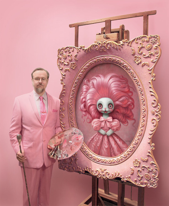
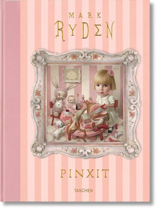
When I was in uni we had to do a presentation on an artist chosen from a provided list and I chose Mark Ryden and the lecturer who I presented it to laughed and asked mockingly why I would make the presentation pink because it’s extremely unprofessional and I was like you mean this guy?


Why did I make a presentation on this guy pink???
#we were told the aesthetics didn’t really matter and to make them cohesive with the theme#and it was LITERALLY just a muted millennial pink background w white boxes and dark pink text#everyone else did black and white but we legit had people with dyslexia on our course so I didn’t wanna do that#AND other peoples were just as heavily decorated and coloured it was literally just the colour pink she bitched about#and I was like why? what’s the issue? it’s a major part of his work and it’s just a damn colour what’s your problem???#in front of the whole class I was so mad and embarrassed but I was too annoyed to drop it#we were also in pairs and I ended up doing the whole thing for a lot of reasons and then my partner couldn’t even pronounce the words#so it was made extremely clear I’d done everything and for some reason this makes teachers assume YOURE the asshole#I’ve had it so many times where I’ve been that guy doing the whole thing and then those in charge are like#why are you being such a control freak and nasty to your group#like idk maybe because I’m the only one even remotely trying and I don’t want to fail SHARON
9 notes
·
View notes
Note
Hai!!! :3
dumps flour on you


i think this was a lot funnier in my head. oh well. be sure to preheat the oven once you're done. or well i guess you should've done that before coating him in flour. oh well :)
#ask#kkpomona#my art#boe#boe tai marrow#my character#as you can see i had to have penny facing away from the camera since i dont think i wouldve known how to draw her face#also i wouldve had Budd in this picture but i think he wouldve started eating him :( <- he wouldnt actually#i also didnt want to clutter the image too much more as well#oh well :)#initially in my head i was gonna keep it black and white. with the oven drawn to the side#and i wouldve had text reading ''foreshadowing oven'' with an arrow pointing to it#but uh. cant really draw flour on a black and white background. granted i couldve theoretically had the background black with white lines#but i wanted to draw something like this again :)#i mightve drawn penny too tall. i started with boe then drew her after#anyway thank you for the ask :) i saw your ask earlier and wanted to draw this
80 notes
·
View notes
Text

I don’t know what the hell this guy is talking about because whatever this is, it’s not fucking normal in pennsy
#I love to hate this guys youtube videos#he has one called ‘understanding social justice’ and in the vid he’s like. so enraged that he puts full slides of#tangential rants in the video. like it’s a full page of white text on a black background and he’s just so… dare i say… triggered
14 notes
·
View notes
Text
the avatar removal hasnt hit me yet but one thing i would rec for people struggling with it; in tumblr labs theres a setting that makes peoples posts on the dash show up using the colours of their mobile theme. its not flawless as some people have very similar colour schemes (and some of you out there have UNREADBLE THEMES MY GOD the fact that i havent unfollowed shows how deeply i love my mutuals) but ive found it does help me a lot with distinguishing blogs, especially when people change avatar and url at the same time
#been using it for. at least a year i really like the colourful dash#lovely to see OH MY MINT GREEN MUTUAL LIGHTING UP MY DASH#my dark purple with dark grey text mutual i love you enough to select all of your posts in order to read them#aaah black background white text mutuals my siblings in gothdom
18 notes
·
View notes
Text
accessibility is more important than aesthetics I love to break it to you
#OOC#only reason I small text is it's easier on mobile for people#but like. you fools with your narrow ass white font on black background#you are going to kill people with vision issues
11 notes
·
View notes
Text
Tumblr user vs Toyhouse user battle of fucking blasting my eyes out with custom CSS themes GO
#tumblr users are usually less bad about this tbf#like almost every time i click on a toyhouse user's page i get visually assaulted with a black and red neon background#with 60 moving graphics and absolutely unreadable text#going from simple grey/white/black to fuck your shit up 9000 is so hard I JUST WANT TO SEE YOUR CHARACTERS
6 notes
·
View notes
Text
AANH *buzzer noise* dyslexia typo! tried to type gorgeous and got hothroud. not even a my finger slipped on my phone thing i CONFIDENTLY sat at my laptop and typed in hothroud and was like “hey that’s not gorgeous! wtf”
#having dyslexia w/ adhd is so funny sometimes because i was one of those kids who learned how to write read and spell by reading the#dictionary when i fell behind (didn’t learn to read until i was 6 1/2 bc of the dyslexia) and immediately became obssessed with words and#spelling so people use me as a pocket spell check all the time and i usually don’t get a ton of dyslexia typos bc of that. so when i do it’s#the really weird typos. it’s never like thier it’s always ‘i somehow missed every single letter’#i actually didn’t even realize i had dyslexia until i was like 21 because the spelling hyperfixation covered it so good but i very much do.#i have to have lighter text on black background preferrably everywhere for instance or the letters get swimmy. idk why white letters don’t#do that but black ones do but it really really helps lol. except for hothroud. nothing’s gonna help hothroud
2 notes
·
View notes
Text

Love is listening to your husband complain about work...to a point.
#whenever I write Tuvok saying 'T'Pel.' it's in the same tone as bob from bob's burgers#this is from a not-really-zine I'm working on...I hope the motivation holds!!#Tuvok/T'Pel#my writing#I showed a friend my writing once and he was like wh ydo you write on a black background with white text this is hurtingmy eyes#and it's funny bc black text on a white background tends to hurt MYeyes!#also it's not a zine bc it's not short. I can't write short things - you've seen my ao3#I guess this goes in the#[REDACTED] family shenanigans
9 notes
·
View notes
Text
I hate you screenshots of long text I hate you screenshots of long white text on black background I hate you screenshots of purple text on black background i hate you screenshots of dark purple tags on a black background WRITE IT OUT IN THE POST BODY FOR FUCKS SAKE
#yes this is ordered from#slight eyestrain to actually unreadable#i neevr understood dark mode tbh#like for short text yeah but for longer spans of text????#like it makes sense for messenger or photo/video based things#but LONG TEXT?????#WHITE TEXT ON A BLACK BACKGROUND????#WHATS WRONG WITH YOUUUUU#any other colour on a black background? you are straight up pretending to read i dont believe you are actually doing it#purple text on black bg is the same as yellow text on a white background
2 notes
·
View notes
Text
this poll is ONLY for my crazy meticulous pinterest board girlies:
#now i have most of my quotes in a section bc theyre black text white background#but some of them look fine except itll be a clump of texty posts#and i like my boards to be more image based which is. SURPRISINGLY hard for pinterest#yes im talking ab my own henry cheng board leave me alone
2 notes
·
View notes
Text
not to be mean but its kinda confusing to me when image ids for web weaving posts of just text always add in the "image of excerpt from [this piece] by [this person] that says..." instead of just writing out the text itself. it's not like when u look at the images you can tell anyway and all the authors and works are credited anyways at the end in plain text*. it just feels like it doesnt add anything but i dont know.. can people who use screen readers weigh in
#*if the authors and stuff are in the image not in the post itself then yes i do understand putting that into the id#when the id literally has black text on white background like is that really that important??? thats my main question tbh#been thinking abt writing ids again bc i have a . lot in my drafts left over. so wanted to check this first before starting#nitzie.txt
1 note
·
View note
Photo


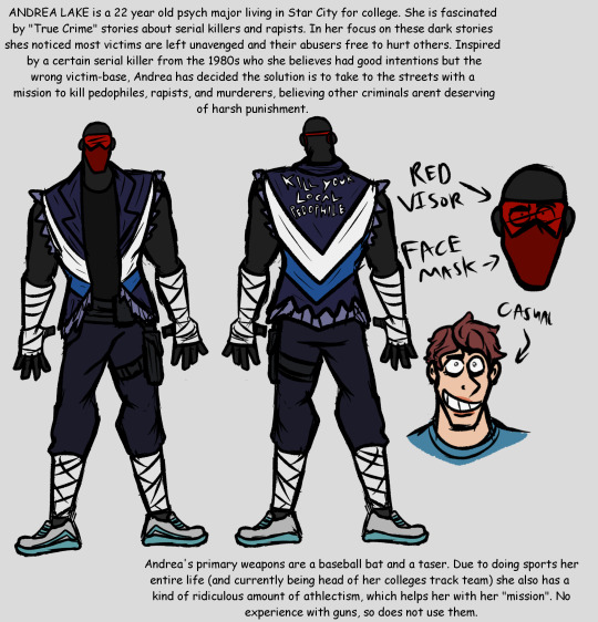
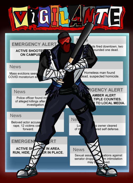
I have a pitch for a black label Vigilante series.
#Rape mention#Mass shooting mention#My art#4#5#Andrea Lake#Hiiii. I posted the fake cover there earlier but it has a white border I hated and I had to change it.#Also originally didnt include the reference but will now to avoid posting this freak of mine like 12 times#My pitch for this is basically for it to be anti vigilantism and anti violent state punishment#Also black label series because I liked the idea of Vigilante 1983 actually having happened in the 80s still.#As evidenced by the logo all the other vigilantes would still be canon too because it MY PITCH#Except Beyond Vigilante obviously#Anyway thank you. Yeah I did half make this to draw my idea of a vigilante in front of phone notifications.#Unintentional but the phone notifications background turned out to be good for a Vigilante cover since I couldnt figure out how#Not To Obscure Most Of The Text. So I think it has the vibes of Vigilante obscuring The Issues instead of like#Vigilantes gonna go out and address them. Ok anyway
4 notes
·
View notes