#i just realised i never actually draw in this show's style
Explore tagged Tumblr posts
Text
Oh Old Man McGucket, they could never make me hate you...

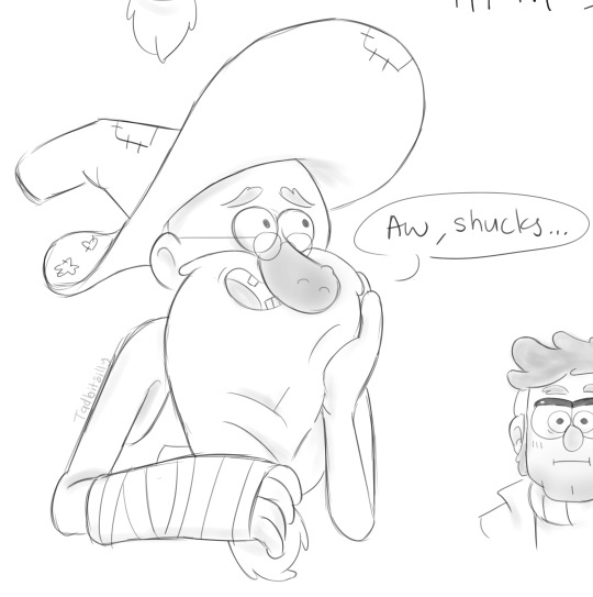
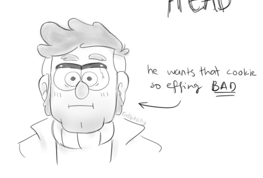
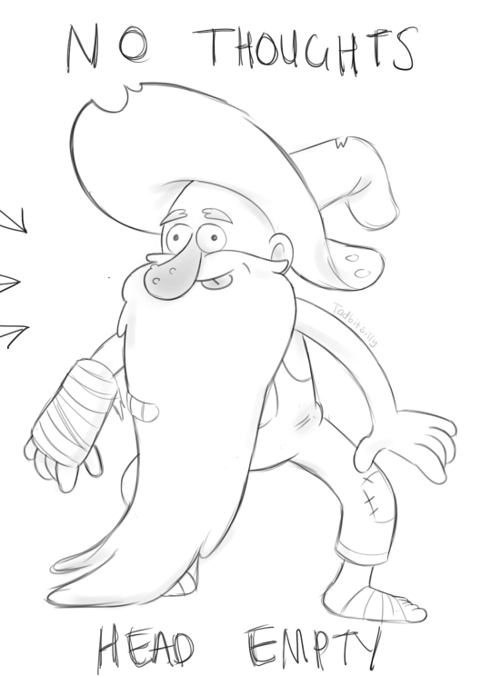
(Full canvas below cut >>)
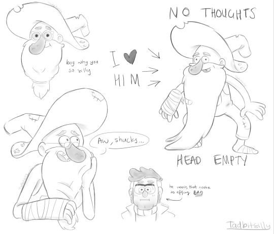
I ❤️ HIM!!!!!!
#i just realised i never actually draw in this show's style#im such a fake fan fr#anyways i had fun experimenting with this style#i love him sm its unreal#gravity falls#fiddleford mcgucket#old man mcgucket#stanford pines#fiddauthor#gravity falls fiddleford#gravity falls stanford#gravity falls fanart#my art#fanart#gf fanart#fiddleauthor#banjoportal#artists on tumblr
275 notes
·
View notes
Text
this day last year i posted my first oc and canon thing so i decided to redraw it


sappy yap session incoming

god my art style has changed so much 😭 i remember posting this on instagram alongside a drawing of me and my friends and i just hid it in the second slide being like ermm.. no one’s gonna see it hahaha..
when i started posting ani i was so nervous people were gonna be like “clef wouldn’t have another daughter he couldn’t even raise one, you’re mischaracterising him” and so far no one has said that. like. ever. 😭 i was worried about the stupidest things. and yeah i still feel cringe about it sometimes but i realised it’s not that deep, if you have an oc that makes you happy go ahead and post them, who cares if it’s cringe or you think no one’s gonna like it. because i thought that too and now i have so many lovely mutuals who like my oc and have made incredible art of her. i honestly never thought id get here, i can’t believe ani has made it out of the imaginary worlds in my mind and become an actual. thing. like that’s so crazy to me. it just goes to show that if you step out of your comfort zone you can do things you never imagined doing. like last year i would have NEVER had the courage to even post my oc let alone start cosplaying, interacting with other scp fans, and having my own platform with people that actually follow me ?? and like my stuff ?!?!
anyway. idk where this is going but. the point is im so grateful and i appreciate you all that follow me and like my silly anime girl oc. you all motivate me to wanna do bigger and better things this coming year. you’re all incredible and i hope you have a great christmas and an even better 2025 <3
80 notes
·
View notes
Text
MY HUGE TPOT 15 THEORIES AND OBSERVATIONS AND JUST RENERAL RANTS AND AUTISM POST. SPOILERS AHEAD
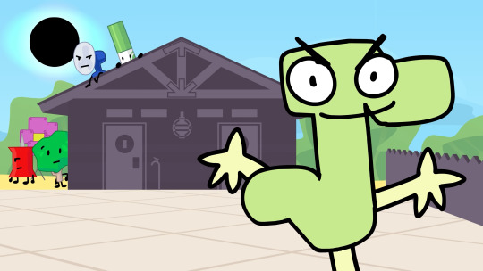
i NEED TO TALK ABOUT EAN AND VERPT(? NO SUBTITLES YET) RIGHT NOW
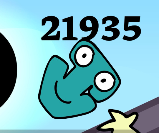
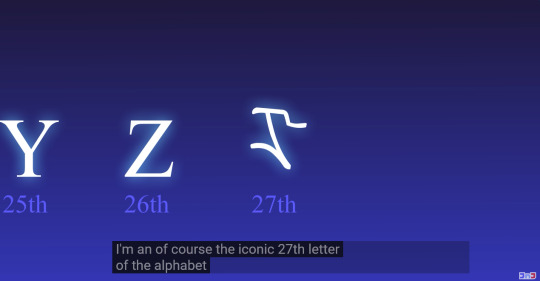
I NEED PEOPLE TO REALISE THEY CALLED THEMSELVES A LETTER. NOT A VARIABLE. A LETTER. ALSO CALLS VERPT A LETTER.... also awesome 1 legged algebralien and no limbed. we love to see variations :> excited for eventuall floater algebralien
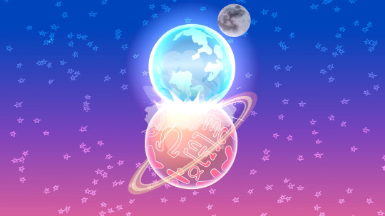
PLEASE CORRECT ME IF IM WRONG BUT ASSUMING THIS IS WHERE THE ALGEBRALIENS COME FROM I THINK THIS IS THE FIRST TIME WEVE SEEN THIS???
HUGE WIN FOR NUMBER AUTISM
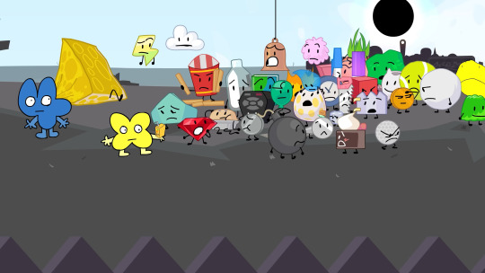
SOMETHING I JUST REALISED WHILE GOING FRAME BY FRAME FOR LAST IMAGE, MARKER. IS PURPLE HERE BUT THEN

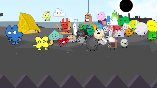
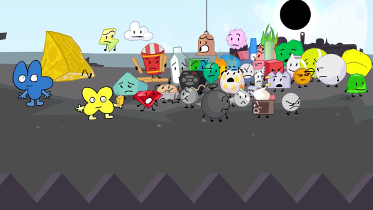
YOU CAN SEE THE EFFECTS TAKING PLACE!!!!!
THATS AWESOME!!!!

these little shits are remind me of goo man from TPOT 11 (out of the blue)
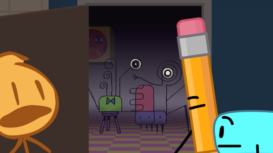
looking back at goo man im not sure why

IM SO HAPPY THE VR HEADSET HOST FINALLY GOT USED

according to the awesome wiki
"The character was shown during the production of BFB. They may have been the original host of BFB, given the tweet description, but was replaced by Four and X.
Sometime after the VR Headset post was posted in jacknjellify's Twitter, Satomi clarified VR Headset was never meant to be a host or any sort of character, and was drawn simply because Michael thought they would be cool to draw."

HIIII PROFILEY... AWESOME TO SEE THEM BACK. REALLY COOL PARALELL HERE METHINKS BC THEYRE VOICED BY THE SAME GUY AS TWO :>
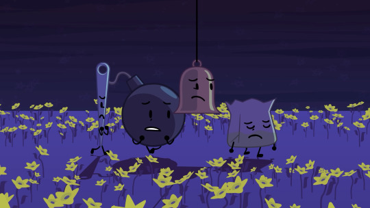
jumping around a bit. this was shown earlier and not expanded on untill the end. this. this drives me insane
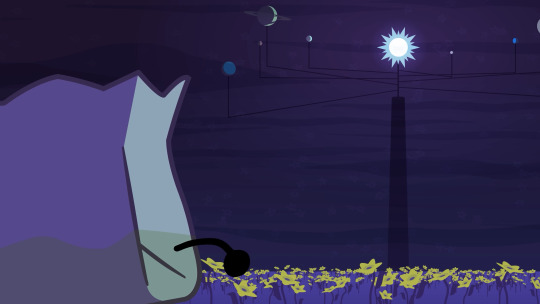
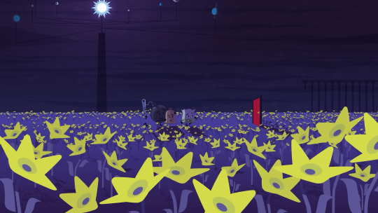
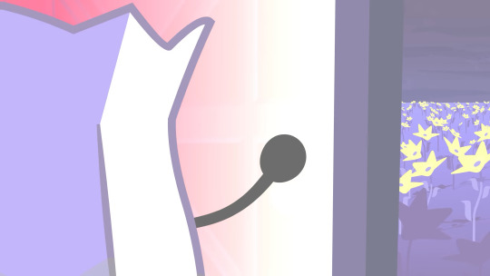
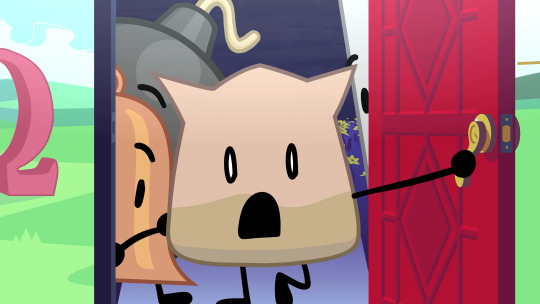
thats ones equivilent of the fourest, it has a link to the equation playground I WAS RIGHT
very interesting its also plant based.

I CANNOT FIND . WHEN I WAS BLABBERING ABOUT THIS SO IT MUSTVE BEEN IN A VC. BUT I CALLED THIS. also barf bag literally my face when i saw this lollll
okkkk back to like the usual time
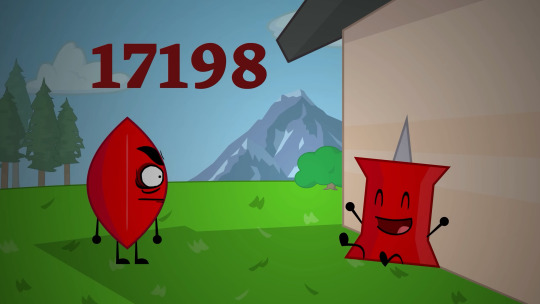
HI EVIL LEAFY HIIII IM SOOOO HAPPY SHE APPEARED. THIS DOESNT MEAN SHE ISNT LIKE DEAD AFTER IDFB BUT IM GLAD WE GOT TO SEE HER IN TPOT .. AND AS A HOST NO LESS!!


ID ALSO LIKE TO POINT OUT not sure if this is just startled or pin here being AFRAID for a second of EL
ABSOLUTELY HEARTBROKEN RF AND BB GOT OUT SAME TIME. HORRIBLE also neat they used the ending of the bfb intro here
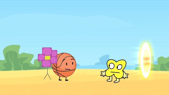
X host.... imagine. life could be a dream
ok let me go over all the style stuff we see here also in order
(starting at the start of cake at stake (or cake at skate))
for the entire first half its just the usual TPOT style so i wont make a huge deal of that
Ean's part is also in TPOT

Pan Flute here's part is in the style of BFDIA specifically the newer episodes, figures, thats what hes from
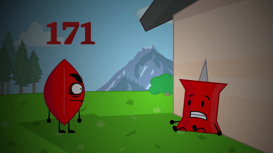
EL's part is also in BFDIA style (with some very old assets behind), however id like to go over something else here


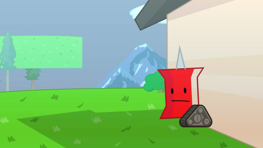
RIGHT BEFORE SHE APPEARS PIN GOES THROUGH SOME OF HER BFDIA ARC CHANGES. NEAT
also the music in the background here is "The Fiber" (thats what its called in the bfb ost release at least) WHICH IS ALSO THE SONG THAT PLAYS ENTIRELY THROUGHOUT BFDIA 5B!!!! AWESOME!!!!
youtube
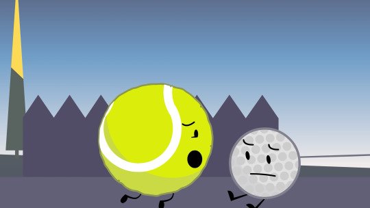
GONNA BE HONEST NO IDEA WHAT STYLE THIS IS SUPPOSE TO BE... THE ANIMATION IS SUPER WEIRD AND DIFFERENT. it actually reminds me of how sacri animates her shows!!
hold on i need to make a new post i cant upload any more images
60 notes
·
View notes
Text
Here ye here ye, another breaking down processes post from yours truly!
For this animation, my plan was to make something I'm proud of AND also something to force me to take my time since with all previous animation works they were all rushed. I normally tend to speed through work as someone whose illustrations are painterly and I like to keep them rough. Also lets be totally honest my other plan for this animation was to animate Mizrox being so sickeningly sweet.
Fun fact, this animation was going to be longer. I had tried to plan out Olrox climbing on top of Mizrak during the kiss to lay on his chest. There was an attempt trying to rough that out and several ref videos It was scrapped because for the life of me I could not figure it out. Also hypothetically if I was going to keep it, I would cut to another angle (perhaps Mizrak's face close up) and then cut to another angle that would make it easier to see that climbing over the top. OR, consider Olrox already sleeping on his chest (im just rambling now but this is basically 'if you were able to do this again' section).
I wish I actually went through a more proper tie-down process because the jump from going from my rough straight to clean was rough (badum tsk) for the first few seconds. Defintely learnt my lesson ALSO Olrox is surprisingly really fun to draw from behind.
I challenged myself to see if I could get the idea of "bigger movements, less in-betweens, smaller/slower movements, more in-betweens." Though the effect of Olrox rubbing his face against his arm may be a little too jarring and I steered quite a bit away from my rough and self-reference video in hopes of making the face rubbing more apparent because I thought the character acting was too subtle and wanted a contrast to the other half of the scene. I reconfigured my CSP animation workspace for this too so it definitely made the process less tedious when cleaning up the animation.
(Which by the way I do record a lot of self-references depending on the section! For things I can't do/uncomfortable doing, I'll end up looking up videos. It's the easiest for me to catch subtle things in body language and also get a feels for the motion.)
Also I'm really satisfied with Olrox's anticipation before his smooch and the shoulder roll at the end even though technically the arc doesn't complete itself. MIZRAK THOUGH, when cleaning up I realised my rough wouldn't make sense because he's already looking at him so there's no need for a turn, and then the lack of a shoulder movement felt jarring, so all of that was done without any thought, wish I did think about it more though.

Now compositing was a monster in its own right and basically me jumping back and forth between turning on and off different layers, but here are all the new things I did; I duplicated and blurred the lines of the lineart, beveled the shadows so it was lighter on the inside, and added a rim of blur so the focus drew towards the couple. Also will absolutely admit that my fanboy ass went "... be crazy and try to mimic the show." The final did not go that route because I thought it was more important to emphasize the mood/atmosphere (Also Olrox is intentionally stylized differently because i wanted him to be softer here and I had to give him eye highlights for plot HELP). THOUGH to say I did not try to mimic the style, the #2 lighting test was my 'attempt' LOL 😭 I can never consume media normally.
Here are the lighting tests I went through. I definitely knew I wanted to go with a morning vibe, though I tested out a night ver for fun and did some edge lighting which led to mixing both version #2 and #3 to make #4.
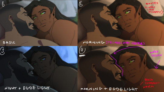
Fun fact, I almost went with #2 due to fear of getting too heavy-handed with compositing and therefore losing the animation (even though I really liked #4 at the time). Thanks to a friend, they also shared the sentiment of liking #4, though pointed out it felt like midday and encouraged me to make the colours warmer and deepen the shadows. It is a really tough balance but I think for a softer scene like this, the more additional layers of comp worked out in the end.
The edge light was a last minute thing because someone told me to add sound and to have light stream in. Also at this point I deadass forgot that you know, Olrox, is a vampire, but hey rule of cute overrules. We can pretend its light not from the sun LOL

Also yay I got to show off my own style a tad, I love paintingggg. It's not as completely fully rendered coz I knew that it would get covered up but I still made sure it was quite clean regardless. I didn't realise how much of it would be covered up even though I did make sure they would fit/make sense for bg LOL
Now we are done!
If you've gotten this far thank you! There's gonna be less frequency of these animations due to the semester starting back up soon and I don't get many opportunities to actually 2D animate (despite it being an animation degree RAH). Also I remembering cringing and laughing a lot when I immediately started putting colour down going "oh i can see the end of the horizon, i have too much power as an artist, people will see this i cant let them see me be crazy"

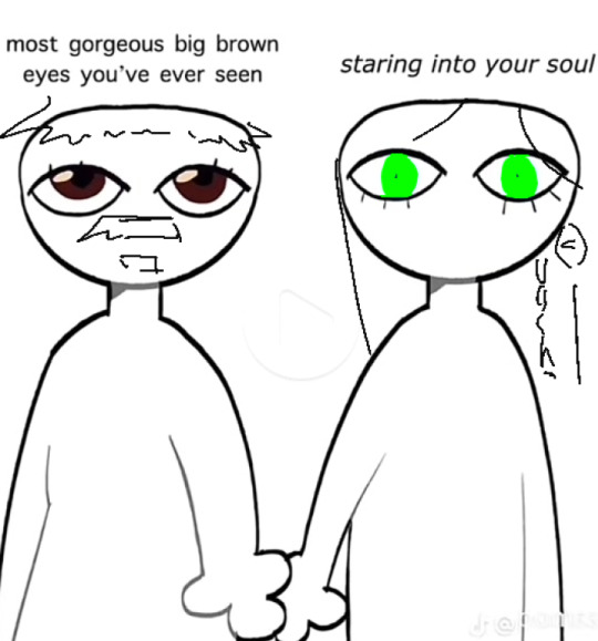
[Here's some memes I drew over while my friend was reviewing my work]
#mystery talks#castlevania nocturne#artists on tumblr#castlevania#castlevania fanart#fan animation#olrox/mizrak#i still keep going “oh no people who worked on the show will see this theyre gonna see im insane /lh”#its ok coz being crazy pushes you to achieve things
88 notes
·
View notes
Text
Batkids as AO3 users
Dick - I don't think he'd be a writer. He just don't give me the vibes, ya know? He would, however, read fics about people he knows. And himself. He's deep in superhero fandom, and at some moment he gets super invested in some rarepair and actually menages to set them up. I also think as a teenager he would stumble upon some E rated fic for someone he knows, then promise himself he'd never touch it again, and then a few years later he reads them a lot, is just super secretive and guilty about it. He does not, however, touch Batman E rated fics with a ten foot pole.
Tim - you'd think he'd write Hero RPF, huh? No. He's deep into Formula 1 RPF. He writes, he reads, he's just very active in fandom. Most of his works are some kind of Formula 1 murder mystery.
Jason - he is the one from Hero RPF. He doesn't read it, he just writes it. In various AU's, ranging from some inspired by his crazy adventures to those from classic literature. When he was still Robin, he wrote Pride and Prejudice Superbat fic, that became crazy popular. After ressurection he sweared he wouldn't touch it, but after checking it out once and realising how tragic his writing style was, he rewrites the whole thing. He reads fics from fandoms he does not know the original works of. He finds a fic he likes, and learns things from it. Then he spirals deep into fandom. Like many of Batfam fans I imagine. That's why he doesn't write, because he feels he can't without knowing the original, and he sure as hell ain't watching some kids show called Ben 10.
Babs - I think her beginnings were in something like Twilight of DCU. She would regret it forever. Currently she's involved in some shows she watches when on break from work and Oracle. I'm not really into TV series but maybe something like Bridgertons or The Boys or something like that. She writes only one-shots and is active on Tumblr. She has like a thousand bookmarks and she posts fic recs with the most wild analysis of writing style, plot consistency and just vibes. She stays away from any RPF's, but esoecially Superhero RPF. She's got it enough on day to day basis thank you very much.
Steph - that girl post Robin writes the most sick gore body horror fics change my mind. And she does it in fandom's you would least expected. She also writes Spoiler/Batgirl fics, that are really fluffy but also full of action and actually made the pairing wildly known.
Cass - she reads everything Steph writes for Spoiler/Batgirl. Steph does not know Cass knows she writes them. Cass is really charmed. She tried writing one, but it came out really dark and she didn't like how clumsy it was and gave up on trying to be an author. She reads heavy angst, crack, or Steph's Spoiler/Batgirl fics, nothing else. She's the person that leaves very short but very sweet comments on literally averything she likes.
Duke - that boy is in the same circles as both Tim and Dick. He actually finds out it's Tim that writes his favourite Formula 1 fics as Tim finds out it's Duke that leaves those super insightful comments on them that start's conversations with author and other readers. They have one talk about it and then forcefully forgets about it and continues as it was. He writes Batman and Robin and Robin Gang fics. He's really good at it, and that's how he found Duck Grayson. Not that any of them knows that's the other on the other side of the screen. And yes, he's Steph's beta reader, and she's his. They don't talk about it, it's just how it is.
Damian - he reads Batman and Robin fics but only about himself. He also draws fanart and makes comics about Batman and Robin (himself). Later he gets involved in Teen Titans fandom, then the Justice League one, and suddenly he's a wildly known fanartist in the whole Hero RPF community. And he did draw a fanart for Jason's fic ones. They both don't know it's the other. He also gives aby superhero an emotional support fictional pet. Dick think it's adorable. (He was the one that introduced Damian to fandom.)
#batman#dc comics#dc#jason todd#robin#batfamily#fanfiction#tim drake#duke thomas#dick grayson#stephanie brown#cassandra cain#barbara gordon#ao3#fandoms#batkids#batsiblings#damian wayne#ao3 writers#batkids as ao3 users#stephcass#the spoiler#spoiler dc#batgirl
73 notes
·
View notes
Text
Applauding myself for somehow fitting my thoughts on this arc in just three posts. This was a feat
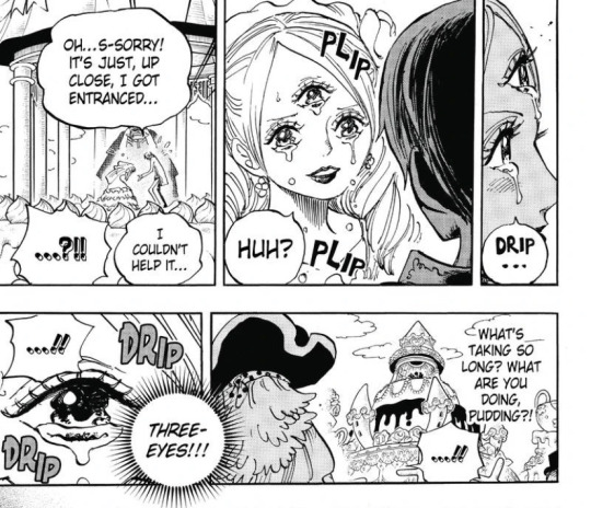
Pudding to me is one of the most overhated characters in the series. She’s a sixteen year old girl who has been conditioned to believe by her own mother that she’s disgusting and ugly, and since she’s not physically strong the only way she can see herself being useful is by being the cunning one. When Sanji calls her eye beautiful, the same eye that she was ridiculed for her entire life, she breaks down, and she falls for Sanji as he’s the first person outside of her siblings that sees her as something other than a monster once he sees her eye. She’s not an evil bitch like a lot of people are convinced she is, she’s a traumatised child
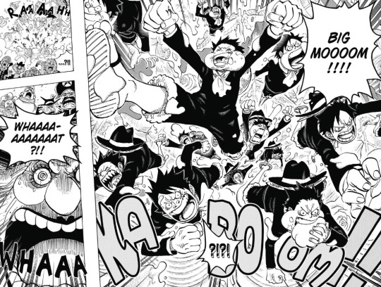
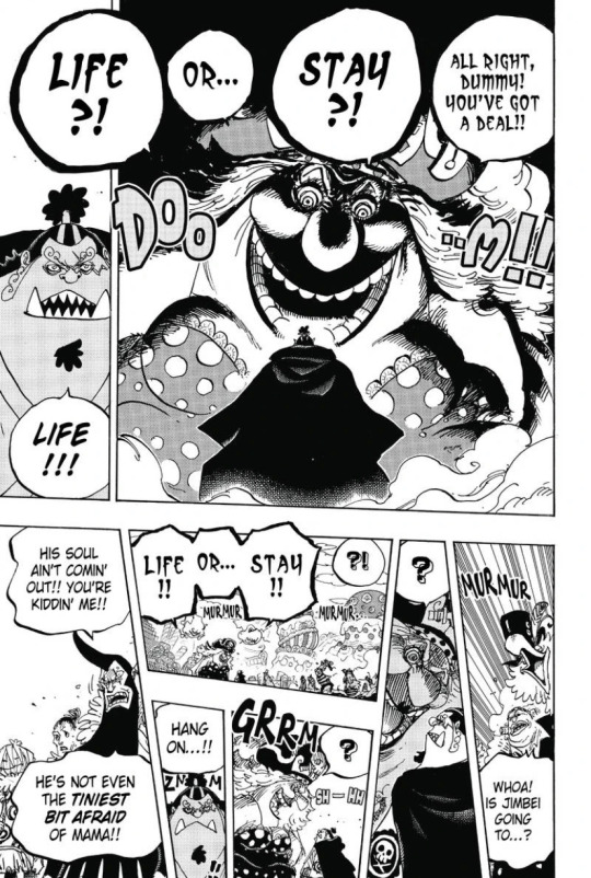
In other news about the wedding, I adore Luffy’s plan of using Brûlée’s power and doing the funniest thing he could: creating a situation in which a hundred feral Luffys jump out of Big Mom’s cake. Absolutely hilarious and wonderful everyone go home. Things seriously don’t go Linlin’s way cause soon enough Jinbei straight up leaves her crew. And holy hell I love this scene so much. He’s so badass! Standing in front of a terrifying emperor and not even flinching? Not being scared at all? Jinbei is one of the most loyal Straw Hats and here you can see it on full display
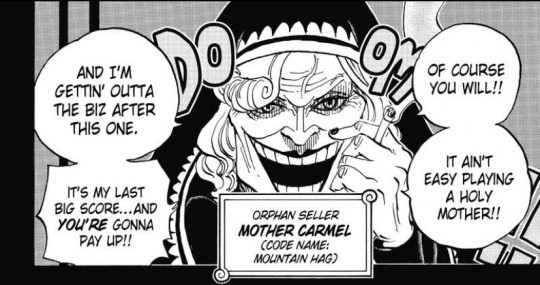
Big Mom’s backstory in itself is insane, and while most people will be jaw dropped at the plot point that Linlin accidentally ate her friends without even realising it, to me the Mother Carmel reveal is what always gets me. ‘Orphan seller’ displayed in the box is so jarring, and the fact it’s the navy looking for these kids should tell you all you need to know about how much they actually care for the justice they wear on their backs so proudly
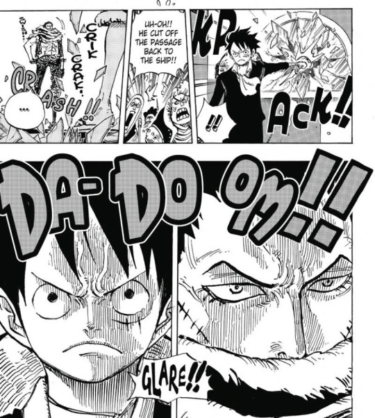
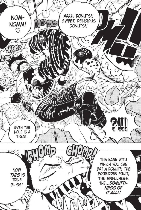
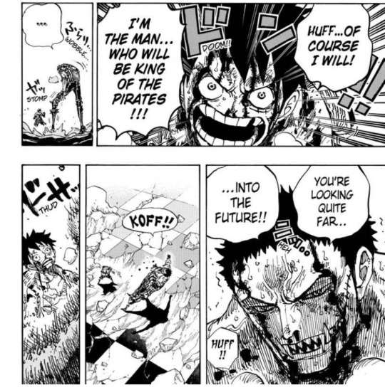
While Luffy vs Katakuri is great in the anime, as Whole Cake is where I’d say the current style of One Piece finally found it’s bearings, it’s absolutely ingenious in the manga. Oda goes so hard on the panelling, and the pacing of the fight is absolutely wonderful, with the reader learning more about Luffy’s abilities, Katakuri as a person and the dynamic between the two as the battle goes along, and it never once feels as if Oda is drawing something out or adding unneeded stuff. Everything here serves a purpose, and I adore this fight, even if it isn’t my favorite in the series
Also on the topic of Luffy vs Katakuri I highly recommend this video as it goes over WHY the panelling of the fight works, it’s really good I just gotta recommend it
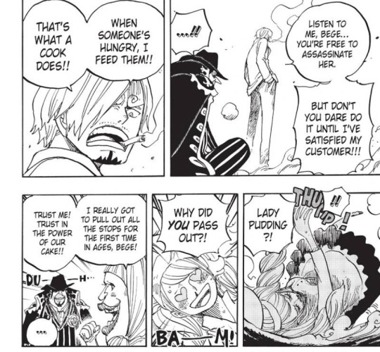
Something I really like about Whole Cake is how it brings back the themes of Sanji’s character explored in Baratie, and puts them on full display. Big Mom may be a tyrannical emperor that’s chasing the main characters to kill them, but for Sanji, she’s still hungry, and she still deserves to eat food. It’s the biggest reason Luffy wanted him on the crew: his kindness towards everyone, something his father saw as a weakness, but that One Piece shows you again and again, is an important trait to have
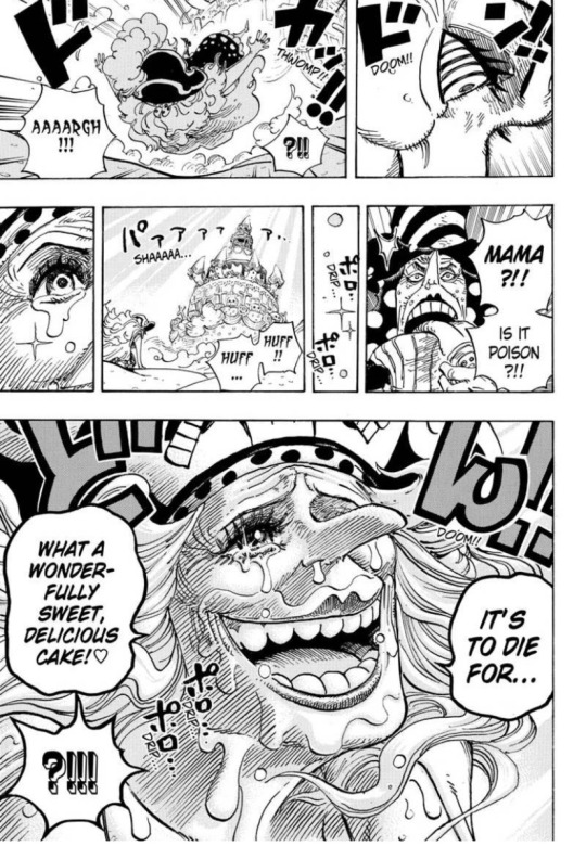
And well, the cake Sanji, Pudding and Chiffon make us absolutely wonderful. I really want to bring attention to the absolute masterclass of a panel this last one here is, from the passage of time when you’re holding your breath between the six panels before it, to the absolutely amazing rendering of Big Mom’s face, I adore it so much. Maybe it’s a silly thing to gush over and give a whole section to; but damn me if I didn’t mention it
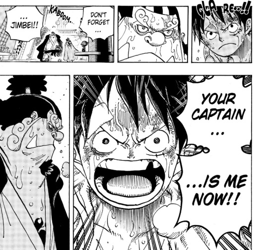
Besides the musical number being sung in the background, Whole Cake Island ends with Jinbei now officially a Straw Hat, but having to leave for the last time to save the crew. Again, his loyalty is unmatched, one that has been built up since the Summit War Saga, and every single time it’s on display, I love his character more and more. I genuinely don’t get people who believe he shouldn’t be a Straw Hat, he deserves to be part of the crew more than anyone else you could have wanted here
#one piece#op reading corner#whole cake island#charlotte pudding#monkey d luffy#jinbei#sanji one piece#charlotte linlin#straw hat pirates#wci is a beast of an arc god I love it so much
20 notes
·
View notes
Text

“This, is a soul stone.”
“A…soul stone?”
“Yes. Once a soul leaves its physical form they create a soul stone to keep their…ghost-like form intact. This soul stone is surrounded by the actual projection of ourselves, similar to how a heart is encased inside the body. It cannot be taken out easily. In fact, the only ones who can remove anyones soul stone from their physical projection is the First spinjitzu master, Sensei Wu, Sensei Garmadon, and the consciousnesses of the two realms of the dead. Other then them, not even the person whose soul stone it is can remove it from it’s home, and its no easy task for the ones who can either.”
“…If all of that is true, then how are we both looking at your soul stone?”
“….Unfortunately, my soul stone had faced extreme abuse years ago, leaving it fractured and….weak.”
“Is that why it has pieces floating around it? It looks almost like a planet, surrounded by its moons…”
“An interesting comparison.”
“Ahm…that’s besides the point. Why are you showing me this? If its so delicate that it can almost never be removed from its home, then why would it help us in our mission?”
“…the merge, has shown to create unique consequences over the years. One of such, being the slow return of the Preeminent.”
“What.”
“I can’t explain in too much depth to what had happened, we don’t nearly have that much time and I need to use it sparingly.”
“What are you talking about?!-”
“A soul stone is indeed delicate, Lloyd. So delicate, so precious, that the very existence of a soul relies on it.”
“The..what?..”
“If my soul stone gets into the wrong hands, if it faces too much harm, I will no longer be able to keep it connected and in ‘one piece’ as I have so far. I will be erased from existence, and so will all the knowledge I have so painstakingly collected.”
“…Where are you planning to go, Morro?”
“…A place I should’ve visited years ago.”
——————
Will there be a fanfic of this? Probably not, since i can’t stick to finishing stories.
Anyways, take Morro from an AU i created in my head, theres no other content of it other then half completed stories in my notes/word documents and this post.
If anyone rlly wants me to, i can go more into depth of this AU and give it a name. But for now, all you need to know is that its mainly canon compliant, just with a few changes to the story of Morro and then the actual canon divergence starts during the merge. Some things before that will also be changed to fit ideas i have and things i like, such as the issue with Lloyds age.
Oh, alsooo! Morro in this drawing is still a ghost, but in this AU to differentiate departed ghosts from cursed, cursed ghosts look like how they did in the show and Morro’s og design, but departed ghosts tend to look more like how they did when they were alive (with some differences and yknow, being see- through)
So Morro in this looks like how his Departed ghost form would in this AU
I also realised that the gi itself looks a lot like Cole’s because of the black and orange. Pretend the orange is grey/green/yellow, pls and thank you.
AND MY FAVOURITE LITTLE DETAIL. Look at Morro’s gi and how its folded, see what i did there??
I had fun drawing this with another newly acquired art style, this is also one of my first few times drawing Morro and being happy with it. Turns out i am very picky when drawing characters i like over literally anything else.
#morro ninjago#lego ninjago#morro wu#lego emo#green#ninjago morro#lloyd ninjago#ninjago fanart#green ninja#ninjago au#asrikal art
71 notes
·
View notes
Text
Morgan, you fool
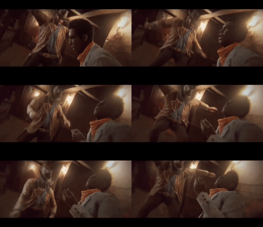
(yes I wanted to give this a try)
Please excuse my mistakes, English is not my first language (French feller here)

Arthur Morgan x GenderNeutral!reader
Word count : 2.1k
Short summary : Arthur Morgan is completely drunk at camp and everyone is pissed by his attitude, so you're actually called to take care of him.
A/note : Arthur's tent has flaps for more privacy !
Tags : fluff, cuteness, drunkenness, Arthur's puppy eyes, chapter 2, Arthur is SOFT, trust issues, hugs

"Y/N !"
Ms. Grimshaw’s voice sounded behind you, you couldn’t hide anywhere. Almost everyone was asleep, but not you. You loved spending time smoking near the cliff of Horseshoe Overlook’s hideout, gazing at the stars when the moon was not shining. You had been rescued by the Van Der Linde gang over a few years ago, and Ms. Grimshaw calling your name had always triggered your sudden desire to hide in a tree and never get down.
There was no way out of her call, only falling forward... and you certainly did not want to die. At least, not yet. You turned back, noticing that Ms. Grimshaw was waiting for you, hands on her hips, standing near Arthur. You noted how drunk he was, he was barely able to stand on his feet and was singing something in another language but English. He had been on a night out with John, you almost did not bother when you saw Marston coming back alone. Arthur had just arrived. And he was singing a song in Spanish with a broken voice, loudly enough to wake the whole state up.
"Could you take care of Arthur ?" Ms. Grimshaw asked you. "He’s drunk like a skunk and is too noisy."
"What ?" you shrugged. "Why me ?"
"Cause you’re the only one awake who's not on guard duty, Y/N ! "
You walked closer to Arthur who nearly fell on the ground as he noticed you were about to drag him to his tent. You had no time to question anything, Ms. Grimshaw had already vanished somewhere, leaving you alone with a drunk Arthur who could not stop singing la Calandria. Javier might have taught him that song.
"Ay Dios, no ay remedio, ay Dios, no ay Piedad !" Arthur shouted
"Shh…" you whispered, wrapping his arm around your shoulder. "It’s late !"
"Me robas el reposo !"
"Arthur, please."
"Y adiós tranquilidad !"
You chuckled, listening to his sudden high voice, his laugh as soon as he forgot about the lyrics, speaking in a rather strange mixture between Spanish and a very broken German. He clung onto your shoulder, singing continuously until breaking his voice even more. You had never seen him so joyful, so happy to be alive. He trusted you enough to be himself around you, enjoying telling you about his discoveries, showing you his most personal drawings of you while blushing, believing you would hate every single one of them. However, you would often compliment his style, you adored his drawings. But what you loved the most was the smile he rewarded you with whenever you would say how beautiful is art was.
While you dragged him to his tent, you suddenly realised how short you were, and how heavy Arthur was. He was showing some resistance, tripping on nothing, slurring a little before moving forward, still trying to keep you away from his tent. He did not want to stop singing, he wanted to dance with you. All night long, if he could. However, his legs would probably not hold him long enough, his overall state would lead him to fall on the ground and watch the sky for minutes before passing out.
"Aaahaaah !" he shouted. "FOUND YA, Y/N !"
The journey between the Scout Campfire and Arthur’s tent felt endless, since Arthur would, at times, fall on his knees, dragging you to the ground. You would squat down and put him back on his feet, up until reaching his cot on which you gently pushed him, closing flaps behind you while lightening a nearby candle. Arthur laughed to himself, trying to talk to you in a rather strange language that was known to nobody but himself. Noticing he would not undress and was rather kicking his legs with a frown, you sighed and obliged. You knelt before him and took his boots off.
"Let’s get these off, shall we ?" you smiled
Arthur titled his head, you could barely resist to this attitude. Arthur was always quiet around the rest of the gang, never displaying any signs of childishness. However, at this moment, the way he looked at you reminded you of a young man, or a puppy. You took his boots off, carefully unbuttoning his shirt, trying your best not to meet his gaze a second time. Otherwise, you would certainly end up blushing and kissing him everywhere you could. It was hard to resist, whatever Arthur was doing.
"You’re handsome, Arthur." you whispered while attempting do drag one his arms out of his shirt
"No, I ain’t handsome." Arthur responded with a rather raspy voice, still displaying evident signs of drunkenness. "I’m ugly. The ugliest man on earth."
"You ain’t ugly, Arthur. Next time you’ll say it, I’m gonna slap you across the face."
"I’m ug…-"
You quickly rose your hand before Arthur’s face, making him shiver and shut his mouth. You hated listening to him complain about his appearance. To your eyes, and to the eyes of a vast majority of the people who had the opportunity to meet him, Arthur was handsome. Handsome and charming. You would get lost in his blue/green eyes and melt each time he winked or sent you an unexpected smile. To your eyes, he was most certainly the most handsome man you had ever met. And listening to him insulting himself when looking at his reflection was always devastating to witness.
"I’m not ugly." he gasped as your hand moved back to his shirt
"Better."
He did not move a finger, allowing you to slightly undress him. You took his shirt off, removing his suspenders in the process, gently rubbing his skin with your hand. After being done, and mostly tired, you pushed him on his cot, making him rest his head on a makeshift pillow you had bought for him earlier. He cherished this pillow, as well as any gift you would be willing to give him.
Each flower you collected during your travels would be kept on his bedside table, even these small funny shaped rocks you would find by the river. He loved piling them next to him when he was alone and nobody was watching, grumbling and sighing when his construction would collapse, and be overwhelmingly excited when you would bring him another one. You could see how happy he was to see you, and how much he loved these weirdly shaped rocks you kept offering him. He adored seeing you coming to him with a large proud smile blooming on your face, impatient to show him your latest discovery.
In exchange of your various gifts, Arthur would also bring you flowers from his trips, as well as a few antique alcohols. He always enjoyed offering you his drawings, you had a full collection of them in your chest, cherishing every single one of them. You were the only gang member to know how sweet he was behind his brawny stature. Whenever he was with you, you would never get into any trouble ! Everyone would easily be scared by this man, built like a tank !
"Stay with me." Arthur said with a soft voice, certainly not wanting to let you go
You could no longer resist, your eyes met his. You felt like melting as Arthur gave you this puppy look which would win you over anytime he wanted something. You could easily do the same to him, just throwing him some subtle glances which would instantly drag him to you. Just a word and he was yours, entirely. But right at this moment, you were the one that was his. You could not resist to this gaze filled with desperation and love.
"I can’t, Arthur."you sighed, feeling tired. "I need to sleep too."
"Please." he begged. "Stay with me ?"
"Don’t you want to drink some water first ? You must be freakin’ thirsty !"
"I am… Could you get me some water ?"
His weak voice broke your heart. His throat was sore, you did not even think about giving him any water on your endless trip to his tent ! You quickly left his tent, he whined a little before sighing, placing his hand on his forehead. He could not get some water by himself. He knew he would not remember anything from this night, not even being this soft with you. He had always been a bodyguard around you, but you did not mind his rather childish attitude. In fact, witnessing his soft side was not as bad as you thought. He was handsome and adorable at once.
You came back with a glass of water. As you handed it to him, Arthur almost made the glass fall, his vision being mostly blurry. You sighed and smiled, him struggling to grab a glass of water was certainly a funny thing to watch. As soon as he caught the glass, he chugged it without even bothering about the fact that a third of it landed on his bare chest.
"Slow down, feller." you smiled
"Agh, sorry. " Arthur gasped. "I feel like I haven’t been drinkin’ water in ages !"
"Morgan… you fool."
After finishing, Arthur gave the glass back to you and sighed, feeling a little better. However, he could not even more his legs properly. He remained seated for a short while before turning his head back to you. Arthur slowly opened his arms for you to embrace him, you could not leave him anymore. Not like this. His pleading look and teary eyes were so pure that you could almost forget Arthur was a 36-year-old cowboy. Lenny had the same impression when he got drunk with Arthur at the saloon, a few weeks ago. Whenever he was drunk, Arthur was cheerful.
You smiled and took your boots off, causing Arthur to tap the side of his bed with the tip of his fingers. He wanted to rest on you, not next to you. In fact, there was not enough space for you two to fit his cot, and you were certainly not sleeping on him. You knew Arthur was probably going to get up early for his morning coffee, you did not want to make him uncomfortable. You gently moved next to him, Arthur wrapped his arms around your waist and buried his head in the crook of your neck. His beard tickled you a little, you chuckled each time his breath would caress your skin.
"Comfy here, Mr. Morgan ?" you smiled
"Hmmm. Yeah. Comfy."
You caressed his back with the tip of your fingers, he chuckled and wriggled a little, begging you to stop. He would rise a little above you and unexpectedly kiss your lips before falling back on you, resting his head on your chest. You were shocked, but still loved it whenever he would kiss you so unexpectedly. Your hand rises above his head, caressing his dirty blonde hair. You have always enjoyed patting his hair, whenever you would be able to reach his head. You loved this silky touch, his short locks running between your fingers. And, despite denying it, he loved it too. Nobody had the right to touch his head but you.
The two of you waited for an hour until Arthur started yawning. His head nuzzled against your chest, listening to your heartbeat had made him slowly drift away into sleep. He loved your embrace, feeling great and, somehow, safe. You also loved it, you loved having him over you like this. He felt like a heavy blanket, you could not catch a cold with him laying above you ! You blew out the candle, he moaned as he felt you moving. You apologised by running our hands into his hair and kiss the top of his head.
"I love you." he mumbled
You shivered, not being sure about what you had just heard. Arthur, saying he loved you ? Nonsense ! He would barely dare kissing you around camp, he knew people would give him a side look, especially Hosea. The latter was very close to you like mostly a father-figure, and sometimes was worried about the way Arthur would approach you. He knew Arthur was somewhat rough and did not really approve anything between the two of you, he still enjoyed seeing you happy. It was all that mattered. Seeing his kids happy was a treasure, his treasure.
"What did you just say ?" you asked, still surprised
"I love you, Y/N."
Arthur’s voice was so weak, you immediately felt the need to kiss the top of his head ore more time. He had never told anything to you, Arthur was really awkward when needing to verbally express his feelings. He knew how to make you understand by his gesture, his embrace, these hidden kisses behind the trees or straight inside your tent, him catching your hand when the two of you were eating… hearing him whisper such a short sentence made you melt.
"I love you too." you whispered back, holding Arthur close to you, enough to break his bones in the process.
#arthur morgan x reader#rdr2#azurestales#red dead redemtion 2#arthur morgan#fluff#rdr2 fanfic#arthur morgan fanfiction#red dead redemption fanfiction#cowboys being cute
452 notes
·
View notes
Note
I saw your reblog about asks and then you gave me an ask and I realised I've never asked you anything before so I sprinted over here to reciprocate the favour (and now I'm a little out of breath because my cardio is shocking!).
So... my main problem as an artist is having a thousand ideas popping into my head but not being able to put even a fraction of them on paper - if you have the same problem, would you like to share any of those ideas??
haha aw, thank you! and same about the cardio 😰
this is a really interesting question!
I struggle with the exact same problem tbh, it's always really hard wrangling so many ideas! I wish I had some like groundbreaking tips to help manage this but my methods are pretty basic:
-as ideas come, i try to write them down (i usually fail at this) but if it's a good idea it will stick in my mind for days or even weeks, so when i get the chance i will sketch something out. it usually turns out really bad but that's ok bc it's just to get the barest essence of the idea, and i'll write down the actual idea down on the paper or canvas of whatever i'm working on so i can decipher that later. (i like to have a good bunch of these drafts ready at any given time so i can pick and choose what to work on next once i complete something)
-this one might not apply to everyone, but: i cycle between a few different art styles. sometimes it depends on what brushes i use, or if i know i want something to be a casual sketch, a whole sketchpage, or an illustration. it also depends on knowing how much time i want to spend on it. faster drawings done with my favorite chunky pen in a more cartoonish style usually rank higher in order of what to work on, because i know i can finish it in a few days (or even hours). stuff that's more detailed/rendered is lower on the list of execution because i know it'll take longer to finish because of details and the linework, and that i'll definitely want to take breaks from that one to work on the faster ones. (i have two pieces for Bad Blood i've been working on for MONTHS now bc they have so much detail and i still don't know when they'll be done lol, just chipping away at them bit by bit)
-sometimes, depending on what art projects i'm currently working on, i won't get a chance to actually develop that new idea until much later on. or maybe i try and just don't feel into it anymore. in that case i try to just focus on something else. i usually have about four or more other art ideas in various stages of completion to work on in rotation which has really helped. and then some days i really don't feel like working on one particular thing and want to work on another, but i compromise with myself that if i get decent progress done on one then i'll switch to the other after a point. just as a little treat :3
i also think a large part of managing all these ideas is accepting that some of them will just never be made. every now and then i go through my procreate files and delete drafts that i know i'll never actually draw. either because i don't love the idea anymore, have no time, i don't think i can execute it well, or just pure laziness.
it kind of sucks but it's just the way things go, and the ideas keep coming anyway so it's not like that's the end of the line if you decide to toss a few out the window! (ESPECIALLY considering we draw a lot of wwe based art and since it's a weekly show there's just so much more potential for new art every few days.) it's great to be able to get anything out at all tbh! i do feel a lot of pressure sometimes that i have to get things out as fast as possible but it does work as a great motivator and i'm just always so excited to see what everyone else is working on and posting! it's a very inspiring environment.
this turned out so long, but i hope it helps! :D
6 notes
·
View notes
Text
Okay!! So!! For those who have been following my ramble blog, you'd know I got into TF2 as of recent
Even if I haven't played the actual game yet... Kinda nervous because Im not the best at those types of games but nonetheless!! I present to you...
TF2 Doodles 💥❤️
(As a new fan... Kinda)
Page 1 doodle page;

Started to draw this because I wanted to develop a style for drawing my top 3 fellas! But then I realised I haven't included Sniper much and I didn't wanna leave him out too much, therefore!
Doodle page 2;

This one didn't go as well as the first one >:(
The white pen I used on the plane kept malfunctioning (dont worry, didn't get it absolutely everywhere) in which it got on the drawing twice >:[ Was less than ideal but hey, look!!! Pretty colours! Focus on the pretty colours!!!
I also not fond of how I did his anatomy bit I erm uhh yeah. I tried XD
Though I do like the gun...usually not good at drawing guns but for this one, it looks nice :3
Medic doodle!!;

The black pen kept showing through the page... This is so sad guys /j
Anyways!! Got told to draw Medic (again) by my irl friends and who am I to deny drawing a silly doctor? We're just gonna ignore the fact I didnt go over it fully with pen >:]
Lil Pootis doodles :D;


Last but not least!! Probably my favourite of the bunch, Lil' Pootis!!! >:D
Dont get me wrong, I have not watched the series yet, but I saw these birds around Tumblr and if anything happened to them, I would be fuming >:C They are the sweetest... and my favourites ever... I love them...silly birds...
I will watch the series, though!! I swear! Im planning on it tomorrow if no other plans fade into existence from thin air.

So yeah! In conclusion, I probably need to practice drawing the fellas but I can do that! They are quite fun to draw anyways. I'll draw the rest of the mercs too, dw :3
Ive been lurking and the fandom (on Tumblr anyways) seems cool!! Was quite nervous to post this but I think its now or never or you only live once or something like that XP
#tf2 medic#tf2 scout#tf2 sniper#tf2 fanart#team fortress 2#100% normal about them#lil' pootis#lil pootis#I love those goddamn birds so muchhh...#doodles#Ive worked on these altogether for 2 weeks now I think approx#I cant even decide my favourite from those three... Grr too hard of a choice#silly#I had to include the Kiwi bird. there was no other way!!!!#Oof my camera refused to focus for most of these drawings. RIP
25 notes
·
View notes
Note
Any art tips for artists just starting out? I’m struggling big time to find my style 😀
Sure.
It got kinda long. Bc when have I ever been a person of few words?
There is no trick to finding your style other than drawing a lot, and setting a, more or less, loose goal. When I was young it was old school Disney and Don Bluth. That was my holy grail, ideal style. But it evolved to be something else, because that's how style works. You'll put your own twist on things, in time. But first focus on practicing and don't narrow yourself down to just one thing. You'll also probably develop multiple styles out of convenience. Sometimes I prefer the cartoony, simpified stuff. Sometimes I'm more into fully rendered pieces.
Experiment. Make bad art a lot. The more you expose yourself to the inherent let-down of sucking at something, the less it stings. The key is asking yourself why something didn't turn out right.
You can't get good at All Art at once. Start with something you're most interested in learning. Maybe it's anatomy, or gestures, or expressions, or colors. Start with that one thing and practice is with a specific goal in mind. Fx: "I want to get better at drawing faces and expressions, so I'm going to do an expression sheet of a character once a week, and do a little practice every day if I can" – That sorta thing. Everyone is different, though. My old music teacher used to say 30 minutes a day. If we couldn't do 30; 15 mins. So on. As long as you do a lil doodling every day that's still progress.
Learning art is sometimes frustratingly non-linear. Somedays I still 'forget' how to draw a certain thing I've had down since I was 14. Other days I bang out something I've always struggled with on the first try, then fail the next day. It's not a linear progression, it's a damn roller coaster. Best you can do is throw your hands up and try to enjoy the ride. The pipe line for me is usually: First attempt (sucks ass but I've learned to laugh at this stage, just throw ideas at the wall) -> getting comfortable (this is where you think to yourself you have a concept down but you really don't) -> Getting good (you start to draw with more ease, you're not having to 'remember' how you wanted something to look, it's just muscle memory by now) -> Actually having it down (and still having more growth to go. But this is where you get to look back on the comfortable phase and go: 'wow I really had a long way to go')
In fact, having fun is by far the thing that's made me progress. More than tutorials, more than fancy equipment. If I'm not having fun, I have no motivation to keep going. If it's not fun, try and make it so.
Get into the habit of stepping back (whether physically or more metaphorically) and really looking at your art often while you draw. When you add a line, or color, or background element etc. Ask yourself "Does this work?" And adjust accordingly. It seems like a lot of work at first, but eventually it becomes a natural part of the process. I don't really realise I'm doing it but most of the patreon screen recordings I have show the way I zoom in and out of the canvas constantly lol.
Make the things you want to make. Even the most self-indulgent stuff. We have a million artists already doing their thing, but we don't have you yet. Show us what you got! There's room for everything.
Get used to people expressing mild envy/annoyance when you're drawing near them. I've gotten the 'wow I wish I could draw, I can't even do a stick figure!' comment from waitresses, cabin crews, classmates I'd previously never spoken to, teachers, strangers on trainstations, etc etc etc. But! Learn to say 'Thank you' when people compliment your art.
Don't ask for critique if you don't really want it. Don't let people critique you if you didn't ask for it.
You! Don't! Need! Fancy! Equipment! Save your money and get the version of a medium that's affordable and comfortable for you. Look at Stardew Valley's creator's old setup. It's really not about how the tools are set up or the price of them. It's how you make use of them. Didn't FNAF's creator build the models in a moving car on a laptop?
Art takes time. There is no short cut to make it take less time. But the more fun you have the more it'll feel like it's faster. If you're miserable the time will drag on and on and on.
Look at a lot of art. Take in and analyse. I wish I could go back a few years and tell myself to analyse paintings I liked, rather than just going "Oh I like that! Nice!" and then moving on. Why is it good? Why does it move you? What captured your attention? Be the person at a museum leaning forwards to see the paintstrokes, you learn more that way.
Don't feel ashamed if you want to take inspiration from others. Everyone takes inspiration from somewhere. If you see something cool another artist is doing with their rendering or lighting or whatever, try and do a drawing or two emulating it! Maybe you'll discover a new favorite technique, or you'll not really jam with it. Either is good. Both teach you something.
You'll go through more eras than Taylor Swift. Sometimes you gotta do a lil Eras Tour of your own and go back through the catalogue. I'm currently working on reviving several projects I made when I was 13-14. Keep everything. Don't delete; archive.
Get good storage. Like, seriously, wish for a harddrive your next birthday or christmas or whatever. If you're working traditionally wish for some good ringbinders and the good plastic sleeves. Much nicer than running out of storage and having to delete things. Never delete!
You are already an artist. You became one the second you picked up a pen and put it to paper, and then decided to keep going with that. So don't compare yourself. When you find yourself jealous of someone, it's because they have something you want. Figure out what it is, and make it for yourself.
Deadass? Tracing helps so much with learning forms. But it's only helpful when you also practice drawing the same things freehand.
The trick to coloring is just that everything looks good shaded with purple set to multiply, and that if you're ever in doubt go in an L shape on color wheel. Down in brightness, inwards in saturation.
People who say you can never use white or black in drawings are jerks and you should not listen to them. You can do literally everything you want. Sure, experiment with other ways of using white and black. But art advice is just that: It's an option, not gospel. As a wise prophet of our time, Justin Bieber, once said: Never say never.
People will say you should be your own biggest critic. But fuck that. Be your own biggest cheerleader. Love what you make, even when you hate it, find something that works. That stepping back I mentioned in point 6? Sometimes that's zooming out and saying "Damn! That looks really good!" – People will often make art out to be something that should be suffering and painstaking. It's not though. In my honest experience, I've made just as much good art when I was happy and content, as I did when I had severe depression and anxiety and burnout. You're not an artist because you suffer. You're an artist because you can't just sit in that suffering all the time. You know there's beauty besides your pain, and so you'll remind yourself in the act of creation that there is always something more.
Once you realise you have the power to draw truly anything, you'll start having a lot more fun. "Oh but I've never done it before" or "Oh I tried and it just didn't work" Okay. So?
In case of frustration to the point of throwing your art supplies out the window: Take a breath. Go for a walk. Sometimes it's just not your day. Sometimes the rollercoaster gets stuck in the middle of a loop or right at the top of a hill. Wait it out. Try again.
You have absolutely got this. Let me know if there's anything else I can help with.
9 notes
·
View notes
Text
Scared into acting again, here are some shadow/persona designs I made for Persona Crossroads:
I saw a news article thing for P6 show up on my phone's newsfeed and got scared into acting once more, here are some more persona and shadow designs I made for Crossroads (which I sort of scrapped since I don't want it to be done in the P5 Tactica art style anymore XDD)
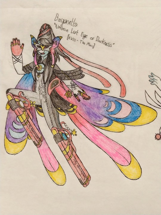
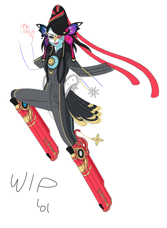
First up we got the myth, the legend, Bayonetta!
I actually got pretty far into making the art digital, but as much of a shame as it is, I just wanted an art style change XDD The final Bayonetta design will probably still look similar tho owo
I used Ernesto from P5T as inspo for the gun feet X33 I don't really have much else to talk about regarding her design since it mostly sticks to her canon outfit in Bayonetta 1.
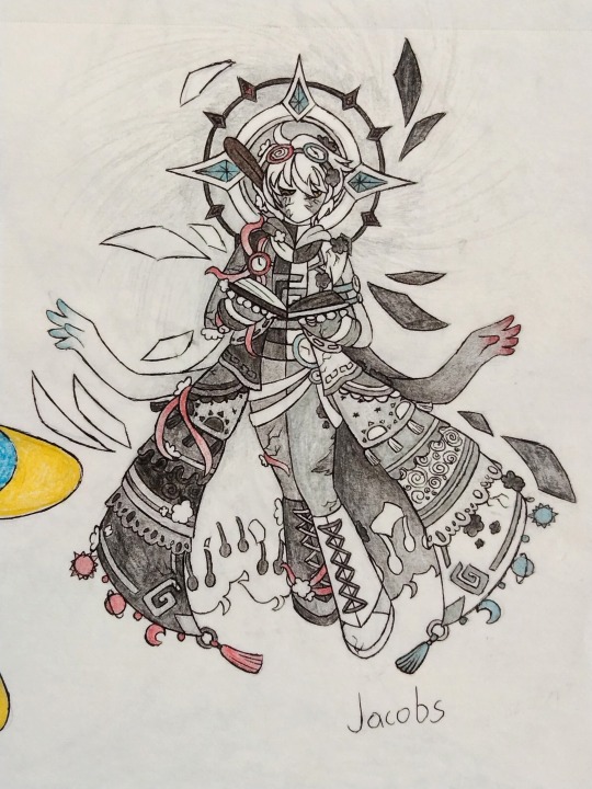
Next, we got Karl Jacobs' TFTSMP character.
I really wanted to lean in on the whole In Between-Other Side-XD's World idea, tho I ended up not finishing the colouring since I got stuck on what to do with the hair lol XDD
The bottom coat part is inspired by a fanart I saw by Cute Studio (I believe their username was...) and the inside of the coat and the hands sprouting from the ends of Jacobs' scarf is a reference to all the versions of him that can be found in the In Between. The last notable note I can think to mention about his design is how his halo is meant to sort of... evoke the imagery of a clock? If that makes sense lol.
I wanted him to look super ominous since Jacobs' was supposed to be a boss.
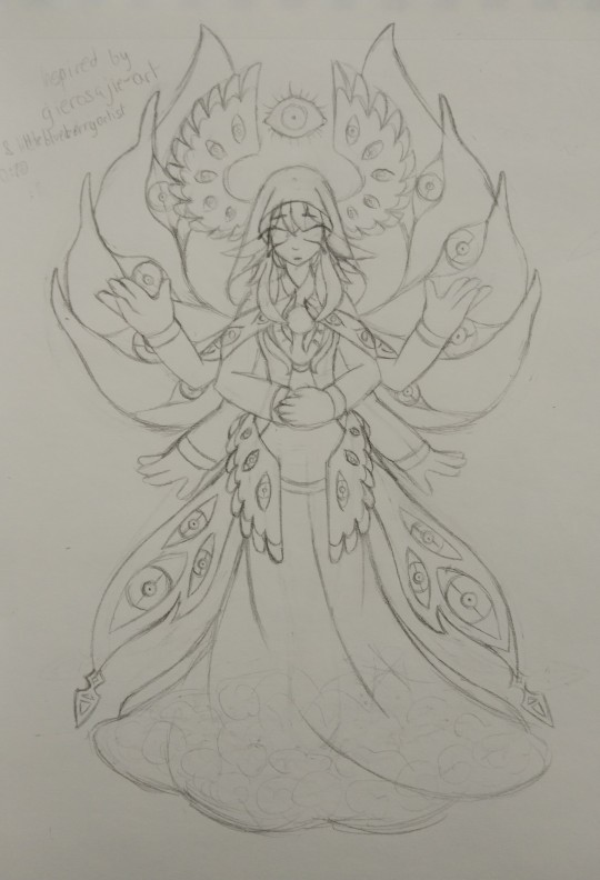
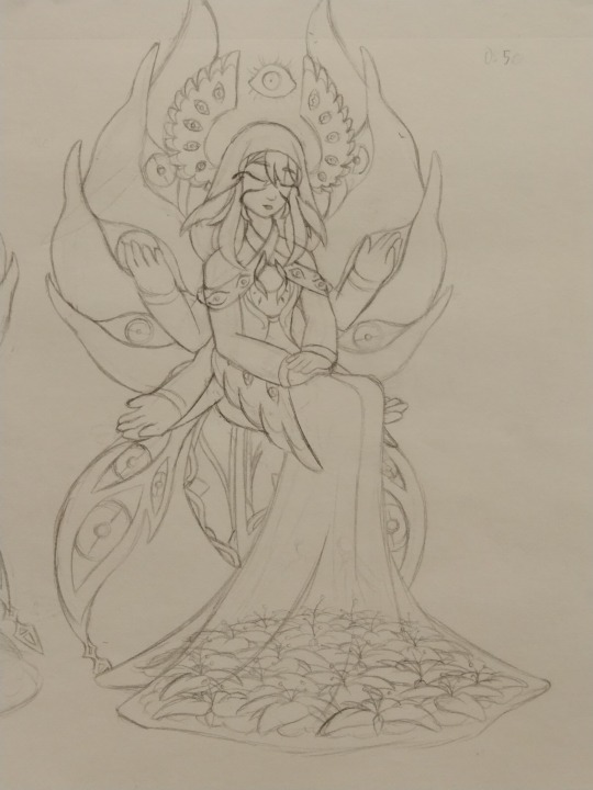
Unexpectedly, up next we have the illusive, rumoured Istaroth from Genshin Impact!
It's a weird choice since we've never had a confirmed appearance for her, but back in my old notes for Crossroads, Istaroth was supposed to be one of the characters' personas, so yeah, I made her lol.
Her design was inspired by art of her drawn by gierosajie-art and littleblueberryartist! Originally I had her standing, but realised the pose of her sitting down with her hands in her lap to be more iconic.
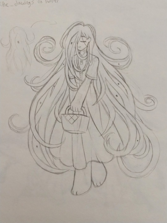
And here we have Mari from OMORI! :DD
I think I mentioned it before, she was originally supposed to be part of a system of personas that's like... a bunch of personas in one personas because their user was a person with DID. Still not sure if I'm keeping the concept yet, but if not, then she'll just be a shadow roaming around.
Her hair was inspired by a fanart made by k0re_drawings on Twitter. I just loved how they drew her hair in a way that looked like snapped violin strings! If I redesign her tho, I think I might use a drawing by an artist called Hiko (I think) as inspiration. Mari doesn't really look like Something, but if you look at her from the back, the resemblance is there, I swear!
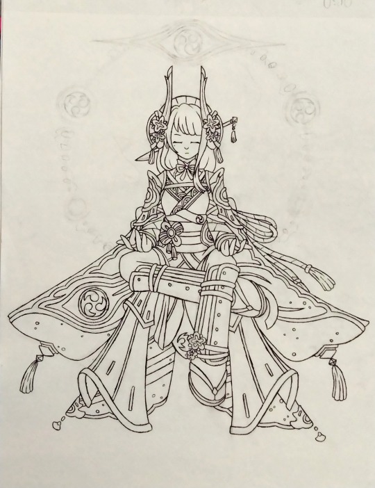
And next we have the Electro Archon herself, Raiden Ei! :DD
This was designed when she was still supposed to be Arilette's persona and I truly regret not making her skin look like shadows :\\
Her outfit is basically just her normal outfit without some of the asymmetricalness and some extra ornaments and armour inspired by the Raiden Shogun boss and a small handful of fanarts. I love how her bottom half has the vague silhouette of a butterfly :))
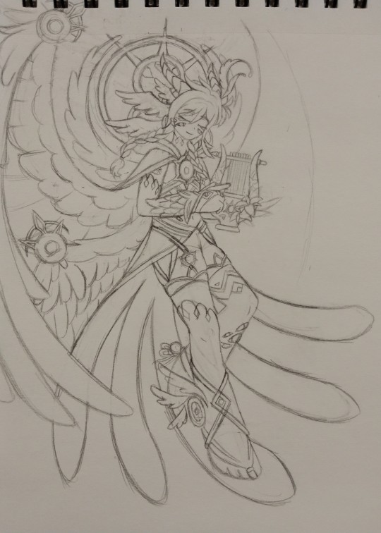
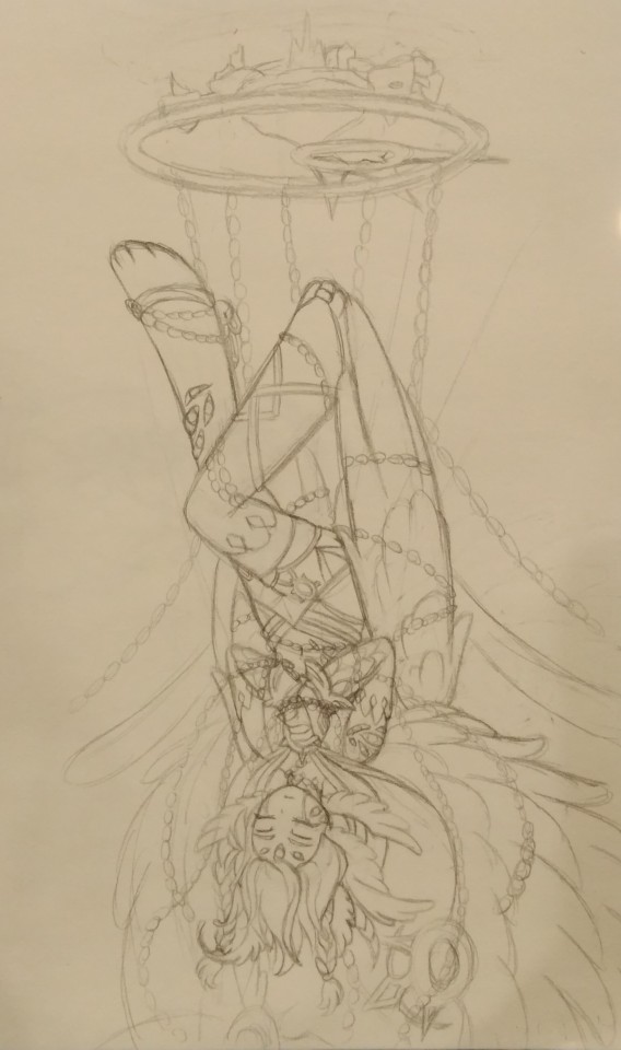
And last but not least, we got the Anemo Archon, Venti! :DD
So... I don't like his design ._. It's too much. I tried using various fanarts as inspiration to try and make his outfit a lil cooler, but it's just... so... much ._. (I do love the touch of Celestia in his corrupted form owo)
Even tho the name of the persona is Venti, I decided to make his look resemble Barbatos so I could pull a Third Ascension and make it look like his bard outfit while naming it Barbatos owo
That's all I got lol
#persona series au#persona crossroads au#persona series#traditional drawing#digital drawing#Bayonetta#Karl Jacobs#Dream SMP#omori mari#raiden ei#genshin venti#Genshin Impact#istaroth
15 notes
·
View notes
Text
Constellation Cat

---
OK I know it seemed like I completely forgot about Stacy when it came to all of this but I DIDN'T I SWEAR- it was just a case of Bex and Silly's drawings taking a LOT longer than I hoped for and it had me running out of steam when it came to drawing them. But hey, this is actually perfect timing to post Stacy's art. The MLP villain of choice for her is Nightmare Moon! I was actually stuck between Chrysalis and her for Stacy, but then settled with Nightmare Moon since I realised that Galactica!Stacy exists so why not make another drawing that incorporated both Stacy and space.
So that's what I did! It was a bit difficult to try and work with Nightmare Moon's design into an outfit of sorts- originally she wasn't meant to wear a dress but in the end I settled with this long flowing one. I also made the crown work as a horn too, just to further tie into the alicorn idea. Kinda like what I did with Silly and her Sombra outfit/look with how the spike headband looks like Sombra's horn. That but make it more elegant looking since this is Stacy I'm drawing and she's the definition of gorgeous. Honestly it was fun to lean into a more "evil" expression for Stacy in this art. I don't typically draw those types of expressions (obviously since Stacy is one of the main protagonists, so she's obviously a good gal), so it was fun to see a different side to a character like Stacy when it came to expressions. I definitely think she wouldn't be as over the top evil compared to Discord Bex or Sombra Silly. It would be a more "sly" evil if you get me. Whether Discord Bex is making never ending mazes full of tricks and illusions, or Sombra Silly showing people their worst nightmares through corrupted hate fueled magic doorways. Nightmare Moon Stacy could just give a certain look to someone and you'd KNOW she's up to something sinister, she doesn't need to say or do anything, but you would know. Did that make sense? If not then blame Discord Bex for putting a nonsense spell on me while I was midway through typing this HAH. I have a LOT of ideas for these 3 if you couldn't tell- I've been feeling nostalgic once again for MLP as a whole, and while, yeah, the show isn't for me now, I still like to look back or listen to some of its music when I can. Cuz it's a really nice show and it was the reason I started to draw in the first place. So I have appreciation for the impact it had on little me whatever number or years ago when they decided to pick up a pencil and learn how to draw their favourite ponies. (Which does explain why my style is so 2010s-)
---
I'm starting to just rant on, if yall would be interested in seeing sketches/doodles of these 3 don't be afraid to say. I'll probably post them anyways but if you guys would like to see more sketches/non-finished work then feel free to pop in and mention it
---
Deviantart
Tumblr
Art Tumblr
Youtube
TMM Official Tumblr
Newgrounds
---
[all content I post is automatically 13+ if not stated in the title or the content itself]
#art#oc character#tmm#oc#too many misadventures#digital art#ocs#digital drawing#my art#too many misadventures stacy#tmm stacy#mlp film#mlp nightmare moon#oc au
4 notes
·
View notes
Text
Logan wanted to try drawing the Sides (+ himself) as well, so we now have his drawings to grace our presence
Let's get started (it will have our little bonus details, I never would've left you like this!!)

Our happy pappy Patton!! He heard Logan was gonna draw him so he missed no opportunity putting on Logan's glasses and posing right in front of him. Logan will be drawing everyone with very harsh lines, including Patton. More on his drawing style later though ;). Through his sketches, you can really tell what he deems more important for each side (in this case, it's Patton's smile) as he puts it in the very centre.

Moving on, we have our Prince Roman! Logan really wanted to accentuate (and place at the very centre) how self absorbed and lost in his imagination Roman is. He drew him kissing his sword because what better way to show the physical manifestation of ego of how unrealistic they are.

Virgil!! Logan took point about how Virgil draws himself smaller than all other sides (like in my first post about them all) and acted accordingly! I personally really love how they seem to understand each other very well and sympathize with each other's struggles. He drew him happily posing with his birthday cupcake, as he should!

Our reptillion repscallion is in the house! Can we acknowledge that Logan has Janus related trauma? We still have no idea what happened to him when Janus snatched him away in POF. So I took matters into my own hands and made Logan draw him as a disney villain. He has a sinister smirk, the infamous hook, his cape is flowing in the wind. Our Lord of the Lies is looking in the distance, slits for eyes. I think it there's one dark side that has managed to get under Logan's skin, it's Janus.

Look at how adorable Remus is!!! Hhhhh I love him and I'm sure Logan does too (you don't have to ship it but I ship it and that's that). He is shown eating his deodorant, a vacant expression as he calmly stares at the distance. Logan can understand that the Duke has no actual impact on him. He can (and will) figuratively undress him with logic. He is just a silly little guy after all.

Lastly we have Logan. He has a closed book in the centre of his sketch, which I find fascinating. I believe the book itself is a metaphor for all of the knowledge that he possesses, as logic, as the overseer of Thomas' language Centre, as the manager of Thomas' right arm (if I'm not mistaken). But the book is closed. The knowledge isn't only not being used as of this moment but it's closed, it's disregarded. Like Logan is being disregarded. Hence the look of hurt and disgust on his face. There is no use for him if knowledge has no power.
As for the harsh lines all over the place, this explanation will be a little long but I'll do my best to be coherent.
Logan is, as far my understanding of the canon goes, as war with himself. His whole arc consists of him realising his importance in the creative process. His job is not to only keep Thomas at check, but to also urge him to create things that are informative, coherent and hold intelligent value. As of right now, Roman is the only one who's handling the creative process (who's being censored by Patton) so the creative process is stuck in a family friendly, full of criticism and stagnant ideas sort of situation. Unless Thomas (and Roman) realise the importance of Remus and Logan in the process, the product will forever be incomplete.
So, you might have thought that Logan sketching the sides would be full of harsh, symmetrical lines, devoid of any character. But even though his appreciation for perfection can't go unnoticed (as it is a big part of who he is), I can't personally pretend like Logan wouldn't figuratively kill it at creating and drawing and writing and sculpturing and singing and acting and and and and...
Conclusion: Logan is precious and must be protected at all costs (also he should be given a little more power, he knows the sides almost as good as Janus and Patton do)
#sanders sides fanart#sanders sides#fanart#logan sanders#patton sanders#remus sanders#thomas sanders#virgil sanders#roman sanders#sander sides#ts#Tss#tss theory#A little overthinking never hurt anybody#(I feel like I've improved my drawing too#Which really accentuated the points I made on Logan's character arc#artists on tumblr
4 notes
·
View notes
Text
Nim Sketch Dump
as promised, here's a big sketch dump of my sona/oc nim! this isn't gonna be a popular post and I don't care 👍
I didn't originally intend to post these so I've referenced some art works heavily but I've written the name of the artist and I'll type it out too! if any of the artists see my references and is uncomfortable with it please let me know and I'll remove it from this post :D
dump under the cut!

the first ideas for his "modern design" (he's been around and recycled for a loooong time). the pose in the top right hand corner is taken from @/hiraethminds! they are a very cool artist and inspire me a lot. though the grey-ish tones as the major colour goes away I still really like the centipede tattoo, centipedes are rad as fuck and you can't tell me otherwise

I started to play with the idea of a goat design for him here! which is strange because like. that's not even his main design or motif or anything, I just really liked the idea I guess LMAO also Aurelai belongs to my mate of the same name! she's not on tumblr (yet) but you should still like her because she's cool and awesome

a treat for my qsmp enjoyers!! an unfinished short comic I sketched on the day tallulah lost her first life. the other characters in this are my old ocs, don't even worry about them
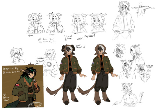
I straight up just have the image that inspired me in this one. its by @/sss-eriema and it was a gift from GOD. I was trying to sort out the colours and wanted to incorporate both orange (my favourite colour) and green (my close second favourite colour) but wasn't having much luck. eriema's artwork showed me that it can work in a more muted way and it was very very helpful!!
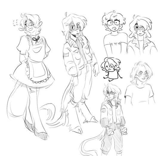
maid dress. sorry. also slimecicle
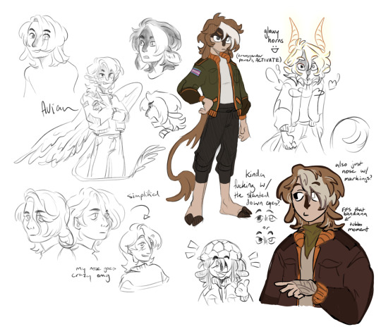
I started to get the colours down in the bottom right corner!! I really like this sketch page honestly. some bonus self portrait sketches because I wanted to try and put some more of my own features into his design as my sona! also in the notes I was debating between the two eye shapes and I'm still thinking about it. I think the bottom ones fit his personality more and are way more expressive but I just like the Vibe of the top ones

a lot of little drawings with varying styles! also more slimecicle. I am adhding so hard for him right now, it's concerning.

t. this one is the reason for the blood tw in the tags. I just really like drawing blood. as a treat. don't come for me this is my self-indulgent safe space leT ME BE EDGY </3 also the writing is a little hard to read so I've put it in the alt! and more qsmp doodles!
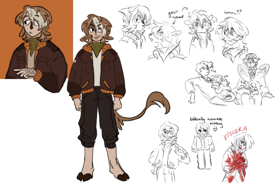
I'm starting to ditch the goat design but this one is my last hurrah. basically settled on the general colour scheme now! and more qsmp stuff. its literally gripped my brain I can't escape it, even in my personal work
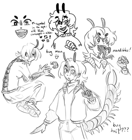
then I realised. nimbus-BUGS. bugs! what if bug? this was a really fun study for using more creature features that I wasn't used to! loving the mandibles tbh
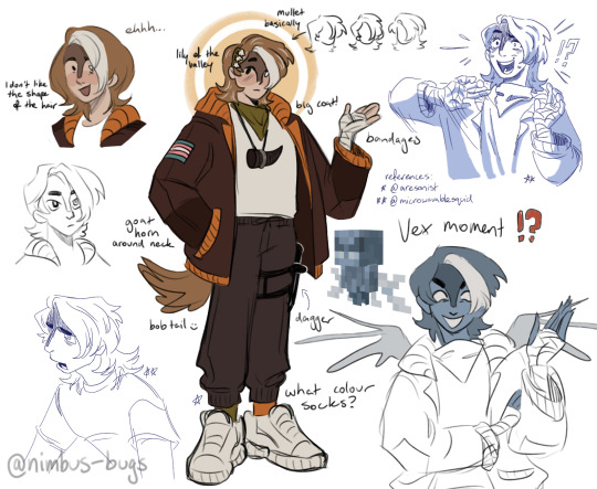
my most recent sketch as of posting! I might update this later, but this sketch page is probably the most gratuitously referenced, the expressions in the bottom left and top right were basically ripped from @/microwavablesquid so if you like those please check them out! the basic design structure of the full body was referenced from @/aresonist, retroactively I realised a lot of my design choices. uh. they also made LMAOOO so if my design in General tickles your brain, follow them!
as for his lore and basic information for what he actually Is, uhhh. ??? I don't know HAHAHA he's a little guy! he's creature! is he human? probably not but no one could say for sure! is he bugs? is he 1000 bugs in a trenchcoat? sometimes he's goat I guess??? I can never decide on a design and I think that aids his cryptid-like habits. he shows up sometimes, vibes and can't die in a way that matters! he has a running motif of my fake-God-thing, the centipede ouroboros, so I was like "what if he was a harbinger of the ouroboros, what then." and I like to imagine he has video game logic where when he dies, he basically respawns. also weirdly it's worked out in a way where he has lots of biblical motifs, like my name is literally nimbus, like the halo, and he's a messenger of a god like some fucked up blorbo angel. also lily of the valley is my favourite flower and I like drawing him with it, it also has lots of symbolism in the bible?? wild.
I sincerely doubt it but if you guys have any questions about nim or want to draw him or anything I would Die. I would just keel over. you'd take me out.
thank you so much if you got to the end of this btw!! this was a lot. seriously though, it means the world if even one person would like to see my little guy <3 have a great day and take care of yourself!
18 notes
·
View notes
Note
You could just provide the correct warnings for your Targ Ocs and put at the top that you are not cool with Targcest and the like and that just including it for continuity. just a suggestion because i would love to hear about your Targ ocs
Honestly… good idea.
I’ll post them in response to this ask too then because why not
Warnings: Targcest, twincest -none of which I agree with but if you’re gonna targ, targ hard- and special little snowflake syndrome
I actually wasn’t gonna post about them any more unless I figured out how to draw dragons so I could draw theirs. But… I’m gonna anyways.

(Info on them below the cut + chibi faces for them)

They were made in like 20 minutes on the discord server like I have put no thought into this at all. It’s just for fun. Hate them? Sure, go ahead. But I don’t care
These are Elaena and Aenar Targaryen (literally just chose canon targ names lmao), they’re twins and they’re targaryens and you know how that’s going down already.
They’re Alicent and Viserys’ kids, idk where in the order they’d fall but they’re assholes no matter how old they are.
Both of them have like… issues. Severely.
They grew up kind of hating eachother. Of the eggs given to them as babies, both of them came from a diseased clutch. One never hatched, and the other one was deformed with bicephaly, and assumed to die soon. They both argued over who’s ‘fault’ it was, and when the surviving dragon showed to be healthy despite its deformity, they both argued over who got to bond with it.
Of course, because it had bicephaly (two fucking heads) it meant that it could bond with both of them. Because both heads kind of function as separate entities, despite sharing a body. This made riding dangerous, especially for Aenar, as Elaena bonded with the dominant head and he bonded with the more submissive head.
Despite this, Aenar rode their dragon the most, and ended up getting injured his first time trying because the other head threw him off. It left him with a scar, but he got back on anyway just to just of stick it to Elaena that he was better at riding than her on a dragon that loved her more. He was still bleeding though and like mildly concussed, so he almost fell off again. Elaena helped him off and cleaned him up because she didn’t want blood getting on her dragon, and he’s an asshole so he wiped a bunch of the blood on her.
This, due to fucked up and gross reasons, lead to a lengthy love affair between the pair, sometimes including other people if they felt like it, and generally just them being gross.
Elaena’s the perfect pretty little political pawn. She’s basically used by her family to get them more power and she complies because that’s what she was raised to do. She mostly wears green, and a lot of jewellery, and the green is because Aenar’s eyes are green and they’re weird and twincesty together. She was a germaphobe as a kid (hence Nar wiping blood on her in vengeance, and her dislike of blood being on her dragon) but she grew out of it with time. She still likes to be neat and clean, and portray herself as the ideal of a Targaryen woman even if she’s not quite that. A lot of comparisons would be made between her and Nyra, simply because she’s what the greens use as an example of how Nyra ‘should’ behave. She has a lot of piercings bc I said so.
Aenar refuses to marry, and rebels a lot more openly than his sister in that regard. He’s a dragon rider or he is nothing. He keeps his hair as long as he can grow it, often styling it similarly to Elaena’s, and wears a lot of dark purples (again to match her eyes). He can be incredibly violent, though does not portray this openly, and enjoys himself his ruffles on his clothes. He encourages Elaena’s more fucked up habits and even started a few of them, and no matter who she marries he makes sure he’s the most important person in her life - he is her twin, after all. The only reason he’s neutral in the dance is because he’s too busy being a little freak to realise that politics is happening around him.
I will leave the more fucked up stuff for like… later… because an intro post is not the place to get into Elaena’s bad habits and Aenar’s weird little perversions. But these are the basics.
#Game of Thrones#a song of ice and fire#house of the dragon#hotd#hotd oc#tw targcest#tw incest#tw twincest
6 notes
·
View notes