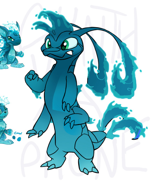
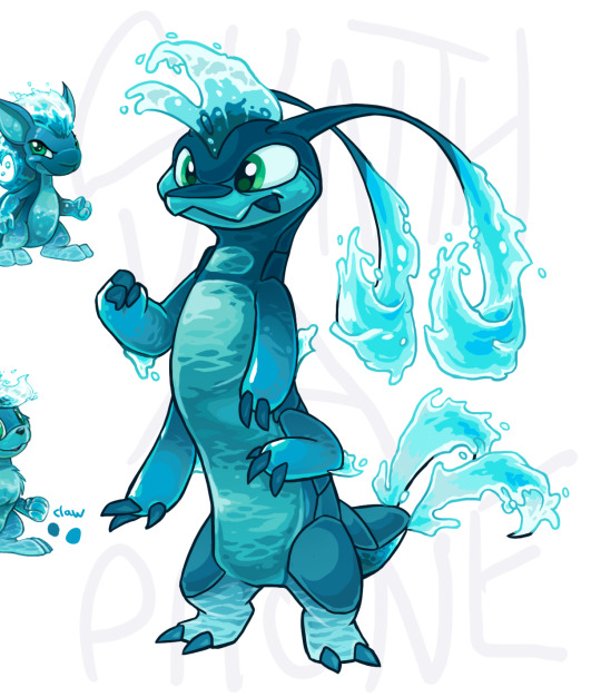
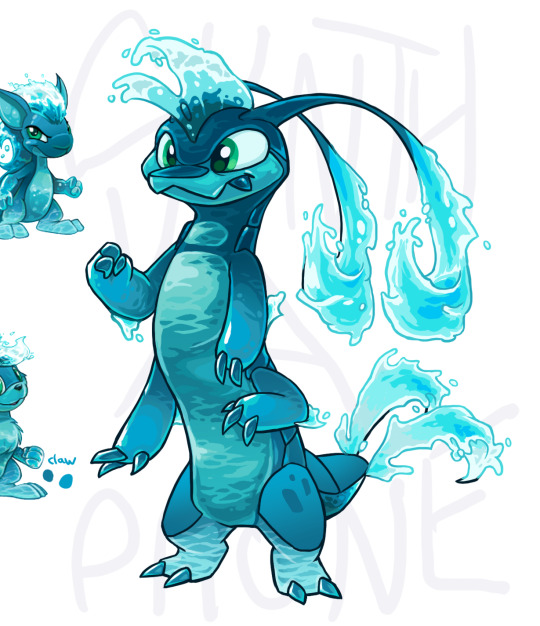
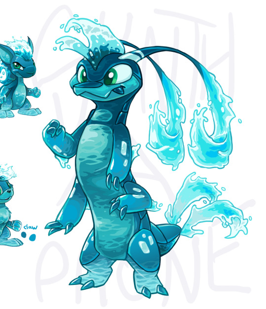
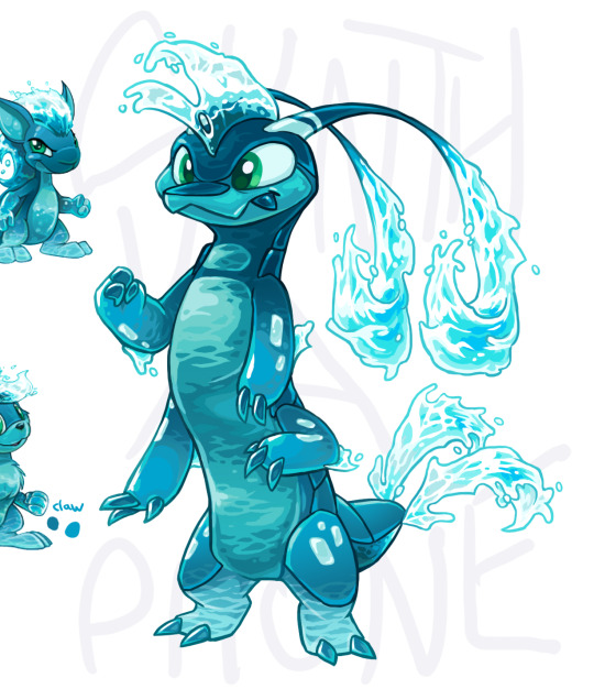
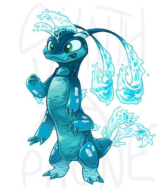
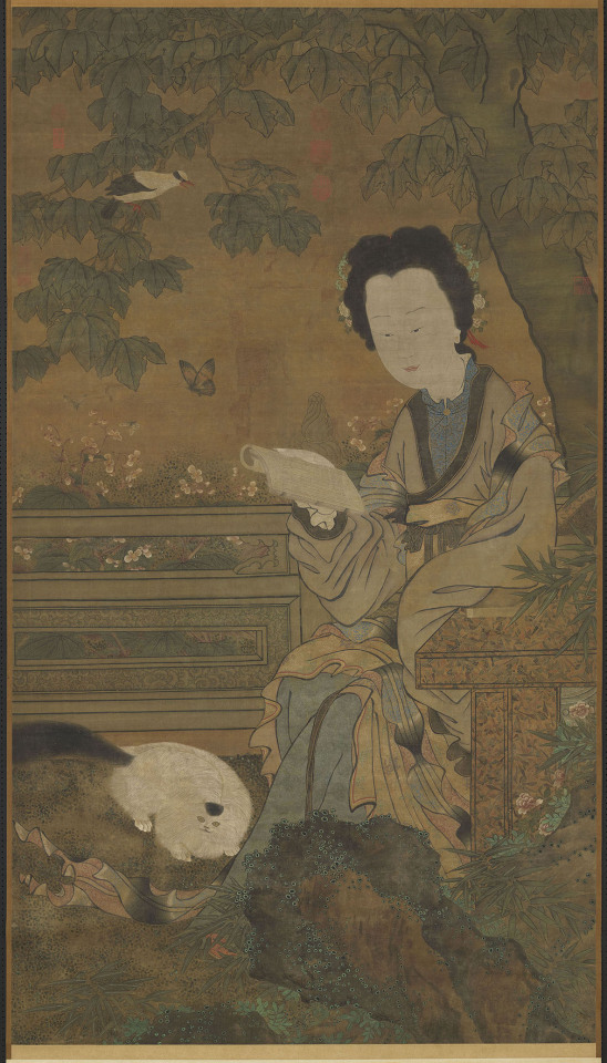
#i have two different kinds of stylization
Explore tagged Tumblr posts
Visit Tumblr Blog
Explore Tumblr blogs with no restrictions, modern design and the best experience.
Last Seen Tumblr Blogs


Fun Fact
Total funding amounts to $125.3M.
Note
I really do not want to discredit JKR, she created a fantastic world, with great ideas etc and I hate to be like "oh her success was just an accident!" especially to a woman. But that's what I feel about her getting praise for Snape. People say that the fact that there's so much debate about him now is a testament of JKR's writing skills, but on the contrary I think there is much debate about him now because she executed his character badly...or at least not in the level of genius I see her get praised for. I have always felt this way even before her views but I hate saying it now bc it'll come off as "revisionist" or something 😭 imo the fans have interpreted, analyzed, and broken down his character better.
JKR's success was absolutely not an accident. She dusted off and revitalized the dead School Story genre, she clicked things together in proportions that made a lot of sense, she's VERY good at marketing both herself and her work, she understands (and polices) brand identity and always has, she understands franchise potential, she made the *very* smart decision to age her series up along with her core fan base... but. This did create a few issues with the actual text.
There is a LOT of ambiguity in the Harry Potter series. Lines, scenes, entire characters (Snape is the poster boy, but not even close to the only one) that can legitimately be read in vastly different ways. And not Game of Thrones "oh this is a morally grey character in a complex situation." It's more like "you can interpret what is literally happening in this scene in about three different ways."
I see this ambiguity coming from two main sources, which are honestly kind of unique to the Harry Potter series.
The "Three Year Summer" Shift.
Books 1-3 are kids books, written like kids books, and Books 5-7 are young adult books, written like young adult books. It's not a new take that there are a lot of worldbuilding details and characterization choices that make perfect sense in a kid's book, but not if you're going for the added complexity and grounded tone of an adult book. Filtch is fine as a one-line joke comic villain, but if you're treating him as a fully realized person who actually exists in a more grounded sort of world - he becomes terrifying, tragic, and actually starts creating plotholes. It's like how Willy Wonka is whimsical in his own universe... but if you were to move him to one that's less stylized, now he's Julian Slowik from The Menu.
This leads to a backwards-compatibility situation where you're taking the "adult book" versions of the characters and trying to make them fit over the "children's book" character's actions. Often, the fit isn't super clean. So, you interpret these children's book scenes to make it fit - and you CAN, because children's book scenes are short, use simple vocab, and don't generally give you a *ton* of extra information. Why not interpret them with adult subtext? It's not contradicting anything. But it is essentially a version of that "open scene" acting class game where you get a scene that's like:
- What’s that? - My latest project. - It looks very interesting. - Well, I think so.
and then two actors run it though first straightforward, then sarcastic, then angry, then longing, etc.
2. Harry Potter is a mystery novel serial.
This is where a ton of the structure of the Harry Potter series comes from. Who opened the Chamber of Secrets? (we have suspects and clues) What is the monster? Who put Harry's name in the Goblet of Fire? (we have suspects and clues) How is Sirius Black getting into the castle? Who is the Halfblood Prince? Who is Snape loyal to? Like there are TONS of these questions (especially in the better books...)
And they make the books fun! They made speculating between the books a TON of fun. Buut.... suspects in a mystery story HAVE to be written ambiguously, or they're not very good suspects. The point is to have a scene that seems super suspicious on a first read but is actually completely innocent, and vice versa. So the scenes themselves fundamentally have to be written to support multiple meanings, in order to make the magic trick work. But the problem IS that in order to do that... you have to sacrifice cleanly articulated character development. There's a reason, in serial detective novels, that the detective goes to a new place and meets a new group of people every book. Ex-suspects have trouble going on to serve new functions in the plot, because who are they exactly? The point is that we don't know.
Lots of Harry Potter characters get hit by "suspect effect." In Book 3, Sirius Black is written to be a dangerous red herring (like why DID he slash the Fat Lady's portrait, in retrospect?) and in Book 4 he's this positive (but ultimately misguided) mentor whose function is to shift suspicion off of Moody and Barty Junior. So when we meet him in Book 5... and he no longer has a structural narrative role... who is he exactly? In a lot of ways, it's up to you the reader, and how you interpreted books 3 and 4.
Or Remus and Tonks. Their relationship is treated as a "mystery" in Book 5. So we get the reveal, but we don't get to see it develop. Because every time the relationship comes up, it needs to be discussed in a way that Harry can misunderstand. As a result, we don't get a good sense of what the dynamics of their relationship actually are.
And Snape... he's the red herring in Book 1, he's "up to something" in Book 3, a red herring again in Book 4, AGAIN in book 5 and 6. Which means. That is there is at least one alternate way to interpret pretty much every single thing that man says by design. So of course there are going to be multiple ways to interpret his motives. Snape the literary equivalent of the face/vase optical illusion... only you have Word of God saying "it's for sure a vase."

129 notes
·
View notes
Text
ngl all the "cankle" complaints about the tv show's style or things that are being done differently for g3's continuity is giving off serious "trukk not munky" vibes
#not to stir that talking point up again obviously but come on#cankle complaints still? by people who do not understand stylization for animation no less?#or people not understanding that g1 and g3 are two totally separate things no matter how many times you tell them#speaking as someone who's liked mh since g1 when i see other g1 likers say stuff like that it's like hmmm sounding a lot like tf fans when-#-beast wa.rs first came out or g1 poke.mon fans that only think g1 is the best gen. geewunners behavior that's what that is#like not saying you don't have to like g3 obviously but there's kind of a difference between saying you don't like it and saying stupid cra#-BECAUSE you don't like it#idk that's just me though#im not going to say much about this but ONE more cankle complaint and im gonna lose it lmao#not saying all g1 likers are like this but you know the ones im talking about#monster high#🦴 rattles
8 notes
·
View notes
Note
*twirling my hair* do you like cassandra cain? if not, do u have a moment to hear about our lord and saviour cassandra cain?
CASSANDRA CAIN MY LOVE!!! She's definitely the batgirl I've read the most in terms of full issues, the first 30-ish issues of her solo by Kelly Puckett Scott Peterson and Damion Scott had me hooked and I binged them but fell off after Horrocks came on (nothing against him, he was just given an editorial mandate to make the book more romance focused and it turned me off because it felt so ooc for Cass to me lol. I do own some of the issues he wrote tho! I like the ones with art by Rick Leonardi). I'm not really caught up with modern comics (ish??) And I'm not reading anything dedicatedly but I hear she's in a new original book teaming up with a magic user? Neat! Good for her. I love her in the shadow of the batgirl graphic novel (IT'S SO GOOD)
#ramblings of a lunatic#asks#^ sorry had to be tistic about things for a minute#i loved damion scotts artwork for her solo series sm (especially the later moee stylized stuff even though i recognise how bonkers-#-the proportions are i can't help myself. i like women and i love stylised art like that)#his stuff was surprisingly influential on my own art. idk how much it shows these days but It's There#this hasn't mentioned anything about what i love about cass as a character but like. it's the same as most people who love her man#i love her self destructive dedication to redemption i love the guilt she's saddled with-#-and how it's juxtaposed with her committment to kindness and justice i love how she's the fucking best and she knows it#i love how the relationship between her and oracle was an intergenerational mentorship between two disabled women#and her gay ass bond with stephanie (who in all fairness may be my fav batgirl???-#-but I've also read wayyy less complete issues of her compared to cass due to the differences in how their respective series' are-#-formatted but like. what i have seen i tend to love. i love u stephanie)#but also dear god i do not wanna get reeled back in because nothing the industry ever does will please me the way the ideas in my head do#and I'm constantly at war with myself reading stuff#also it's just hard to get back in when you've been gone with a while it's all just very difficult#but i am rotating cass and stephanie in my brain like a microwave waiting for someone to explode#plenty of people smarter than me have already said this but cass should team up with jason and they should both seethe#he wants to kill. she keeps breaking his bones if he tries it. they're both brushing each others philosophies off bc of where they exist-#-on the batfamily ''kill/no kill'' binary even though they share similarities of wanting to be batman but Better#(jason via controlling crime and killing criminals and her with her ultimate dedication to the symbol and superior combat skills)#(also keep in mind i just watched utrh but haven't read a rhato comic in yonks. so if this is an outdated jason characterization+#-then whoopsie <3)#Jason's dedicated to pushing buttons and poking holes in batmans philosophy and cass is great at reading ppl-#-and sometimes in her series she then performs a limited psychoanalysis of them and tears them apart#(at least she did for shiva) I'd love to see her do that to jason. break him so i can tape his sad lil ass back together#this is getting away from me. anyway no need to proselytise. I'm a former alter boy round here
7 notes
·
View notes
Text


Shortly after that Zanmu drawing, I went on an art spree and made small little drawings of a majority of the current playable characters in Touhou (I've been procrastinating on drawing Aya and Ran) and finally gave myself refernce points for how to draw all these characters going forward! Also, don't mind the change in background colour, that's just me changing the background so the values are actually visible lol.
Artist's Notes;
So the first one I started with was Reimu, and the inspiration for her pose came from this pose reference on Pinterest of a girl doing ribbon dancing, and I thought "Damn, that's very Reimu-coded" and did a quick little Reimu drawing from that.
This was also the drawing where I finally learned what makes a Reimu drawing feel like Reimu. It's the shirt, it's literally just the shirt. I decided to try making Reimu's shirt have a stronger square shape and oh my god it's like I discovered some kind of secret sauce because it just feels so much more like Reimu. I also gave Reimu a tabard and loose pants because I felt like that also fit her very well and also tied in some element's of Yukari's design into hers. I also made her bow look more like a very geometric butterfly as a bit of a tie in to "Diochromatic Lotus Butterfly" and also because I think butterfly symbolism fits her a lot. I also left the hands unfinished because they are not the focus of this piece, Reimu is, I don't wanna cry over how I can't get the hands right and then never get to the actually fun parts of the drawing. Previously, I did some design experimentation with Reimu where I added a little ornament on her obi that was inspired by Yuna's design from Final Fantasy 10 (I can't remember if I ever posted that one lol, also FFX is so good you guys I love it so much) and I like it, I think it adds some fun assymetry to her design that I think makes it look neat. I also gave her some more traditional Japanese shoes (I don't know the name of them so please correct me if you know) since I've seen other artists doing it and I love that look so I added that to this drawing as well.
I also really like how Marisa turned out, I experimented a bit with her body type and outfit, though I didn't really go too off-model with her compared to Reimu. I liked the longer sleeves on her and I gave her a big bow on the back of her apron since I thought it looked cute. I couldn't find a spot for the bow on her hat that looked good so sadly that isn't present in this version of her :( I do like how her face turned out though, since I've also been experimenting with how differently stylized I can make faces in my art. I will always love mangas like Hunter X Hunter that can put two extremely differently stylized characters on the same panel and make it look cohesive, it's why I love the style so much.
I think the crulest irony is not being able to draw your favourite character well while you're hyperfixating on them, but then only being able to draw them how you picture them once they're no longer your favourite, and that happened with Sakuya here. I was initially gonna give her the flashiest eyeshadow known to man but when I removed the layer wih the eyeshadow rendering on it I ended up liking it more without it, so now she's just got some nice bottom lashes. I tried giving her more of an hourglass shape for her body type, mainly to differentiate her more from Reimu and Marisa, and I focused on making as many points in her drawing as sharp as I can. I also gave her some white gloves because I like the idea of Sakuya having fancy gloves, it fits her. To me, Sakuya has always been the most high femme of the main Touhou characters. Maybe this is just because she was my gay awakening, maybe it's just influence from the fandom, but it just kind of makes sense to me. Much like Marisa, I also emphasized the bow ribbons for extra oomph with the silhouette and when I added the red bows and looked at the overall design, I fixed the lack of red anywhere else by just... covering her in blood... I mean she does work for two vampires and she's exactly the sanest person in Gensokyo so please pardon my indulgence in edginess it couldn't be helped.
Youmu was really fun to do but also kinda challenging. In my mind I wanted to make her feel different compared to everyone else I've drawn so far, short enough to be somewhat accurate to canon, but not too childish looking since she never really acts all that childish in cannon and it wouldn't make sense for her to look like a child. I also had to make her look fast and speedy without her looking like Sakuya and potentially avoiding same body syndrome with Aya, who's whole gimmick is speed. In the end, I think her drawing is my favourite, mainly because of the shapes and silhouette. I also really like how I golden-ratioed myon. I also took a few liberties with her outfit and decided to give it some layers to add visual interest. I also like how the cuts in the clothing add more triangles, which adds to the shape language. For her face, I was wondering what to do with her eyes until I decided to just go for the simple, glowing, circular eyes she has in the final product. I was also listening to a bunch of Gorrilaz albums while drawing these (Demon Days is my favourite album btw, idk how basic of a take that is though) and my brain 100% was subconsciously influenced by some elements of the art style (it's so good omg). I also like the shade of green I gave her, though I am a certified green lover so I am 100% biased.
Reisen is where I let myself get a little weird with it, because as you can see, I turned her into an anthropomorphic bunny because she is a weird moon rabbit god dammit, why should she look normal? I was more excited about drawing her IN design than her modern design so that's why she's dressed like that, but I do have a sketch of her in my sketchbook of her modern design. I also had fun rendering her velvet suit jacket. This also helped me tie in some of the reds in her eye and ear, which is also a nice bonus. I also gave her pure white fur to create more visual contrast. Overall, I'm pretty happy with how she turned out, though I wish I didn't shade the legs too much because it's kinda blending with the skirt colour....welp, ya win some ya lose some I guess.
Sanae is also relatively on-model compared to everyone else here, though I did try to make some changes to her outfit to make her feel different from Reimu. First of all, I made her big sleeves (IDK the proper Japanese term for them, if there is one, so again if you know please correct me on this) more open than Reimu's, as well as making them more pointy to give her a different silhouette. I also tried out a new rendering style on her eyes that I also applied to Cirno (we'll get to her in a moment) to also make her face feel different from Reimu's. I'll be honest, I didn't really know what to do with her body type so she just kinda got the "basic slim girl" look in her drawing. I'm not too big a fan of the frills I added to her skirt though, I don't really think she needs them. I'm glad I gave Reimu pants and a tabard instead of a normal skirt because that does help to make the two of them feel different. I also kept her little frog hair clip the same shade of blue as her dress, mainly to economize my colour usage and limit the palette into something a little more tight-nit. I do like how her little hair snake looks though, it's cute lol.
And finally, we have Cirno. I have been a firm believer of "long sleeve Cirno is best Cirno" ever since I saw the art of her in PMiSS because she's an ice fairy, I think it would make sense for her to want to keep herself warm, same reason she has little socks too. Now that I look at it more, her colours are pretty similar to her design in Great Fairy Wars, and honestly I like that, I think keeping her colour palette simple is a good idea so I'm happy about that. I mainly wanted to focus on rendering her wings though, mainly because rendering ice and crystals is fun even though I have done zero studies of them! I also wanted to experiment with rendering her eyes in a similar way to Sanae's, and I like how they turned out! I don't know if I'll continue with this style in the future but it will probably stick around because to me, any stylistically different way of doing eyes is another facial feature I can use to bend the rules of same face syndrome.
While I'm on the topic, I want to mention that the reason Hunter X Hunter's art works so well is because everything is kinda rendered the same. It showed me that if you do everything else consistently in your style (i.e. rendering, lineart, shading), stylizing each character's faces differently will be a lot easier, at least that's how I see it. IDK if I'm ever gonna do drawings of Aya and Ran in this style since I gotta think about them more as well as stop procrastinating lol.
#tw blood#touhou project#art#fanart#touhou fanart#reimu hakurei#sanae kochiya#sakuya izayoi#marisa kirisame#cirno#reisen udongein inaba#youmu konpaku
1K notes
·
View notes
Note
Do you have any tips on how to make character height sheets? I'm currently doing my own for the set of OCs I'm working on and they always seemed so off.
i.e. One character would be taller than another character; but the other character would have bigger proportions, making the first character look tiny compared to them despite the height difference. Which is not the effect that I wanted between these two characters.
Hmmm that's tricky. A lot of it is understanding your fundamentals and knowing proportions.
First, definitely start with a sketch of your entire lineup all next to each other. That way you can visually see and easily adjust as you go without messing with final line/color. I'm not sure what kind of style you're working in (im assuming not toooo stylized or this wouldn't be much of an issue) or the ages of your ocs, but generally head sizes within an age range are pretty consistent from character to character. Like adults usually have similarly sized heads as each other and kids have similarly sized heads as other kids.
Assuming you're working with a tall adult and short adult, draw both of their heads the same size, put them at the height you want them to be at and then draw the bodies in proportional to their height. Idk if that makes sense but that's usually how I do it
576 notes
·
View notes
Note
hi! i wanted to ask if maybe you had an idea how the sparkles on the overwatch 2 iridescent skins work? it looks like they're in a fixed position depending on the character's movement and it's very trippy to me. i made a video, but idk if i can send links through asks - it's at tinyurl "ow2sparkles". hope you have a good day! o7
ohhh interesting..!!


hard to say exactly but it seems like the closeup sparkles are locked to the geometry with a texture.. so i think they might be two different shaders because the zoomed out one Definitely has something going on when you look at it from different angles
it's Possible that it's a screenspace noise texture, but dependent on the object's normal and view direction for making specific noise colors sparkle.. it'd look something like this. wait nevermind not yet i was making the shader to show and example but i made this instead this is #awesome #eyestrain

ok sorry ok so like. here's what it would look like if the sparkle texture was done in screenspace (so just a big texture stretched over the screen), but the computation for when the sparkles should show up are still done relative to the object (like here)

feels close though i dont know if this is the whole story.. it's possible instead of it being screenspace it's some sort of parallax effect, but when i tried it with the parallax effect it looked a little bit too unstable.. though this could be fixed up if you had the budget blizzard has (you can kind of see what it would look like by the way the sparkles move in the eyestrain gif)
it's also possible it's some sort of.. screenspace-object locked effect. like so: where objects closer to the camera have the screenspace texture scaled up, so that the details can scale with the characters. so still the same effect but instead of there being a uniform sparkle texture draped across the screen, it's scaled up or down based on how far away the character is


this is done with some stylized postprocessing effects but i could see it being used here. hard to say for sure though since there is only one genji, though if this is the case then the 1st person shader could be the same shader as the 3rd person one, even with a screenspace texture. but, i tried mousetracking some of the sparkles on the 1st person one and they definitely seemed to followed the object and not the screen.. so either its probably a different shader, or theyre using some sort of parallax instead of screenspace (or some mix of both !?) and its tuned down on the 1st person view
#nurgl3th#potion of answers your question#gamedev stuff#ignore my bad uv mapping i couldnt find the texture thta makes me look normal#eye strain#flashing gif
148 notes
·
View notes
Text
First impressions with The Gaslight District trailer
Really enjoy how the animation is done. Almost seems like some of it was done maybe on twos instead of ones (24 fps is average and considered animating on ones, so twos would be half at 12 fps) giving it a slightly choppier feel in some instances. Could be wrong on that part, but do know going back that there’s moments where the point of impact is delayed to give an extra punch to whatever is happening. With the editing, gives an impression those are some serious moments.
Stylization very unique and different than the previous two shows. I remember in GlitchX 2023 it was mentioned they were pushing themselves with the stylization and their attempts at getting it right, and it shows. It almost makes me think of a video game with how the graphics are, and I mean that in a good way. Lots of clean but dramatic lighting and solid models for the characters. some of the camera angles also gives this idea, like when it pans from the side to the front of the house (shop?) makes me think the beginning of a cut scene. Plus, some of the details on skin and hair make me think of almost cell shading for comics where there’s a slight line to indicate muscle or hair strands.
Speaking of that particular moment, I’m almost getting earlier 3D animation, like from the 90s-2000s, specifically Monster House. Something about it gives me that same vibe. Also kind of resembles Claymation with the texturing and such, but clearly computer animated.
Honestly just going over the trailer a few times the animation is soooo good. the studio really is getting better and better every episode of their series. Like thinking how Murder Drones started verses how it ended in graphics alone shows how they improved. There’s even signs of better quality between episode one and four of Digital Circus. and it just looks so professional. Big round of applause for everyone who works there/for them for their efforts.
Both from the synopsis of the video and a few things in the video itself indicates the series is going to be quite a doozy. Undead gangsters in a (potentially) gothic punk environment. Whole bunch of conflict from that alone I’m sure, plus what’s going on with our main lead (trying making out her name but just can’t quite get it; if someone could tell me what it is, that’d be great). The main character seems to be loyal to the family she’s part of, but also curious as to where she came from. One scene shows a part of a conspiracy string board with a photo of her and what I’m assuming is her father figure, a torn paper reading “where do I come from?” and a newspaper clipping about humans and how they’re tied to a prophecy involving the destruction of the Gaslight District. Probably suspects she’s not actually undead, or was a human that was killed and revived but with her memories fuzzy at best (We got quite a few characters with memory problems in the Glitch verse. First Tari in Meta Runners, then N in Murder Drones, Pomni and the rest of the humans in Digital Circus and now our main girl here. Is having some form of amnesia a required trope for Glitch? /j)
I swear I know the voice of the main girl, but I can’t put my finger on it. Big butcher bug looking guy kind of sounds like Pete from all the Mickey Mouse stuff (grew up watching a lot of Disney stuff don’t come at me for the first idea I got) but a lot more gravely.
I feel like I’m going to say this a lot, but very unique designs for the cast. With things like animation what makes them stand out from one another is the designs of the cast and world as a whole. There’s some gangly boney like characters in the background and then the main cast. There’s the bug butcher that also almost makes me think of the Kraang from TMNT 2K12, a guy with a loaf of bread for a head, skin degrading skeleton guy, and our main girl that looks mostly mummified if the wrappings around her body are any indication. Not to mention that giant thing with the eye both in the thumbnail and family photo. I feel like @endomentendo is really going to get a kick out of the designs here because a lot of reminds me of their art, at least with some of their OCs. I want to push my capabilities of drawing characters that aren’t quite perfectly human so I might try my hand at drawing one of these guys for practice. (anyone else notice one guy eating cars that has a head that I think is supposed to be a luggage bag but looks a lot like Caine?)
Intrigued by the soundtrack. Like the hollow-ish bell sounds in the first half and then the more hopeful, light track of the second half that’s paired with the violence. Bright happy music with sad or violent things has got to be one of my favorite tropes. And sound design in general is really good. with the whispers and the different sound effects like the gun shots and punches and drowning, all well done.
Overall, a testament to the team’s work and skill, and showing another example of someone’s creativity being highlighted in a way they may not have had the chance before. I vaguely remember how Part Time Seagull (the creator of The Gaslight District) was working/planning to make this a series, but 2D and had some concept art, which is how he was found by Glitch. It really is great that the studio is trying to help people have their dreams realized and helping others showcase their works and ideas (thinking how GlitchX 2024 was more of a showcase of others’ works then their own). Truly a powerhouse of indie animation.
Watch the trailer here:
youtube
#the gaslight district#gaslight district#trailer#analysis#glitch#glitch productions#the amazing digital circus#murder drones#meta runner#animation#3d animation#radio rambles#humanradiojmp#Youtube
190 notes
·
View notes
Note
So I don't know who to ask about this, and since it's your profession, I figured you'd know most! I like to use Magic Poser to help me draw my characters' poses, but I feel like I always wind up altering the proportions to fit the models rather than my style without meaning to just because I'm drawing what I'm looking at. It feels less like looking at a reference and more copying a picture, and it makes me feel really bad, like I'm cheating at art. Do you have any thoughts or word of advice on this? I'd greatly appreciate it. Thanks!
Hey Nonnie! Hmmm there's I feel like kind of two questions here. One, using Magic Poser or any other legit reference to make your art is not cheating. It's just using a tool the way it's meant to be used (as a reference). There's nothing at all wrong with that. ♥ However, if you are getting Not The Results You Want from this process that's another issue entirely. So, two: what do I do if the art I'm making from reference doesn't look like *my* art? If you find that working from a reference is changing your style in ways you don't like, I have suggestions: 1) do a sketch from the reference just like you normally would in whatever style comes out naturally using the reference 2) look at the drawing you did and put the reference away 3) draw another drawing from the drawing you did but try to make adjustments towards the stylization you prefer (your first drawing is your reference for your second) OR, if your brain will do this for you: 3b) after sketching from the reference (maybe a few times for good measure) put the reference away completely and try to draw the pose from memory* and see what happens. If you think you're overly reliant on references to the point you think it's holding you back then you can start to wean yourself off of them but doing more and more drawing without them. Maybe start with a 20min warm-up on my Sketch App drawing a bunch of poses really fast from reference, then pull up a new pose, look at it, and try to draw it without checking back in at all. Honestly the best way to get to a style you like is to just draw A LOT. Draw lots of different ways. Mess around with line weight and shapes. Make things swish, make them pointy, make lines that cross over a lot, make a mess, make it neat, keep going. Do a lot of drawing and investigate what feels and looks right to you. And if a tool isn't serving your goals, you can let it go. It might be hard at first but you will find your way. ♥ * Side note: I have aphantasia which means I don't have head pictures. If I look at a reference and walk into the other room, I am not going to be able to replicated it very well from memory. That being said, if I sketch a pose over and over and over a bunch I will retain it somehow, somewhere (I don't know how brains work). The next time I go to draw that pose it will be easier. Just popping this in here in case you have the same trouble.
530 notes
·
View notes
Text
💥 “The One That Doesn’t Exist” — Bob Reynolds x Reader Insert | Part One
Warnings: BOB!!! FINALLY!!!
Masterlist | Part Two
Summary: Every team member’s gotten the meme-shirt treatment—except Bob. The others start to notice. So does he. But what no one knows is that you do have ideas for a Bob shirt… you’re just terrified he’ll hate it. Or worse: he won’t say anything at all.
The shirts had become a tradition by now.
At first, it was a running joke—a chaotic hobby that got the whole team laughing. But over time, the meme shirts started to feel like something more. A kind of badge of honor. A strange, funny love letter to the weird, dysfunctional family you’d all become.
Each team member had gotten one. Ava’s was framed in her room. Walker wore his to bed. Bucky kept his in a box of memories under his bed. Yelena wore hers around the tower. Alexei had a matching mug.
Except for Bob.
Bob didn’t have a shirt.
And it was starting to get obvious.
He never mentioned it, not once, but he felt it. Every time he glanced over at a new reveal. Every time he gave a soft, warm chuckle and said nothing more than, “That’s a good one.”
He smiled every time.
But never asked.
The others started to notice.
“Still no Bob shirt?” Yelena asked casually one day, twisting her hair into a bun. “What gives? He’d be hilarious.”
Alexei chimed in from the bench press. “You should make one where he’s vaporizing a printer. Or, like, lurking.”
You laughed it off, because that’s what you always did.
“Oh, I don't know,” you said.
But inside, your stomach twisted.
Because the truth was… you did have shirt ideas for Bob.
Good ones.
Ones that made you smile just thinking about them.
One of him floating above the Watchtower kitchen like a cryptid, eyes glowing faintly as he peered at a box of Pop-Tarts. Caption:
“He hungers.™”
Another of him in his full Sentry glow, but you edited it to look like a vintage romance novel cover. Flowing hair, exaggerated lighting, a dramatic backdrop of swirling cosmic energy. Caption:
“Local himbo accidentally turns into a god. Film at 11.”
But you never printed them.
Because with Bob… it felt different.
Everyone else you could tease, push, prod. But Bob? You liked him. Too much. And you were scared.
Scared he’d misread it. Scared it would embarrass him. Scared it would make him pull away.
Or worst of all—scared he’d just… say nothing.
So you didn’t make the shirt.
And Bob noticed.
He didn’t say it. But he felt it.
The way you’d look at the others, laughing, nudging them, giving them the spotlight—and then glance at him and look away too fast.
He started to wonder.
Had he done something wrong? Was it because of what he was? Because people still looked at him sideways sometimes, like a bomb waiting to go off?
He never asked.
He didn’t want to make it weird.
But every time he walked into the lounge and saw someone wearing a shirt you made, something ached in his chest.
Until one day, while the others were gone and the Watchtower was quiet, he found you alone in the command room, editing a new design.
He stepped in silently, watching you from the doorway.
You didn’t see him.
Your screen glowed with the outline of a shirt.
His face.
Stylized. Cosmic. Glowing just a little too much. Underneath it, the caption:
“He’d never implode me.”
You turned in the chair to adust you positon. You froze when you realized he was standing there.
He said nothing at first.
Just blinked, slowly.
Then—softly, carefully, almost shyly—he asked:
“…Can I have that one?”
Your heart stuttered.
You met his eyes. “Really?”
He smiled—small and awkward, but honest.
“Yeah,” he said. “I’d wear it.”
You swallowed.
“…I thought maybe you wouldn’t want one.”
“I’ve wanted one this whole time,” he admitted, rubbing the back of his neck. “Didn’t know how to ask.”
You both stayed there, feeling the silence curl around your shared confession.
Then, finally, you nodded.
“I’ll print it tomorrow,” you said.
And for the first time in weeks, Bob’s smile reached all the way to his eyes.
#thunderbolts*#thunderbolts#new avengers#bob reynolds x reader#bob reynolds x you#bob reynolds#robert reynolds#robert reynolds x reader#robert reynolds x you
122 notes
·
View notes
Text
Media I imagine different fiction podcasts in instead of the media of being a podcast.
TMA: A selection of volumes, relating to the fears, each with those removable covers. Those covers has a victim or two, and then underneath the cover is a really detailed cover. The paper is decoratively ripped, with a kind of scraggly font, and each has a foreword and ‘author’s note’ from Jonathan Sims.
Malevolent: A really gritty graphic novel with deadly detail in each panel, and very little color. Maybe a trinket on each important character has a color? Like Arthur’s eyes being yellow or Oscar’s collar having a blue sheen to it. The novels are long, dramatic, and intimate in a visceral way.
Welcome to Night Vale: Local 58 bullshit. A broadcast on television with low quality images and audio, tacky music, and a kind of 80’s aesthetic. Each episode the words WELCOME TO NIGHT VALE zoom onto the screen, the purple eye behind them. And each weather segment is an animated short by a different artist.
The Penumbra(Juno Steel): A webcomic. Hours spent scrolling downward a comic that has so much color and GEOMETRIC design. Juno and his curvy jaw, brown pie slice eyes, a cartoonishly high collar for his investigator jacket. Nureyev and his sharp square jaw, shimmering jewelry, and stick legs. Characters sticking out of the panels, fonts changing constantly, a little blue Juno that does his narration and *guitar theme plays* each time he appears.
Wolf 359: A classic comic. Issues month by month. Different special covers of the characters in extra dramatic poses or scenes. Even MORE panel breaking than Juno Steel. So MUCH onomatopoeia, even for small things like the clink of a panel or the disapproving hiss of Hilbert in the background. Geometric designs like Juno Steel, but less colorful. Like the superhero art style mixed with a more stylized look.
Midnight Burger: You pull up the Midnight Burger website. They have a hidden page that has a sort of script-comic thing going on, where the art is next to the writing. Small coded in notes from Leif sometimes pop up if you hold your arrow over the art. Links are attached to the parts where Effie and Zebulon play music, linking you to the music so you can listen to it while you read.
Desert Skies: An animated show. Indie, something you’d find on YouTube. The animation is bouncy and incorporates 3D animation alongside the 2D. Maybe the Sphere Movers have 3D models and the staff don’t? The credits are short because it was made by one guy. People are complaining about it on Twitter /j. People are making content farms about it. Everyone is pissed at Corson like they’re pissed at Jax.
The Amelia Project: A sort of simulation video game. You play as Arthur. You listen to their stories and draw pieces of the tale to invent their death. Every once in a while the game transitions to a point and click suspense game where you solve puzzles as Cole and Haines. Maybe there should even be an Operation-esque part of it where you work as Kozlowski.
Ghost Wax: A novel with a lot of pictures spliced in it. The stories are all in a single book, though the book is through Luca’s perspective— so he picks up on the ghost’s body language and Voncid’s reactions. The pictures are tarot cards with each victim as a card. Some are repeat cards— Lorem does not have a card at the end of the story. Nor does Our Home or Evening at the Ardent. The pictures are only white with black line art. No color whatsoever.
Kakos Industries: A company newsletter. Not a broadcast. A newspaper that arrives at your door and has big bold letters with the main story and pictures of the events that happen in the story as it goes. And the Sunday Comic page is full of employee shenanigans. Some innocent… some not.
I am losing my mind.
#the magnus archives#malevolent#welcome to night vale#the penumbra podcast#wolf 359#midnight burger#desert skies#the amelia project#ghost wax#kakos industries
448 notes
·
View notes
Note
i just need to take a second to gush about how much i love durge drow and astarion, they feel so fleshed out and perfectly written together in their fucked up wretched ways. They really inspire me to write more for my own tavs, hopefully one day ill be able to say im as happy with my own work as i get when seeing yours. I have to ask though, do you have any tips on drawing head shapes and faces? or maybe about wrinkles? i find i really struggle with that stuff when drawing and i adore how expressive and grungey all your art looks!
First of all thank you so much, I love hearing what people think of the two of them together 😭
Honestly you've hit on something that's quite near and dear to my heart, I love developing and figuring how to draw and stylize different faces to get the most unique, interesting looking results - everything about the details is highly rewarding to me. What does x type of nose look like from this angle? In this style? How can this eyeshape best translate to my art? How different does a face look when its making this expression? What does that MOUTH DO? etc etc.
In fact you kind of inspired me to put a little tutorial/guide together the last hour lmao and what a blessing it is that the two current subjects of this blog serve as great models here, being that their faces are basically polar opposites!
When it comes to heads, you've probably heard it a dozen times before that you want to think of them in terms of geometry and facets; my process to drawing them is pretty conventional so I won't spend too much time on it, but it goes something like this:
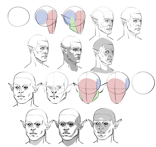
Obviously I don't do every single one of these steps most of the time, which is just something that comes from practice/developing muscle memory, but it is helpful to start off this way for two main reasons:
By making these guide lines and splitting a head into pieces like this, you'll have an easier time seeing and understanding it as a multidimensional object, and in turn, facilitate It for you when you venture out into doing wacky angles and lighting.
Making different headshapes starts HERE. notice how Astarion's "face" slate is narrower and longer, how my durge's jaw pieces sit lower on the head, how all of the same pieces came together in the same way but we ended up with one real pointy elf and a real brick of a drow - making characters look different successfully begins very early in the sketching process.
The next thing you want to do branches out into every day life: start noticing yours and other people's facial features. How does an upturned nose look from a high angle? How does the size of someone's cheekbones affect what they look like when they smile? How about when the light hits them a certain way? Does someone's lip shape changes when they pout? When they laugh? How does a person's hairline change the shape of their face? You do NOT need to creepily sketch every stranger you see on the bus, but get into the habit of actually noticing what people look like when you talk to them - when you look at pictures, when you watch movies - make a mental list of interesting ways mouths, noses, and eyes can come together in a variety of different proportions to make completely distinct looking mugs, and how they change depending on how you are looking at them.
Light and shadow play a HUGE role in how faces look, too, basically as crucial as actual bone structure does. As you see up there I tried to rough out how natural, head on, and underhead light would look on these two very different looking guys, and while we can see definite patterns, there are small differences that come to be because of the sizes and shapes of their features.
Here is a very, very basic look at how some of these features come to look the way they do, how they interact with one another, and how they compare between a blocky, rather conventionally "masculine" head and one that's much softer and slimmer.
Note please that it is not one or two characteristics that give a chaarcter their "look"; you can reduce a face to eyes, mouth, and nose through stylization and still have them be recognizable, but if you want to do more than that, you have to consider the whole package! Chin, cheeks, brows, direction of the jaw, slope and size of the forehead, depth of eyes, ridge of the nose, etc - I know this is probably far more than you bargained for, but if you start making note of a FEW of these things now and slowly add on, this will eventually become second nature to you.
Similarly, understanding how these characteristics come together will help you with rendering light and shadow in a realistic way, and predicting what their facial expressions may look like - if no two people are alike, neither are their smiles. :)
Lastly, remember that I'm no expert - I have developed my own methods and semiotics and yours may look slightly (or vastly) different, and that's fine! I hope only that by sharing this it has given you a base to work off of.
Anyways, I HOPE this has been helpful and not just the unsolicited ramblings of a face pervert.
872 notes
·
View notes
Note
I love how Neopets draws water (ie. water PB pets) but when I try to copy them it always looks weird, do you have any advice on replicating it?
ooh, let me see- i've only ever tried to replicate it once, with the Water Centibyte:
my favorite water pets are the Kyrii and the Zafara, so those two were the ones I referenced most heavily when I was designing this!
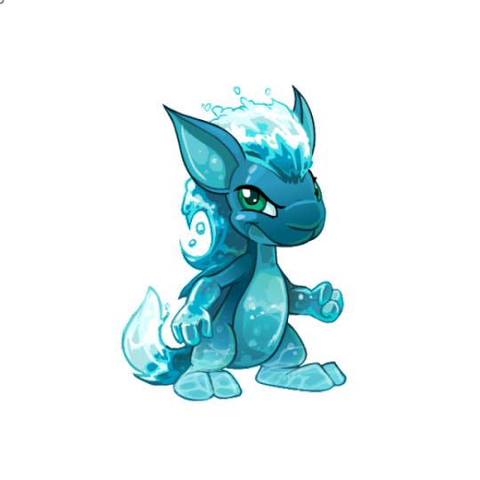
I apologize in advance for not necessarily knowing how best to describe this, but in short, I think I'd recommend
laying down a base gradient for darker areas that you can then add hand-painted caustic detail over on a different layer
make extremities that you'd want to be clearly visible lighter/higher contrast (The Zafara and Kyrii both have lighter colored hands and feet, light colored tails and hair, and faces where you can make out the eyes and facial expression due to having contrasting areas of light and dark next to each other. I find it helpful sometimes to squint at what I'm working on to see if I can still roughly make out its shape, vs everything turning into a same colored blob)
consider keeping thinner pieces of a design like 'sheets' of hair lighter, and maybe visibly darker spots where you'd realistically 'see through' the sheet of water
Honestly I mostly was winging it + heavily referencing those two pets, but looking at irl photos of pools and ocean waves would probably be a good idea too- you can sort of build up a sense memory for how light interacts with water, that can make it easier to stylize or 'cheat' it.
If you want my long attempt to remember wtf my process was for the Centibyte in particular, i've put it under the cut :)
Water is a color that's pretty reliant on gradients, and where the shading and detail work on top of that base gradient really make it shine. Both of my reference pets have their darkest area around their neck and shoulders, and get lighter towards their extremities, so the first thing I did (after making my lineart edits to the hair to get the splashy effect, and recoloring the eyes to match the Kyrii and Zafara) was lay down some base gradients.
I believe i used the gradient tool first to establish main dark-to-light gradient from the head to the feet, and then later went in with a lasso tool to add smaller gradients to the ends of the arms, and probably used the soft brush to add that lighter marking to the face and to make the feet even lighter. (The belly marking I add later will cover up that jaggedy spot on the belly, so it didn't matter that it looks weird)
After that, I added simple gradients to the shell and belly markings too:

I have these on separate layers already, so it was relatively simple to lock the layers and throw more gradients over them.
After that I seem to have started to add stylized water caustic effects!
Note that I'm extremely inexperienced at painting or rendering water, so I was just sort of eyeballing how it looked on the two pets I was referencing, in addition to considering what looked good to me. I used a couple different low opacity multiply layers to do the darker markings on the body and the belly, and a 100% opaque normal layer to paint the lighter markings onto the feet (which also have a gradient on them, so that they'd match the gradient they were being drawn on top of)
After that I... seem to have just gone buckwild and started painting shit with the opaque hard brush.

I mimicked the hands on the Zafara being a less green shade of blue, and sort of gradiated that color out manually by painting on the lighter colors with a few blobby splashes and caustic patterns to make them feel blended. (I don't think anything I painted on these layers has an actual gradient, soft shading, or lowered opacity). I also added lighter outlines and a few bright white highlights to the arms, to give them that shiny jelly-like effect.
For the belly, I also just kind of went wild painting more caustic patterns- my main goal was feeling acceptably "watery" while also keeping the basic shape of the belly marking distinct from the background. The lighter blue marking in the middle of the belly (and at the bottom of it) is supposed to be underlighting that's reflecting back up.
For the lighter splashy 'hair' parts of the design, I tried to focus on getting the basic background colors in before worrying too much about where the highlights would go, knowing I could do those on a different layer afterwards. I tried to use the darkest blues at the spots where the curved hair shapes overlap each other, and also copied the head colors for the parts of the mohawk that would be thin and overlap the darker shell of the head.
I decided to sort of transition that darker shell part out 'early' instead of following it all the way through to that back antenna, so that the hair would stand out from the shell, and also because the antenna gets further away in perspective as it extends past the head.
Then I threw on a shadow layer for the shell, and then (confusingly) I made another layer on top where I added highlights AND obscured the last two segments of the tail and the knees with gradient layers. I think I felt that they didn't feel 'water' enough?
I added highlights and additional caustics for those elements on another layer afterward, with another opaque layer:
Then we have the spots and stripes markings + area specific colored lineart:
Aaaand some causticy-wavey lighting for the hair + blending of the head antennas into their hair, because it felt very abrupt for Water:
For the 'hair' highlights, I used a mix of pure white and very light blue- I probably could have made my life easier by doing a gradient on these areas, but for whatever reason I hand painted them. You'll notice in close ups that it can look a little sloppy, but if it looks decent at the size you intend the piece to be viewed at, this doesn't really matter.
And that's the finished piece! (identical to the one above, i just hid the refs)
No idea if this will be helpful, but I hope its at the very least interesting!! I viewed a lot of the more difficult Centibyte colors as challenges and puzzles to solve- its fun trying to reverse engineer very specific aesthetics I'd never tried to tackle before. I wish you luck and hope you have fun in the future with your watery neopets endeavors!!!
108 notes
·
View notes
Text
Countdown to Homulilly
Like Walpurgisnacht before her, Homulilly's formal entrance to the narrative is heralded with a the whirring of a projector and dramatic countdown using film leaders (though technically speaking, she's been there from the very beginning as both Homura and the entire false Mitakihara). I've already talked about how Homulilly's countdown signs evoke Walpurgisnacht's, so I won't go into too much here except to say that the Rebellion Production Note explicitly confirms as much; instead, I'll focus on what else is going on in this sequence as the rest of the Holy Quintet braces themselves for impact.
Rebellion thrives on surrealism and dream-logic, and it's unclear how much is meant to be taken literally here. The stylized format makes it feel like we are watching actors on a stage as they prepare for a big scene, and I don't think that's a coincidence.
Regardless, note that of the girls are already transformed and wearing their magical girl costumes, presumably because the city going up in flames as the biggest Nightmare of them all gets going and they are the only ones who can deal with it, even if only Sayaka and Nagisa/Bebe have the mental framework for what is actually happening.
First up is Madoka, hiding behind a wall of ticking clocks. Unlike the clocks chiming midnight that marked Homura's revelation of her witchhood, most of these clocks are set for 4 am--which, along with midnight, is known as "the witching hour". (There's also one clock set for 3 and another a little after 5, and I'm not sure why--"the time is out of joint, O cursed spite / that ever I was born to set it right", perhaps?)
Also, the gap between midnight and 4 am suggests that Kyubey's explanatory monologue and argument with Homura was four hours long in-universe, which is just too funny for words. Alternately, the more depressing theory is that Homura got "stuck" in her own despair before she emerged in her witch form. But like everything else in Homura's labyrinth, time is malleable, so I wouldn't think too hard about it--everything happens at the most dramatic moment possible, regardless of logic or logistics.
(Still, it's kind of insane that starting with the sunset bus ride to Kazaimino about thirty minutes in, everything after that takes place in a single night, at least until Homura wakes up and resets everything. Not to mention that this all goes down approximately one month after Homura's first day of school, as if Homura can't escape her loops even in her dreams. The chronology of Rebellion is both entirely deliberate and fucking wild.)
Behind Madoka on the shelf are two teacups that previously appeared on the street as Homura walks to Mami's apartment. I confess I don't really know what's going on with these teacups--tea is usually associated with Mami but her cups are in a different style, and I've only been able to find the cups in the drawing with the clocks in the Production Note. So clearly they mean something to Inu Curry, but what I'm not sure.
Unlike the earlier film leaders, which were floating in a nebulous meta state, the rest of Homulilly's countdown signs are projected onto the landscape. This makes perfect sense when you remember that the entire false Mitakihara is Homulilly's labyrinth, so there is no separation between them. Here it's reflected on the floor of the alleyway where Homura confronted Sayaka... and sure enough, a second later we see Sayaka in silhouette, working "behind the scenes" to ensure that their plan to rescue Homura comes to fruition.
Sayaka is frequently associated with "black and white" during her transformation sequence and elsewhere during the later battle sequence, some of which is deliberately borrowing from the witch Elsa Maria from the original series who was Sayaka's foil and some of which is just because it makes some nifty artistic shots.
#3 is the bridge over the highway where Sayaka and Kyouko fought in the original series, with a glow-up even beyond what it got in the Beginnings recap film (below).
I don't know why this bridge is associated with Mami here, and I don't think it was featured in any of the establishing landscape shots earlier. It's also much better illuminated that in the original series, with a new design of lamppost I haven't seen before.
Number 2 is also on the bridge, this time next to Bebe, and we get a nice close-up of the intricate tilework that was added in for Beginnings. Also I love that Bebe's jacket has Charlotte's face on it.
Mami stands up, ready to face the witch, because that's what magical girls do, even if she doesn't realize it because her memories have been wiped. Instead, she bravely faces the unknown, and I think that's beautiful.
(Note that the fence/railing that was visible in the previous shot disappeared because reality continues to mess with us. Or, alternately, you could interpret this as the "guardrails being off", i.e., the normal rules no longer applying.)
Cut to Kyouko, hunched in her chair in front of a red curtain. The camera pans out to reveal she's at the cafe again, except that the braided innocent Homura from earlier is missing the upper portion of her head.
Abruptly and without any warning, the table is gone, allowing Kyouko to reach out to Homura as the curtain rises. Note that her posture means she is unable to look Homura in the face even if Homura had one in the first place.
Furthermore, while the curtain was closed, the background set has changed, and Homulilly is formally introduced to the narrative.
Why is Kyouko so depressed here? Well, it's not just because she cares about Homura (although there's no question that she does). The next time we see her, she's more or less in the same position, isolated away from the others. Because of the way reality works in ths movie, it's likely she was always like that, and what we saw before was just a symbolic rendering; the same action viewed in two different ways (although other readings are certainly possible).
Homura's awakening as a witch isn't simply horrific for its own sake; it means the end of Kyouko's happy dream life, and she's not happy about it. As she tells Sayaka, "I had a horrible dream about you last night. You were... dead. But it wasn't a dream, it was real, wasn't it? This, right here, us fighting side by side, is the dream, ain't it?"
Every scene in Rebellion has its counterpart somewhere, and this one echoes what Homura says to Madoka in the second flower field scene, "I had a dream and it scared me. ...In my dream, you went someplace far away and it was so far, I wasn't going to be able to see you again and everyone forgot about you."
Homura and Kyouko are kindred souls in more ways than one, but especially in that they can only meet the person they love in this dream. This is why Kyouko doesn't join the fight until Sayaka is swallowed up by one of Homura's familiars, and why she's not very active in working against Homulilly. On some level, Kyouko would be happier if Homura succeeded! And when Kyouko does fight, it's because it means she can be with Sayaka one last time before the dream ends, and there's something so bittersweet about that.
Anyway, while that particular topic is worth a whole essay in itself, I think it's fascinating that each of these five characters has a very different reaction to Homulilly's emergence, and how that's reflected in both their surroundings and the way they carry themselves.
109 notes
·
View notes
Note
What kind of art do the Sloman/Uniima make?
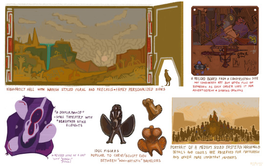
Very hard to answer in a single post so I focused on visual art here. Here are some few sketchy examples from both species.
There's a wide spectrum between the single species' cultures and even bigger between the two species. But there are many convergent art forms where the biggest differences lie in style as slomen and uniima see the world differently (color, space, person recognition...).
Slomen
In slomen cultures, art is commonly created for a community. Either to decorate a space or gift to a group etc. The least rare exception would be gifts for family heads but those usually see it as an obligation to share it with the rest.
So portraits of only one person are very rare. Art pieces also tend to be large, as the average painter group (in Ciwa) consists of 5 members and a mural-making group can be around 20. When they agree on the base motives, each artist executes their part with the resulting piece having all sections equally over-detailed.
Ciwan and general sloman visual art is often about fitting as much as possible experience and telling many stories without focusing on one single aspect (unless it's to highlight a higher-ranking member such as a matriarch). Art that can be touched is preferred.
Ciwan style of people drawing focuses on little facial detail, drawing people more idealistic with expression being shown more in body language. Individual indicators are primarily stripes and markings, sometimes holding a token of their occupation.
Uniima (sky)
In sky cultures, visual art is very popular and used in practical senses too. Ueema cultures commonly exchange art as information in case of language barriers and use it for documentation when they can afford it.
The structure of sky settlements, being that of thousands of microstates, leads many to compete in presentation. Having the most inspired architecture and decoration is why many become artisans which then bleeds into other parts of society.
Art is a job for one and it's full of competition. A good artist acts as their whole company, creating advertisements inside and outside their home, traveling, and inserting oneself into events.
Sometimes, uniima stylization can be realistic and practical but very often it's not and becomes hard to read for outsiders (even other uniima cultures).
Many artsy movements wash over regions in a year, inspired by people, cultures, and faded cultures like those of dead microstates that had little to no outsider contact.
The people drawing style spectrum over ueema cultures alone is overwhelming as they don't work as a single culture and many have a style native to their small area.
Most honor the individual great, including self-portraits and private pieces. The best indicator of who is the painted/crafted individual is the crest and beak shape, after that marking spacing and color + often accessories showing off a uniimas status, skill, and faith stance.
Some styles will include noise visualization to show the person's voice or other non-visual information to make the piece truly pact with context about them.
#art#digital art#speculative biology#artists on tumblr#artwork#worldbuilding#speculative evolution#spec bio#uniima#slomen#sloman culture#uniima culture#sky uniima#uniima c#alien species#spec evo#original alien species#xenobiology#alien culture#ask#answers
132 notes
·
View notes
Text
Ok, so this a character draft for an AU I'll be writing, Part 2
(basically a rip-off of one of my dr scripts, for those who know what I'm talking about.)
(The only difference between ver 1 and 2 is the noses)
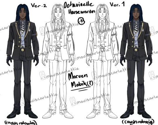
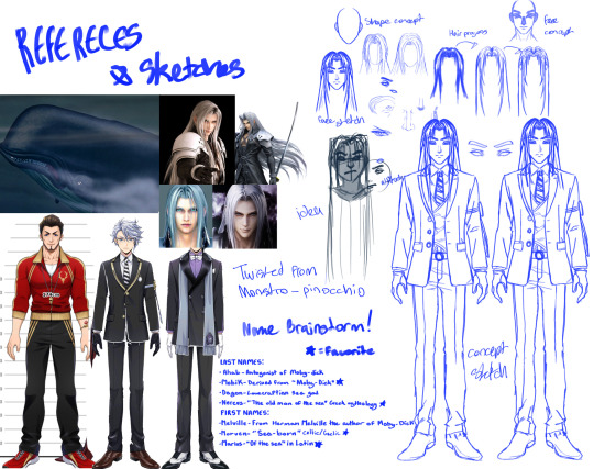
(These images are available on my art account @maviscarlettie)

I also need help with figuring out this guy's name(even tho I basically already chose, but second opinions are good)!
He's twisted from monstro in pinnocio and, from what I gather, is a sperm whale.
Morven MobikMorven = a name from Celtic/Gaelic origin meaning "lives by the sea," "sea-born," or from Mhorbhairne (“the sea-gap”) Mobik = a stylized twist on Moby Dick, the iconic white whale,
Marius NereusMarius = Latin origin meaning “of the sea” or “male descendant of Mars,” Nereus = a sea god in Greek mythology, father of the Nereids; wise, ancient, and often called the “Old Man of the Sea,”
OK More AU Info
Ok, so this serious (but actually sly) guy is the house warden of Octavinelle at the beginning of the story since it takes place a year early.
He and the vice warden are 4th year and will leave for internships when the game story begins (like mentioned in post 1 NCR is now a 5 year school instead of 4)
He and Mc know each other prior to NCR, which plays into her acceptance since he will vouch for her stay.
Now, why does MC even get sent to NCR if it's not an isekai situation like the game is? Well, just in the same manner that the dark mirror chose video game yuu for some "unknown reason", our mc was chosen because they will bring great change to the school, for better or worse.
Additionally, they weren't just randomly hit by the ebony carriage and brought to the school. No! They, in fact, got the official NCR letter of acceptance/invitation to study there like every one of the students around early July.
Did she send back a letter that basically said that she would be accepting the opportunity and would be attending the school starting September while fully knowing that NCR was a boys' school? Yes.
Did she contact Morven(?) in advance about the situation since she knew of his current schooling and that he was currently Octavinelles dorm head(he became dorm head in his 3rd year)? Yes!
Anyway, they know each other, which helps her weseal her way into staying at NCR even though she is infact not a male student(Though there are a lot of factors that she and he manipulate to stronghand Crowley into accepting).
Mc is a nymph, but I kind of create my own version of what these terms mean in my story, so hardcore mythology fans don't come after me!
She is an estuary nymph, which is the offspring of a sea nymph and a river nymph. Which is very important.
Sea nymphs have powers that would best be categorized as one of a 'siren'. However, they are forever bound by the sea(well, unless you have transformation potions, but it is very unlikely that one would acquire said type of position, and you will see why)
River nymphs can change their form to be able to walk the earth without any potions as long as they are not too far from water that originates from their river/stream. A loophole to this is for one to be carrying a vial containing some of that water on their person.
Now, MC, as an offspring of both, possesses the ability to roam the earth but also uses a voice that is beyond this world~
Those legends about sirens luring sailors with enchanting songs? They're real. But the public got it wrong—they aren't merfolk. They're actually sea nymphs.
To most land folk, sea nymphs look just like merfolk. That’s why no one realizes the truth. The resemblance is close enough to cause confusion, and since humans can’t tell them apart, the nymphs stay hidden in plain sight.
Sea nymphs avoid merfolk deliberately since merfolk can tell the difference—and the nymphs don’t want their existence leaked.
Nymphs are a type of fae, no matter where they come from—sea, river, forest, even volcanoes. They don’t usually hang around other fae either, except for pixies (actually, they speak the language of pixies) Nymphs can vanish into a secret dimension known as the Nymph Realm(placeholder name). Think of it like the mirror dimension in the Halloween event or just the NCR dorms. It's another dimension superimposed on Twisted Wondeland.
Portals to the Nymph Realm are scattered across the world, disguised in nature. A nymph could lift a wave like a blank and step in, push a waterfall open like curtains, step into a seemingly ever-going fire—these are gateways to their realm.
Other beings can enter the Nymph Realm—but only with a nymph escort. And even then, each nymph type (sea, river, forest, etc.) is picky about whom they guide.
Need to travel far? Enter the Nymph Realm. It's a maze-like wonderland, but if you know the paths, you can cover vast distances in Twisted Wonderland just by using that dimension like a shortcut.
Anyways most nymps stay away from all other species; they are very secretive yet relaxed in nature, which is why they wouldn't make contact in most cases just to get a transformation potion.
If anything, if one really wants it, it will go to the more mischevious and chaos-oriented Nymphs(like mc) that roam Twisted Wonderland without a care in the world to procure some for them.
Final points:
Each nymph type has its own rules apposed on them-sea nymphs have beautiful voices but are basically merfolk, river nymphs can walk the earth but need water from their river on them do so, etc.
Mc is the stereotype 'siren' archetype (sultry, seductive, dangerous, etc.) but also somehow a gremilin who is a harbinger of chaos.
(The first bits of info can be found in this post.)
Please comment your thoughts y'all, and stay weird fam!!!
#twst oc#disney twst#twst fanart#twst wonderland#twst#twisted wonderland fanart#disney twisted wonderland#twst art#twisted oc#twisted wonderland#twisted wonderland oc#tswhiisftteedr#twst x reader#twisted wonderland x reader#twst smut#twst smau#twisted wonderland smut
79 notes
·
View notes
Text
青白之魅 3: Hair & Makeup Styling
1 Introduction & Presentation // 2 Background & Influences // 3 Hair & Makeup // 4 Set Design // 5 Clothes & Accessories // 6 Conclusion
If you thought there was gonna be less nerd from here on out you are deeply mistaken.
I was responsible for the hair styling for both the white and green snake, which was super fun. I’ve been doing hanfu hair styling for a year or two now (thank you to everyone who let me practice on them!!!) and have gradually gotten better at it, even though I still struggle with some parts of it. I certainly have the equipment collection to show for it now at least! I have so many fake hair pieces I can’t keep track.
As with any hanfu hair styling, the process involved a lot of fake hair, pins, and hairspray—but of course before the actual styling started, which was mostly only on the day of, I had to spend some time thinking about how I wanted the hair to look on each character.
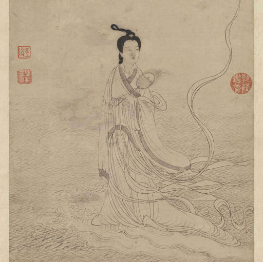
元 衛九鼎 洛神圖, Taiwan National Palace Museum, 她:女性形象與才藝,2020
As far as snake-like hairstyles go, the first thing that comes to mind is the 靈蛇髻/灵蛇髻/ling2 she2 ji4/Spirited Snake hairstyle, shown above on Luoshen, a women’s hairstyle that went through a lot of changes through the dynasties but generally involved a tall, twisting bun leaning slightly to the side on the top of the head, resembling the body of a rearing snake. It’s a very popular style both historically and among hanfu enthusiasts today, because it looks very unique and ethereal. Often, female spirits or goddesses are depicted with this hairstyle.
That was the style I was originally planning on using, but it came with some limitations: one, it’s kind of… in unstable equilibrium? We’d essentially be walking around with the leaning tower of Pisa around on top of our heads. I had to style both of our heads BEFORE setting up the set design, so there was too high of a risk that something would get knocked out of place, since I knew I would have to be running around doing things. Also, because Yulan has brightly colored dyed hair, she had to wear a black base wig under all the fake hair pieces, which is a bit more difficult to pin things to than your actual scalp.
So instead I went with a different design. I knew I still wanted a lot of serpentine loops and strands, and I wanted there to be a significant amount of volume going on—they are ‘spirits’ and ‘goddesses’ after all, they deserve to be fancy!—so I went from there.
The Poetry Vibes
I stumbled upon a few poems last year while looking for names for Cloud9 Hanfu’s Year of the Dragon collection, and a few of them ended up becoming inspirations for this project.
This is the first part of 張可久 (Zhang Kejiu)’s Yuan Dynasty verse, 醉太平·春情 (Drunken Peace · Spring Romance). It’s a bittersweet poem describing a speaker that is longing for a lost love, likening her beauty to the imagery of the evening spring showers outside his home. I’ll do a slightly more faithful line-by-line translation of the poem’s actual words, then a paragraph-form translation with more stylization that gets at the meaning a little more (poetry is really hard to translate).
This is mostly just my interpretation though, and my Classical Chinese is... extremely questionable, so like... take it with a grain of salt.
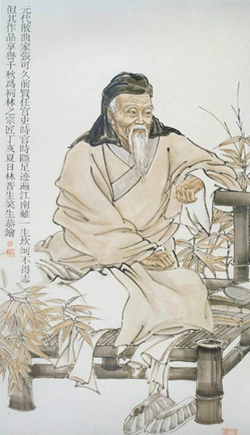
張可久 Zhang Kejiu, 百度百科
Line-By-Line
烏雲髻鬆,金鳳釵橫。<- “Storm cloud hair is soft and loose, the golden phoenix hairpin is horizontal.”
伯勞飛燕自西東,惱離愁萬種。<- “The shrikes and swallows fly their ways to the West and the East, causing ten thousand kinds of sorrowful goodbyes.”
碧溶溶满溪綠水桃源洞,淡濛濛半窗白月梨雲夢,恨匆匆一簾紅雨杏花風。<- “Jade stream water flows to the Peach Blossom Grotto, moonlight is cast cloudily through the pear blossoms to my half-open window as if through a dream; the wind is unforgiving, felling apricot petals like a red curtain of rain.”
把青春斷送。<- “It ruins the spring.”
Stylized
Storm clouds gather loosely outside my window. I can almost imagine that they are strands of her soft hair; I can almost see where her golden phoenix hairpin would have laid, nestled in her black locks.
It’s springtime now—the orioles should be migrating, flying to their summer homes in the west, and the swallows to the east. Imagining their inevitable parting stirs a complicated sorrow in my chest.
As it storms, clear rainwater collects on the ground in rivulets, streaming away like liquid jade. I wonder where the water is going—is it to some forgotten, untouchable paradise? Is that where she is now? I can see through my half-open window where moonlight drizzles through the petals of the pear-blossom trees, misty and clouded as if I’m dreaming. Suddenly, a curtain of red petals fall across my vision like rain: it’s my flowering apricot tree, struck by the wind.
My trance is broken—spring is over.
//
As Chinese poetry tends to be, it’s very romantic with lots of natural imagery, tinged with sadness. When I reread it with this project in mind, it made me think of Xu Xian after the events of the Legend of the White Snake. While it’s commonly accepted that Bai Suzhen later ends up getting freed and there’s some kind of happy ending, the actual legend itself ends with the White Snake being imprisoned under the Leifeng Pagoda. Many years, if not centuries, pass before she gets out. So as many Chinese romances tend to be, the Legend of the White Snake is, by itself, a great tragedy. I can see the Xu Xian as the speaker of the poem.
Bearing this in mind, I imagine that the beauty of the Snake Spirits are much like the scene described in this poem—soft and ethereal like mist, hiding enough power to bend nature to their will. I decided to lean into the ‘clouds’ theme, especially for Bai Suzhen.
傳 五代 周文矩 仕女圖, Taiwan National Palace Museum, 她:女性形象與才藝,2020 (ft fucked up fat cat)
The comparison of women‘s hairstyles to rainclouds is actually very widespread in Chinese literature, so it was perfect for hairstyle inspiration—in poetry, women are often represented by their features, ex. a poem might say "moth brows" or "cloud hair" to refer to a beautiful lady. Cloud hair and cultivated appearance is integral to the allure of a woman, so much so that the act of putting on makeup can be considered a transformation of identity.
In the linked instance the transformation of identity is supposed to be in the sense of gender identity, but you could also see it (in the context of this project) as the transformation from snakes to women.
This connection is strengthened by another poem, 好事近·夢中作 by 秦觀/Qin Guan from the Song Dynasty.
清宫殿藏画本. 北京: 故宫博物馆出版社. 1994, Wikimedia Commons
Line-By-Line
春路雨添花,花動一山春色。<- “Rain has filled the road with flowers, swaying in the breeze, filling the mountain with the feel of spring.”
行到小溪深處,有黃鸝千百。<- “I walked far along the mountain stream, where there were hundreds and thousands of yellow orioles.”
飛雲當面化龍蛇,夭矯轉空碧。<- “The flying clouds turned into dragons and snakes before me, stretching across the vast jade expanse.”
醉臥古藤陰下,了不知南北。<- “I lay down, drunk in the shade of the vines, not knowing which way is North or South.”
Stylized
I see where the spring showers have filled the mountainside with flowers. They sway in the breeze, bringing with them the rejuvenating scent of spring as I walk deeper and deeper into nature, following the bubbling mountain spring and the crowds of yellow orioles that have come out to celebrate the season as well. As I look up at the sky, I see dragons and snakes form in the midst of the roiling clouds above, leaping and coiling across the expanse of the clear blue sky. Intoxicated, I stop to rest underneath some vines, lost in the beauty of springtime.
//
So I am aware that it kind of sounds like this guy miiiiight be on acid but I'm pretty sure it doesn’t mean he’s hallucinating snakes in the clouds, it’s just like when you look at a cloud and say “that one looks like an elephant!”
Then again there is an interpretation that says his "walking further and further into nature" means he's just getting more and more drunk to escape his problems, so like... make of that what you will. Art is more often than not subjective.
Anyway, dragons also have power over rain and weather, and snakes are often called the ‘little dragon,’ often also associated with flowing water. All this is to say—clouds & coils are good representations of snakes! Also, you’ll notice that both of these poems are about springtime (though the second one is noticeably happier), fitting in with using this project to welcome the Spring Festival :)
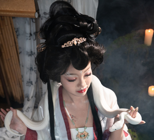
Moving onto individual hairstyles. Keeping in mind the shapes of clouds, I wanted Bai Suzhen’s hair to be very tall, voluminous and ethereal to represent her spiritual prowess and strong will. A bunch of loops fan out at the top center of the hairstyle, adding ‘rays’ pointing outwards like a halo. I made sure there were a lot of round, circular elements to ‘fluff out’ the shape like a cloud. There are two strands of circles kind of peeking out at the bottom behind her neck/ears area, which were achieved by pinning a braid to each side and then pulling the outermost hair strands of each ‘loop’ outwards to create little flat circles.
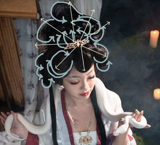
Going back to the first poem, if I imagine that the speaker is Xu Xian thinking of Bai Suzhen, it makes sense for the mentioned ‘gold hairpin’ to appear in her hairstyle, doesn’t it? So I also added a few gold hair accessories—U-shaped pins for the most part, plus a small guan in the center to tie things together—to point outwards above her head.
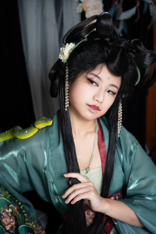
For Xiaoqing's hair, I wanted something that was a little more youthful, but still resplendent enough to do her justice. Xiaoqing is a younger spirit than Bai Suzhen, but still accomplished in her own right. Her hairstyle don’t extend as far outwards as the White Snake’s, but she has two ‘loop’ buns on each side rather than one peak in the middle. It’s kind of evocative of the double bun look often styled on younger girls, but with more fancy loops and swirls added to represent her high spiritual abilities. Each of the two main buns has two strands of hair looping up from the back of the head to the top. The strands are very loose, so depending on how I moved, they separated into several visible strands/just one thicker lock of hair.
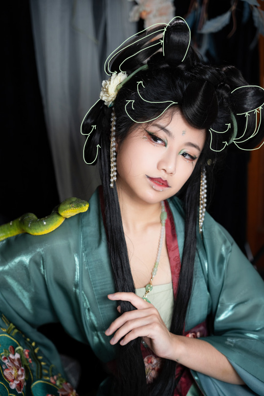
The hair accessories I chose for Xiaoqing don’t have as much metal in them, to distinguish her from her sister, as I wanted to emphasize her connection to nature—because she has less experience than Bai Suzhen, she is often portrayed in media (Green Snake 1993 especially) as not yet reaching full human form, still closer to her serpentine origins. She has a white flower with green leaves on each side, standing for spring, youthfulness, and her dedication to the White Snake. There are a couple strands of pearls ‘dripping’ down from the flowers like raindrops, matching with the pearl accessories in the makeup, as well as with the white markings on Dragun’s back.
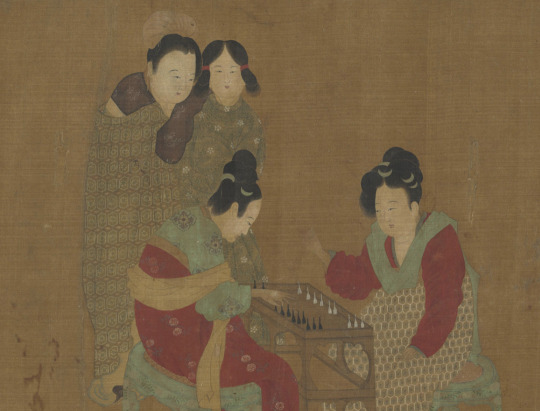
傳 唐 周昉 內人雙陸圖 , Taiwan National Palace Museum, 她:女性形象與才藝,2020
I also chose to include a pair of green half-moon combs, made to imitate jade (they’re acrylic, I’m working on a budget here ;-;). These were often worn several at a time, inserted into different layers of hair (as seen in the image above). Jade accessories are carved from nature—they are often subject to the colorings and properties of the natural base material they are made from, and they are often used to describe natural imagery. This can sometimes be a limitation, but for those who look further it can be an inspiration (see the Jadeite Cabbage, my favorite thing ever, Taiwan Numba One).
Peking Opera Hairstyles
京劇旦角,百度百科
Peking opera influenced the hairstyle design a lot. Dan roles (旦角)in opera have very specific hairstyle protocols. They wear a lot of fake hair pieces and hair accessories just like modern hanfu hairstyles have. One of the base hair silhouettes shared by almost all dan is the traditional 大頭/大头/da4 tou2/'big head,' with most of the hair wound into a large oval bun on the back of the head, and small pieces added at the edges for decoration. To imitate this look, the back of both of the hairstyles are padded with a large, flat, and round hairpiece (known in the hanfu hairstyling community as the 西瓜包/xi1 gua1 bao1/'watermelon bun'). This helps to add volume onto the back of the head, creating the illusion of very long hair that has been neatly wrapped and pinned up.
Another one of the key parts of these hairstyles is the round loop of hair in the center of the forehead. It’s an important feature that I included to tie the two styles together, to make sure it was clear that it was a ‘matched set’ so to speak, and was inspired by the hair loops seen in Chinese Opera styling.

戏曲旦角化妆、梳大头全过程,新浪博客,2011
Traditionally, a solution made from elm tree sap and/or kelp was used as hair gel to glue the little contouring base pieces (貼片子/tie1 pian4 zi0) down to the face. Seven loops called 小灣/小湾/xiao3 wan1/'little curves' line the hairline, one in the center and three off to the sides. I think they look kind of similar to the hairstyle that ballroom dancers have.
This was an artsy hanfu concept shoot, so I didn’t want to necessarily copy the operatic hairstyles—not to mention I don't know how, the motion of making one hair loop alone can take 3-5 years to train—but I did want to include some elements of the opera characters as a nod to their role in popularizing the legend! So each hair design has that central loop. It’s a separate hair piece that I bought for this shoot, whose base I covered with some of the other hair. It isn't glued down like it would be traditionally. I was going to have a few more loops coming down on the sides too, but I found that it looked kind of awkward so I took them off.

There are also two thin strands of hair trailing down each shoulder, another element partially inspired by Chinese opera styling, but it’s very common nowadays to have those there just for the Vibes so it’s not as unique. Most dan roles have a section of long unbound hair trailing down their backs, with two small strands separated out to stream down the front. This is called 線尾/线尾/xian4 yi3/'thread tail' or 線簾/线帘/xian4 lian2/'thread curtain.'
Makeup
Okay so this mostly ended up being about hair rather than makeup because I know a lot more about hair than makeup, but I'll talk a bit about the makeup too lol. I can't speak for the White Snake's makeup—Yulan was in charge of that and she did a marvelous job!—but I did do my own makeup.
The makeup for the green snake came with a great challenge: how do you make my face, arguably the roundest and most nonthreatening thing you’ve ever seen, into something resembling a snake demoness? Also, flamboyant makeup in cool colors can be tricky—too little and it’ll all disappear on camera, too much and it’ll look like a muddy green mess.
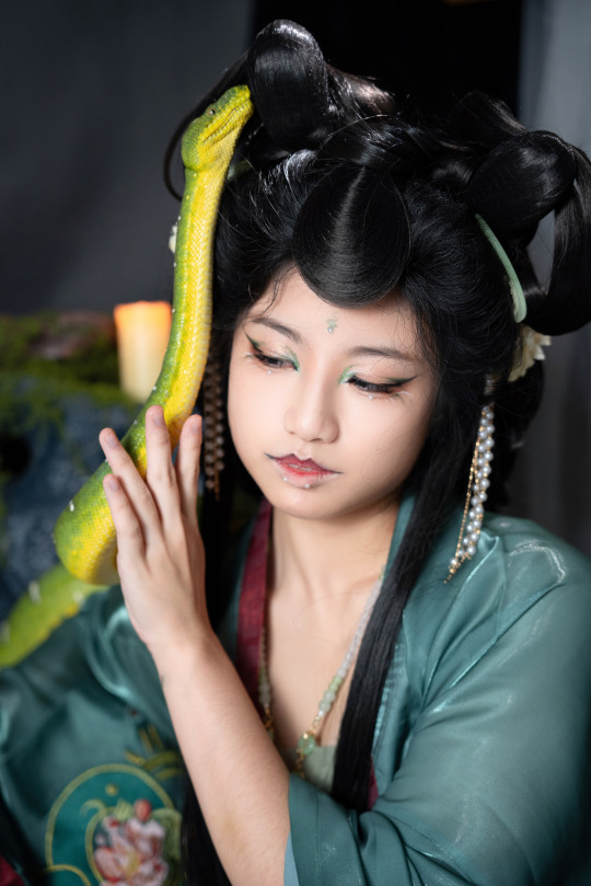
Both my sister and I are fairly warm-toned; green has to be very concentrated in a very small area to look interesting, otherwise it just looks like a bruise (I tried it). So I tried to use a lot of long thin lines of color and angles in the eyeshadow to avoid that, and to kind of draw out the snakey vibes. The meager selection of green eyeshadows that I had weren't the most pigmented, so we made a stop at Sephora (my first time in Sephora believe it or not) on the way from LAX to Riverside and bought some supplies. They turned out to be super super useful.
One of my favorite makeup features was a my sister’s suggestion—fake pearl ‘snake bite’ piercings under the bottom lip! It’s a fun little linguistic easter egg that I’m super happy to have been able to incorporate into her styling.
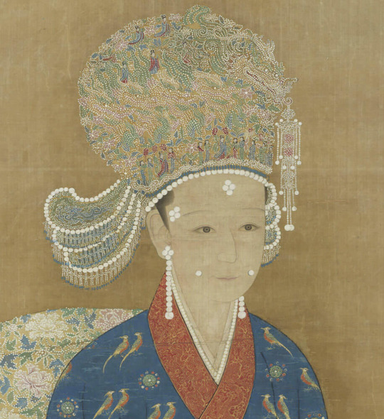
宋人 宋高宗后坐像,Taiwan National Palace Museum, 她:女性形象與才藝,2020 Look closely and you'll see dozens of tiny women depicted in pointillism on her guan headdress!
Pearl makeup (珍珠花鈿/珍珠花钿/zhen1 zhu1 hua1 dian4)was really popular throughout several dynasties, but especially the Song Dynasty, where it became a huge trend among nobles. Today it mostly appears in hanfu circles, but I believe some Southern Chinese opera styles use them too.
As far as I know, the position that we put them in under the bottom lip is anachronistic, but they did often appear at the corners of the mouth/the dimples (面靨/面靥/mian4 ye4), so if you stretched it a little and imagine they've just been moved slightly, I could probably claim that it's at least historically inspired.

元人 畫梅花仕女, Taiwan National Palace Museum, 她:女性形象與才藝,2020
Other places that pearl makeup often appeared was on the temples, cheeks, or forehead. I also put a pair under my eyes just for funsies (I find that using smaller-sized pearls looks better to me, even though the ones shown in paintings are usually fairly large).
//
Okay that ended up being a lot longer than I thought it would be. I am so tired wow. The next one might take a while to come out too, but hope this one was enjoyable :)
1 Introduction & Presentation // 2 Background & Influences // 3 Hair & Makeup // 4 Set Design // 5 Clothes & Accessories // 6 Conclusion
#hanfu#hanyuansu#chinese hanfu#chinese fashion#chinese history#hanfu fashion#hanfu photoshoot#hanfu art#long post#like really really long post#hanfu makeup#makeup#chinese makeup#hanfu hairstyle#hanfu hair#青白之魅#cloud9 hanfu#cloud9hanfu#九雲閣#snake#snakes#洛神#chinese opera#peking opera
91 notes
·
View notes