#i have no idea how to use photo editing software
Explore tagged Tumblr posts
Visit Tumblr Blog
Explore Tumblr blogs with no restrictions, modern design and the best experience.
Last Seen Tumblr Blogs


Fun Fact
Forty percent of Tumblr users are between the ages of 18 to 25.
Note
hi! do you have any tips on how to make teenagers look like actual teenagers? venus looks so good!

hi!! so i don't use the preteen mod, but i do use the shortest height preset from this set by luumiasims. so far there really isn't a huge animation issue because her friends are using the same preset and other animations with adults/kids (like hugging) don't look that bad. however, i'm noticing that there are some clipping issues when trying to pose her, though. i hate how teens are the same height as adults and i really wanted to play out the preteen/early teen life stage with the girls. other than the height preset, i think i just made her eyes bigger and cheeks fuller. i think adding blush and braces also make her look younger. i try to use hairstyles and accessories that look "younger", but tbh i'm having a hard time finding clothes for her atm. here's a photo to show what the shortest height preset looks like standing next to an adult and a child. i hope this was helpful!

more asks under the cut!!

byeee this is so funny. i forget i never really posted the beginning parts of this save so not many know the lore of these three. oh god, i'm gonna yap for a bit. short story of their relationship is eva & kato got together in their early 20s and were going to have a son named saturn, but sadly eva had pregnancy complications and they lost the baby. unfortunately, it made things really difficult in their relationship and they decided to break up. during their time apart, eva meets judah and falls in love, but she ends up cheating on him multiple times with kato (even the night before she got married to judah ) and they literally wouldn't stay away from each other. years later after both girls were born, she confesses to judah and they take time apart. i know what you are probably thinking, how tf does this end in the big happy family we have now? eva basically made it known that kato is her soulmate and she could never really be done with him. they would have never broken up if not for the loss of their son, but she was also so in love with judah and the family they had created together. she proposed the throuple idea (lmao the audacity) and both kato and judah were veryyyy hesitant, but ultimately, they both loved her so much that they decided being with her was worth it. at first, they decided to just move in together and kept their relationships with eva separate. ngl it was such a weird and tense time in my game and they would constantly get jealous/upset with each other. i ended up using a mod allowing more than one partner and things settled down. after some time living together the guys realized they actually fw each other and they were lowkey bestiess. they have been together #challengers style a few times, but they usually tend to be romantic with eva separately. i know it's a weird situation, but now i'm happy with how things turned out. no one holds any ill feelings towards each other and all three of them just really enjoy doing life together and parenting the girls the best they can. there's soo much more to it, but i tried to keep it as short as i could lol.

totally!! you don't have to credit me, but i would like to seee

hmm i'm not really sure. i normally label my sims as maxis-mix. maybe more alpha? i think i prefer alpha skin details and clothes over mm. my build/buy cc is a good mix. it's nice not having to force myself into one style

ty :)) i don't really play legacy challenges. having rules sometimes ruins the gameplay for me, though i do think they are super useful when it comes to using/playing with certain features of packs that i wouldn't mess with otherwise. i tried nsb 2.0, but i'm still on gen one lmao. sorry i don't really have any to recommend.

hi!! it's actually really easy if you have sims4studio and a photo editing software. i use photoshop. first i find either a painting or photo frame that i like, then i export the diffuse map in s4s. i take the png file and basically paste my photos on top of whatever was in the frame (in photoshop) and then i import it back into s4s & save. if you want an in-depth tutorial i could definitely make one, but there are also a lot of great ones here on tumblr and youtube.

had to ask my bf about this lol. i have 0 idea what any of this means:
cpu: amd ryzen 5 3600, ram: 16gb ddr4, gpu: rtx 3060, 1tb m.2 nvme ssd (x2), motherboard: asus prime b550-plus, 650w power supply

i think i've had this account since 2018, but i didn't start to really use it until around 2022. i was suuuuper involved in the simsta community at the time. i was always kind of intimidated by tumblr (and the people here) and didn't really know how to use it. now that just seems funny.


well, first i think i should mention that i absolutely do get bored and experience burn out. sometimes i don't touch the game for months. i feel like this is common and i know a lot of my friends experience it too, so don't feel bad about it.
not sure how great my cas advice is considering i feel like i make the same sim over and over, but one thing that helps me keep things fresh is using cc, presets, and aesthetics that i don't normally use. i find myself using the same skin details a lot and things can get boring. use that hair that you never touch, try out different aesthetics, mix and match different skin details together, utilize different sliders, pick a fun hair color, try different makeup styles!
when it comes to keeping gameplay interesting, my advice is to try not to micromanage everything. i knowww it can be difficult, especially if you have a certain storyline in your head, but i feel like if you control every little thing, it's easy to lose steam and things can get boring or unenjoyable fast. it's really fun to let your sims tell their own story and it keeps you guessing what will happen next, especially when they decide to do things you wouldn't normally choose for them. for example, when eva had her pregnancy complications it took everything in me not to cheat it away, but some of my sims wouldn't even have been born had i not let things play out. another example is when she decided to be unfaithful. it's not something i'd normally want my sims to do, but it created a whole different story that has been so interesting to play. also let your sims have flaws! not everyone is a saint. let them be mean, let them fail, and let them develop their own personalities as you play. i pay attention to their whims and choose to do the things they want. when my sims age up, i like to use the randomizer on their traits and pretend it's fate. now this isn't to say i don't have some storylines or things that i'd like them to do planned out, i just wouldn't recommend planning their entire life out all at once, you know? but this is what keeps things interesting for me, it may not be for everyone :)
as for the right time to take screenshots, it depends on your personal preference and what you want photographed. i personally take screenshots of my sims doing everything so much that i feel like a proud parent. every once in a while, i go through my screenshot folder from the beginning of my save and watch everything back like a movie :'). when it comes to actually posing my sims for a screenshot, i like to keep it to a minimum because setting everything up can sometimes take me out of gameplay mode lol. i really only pose them when i want to take photos to decorate their home or if there's a pose i really want to use to tell a story.


hi!! this is so nice :')) thank you!
i don't really have anything specific when it comes to posting on tumblr, other than using hashtags that help others see your posts. i don't care about numbers or anything like that. i post whenever i want, sometimes multiple times a day and sometimes once a month. i feel like as long as you are posting what you love, the right audience/community will find you. definitely interact with people in the community! there's so many creative people here that inspire me all the time. if you have specific questions about how to put sims up for download (like exporting their files) or anything like that, feel free to dm me! i'm happy to help. :)

ooo okay, so presets help a ton. northernsiberiawinds has some head presets and i use #8 all the time and it gives the head a narrower shape. here is a gif showing how i use sliders to pull the face down because i honestly don't know how to explain it in words and figured a visual would be of more help anyway. hope this helps! <3

#sorry i am using your question to bulk answer a lot of my asks :b#also sorry for how long it's taken me to get back to everyone!!#maybe one day i'll spill all the rapp family lore and post the photos from the super early days#honestly so tickled that people like and follow my lil virtual children's lives :')#asks
27 notes
·
View notes
Text

It's my birth month and I usually loathe my birthday but love November, the weather, the way the air gets crispy and fills with the scent of woodburning stoves and firepits. ♏ I dislike pumpkin spice flavored drinks because pumpkin is not a spice. I do love chai though and pumpkin pie. 🍵 I made myself a cozy little basic bitch loading screen and a sweet little plumbobber to go with it. 🎁 Grab them both under the cut! ⬇️

Load Screen designed with Free Version of Canva. 🍂Cozy Fall Load Screen here [google drive] 🩷PinkiePromise Plumbob here [google drive] Many thanks to @pixipui for the Plumbob tutorial I found on YT and of course @sims4studioofficial.
#ts4 download#custom loading screen#custom plumbob#sims4#brand new simblr#ts4 simblr#the sims 4#sims 4 download#it probably took me too long to learn how to do this stuff#i have no idea how to use photo editing software
13 notes
·
View notes
Text


I love Bruce

#please excuse the poor quality... I made these on my phone#I have no idea how to use the photo editing software on my phone
109K notes
·
View notes
Text
From the Slang Dictionary
Brainrot - (sometimes spelled brain rot) used to describe the effects of being “perpetually online” and consuming large amounts of low-value internet content. The term, which can be used as both a noun and verb, is also used to describe an intense and often obsessive preoccupation with a particular topic, such as a TV show, movie, fandom, or idea. People experiencing brainrot often find themselves mindlessly scrolling through never-ending social media content.
Delulu - a slang shortening of the word delusional. It is especially used to describe superfans or dating partners who display odd or extreme behavior. Frequently, delulu is used in jokes, memes, hyperbole, or lighthearted mockery, especially in memes and social media videos depicting people acting bizarrely or obsessively.
Girl grip - holding multiple items in one hand by grasping them between fingers. Typically, the phrase refers to a person using a clawed hand to hold multiple items at once. For example, a person may hold a paper cup using primarily their thumb and pointer finger while holding a smartphone, keys, receipt, and wallet with their remaining fingers on the same hand.
Goblin mode - a way of behaving that intentionally and shamelessly gives in to and indulges in base habits and activities without regard for adhering to social norms or expectations. The phrase is typically used to be at least somewhat humorous and is commonly applied to oneself as a way of embracing such behavior. It is often considered the opposite of and a reaction to the kinds of healthy, organized, productive habits and lifestyles that are commonly presented (and glorified) in highly curated social media content. It is also sometimes used in reference to people and animals who suddenly become “wild.”
Nepo friend - a person who is thought to benefit from having a famous or influential friend. It is often used to imply that someone is only famous or successful because of their association with a famous person. The term may be used playfully, but it is often at least mildly negative.
Out of pocket - a phrase with three different common meanings. It can refer to a person having to pay money themselves, a person being unreachable, or a person acting unnaturally or in a wild, inappropriate way.
Side character energy - a characteristic that describes how a person sees themselves and their attitude toward life. Side character energy is typically associated with people who are funny, content, and self-assured or who don’t seek to be the center of attention. It is often seen as a counterpart to main character energy or main character syndrome.
Situationship - a romantic or sexual relationship that is undefined and noncommittal. People in a situationship are more than friends but less than committed romantic partners. It can often vary in what happens within it. It could involve casual sex, romance, dating people, spontaneous meetings, a lack of plans, a lack of emotional connection, or possibly all or none of these things.
Unalive - a slang term used on social media as a replacement for the verb kill or other death-related terms, often in the context of suicide. It is typically used as a way of circumventing social media platform rules that prohibit, remove, censor, or demonetize content that explicitly mentions killing or suicide. The term is used both seriously (such as in discussion of suicide prevention and awareness) and in nonserious posts and memes (such as saying My mom is going to unalive me if I don’t clean my room).
Yassification - the act of making something better, especially more visually appealing. Specifically, it is often used to refer to an internet meme in which pictures of people are edited using photo editing software or beauty filters to resemble an exaggerated, hyperfeminine version of a woman adhering to stereotypical beauty standards.
Source ⚜ More: Word Lists ⚜ Writing Resources PDFs
#requested#slang#writeblr#writing reference#langblr#word list#writing prompt#spilled ink#dark academia#writers on tumblr#literature#creative writing#writing inspiration#writing ideas#dialogue#writing resources
188 notes
·
View notes
Text
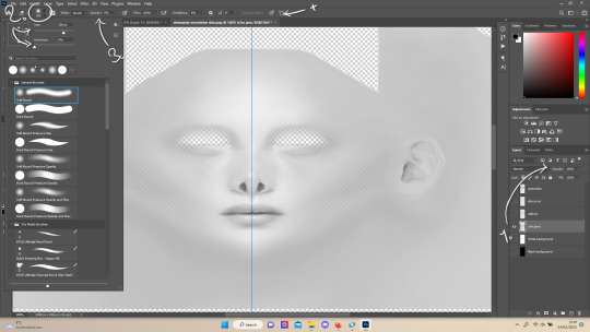
wrixie's guide to default eyes 🤩
welcome to my guide on making default eye colors for the sims 4 this'll be my first ever tutorial and it's a big one so please bear with me!
if you have any questions please don't be afraid to send me a message!
here you will hopefully learn how to: make defaults for humans, aliens and vampires as well as cats, dogs and mini goats and sheep! -> i'm unsure about how to do cottage living animals anymore due to s4s changing and the foxes are currently bugged to be gray :( BUT i will provide my files so you can just recolor them and merge them back together down below
you will need a few things to start: sims4studio, photo editing software such as gimp or photoshop to create and edit your textures, some meshes that i've provided + these body templates
human defaults (and beginning steps):
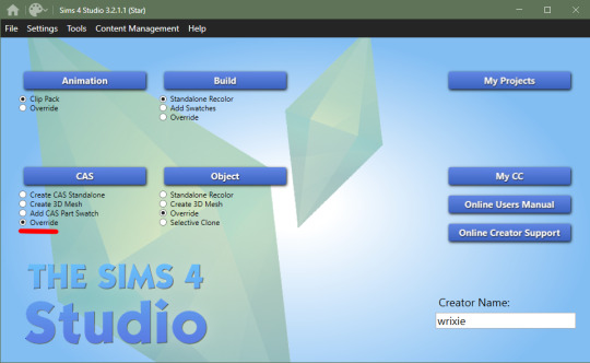
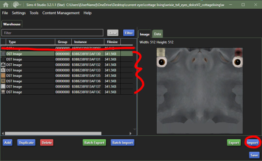
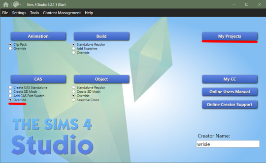
open up sims4studio, locate the CAS button, under that you should have 'override' ticked instead of the default 'create CAS standalone' then click the big CAS button to go to the next step
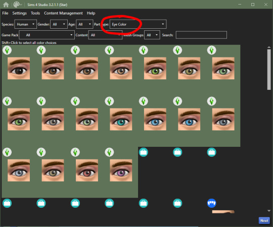
2. you'll see a few drop down menus, locate 'Part Type:', scroll down until you find 'Eye Color', we're doing human eyes so shift+click all of the base game default colors and click next
3. save your new .package file what ever you please i recommend something like -> yourname_eyename_default <- make sure to have it save into your mods folder or somewhere where you can easily access it (i saved mine into my mods folder)
4. this is where you'll import all your eye colors - assuming you've made your eye textures, locate the 'Texture' box in the 'Texture' panel, you'll see three maps: Diffuse, Shadow + Specular, import your eye texture in the 'Diffuse' texture for all of your eye colors, click on 'Specular' then click on the purple 'Make Blank' button to get rid of the cloudy shine on the default eyes (you'll have to do this manually for each swatch)


alien eyes:
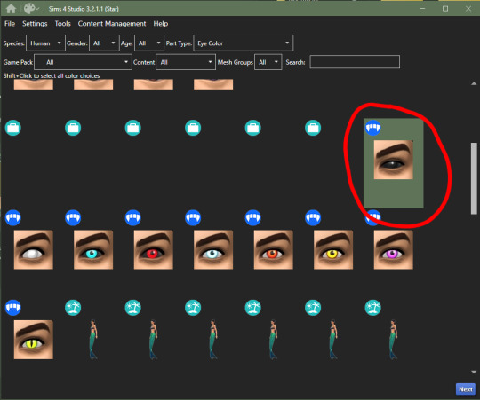
you'll do the same as the human in terms of selecting 'override' in the CAS section then locate 'Part Type:', scroll down until you find 'Eye Color', but instead of selecting the human eyes, we'll select the all of the alien eyes with shift+click - they don't have previews for some reason

2. then you can follow the previous steps, save your file under yourename_eyename_aliens_default into your mods folder
3. same as the humans, import all of your alien eyes into their proper swatches but this time there's two more maps: Normal + Emission - you do not need to touch these for aliens as alien eyes do not glow and the emission map is for glowing textures (i have no idea how to do this)
4. make your 'Specular' maps blank and click save!
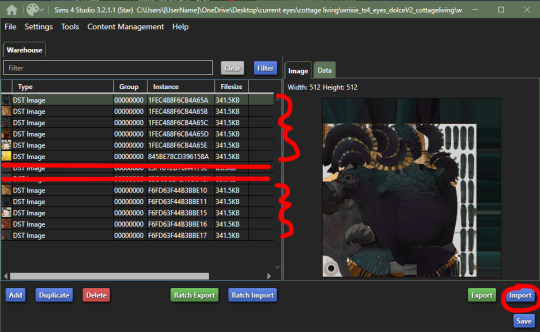
vampire eyes:
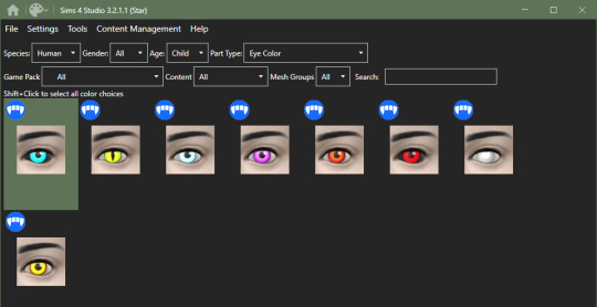
do the same as the others in terms of selecting 'override' in the CAS section of the main menu, locate 'Part Type:', scroll down until you find 'Eye Color', but instead of selecting the all of the human/alien eyes, we'll be selecting the black swatch for right now - this black swatch is for all ages
2. import your black swatch in 'Diffuse' and make the 'Specular' blank
3. this is where you can veer off and follow a different tutorial to get the glow of the vampire eyes or you can continue without it here; go into your photo editing software, create a 1024x2048 image and fill it in completely with black and save it as emission (this is what you'll use to lose the glow and make the eyes work)
4. in the 'Texture' panel, go to 'Emission' and import your black image you just made and save it as -> yourname_eyename_vampires_black < (or what have you)
5. now change the 'Age: All' to 'Adult', select the next eye color, save it as the color it is and follow steps 2 - 4
6. after completing all of your adult swatches, change 'Age: Adult' to 'Child' and repeat the steps you just took with each eye color you will have to do the same with toddler and infant eyes as well; save child files with _CU in the file name, _PU for toddlers and _infants for ya know... infants
7. once you have all your swatches done, make sure to test them before this next step (merging the files into one, this is an optional step but highly recommended) go back to the main menu and under 'Content Management' click 'Merge Packages..'

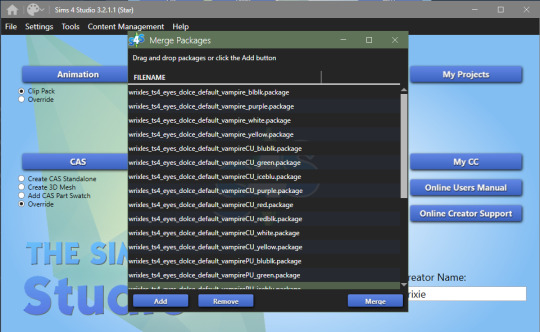
8. click 'Add' and select all of your vampire eye files, click 'Merge' and name it what you want
cats & dogs:
with sims4studio open, the CAS section should still have 'override' ticked, click CAS again and in the drop down menus, change 'Species: Human' to Large Dog, Small Dog, Cat, Foxes, or Horses; if you don't have the textures already, export the default texture so you have it as a base

2. import each of your textures in the 'Diffuse' map and make your 'Specular' map blank for each color and save
3. for heterochromia you can use these meshes - edit the textures to add your own, import your texture to the 'Diffuse' map and make your 'Specular' map blank for each color and save as _heterochromia
4. remember to test before merging - go back to the main menu and under 'Content Management' click 'Merge Packages..', add your files and merge them
mini goats & sheep:
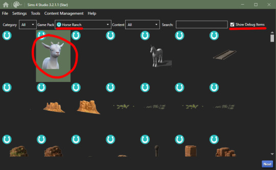
in the Object section of the main menu, tick 'override' and click the Object button

2. in the 'Game Pack' drop down menu, choose 'Horse Ranch' and tick 'Show Debug Items' and at the very top, you should see the mini goat, select this and click next save it as what you would like to
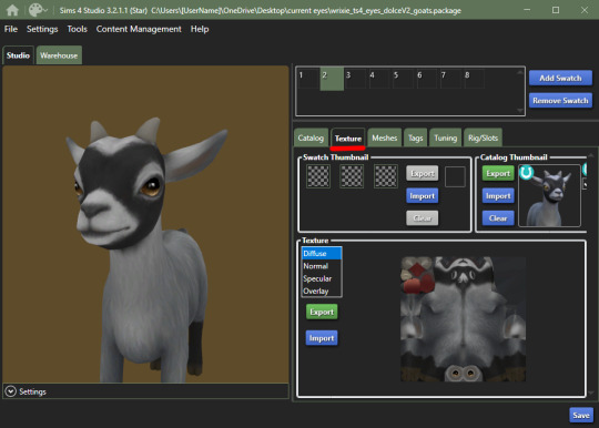
3. go into the 'Texture' tab and export all the goats textures if you haven't already made your eyes - when you have your textures done, import them into the 'Diffuse' map for each swatch and save
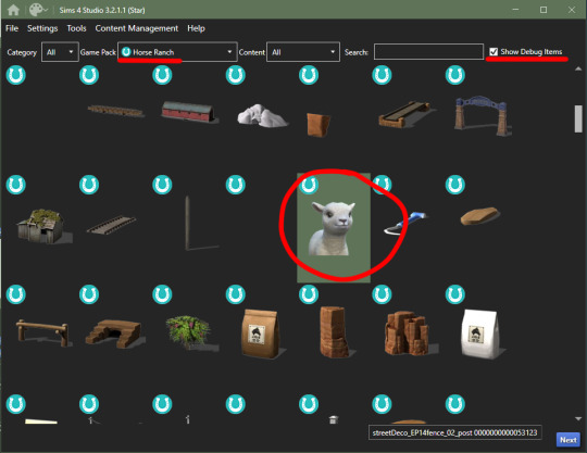
4. go back to the main menu and repeat steps 1 + 2 but instead of selecting the mini goats, scroll down until you see the mini sheep, should only be a tick or two down and then repeat step 3
cottage living:
go to my folder and download the meshes you need here i'll go through recoloring each animal, we're going to start with the wild rabbits; open the rabbits file
ignore the top file you don't need to edit this
'Export' (not the batch export) each rabbit texture, open them up in your photo editor and add your own eye texture then 'Import' each of them in their proper swatch and save
next will be the llamas, open up the file, you might be put into the 'Warehouse' tab, switch over to the 'Studio' tab
export all the 'Diffuse' textures of each swatch, open them up in your photo editor and add your own eye texture then 'Import' each of them in their proper swatch and save
cows are next, open up the file, ignore the top file and 'Export' the three textures then edit them in your photo editor to add your own eyes
'Import' each swatch in their proper place and save

lastly, for now, are the chickens, open up the file in sims4studio, 'Export' the first 6 image files, ignore the next 2, then export then last 5 and repeat editing and adding your own eye textures to them
once that's done, 'Import' all your swatches in their proper places and save
how to convert non-defaults/contacts to default:
1. open up sims4studio, locate the CAS button, under that you should have 'override' ticked instead of the default 'create CAS standalone'
2. before clicking on the CAS button, go to My Projects and open up the contacts you want to make default and 'Export' each color to save it on your computer
3. now you're going to basically follow the beginning steps again, go back to the main menu and click the big CAS button, then it's 'Part Type: Eye Color', shift+click all human eyes or vampire or alien eyes and hit next (i'll be doing human eyes) if you were put into the 'Warehouse' tab switch over to the 'Studio' tab.
4. 'Import' your textures to each swatch to the 'Diffuse' map and make the 'Specular' blank and save!
232 notes
·
View notes
Text
Yo, Welcome to my photography blog!
This is a photography project with a focus on older digital cameras sold before the mid 2000s. I've been working with these sorts of cameras since 2022, which grew from my interest in retro computers that I have had since 2020 or so. Here, I'll introduce you to my cameras, my computer rig, and try to convince you that this is a cool hobby.
General Q & A:
Whats in the name? - Kb refers to Kilobyte, all of the photos I take with these cameras only take up a little over 100 Kilobytes of digital storage per photo. FD refers to the physical media the photos are stored in, currently one camera uses floppy disks (FD), the other two use compact flash (CF) and smart media (SM) cards. unfortunately, their shortened forms do not rhyme and so they do not matter.
What can I expect from this blog? - amateur photography using old cameras, I guess. I'll say some nonsense below each photo but you're free to ignore it. I don't plan on reblogging anything here, so don't expect that. I am the star of this blog. me me me. I tend towards finding weird buildings/architecture, "liminal spaces", sunsets, and generally trying to see how well I can make a photo look like a blender render in a Kane pixels video. don't expect any consistency, though. the medium will remain the same but the vibes will absolutely fluctuate with my mood. I'll try and tag things correctly if it's off putting.
Are you a cool person? - I tend to be! I don't want this place to be alienating for anybody but assholes who don't deserve to see the stuff I do. being a tumblr blog, I follow a lot of the standard stuff. jerks are not welcome and I'm not gonna give you the pleasure of an argument if you do turn your head round these parts.
who are you? - trans pan girl. takes pictures. listens to Femtanyl. much unlike Peter Parker.
My Cameras
Mavica FD-7
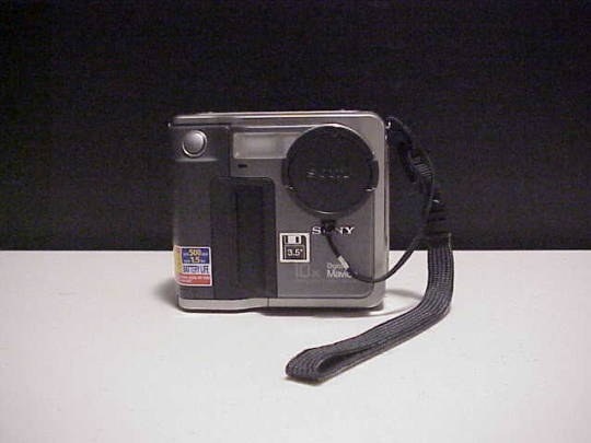
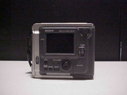
released in 1997, this was the second of Sony's "Digital Mavica" line of cameras. it records photos of around 50Kbs in size to a standard 3 1/2" floppy disk. it has some standard features like a manual focus wheel, 10x optical zoom, and exposure control. I haven't found a strict source but I believe this camera is less than one megapixel. I actually have a few different Mavica cameras (a fd-71/75/83/85/87 and a cd-1000) but they aren't different from the fd-7 enough to justify being used often. I'll make note on individual posts if I use 'em at all.
Kodak DC220
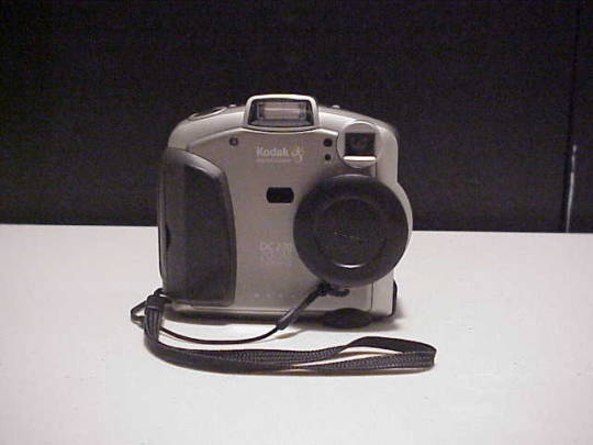
released in 1999, with a quality of exactly one megapixel the DC 220 is a weird little thing. it has custom software, connects to a computer via com ports with a transfer speed of ~11,000 bit/s. (roughly 30-60 seconds per photo in my experience) you can add custom text to your photos in the cameras built in software, and attach custom audio to each photo. it is a pain in the butt to get working, but it's quirks make it worth the frustration.
Olympus E-10
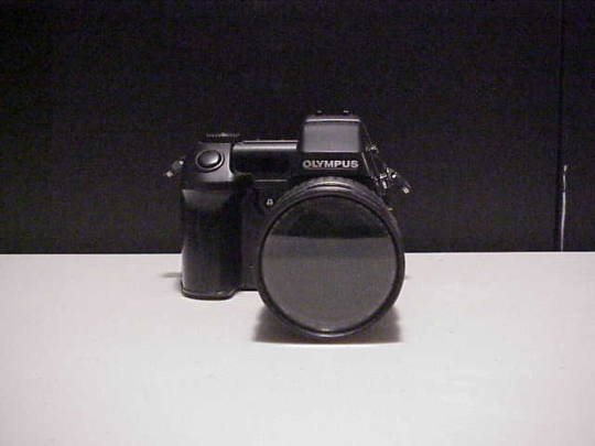
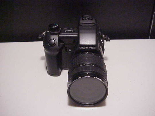
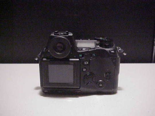
made in 2000 with a quality of a whopping four megapixels, the Olympus E-10 is the newest addition to my collection, and possibly the nicest camera I'll ever own. it's a fixed lens DSLR camera capable of 4x zoom, you can easily adjust the aperture and exposure on the fly, it's photos tend to be a whole 100kb in size (1/10th of a megabyte!) and to be entirely honest I have no idea how to use it. but I will eventually!
My Computer
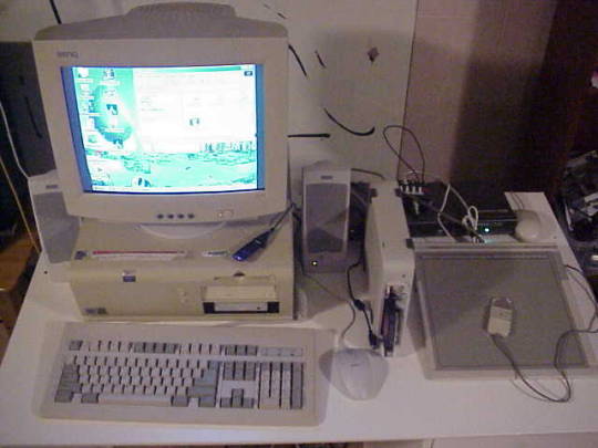
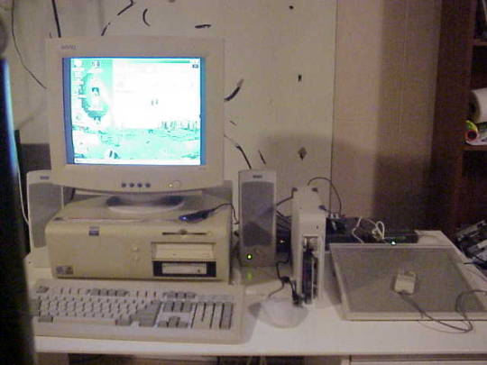

I try to use all era-appropriate tech to transfer photos and do any edits, this is the computer I do all that processing on! its a Dell Optiplex gx1- the daddy of pretty much any computer used in public schools (Chromebooks don't count) It's got a Pentium 3 CPU clocking at 500MHz, 512mb ram, running windows ME. it has all the original Kodak DC220 software installed, and I can't really access the Kodak's photos any other way. I've also got a few other weird bits attached to it -an HP sketch pro cad tablet and an external data cartridge SCSI device. both work, but I don't really bother to use them, they just look neat.
that's about it. have a good one! thanks for reading this all, if you did.
83 notes
·
View notes
Note
hello! i'm not sure if you remember me, a while ago i asked about digital art and if it's possible to do on an ipad or something similar. i was really grateful for your response and i got an ipad over christmas! i didn't realize how expensive the pencils were though and was only able to get one recently. now that i have all of that, i download the first art program i saw (ibispaint x, i don't know how good that is) and feel super overwhelmed by everything, all the tools and brushes and i have no idea where to begin. i know this is a super broad topic, but i don't know if you have any advice for a beginner hoping to become a digital artist? or know of any resources? thank you so much in advance and no worries if this topic is too broad to really get into properly!
Oh hey!! Congrats on getting an iPad! And yeah, shopping for the pens is a big pain in the butt, but I'm glad you finally got it all setup!
So most of the advice I'm gonna give you is very basic, starter advice that can apply to virtually any digital art software, as the vast majority of them are built with the exact same base tools, they just vary in their intended purposes which means they may differ in more advanced settings and what they offer beyond the basics (ex. Photoshop has more colors than Clip Studio because it's built for editing high quality photos whereas Clip Studio is meant to emulate comic art, but Clip Studio offers more in the way of comic-creating tools such as specialized rulers, 3D material support, built-in screentoning, etc. and all of the software available will tend to have different brush engines, meaning it doesn't always 'feel' the same to draw in one software as it does in another).
Your bestest friends:
Layers! This is the biggest pro to going digital, because now you can work with layers! So anything you draw on each layer is preserved and can't touch or affect whatever's on the other ones :3 You can find the layers tab in Ibis Paint X in the bottom right, don't be afraid to make a bunch of them and mess around with what you can do. Play around with the different blending mode settings (in Ibis Paint it's the menu that's labelled 'Normal' in the layers popup) especially Multiply, Color Dodge, and Overlay, as those three are the most commonly used to make coloring more efficient and give your art some extra pop.
Lasso/marquee/magic wand tools! These are basic selection tools that allow you to select an area within the layer you're working on, so that whatever you paint won't travel outside of that area. The Lasso is a free draw tool, the marquee tool is typically 4 sides by default (so squares/rectangles) and the magic wand detects and selects a closed area with one click! (just note that by default it's only on the layer you're on, so if you use it on a layer that has nothing, it will typically select the entire canvas).
Alpha locking! This is a simple button setting you can click to 'lock' the layer you're working on, which basically means that whatever you've drawn on that layer, anything you add can't travel outside of that drawing. So if you want to quickly shade something without going outside the lines, alpha locking is your solution!
Clipping groups/layers! This is a bit more advanced but is basically an even better version of alpha locking that you can use in conjunction with it. Clipping layers are basically additional layers that , when you click the 'clipping group' button, 'attaches' that new layer to the layer that's below it. It performs the same function as the alpha lock by preventing whatever you draw on that layer from travelling outside of it, HOWEVER it comes with the added benefit that it's on an entirely different layer, meaning you can erase and mess with whatever's on that new layer as much as you like and it won't hurt the base layer. It kinda follows the same logic as animation cels !
Masking! Y'know when you're doing a traditional painting, and you put down tape to cover the area so you can paint over it and later remove the tape and everything underneath is untouched? That's basically what masking is! Once you put down a layer mask, using the erase tool on it will 'erase' whatever the mask is applied to, and using the brush will make it magically return! This may sound silly at first, but I find masking is especially helpful if you want to erase something on the layer you're working on without it disappearing forever! It's also really helpful for comic work because you can mask whatever's outside of the panels and voila, nothing you draw will travel outside of those panels!
Stabilization! I don't know how extensive Ibis Paint X is with offering stabilization tools, but many digital art software comes with it and it's a LIFE SAVER for new digital artists adjusting to the feel of digital art. It essentially 'slows down' the output of the ink on the canvas which helps a lot with getting cleaner lines in fewer tries. It's not quite as big of a deal when drawing on iPads because obviously you have more control by default by drawing directly on the screen, but it can still be really helpful when you need to pace your hand ahead of the actual drawing tool to pull cleaner lines!
That's pretty much all I can think of for now! But here are some other commonly asked questions:
1.) There are so many brushes to choose from, which one do I use?
The round brush is small but mighty. Virtually anything can be painted with it, it's simple, but malleable, especially when you start messing around with the hardness and opacity settings. Don't get too lost in the sauce with the brushes that are available to you, it can be very easy to get overwhelmed by all the options and variety. Some artists still work purely with just round brushes, some artists have custom brushes they like to use to speed up their drawing process or achieve certain textures. Play around with them, but don't get too stressed about which one you use because there's no wrong answer, the right brush to use is the one that gets the job done ! <3
2.) What canvas size should I use?
It depends on a variety of factors such as whether or not you're planning to print, where you're going to be posting it, etc. By default I like to work on 8.5 x 11 inch canvases (standard printer paper size) at 350 dpi, which if you want to make that canvas in Ibis Paint X, means you just have to make a canvas with a pixel ratio of 2975 x 3850 pixels! Just note that the lower you go in either pixel count or dpi, the lower the resolution, so it's typically encouraged you work at a minimum of 300 dpi (but you usually don't have to go any higher than 600) to ensure you don't wind up with any blurry low res JPG's/PNG's.
3.) Should I export my final drawing as JPG or PNG?
This is usually just up to personal preference, but like the canvas size, it depends on what you're using the image for. You can always export as both, the biggest difference between them is that PNG is lossless meaning you won't experience image compression like you will with JPG, BUT you're also going to have much larger image sizes. JPG is often fine for any standard posting, PNG is typically recommended if you want to have a drawing with a transparent background for printing (as JPG can't do transparent backgrounds) or if you just want to have a really high res image file for sharing outside of social media sites (as social media sites like FB/IG/etc. will typically compress the hell out of your images anyways)
Here are some other super helpful resources as well if you need some visual and/or audio guides:
Sinix Design - How to Learn Digital Painting (Beginners)
Marc Brunet - The Beginner's Guide to Digital Art
Skynix Art - 50 Digital Art Tips in 5 Minutes
One thing I also like to do is watch speedpaints of digital artists as it can really help pull back the curtain on what they're doing (or at least, it can help you see what they start with which can help you better picture the process of turning a blank canvas into a finished work of art!) And though I don't do it as often, if there's an artist whose work I REALLY like, I'll try and find their actual work files (many bigger artists sell them on their crowdfunding sites/Gumroad/etc.) so that I can actually break the drawings apart layer by layer for the purpose of analysis. Of course, all that is something that you'll grasp better over time as you learn the tools and learn to recognize what artists are doing in their own workflow, so don't worry if you don't glean a whole lot of info from the "big guys" right away, you should always be referencing artists who are higher along the skill ceiling from you but not too high that they're using techniques and tools that are outside of your realm of understanding.
Other than that, just try to have fun, don't stress too much about it, and save often!!! Part of creating art is learning to be at peace with the process, so don't stress too much if it takes you a while to get adjusted to the layouts and tools - at the end of the day, digital art is another medium entirely, so it's not uncommon at all for traditional artists to need a lot of practice to 'switch' to digital, because they both utilize different tools and techniques. Be patient with yourself, always be on the hunt for new resources and guides and references, and don't be afraid to experiment and make mistakes (the best part about digital art? Mistakes don't cost you any paint or materials!)
Good luck!! And congrats again! 🥰
60 notes
·
View notes
Note
I'm curious, how long does it usually take you to take a picture in Survior? You post quite a bit, so I'd honestly be very interested in hearing about your overall process if ur willing to share. What decides what picture u take? Do u ever use the lights? (I have the vaguest knowledge about how to light subjects and I just can't get it propely in my head, so I personally find that a bit difficult, tbh. Both irl and otherwise.) Do u do something w them outside of the in game photomode, aside from cropping? Do u ever consciously think about composition like the golden ratio or the 3x3 grid? Do you spend a lot of time setting them up or is it more spontaneous? I'd love to know just bc I find myself very fascinated by them and I'd like to know what goes into them (:
- @frunbuns

Love these questions @frunbuns! Though I do genuinely wonder if I'm posting too much sometimes 🫠 Both because A) I don't want to swamp the Jedi tags, and B) it probably means I'm playing Survivor instead of sleeping and that's... not helpful haha.
Answers under the cut!
What decides what picture u take? Do you spend a lot of time setting them up or is it more spontaneous? - Sometimes I'll have a very specific idea (like the Cal silhouette photo or these portraits of Bode) so everyone gets posed and lit very intentionally. But most photos are "discovered" while exploring the environments, watching different character animations, etc. I'm constantly pausing and zooming in with photomode to see what a moment looks like.
I want to make a video tutorial that walks through the entire process (because describing this stuff with words is a struggle) so let me know if you have any specific questions!
Deciding on a photo theme or goal is helpful though. If I want to take photos of Cal and Merrin fighting together, I'll obnoxiously follow Merrin around and make sure Cal is near her while attacking the Jedha patrols. There'll be a bunch of duds and a few cool moments (and a bit of electrocution, sorry Cal)

Do u ever use the lights? - Always! The lights make a huge difference in photomode, but I know they're tricky to use. I posted a mini tutorial on lighting recently, but it goes through general concepts rather than any technical how-to. Definitely want to break down the process more in a video tutorial.
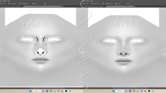
Do u do something w them outside of the in game photomode, aside from cropping? - I'll edit my favorite photos by adding more contrast, either from the built-in phone app or a photo editing software. This ask has a good before/after example.
Do u ever consciously think about composition like the golden ratio or the 3x3 grid? - Sometimes! I've been in the photo/video industry for almost nine years (oof that makes me feel old) so a lot of that experience probably shows up in my photomode compositions. I like shooting IRL portraits with a telephoto lens, so these virtual portraits are almost always at 3x-4x zoom to mimic that look.
Hope some of this is helpful! Survivor's photomode is really fun and I love seeing how other people use it 🙌
#wonder if streaming a photomode session would be fun??#I've never streamed before but it sounds like a fun way to teach some of this#asks#photomode asks#jedi survivor#merrin#nightsister merrin#photomode
38 notes
·
View notes
Text
How to Get Selfship Merch and Art with Low or NO Budget
*Okay, kinda misleading title as many of these are DIY but they can be cheap or free depending what materials you have access to. These are just some basic ideas I hope will inspire people to try their own things.
Feel free to add any ideas you have, too!
Things you can get/make for free
Picrew / Dressup games
I’ve seen some couple/romance picrews before!
I don’t always find the options I want in Picrews (ie body type) but you can always edit them using free software like Autodesk sketchbook, gimp, etc
Wallpapers
If your f/o is popular, you might be able to find some good phone/desktop wallpapers by searching online
Edits
There’s free apps for editing selfies where you can put in a photo and add in filters, stickers, etc. (Not my area of expertise, also may not work as well with animated f/o’s)
Free apps for video editing - I see a lot of edits on Youtube and Tiktok for example
Making silly edits where you put your ship into existing memes
Free art?! - Artists doing art requests / free art for experimental purposes
(Search for “art requests: open”, only ask if people offer first)
Free art?! - You can draw whatever you want, whenever you want
Apologies if that sounds condescending, but that’s often the thought that motivates me to draw selfship art when I do. No one can stop me from drawing myself kissing my f/o!
If this is daunting, try breaking it down into smaller steps. Search for tutorials on how to draw your f/o, or how to draw romantic scenes, etc.
Misc arts & crafts!
Whatever you have on hand you could make - especially in your f/o’s colors! Or things you associate with your ship
Sometimes schools and libraries have free events where they let people make things free of charge - check out your local library’s site! They’re always open for feedback, you can email suggestions for events.
I’ve seen events where they let you paint, make friendship bracelets, make buttons with their button machine, etc
For example my uni had a “destress from finals” event where you could make bracelets with plastic beads (like kandi?), and I made one with my friend’s f/o’s name and color scheme.
Things you can get/make for cheap
Keychains! Get one of those keychains where you can put a photo in, print out or draw a pic of your beloved, and put that bad boy in there
A lil character shrine! It doesn’t have to be huge
A good place to start could be a photo of the character and little trinkets you associate with them. Like an eraser shaped like their favorite animal or a candle in a scent that reminds you of them.
150 notes
·
View notes
Note
sorry i couldn't find out how to ask on your other blog.
that book binding you posted is gorgeous btw !!
I noticed that in one of the photos you included the disclaimer that you also edited it. I just had a question about how you formatted the text.
one of my biggest gripes with AO3 is text formatting (i often feel like i'm reading a legal document vs a novel/story) . Did you change how it is formatted on AO3 compared to printed?
I feel like i'm in the 0.5% that hate AO3 formatting but i thought i might as well ask in case you have any tips for that. >,>
(also how do you decide on the page size, do you just choose a standard size for all your projects? or do you vary it depending on what you are binding?)
thanks so much for taking the time to answer and for sharing your projects :) !!!!!!!!!!!
hey anon! I have asks turned off for the sideblog, but happy to answer here. Thanks very much!
I'm taking this opportunity to info-dump and link a lot of resources. I think they're useful for people new to either typesetting or bookbinding, but not all are directly related to your queries. That said, hope this is of use!
one of my biggest gripes with AO3 is text formatting (i often feel like i'm reading a legal document vs a novel/story) . Did you change how it is formatted on AO3 compared to printed?
I do a fair bit of editing when I'm binding a fic; typesetting is often the longest part of the process. Your mileage will vary depending on your experience with using word processor software, particularly the paragraph style and page style settings. Another factor is how simple/complicated you want your typeset to look. Replicating a published novel in format is difficult but learnable for a complete beginner.
I'm not equipped to give a full tutorial on how to typeset, but I'll point you towards some useful resources for ficbinding then talk about my own process.
ArmouredSuperHeavy has a tutorial on how to make Ao3's HTML downloads into a printable book in Microsoft Word. I use LibreOffice Writer myself, so this adaptation of the same tutorial is what I follow. Both are very helpful to reference as you're learning the typesetting ropes.
Personally, I don't mess around with HTML. I find it easiest to start by doing a Ctrl+A copy of the Entire Work fic view on Ao3 then pasting that into my word processor. This video tutorial by Beautifully Bound runs through how to do this in Microsoft Word using an AO3 fic as an example, including the associated steps needed to make the fic look novel-like. This is probably the best tutorial to address your gripe with AO3 formatting. Other than that, I'd recommend looking into videos or tutorials about typesetting novels for print. Same idea, and you may get more hits than searching for fanbind/ficbind typesetting tutorials.
More under the cut! Once I start yapping, it's hard to shut me up 🤷♀️
As a point of comparison, here's one of my fics on Ao3 and the corresponding typeset side by side:


Beautifully Bound explains this in far better detail than I will, but off the top of my head, the steps involved:
making a new document and setting the default page size to whatever size I want the book's pages to be (A5 or A6 usually). You can also set the margins at this point, taking account of your printer settings.
CTRL+A and copying the entire work's text on AO3 then pasting it into the document.
removing all hyperlinks and AO3 frontmatter, things like the author tags, summary, notes, etc as well as any website text that got copied over alongside the fic.
(optional) running a spell check and ensuring grammar usage is consistent. For me that's substituting em dashes for hyphens between clauses, enforcing curly double quotation marks for dialogue, etc. LibreOffice Writer automates a lot of this with customisable settings, via Tools -> Auto-Correct. Here's also where to make sure character names are all spelled right, convert the text to or from US to UK English, etc.
picking out fonts for the body text, headers, page numbers, etc. This is where you'll want to use paragraph style settings. Page style settings also comes in clutch if, for example, you'd like different headers on alternating pages. I like having the author on the right, the fic title on the left.
setting the body text first line indent to whatever makes sense visually). This in particular helps make the fic feel more like a novel. You can also play around with line spacing and space between paragraphs at this stage. For this A6 typeset, I had a 0.75cm first line indent, 1.15 line spacing, and 0.15 spacing between paragraphs.
(optional) formatting the first line of the work to use small capitals and to add a drop caps to the first letter of the first word. Again, this is a convention in publishing which add a novel-like feeling to a printed fanwork.
Inserting page numbers, adding images, coming up with how I wanted the "copyright" page to look—optional for the most part, but these are details that make a fic appear more like a novel.
For multi-chapter works, there's extra work in formatting chapter titles as headings so that they're referenced correctly in the automatic table of contents word processors can generate.
Once you have a typeset you're happy with, and if you're considering printing and binding it as a book, then you'll need to look into how to create and print signatures. Personally, this is something I had to actually try (and mess up a bunch of times) before I got to grips with it. Understanding how both your printer and your PDF reader work, particularly printer margins and booklet print settings, is key.
I won't go into as much detail on this, but if it's something you have an interest in, I'd recommend starting with DAS Bookbinding's tutorial. DAS has tutorials for everything bookbinding related so when in doubt, check his channel! Plenty of other YouTubers also have good videos on making signatures.
This resource is extremely useful once you've got your head around how to print signatures manually, so here's a link for anyone in that space: GitHub Bookbinding Imposer. Essentially, this does the signature creation for you, removing the need for booklet print settings in your PDF reader.
also how do you decide on the page size, do you just choose a standard size for all your projects? or do you vary it depending on what you are binding?
I have access to both A4 and A5 sized paper and my printer can handle printing on either size. In bookbinding, normally two pages are printed per side of the paper (which are then folded in half as part of a signature). That is, when I print on A4 paper, it's to make an A5 sized book. Printing on A5 paper will yield an A6 sized book.
Before I begin typesetting, I'll usually know what paper I plan to use, so the typeset will be one size down from the paper. So far, I've made softcover pamphlets at A6 size and casebound books in A5. No real method of choice for me, it's whatever I feel most suits the project.
---
If you made it this far anon, thanks for reading! Here's links to a few general resources if bookbinding is something you'd like to explore more:
DAS Bookbinding (YouTube, bookbinding in all forms)
Sea Lemon DIY (YouTube, bookbinding and other crafts)
bitter melon bindery (YouTube, bookbinding, particularly beginner friendly!)
Jess Less (YouTube, demonstrations of fanbinding and re-binding existing novels)
Papercraft Panda (blog, lots of detailed tutorial on bookbinding)
Renegade Bookbinding Guild (collective and website, loads of fanbinding-specific resources from their members and they have a helpful Discord).
21 notes
·
View notes
Text
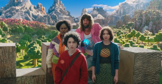
Why the Minecraft Movie looks so bad
Okay, let’s see if I can make this work
Hi, I’m Watercolor, currently a student learning animation and visual effects. I’ve got some more technical explanations for why exactly the trailer looks god awful
I’m gonna do my best to explain this in simple terms, but if I don’t explain something very good, let me know and I’ll explain more. Alright, this is gonna be a long post
Starting off with the obsession with backlighting. See how it doesn’t really match the environmental lighting? That’s one of the major things that makes it look so weird to a lot of people. It could have been done to better distinguish the actors from the background, but it does that a little too well and makes them look way too out of place. The environment has a very nice constant (most likely singular) light source, which is most likely an HDRI.
An HDRI (or high dynamic range image) informs the animation software on how the scene should be lit, and is often a weird panoramic image of whatever physical area you want to replicate.
In a reverse case, adding a CG character into a real set, you could take an HDRI of the physical set, and use it to apply similar lighting. Adjustment will most likely have to be hand adjusted by the lighting team (and tbh they add a lot of extra lights in anyway. It just needs to look right) but it’s a fantastic starting point for the compositing and lighting teams.
However, the McM’s live set has way different lights set up then what is seen in the environment.
Here, for example, the live set is most likely being lit by standard 3 point lighting, which are not only the wrong color (the lighting on the environment is much more yellow) but also washes out any shadows that would help define the actors. If this movie wasn’t obsessed with backlighting, you could fix that by lighting the actors and environment from the front, but because the sun is in the back, they have to make the front of the actors unnaturally brighter to see them more properly. I have a slight idea on why the kid in red looks especially “photoshopped” in, and it’s mostly because his hoodie doesn’t have a similar reflectiveness to everyone else’s outfit, and his hair is a more neutral color, causing the highlight to be even more washed out. Also, while we’re here, the cube is a physical prop, but it was not lit up during filming, and all the light output was tossed on after. And it’s really inconsistent and honestly, lazy. For the most part they just hit it with a blue blur effect in post, it doesn’t actually cast any light.
Another major issue is the color difference between the actors and the environment. The color balancing on the actors is particularly garbage, they’re somehow desaturated while also being too saturated, I don’t know how they managed that. But the technical issue on why it looks odd, is because the physical camera cannot physically pick up the same vibrancy as the “camera” in the CG world. You might have seen an example of this when trying to take a photo with your phone, especially of a very colorful event like the sunset. It’s also why “ugly sonic” looked particularly out of place, he was 10x more saturated than anything else around him.
Having the actors on a very low effort green screen stage also completely ruins any chance of getting the proper ambient light or ambient occlusion.
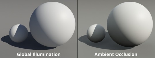
Ambient occlusion is basically the bounce light from other objects in your scene, gamers might know this as a form of ray tracing (ray tracing is live changes in ambient occlusion, games without ray tracing bake in ambient occlusion to get a similar result)
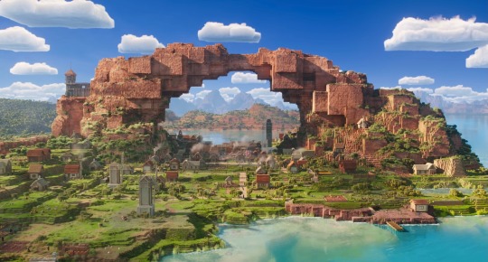
When everything is CG, (again art style aside) looks pretty darn good actually!
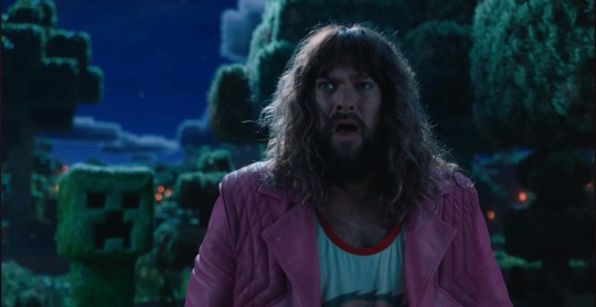
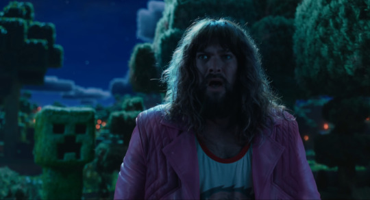
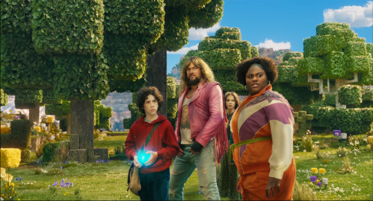
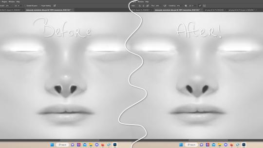
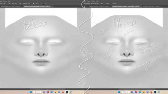
I attempted some edits to see if anything could make it look better (left is original, right is mine), and I don’t think proper lighting or anything could actually fix what this movie has wrong with it. They should have made the whole thing animated, I don’t think any amount of bullying would fix this, the studio basically has to scrap the actors, and make new CG characters from scratch in the same style as the rest of the world.
All of this is not the fault f the animators, or any of the vfx team, they did their absolute best with what they had, this is 100% the fault of the higher ups on this project. I have no idea how this good this far into production without ANYONE saying that it was a bad idea (Either that, or a lot of people got fired, which is unfortunately a likely possibility)
19 notes
·
View notes
Text

i didn't have a tutorial yet... so i made one lol. its longer than i wanted it to be, but i wanted to make sure it's easy to follow for people who've never made cc or have no experience with photo editing software, and fully explain my process. it's by no means hard at all though lol, i guarantee you making skin details is the easiest thing aside from recolors and if you want to learn this is a good place to start :-)
for people who are more experienced than that, and want to know specific things-- i've sectioned everything so it should be easy to skim through until you find what you need!
requirements.
this tutorial will only require sims 4 studio (free) and photoshop (not free) or gimp (free). i pirated photoshop 2022 myself. any version will do but i think 2022 just has nice new features for making content! if you don't want to buy or pirate, gimp is a similar alternative.

1.1 how to find skins to use as a base.
in case you don't have (a) skin(s) in mind to use for your skinblend, my tip is to download as much random ones as you can find. this way you have a lot to choose from and it's easier to get an idea of what you want.
go-to creators for maxis match skins: heihu, madmono, pyxiidis, faaeish, miikocc, emmibouquet and stretchskeleton.
creators for maxis mix/alpha skins: sims3melancholic, obscurus, ddarkstonee and pralinesims.
creators for maxis mix/alpha skins that only allow editing for private use: northernsiberiawinds, remussirrion and thisisthem.
go into cas and try them all out. if you like a part of a skin, write down which skin it is and what part(s) you want to use of it from which swatch if it has multiple.
for example, i almost always use one or two skins for just the nose shape, one for the eyebags, one to three for the lips and one for the basic shading of the face. don't be afraid to use the opposite style skins of what you're going for, you can always add or erase details.
1.2 exporting the skins.
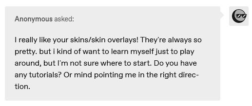
now we're gonna export the skins with sims 4 studio. click on "my projects" (1) and navigate to whereever you have the skins you want to use, and select one and click "open" (2).
the colored little boxes in the top right are the swatches. click whichever swatch you wanted to use something from (1), then click the "export" button (2). you'll get a window to save the exported skin now.
tip: i highly recommend making an organized folder for your skinblend, to have all your files together and easy to find. if you haven't made it already you can easily do so within this window. i put mine in a folder called "resources" in a folder named "unnamed skin" for example.
name the exported skin file (3) and make sure the "save as type" is set to .png (4).
after saving the file, you can just click "cancel" on the bottom right to go back to sims4studio's starting screen. if you have multiple skins you want to use, repeat the above process for all the other skins to export them too.

2.1 opening the exported files in photoshop/gimp.
open your program of choice and click on "file" from the top bar (1) and then "open..." and navigate to the skin files. you can left click and hold down your CTRL key to select multiple at once to open.
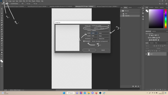
we have to layer them all in one file, but before we do that we have to check if they're all the same size.
note: some skindetails might be 2048x4096, others may be 1024x2048. unless you want your skin to be compatible with the HQ mod, you should just opt for 1024x2048, as without the mod both resolutions look identical. the bigger one will just make your fize unnecessarily large.
click "image" at the top bar (2), then "image size". it'll say the size at dimensions. if it's at the size you want it to be at, just exit the window. if you need to edit it, select "pixels" from the dropdown menu (3), and put in 1024 for width and 2048 for height OR 2048 for width and 4096 for height. if you're sizing up select "bicubic smoother (enlargement)" under resample (5).
repeat this for every skin you opened.
2.2 layering the skins together.

copy and paste all the skins individually onto one by selecting them with CTRL + A and CTRL + C on your keyboard, and pasting them into one of the other opened skins with CTRL + SHIFT + V. you can then close all the other tabs.
the file now has multiple layers. you can rename them by double clicking the layer name. this makes it easier to keep track of whats what. you can reorder them as well by dragging them with your mouse. put the skin you want to use as base (for the general facial shading, highlighting) at the bottom.
tip: i recommend making all white and all black background layers to see the skins better. you can do so by pressing D, then CTRL + SHIFT + N. for the white layer then press CTRL + BACKSPACE and for the black layer repeat the first two steps and then press ALT + BACKSPACE. now there should be two new layers in black and white. drag them to the bottom of the list. i prefer using white so i put black last.
2.3 changing the opacity in parts of the base skin layer.
to make ea's preset details (cheek/nose bridge sharpness, dimples) come through your skinblend, you need to change the opacity of the base skin sometimes. alpha skins tend to be fully opaque but maxis match skins are usually already transparant enough.
hide all the layers aside from this base layer by clicking the eye icon next to the layer names. you can see the transparancy with the visibility of the grey-white blocks or if you find it easier you can also unhide the black background to see it instead.
to change the opacity, you can either edit the entire layer's opacity (1) or use the eraser tool (E key) to add transparancy at specific parts.
if you have photoshop 2022, turn on vertical symmetry (+). if you don't have it, you can choose to edit only one side of the skin and mirror it later or do both sides and embrace some asymmetry.
i selected the eraser (2) and set the brush size to about 200px and 0% hardness. the opacity of the brush i set to about 10% (3). i used the eraser on the lower cheeks, the nose bridge and tip and the bottom of the chin. i also erase the upper eyelid 100%, cause i prefer to have eyelid freedom :p. it then looks like the above! this will very subtly let through details, if you want more you should make it more transparant.
2.4 optionally: editing out freckles, pores and/or eyelashes.
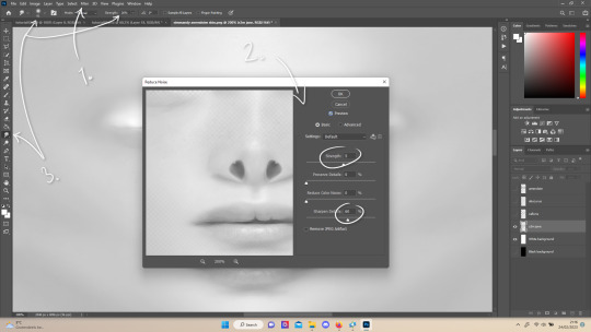
your base may have pores, freckles or moles you want to get rid of. to smoothen everything at once, click "filter" at the top bar (1), "noise" and then "reduce noise". i only edit the strength and sharpen details setting (2), this setting erased the pores and most of the freckles for me while keeping the details looking sharp, but you likely have to adjust it a little cause it depends on how large/fine the details are.
the remaining freckles, pores and eyelashes i remove by using the smudge tool, with 0% brush hardness and at 25% strength. (3) brush size depends on the size of the details. i just go over it in circular motions until the freckle or whatever it is has been blended away without pixelation.

for this part i'm going to only show how i do the nose as an example, however it works the same for editing in eyebags, lips, jaw lines or whatever you want to add in too.

unhide the layer of the skin you want to use a part of, and hide the base layer. if you are going to use multiple parts of that skin (for example, you want both the nose and the lips of that skin), duplicate the layer by right clicking the layer name and choosing "duplicate layer...". then hide the duplicated layer. it's easier to edit one part at a time.
use the selection tool (M) to select the part. press CTRL + SHIFT + I and then DELETE. press CTRL + D to unselect. should look something like the above.
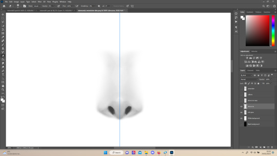
use the eraser tool (E) at a moderately small size like 30px~ with about 30% hardness and 100% opacity to erase around "hard lines", like the nostrils in this case and the bottom of the nose. the nose bridge has "soft lines", so if you were to use a hard brush for that, the shading of the nose bridge would look far too harsh and unblended. for the soft lines, set the eraser tool at a bigger size like 100px~ with 0% hardness and a lowered opacity between 15-45%. erase soft lines "gradually", so the shadows blend in with the layers underneath it. should look something like the picture above.
always look at the newly added part with both a black and white background to see if there's anything you need to erase more. then look if it blends in properly with the layers underneath. if it's too dark or light, you can click on "image" on the top bar, then "adjustments" and "brightness/contrast", and lower or raise the brightness until it blends in better.
i'm using two separate skins to make the nose, so i've repeated the process above for the second nose skin, then used the method of step 2.3 to erase certain parts and make other parts more transparant / blended in. as you can see above, it's now the perfect offspring between the two noses i used.
note: for a maxis match nose, you'll want to avoid a completely opaque nose, mainly at the nose bridge it should be more transparant. i always make sure the lips and eyebags are fully opaque though, unless you're going for a vanilla type of skin it doesn't look good transparant.

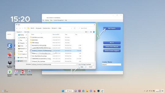
at this point, i like to save the file with the white background layer on and see what it looks like in sims 4 studio. this gives you a better idea of what it looks like on sims and what you may want to change or add. press CTRL + SHIFT + S and name your file, and set the file type to .png.
open any skin or skin detail cc file just like in step 1.2, and instead of exporting anything, click "import". now navigate to the file you just saved, and open it. the sim model now displays what your skin looks like. should look something like the above! you can click cancel after you've looked enough, so you don't have to worry about ruining the original cc file.

maybe you're happy with the skins current state... but in case you want to add or change some things, here's a step by step how i do it.
5.1 drawing shadows & highlights.
as you probably have noticed, everything needs to be done in greyscale, so select black (for shadows) or white (for highlights) in the top right colored box. make a new layer (CTRL + SHIFT + N). select the brush tool (B) and set the brush at about 0px with 100% opacity. draw the shape of the shadow or highlight where you want it. make sure to make a new layer for every shadow and highlight!
now you can either use the smudge tool to blend it out, but i prefer using "filter" from the top bar, "blur" > "gaussian blur". i just play around with the radius until it's blended out but still has some shape to it. it depends on how small or wide and blended you want it to be.
then i use the eraser to shape the shadow/highlight further. for example, i want the shadow in this case more blended out towards the eye, but harder towards the forehead and nose, so i use the eraser on that side. lastly i change the layer opacity to make the shadow/highlight less dark/light. my preference lays with subtle details, but of course you can make it as contrasted as you like!
5.2 drawing small details.
to draw your own details, use the brush in 1-3px brush size, 100% opacity in black. i can't help you here cause it's just drawing where you want and then blending it out with the smudging or blurring tool where needed, and using the eraser at lower opacity to blend it in.
to give you some ideas, i usually draw some details on the nose like sharper nostrils or a nose wall, some texture on the lips and the eyebags. i like using reference pictures of real peoples skins to see where and how to draw things. before and after pictured above! (i'm so proud of these eyebags yall T-T)
5.3 adding other creators cc skin details.
if you don't like drawing things yourself or know just the right cc skin detail your skin needs, you can also use other creators' skin details on yours.
maxis match + mix details: pyxidis about face, miikocc face kits, okruee face details, sammi-xox face details, lamingtonsims face details.
maxis mix + alpha details: detail overlays by obscurus-sims, ddarkstonee & sims3melancholic
like in step 1.2, just open the file in s4s and export whatever swatches you want to use. remember to make sure the resolution of the file is the same as your skin's before copy and pasting it on your skinblend! and remember you can lower the opacity layer for these too.
5.4 mirroring your skin.
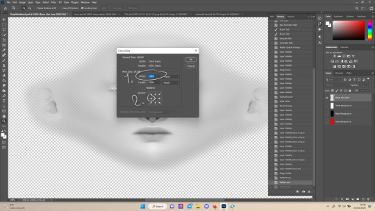
if your skin isn't mirrored/symmetrical yet, save your file as a .psd and then right click the layers, click "merge visible", press CTRL + ALT + C, and set the canvas width to half what it is now (either 1024 or 512). (1) click the arrow in the left middle if you want to mirror the left side, or the arrow on the right middle for the right side. (2) press "ok".
press CTRL + A, then CTRL + X, then CTRL + SHIFT + V. delete the layer beneath the active one (it's empty). then press CTRL + ALT + C again, and put the canvas width back to the original (2048 or 1024). select the same arrow you selected before, and click "ok".
press CTRL + A again, then CTRL + C. now click "image" from the top bar, "image rotation" and then "flip canvas horizontal". now press CTRL + SHIFT + V .... and voila, your skin should now be mirrored.
note: ik there's a ridiculous amount of steps for such a simple thing so i feel like there's probably a much faster way to do this, but i hate following tutorials and guides (the irony) so this is just the way i taught myself lmao
5.5 last test & optional last touches.
at this point, i'm done with the skin. i erase everything aside from the face if the skin still has a full body texture cause i prefer face-only skinoverlays. i always save as .psd and .png, .psd is to edit it later on if need be. once again import your skin into s4s like in step 4, and see if you're happy with the skin. if not, just keep editing whatever you need!
i also like to add alternate versions of the skin lastly here. some examples: a soft nose or hard nose bridge (justice for flat soft noses, simblr loves to erase them lol), different eyebags, lighter or darker lip option, version with eyelid overlay or without.

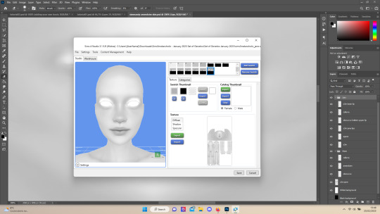
6.1 creating the package file.

to make the package file for your skinblend, open s4s and select "create cas standalone" and then click "cas". (2) now select "skin detail forehead" from part type (3), click the most left forehead wrinkle and click "next" (4). name the skin file whatever you want, you can always change it later!
click "import" and open your skin file. and voila! you're pretty much done!
6.2 editing the age, gender & occult flags and category.
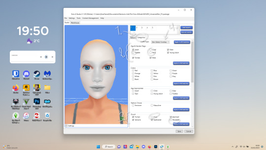
right now your skinblend is only available for young adult to elder sims, and not for aliens and werewolves, so you probably want to change this. go to "categories" (1) and check the boxes you want under "age & gender flags" and "occult" (2). you don't need to change any of the other things.
if you wish to change the skin detail slot it's in, you can change it at "outfit type". most people use either forehead or mouth crease, but you can use any of the ones that start with 'skindetail'.
6.3 adding swatch colors, thumbnails or additional swatches.
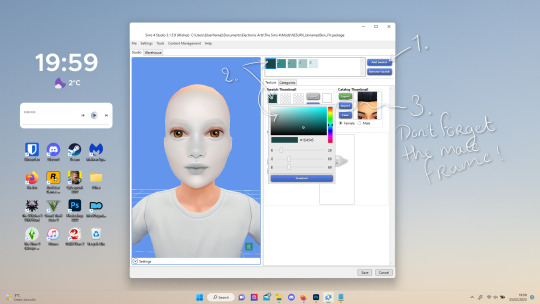
if you want, you can add multiple swatches (1). you can also edit the color of the swatches (2) and upload a custom thumbail with 104x148px resolution (3), make sure to upload for both male and female frames.
6.4 editing the sorting layer.
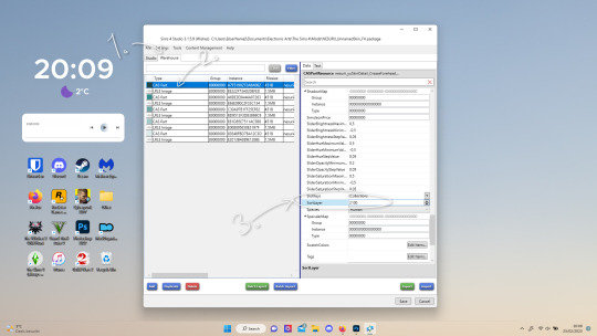
it's not the end of the world if you don't do this, but you may run into some skin details or freckles/moles that won't display on top of your skinblend if you don't edit it :).
click on the "warehouse" tab (1), select the first "cas part" (2). scroll down on the right to find "sort layer" (3) and put in 2100. you're gonna want to change this for each cas part individually.
now just save your file... and try it out in game!
if you need any help or have any questions please comment below <3 feel free to tag me in the end result if you want too.
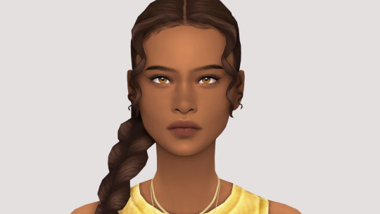
(my end result)
293 notes
·
View notes
Note
Hello!
How did you put the flag behind your profile picture? Is it plain photoshop (or similar) or there's a specific place for that? I've seen lots of people with these on but I have no idea how
for this specific icon I think I used a native piece of software on my old windows laptop, but since I've been confined to chromebook jail whenever I need to edit something like that I use the browser editor pixlr. I think most image editing software should have a feature to cut out pictures? the basic procedure for flag icons is to get a photo, erase all the background parts that you don't want, and put the cutout over the image of your choice. you can erase that background by hand or use a "lasso" tool that tries to detect the outline of the figure you want to keep and automatically delete the rest of the bg, but I tend to find doing it myself works better.
11 notes
·
View notes
Text
That's a wrap.
2023 is on its death bed and I'm both happy and sad about that. Personally, this year has sucked on so many levels and for so many of my loved ones. But four months ago I published my first title under Addison Acres and so my foray into the world of M/M publishing began.
It has not been easy. It was a hell of a learning curve, and I still feel out of my depth some days. It's hard bloody work. I work full-time and I also study part-time so it's not like I can sit and write all day (as much as I wish I could). I needed to take the leap though because if I kept on saying 'I just don't have the time' then it was never going to happen.
I've published 2 shorts and a novella on Smashwords and I think I've done okay with them. To date I've sold 768 copies. Yes, some of them have been freebies (Draft2Digital counts those in total books sold) but hey, I'm pretty happy with those numbers. Have I made millions of dollars? Pfft, no. Have I made thousands? Yeah, nah. But I've made a about $700USD so far.
Yeah, I don't have a problem talking about stuff like this. I know a lot of people are very hush hush about money but one thing I've discovered coming into this gig is that there's very little data to measure against. Who knows if this means I've been successful? I fucking don't! But maybe another indie author will see this and go 'Hey, that's similar to what I managed' or 'I made more than that so I'm doing really well!'. So yeah, I'm happy to throw out my figures if it'll help someone else. I'm not raking in the cash, and I haven't had my first title become a crazy best-seller and I'm suddenly playing with the big kids. I'm still very much a baby in this industry, finding my way.
Ultimately, yes I got into this publishing gig to make a few extra bucks. The cost of living has sky-rocketed and my job does not pay well. I adore it though so I needed to do something to supplement what I make. This isn't going to pay off my mortgage but it's paid for a new water pump for our rainwater tank and a delivery of hay for the alpacas. I've also re-invested some of my royalties into my writing. I've purchased the Atticus software and I got a bundle of photos from Depositphotos to use for book covers.
There's still a lot I need to do. I have yet to set up a newsletter, which is much to my detriment. I feel like I need to have a NL magnet first (which is the term used for a free story readers get when they sign up for your newsletter). I feel like no one will sign up for nothing so I've not set one up yet, but I have no idea what to write for the magnet...
I've been doing a lot of promo work on FB with joining release parties and giveaways but it's hard work. The marketing side of things takes up a lot of time, which yeah, I don't have a lot of. I did set up an Instagram account but I've hardly used it as it's very, very full on and I haven't really had the spoons. I know I need to invest more time in that, and I will try in the New Year but we'll see how full the cutlery drawer is first.
I also made the choice to do Tumblr instead of Tik Tok. Probably a very stupid choice since BookTok is huge and people get a lot of exposure on there. Why didn't I? Well, firstly, I'm really not very good at making videos and editing them. It's so very time consuming. Secondly, I like Tumblr. Is it a dumpster fire? Yes. Am I a bin chicken masquerading as a human? You betcha. So, yeah, I feel comfortable here. But I know I need to invest in more time here also.
Anyway, next year is a new year. I am currently working on a project that I've told no one about because I feel if I do, I will jinx myself and my motivation will fuck off to the moon. So, there is something in the works for publishing maybe in February. I'll be looking for beta readers once I've gotten it finished so if you're interested, hit me up.
I've also created a new logo because I haven't really done that and I figured I really should. I've made 4 variations to use for different situations and I really like it. It's pretty.

Anyway, I've rambled enough. Just wanted to do a little wrap up for the year and to prove that I'm not dead lol
Enjoy the final days of 2023 and I shall catch you all on the flip side.
9 notes
·
View notes
Note
Hello, im wehaveagathering from my main blog, im kind of obsessed with your hockey poetry edits and I think your blog is great! I guess I kind of have a dumb question, where do you find the images you use for your edits? Did you say Getty in your tags?? I’ve gotten into making icons recently (and i have ideas for poetry edits hrrrghhh) but it’s hard to find high res images. Thanks for your time and I hope you have a nice day :)
first of all thank you so much 🥹 and second that’s absolutely not a dumb question!! i do pull a lot of images from getty and i’ll also download pictures from sports articles (i got a lot of the hugheses pictures from online access articles, for example), or sometimes from instagram/facebook/twitter if an account is public. freely admitting that i am not technologically advanced? inclined? in the slightest here, but the image editing software that you use and how you import/export photos with it makes a difference in the quality of them as well!
if you haven’t seen them yet, i would also recommend checking out @simmyfrobby @national-hockey-lesbian @hauntedppgpaints @tapedsleeves @starscelly and @captainbradmarchand’s blogs just off the top of my head!!! they might know more places to get high res images and also i love their work 💕🫶
#sorry can’t type hands all butterfly hearts i’m just out here like 🥰🥰🥰🥹🥹🥹😭😭😭💕💕💕#@ everyone i tagged ty i love you i hope you don’t mind the tag 😘 also i KNOW i am unintentionally forgetting people so tag them at will#forgive me i am eepy. we are running on <4 hours of sleep and over 18 hours awake 🫡#liv in the replies#join the club!!! join the club!!!!! we love the hockey poetry edits!!!!!! i’m so excited to see what you create!!!!! :)))))#the process of me finding images is very much like. either i have a vision in my head and i troll getty looking for it or my screenshots#if i know i have one l m a o but either way i am always 68 pages deep in a hyper specific search labeling my photos like ‘ohHHH buddy’#‘menace 1 abd 2’ ‘but he’s not a cup winner’ ‘ohhhh the nolpat media scrums are rich earth’#‘because WILLY WON’T CUT HIS HAIR’ ‘deJA FUCKIN MILK BAYBE’ ‘is it truly sn edit if u don’t find a devastating baby pic’ ‘yes MF last line’#and so forth. like. glad it’s comprehensible to ME but if anyone else ever tried to use these photos based on file name alone i am so sorry#also i forget that y’all can’t see all of the metadata notes on photos to know where they’re from :/ i gotta be better abt making it clear#also on the note about image quality i just need to state for the record i am so photoshop whatever illiterate.#i learn one (1) new trick on GIMP a year maybe two if i am lucky & no i have never figured out consistent sizing 🫡 but the one hack for res#i HAVE figured out is that when i do edits i usually make a whole doc w/the poem lined up on it (helps me keep somewhat consistent sizing)#and then i export that document as a pdf and edit the pdf in the software instead of trying to screencap or jpeg or anything. PDF quality >#that is probably so convoluted lol if anyone has tips please lmk i am always learning#ANYWAY. rambling u did not ask for but is inherent to Me.#have a great day too!!!!! you literally made mine so 💕😭#wehaveagathering#indecisor
9 notes
·
View notes
Note
What do you use to make your comic edits? I really like them!! And is there like a process you follow? Like do you storyboard the rough idea first? Sorry if you've answered this somewhere before
Ohhhh man this is going to have to go under a cut due to pictures. Luckily whenever I make an edit I tend to DM my friend process pics while screaming about how horrible they look and how I can't figure out how to fix them. 💀 So some of the record exists!
I use a mix of three different programs. To be honest even though it's free, Photopea.com is my go-to for most functions, especially since they have a large pool of fonts to choose from which means I don't have to go into the font mines and download 500 different ones just to see what's going to look best. I also use Paint Shop Pro, which is the program I learned how to make edits (icons, back in the day) on when I was like 14. I have a newer version now since I finally had to retire the 15-year-old one on my broken laptop, and I still don't really know my way around it that well. It's not the most user-friendly software, but it is a lot better than Photopea at resizing images to make them larger. I also use Clip Studio Paint whenever I need to draw anything for an edit.
When I need resources, I often use dafont.com for fonts. I have a bunch of texture packs from various places on the internet, but my go-to nowadays for new stuff is pexels.com where you can get stuff with a royalty-free license. I also occasionally use my own photos for textures (took a bunch of wall photos in Italy- my dad thought I'd lost my mind). I don't use brushes all that often but there are other free resource spots.
As for process, I usually start with comic panels that I like visually and cut out the characters, then figure out what I want to do with them. For Kill Krew, I knew I wanted to use a bunch of the tiny Foggies, but I didn't know that I wanted to make it a story per se until I finished the first section of the edit where Foggy's holding a bunch of papers and I decided to make it kind of like he was authoring his own memoir. Then I just followed the events in the comic. For my volume 5 edits I did have more of an idea for the story I wanted to tell from the start and looked for comic panels that would fit it. (By the way: never forgiving the volume 5 editors for allowing so many different artists. It pained me to have to use a couple different artists in one edit.)
Anyway though kind of like when I'm writing fic, I just start with pretty much a blank canvas, plop the characters on, and hope they arrange themselves into something that looks cool. This is a very early draft of one of them next to a slightly more advanced draft:
A lot of the work honestly goes into choosing the background and marrying it to other elements such as the text and the cutouts. I use a lot of rectangles for this, as you can see in this Kill Krew one next to a near-final draft below. This is also the phase where elements get resized, whether for story-telling reasons or design reasons.
I also fool around a lot with layers and coloring. An unexpected layering choice can totally make or break an edit. See the original comic coloring (left) versus my coloring change (right):

Or this original panel (left) versus a combination of a picture of a starry sky and a coloring layer (right):

Font is also hugely important to me. I try to find ones that fit thematically AND also look great on the image. Like bad coloring or a bad background, an ugly font can also kill an edit. Choose wisely lmao.
Another thing to watch out for in an edit that's multiple images is to make sure they all look nice together and like they're part of one set. I find this probably the hardest, since different source images (comic panels in this case) often have different coloring requirements, but you want the colors to mesh well between different images. It's tough! And if you make extremely long edits like I do occasionally it's hard to even see what they look like together. Sometimes when I'm looking at them stacked in Photopea it looks like a tiny, tiny photostrip and I have to figure out what's working and what isn't. It's tough out there!
Anyway I think that's all I got! Hope that gave you some insight lol I'm glad I had these process pics because I usually just kind of go into a fugue state while making them and come out covered in blood!
7 notes
·
View notes