#i had uploaded an earlier version but then i added more to it
Explore tagged Tumblr posts
Text

my take on the wbn song of the summer remix: outside the box (i’m a mantis shrimp)
because sometimes a song is a sketchbook page when you’re colouring outside the lines 😎✌️
#wbn#wbn song of the summer remix#scribbles#not sure if i’m actually going to submit this#but it was fun to make#i had uploaded an earlier version but then i added more to it#okay i submitted it for thematic purposes but included in the name of the file that i wasn’t sure if it qualified#it is technically a composition and a remix it’s just not made out of sound#even though that is their whole thing
11 notes
·
View notes
Text
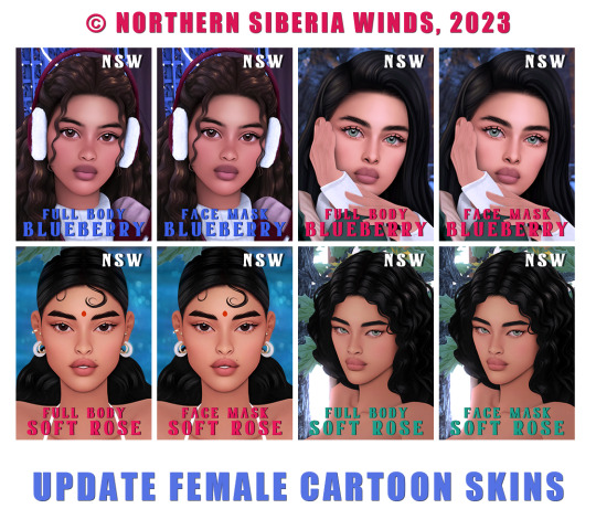
UPDATE FEMALE CARTOON SKINS
I am gradually fulfilling all your requests. I was asked for quite a long time to make a version of the face mask, and finally I found the time to do it.
🔧 CHANGELOG
SOFT ROSE SKINBLENDS
Added 15 new swatches to FULL BODY versions (softer versions with less marked eyebags + free eyelids versions + transparent versions)
Added the FACE MASK versions;
FACE MASK versions also available for male and female children;
FULL BODY and FACE MASK versions available in two skin details categories (I used the duplication technology without increasing the file size, which I mentioned earlier, but the file has become bigger anyway as there are now more swatches);
New thumbnails.
BLUEBERRY SKINS
Added 5 new swatches to FULL BODY versions (free eyelids versions).
FACE MASK versions now available for male and female children;
FULL BODY and FACE MASK versions available in two skin details categories;
New thumbnails.
✅ INSTALLATION INSTRUCTION
delete previous versions of skin files from your mods folder (please note that the main names have changed a little, so you need to manually delete the old files by keywords "soft rose" and "blueberry";
put new versions of skin files in your mods folder;
if you have had my skins installed before: in order for new thumbnails to be displayed in your game, you need to delete the "localthumbcache.package" file from "C:\Documents\Electronic Arts\The Sims 4" (this is the folder where your mod folder is located), or you can do it through the sims studio;
if the new СС did not appear, it means that somewhere in the mods folder there is an old version of the file.
❌ DO NOT: re-upload my CC, claim my CC as your own, use as a base/part for your CC!

MORE INFO AND DOWNLOAD
3K notes
·
View notes
Text

Today marks three years of Dianthus existing! I made my first concept sketches for her on 11/20/23 💖 this also means it's been three years of Diathesterius! I sometimes use the date I uploaded Dia to toyhouse, the 21st, as the anniversary date just in case I'm late... but I managed to finish colouring this <3 I had actually wanted to do something for this earlier in the month, I even made some very elaborate plans for it... but it ended up not happening! Which is okay 💞 but I still wanted to draw a little wedding piece... so I did! I'll make something fancier when I have more time later on... 💝 I used my own handwriting here for authenticity, but at some point... I'd like to be able to rewrite in Greek for More authenticity <3 Uncropped version (and long rambling post) under the cut 💕 I get a little Vulnerable so don't read it if you're gonna be mean or else I'll like Get You or something
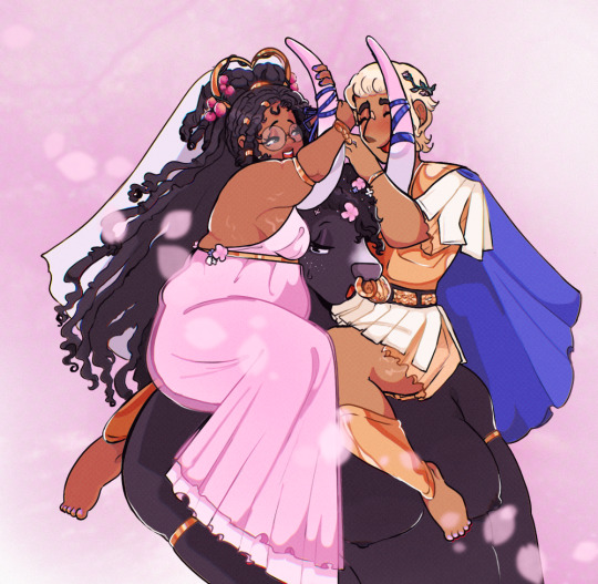
I've made posts in the past talking about why Theseus and Asterius mean so much to me, but I don't think I've made one on why Dianthus herself means so much to me.. so for her own third year anniversary, I'll do that here! before I begin...! the fruit in dia's hair here are from the strawberry tree, arbutus unedo. I associate the tree and its fruit with Theseus but... it's honestly been so long, I don't remember exactly why! Just that, for some reason, I imagine thathis childhood home had a tree of these fruit blossoming just outside his mother's room, and thus he has fond memories of it. Lady Dianthus... she who loves all things pink, actively hates celery, and still has a job at the library despite being so fogetful and clumsy... she who met Theseus and immediately became obsessed because it was the first interesting thing to happen to her- not a parent or someone she's close to, but herself! her first time feeling as if she had a true purpose. She who didn't understand Theseus' obsession with Asterius until meeting he Minotaur, and promptly decided "he's not scary? he's not scary at all! he's just a cow!" I've made sona and the likes before Dia of course, but she was the first in a long time who was truly meant to resemble me in all ways (except for the setting, of course...). I made her design simple so I would easily be able to redraw her, and gave her one of my favourite palettes pink and green and cream and gold. At first I really didn't expect to get that attached to her... I went months without drawing her after her initial creation. but the more I drew her the more I realized how much fun I was having with her...! It's funny looking back on it... originally I had a much more comedic idea for her story, and di not intend to ship her with Theseus in any serious way. It was going to be a completely one-sided love (with Dianthus taking the role of "crazed fangirl" - which she still is, in a way). I'm sure it isn't a surprise but it didn't take me long at all to start drawing ship art of them, creating artworks and writing of Theseus and Asterius was a self indulgent joy for me, so why not selfship art too? I ended up invested, of course. Using Dia I put a lot of my own feelings into a story; a sense of otherness, her loneliness, feeling lost and out of place. I had removed it later on because I felt uneasy with how vulnerable it was, but at one put I had placed one of the most traumatic events of my life into Dia's story- sometimes I think about adding it back, because I know giving her an oppurtunity to open up about it with her beloveds would be something beneficial to Me irl(!). But that's besides the point here... she's a stubborn girl, sweet but arrogant is my usual go-to descriptor for her; that's how I think of myself too, just based on what I've been told (I have a hard time thinking of myself as nice, though others always say so to me...). That may be part of why I tend to look for those features in (fictional!) lovers... something feels good to me about being able to butt heads due to this shared traits, but still coming together and making amends despite it. I do think it's a little funny that the sonas I've gotten the most attached to so far- Dianthus, and now Nerine- have some sort of theme of death with them. Dianthus is literally a ghost, and Nerine is metaphorically one (and maybe liteally, if I ever make up my mind...). Maybe that's just fitting for me, though... hmm... I'm not sure what else I want to say here... I think of Dianthus as "Me but in Hades Game / Ancient Greek context." Of course some events that happen in her life didn't happen to me, or, sometimes, I dramatize it (Dia's mother leaving her and her father to become the wife of a god was inspired by the fact that for the first few yers of my life, my parents were separated... but they always had a positive relationship with one another! Unlike Dia's parents), but she's become a big par
t of me all the same. Just as I am happy and hoping to spend many more years with Theseus and Asterius, I hope to spend many more years with her as well. i think that's all I'll write for now <3 if you read this thank you for being curious enough about me to be interested in all this 😭
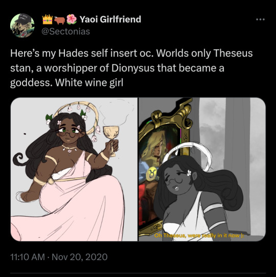
btw, here's the first ever post of her... (yes thats my priv </3 i briefly unlocked it to search for this... don't try and follow me over there though it's crazy over there)
92 notes
·
View notes
Text
Oh yeah this is my redesi- *gets brainwashed*
Yes this is a day late, I know no one keeps schedule of these redesigns, but I like to have an upload schedule to challenge myself, but it has gotten harder to adhere to said schedule lately because I’ve been cleaning my dad’s apartment(he’s still alive and everything it’s just a mess)
I added him in between class A and B because while it has been revealed which class he’s in, I figured it would be a nice transition and either way I’m going to stop talking now here’s the redesign
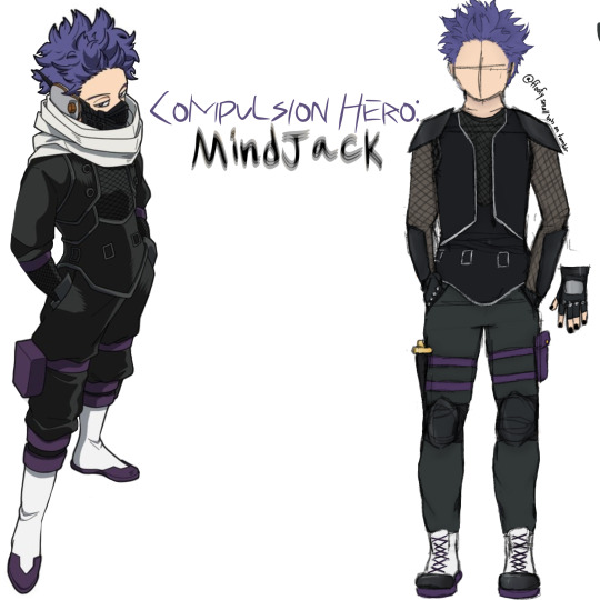
Compulsion Hero: Mindjack
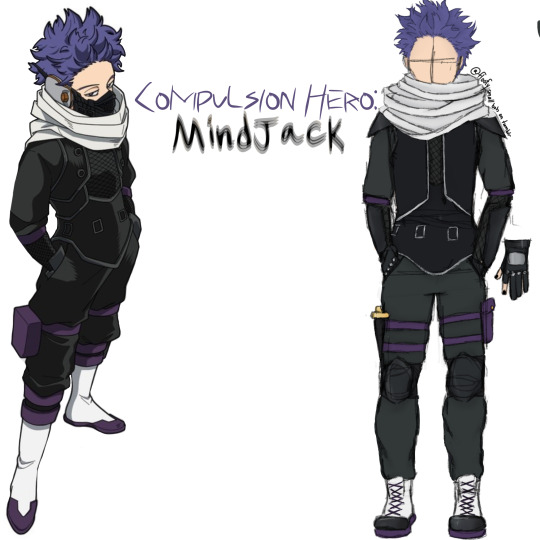
sorry if the text is hard to read or headache inducing
yes the name is a giveaway of his quirk, but I don’t think his hero name would be public knowledge, he’s likely be an underground hero due to the lack of flashiness
honestly his canon costume is the best one out of all of them
it’s practical and it looks great
vest would have been the same but I sure as hell can’t draw that so it’s just a regular looking vest
thin undershirt covered by a fishnet mesh
which is also in turn covered by the vest
and the sleeves in canon look like a separate garment
i told myself when I did the Kirishima design that I wouldn’t give anyone shirtless sleeves.
i have now given two people shirtless sleeves.
i was supposed to give him cargo pants but I forgot to draw the pockets :|
leg strap pouch
dagger, would be useful if the capture weapon got tangled or for close combat fighting. also it looks sick and I really like swords and tbh this costume is something I would want to wear and at this point I’m not even trying to hide the fact that I am Shinsou Hitoshi
i have very prominent purple hair and eyebags too
also there are a fuck ton of layers because I can’t think of a single person this edgy who doesn’t layer like hell
i would rather burn up than not layer and that’s saying a lot considering my incredibly low heat tolerance
but back on topic
combat boots
steel toed
kneepads, shoulder pads, and forearm guards
gloves are the same as canon
so is his mask but I was not going to draw that
it’s legitimately just his canon costume in my art style
COLD WEATHER VERSION:
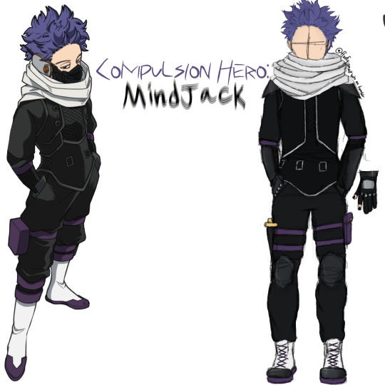
darker fabrics
slightly longer gloves on the thumb and index fingers
thicker fabric
capture weapon is temperature regulated
can function as an actual scarf
turtleneck(not visible)
undershirt is thicker
WARM WEATHER
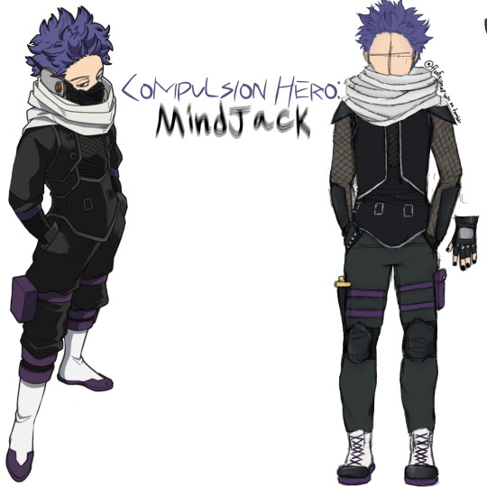
yeah he’s still gonna overheat lmao
undershirt has mesh sleeves
gloves are now completely fingerless
also I forgot to mention earlier yes he has black nail polish, just be glad I didn’t give him a full face of alternative style makeup, too
I don’t care if he canonically just wears jean jackets as his casual wear he’s alt now and there’s nothing you can do about it
hell, Jirou is supposedly ‘punk rock’ and the only vaguely alt outfit she had was the time she was wearing an ‘end of villainy�� tshirt with fishnets and boots in one of the openings
no more shirtless sleeves
slightly thinner, looser fabrics
WITHOUT CAPTURE WEAPON:
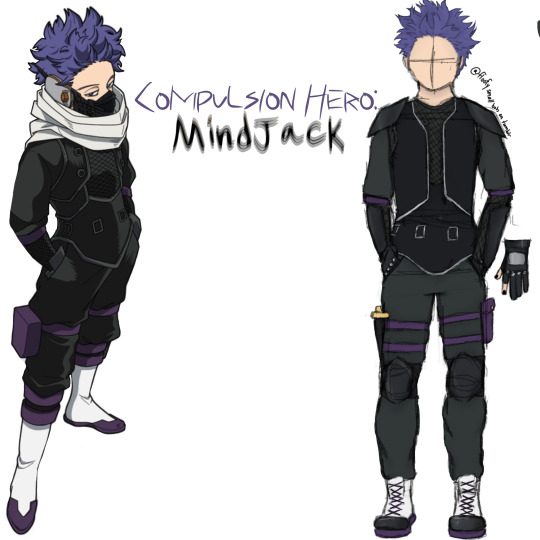
not really any notes lmao
COLD WEATHER WITHOUT CAPTURE WEAPON:
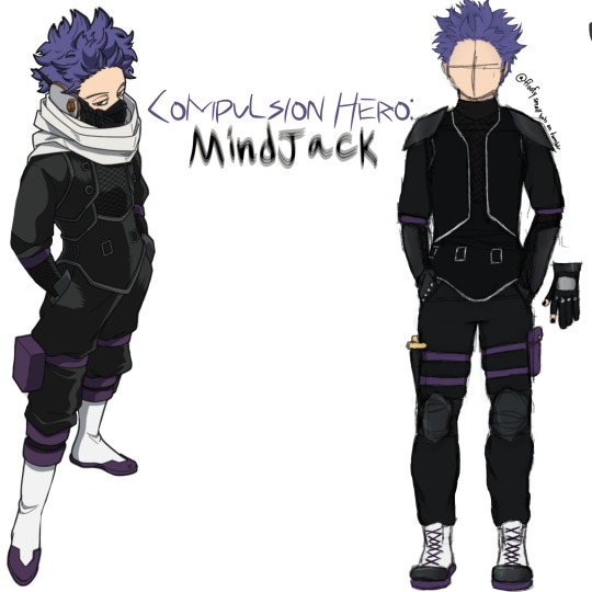
you can see the turtleneck now
HOT WEATHER VERSION WITHOUT CAPTURE WEAPON:
neckline is slightly lower
as always, tips and advice are appreciated!
#i accidentally saved the redesigns with the color picked palette over the reference photo so I had to go back and fix it#also I don’t think the reference photo is official art but it’s like 90% accurate and the official one is a terrible reference#also hey if you’re reading this why not go over to Arab.org and click a few buttons#shinsou hitoshi#hitoshi shinsou#mha shinsou#shinso hitoshi#hitoshi shinso#bnha shinso hitoshi#mha#mha redesigns#mha redesign#my hero academia#boku no hero academia#bnha#bnha redesign#bnha redesigns
24 notes
·
View notes
Text
Without a doubt, and by far, the most marginalizing development I've seen within media analysis over the past decade is a shift towards the production of long, flashy videos which tend to require the same for a dialogue to occur. Literally nothing which has been written about Elden Ring, for example, since its release has enjoyed even a fraction of the visibility as a one-hour-and-forty-minutes video by Joseph Smith, or another of similar length by NeverKnowsBest. I don't know when exactly the shift started to happen most obviously -- maybe 2016 or 2017 -- but, today, circumstances are such that pretty much the only way to get real discursive traction on your thoughts about a piece of media is to make a colossus of a video.
Although worried and worrying discourse has complemented the unveiling of newer public A.I. technologies, we've already done a perfectly fine job of out-dating other forms of media communication by way of the aforementioned analytic format; just as, of course, earlier methods of industrial production rendered a whole variety of professions or emphases as outmoded. If you don't have the relevant editing tools at your disposal and/or don't want to spend hundreds of hours cropping footage and making it fit with music and your own narration, well -- too bad! And even then, of course, there's no guarantee that your video will reach your desired scale of an audience. I've found dozens of such videos on YT channels with only a few thousand views, if that; and on each channel it's clear that the people finally gave up after the monumental task of assembling these videos had no equivalent payoff.
Personally, I do still believe in the primacy of the text (or the spoken word, with no competing stimuli); in text as the primary form of critical engagement. More than that -- if I'm going to read a non-fiction work, I want the paged book, and not a digital version. Now, this preference is just that: a preference. And it surely is a preference a good number of people share. I find that a paged book lends itself better to my own retention of the material; and I really enjoy making my notes on the book's paper with a pen. But I don't believe that the construction of multimedia behemoths should be a baseline requirement for discourse.
I wonder if we will, in the near future, start to see some resurgence of the valuation of unembellished textual analysis complementing a more general fatigue with Internet-derived overstimulation. I've already run across numerous channels with fairly sizable communities where there is an appreciation for the "simplicity" of the formats: a person in a room just talking to the camera. I think a lot of people like engaging analysis where the only barrier of significance is devising a good script. To be sure, this is a formidable barrier in itself. I find writing long-form pieces to be the most difficult of any of my creative practices (which include drawing, painting, and music composition). But if writing on media were my main passion or goal in life, I'd feel fairly crushed to know that these projects now required me to put in perhaps quadruple the amount of time to make a blip on the radar of engagement.
EDIT: Thinking on this -- I wonder if there's a parallel to be found in the realm of supplementing one's work with excess-entertainment via social media engagement; e.g., daily Instagram videos. "Excess-entertainment" refers to material that's being made not because everyone who's making it wants to make it, but because each person is now beholden to an abstractly instituted algorithm of engagement -- an algorithm reinforced by audiences who, also under algorithmic influence, will wonder what's going on if a week goes by without something from a Content Creator.
Most artists who I've talked to regarding their Instagram videos say they would be only too happy if they never had to do another upload showing them adding paint or linework to a work-in-progress with lo-fi beats. Similarly, I wonder how many people making these mega-videos actually want to make them, and if we're not rather seeing the production of this material under a mutual, and mutually untrue, assumption of necessity, and the demands of a largely imaginary audience; and how long they'll be able to keep the act up, given the certainly enormous time investments they require (while noting that I am sure the more successful people hire others to do most of the editing for them).
48 notes
·
View notes
Note
hey Becks! North_was_here here (pun intended). i mentioned in a comment on SPPF that i've been working on a fanart. i said i wanted to take my time to make it good...
well, i lied! (unintentionally)
i didnt take my time at all and finished it that same day, after about 4 hours (i think. could be more and closer to 5 or 6, as i'm using an older version of my program that doesnt track work time). i've just touched it up and decided id share it now before i can overthink anything else about it!
i recorded a timelapse (around 3 minutes) of me working on it but i dont think i can upload videos to tumblr via Ask. if you want to see it id be happy to share, i think i can just upload it on my own tumblr. I've literally never uploaded anything on tumblr before LOLOL

here it is! I'm quite happy with the result. heres a breakdown of the drawings, my struggles, extra info, stuff like that if you wanna read it!! (timelapse shows more detail and probably makes this whole breakdown make more sense):
before we start off, let me just clarify that since i'm getting back into art, ive been experimenting with different art styles (and with that using references) which is why some things look different than others in this drawing
I started with the left drawing (labeled with her hero name) with a pose reference, then drew her body and clothes. i used that ai image of Yoru you provided during the battle training chapter as reference for her hero suit. it was actually quite fun drawing it, especially the wrinkles in the clothing and such!! did her face, scars, eyes and then her hair (which i later redid as i was unhappy with how it came out).
the second drawing, the USJ attack, in the bottom right, is by far my favorite of these three. i used a reference drawing i found on Pinterest, and added some more detail to it and it turned out great. the hair was minorly tweaked from the reference, hence why it looks so much better than the other three's hair. i added her scars, and added the wound on her throat toward the very end of this whole project as i debated whether or not (or rather, how) i would draw it
the third and final drawing, top right, is probably my least favorite because its so simple, even though thats the point lol. i was thinking about making it an art of younger Yoru at first then decided id stick with older Yoru, so i made her hair longer, since i originally had it quite short on this drawing, and added her throat scar (i faded it out quite a bit, maybe more than i should've, as this is after the USJ). after all these drawings i shaded and added some more details
finally, after i added the watermark, title, your user and mine, i went back and polished it up (this is where i, as i mentioned earlier, changed the hair on drawings #1 and #2, added the shiggy scars, and even more details to make me more happy with it, and hopefully raise your chance of liking it) and now im here!
as im writing all of this, ive already noticed quite a few things id go back and fix up on this drawing, but im not going to because 1. by the time im done overthinking, SPPF would be finished lol and 2. i can go back and look at mistakes during future projects to learn!
anyways thank you so much, first of all, for even creating SPPF in the first place. This series is one of if not my favorite fanfics of all time. you're an amazing writer and i cannot wait for more chapters and things from you in the future. secondly, i really hope you like this fanart! this is actually my first time doing fanart for anything, but i plan to do more in the future - especially for SPPF. and hopefully, in the near future, i'll relearn how to color and render again to provide you with better art than this haha
feel free to include this drawing in the next chapter's notes. if not thats alright too! (that'd actually be such an honor tho not even kidding)
yap session over lol <3
NORTH! HELLO! 🙌
Sorry for the ultra-late reply, I just came back home from France and was out and about with work, walking through Marseille, and flying back home and all that, so it took me a long ass time to give your message the time it deserves! :(
This is so ridiculously AWESOME! I want to hug you and gently pat your head (maybe even give you a kiss on the forehead if you'd be comfy with that) because THIS IS SO DAMN AMAZING!!! 😍😍🥹
You got her hero costume down to a T! It's perfect! And the way she's standing kind of reminds me of her Dad's seemingly disinterested stance. And her scars and her face and expression!
The portrait is awesome, too! OMG I love it!
AND THE USJ ONE!
!!
It's perfect, shows her exhaustion and her empty stare so well! Like, her swollen eye and the dirt and grime and messed up hair and all that!
Now, personally, one of my most favorite things about your stunning drawings are the handprint-scars! I never managed to got them right and had such a hard time explaining the placement, and you did it exactly how I envisioned it in my head!
THANK YOU so much for this, North! I feel so damn honored that you (and people in general) draw Yoru! And put in so many details and thought behind everything, too! And since you said that it'd be okay for me to include it in the next Author's Notes, I'll definitely do it - thank you for allowing me :)
And thank you so much for your kind words, it makes me super happy to hear that you like the story so much! 🤍 Especially to such an extent that it inspires other people to get creative and bring the story to life even more. That fact is still so wild to me. I'm giggling like a schoolgirl (kicking my feet, twirling my hair, and all that!) everytime I get a new comment, even more somebody making art for the story. I love you readers all so much. People spending their precious time doing something like that is really moving
P.S.: Also, I'd love to see your drawing process! It's so interesting to see how people's brains work when they draw + I learn so much by watching it, too!
HAVE THESE FLOWERS AS A THANK YOU!

8 notes
·
View notes
Note
Listing them out Rq for the iceberg, cause I’ve played Dislyte on and off since it came out so there’s gaps in my memory: beta Gaius, “special loli” Chang Pu’s age, Legge, Celebrity events.
(Btw I love the iceberg it’s so funny seeing community events all piled together)
Hiya, thanks for the ask! Here's an elaboration of those specific entries:
Beta Gaius
Gaius is a well-known character in the game right now - one that was introduced in version 3.1.1 with the static shock Event.
But! His name was known way before that. Gaius has made an appearance in promotional material before the event was released - before the game itself was actually launched, even! His strange absence after the game's official release was a point of many discussions and a lot of confusion within the fandom, many wondering if he was outright scrapped or just being withheld for an unknown reason.


(the above is a clip from an October 2, 2021 live-stream - about half a year before Dislyte had it's global launch)
As you can see, his early design was a bit different from his final look too - being a lot more yellow than pink.
"special loli"
This is a reference to a very... peculiar ad.

Dislyte is known for having weird advertisements (which I was told is a result of Lilith outsourcing most of their marketing), but this one garnered particular notoriety.
Chang Pu’s age
When the game launched, Chang Pu was officially 15 years old. Later on, however, her age has been changed to 18.

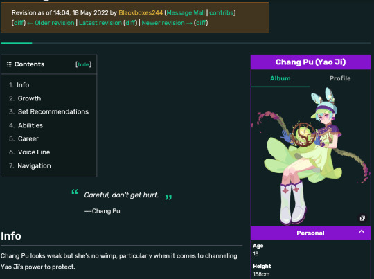
(I could not find screenshots of her in-game bio that showed Chang Pu being 15, but the wiki's change history can attest to this actually happening)
Many speculated this was a result of players being gross towards a minor character, and thus a reason for why we hadn't gotten any non-adult espers since.
Legge (Heimdall)
Datamined information shows that Heimdall's esper was originally conceived as a male character named Legge:

(his name and this image are the only things I have been able to find regarding him)
As you probably already know, Legge has since been scrapped and replaced with Ashley. Not much is known about him I'm afraid.
Celebrity Profile Events
These events have been used to introduce new characters during the game's beta and are the very first Event Tales (at least as far as I know) ever released.
There have been two of them: one for Clara and one for Sienna.
Post-launch, these have been replaced with the story events we have now - beginning with Ollie and The Lone Star event.
Whitewashing and Blackface
(I'm including it here so I don't have to make a separate answer lol, for the sake of being tidy and all that)
There have been minor controversies within Dislyte due to how it has treated it's dark-skinned characters.
One such instance was when the Amunet - Bloody Hunt trailer was released, featuring imagery that many considered racist:


(on the left - the original trailer; right - re-uploaded version)
The other instance included characters having their skin tone made lighter than originally depicted. The most famous example being Ahmed:


I distinctly recall an advertisement doing the same to Asenath, but I cannot find it anymore, so you'll just have to take my word for it
2024/03/25
this has been answered in a previous ask and I kinda don't really wanna repeat all of that, so I recommend checking out an earlier post of mine if you're still curious!
Thank you for giving me the opportunity to talk about this game some more <333 And yeah! Icebergs are a really fun way to present a bunch of scattered information in an engaging manner, and it's always fun to see how deep your knowledge of a topic goes :3
16 notes
·
View notes
Text
One of the earliest looks at THE NIGHTMARE BEFORE CHRISTMAS, back when it was going to be released as a mainline Walt Disney Pictures films, appears on the 1993 VHS release of PINOCCHIO...
youtube
The PINOCCHIO VHS in question streeted in late March of that year, and copies were printed as early as January. Maybe even earlier, so this was early on in the film's road to release.
Close to release, it was decided to have NIGHTMARE be a Touchstone Pictures title instead, as Disney higher-ups had concerns over the film's "macabre" content. 13 years later, in 2006, it was rebranded as a "Walt Disney Pictures" film and all current copies and versions open with that CGI castle logo.
Today, Animation Compendia uploaded an international trailer from the year after its North American release...
youtube
Built around the PINOCCHIO VHS trailer, and adding THE LION KING now that that film had already been out in most of Europe before this movie debuted across the Atlantic, it's fascinating to see it open with a Touchstone logo but still hype up how it's part of the Disney legacy of innovation, along with WHO FRAMED ROGER RABBIT... Even though Disney tried to distance it and that movie from the Disney name...
ROGER RABBIT is its own breed, though. Disney had BIG theme park plans for the movie, with only a few of them materializing (like ToonTown in Anaheim), and Disney Feature Animation did three shorts w/ Roger, Jessica, and Baby Herman, two of which that ran before mainline Disney movies. (The first of them, TUMMY TROUBLE, was attached to HONEY I SHRUNK THE KIDS. The third, TRAIL MIX-UP, was with A FAR OFF PLACE.)
It's also kinda weird seeing LION KING before this movie, but yeah, in Europe... LION KING was out first, then NIGHTMARE.
Here in North America, NIGHTMARE came out in October 1993, and THE LION KING was a June 1994 release.
THE LION KING was originally meant to be a Thanksgiving 1993 release, following the Thanksgiving debuts of OLIVER & COMPANY, LITTLE MERMAID, RESCUERS DOWN UNDER, BEAUTY AND THE BEAST, and ALADDIN... All in a row...
But when LION KING's story issues proved to be a larger problem than anticipated, it broke the new "Disney animated event every Thanksgiving/holiday season" tradition and moved to the summer. So that meant NIGHTMARE had that space to itself, albeit, opening wide two days before Halloween and playing throughout the season. As long as it could, anyways. NIGHTMARE was only a moderate success, grossing a still impressive $50m domestically. Many clicks above Disney's competition (it was even a little bit higher than what Don Bluth's '80s hits AN AMERICAN TAIL and THE LAND BEFORE TIME took in), but quite a few clicks below BEAUTY and ALADDIN.
In Europe, however, THE LION KING was released first. The UK, for example, got it in October 1994. NIGHTMARE was closer to Thanksgiving that year. This was during a weird time where not only did Disney's newest animated movies open waaaay after, theatrically, in Europe... But also, Warner Bros. (!) distributed some of the movies!

Weird, huh?
A practice not uncommon way before these corporations all began to firmly say "All of this stuff is under ONE roof", believe it or not! Disney was no stranger.
For example, in Italy throughout the 1970s, Cinema International Corporation handled distribution of Disney's films. Here's an opening to a 1979 re-release of PETER PAN - sourced from a Super 8 reel - that has their logo following a blanked-out Buena Vista title card...
youtube
Disney joined w/ Warner Bros. to distribute their movies in the UK and a few other European territories in 1988, but then ended things in 1992 after BEAUTY AND THE BEAST came out in Europe, later creating a new version of Buena Vista International. That logo, you can see at the beginning of the NIGHTMARE trailer Animation Compendia just uploaded, showed up towards the end of 1993.
They became so big by that point in time, they could now handle more theatrical distribution overseas. Video was still an exception, though. In a country like, say, Brazil, Disney's video releases were put out by a regional company called Abril Video. That's one example of many. You get the idea, right?
Disney minutiae.
5 notes
·
View notes
Note
Considering that the English translation prettied up Caspar's endings for Flower (changing "often out of control to "sometimes reckless" and removing the text confirmed Caspar's career involves invading other countries), while vilifying his non-CF ending (saying he had victims), yeah. Same with turning Rhea restoring the Church to her rehabilitating it. There's definitely reason to side-eye the changes made by the translation team.
TBH,
(bcs i didn't enjoy FE14)
FE16 and Nopes (and all Fodlan content) seriously made me reconsider my stance on the localisation.
After FE Tellius I knew (I mean after FE10) that changes/omissions existed but never thought they were deliberately made to push one character by destroying others, the general feeling was the same at the end of the game (we are supposed to worship Ike, the localisation played it up to 11, but FE10 does it on its own).
Now, FE16 ?
I was pleasantly surprised with FE15's voice acting so I thought the dark eras of lolcalisation were behind us...
But then Rhage popped up.
And with Rhage, I started to notice all little tweaks here and there made in the localised (some at least) scripts, that added end up with the result that "maybe Supreme Leader isn't that bad" that is pretty different from the JP/og version.
When FE10's loc said "Ike is the most awesome dude ever" instead of the jp FE10 saying "Ike is the most awesome dude", the Fodlan lolcalisation tries to give a different meaning to the solution/story given by the game!
As you pointed out, Caspar doesn't invade countries and is "sometimes" reckless, instead of being "out of control while invading the rest of the known world", his non uwu endings are worsened, Rhea was swapped by Rhage, the church needs to be "rehabilited" instead of "restored"...
I don't want to be overly critical and dissect everything when I'm playing a game, I'm playing first and foremost to enjoy myself but when I listen to Leigh's voiced lines and see this :

or this :

even if you're not thinking about localisation too much, you can see there is an issue in voice direction, which leads to discovering issues in script localisation and then... you start to ask "why", and come up with sad answers.
So, because Fodlan verse really disappointed me lolcalisation wise, even if I made exceptions earlier for FE14 and FE15, I can't be assed to trust the lolcalisation at all, so if a game has audio but no dual audio, it will be a hard pass.
Even if a kind soul, like the ones who made the FE Datamine site, compile and upload the script with the different audios to compare, it's a big no-no.
I know jp audio will not solve everything (especially if i still don't understand the jp script lol) but at least when the localised script tries to sell me the apple that is orange in the original script is akshually purple I'd have some clues about something being wrong.
More power to you if you like purple apples, but if I was supposed to get an orange apple, I would like to get this orange apple (or maybe red or yellow if needed), and not another product.
#fantasyinvader#lolcalisation woes#lolcalisation issues#this verse is full of them#i often use rhage as an example because she's the most obvious one#but i think the sprinkles added here'n'there you mentionned are worse#it's not enough to warp a character#they have to edit the original script to support their new ideas/vision of the game#like dudes wtf#i don't give a crap about your vision you're not the devs#and again to reiterate just in case of sea life attack#I have nothing against voice actors who do their job according to the directions given by the voice director#it actually feels like Ms Leigh was given more freedom to voice Rhea in Nopes so we can see more range and emotions especially in#that paralogue#FEH's Halloween!Rhea on the other hand is a clear example of her voice direction not fitting at all the character she's supposed to voice#at times i wonder if Nopes!Caspar isn't an exaggerated version of lolcalised!Caspar#FE16#3 Nopes
25 notes
·
View notes
Text
The 31 Days Before In Space With Markiplier
!!🧹CLEANING OUT DRAFTS WRITTEN IN LIKE 2022. Posted as is last written🧹!!
A recap of what happened in the one month before the release that is more or less related to ISWM. Open to any missed info and note.
I used my time zone for this so some events may have happened hours earlier or later for others. That and also the date I found certain posts. So you have to keep those two factors in mind while reading through. Also minor note is that I write them on the day and once it’s over I do not mess with previous entries.
This post is for fandom historical purposes or in case someone needs a refresher in the future or someone is feeling nostalgic.
March 5, 2022: Mark released the official trailer for In Space with Markiplier.
He has replied to tweets, and reblogged stuff on tumblr. If you look at the keywords for the trailer, he was cheeky and typed “you’re looking for an easter egg aren’t you?”. No need to call us out.
2 Major fan agreements: Chica is seen as the most important part of the trailer, and we aren’t qualified enough to run a spaceship.
March 6, 2022: He is seen in multiple comments section of ISWM trailer reaction videos on youtube. Pretty active on social media probably reading fan reactions on all platforms he knows. Like a lurker.
March 7, 2022: Unrelated but it sparked discussion. Matpat made a Game Theory video of Mark’s ideal Pokemon.
March 8, 2022: Some memes about how ISWM is free and not paid got popular. Not sure the origin date of this fandom meme but he does go on a rant in “nothing strange is happening here.” about being confused why people think Distractible Podcast was paid.
March 9, 2022: Mark has interacted with his fans on twitter. Gave the fans a scare.
A fan announcement is released to change names and locations when ISWM drops. Mark himself liked an earlier version of the tweet.
Unrelated to ISWM but related to fandom matters. 10 Minute Power Hour - Season 2 Trailer on The Grumps youtube channel was posted. I’ve heard that marktwt ended up having to see his ass on their timelines for a few days. Cannot confirm nor deny.
March 10, 2022: Cursed stream. Watching the Same Video 100 Times. He has way too high of a charisma stat that there was a good amount of people went along with this insane stream from start to finish. He had a very Actor-esque monologue in the middle and got permission to show BTS photos (say Thanks Amy). Live viewers was consistently around 25k.
This is the day a good amount of the fans decided we will give him hell when the show comes out.
March 11, 2022: I’m not sure why but the Markiplier fandom on tumblr decided to make some Bald Mark edits.
March 12, 2022: The Test 2. Timestamp: 51:34. It’s another tease for ISWM but this is from the last frame of Everything has to begin with the date release from the ISWM trailer.

March 13, 2022: Not much outside of some fans making a copypasta. “Hello. This is Markiplier. I have been logged out of my main account and I need your credit card information so I can keep making Youtube Let's Plays.”
There are variations but the main content of the copypasta is the same. Mick also posted this on his twitter.

March 14, 2022: Mark did a livestream “Five Nights at Freddy’s 2: REVISITED”. It managed to reach over 100k viewers live on average (probably, I was only there in the last 50 minutes). For whoever needs it. He likes being called a himbo.
March 15 & 16, 2022: Nothing noteworthy to say about these days.
March 17, 2022: Since so much nothing has happened. I’ll report that Mark uploaded Assessment Examination. Cursed Thumbnail BTW. Thanks, I hate it.
March 18, 2022: Nothing to note.
March 19, 2022: Mark went live. FNAF 3 Revisited. He mentions 1928 so WKM fans are triggered. Also briefly explains why he hasn’t been active.
March 20, 2022: Mark retweets this.
March 21, 2022: Mark went live. FNAF 4 Revisited. I find it funny that if you ctrl+u and searched for the keywords he just keeps adding instead of changing things around. First one I didn’t get to watch live.
March 22, 2022: The Grumps: 10 Minute Power Hour. Our [REDACTED] boys doing chaotic things as usual. 2 weeks left before release, I’m assuming Mark will start messing with the fandom big time when there’s only a week left.
Mark went live and streamed Sister Location. Peaked at 106k viewers. He’s still adding keywords there.
March 23 & 24, 2022: Please move on to the next date.
March 25, 2022: On youtube, Mark started a premiere countdown. Mark retweeted 2 fan arts on twitter. Then he had a bit too much fun over on tiktok.
March 26, 27, and 28, 2022: Please move on to the next interesting date. I guess instead of just the trailer thumbnail, we had the trailer playing too.
March 29, 2022: DING! DING! DING! DING! Something finally happened! One of the captains found a link to an unlisted video because their premiere glitched. It’s mostly the same. The only thing that has changed is that the slap is in reverse. Here is the link and from unlisted it went to private. So that link is useless now but hey, at least we have the URL.
He really played us like that huh...
March 30, 2022: Because timezones are a thing, I’m writing the part 2 here. A couple of our fellow captains found 2 codes from the video. One and two. The first one has an update. First link references Venus, and the second link is with Zeus so Jupiter. This amazing captain has a pretty solid idea. Whether this will be true or not is up to the future.
Thumbnail changes are also happening. Mark is also messing with the polls. Three times actually.
Mark liked this post on twitter.
(kinda lumped them together because I was still looking for posts of peeps trying to figure this stuff out.)
March 31, 2022: Knock! Knock! 3rd edit has us shown a robot and a new set of codes. This time it’s for Kronos aka Saturn. Differences for today’s trailer. Theory of possible upcoming codes. Link to the video that is now privated. Thumbnail change is even more fucked up with the mouth erased.
April 1, 2022: Captain Atterid with updated code results. Also better compilation post of trailer thumbnail changes. Mark changed the thumbnail for April Fools. He also seemed to stop creating a poll asking whether we had reminders on.
It was Ares this time around. Theory for upcoming planets as well.
April 2, 2022:
.
April 3, 2022:
.
April 4, 2022:
.
April 5, 2022: In Space With Markiplier releases in my time zone :)
Happy Space Expeditions fellow Captains!
.
In order: Aphrodite-Venus, Zeus-Jupiter, Kronus-Saturn, Poseidon- Neptune, Ares- Mars,
March 22: I’m assuming Mark will start messing with the fandom big time when there’s only a week left.
Hey I got it right!
4 notes
·
View notes
Text
boarding: the floor plans

so um... hi folks! if you're here, you've probably been reading my skz fanfic boarding over on ao3. some of y'all have been asking to see my floor plans that i've made for the story. this is me, obliging. hope you enjoy :)
introduction and vibes
i'm planning to upload some edits to the earlier chapters within the next month or so to give a bit more of an image of what i imagine the space to look like, now that i actually have it. in the beginning, i was really just putting scotch tape over the world-building in order to get to the character interactions. for now, here's the edited version of the initial description of the school:
"In the distance, the sparse forest through which they’re driving melts smoothly into a series of rolling hills. With how early it is, the hilltops still catch a hint of morning reds and pinks from the lazy sunrise. The car rounds one last bend in the road, and Felix’ breath catches in his throat. The ground slopes gently upwards for a few hundred yards, and at the peak of that hill stands an ancient estate, cloaked in brickwork and ivy, rising up out of the landscape with impossible grace. It is majestic, and dignified, and makes his heart sink in his chest with a pain like simmering water." (Intro Pt. I)
i can't actually draw, in fact i can barely sketch, so u will just have to use ur imagination on that. but keep it in mind for overall vibes.
the school grounds

this is the worst of these sketches, and i apologise, but this is generally how i imagine the layout of the school. that big thing in the front is the mains, then the courtyard, and the three houses: yang, park, lee. the line around it is a sort of brick-wall fence, old-looking and worn. it's all surrounded by forest that gets thicker the further u venture away from the school, but light enough to allow for hyunjin to catch glimpses of the sun reflecting off the lake on a good day. here is part of the updated description:
"Changbin directs them outside by way of the back door, which leads out to a large manicured courtyard bisected by cobbled walkways; it’s structured a little like a park, complete with benches clustered around trees and small sectioned-off parts clearly set up for games. It’s about a five-minute walk through the courtyard to the dorm buildings, though that’s with the added weight of the suitcase. Felix tries his hardest to memorise where he needs to go — the school grounds certainly seem large enough to get lost in at some point." (Intro Pt. I)
the distance between the houses and the football field is way larger than it appears here; unfortunately, i only had so much paper to work with, and i wasn't gonna start again at this point. it's definitely a five to ten minute walk from the field gate - u can see it in the gap in the fence - to the football field. the path to it slopes vaguely downward. the building next to the football field is the auditorium where choir practice happens, and sometimes assemblies. (we'll get to that in the story eventually, i promise.) also there's changing rooms for when there's football matches.
the mains
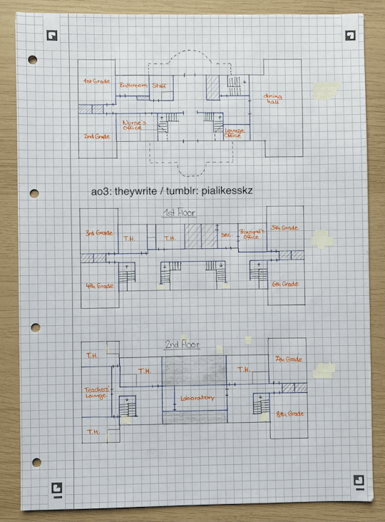

this is how i imagine the layout of the main building. the cellar is on a separate page because i make bad choices in life. "T.H." stands for teacher housing. anything with diagonal lines across it is storage of some sort. the grey-shaded thing on the second floor is a bit of roof - for architectural interest, u feel? i play a lot of sims.
the dorm houses
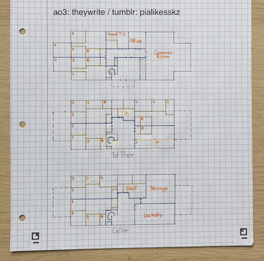
this is how i imagine the layout of the three houses - or, at least, park house. (btw has anyone figured out why i named the houses the way i did? it made me feel really smart when i came up with it.) more on the single dorms later. the stuff in dotted lines is, like, stuff that exists on one floor but not on others - like, the ground floor has those wing things to the sides, but there's no equivalent above or below, it's just roof. hope that makes sense.
the dorm rooms
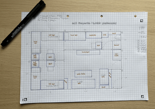
and finally, this is the layout of the dorm in my head. yes, it's pretty small, but consider this: stuck-up private schools don't care about the rights of children. for this one, i actually tried to work with some realistic measurements, but like, take it with a grain of salt, y'all, i'm an english literature major. as to who's in which room, peek at the top of the page. updated description:
"(The door) opens into a small common room populated by an assortment of worn-looking furniture: a closed wooden storage cupboard in the corner, a mostly-empty bookshelf leaning against the wall, two sofas with a wild assortment of pillows on them placed haphazardly around a chipped coffee table." (Intro Pt. I)
fin
so that's that! i've put a lot of thought into this space, and i think at this point i've got it down pretty well. of course, these are all just what i have in mind myself - if it doesn't fit with your vision of the story, that's cool! keep picturing that! we love anarchy here.
feel free to let me know your thoughts on the floor plans, the story, anything at all! i am really happy to talk to y'all, and answering tumblr asks make me way less anxious than replying to ao3 comments lol. have a lovely day, and i'll see you for the next chapter!
-pia
ps: i took the leap out of my comfort zone and put this on my personal skz tumblr, instead of one specifically created for the purpose of sharing ao3 things. that's big for me. be nice.
pps: if you know me in real life, and you want to tell me that my writing is cringy: don't! it will make me sad. so mind your business.
ppps: if anyone steals/reposts this, i will hunt them down and make them eat a ten-pack of tissue paper. do not test me.
9 notes
·
View notes
Text
New ‘Warrior’ Cover Art for Chapter 6: Ghosts in the Nursery
Hey all! Now that ‘only as strong as the warrior next to you’ is all finished and posted (still can hardly believe it!), I’ve been chilling out and decompressing by making some new and updated versions of earlier chapter cover art.
I was never really happy with the cover for Chapter 6 (Ghosts in the Nursery), mostly because it turned out taller than I wanted and Din’s picture was drawn more blurrily than I liked. 😂🙏 (I also realized after the fact that he had the wrong armor on and I couldn’t unsee it.) So... bam! Updated version!

I’m feeling much better about this one. :3 Improvements in my mind include:
Din has the right armor on, BLESS
More reflective of the chapter’s actual content
the fonts are consistent with what I ended up going with in cover art for later chapters: Star Jedi font for title, Mandalorian font for the chapter title, and Franklin Gothic (open crawl font) for written/beta read credit
Actually got input from Caro this time around and they make gr8 lil colouring/cleanup touches
IT’S REASONABLE SIZED AND THEREFORE CAN BE ADDED TO THE CHAPTER ITSELF lmaooo
I have to upload the picture to tumblr in order for a link to be created so I can embed the image in AO3 -- so I figured I could add a few process/rationale thoughts while I was at it in case anyone was interested in any of the behind-the -scenes fic cover art. Enjoy!
#star wars#dinluke#luke skywalker#din djarin#only as strong as the warrior next to you#the ignorant and the weak#sith luke skywalker#not sure if anyone cares about this kinda stuff but i thought#why not!#if you like this kinda stuff let me know#bodyguard din djarin
21 notes
·
View notes
Text
In general I think the servers having a max capacity is a lame way to solve their problem. I understand what they're thinking, the game isn't going to hold this amount of traffic and it doesn't make sense for them to buy a bunch of servers that will never fill up past the first few weeks here. I really wish there was a queue system though, instead of it being seemingly random. I tried to get in for almost 5 hours earlier and did not get in once. Meanwhile other people get in on their first try, because the way the system works it's just a random check to see if there's a spot. I'd prefer to get like a 200 people in line message, or something, rather than the current system.
While playing I found that the promise menu freezes a bunch. It was constantly having to reload all the thumbnails which would take almost a full minute. Almost all the promises I was trying to get into were full, and I understand because I'm only going for the free ones that don't require a specific outfit, but that meant trying to get into a promise, then waiting a minute for it to reload the page, and then trying again ad nauseam.
It also took quite a while to upload a single photo onto my profile page. In general the waiting times are pretty bad for a mobile game. It's not like a console game where I can pull out my phone where I wait for it to load, with this game I have to just sit here and wait for them to reload all the thumbnails.
another frustration is that everyone is hosting the exact same songs as promises. If I have to play Pretty Prism Paradise one more time I'm going to lose it. but I don't want to use my promise tickets, because you know hoarding tendencies, so I'm stuck with whatever isn't full.
In general I feel like I'm playing the switch game on my phone, but my switch is right next to me. I could play the switch game on my switch. I got into one photo promise, but it really was just an animation of my character playing with a bird, that I pressed the screenshot button a few times to.
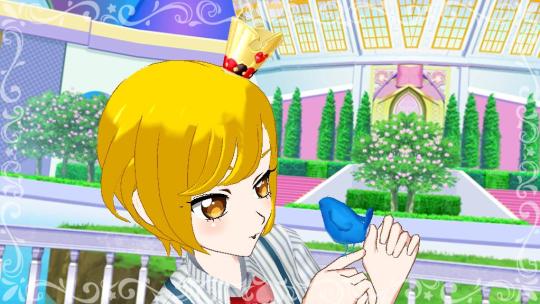
Not to say that this game is bad, but I think my original imagination of this game was something more, and not a port of the switch game with a few features moved around and a bunch of paywalls.
Also I pulled the gacha and I got a skirt, which is funny because I only wear outfits with pants. So it was a waste of a ticket. With the gacha too I'm never going to get that full outfit, so that skirt will never match anything.
Another thing I got to try once was the bonus shop, you can see the auto translation of the help menu and the other post I made. The outfits available were slightly better than what's in the main shop currently, but I still didn't buy any of them because none of them had pants. I think I like it slightly more than the switch version where you just pull a gotcha and get one item.
Yeah overall right now this game is just the switch game but with more loading screens. I'm going to keep playing because why not, but I hope this game gets events or just something to have a reason to keep playing it. If all it gets is a new shop weekly and an anime ep drop once a month, what's the point?
6 notes
·
View notes
Audio
1990s House Playlist
Got some adds this week for this 1990s house playlist that I’m slowly building. At some point down the line it’s going to be, by far, my longest playlist, but we’re not even close to reaching that point yet 😅.
The two adds for the Spotify version come from Warp Records, who appear to have opened up some more of their catalog to Spotify since the last time I updated this playlist. Warp is synonymous with the explosion of IDM and ambient techno, putting that stuff on the map with an incredible 1992 compilation called Artificial Intelligence, but around that same time, they also released a less appreciated comp for the acid warehouse crowd called Tequila Slammers and the Jump Jump Groove Generation, which features a bunch of sick early 90s house bangers. Some of them were already on this playlist, but with this update, I was also able to add “You Can’t Stop the Groove,” by Coco Steel & Lovebomb, and “Happiness,” by Nightmares on Wax, the latter of whom is way more known as a downtempo and trip hop entity than a house one. And both tunes are currently sitting at under 1,000 plays, so let’s change that!
Coco Steel & Lovebomb - “You Can’t Stop the Groove” Nightmares on Wax - “Happiness”
And those two songs have been on the YouTube version of this playlist since jump, but I also added a couple others to it that aren’t on Spotify as well with this update. First is a song that comes off of a comp I have been repeatedly posting about every Sunday now for the past month or so: the FFRR label’s California Dreaming, a 1993 release that showcased an eclectic crop of psychedelic cyberhippy electronic music that was emanating out of the Golden State at the time. This song is by a Bay Area native named Aquatherium (he’s also gone by B. McCarthy), and it’s an early 90s, hypnotic, tribal house, floor-filling monster called “Feelin’ Real Good (Aqua’s Trance Mix).” And across its couple different uploads on YouTube, it’s currently sitting at about 4,800 plays. Pretty low!
And the other add is the most obscure of this batch, one that a certain someone had to upload to YouTube themselves. It comes off a 1999 12-inch compilation from the Paris-based Basenotic Records called Bakchich EP #4 and it’s by a guy who’s originally from Chicago named James Curd, who, earlier in his career, went by Jimminy Cricket. His song’s called “Testing & Balancing” and uses a bunch of pitched-up samples from the Al Green early 70s soul classic, “Love and Happiness.�� And it’s only at a little over 100 plays, so give it some love!
Aquatherium - “Feelin’ Real Good (Aqua’s Trance Mix)” Jimminy Cricket - “Testing & Balancing”
Playlist is also on YouTube Music.
So, here’s where we currently are with this thing: the Spotify version of this playlist is currently at 15 songs and is an hour and 45 minutes long, but the YouTube version is nearly double that, with 29 songs at almost 3 and a half hours. Yet another electronic genre and decade that the Spotify library is severely lacking in 🥱. So, you know which of these two options is the better one.
Enjoy this update!
More to come, eventually! Stay tuned!
Like what you hear? Follow me on Spotify and YouTube for more cool playlists and uploads!
#house#house music#dance#dance music#electronic#electronic music#music#90s#90s music#90's#90's music
10 notes
·
View notes
Text
My weird relationship with profile pictures
So I saw this making the rounds the other day, and felt maybe just a little targeted because... mine’s kinda similar.

I have kind of a complicated relationship with this sort of thing. I started this blog uh... pushing a decade ago, at a time I otherwise WAS NOT out as trans to literally anyone, and surrounded by people I (unfortunately quite correctly) guessed would have a huge problem with it when I did come out. So here, I had absolutely no identifying info of any kind, profile pic included, and was just hunting information on transitioning resources. My oldest posts explaining this have been long since nuked too since, well, I’ve gotten more paranoid over the years.
When I started up a Twitter account back in the day, more or less exclusively to link articles on here to a hopefully wider audience, same deal. Back then if you didn’t set a profile picture you just got this egg on a random colored background. Pretty sure I ended up with a violet background and you know, the egg wasn’t bad iconography for my purposes. And people absolutely HATED this because turns out at the time people would mass-register burner accounts and make no effort so you’d have a stalker and just get this whole pile of angry eggs in your feed, then maybe me saying something friendly and weirding you out.
So people were pressuring me to switch over to literally just anything, which I was tempted to consider, but while I was pondering that, there was this other pseudonymous-for-safety trans girl I knew who was almost as paranoid as I was, but had a real avatar. This one funny picture of a dog... and uh, she got doxed based on that alone. It was something like she ran a server for something else, that dog image was saved to that machine somewhere, some shot in the dark stalker-y tied it to a profile on that site, and from there unraveled that thread enough to get her legal name, I think her address even, and started really raining serious hell down on her. So that scared me the hell out of making a change.
I did since loosen that policy up a little, and started using profile pictures over there if anyone was sufficiently bothered by the one I had to just post something else and demand I swap it in. Did that a couple times, then had the added problem of people who’d provided earlier ones being upset I was using something else. Sorry about that by the way.
Anyway, this is still kinda the way I live my life. I don’t show any of myself if I can help it. I can’t recall ever uploading photos of myself anywhere, nor videos. Beyond letting a few vague facts slip, like, you know, being some absolutely gigantic trans woman, I don’t let personal details out, and I don’t use profile pictures anywhere, unless someone actively suggests one. And I still get constantly stalked and harassed even with that.
Somewhere along the line people got frustrated by the lack of info on me, made a bunch up, started circulating that, and like, going so far as to “issue corrections” to stuff like game credits sites that correctly had the name I’ve used professionally for as far back as anyone’s going to want to look up, convincing them to change it to whatever random BS they pull off some sketchy website or other, and while that’s actually a serious problem for me when I’m looking for work and have to explain to people looking up previous projects why they find some other person’s name in place of mine, I also get rather unfortunately frequent sneak peeks of the sort of violent stalker crap I’d be dealing with if they had real leads. Photos taken of random houses, anonymous messages that are all like “I know you’re really Albert Zuckerman” or whatever with some rando’s photo embedded, “found you” with arrows drawn pointing at random people in group photos, crap like that. It’s always kind of relieving to confirm they’ve all tricked each other so thoroughly, but the version of that I’d get if there were real things to go on I’d really prefer to keep living without.
So, you’re stuck with the sleepy triangle. At least until someone goes out trophy hunting fascists with enough gusto the rest go into hiding, or someone hooks me up with some kinda like private high security mansion with on-site security or something. Sorry if you don’t like seeing it?
4 notes
·
View notes
Text
Episode 2 Transcript
Thanks for tuning in to your regularly-scheduled writing journey podcast, An Act of Will. I’m your host, Sydney. Let’s get started.
Ok, so I seriously dropped the ball in terms of keeping up with this podcast, and honestly writing at all. This episode and the next were already written but never recorded, so I’ll just go through them and then the third episode from now I’ll catch you up on the new stuff. I won’t take a month to upload- instead, I’ll post this episode, then the next episode in a week, then the episode for where I actually am in my process a week after that.
I started editing my most-complete novel idea. I’ll call it The Village here. I’m on draft 5.5 because this draft is weaving in scenes more than anything, so it’ll probably be really similar to my previous draft. I took notes on draft 5 in my writing software so hopefully that will make it easier. I’m calling it draft 5.5 aloud, but in my computer it will be version 6 because drafts and versions are different for me. To me, a ‘draft’ is more complete, for lack of a better word, and a ‘version’ is any time you make edits. I rarely have half drafts.
The way I decided to edit is to write every major scene on white index cards and use copic markers to color code the top according to what act the scene is in, plus which major characters are in each scene. I only have five main characters I thought were important enough to have their own color, so that would be few enough that I wasn’t overwhelmed. Honestly, I fell off the ‘denoting what characters’ part. I also wrote in pencil what chapter the scene appears in and numbered the back so I know where I originally had them when I move them. I’ll finalize the order later, but I just need some record because there’s a lot of them, too many for a picture.
I also cut down card stock I had lying around to be roughly color-coded to what I decided to be my act color to be sub-scenes that are still scenes, just not major ones. I also had the transitional scenes between acts written on a different color of card stock so it stands out more to my eyes.
So I used: green for act one, pink for act two, blue for act three, and purple for transitional scenes. I wrote on the back of the purple ones which acts they served as a transition for and numbered those, too. I also had red scenes I know I need to move but can see where they fit in later when it’s time to re-arrange.
I actually color-coded the re-ordering as well. I also added page flags. Look at me, being all organized. I made a key because my brain will look at this later and be like ‘what does yellow mean again?’
Because it’s a mystery, I had blue page flags for general clues, yellow for specific clues, and red for red herrings. I seriously need to add a lot more of those. Then there’s orange for interviews my main character conducts and purple for re-interviews. Draft 5 contained a grand total of four interviews, and no re-interviews, so I knew I would have to write a lot more in to flesh out the mystery more because it felt way too easy and rushed when I re-read it. And, since there’s a romance subplot, pink for that. I need a lot more of those scenes, too.
Sticky notes also came into play. I added specific colors to the scenes that mean ‘move earlier’ or ‘move later.’
It seems super extra, and it took me a little over three working hours minus breaks to do it, but it was so important and so useful. It’s helpful for me to step away from digital and move to real life so I can physically move scenes around without worrying about having to undo any work I copy-pasted. Plus, like I said, I have a record if I need to change it back. Not as easy to do if you’ve moved five scenes after the one you decide works better where it originally was.
I used a thirty minute working session for the first one and forty-five for the rest because most of the first session was spent making a key and cutting down the card stock. I use an app called Forest to time myself because it gives me satisfaction to have a representation of the work I’m doing. Every session I complete, I grow a digital tree and it keeps count of how long I’ve worked that day at the top of the screen. Plus, I can look back and see how productive I was during the week and get the same satisfaction.
I thought I would really dislike editing- I always have in the past- but the process made it so easy, even a little fun. I’m making the story better without a whole lot of effort past the initial one with writing all the scenes down. I think I was avoiding doing this because I knew I would have to write a lot of scenes whole-cloth, but I kind of tricked my brain into thinking that those would be like drafting again. Will it majorly suck that those scenes will be first draft level instead of draft 5.5 level? Yes. But it has to be done.
After the index cards, card stock, page flags, and sticky notes were all finished, I decided the first thing to do was to choose an ‘editing’ candle. Yes, I know, it’s a weird first step. But I had a really little one on my desk that I literally never used, and figured that since scent is one of the most powerful memory triggers, that maybe I could use it to my advantage and light the candle every time I edit and it would keep me focused and not dawdling on the internet. Hey, I’m a candle hoarder and decided to use that to my advantage.
I then got down to the business of actually editing. I made a list of what scenes needed to be moved for sure. I have a picture-laden post on my blog on that I’ll link down below if you’re interested in seeing it. I’ll also describe it here.
So first I went through all my index cards for act 2, writing in my writing journal the scene summary on the red cards which I used to denote the scenes that need to be moved. I started with act two because surprisingly, I didn’t need to move any scenes from act one, though I probably will once I start adding scenes.
I changed gel pen color every scene, then I wrote down the chapter the scene appears in in my current draft in black so it stands out from the summary. I also added a short note to where it could be moved if I had a thought about it, also in black ink. As I did this, I made small boxes to the left of the scene summary matching the scene’s color so I can check them off when I complete them.
I used different colors because a) it looks prettier and b) it can sometimes be hard for me to separate tasks and similar things when it’s all one color of ink. It honestly looks like a wall of text to me if I don’t concentrate.
After I made the list, it was time to get a tri-fold poster board and go back to the index cards.
I arranged all of the act two cards on a tri-fold poster board so it didn’t take up as much room as the floor. Tri-folds are able to be folded away when I’m not using it, which is so useful because I could walk away and not have to clean up and then set up everything again.
So I set up my handy-dandy Forest app timer and got to work. I did two thirty minute work sessions that first day.
I discovered that every single one of my index cards, from all the acts, actually fit on the board. It’s tight, but they fit. This was good, because then I could see all of them at once and move them freely.
I ended up having to move more than just the red cards, which surprised me. But that’s the beauty of this method- you can just move an index card without having to copy-paste a whole scene.
When I thought I had a good re-ordering, I wrote in my writing journal what went where. To do that, I wrote down the original act the card belonged to and the original scene number. I made sure to title it as the first version of the re-ordering so if that changes, I’ll be able to tell which attempt worked the best. Then, the beauty of the trifold came in- I folded it away and leaned it against the wall in my room.
The next day I went at it fresh.
I, again, did thirty minute work sessions with about two minutes in between. Looking back, I should have done five minute breaks because after two sessions, my brain became goo. I took an hour break to let my brain rest.
But, thankfully, before my brain gooified I did some more work. I moved some scenes around and even saw where I could add scenes. I added post its in a different color to the places I thought I could add them and wrote a short description of what I thought the scene could be. By ‘short’ I mean five words or less. Then in my writing journal I wrote the place, the summary, and any more thoughts on what the scenes could contain. Unfortunately, I had few of the last point. But I still wanted to note it down in case I had ideas in the future.
And sidebar- I just realized I never told you guys what this story’s word count is. The latest version- version five- is fifty-seven thousand, one hundred sixty-nine words. Now, most writers know that a novel generally falls around the fifty-thousand word mark. I felt because I was over that benchmark, I was in good shape.
Out of pure curiosity, I looked up what an average word count by genre was. But when I found a source for my innocent query, which I’ll link in the description below, my heart sunk. Now, word count isn’t the only benchmark to shoot for when you’re writing, and I know that. You can have a novel that is outside those bounds in either direction and still be amazing. But according to the source I found, an average mystery is eighty to ninety thousand words. And thrillers tend to be eighty to a hundred thousand words. Mine is a mix of both genres. Ouch.
Now I do have to add scenes as I mentioned previously, but how the everliving Hell am I gonna write at least an extra twenty-three thousand words? That’s a lot of words!
Hopefully as I start to write the scenes I need to add, that gap will slowly close, but thinking about it makes me want to scream. Ah. The life of a writer.
After the hour break, my brain felt refreshed and I was able to go at it again. This time, I learned my lesson. I shortened the working sessions to twenty-five minutes and took breaks of five minutes. Hey, any work is work and the last sessions were hard for me. Take care of your brain, folks, you only have one and it gets tired.
I did two twenty-five minute work sessions and moved a few more scenes, enough to where I actually had to move index cards to fill in space because two or more major scenes had to move, and I made note of a few spaces I could add more. I also realized I had to split two scenes into two, so that was two half-scenes I had to move. Thankfully they’re more or less written, so I just have to add to them and then change them slightly so that they fit in the new order.
Then, because I had work soon after that, I wrote down this order in the same way I did the first re-ordering, including where I thought I could add scenes.
So all in all, I spent a hundred five working minutes ordering all one hundred twenty-eight original scene cards, and thirty-one spaces of where to add scenes, some with multiple scenes to be added. So with the multiple scenes taken into account, I have about fifty three to over seventy-one scenes to add. Ouch. I know, that’s a pretty big spread, but most of them were like, add two or three scenes here or one or two there. A few I had four plus scenes, but those will likely be short bridge scenes. So, if I don’t add any more scenes to my rough plans, which is doubtful, I’ll have one hundred eighty-one to one hundred ninety-nine scenes in total.
I feel pretty good about this re-order. I knew I definitely have some spots where I need to adjust, and way more scenes to add, but it’s coming along and progressing.
After this re-order, I made a list of the locations of the scenes I need to add and what they could possibly be about. I only had a couple of ideas of the content because I mostly just had a feeling that there should be more space between the existing scenes to space out plot points. So I knew they had to exist, but just not what they’d contain.
I’m not doing this purely to boost my word count, though that’s a welcome side effect. I’m doing this because my draft feels a little rushed most of the time and too easy of a mystery.
So not only do I have to add the scenes in the spaces I know about currently, I pretty much have to develop entire subplots with red herrings. My guess is that after I add the scenes in the places I know about currently, I’ll have to use some way to kind of track those red herrings. I don’t have any ideas currently, but I really hope I won’t need a cork board, tacks, and red string.
But I’m gonna focus on the scenes I know I need to add right now and hopefully those subplots will come to me.
Those were my first two editing days after the original scene cards. My grand total for those two days was one hundred seventy minutes, or just under eight hours. I’ll still work on editing, I promise.
That’s all for this episode. Thanks for coming with me on my journey through storytelling. I have a Tumblr at an act of will with hyphens between the words if you’d like to keep up with me there. I will see you in a week. Until then, I wish you well and happy writing.
0 notes