#i had a screenshot of the thumbnail a long time ago but i deleted it for space maybe two years ago
Explore tagged Tumblr posts
Text
lately i've been looking for this youtube video i watched years ago again. i've been looking on and off for 3 years at least iirc and i haven't been able to find it yet. it was this video titled something like "a dream i had last night" and i don't remember the creator. it was animated and it was about the ocean having less and less water, and these people who were paid to pump the water either from the ocean or these hose-like things that were along the beach and the people having the realization of just . what are we doing? the solution is right here. so they directed the hose things to the ocean and slowly it started giving back. it was something like that. maybe i'm stupid and looking in the wrong places or maybe the video is just gone for good but idk.
#i had a screenshot of the thumbnail a long time ago but i deleted it for space maybe two years ago#i'm still mad about that. i keep deleting things and then needing them later#anyways#i don't really want to fully put this out there right now but this doesn't ring a bell for anyone does it?#posts#terrified of sharing this because idk i feel like i'm missing something and i'm just going to seem like an idiot#but i want to find it#i used to watch the video all the time#it was kinda a comfort for me#lost media#?#youtube
8 notes
·
View notes
Text
Updates! YouTube Stuff
Howdy folks! Just a few updates for the youtube channel
Videos Names
Short and quick-- I ended up changing the name of the sprite animation videos into battle animation videos. I was thinking of calling them "Sprite Animations, Magia, and Doppel" but that felt too long.
To be honest, the videos don't get a lot of views or engagement-- which is fine. I think that archiving them is worth it, and I don't think these are the kind of things people will watch over and over? But I do wonder if they're not viewed as much because people might think that they are only sprite attacks and not magia and doppels and stuff. I'm kind of hoping that "Battle Animations" will clear things up, because I don't wanna add the "Magia and Doppels" part to it.
If it doesn't, then I'll leave it as is. It's a little sad if they're lesser viewed but that's fine ultimately.
TO BE CLEAR THIS IS NOT ME BITCHING ABOUT VIEWS, I WOULD STILL DO THIS EVEN IF THEY GOT LIKE 5 VIEWS IN TOTAL. Just, more that I was thinking that maybe I'm not being very clear about what's in them? ANYWAYS
Recordings
So! I've been trying to finish up my animation project so that I can devote my time and energy to other things~
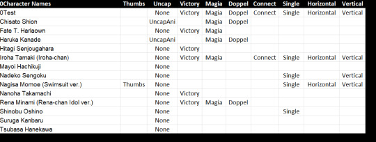
This is how much is left to record! Naturally a lot of the collab girls are kind of. Well it's going to be a bit.
Chisato and Haruka are giving me pause. When I started recording about two years ago (and then deleted all the files and started over and then deleted them all gain and started over again), I kinda assumed that Suzune would get a rerun, and I could nab those two and easily record their non max-ascended forms but uh. Not sure if that'll ever happen? I'm wondering if I should just record them regardless and release an updated version if we ever get a banner for them again. Lots to think about.

Meanwhile, the above is a short screenshot of how many I've completed. Yeah... 194..... This isn't including the girls who still need to be uncapped either. My computer has more space now, it's amazing to move them permanently to the backup now.
These are all the ones that have completed recordings that still need to be edited and uploaded:

Editing doesn't take too long, it's just that my computer slows down and it starts to take a long time when you have like tens of them to do. But I'm starting to see the light at the end of the tunnel! ...Still need to record a bunch, but I have lots of queue so things should be fine.
I kind of wish I had done some things differently, but oh well. When it comes to my channel, I feel like... well, you don't really get quality, but you do get quantity. Even if that's not technically as good, I think there is still value in it. idk.
Thumbnails
My stupid ass was looking at the channel and decided to redo a bunch of thumbs, and hey did you know that there is a 100 limit on how many thumbnails you can upload in a day? Sucks man.
Anyways, the transformation thumbnails are mostly updated and I just have about fifty left to upload now:
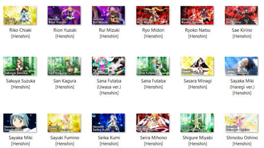
A while ago I started to make the characters' names a few pixels larger than the rest of the text, and it's been bothering me for a while that some vids had the bigger text and other vids didn't, so uhhh. Yeah. I also ended up changing a bunch of thumbs so that they show the end shot. Is that the better choice...? I'm not sure. I think it might make the thumbs more boring, but I think it's also more upfront about the fact that they're transformation videos.
More importantly, I also decided to redo the battle animations thumbs!

At first it was because I wanted to put "battle animations" in the thumb but I ended up deciding that plain old "animations" looks better. So why am I still changing all of them? Well...
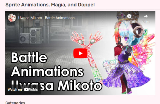
I'm super honored that my stupid lil channel is getting used for the gallery section for the girls! See here on the fandom wiki. But then I was looking at it and man, that thumbnail sure does look fucking ugly when it's all blown up in your face like that. And if people are gonna use my stuff (🥺), I'd at least like it to look nice on their site...?
So I'm using the sprites from the magireco sprite viewer (rip), although unfortunately it's missing some/doesn't have new stuff/won't be updating anymore. But at least some of the new sprites will look better.
I know how to get some stuff off of Rika.Ren for datamining-ish, but sprites aren't one of them, and tbh I'm kind of not interesting in learning new things atm. So stealing off the Puella Magi Wiki is the best we'll get. But still! Older videos will have better thumbs. And oh man, some of them were ugly as fuck.
...I still need to make uhhh 200 more of them ish but I'll work on that tonight.
Playlists
Much to my displeasure, the results for the poll I made pointed towards folks deciding that more videos in a playlist is better, so I'm redoing all the playlists I had foolishly trimmed (this is also how I noticed some thumbnail problems and then got obsessively focused on fixing them last night instead of the playlists).

A couple of playlists still need to be redone-- I basically deleted everything in them, 'cause it's easier to just start over instead of dragging things around (especially when you get past 100, as it'll stutter and boot you to a different place). But I'm slowly getting there, and they should all be back up by tonight? The Madoka one will take the longest I think; that was easily 150+ videos if I recall correctly.
I also put all the battle animation videos currently uploaded into the battle animation videos playlist.
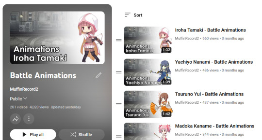
Originally I was trying to upload the videos in order of release, to make it easier on myself when putting it into the playlist. But that was kind of frustrating, especially when I had already released some out of order and then you factor in holidays... So fuck it! They're all in there now, even if they're private.

This is what you see when you're not on my channel (and you select to see hidden videos). Woops. Oh well!
But this means I'm more willing to go out of order in the uploads :)
Conclusion
I really wanted to get this all wrapped up so I can start to move on to other things! Like, ya know, my webcomic project. And also liveblogs!
Oh speaking of which... wait maybe I should make it a separate update... hmmmm. Yeah I'll do that.
Anyways, yeah! It'll be nice once I no longer need to upload a video every day, but it's also not too bad. I'm just glad I have a huge amount of queue, which'll give me time to look for some of the older collab characters. I'm not entirely sure how I'll film their little poke animations... Maybe I'll have to ask around, or perhaps use the kyugay sprite site? I have no idea how to record my screen. Ah man.
But I think the channel is heading towards a decent place, and I'm excited to finish everything up :)
Hope y'all aren't too bothered by the spam of videos! It's gonna be a couple more months at least....
#Magia Record#Youtube Stuff#Im not really sure if this should go into the tag...#I apologize if you feel it's spam#but i did put it under a read more!
9 notes
·
View notes
Text
EGO MAYHEM THEORIES: II
THIS IS PART II. CLICK HERE FOR PART I.
OK FUCKERS LET’S FIRST COVER SOME STUFF:
Jack posted a photo to his instagram with red lights shining on his face as he wore chases shirt and marvin's mask was spotted in the back
he livestreamed some fortnight and @lisasepticsuperplier spotted marvin’s mask hanging on the whiteboard. @maggiemaemoo also noticed and pointed out when he went on a “pee break” the mask went missing. this same mask was on the whiteboard in his new “am i colorblind” video.
it’s important to note that the red lights were in every video between chapter one and the colorblind video.
RGB lights/lens flares in most thumbnails.
he wore a black shirt in every video up until today (5/9) where he switched it out for chases shirt in “try to fall asleep” and a fairly normal tee in “am i colorblind”
i don't think “am i colorblind” is important to our theories at all, i actually think for once we got a normal video? besides the mask, nothing off happens the whole video and there’s no red lights. did jack go back to sleep?
CHAPTER 4: “IT WAS ALL CONNECTED”
"you see a man in front of you. this man looks strange, not like any man you have seen before. suddenly, you realize you were looking in a mirror..."
by this point we know all of the intros are connected/parallel events having to do with jack/the egos. this intro doesn’t end with “stories untold.” it’s likely the case because in game, we learn what the characters “untold” story is- and we start to uncover jacks.
all of his egos have a similar likeness to jack, so he could be referring to coming face to face with any of them. i think, however, this is more of a “i don’t recognize myself” statement. jack has lost his memories, he hasn’t been himself and his subconscious knows. that’s why he doesn’t recognize the man in the mirror, why it looks strange to him. mirrors have been a common theme over time regarding anti/broken!jack, and mirrors were also involved in the second video this day.
i really think jack did a good job choosing stories untold to be The Game(tm) where all this shit goes down. there’s a lot of very obvious connections you can make with jack/the ego’s stories and this game, and i enjoy it a lot. i took some notes while watching the video, it would take to long to expand on them individually so i'll just share this screenshot. it’s a lil messy:
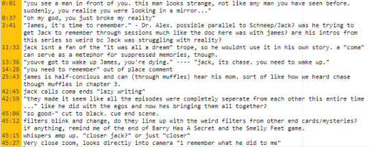
now let’s jump to that ending. i’m still reeling from it; wig evaporated.
i still have NO SOLID IDEA what he could’ve been referring to. does he remember everything or just some things? does he blame schneep or anti? does he remember who everyone is again? SO MANY QUESTIONS! gif credit
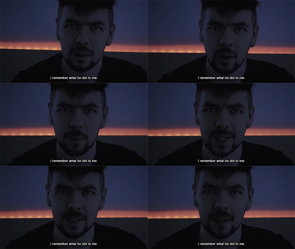
@fear-is-nameless pointed out he looks directly at the camera, not through it. almost as if he's talking to someone. i think he’s either talking to us, or talking to schneep/chase considering (i think) they were the ones trying to get him to wake up to begin with.
@no-strings-puppet pulled together the whispers that you can listen to slowed here, slowed and reversed here.
@damienisverygood made a transcript of the whispers, i have a hard time hearing it so i cant rly confirm for 100% that this is accurate, but definitely worth noting.
@monochromemedic had a really interesting theory about schneeps involvement in it all, it’s definitely worth taking a peek at.
@booperdoopcr has a theory that really got me thinking as well.
i really do think someone has been “pulling the strings,” choosing what jack can remember and locking away whatever memories either a, hurt him or b, doesn’t serve their agenda. it’s hard to tell if it’s anti who’s in control of what jack knows or if it’s our doctor.
i don’t think schneep is evil or malevolent. if he’s keeping jack from remembering it’s for jacks health or the well-being of the other egos/himself. it’s an outdated theory that anti thrives off of attention (i can’t remember but i think jack said that wasn’t quite the case) so it would make sense for henrick to lock away memories that involved anti, it would also explain why jack doesn’t remember him (considering he was corrupted last time we saw him). the thing that doesn’t quite add up with this theory is why schneep was so frazzled to see jack playing his role, when he knew jack didn’t remember him or really know what he was doing. schneep looked scared when confronting jack, he knew something was wrong. overnightwatch happened after schneep left for “vacation,” yet jack seems to forget about that too. i don’t dismiss this theory completely, it just leaves a lot of questions.
anti, however, would benefit from jack having amnesia about him. if he doesn’t know who anti is and doesn’t know there’s something fishy going on, he can’t stop it. it would make sense for anti to make jack forget schneep, considering he tried to save him. it also could’ve just been a casualty of trying to get jack to forget everything regarding the glitch demon himself. it would also make sense for schneep to be frazzled in this case when confronting jack, because he likely didn’t know who he was talking to. he recognized jack, but he didn’t know jack. if that makes any sense.
i stand strongly by my theory that memory-lacking jack is just a puppet of antis, being controlled by him without really knowing. schneep has experience with anti, he was likely afraid of the unknown possibilities that stirred around confronting an unstable, unknowing puppet!jack. i honestly believe schneep came back to try to save jack. after he confronted puppet!jack, i think he started some sort of therapy to get him to remember, and had chases help. (like a parallel to the dr. alex/mom and james in the game ya feel?)
@chronically-illustrated pointed out that all of the endings could be a bit of interpretation of what happened to jack over the years. James Ation had a hard time interpreting reality so the truth manifested in complicated and symbolic ways. the outros could’ve symbolized jack’s memories coming back to him/events that have been actively happening.
we see jack “wake up” periodically (i think the jack that remembers is conscious, just locked away, being tortured and watching everything unfold) , leaving hints and cries for help littered here and there. they almost ALWAYS get removed though, seemingly by anti trying to get things back under control. the tags on the DDLC playthroughs that got deleted (canyouhearme, i remember what happened), the entire overnightwatch stream getting deleted (seemingly from memory as well), the random tags showing up on posts only to get deleted later (the sos in morse code). anti doesn’t want jack catching on, he deletes all signs of him he can and all of jacks cries for help while simultaneously taunting us and fucking with us (like overnightwatch as whole). thanks to @fear-is-nameless for reminding me about the tags on DDLC.
no traditional outro or intro
CHECK PLEASE
this video just seemed very off. i don’t have a lot to say about it, but i’ll let my notes sum it up:

i don’t really know what to make of it, other than it’s suspicious as all hell. the red light was in this video as well.
he mentioned magic 6 times, made a blood/knife/threatening comment about 5 times, and got injured/burned twice.
that mirror speech was all fine until he said “you got this- we got this.” i just don't trust like that.
if anything, i think this just helps solidify the idea that memory vacant jack is just a puppet of antis. it might also reveal that anti’s whole plan is to become one with jack and be the foreman (host).
“papa” sounds a lot like anti in the closing scene lmao. i don’t think there’s much to read into, its just something funny. if he is a puppet i wonder if he sees anti as dad?
there IS a traditional outro/intro
TRY TO FALL ASLEEP
i hate this man. i absolutely despise him. im kidding i love him and his creativity and torture knows no bounds. this mother fuck really did this to us.
before even watching the video, i knew we were NOT in the clear, after jack seemingly “waking up” yesterday and then this video? i love hate him.
here are my general notes on the video. i added lines to make it easier to read cos this was a Lot:

i take the notes during my first watch through so i'm sorry for the meaningless comments/reactions throughout.
let’s break this down a lil bit. the video starts off weird. there’s no normal intro, and the red lights are there- just dim (this was brought to my attention from this post by @markired), “jack” fades in through static.
@lizziebirb made this gif where you can see marvins mask show through the static:
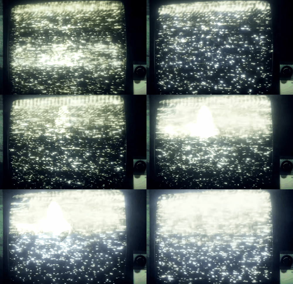
then that creepy grin is back as he introduces the game. he stares directly at us as he makes his “speech” about going to sleep. when he makes the comment “when you drift off, that’s when the fun begins,” i half expected to hear anti’s laugh. bone-chilling to say the least.
the character in the game is someone who just went through an accident of some kind, and memory loss is mentioned (another parallel?). jack glosses over that, and instead focuses on brain damage. now hear me out; what if jack doesn’t want to remember? what if he wants to stay asleep because he’s afraid? i feel like due to the theme of the last game egos aside, he normally would’ve pointed it out or made a connection? i could be wrong, im just thinking out loud.
he also, out of place, brought up “why are all these people in my house” which reminded me a lot of a post he reblogged a few days ago.
he says “i don't know if i need a mask” (referring to gas masks in game) but that line stuck out to me, due to the fact two egos have masks and one of them even popped up in this video. the other ego (jbm) we haven't heard almost anything from since this all started.
i found a lot in the TV snow. we see marvin, JJ, and a hidden message. ill link the post with all the pictures here, but i would like to highlight a few screenshots in specific.

in this one, jack’s webcam seems to glitch out when marvin pops up. i don't know if that was something that messed up in the rendering of the video, but it honestly reminds me a lot like the glitches that popped up during the antipocalypse days. with the way the color fades and there seems to be hints of color over his face. i wonder if there’s a second image there we just can’t see?
and then there was this:
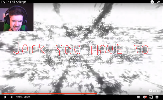
i traced over the words, but that’s all i saw. i’ve seen people claim it says “you need to wake up” but i just... don’t see that. it would make sense, but i never see the end of this sentence and i very clearly see an “A” in the 3rd word, so it doesn’t say “need”. it could say “you have to flee,” considering that is the next word we see after this. if that’s the case, who is he fleeing from and why?
it could ALSO be someone telling jack he HAS to wake up. like they’re telling him he doesn’t have a choice, he can't just keep acting like things didn’t happen and put off confronting his memories/his egos. after waking up yesterday, and then this video today, i wouldn’t be surprised if he’s deliberately trying to fall back asleep.
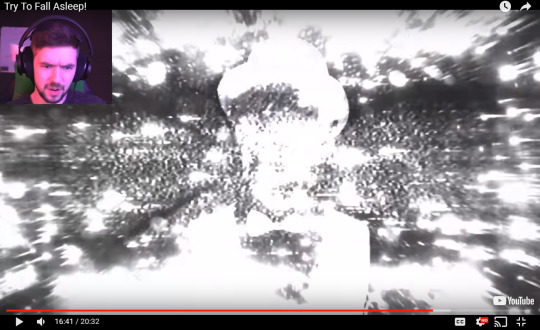
we also see JJ. but why? this is the only time i see him, and as far as i know jack doesn’t even reference him in this video, unlike how he referenced marvin with the abundance of magic-related comments. what’s the significance of JJ being in this video/making an appearance?
he also makes a face worth mentioning after reading the phrase “loose lips spit sekrits.” (i’m p sure it’s spelt that way because in dreams it’s common for things to be a little off, especially words. it wasn’t a typo by the developers, it was deliberate). this face goes entirely full screen and only lasts for about a second. it could be for comedic effect because he thought it was a typo, but it could also be a certain someone throwing some shade, yanno? someone's been slipping us hints, “spitting sekrits,” and another someone is probably not very thrilled about it.
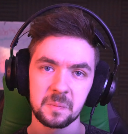
he then makes a comment about “revive” due to the word being on a podium. he picks up a fuse and says, “can the doctor revive me after this” (as JJ pops up on screen) which could be a direct reference to schneep “reviving” jack- or at least his attempts to.
fear was a big theme in this video, he repeated that he “wasn’t afraid” many times even though he was very obviously afraid. i wonder who he was trying to convince he wasn’t afraid? who are we even watching in this video, and who are they trying to prove something to? he breaks the fourth wall towards the end and tells us “no fear, im repeating it so you guys remember it.” does he want us to have no fear, is it important that we aren’t afraid? or is he trying to convince us/whoever he really isn’t afraid, just cautious for our sake?
there were about 5 mentions of magic i caught throughout this video.
no traditional outro/intro
i’ll add more as the days go on, but in another two days (if there’s still ego stuff goin on) i’ll make another one. :D if you have any theories to add lmk by tagging me, messaging them to me, or just replying here ! i’ll throw them in where/if they fit and tag you. thanks for all the positive responses on my first theory post, i hope this one is as helpful. :D
Tags (im sorry): @jacksoopticboop @jacksepticeye-protection-squad @lum1natrix @puppet-master-anti @kasper-the-ghost @septicjacks @mrcamillaa @hufflepufftrax @rogue-of-broken-time @marielgum @markired
#jacksepticeye#antisepticeye#overnightwatch#marvin the magnificent#jse theories#jse community#stories untold#mo theorizes#mo squeaks#long post#*100
169 notes
·
View notes
Note
@greenwire i can absolutely back you up because i witnessed the entire explosion of accusations. i’m one of the lesser amount of radfems still remaining from pre 2016, and i remember what happened very clearly. it wasn’t just that one video. there were at least two other accusations i believe, that came out within 24 hours after that video due to the victims feeling emboldened by the youtube video where the brave young woman revealed her face, and therefore essentially her identity. one was a wordpress post, and i can’t remember what the other was, but it wasn’t from twitter or youtube, some kind of blogging website that allows long format writing, similar to tumblr and wordpress (may have been another wordpress, but the third one is the fuzziest for me due to being up the shortest amount of time). and as all of us were sharing and freaking out about the accusations, they were gone as quick as they came. but not without alarming signs. one radfem posted a screenshot of what the youtube video used to be because either she had preemptively saved it, or was in the process of viewing it (suddenly a lot of us who were watching and rewatching couldn’t access it since it was taken down). and in place of the video and thumbnail, it had the typical grey screen when a video is taken down from copyright, and i’m not sure if they still do it on youtube now, but it also stated on the screenshot who had taken it down, and it said verbatim “claimant :Mr Lundy Bancroft”. all of us were aghast and enraged. and my memory is less clear for the text posts, but i do believe i remember one of them writing another post after they deleted the accusation, but before they deleted their entire presence and stopped speaking, that they were contacted and threatened with a slander lawsuit by bancroft’s legal team, and she removed everything in fear. i don’t know about the other accusation, but because it disappeared around the same time, i think it’s safe to assume something similar happened.
and all three of the accusations struck the exact same theme; they were abused women that went to this ‘healing retreat’ because they loved bancroft’s book, it really helped them, and they held an immense amount of trust in him. but on the retreat, bancroft’s actions made them extremely uncomfortable and revictimised. i vividly remember one talking about how he’d come up behind her and give her shoulder and back massages without her consent and asked if she liked it. another accusation (i don’t remember who’s was who’s, if multiple were in the statement of the same person, if the same action was in multiple accusations, etc.) was that he’d ask inappropriate questions, about their relationship status, ask if he could take them out after the retreat, about their interest in sex, if they had been sexually abused. he’d apparently use that “therapist language”, and talk about “healing”, and “recovery”, but in the context of....doing things with him. and so these women would avoid him at all costs during the rest of the retreat, but stay because they didn’t want to waste their money (no refunds and extremely expensive. like greenwire said, even without the sexual harassment it feels nasty and exploitative) and also, being abuse victims, they had no sense of form boundaries and refusal, which bancroft would have known very well.
there are multiple other radfems that witnessed the entire occurrence on radblr, but most aren’t on here anymore. but some are, and definitely remember it, even if they weren’t paying as much attention to it as me. even some women who migrated from radblr to reddit remember, bancroft being predatory was brought up by some women on fds just a few months ago. so, while there is no physical evidence left, bacroft made sure of that, there’s a bunch of us women who were direct witnesses to the accusations. when a ton of us are saying this, are saying that we saw the exact same things, what’s there not to believe? especially when the intial and main accusation came from a woman not hiding her identity at all. she wasn’t a famous person, she had no sway or power, she was just a woman showing her identity on camera and stating what happened. even if the other two were fake trolls (which i don’t believe, at least for the second accusation. like i said, the third is fuzzy), just that video alone is enough.
and like greenwire said, his book is incredible, has helped many women, and will continue to be a valuable tool. in the same way as the science, inventions, and words of many historical terrible men.
hi just curious why you call lundy bancroft a freaky cult guy in your tags, from that gifset you reblog? i know their have been some accusations against him and just curious about why you call him freaky cult guy or if it's just tongue and cheek thing to say in tags! thanks
Lundy Bancroft is an author and he wrote the book Why Does He Do That, which I consider to be well written and I recommend people read it. The reason why I put it in the tags is because there are some facts about him that I find, not necessarily damning, but in my opinion makes him somewhat suspect.
First: Here's the website for his "Peak Living Network" which is a mixed sex organization that holds retreats: https://lundybancroft.com/retreats/
Based on the seminar titles, he is actively recruiting vulnerable women who have been abused before to these retreats and that by itself is iffy. Bancroft is an expert in working with abusive men. Why is he trying to have retreats for women who have been abused to "heal," why is he including men on these retreats, and what is his expertise in counseling women who are abuse victims?
Second: At these events, he is apparently grooming attendees in order to form relationships with them. The evidence for this is pretty spotty, however. A woman came forward with a video titled "My Lundy Bancroft Nightmare" about going to a PLN retreat and being sexually harassed by Bancroft. She alleges that several women have the same experience, but she also quietly removed her video and scrubbed all evidence of it from the web. I haven't been able to locate any archived version of it.
Here's the link that proves the video existed at one time: https://radfemspiraling.wordpress.com/2018/09/23/watch-metoo-my-lundy-bancroft-nightmare-1-of-3-on-youtube/
I think it's iffy and something about hosting a retreat and specifically targeting vulnerable women who have gone through the extremely damaging experience of intimate partner violence strikes me as predatory. Bancroft has no psychological credentials. Abusers are not mentally ill. Their issue is that they are entitled, not that they are sick.
But when you've gone through the trauma of being abused, you need a professional to help you out. Spending thousands of dollars to go on some retreat to meet an author instead of putting that money toward psychological counseling with an accredited expert (better yet: feminist psychological counseling) is not a wise choice. It's your choice to make, of course, but I think the fact that this is something offered at all is unethical.
I don't expect total purity from other people. I think, even if it comes out that Bancroft is himself abusive, that his book will still remain an accurate guide to how abusive men think. I hope the allegations, such as they are, are untrue. But, we have seen time and again, men who are self-aware, men who self-ID as feminists, men who are passionate and outspoken about eradicating prejudice where ever it is found, can still be predatory.
474 notes
·
View notes
Photo
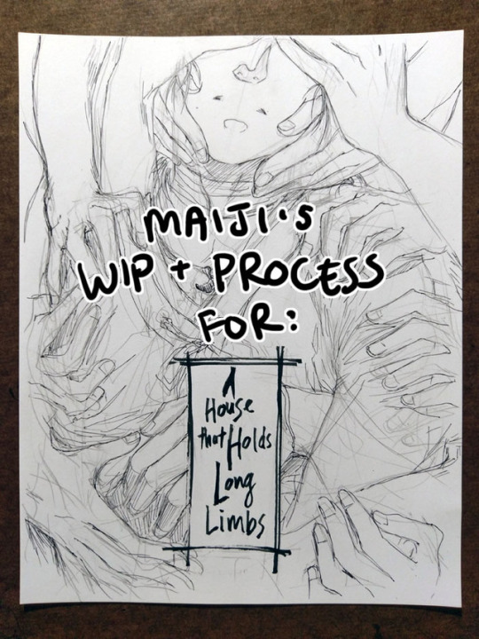
Process and wip images for A House That Holds Long Limbs
You can read the pages for part 1 here (full complete version will be linked from YYH North Bound master post whenever it’s done.)
Every so often I get questions about how I work, and I also enjoy reading about how other creators make things, so perhaps this might be interesting and useful to somebody out there too. I’ve talked about my process before but never really documented and shared it WHILE working on a project, so here you can see some of my thinking and decision-making (and poor habits lol) a bit more immediately, alongside screenshots, photos and scans.
Very long, everything is below the cut, and apologies to people on mobile and anywhere else this goofs up.
One question I get a lot is “do you start with words or pictures when creating a comic?” I jump between both a lot. That said, I tend to lean more heavily on words when documenting ideas in the early stages of a project. This is because, for me:
Words pack a lot of punch in conveying detail quickly. They work better when I need to quickly communicate something extremely specific to future me. I’m a sloppy drawer, so my sketches tend to make future me squint and go, “What the hell was this supposed to be?!”
A great deal of my thinking and planning is done during crowded commutes. It’s more convenient to jot notes on my phone than to whip out my sketchbook and a pen.
(For a while I thought it’d be awesome to have some sort of app where I can type notes AND have an accompanying thumbnail sketch, and be able to drag them around or break them out into more or fewer pages. At one point years ago I thought about creating a custom app... but ultimately too lazy/busy and my current process works well enough. If anyone wants to take this idea and run with it, please feel free to do so and just let me know about it so I can try it haha.)
I usually start with a few lines summarizing the gist of the idea, enough that’s recognizable and I don’t forget the important things to build off from. From there, I start point-form outlining the stuff that needs to happen, structuring them into key scenes/parts. These scenes are not always fleshed out in order - I just add to them whenever I have ideas for that part.
Long Limbs, for example, had a progression like this:
Overall story idea: “horror story with rokurokubi, key plot point(s) happens, the end.” (There was a bit more detail than this, obviously, but we’re avoiding spoilers here.)
Initial description for Part 1 of the story: “Hokushin lured to go to somewhere. Separated from Raizen. HOW??????”
After letting it simmer for while, a solution: “Hokushin annoyed at Raizen. Opportunity for him to get away and go do his own thing.”
Gradually more detail: “Stranger invites him to go to this place to look into something/maybe has a paid job that needs to be done and Raizen is busy goofing off or whatever.”
Problem. I couldn’t resolve this chain of thought to my satisfaction. What kind of task/job can someone convince Hokushin to do on his own when he doesn’t know this person/it seems questionable? And how long will the conversation need to run to establish this as believable?
This was starting to get convoluted and I was getting annoyed because it was turning into a burden in being able to continue the story AND IT WASN’T EVEN THAT IMPORTANT. I decided to abandon this path of thinking, and left the entire story for a while.
Much later (like months?), I had an idea: “Mysterious person drops something, piques Hokushin’s curiosity.” Aha! Hokushin’s own initiative. Simple and plausible enough. HOORAY NO MORE THINKING. LET’S DRAW.
Then I realized, oh shoot, I need to figure out who this mysterious person is and what they dropped. More time passes. And so on… in between I’m always working on other things, so there’s no real creator’s block - at some point I start thinking about this comic again, and ideas work themselves out to some decent level of satisfaction and link together. Thanks subconscious!
Eventually, enough key scenes are fleshed out that I feel confident enough to turn this into a real thing. At present, for example, not all scenes in Long Limbs are totally worked out, but I’ve got enough that I ran ahead with Part 1.
Screenshot of the Google Docs notes/script for Part 1:
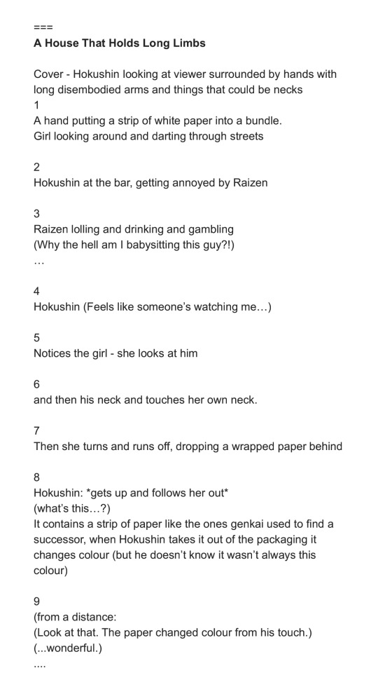
This is a close-to-final version. The === on top is just to separate this from notes on other stories or ideas. This is the beginning of the document, but this document actually includes many other notes and stories for North Bound. I delete them as I finish and post the pages. Every so often I wonder if I should bother keeping them, but they’ve been refined throughout the process and usually don’t bear much resemblance to the original jotted notes anymore. Long Limbs was originally planned to be a later story in North Bound, but I got especially excited about it and fleshed it out further than the others. When I reviewed the earlier stories, I didn’t think there’d be a big continuity or reader experience issue if this was finished and posted first. So I moved the messy notes for this story to the top of the document.
The page breakdown for the script is done by me generally picturing in my head how I might want the scene to go and how much action I might be able to fit on the page for good effect. I’ll sometimes start paginating without thumbnails, and sometimes will do both side by side (thumbnail and update pagination in tandem).
As you might imagine, pagination frequently changes. For example, you’ll see the script above is 9 pages instead of 10.
The original script for this section was broken up into maybe 4-6 pages, with 5-7 being more condensed.
When I started thumbnailing, I found it felt too cluttered and moved too fast.
So I stretched out the part of Hokushin and the mystery girl exchanging glances, and added pages to be able to create a (hopefully) more cinematic feel and really focus on the reason they catch each other’s eye - the bandages on their necks.
I then went back to the Google Doc and updated the script to line it up better.
I was also tweaking the dialogue at the same time and didn’t want to forget any key phrasing I liked. Dialogue is another thing I get really hung up over, often changing words up to the last second. (Sometimes this is because I messed up the size of the speech bubble, if I’m lettering on the computer...)
Thumbnails:
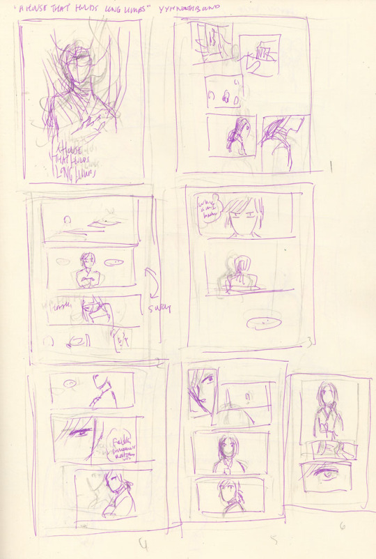
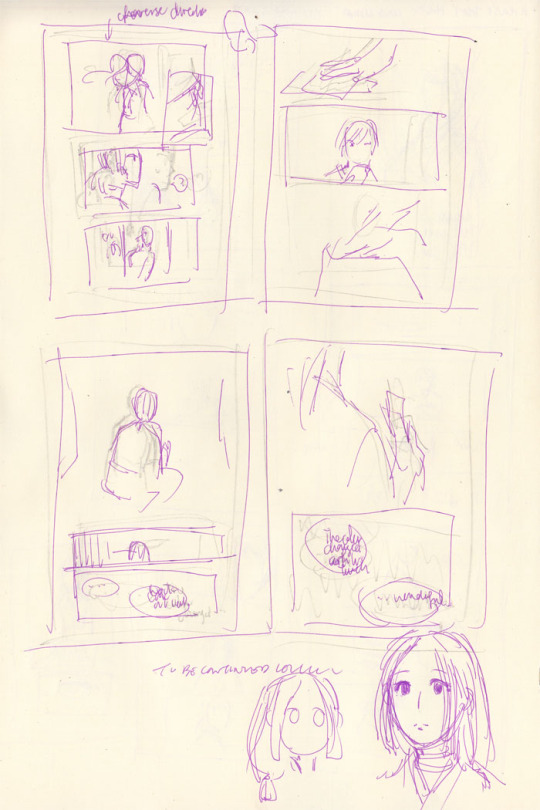
Pretty close to the final in this case - mainly because the sequence is pretty simple and straightforward and not many people are involved. I keep my thumbnails very crappy and rough so that I don’t get upset later when I can’t redraw something as good as the thumbnail. Bottom right was a quick attempt at designing the mystery girl.
Once I think the thumbnails are good enough - translation: I get impatient and just want to start drawing - I proceed to pencils for the actual page.
Throughout all this, I’m repeatedly reviewing script and thumbnail and playing sequences out in my head and then trying to figure out how to better direct the “camera” and the action. I may go back to the script and the thumbnails even as I’m finetuning the actual page if I encounter issues. You can see in both the script and the thumbnails that there are still deviations in the dialogue and the art from the final. Here are a few examples:
Page 3: The panels were originally 1) the setting, 2) Hokushin with his arms folded, 3) Raizen laughing, 4) we see that Hokushin is watching Raizen. After reviewing the thumbnail, I felt it’d be a better setup to flow into the scene if I switched panels 2 and 3. That’s closer to how you’d experience it in real life, or how it might be directed in a shot sequence: you enter an area/place, you hear the sound of some guy’s loud laughter filling the air, then the camera zooms up to the annoyed expression of this one particular dude and you see he’s staring at the laughing guy. Moving from bigger ambience to smaller details around the room.
Page 7: The girl was originally turning in the other direction (hard to tell because I redrew it right on top of the original sketch lol). However, this meant all the directional action would be pointing to the right - Hokushin is facing the right, and when he leaves the bar he’s angling towards the right side of the page. Facing the direction that readers will read in gives a sense of driving the action forward, while facing the opposite direction provides a bit of a mental stop. (This is something from Scott McCloud that always stuck with me.) So, I flipped the girl around.
Page 8: Script has Hokushin going “What’s this?”. When thumbnailing, I thought, “obviously it’s self-evident he’s wondering what this is when he picks it up”. It added nothing to the panel, and the speech or thought bubble would have interrupted the smooth action of him picking up the paper. So, axed.
The damn friggin’ bar and gambling: You’ll see the script mention this, and at one point I actually had the guy standing across from Raizen saying “Is this guy drunk?” I’m actually not sure if they’re in a bar or if Raizen is drinking, but neither were important to the actual story because I just needed Raizen and Hokushin to be in a place where Raizen could hang out with humans and be stupid. So I dropped these details. This is mainly because I ran into historical research problems about bars and alcohol during the Kamakura period (more on that near the end of this post), and this was the only way to stop myself from getting hung up on trying to make it “perfect” and “correct” and just get it done.
Drawing the actual pages. This part is fun!
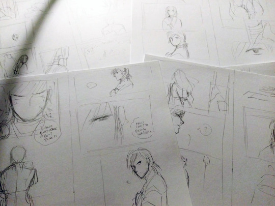
Inking the actual pages. THIS PART IS NOT FUN :(
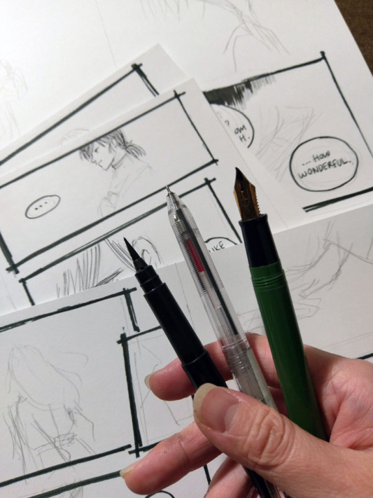
I don’t have very steady hands and I get very anxious about messing things up, so inking always takes me the longest. (I also get distracted easily, e.g., ink two lines and then surf tumblr for ten minutes lol). I’ve improved a lot since I started drawing comics much more frequently a couple years ago, and my choice of tools and style has helped a lot (I lean to variable lines and sketchy style, which is more forgiving than, say, a very precise art style with fixed-width pens) but I still get nervous at this stage.
I’m very lazy so I usually stick with one tool for inking. For Long Limbs I tried to effort more and actually used three. Right to left: Sailor fude de mannen for panel borders and text, Muji pen for artwork (0.4 because that was the only size available at the store when I went to get my refill), Pentel pocket brush for filling in blacks. I refill the fude de mannen and the pocket brush with fountain pen inks.
I usually ink panel borders first, then speech bubbles, then everything else. I hop all over the place and pages are generally in varying stages of completion. I also sometimes add in some more text lines because it seems like a good idea at the time - Hokushin’s complaint on page 3 about how he should have left Raizen when he got into a fight with a fish-seller in a previous story, for example. Sometimes these work, sometimes I regret it later and edit it on the computer.
Cover thumbnails and pencil sketch:
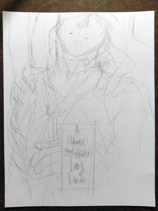
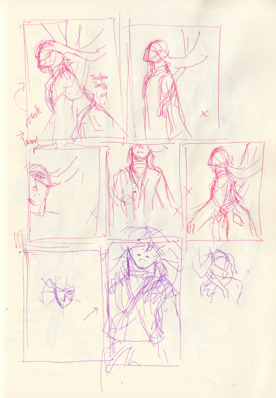
The one in the page thumbnails was the original idea, but then I thought, “seems kinda cliched. Can I get a more interesting angle where he’s not looking straight at the viewer?” (OK, his eyes are covered, but you know what I mean.) I quickly tried a few other angles and compositions, didn’t like them and ended up going with pretty much the original idea, but more zoomed in.
In the thumbnails, you can see all my little x’s indicating “ehhhh I don’t like this”. I wanted something with a particular mood/atmosphere especially with all the hands and arms, and I was conflicted between zooming out (for more environment and more arms, and the focus on the “long limbs” part of the title) or having a tighter, more close up shot. Ultimately I think the latter works better as it conveys a sense of claustrophobia, and it’s more intimate which supports the idea of psychological horror. ALSO IT’S SEXY (maybe???). The end.
Other random thoughts:
I took a lot of heart/inspiration/motivation from Togashi’s last few volumes of Yu Yu Hakusho to keep the backgrounds as lazy - I mean sparse - as possible and also speech bubbles over plain backgrounds lmao. I think it takes a lot of confidence (or maybe laziness) to be so minimalist and restrained, and it’s an impressive and economical way of working. I was always impressed that when reading those pages of his for the first time, the lack of detail never really bothered me - you had everything you needed for your brain to comfortably fill in the gaps and complete the sense of narrative and story progression, and there are still visual flourishes when the situation calls for it. So I’m trying to bring a bit of that tighter philosophy in.
Research. I struggle a LOT with not getting bogged down by details, especially when it’s something “just” for fun or “just” a fancomic. I have very lovely and helpful friends and family who every so often patiently allow me to whine and bounce things off of them, help me look things up, and/or tell me when I’m getting myopic about stuff. For all the North Bound comics, finding quick and useful historical references for the time period has been a challenge. There’s a ton about aristocracy and warriors but very little about the ordinary/common people, not surprisingly. I frequently question my instincts about what makes sense because I tend to automatically draw on similar/equivalent Chinese culture (there was certainly lots of cross-over, but not always appropriate/relevant) or Edo period references (wrong time frame! Too far in the future). I often end up losing a ton of time trying to find something with roundabout searches, and then give up and look at other comics I have close enough to the time period. And then referencing those and compounding whatever historical errors they have in them. (e.g., “Well if it was good enough for Osamu Tezuka’s Phoenix it’s good enough for this rando fancomic!”) I just would like historical/subject matter experts to know I did try...
#yu yu hakusho#comics#hokushin#raizen#fanart#process#wip#art by Maiji/Mary Huang#sketches#art supplies#yyh north bound
9 notes
·
View notes
Text
How We Topped Product Hunt (Overnight)
Nothing summons the old imposter syndrome monster quite like the moments before a big project launch. All at once, you begin to question every decision you’ve made along the way — from the name of the project down to the comma placements.
For me, these nervous feelings are still fresh. Back in August, my team and I released a totally revamped version of our buyer persona tool, Make My Persona.
We’d been hard at work on the project for months and were all in agreement that it’d shaped up to be something uniquely valuable — something different than we’d worked on before. Nonetheless, I proceeded with caution as I began green lighting the promotion plans we’d put together.
Email? Check. Social media? Check. Blog post? Check.
The feedback started to roll in almost instantly … and it was positive.
Users loved the tool. And that’s when I knew it was time to spread the word a little further. So I pulled up Product Hunt, spun up the tool details, and set it free for the community to have at it. I gave the listing a courtesy upvote from myself and closed my laptop. It has been a long few months — and even a longer few days.
What happened next? Something special.
Make My Persona: The #1 Product of the Day
The great thing about having team members in Dublin is that they are up and at it hours before we’ve had our coffee here at HubSpot headquarters in Cambridge, MA. This means I often wake up to surprises from the designers and developers I work with — from updated wireframes to development progress to reimagined solutions for project blockers.
Though, I can confidently say that the Friday morning after our launch brought about my favorite surprise yet: A Slack message from my colleague claiming that Make My Persona had been featured as the #1 “Product of the Day” on Product Hunt.
I rushed to the site to confirm and was delighted to see that my single upvote had grown into nearly 200 upvotes overnight. We were topping the charts and new upvotes were being tacked on by the minute.
In an attempt to understand exactly how we landed ourselves in this situation, I started reading articles from other teams that had seen success on Product Hunt. From what I could gather, this wasn’t something that was supposed to happen by accident. People had calculated plans. They’d researched the best time and date for launching. They’d done their homework.
I’ll be the first to admit that I wasn’t as strategic about the launch as I could have been. I’d launched a couple of lead generation tools on Product Hunt in the past, but our strategy still needed refining. I was learning. Though, the listing did check a lot of the launch “best practices” suggested by Product Hunt:
We had a great explainer video heading up the gallery
An animated thumbnail
Quality screenshots of the tool’s experience
A clear and concise description
Links from features around the web
But I also missed a lot of opportunities:
I hunted the tool myself
I didn’t have all of our Makers in order before launching
I failed to have one of the Makers post a comment to invite feedback
I didn’t arrange any reviews
I asked no one to upvote it — in fact, I didn’t even tell anyone I’d posted it yet
Suddenly, I could feel the imposter syndrome monster bubbling up again. Did we deserve this recognition? Was this a mistake?
I silenced that internal dialogue quickly. Of course we deserved this. This tool was unique, helpful, and visually stunning. I was proud of it for a lot of different reasons, so I decided to focus on that instead. And after tracing back the steps we’d taken to get here, it became clear why we’d been so successful. Allow me to explain …
The Hidden Success Ingredient: Over-Investing in the User Experience
We had a kickoff for the project back in May where we drew up this list of improvements we wanted to make to the existing tool:
Offer a solution for everyone Reduce friction in the conversion process
Make the experience more engaging
Encourage collaboration and customization
Make the avatars more diverse to better represent all people
We referred to this bulleted list as our “rebuild objectives” and they all had one thing in common: they solved for the user. That was the hidden success ingredient. It suddenly felt so obvious. People were upvoting this tool because it was simple and engaging and entirely free. We over-invested in making it the best it could be for the end user and it was starting to show.
Here’s how each of those rebuild objectives shook out within the tool itself:
Offering a solution for everyone.
Make My Persona was a tool that we launched several years ago and made the decision to update this year. When we took a look at the tool’s organic performance, we found it was ranking for a variety of buyer persona-related terms — from “what is a persona” to “buyer persona templates.” To ensure we met the needs of everyone that discovered the tool, regardless of their intent, we split the tool into two parts:
Path #1: This conversion path was designed to help those who were just getting started with personas. Here we provided a brief intro to what a persona is, followed by a beginner’s guide to walk them through how to conduct persona research. Path #2: This was the main conversion path that walked visitors through the creation of an actual persona. Visitors that chose this path would have already completed their persona research and be ready to document it.
Reducing friction in the conversion process.
Persona creation requires a lot of information. And in most cases, the more detail you can provide – the better. With that in mind, we set out to balance the need for context with the even greater need for a simplified user flow.
To do that, we combined similar questions to form seven steps. In each step, we incorporated sliders and dropdown menus to help users input information faster, with less typing.
We also introduced a CTA that allows a user to skip the step-by-step process entirely and head straight to the editable template for an all-in-one view.
As a result, the new version of the gives users the freedom and flexibility to input information and work through the creation process on their terms, without restrictions or roadblocks.
Making the experience more engaging.
There are a ton of lovable “micro-moments” throughout the tool that are intended to make the experience more engaging – and more human.
For example, your avatar reacts to your inputs in the walkthrough mode (giving a thumbs up, winking, etc.) and confetti falls from the screen to help you celebrate when you complete your persona.
All of these gamified elements create an experience that is fun for the user, encouraging them to continue through to the next step.
Encouraging collaboration and customization.
Buyer persona creation isn’t always a one person job. And persona documents are not one size fits all. With these two things in mind, we introduced shareable links that users can send along to their colleagues to make edits to the persona and collaborate on the positioning.
This shareable link creates a copy of the master persona to ensure nothing gets deleted, while still providing the flexibility for others to rework the persona data.
To provide greater control over the actual look and feel of the document, we made the persona editor full customizable: users can drag, drop, resize, and reorder the modules to ensure the information that’s most important to them is front and center. They can also adjust the color scheme to align with their branding.
Making the avatars more diverse to better represent all people.
The stock photo selection within the old tool was not a good look. There was only one-person of color represented – and an uneven amount of men and women.
In the 2018 version, we made the conscious decision to remove gender from the equation by introducing avatars that represent people – plain and simple. We also aimed to include a variety of skin tones, hair types, and age identifiers. While these were small acts of inclusion, they went a long way in terms of ensuring that everyone felt represented.
The Results: What Happens When You Top Product Hunt
At this point, you’re probably ready for me to skip ahead to the numbers. What impact does getting featured in the #1 slot have on the performance of your project?
Well, the Product Hunt win helped to shape our numbers in a few different ways:
Our upvotes skyrocketed. Being featured on the Product Hunt homepage = visibility. As a result, we ended the day we got featured with 600+ upvotes, though that number continued to grow over the next few days as we remained on the homepage. We also saw a second wave of upvotes from an inclusion in the daily digest email that followed. As it stands, the tool has 1.3K+ upvotes, making it the most successful HubSpot Product Hunt launch in history.
We saw a big increase in traffic. All said and done, we generated roughly 10K views from Product Hunt. Again, these numbers climbed steadily days after being featured thanks to continued homepage visibility and subsequent emails. We also saw an uptick in traffic from social media, as the listing spawned a lot of love on Twitter, LinkedIn, and Facebook.
We generated some leads. While the conversion rate from the traffic was nothing to write home about, we did pull in some leads from Product Hunt. Note: Because these people likely stumbled upon the tool on the homepage without searching for any terms, there’s no guarantee they actually have a need for it. We’re keeping this in mind as we evaluate the quality of those leads and expect that those who find us through a deliberate search in the future will have more intent.
We got a lot of shout outs. As I mentioned before, the uptick in traffic from the feature earned us recognition via the Product Hunt email and on social media. But there were a few other unexpected surprises. For example, the tool was also picked up by InVision’s design inspiration extension, Muz.li. This extension curates content from hundreds of sources, including Product Hunt, which is where I suspect we got on its radar. This brought in another 7K+ views.
Setting the Flywheel in Motion
If you think about these wins in relation to the flywheel, it all adds up.
By investing in the delight stage — the overall user experience of the tool — we were able to build enough momentum to set the rest of the flywheel in motion.
Delighted users shared and upvoted the tool
↓
Those shares and upvotes helped us attract a larger audience
↓
Drawing in a larger audience gave us more people to engage and convert
So while we enjoyed basking in the our fifteen minutes of Product Hunt fame, we’re excited to watch this tool continue to build momentum. If you haven’t already checked out it out, you can give it a spin here.
Read more: blog.hubspot.com
The post How We Topped Product Hunt (Overnight) appeared first on Content HOW.
0 notes
Text
How We Topped Product Hunt (Overnight)
Nothing summons the old imposter syndrome monster quite like the moments before a big project launch. All at once, you begin to question every decision you’ve made along the way — from the name of the project down to the comma placements.
For me, these nervous feelings are still fresh. Back in August, my team and I released a totally revamped version of our buyer persona tool, Make My Persona.
We’d been hard at work on the project for months and were all in agreement that it’d shaped up to be something uniquely valuable — something different than we’d worked on before. Nonetheless, I proceeded with caution as I began green lighting the promotion plans we’d put together.
Email? Check. Social media? Check. Blog post? Check.
The feedback started to roll in almost instantly … and it was positive.
Users loved the tool. And that’s when I knew it was time to spread the word a little further. So I pulled up Product Hunt, spun up the tool details, and set it free for the community to have at it. I gave the listing a courtesy upvote from myself and closed my laptop. It has been a long few months — and even a longer few days.
What happened next? Something special.
Make My Persona: The #1 Product of the Day
The great thing about having team members in Dublin is that they are up and at it hours before we’ve had our coffee here at HubSpot headquarters in Cambridge, MA. This means I often wake up to surprises from the designers and developers I work with — from updated wireframes to development progress to reimagined solutions for project blockers.
Though, I can confidently say that the Friday morning after our launch brought about my favorite surprise yet: A Slack message from my colleague claiming that Make My Persona had been featured as the #1 "Product of the Day" on Product Hunt.
I rushed to the site to confirm and was delighted to see that my single upvote had grown into nearly 200 upvotes overnight. We were topping the charts and new upvotes were being tacked on by the minute.
In an attempt to understand exactly how we landed ourselves in this situation, I started reading articles from other teams that had seen success on Product Hunt. From what I could gather, this wasn’t something that was supposed to happen by accident. People had calculated plans. They’d researched the best time and date for launching. They’d done their homework.
I’ll be the first to admit that I wasn't as strategic about the launch as I could have been. I’d launched a couple of lead generation tools on Product Hunt in the past, but our strategy still needed refining. I was learning. Though, the listing did check a lot of the launch “best practices” suggested by Product Hunt:
We had a great explainer video heading up the gallery
An animated thumbnail
Quality screenshots of the tool’s experience
A clear and concise description
Links from features around the web
But I also missed a lot of opportunities:
I hunted the tool myself
I didn’t have all of our Makers in order before launching
I failed to have one of the Makers post a comment to invite feedback
I didn’t arrange any reviews
I asked no one to upvote it — in fact, I didn’t even tell anyone I’d posted it yet
Suddenly, I could feel the imposter syndrome monster bubbling up again. Did we deserve this recognition? Was this a mistake?
I silenced that internal dialogue quickly. Of course we deserved this. This tool was unique, helpful, and visually stunning. I was proud of it for a lot of different reasons, so I decided to focus on that instead. And after tracing back the steps we’d taken to get here, it became clear why we’d been so successful. Allow me to explain ...
The Hidden Success Ingredient: Over-Investing in the User Experience
We had a kickoff for the project back in May where we drew up this list of improvements we wanted to make to the existing tool:
Offer a solution for everyone
Reduce friction in the conversion process
Make the experience more engaging
Encourage collaboration and customization
Make the avatars more diverse to better represent all people
We referred to this bulleted list as our “rebuild objectives” and they all had one thing in common: they solved for the user. That was the hidden success ingredient. It suddenly felt so obvious. People were upvoting this tool because it was simple and engaging and entirely free. We over-invested in making it the best it could be for the end user and it was starting to show.
Here’s how each of those rebuild objectives shook out within the tool itself:
Offering a solution for everyone.
Make My Persona was a tool that we launched several years ago and made the decision to update this year. When we took a look at the tool's organic performance, we found it was ranking for a variety of buyer persona-related terms -- from "what is a persona" to "buyer persona templates." To ensure we met the needs of everyone that discovered the tool, regardless of their intent, we split the tool into two parts:
Path #1: This conversion path was designed to help those who were just getting started with personas. Here we provided a brief intro to what a persona is, followed by a beginner's guide to walk them through how to conduct persona research.
Path #2: This was the main conversion path that walked visitors through the creation of an actual persona. Visitors that chose this path would have already completed their persona research and be ready to document it.
Reducing friction in the conversion process.
Persona creation requires a lot of information. And in most cases, the more detail you can provide – the better. With that in mind, we set out to balance the need for context with the even greater need for a simplified user flow.
To do that, we combined similar questions to form seven steps. In each step, we incorporated sliders and dropdown menus to help users input information faster, with less typing.
We also introduced a CTA that allows a user to skip the step-by-step process entirely and head straight to the editable template for an all-in-one view.
As a result, the new version of the gives users the freedom and flexibility to input information and work through the creation process on their terms, without restrictions or roadblocks.
Making the experience more engaging.
There are a ton of lovable "micro-moments" throughout the tool that are intended to make the experience more engaging – and more human.
For example, your avatar reacts to your inputs in the walkthrough mode (giving a thumbs up, winking, etc.) and confetti falls from the screen to help you celebrate when you complete your persona.
All of these gamified elements create an experience that is fun for the user, encouraging them to continue through to the next step.
Encouraging collaboration and customization.
Buyer persona creation isn't always a one person job. And persona documents are not one size fits all. With these two things in mind, we introduced shareable links that users can send along to their colleagues to make edits to the persona and collaborate on the positioning.
This shareable link creates a copy of the master persona to ensure nothing gets deleted, while still providing the flexibility for others to rework the persona data.
To provide greater control over the actual look and feel of the document, we made the persona editor full customizable: users can drag, drop, resize, and reorder the modules to ensure the information that's most important to them is front and center. They can also adjust the color scheme to align with their branding.
Making the avatars more diverse to better represent all people.
The stock photo selection within the old tool was not a good look. There was only one-person of color represented – and an uneven amount of men and women.
In the 2018 version, we made the conscious decision to remove gender from the equation by introducing avatars that represent people – plain and simple. We also aimed to include a variety of skin tones, hair types, and age identifiers. While these were small acts of inclusion, they went a long way in terms of ensuring that everyone felt represented.
The Results: What Happens When You Top Product Hunt
At this point, you’re probably ready for me to skip ahead to the numbers. What impact does getting featured in the #1 slot have on the performance of your project?
Well, the Product Hunt win helped to shape our numbers in a few different ways:
Our upvotes skyrocketed. Being featured on the Product Hunt homepage = visibility. As a result, we ended the day we got featured with 600+ upvotes, though that number continued to grow over the next few days as we remained on the homepage. We also saw a second wave of upvotes from an inclusion in the daily digest email that followed. As it stands, the tool has 1.3K+ upvotes, making it the most successful HubSpot Product Hunt launch in history.
We saw a big increase in traffic. All said and done, we generated roughly 10K views from Product Hunt. Again, these numbers climbed steadily days after being featured thanks to continued homepage visibility and subsequent emails. We also saw an uptick in traffic from social media, as the listing spawned a lot of love on Twitter, LinkedIn, and Facebook.
We generated some leads. While the conversion rate from the traffic was nothing to write home about, we did pull in some leads from Product Hunt. Note: Because these people likely stumbled upon the tool on the homepage without searching for any terms, there’s no guarantee they actually have a need for it. We're keeping this in mind as we evaluate the quality of those leads and expect that those who find us through a deliberate search in the future will have more intent.
We got a lot of shout outs. As I mentioned before, the uptick in traffic from the feature earned us recognition via the Product Hunt email and on social media. But there were a few other unexpected surprises. For example, the tool was also picked up by InVision’s design inspiration extension, Muz.li. This extension curates content from hundreds of sources, including Product Hunt, which is where I suspect we got on its radar. This brought in another 7K+ views.
Setting the Flywheel in Motion
If you think about these wins in relation to the flywheel, it all adds up.
By investing in the delight stage — the overall user experience of the tool — we were able to build enough momentum to set the rest of the flywheel in motion.
Delighted users shared and upvoted the tool
↓
Those shares and upvotes helped us attract a larger audience
↓
Drawing in a larger audience gave us more people to engage and convert
So while we enjoyed basking in the our fifteen minutes of Product Hunt fame, we're excited to watch this tool continue to build momentum. If you haven't already checked out it out, you can give it a spin here.
0 notes