#i got too busy to post
Explore tagged Tumblr posts
Text
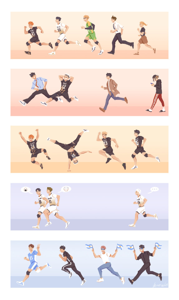
bookmark designs i did for kaicon!!! planning to add inarizaki and shiratorizawa next yr hehe
#haikyuu#haikyuu!!#karasuno#nekoma#fukurodani#msby black jackal#schweiden adlers#seijou#aoba johsai#fanart#IVE BEEN. WAY TOO BUSY LATELY#but the con went rly well!!! :')) altho i was super stressed on the first day akjsfk#keen to do more next yr!!!#ill make a proper post later but 👀 we got into melb kaicon
5K notes
·
View notes
Text


FORGETTABLE-AU (page 82-85)
THAT LAZYBONES!!
[BEGINNING] [PREVIOUS] [CONTINUE]
#So sorry it took me almost 2 weeks to post these#I was busy irl but ALSO I had too much fun doing extra art and forgot to work on these for like 3 days lmao#NOW THIS TIME I DO HAVE SOME THING TO SAY#YAY RIVERPERSON! SO MANY PEOPLE GUESSED CORRECTLY!#It wasn't that hard#We know Papyrus knows the river person#are they friends? idk BUT I PERSONALLY THINK THEY ARE#I just LOVEEE looking at the dialogue and making connections#I referenced one of the lines from the river person here...sometimes they'll ask you if you know any game you can play with a dog...#They said they were “asking for a friend...”#And I couldn't help but think about Papyrus' problem with the annoying dog LMAO#+ Papyrus seems very excited to know if the river person is there when you call him nearby that area#Okay so... now ...some comic thing that I made up but also didn't...#��FLOWEY DOESN'T KNOW WHO THE RIVER PERSON IS?”#okay so...#I feel like#It's not very common for them to be there...#When talking with Undyne around that area it's kind of *unclear* if she knows about the river person being there....#She tells you about the river connecting different areas and that you should “jump in”#She then clarifies that's the only thing they got for public transport#AND LIKE? It's unclear if she's telling you to jump in the boat (OR IF SHE KNOWS THERE'S SOMEONE WITH A BOAT) or is she's literally telling#you to jump in the river?????#Anyways...so...that's that#HEHE Flowey and Papyrus finally arrived at the house! WOHOO#Sans is too lazy to bring his old stuff to the surface! (or does he still think he'll end up back in the underground eventually?)#undertale#undertale comic#forgettable-au-comic#papyrus#flowey
1K notes
·
View notes
Text
What a terribly dull ending this is.

#a lil manga redraw I did quite some time ago#sebaciel#kuroshitsuji#black butler#ciel phantomhive#sebastian michaelis#my art#redraw#sorry for not posting for so long again life's been kinda crazy on me last couple months#for good and for worse ig#good news is I may be opening commissions soon💋#bad news I (got) dropped out of university🥀#can't say I hadn't seen it coming#just need to keep myself busy with something but can't find it in myself to look for an ACTUAL job outside of freelance for now...#too scary...
2K notes
·
View notes
Text


"smaller mass" you say
#she was punted first. the implications of nori still being in the pit when uzi comes down later#long post#i think. does it count if theres a lot of images and they are long#too lazy to draw 4 more lazy backgrounds so just pretend they're falling#or a second cyn. im losing my touch#struggled so hard to draw her.stupid people proportions kinda#go read ad astra per aspera its so good im munching#no like genuinely i love it so much its what got me thinking about this post#not dead just too busy reading ao3 twenty four seven to actually draw anything#art#murder drones#murder drones nori#murder drones cori#i think cori is a really funny name#murder drones cyn#murder drones flesha#cw blood and gore#thanks tumblr user digitalcatastrophes#if only i knew how to animate. not trying my old method again
2K notes
·
View notes
Note
The cut they did with the latest chapter...Malleus was straight up a HORROR VILLAIN IN THE BEST AND MOST TERRIFYING WAY EVER.
"You're 'awake', aren't you, Shroud?" CHILLS LITERAL CHILLS
now, let's be fair to Malleus, he started out very politely! a dainty little knock on Idia's door. graciously allow a couple of minutes to give him a chance to realize that his rebellion is futile and all shall succumb in the end. then, when that doesn't work, a firmer but still unquestionably mannerly knock. then just straight-up haunting his shit
honestly, there was a surprising amount of Twst trying out just a little bit of horror movie in this one! like. you're having a nice cup of tea one minute and then it turns into Alice in Wonderland Does The Cube. everything's red for some reason. your friend's mom is actually a mass of giant shrieking arms rising from the depths to drown you in an ocean of chamomile. this is all a precursor to being hunted as the most dangerous game throughout a labyrinth by dopplegangers of your best friends. what's going on, Twst. are you okay.


#art#twisted wonderland#twisted wonderland spoilers#twisted wonderland episode 7 spoilers#twisted wonderland book 7 spoilers#twisted wonderland episode 7 part 12 spoilers#twisted wonderland book 7 part 12 spoilers#...this felt less tangential before i went to actually post it#my brain is all over the place right now i apologize#did very much appreciate how we cut from malleus' still quite polite knocking#and then when we finally cut back a few hours later idia still hasn't answered his door and the room is just SHAKING#malleus probably thinks he's still showing remarkable patience given the situation#anyway i do apologize for this again. for some reason silver going I PLAY THE OCARINA was ridiculously funny to me and i want it everywhere#i think just because we had an incredible superband for about thirty seconds there#i'm so sad we never got to hear any of them#just imagine it#like...okay we do know cater knows how to play guitar#(the light music club tends to be portrayed as more 'enthusiastic' than 'good' but to be fair that's probably mostly lilia's fault)#and then riddle on vocals and che'nya on bass#having not actually experienced any of their playing the actual quality of which is anyone's guess#meanwhile adeuce are doing interpretative dance over in the corner#ortho is delightedly pressing buttons on a soundboard with no regard as to audio harmony#sebek is sawing away at a violin with immense gusto and absolutely zero skill#and in the back there's silver just dead-facedly piping away on his ocarina like the weird little forest nymph he is#why no i still haven't gotten any sleep. too busy thinking about how much i really want deuce to actually ask riddle about his pet dog.#i want this to be the new running joke that deuce never figures out
1K notes
·
View notes
Text
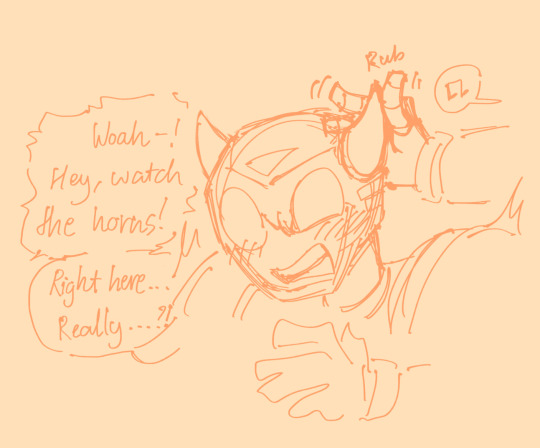
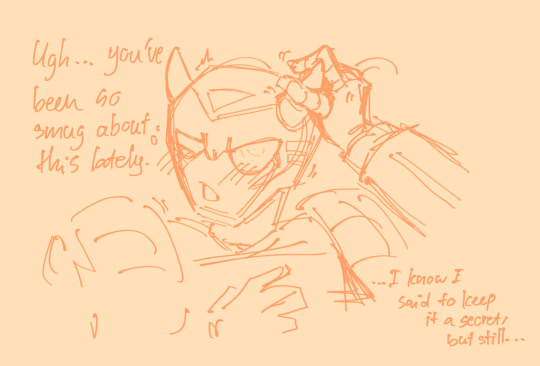
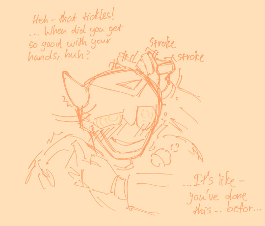
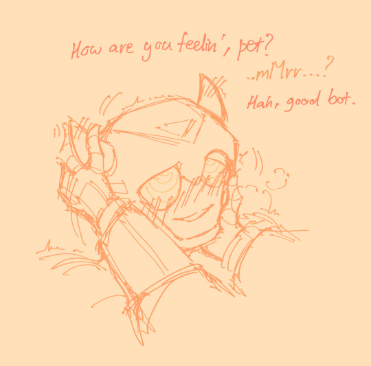
Tfa Bee conditioned into a trance whenever his horns get stimulate? 👀👀
Rewatched Tfa lately and god i did not remember bee being that annoying (lovingly), but hes also very cute so i want to draw him more :)
#transformers#maccadam#bumblebee#tfa bumblebee#tf animated#hypnosis#suggestive#petpl4y#its like one word but eh#sorry for not posting much its been a busy month for me sighh#valveplug#this is also suppose to be prowlbee btw#i just got too lazy to look for prowls#hand refs#prowlbee
479 notes
·
View notes
Text
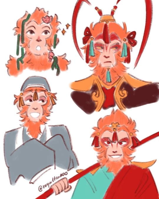
[stress relief doodle] just wanted to let you guys know that he’s always had those stupid tassels dw
#this is also me doing concept sketches for what my qitian dasheng design will look like#having trouble with designing the armor bit o(-(#journey to the west#jttw sun wukong#sun wukong#monkey king#digital art#my art#sorry I’ve only been posting only quick doodles I’m very busy with finals#but I’ve only got two weeks ish left then I’m home free!!!#graduated!!!!!!#but these two weeks will be the worse of my life work wise#gearin up for that#save me monkey king…save me….monkey..#I love those stupid fucking dangly tassels#they’re the best feature I’ve thought up for him like they suit him so well somehow#showy but understated ya know? not too flamboyant but gives a hint of former grandeur ✨
554 notes
·
View notes
Text
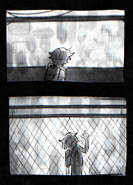
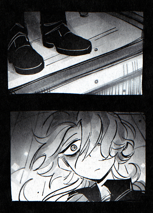
#messyr#artists on tumblr#vent post#vent art#tw sui ideation#being busy keeps me distracted as f from these behaviors and thoughts;#keeping distracted bc idfk how to get rid of the urges from intrusive and harmful thoughts#every scenario is just like: hey we can try attempting again today maybe we'll succeed this time!!!#then i'll be rational (focusing on the present) and go : nah cant bro we busy#got clients. gotta graduate. got people to take care of. got people waiting blah blah blah#the endless list where i never catch a break and maybe I've grown used to it.#i yearn death but i don't take its offer. I can't really leave. Not yet. not when there's still too much to do.
557 notes
·
View notes
Note
AUGH I’d love to see more time looping odile if possible,,,,, how do you think she’d like; “devolve” over each of the acts as compared to Siffrin over time :O
ok im gonna be honest i did like portrait edits months ago and just never finished them. so here you go
act 3:


act 5:


#some of them are still missing... I'll edit this post if I finish them as well#isat#isat spoilers#odile loops au#day 108#isat odile#i'm too lazy to individually export them in transparent atm...#tell me if yall ever need it#edit: I FORGOT TO ANSWER THE QUESTION#I mean yeah technically the portraits work but I do have Thoughts about this#I just think that throughout the loops odile becomes more. annoyed. and irritated#Like by act 3 fighting isn't really amusing anymore#dying/getting frozen is. ah. welp#But by act 5 she's just speedrunning#Just super irritated. like die already i've got variables to test#act 3 frozen is a momentary rest; the break is nice and she knows she can get back next loop; it's fine. act 5 is ugh seriously#tired. annoyed. unamused. what a waste of time#anyways wait how long has it been since I posted#(sees date of last post) OH. um#sorry guys I've been busy job (internship) hunting#will I post more from now on? No promises <3#Thank you for sticking around nontheless... I appreciate all the stuff yall send in my inbox <3#isat au
618 notes
·
View notes
Text
Oh no he’s fuzzy
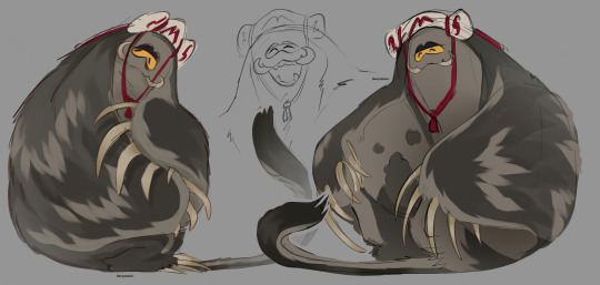
#and he’ll cuddle#and rip flesh apart too#art#fanart#my art#original art#Splatoon#Splatoon 3#Splatoon fanart#splatoon art#Splatoon fan art#Splatoon big man#big man Splatoon#big man#big man fanart#splatoon big man fanart#mantaro#apparently I lied. yes I will continue posting because if I’m being honest it’s what I do all the time. not even my homework#and while I am still busy working on commissions even if it doesn’t look like because of how long I take- I still have like#nighttime and some breaks to still draw stuff to post. and yeah I mean I draw quickly when I’ve got good ideas#man I really have to stop procrastinating so bad#Splatoon fuzzy au#Splatoon au#fuzzy au#comfort au#original au#just now I realize I didn’t tag the Frye post with the fuzzy au smh
745 notes
·
View notes
Text
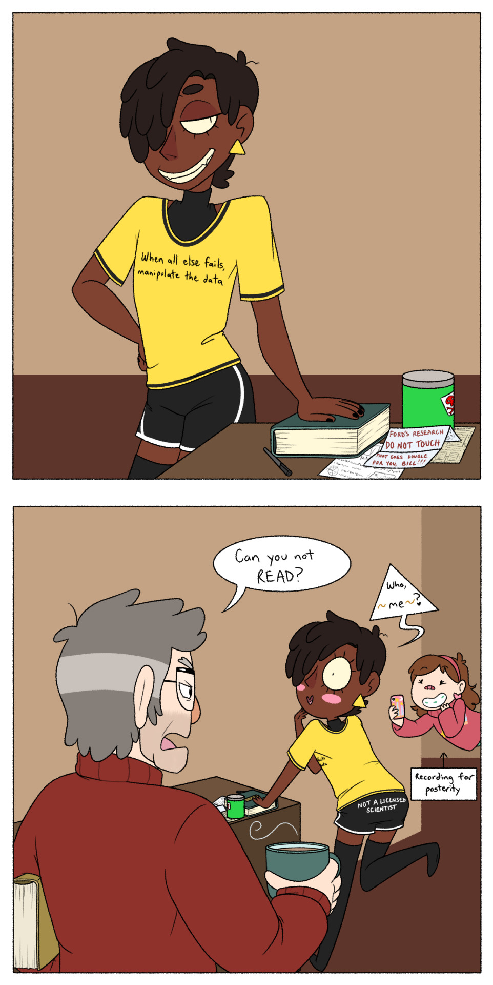
Saw this post and couldn't resist because,
1.) @tesscourtes' human!Bill is a lil cutie-patootie menace that I very badly wanted to draw, and,
2.) I have a - M I G H T Y - N E E D - for any version of human!Bill to find any way he possibly can to annoy Ford a whole lot :D
Also, 3.) I like to headcanon that Bill's knowledge in The Sciences is mostly limited to 'Ways I Can Make A Really Cool Doomsday Portal', and everything else he knows is just a slapdash mix of the stuff he remembers from whatever schooling he went through on Euclydia, a whole awful lot of lucky guesses (which he WILL gaslight you about if you tell him he's wrong), and - naturally - conning all the rest of the answers he needs out of any more educated saps who are unfortunate enough to be around him at the time (answers which he will then proceed to take credit for), so as far as I'm concerned, this "outfit" is perfect for him.
Ignore the shitty backgrounds, I am sick to death of doing backgrounds, I just want to draw goofy shenanigans, okay???
#fanart#billford#bill cipher#stanford pines#gravity falls#mabel pines#human bill cipher#my headcanon is not to say i don't think bill is smart. bill is clearly Very Smart. he just applies all his smarts to con artistry and evil#which - honestly? MOOD#tagging the ship because this particular AU is Decidedly Billford XD#i'd say 'their divorce is going so well' but i think they're too busy with doing ~other stuff~ to actually get divorced#if ya know what i mean - wink wink#i hope i drew him okay ahaha i tried my best but i am still crawling and scraping my way out of massive art burnout :‚)#and i gotta add - it is ROUGH transitioning from drawing furries to drawing regular humans again O-O;#prolly gonna draw this lil menace again with a few other human!bill designs i like all in one image :3c#for rn tho i have an equally mighty need to address a post joking about how bill is not allowed to swear and hates it#got a few perfect quotes from 'the good place' i can utilize with just that one little concept‚ lemme tell ya OuO
361 notes
·
View notes
Text
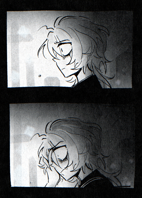
hi Sorry haven’t updated in so long lol life has been busy and a load of big changes took place
here’s low effort scribbles n doodles (in order from oldest to newest) all from the past several months


#the walten files#twf#susan woodings#the walten files susan#art#digital art#procreate#twf brian#twf fanart#twf sophie#twf Kevin#twf Linda#twf bon#the walten files fanart#sketch#nothing too detailed cuz busy and had to rebuild my skills over time and I was drained asf#guess who stopped being homeless and got a job and has money and stability now#ya literally 4 days after the last post I made here I got insanely lucky and got a chance to move into a large and lovely rented room#across a shopping center and everything#life is good#it’s been rocky getting used to the new environment#but I’m doing good overall#I’m fed and have exercise and the means to exercise my brain and social battery#yeah#blessed
218 notes
·
View notes
Text
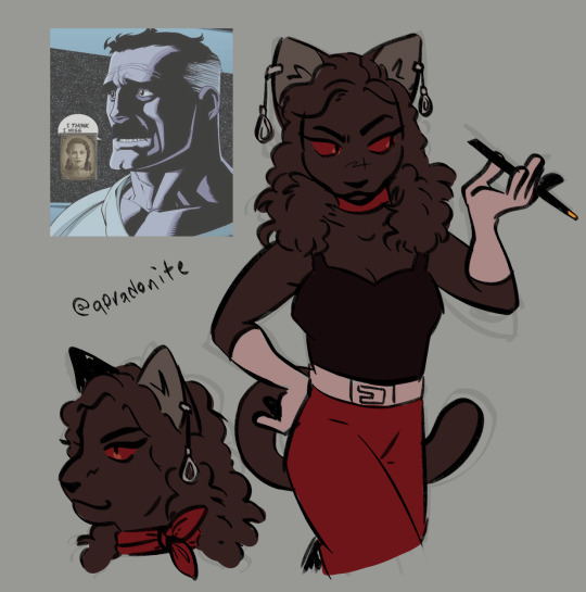
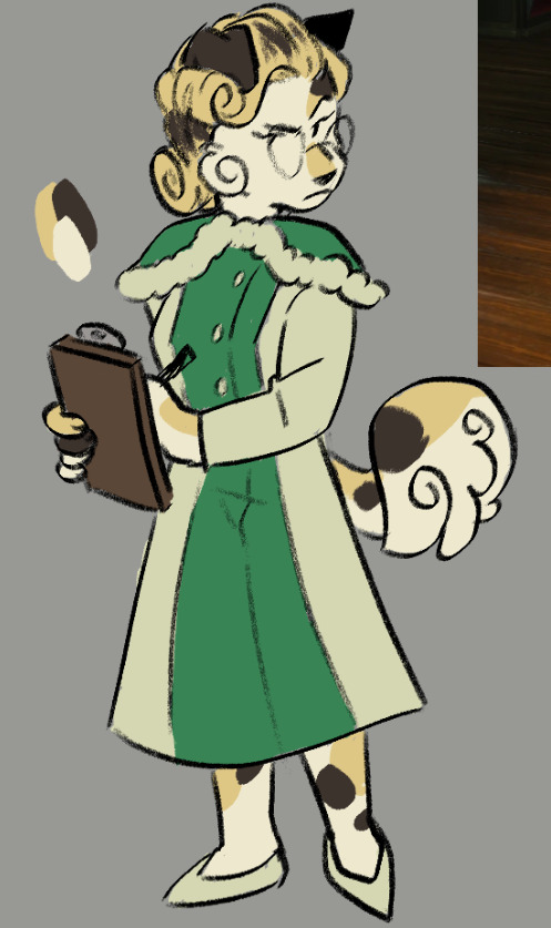


#im back! and busy with art for once :]#culpepper's eyes were originally gonna be orange but they felt so out of place so i picked the unrealistic but better fitting option#i wanna do a little something for her (and maybe julie too) when biofluff starts...i already got a jasmine illustration-#-in the works to post soon as well so i figured i'd bang these out so i can focus on those while giving people content to gnaw on#either way im planning on making the next biopaws batch big daddy/little sister focused so i can talk about worldbuilding teehee#bioshock#biopaws au#anna culpepper#julie langford#frank fontaine#brigid tenenbaum#fontbaum#digital art#artists on tumblr
267 notes
·
View notes
Note
I'm very new to joseimukes, what happens when they reach the conclusion of the main plot? Do they keep the game going with a main story - part 2 and events to wring out every cents out of the audience or do they close down the servers and that's the end of it?? I'm scared for my twst obsession's future
honestly, this is the first game of this kind that I've played that looks like it's actually going to reach the end of the story without getting cancelled midway through, so...I have no idea! :') my gut assumption is that there'll probably keep being events and reruns for a while, until it finally stops being profitable enough to justify itself and they end service. but I am also interested in the answer, if other people more familiar can give their experience!
#twisted wonderland#joseimuke games are serious business#afaik twst is still doing well amongst the target demo and probably will for a while yet#the manga's still on the third arc and we know we've got at least three seasons of anime incoming#so they've been laying the groundwork for post-main story stuff to keep the interest going#and beyond that...we'll find out i guess#honestly i don't play a lot of very story-heavy live service games and this is one reason why#i've been thinking about it lately and i'm glad there's people out there uploading recordings and attempting to archive and preserve things#(i do have generally some weird feelings about this sort of stuff just as someone who does primarily digital art)#(so i'm not gonna say too much there because we have already gone off on too much of a tangent)
173 notes
·
View notes
Text
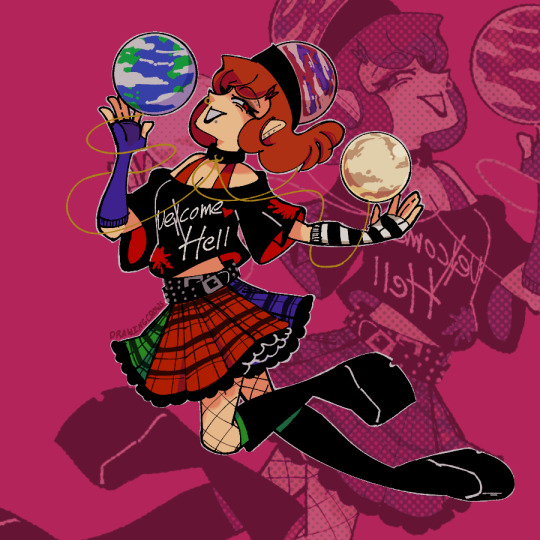
can u guess who my fav 2hu is
#crow art#touhou#touhou project#hecatia lapislazuli#i drew this back in january and then just. Forgot to post it#i think(?) this was meant to be part of a set of my other favs but then i got too busy to finish the others#maybe someday
383 notes
·
View notes
Text

#this one ended up a bit busy but I got no time so it's done#yveltal#pokemon#halloween#halloween palette pokemon#pokemon halloween#dark type#flying type#forgot this dude is flying and thought dragon at first#happy halloween everyone#I'll be posting a little bonus thing later too as long as I don't forget#legendary pokemon#Gen VI
148 notes
·
View notes