#i found out i am not able to draw symmetrical
Explore tagged Tumblr posts
Photo

:)
#i drew him a company#drawing#harry styles fanart#butterflies#i dusted off my coloured pencils#again#harry styles#hlcreators#styles-edits#older drawing of harry#nature#botanical drawing#colored pencils#i found out i am not able to draw symmetrical
78 notes
·
View notes
Text
AUTISM CREATURE RANT [PART I]
@copperpipes I summon thee.
So! This is the first official large rant I am going off about with my version of the TBH/autism creature/yippee whatever you call this lil dude by.
School is quite meh right now so I couldn’t focus or write this nearly as well as I wanted to. I should have done more triple checking. >:(
Ok, um, let’s get started.
WHAT IS (my version of) THE AUTISM CREATURE?
The Autismus, also known as the TBH, yippee or autism creature(s) is an extraterrestrial genus known for its distinctive behaviour, hunting methods and high intelligence. This genus contains a few species adapted exceptionally for their corresponding environment, But today I will be focusing on one particular specimen; the Autismus niveus niveus, also known as the TBH-A1.
(I may change the scientific name later… I’m still deciding.)
Oh, and if you are wondering what the “A1” on TBH-A1 means, it’s a way of calling them that I have developed so that I don’t have to say their long scientific names every single time I want to refer to an Autismus species. the A=species and 1=subspecies. TBH is what you can call the Autismus genus in general, as I said before- not referring to a specific species in particular. So, for example, there are TBHs like TBH-A2, TBH-A3, TBH-B2, TBH-C4 and so on.
Well then, back to the TBH-A1:
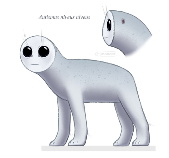
BODY PLAN:
As you can observe in the drawing of TBH-A1, It’s body is bilateral with symmetrical sensory organs.
It has an endoskeleton, because it is way more efficient than an internal or external exoskeleton for its way of life. An exoskeleton would be much heavier and lacking in mobility compared to an endoskeleton, and although it would provide the body with better protection, the TBH-A1 needs to be lightweight and agile to capture its prey quickly.
For this same reason of weight and agility, it walks in a digitigrade stance with all four limbs, meaning that it moves around on its phalanges (toes) with the rest of its foot lifted. This also helps with stealth.
Its olfactory organs are separated from its airways, with two hidden nasal cavities found near the middle of its facial disk, and two breathing holes located on the back of its head. Its front-facing pair of eyes and single mouth are visible on its facial disk.
The TBH-A1 has serrated retractable claws. There are four of these on each “paw”.
Its head is large relative to the rest of its body, due to its large sensory organs and powerful jaws/muscles for detecting and catching prey.
HABITAT:
The planet that the TBH-A1 lives on is quite cold in general, but the part that it lives in particularly is really quite freezing, with subzero temperatures. Due to this, TBH-A1 has developed various ways to maintain the heat needed to survive:
I] The TBH-A1 is an endotherm, meaning that it produces and regulates its own body temperature. This is necessary for their hunting and living style. Although ectotherms with proper antifreeze proteins or antifreeze chemicals in their organism would also be able to survive, they would have a significantly lower metabolism than an endotherm. The exposure to cold would naturally lower their metabolic processes, and they wouldn’t need to burn as much energy as an endotherm to keep warm, who in turn, would need more, but this would ultimately make an ectotherm slower and less active, which wouldn’t work for the TBH-A1. It is an active hunter that needs to be strong, fast and agile enough to take down its prey, even if it is an ambush predator.
II] It has Two thick layers of fur/feathery structures all over its body. The outer “guard” layer is waterproof and acts as protection against the cold, damp, snowy weather. The inner “insulation”layer is thicker, more closely spaced, and retains body heat.
III] As for how it’s huge eyes are protected from the cold; they are covered in a thin layer of oil that lubricates them- preventing icy air from drying them out, and providing a barrier against wind and small ice particles from reaching their sensitive surface and causing damage.
IV] Below its coat, its skin is black, similar to a polar bear or artic fox here on Earth. This skin colour better at absorbing and retaining heat. Plus, its coat is translucent, only appearing white due to the scattering and reflection of visible light, and could allow for it to absorb more of whatever little uv radiation it receives.
V] TBH-A1 has rough, thick, fatty pads on its “paws”. These are surrounded by fur/feathers (I don’t know what to call them since they’re a weird mix of both and neither,) and their fatty design makes them able to not loose heat as easily as other tissues. The “paws” also act like natural snowshoes; being large in size and having special webbing between their digits to make the surface they come into contact with even broader.
—————
If any of this doesn’t make sense anatomically/realistically to you, please, don’t be shy to tell me about it, and why, if you want to. Any constructive criticism is highly welcome. It helps me improve my creatures. Also because I wish to expand my knowledge as much as possible in this life, and I enjoy feedback. :]
Forgive me for any grammatical errors. TwT
58 notes
·
View notes
Text
INTRODUCTION TO CREATIVE PLAY: LOST AND FOUND - CHARACTER ANIMATION TEST.
For the final stage of my project, I created an animation test to experiment with the 2D paper cut-out puppet I had made. I also created a background with moveable parts to go with it.
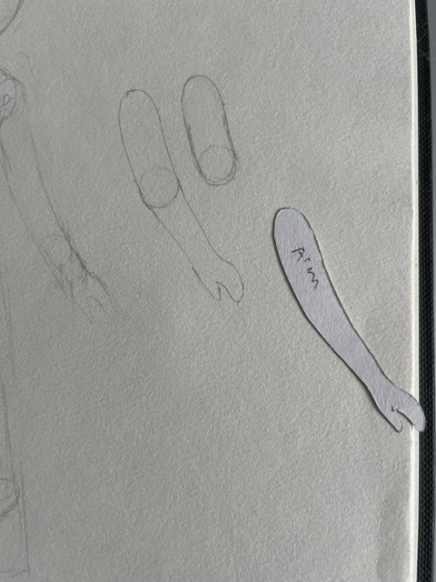
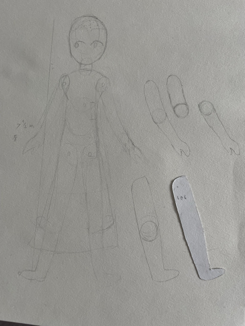
I briefly experimented with drawing blueprints for a puppet with articulated elbows and knees, which I drew using the template parts I'd made to make the prototype puppet parts. However, I ultimately scrapped this idea due to wanting to focus more on getting the background and animation test itself done and because I felt the character having non-articulated arms and legs would add to the feel of the character being a cheap children's doll and would give her a unique style of movement that I could experiment with.
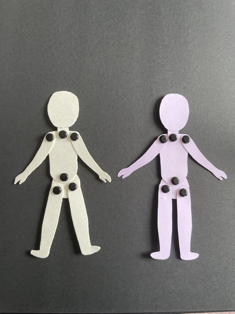
For my final puppet, I used the template parts to trace around lavender/periwinkle card paper. I believed using this light-coloured card, would not only help the doll stand out from the black background, but also give the piece a splash of colour contrasting with the dark monochrome colour palette.
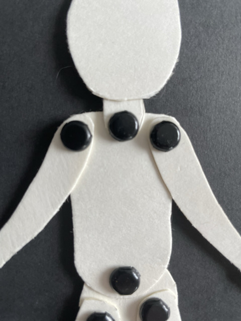
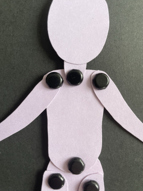
During the process I did make some mistakes with this puppet, like making the shoulder articulation point on the left side of the doll a bit too close to the chest, resulting in an unnatural and slightly lob-sided arm placement. Not to mention, the arm later breaking off as I had placed the articulation hole too close to the beginning of the arm. Therefore I had to make a second one with the arm hole slightly further down the arm. Had I made the puppet again, I would reference the points of articulation on my previous prototypes so that they would be properly placed and symmetrical.
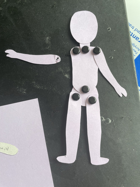
For the background, I used a black piece of paper and shaded it with a BH pencil. Adding and shading the floor and dust in the air, portraying the feeling of a dusty, dark underside of the bed.
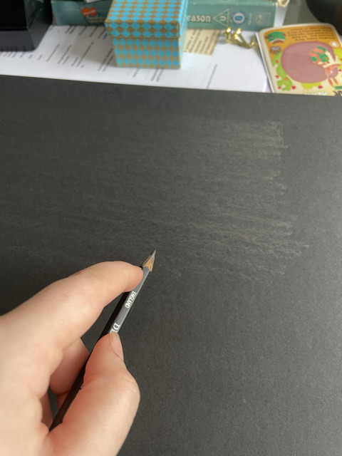
I also wanted to use charcoal in the shading to add further texture to the piece. However, I discovered I didn’t possess any drawing charcoal (likely to have gotten lost during a house move). If I had more time, I would have gone out to buy more charcoal before starting the background. Along with this, I also cut out shapes for the background dressing such as a lost teddy bear, a baseball and a discarded pencil, objects that could conceivably be found under a child’s bed. I shaded and drew in details with the pencil I had used for the rest of the background.
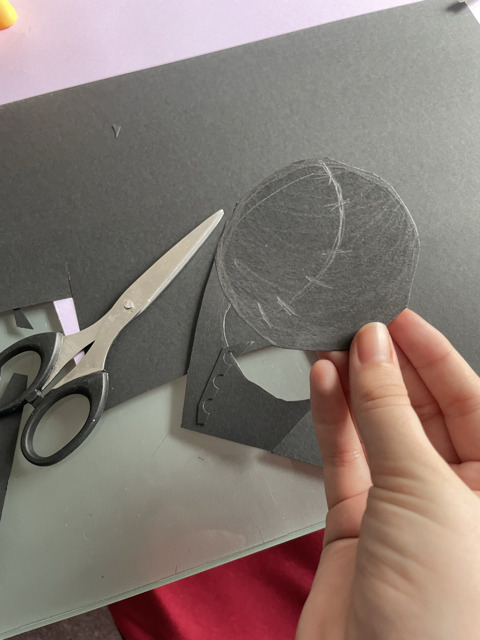
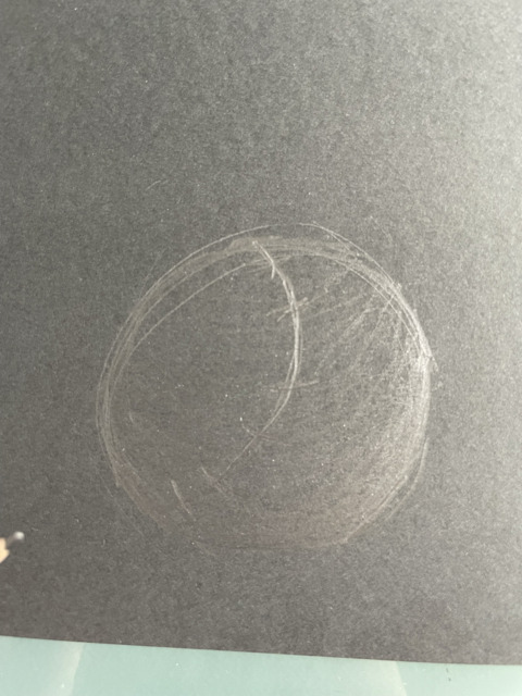
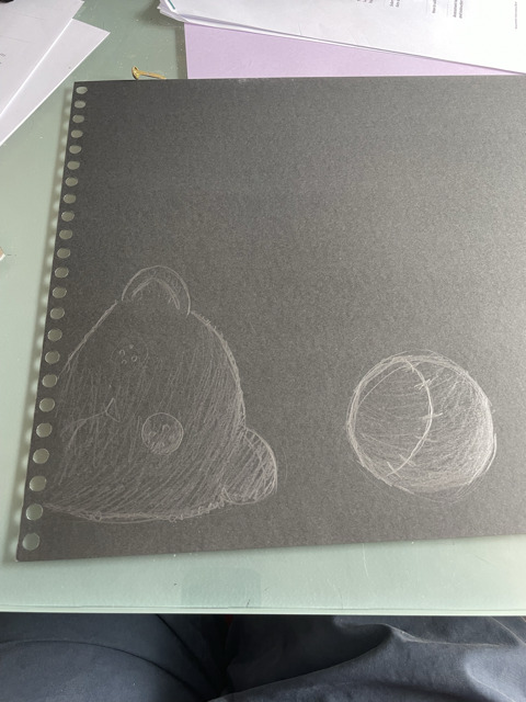
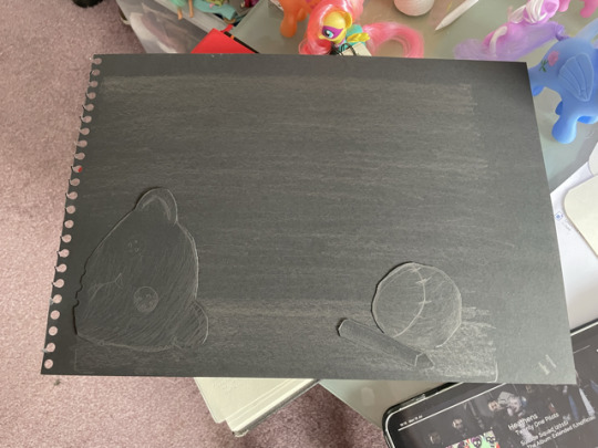
With these assets made, I went to the Media City Campus to film the test. I was hoping to use the down facing multi-plane camera in the Stop Motion Studio that is specifically designed for 2d animation such as paper cut-out animation. However, another student was already using the multi-plane camera and had already set up their project there. So Instead, I used a regular camera. I modified the position of the camera and tripod so it would face down at the table.
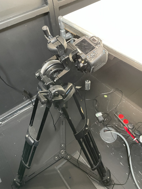
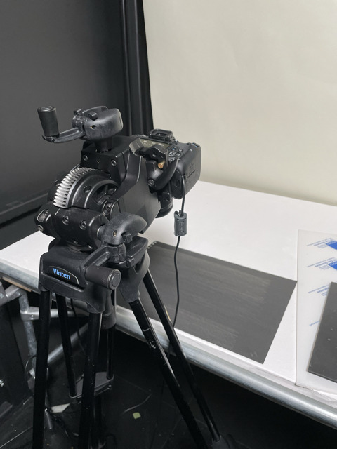
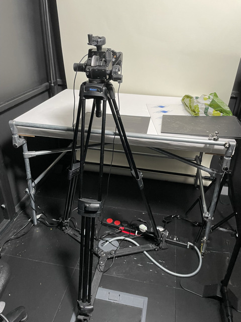
For the set-up of the background and doll, I initially wanted to experiment with placing a piece of Perspex on the background and some pieces of the dressing, to give the illusion of depth of space in the scene. However, when I placed the clear Perspex over the scene, I saw on the camera how the reflective surface of the Perspex showed the glare from the stage lights, which was very distracting and would break the illusion of the scene, so I ultimately decided not to use the Perspex.
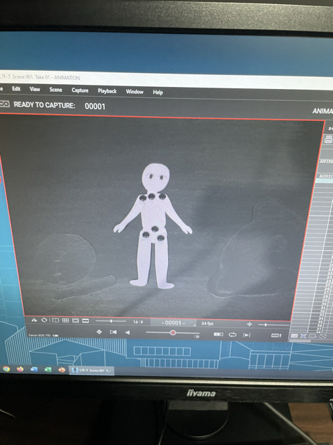
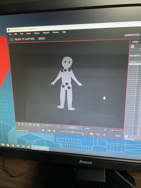
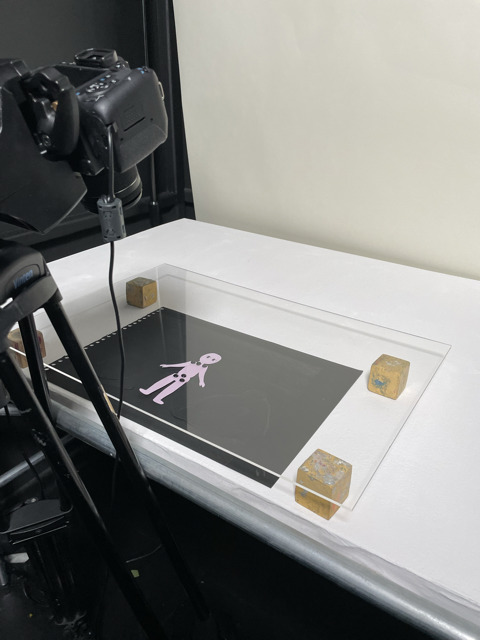
I used the program Dragon Frame to animate the sequence, which overall took me a day and a half to animate. Once it was done, I exported the film to a USB, edited a title and credits into the film using Premiere Pro and exported that as an mp4.
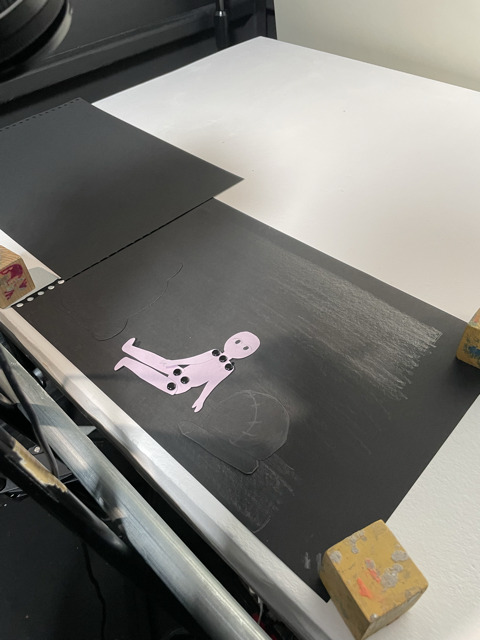
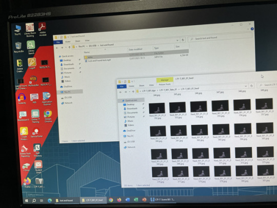

Overall, I am proud of how the test came out. I think I managed to breathe a lot of life and character into the doll puppet and the movements conveyed the doll's personality well. I’m also glad I was able to complete the test under some of the circumstances and with the resources that were available to me.
#lost & found#creative play#stop motion#animation#stopmotion#paper cut out#video#dragonframe#animators on tumblr#intro to creative play
2 notes
·
View notes
Text
ARDN631 Saskia Norman Week 1
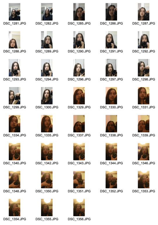
For the photos up until DSC_1300 I was listening to and thinking of the song Dance The Night by Dua Lipa, and I feel that the bright lighting helps to brighten the mood and express how pop the song is. I am not usually very expressive on camera so it was challenging for me to show the mood in these photos, but in comparison to the next set they look a lot lighter and clearer.
For the the photos DSC_1329 onwards I was listening to and thinking of the song 80s Mercedes Maren Morris, and while this song doesn't have a dark mood it was definitely not as bright and pop as the other song. This song has a slower and more country sound, so I tried to express that through the more yellow lighting and with a different mirror. These ones were really challenging to shoot because the mirror was old and had a lot of scratches and other marks that kept messing with the camera's focus, so some of them are a bit blurry and even are solely focused on those marks.
I did try using the self timer to take some self portraits but I didn't have a way to set the camera up in front of a mirror so I wasn't able to take any photos hands free, but I figured out how to do it so I could if I needed to.
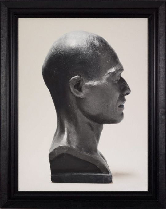
Fiona Pardington
I chose this photo because I hadn't been seeing many side profile portraits while researching so I found it interesting. The lighting in this one is really striking to me because of the way such specific areas are highlighted so brightly, which add more depth and detail to the head. The dark shadows are very strong which means that they are visible against the dark grey sculpture, and creates a nice contrast with the lighter parts.
The composition of the sculpture shows off the fine detail of the side profile that may not be appreciated from a front view. The close up framing means that the sculpture is directly in the center of the image, and means that it catches attention much more than the plain white background.
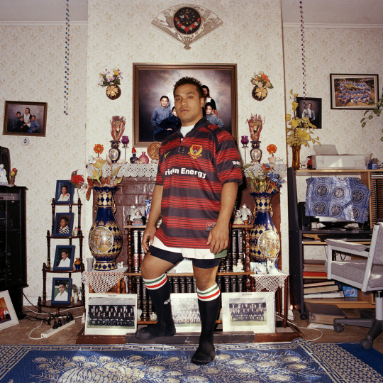
Edith Amituanai
This photo has interesting composition and setting, and the lighting really completes the mood overall. The lighting is very dull, seemingly all natural light coming from a window on the right, but it gives off the look of artificial lighting from how much it seems to be coming from behind the camera. This warm-toned lighting creates a homely feeling, which fits with the homely and family life mood and setting of the image.
The composition is very zoomed out, showing the subject's fully body, and he is centered with the fireplace, which draws in a lot of focus to him. He is slightly diagonally-facing which creates some slight shadows along the left side, since the light seems to be hitting from the right to the middle. All of this gives the photo a very nostalgic feeling to it, since the background shows that it really was just taken in a home. Edith Amituanai is described as “a village photographer.” because of this exact mood and feeling she is able to create with her work.
Dunn, M. (2019). Edith Amituanai - essay. Photo Forum Online. https://www.photoforum-nz.org/blog/2019/7/5/edith-amituanai-essay

Laurence Aberhart
Since this image is in black and white and is taken outside with a lot of soft natural lighting, there is hardly any dynamic range with everything very defused and dulled. The darkest parts of the image are the hair and clothing, which isn't affected by the lighting, so the image doesn't have a very intense mood which seems for fitting for a photo of children.
The composition of the image is very centered and zoomed out, capturing their full bodies and even having them truely centered by sitting so their feet aren't touching the bottom edge. The children are positioned with the shortest in the middle so the heights are symmetrical on each side, and the window/door indent area they are sitting in makes for a more interesting background while seeming more silly and child-like. Since he uses a large format camera his photos and compositions are "more considered in a formal sense." (Museum of Contemporary Art Ltd., 2013).
Museum of Contemporary Art Ltd. (2013). South of no North. https://static1.squarespace.com/static/54728164e4b081a2addc014d/t/54b5f17be4b05e2e7fb60546/1421209979414/South+of+no+North.pdf
0 notes
Text
Second Class
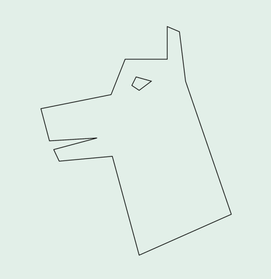
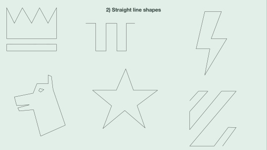
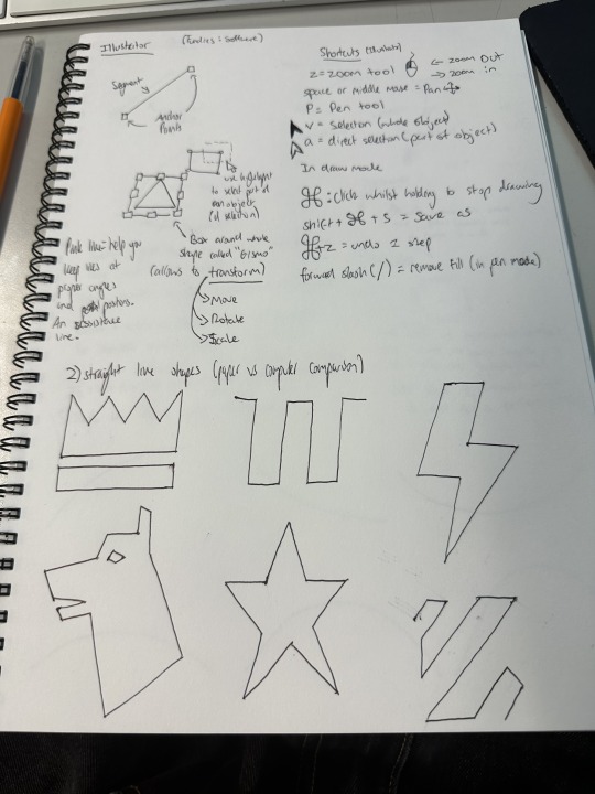
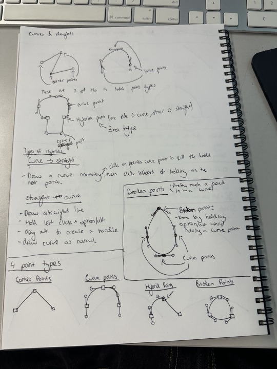
Firstly, we did some more straight line shapes, learning about how complex they can actually be, and compared them to drawing them on paper like the previous class. There is more on this in my notes from this class which are at the bottom of this post (Along with notes on every other section of this post). I found the Dog shape particularly complicated, which is why I highlighted it. It was interesting actually making a more complex shape with the new techniques I had learned.
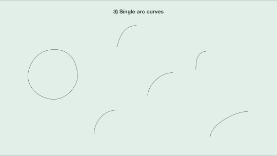
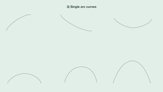
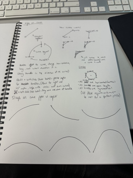
We then moved to learning about curved lines, starting with single arc curves (Although I did try making a circle). They're much more complicated than straight lines, as rather than just clicking two points, you need to create handles to control the angle of the curve, and adjust them accordingly. This was pretty simple to get the hang of though once you mess around with it a bit.
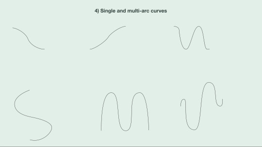
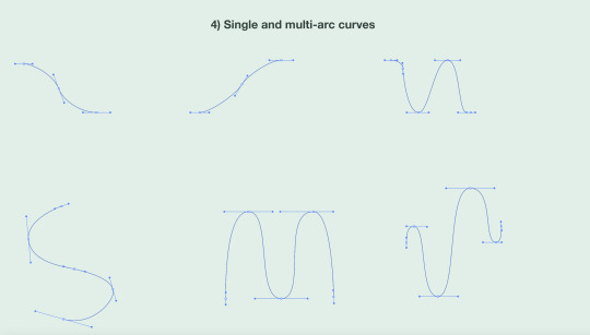
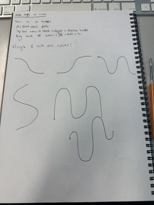
Next we added more points into the curves, turning them into multi-arc curves. This allowed for more complex curved shapes as shown. In the second picture is an example of all the handles in the shapes we drew, which are the lines with the dots on each end sticking out from each point in the shape. We had to learn in this section that the best way to make a symmetrical curved shape is to have even handles, though I am pretty bad at doing that as you can see.
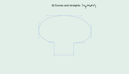
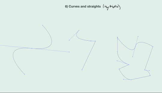
After that, we learnt about Hybrid points. Hybrid points have a straight line on one end, and a curved line on the other. These are much more complicated than the other two points from earlier, as they take certain keys to create depending on what order you put the types of lines in. The key is listed in the notes below. By this point, we had nearly learnt all of the types of points, but there was still one more.
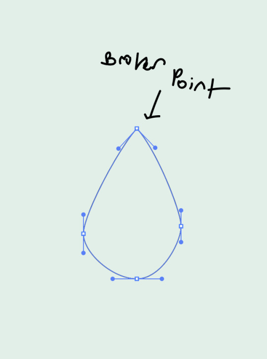
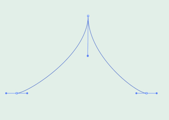
The final type of point is known as a broken point, as it is literally a break in a curve. It was just about as complicated as the hybrid point, also taking a button to create. It is achieved by separating the two ends of the handle on the point, and pointing them at different angles. As you can see at the top of the teardrop shape the handles on the joint are both pointing at a downwards angle in opposite directions, literally bending the handle and creating a break in the curve.
So to recap, there are 4 types of points:
-Corner Points: Used to create straight lines and corners -Curve Points: Used to create curves, achieved with handles -Hybrid Points: Used to connect a straight segment with a curved segment -Broken Points: Used to create a break/corner in a curve, allowing for more complex shapes.
We learnt how to utilise these 4 joints, and are now able to create any shape we want with Adobe Illustrator.
Notes from this class Page 1 - Straight Line notes Page 2 - Single arc curve notes Page 3 - Multi arc curve notes Page 4 - Hybrid & Broken Point notes
0 notes
Text
Week 1

Recently I found the Ed, Edd, n' Eddy series bible on Twitter and decided to draw the model sheets for Double D. I think a good way of starting to practice animation is by working with the face since that's what I have most trouble with in stand-alone drawings.

This is my first time making the full-body turnaround to see how consistent I can be with the proportions. Next, I'll photoshop these into a GIF.

Came out really good :)

Some Robot sketches today, I made them very simplistic since I'm gonna have to animate them later. The robots that came to mind while I was sketching was HAL 9000 since I just recently watched 2001, Bender from Futurama, the robots from Robotomy, and the Hat from Meet the Robinsons

I liked the sketch I did on the bottom left of the page. I made a model sheet for him but only 3 frames since I knew I wasn't going to do any crazy animation.
I made this animation in After Effects with the pen tool and the simple shapes provided. It's not 100% symmetrical because I'm still figuring out the tools but it was interesting experiencing the process of translating a doodle into an animation.

Not my first time making digital art but it is my first time using Krita which works a bit differently from Photoshop. I'm definitely going to need to improve my digital art skills if I am dead set on making an animation for my Capstone.
REFLECTION:
Out of everything I made this week I was really impressed with how well the turnaround GIF for Double D came out. Normally whenever I tried animating by pencil I would put the paper frames stacked on top of each other on an iPad with the brightness all the way up. I was also really happy that I was able to find the series bible in the first place, the most I would find is model sheets for characters on other animated shows and anime but this was the whole thing. It was a great insight as to what goes into making an animated show and because Ed, Edd, n' Eddy was one of the last traditionally drawn animated shows on cable TV so it gives me a great point of reference for how things are done now.
Link to the Ed, Edd, n' Eddy bible:
0 notes
Text
Vector Replication
In class we worked on vector replication. We paired up and gave two vector images for our partners to create two vector drawings.


For the drink I found it fairly easy to replicate the image. It's mainly made up of straight lines with geomentric angles. I used the original raster image as a reference and pretty much traced over it using the pen tool in illustrator. I've used the polyagonal lasso tool in photoshop a lot in the past so this concept was not too hard. I was able to 'alt J' the reflection lines to duplicate them and then change their size since they go at the same angle.


This image was much more difficult as it's mostly made up of curves. Went through a lot of trial and error to create these curves. A lesson learned from this experience was to not add more anchorpoints, the simpler the shape, the better it will look. The rocket dome shape only has 3 points (one at the top and two at the bottom - like a triangle). I could have perfected the circle windows more to make them more symmetrical by evening out the handles. Overall I am really happy how it turned out. A much cleaner look to the orginal raster image.
0 notes
Text
Week 9 - Prototyping
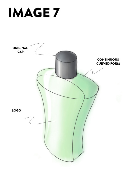
PRE-CLASS ACTIVITES I found this video useful discussing the use of models in mug development. Andrew's video has many similarities and some differences between my experience using the model for his mug project and the Olay concept model I did. A stark contrast between Andrew's workflow and my own is the importance of his concepts. It can be seen that his concept has more physical material and product concepts, holding the cup in the process and introducing parts by hand for pointing out. Digital software cannot enable such an experience, and in particular, weight and design may affect how we hold our cups and grip the handles. In his studio, the feel of glass, ceramics and even holes is tested. In such a process, countless variations and adventurous ideas have been tested for interactive purposes. In contrast, I did not delve into the material and other attempts. I can only do my best to simulate in 3ds max, I rarely feel objects through physical objects, but as a designer it is very good to do more physical models, because these things provide feedback on the feel of the design body.
IN-CLASS ACTIVITIES
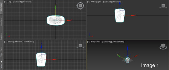
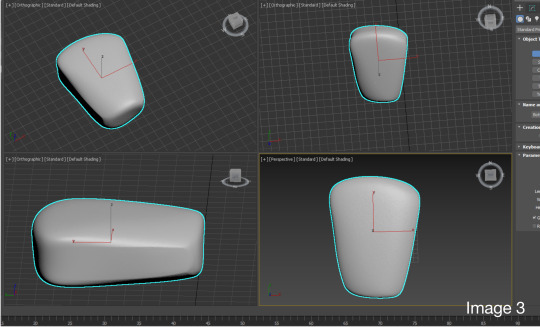
During modeling, I wanted my bottle to be symmetrical. So, after fixing the dent, I used the Symmetry Tool and I made a symmetry modification along the X axis to make the left and right sides of the bottle symmetrical (Image 1). It would be easier to use modifiers if I had this feature for the first two weeks. Two other very practical tips are using Relax to remove foam and symmetry imperfections. Symmetry makes a lot of sense for hand-drawn or hand-crafted models, greatly reducing the burden of hand-drawing (Image 2+3).

At the end I added the color, applied shader (Image 4). This makes it easier to see the imperfections of the model, some dents are not completely eliminated, and the bottom of the bottle looks strange from this angle. This leads me to discover that CAD models force you to imagine and be exact with all kinds of difficult details. But keep experimenting, experimenting with different materials, colors, and finishes at the click of a button, and digital modeling really excels in this case.

For digital iteration and 3D printing of 3D scans, unfortunately I am an online student, and while I can still complete the process and print my designs remotely at the Design Futures Lab, I will only be able to pick it up when I arrive on campus next year.
POST-CLASS ACTIVITES Reflection:In this assignment, I combined my previous experience to save files every so often to avoid computer crashes during modeling. This week's assignment was more difficult than I expected, but it made me realize that I need to spend more time learning the software later on, as the basic skills I've learned so far can only produce a simple modeling and render. I will also spend time researching different materials to see how this affects the design. My goal is to become more confident and proficient at every stage of design, and I've found learning and gaining experience from elders in the industry very helpful and really fun.
7 notes
·
View notes
Photo
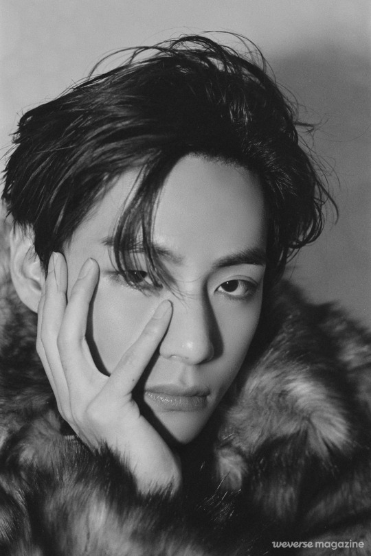


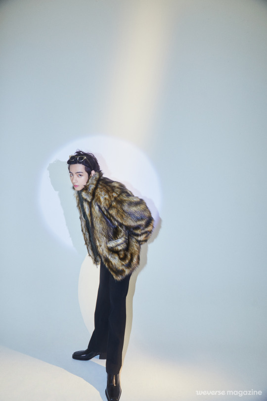
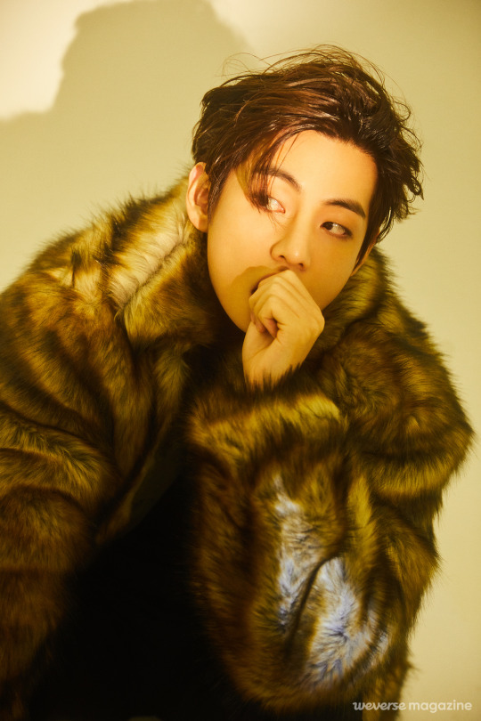
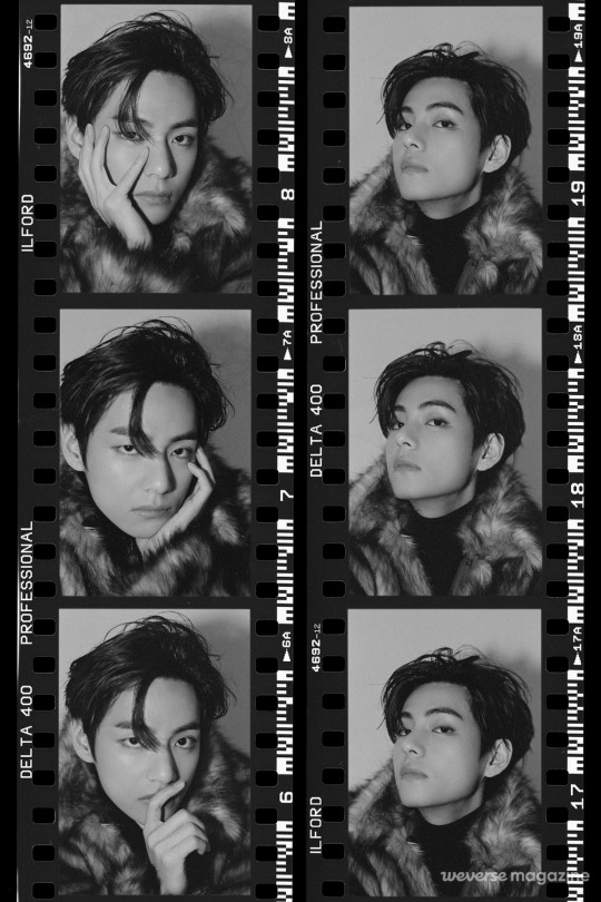
201125 Weverse Magazine ‘BE’ Comeback Interview - V
V: “I wish we were back with ARMY, laughing together” BTS BE comeback interview 2020.11.25
During V’s photo shoot, he’s wearing a different expression in every photo on the monitor. They create a tension and an anticipation because we have no way of knowing what he might do even one second later. But the result is cool from start to finish. It’s V.
How are you doing these days? It’s been a long time since you were able to see your fans. V: I’m not over-stressing about how I can’t meet the fans face to face right now. I just want to see them when it’s safe to meet. I think now, I can wait until then.
As your song says, “Life Goes On.” You decided to keep going on with your life. V: We have to move on. We can’t feel defeated forever. I felt a lot better after making some songs.
Other than working on “Dynamite,” you’ve spent very little time away from home. How do you pass the time when you’re by yourself? V: I really like just spacing out, so I’ll sit in my room doing nothing for hours. I could try putting on a movie, but then I couldn’t concentrate and would just zone out. When that happens, it’s kind of like I’m living without a thought or care in the world. Maybe I should make a song about all of this someday. Probably call it “Spaced.” (laughs) Anyway, these days I’m looking for ways to keep myself happy.
Have you found anything? V: Well, I’m listening to LPs lately. It’s getting to be Christmas season and I love snow, so I bought two or three Christmas LPs to listen to. I’m also listening to old jazz songs by Frank Sinatra and Sammy Davis Jr. Frank Sinatra is cool, like chilled wine; Sammy Davis Jr. is crazy talented. (laughs)
So that’s the type of performer you find cool. V: Those two were also a big inspiration to me while we were working on “Dynamite.” Sinatra has all this jazzy body language, but he also threw some disco in there. And I imagined how Sammy Davis Jr. might dance if there were a mic on stage and he had to dance around it. They were a lot of help when I was finding a way to be upbeat and cool at the same time in “Dynamite.”
I guess making “Dynamite” must have been some consolation even when you couldn’t meet fans due to COVID-19. V: We couldn’t put on a concert and couldn’t see ARMY, so we were feeling more and more drained. It seemed like an endless battle. We really wanted to see ARMY feeling better, so we had to get back up on stage and make another album so that together we could beat this thing. I want to be the friend who’s always cheering ARMY on, but there aren’t many ways to make them feel better.
How was the whole “Dynamite” experience? You made it to the top of the Billboard Hot 100 and also had a chance to perform in a variety of different styles. V: Shooting the Tiny Desk Concert was a very natural process, which was nice. But actually, with the situation being what it is, we couldn’t really feel much. The day the news came out was of course thrilling. It was great, actually, all of us calling each other and some of us laughing and others crying: “We haven’t gone down the wrong path after all! Turns out we had a chance—it really was possible!”
While you were performing in “Dynamite,” you were also the visual director for BE. I’m sure you were unimaginably busy taking photos, but were you able to communicate well with the other members? V: We communicated smoothly, and I listened to all of their concept ideas and I organized everything around that. If we tried something too natural, it wouldn’t be conceptual enough, so we did our best to strike a balance.
You had everyone sitting in the middle, with the set arranged symmetrically around you. V: That was made possible thanks to everyone having their own ideas. There was no overlap between items, which actually allowed us to create a sense of unity by placing all these different props symmetrically. It wasn’t intended to be symmetrical; each member really did choose something unique.
In your room, you included a violin and a photograph. V: That’s a picture I took. I like photos and drawings, but if I had used any art then I would’ve been using that one particular artist’s work, so I thought I’d better use one of my own photos. I ended up choosing the violin because I learned how to play it but also because I enjoy classical and jazz.
So how do you feel it turned out? V: I made it, so naturally I like it. (laughs) Part of me thinks I should’ve tried something more conceptual. BE was supposed to give off sort of a magazine or poster feel since we didn’t shoot many of those, but it ended up having more of a natural feel to it. But I did think that the next time we try to make a photoshoot conceptual we should move away from that natural look a bit. The group explained their ideas clearly and they were simple enough to do, so I think it all went really smoothly.
It sounds like there were no problems choosing the songs for BE. How did you feel recording your parts on the other members’ songs? V: I like “Dis-ease,” which Hobi hyung wrote, but stylistically it was challenging. It’s really far from my own style so it took a long time to get used to. “Fly to My Room” used to be my favorite song, but it was also the hardest to sing. It was okay at first, until Jimin jumped in.
What about Jimin? V: Because I had to keep up with Jimin, the song went up maybe three keys. I thought I would die. (laughs) It started out as my favorite song, but it was just way too hard to sing.
But why did you have to sing that way? V: Jimin said he was sorry, that he couldn’t go any lower. (laughs) When I first heard the demo version, the key was perfect for me, so I thought it would sound great and I should definitely do it. But then Jimin said he wanted to do it too, so I said, “Great, let’s do it together.” Turns out we went up three keys. So I said, “Hey, what’s the deal? Should I just give up?” But, well, somehow it all worked out in the end. It was a happy ending. (laughs)
People might be able to hear that part better because it’s so much higher. (laughs) The tone of your combined voices and the way they contrast is really impressive. V: Yes, but all that aside, it was quite the struggle. (laughs) And the chorus is really long. I think it repeats, what, four times?
Yes, it feels like the chorus never ends. The production style is very unique. I like how the emotion is carried through the whole way. V: I agree, but it’s so long. The chorus turned out crazy, like I was kind of beating the melody into people’s ears. (laughs) The chorus is good, but the whole song’s melody is really catchy. Whenever I heard the beat, I was totally into it. The way the vocals pick up on the beat and the melody was so original and fun, I just had to do it.
What instructions did you give to the other members when they were singing on your song, “Blue & Grey”? V: I didn’t really have to give them instructions much. I told them it would be nice if they could think of all their problems and then try healing those wounds with their voices, since if they focus on those emotions, there’ll be more feeling in the song. They all did a good job expressing the emotions I wasn’t able to.
It seems like you intended “Blue & Grey” to be a melancholy song. I heard you had originally planned to put it on your mixtape. V: I wrote “Blue & Grey” when I was at my lowest point, when I was actually asking whether I could keep going with my work or not. Even the fun parts of work became a chore, and my whole life felt aimless. “Where do I go from here? I can’t even see the end of the tunnel.” Those kinds of thoughts hit me hard.
Was there a reason for that? V: It was when work was a major challenge. When I’m happy, I want to work, and when I’m happy I can put on a smile and see the fans, but there was just so much work to do. I’m an easygoing, you know, laid-back person, but I was stretched too thin and I was starting to sputter. What I mean is, I was having a really tough time, and thinking, “What’s waiting for me at the end? It’s important to be successful, but I’m also trying to be happy, so how come I’m not happy right now?” That’s when I started to write “Blue & Grey.”
So writing the song was sort of your way of bringing yourself some peace of mind. V: There was a time I was going through something like this. I was having the toughest time, but I couldn’t keep carrying that feeling around with me. Instead, I could use it as a kind of fertilizer. So I took care of that feeling by constantly writing it down in my notes. I just kept writing everything down, and when finally I felt like I wanted to try writing a song, I did. After the song was finished, I felt a sense of accomplishment, and that’s how I was able to let go of “Blue & Grey.” That was one way I wanted to try getting over my problem.
The songs you make or sing solo on all have similar images: night; loneliness; snow. V: I like nighttime and the late-night air, and when it snows, too. I liked those things since way back when, but lately I feel things like snow and the night air keep me alive. They may just be another part of normal life to other people, but to me, they represent very special moments.
That makes me think of the ending from “Blue & Grey”: “After secretly sending my words up into the air / Now I fall asleep at dawn.” V: I don’t really sleep well. I toss and turn and get caught up in a lot of thoughts. Even when I turn out all the lights, I can see everything clearly. I close my eyes, but all my thoughts spread wide open. Then I’m sleepy at work, and staring off into space when I’m alone, with bags under my eyes, but if I want to avoid that then I really have to sleep. Except, with the way I am, it doesn’t allow for it. I wrote about that in the first and second verses; a feeling like, “When I’m stuck thinking like this, everything is grey, and I’m all blue.” I wrote these feelings out as a song, and now that I’m thinking about it again, I’m actually over it. I feel a lot lighter. I sent my words out into the air, and now I fall asleep at dawn. You’re supposed to sleep at night, but I’m sleeping in the morning again. So I say “good night,” but it’s not actually a good night. “I pass out because I’m exhausted” kind of thing. It’s the emotions I felt in those moments that I wanted to express.
What do you hope hearing about that feeling will do for listeners? V: Rather than just some stranger telling them to cheer up, I think it’s better to say something like, “You seem depressed lately,” or, “Seems like these days it’s tough for you to perk up.” “Blue & Grey” is the same: “You’re depressed lately? Me too. We’re in the same boat. Wanna talk about how you’re feeling? You wanna feel better, right? I know, but sometimes it feels like you’re being washed away by a whirlpool of stress.” I want the listeners to hear me saying that to them.
It’s important to express your emotions right away when they’re so overwhelming. V: Yes. I usually write a lot of songs when I’m feeling emotional, but these days I have so many different things to do that I can’t really write anything. I tried to write something before when I had a little time, but nothing came out because the feelings I had were already gone. So I tell myself, “You gotta write a lot when you’ve got the feels!” (laughs) And then I open my notes app and come back to old notes, like, “Ah, so that’s how I was feeling back then? I see. Well, that’s how I used to be, I guess.” So I tried to write “Blue & Grey” quickly, as soon as a big feeling came on.
Then it’s important to revisit those feelings when you’re producing a song or choosing which songs to release? V: If you can’t bring the feeling back, you can’t make the song, either. I release a song if I feel it expresses who I was and how I felt at the time when I wrote it. Even if we record it perfectly, if the result sounds artificial, I would rather release another, more honest sounding song instead, even if it’s not perfect.
Are those the kinds of songs you selected for your mixtape? V: Um … I don’t know. This is my first mixtape, you know, so I feel a ton of pressure about it. I’m thinking all the time about what kind of album I should make so that I can feel satisfied with it. The title track is the title track, but everyone also says to just leave it as it is, but I keep getting the urge to keep putting in more and more.
You usually write and choose songs based on your emotions. Maybe the pressure to make your first mixtape comes from you having a hard time with that. V: I think it still has a long way to go. Maybe it’s because it’s my first mixtape, but it’s so hard. And I feel like it’s a little lazy. People tell me just to put it out and see how it does, but I’d rather know what needs to be fixed before I release it. I also don’t want the title track to be depressing. I want it to be positive and help people beat those depressed feelings. But it’s not easy.
That sounds a lot like what the members conveyed with “Life Goes On.” V: I think we showed the current situation in a very straightforward and honest way. We’re still going, going, going. And the going is tough. But it doesn’t end here. I wish we were back with ARMY, laughing together. I hope we’ll all be happy in the future and keep on doing our own best, cherishing our hope for our happy future.
Trans © Weverse
398 notes
·
View notes
Text
Week 6: Digital Concept Drawings
To date doing the digital concept rendering has been the part I was both looking forward to and dreading the most. Before completing this weeks work I had never used photoshop, and avoided any and all Adobe products like the plague (I rendered everything for BENV1010 in Rhino last term, for which I make no apologies). Fortunately (?) for me there was simply no way to avoid it this week.
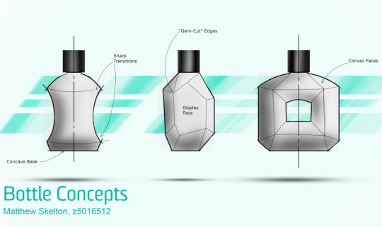
The final product...
I found Rob's videos invaluable in creating my concept drawings, though there were quite a few points where I had to madly google things as A) I don't use a mac (therefore the shortcuts are different), and B) things did not always go to plan.
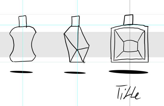
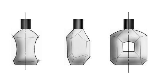
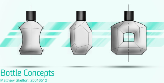
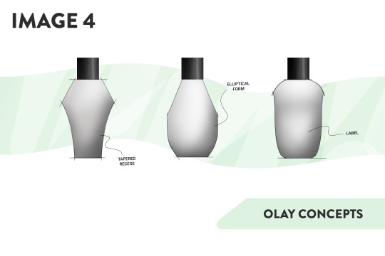
To begin with I drew in a very rough copy of the 3 bottle concepts I wanted to take further. They were very rough, but it was good to get something on the screen quickly and messily so I had a starting point.
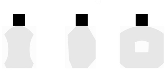
Blocking in the base colours for the bottles seemed to go ok, and it helped me refine the profiles of the bottles. The symmetry tool was invaluable - I hated trying to free-hand draw symmetrical shapes last week so this was no small blessing.
My layers were a bit weird which caused headaches later on. If you look closely at images 2 onwards the block colour for the bottles either hasn't been erased properly, or I somehow managed to get 2 blocks with different shades of grey from each rectangle - I have no idea what went wrong, but I did it twice and the same thing happened again so I pushed on :(
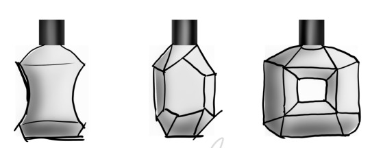
After I blocked in the colour I tried something different and created another layout layer so that I could (roughly) trace the grey masses and work out where the edges were. I then locked this layer so I couldn't alter it and put it over the masses so that I could put shade and highlight in the appropriate places. This made it much easier to do the shading as my bottles were not purely organic shapes like was demonstrated.
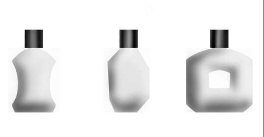
After removing the rough layout layer I was left with some rather uninspiring blob-bottles. I had difficulty with getting the outline to generate on a different layer and it resulted in some weird artefacts that I couldn't figure out why they existed, but just had to manually erase from the new layer. Adding additional layers for the contours ad making it look a bit more hand-sketched and "open" as a concept took a lot of time but was well worth it. I think the shading could be matched up a little bit better, but overall I was happy how it cam out.
Adding in the background really elevated the sketches and made them pop. I'm quite proud of how it turned out, though personally I think it is cleaner without the notes.
Lessons learnt: 1) Photoshop is scary, and has one hell of a learning curve, but it's so much better than trying to draw on paper, so I'll take it any day of the week.
2) Sketching skills are transferable from paper to the digital realm, so I need to continue practicing sketching if I want to be able to effectively communicate and ideate rapidly. CAD has it's place, but I have developed a new appreciation for the artistic side of IDES.
3) The order of your layer stack is important and I feel like I have only barely begun to get my head around it at this point - the layers are soo much more than just different line weights and colours as they are in AutoCAD and Rhino.
4) I'm so glad I had the sense to get a touchscreen laptop with a pen at the start of this year - I cannot for the life of me imagine how much longer this would have taken be if I only had a mouse - and I am certain wouldn't have come out as good.
2 notes
·
View notes
Text
Week 6 - Digital Sketching
During the non-teaching week, we were tasked with creating digital sketches, developing the skills taught during week 5's content.
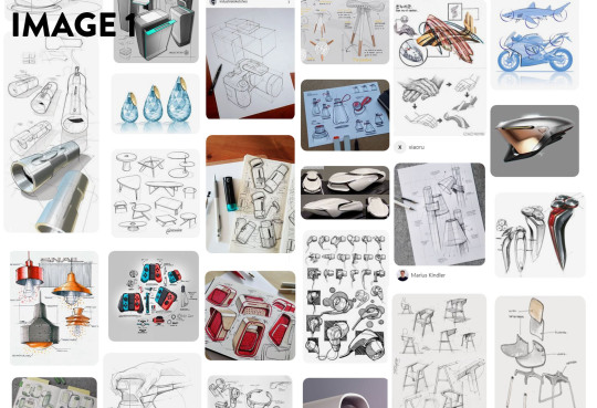
Before any sketching and drawing took place, we were tasked with gathering reference for our pieces on Pinterest. I found that Pinterest managed to curate images much better than google images, Flickr and other image search engines I have used before. I really wasn't aware how powerful it was at creating themed moodboards (Image 1). I am absolutely certain that I will use it for future projects, because I gained lots of insight into different styles and design trends; and it even linked me to some really interesting tutorials.
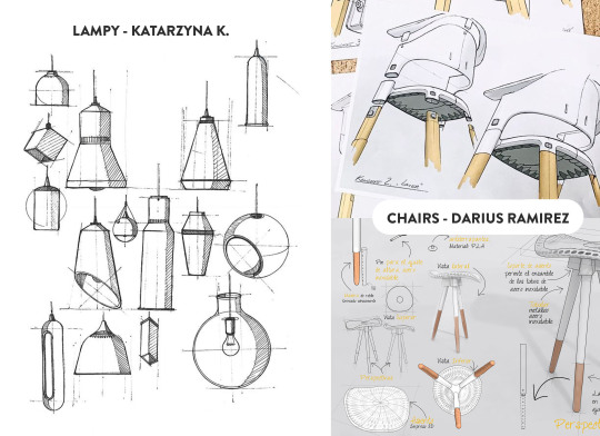
I selected a few images that I really liked and appreciated; the first being LAMPY by Katarzyna K. I really liked the clean linework and hatching in this piece. Even though it was hand drawn, the shapes and forms are legible, clean and convey the necessary information in as few lines as possible. The linework skill is something I definitely aspire to achieve with more practise.
The next set of images I gained insight from were the chair drawings by Darius Ramirez. This image set really resonated with me because of the clean marker renderings, and the composition of the pieces. I enjoyed that there were overlapping features and lines, but the overall composition remained clean and not too overwhelming. The marker renderings were colourful and sharp, and the minimal palette really worked well with the simple forms. Both these artists produced wonderful works; and I would love to emulate the skills and techniques required to make them. I will definitely continue to look for inspiring designers and skills that will improve my own works.
For the tutorial itself, I started with the online video tutorials from Rob. Even though I feel like I have a lot of experience with Photoshop, it was really interesting to see the workflow of someone with more experience than myself. I found that it was less the technical information like the use of layer masks and clipping masks, but more the process, and artistic design choices where I gained the most insight from these tutorials. Using a digital medium like photoshop, there are many ways to speed up or improve workflow compared to traditional sketching. One of the most important methods from the tutorial was the use of masking and copying (Image 3). Using the initial block-out as the boundaries, applying shadows and highlights is a much faster process as it reduces the clean-up at the end. Another method I used during the blocking out stage was the symmetry tool in Photoshop to create even and symmetrical sides. I found that this allowed me to see the form faster, and iterate through ideas at a quicker rate.
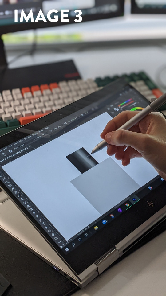
I really liked Rob's use of the Gaussian Blur filter to soften the edges. It allowed me to block in the hard edges and shapes. I found that it was much easier to be conscious of the shadow shapes and highlights when they had hard edges; and softening them out was a simple one click process after the fact. Before seeing this method in practise, I would either have used a soft brush with high opacity, or the smudge tool, which often results in muddy and inconsistent shading. Something I struggled with in this tutorial was the consistency of my linework. The laptop screen was slippery compared to paper, and this led to losing control of the pen - creating a line which was way off the desired trajectory. This was the main reason I was glad to have an undo button and layers to delete. In a way, having the security of redoing a stroke gave me more confidence in my linework.
I added a slight amount of smoothing to the brush to counteract the glassy screen. Going slower meant that I had more control over the curvature. In the end I was happy with how this exercise went. I gained a lot of insight into product design sketching with photoshop, and was eventually able to produce a piece I was happy with (Image 4). I would definitely experiment with different styles and shapes if I were to redo this activity.
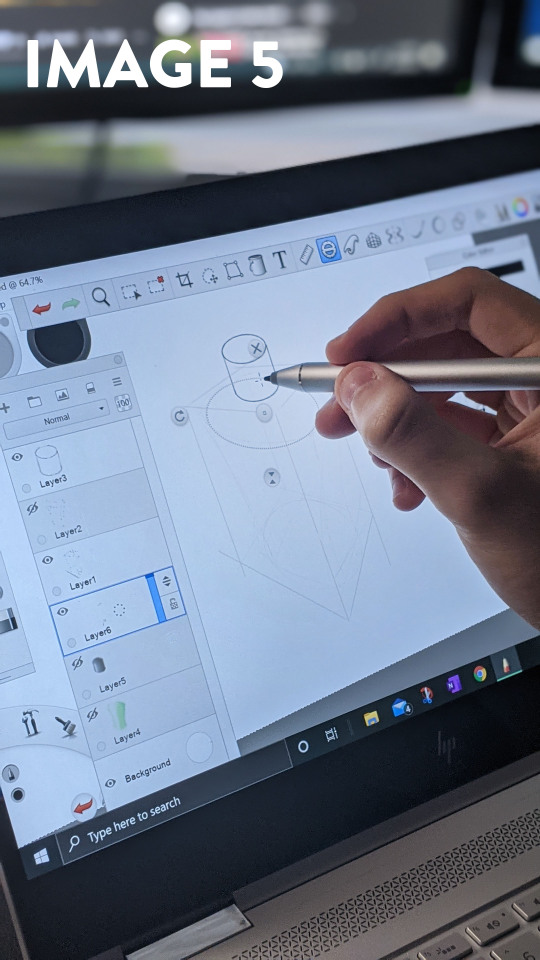
I decided that I wanted to try another program as well, so I opened up Sketchbook Pro on my laptop. Sketchbook Pro has a plethora of tools designed specifically to speed up the process of perspective drawing, and I wanted to try them out. The perspective grid tool was extremely powerful, and it allowed me to block out the bounding box of the bottle in under a minute. From the bounding box, I created a freehand sketch of the bottle on a new layer, and when I had created something I was happy with, Reducing the opacity of that layer and using the built-in drawing tools helped create the final linework. I liked this process because it allowed me to work methodically and in stages. I don't think I have full control over Sketchbook as of yet - the perspective was still a bit off due to the fact that I neglected the initial linework and misjudged where to place the ellipses. I found the process of creating a drawing in Sketchbook enjoyable, and the built in Copic marker set made it feel like it was built for Industrial Design.
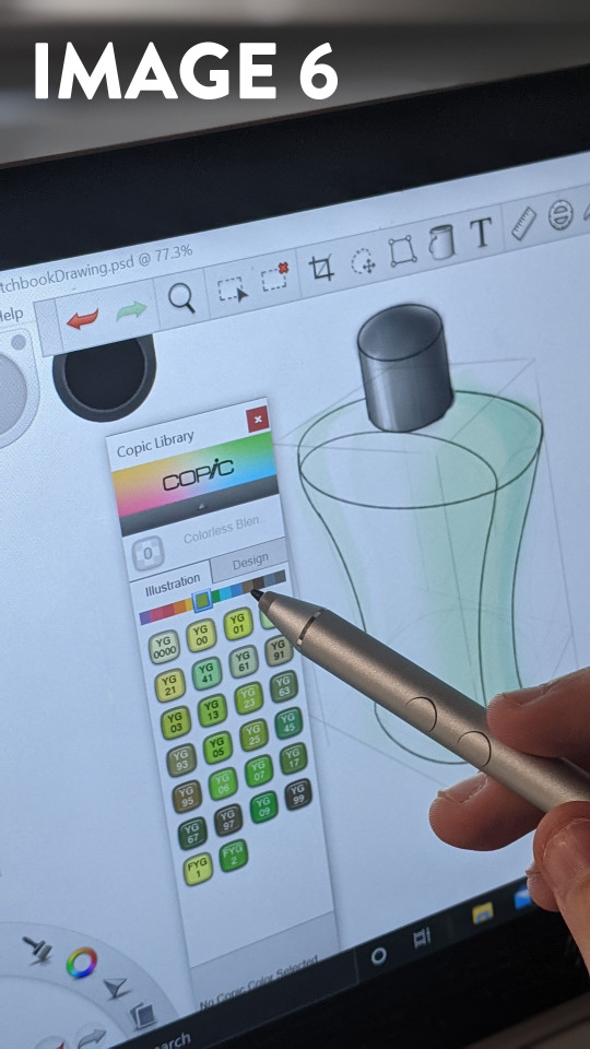
Even though I am happy with the final product, I would say that my drawings are still not where I would like them to be. I think that my linework could be refined and confident; and my application of colours and lighting are not always appropriate. I would like to continue to complete these exercises on a semi-frequent basis, and use it as a benchmark to track my progress - focusing on my linework and colouring. Overall, I feel like I have already made a lot of improvement in my drawing abilities over the past 6 weeks, and I look forward to evolving them further.
9 notes
·
View notes
Photo
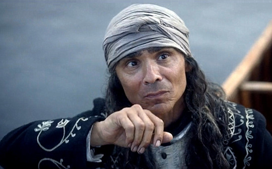

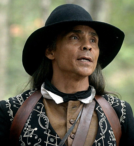
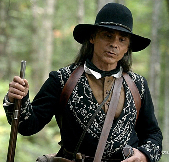


Wanted a better look at the embellishment on Yvon’s jacket, so I took some caps! Some general observations:
The jacket is basically in the cut of a tunic, falling to about midthigh and with the left breast wrapping over the right so that the sides of the lower skirt-like part overlaps.
Symmetrical decorative patterns are found around the collar (meeting in a shallow vee over his upper back and gently tapering in front to form lapel shapes that terminate around the waist, covered by his belt) and also around the sleeve cuffs.
The prevailing motifs seen in these designs differ between collar and cuffs. The ones around the collar seem abstract: curving linear and geometric patterns. The cuffs, however, share the curving line style but are more representative, depicting floral/botanical elements.
I had initially wondered whether some of the round/raised bits might be beads rather than thread. I found some real close-up shots in which you can see the stitching, though, and it looks like the bits I thought might be beads are just loops or whorls of thread, so I think I can confirm that it’s all thread embroidery.
I’m putting the rest of this under a cut because it’s quite long, but: basically, I was interested in the style of decoration on his jacket, particularly the floral aspects, and attempted to do some historical research. I honestly was not as successful as I would’ve liked, and this post has actually been sitting in my drafts for almost two weeks now because I kind of got stuck. But on reflection, I still do want to share the screenshots as references, my observations, and at least the gist of what I looked into and what I found.
So! Under the cut: rambles about what interested me and what info I was looking for, links to the work of modern Ojibwe and Métis artists, and also a brief note on Yvon’s rifle strap, which I think is quite interesting as well!
Basically, when I was initially collecting the above images, my interest was particularly piqued by the floral decorations on the cuffs. The show identifies Yvon as Anishinaabe, and Zahn / Nat Geo have identified him specifically as Ojibwe, and I had a vague memory of reading at some point that Ojibwe art is particularly associated with floral designs. Floral designs not being solely unique to Ojibwe art among indigenous arts, and Ojibwe designs not being solely limited to floral ones, but a strong association nonetheless. I think most famously this takes the form of colorful, intricate embroidery with tiny glass beads:
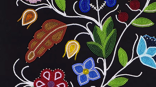
(image source: Native American Artist-in-Residence: Jessica Gokey)
This is often done on black velvet or, as in the case of some of Gokey’s work that I saw, on black broadcloath, which I would say is probably about the same type of fabric Yvon’s jacket is made of — a plain, dense, sturdy wool. Although my understanding is that Ojibwe didn’t begin using colored glass beads of this sort until they acquired them via trade with Europeans in about the 19th century, beads made of other materials would, of course, still have been available in Yvon’s time, and I was still curious about whether the designs themselves on his jacket accurately reflect authentic patterns and motifs used by Ojibwe people. What was clothing and decoration like among Ojibwe and Anishinaabe people in the 17th century? What styles and materials were used? Are the elements in Yvon’s embroidery more generic, or are they recognizably specific in style to his culture, etc.?
And so I began with the Wiki-ing and the Google Scholaring and the skimming of articles. Unfortunately, a lot of the most promising-looking sources were only available as printed books (some of them quite expensive, too), so I didn’t have access to them, but from the articles I was able to browse, I did learn some relevant things. I found sources saying that before glass beadwork, Ojibwe decoration did use other types of beads and also used embroidery, which tracks with what we see on Yvon. I found a number of sources saying that floral motifs specifically were introduced to people of the Northeastern Woodlands in the 17th century via contact with Europeans, particularly nuns, who brought with them their floral embroidered fabrics and their floral folk arts.
However...
Although there were plenty of mentions of Ojibwe beadwork and floral designs, and a good number of more modern examples, I had difficulty finding in-depth information that discussed it specifically in the context of Barkskins’s time period (or prior to European contact, either). Sources focusing on the art in later time periods might still be relevant to what Ojibwe decorative arts were like in the 17th century, but I just don’t know enough to know. The example images I found were of beadwork from the 19th century or later, and even then, they were buried in a slew of Pinterest results that I really don’t consider reputable sources, because sure, they might be legit, but they might also be completely mislabeled.
In general, I felt less than confident about what my searches turned up. This is a topic I know little about, have no personal or academic experience with (not being Ojibwe and not having formally studied anything relevant to this), and I’m wary of misinformation here because I know that indigenous people have spoken about seeing biased, simplified, and outright inaccurate info presented even by sources that should seem credible, like museums. Not to mention conflicting info. Remember I mentioned I read about floral designs being introduced (or at least popularized) by European art? And yet I also saw other sources rejecting this idea that Ojibwe floral motifs have their roots in colonizers’ art rather than simply in drawing their own inspiration from nature. In general, I just didn’t feel confident that I had the insight or education necessary to evaluate my sources or synthesize conflicting info, and my brief, superficial research didn’t seem reputable or interesting enough to shed any particular light on Yvon’s clothing. So I basically put this post aside.

(image source: Native American Artist-in-Residence: Sarah Agaton Howes)
But ultimately, I still want to highlight Yvon’s embroidery, even if only from an aesthetic, costume-detail perspective, and I also want to share some of the lovely videos showing the work of modern Ojibwe artists I came across while I was looking all of this up! Here’s another link to this video featuring the work of Jessica Gokey, which I inserted near the top, and here’s one in which Greg Bellanger discusses some of the history and process of his art. In this interview, Sarah Agaton Howes brings up the idea of Ojibwe floral designs as a historical means of teaching about medicines and preserving that cultural knowledge, especially in times when passing down such knowledge was suppressed. I thought that was very interesting and am kicking myself because I did actually look briefly at a thesis extract on Ojibwe botanical/medicinal knowledge, but now I can’t find it again. I also enjoyed this shorter video with Howes as well. And this video featuring the work of Delina White gives us some examples of these floral designs primarily as embroidered thread, like on Yvon’s clothing, rather than as beadwork:
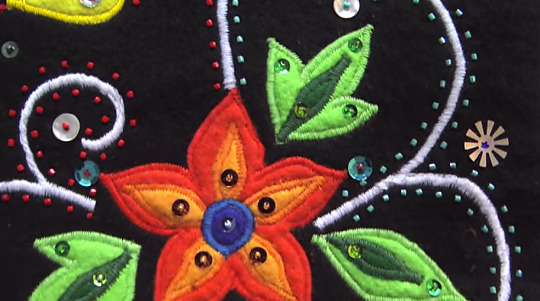
(image source: Delina White)
The final video I’ll link is this one, which is about Métis floral beadwork rather than Ojibwe. I don’t know how similar/different the two styles are (nowadays or historically), but since Métis share roots with Ojibwe and Anishinaabe people, and since Métis culture developed out of the setting, cultural interactions, and approximate time period of Barkskins, I thought it still relevant enough to rec here. Not to mention that it’s just pretty and I wanna rec it. All of these videos offer a lot of interesting information and perspective on the craft itself as well as on the history and tradition.

Before I go… One little costume detail I do feel reasonably confident offering my own speculation on is that the decoration on Yvon’s rifle strap appears to be quillwork — porcupine quills dyed and shaped into designs. I could be wrong, but the texture, colors, and pattern look very similar to the examples I’ve seen, and it’s an art form that would certainly have been established, culturally relevant, and available to him in this time period. So that’s the tiny bit of original input I’ll contribute to this post!
In general, I think the whole Barkskins team — costume design very much included — has shown that they put a tremendous amount of research and thought into the design and construction of this show. I’m sure Yvon and his costume were no exception. And I love the overall look!
#barkskins#yvon#zahn mcclarnon#barkskins meta#i heard y'all wanted more yvon meta! so i finished this up#op#history#costume
96 notes
·
View notes
Text
V: “I wish we were back with ARMY, laughing together”
During V’s photo shoot, he’s wearing a different expression in every photo on the monitor. They create a tension and an anticipation because we have no way of knowing what he might do even one second later. But the result is cool from start to finish. It’s V.
How are you doing these days? It’s been a long time since you were able to see your fans. V: I’m not over-stressing about how I can’t meet the fans face to face right now. I just want to see them when it’s safe to meet. I think now, I can wait until then.
As your song says, “Life Goes On.” You decided to keep going on with your life. V: We have to move on. We can’t feel defeated forever. I felt a lot better after making some songs.
Other than working on “Dynamite,” you’ve spent very little time away from home. How do you pass the time when you’re by yourself? V: I really like just spacing out, so I’ll sit in my room doing nothing for hours. I could try putting on a movie, but then I couldn’t concentrate and would just zone out. When that happens, it’s kind of like I’m living without a thought or care in the world. Maybe I should make a song about all of this someday. Probably call it “Spaced.” (laughs) Anyway, these days I’m looking for ways to keep myself happy.
Have you found anything? V: Well, I’m listening to LPs lately. It’s getting to be Christmas season and I love snow, so I bought two or three Christmas LPs to listen to. I’m also listening to old jazz songs by Frank Sinatra and Sammy Davis Jr. Frank Sinatra is cool, like chilled wine; Sammy Davis Jr. is crazy talented. (laughs).
So that’s the type of performer you find cool. V: Those two were also a big inspiration to me while we were working on “Dynamite.” Sinatra has all this jazzy body language, but he also threw some disco in there. And I imagined how Sammy Davis Jr. might dance if there were a mic on stage and he had to dance around it. They were a lot of help when I was finding a way to be upbeat and cool at the same time in “Dynamite.”
I guess making “Dynamite” must have been some consolation even when you couldn’t meet fans due to COVID-19. V: We couldn’t put on a concert and couldn’t see ARMY, so we were feeling more and more drained. It seemed like an endless battle. We really wanted to see ARMY feeling better, so we had to get back up on stage and make another album so that together we could beat this thing. I want to be the friend who’s always cheering ARMY on, but there aren’t many ways to make them feel better.
How was the whole “Dynamite” experience? You made it to the top of the Billboard Hot 100 and also had a chance to perform in a variety of different styles. V: Shooting the Tiny Desk Concert was a very natural process, which was nice. But actually, with the situation being what it is, we couldn’t really feel much. The day the news came out was of course thrilling. It was great, actually, all of us calling each other and some of us laughing and others crying: “We haven’t gone down the wrong path after all! Turns out we had a chance—it really was possible!”
While you were performing in “Dynamite,” you were also the visual director for BE. I’m sure you were unimaginably busy taking photos, but were you able to communicate well with the other members? V: We communicated smoothly, and I listened to all of their concept ideas and I organized everything around that. If we tried something too natural, it wouldn’t be conceptual enough, so we did our best to strike a balance.
You had everyone sitting in the middle, with the set arranged symmetrically around you. V: That was made possible thanks to everyone having their own ideas. There was no overlap between items, which actually allowed us to create a sense of unity by placing all these different props symmetrically. It wasn’t intended to be symmetrical; each member really did choose something unique.
In your room, you included a violin and a photograph. V: That’s a picture I took. I like photos and drawings, but if I had used any art then I would’ve been using that one particular artist’s work, so I thought I’d better use one of my own photos. I ended up choosing the violin because I learned how to play it but also because I enjoy classical and jazz.
So how do you feel it turned out? V: I made it, so naturally I like it. (laughs) Part of me thinks I should’ve tried something more conceptual. BE was supposed to give off sort of a magazine or poster feel since we didn’t shoot many of those, but it ended up having more of a natural feel to it. But I did think that the next time we try to make a photoshoot conceptual we should move away from that natural look a bit. The group explained their ideas clearly and they were simple enough to do, so I think it all went really smoothly.
It sounds like there were no problems choosing the songs for BE. How did you feel recording your parts on the other members’ songs? V: I like “Dis-ease,” which Hobi wrote, but stylistically it was challenging. It’s really far from my own style so it took a long time to get used to. “Fly to My Room” used to be my favorite song, but it was also the hardest to sing. It was okay at first, until Jimin jumped in.
What about Jimin? V: Because I had to keep up with Jimin, the song went up maybe three keys. I thought I would die. (laughs) It started out as my favorite song, but it was just way too hard to sing.
But why did you have to sing that way? V: Jimin said he was sorry, that he couldn’t go any lower. (laughs) When I first heard the demo version, the key was perfect for me, so I thought it would sound great and I should definitely do it. But then Jimin said he wanted to do it too, so I said, “Great, let’s do it together.” Turns out we went up three keys. So I said, “Hey, what’s the deal? Should I just give up?” But, well, somehow it all worked out in the end. It was a happy ending. (laughs)
People might be able to hear that part better because it’s so much higher. (laughs) The tone of your combined voices and the way they contrast is really impressive. V: Yes, but all that aside, it was quite the struggle. (laughs) And the chorus is really long. I think it repeats, what, four times?
Yes, it feels like the chorus never ends. The production style is very unique. I like how the emotion is carried through the whole way. V: I agree, but it’s so long. The chorus turned out crazy, like I was kind of beating the melody into people’s ears. (laughs) The chorus is good, but the whole song’s melody is really catchy. Whenever I heard the beat, I was totally into it. The way the vocals pick up on the beat and the melody was so original and fun, I just had to do it.
What instructions did you give to the other members when they were singing on your song, “Blue & Grey”? V: I didn’t really have to give them instructions much. I told them it would be nice if they could think of all their problems and then try healing those wounds with their voices, since if they focus on those emotions, there’ll be more feeling in the song. They all did a good job expressing the emotions I wasn’t able to.
It seems like you intended “Blue & Grey” to be a melancholy song. I heard you had originally planned to put it on your mixtape. V: I wrote “Blue & Grey” when I was at my lowest point, when I was actually asking whether I could keep going with my work or not. Even the fun parts of work became a chore, and my whole life felt aimless. “Where do I go from here? I can’t even see the end of the tunnel.” Those kinds of thoughts hit me hard.
Was there a reason for that? V: It was when work was a major challenge. When I’m happy, I want to work, and when I’m happy I can put on a smile and see the fans, but there was just so much work to do. I’m an easygoing, you know, laid-back person, but I was stretched too thin and I was starting to sputter. What I mean is, I was having a really tough time, and thinking, “What’s waiting for me at the end? It’s important to be successful, but I’m also trying to be happy, so how come I’m not happy right now?” That’s when I started to write “Blue & Grey.”
So writing the song was sort of your way of bringing yourself some peace of mind. V: There was a time I was going through something like this. I was having the toughest time, but I couldn’t keep carrying that feeling around with me. Instead, I could use it as a kind of fertilizer. So I took care of that feeling by constantly writing it down in my notes. I just kept writing everything down, and when finally I felt like I wanted to try writing a song, I did. After the song was finished, I felt a sense of accomplishment, and that’s how I was able to let go of “Blue & Grey.” That was one way I wanted to try getting over my problem.
The songs you make or sing solo on all have similar images: night; loneliness; snow. V: I like nighttime and the late-night air, and when it snows, too. I liked those things since way back when, but lately I feel things like snow and the night air keep me alive. They may just be another part of normal life to other people, but to me, they represent very special moments.
That makes me think of the ending from “Blue & Grey”: “After secretly sending my words up into the air / Now I fall asleep at dawn.” V: I don’t really sleep well. I toss and turn and get caught up in a lot of thoughts. Even when I turn out all the lights, I can see everything clearly. I close my eyes, but all my thoughts spread wide open. Then I’m sleepy at work, and staring off into space when I’m alone, with bags under my eyes, but if I want to avoid that then I really have to sleep. Except, with the way I am, it doesn’t allow for it. I wrote about that in the first and second verses; a feeling like, “When I’m stuck thinking like this, everything is grey, and I’m all blue.” I wrote these feelings out as a song, and now that I’m thinking about it again, I’m actually over it. I feel a lot lighter. I sent my words out into the air, and now I fall asleep at dawn. You’re supposed to sleep at night, but I’m sleeping in the morning again. So I say “good night,” but it’s not actually a good night. “I pass out because I’m exhausted” kind of thing. It’s the emotions I felt in those moments that I wanted to express.
What do you hope hearing about that feeling will do for listeners? V: Rather than just some stranger telling them to cheer up, I think it’s better to say something like, “You seem depressed lately,” or, “Seems like these days it’s tough for you to perk up.” “Blue & Grey” is the same: “You’re depressed lately? Me too. We’re in the same boat. Wanna talk about how you’re feeling? You wanna feel better, right? I know, but sometimes it feels like you’re being washed away by a whirlpool of stress.” I want the listeners to hear me saying that to them.
It’s important to express your emotions right away when they’re so overwhelming. V: Yes. I usually write a lot of songs when I’m feeling emotional, but these days I have so many different things to do that I can’t really write anything. I tried to write something before when I had a little time, but nothing came out because the feelings I had were already gone. So I tell myself, “You gotta write a lot when you’ve got the feels!” (laughs) And then I open my notes app and come back to old notes, like, “Ah, so that’s how I was feeling back then? I see. Well, that’s how I used to be, I guess.” So I tried to write “Blue & Grey” quickly, as soon as a big feeling came on.
Then it’s important to revisit those feelings when you’re producing a song or choosing which songs to release? V: If you can’t bring the feeling back, you can’t make the song, either. I release a song if I feel it expresses who I was and how I felt at the time when I wrote it. Even if we record it perfectly, if the result sounds artificial, I would rather release another, more honest sounding song instead, even if it’s not perfect.
Are those the kinds of songs you selected for your mixtape? V: Um … I don’t know. This is my first mixtape, you know, so I feel a ton of pressure about it. I’m thinking all the time about what kind of album I should make so that I can feel satisfied with it. The title track is the title track, but everyone also says to just leave it as it is, but I keep getting the urge to keep putting in more and more.
You usually write and choose songs based on your emotions. Maybe the pressure to make your first mixtape comes from you having a hard time with that. V: I think it still has a long way to go. Maybe it’s because it’s my first mixtape, but it’s so hard. And I feel like it’s a little lazy. People tell me just to put it out and see how it does, but I’d rather know what needs to be fixed before I release it. I also don’t want the title track to be depressing. I want it to be positive and help people beat those depressed feelings. But it’s not easy.
That sounds a lot like what the members conveyed with “Life Goes On.” V: I think we showed the current situation in a very straightforward and honest way. We’re still going, going, going. And the going is tough. But it doesn’t end here. I wish we were back with ARMY, laughing together. I hope we’ll all be happy in the future and keep on doing our own best, cherishing our hope for our happy future.
© source
22 notes
·
View notes
Text
Hyde & Seek
Humans have a natural and instinctive desire to be understood. To be loved. But to what end? Doesn’t love end? Doesn’t life end? I rather live for something more eternal. ———— I smiled, greeting the new squad. Some nervous, some excited, and handful of eyes cold for revenge. And then yours. Cloudy like mine, you smile back at me. As if you could see through me. As if you were judging me. ——————– With everyone pursuing their own form of justice, thirsty to make a dent in this harsh reality and leave a legacy. You would be calculating, cold, detached like me. One leg after another, drawing perfect circles in the air, following my every command– You would execute these sinners with grace. As if you were playing savior. ———— I purposely isolated you from me. I didn’t need a doppelganger walking around me. You were a great soldier, a team player, a leader. But I kept you at arms reach. Never too close, but never too far. To observe you, but never to know you. The perceptive ones close to me would notice and question, but never doubt. I had these men’s trust. Did I have yours?
————– I would lead troops to their death for humanity. For the greater good. Bodies after bodies, falling falling. All men die, and as the living we have to remember them to pursue meaning. And after weeks of these battles, I noticed you had tears on your cheeks as you fought. Never a single sound to escape from your lips, you fought with impressive professionalism– like a butcher in a pigs barn. But your eyes would betray you, always a faint shade of red. A captivating sight but I had no care for it. You became one in many. In fact, this comforted me. You were just like the other. You were not like me. —————- “Hey, you alright? I saw you crying on the field again.” I stopped in my tracks. From the corner of my eye, I could see two figures talking. “Its fine. Just a habit.” The other girl must have given an incredulous look. You sighed and explained. “It’s not exactly a habit. It started after my mother died in front of me. Ever since then, it’s been an automatic response.” “Whatever it might be, don’t let it affect your fighting. You know they’re coming faster each time.” “Hey–” “Yeah?” “Are you ever curious… what these titan might be?” Your voice dips, almost a whisper. “No, I just want to kill as many as possible. And so should you.” With footsteps fading away, I also start to walk back. Just when I was able to take away my interest, you came right back. ———————- “Commander.” I turn my head. Between our ranks, it was surprising to see you ask for me. I greet you, and ask what your business is. “How do you live with yourself?
You liar?” My face froze. Fingertips turning numb, blood rushing in. “Stand down, I am your commander.” My words come out cold and firm, trying to maintain composure. But your smile grows. Eyes slowly rotting into black gaping holes, and lip going up in a lopsided grin. “Have you fooled yourself as well?” Blood pouring from your nose and ears, you start to stumble over like a broken puppet. Your symmetric features in a chaos of agony and joy. “Have you, Erwin?” I jolt out of my bed, back drenched in night sweat. Half asleep, I make my way to the common room for water. “Commander?” My shoulders flinch slightly, but I turn around. An unwelcomed déjà vu. But comforting at the same time to have the real you in front of me. Your eyes, deep and hollow. By standing closer to your face, I feel a thrill going down my spine to see them filled with my face. As if I own your view. “Having trouble falling asleep again, commander?” You asked as if this was a reoccurring event. But I had no recollection of seeing you. I stared for a hint and realized you were still waiting for my answer. Was I still feeling off from the nightmare? This wasn’t like me.
“Don’t worry about it. I’ll be going in now.” As I walk past, your hands reach over to grab my sleeve.
I was faster. Hand in hand, we face each other again. Placing a finger on your wrist, I feel your heart beat rising by the second. The same chilling thrill makes its way from your veins to my throat. You pull away first, apologizing for stepping over. Trying to fool me with a sheepish grin, not even bothering to hide the disgust in your eyes. Disgust? Your emotions were always veiled, concealed. I disgust you? Your steps rushed, you walk away as if you know my eyes were following your shadow. You have no basis to be disgusted by me. What would you known about me. You know nothing. Fingers tightening into a fist, I walk over to the washroom to calm down. Looking up from the sink, I touch the mirror. A smile. Faintly, not enough for most to notice. But I was smiling. Did I felt… seen? ——- I was searching for you now. In groups, in halls, in battles. It was only for milliseconds, I would never let myself be distracted for any longer. But it was enough. To track you, to know your movements, and habits. How much did you know? How much could you tell? Were we the same? When I found any opposite traits, I would convince myself this was a momentary lapse of judgement. And when I saw similarities, I would bite my lips and admit defeat. Like a tug of war, it fought childishly in the back of my head, far away from all the corpses stacking on the streets. Thousand moments of you to piece like a puzzle, what would it show? Would it show you? Or would it show me? It didn’t matter. In few weeks, you had requested a transfer. ———- It was 5 o'clock, and I heard your footsteps at the door. Before you even got the chance to, I opened to let you in. Not missing a beat, you bowed and waited for my nod to sit.
You were a good soldier. I gestured at the seat, and handed the form back to you. “What’s the reason for transfer?” Your reply was almost immediate. You came ready. As I would have. “I believe my skill set would be more useful in another squad, sir.” “Wouldn’t that be for me to decide?” “Yes, sir. But–” I raised an eyebrow. “Are you doubting my leadership?” “No, sir.” “Or is it because you fear death?” “..No, sir.” “Then I consider this form to be retracted.” “Commander..!” Your hand on mine, barely touching but enough to feel your warmth. Slowly, I shake you off. “You’re good at what you do, if not great. I will not let a talented recruit leave my team without a reason.” “Sir, please–” Pleading, your eyes start to show fear. Fear? Fear of what? “Please let me transfer, I will do anything–” I had never seen you so overcome with emotion. Even on the battlefield, you held your stance. Shoulders trembling, head hunched over. I put my hand on your shoulder. Turning your head to face me, I realized you had fainted— With a fresh bruise forming around your neck. ———- “You creep me out.” Levi grimaced, and I agreed lighthearted. I was used to hearing it since young. You were still resting, and people were unsure of what happened. No one dared to point at me and quickly, it was forgotten. Overwritten with more loss, more death. The battles were getting worse, a chess game where no one seemed to be winning. But I needed to win. I no longer had enough time to even sleep, so to know you were in the same building, same room became a relief. I no longer questioned why it relieved me. In case you woke up while I was gone, I asked for a medication to be administered. Nothing crazy. Just a sedative. I couldn’t fool my intentions to myself anymore, and I didn’t have to.
This was much easier to admit, compared to the lie I had held on for years.
This was for no humanity.
This was for me.
Locked in that room, I no longer wasted time searching for you. Wondering about you. Thinking about you. Isolated. You were sleeping quietly, waiting for me. When we meet, we could finally talk. Not like before, we could properly talk. I wanted to know how you could see through me. I wanted to know if you understood what it meant- To chase after the past; To become dark to spread light; To accomplish a goal, even if it meant letting guilt become part of you.
A poison that slowly eats away at your bare mind. And of course, you would understand. Perhaps you would still look at me with disgust. But you would understand. That I wasn’t meant to be like this. That I never meant for all this loss. That I never intended for… Maybe understanding wouldn’t be enough to keep you though.
You tried to leave me once.
Even if you managed to escape, you’ll soon find out that there is no one to trust. They trust me. Not you. Inevitably, you’ll find yourself in the same room, on the same bed. I don’t feel the need to label what I feel. You are my accomplice. My audience. My spectator. I can finally appreciate the desire to be understood. I saw my self hatred through your eye, and I’ll see my salvation through them. You just need to be alive; And realize this world was lying to all of us.
And for that,
you don’t need your legs. I won’t have you run off anymore.
————–
“I’m thinking of transferring.”
“Are the battles getting too much?”
“No, everyone knows you’re pretty good.”
“Why are you transferring?”
“..I can’t say.”
Puzzled looks, concerned faces.
And beyond the sea of my friends, I catch his stares again.
Piercing, relentless, terrifying.
But when I look up, it’s as if nothing happened.
“I just need to.”
27 notes
·
View notes
Photo
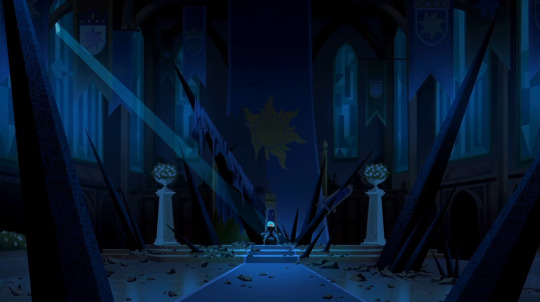
in the wake of once a handmaiden i’ve seen a few posts drawing comparisons between the final shot of cass in the ruined throne room and either (1) varian at the end of queen for a day or (2) varian and the saporians in the throne room mid-rapunzel’s return. which... sure, i guess, but to me both of those feel a bit superficial, as parallels go. they’re like the “hu hu hu gothel said ‘now i’m the bad guy’ and so did cass (but the context and meaning is completely different)!” of comparing varian’s villain arc to cassandra’s SO INSTEAD!—
the plot of handmaiden is best understood, imo, as kind of moral argument between cassandra and zhan tiri. cassandra’s side of the argument is “i am not a bad person; i did bad things, but i can fix it.” zhan tiri’s side of the argument is “you can try to fix it, but you will fail, because just like me, you are a bad person.” cass pursues a convoluted plan to “fix” things that involves very low risk to her (and also in no way addresses the bad things she has actually done) because she is, deep down, afraid that zhan tiri is right. all zhan tiri has to do is coax that fear to the surface, then gently place her thumb on the scale to ensure that the fear becomes reality, to make cassandra snap, thus “winning” the argument.
when cassandra exclaims “zhan tiri was right!” after breaking free from the amber, she’s talking about the existence of project obsidian, but subtextually, she’s also talking about this argument. that’s is why the next thing out of cassandra’s mouth is “you want me to be the bad guy? fine. i’m the bad guy.” using zhan tiri’s potion against rapunzel and taking over corona is cass lashing out in rage, yes, but it also has an edge of defeat: zhan tiri is right, cass is a bad person.
thus, this final shot with her in the destroyed throne room of corona is not a triumphant moment; it’s grim, and dark, and she sits heavily and hunched over in her stolen throne. this is cass at what i would argue is her lowest, most miserable moment thus far. here, cassandra has achieved everything she’s worked for this entire season: she has total control over the moonstone’s power, she has usurped rapunzel’s destiny, brought corona to its knees, and claimed her throne. she has her power. she’s won—but she’s still angry, still hurting, still lost, and now that she knows who her “friend” is, she’s beginning to understand the ways she’s been (figuratively) imprisoned and (literally) manipulated and thus controlled, and the worst part? she has wholly accepted that she is a bad person, that she can’t escape from being a bad person, and the only thing left for her to do is embrace it no matter how awful it makes her feel.
she has never been more powerful, or more trapped.
NOW LET’S TALK PARALLELS!
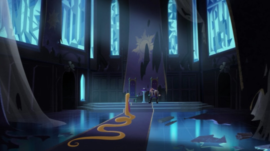
in this scene at the end of tangled: before ever after, rapunzel faces her father’s wrath and disappointment. her coronation was crashed by a group of criminals who wanted to kidnap everyone in attendance, including her father, and rapunzel beat them soundly and saved everybody. instead of celebrating her accomplishments, however, all frederic can see is the danger she is in: because her famous magical hair is returned, and because she threw herself into a high-stakes battle against his express commands. he demands an explanation that she can’t offer fully (because she has to lie about cassandra’s involvement in the black rock adventure, in order to protect her friend from being forcibly sent to a convent), then doubles down on “protecting” her by controlling where she goes and what she does, literally imprisoning her in her own home.
like cass at the end of handmaiden, rapunzel’s victory earlier in the day should have been a moment of triumph, as a culmination of everything she longed for at the beginning of BEA: freedom, excitement, the ability to live according to her personal values and truths. instead, it’s soured and becomes a source of misery.
and, just as cass’s hollow victory at the end of handmaiden is visually represented by the framing, so too is rapunzel’s. in both shots, the throne room is in ruins and looks dark, cold, and unwelcoming, and cass and rapunzel are both dwarfed by the enormity of the room. but there are also a few key differences:
in the handmaiden shot, the camera looks straight into the throne room, making the set symmetrical save for where the black rocks and rubble have disrupted the order of the room, and cassandra is positioned in the exact center. this emphasizes the power cassandra has over this situation. fundamentally, this misery is something she did to herself. zhan tiri has never forced her to do anything; manipulated situations, twisted facts, and blatantly lied to persuade her, yes, but even so, every step cassandra has taken along the road to razing corona is one she took of her own volition. she isn’t intrinsically bad; she does have a choice.
whereas in the BEA shot, the camera is set at a slight angle and places the tiara in the center of the shot such that it separates rapunzel from frederic. rapunzel isn’t trapped by her own hopelessness, as cassandra is; frederic’s authority is real, and the conflict between them hinges on his overprotectiveness and the expectations and responsibilities of rule, both represented by the tiara (this symbolism continues through the rest of the scene; when fred confines rapunzel to corona and orders her not to speak to the black rocks to anyone, he hands her the tiara. it’s a physical symbol of the weight of his authority). while the handmaiden shot establishes that cass is sitting in a deep, dark pit of her own making, the BEA shot shows the precarious balance of rapunzel’s relationship with her father, the authority he has over her, and foreshadows his role as the major antagonist of the season.*
(*varian is the villain of season one, but fred is the antagonist in the sense that he is the primary obstacle preventing rapunzel, the protagonist, from achieving her goals.)
further, the BEA shot is much brighter than the handmaiden shot, with lots of moonlight pouring in through the windows and the side door and the polished floor reflecting it back while in the handmaiden shot, the entire room is in shadow save for a tiny beam of moonlight filtering through a broken window pane. the comparative brightness of the BEA shot reflects the comparatively lower stakes (rapunzel is being confined against her will, but the kingdom is not in immediate danger, and rapunzel has friends/allies whom she can rely on for emotional comfort, whereas in handmaiden the kingdom is literally in ruins and cassandra has driven away everybody but her emotional support demon). at the same time, the handmaiden shot is not entirely without hope: that last, lonely beam of light falls through the window and lands directly on cass, symbolizing that she is not past the point of no return.
lastly, comparing these two shots side by side is interesting because they can represent the broader conflict between rapunzel and cassandra. rapunzel struggles against external forces that seek to confine her or steer her in directions she doesn’t want to go, and most of the time she comes out victorious (by the end of s1, the clash with her father set up in the BEA shot is resolved with him encouraging her to leave corona and find her destiny). in contrast, cassandra’s struggle has always been internal: she is fighting her self-doubt, her fear of abandonment, her inability to believe that she is loved, her discontent with her station, and her tragedy is that she keeps trying to fix this internal problem with external solutions, and failing because she is applying a bandaid to a hemorrhage. and the end result is that she is left like this: sitting on a broken throne, in the ruins of a palace, in the dark, completely alone, with nothing.
BUT WE’RE NOT DONE YET!
let’s talk about varian.
varian’s villain arc and eventual redemption gets compared to cassandra’s a lot, and that makes sense because there are some obvious similarities. they’re both friends of rapunzel who eventually become frustrated with her, blame her for their problems, and lash out violently out of anger. however, i would argue that in spite of this, they are much more different than they are similar, and to talk about why we’re going to talk about the real parallel between varian and the handmaiden shot. and that’s this:
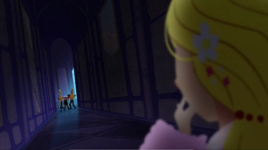
this shot, when varian is being dragged away by the guards in the middle of queen for a day, does not take place in corona’s throne room, but it has the exact same visual symbolism as both the handmaiden and BEA shots. varian is made insignificantly small in the enormous but somehow still claustrophobic halls of the palace, and the lighting is dark and cold to reflect the emotional mood of the scene. he is rendered powerless visually (he’s minuscule compared to rapunzel, who occupies fully a third of the shot and is the character with all the power in this scene) as well as literally (because he is being dragged away by two guards who are twice his size).
and, like both cass and rapunzel in the handmaiden and BEA shots, a moment that should have been triumphant for varian—he finally made it to the palace after a grueling journey through a deadly snowstorm, and he found the one person who might be able to save his father!—goes horribly wrong, and he’s reduced to begging frantically for rapunzel’s help while the guards drag him away from her and, back home, his father dies.*
(*of course, quirin does not actually die, but varian has no way of knowing that a year and a half from now, rapunzel will be able to safely release his father from the amber. for purposes of this analysis, quirin is effectively dead.)
ANYHOW. the key difference between this shot and the handmaiden shot is that for varian, this moment of powerlessness is a) not in any way his fault and b) happening at the very beginning of varian’s descent into villainy, rather than at the end or very close to the end.
this scene sets the rest of varian’s villain arc in motion. his agency is taken from him at a critical moment, preventing him from fixing a horrible mistake that cost his father’s life. instead of collapsing and being eaten alive by his own guilt, varian funnels his anguish into rage directed at rapunzel, who is easier to blame than himself (especially because he is fourteen and doesn’t grasp that rapunzel did make the correct choice when she refused to leave corona). this blame and anger is exacerbated by rapunzel’s inaction after the storm; in failing to check up on him, she leaves varian to fester in resentment until he finally just snaps.
like rapunzel in the BEA shot, varian is up against an external force (rapunzel) preventing him from achieving his goal of saving his father, and his villain arc is a kind of counterpoint to rapunzel’s s1 struggle against her father; they both fight back against their antagonists, she against fred and he against her, but varian does so in a violent, destructive way and thus ultimately fails to achieve his goal; rapunzel by comparison fights back by asserting her independence and relying on her friends/allies to help her, and ultimately achieves her goal by persuading fred to see her as a capable individual rather than an object to be guarded.
like cass, varian lacks rapunzel’s extensive support network; he spends his villain arc alone, stewing in his resentment and guilt, spiraling deeper and deeper until he is unrecognizable as the innocent boy he used to be.
unlike cass, however, varian has a clearly-defined, straightforward external goal: he wants to free his father and punish rapunzel for her inaction. as i discussed earlier, cassandra by contrast is trying to fix an internal problem with external measures, which is why her villain arc is so much messier and more complicated than varian’s, and why it has been driven partly by cassandra falling victim to the manipulations of a demon who keeps passing her concrete goals to pursue with the promise that achieving them will fix her problem.
and this is why varian’s handmaiden parallel happens at the beginning of his villain arc while the handmaiden shot occurs at the end or very close to the end of cassandra’s: the QfaD shot is varian’s inciting incident, but the handmaiden shot is cassandra’s end result.
in the QfaD and BEA shots, varian and rapunzel both have choices taken from them, and everything they do from this point onwards is driven by their drive to fix that injustice. but in the handmaiden shot, cassandra has given up on her ability to choose, and this comes at the end of a long, self-destructive road. unlike varian, whose villain arc hinges on an external problem with an obvious, clear-cut solution (save his father), cassandra’s villain arc hinges on an internal problem (she is unhappy, anxious, and hurting) with no real answer, and because she is unable to seek comfort from her friends (who have spent a year not treating her well in general) and rapunzel specifically (because rapunzel doesn’t hear her when she voices her pain, and because a lot of her pain is connected to or outright caused* by rapunzel), she clings to the first source of emotional validation and comfort she encounters—which happens to be an ancient, evil being who’s really just using cass as a means to an end, and who keeps telling cass, “if you do this bad thing, you will fulfill your destiny (and your pain will stop).” and cass, because she doesn’t know how to fix her problem, and because zhan tiri starts with small, palatable ideas like stealing the moonstone, swallows this hook, line, and sinker.
(*to be completely clear, the pain rapunzel caused stems from their argument in the great tree, cassandra’s subsequent horrific injury, and the way rapunzel blamed cass for everything that went wrong in the tree. i am not talking about gothel’s abandonment.)
all of which is a somewhat long-winded way of saying varian’s villain arc and cassandra’s villain arc are not really comparable, because varian’s involves him turning to extreme, violent, desperate measures to save his father, while cassandra’s involves a self-destructive downward spiral exacerbated by the machinations of a demon, and the timing of when these parallel shots in QfaD and handmaiden occur in their respective villain arcs perfectly encapsulates that difference.
#rta#tts#cassandra#rapunzel#varian#tldr i rant about visual symbolism and framing and character arcs#for ... a long ... long time.#tts spoilers
194 notes
·
View notes
Text
Type and Language 2 - Visual research
Because the quote I have chosen is about science, wonder, and the beauty of scientific knowledge and the pursuit of it - I am going to collate some visual research of scientific diagrams, texts, posters etc. I want to use the design elements present in the science world in order inspire me to be able to express the importance and severity of the sentiment I am designing around.

I began by looking at vintage scientific illustrations. There is a very specific and peculiar, gothic aesthetic to them. Due to their need for function over form, they are often meticulously crafted with rulers and compass to keep shapes just correct and symmetrical. The lines used are thin, utilitarian, and distinct, so as to inform the viewer and not confuse them. They are often kept bare and without much flair and experimentation, so that they serve their purpose well and do not distract the viewer. Modern science textbooks are borne with these same principles in mind, yet, as design conventions change, you are more likely to see even barer, stripped back illustrations, and even more likely to see photographs. Serif fonts are more popular in these old textbooks as well, as Sans Serif was yet to come into the world of academia. (More on modern textbooks later!)
A couple of months ago as I was starting to study my artistic anatomy module, I was gifted a set of two medical anatomy textbooks from 1937 and 1939 respectively. They are from the university of Edinburgh, and have some student’s scribbles and notes in them - I’m not sure who.

Doing this visual research has brought me to realise that graphic design is a massively important part of scientific inquiry and explanation.
NASA have some rather beautiful diagrams of their specialist equipment online. Below are a few of them - they feature extreme levels of technical detail, and accurate representations of scale. The extremely fine lines really show their purpose in these diagrams - if you need to display a lot of detail, then you need to draw in such a way that you can show that detail. I love when graphic subcultures are borne of necessity and resource, and diagrams like these are an example of how art styles have developed not through aesthetic means but through way of necessity.


Some designs created for the purpose of scientific exploration have become iconography in and of themselves: chemistry structures are explained by these hexagonal patterns, for example. This symbolism has entered popular culture in realms beyond scientific study. Another example of this taking place is solar system diagrams.


The following images are from a book I’ve had for a decade now. It is called See Inside The Human Body and it’s a science book aimed at teenagers. It has wonderful, detailed, informative illustrations and computer generated images of anatomical structures. It is a great example of how scientific illustrations have progressed from the likes of my 1930s books, to present day. The images are much more vibrant and dynamic, with even greater detail, bright and beautiful images and a really keen eye for texture. There are some pages printed on acetate which overlay others, to show the body’s muscular-skeletal, vascular, and nervous systems in 3 dimensional detail. It is a really wonderfully thought out book.

The graphic designer featured below is named Estefania Loret de Mola. I recently came across her work and I find it very apparent that she has been inspired by scientific diagrams and aesthetics. I have been really inspired by her use of diagrams to express human emotions and I think her work fits perfectly into the theme of my Type and Language project.

Katie Scott, who’s work is below, draws scientific style illustrations of biological beings. I absolutely love this illustration style and the layout of her drawings.

With this visual research taken into account, I think I have a great direction to go towards for artistic style now. Although typography is not a massive part of these visual languages, I want to take the lessons learnt from the design styles of scientific diagrams, illustrations, posters, etc, using their colours shapes and textures, to build up a typographic language and create type work that stylistically exists within the same world as this imagery.

Another designer I have found who uses a pseudo scientific art style is Beaming Design. I really love this art style and I wish to somewhat emulate it.
6 notes
·
View notes