#i found a new way to colour in photoshop too
Explore tagged Tumblr posts
Text
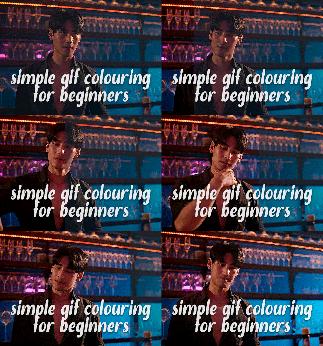
✨ Simple Gif Colouring for Beginners ✨
I wrote up my basic gif colouring process for a friend recently, but a couple of people here mentioned they'd also find it helpful! so, as requested, this is a beginner-friendly walkthrough of the way I colour my gifs :) it's aimed at brand new gif makers with no prior experience with photoshop or photo editing.
when I first started gif making I found colouring and photoshop in general suuuper daunting, so I've tried to simplify everything here as much as possible. hopefully this will be relatively easy to follow and not too intimidating!
a couple of things to begin with:
I'm only talking about colouring here - this is not a full gif making tutorial. I've linked to some of my favourites of those here!
I personally like to make bright, 'clean' looking gifs with vibrant but natural colours, so that is the style of colouring this tutorial is geared towards. most of gif colouring is subjective and about personal taste - the only thing that I'd say is possible to get wrong is skin tones, which I talk about a lot in this guide.
as I mostly gif Thai dramas, most of the advice is geared towards colouring for East Asian/South East Asian skin tones - but the techniques should be fairly universally applicable (and here are some tutorials that talk about gif colouring for other skin tones).
I'm not an expert! I'm not claiming this is the best or the only way to colour gifs - it's just how I do it.
this post is very image-heavy. if the images aren't loading (or the gifs are running slowly or cutting/looping weirdly), then try viewing the post in its own tab (rather than on the your dash or someone's blog) and refreshing the page.
okay, full walkthrough beneath the cut!
contents:
1. intro a. natural gif colouring goals b. very very basic colour theory 2. super simple colouring (the essentials) a. curves b. selective colour (and skin tone correction) c. hue/saturation d. saving and reusing colouring e. another simple colouring example 3. other adjustment layers a. brightness/contrast b. levels c. vibrance d. colour balance e. channel mixer 4. troubleshooting a. curves b. saturation 5. fin!
1. intro
the colouring part of gif making can be super overwhelming, especially if (like me when I first started!) you're completely new to photoshop and/or have no experience with colour theory or photo/video editing.
if you're opening photoshop and making gifs for the first time, I highly recommend getting used to making a few basic, uncoloured gifs to begin with. just to practice, rather than post anywhere (though you can always come back and colour them later if you want) - but it'll make the rest of the process much easier if you're already beginning to get used to working in timeline mode of photoshop. give yourself a bit of time to practice and get a feel for things like how many frames you tend to like in a gif, where you like to crop them for the best loop, what kind of aspect ratio you like etc* - so that you're not trying to navigate all of that for the first time on top of everything else!
* frames: for me between 60-90 frames is ideal, but 40-120 frames is the absolute min-max I'd personally use in a normal gifset loops: for the smoothest loops, try to avoid cutting someone off mid-movement or mid-word if possible. aspect ratio: for full-size (540px) gifs, I tend to go for either 8:5 (slightly 'skinnier' gifs), 7:5, or 5:4 (particularly big, thick gifs lmao)
✨ natural gif colouring goals
part of what can be so daunting about starting gif making is not knowing where to start or what you want to achieve. this is definitely something that gets easier with practice - the more gifs you make, the more you'll get a feel for what kind of look you like and the more instinctively you'll know how to get there. it also helps to see if any gif makers you like have made "before and after colouring" posts - these can help with getting a sense of the kinds of changes made through gif colouring. here's one I made!
in general, I like to make my gifs bright and 'clean' looking, with vibrant but natural colours. these are the things I'm usually hoping to achieve with colouring:
brighten dark scenes
remove muddy, yellowish lighting or filters
saturate colours
correct any skin lightening filters or overexposure
make lighting and colours as consistent as possible between gifs within a single gifset, especially gifsets featuring gifs from multiple scenes/episodes/videos
this guide is focusing on natural colouring, but of course there are many cool ways to make stylised/unnaturally coloured gifs. imo you'll need to master these basics first, but if you want to learn how to do things like change the background colour of gifs or use gradients or other cool effects, then @usergif's resource directory has loads of super helpful tutorials!
✨ very very basic colour theory
[disclaimer! I don't know shit about fuck. I do not study light or art. this is just an explanation that makes sense to me exclusively for the purposes of gif making.]
the primary colours for light/digital screens are red, blue, and green. having all three colours in equal measures neutralises them (represented by the white section in the middle of the diagram).
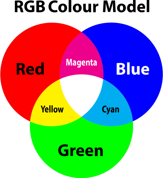
so to neutralise a colour within a gif, you need to add more of the colour(s) that are lacking.
in practice this usually means: the scene you want to gif is very yellow! yellow is made of red and green light, so to neutralise it you need to add more blue into your gif.
it can also mean the reverse: if you desaturate the yellow tones in a gif, it will look much more blue.
looking at the colour balance sliders on photoshop can make it easier to visualise:
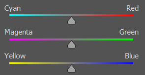
so making a gif more red also means making it less cyan.
removing green from a gif means adding magenta.
taking yellow out of a gif will make it more blue.
tl;dr:
neutralise yellows by adding blue (and vice versa)
neutralise reds by adding cyan (and vice versa)
neutralise green by adding magenta (and vice versa)
2. super simple colouring (the essentials)
starting with a nice sharpened gif in photoshop in timeline mode. (these are the sharpening settings I use!)
some scenes are much harder to colour than others - it helps to start out practising with scenes that are bright/well-lit and that don't have harsh unnaturally coloured lights/filters on. scenes with a lot of brown/orange also tend to be harder.
I usually save a base copy of my gif before I start colouring just in case I end up hating it, or find out later that it doesn't quite fit right into a set and need to redo it etc.
so here is my base gif!

it's an okay gif, but it has a bit of a yellow tint to it that I want to reduce.
colouring is easiest to do in adjustment layers, which can be found under layer -> new adjustment layer - or for me they are here:
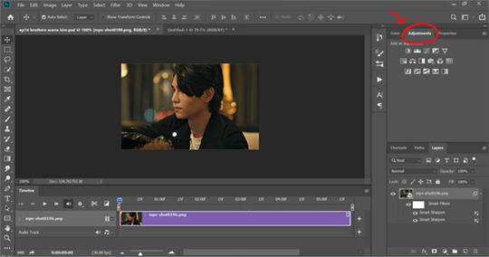
there are lots of different types of adjustment layers that do lots of different things - but for me the absolute essentials for colouring are curves, selective colour, and hue/saturation.
I also use brightness/contrast, levels, exposure, vibrance, colour balance, and channel mixer sometimes, depending on the gif - but I use curves, selective colour, and hue/saturation on every single gif.
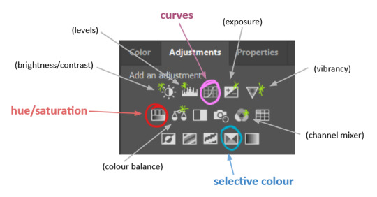
✨ curves layer
the first thing I always do is a curves layer. when you first open one it will look like this:
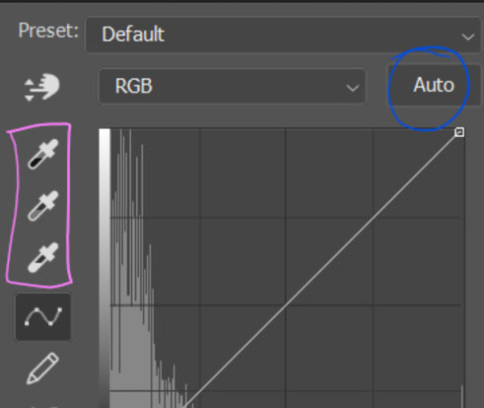
first I usually click the ‘auto’ button, just to see what happens. sometimes it makes a big difference (it usually brightens the gif a lot) - but on this gif it didn’t do much.
if it had made the gif look nicer then I would have kept it and added a second curves layer on top to do the rest of these steps.
the next step is selecting the white and black points with the little eyedropper tools.
the bottom eyedropper lets you pick a white point for the gif. click somewhere super light on the gif to see what happens - for this gif, I clicked on the lampshade on the left. if it looks weird, I just undo it and try somewhere else - it usually takes a few goes to find something that looks good.
here's what that did to the gif:

then I pick the top eyedropper and use it to pick a black point by clicking somewhere really dark, again playing around until I find a black point that looks good.
here's what the gif looks like after picking the white and black points:

this can take some experimenting, but you can make super easy drastic changes to your gif just with this. in this case, the curves layer took out a lot of that yellowy tint.
and this is what the curves graph looks like now:
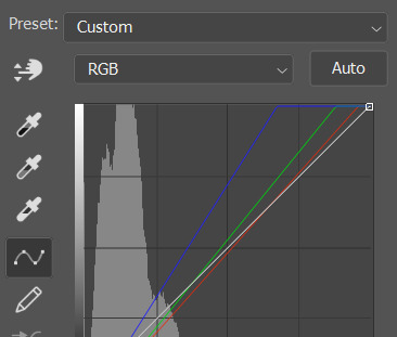
you can click and drag those lines to make further changes if you want - I usually leave them alone though. the colours of the lines indicate which colours have been changed in the gif - for example, you can see from that steep blue line on the graph that blue has been added to neutralise those yellows.
next I usually do another curves layer and just press the ‘auto’ button again to see what happens. usually it brightens the gif a bit more, which I like.
‼️if nothing is working: usually with a bit of fucking about a curves layer works well - but sometimes you can’t find a good white and black point anywhere, and instead your gif turns wacky colours and nothing looks good. this happens more often with very heavily colour tinted scenes :( the troubleshooting section at the end goes over some options, including starting with a levels layer instead.
✨ selective colour (and skin tone correction)
skin tones are made up of a mixture of yellow and red.
removing yellow (or adding blue or red) to a gif will make the skin-tones too red - and removing red (or adding cyan or yellow) to a gif will make the skin-tones too yellow.
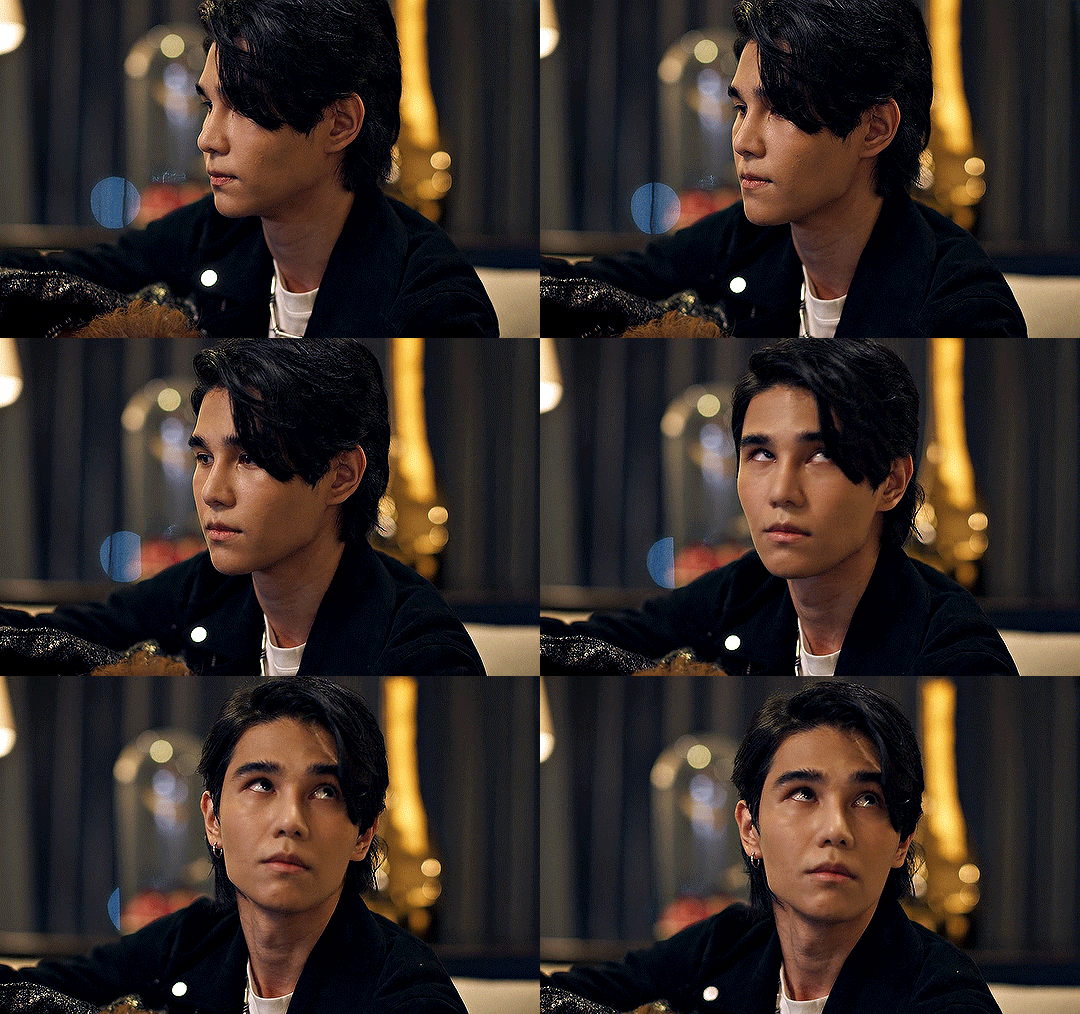
adding blue to this gif with the curves layer took out the yellowy tint, which I wanted - but it also took the yellows out of Kim's skin tone, which I don’t want. so I need to put yellow back into the skin tones specifically - without putting it back into the rest of the gif.
selective colour layers let you select an individual colour and adjust the levels of other colours within that colour. you can change how yellow the green shades are, or how much cyan is in the blues, for example.
I need to add yellow back into the red tones to correct the skin tones on this gif. this is the case for most gifs in my experience - the vast majority of the time, unless a scene is very heavily tinted in another colour, a curves layer will add blue/remove yellow.
in the 'colors' dropdown, select the 'reds' section and drag the 'yellow' slider higher - this will add more yellow into just the red shades within the gif.

the amount of yellow you need to add back into the reds depends on how much yellow was taken out of the gif initially - I just play around with the slider until it looks right. if you're not sure, it helps to have some neutrally-coloured (not white-washed!) reference photos of the people in your gif to compare to.
here's the result. Kim's skin is a lot less pink toned and much more natural looking:
✨ hue/saturation
this adjustment layer lets you adjust the hue and saturation of the gif as a whole, and also of each colour individually.
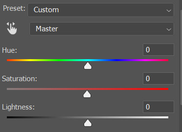
I don't use the hue or lightness sliders unless I'm trying to do something more complicated with the colouring.
clicking the dropdown menu that says 'master' lets you edit the saturation of each colour individually. this is useful if your gif is still super tinted in one colour.
I thought the yellows on this gif were still slightly too bright, so I switched to the yellow channel and desaturated them slightly. (remember if you do this then you need to go back to selective colour and add more yellow into the red skin tones to balance out the desaturation!)
then I increased the 'master' saturation of all the colours to +5:

I usually find the right amount of saturation is somewhere between +5 and +12, but it depends on the gif.
‼️if the gif feels undersaturated, but the saturation slider isn't helping/is making the colours worse, try a vibrance layer instead.
done!
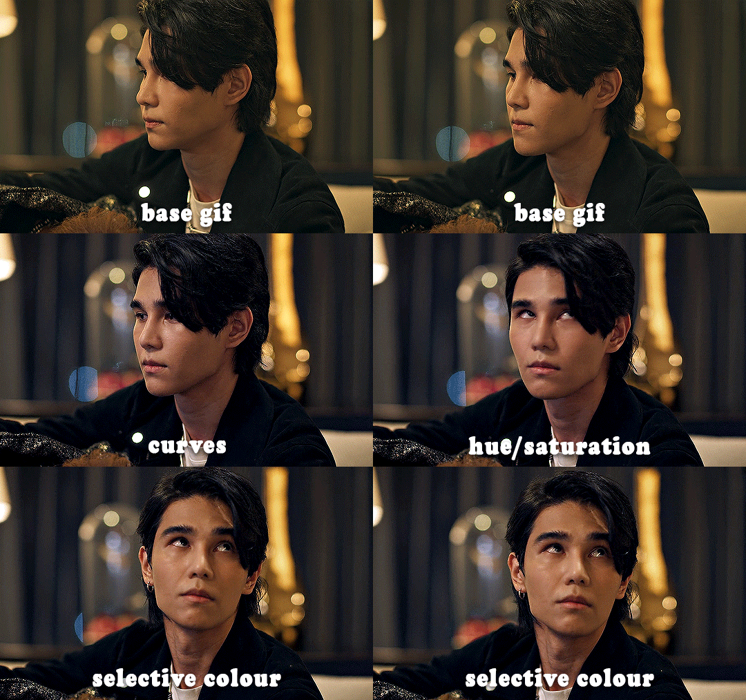
✨ saving and reusing colouring
you can copy and paste adjustment layers between gifs to make your colouring even across each of your gifs for one scene - so if you're making a set of multiple gifs of the same scene, or you think you might want to gif the same scene again in the future, you can save it as a psd so you can reuse the colouring again later.
each gif's colouring will then still need tweaking - different cameras/angles/shots of the same scene can still start out with slightly different colouring.
I recommend uploading the gifs as a draft post on tumblr so you can see what they all look like next to each other and catch any inconsistencies.
✨ another one! (speedrun!)
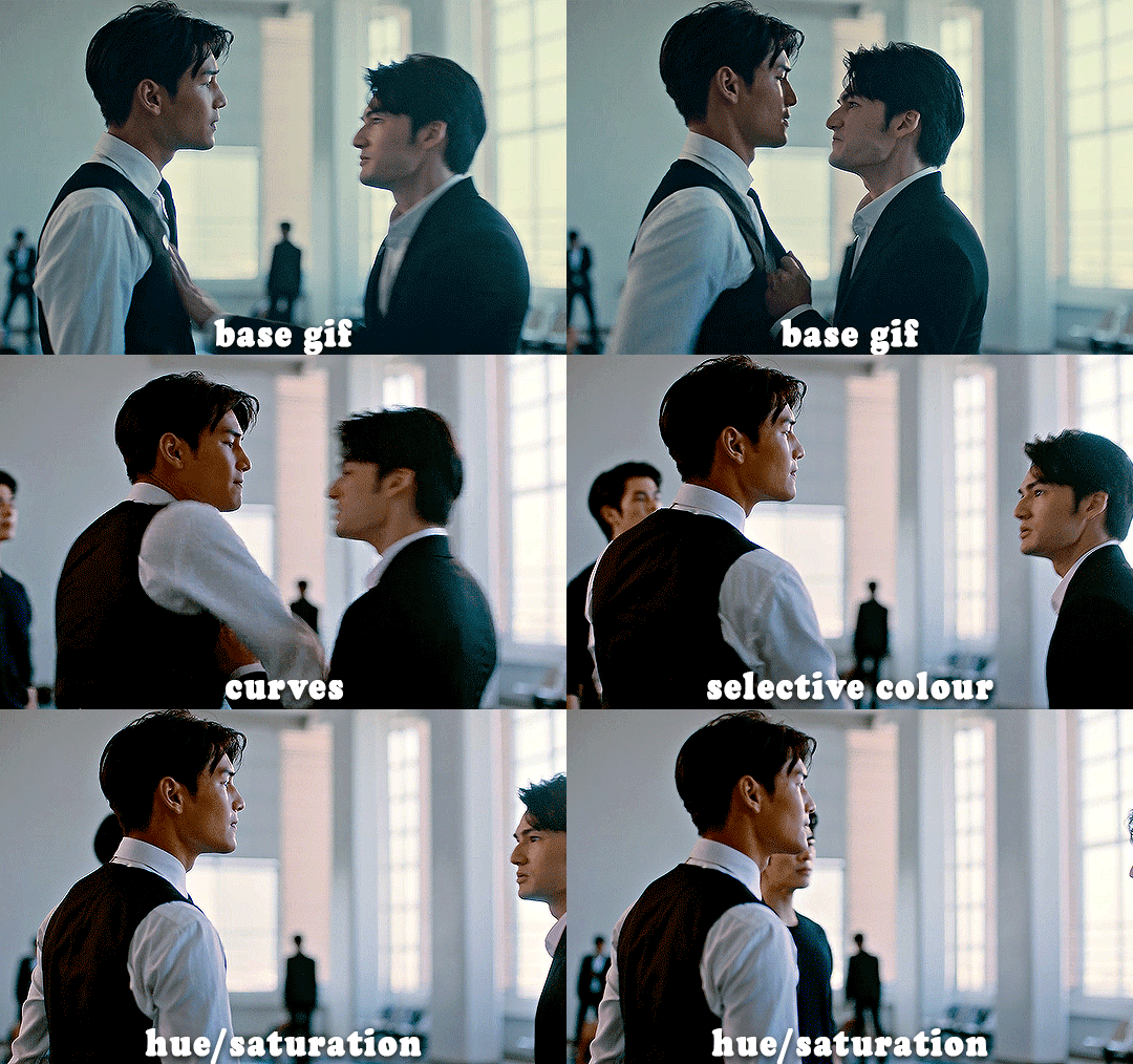
HI KEN!
the white point for the curves layer was in the window behind them.
the curves layer removes the muddy yellow tint, but again it makes their skin tones (especially Ken's) very red toned, which is adjusted by the selective colour layer.
3. other adjustment layers
imo many many gifs can be coloured really nicely with just those three adjustment layers, but some need different adjustments.
✨ brightness/contrast
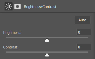
pretty self explanatory!
I personally usually avoid using the 'brightness' slider because I rarely like the effect - I only tend to use the 'contrast' one.
the 'auto' button is sometimes useful though, especially if you’re struggling with the curves layer.
✨ levels

levels alters the white and black points of the gif, like curves - but unlike curves it doesn't also alter other colours.
use the sliders beneath the graph to alter how dark/light the gif is. you can slide the black slider further to the right to make the blacks darker, and the white slider to the left to make the whites lighter.
levels is a good place to start if your curves layer isn't working.
(I'm going to hit the image limit for this post lol so here are some screenshots of a table I made to demonstrate this rather than actual gifs. sorry!)
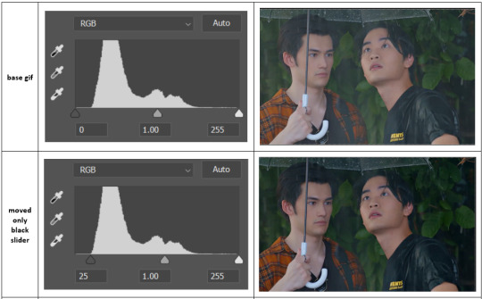

on both sides, I dragged the sliders up to where the big jumps are on the graph - this is usually a good place to start!
✨ vibrance
vibrance... makes the colours more vibrant. it's more subtle than saturation.
it's really helpful for gifs that feel grey. sometimes adjusting saturation just makes the greys kind of weirdly tinted, but a vibrance layer can fix that.
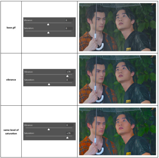
vibrance is much more subtle!
✨ colour balance
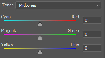
colour balance affects the overall balance of colours within a gif.
it's good for scenes with heavy tints.
I tend to stick to the 'midtones' dropdown, but you can also alter the colour balance within the shadows and highlights if you want.
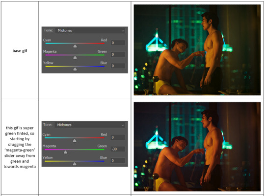

✨ channel mixer
I avoided channel mixer for such a long time because it scared me. but it's great for scenes that are very heavily tinted in one colour.
basically, it works with the levels of red, green, and blue within a gif. you select an output colour and then play around with the levels of the colour you selected within each other colour.
kind of the reverse of selective colour?
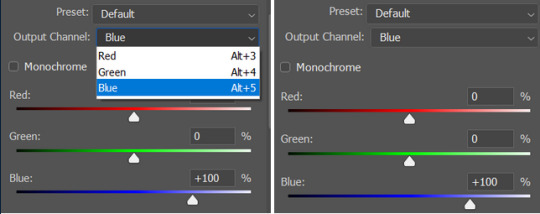
so in the 'blue' channel, the levels of blue are at 100%, and the levels of red and green are at 0% - but you can impact how much blue is in the reds and greens and blues.
this tutorial explains it well - but imo the best way to get to grips with channel mixer is just to play around with it a bit (sorry)
(when I made this guide for my friend, I also made a slightly more complicated gif colouring walk-through that included using channel mixer. there isn't space to include it within this post, but if anyone is interested I could always upload it as an 'intermediate' gif colouring tutorial - lmk!)
4. troubleshooting
‼️curves
usually with a bit of fucking about a curves layer works well - but sometimes you can’t find a good white and black point anywhere, and instead your gif turns wacky colours and nothing looks good. this happens more often with very heavily colour tinted scenes :(
for example, with this base gif:
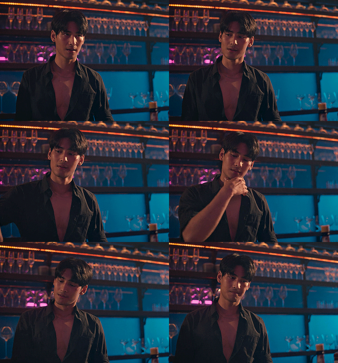
using many of the brightest points as a white point turn it wacky colours, like this:

yikes :(
some options for these cases:
try brightening the gif first with the 'auto' button on the curves layer or with a levels layer. having a brighter gif to start with can give you better options for picking a white point.
try finding an alternate, whiter/brighter white point. look for places the light reflects - on this gif, using the light on Porsche's cheekbone works well as the white point. it also helps to find places that would be white if the scene wasn't tinted - the lightest part of a white shirt is often a good place to start, for example.
skip the curves layer, and instead use a levels layer to alter your white/black points, and colour balance or channel mixer to balance the colours.
‼️over/undersaturation
if your gif (especially the skintones) is looking a little washed out or lifeless, it might be undersaturated. boost that saturation - or if that's not working, try a vibrance layer.
oversaturation is often easiest to spot in the mouths and ears of any people in a gif. if the mouths are looking unnaturally, vibrantly red, then you've gone too far with the saturation.
5. fin!
and done! I hope this was coherent helpful to somebody.
if there's anything that I've missed or that doesn't make sense pls feel free to shoot me an ask or a message and I'll do my best to help! I've also collated a bunch of additional reading/resources below.
happy gifmaking 🥰
✨ some links!
photoshop basics by @selenapastel
gifmaking for beginners by @hayaosmiyazaki
gifmaking guide for beginners by @saw-x
dreamy's gif tutorial by @scoupsy-remade (includes instructions on how to blur out burned-on subtitles or annoying video graphics)
beginner's guide to channel mixer by @aubrey-plaza
how to fix orange-washed characters by aubrey-plaza
colour correcting and fixing dark scenes by @kylos
does resampling matter? by usergif
how to put multiple gifs on one canvas by @fictionalheroine
watermarking using actions by @wonwooridul
resource directory by @usergif
#i got a couple of asks about this so i figured i'd type it up as a post#it's been sitting in my drafts for a while now though i'm so sorry omg.#i had to replace my laptop and it took me a while to get round to downloading photoshop on the new one#but i hope this is helpful!!#gif making#tutorial#photoshop tutorial#colouring tutorial#coloring tutorial#gif colouring#gif coloring#photoshop resources#gif tutorial#gif resources#userbunn#uservik#darcey.txt#darcey.gif#usergif
789 notes
·
View notes
Text

Thank you @cobbbvanth for asking me for this; I’ve never been more flattered! ☺️ I’ve only been making gifs for a little more than 2 years, so I’m really still only figuring Photoshop out, and my colouring owes everything to other people’s tutorials (some of which can be found here). To be honest, I was only asked some tips, but I have no clue what to include and what to leave out; so, here’s my complete (if random) colouring process.
NOTE: This is a colouring tutorial, not a gif-making one. The tutorial that taught me everything I know about that (and to which I am eternally grateful) is this one by @hayaosmiyazaki.
I. SHARPENING My standard sharpening settings are:
One Smart Sharpen filter set to Amount: 500 | Radius: 0,4
A second Smart Sharpen filter set to Amount: 10 | Radius: 10
One Gaussian Blur filter set to Radius: 1,0 and Opacity: 30%
One Add Noise filter set to Amount 0,5 | Distribution: Gaussian
II. BASIC COLOURING This is the part where I add most of the adjustment layers available and just play around with them. Obviously different settings work for different scenes, but I do have some standard ones.
Brightness/Contrast I usually up the Brightness to +10-30, and the Contrast to about +10.
Curves
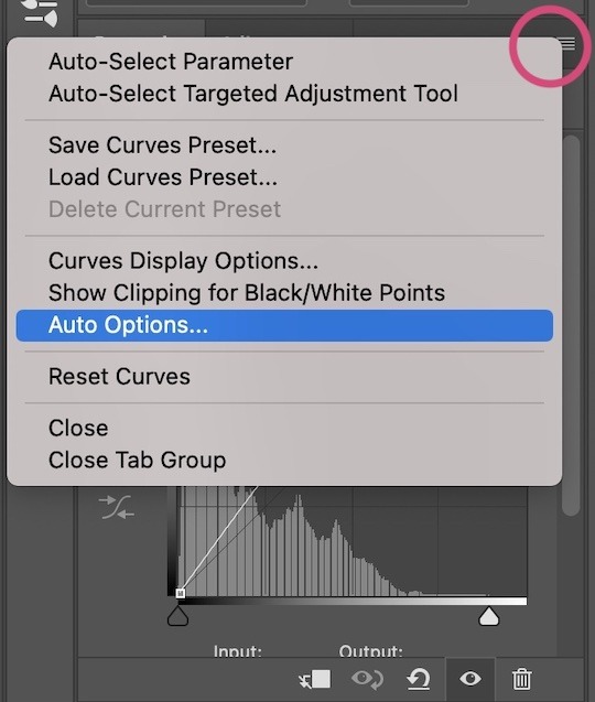
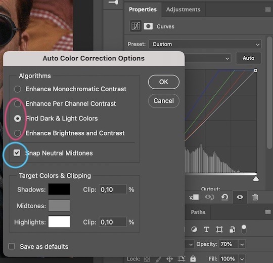
For the first Curves layer I go to Auto Options > Enhance Brightness and Contrast, and then adjust the opacity until I’m happy.
I might repeat the above step if the gif still looks too dark to me.
I add another Curves layer, I go to Auto Options and this time I pick either Find Dark & Light Colors or Enhance Per Channel Contrast, and check or uncheck the Snap Neutral Midtones option, until I see something I like. I will then adjust the opacity.
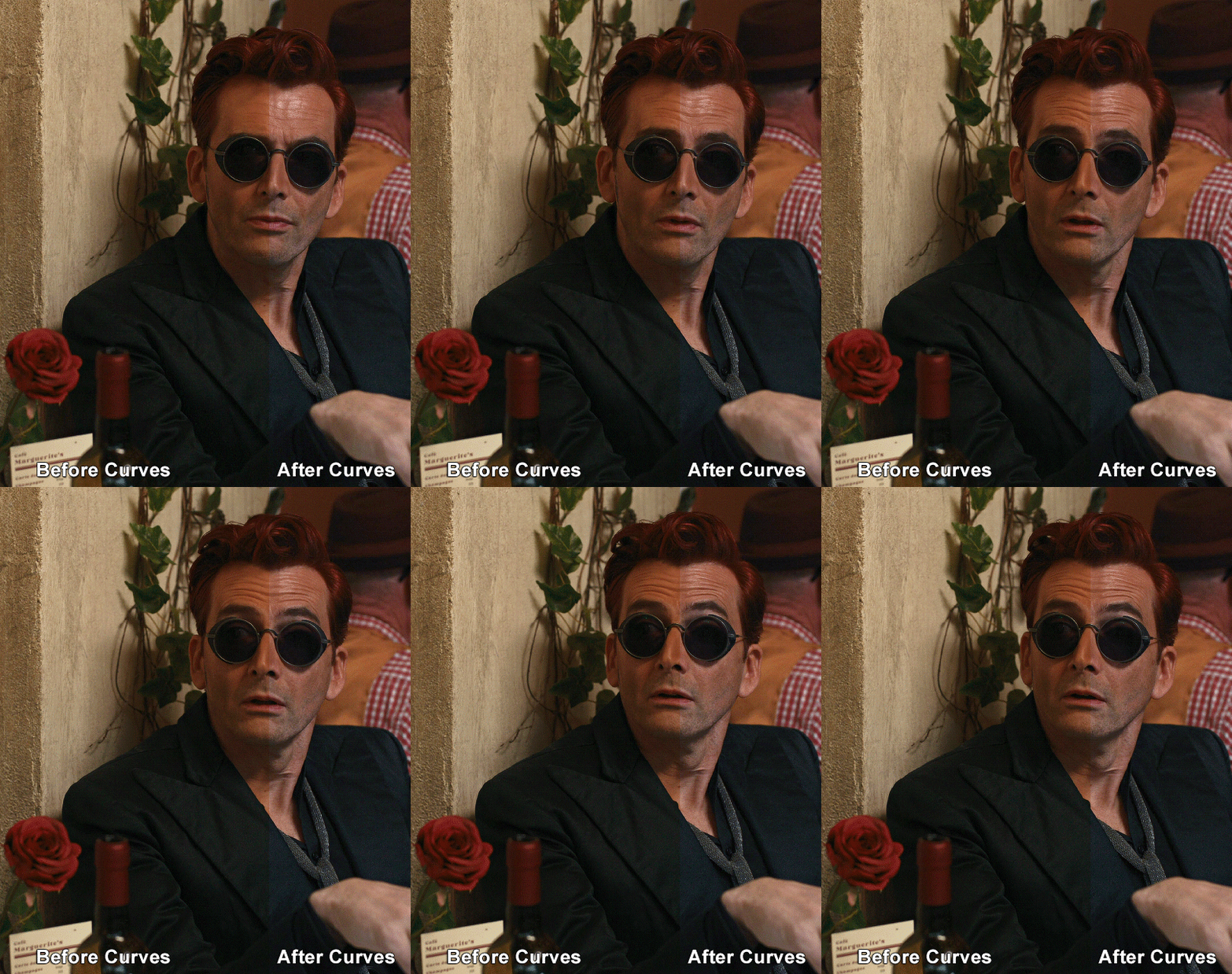
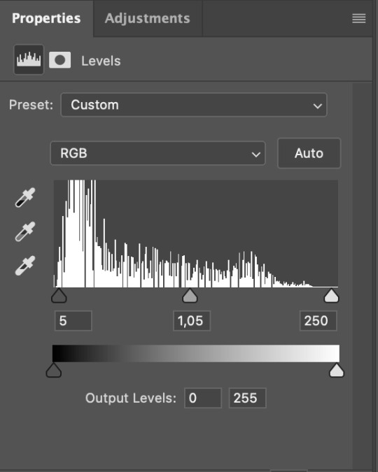
Levels I add a Levels layer that usually looks something like this:
Exposure I add an Exposure layer, where I usually set the Offset to around -0,0010.
Selective Color To make the faces look okay, I create a Selective Color layer, select the Reds and usually add some Cyan (+10-20%) and play around a little (±5%) with Magenta and Yellow too. I might also add another layer, select the Yellows and make slight tweaks there too.
III. FUN COLOURING About colour manipulation: PiXimperfect just uploaded a tutorial that explains everything so much better than I ever could, so I highly recommend you go watch it. It’s made for static images though, and things are more complicated with moving images, so I also recommend @sabrinaacarpenters’s tutorial.
The reason I usually go for a softer colouring is that a more vivid one requires a lot of patience and precision, and I honestly can’t be bothered. Instead, I try to tweak the colous only a little, so that the edges can be a little rough without it looking too wrong.
One thing to remember is that each gif is different, and there isn’t one foolproof way to do this, so you will need to use a different technique depending on the gif you’re working with.
Okay, so, after I’ve decided what colour I want my background to be:
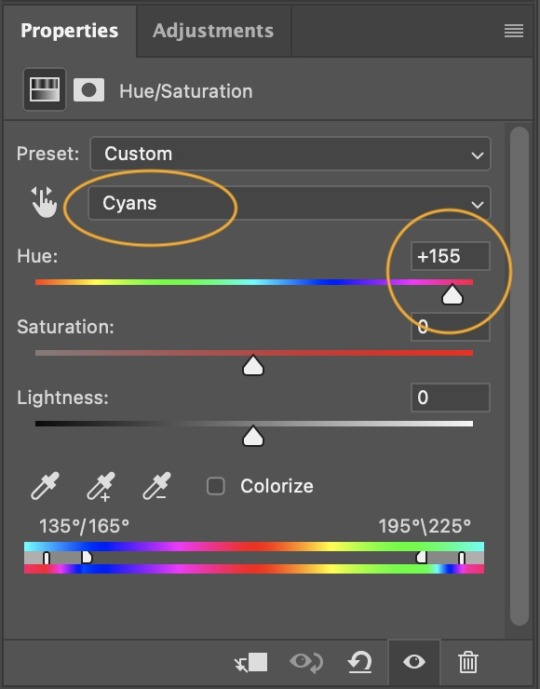
1. I create a Hue/Saturation layer and change the greens, cyans, blues and magentas to that colour. That’s easy enough, since it doesn’t mess with the face colour. I then set the blending mode to Color. If your background doesn’t include any yellow or red, you might be done here, like in the case bellow:
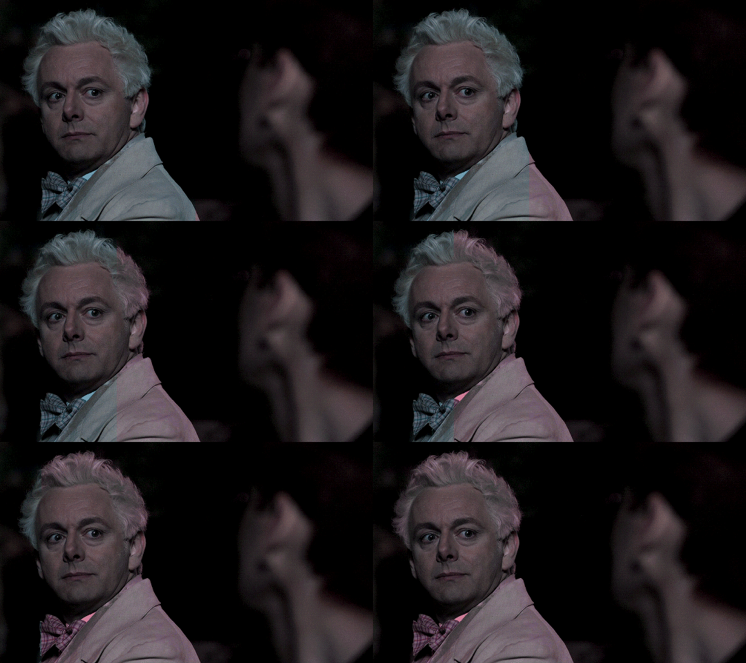
2. To change the yellows and reds, I create a new Hue/Saturation layer, select the yellows/reds, move Saturation to 100 (temporarily) and then play around with the sliders until the face colour isn’t affected. I then change it to whatever I’ve chosen and change the blending mode to Color.
3. If for whatever reason step 3 doesn’t work (the background is white or black for example, or just too red), I might create a Solid Color layer set to whatever colour I want, set the blending mode to Color and then select the layer mask and carefully paint with a soft, black brush over the people’s faces/bodies. I will then lower the Opacity, to whatever looks smooth enough. If there’s a lot of movement in your gif, you might have to use keyframes (see sabrinaacarpenters's tutorial linked above). However, my main goal is to avoid using those; that’s why I try my hardest to tweak around as many Hue/Saturation layers as needed and not have to create a solid color layer.
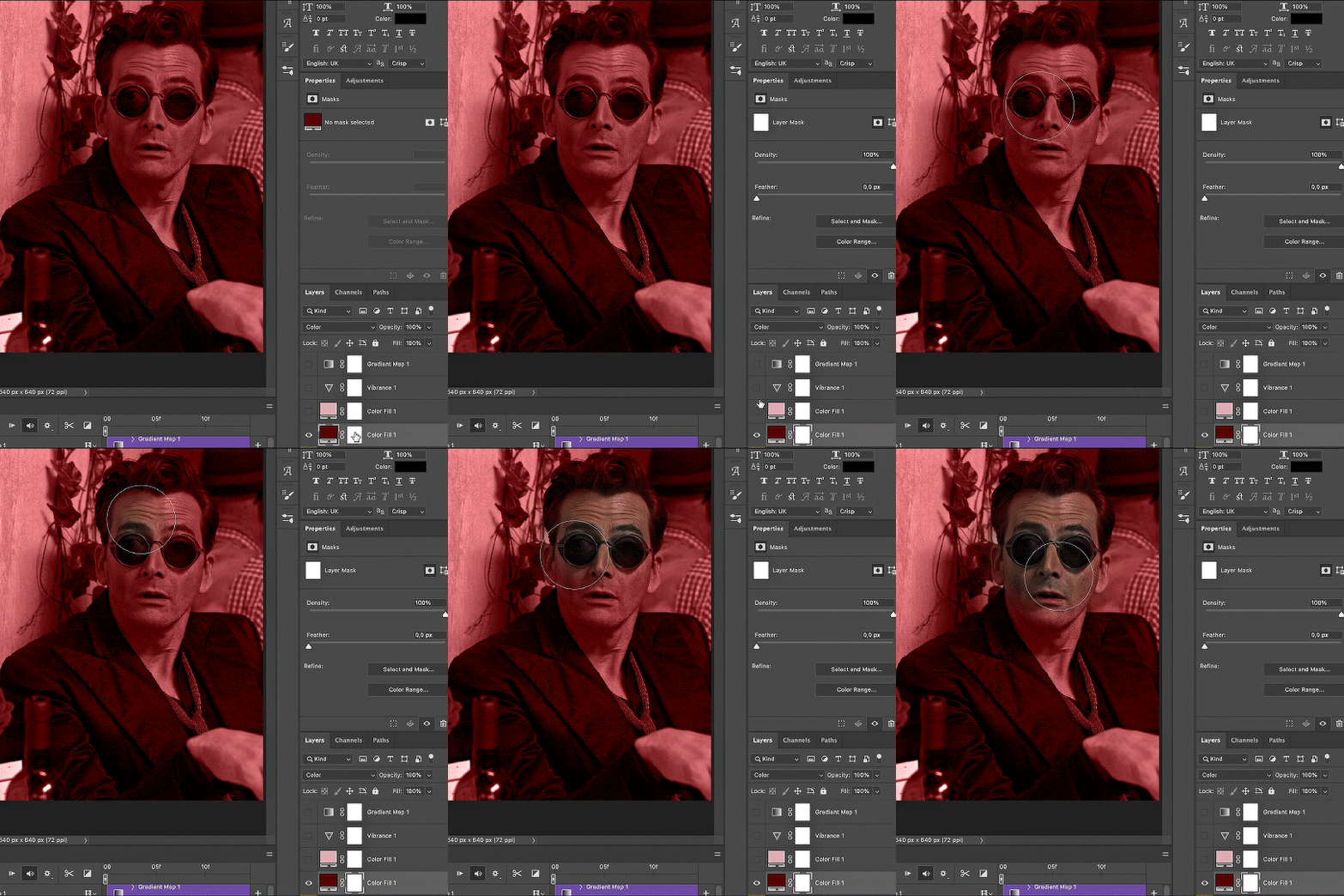
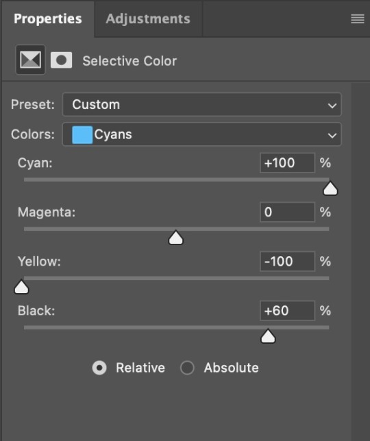
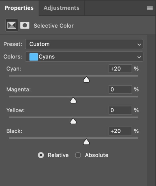
4. Once my background looks the colour I want it, I might add a Selective Color layer that matches my background color and then try to make it look more vibrant. For this Aziraphale gif below for example, I’ve selected the Cyans and then set Cyan to +100%, Yellow to -100% and Black to +60, then created another one, selected the Cyans again and then set Cyan to +20 and Black to +20.
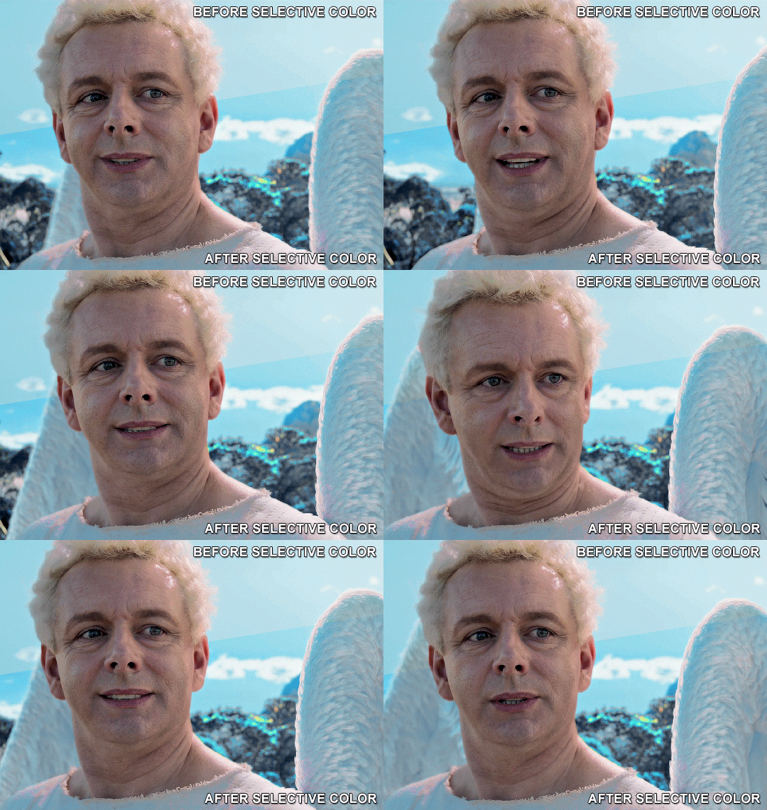
5. If the gif has a white area, I create a Solid Color layer with a colour that matches the rest of the background and then set the Opacity low. I might also create a Selective Color layer, increase the Black and then play around with the colours.
IV. FINISHING TOUCHES
I create a Vibrance layer and set the Vibrance to around +30 and the Saturation to about +5.
I create a black and white Gradient Map layer (with black on the left end of the spectrum and white on the right), set the blending to Luminosity and the Opacity to about 20-30%.
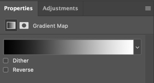
AAAND that’s about it I think! This ended up way too long and perhaps a little incoherent. I tried to make it as general as possible, so you might have to mix and match for best results. Feel free to ask me for further explanations about any one of these steps, and please tell me if you want me to go through the colouring of a specific gifset (although, as I said, I'm by no means an expert). Happy gifmaking!
#gif tutorial#allresources#completeresources#dailyresources#photoshop tutorial#minee#tutorial#tutorial*#chaoticresources#uservivaldi#userdanahscott#usersanshou#userfanni#userbuckleys#userrobin#tuserjen#userdavid#userzaynab#tusermimi#thingschanged#tuserju#usertj#userhallie
359 notes
·
View notes
Text
Before / After colouring 🎨
I got tagged such an embarassingly long time ago that I don't remember who it was. Anyways, thank you so much to whomever lovely it was, I really appreciate the tag and finally found time to do a post about my colouring.
I started gifing less than a year ago and learned a lot since then. I gif online in Photopea as Photoshop is just to expensive for me atm (and my old laptop probably wouldn't survive running Photoshop). So, if anyone wants a detailed process of gifing in Photopea, jhmu.
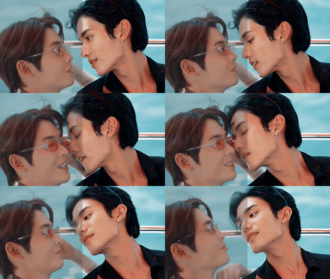
Bed Friend | King and Uea I love how King's desire for Uea is shown in this gif. He is just gone on Uea and barely can hold himself back.
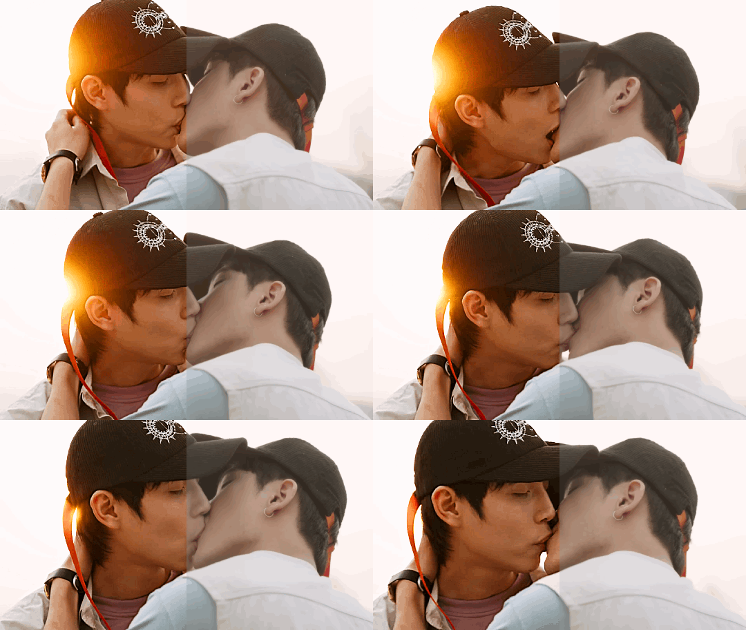
The Eclipse | Akk and Ayan Loved the sun shining from behind Akk's head and had to colour the gif in a way that the sun would stand out a bit.

A Boss And A Babe | Gun and Cher Them and their adoration for each other made me love this show.
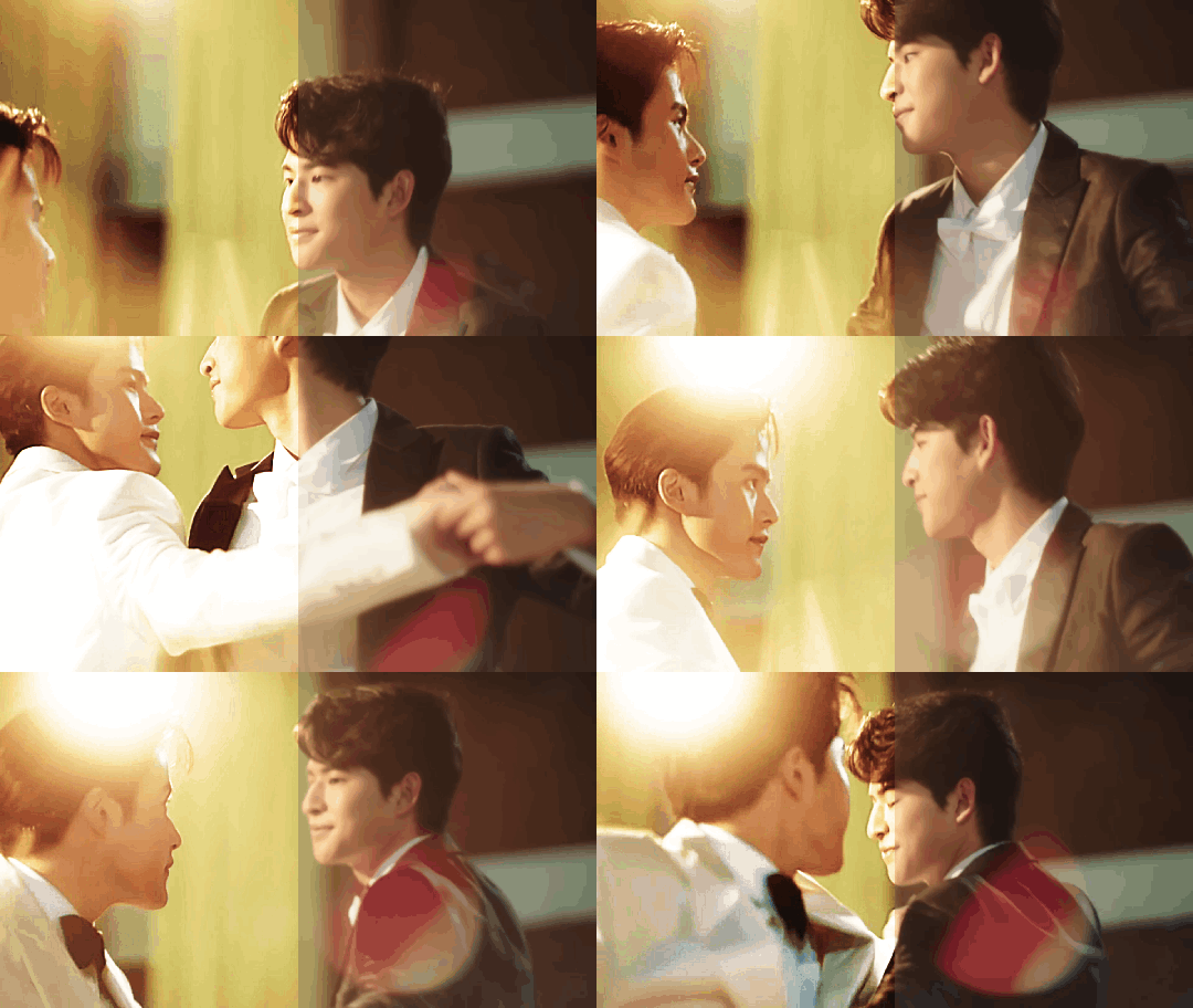
My School President | Tiw and Por TiwPor my beloved side couple 💖
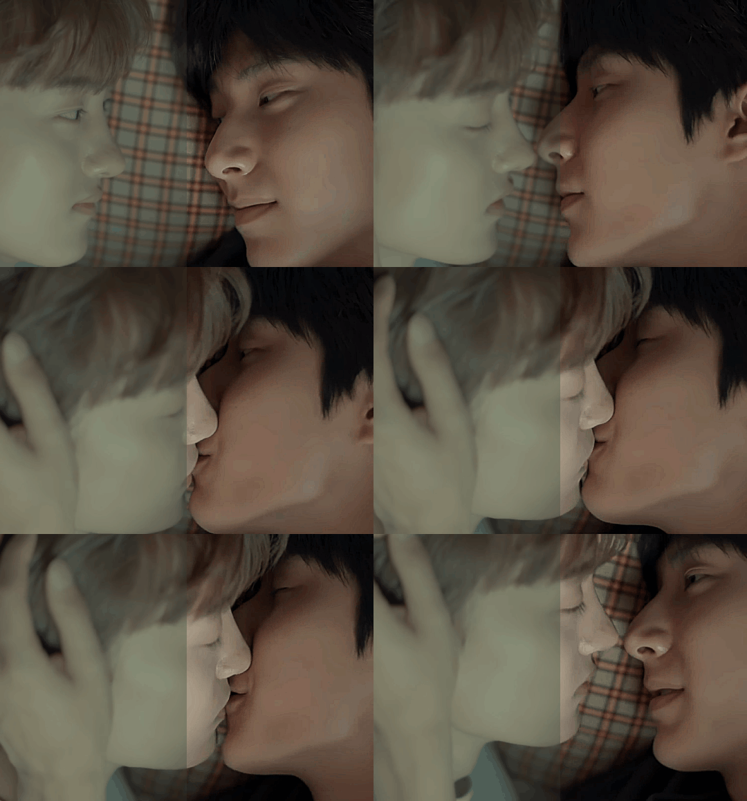
The Eighth Sense | Jae Won and Ji Hyun The story of Jae Won and Ji Hyun was the first of a few series that I call "The Right One", i.e. series that just capture me and leave an impact ✨
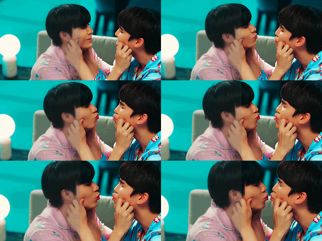
Naughty Babe | Yi and Lian My favourite ghostship. Also the colours in this scene were just too good to not gif.

Never Let Me Go | Palm and Nueng Just Palm having his big entrance 🤩

Bake Me Please | Shin and Peach This kiss was sooo cute and lovely.

Moonlight Chicken | Alan, Wen and Jim MLC was everything, especially this scene.
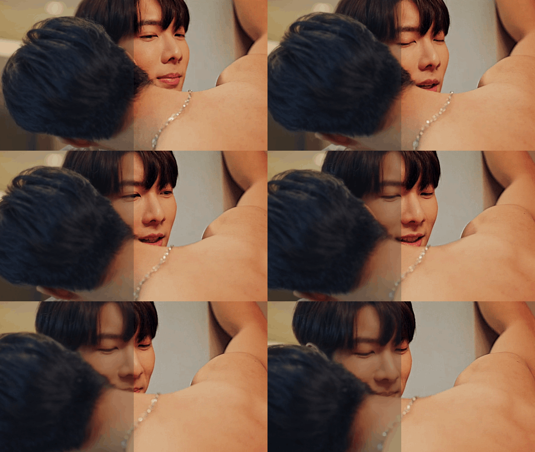
Be Mine Superstar | Mingmueang and Namning Aka how to seduce a doctor. I'm excited that we get a new series with Bosston and Jo.
Kiseki: Dear To Me | Bai Zong Yi and Fan Ze Rui A couple and a show that left me speachless. Their story was so just so good.

Wedding Plan | Sailom and Namnuea Loved their story and how insatable they were.
Laws Of Attraction | Tinn and Charn Forever one of my favourite couples and series ✨

My Ride | Mork and Tawan Had the most fun doing a rewatch of this series.

Playboyy | Teena and Zouey The way this show combines gorgeous cinematic shots with that storyline makes me feel like I'm watching a stage show. I love it.

The Sign | Phaya and Tharn Every week this show leaves me spechless it's that good. One of the shows that I call "The Right One"!
Bonus:

The Sign | The colours As I sad in another post, I'm rolling in the colours of this show like a cat in catnip 😎

Edited to add a few people who I'd love to see doing a post about their before / after colouring: @wanderlust-in-my-soul @pharawee @liyazaki @bunnakit @khaotungsfirst @gabrielokun @spicyvampire @zhaozi @guzhu-furen @25shadesoffebruary @chinzhilla @crispywizardtale as always please ingnore if you don't want to do it.
#the eighth sense#our skyy 2#the eclipse#my school president#a boss and a babe#bed friend#naughty babe the series#never let me go#bake me please#moonlight chicken#be mine superstar#kiseki: dear to me#wedding plan the series#laws of attraction#my ride the series#playboyy the series#the sign the series#bl series#bl drama#maxine gifs#thai bl#korean bl#taiwan bl#multi bl#photopea
151 notes
·
View notes
Text


4 years ago today my dear friend @kpopingenue and I were talking and she sent me the MV for Wonderland because she liked it and thought I would too.
And, thus, my Ateez journey began.
I jokingly call it a slow burn relationship. I loved their music from the first time I listened to Wonderland but it took a few months before I checked out their albums and listened to their b-sides.
Even after that I still didn't know all their names (which is nothing against them, I'm the same with a lot of kpop groups I've been listening to for ages. I've been listening to Stray Kids for almost as long as I've been listening to Ateez and I still only know half the members).
Eventually, and I remember this clearly, in December 2021 I had a very vivid dream about buying Zero Fever Part 2 and I took that as a sign and ordered it as soon as I woke up.
It was funny because I knew some of the members at this point but not all of them and I had to text a photo of my photocards to a friend because I knew one of them was San, but I had no idea who the other one was (it was Yeosang).
After that, it became a pay day treat. Every month when I got paid, I'd treat myself to an Ateez album until I had them all. I now have at least one version of every album including all the Japanese ones.
And I finally sat down and watched a guide because if I was going to start collecting albums I should probably learn who everyone was.
Even after that I still struggled telling Yunho and Jongho apart for the longest time, and I have no idea why because now that I know them well I can see that they don't look anything like each other.
So, this carried on for a couple more years. I was happily collecting my albums and watching new MVs when they came out, but I still, for whatever reason, hadn't crossed the bridge into the fandom side of things. I was just quietly enjoying them by myself.
Then Will came out, and I don't know why, but that album rewired something in my brain. Suddenly I was fully obsessed. I watched Hongjoong's behind the scenes of Matz vlog, and suddenly I wanted to make gifs, but proper gifs not just a using a screen recorder which was all I'd ever done before.
I had an ancient version of Photoshop (which I have now upgraded) so I found a gif making tutorial for beginners. The gifs I made were very basic, but I had made them, and I was proud of myself for learning a thing.
Then I decided that to practice and learn new colouring styles, it would be fun to make gifs of all the Ateez MVs. So I did! It took a good few weeks of making a new set every evening, but I did it, and I can definitely see how I've improved as I've gone along.
And there we have it. 4 years from watching an MV to collecting albums to learning how to make gifs. And along the way I've reconnected with some old friends who love Ateez, and made some amazing new friends too. I went to my first ever cupsleeve in May, and I've been to a couple more since then, with another one on the calendar for later this month (happy birthday Mingi). And next time they come to the UK I am definitely going to try and get tickets, which will also make them my first kpop concert.
It's taken me a long time to get here, but the important thing is I made it.
Happy Ateez-versary to me!
#my gifs#ateez#ateez gifs#hongjoong#kim hongjoong#hongjoong gifs#seonghwa#park seonghwa#seonghwa gifs#yunho#jeong yunho#yunho gifs#yeosang#kang yeosang#yeosang gifs#mingi#song mingi#mingi gifs#san#choi san#san gifs#wooyoung#jung wooyoung#wooyoung gifs#jongho#choi jongho#jongho gifs
46 notes
·
View notes
Text

Someone asked me for my gif colouring tutorial - this is a day I have been waiting for.
I’ll start by saying that there is no right or wrong way to colour gifs. It’s entirely dependent on the show, scene, character and the giffer. Over the years I’ve followed many gif tutorials (I’ll link my favourites at the end) and I think I’ve finally settled on a colouring routine (?) that works for any gif.
This tutorial presumes you have a basic understanding of how to make a gif and that you know how Photoshop works. I use Photoshop 2024 so things might differ depending on what version you have.
Shall we begin?
First thing I do once I’ve cropped, made my gif and sharpened it is to adjust the curves.
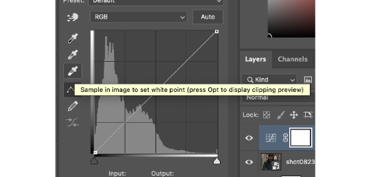
I always set the white point and the black point using the eyedropper tool. This adjusts both the brightness but also the RGB layers (red, green and blue) and begins colour-correcting the gif.
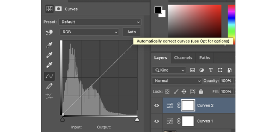
I then do another curves layer and I use the auto-correct curves button. This automatically adjusts the curves and brightens the entire gif.
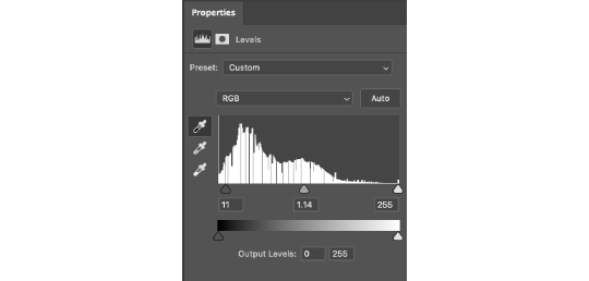
Once I’ve done my curves I move on to the levels. I increase the black point (the first little arrow as you look at it) and the grey point (the middle arrow). The black point deepens the darker areas of the gif. The grey point can either brighten the grey areas or darken them - I tend to brighten them.
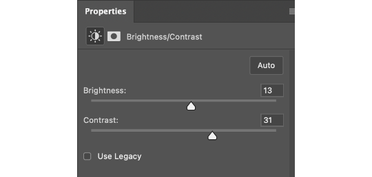
Then I adjust the brightness and contrast to make the whole thing brighter and deepen the colours.
The channel mixer is a new discovery I made (I didn’t make it, I just found a tutorial that did). It helps to colour-correct the gif and make it less orange/blue etc. If you’ve seen Shadow and Bone (namely season one) you know how green and orange some of it is. This layer helps to combat that and make it a more natural colour.
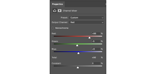
For this gif, because it was all a bit yellow/orange, I decreased the reds and greens and increased the blues. I only go up or down by one or two - if you go too much in one direction or the other it’ll begin to change the colour of the entire gif rather than subtly correct it.
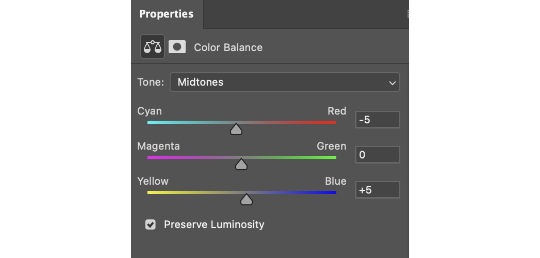
To colour-correct a bit more I use the colour balance layer. Again, I decrease the red and increase the blue. I tend to stick to going up in fives on this layer. +/- five tends to do what I need it to regarding colouring.
And finally I adjust the vibrance by five or ten just to make the entire gif pop that bit more.

Here's the gif before and after!
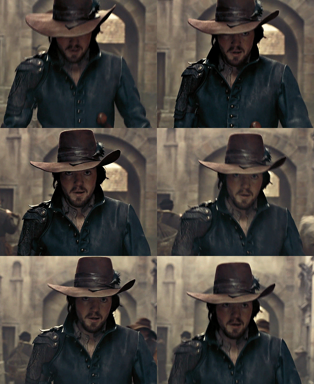

It's made a huge difference and made the entire gif seem a lot brighter and less yellow.
And just to prove it works no matter what - the left side has been coloured the right hasn't. The difference is noticeable, especially on Yennefer.

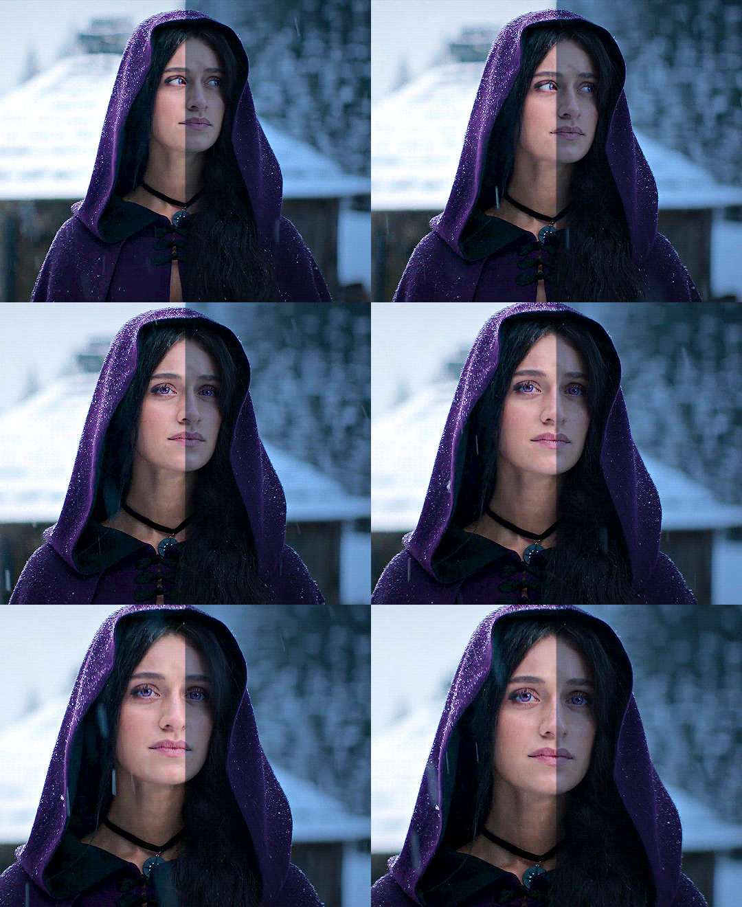
Tada, colouring tutorial! Whilst the numbers vary from gif to gif the order and layers used remain the same.
Here are some useful links to other tutorials. These are like my bible and I swear by them!
Gifmaking for beginners by @hayaosmiyazaki (the holy grail of tutorials for me)
Gif Making Guide for Beginners by @saw-x
And this tutorial by @aubrey-plaza goes into more detail about the channel mixer and how it actually works!
Any questions don’t be afraid to ask :)
50 notes
·
View notes
Text
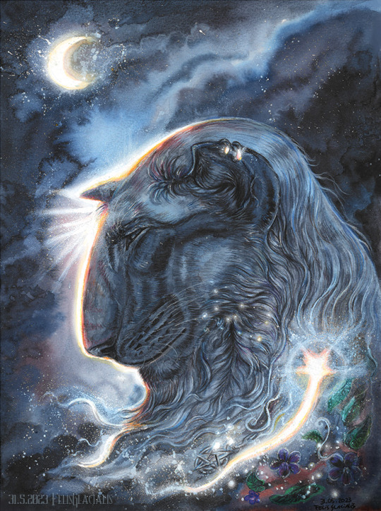
This is Morthian – the youngest son of Stian & Vivanna. See here his refsheet: https://www.deviantart.com/felisglacialis/art/Morthian-reference-831521064 He’s been quite close lately so I wanted to draw him in a bit of a peaceful, spiritual setting. He's in many ways so different than his parents and siblings. His father had become a fanatic fighter and his siblings followed in their father's footsteps. His mother was gentler but she too, had a brave determination that he didn't find in himself. Morthian has a calm and peaceful nature and he doesn't like violence. He struggled quite a bit to find his place among the others as he had been raised close to the Fjordland Force's activities (a sort of organization led by his father to defend their lands against invading humans). Eventually he found his role as a healer (like his mother) rather than a fighter.
I wanted to practice with liquid water colours and this kind of ‘glow’ technique that I find so inspiring in Khaosdog’s work. This was my very first attempt (I did this one before the previous drawing of Nintu) and I didn’t really know what I was doing. I still like how the water colour effects came out, but the glow effect failed a bit, so I edited it slightly in photoshop (just a splatter brush that mimics my traditional technique the most, no air brush or dodge effects). I've also used quite a lot of pencil this time and I learned some new techniques. Anyway - I've more ideas to draw Morthian in this style but I haven't come to it just yet -as I'm running short on time and energy :/
The title for this drawing came form a track from Beauty and the Beast www.youtube.com/watch?v=tH9RTu… – I generally associate Morthian a lot with the Beauty and the Beast soundtrack (particularly from the 2017 remake – the music was good even though the movie had lost the magic). This piece I link to his passing but also to the transformation that he underwent personally - when he learned to accept whom he is as a person and that he doesn't have to be like his father or siblings; he is ok the way he is.
Anyeay - I’ve been a bit inactive with drawing lately and I’m focusing a lot on 3D stuff, other activities and I have a shitload to do at work. So hopefully I can keep up with my every-second-week Sunday submissions again but no guarantee... ------------------------ DON'T COPY/USE ANYTHING OF THIS! Don’t use these or any other siderians as avatar in RP games and don't use them to represent some other character in role play games! They are who they are and they CANNOT represent someone else.
#siderian#Morthian#traditional art#artists on tumblr#liquid water colours#big cat#feline#Siderian#my art#FelisGlacialis#Bluepoint#traditional#Sætansen
22 notes
·
View notes
Note
hi! do you have tips and advice for making gifs? i love your gifs so much!
awww thank you so much, that really means a lot to me as I'm still rusty and a bit insecure because I've learned how to make gifs like 10 years ago? things didn't changed that much in terms of method and yet it's still scary, but at the end people like you make it worth!! 🥺🥺🥺
a little disclaimer: I'm colorblind, I can see colors okay! but I just see them a little bit different than most people so sometimes my edits may seem a little weird and that's the reason
Okay It will definitely be a long answer so I'll put under the cut ☺️
My advices would be:
- Just go for whatever scene you like the most, and try to focus on things you enjoy. I like to gif what I love, things I find beautiful as it gives me so much joy to look at the final result 😌
- Fortunately tumblr is full of people willing to share their knowledge and skills and there is lots and lots of blogs with the main theme being tutorials or even inspo and sources, so I always try to follow them to keep up with whatever is trending and just to learn new tricks and tips, some of my faves are @completeresources @gifmakerresource @allresources and @chaoticresources
- Be patient with yourself, if you are trying a tutorial and it is giving you a hard fight you can always stop and try again another time. It happened to me more than once that a tutorial or a particular idea I was trying gave me such a bad fight that I ended up so frustrated, exhausted, angry and feeling shitty but then I would pick another time to give it try and the thing worked hahahaha, so don't forget to respect your time and wellbeing
In terms of tips and tricks:
- Always use high quality videos, like the best quality available as it really makes a difference in terms of the final result
- Oh always resize your gifs!!! I use the crop tool and then I adjust the image size to keep it high quality, I think this is BY FAR the best tutorial as it explains quite well if you are new to editing
- So far I have tried many many different methods over the years, my fav is to cut the scenes I want to edit and for this use any video editing software really and after choosing a couple of scenes I import all of them to Photoshop (my version is the 2022 edition) and then I use the video timeline method (i don't really remember where I learned it but I found this really good tutorial that might be helpful)
- I slow down the gifs I make (idk how to explain it in english I'm sorry) but I set the speed for something in between 50% to 70%, depending on the scene
- In terms of colouring I don't really have a specific preset or fav PSD, I adjust them one by one just trying to focus on what the scene gives and then I work my way around it depending on what I'm trying to achieve or how do I want my gifset to look like (a good example was the Ron one on my last gifset i didn't wanted to look so yellow as it would be too different from the other gifs, it was a nightmare) BUT I guess I tend to use lots and lots of adjustment layers like I start with brightness/contrast, curves, and levels and then I proceed to selective colors, hue, vibration and saturation, sometimes I even use gradients and/or solid color layers with different blending options like soft light, overlay, opacity and fill settings to correct colors (I always use the color wheel principles of opposites and/or complementaries)
- Use smart sharpening!!! Peopel are so brilliant that they gave us actions, it is literally just a click away from all the trouble to do it manually, and it speeds up my process. Personally I have been using this amazing one I found quite recently, and it's really doing wonders to my edits
anyway thank you so much for being so kind and supportive, my ask box and dm are always open if you have any doubts or just want to exchange ideas. Really hope it helps you ❤️
7 notes
·
View notes
Note
hello chrissie! I hope you're having a good day!
do you have any tips on gifmaking for someone who wants to start?
Hi Nonnie, thank you so much for your ask, I hope you're having a good day, too 🥰
Tbh, I always feel like I am not really qualified to answer these questions, because – unlike me – most of the wonderful gif makers on this site use photoshop and if you have access to that software, I would always recommend using it because it’s easier, faster, the outcome is so much better and the opportunities it offers are endless. (There are a lot of beginner tutorials on this site if you search for gif + tutorial in the search bar 😊)
However 😉 If you don’t have access to photoshop or your cpu can’t handle it or you are simply overwhelmed by the vastness of the program, you can always try GIMP 😊 It’s opensource, you can download it legally for free and it runs on all platforms. The main drawback is that it doesn’t have the timeline feature, which means that you have to edit every single layer separately. (The program literally wasn’t designed to create gifs, it’s just that a few clever people found a way to work around that 😆)
I would recommend starting with this tutorial here. It explains how to create a gif in GIMP in general, how to create screencaps, how to import them, how to resize, how to crop and how to export your gif.
As for the really fun part (editing your gif), I think for a beginner it would be easiest to concentrate on three basic steps: brightening up the gif, adjusting the colours, and sharpening the gif. You’ll find all the editing tools that you need for that under “Colours/Colors” in the menu bar.
The brightening/contrast tool of GIMP can give weird results, so it’s usually easier to use the exposure tool, but that’s just my personal opinion.
As for playing around with the colours, the tools that you would want to look into first are “curves”, “levels” and “components -> channel mixer”. The channel mixer isn’t nearly as good as the one in photoshop, of course, but it makes me so giddy that GIMP finally has a proper one implemented 🙃
Also, if you’re just starting out, I would always recommend working with the largest quality source material that you can find (at least 1080p). I spent most of last year giffing really low quality vids because I’ve never been able to resist a cute Oscar moment, but if you’re just learning how to gif, the quality issue might become really frustrating, especially in the beginning.
And of course, the most important part: Allow yourself to have fun playing around and trying new things 🥰 Every new gif poses a new challenge, so don’t be discouraged if a certain editing step doesn’t result in the outcome you’d expected, you’ll soon get the hang of it 💜
I hope this was at least a little helpful 🥰
1 note
·
View note
Text
Lookbook - Front and Back Page
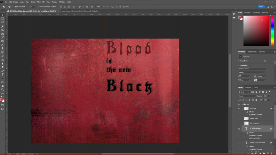
To start off creating this lookbook, I remember being told that we were allowed to rename the trend so after a bit of brainstorming I had decided to rename ”Grunge Romance” to “ Blood is a new Black” shortened to BITNB, as it is a spin-off of the phrase “____ is the New Black” meaning whatever word somebody starts off the phrase with it means it is the new chic or it is currently fashionable. I like this new name as it is memorable catchy and rolls off the tongue.
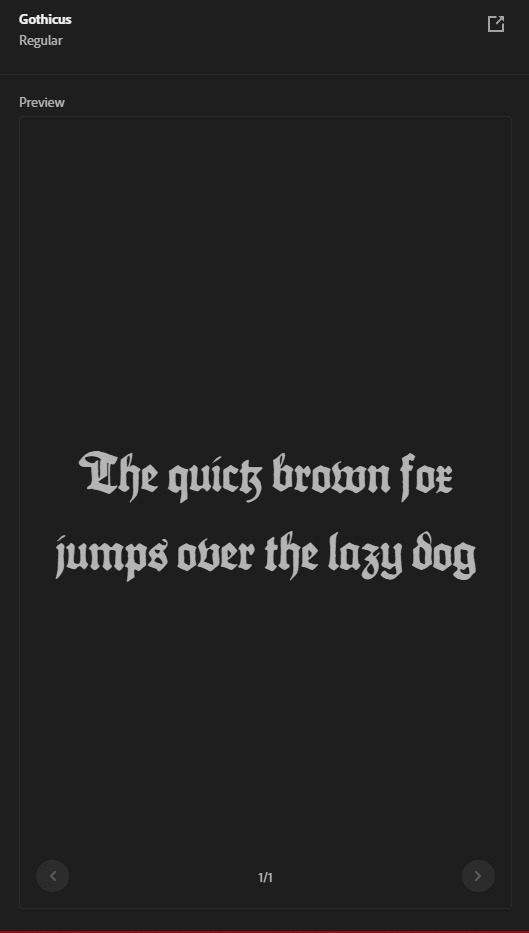
I had also decided I had needed to find a font that appropriately represent this trend, so after looking online I had found a serif font called “Gothicus” In Adobe's own font library. I like this font as it is obviously quite representative of the gothic subculture that is known for using Blackletter style/Old English script in calligraphy, and as Grunge Romance/ Blood is the New Black does take inspiration from the gothic subculture I thought this font would be great for this trend.
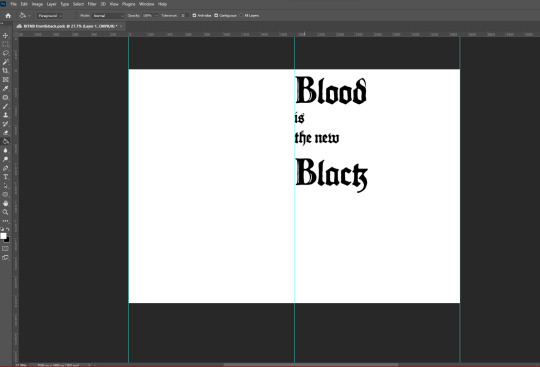
After using the text tool on Photoshop and selecting the gothicus font I had dragged out where I wanted my text to be and type out the trend name. I had also wanted an appropriate background As the front page of the lookbook would set the tone for the rest of the other pages, the front page of the lookbook should show the reader exactly what the trend is visually before they even start reading. I had gone online and found this fabric image, coincedentelly also called Grunge romance And how to use this as the background for my front and back page .
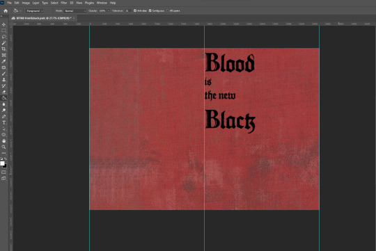
I had gone online and tried to find noise / grain details That would make the background more rugged and messy, as if it was quite old, As well as using the levels tool to change the darkness and lightness of the background enhancing certain details.
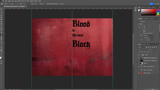
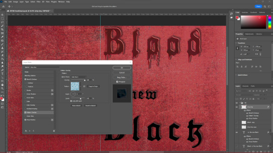
Next, as the name of the trend is “Blood is a new Black” I had an idea where I wanted to add a blood-dripping effect to the text, this had taken quite a while as I had not found any short solution to this and had involved me turning the text into a PNG image, although eventually I had figured out and had achieved the result I was looking for. I had decided I had only wanted the blood dripping effect to be only on the word ”blood” as it seemed right and it'd be more impactful and eye-catching for the front page of the lookbook. Next, I had wanted the rest of the text to stand out from the background so I had gone into the effects section of the text and added a drop shadow to the text so that the title doesn't seem flat against the background.
Going back to the blood dripping effect I had gone into the effects section, and added a pattern overlay of water, to make the blood seem more realistic in a way, I'd wanted this to be a subtle detail as if I had decreased the opacity the effect would show too much and the attention would be brought solely towards the word blood and ruin the rest of the page in my opinion.
My next step was to add some images of models that would represent the trend appropriately I'd found some on the WGSN website, under the Grunge Romance trend, as well as other sites. I had used the selection tool to highlight the model and use the vector mask tool to get rid of the background therefore only showing what I had selected with the selection tool, cleaned up any parts of the background that would shown by selecting the paintbrush, selecting the black colour, and selecting the vector mask and going over what parts I had wanted to be hidden. I plan to do this for all images and models that I want to use for the rest of this lookbook as it makes it easier to show/hide any parts of an image instead of selecting parts and deleting it, because if I had made a mistake and spotted it later, I would have to go back using the history section, therefore getting rid of any work I might have done after. After removing the background I had moved about and placed the images that I thought looked nice.
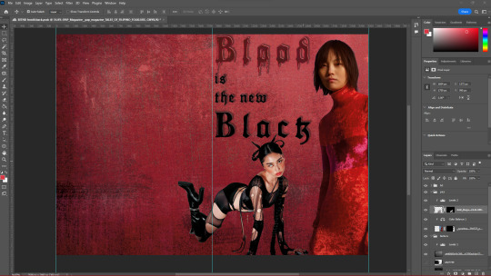
I had also used the Levels adjustment tool to change the mid-tones and undertones of the models as well to fit the theme of the trend which would be darker and sort of grittier as the original images were quite bright.
Before adding more images of models I had wanted to add something in the background so that it wasn't just a shade of red, so I had gone online and found a low-angle image of a church which I'd looked quite ominous and thought this would be perfect, so I had again used the vector mask tool and hid in the background of the image, lowered the opacity as to still show the details of the red fabric and placed it on one half of the double page spread, duplicated it and put it on the other side of the DPS so that it has a mirroring effect. I also decided to organise all my images into folders as to make finding certain images so that if I'd want to change anything in the future it wou;d be much easier and I'm not having to move about layers and getting confused about what goes where.
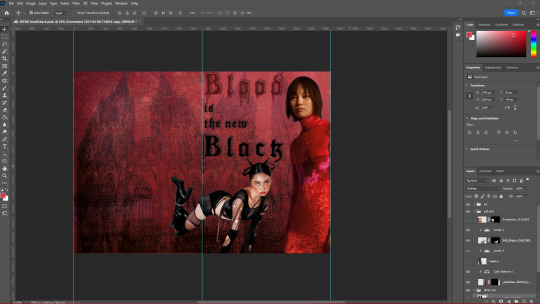
I found more images of models and clothing that I thought reflected the trend quite well, I used the levels tool for each image and made them each slightly darker but still made them stand out. I had again moved about and experimented with where I had wanted each image. Something that I had found quite useful while manipulating these images was while having the levels layer above an image that I'd wanted to change the brightness of, and selecting the Levels adjustment layer and pushing ALT In-between the levels and the image it would make it so that adjustment tool only affects that specific image, this would allow me to independently change the brightness of each image freely, which was extremely useful.
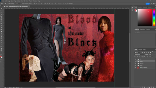
2 notes
·
View notes
Text
GET TO KNOW THE MUN.


Interrupting writing (only momentarily) because everyone is doing this thing and after-dinner fatigue is absolutely kicking my ass. And also, let it be known, Min, that I hope you knew exactly what me answering this was gonna look like. /drum rolls (also I need people to know that this has been playing in the background this whole time and I'm jamming out).
What's your phone wallpaper: Zhongli. But I edited the picture way too monumentally much in Photoshop. On my phone, it has a black background., I've dimmed it because I don't like my backgrounds to be overall too bright, I've selectively brightened some of the veins/lines along his arms and legs— he's a beautiful man and he's beautiful on my phone, he's been on there since I first found the picture months ago.
Last song you listened to: 'Saturn' by Sleeping at Last, but specifically the violin version with Tim Fain. Since I called myself out on this yesterday, the following should come as no surprise: it's my ultimate favourite song for Zhongli/Guizhong, specifically from his perspective after her passing. Aside from that however, it's also simply one of my absolute favourite songs that soothes me to the core every time I listen to it. .
Currently reading: It's been paused for a while, but things I've most recently picked up and haven't finished? 'City of Souls' by Cassandra Clare, a franchise I love dearly, even if nothing will measure up to the first three books.
Last movie: Final Fantasy VII: Last Order, I'm a huge Zack Fair fanatic. But also, it's been a while since I've actively engaged in watching a full film because I don't currently have the attention span for it.
What are you wearing: I live in loungewear or a mix/match of lounge/sleepwear and other clothes; I'm just that kind of girl. Granted, with all the moving abroad twice over in the last two years— I no longer have all of my comfy things. I'll restock. But currently my pyjama pants, short sleeved turtleneck, fuzzy sweater and fuzzy socks. If you ever see me inside of my home without fuzzy socks or fuzzy slippers (you know, like those that look like animals? I'll be 65 one day and still wear them), you know I'm not doing well.
Piercings / tattoos: Neither. I don't even have my ears pierced and it's not even for any specific reason, because I'd like to get them pierced. I just never... got... around to getting them pierced? I would like to possibly get a script tattoo under my collarbone, or something on my inner lower arm in white ink (I do have specific ideas as to what, shh).
Glasses / contacts or both? I'm nearsighted, so glasses, technically— but my eyes either got worse or better over time and my old glasses now give me a headache. I haven't gotten new ones yet, but I see well enough to be okay in the meantime. But soon.
Last thing you ate: ... Chocolate. But I heated up my chicken stew. I love, love, love a good stew or roast. And honestly, I'm on a fries and cheesy pasta binge, so I'll likely have one of those later tonight as a snack as I will, very likely, once again stay up until 6am writing and doing my own head in, because I'm right back there.
Favourite colour(s): Depends on whether we're talking clothes or otherwise. Black is a safe answer, but I like a lot of my accessories in white.
Current Obsession: Guizhong, (Kay, don't look) Zhongli, the Guili Assembly, Liyue the greatest nation in any game to have existed ever; yes, in that order. I guess also coffee. And also, none of these are only 'current' obsessions, they're going to be my obsessions well into any kind of perpetuity. No, I don't need help, I'll drown here very happily. :)
Do you have a crush? Are we including video games because of so... absolutely not, obviously. Geez.
Favourite fictional characters? /takes a breath. Guizhong, Guizhong, Guizhong— oh, others? Okay, uh, Zhongli... Madame Ping, Cloud Retainer, Osial, Marchosius/Guoba because I'm absolutely insane, Yaoyao (did you know that Yuegui, her bunny, was made by Cloud Retainer? I still cry over that), Nahida (she's the only non-Liyue character but I'm in total and utter love), Ganyu (I'm so close to adding her as an NPC on this blog, I swear to god), SKY BRACER-- I have a problem, I'm aware. I'm just absolutely feral over Liyue and it's fine. Let's move on before I expose my love for them too much more.

Tagged by: Literally no one, no one asked for my madness; they knew better Tagging: Be sneaaaaaky. <3
#[ et cetera. ] we think of human life as like a lantern that's lit one minute and extinguished the next. but are we adepti so different?#[ for anyone who knows me-- tell me you're surprised i rambled. truly-- tell me. ]#[ with a /straight face/ tell me that you're surprised. ]#[ ooc. ] wherever her spirit may be among the countless grains of sand and specks of dust between the harbor and the mountains…
5 notes
·
View notes
Note
Hi Scottie, same anon here. Actually, a recent follower. Your gifs are marvelous, i'm ever so jealous. Thanks for letting me know. I live in Canada, so I have a few options, but one day, maybe i'll buy them. I'm sure my hype for LAW won't stop, but money is tight.
Anyways, thank you for gracing us for your hardwork, dedication and love towards LAW, Abbott and so forth. I'd love to see more Life's Work gifsets if you plan on making more. How would you describe Lisa Hunter? There is an episode I felt so bad for her for (cause I only found three on the Internet Archive), about a third baby. Her humor always makes me feel better, even in another sitcom with an audience for it.
As a new gif/gifset maker myself, though someone with slow stamina to work on projects, I fiddle in photoshop all the time. For the RPC, I've been considering making some more to use of LAW, it's just the resources I need to get aside from AElem. and PTrap. You should try your hand at it, maybe? it's gifs, a certain size all in one post. I just asked what your secret was cause I love how even tho the show was in 96/97, we know it's not HQ like now. Anyways, enough about me. I'm happy they turned out so well for you. Lastly, through trial and error-- do you know if there have a way to sharpen every layer at the same time? Thanks again - CW.
Hi again! Yeah, I fully get that. I really wish there was a more accessible option. Maybe with such awards interest in Abbott more of the stuff from her back catalog will get brought to streaming services? It was on the same network as Abbott after all! We can only hope.
Thanks so much for your kind words! I absolutely do intend on doing the whole series, at least one set per episode (that I have access to) along with some of the funnier lines.
If I was gonna surface level describe Lisa Hunter to an alien? I think you can tell she's is probably more LAW than probably anything she's ever done and very in-line with her stand-up persona. She's streetwise and dry-humoured and crass and a total hard-ass and is quick to anger and stand up for herself, but she isn't one-dimensionally a big tough-guy, she has huge depths of softness for her family, is emotionally available and open about her feelings, is demonstrative to her family in a way that doesn't feel like just going through the motions, they hug and kiss, they have stupid in-jokes, and she makes out with her damn husband! And it doesn't just feel like it's for the viewer! They feel like a real couple who are actually crazy about each other, not just people who put up with each other. She talks openly about her interest in sex in a way that centres herself in it instead of trying to please her guy which is something that a lot of sitcoms of the era lacked (and still do really, in the bad ones) but also what it's like trying to have a sexual relationship while you have a busy life. She's candid about the realities of motherhood - not just in terms of how it effects her relationships and her work-life balance but how it literally changed her relationship with her body, which is also something you don't hear a lot of in comedy, at least in a way that isn't at a woman's expense but rather a commiseration instead. More than anything she feels like a real young adult (I can't believe she's nearly the same age as me!! terrifying!!) dealing with a young family, and a stressful job and financial difficulties, rather than a cartoon character. I really love her a lot. This show had so much potential that was cut WAY short. I could go on about it a lot more than this but this got way too long already! Re: sharpening gifs - what you wanna learn how to use is Smart Objects! They make an absolute world of difference, because you can edit the whole gif all at once, including sharpness, contrast, colours etc. I found a good beginners tutorial for you here - I hope it helps! (Link Here)
2 notes
·
View notes
Text
Colours, Print & Light: The Editing Stage and Methods.
There were a few different methods I found during my research that I was keen on getting to use but I decided that only picking one method would not only make it easier for me to edit in bulk but to keep some kind of consistency throughout the ideological chaos the project already has. Plus I could always go back and try out the other editing methods if I really wanted to. I'll be using this photo of the Sydney Harbour I took to give a visual guide to the techniques to separate layers by colour profiles.
These images will be edited in ADOBE Photoshop 2024. I'll also link the youtube videos that I used as tutorials to the different editing techniques!

Method 1: Colour Channel Splitting
Colour channel splitting is the name for splitting the colour channels onto different layers so that different channels (R, G, B) are separated and can be wholly manipulated.
youtube
Up on the menu bar (The bar with all the different operation functions and buttons such as minimise and close) hover over to Menu > Modes and then select which mode you want. For example, I set the mode to RGB Color. This step is important for the next couple of steps.
With your source image create 3 different layers and label them to a unique colour according to the colour mode that you have chosen. E.g. Red, Green, Blue as I chose the RGB colour mode.
Double left-click the thumbnail of a layer. This will open up the Layer Style panel.
Under Advanced Blending, all colour channels will be checked on default. Uncheck the colours that you do not want on your layer then click OK. E.g. Leave Red checked for the red layer.
Repeat for the rest of the colour channels with the appropriate colours then ta-da! You can now mix or display the colour channels separately. It's just like a digital cellophane and a great exercise to learn about additive colours/lights!

Method 2: Colour Halftones
Colour halftones or just halftones is a technique where photographs are reproduced in different 'grey' tones through dots varying in size and spacing.
youtube
There are 2 different ways to create coloured halftones but this is the method, both methods are accessible through the Filter dropdown menu. This method also works better with the source image as a smart object to make the editing process easier.
Open or convert your source image as a Smart Object (You can convert by right-clicking the layer and selecting the Convert to Smart Object button)
In the menu bar go to Filter > Filter Gallery. This will bring up different filter types. Go down to Sketch and then select Halftone. The menu on the right will give you the option for how big you want the pixels (dots) to be and the image contrast. You can also select the style of the halftone from the options dots, circles and lines. This also gives you a live preview of how your halftone will look.
Adjust the colours you want on the colour selector on the left. For example Red/White for the two-tone look.

This method is good but the dots are too gridded for my taste.
Here is the second (and my preferred) method.
Open or convert your source image as a Smart Object (You can convert by right-clicking the layer and selecting the Convert to Smart Object button)
In the menu bar go to Filter > Pixelate > Color Halftone. This will bring up a pop-up menu with the pixel (dot) size and the angles of Channel 1, Channel 2, Channel 3 and Channel 4 (These channels represent CYMK) In my example I set the dot size to 25 and set all channels to 45. This step has no live preview so you'll have to go through trial and error to get what you like.
This is where I will deviate a bit from the video tutorial. To adjust the colours go in the menu bar the go to Layer > New Adjustment Layer > Gradient Map. This will create a new gradient map adjustment layer that will apply to all layers below it. Left-click on the gradient bar and you can adjust your colours there. Slide the small coloured boxes to achieve your desired colour levels. The reason why I created a new adjustment layer is so that if I wanted to change the colours in the future I could do so a lot easier.

Method 3: Raster Image (Clip Art)
Creating a "clip-art" style raster image is a great way to give the shadows of your image some standalone structure in a high-contrast two-tone image. I used a mixture of different tutorials to achieve the effect I wanted.
youtube
youtube
In the menu bar go to Image > Adjustments > Posterise. This should hopefully make the next Threshold step a bit easier by 'flattening' the image and having fewer dark spots otherwise you can pick out your subject and erase the surrounding area. I found setting the levels from 4-6 gives me better results.
In the menu bar go to Image > Adjustments > Threshold. Adjust your levels to your desired effect. You can also create new layers and repeat this step to capture certain areas if you're having trouble. Just erase the areas you want gone then merge the adjusted layers.
In the menu bar go to Layer > New Adjustment Layer > Gradient Map. This will create a new gradient map adjustment layer that will apply to all layers below it. Left-click on the gradient bar and you can adjust your colours there. Slide the small coloured boxes to achieve your desired colour levels.

So... which method did I choose?
I ended up going with method 3 for many reasons.
It left a lot of negative space which I liked so that the different layers would highlight the important bits and thus not be overflowing with 'information', making it the final prints easier to look at when not under the LED strip light lighting.
It felt more economical for ink. Even though I bought a whole new Canon Megatank printer I didn't want to oversaturate the paper that I was using as well.
It forced me to think more about what images I chose to make it to the print stage. If I were go to with the other methods I feel like I wouldn't have thought as deeply about what images I thought would create a better contrast between layers as I knew the grey-tones would fill up the space anyways.
It looks cooler.
0 notes
Text
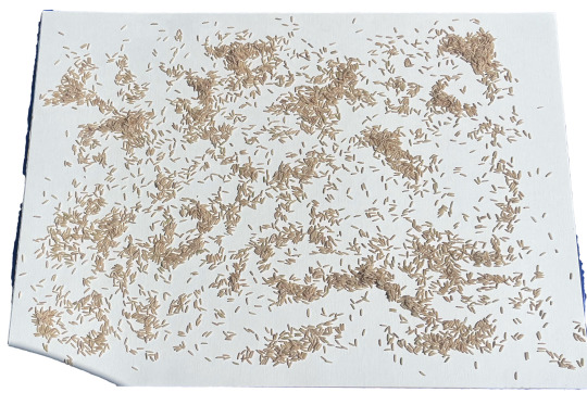
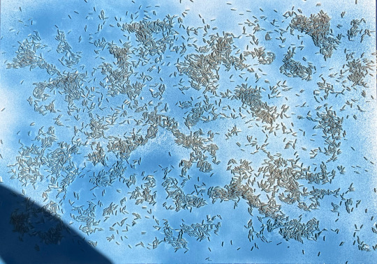
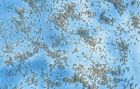
after the recieving feedback for my work with the lego figure and stamps i decided to recreate or rather create a new work using the same elements ? or even new ones ? i kind of just felt that if i used the lego figure it should be enough especially after the most recent experiment with the stamps and lego figure combined
i opted to use this new background that i made for another work earlier this semester
i thought about how i could merge this with the lego figure to create a new work, i found the process again enjoyable and informing
i again didn't bother to glue or secure the rice grains when applying the spray-paint, i still followed along the process of the first one where i let the rice move around and interact with the canvas as like their own being, using their own movement from reacting with the can, it kinda reminds me of like a field of crops
with this work i actually didn't make like a mock up in photoshop, i just cut out the stencil and placed it on the canvas, this is a first i kinda of just trusted my judgement but also i felt that the stencil was so large that it didn't really matter as to where it should be placed i think
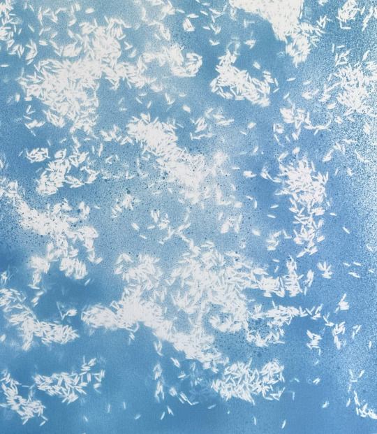
i am happy with the outcome of the rice stencil
looking at it in person is making me think of clouds, like the gradient change throughout the stencil, where some areas are lighter than the other its kind of like a blob of ink on white paper spreading
yeah i would say it is very strong in evoking a sense of being in the clouds
the rice sort of guides your eyes like your looking at a map of these rivers and streams flowing
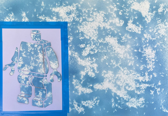
i actually tried this new way of applying the stencil, itried sticky taping it down, i was worried that it would not come off the paper and in turn ruin the work
the stencil was also not paper, well it is paper just a thicker one
i also made like a make shift box with two pieces of cardboard to map of the two edges that were directly in line with the background
i did debate what colours to use but i thought i would keep it plain and simple in case i added more which i am sure i will to what that might look like, i am not aware yet
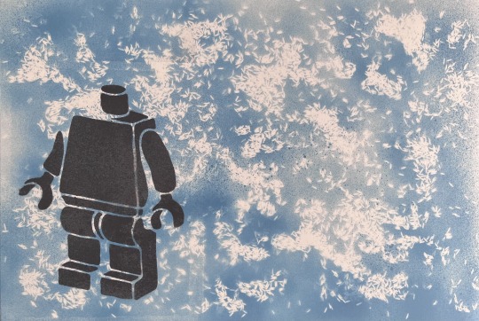
i am pleased with the finished result, i do still feel like it is incomplete though, i have debated spray painting on bits of the figure like an arm or a leg/legs however it is not achieving the look that i would like for this work
i have thought about other potential figures like a cartoon bird or even snoopy but i don't know what i want to achieve with this work so i am stuck as to how i should progress this work
in saying that, the process of creating was still fun and enjoyable, it is getting tiring cutting out the stencils as they take a while, especially since i try to manage how much i actually take away, as well as managing enough paper is left between two cuts to ensure that the legibility of this line cane be seen and contrasted well against the background
i just thought that because i'm using this detailed backgrounds it might be stopping me or potentially halting my process of creating because of adding too much to the canvas which could result in a composition that feels cramped, which is something i don't want to achieve
i don't know if i can express or rather state a theme or context for this work because i am unsure myself, i don't know, i do feel like the background though is like this zen rice field, that looks like clouds, kinda of like howl's moving castle like that type of sky
i have debated just going all out with stencils in this work and have a mixture of mediums however i am unsure still and have decided to leave this work for the time being and come back to it later on
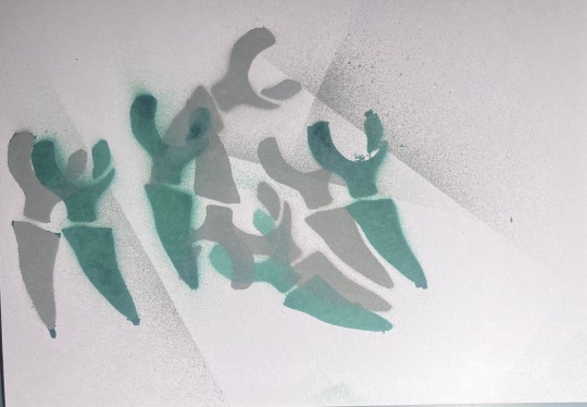
i trialled out using the arms of the lego figure to try and create like bones lying around the floor or something
i was going to try and implement this into the work however i felt that it wouldn't go or maybe its a scaling issue however in saying that i will get back to the work later on
0 notes
Text
Van Texturing


I spent this past period of time learning how to create materials for stylised assets, something that I am very new to. Since I usually work on scenes with a realistic or semi-realistic art style, I've never had the need to create custom materials. I usually just make use of the materials available in Substance Painter and the UE Megascans library. This project allowed me to experiment instead, since the art style I'm going for is stylised.
This led me to learn how to use generators with filters and masks to create multiple layers of fully customisable materials. And since colour variation is a must with stylised materials, using texture maps to distribute colour data was a genius way of making them look more interesting. I also hand-painted a lot of details where I felt there was a need for a manual touch. As for the solar panels, I chose to use alphas with brush painting, so I used a seamless photovoltaic pattern I found on Adobe Stock which I edited in photoshop so I can import it into Painter as an alpha texture. I also made a single tile/unit version of it to use in areas where the bigger alpha texture can't be used because of distortions when applied on the mesh.


One challenge I faced was in creating the materials in UE5. I usually switch off the SRGB box in the parameters of the metallic/roughness/occlusion map so that the material display properly and does not look too glossy in UE. This time, the software was not letting me do that for some reason as the SRBG box was already ticked off after importing the maps. I searched a lot for a fix online but could not find one so I eventually asked my classmates for help on our student discord channel. They were quick to help me out, and it turned out that this happens sometimes and I needed to change the filtering to "mask" in the settings of the shader editor and the compression settings to "masks (no SRGB)" in the texture map's parameters. I am glad I decided to test out the materials in UE before moving on to a different asset as it allows me to detect any issues early on. I will continue to do so for the rest of the assets as well.
Source:
Adobe Stock (2024). Solar Panel Texture Images – Browse 22,029 Stock Photos, Vectors, and Video. [online] Adobe Stock. Available at: https://stock.adobe.com/search?k=solar+panel+texture&asset_id=498405147
0 notes
Text
Making The Tile Set And Tile Map
First, I started off by looking at different designs for the levels on pinterest:

I really liked some of the ones that looked more like dungeons because, even though having the game be dungeons wouldn't fit at all, I thought that the way that they made the tilesets, and the layout of them was a lot better as well, I also selected a few other ones too that I found interesting, like the grass and dirt ones, because these would be the closest fit for my game style so I included them to have some more references.
To make the tileset, I used Photoshop - I had a basic idea of what I wanted it to look like, and got a few reference images of dirt pixel art up, then I made a simple palette with all of the colours that I planned to use:


Now that I had all of the colours that I needed, I started by making a very rough outline of all the shapes I was going to need - straight pieces, corners, center pieces, inverted corners, and column pieces.
After making these outlines, I gave them all some colour, I tried to make it seem like it got darker the further away from the wall that it was, and I was very happy with the result:

I then saved this as a PNG file, and started working in the game.
After importing the image, I had to make sure I applied "paper 2D texture settings" because this makes sure that all the pixels don't blur:

Then I clicked on it again and selected the one below that to turn it into a tile set instead of just a texture.
Then by right-clicking again on this new asset, you can turn it into a tile map:

This brings up a new menu where you can start to built a level:

First, I changed the size of the map (red) so that I had plenty of space to make a level, then added a new layer (blue) to put the walls on, and changed the thickness of this layer so that the player can't just step over them (yellow).
Then I drew out the walls of the level, using the tileset on the left that I made to select which parts I needed, and placing them on the map. After this I added a background, which also acts as the floor for the player - I selected the original layer, and used the fill tool in the top left to completely fill it with the solid colour - then used the other two tiles that fit with it to give it some texture:

I dragged this out and dropped it into the level:

However, when I tested this, the player would just fall through the floor - this was because I'd forgotten to add collision to the tiles so the game didn't know what was supposed to be solid.
This can be fixed by clicking on the tileset again, which brings up this menu:

This allows you to select each of the tiles, and give them all collisions.
Most of my tiles just needed box collision, which is just a square, but there were a couple that needed a bit more detail to work better:

After adding a box in the top left, I could shift-click along the lines to add new corners to the collision, then just drag them to adjust their locations.
0 notes
Text
Reflective Statement Writing Exercise
Reflection on my research skills
What specific forms of research did you do? What really helped inspire/extend your poster designs? How could you improve your research?
I knew I wanted to do something based around nature/outdoors/wildlife in New Zealand because that's a big part of my love for Aotearoa
I found a few issues that I experimented with eg. pollution, unswimmable waterways, animals going extinct and also looked into the Greens Party and some projects they were doing that revolved around these issues.
Because New Zealand for the most part is actually a very clean and environmentally friendly country, some statistics that I found didn’t seem accurate. They were either way too extreme and unrealistic, or quite minimal, and therefore I didn’t see a reason to make a poster speaking up about it.
Reflection on my creative process
What design processes did you employ? Eg. sketching, experimentation in InDesign, development of selected design ideas, print testing etc. Which processes helped push your ideas + shape your posters? How? What are the strengths and weaknesses within your design process?
Should have done some print testing instead of leaving it to the day as colours and transparency didn’t come out very well and then I was in a rush to fix and finish
Should have done some more experimentation, maybe more so sketching on paper to get my ideas down. Sometimes when I make designs straight in InDesign I get carried away, forget the purpose of the posters and end up making something that I am happy with, but doesn’t fit the guidelines. I think if I were to get my ideas down on paper first it would make it easier for me to see a vision in front of me and then make it digitally.
Reflection on my decision making
How did you make decisions to develop the project and its responsiveness to the brief? What did you find hard + which decisions were easy? What did you do when you were stuck? You may refer to your Rationale for ideas, but do not repeat the content
Experimented with a range of themes but struggled to pick a final theme to base my posters off of
Found it hard to make the typography do the talking in the poster
In my final posters, I still wanted a little bit of imagery, so I added it to the typography, I thought this way it gave the poster a bit more detail but technically it was still the type doing the talking??
Reflection on the overall progression of my work and leaning
What have you learned so far? What were some of the challenges and breakthroughs? What insights do they suggest for your work for the rest of the semester? Are there any skills or processes you need to revise or improve?
Struggling using InDesign, I feel as though I could have created better work in Photoshop with the range of effects and more quickly. Not quite used to using it yet.
Need to watch some more videos on how to do fun techniques, because since I don’t really know what's available, yet I tend to just stick to basic/plain techniques, effects, and fonts.
I think doing some more poster research, particularly typography posters, to really get into my head that it's the type that needs to be the base concept of the posters. Doing more research and exploration of other artists may help me broaden my ideas.
0 notes