#i forgot to size up the canvas after sketching :///
Explore tagged Tumblr posts
Text

He who holds his soul in his hands
#accidental doodle of my oc Willow hehe#he/him for him#he was created by a witch from a fallen star and is a few hundred years old and#she made him cause she was old and wanted company but mostly wanted someone to clean up after her#but then realized oops hes a whole person! shit! and also that his personality sucks#anywaydidnt plan on adding the glowy bits till the very end so the lighting of the original sketch doesnt totally match with it but alas#art#sketch#doodle#original art#illustration#artwork#oc#original character#i also dont like the composition i meant to change the canvas size but then forgot lol
208 notes
·
View notes
Note
Bro I'm in love with your art style and I'm in love with the Cronan x Rosalyn
So
Please?
I gotcha bro dw 🤟
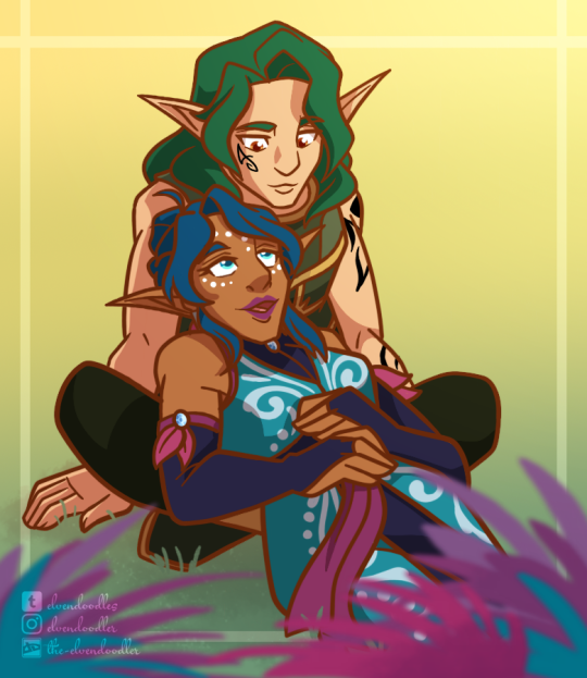
Art/Ask Prompt Masterlist
ON TUMBLR REBLOGS ARE BETTER THAN LIKES!!!
#lego elves#secretsofelvendale#artists on tumblr#elvendoodles#lego elves cronan#lego elves rosalyn#cronan darkroot#rosalyn nightshade#ship art#anon#i forgot to size up the canvas after sketching :///#and didn't realize until i was importing my watermark ( ;0;)#so if the image doesn't look as crisp as my other stuff#that's why
42 notes
·
View notes
Note
hi! not exactly a request but i do wanna ask, whats your process when you're rendering more paint like art? (if that makes sense, English isnt my first language so apologies hdskhsjdbd) i really love how you use the colors and im curious how you do it :0
i’ve been meaning to answer this one for a while so here’s how i painted miku in today’s post (put under the read more because yeah prepare for a long post
i’d also like to preface this by saying that i never follow a set way of doing things, so in terms of what my personal process is like, these are only broad strokes of what i do! sometimes i’ll combine or skip parts entirely, depending on how i feel. also, this is not a tutorial, just how i do things, so please don’t treat it like one :’D this will read like the ‘how to draw an owl’ picture if you do
first, like every artist, i sketch. more specifically, i’m getting an idea of what i want to paint later on. this could be how a scene is set up or in this case, how a character is posed. here i’m not concerned about details or getting everything perfectly, i’m only planning how the thing will be composed. maybe a lot of canvas size changing, or adjusting what miku’s doing (note how busted miku’s right hand looks from all the transforming!) however, i still have to be concerned with how clear the sketch will be to future me, because the sketch won’t be any good if i can’t read what miku’s doing

after that, i lay down a flat gray under the sketch, mainly focusing on giving miku a clear silhouette. this is also a good time to make adjustments to the composition on the fly if i suddenly feel like something can be improved upon, like shortening miku’s left arm from the sketch!
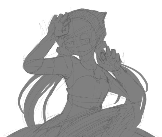
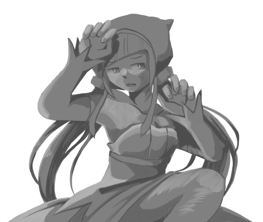
after painting a flat silhouette, i start shading in grayscale, focusing only on lighting. i usually do it in two passes, one for the lightest and darkest tones i’ll use (not black and white) and then a second for midtones to blend them better with the base gray but i forgot to screenshot the result of the first pass 🗿 nevertheless, here is where i can start adding some amount of details. i’m not including any extra accessories yet, just focusing on the base design of the outfit and the character herself (for anyone wanting to draw characters from That Gacha Game, this is how i personally make the process more bearable for myself.) i still use the dark gray to separate where certain details (like the facial features and fingers) begin and end, mainly to make colouring more bearable later.
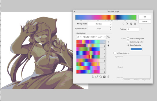
now here’s where i get the Good Colours. it’s a cheat lol. i put a gradient map layer over the grayscale painting so that there’s a little bit of color to start. some gradient maps can be applied as is, some need the layer settings adjusted to make it look good. this one, for example, is a (free) gradient map set from the csp assets store that needs you to set the layer opacity to 20% and to set the blending mode to color to achieve this result. in general, i tend to pick which gradient map i want to use based on vibes, or basically whether i want the work to be warmer or cooler, colour-wise. but this does do quite a bit of lifting for the colors in my stuff.
and then, finally, i add the colours. i add flat base colours in an overlay layer. at this stage, i’ve made the character silhouette clear enough that i don’t need to refer to the sketch anymore for what miku looks like. also, the gradient map layer does its magic by making the shading a bit more vibrant than it would’ve been without it. after that i paint over with a new layer to add details like the lace.
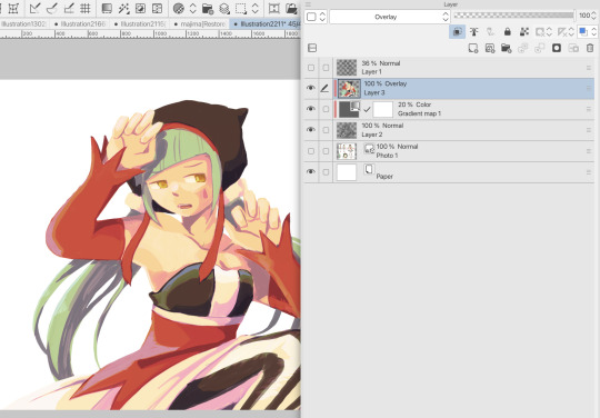
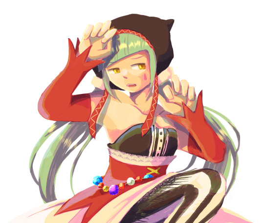
and then i put some extra shading on top. basically this is where the ‘better lighting’ happens. again, this isn’t a tutorial, so i’m not here to say what each part of the lighting is, but i’ve labeled which layers do which job. in other works where the lighting within a scene is more defined (from a window, from a small crack in the walls, etc) the glow dodge layer may be more opaque and sharper, but since this isn’t a work with that, the lighting was applied using an airbrush. the linear burn layer is also there to make the whole thing darker so the glow dodge doesn’t end up oversaturating miku. i also usually match the lights to the vibe i want, and use a complementary color for the shadows. so here you can see i have warm colors on the glow dodge layer, but light purple on both the linear burn and multiply layer.
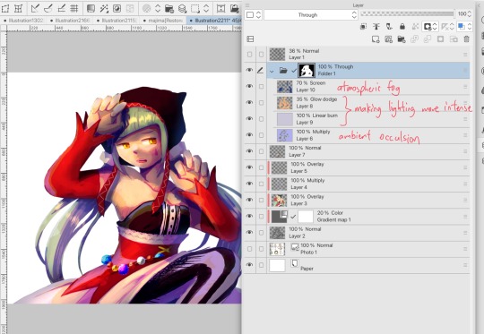
and that’s it for the character—here’s a gif showing how each layer adds to miku! (sorry it’s so toasty)

as for the background, depending on the complexity, it may go through a similar process, or if i can settle with flat image backgrounds, i just go for that. it’s ok to use external image materials. i didn’t have a background in mind for this miku in specific, so i got some default csp materials and threw together something
and that’s about a rough overview of what my process for more finished works looks like! again, art is a fluid process so i never specifically stick to certain steps all the time, and you shouldn’t either. i can probably answer why i’d pick this colour over another in one particular work, but it’s something that kinda has to be learned on a grander scale. i think everyone can already feel what colors work with what atmosphere or what setting, even if they can’t immediately explain why. colors and composition do take some level of experimentation to find what works best!
126 notes
·
View notes
Text
“Zankaaa.. are you hungry I cou—oh.”
Pausing at the doorway to the infirmary, you poked your head in to see if Zanka was awake. Knowing him, he probably would start moving around as soon as possible, and knowing him he probably would also put eating to the side for now.
But instead of a Zanka sitting up in bed looking out of the window (he always liked a window view), there’s an Enjin sprawled out on the bed next to Zanka’s. The sheets were moved to the side, so maybe Zanka went to the bathroom? You huffed.
I must have missed him on his way out.
Humming to yourself, you debated whether or not you should go through the trouble of walking through headquarters’ halls to go looking for him.
…Nah.
Taking a step through the doorway, you made your way over to Zankas bed and plopped down on the edge. Kicking off your shoes, you moved to the center, sitting criss-crossed. Looking around for a few seconds, your eyes landed on the bag on the floor next to the bed. Curious, you plopped down on your stomach, lazily reaching down at the bag to take a peek.
Huh, so Zanka already had snacks. Well coming here was a total waste then if he already had food. Propping your head up on one of your palms with your elbow holding you up against the bed, your eyes landed on Enjin. You almost forgot he was here with how quiet he was being.
Normally when one looks at Enjin, they’d think he snores louder than the devil but the only noises he lets out in his sleep is the occasional grunt. He had a bad case of drooling while sleeping though.
A noise coming from him popped your bubble of thoughts, sending you back down to earth. He grunted, from the looks of it. You let your eyes roam his body from head to toe. He was drooling, and he even had his slippers still on. You clicked your tongue instinctively, he always had a bad habit of not taking his shoes off clean spaces. Humming low, you contemplated.
One sketch wouldn’t hurt, right?
Reaching down you pulled out a decent sized journal from one of the pockets on your cargo pants. Ah, cargo pants, a blessing really. You can’t see why so many people don’t like them. Along with the journal, you pulled out an old pen. Your jinki. It was an old thing, a little battered but you took care of it with love. Enjin once compared your abilities to the ones of the spellcaster from Canvas Town, the thought made you smile.
You haven’t visited Canvas Town in a while.
Opening the journal, you flipped to a fresh page. Settling in a comfortable position, albeit still on your stomach, you started drawing. It was quiet for a while, with only the scratching of the pen against paper filling in the silence along with the occasional noises from outside. It was nice, these moments of peace in between the chaos that came with being a Cleaner.
You didn’t know how much time had passed when you heard creaking on the bed next to you. Glancing up, Enjin had moved from being asleep on his back to being awake and lying on his side with one hand under head, supporting it. And he was staring straight at you. It kinda spooked you for a second, holding eye contact with him for a couple of moments before you swallowed saliva down your throat and went back to occupying yourself with the drawing of the same person who was staring at you. It was almost finished, nice.
“I thought you were still sleeping,” you muttered.
“And I thought Zanka was still here.”
Smart-ass. You could hear the smugness in his tone.
“He left.”
Enjin, as if deep in thought, hummed. It was a deep noise that rumbled and rolled out from the back of his throat. You could hear faint rustling before you heard the familiar click of his lighter sparking to life, soon lighting a cigarette aflame after. The home-y smell of nicotine soon invaded your senses, causing your body to melt slightly. You smiled.
“Don’t smoke in here.”
“You don’t care.”
Nope.
The sounds of your pen against paper was now accompanied by the faint sounds of Enjin smoking, and the smell of cigarette smoke. The soft sounds of burning tobacco were left by itself a few moments later as you set your pen down on the bed. The drawing of Enjin sleeping was now complete, you always liked the feeling of finishing a piece, it put a smile on your face. Distracted by admiring your work, a wave of movement caught your attention from the corner of your eye.
Looking up, Enjin was back to the position you found him in—on his back, a hand behind his head but this time with his hand dangling off the bed, cigarette caught between his fingers.
You caught on, grunting softly as you stretched out your own arm, taking the cigarette from him and letting it rest between your lips. Taking a deep breath in, you sighed with contentment. The smoke billowed out of your mouth as you parted your lips slightly to exhale. Your face had settled into a smile, your eyes soon closing.
Your moment of peace was interrupted when you felt a pillow land on your backside, close to your bottom. Grunting, you opened your eyes to see a cheeky looking Enjin staring at you, still on his back and with his arm out. This time it was stretched out with his hand open, and it soon made the movement that could only mean give it here. Blowing out air from your nose, you reach for your journal and lazily hand it over to Enjin.
Moving, you mirrored Enjin’s previous position, lying on your side. You watched him flip through the pages, his eyes dragging across every sketch, doodle, and scribbled out note. You didn’t mind him looking through it, or anyone else from the Cleaners. Most of your drawings were of them anyway. You liked drawing them, from the most mundane moments of the day to jotting down how they looked while fighting the trash beasts from memory.
Plucking the dying cigarette from your lips, you trapped it between your fingers, letting it continue to die as you watched him flip to the page where you drew him just a few moments later.
“Y’think Rudo will let me draw him?” It was a genuine question. And it made Enjin chuckle.
“Probably, he’ll short circuit when you ask him—should’ve seen him when he first met Riyo.”
“Cut the kid some slack, he’s probably never had a girl so close to him before.”
Enjin smiled, causing his dimples to come out from their hiding place. You wonder if anyone else has noticed he had dimples.

a/n: whoops. anyway I haven’t written in awhile, take this hot garbage from my lump I call a brain.
125 notes
·
View notes
Note
Happy anniversary arsenic blues and cheers, queen!!💙im currently cooking AB + anubis fanart to celebrate :D ill be posting it here immediately after i finish, which can take a while :(( (i had to redraw the entire drawing since i forgot to adjust the canvas size during the sketch so the resolution was cooked😃) so sry if its a lil late. tysm for cooking my favorite fic and introducing me to my ror bbgs💙💙
for the meantime, here's some twitter reaction pics that iredrew as percy.
"percy's crippling mental state after rizzing up another pantheon":

THE ONE WHERE SHES GRIPPING SOMEONE, IS THAT LOKI??? I recognize that hairdo 😭😭😭😭
And you’ve captured the essence of Percy PERFECTLY. ✨uwu✨ on the outside, but completely deteriorating on the inside 😭 my poor girl is fighting for her life 25/8 and these fuckass gods are not helping!!!!!
AND DID YOU JUST SAY YOURE COOKING UP ANUBIS WORKS NEXT??? OH I CANNOT WAIT TO SEE WHAT YOU MAKE 💖💖💖
48 notes
·
View notes
Text
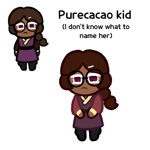
Heck I don’t actually remember if Pure Vanilla/Dark Cacao was a request or if it was something I just planned to do on my own. I know it started out as my own idea, but sometimes that happens and then before I get to doing it, someone requests it and I just make it a request, and I don’t remember if that happened here
But regardless, this was a drawing I made of the idea for a purecacao fankid on it’s own, and I’m posting it as such
Now you’ll notice that this isn’t my usual format. This is because this isn’t her official design, it’s just that last night, I had this idea for a design of her as a young child with Dark Cacaoian clothing, and so I just wanted to make a quick doodle to show you
It was just going to be that picture in the middle, as it’s more sketchy and rough, and clearly not how I usually do these fankid requests. However when I finished, I realized that I made her too small. See, if I may explain some things, for my poorly drawn comics and other things that use that particular brush (it’s the Narinder Pencil if you want to know), and I don’t like enlarging pictures drawn with it because the lines get all blurry and it loses its texture. Prior to the Charcoal Cheese comic, for my poorly drawn comics I tended to enlarge the sketch to fit the screen, and then I’d completely redraw the lines. But here, I had already colored the whole thing, plus it was multiple layers to redraw, so I didn’t want to. But I couldn’t just crop down the canvas to fit it because my square canvases are already 500x500 pixels, they’re very small (and also I think the small size might account for why they may not show up in the best quality, but I’ve been using this size for over 2 years and I’m set with it, and I feel like changing would be too much effort). And I feel like making it even smaller would just tank the quality even more
Though to be honest, I’m glad I made a second version with my proper sketching process, as I was better able to figure out her colors and design
Speaking of her design, yeah this is sort of what I’m thinking for her look, at least in terms of hair, dough and eye color. She’s not gonna keep the braid though, that’s just a kid thing
I feel like maybe I should give her streaks, but I’m not sure where to put them or what color
Also I realize that I forgot to put KitKats on her design. I wasn’t planning to originally since this is a little kid’s outfit, but also in some of the artbook drawings, young Dark Choco had small Oreo shoulderpads, so maybe she should have something similar. I had an idea for her wearing tiny KitKat shoulderpads, but I forgot them. Ah well
Hmm, does she look like a purecacao kid? I’m looking at her and I feel like she looks more like her own character than related to them. Maybe it’s the lack of streaks
Oh yeah, and one more thing I want to add, I’ve decided she’s a post-canon kid, as in Pure Vanilla and Dark Cacao got together after the events of the Dark Flour War and canon in general. The story in my head goes that Dark Cacao developed feelings for Pure Vanilla, but was hesitant to tell him about it, maybe because he’s socially awkward and wasn’t sure how to, maybe because Pure Vanilla and White Lily had something going on and he didn’t want to stir up drama between them. But regardless, Dark Cacao felt that it wasn’t so much of a big deal since they were immortal, he could tell him when he felt it was right. But then the Dark Flour War happened and Pure Vanilla seemingly died, with Dark Cacao never telling him how he felt. But then years later, Pure Vanilla came back, and while Dark Cacao was of course overjoyed, it also caused him to realize that even being immortal, they don’t have all the time in the world, and he needed to tell Pure Vanilla how he felt, and so during the events of Odyssey, he confessed to Pure Vanilla, and then likely sometime after Dark Enchantress’s defeat, they got together, and later had this girl
Also this means she has a (probably) 30+ year older brother in Dark Choco, but it’s all good
I feel bad just keeping her unnamed, but I don’t know what to call her. *sigh*
Any suggestions?
But yeah, I just wanted to show y’all this idea. Don’t know when I’ll be finishing her, but I’ll draw her officially at some point
#cookie run#cookie run kingdom#purecacao#pure vanilla cookie#dark cacao cookie#cookie run oc#fankid#fanchild#my art#my ocs
34 notes
·
View notes
Text

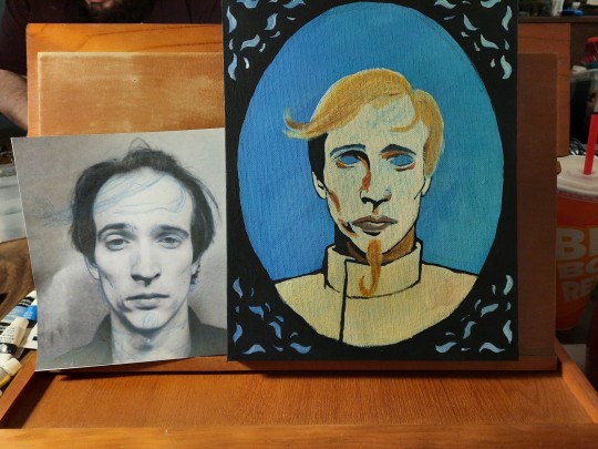
The next installment of my Walter Family Portraits is done!
We have the original inventor, creator of our beloved Singing Musical Automatons, Col. Peter A. Walter I. Based off of the original art from Sam Luke (@samhears) in the Steam Powered Giraffe comic and a photo of David Michael Bennet
Color pallet was partially chosen by popular vote here on tumblr using the poll function
Acrylic paint on a 8x10 inch stretched canvas
WIP photos under the cut as always
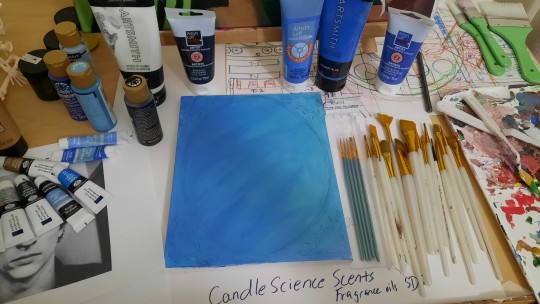
The canvas was originally a test of the new blues I had bought, and was going to be used for the Sky Shark painting, but I ended up going with a larger size for that so it's been sitting partially painted since then. On the far left side you can glimpse my skeleton helper Darla, and part of my work surface is the sketch for my Lily Airheart painting (still in progress)
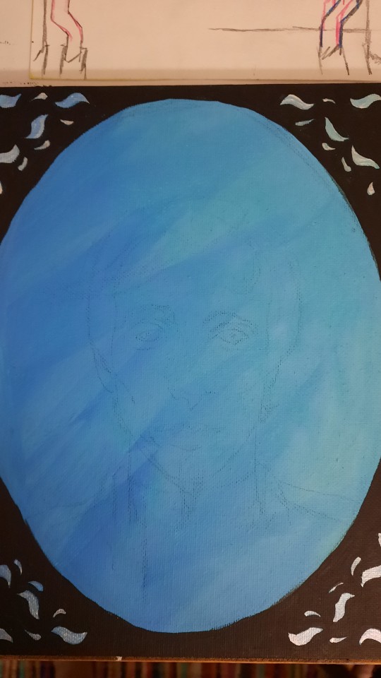
The very initial sketch, transferred over using graphite tracing paper, the canvas wasn't completely square so I decided to try making it look like an oval frame over a photo instead of a square and trying to find a frame that looked good with it
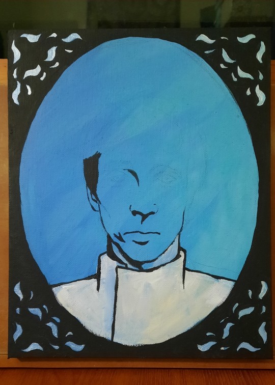
Unfortunately the blue had to go, at least for the bits of the painting that wasn't background, so it was time to start laying down some base colors and solidifying my choice to go for half-comic half-realism
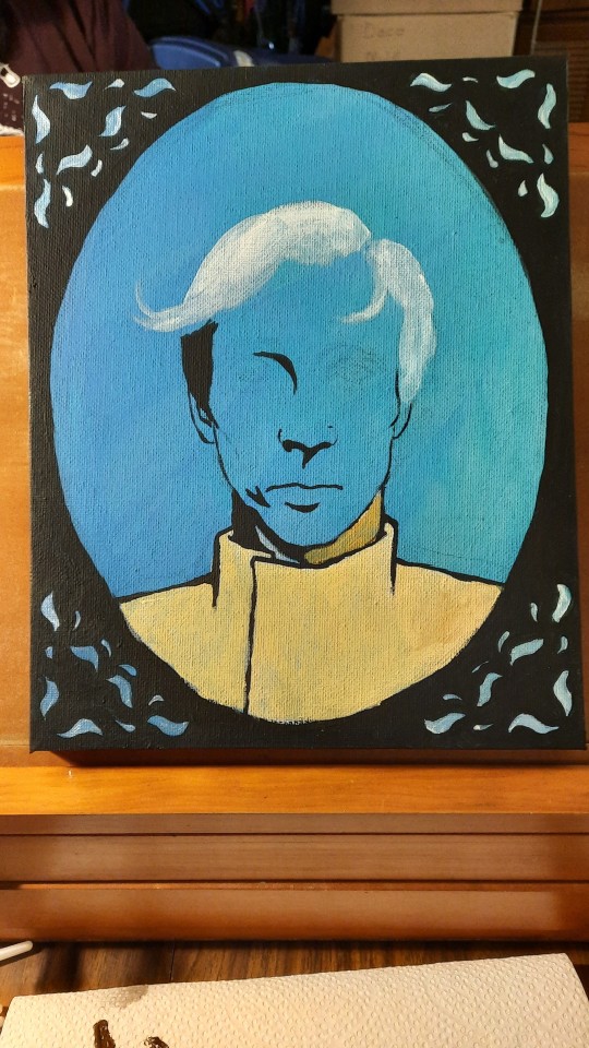
Didn't really know what I was doing and ended up using Yellow Ocher for one of my base colors, I changed my mind on this much later after sleeping on the decision for a few nights. The yellow just wasn't working right with the Burnt Sienna for this

My reference photo and some more base colors, nearly ready to move onto shadows and other tones
Lips??? How do people paint lips?

Starting to regret the yellow, but forging on hoping that it'll end up looking ok
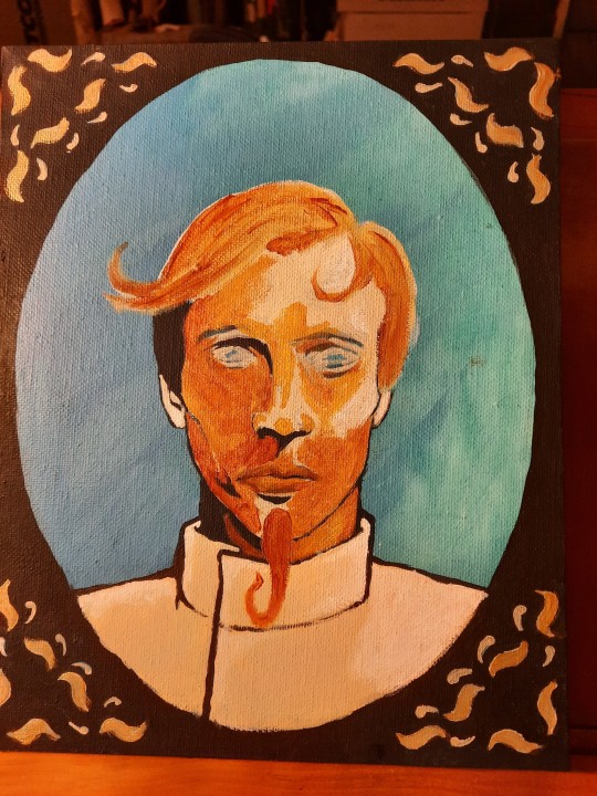
Relising that the process isn't going to fix this and that the yellow needs to go, starting to paint over it with a combination of Unbleached Titanium and Burnt Sienna

Just before I realized that I forgot his coat buttons, and a few details left to finalize. The little gold frills weren't popping as nicely as I hoped so I painted them over in black before adding a gold wash over it to make it look like worn and old gold
#gigs art#reblogs encouraged#Steam Powered Giraffe#SPG#peter one#acrylic painting#Col. Peter A. Walter I#Walter Family Portraits#art blogging
12 notes
·
View notes
Text

drew this too small bc i forgot to change the canvas size after reusing my brainstorming sketch file. it was tragic seeing any amount of detail turn into a blur the moment i uploaded this. and also hate the way i colored this (also the silver fabric turned out sooo ugly especially bc i didnt feel up to it after having more fun w the holographic one lol) but!!!
first finished art of my my masks character rishika :) also first digital art i've done in like a year!
6 notes
·
View notes
Text
Summary of April:
Was away at the beginning of the month and then when I got back got really unmotivated. I joined a Discord study check-in chat two weeks ago which helped get me back on track - hoping that my extreme competitiveness will help me at least get through the DAB stuff without giving up. I was really off track for finishing stuff, but I managed to pull it together in the end, and I think I actually managed to finish more of my monthly goals than I have in a really long time!
My drawing skill is kinda all over the place atm, which I'm hoping means it's going to consolidate itself into something better soon xD
Plan from April:
3x 100 comp ✗ forgot to do two of these AGAIN
5x scared ✓ didn't technically do 5 but they were longer than 5min anyway
DAB Lesson 7 - 2 vehicles ✓ YEAHHHH
Proko - shoulder bones ✓
DrawThis - 2x 2h videos ✓
Rough sketches for all 5 FEH alt ideas ✗
1x background sketch/screencap study (1h timer) ✓ well I drew over a bunch of rooms and discovered that I can't do it in an hour
1x simple form studies (1h timer) ✗ did do some form studies though not 1h
Look at how FEH artists handle small details/trims with lineart ✓
May plan:
at least one day/week playing games (not art but important to relax with)
Draw May 4th/5th pieces
Rough (pose) sketches for all 4 FEH alt ideas and finish current one before 8th
10x scared
4x 100 comp
Proko - review notes + watch shoulder critiques
Proko - pecs and breasts I guess
4x Ges Draw Party
DAB Lesson 7 - 4 vehicles
1x master study - comic background or screencap study with perspective
notes and improvements from finished stuff:
USE PHOTO REFERENCE FOR EXPRESSIONS and try more open mouths ✗ did expressions but not referenced, do more hair studies ✗, use photo reference to figure out stylised ¾ eyes AND NOSE ✓, push unhorizontalness ✓, see how other (FEH) artists handle trims ✓
5MIN SCARED IDEAS: find good hair examples and trace ✗, find ¾ photos and trace eyes/nose ✓, trace torsos for gesture ✗, review/learn leg muscles ✗, trace thigh high boot opening contours from actual photos ✓
knoll: not detailed enough (did a drawover to add details which made a BIG difference), hand unintentionally too wide, browbone doesn't go in to lead into cheekbone
h/ux: not enough ribcage space, crop looks like his forearm is just really thin, eyes aren't in perspective (not lined up + eye area is a bit too wide and flat), hand wasn't referenced and it shows
elan: values too close, REALLY BAD HAND, antennae shouldn't be that swivelled, folds don't make any sense
t/ana: tried to do too much of a dynamic pose and made an unnatural twist between upper + lower halves, eyes aren't looking at viewer, arm holding bouquet/shoulder/underarm area is flat and too far off to the side, lighting not consistent + shading on skirt too conservative (should have pushed the back of it way further into shadow to bring out the roundness), sash thing has no texture and is placed really awkwardly because I realised during the colouring phase that the entire skirt was off-centre, value contrast too low (not engaging to look at). HOWEVER I did try to clean up my lines AND shading at the end, and also used a much smaller brush (doubled canvas size to A4 and used a 3px/1px brush) so it looks a lot neater overall
ACTIONABLES: USE PHOTO REFERENCE FOR EXPRESSIONS!!!!! JUST DO IT, do hair studies, decide whether majority of piece is going to be dark or light and base contrast around that, draw out ribcages (+ shoulder bones) for every sketch, use photo/RL reference for EVERY HAND - even doodles, do a separate detail pass the day after 'finishing' something, use photo reference for folds
5MIN SCARED IDEAS: find good hair examples and trace, trace torsos for gesture, review/learn leg muscles, draw one hand, identify fold type in clothing photos
3 notes
·
View notes
Note
Your brush strokes feel so precise while also flowy, not restricting at all! how do you do it?? :D
This is easy, let me teach you (^^ )
Having to do lines over and over again can take up a lot of time, so it's important to be able to make accurate lines! The first thing I do after opening a new canvas is to check my eye-hand-monitor coordination. I use a screen-less tablet but those exercises are applicable to traditional painting as well. Here's how to do it: Quickly* draw a line straight down across your tablet, if the line on your canvas goes perfectly down, you're good. If it is skewed left or right, rotate your tablet a little and try again until it goes straight downwards. *The lines should be quick for a few reasons: 1.) a "real" painting will be made out of thousands of brushstrokes, you don't want to think about every single line. 2.) quick lines are not as shaky and therefore more elegant. 3.) the faster you paint, the more you can paint.
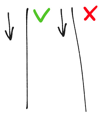
It's important to check that you can accurately and repeatedly hit the same spot on your canvas regardless of the direction of your brushstrokes. Imagine or draw a point on your canvas. Draw a vertical, horizontal and diagonal lines that will meet in that point. Try it in three or four places on your canvas for good results.

Checking the length of your stokes: Quickly draw a square, with the intention of not erasing any edges outside the square. Getting this done correctly should help you get an idea of how the length of your brushstrokes drawn across the tablet corresponds to the lengths of your lines on the screen.
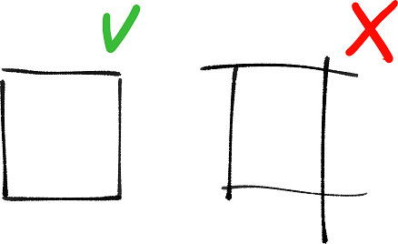
If you get those right, it should be easy to get your lines to look good! Please try it out! <( ̄︶ ̄)> About flowy lines... You can enhance your linework using brushes that have settings such as brush size or opacity changing with pen pressure and/or velocity. (make sure your tablet is properly set up for these. I use an older Wacom tablet, so my advice is to make notice of the "tip feel" setting) but the most important thing.... I think we've all had this thought while working over a sketch we really liked, "the more effort I put into it, the more tired this picture feels!", gradually straying away from the original idea, losing motivation to work and throwing the file into the wip folder, never to open it again..! orz
The solution is to make meaningful lines! Paint with intention! That is, you don't want to make lines which you will have to redraw later. The exceptions would be... if your idea changes during the process or if you forgot to include something in the sketch. Then, you should, naturally, edit your picture... haha.......
Here, I made an example using my sketch, (the original sketch + final pic are above) and, below, a "bad" sketch I edited just now,
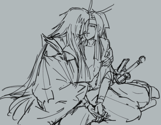
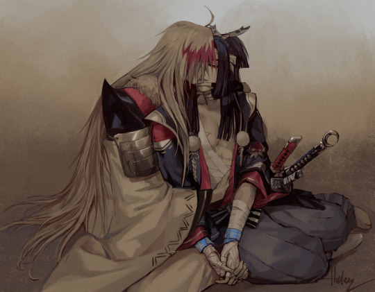
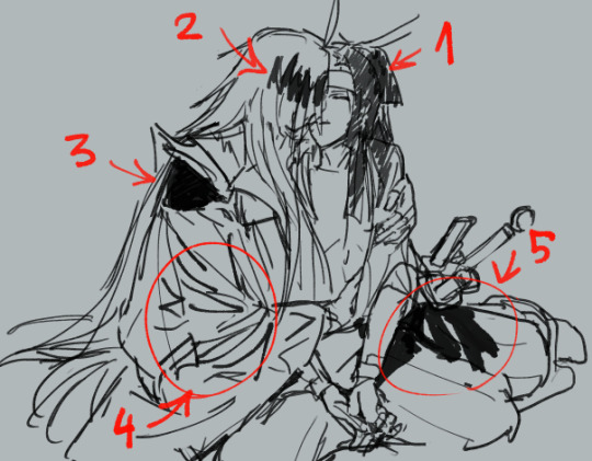
Things I would personally see as mistakes: 1.) Zig-zaggy lines that don't go in direction with the form. 2.) Filling in parts that will not be black with black. Tempting to do to see how the contrast will turn out later. Will have to be repainted. 3.) Filling in big black spaces with black. Unless it's a void, it will have to be shaded later. There is no need to do black before other colors. 4.) Adding a lot of cluttering lines that disrupt the flow make it easy to get lost later. 5.) Black shadows that obscure form. Since the picture is not going to be black and white, it's too strong and heavy. Steals attention off more important things.
Why these things that are not necessary, is because after you're overall satisfied with your sketch you can easily make a layer under it (in my case one under and one above the sketch) and do a color test with minimal shadows. This is an important step that tells you if the final picture will look good. And it takes only a minute!
(this is what mine looked like ↓)
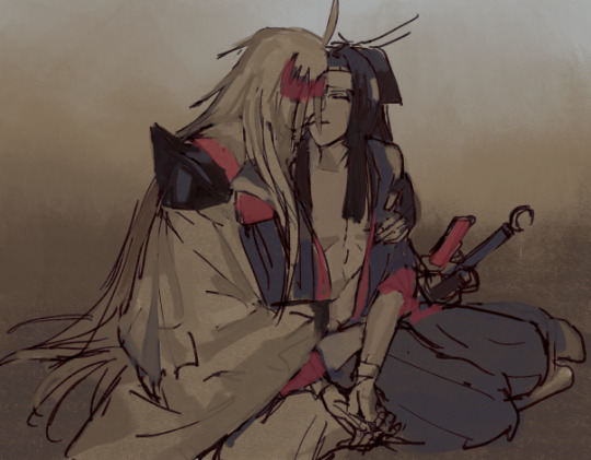
If you have a good foundation to work on, cleaning up becomes easy and you maintain the energy of the sketch!
I'm happy you like my art. ❤ I hope this helps!
36 notes
·
View notes
Text
"Finding Purpose" Chapter 11
Gojo Satoru x Reader Fanfic
You groan as you wake up, the morning light hitting your face. You bury your face in what you think is your blanket, but as soon as you smell what you recognize as cologne, your eyes shoot open to see a black jacket in your arms.
“Oh my god,” You facepalm. “I somehow fell asleep when we were and latched onto him… didn’t I..?” You knew about your habit of snuggling into jackets and hoodies, so you knew what happened immediately.
“God, this is a pain… How am I going to face him now? I’m going to have to return his jacket at some point…” You groan again, quickly shoving the jacket underneath your blanket to hide it, as you hear voices in the distance.
It sounds like.. “The first years? Wait.. what time.. Ah!” You yell as you look at the time “9:42am” it reads. You slept in, since you were too distracted by chatting away with Gojo, that you forgot to set up an alarm.
After setting up an alarm for 7:00am Monday through Friday, you start getting ready for the day. You open the closet to find more casual clothes, you grab a pair of jeans and a plain black t-shirt. You get changed into the new clothes, taking a mental note to thank Ieiri and Ijichi-san later.
You unwrap the soft wrap around your head as you use the mirror to make sure your ponytail is smooth as you put your hair up. Satisfied with the secure ponytail, you rewrap black fabric around your head and your right eye. You almost forgot about the bandages on your arms, and after a minute of debate in your head, you decide to take the bandages off your arms.
Long sleeve shirts and stuff on your arms always bothered you, especially when you were drawing and painting. You’d much rather have your own skin get covered in paint than bother with attempting to clean messy clothes later, plus it was just simply more comfortable that way. Though your arms were covered in scars, you’d opt for comfort rather than care about hiding the scars on your arms.
Your face was a different story, with a gaping hole where your right eye used to be, skin severely warped, you’d prefer to keep that covered. Plus you had just gotten a new wrap from Gojo, you wanted to wear it at all times. The thought of chatting away the night last night makes you blush a little bit as you reminisce about Gojo gifting you the wrap.
You slap both hands to your cheeks, “Get ahold of yourself, (y/n)! You have work to do!”
With a determined huff, you put your shoes on and get going to your studio for the day.
You find yourself staring at the large canvas in front of you. Usually you would start your process by sketching at a smaller scale, but with the size of the challenge ahead, you knew you wouldn’t have the time for that. It would take a lot of paint and a lot of time to dry, so you had to factor that in accordingly so that you would finish in time.
Pencil tapping your chin, you try to wonder what would be a suitable subject. You really wanted to make an impression on the higher ups, it really was “go big or go home” in this scenario. You wanted to wow them, shock them to their core, make something that would prove your skills would be an invaluable asset here at the school.
It couldn’t just be like any other painting you’ve done before, it had to be unique, something they’ve never seen and wouldn’t expect from you. You close your eye and try to dig deeper into your thoughts, pencil still tapping at your chin. Maybe something dark would shock them, all your previous works were pretty standard and tame in subject matter, nothing dark or evil in sight. But you wouldn’t settle for a stereotypical “spooky” subject like a skull or lame looking ghost or zombie. No, it had to be something.. special. Wait, special.. Grade? Wait, maybe you could paint something resembling a curse, that would be fitting for Jujutsu High! But wait, would that be too predictable? Maybe, but it was the first thing that gave you a rush of inspiration.
The first thing that flashes in your mind makes your blood run cold. The curse that attacked you. You remember the fear that paralyzed you as you stood in your shop just a couple of weeks ago. Your heartbeat quickens just thinking about it. Maybe your head is twisted, but the emotions recalling the incident made an unidentifiable feeling bubble up in your chest.
The subject of your painting now decided, you open your eye and bring your pencil to the large canvas.
After sketching for a couple of hours, your focus is interrupted by the sound of the door to your studio being slid open.
“Time for lunch!” Ieiri-san smiled as she held up bentos for the two of you.
You laugh, “I’m starving, let’s eat!” You take the bento she holds as you follow her out of the studio to her office where the two of you ate together. When you sat down, she made sure to point out right away that you were wearing a new wrap around your head.
“A-ah.. this?” You nervously chuckle, “Well, Gojo-san somehow snuck up on me after I set up the studio space last night. He kept bugging me at first but then he suddenly gave this to me? It was oddly… thoughtful?”
Ieiri-san squints and responds with a tone of suspicion in her voice, “Odd indeed, very much unlike him.. But I must admit, to his credit, it does look good on you.” Thankfully, the conversation seemed to move on from that topic fairly quickly as you two started to talk about your day so far.
This lunchtime routine becomes the normal over the next few days, you were thankful for the company Ieiri-san provided. She started to feel like the older sister you never had. Lunch becomes a time where you two would talk about your day and catch up, often providing your own tales of Gojo pestering you. Occasionally he would poke into your studio, tug at your ponytail, or scare you by sneaking up on your blind side and poke your cheek.
Though to prevent any unwanted noses poking in your business, you covered the large canvas with a fabric cover whenever you weren’t around, so no one would see the final product until the grand reveal. Pretty early on in the process, you had decided you would keep the artwork a secret from everyone until after the meeting with the higher ups.
Your days mostly consisted of working on this piece, working on it as long as the natural light would allow you, morning till evening. Night time would mean relying on the singular light that hung in the center of the room, which you wanted to avoid, since you thought the artificial light in contrast to the dark sky would warp your perception of the color palette.
Occasionally you had the treat of observing the first and second years training outside while you were working during the day, the spectacle and noise was always a welcome sight to you. Sometimes you would take a break, sit and watch the commotion that went on outside your window. Whenever any of the students or Gojo would catch you watching, you always gave them a small wave and smile. After your many years of only hearing about them, you treasured every moment you were able to witness for yourself.
#gojo satoru#gojo#satoru#jjk#jujutsu kaisen#fanfic#ao3#ao3fic#ao3 fanfic#ao3 author#x reader#reader insert
11 notes
·
View notes
Text
You're Not Alone Ch. 2
Ao3 Where it began Ch.1 Ch.3 Ch.4
Some Tim, Marinette and Damien interactions. With a bit of Alfred being all-knowing in the background.
Chapter 2
Tikki woke them up around 6am in order to deal with a noon akuma over in Paris.
“I'm awake, you’re awake.” Marinette declared sleepily as she tossed something at his head.
Tim blinked tiredly at the fox necklace in his hand before he remembered what it was an put it on.
He watched Marinette merge Tikki and Kaalki and had just called on his own transformation when Alfred showed up with two small shots of espresso. Everything was moving a little like molasses through his brain and he may have proclaimed Alfred a God. Maybe it was Marinette that called him a God. Both? He would figure it out later after the caffeine took effect.
They arrived to a city covered in rats. So unless it was some new incompetent akuma, Hawkmoth had gotten Mr. Ramier again.
He watched Ladybug use her lucky charm to set up a life size mouse trap game that he hid with illusions. Then Chat and her lured Mr. Rat over. Ten minutes later they were stepping through a portal back into his bedroom.
There was a small plate on his dresser with treats for the kwami and he smiled to see them happily snacking. He stretched and turned to Marinette to see if she wanted a proper cup of coffee but she was asleep against the wall. He went over and shook her shoulder. “Come on Bug, Alfred will come get us for breakfast soon.”
“Don wanna.” She mumbled as she latched onto him instead of the wall.
He smiled and pried himself free. “Sleep then, but don’t blame me when the Gremlin storms in demanding to know where you are.”
He watched her eyes open wide, “He would.” She stumbled quickly towards the hall “I'll see you at breakfast. I am going to shower quickly.”
Tim followed since his quest for coffee would lead him past her room anyway. “Do you even remember where your room is?”
She paused briefly, “I thought I did but now I am doubting.”
He spotted a splash of colour where her room should be. “I have a feeling that the Gremlin decided to make it easier for you.”
She looked back at him, “What is that supposed to mean?”
Tim gestured towards her door. Last night it had been just a normal door, not the canvas it was now.
He watched her face as she took in the bright cherry blossoms that had bloomed in paint. Her hand reached out only to hover over them. “This is amazing. They look so real.”
“The Gremlin may be a brat, but I will never deny his talent.”
“Will Bruce be upset?” her hand traced the air above the flowers.
He shrugged, “If it mattered then Alfred would have stopped him from painting it.”
She continued to stare in awe so Tim reached around and opened the door for her.
“I am extremely comfortable with you but even that comfort does not extend to helping you shower when you aren’t injured.” He deadpanned.
She blinked, “What?” then her eyes slowly widened as she snapped out of it. “No no no. I'm good. See you at breakfast.”
He laughed as the door closed quickly then continued his search for coffee.
Everyone was just finishing their breakfast when Bruce glanced up over his paper. “What are your plans today Miss Dupen-Cheng?”
“Tim is going to take me out and spend too much money on me.” She answered with a bright smile.
Tim almost snorted his coffee as Bruce just nodded before saying, “That's nice.” As he stood up and left for work.
Marinette turned to look at him and Damian, “He didn’t hear a word I said did he?”
“Nope.” Tim laughed.
Damian glared at him and huffed, “It is not fair that you get out of your responsibilities in order to spend time with DC while I must continue to attend school.”
“I don’t mind you coming along if Tim doesn’t.” Marinette smiled, “As long as I don’t take the blame for you skipping.”
“You can come.” Tim took a sip of coffee as he waited for Damien to show signs of happiness. “But we are going to get manicures, pedicures, and get our nails painted.”
Damiean frowned as he thought about it. After a few long moments he reached for his bag, “I think I shall have to decline.”
“Too embarrassed to get your nails painted?” he teased.
“No. I am just not willing to deal with the ignorant comments from my supposed peers if I do.” He stood gracefully, “Perhaps I shall be allowed to join your other activities.”
Tim blinked a couple of times to hide his shock. Every time he thought he had the Gremlin all figured out the kid had to go and surprise him.
A few moments later Marinette jumped up and raced towards the main doors. “I forgot to compliment him on the painting!”
The spa day had been fantastic and now they were relaxing in the study together. Tim was working on some cold cases while Marinette embroidered one of his dress shirts. The quiet was nice.
Tim winced as the study door swung open loudly and the Gremlin sat next to Marinette. Of course his own thoughts jinxed him.
“I regret not accepting your offer this morning.”
Marinette set aside the shirt carefully so as not to ruin her work, “Long day?”
“Some females came up with the asinine idea that I am shy.”
Tim looked up at that, Damian was painfully blunt. How the hell did they come to that conclusion?
“These females then conspired with the rest of my imbecile classmates to break me out of my hypothetical shell.” He paused to take a calming breath. “It did not matter what barbs or words I used since they had convinced themselves that I was just being prickly as a defense mechanism.”
Marinette looked passed Damian to give him a pleading look. He nodded and pulled up the spa's website with only a small internal sigh.
She smiled wide at the Gremlin, “Let’s go now then.”
“Excuse me?”
“I am thinking black with gold detailing.” Tim smiled as Marinette grabbed Damian's hand and started pulling him out of the room. “Or you could go with a bold cheetah print, maybe in green to match your eyes.”
“I demand to know where you are taking me DC?”
She stopped long enough for Damian to almost free his wrist without hurting her before she was dragging him again. “To get you nails done of course.”
Tim chuckled as she continued to spout off different ideas.
“Drake.” To his amusement the Gremlin almost sounded pleading.
“Don’t worry Little D, I booked us an appointment for manicures. You are the only one who is getting his nails done though.” He smirked and showed off his pink and grey nails with little coffee cups painted on his thumbs.
Damian’s eyes trailed to the hands gripping his wrist and Tim watched surprise as he registered the pattern. Marinette had gotten hers green and pink with cherry blossoms to match the scene painted on her door. He knew the Gremlin would never admit it, but the slight blush showed that he was flattered.
“Were going to the zoo on Wednesday.” Tim said to stop Damian from escaping. “I already told the school that you won’t be going in.”
The Gremlin stopped resisting and looked back at him in surprise even as Marinette started to pull him into the vehicle Alfred somehow had waiting.
“Thursday is a day trip to the park for inspiration and sketching or photography and Friday is a surprise for Marinette but you are still invited. The school believes you are needed as a translator for a visiting guest.”
Damien glared as he climbed into the car, “Why? What are you planning?”
Marinette finally let go of his wrist now that they were secure in the vehicle. “Because I asked. I wanted to thank you for flying the helicopter to come and get me. Also for the beautiful painting on my door.”
“Oh.” Tim had never seen his younger brother’s glare disappear so quickly before. “I shall accept your invites.”
Tim wondered if Damian may even smile when they told him that the kwami wanted to go on patrol with them tonight.
No beta and written on mobile. I hope you enjoyed it even half as much as I enjoyed writing it.
Taglist: @novemberandmay @laurcad123
65 notes
·
View notes
Photo
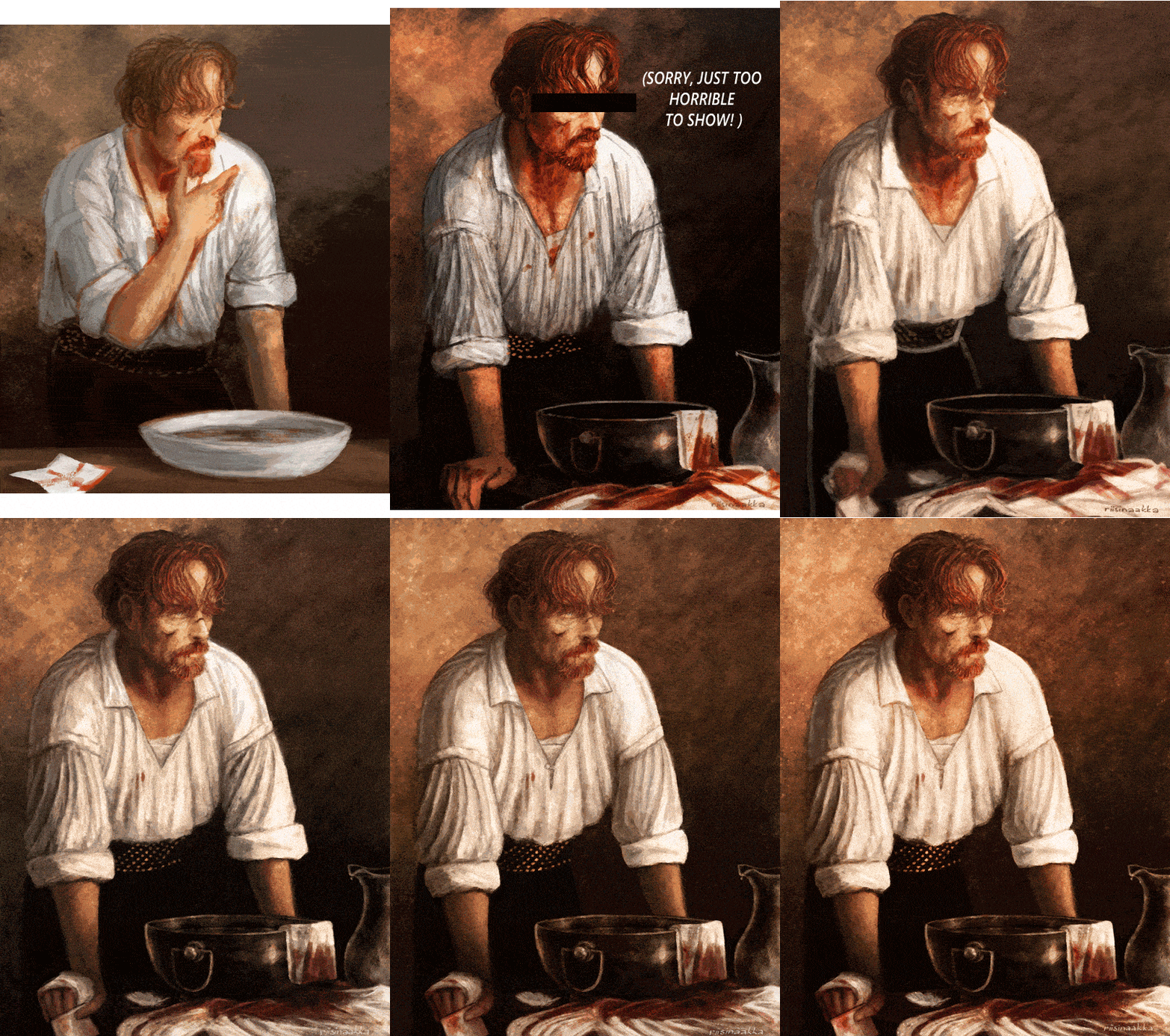
Progress gif of this: “Would you still recognize me?”
The quality isn’t the best possible, but hopefully you get the idea how things evolved... It’s made from “the preview pics” that I saved in this painting’s draft/wip folder whenever I took a break or wanted to compare/remember something special - and also so that I’d know where I left things and wouldn’t have to open the actual psd file every time, lol. To make the gif size smaller and to have it flow better (and be less eye-hurting), I left some of the frames out.
I admit it, it’s quite fascinating to watch now after everything :D *pats myself on the back*
So that the post doesn’t become too long on the dash, I put some additional notes under the cut, mainly about the refs and wips if you want to take a look! Please, do not repost elsewhere :)
(Btw, you can just read the bolded parts if you want a quick version or get tired of the rambling.)
I want to point out that the main work always happens underneath all kinds of adjustment layers because I like to test things a lot during the process before sticking on something if I don’t quite know yet what I want. Like the colour scheme or where the light comes (or if there are multiple light sources) or if something needs more contrast etc. So I paint with simpler colours first, but already have some ideas/adjustment layers over them, but hidden and waiting until the basics are done. Then I merge things and continue to paint with the “new” colour palette.
I also often test filters to have more texture or bring out some things better - or just to find something interesting to incorporate! Accented edges, crosshatch and watercolor are things that I often test in some way over my sketches and wips at some point when the basics are done or when I need/want some kind of further effect/texture or just something to knit them together better and for balance. And also just for fun!
Then I flatten the things I like (or I am “certain about” at that point) and continue painting over that ...aaaand end up testing something else, keep different versions or parts of things on separate layer groups (to compare or to bring back some earlier things that I liked or alternative lighting solution or object/body part placement, or...) and so on...seriously it’s always a mess controlled chaos! aahahahaha *face palm*
But mainly the things keep building on top of each other instead of having neat groups for sketch, lineart, colours, lighting etc. I mean, I always try to start with that but never have been able to actually keep it very long... And on the other hand I’m too nervous and indecisive to paint with only single layer/canvas from the beginning with (like a traditional painting would be painted). Or with just a few layers for background, character(s), effects on their own and so on... So I have this chaos that swirls towards that something that I had preplanned or wanted to achieve/practise until I’m happy with it.
ANYWAY, BACK TO THE ACTUAL ART :
The original “spark” for this work was Flint at the end of the episode 1 with his bloody face and white shirt, and that nice splash of light, which made me think about the aftermath and him cleaning himself in the privacy of his cabin with some nice morning light painting his beard fiery and him lost in thoughts :) At some point that made me think of Henri de Toulouse-Lautrec’s beautiful painting “The Laundress” which I have liked since I was a kid, so I started to steer towards it.
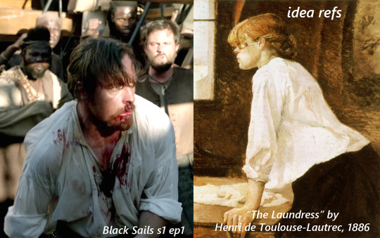
See the resemblance? (˵ ͡~ ͜ʖ ͡°˵)ノ ✧*:・゚✧
Some of the refs for the bowl and Flint. The angle/posture ended up being a bit different and I had more refs for Flint’s face and shirt and hand etc.

Some wips:
1) basically the idea and items that I wanted to include.
2) after a break (weeks? months?) and after I had searched some more references to help. The eyes were at this point (accidentally) absolutely awful so I censored them for the sake of my own peace of mind here, lol (not sorry!)

More wips along the way, although not much difference can be seen as the pics are quite small.. :
3) I mirrored/flipped the painting constantly, to see the mistakes and also because I couldn’t decide which way I wanted him to be! This stage was aaalmost ready but I got stuck and forgot let it be for several months doing other stuff again.
4) I continued it, fixed lots of things with fresh eyes and experimented more with lighting and texture but nothing too drastic stuck in the end. I have two monitors and either (or both...) are calibrated a bit off atm, so it was quite frustrating to navigate and to know which one had the right colours that I was after... and I still don’t know but it looks nice on both screens so ¯\_(ツ)_/¯ At this stage things were basically nitpicking and a bit too much honing.

The finished piece:
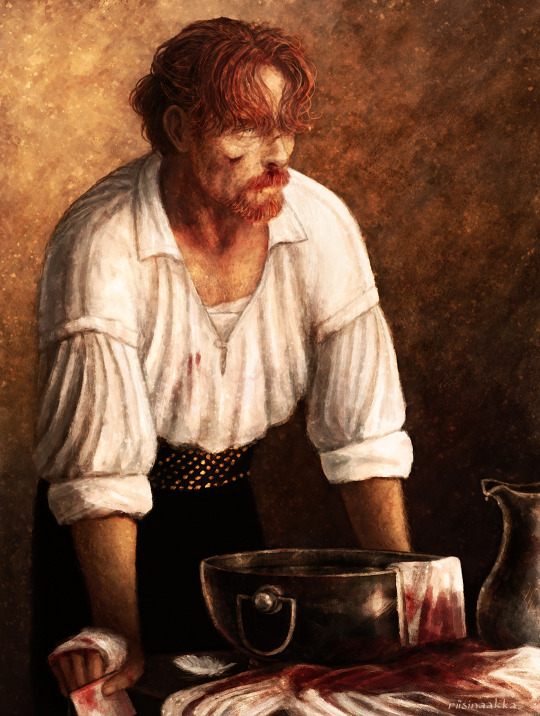
In the end I lost some of the things I actually liked more in the earlier versions (for example some had more of a dreamy feeling or better texture or more emotions/wearyness/anger showing that didn’t quite reach the end result again) and I overworked some other things, but nevertheless! I’m very pleased how this turned out! I reached the vision I wanted and learned a lot again :D
Thanks for reading <3
#black sails#captain flint#tw blood#flashing gif#tw flashing gif#progress gif#or is it process gif?#anyway. here's some notes and refs and ideas again#the gif shows more than the small pics later#but I wanted to point out some things from along the way#ask away if you want to know something specific#OH yeah btw this one sparked 'the first mo(u)rning in Nassau' painting with Flint and Miranda!#that I drew a while ago and finished before this#atleast I have a vague memory that these were connected#and also the one where mr Gates is patching up Flint with dr Howell xD#which I privately call 'HURGH' (because of Flint's reaction lmao)#so you see#it's dangerous to start new things because they end up multiplying and then u end up with shitton of wips#that are like 70-90% ready but just.can't.finish.nggggghhhhhh#at least some of them finally saw the light of day...#also I forgot to draw his collarbones again lol#let's pretend there's enough meat to hide them ;)
99 notes
·
View notes
Text
Even Jedi Get Nervous
Paring: Obi-wan Kenobi x Reader
Word Count: 2.2K
Request: heya! Could you do an obi wan fic where before the clone wars obi wan meets a painter on the side of the street and falls head over heals, stuttering and blushing - Anon
A/N: This was fun to write! Like just imagine the crap Obi-wan had to put up with while Anakin was still young. (Also I hit triple digits on my follower count and I feel loved so thank you!)
Masterlist

You dipped your brush into the paint and smeared the light blue pigment over the entirety of the blank canvas. You weren’t quite sure what to paint just yet, but you had learned early in your career that sometimes putting down that first stroke was the hardest. You looked around you for some inspiration. You currently sat on a stool surrounded by your various works of art. Some were hung on the walls of the small stall you rented out others were stacked against each other inside various sized boxes. You looked out a little further, despite the clean and peaceful manner you attempted to keep your stall in the rest of your surroundings had the usual characteristics of a rather seedy flea market. Off in the distance, you could see someone being arrested, most likely for stealing. That was a very big problem among these parts after all and sadly not a great inspiration for a painting. You couldn’t wait for the day you managed to save enough to save credits to move out of this hellhole and buy a proper studio in the nicer part of Coruscant. Of course, that was a far-off dream at the moment. It was hard to find clients in a place like this, but it was even harder still to afford the rent anywhere nicer.
You dipped your paintbrush into a small pot of paint having come to the conclusion that you paint the Coruscant skyline; it was lovely after all. But before you could start something caught your attention. You rarely saw new faces. The market had a very loyal set of regulars and others rarely ventured in. The two newcomers had to be Jedi judging by their outfits. It struck you as odd until you remember that one of the local crime lords and been making things very difficult for the Senate. You watched the Jedi for a moment, trying to take in as much of their appearances as you could in the short amount of time you had. Both appeared to be young, far from the wrinkly old master you usually pictured when someone mentioned the order. The younger of the two was a small boy, you imagined he was no more than eleven. He had short blonde hair and a single long braid. He had to be a padawan then. You turned your attention to the older one; he was quite handsome you noted. His features were strong, but his expression was still soft as he spoke to the child next to him. You forgot your original plan of painting the Coruscant Skyline and instead picked up your stylus and began to sketch his features; you worked quickly not knowing how long he’d been within your sight.
You were quite engrossed in your work when the voice a child asked for your attention. You set the brush down on your palette careful not to let it roll off and looked to the boy; it was the Padawan you had been observing earlier. “Can I help you?” you ask with a friendly smile.
He pointed a finger at one of your larger paintings, “What kind of starship is that? I’ve never seen one before.”
You shrugged before gently placing the canvas you were previously working on onto the table. “I don’t really know, actually. I just paint and draw things as I see them. Do you want to see more? Maybe you can tell me about some of the starships in my sketchbook?” You weren’t entirely sure why you offered the kid to come see more of your work. After all, you had paintings to finish and future clients to chase down but you had always had a soft spot for children and the way he grinned at your offer warmed your heart in the most wonderful way.
You pulled up a stool for the young boy and riffled through your bag until you came to one of your paint covered sketchbooks. It looked like it had gone through hell and back. The bindings were coming apart and the leather cover was peeling in far too many places, it had been well used and loved to say the least. You took a seat back on your stool and opened the sketchbook to the first page. It was a watercolour painting of a cruiser half-submerged in a lake; you had come across it during your travels. You looked to the young boy, “I don’t believe I got your name.”
“Anakin.”
“Well, it’s a pleasure to meet you Anakin. I’m (Y/N)”
-------
You weren’t sure how long you and Anakin talked but it was nice to have some company. You told him about the places you had travelled to before decided to settle down in one spot and he told you all about the ships in your many paintings. You had started working on the painting of his master again. You had assured Anakin that you were really enjoying his company but that the paint was drying so you had to work and listen at the same time.
It didn’t take long for Anakin to become curious about your current project. “Are you painting my master?” he asked tilting his head to the side trying to get a better view.
“I suppose I am,” you replied with a laugh, “but why don’t we keep it to ourselves? I’ve found some people don’t react well when they find out I’ve been painting them without their permission.”
Anakin’s smile turned into a wide grin, “Obi-wan isn’t like that. I bet he’d love it! You should show him!”
You couldn’t help but laugh the kid’s enthusiasm and confidence. “Oh, I really don’t want to disturb him, I’m sure he has important work to do.”
“I don’t think it’s too important. I mean he’s coming over here anyway,” he said gesturing towards his master who was, in fact, approaching your stall. You were quick to tuck the painting away.
When the other Jedi arrived, he wasn’t paying any attention to you and you were just fine with that. His focus was purely on his Padawan. “What have I told you about running off Anakin? I’m sure this lovely lady has lots of work to do and no time to answer all your questions.”
You couldn’t let Anakin take all the blame for this; you had been the one to offer to show him your paintings. “He’s actually been great company, Master…” you trailed off at the end, realizing you didn’t know his last name.
“Kenobi,” he replied quickly giving his young Padawan another scolding look. “I really am sorry though; he tends to get…” His words caught in his throat when his eyes met yours. Maker, but you were gorgeous. He stood quiet for a moment trying to get his body under control. There was no way he could effectively scold Anakin if he was blushing like an idiot. He opened his mouth as if to say something to you but then closed it again. He grabbed Anakin’s hand and looked back at the boy; finding it far easier to speak when he wasn’t looking at you. “Let’s go Anakin.”
Before he could pull the boy away you grabbed the sketchbook you had been showing him and quickly slipped it into his free hand. You held a finger up to lips indicating to him that this was supposed to be a secret. As you watched the boy get pulled away you couldn’t help but smile to yourself. He was such a kind kid and well you didn’t know much about his Master, but he was certainly something to look at. You went back to your painting of Master Kenobi, wanting to get as much done while his features were still fresh in your mind.
-------
That evening Anakin found himself sitting in his master’s quarters as he flipped through the book you had given him. He went from page to page telling a rather distracted Obi-wan all the stories you had told him earlier. He was quite excited to share all his new knowledge with his master.
“She visited Tatooine once, you know. It’s too bad we didn’t know each then, it would have been fun if she had visited. I could have shown her all the best places to paint.” Said Anakin as he admired a painting of a desert with a single bantha standing in the distance.
“Who visited Tatooine?” asked Obi-wan. He wasn’t very interested in the answer but if he didn’t show any interest Anakin would get bored with talking and most likely find some trouble to get into.
“(Y/N)”
“Who?”
“(Y/N). The painter in the market,” answered Anakin turning to the next page in the sketchbook.
“Is that where you got that book from?” asked Obi-wan looking over his shoulder at his padawan.
“Yep! She’s really nice! She told me all about the planrts she’s visited but we didn’t have time to look at the whole book, so she gave it to me! We talked a lot about starships too!” replied the young boy. He was obviously very excited about the new friend he’d made that day. “I want to go back and thank her tomorrow.”
“Well I, I suppose that would be appropriate. We’ll go first thing in the morning,” stated Obi-wan, if Anakin didn’t know him any better, he would have missed the slight blush and hint of nervousness in his voice.
“You think she’s pretty; don’t you Master?”
Obi-wan scoffed. Of course, he had thought you were pretty, you were easily one of the most beautiful women he had ever laid eye on but his young padawan didn’t need to know that. “Go to bed Anakin.”
“So you do think she’s pretty?”
“Go to bed,” he repeated this time voice firmer.
-------
Obi-wan and Anakin arrived at the market just as it opened the next morning. “Now Anakin,” started Obi-wan, “you’re just here to say thank you. Please don’t take to long. Now go on, I’ll wait here.” He waived his young padawan off and turned his gaze to you. He admired the way you happily turned to greet the young boy. He would have loved to go up and talk to you himself, but he was afraid that if he tried, he wouldn’t be able to get many words out. Admiring from afar was much easier anyway, he didn’t have to worry about embarrassing himself. He watched you give Anakin a gentle hug and then look up at him. When your eyes met, he tried to look anywhere else but you. He didn’t want you to know that he had been staring.
Once he had determined it safe to look again, he found you kneeling by Anakin laughing about something. He couldn’t hear your laugh over the noise of the market, but he could only imagine it being as beautiful as you. He had decided he really was quite content just watching you when Anakin waved him over. Had something happened? He couldn’t just ignore his padawan, so he approached with his eyes focused on the ground ahead of him.
“Master! (Y/N) invited me for tea and we wanted to know if you’d like to come too!” said Anakin with a wide grin.
Obi-wan looked from his padawan to your smiling face. “I.. I would, um…” He tried so hard to answer. Of course, he wanted to go for tea, after listening to Anakin spend the better part of the day before and the evening talking about how wonderful you were he wanted nothing more but his mouth just wouldn’t form the words. Maybe it was the way you smiled at him or the way your gentle eyes reflected the sunlight.
“Is everything all right Master Kenobi,” you ask kindly.
“He’s fine. He’s just nervous cause he thinks you’re pretty,” states Anakin very matter-of-factly.
Obi-wan’s heart stopped and he was ready to drag Anakin away to keep him for embarrassing him anymore. He glared at the young boy while trying to suppress the heat he could feel rising on his cheeks. Your laugh pulled his gaze back to you. He had been right in assuming it would be beautiful. It was absolutely magical if he was being honest with himself, if he could hear that sound again every day for the rest of his life he would count himself a lucky man.
“Well,” you said holding Obi-wan’s gaze with you own, “Tell your Master that I think he’s incredibly handsome and my offer for tea still stands.”
Obi-wan didn’t have any words, he just stood and stared at you as you spoke. There was no doubt in his mind that he was blushing, but you were now too. It was much less embarrassing when he wasn’t the only one. “I’d like that very much,” he replied in an even and gentle tone as he could manage.
Anakin couldn’t help but make a disgusted noise at the way the two adults were looking at each other. At least his master was happy.
Tag List: @psionicsnow @in-the-frap-of-the-gods @glitchnovax
#obi wan kenobi x reader#obi wan x reader#star wars x reader#star wars imagine#obi-wan kenobi#anakin skywalker
291 notes
·
View notes
Photo
Man, I forgot to post 90% of my art here for the past while. I’m gonna do an art dump in this post under the cut. Enjoy the bonk emoji if you don’t click the read more, and man am I dumb and forgetful lmao.
Includes: OCs getting names, a Sonic impression, a D&D map, homosexual energies, a sheep floating in the astral sea, a birthday drawing I already posted, Hex Maniac Ender, D&D Characters, D&D Characters as Miis in Miitopia, Little Hater Axel, local Demon in the consciousness of my D&D character yelling at him, illegal plants, a necromancer being cute, an actual event that happened in a D&D game two days ago, and Mermay drawing.
That’s everything in here as a TL;DR, I guess. Enjoy your day!
I’m gonna try and sort of have them in chronological order, oldest first, but I may end up putting them in the wrong order. If I do... Whoops, I guess?
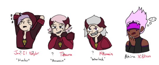
[04/14/21] - This isn’t really new art, but I started to work on giving the four OCs of mine without a full name full names... I have not finished this bit, though. So Hunter and Akira have full names, and Warlock and Assassin only have temporary names. This may end up like Seven where I put in their names as a temporary name (7th OC I’d made at that time) and it just kind of... sticks. Lmao.
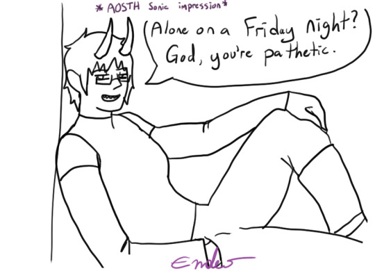
[04/20/21] - Alone on a Friday Night? God, you’re pathetic. I didn’t colour this one because it was a half-attempt at a meme image I still like it, though, so I might end up colouring it. It’s gonna appear again whenever I do my “unfinished drawings art dump” at some point probably in... June? I know I said I’d post them last month but forget it, lmao, it’ll happen eventually.
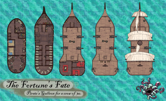
[04/20/21] - A D&D Map! This was to help me visualize the layout of my D&D character’s ship he used to be on. Also for my DM if they ever put us aboard the ship. The little fella in the corner is just there to vibe. This map is made of free to use assets from This Website, so while I’m gonna say DONT USE MY MAP WITHOUT PERMISSION, feel free to make your own!
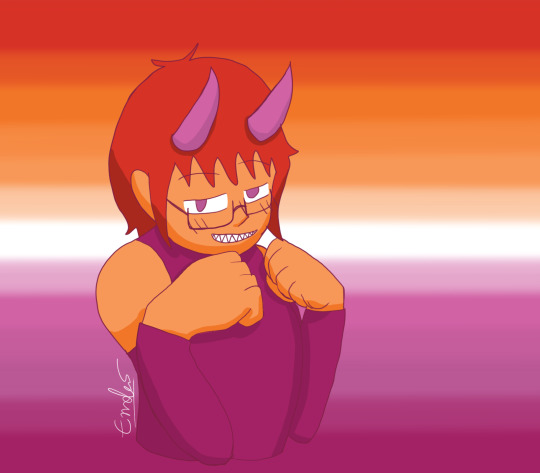
[04/26/21] - Lesbian Day of Visibility drawing of yours truly, the disapointment! That’s... really all I have to say about this, honestly. It was just for that one day and that was it, lmao. I mean, I accidentally lined it in dark pink, so.. .That’s different, I guess?
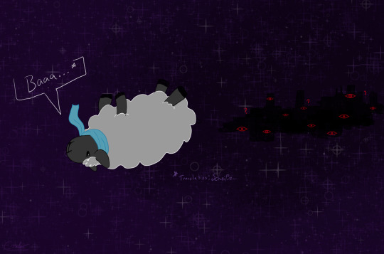
[04/30/21] - Do Astral Seas dream of Ensorcled Sheep? Does the City know what Sheepleb is going to do? What crimes he may commit? Who knows! This was fan art of Critical Role ep. 134 if I remember correctly, right at the end when they jumped into the portal into the astral sea and Caleb was a sheep. Using my knowledge of the German language, I knew the word for “shit”, and had to use it.
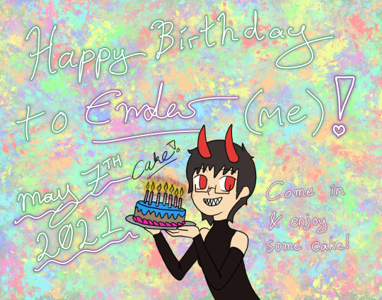
[05/07/21] - This was already posted, but it’s going in here to dilinuate that it was drawn at this point. Also, aside from playing Miitopia, this is all I have to show for myself until the 12th.
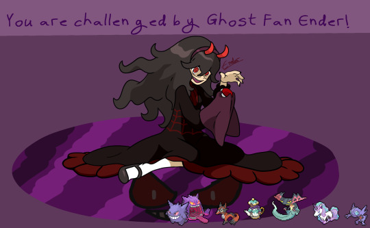
[05/12/21] - Hex Maniac Ender challenges you to a Pokemon Battle! WIll you win against my team? My sis, who loves fairy types, pointed out to me that there’s a fairy girl and hex maniac duo, so I’d be the hex maniac. I spent... Over a week drawing this, because I basically had to redraw the Hex Maniac art from scratch in a higher quality size, and then draw myself over it. So... You can excuse the low-effort background for once. It was basically this, and then my birthday doodle from May 1st to May 12th, and then I took a break to draw up several D&D characters quickly for fullbody references.
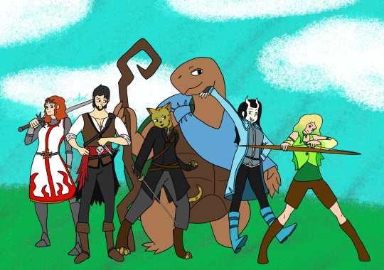
[05/12/21] - Remember this art I made several months ago? I finally added my other two completed characters! I have three more named but without character sheet D&D characters, so for now this is just Kara, Axel, Golden Shadow, Kau, Cecillia, and Miri. Kress, Tempest, and Melia will have to wait until I make character sheets for them to be posted, and... For when I probably make more D&D characters. I have at least 9 additional, incomplete character ideas floating around, so... I’m never gonna be done this art, huh?

[05/12/21] - Speaking of D&D characters, did you know I’ve been making them as Miis in Miitopia? So here is their finished full body art next to their Miitopia self! Some of them look a little off (Golden Shadow, Cecillia) because of limitations of the editor and shading issues, some of them look a little off (Kau, Kress) because this is a human face canvas that I’m using to make a non-human face, and some of them (Melia, Axel) look REALLY GOOD. Common traits among my D&D characters include green eyes and tall. You wanna know why? Because I am tall and... despite having red eyes, I do have green eyes under the coloured contacts.

[05/15/21] - More D&D stuff! This is based around my D&D group’s current Rime of the Frostmaiden campaign where our Goliath Fighter, Nioh, ends up getting a little bit of hate for being cocky, and our little (well over 6′) hater, Axel, is just a man full of irritation. These are the tallest two characters of the group at the moment. Someone send help. Nioh belongs to one of the other D&D players, Axel (and his stupid additude) belongs to me.
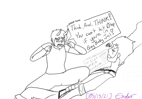
[05/15/21] - This is what me playing D&D feels like. Me, the demon entity trapped inside the head of my D&D character, yelling at them to do things while the dice decide that they’re gonna get bopped a hundred times by a yeti and somehow still survive. This is also a reference to our first or second game where I just ran off like sixty feet to one side of the battle map to fight a Crag Cat and was just in Gay Baby Jail until like two turns later when I could run back to the others. I also drew him not in his winter gear even though this is a bit from when we were atop Kelvin’s Carin in an icy cave, so maybe that’s why he’s at low HP.
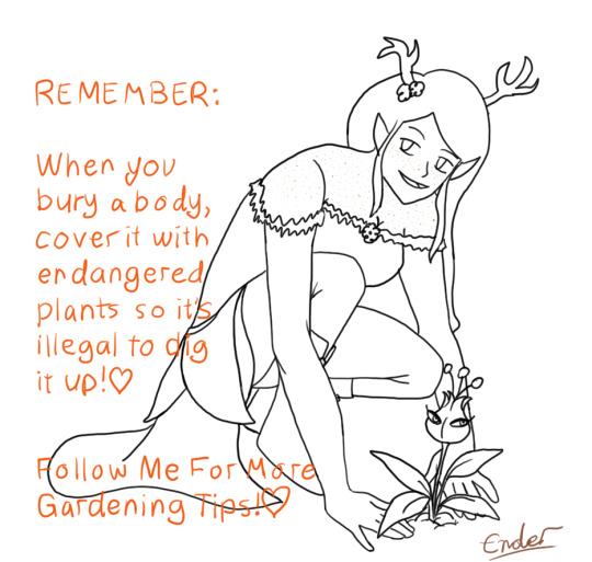
[05/15/21] - Melia has good gardening tips, such as Use A Mars Mii Trap To Hide A Body Because They Are Endangered And It Is Illegal To Dig Them Up. I love her a lot, because she’s the youngest of four, all four sisters based around the different seasons. She’s based around Autumn, so she’s all orange and yellow and brown and is so cute. Also she’s Chaotic Neutral, as if she didn’t need to be mildly more threatening.

[05/15/21] - Cecillia is my Tiefling gal who lived in a very northern town plagued by cold weather and snow, and Axel is my Pirate guy who spent most of his time further south on the high seas and warmer weather. So, naturally... I’ll use the guy more acclimatized to the hotter weather in the campaign where we spend 99% of it in the snow. She uses Tarot Cards as her spell focus, and I decided to sneak my other D&D characters onto her Tarot cards so naturally, Axel is The Hanged Man, given his backstory and personality. She’s a very cheerful and friendly Tiefling Necromancer of the Hexblade, so she’d for sure take care of those around her to ensure their success. Especially if they’re on her Tarot Cards, and their spirit comes to her aid when she asks for them.
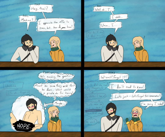
[05/16/21] - Content Warning; Ryma thinks too much into local stupid moron’s lack of knowing how to answer a question and thinks too much into the reputation of Pirates. Poor Axel, man doesn’t know how to socialize with people who aren’t pirates and is used to being hostile towards everyone, so when he’s asked a question that his answer to is “uhh... no?”, he panics and ends up making a mistake that leads him to think that Ryma can read his mind. Ryma belongs to another of the D&D players. I guess me drawing all those spicy Cow Costumed OCs earlier just brought me to drawing Axel being a bottom in this, huh?
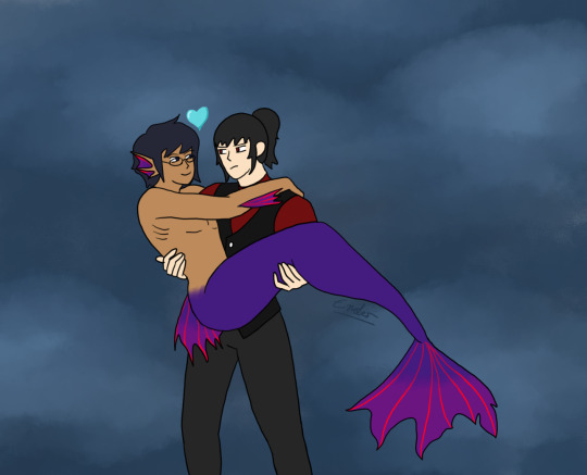
[05/16/21] - It’s Mermay, which means more OC drawings! Here’s Theo after drinking some potion that turned him into a mermaid, and Seven, tiredly, collecting his stupid boyfriend so that Lailah can fix the fact he’s turned into a mermaid. Mer!Theo is based around his sword’s colours of indigo-purple with red accents, which looks a little weird since Theo is the Blue one of the group, but... it looks cool, I guess. Seven’s just the same outfit as always, just no gloves this time.
--
And that’s it for the art dump! This was, frankly, MASSIVE. I’ll try and remember to upload both on Twitter and Tumblr at the same time, but... Ah... I have been drawing a fair bit. Just mostly sketches and linework that I haven’t finished and may not actually finish. If they’re not completed, I’ll dump them all into something at the end of the month or whatever. Maybe you’ll get the old sketch of the Axel face in panel 3 because in the sketch phase it was an Ahegao face, in the clean sketch it was a lip bite, and in the linework and final it’s just horny face. lmao.
Top ten things I have to remember for drawing: AXEL HAS A SCAR AND GREEN EYES. I remember his eye colour now, but if you look at his fullbody ref, he’s got brown eyes. And, naturally, I keep forgetting to put in his scar. He has more, but most of them are located in areas covered by his clothes. So if I ever draw him shirtless I guess I’ll have to place them somewhere.
Also maybe finish the reference sheets I have left to finish so I can post more of them, since I have two “Pets” completed (Roko and Mona’s nameless pet), but I have to do up Hunter, Warlock, Assassin, Akira, Myuut, and Stella. I’m betting when I do complete two more, it’ll be Hunter and Akira. Those two are the most fun to draw, at least.
#the disappointment speaks#drawings by me#OCs#D&D#art dump#Miitopia#of all of these drawings I gotta say the most cursed is censored bottom!Axel and the most blessed is Cecillia's lap nap#I drew a lot of D&D stuff lately! Most of my OC stuff has stayed in the sketch stage so#I guess that says something about what I've been prioritizing in my drawings?#Also that drawing a twunk as a twink is incredibly funny and cursed. love my pirate boy
4 notes
·
View notes
Text
— hwang hyunjin x reader
— dancer! hyunjin x artist! reader
will have a part 2
with your hands, you were said to be dexterous.
and with being dexterous came money.
being someone with such capability led you to helping people with paintings or drawings, so you decided to make that little thing into something big. along the block next to the local pharmacy stood your art store.
nope, you didn't sell art materials, you drew for the customers. all they had to do was give you a picture and boom, there they have it.
you just loved the idea of helping people through your most loved hobby.
everyday you drew sketches of people you didn't know, you would see the reactions of the people when they see your studio for the first time, the small smile you sported when you see their reactions.
you loved everything so much.
and school?
that's what you were aiming for.
your parents passed away when you were quite young and they left you nothing but your angelic grandmother who ran the flower shop across yours.
one day, a guy wearing what seemed to be a uniform and probably your age entered your small studio, clutching an a4 sized paper of a girl. after examining what the guy held, you let your eyes wander up to his features.
tall nose and a cute mole under his left eye and plump and kissable lips. he was attractive, a very attractive guy with his hair parted to the side.
with those godly features, you expected a smile coming from him but instead, he was panting heavily and you noticed his red eyes, suspecting that he's been crying.
you gave a small smile at him who just remained standing, adjusting his breathing pattern in order to speak whatever he had to well.
he walked towards your table, which was situated on the center of the shop, the table being a barrier between the plain wood when you enter and the beautiful mess you call your workplace. you still sat, grinning at the boy who slammed the picture in front of you making you lose face and raise your brow at him.
"i need a painting, asap," he spoke breathily, his eyes boring into your eyes as you stare at him. he was cute and all, but he's quite rude.
paying no mind to his attitude, you look down at the picture he just slapped, finding a beautiful girl holding flowers. his girlfriend perhaps.
you stood up and took the picture, "look, kid, i'm gonna need 20 minutes, 25 max if you want a detailed version,"
he straightened his back, crossing his arms and put on an emotionless face, "and i'm gonna need you to control that attitude, you may be handsome but your persona gives that off," he scowled at your comment and rolled his eyes.
"could you please hurry that up? i don't have all-" he was cut when you walked away, your back turned to him as you looked for the right colors to pour all over the canvas.
"oh, you could sit there if you want to wait," you motioned to the chair you just sat on and he moved to sit, crossing his legs as well as his arms.
while you worked, hyunjin sat there observing you. how you only held the brush for a few minutes just to let go of it and use your hands, how your bun let your baby hair fall freely in front of your eyes, how you puckered your lips everytime you focused on mixing the colors, he could see to himself that you were more than attractive.
he had a small smile on, finding you cute when you cursed at spilling some paint on the picture. he didn't mind that you spilled some content onto the picture because he was busy examining you and finding you cute that he didn't notice you turning to his direction and asked if it was alright for the original picture to have a smudge.
you had some green paint your right eyes and your hands were all littered in tan, pink and other colors. hyunjin was in awe that you were so pretty, so mucb more pretty than his girlfr-
oh shit, he had a girlfriend.
"o-oh, yeah, that's alright." he stuttered as you raised your brow at him once again, as you tilted your head but continued on your work, "is she your girlfriend?"
"uh, yeah, she is," hyunjin looked down after answering your question, the memories of how his girlfriend treated him unfairly flooding in his mind.
he noticed that everytime he'd buy something for her, she'd pout and smile with that sweet sickly tone of hers and when he'd hold her hand on public, she'd harshly shrug his attempt and glare at him.
he was aware that he was being used, but what could he do? he was in so much pain and was still under the influence of love that he was confused.
if he had to continue on spoiling her, she'll probably get back on her senses and love hyunjin the way he does to her and at the same time, he was contemplating whether to break it off because she might continue on using him for her pleasure.
prior to his arrival on your shop, he forgot that it was their monthsary today, so he had to run from many blocks away to get here and make her a gift that aren't necklaces or dresses. on the phone, his girlfriend had told him that he was uselessly forgetful and he didn't know if she knows that he was really prone to insults that he cried after the beep came.
"i don't think she's that pretty, man." he quickly whipped his head up to your direction, "pardon?"
you sighed and faced your head to his direction, "she isn't as pretty as you are."
at that comment, he blushed. though it was silly for you to call him pretty, he's never been given such compliments from his girlfriend, "a-aren't guys supposed to say those things?"
he was cutely stuttering and you were amused. how could this boy, who straight up slammed a picture in front of you just turn into a blushing and stumble with his words just with a compliment?
there was more to this boy than his face.
"so you agree?" you pressed on, "that you're pretty?" you weren't trying to provoke him, but you just wanted to see more of his flustered side than necessary.
he stared at your smirking lips, "w-what?"
"n-no, it's just that um-"
"i was kidding, you really are one attractive being, i bet everyone at your school loves you." you smile at him and he returns one back, your stomach churning at the sight of his pearly whites and eye smile.
after a few minutes, the painting was finally done and you'd have to wait for another set of minutes for it to dry. as you hadn't alerted hyunjin about the condition of the painting, you spun on your heel to tell him only to be greeted with his chest. he looked over at your masterpiece and smiled.
it was now your turn to get flustered, at the close proximity, you swore your nose had a waft of his perfume, a whopping gucci magnolia. you noticed the necklaces adorning his neck and you were much more attracted than what you had initially planned.
a passing crush, it was supposed to be.
you didn't get why, but you liked the sight of chains. necklaces, bracelets and rings, you liked how men can even make some piece of metal look somewhat pretty.
when hyunjin noticed your flaming cheeks, he smirked and turned his head to you. you evidently gulped as his eyes bore into yours and yours into his, as if it was to help the erraric beating of your heart but to no avail.
"i-it's probably d-dry, so you can take it n-now," you cursed yourself in your head for stuttering in front of him when you were the one teasing him for stuttering earlier.
"and how much would that be?" he tilted his head as he supressed his smile, "i'd take any price,"
you were about to say his name when you remembered that you hadn't asked him for his name.
you opened your mouth and was about to ask for his name but he beat you to it, "by the way, i'm hyunjin, in case you needed to write that dowm on a receipt, hwang hyunjin."
then there he goes again with that bright smile, you swear you could melt there in a second if he continued to smile at you like that.
the both of you go silent as you stare at each other. not wanting to embarrass yourself any longer with your red cheeks you back away and move back to where he had sat and took your place.
hyunjin felt himself miss the proximity.
he didn't know why, but everytime he sees you, he feels that he's forgotten that he even has a girlfriend. it's like, you're a candle, momentarily being lit and giving the dark room light but is easily outshined when a real light bulb is in. but in your case? you were pretty hard to forget.
your mix of personalities had him, and he liked it.
he faced your back as you wrote on a receipt and ushered him to bring the painting for the payment.
with the painting in hand, hyunjin drops an amount more than what the usual people would pay, "are you expecting some change?"
you asked him incredelously as he just gave you 3 times the amount of a usual, "no, i'm not. it's a little tip for entertaining me while you did your work, but even if you hadn't talked to me at all, i'd still give you the same amount because your visuals caught my eye the most."
your mouth closes and opens as his words, "you're like your paintings, miss artistic," he grins at you, "as your paintings are beautiful, so are you but you lean more on the 'beauty that makes you stop and stare' side." he winked at you and your cheeks go red again.
"until we meet again, miss artistic." he gives a little bow and walks out the door, his eyes scanning you one last time through the glass panes.
#stray kids imagines#kpop#kpop imagines#stray kids#stray kids smut#stray kids fluff#stray kids angst#stray kids hyunjin#stray kids hyunjin fluff#stray kids hyunjin imagine#hwang hyunjin imagine#hwang hyunjin fluff
144 notes
·
View notes