#i finally learnt how to make gifs in photoshop
Explore tagged Tumblr posts
Text
FIT DIGITAL GRAPHICS INTENSIVE II
Session 1- 27/01/25
Today we began by going through the class syllabus and discussing what we were going to be doing this sprint semester 2025. We discussed the projects we would be having-
1. digital collage based on an article
2. digital collage storyboard
We then read all 3 articles that we were given and I chose this one-
I created a mind map of my thoughts as I read the article, to help me decide what I want to create for my digital collage-

Session 2- 30/01/25
Today we discussed what we found reading our articles and talked about whether we enjoyed mind mapping. I don't think it's a very popular way of learning in American schools as most of my class had never made a mind map. I do enjoy making them and find them effective as I can summarise the information and it means I don't have to keep referring to the original piece constantly, and I can just look at my maps. About the article- I feel the information was common knowledge for people interested in dogs- whether that means you own one or you are interested in owning a dog. I think some dog owners are ignorant and see their dog as superior, meaning they look down on how other dogs are treated even though it isn't necessarily 'wrong'. Therefore, I do believe in the article as there is a lot of myths about dogs, and there is a lot of misinformation around dog- human relationships.
Some sketch ideas-

We had our first photoshop class- We learnt about cropping images and angling a buildings perspective from wonky to direct view. I created this building of British icons after class to practice the skills I learnt in class.

Session 3- 03/02/25
Today we ran through all of our sketches and building designs. My feedback was to add more purpose and detailing to my sketches as mine were more sketches of concepts rather than composition realistic design ideas. Kris loved my building and said it was nice how I added a memorial top left (unintentional). We ran out of time for a PS lesson.
Homework- develop sketches further and create a mood board for my collage design.

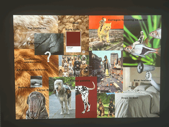
Session 4- 06/02/25
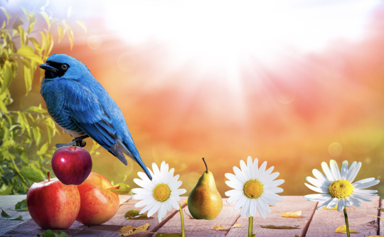
Today we covered selecting and masking on PS, which I have done many times before but I re did masks which I had forgotten. I created this by using lots of different techniques and tools, to practice all kinds of cutting images out.
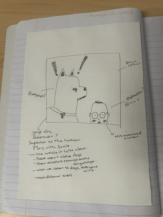
I got feedback from a further developed sketch-
" I think the base idea is fine as far as it goes, but I'm not sure yet that it goes far enough.
My question is, how will we know that the dog is trying to communicate, and that the man is confused? I think those two emotions need a bit more teasing out. There are lots of possibliities: hand drawn images, icons, thought bubbles, speech bubbles... Consider having the dog and the man looking at each other. Right now they are just two figures in the same frame. How can you use their poses, their gazes, to help communicate the confusion that is going on.
These ideas can be resolved as you begin to source images.
The sketch is charming, btw. " 93/100 A-
Homework- mood board, collect some images for collage compositions (explore different public domain images and stock images)


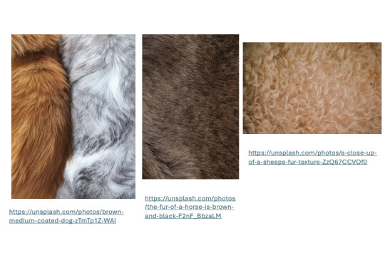


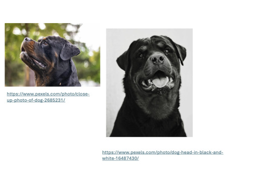

Session 5- 10/02/25
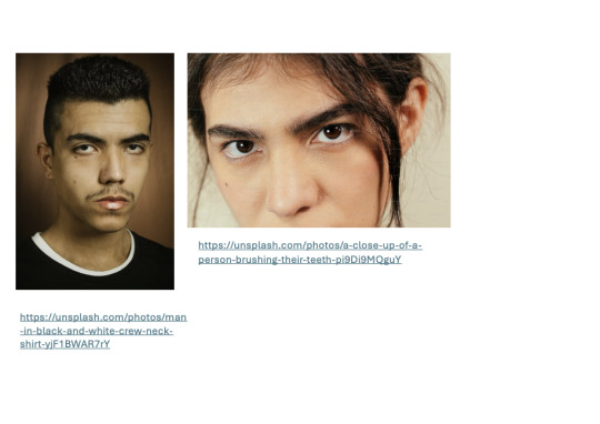
Kris was ill today so our class was cancelled, our assignment was to carry on collecting images and upload our homework to brightspace.
Session 6- 13/02/25
Today we went over ps layer mask and adding adjustment layers... we watched kris demonstrate with a bird and make it look unique and then we began by starting our final files by adding our sketches and layering on top of it... This is the experiments I did.

I started my file by creating a ps doc 8 inches by 8 inches, 150 pixels/inch, rib colour, transparent. I added my sketch as the background and locked the layer. I experimented with some images I used in my mood-board and experimented with scale, colour and adjustment layers.
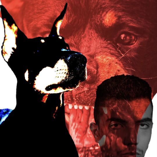
Feedback from Kris- experiment with layering onto of the dogs face- different eyes, teeth, nose??
Session 7- 20/02/25
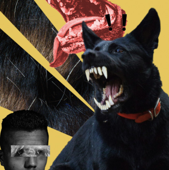
Today we pitched our composition collage ideas to someone in the class- Sunnie and I discussed our work to each other and she gave me lots of feedback and suggestions- make the teeth more yellow to match the back ones, use human eyes over the dog imagery, enlarge the exclamation mark, collar around the human, human behind the dog image. I then got some feedback from Kris and she said to maybe make the dogs eyes red and glowing and from another animal?
Photoshop session-
Session 8- 24/02/25
Today we learnt lots of new PS skills which may help with digital collaging.
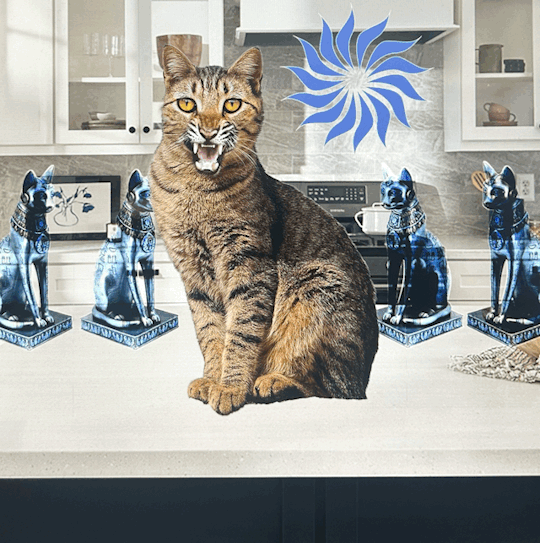
Cat- we used layer styles to fade away the bright orange background of the glow to combine both the images without it looking choppy.
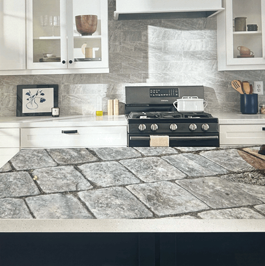
Glass- we used blending modes and multiple of them to create this glass design from a tutorial on YouTube. We added in shadows and white reflections to make it more realistic.
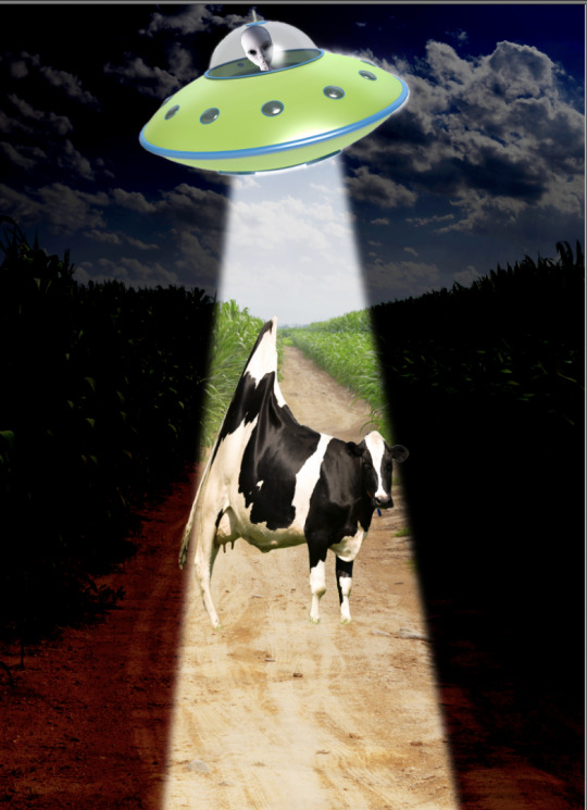
Alien- we used image masks and blending modes to create the dark background to make it look like night time then cut out the reflective streak to show a glow and blended it out by using gaussian blur to make it less structures. I used the warp tool to distort the cow image to make it look like it was being sucked upwards.


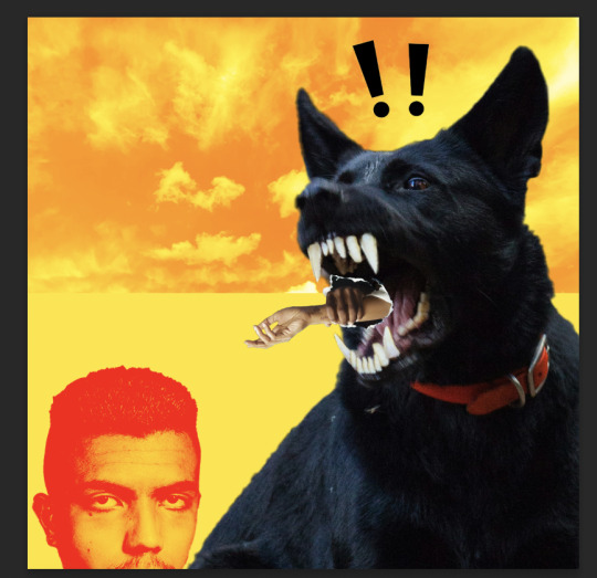
We then got feedback from our digital collages as they're due in one week now. Kris really loved my bright background and my use of red eyes on the dog. Critique- could something be coming out of his mouth? Limbs? Add some more details to the background- she likes the fur.
Session 9- 27/02/25
Today we learnt lots of ai tools on photoshop and practiced lots of different removal edit tools such as the remove tool, content aware tool, healing brush tool, clone stamp tool and the patch tool. I found them al super useful and il definitely use the remove tool and the healing brush tool again.


Kris gave me some feedback from this piece of work and she suggested I make the dog bigger and make the man be looking at the dog. I also think I'm going to remove the cloud background as I feel like it looks like 'hell' and she suggested I change the colour of the dogs glow too.

0 notes
Text
Today's twitter writing community's question of the day that's making big rounds is where would you be now if you had followed the career ambitions you had at age 13.
Hah..hah..hahahhahaha ahhh...life loves to rub it in my face. I'd still be here, mourning my life. I did follow my ambitions since 13. In fact the ambition started at age 9 and it's been haunting me since.
At age 9, while it was mostly play pretend that I was already in the business of my dreams, I started making edits as much as I could with the resources I had. At age 11, my teachers allowed me write and direct my first and last theatrical play ever (didn't go that well cause they put it last at the school closing ceremony and parents and kids were tired and chatting, but oh well my family and the families of the kids that played did pay attention). At age 12 I turnt more on video editing, cause I finally decided which exact job I wanted in the business of my dreams and that required knowledge on video making. At age 15-16 I met my Technology teacher in high school, who after finding out my love for music video making, gave me a cracked version of Vegas pro and books on filmmaking and camerawork. At age 18 I applied for 3 filmmaking schools in the UK. I was accepted in 2 but one wished to give me a place in animation instead (probably cause I didn't have original material just fanvideos, not my fault my friends didn't want to help me record shit) so I ignored it and went with the one in Wales, but due to my parents' insecurities I lost my chance. At age 21 I finally found the balls to try Photoshop and start building a portfolio. I also learnt how to code through the uni I was forced in, helped with building my fanblogs and website.
And it all froze there. I made a couple of fanvideos, one of which got noticed by the band I had made it for and got banned in Japan the next day, no wonder why (I didn't know much about copyrights back then and just accepted people can no longer make fanvideos). I quit making videos within the year. My portfolio not being good enough and not getting attention in social media either eventually discouraged me and I stopped improving it around 2019. I haven't finished a single original work since. But it is slight improvement I got back to both thanks to vtubing. Even if it's not really what I want in life.
Dream they said. I'm good.

1 note
·
View note
Text
week 12
this was our final week of fundies, learning the software. today we did a bit on exporting in InDesign. we looked a little bit into RGB and CMYK. what these stand for and what we use what for. i had learnt a bit about this in DT1 and DT2 so i already had an idea of the use and what the colours combined in each one create.
today we exported our book as a PDF.
3mm bleed is always a good idea, because it means we aren't loosing any of the image but still getting the full size. we don't want a white edge going down the side of the page.
we also use crop marks to know where to cut the page, with the bleed on.


in the compression tab we can adjust how big the file is. we can also make it a high quality print which is what we want.

then we opened it with adobe acrobat.
we downloaded mockups for our book in photoshop and were able to add covers. it was all under smart objects so it created another file that when we save it, it will update the other tab of the mockup... see below.


i started off having a transparent background so i went back into indesign ad editted the actual cover. little did i know there was a shortcut for this that would save me so much time...

then we made spreads, it was the same idea and system to it...


from there we can add any background we want to.
learning this was super handy and helpful. i know know how to create mockups! throughout school in design, i always made it manually and edited the individual images.
shift + option + command + s (save as web) this means it can easily be uploaded. it saves as a gif.

here are the mockups of my whole book. (below) (because the mockup file was very small the quality is not very good)


0 notes
Photo


How Kadavul(s) feel about our lives.
Oh My Kadavule (2020)
#oh my kadavule#Vijay Sethupathi#vijay sethupathy#ramesh thilak#kollywood#sontha post da#kolly#I learnt how to finally make gifs on photoshop instead of in browser sites#gif#my gif
83 notes
·
View notes
Photo

Written in Blood (Animated)
Meiri Lavellan - 9:41 vs 9:44 Dragon
[static version]
#dragon age#dragon age inquisition#solavellan#solas#lavellan#meiri lavellan#i finally learnt how to make gifs in photoshop#my art
23 notes
·
View notes
Photo


My Pixel Art Animation!
His name is Ricky; Ricky the Raccoon. (please be nice to him; he’s soft and sensitive(and lowkey sad 24/7) but we love him…say you love him…there’s a good chance he’ll cry if you don’t.)
I really enjoyed making my character. This was my first time properly animating a walking cycle. I started out by sketching my character on paper then I drew it on Adoble Photoshop and in total this took about 2 hours and I only had 4 frames as I didn’t want to make it too complicated for myself as this was my first time doing a walking cycle.
This was a very exciting experience for me. Before today I didn’t have much knowledge about animation and I finally learnt how to create movement with simple walking motions such as contact, passing, up and down. This was easy to pick up as the UCA team was very helpful. My knowledge has expanded and this has inspired me to keep creating characters in the pixel style which I never thought about before until today.
In conclusion I’m very happy that Ricky the Raccoon was born, and I had a very good time. WE LOVE YOU RICKY!!!
10 notes
·
View notes
Photo

Here is my final product. I’m really happy with my final walk cycle at first I was worried that he didn't look like he was walking but I think its adds to his character as he floats around. I learnt how to use Adobe Photoshop and I used the timeline function to create this gif. To make the process a bit easier rather than drawing out each frame separately I used the looping and selection tool to select specific parts of the body and moved them around sort of like the body parts were on pivots. By doing this it meant that in each frame i was able to keep my character looking the same. I didn't use many other functions mostly used selection tool and the brush but I found that by turning of the shape dynamics the lines were much more defined. There are many other functions but for this I only used those few. This pixel art also doesn't resemble most as the pixels are minuscule but it is actual drawn in pixels unlike my previous gif of Felix.
#animation#pixel art#pixel animation#uca#university of creative art#bronze art award#art#skeleton boi
7 notes
·
View notes
Photo
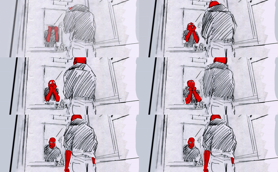
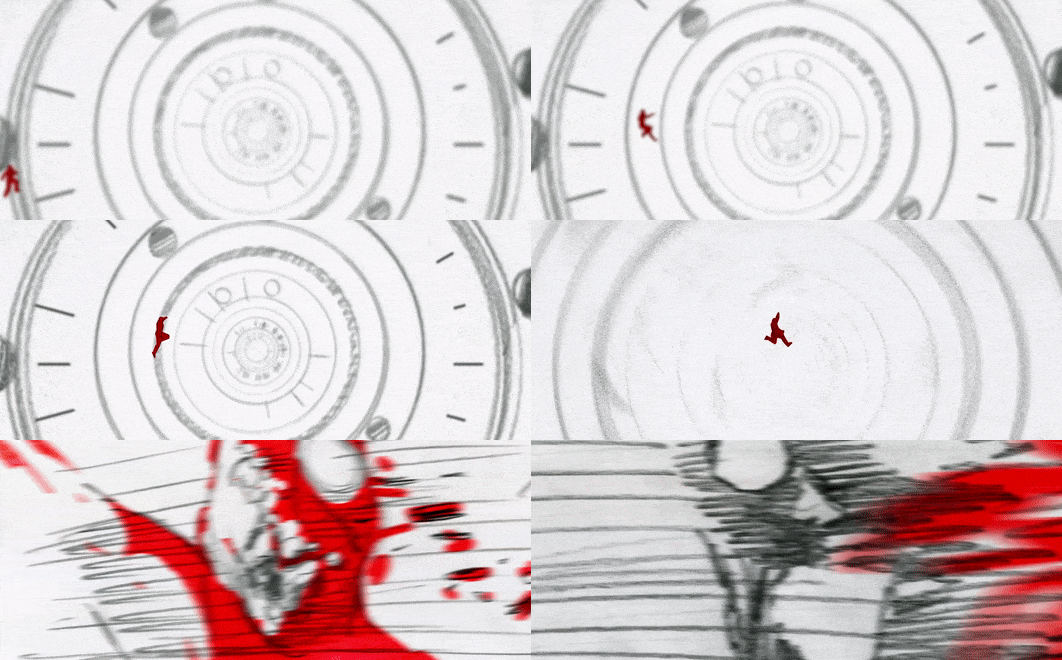

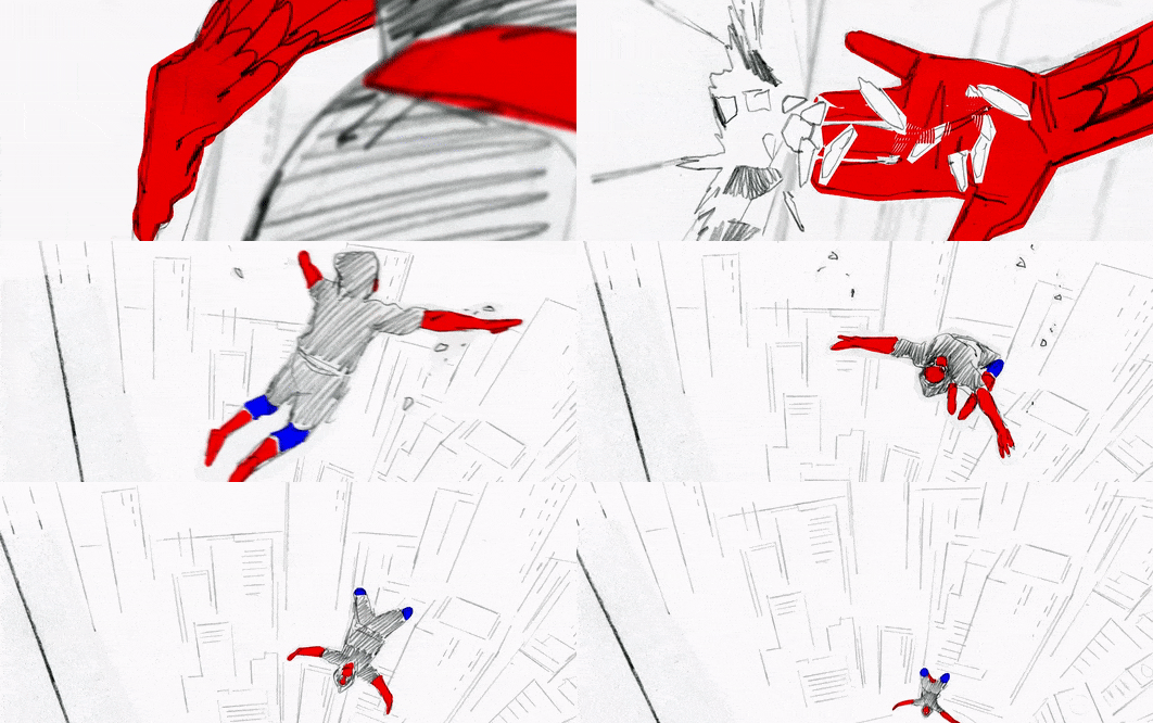
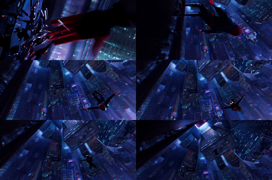
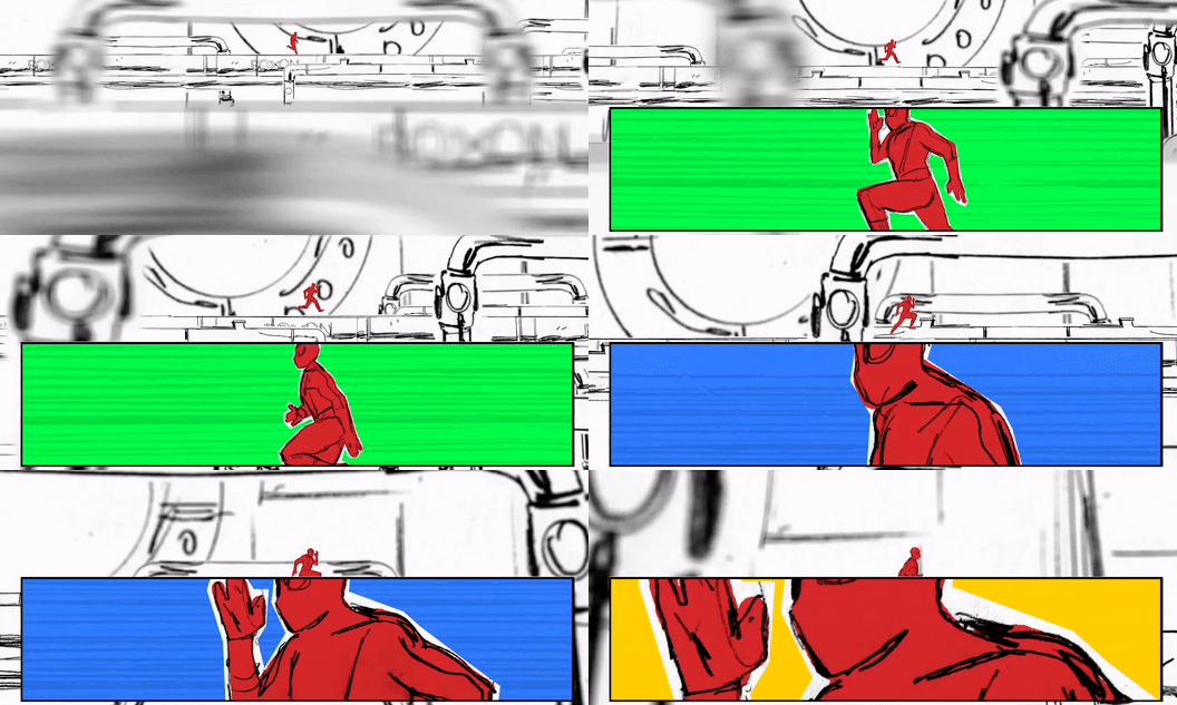
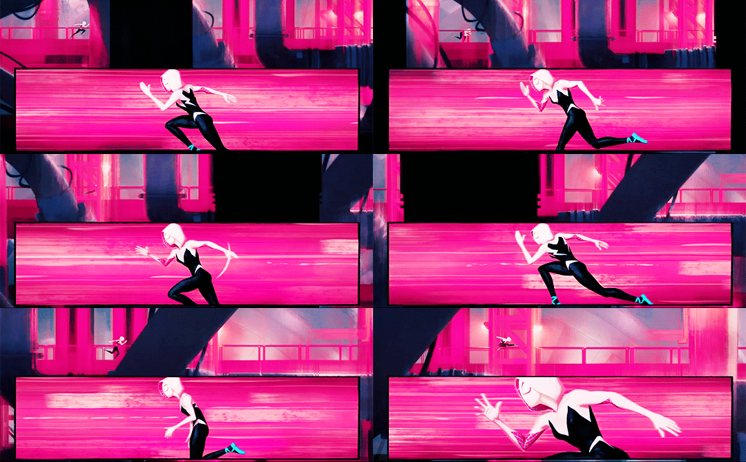
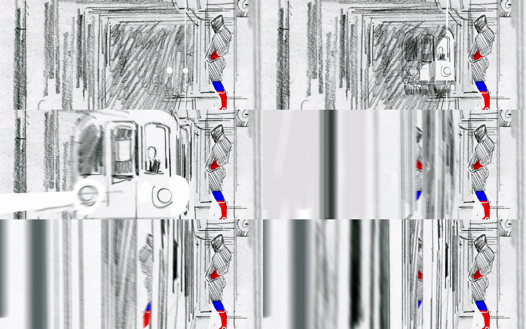
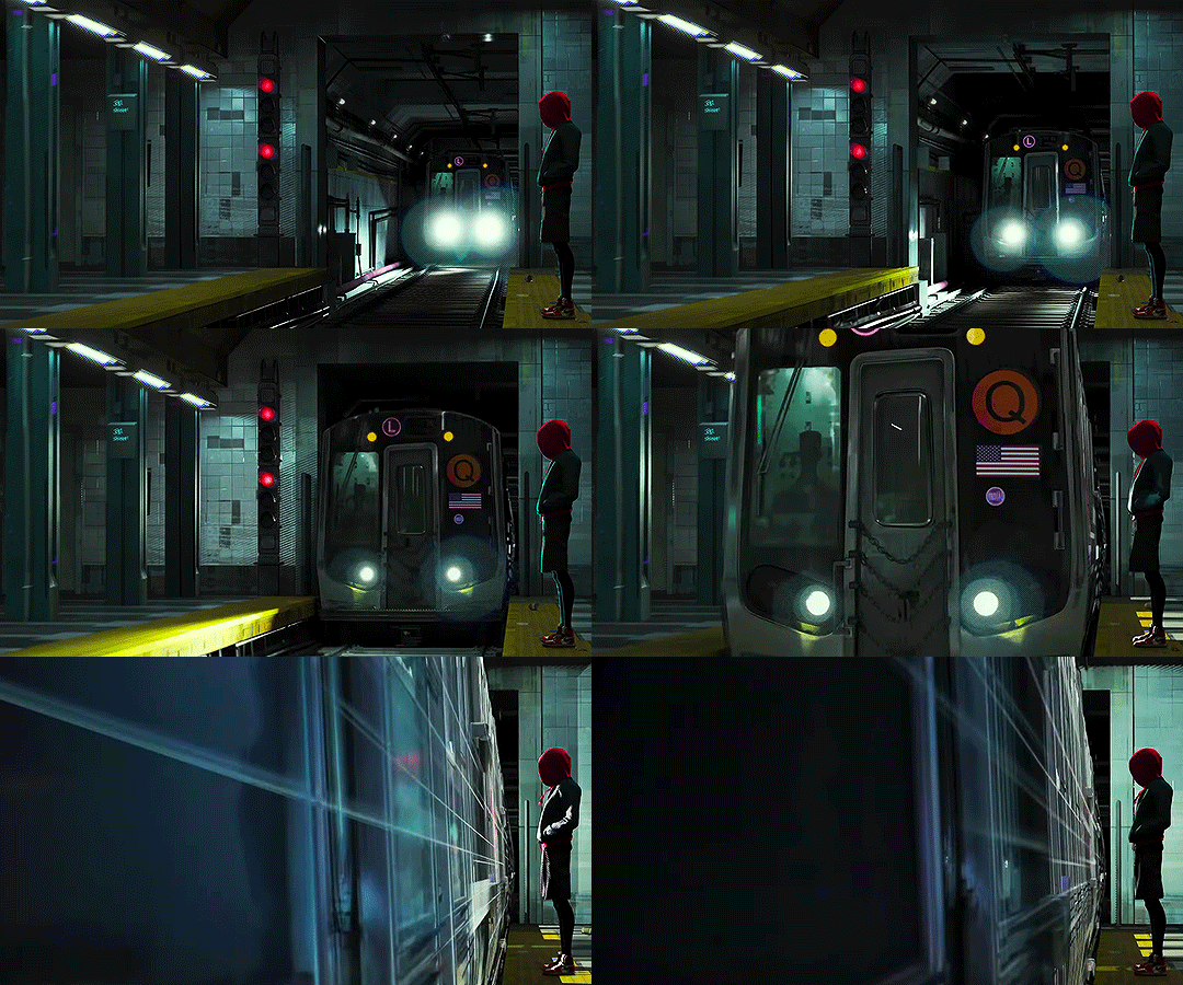
Alberto Mielgo: The Visionary
Spider-Man: Into the Spider-Verse represents a break-through in animated storytelling, pulling compositional and aesthetic inspiration not just from live-action cinema - instead, the artists were inspired by the comic source material adapting dynamic storytelling poses and graphic printing techniques to the animation.
The origins of this style, however, are a little more interesting. As research for this essay, I wanted to take a look behind the scenes and how this new visual language came to be. Looking through the Art of Into the Spider-Verse book, and trawling through countless interviews, online articles and really anything I could find on the process and film itself, it appears that there was a little discrepancy amongst the creators.
The decision to explore such an experimental approach to animation was largely that of the afore-mentioned Alberto Mielgo. A veteran in the animation industry, he strongly believes that the craft has the ability to ‘tell any kind of story’, with a passionate hatred towards mainstream animation. To him, it’s monotonous and mindless work: simply serving to ‘shell Happy Meals’. There’s no real artistic value or risk in these safe, standardized animated pictures, just commercial success: to put it simply, these films make money. Mielgo wants to ‘change the industry’, and with his extensive influence on Spider-Man: Into the Spider-Verse – it seems like he’s sparked the fire, at least.
With a fiery passion for his craft, Mielgo was hired when pre-production began on the film. Tasked with directing the first animation test, in this year and a half, Mielgo and his group of talented animators and CG modellers explored the visual language of the film, delving deep into the mythology of Spider-Man in the process. His task was to explore the language of comics and film, and combine these to produce something the audience had never seen before. His team ended up producing four finished shots, and a series of animatics that ‘open a door to a pipeline and it’s possibilities’.
The shots are intensely cinematic, presenting Mielgo’s vision of a hand-drawn 3D world. Although somewhat rough on movements, these animatics perfectly encapsulate the artist’s initial exploration of the project, and represent a raw vision that the final film has fully realised. With these comparisons, it’s clear to see that these early animatics played a key role in establishing the film’s stylistic visual language and a new, snappy approach to animation. The idea to use comic book panels, illustrated onomatopioa and an experimental approach to composition was the work of Mielgo’s early development in the project, making the conclusion to this story a hard pill to swallow, so to speak.
The artist ultimately found himself with merely a ‘visual consultant’ credit due to creative differences with Sony, it’s clear to see that these early animatics played a key role in establishing the film’s stylistic visual language and a new, snappy approach to animation. According to one of the animators on the film, his animatics were widely seen by the ‘entire animation crew’ before they started working on the film.
With these early tests, Mielgo was able to establish a new production pipeline, and a whole new approach to computer-generated animation. These first tests, whilst being rough in execution, represent Mielgo’s first exploration into this unknown territory, which would later pave the way for artists, modellers and animators who were able to realise this vision in dazzling CG. It would be a disservice to the entire team of animators and visual development artists that worked on the film to simply say it was all the work of Mielgo: big-budget animation, at its heart, is an intensely collaborative industry.
Mielgo created these tests using the Adobe Creative Cloud suite, drawing with pencil and digitally in Photoshop, compositing the sketches in After Effects before editing in Premiere. Comparing these initial animation tests to the final shots demonstrates the team’s real belief in realizing Mielgo’s artistic vision for the film, preserving many of the shots and compositions which has clearly helped to estimate the overall film.
What has changed, however, is the overall atmosphere and mood of the project. Aside from a few notable exceptions, Into the Spider-Verse is a fun, exciting animated feature film. There’s not a great deal of emotional exploration into Miles’ character, who becomes the new Spider-Man in a relatively short period of time. Mielgo’s initial tests, however, present a different film in regard to tone and emotional flavor: these animatics evidence a vastly different creative direction, exploring a more nuanced and personal study of Miles Morales and the emotional burden of living up to the mantle of Spider-Man, the original of whom who found a gruesome demise at the hands of the ‘Green Goblin’.
Interestingly, this version of the film would keep to Peter Parker’s teenage persona as the web-slinging hero – and more explore the idea of the superhero losing the fight. Superhero stories are designed to entertain and inspire us to be better, to find hope in the darkness. This alternative approach to the film, as described by Mielgo, explores what happens is that hero doesn’t save the day, and finds his end at the hands of a truly terrifying supervillain.
To say it was Mielgo’s creative vision wouldn’t be an overstatement: despite his fleeting mention in the credits, it was his cinematic direction, bold and exciting use of vibrant colour and move towards a hybrid approach to animation that defines the look and feel of the final film.
In my previous unit, I put a focus on a more theoretical analysis of a film - looking at large, broader concepts in society. In this essay, I want to put the spotlight back on the actual animation and visual language of the film: how Into the Spider-Verse presents it’s narrative to the audience, in a way never seen before in modern cinema.
With this final research post, I feel like I’m ready to begin work on a first draft on my essay. It’s been a wildly illuminating experience, and I’ve learnt a great deal about the narrative and technical processes used to create my chosen film, Spider-Man: Into the Spider-Verse. Whereas I initially was going to discuss the Hero’s Journey of Miles Morales, through this research process I’ve found the ultimate success and my own interest lies in the visual language and animation of the piece. Instead of analysing the film’s plot, I will be discussing how Into the Spider-Verse presents an entirely new approach to visual storytelling within CG animation - focusing on the animation centric question described in the project brief.
References
Mielgo, A. (2019). Spiderman — +. [online] +. Available at: http://www.albertomielgo.com/spiderman/2018/12/19/d9zh-z04jz8ddc22m0rcduzm56vw4fd [Accessed 1 Feb. 2019].
Mielgo, A. (2019). STORYBOARDS-SPIDERVERSE-ALBERTO MIELGO. [online] Vimeo. Available at: https://vimeo.com/311716775 [Accessed 1 Feb. 2019].
6 notes
·
View notes
Text
Photo Essay


Working individually through these tasks I was required to produce a photo essay discussing 5 original photos that portray a single theme as working for production across many media platforms. My chosen theme is books.
Through the production of this piece, I was overwhelmed with emotions as my photos were quite basic and dull due to the chosen location and comparing them with other peoples. However, after using Photoshop I was able to transform and improve these photos which has boosted my self-confidence.
Some of the key elements that went well was the process of taking the photos as Kingston library was spacious and condensed with books and objects that gave me the freedom to take a lot of content then choose the best 5.
On the other hand, I’ve struggled with editing the images using Photoshop as I felt it was a complex app to use. It was quite difficult to find the perfect tone and shade to match the” dark” mood that I was aiming to portray. However, using shadows and different warm tones I was able to achieve the final product.
In conclusion I’ve learnt to always familiarise myself with a tool/ app as it’s time consuming making repetitive mistakes and starting all over again. As well as to develop my knowledge and skills on Photoshop I’ll watch guidance videos on how to use the app. Final thoughts on the photos, in the future I'll use less intense undertone filters and shadows since they all appear identical now.
0 notes
Photo

Hopefully there will be no more shit gifsets since I finally learnt how to make gifs on photoshop :))
2 notes
·
View notes
Photo

(unofficially titled: how to change the grey wall)
As a thank you for reaching 2.5k followers, I thought it was about time to stop being lazy and do a gif tutorial as it has been frequently requested. Hopefully, this will help anyone who wants to start making gifs as well as anyone who wants to understand how to create colourings!
What You Will Need: - Photoshop (I use CC) - A source video
What Will Be Covered: - How to get the video - Timing, Resizing & Cropping - Sharpening - Colouring (and how to achieve extra af colours) - Subtitles - Saving your gif
This is going to be very thorough and informative (to the best of my ability) so all the information on how to make gifs is below the cut! As a disclaimer, you can use any version of photoshop for this.
1. Getting the Video.
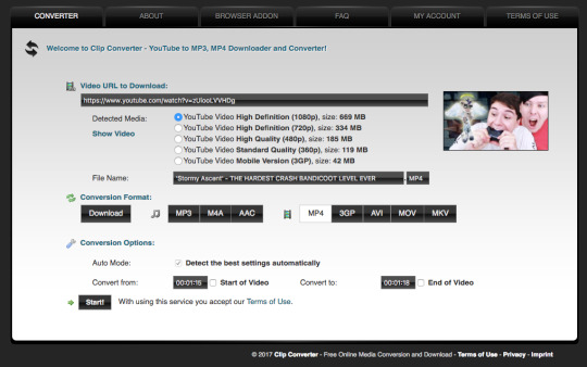
For this tutorial, I’ll be using a random clip from Dan & Phil’s crash bandicoot video. There are a lot of different methods to download a youtube video but I prefer using clipconverter. When downloading a video, you want to get the highest quality available (always try to get at least 720p). I used the download settings shown below:
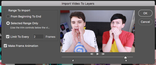
Once it’s downloaded, open up photoshop and import the video. To do this, go to File > Import > Video frames to layers. I use the settings shown below. (I had to trim the video slightly to only include the part I wanted)
Now that your video is imported, make sure your workspace looks similar to mine (the timeline section is the most important thing for gif making. you can add it from the window menu).

2. Timing, Resizing & Cropping.
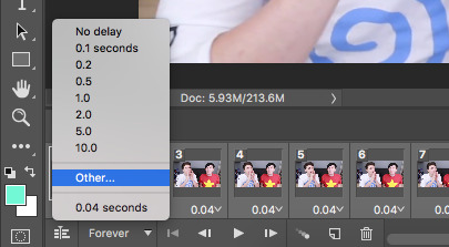
Timing is super important in making sure your gifs aren’t too fast or too slow. To alter the frame rate, select all your frames (shown at the bottom of your workspace) and then click on where it says 0.04 change the speed to 0.09.
After that, we have to change the image size since it’s currently way too big for tumblr. To do this, go to Image > Image size and change it to the settings shown below. 540px is the current optimised sizing for tumblr although 268px is used when making gifs that will be displayed in two columns like this.

Cropping is an optional step that I sometimes do as a way to make the file size smaller/for the aesthetic. Youtube videos have a default ratio of 16:9 and to alter the ratio you just use the crop tool and change it to what you desire. side note: I often use the cinematic ratio of 2.35:1 (i used it in this tutorial’s header).
3. Sharpening.
Sharpening your gifs is essential to making them look clean and crisp. Below is the difference between what our current gif looks like with and without it:
Without:
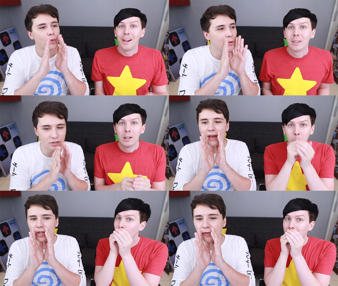
With:

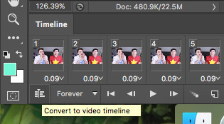
As you can see, the second gif is way more crisp and defined. I use this action to sharpen my gifs (Full details on how to use it can be found in the link.) Once the action is finished, I then convert the frames into a video timeline by pressing the button in the bottom left:
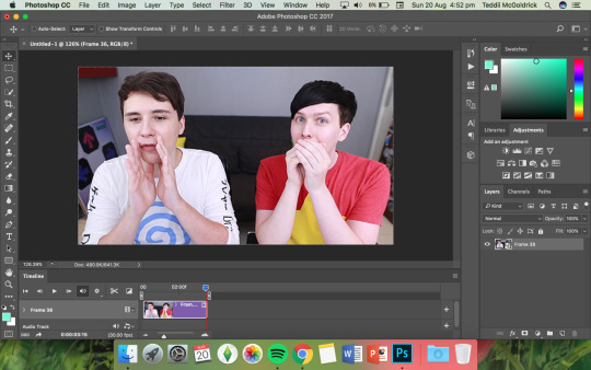
I then select all the layers, right click, and convert to smart object. Now your workspace should look like this:
4. Colouring.
Colouring is by far my favourite part about gifmaking and the reason why I made this tute (questions about colour have always filled up my inbox so I hope this answers some of them). I’m going to show you how to make the same bright blue colouring that I used for the header!
I’d like to start by saying that I never took art or design classes so my knowledge on why adjustment layers do what they do is very minimal. I pretty much learnt how to colour by playing around in Photoshop so this is just a disclaimer about how there is probably an easier/proper/more informative way to do this.
I didn’t particularly know how to explain half the settings so some will be accompanied by screenshots while others will just have descriptions (I really hope it makes sense because heck, my colouring method is chaotic).
Firstly, we want to make a new group to put the adjustments in so to do this you go to Layers > New Group... and make sure the mode is set to pass through.
To create colourings, I use the following adjustments: - Vibrance - Curve - Levels - Brightness/Contrast - Selective Colour - Hue/Saturation - Colour Balance (occasionally)
Vibrance: I almost always make the vibrance +100 (I don’t alter saturation)
Curves: how you make a curve will differ with every video but for this gif I set my curves to this

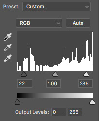
Levels: it does a similar job to curves tbh
Brightness/Contrast: I chose not to alter it for this tute.
Selective Colour: now this is where A LOT of adjustment is going to happen. I found this section the hardest to explain so I apologise in advance. I tend to heavily alter cyan and blue.
Since we have the ability to alter red, yellow, green, cyan, blue, magenta, white, neutral, and black, I’ll write the specific adjustments I used instead of adding a lot of pictures to this already massive post. But this is what selective colour looks like:
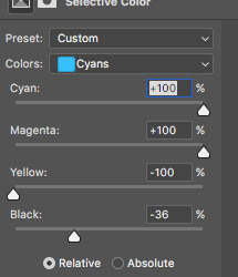
Reds: Cyan -34, Magenta +5, Yellow +8, Black - 7 Yellows: Cyan - 37, Magenta -31, Yellow +35, Black +14 Cyans: Cyan +100, Magenta +100, Yellow -100, Black -36 Blues: Cyan +100, Magenta -65, Yellow -100, Black -26
Now this is what it should look like after adding all those adjustments:
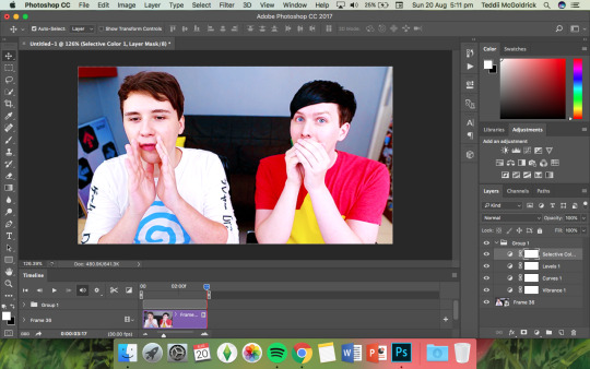
Yes, it is slightly blue but not THAT blue. We then have to add a second selective colour layer with these settings:
Cyans: Cyan +100, Magenta +15, Yellow -100, Black - 8 Blues: Cyan +100, Magenta -21, Yellow -100, Black +15 Blacks: Cyan 0, Magenta 0, Yellow 0, Black +20
(more selective colours will be added later because I’m extra)
Hue/Saturation: This a neat adjustment where you can turn one colour into a completely different colour. For this gif, I chose only to adjust the colour blue with these settings:
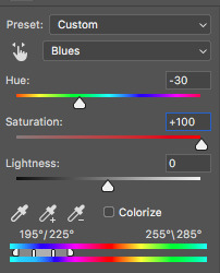
Now you’re probably confused at why it looks so noisy but don’t worry! We’re going to fix that (this is where it gets kinda tedious. Feel free not to use the hue/sat adjustment if you want to make your gifs quickly. I wanted to make this tutorial super in depth hence why it’s about to get problematic)
Selective Colour (Again): You now have to create a 3rd selective colour layer and place it under the hue/sat layer before using these settings:
Magentas: Cyan +100, Magenta -100, Yellow +100, Black +79 Cyans: Cyan +100, Magenta +100, Yellow +5, Black 0 Blues: Cyan +100, Magenta -16, Yellow +100, Black -47
Your gif should now look like this:

Some noise will still remain and we’re going to fix that by erasing some of the adjustment layers! You may notice that the far right behind Phil looks messy so, with the erasure tool, erase that area on the hue/sat layer.
There is also some noise/unwanted colour on the lounge and Phil’s hair so I did the following:
I erased the area of the lounge on selective colour 1, 3 and hue/sat and I erased Phil’s hair on selective colour 1,2,3 and hue/saturation.
Now your layers should look something like this:

And that’s it for the colouring! Erasing the messy bits isn’t always necessary although in this particular case I had to. Protip: If you don’t want to make a colouring from scratch you could always use a pre-made psd!
5. Subtitles.
This gif doesn’t require subtitles but for the purpose of this tutorial, I’ll teach you how to do them since they’re an essential aspect of gifmaking! Every gifmaker has an individual preference on how to make their subtitles so this will be just an insight on how I do mine.
To make subs, select the text tool and create a textbox in the bottom part of the gif. I use the font Calibri (download it here if you’re a mac user) in bold italic size 18pt. If text takes up two lines use the settings shown below:
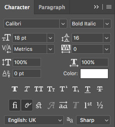
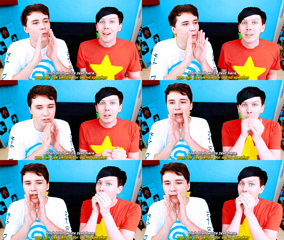
The main colour used for subtitles is pure white and the alternative/2nd speaker colour is yellow (I use the hex code #ffff00).
Now that we have the text you may notice how it doesn’t stand out. To fix this, right click on the text layer, select Blending options... and use these settings for stroke and drop shadow:


Now your gif should look like this:

You may notice that your text layer lasts longer in the video timeline than the actual frames. To fix this, make sure you drag the text layer to the start of the timeline and adjust the grey things above the text layer (I’m stumped at the proper word for them) so that the video ends at the last frame (shown below):

6. Saving your Gif.
Now that we are done with making a gif, it’s time to save!
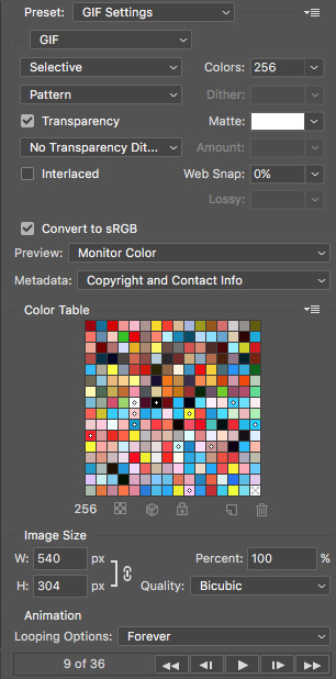
To do so I use the shortcut command + option + shift + s (for mac) or you can go File > Export > Save for Web (Legacy) (for CC) or File > Save for Web (other versions)
My #1 tip for saving a gif is to make sure it’s under 3mb! Tumblr only supports gifs under 3mb so as long as it’s 2.999mb or less you’re fine. Fortunately, our gif ends up at 2.721mb but if you ever do go over, I suggest deleting a few frames or cropping it to a smaller ratio.
Copy my settings when saving:
And we’re done! You should now have a gif that looks like this:
Final Notes:
I hope this tutorial has made some kind of sense and helped you understand the basics of gifmaking and colouring. If you did find this useful and made some hella bright dnp gifs, feel free to tag me in them. I track #scifiphan and will be delighted to reblog them! If you have any questions feel free to send me an ask or a private message (I’ll always respond).
Please like/reblog this tutorial if you found this helpful!
#i actually really like this colouring heck#i created it as i was making it and now i wanna make gifs using this psd#i hope this makes sense#i suck sm at explaining things#this is super long#and the colouring part probs confuses u all#but enjoy#teddii's discourse#gif tutorial#phandom#gifmaking#photoshop#photoshop tutorials#chaoticresources#itsphotoshop#this took me ages to write rip#idk what else to tag it as#validate me lmao
381 notes
·
View notes
Text
Project Evaluation
During this module I have created a body of work that shows my skills in identifying, developing and analysing trends that can be used in a professional practice. The work I have produced has been displayed in the forms of a physical look book and a reflective blog where I document my progress. The look book is a visual representation of my chosen trend where I clearly portray the elements of my trend such as; key materials, shapes, silhouettes and colour palettes. For my trend concept, I have chosen the narrative of Cyborg Punk. This trend relates to portraying the future of punk, where the original punk aesthetic and machinery/ technology come together, creating a future dimension to the trend. What I want to achieve in this project is too change the stereotype of punk by the addition of technology while still withholding the punk image, also I hope to develop a greater range of skills, due to the processes in this project at first are unfamiliar to me.
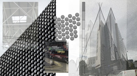


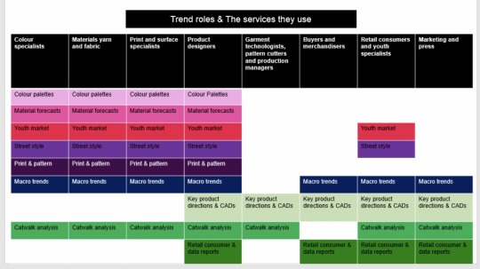
While completing work, I have gathered information from multiple sources to develop a clear trend, with which the elements are clearly established for me to transfer to my look book. My first steps towards research were inspired by the trend forecaster Els Dragt, where Ive looked at the environments around me and made connections between the shapes and colours around me. I documented them using digital imagery, compiling all the elements around me, if that’s architecture, people or wildlife, it’s a great starting point for inspiration. Alongside research for my own specific trend, during this module I have also researched into trend theory, expanding my knowledge of the industry, including the roles, where trends originate and how they spread. Moving on from this I have developed a knowledge upon trend influencers.

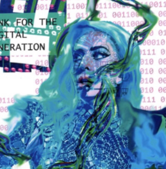

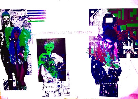
In the process of developing my mood boards and look book, I have developed my skills both using photoshop and InDesign. At first, I had never used photoshop, so everything was a learning curve. My first mood boards I used as a chance to explore all the tools to understand what they do and what outcomes I can create. After becoming aware with the tools, I then was able to create specific looks, exploiting individual tools to their maximum. While completing my first mood boards I researched into several trends, through the collection of fashion imagery and research from trend forecasters such as WGSN. After, several accounts of research I chose a specific trend to take forward for my final look book.
As well as this, I have learnt a great deal around sustainability within fashion, from first hand research through lectures from sustainable pioneers such as Kate Fletcher. Where I was introduced to sustainable pathways that I could relate to my own trend to make it sustainable, as its fundamental that the future of fashion is eco-friendly. Inspired by this I have completed some of my own research into sustainable practices that can relate to my own trend to make sure that there’s environmentally friendly alternatives.

In terms of my outcomes, I am really pleased what I have created. I believe I have clearly identified a micro trends, which has been inspired by multiple angles of researching , such as into designers, collections and other industries like music and film. Thus making my outcomes have a great deal of meaning and inspiration. I believe I have shown inspiration from WGSN where I have taken elements of previous trends and manipulated them for my own work. In relation to the physical appearance of my look book, I am happy with vibrancy of the colours, the choice of using a glossy finish paper really enhanced the colours making the compositions pop.
However, if I was to complete this project again, I would make sure that I establish my Photoshop skills earlier on, so that the creation of my look book is not postponed. Having more time would of meant my compositions would of had a greater level of detail and skill. Moving on I wish, in my look book I used more fashion imagery to highlight my research of designers and collections visually. Thirdly I would of love to of experimented with printing outcomes, in terms of the paper thickness, and the structure of the look book, in terms of folded pages and pages of different materials, to add an interesting element to my look book. On the same lines as this, if I had more time I would of liked to of explored paper shapes outside of an A5 rectangle, to see the possible shapes I could create and if they would benefit my trend narrative.
0 notes
Text
𝑴𝒖𝒚𝒃𝒓𝒊𝒅𝒈𝒆 𝑴𝒐𝒗𝒆𝒓𝒔 - 𝑭𝒊𝒓𝒔𝒕 𝑹𝒐𝒕𝒐𝒔𝒄𝒐𝒑𝒆
Monday 12 October 2019
𝑴𝒂𝒕𝒆𝒓𝒊𝒂𝒍𝒔:
Tracing paper
Ink pen
Paper
𝑰𝒎𝒑𝒐𝒓𝒕𝒂𝒏𝒕 𝑲𝒆𝒚𝒘𝒐𝒓𝒅𝒔:
𝑨𝒏𝒊𝒎𝒂𝒕𝒊𝒐𝒏 - A series of links images placed in a sequence to create the illusion of life.
𝑭𝒓𝒂𝒎𝒆 𝑩𝒚 𝑭𝒓𝒂𝒎𝒆 - When an image moves slightly in every frame. Put next to each other, they create the illusion of a moving image. 
𝑹𝒐𝒕𝒐𝒔𝒄𝒐𝒑𝒊𝒏𝒈 - To transfer an image from live action film into another film sequence by tracing over the frames. 
 𝑪𝒉𝒂𝒕𝒕𝒆𝒓𝒊𝒏𝒈 - This is common in new animator’s work and involves very rough looking, inconsistent frames which makes the character look like it’s twitching. 
The aim of this lesson was to begin to develop an understanding of how Muybridge’s photography coincided with our subject of animation. This was our first project of this term and my first rotoscope animation. We learnt that rotoscoping means to transfer images from live action film into another film sequence. Today we were going to do this by tracing over the top of Eadward’s animal walk cycles in ink. The animations we were about to make had to be looping (this is a repeating sequence of animation) and since this is our first experiment with animation, we were to embrace the naturally chattery (a term used that involves very rough looking inconsistent frames) of our first experiments. By the end of the Day I had made the elephant animation. But in my own time, since I wasn’t happy with the final outcome of my first try, I took a different animal that Muybridge had photographed and traced over the individual frames. Despite them both being 12 frames each I think the second one I made looks smoother and I prefer the warmer colours in it. I think the emu animation looks smoother because I composited the frames together better. 
While I drew out the frames traditionally, I transferred them to photoshop to animate them and play around with colours. I chose the colours pastel blue and pink for the elephant because I wanted it to look childish and somewhat pretty. But for the Emu, the colours hot red and orange make more sense since the animal typically comes from a very warm climate. I prefer the way my second attempt at animating over Muybrudge’s walk cycles looks.
Another way I could create a rotoscoped animation like this is by using post-it notes and a stop motion camera. These animations were made on the same program and with the same method, but if I wanted to keep the drawings traditional and expand my range of mediums, I could go with that. When I make more rotoscoped, looped animations of my own, I am going to focus more on the textures and tones of the animal/person and take away the key line (which is the thick black line I use naturally in my style to separate the character from the background.) Since my own art relies heavily on heavy line art, I will find it difficult to only draw the texture. I know that through out this project I will need to keep reminding myself to include texture and tone throughout my next experimentations.
Having created these rotoscoped looped animations, I now have knowledge of what the process of an animation involves and how it is put together. I also now feel more confident in using photoshop for editing the colours of a picture and putting frames over the top of each other. To further push myself, I could chose to extend my medium and focus only on texture and shadows in future assignments.


0 notes
Photo


Morph Experiments in After Effects
In preparation for the upcoming brief to kick off BA1b. These few lessons act as a well-needed introduction to the software we’ll be expected to explore across the duration of the second Unit. Using After-Effects, a digital motion graphic and animation software apart of the Adobe CC package. This platform is regarded as an industry standard and cracking down on the techniques and skills that the software offers will give us a more diverse range of transferable abilities that we can explore in industry.
An extensive platform, the aim of this lesson was to step outside of our comfort zone, learning skills and techniques that could push forward our initial ideas when we come to explore the brief in the upcoming weeks.
The idea behind the exercise I explored today is the morphing between objects, taking a step forward from the actions of a character or object in our previous unit. This challenge questioned our ability to use shape and motion to allude the audience to a change of state within our objects to morph between one another. This basic premise is the foundation of our brief for this class, as we will be showcasing the morphed transition between two clearly definable objects from a film of our choice.
Taking what we had learnt from BA1a it was stressed that we considered how we could incorporate the principles we had learnt from the previous unit, and how we could apply them to this project. Considering how without these fundamental techniques our animations would become lifeless and static.
Knowing that we had to show the transition between two shapes to achieve the desired effect I had in mind. I knew I had to consider the use of squash and stretch and anticipation to achieve the believability and flexibility of the objects that were required to get a sense of a fluid and transformable object.
Mapping Out my Ideas
Kris suggested the importance of ensuring we worked both digitally and physically to explore our ideas so we didn't have the stress of relying on our work being produced solely digitally. Creating a thumbnail storyboard, I explored a range of ideas through small illustrated sketches that showcased my idea across a page. Showing the motion and a rough idea of key poses to illustrate the motion I want my shapes to emulate.
Upon Kris’ reflection, my storyboard was rough in design and whilst I was able to tell of my own idea it was hard to communicate the process I had in mind through visuals alone. Taking this on board I created a digital storyboard that showcased my shapes plot as it transitioned from one shape to another. This gave me the opportunity to write some critical notes on key aspects of my animation considering changes in speed and processes I want to use having looked at the tools available for me in after effects.
With a total of 8 individual panels, my storyboard breaks down the key stages and positions of my animation. Using keyframes and poses to suggest a change in motion and shape.
Panel 1 = Square Static Image; the starting position of my shape, this is the starting point and opening still of my animation.
Panel 2 = Anticipation; the first instance of staging this showcases the shapes first state of change.
Panel 3 = FollowThrough; Exaggerating the form of the shape, the shapes weight is distorted as it elongates and stretches across the screen.
Panel 4 = Rotation; To get a fluid sense of change, I want the shape to morph through an action that is recognisable and common to the audience, through a rotation.
Panel 5 = Metamorphosis; The moment of change within my animation, the rotation of the square would give a realistic sense of forced metamorphosis as the speed of the rotation increased.
Panel 6 = Reaction; Continuing the weight and state of the mass of the object the circle uses squash and stretch to stay in tune with the flexibility of the first shape.
Panel 7 = FollowThrough; Using techniques learnt from the previous unit I end the animation on a ball bounce to show the weight of the shape.
Panel 8 = Circle Static Image; the ending position of my shape, this is the ending point and closing still of my animation.
Animated Outcome in After Effects
To accommodate my skill level and the timeframe I had to create my animation, I expected my outcome to loosely follow the storyboard I had set out. After much frustration with the software adjusting to the tools subtle differences and key changes between partner software such as Photoshop and Illustrator, I came to an outcome I’m positively fond of.
Although more graphically influenced in design the animation is brought to life through the use of contrast and secondary elements such as a small animated shadow and colour scheme that presents a more polished aesthetic to the final animation.
Having had the chance to experiment and explore metamorphosis through After Effects I'm excited to see how my skills develop as my confidence hopefully grows with the software. I would like to explore how I could further adjust the timing and easing in/out of my frames to bring a more stylised flow to the speed of the actions. I'm worried that due to my lack of time with the program I won’t be able to create an outcome for the brief to a standard that I would be proud of. I believe that if I was to use a software that I’m more familiar with such as TVPaint, I would be able to produce a stronger outcome that reflected the state of change and metamorphosis that is expected of the brief.
I think that moving forward I need to consider how I can explore alternative designs and processes within After Effects looking at the software in my own time to make sure I have a better understanding of all the tools that are available.
To summarise;
After Effects is a digital software that is most commonly used for Motion Graphics and animation.
Using both digital and paper illustrations is a great way to get a range of ideas.
If I was to repeat the process, I believe I can create a better outcome.
I'm happy with the outcome I was able to produce being my first attempt at animation in After Effects.
0 notes
Photo


MAJOR WORK - Assessment 1 - Box Transformation
At the beginning of this assessment task I initially purchased several boxes and didn’t have any agenda/plan or ideas in mind such as how I could possibly transform an ordinary, everyday box into something different, something that would be considered as an artwork/designed object.
Initially, I started through experimenting with the boxes. For my first experiment, I decided to use an idea that intrigued me in my Media Arts lecture. The lecturer was introducing us to the world of illusions and right there and then I had thought of my first experiment. That afternoon, I got home and decided that I would create my own visual illusion.
Post creation of experiment one, I reflected upon it and thought how could I create something new. I decided to continue with the idea of stacking the boxes one on top of the other from the illusion experiment, except instead of creating another illusion, I wanted to experiment with camera angles, shots, types of light and exposure. I then took the boxes into different locations within the one environment and took into account everything mentioned above and that became my second experiment.
Week three was Vagueness. I used this notion of vagueness and scattered my boxes around my surrounding environment as well as used my knowledge of camera angles, light exposure and camera shots from experiment two to tie everything together and create my third experiment.
For my fourth experiment, I took the boxes to a park with an astonishing view and laid them out with a small gap in between. Using everything that I had learnt so far from the various experiments, I placed the boxes in excellent light exposure, centred them in the middle of the frame and took multiple photos which ultimately led to my Major Work concept.
Continuing on from experiment four, I wanted to make an animated GIF that would display the boxes decreasing in size and placed one inside another. This Major Work concept took huge amounts of time and required a lot of planning. I had to take multiple photos of each box individually, one with and one without the lids. After saving the images onto my computer, I then opened up photoshop. I used the Nikon 7000D but unfortunately the images came out very dark, dull and empty like, as shown above in the bottom right image and I was not satisfied with the quality. I decided to individually edit all twenty images as seen in the GIF above, adding saturation, light, colour ect... to give the images a sense of life. I then had to import all edited images into photoshop and create the moving animation. This was really tricky as I have never created a GIF ever before, but I was up for the challenge. The first draft of the GIF as you can see above, the bottom left image went horribly wrong and I hated what I had created. I almost wanted to give up at that point because I had put many long hours into perfecting the project and nothing went according to plan. But I persevered and started again from scratch, determined to succeed!
The final version of my GIF as you can see above, the main image, turned out amazing. It looks 100 times better than the first version because I animated the boxes with more detail, gave the clouds their own animation and even the miniature boats in Sydney harbour were animated. I am extremely proud of what I have created and I’m really glad that I didn’t quit, and persevered through various challenges throughout this assessment.
0 notes
Photo

GIF.
I created my own GIF for this exercise. I went out and got 6 seconds of footage of a tree branches blowing in the wind and cut it down to 1 second of footage. I put the footage into Photoshop and selected the part that I wanted and created it into a loop which turned it into a GIF.
I really enjoyed this exercise as I had never created a GIF before and I learnt how to use the software accordingly to create the GIF. I think my GIF works really well and if i was going to create another one I was try and isolate the movement so only one part of the image was moving.
As the process of making a GIF was really successful and worked well, I am going to explore this for my final piece to go along side my film poster to give the viewer an inside of what is happening in the film and incorporates film and photography together.
0 notes