#i draw illustratively cause its fun for me
Explore tagged Tumblr posts
Visit Tumblr Blog
Explore Tumblr blogs with no restrictions, modern design and the best experience.
Last Seen Tumblr Blogs


Fun Fact
When “GIF” was named word of the year in 2012, Oxford Dictionaries U.S.A. credited Tumblr for pushing the word.
Photo
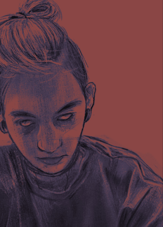
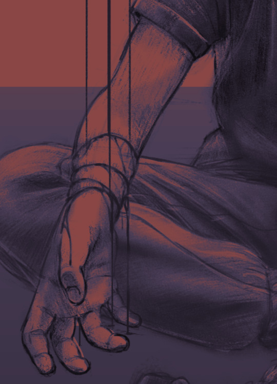

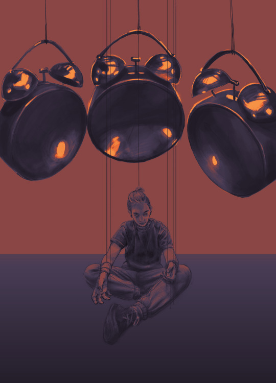
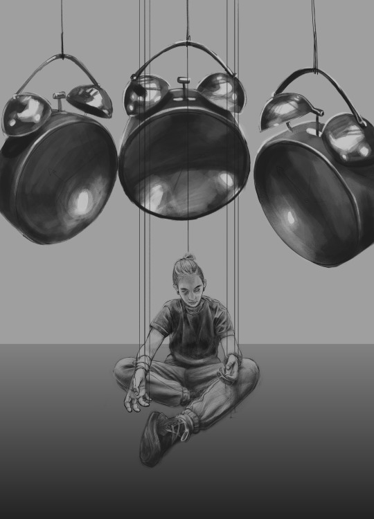

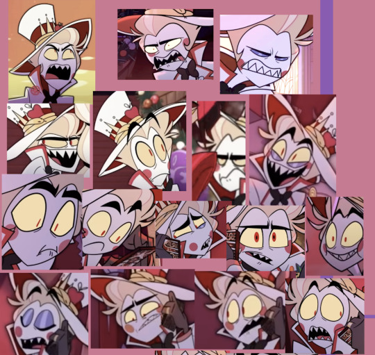
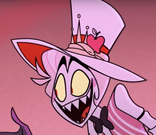
CW: Creepy/ Disturbing imagery :0
AHHHHH one of my BIG projects for uni I've been working on for a couple weeks :0
#I really dont like realism#but here we are#dawg i never wanna hear anyone say that the only reason people draw cartoony is cause they cant draw realism#like shut the fuck up#get out of here with your art elitism bullshit#i dont draw illustrations cause i cant draw realism#i draw illustratively cause its fun for me#realism just awakens my horrible perfectionism and i end up never really satisfied and super annoyed#idk im so tired and burnt out of school man#i just wanna go back to drawing gay shit#art#digital art#Krita
2 notes
·
View notes
Text
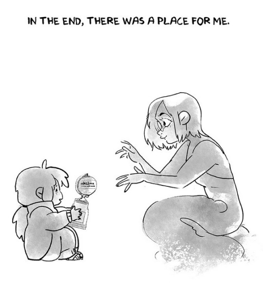
Please Reset Your Save File :)

idk what came over me but here take this forgettable au wingdings undertale ARG ass image
speaking of being a mystery image with secrets to be unlocked, i’m gonna refrain from yapping. do the sleuthing yourself I believe in you
ok…. fine….I cant resist…. BUT DO THE TRANSLATING YOURSELF IM NOT DOING EVERYTHING FOR YOU
Ill start by explaining my proccess cause it was quite eventful!
The jumping off a cliff towards something was inspired off of this tiktok :D

Thought it worked GREAT for a character who was so dead-set on his goal he destroyed himself in the process of achieving it… And thats all I had in mind, Wingdings reaching twords his goal (a star/the player) and the rest I just went along with as I drew


I didn’t intend on the background being black, was just a placeholder, so once I finished the line art I fiddled with the color. thought some sort of “blue screen of death” would go well with the themes of what happens to him since he is IN a game. so the universe literally restarts (resets :3) itself to get rid of a glitch (him)
My theory currently is that his goal was to become some sort of player/gain the ability to reset, and once he did that, the game saw him as an error/glitch, so got rid of that- bro IS Turbo from wreck it ralph
After that whole idea- I was looking at some references to replicate the text and it made me go “OOOHOOO” when I saw the QR code like “oooo I could make my own and have some fun with that…” and so I did- and decided to link my original idea for that!
Reference:

I had fun making some differences in the wording to fit the situation
In the end, 2 silly illustrations that are fun to flicker between!


talking about the actual drawing though:
The cliff Dings is running off of has echo flowers because I SWEAR those are important. trust.
Him not wearing gloves is meant to depict how little he cares for his own safety in his last days. I did the same thing in my IM SANE amv!
The “star” having an eye is meant to show how its both the player, and seeing the stars/surface that Wingdings is reaching for.
The wingdings font covering Dings’ face/eye socket is meant to symbolize that perhaps he feels defined by his inability to communicate like other people naturally can.
“Ths Stars, They Cry Out Your Name” is my favorite thing in this… from Wingdings’ perspective, the only thing that matters, that understands him, that TRULY values him…is THE STARS. its like this goal that he has that will make him feel valued. Getting to the surface = being “worth it” But truly, the stars are the PEOPLE that care about him. Asgore, Alphys, Sans, people that are genuinely concerned over his obviously deteriorating mental health- they CRY out his name, not “call” like I had originally planned.
“66%” hehehehhe funy gaster numbr
ok and last thing- Im gonna cry remembering this dialogue from the official Clock App


its so important for this AU, PLEASE
#undertale#forgettable au#undertale au#forgettable au fanart#undertale fanart#wingdings is the bane of my existence#wingdings i hate you#I spent way too much time deciding what I should put on that qr code#thought of making a google slide presentation from wingdings’ perspective#but that wouldve been way too much work#and probably contradict things that will be revealed later…#IT WOULDA BEEN COOL#But I valued the ‘they cry our your name’ too much not to include it SOMEWHERE#sooo#ALSO IM GETTING SO MUCH BETTER AT DRAWING SKELETO ANATOMY???#maybe having an undertale hyperfixation wont have so many lasting consequences on my art after all#give me lots of opportunities to improve my skeletal structure!
353 notes
·
View notes
Note
i find it funny that one of rachel’s drawings of herself in the afterword that just went up is just fully persephone. is that something she does a lot?
Alright so I've been making it a general rule for myself to like, not harp on Rachel in any way outside of LO as much because frankly the horse is dead now and there's not much left to say outside of what can be analyzed in hindsight. I think despite everything I have to say about her and her work, she still deserves to get away from this nonsense and I don't wanna spend eternity hovering over her shoulder.
But the afterword was posted within the LO series and is clearly meant for readers of LO in the functioning of being an afterword so let's just call it fair game LOL
I will say, on the whole, it does feel very honest and sentimental and I can respect Rachel for taking the time to write out and illustrate her afterword in a way that was personal to both her and her fans. I can understand why she went at it from the angle that she did and I'm not gonna fault her for that.
But there's also something that feels deeply... disingenuous about her approach right from the starting gun. I will say, before I continue, that I'm well aware I am biased towards Rachel as a creator, and I fully acknowledge that I could very well be reading too much into things. This is just my opinion, take it with mountains of salt.
I can get looking back on your own childhood, your past self, whatever, and going "see! it all got better!" because sure! For a lot of creators like Rachel, it must be wild to look back on where they came from and there's a lot of sentimentality on expressing that through an afterword like this where she reflects on where she came from. Though she STILL didn't acknowledge her other comics outside of LO, I can understand if she wants to leave those skeletons in the closet.
But I feel like her drawing herself as a child who's being given an Eisner by her adult self and all that just feels like some gross attempt to disarm any criticism of her because "don't make fun of me, I'm just a sad lonely baby girl!"
She's not a child. Child Rachel didn't grossly misappropriate Greek myth into their own self-indulged vanity project. Child Rachel didn't claim herself a folklorist of a culture's works only to bastardize them completely. Child Rachel didn't create a hostile environment within her fanbase by bullying anyone who she perceived as a threat, sneaking into critical spaces to try and cause trouble, and writing her own clapbacks into her comic. Child Rachel didn't claim to be challenging misogyny and purity culture only to reinforce misogyny and purity culture through her own self-insert baby-virgin-gets-rescued-by-rich-tycoon power fantasy that regularly glorified abuse towards women and the lower class.
30-almost-40-year-old Rachel did though.
At best it comes across as really cringe sentimentality from a Greek-weeb (heh, greeboo) and goes to show how much Rachel inserted herself into Greek myth without ever absorbing its messages or cultural contexts, it was all about her and her feelings as a sad New Zealand girl with dyslexia who thought Persephone's story was about another sad girl being rescued from her "horrible childhood".
At worst it's an active attempt to play on people's heartstrings by drawing herself as a child who people will naturally not want to criticize. I don't want to assume she's doing it intentionally, I really don't want to leave her afterword on a bad foot, as I can definitely understand as both a creator and a person who struggled with learning disabilities in their own childhood how and why she wants to pay homage to her past and where she came from... but let's just say, as someone who's also gotten way too "lost in the sauce" concerning personal self-reflective projects, I think there's a lot to say about how this confirms that Rachel made LO entirely for herself, about herself, without any actual intention to respect the original myths, because she never truly separated them from herself when she was a child. And, in my humble opinion as someone who has Been There with the self-insert OC's and self-reflective angsty plotlines, I can fully attest to the fact that that's not fucking healthy. Even with personal projects, you NEED to learn to get your head out of the sauce, you NEED to learn to objectively separate yourself from the narrative so the story doesn't fall apart under your own hubris and ego, you NEED to learn to draw a line if you want to have any sort of identity as a human being outside of what you make for people. And that's with just normal original stories, this was a story based on Greek myth which doesn't belong to her.
And this goes for a lot of the things she's said and done in the past, so much of her own "sources" even are tethered to things that she read / watched in her childhood and only vaguely remembers, as if she never mentally left her childhood at all, which just... if the point was to highlight her past and the traumas she went through and how they contributed to her present, an Eisner isn't going to validate those experiences. And drawing attention to her past through the lens of her childhood self absolutely 100% does not absolve her of the negative effect her work has had on the modern Greek myth zeitgeist nor the things she's said and done as a 38 year old woman who should absolutely know better.
The community she entered and took from will forever remain changed by her influence and taking, in many ways not for the better. She has the privilege of walking away and never having to think about it again, with all the awards and accolades that were bought for her, the bravado that she built around being a "folklorist" with zero credentials, and the platform she was given over many other creators struggling to even be heard.
That "place" she claims to have now was built entirely on inserting herself into another culture's works and doing nothing but taking, taking, taking, while offering nothing in return but vanity and lip service. That "place" was paid for and brought to you by Webtoons.
#sorry this got a lot more spiteful than i intended#i'm as ready as she is to move on tbh LOL#like god i hope she walks away from all this#she deserves it and so do we LOL#i know she'll never leave behind greek myth entirely because she obviously has internalized it so hard that she's persephone#but christ just. just take your awards and go lol#lore olympus critical#anti lore olympus#lo critical#ask me anything#anon ama#ama#anon ask me anything
379 notes
·
View notes
Text
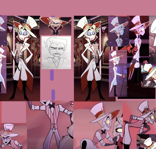
made a reference sheet for Lucifer! :) he's wildly inconsistent in the show, so this sheet has helped me a whole bunch
QUICK IMPORTANT NOTE: BECAUSE HE'S SO INCONSISTENT, THERE'S NO "RIGHT" WAY TO DRAW THIS GUY. JUST HAVE FUN, REALLY! AND DON'T MIND MY SHEET AND NOTES IF YOU DON'T WANT TO
(NOTE DONE) the facial expressions in the lower left corner are more inspiration for pushing his expressions since he's SO EXPRESSIVE!! :D ...rather than direct reference since too many features change between screenshots there
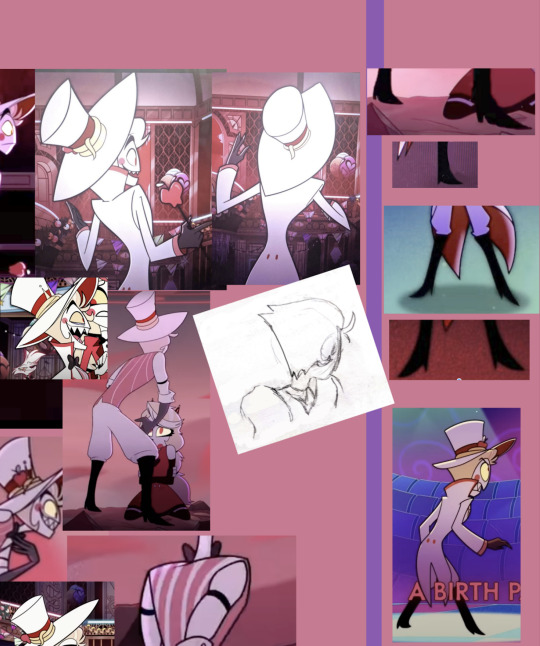
(close-ups of sheet at bottom of the post but before the cut)
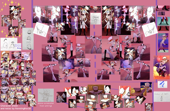
(his front view hair should actually curve in toward his two hair "sprigs" like it does in every other angle, but the way i drew it is just my own personal preference at times -- it helps me think of him as a bit more 3D)
below is how on earth i laid out that crazy-looking collection. there's a method to the madness! (the dashed line in the middle of the turnarounds is the "front view," and then the images spin Lucifer left and right from there. sometimes the screenshots in the turnarounds are just for body/leg/arm shape reference rather than face reference)

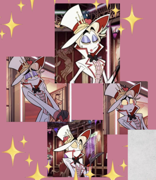
the note at the bottom of the "Hat angles" box says "The hat angles in the center of the ring are usually intended only for animation in-between frames, rather than for longer poses or for illustrations"
"The Ideal Man" in the upper left corner is a partially joking section name and is the Lucifer design i tend to aim for. i think of his face as "very round except for his pointy chin + his eyes are close together and take up almost the whole width of his face (except for in profile view, and except for when it doesn't look good)."
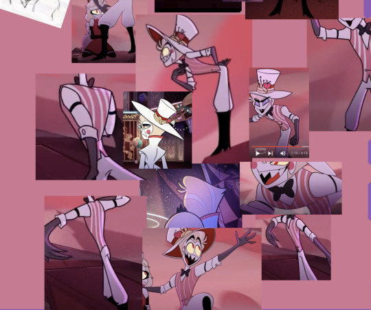
I WANT THIS POST TO STAY SORTA SHORT, SO UNDER THE CUT ARE SOME NOTES ABOUT HIS HAT plus some hat-less screenshots / screenshots where all or almost all his hair is visible
close-ups of reference sheet:


____
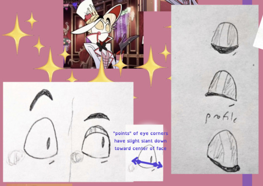
SO ABOUT HIS HAT. HIS HAT CAUSED ME SO MUCH CONFUSION UNTIL I THOUGHT OF IT AS A NON-PHYSICAL ENTITY LOL
short explanation: Vivziepop's art style, and especially Lucifer's design, is heavily based on what "looks right," rather than what is physically possible. so, my hat thoughts:
it's a droopy hat that folds down at the sides. so its brim droops in the back
BUT it also curves upward in the front, both to show his facial expression and in a way that sort of matches the curve of the top of his hair--
--so his hair doesn't look awkwardly cut off on the top
examples:

also, the top part of the hat has a smaller base than you might expect and then angles outward, with the front part always being taller and arcing down to the back
not every moment follows these rules, but they help me a lot when drawing him
(i often take liberties especially on the base of the hat and just do what feels right to me, usually based on similar characters i've drawn before -COUGHBLACK HAT FROM VILLAINOUSCOUGH- and based on where i sketched his head under the hat)
NOW SOME BONUS SCREENSHOTS FOR HAIR HELP. GET THAT HAT (MOSTLY) OUT OF THE WAY LOL


#hazbin hotel#hazbin hotel lucifer#lucifer morningstar#hazbin lucifer#hazbin hotel lucifer morningstar#'(MOSTLY)' LOL#WROTE THAT THREE TIMES IN THE POST WITHOUT INTENDING TO. 'MOSTLY' IN PARENTHESES#i've also got A LOT OF TEXT AND SCREENSHOTS I'M PUTTING TOGETHER on more details on his design#but i don't know when/if i'll finish that#so i wanted to at least be sure to submit this#I HOPE YOU ENJOY THIS YOU LULU NERDS AND ARTISTS (not mutually exclusive categories)
189 notes
·
View notes
Note
I saw a post and you mentioned college and so while I'm not ready for college yet I'm still thinking about my options. So is college worth it? Like you don't need to go to college to be an amazing artist now a days. I really wanna be a professional artist but I honestly don't if college is worth with its cons. (Btw your art always makes me emotional and happy. I really appreciate you and your dedication)
I mean, if you can afford it, go for it. Every academy is different, and they definetely have their own issue. But I can't deny that I surely grown a lot. I grown the most during those years. But that s also cause I put all myself in it. Plus I befriended a lot of cool people. Art school folks are always the best folks. I have no idea how it is in the US, but half of our classes were theorical(?) classes. I did a lot of philosophy, antrophology, psychology, art hystory, etc... these were all subject I was also interested with so I also greatly appreciated what I was learning.
BUT!
If you plan on going on a "visual arts" school, don't expect to do cartoon illustration ahah.
What I did was contemporary art. It's less drawing and more crafting. I liked it, it completely changed how I viewd art and what I thought it was. It was kind of revolutionary. But it's not for everyone.
So be sure to understand how they teach art wherever you wanna go.
I went to art school more for the experiemce and vibes. And I surely had much more fun than what I would had as a selftaught. (I like being around people, so I liked the class for the friends and conversation about art I would have)
But If it's too expensive, you can perfectly be selftaught for what you find online. You might have to follow multiple classes.
I wanted to go to a more cartoon oriented school, but even if I won a couple of scholarships, they werent enough to sustain me all 3 years. So i went to the public school. I learned what they didn t teach me online and by practicing a lot.
142 notes
·
View notes
Note
i was rewatching the rite of spring segment from fantasia and i've got to wonder. Why Did We Draw Archaeopteryx Like That. i remember toys having that same, boomerang arm shaped pose too. it's like a monkey lizard more than a bird.
Ooh okay this is a fun one cause while it technically is an Archaeopteryx and is listed as such in the production draft, I don't think the design is based on Archaeopteryx at all!
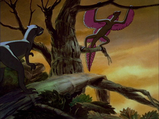
To me, this "Archaeopteryx" almost exactly resembles something else, the fascinating historical phenomenon called Proavis.
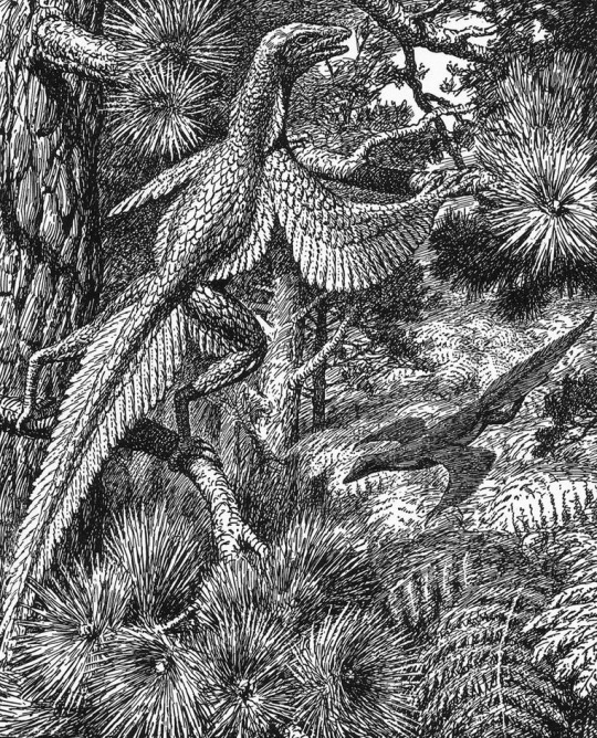
Proavis, or Tetrapteryx as some four-winged interpretations were called, was a hypothetical prehistoric creature that was proposed in the early 20th century as a best guess at what the unknown ancestor of birds could have looked like. The illustration above was drawn in 1926 by Gerhard Heilmann, a Danish artist and amateur scientist who argued that birds evolved from non-dinosaurian archosaurs like Euparkeria. In his 1916 book Vor Nuvaerende Viden om Fuglenes Afstamning and the 1926 English translation The Origin of Birds, he presented Proavis as the imagined midpoint between a scaly ground-running archosaur and Archaeopteryx, which at the time held the title of The First Bird.

Other versions of the same hypothesis, like William Beebe's Tetrapteryx above, were published and discussed around the same time, but it was Heilmann's Proavis that gained immense popularity to the point that bird evolution was considered essentially "solved" for decades. It was also painted by Zdeněk Burian, one of the Old Greats of palaeoart, which kept the concept alive in dinosaur books for decades as well.

Of course further study has shown this hypothesis to be incorrect and that birds are instead members of Dinosauria (and honestly Heilmann either missed or ignored a lot of evidence for a dinosaurian origin of birds even in the 1910s), but the Proavis to me remains a beautiful and fascinating concept that represents scientists and artists striving to understand the prehistoric world and the passage of evolution, much like we still do today!
And of course, its popularity in the early 20th century put it at the perfect time for Fantasia's artists to take... let's say heavy inspiration from Heilmann's imaginary Proavis when depicting a creature that was intended to be Archaeopteryx the whole time! The pattern of feathers matches up almost exactly, although the larger leg wings might have been inspired by Beebe's Tetrapteryx as well:
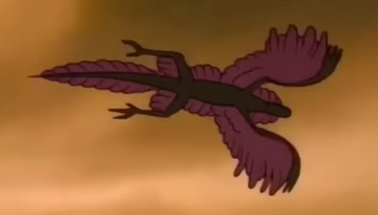
So to get back to your original question that led to this whole deep dive, artists didn't actually Draw Archaeopteryx Like That except when they were mistakenly drawing something that wasn't Archaeopteryx at all! If you want to read more about the Proavis and Tetrapteryx I recommend this Tetrapod Zoology blog post by Darren Naish, he does into more depth about the history of the concept and some of the unusual evolutionary ideas that Heilmann used to arrive at this weird and cool imaginary creature!
800 notes
·
View notes
Text
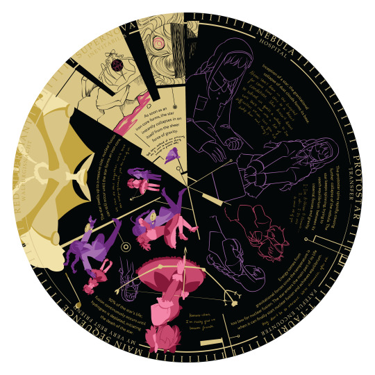
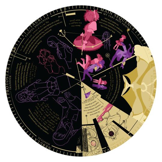
Long post incoming 'cause I really enjoyed making this but timeline project!! Parameters were to show a timeline using pop culture references so I did the life of a neutron star with Madoka Magica (specifically Homura's arc during the main series)!!
For some meta/symbolic/design purposes I inlaid it in a clock :]
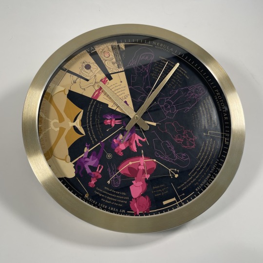
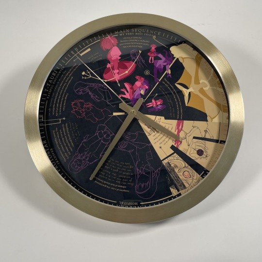
This is a 16-inch clock btw, the design itself is like 14 inches-- Stages Nebula: Inception of a star; the gravitational collapse of dust clouds forms its base. Akemi-san's been in the hospital for some time due to a heart condition. She hasn't been to school in quite a while, so I'm sure she'll run into a lot of difficulties. Make sure you all help her out, okay?
Protostar: The protostar spinds rapidly, causing further collapse of the nebula. The star keeps spinning, trying to reach equilibrium between its internal forces and gravity. I-I'm A-Akemi H-Homura... I, uh... I-It's nice to meet all of you. T-Tauri: Energy comes from gravitational forces since the temperature is too low for nuclear fusion. The star enters the main part of its life when it can finally start nuclear fusion and achieves equilibrium. Hey, don't be so nervous. We're classmates, after all. Main Sequence: 90% of the star's life; fusion continuously occurs until hydrogen is depleted, initiating the death of the star. Homura-chan, I'm really glad we became friends. Red Supergiant: The star swells up to a massive size; nuclear fusion can still occur until the star forms an iron core. We can do this together. We'll beat the Walpurgisnacht, just the two of us.
Supernova: As soon as an iron core forms, the star instantly collapses in on itself from the sheer force of gravity. THIS time, instead of her protecting me, I want to become strong enough to protect her!
Research/more design notes below the cut
There were so many directions to take (as you can see, like lifespan of a star would also be very viable for Rinne) but pmmm is so near and dear to my heart that it would've felt criminal not to do it and especially for like. A golden idea, like I think I hit conceptual gold--
It was so hard picking a singular route 'cause there's so many ways a star's life plays out and so many fitting storylines (Godoka for a neutron star, Akumura for black hole, magical girls in general etc) but I also had to take the physical presentation into account 'cause we were allowed to do that however, and Homura's main story arc fit really well because of the time loop and how clocks are. Yeah (and also the symbolic meaning of it being a clock)
There's more symbolism in the specific route I chose being a neutron star because those are the densest object ever, like how Homura repeating that month over and over again kept converging fate onto Madoka worse and worse--
i literally had a presentation with this and I couldn't think of what to say and if i recall anything i'll add it in the replies but MAN this project was so so fun (not the illustration part. i hit major artblock when trying to figure out how to draw it.)
#sana school stuff#madoka magica#pmmm#this actually got done way way back in february but i hadn't posted it until now dgfhjhkjgkh#'cause i wasn't 100% sure of the execution at the time but i worked hard on it so#or how to like. structure the actual post#in the future i'd like to revisit this or make other variations#every neuron in my brain activating when madoka magica#weeeeeeeee#do. do you like how main sequence. where 90% of the star's life. is their friendship and the leadup to walpurgis. i do. i love it
104 notes
·
View notes
Text
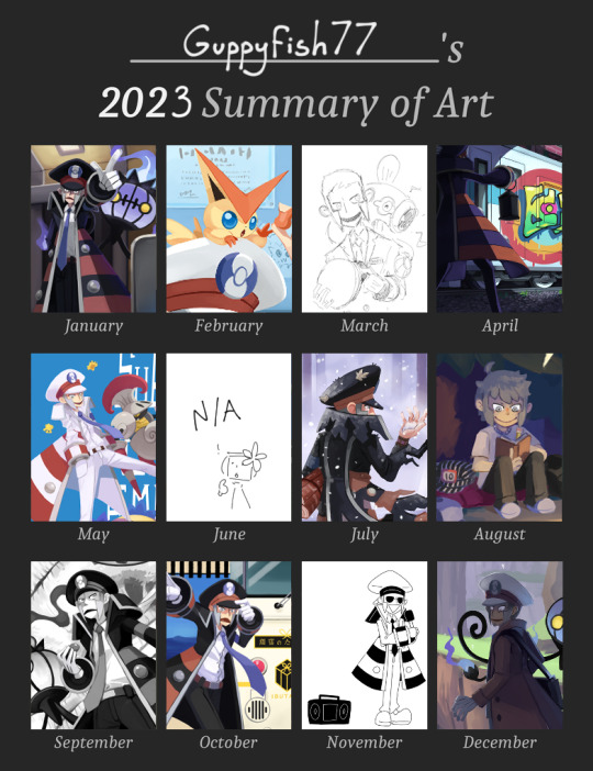
Another year Another summary of Art! An Entire Year of Submas lets gooooooooooo!!!! This year I feel like I really pushed myself when it comes to illustrations and I feel like I've learned a lot! But at the same time I feel a little tired, next year I think I wanna relax and experiment a bit more, I gotta learn to loosen up! Might get more art out if I do :p
I also feel the Submas grip ever so lightly relaxing (unless they decide to do Unova remakes haha XD), so I might introduce some of my numerous ocs in 2024! I'll probably start with the conductor oc ;]
Thank you for all your support! (you are all very nice! ToT), I still have a good amount of submas stuff planned in the works so look forward to that (๑•̀ㅂ•́)و✧
If you are interested, I also have some commentary and behind the scenes for some of my submas illustrations! I wanna talk about it and now seems like a good time to do so now that the year is over! (Beware! its going to be long!)
All titles are linked to the original post
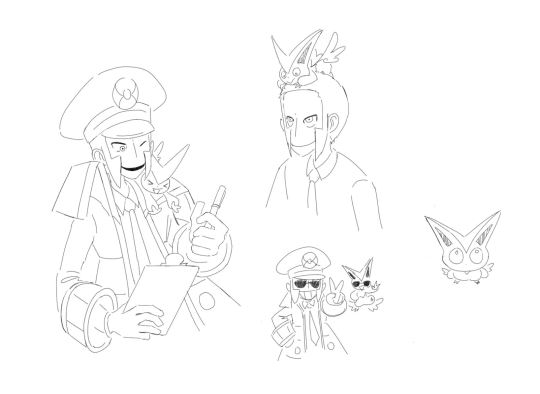
Lunch Break
hoho! This one is the sort of AU thing in which the only thing that changes is that I give Emmet a Victini friend (not a part of his team, I dubbed them the "victory duo" because Emmet likes winning and Victini is the Victory Pokemon), I planned out a few wordless comics regarding the idea, they were all very lighthearted slice of life kind of stuff, usually Victini causing some mischief and the brothers having to deal with it

and here's the thumbnails for this piece! I played around with various angles but decided to keep it simple and choose a straight on angle. It was originally a snack break and Emmet sharing a granola bar with Victini, but as I was planning it, submas unexpectedly showed up in the Pokemon Anime where they were serving ekiben, after learning about it it quickly turned into a lunch break! (how fun when new information lines up with an art piece you are working on hoho! ^ ^) After studying what foods Ekiben usually have in them (there was quite a variety!) I took what I learned and try to make the food look like the gear station logo :D
In the background there are children drawings because in the battle subway one of the trainer classes you can face off against are preschoolers, and I thought at least one of them would share their drawings with the subway bosses (and of course why wouldn't they hang it up?), there is also a trophy in which you can get in the players room if you beat the subway bosses on the super trains (one day, battling competitively is not my forte), I did my best to make Emmet's office feel lived in by adding a little bit of clutter (like adding a note) but overall very organized
(hey hey that joltik mug looks familiar in the corner there, its the same one Rei is holding in the christmas drawing)
Bonus Emmet and Victini Drawings
aw come on dude, not on the trains!
ah this one, it gave me quite a bit of frustration! This piece I used to challenge myself on perspective, and challenge me it did! The version you see now is I believe the 6th iteration of this drawing! The reason for restarting so many times is because I originally wanted it to be in 3 point perspective, but I couldn't get it to look right so its now in 2 point... Haha Some valuable lessons learned there!
This illustration was inspired by the history of New York Subway Trains and Graffiti! I read about it when I got to visit the New York Transit Museum and found it super interesting!! Then I went I gotta do something with this! Since Unova is based in New York after all!
I got so many subway surfer comments, they don’t know I forgot subway surfers existed while making this and that I am a huge nerd lmao
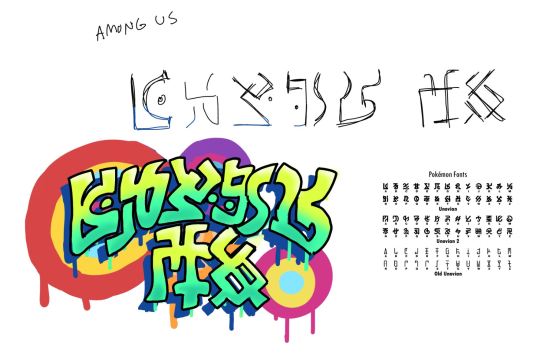
I had a lot of fun designing the graffiti on the train (yes it says among us) stylizing the fictional letters was so fun! I studied some graffiti to see how they do it, I could've pushed the graffiti style more but then it would be illegible! I also mixed in elements of Grafaiai graffiti, and trainer that is running away is the artist trainer class in SCVL because they are graffiti artists! And the train that got graffitied is the Wifi Train, due to BW (and the DS) servers being shut down, I doubt that train gets used much anymore, which makes it a perfect target!
Derailed!
hohoho! This was a fun one! I'm not sure how many of you guys read my tags, but in there I did state that this piece was based off the fact that model trains are powered by electrifying the rail it runs on (very low watts mind you) and the fact that Joltik eats electricity, but thats not the only inspiration, it was also inspired by those videos of cats laying on the layout and derailing the train!
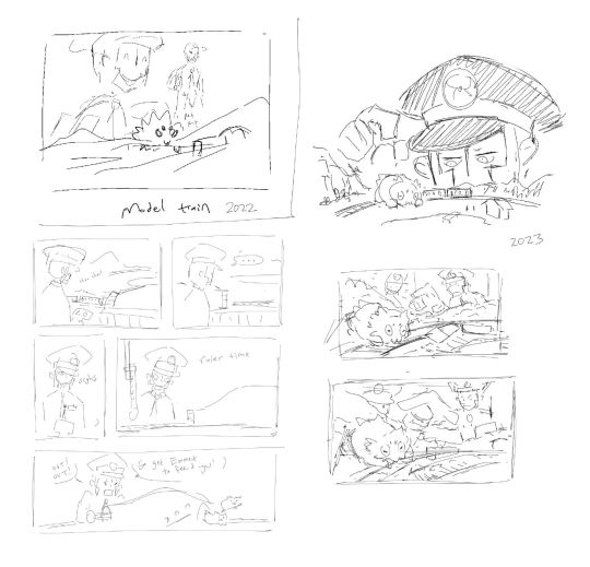
Theres quite a variety of thumbnails for this idea (including a comic!), and the idea was there in 2022, but this year I decided to fully commit to it! I started rendering the top right one and almost finished it, but it felt really boring to me, so I switched it up and made some thumbnails in a new perspective and viola! thats what ended up being finished!
The train that is being derailed are Sanriku Railway Type 36s, based off a model train I have in my collection! (While sharing this fact on the original post Haiku Bot detected it as a Haiku?! and this art went out of my target audience, that certainly was a day (⊙□⊙;))
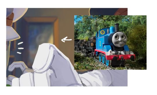
Also I straight up put a picture of Thomas the Tank Engine in the background, I'm not sure if people noticed cuz its quite blurry, the fact that nobody said anything means I probably would’ve gotten away with it before sharing this fact, so hehe :3c
Unexplained Melancholy
eyy! this one! It started out wholly different

It was originally me dropping Warden Ingo in various natural landscapes around Hisui as I didn't feel like drawing anymore linear perspective (ah, but heres the thing, all environments require a little bit of perspective lol), and it was just going to be Warden Ingo hanging out in a lush forest, specifically by the train rock that was shown in his concept art! but after sitting on it, I realized I could do something more with it! by making it a snowy environment I could make callbacks to Emmet's coat being white! hence the "SNOWY!!!" being scribbled there, that was added like weeks afterwards, Then I realized I could push it even more by making the whole environment about Emmet's colors! So the new thumbnail is in color because thats whats its about!
The moon smile thing was stumbled on by complete accident, while working on it it felt empty there and I added Emmet's smile to fill the space before going "moon!!!"
The piece is also a sort of a parallel to last years piece “I am Emmet, I wish for Ingo and I to be a two-car train once more” composition wise, sort of, I tried to at least 👍
Black Tower and Whitetree Hollow
Ah! I was quite proud of this one! Black City and White Forest are some of my favorite places in Unova mainly because the parallels are so very cool!
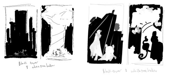
As the thumbnails suggest it was all going to be in complete black and white, as I was working on it though I could not help but add some values in there so yup! I quite like both compositions but the perspective won me out, plus that one focuses more on the characters than the other one (as much as I love backgrounds, it really is supposed to be about Emmet and Ingo U_U)
Being places of duality and having a battle challenge in there, it really fit them!
Emmet drops the hottest single of all time 🔥🔥🔥
Not really much to say about this one since it was very much done on a whim, but
its not the first time I drew Emmet with his hat backwards, I did this little doodle around the same time I did the train graffiti piece, been wanting to do something with this silly idea, and when I heard that audio, I went :o
Following Some Rumors of a Time Machine
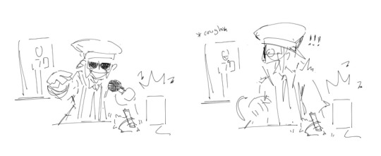
the finale! I decided to choose Area Zero because its a very cool place! I am inspired by cool places! and I decided to give it my all for this one!
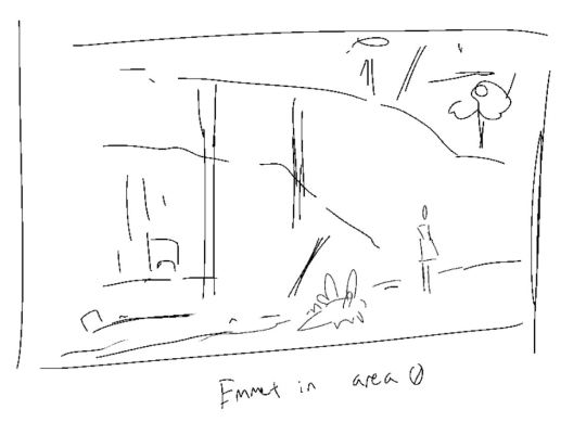
The thumbnail I made was more for jotting down the idea, and the landscape was going to be more eyelevel? Later I decided to make it so you were looking down into the crater and you get to see the fog blocking the crystal caverns, to show that Emmet was going deeper into Area Zero and the Deepest part is his destination (the time machine, not the underdepths, I didn't know about that yet haha!) I was always going to make Emmet encounter a Slither Wing, with it being based off Volcarona, a gen 5 pokemon :]
Anyways, That's all I have to say! I hope you found it interesting! (and enjoyed my varying quality in sketches and thumbnails XD) Thanks for listening! see you in 2024! ✌
60 notes
·
View notes
Note
you drew king and hector soo well
your style is gorgeous
THEYRE ALSO MY FAVES
I'd love to see more hcs you have of them!!
have a wonderful day/night!!
THANK YOU SO MUCH!!!! thats so sweet T_T I am a huge huge huge huge rgu fan so when I found out they had some utena and anthy inspiration I nearly fell out of my chair lol
I've mainly thought about them on like... a literary analysis level but I'll save that for another time when I feel like writing a full essay on their dynamic (though im sure someone has already beaten me to that at this point)
I'll start with King first. I like to think that she comes from maybe a bit of a sad background (also paralleling Hector a little)- something that would cause her to leave her home and journey for a long long time (and gain a lot of empathy and knowledge from doing so) before finally deciding to stay at the grove. Like Razz, I like to think she has an hispanic-inspired background and a bit of an accent. I really want to draw her in Traje-de-luces outfit sometime when I get the chance.
Hector........ ohhhhhhhhhh the character that you are. He is so astoundingly complex (wonderfully juxtaposing King's simple good-hearted nature) I dont even know where to start. He definitely has a learning disability to me- likely autism. He struggles to understand and communicate with others and maintain stable relationships, something King can do with no trouble. Inspekta's domain feels so.... lonely and empty when you see past the bombastic music and his demeanor. I like to think he immediately started aiming for godhood when he arrived at the grove and ascended around his mid 20's- it makes the loss of time when he reverts a lot more heavy and tragic. I have a lot of illustrated ideas for him a few months after the game that I'm currently wrapping up ^_^
Tysm for the ask! I've never actually engaged with media before like this lol... its fun! Theres just something about these characters that feels so magnetic
9 notes
·
View notes
Text
And So it Begins: Intro Commentary

I'm finally awake! Criminy, what a week. And we're doing it all again next week, too! Hm. Look, I'll level with y'all: the way my work schedule is right now, commentary's gonna be consistently pretty late unless we figure out some other way to do this. I can attempt cutting to one paragraph or lingering in the workshop at night, which I do enjoy doing after work from time to time! I just want to make sure that everyone gets a timely response to their cards, 'cause that's what we're all looking for when we submit.
In the generic sense, though: positive notes include the massive amount of subtle and pleasant storytelling that went into cards this week! Whenever someone submits a card that has a strong mechanical bend with flavor implications, that's where my heart shines. I really appreciate the effort that people put it to make the blend work together, and it's a tough talent.
In things to watch out for, there were a lot of mechanical blends this week. It's super cool to see, and there are also a lot of wording interactions to keep in mind for how things should appear on card with new precedent, reminder text, etc. to keep the card smooth. It's always worth double-checking to ensure your presentation matters.
JUDGE PICKS are cards that I'm terrified of choosing because there were so many good ones this week. How many after the fact? 22? I'll select... I guess five, but there's more. Y'all brought your a-game fr fr. Read on.
@bergdg — Livio, People's Champion

There's the inherent timing question that this card asks: can I cast this without flash? And yes, on that technicality you can do that but I don't feel that ambush groks as well without that minor addendum—an easy fix, though, so that's not too bad. Where it gets tricky is what ambushing means in a format. There are combat-like mechanics such as ninjutsu that, when known about, make combat more complicated. The fact that ambush is castable during an opponent's turn, I feel, disincentivises attacking into a known trick in a way that's harder to play around than just having combat tricks in a set. I feel that it needs some tweaking to avoid being a "Gotcha!" mechanic.
As for Livio itself, though, I can also read this as just being a flash creature for combat, and on that note it's a perfectly fine card. Disregarding the ambush side of things, flashing in a a lord/anthem is a great piece of strategy at rare and can turn that tide of combat quite effectively. I'm curious about the juxtaposition of "rebel" and "knight," though that's more a questioning of in-world fealty. Looking back on precedent, I guess Knight of the Holy Nimbus and its ilk are reasonable comparisons, but that's from a set that's not the greatest for precedent. Hey, maybe there's some worldbuilding to check up on for me. I'm sure there's an in-world explanation to expound upon here—or it's just "knight because protector, rebel because people's protector." That's not quite as compelling but it's understandable.
~
@bread-into-toast — Young Telepath (JUDGE PICK)

I like the classroom perspective that you've provided here. This student's bored in class, delving into the minds of their classmates and mouthing off, and the early-Jace comparisons are in full force. It's a great way to tie together simple trope-based worldbuilding in a slice-of-life manner. Why are we looking at random? Because the student's just poking around the minds in class, unstimulated but talented. All of your strengths are sincerely on display here, and I could write out an art description based on this illustration quite easily with the same impact. Good stuff.
I will say that this is a fun support card for limited, and that's the extent to which its power would show up anywhere—and that's totally fine. Double-draw is a great archetype, or at least it was in the couple places where I've played it the most (FDN and BRO). Perhaps there's something to be said for slowing down the game when choosing randomly at higher levels; I doubt that's an actual concern, but timers are timers. I think this card could've easily been a 2/3 because of the supporting role that its supposed to have, maybe to be a better blocker as needed, but that's small potatoes. This card was really great to see among the mix, and I'm looking forward to some wild and worldly choices from you.
~
@brookeuwo — Malamet Cairn (JUDGE PICK)

First things first: great flavor text here, short and simple worldbuilding. Secondly, the design sensibilities are pretty neat! Ixalan's ability to boost with exploration, equipment, and/or auras is a fine reason to play this card and even more so to want it on-curve. Even if you don't have as many things to boost its power, the strong lifelinking blocker can be a real savior in the later parts of the game. Green and white weren't the easiest colors to draft in LCI, I'll say that for sure. Whether or not this card would've saved the archetype, I dunno, but I enjoy the little twist on a defender that pairs well with the world in question.
I also like how it's a good topdeck because of those defensive capabilities. Maybe it doesn't necessarily get around the evasive creatures, but that hardly matters when you're using it mostly to get around full swings and the lot. That's the gist, and there's not a whole lot I feel I need to add that the card doesn't already say. It awakens when you put the power into it, and it's still a staunch defender even without that. I feel the will of Ixalan's world coming into play here as a quiet and ancient force to be reckoned with. So yeah, not bad!
~
@corporalotherbear — Kami of Togetherness

Oh, affinity, how we love thee... It's pretty fun how this card plays with itself, in the same way that a lot of the best affinity cards do. Getting bigger and better means that you're gonna pop off effectively just as much as you need to in limited, and there's the encouragement of multiples and/or spirit-based synergy that makes it pretty awesome. Honestly, I'm reminded a little bit of the MHX cards, although I understand that it's reasonable to have affinity as a one-off mechanic; there was a pseudo-affinity in NEO, I remember that one quite well.
Fair choice of PT also, because I can imagine the earliest you could get this card would be... Well, depends on the other cards in the set, but if there's some kind of other Spirit token generation then turn four or five would be reasonable, yeah? And with that you can have a solid body down. Good choice of the statline. It's definitely playing to my Kamigawa love, and I do appreciate that, even if the name feels just a touch less ethereal than I'd expect. Sensible, but maybe a little too grounded. I think that what I'm really curious about is whether or not the AD would be totally gorgeous or totally horrific. All depends on your relationship with the spirit world, I suppose?
~
@cthulhusaurusrex — Fetid Lurker (JUDGE PICK)

The first comparison that comes to mind is that of Tireless Tracker, whose first line is effectively the same. That said, I'd still want to play both of them in the deck that's asking for it, because they play into somewhat different spaces. Sacrificing your clues to the Tracker is a way to get your card advantage and beef on the board because of it, whereas this fish just wants to eat them up, a trade in resources. I like that choice of differences. Sometimes you want to just get your power up and swing in, and sometimes you need the draw—perhaps into the next land for the next clue.
Regardless, I can imagine this card as a multi-archetypal card that can still stand on its own in a draft. UB evasion, UG ramp, UR artifacts, UW card-advantage-control... Yeah! Don't fix what isn't broken. There's this general trope as well, flavor-wise, of river monsters living in sewers and marshes and swamps. Where does this one come from, I wonder? Probably a place with lots of artifacts to spare (a cousin of Gearseeker Serpent? Or a resident of Capenna?). That's a minor inquiry, though, because this card's definitely focused on power above other things. Slam dunk and/or hatedraft this card in limited, that's for sure.
~
@deg99 — Mishra's Agglomerate

In the submission, you mentioned niches and the fulfillment of a niche for a card like TSP's legendary Mishra. The questions that follow are a) whether or not that's a niche that necessarily needs to be filled, and b) whether or not this is the best application of the necessary mechanics. The obvious one is the "relentless" aspect, having any number with that name. Is the remainder of the plan just to beat down with Assembly-Workers, then? Besides Mishra having random complicated combos in EDH already, I'm not sold on a rare card as the best place for "relentless" in general. This is more of a meta issue with distribution, honestly, but I hope it's fairly evident why it's a little bit of a limited feelsbad to open a rare that plays best when you have multiple copies.
I also feel that, regardless of Mishra's possibilities, there are some easier ways to word this card for a similar effect and/or ways to make it less wordy. The middle two can be combined into a single activation that's similar to the Enduring cycle from DSK, e.g. "UBR, Exile another artifact card from your graveyard: Return this card from your graveyard to the battlefield. It's an artifact. (It's not a creature.)" As it stands, though, for this niche I think having a common/uncommon artifact could've helped with the start of this idea. It's a solid beater if you're going for Assembly jank, and I don't fault it there at all. Execution is the name of the game.
~
@dimestoretajic — Sythis' Presence

I'll start with the positive parts of this card's intentions, namely that it's a strong aura for limited and deserves its legendary potential. My second thought is me wanting to make a token copy of it somehow, and the kinds of awesome shenanigans that you can get away with because of it. The weird thing is that there are only a handful of legendary auras that have been printed...ever? It's actually kinda weird! This would be fun for Yenna, though, and other loops that you can do with multiple copies. I keep thinking that this card gives it lifelink, and maybe that could've usurped the first strike, but hey, that's minor tinkering.
The major and minor wording issues are the other part. When an Aura gives both a PT boost and abilities, the PT boost use "gets" and the abilities use "has." And with the return, I think modern templating could say "this card" instead of the name in the last ability, but I'm not entirely sure. It's the middle trigger that's egregious, though, because you gotta say "another Aura you control" and also specify where it's going into the graveyard from. Is this from anywhere? From the battlefield? Specificity really does matter here because otherwise, well, the rules just don't work with it, and also I can't totally guess the intention. Also, the "instead" is only necessary on replacement effects, "if an Aura would" etc.
~
@feyd-rautha-apologist — Dawn of Faceless Days

I'm almost positive that the draw trigger goes first, so let's shift that around. Let's follow that up with the question of what this card does, exactly. Right now, I know that there are the various creature-shifting combos that you can use with Arcane Adaptation and Leyline of Transformation, all that jazz. So why play this card over those, besides the cost and the draw, to transform a number of other cards? I'm wondering what kind of limited environment could use this, and I'm thinking about Lorwyn. There are a few funny cast triggers there, that's for sure, although the effect of the cards remains the same and might usually care about the creatures types of that archetype as-is.
In a limited format with an abundance of creature types, I can imagine that this card could serve as a glue between shenanigans. It's also asking a massive amount from the format in question to be able to have that amount of kindred cards. I think it just kind of hit me that this card effectively acts as a noncreature type-changer for the usual creature-only type-changing cards, and I can sense the niche there. Is that either too powerful or too narrow for what these effects are supposed to do? Why not change the creatures that you're probably gonna have more of to match the kindred stuff rather than this? But there are certainly combos I know I'm not seeing and interactions yet to exist. This card might be a little too ahead of the curve for me, if I'm being honest, and ultimately I say that positively. BTW, the name is a 10/10.
~
@helloijustreadyourpost — Greel, Genteel Goblin

I think that we can all agree on how this card works and how neat it is overall. I really appreciate this week's efforts, with this card and others, to have more succinct and slice-of-life storytelling. This goblin has a hat, other goblins take the hat, and he gets mad when his hat becomes taken. Boom, easy enough and funky enough that he could easily be someone's favorite card from limited and/or become someone's pet commander deck. Pass the hat around, everyone!
A limited deck that runs this card has the minor issue of needing at least one other goblin around in order to give Greel trample for the turn and/or to use this equipment at all if Greel leaves the battlefield. I think that's the inherent flaw, honestly, because without at least one other piece of equipment and/or another goblin, a lot falls apart here. But perhaps that's just something that's inherent to this card with the deckbuilding that you'd want for it, y'know? Limited is really the only place that it would be the most likely to not work. Sometimes a 3/3 with haste is worth it. The other small note is that the second line should definitely be a trigger. Feels really weird that it doesn't use the stack.
~
@horsecrash — Seven Earth-Shattering Strikes

Starting with the amazing name, I'm more confused than anything as to whether there's no flavor text to go with it. This seems like the perfect place, where I want to know so much more about the card than I do in this moment. Still, regardless of that, there's the push and the question of whether or not this card is at the kind of limited power level that's acceptable for multicolor. And the honest answer is that I don't know, but I don't think so. Not necessarily. The difference between this and a Dreadbore is pretty narrow. Is this the amount of damage that's needed in a specific imagined format? Is this the kind of multicolor power that you'd want?
I'm thinking of the top end right now for two mana, things like Scorching Shot. Unholy Heat has limitations, others have color restrictions on what they can hit... This feels like it goes too far into destructive territory, even with the way that the name leads us to understand it. I'm really torn here, because as much as I want this card to work with its presentation, I feel that it's just...off, numerically. Red burn's efficiency needs to have limitations even in multicolor, and black wants to do other things for this mana. This is quite a difficult card to talk about, but a welcome challenge still.
~
@hyde-the-toad-bard — Serial Driller

The weird thing is that I think this card would be better at home in EDH than limited or standard constructed. Maybe that's me just thinking of how impulse draws work, and/or the question of what Gruul-stompy wants for the longer games. Don't wanna hit something too big, don't wanna hit something you're not able to use in the moment. Hm! I think from a pure design perspective that this card's a real pain in the butt to have to deal with on the other side of the table but not so much that it's an insta-remove. I'd definitely play this in my Xenagos deck after a little bit of ramp, just so I'm guaranteed to hit the big drops.
There are a few shouts and murmurs with the name and the flavor, and I'm kinda on board there. I think that the flavor text is leaning into the faux-dramatic a little more than necessary, and "You never know where they'll strike next" does the job well enough with the implication that they're an aggressive miner. The "killer" to "driller" name feels like it could be a lot more gruesome than the mechanics are presenting here, in the sense that I would be expecting the drilling to be even worse than murderous plans—but no, we're just digging away. The tension/surprise is difficult to do on MTG cards; it's possible I'm posting my expectations on top of what's ostensibly a card that knows just how fun it is and I should stop being a spoilsport. All I know is that I'd slot this card in, so heck, the rest is opinion.
~
@i-am-the-one-who-wololoes — Magic-Intrigued Corvid

Now, as a morally bankrupt Brago player on occasion, this card's an absolute delight with enough blinking effects, especially if you can make them happen more in your favor. The fact that you get to cast the cards that you exile even if they're not yours is pretty baller. There are always strange rules cases that come to mind, such as whether or not doubling the effect with Panharmonicon that somehow exiles multiple spells would make the LTB trigger cast one or two spells, but there are contingencies for that, I'm sure. We've been through Spell Quelling before, after all.
It's a really fun EDH card and a really fun limited top-end card. I think a five-mana 3/3 body would've been fine for modern power levels, considering the stage of the game in which that would be relevant, but that's a minor push and it's okay to err on the side of lower power rather than higher power. Design-wise, I think this is one of the coolest ones I've seen from you, well thought-out and quite cute. The name could use a little bit more mysticism, or at lease some other kind of adjective. Even "Curious" could do some work here, y'know? But names are sometimes the hardest parts of these things. Just like exiling an opponent's one-sided boardwipe...
~
@lanabutnotdelray — Excruciating Interrogation

When thinking about limited formats in which -1/-1 counters appear, there's the question of how they're going to be used, what they combo with, how they affect your side vs. an opponent's side. The ability to put a -1/-1 counter on whatever your want every turn can be beneficial for wearing something down. It's also worth considering the cards that have -1/-1 counters that they want to get rid of, like Grim Poppet or Channeler Initiate. I'm curious if the intent was more to put it on your own stuff or to put it on your opponent's cards and get the benefit? It's a real pain with defenders and the like, but all the same. I'm really curious about that part.
Flavorfully, though, it would make more sense to put it on something that you don't control. Extra card advantage is the side benefit, and I suppose that uncommon can get the extra push from this card. Could encourage some chump-blocking, definitely speeds up the game. I wonder what the environment would be to allow for such a card, because there are times and places where the draw is just advantage on top of advantage, and others where it's a slow burn down. There were some murmurings about this card, and I think I'm curious enough about it to give it a thumbs-up overall. The flavor text certainly scans well, although I'm not sold on what it actually means? Why wouldn't the prisoner just keep screaming, I suppose. I might just not be parsing.
~
@melancholia-ennui — Channel the Scarlands

The thing that stands out to me first and foremost is the use of the UB property as a mechanical name here. It feels strange to me, but perhaps not to the people who enjoyed that sort of thing. Perhaps. If this set isn't a callback to Fallout itself, then that deliberate choice lands more awkwardly than not, all things considered, and IIRC this is meant to be a different U-within world. So... I don't know, I'm not sure about this concept in a standard set in general. Milling works well in Commander because of the 99 cards; in a draftable format where practically all of your cards matter, having a milling mechanic as a main aspect of the set doesn't seem like the best choice.
Conceptually, for Commander, I would've removed all the ability-things you put on here and just gone with the whole rad counter shenanigans as-is. Without that, I don't personally believe that this is the best place for rad counters in general. Multiplayer mechanics are often overpowered in 1v1 formats, see Monarch and Undercity. Having a set with a major theme of rad counters could be relatively balanced if the entire set was worked like the sets that used poison/toxic. Big 'if' there. Even then, rad counters are majorly more difficult to remember rules-wise than poison. There are just too many caveats to make this work in the way it needs to, I'm afraid.
~
@piccadilly-blue — Pontiff's Alms

—205.4i Any permanent with the supertype "link" is a link permanent. Any link permanents are subject to the rules regarding link permanents (see rule 704.5z). —704.5z If a player controls a link permanent, any player may choose another permanent they control and link it to that permanent as a sorcery. This is a special action and does not use the stack. A player may unlink a permanent they control from a link permanent as a sorcery. This is a special action and does not use the stack. The link and unlink actions may only be performed once per turn per link permanent. A permanent can only be linked to one link permanent at a time, and a link permanent can only be linked to one permanent per player at a time. A permanent cannot be linked to itself. If, somehow, a permanent would become linked to itself, the link fails to form. —704.5aa A link permanent is considered "fully linked" when each player controls a permanent linked to it. —704.5ab Link permanents linked to each other form a chain. A chain has a number of links equal to the number of link permanents in that chain. Multiple separate chains may exist.
You are a mad person and I highly respect that. Firstly, unlinking should probably be something you add as reminder text. Secondly... I think that this card is garnering a lot of respect from me, but what the heck do I actually do with this? Maybe I can just leave this card on a miniature pedestal as a reminder of what MTG's future could be, but maybe I'll do a little bit of theorizing.
Battle representation. Multiple link enchantments can be really strange if there are different links on the battlefield, but that's fine. As a visual representation, what about when a permanent has auras and equipment attached to it, but that aren't linked to an enchantment, or vice-versa? There are some pragmatic weirdnesses, but I'm imagining on a digital client you could have little red strings of energy that chain them together. Having "Link" as a supertype is pretty neat, too, although I've been hanging around too many YGO players not to have an unconscious connection. All the same, though: three life for the alms, that's a real clock. Not the wildest clock in the world, but a clock all the same. I think this might last one turn, honestly. You link something up probably as soon as you play it, and an opponent sacrifices a permanent (basically) to not have that happen again. I... Huh. Sounding it out, that doesn't sound that powerful all things considered. I think I'd like to have seen a more perpetual linkage, perhaps? The thing that I'm imagining the most of, as a last thought, are links on links on links, giant chains of cards. What a nightmare, but what a visual into the world of possibility.
~
@real-aspen-hours — Gnaw from Within

With the modern wording, "this" should at least be "this enchantment" or "this permanent," right? Nine Lives Familiar and all. Feels weird without that stuff... Anyway. I think the art direction is pretty great, and I saw it got some attention by word of mouth. Totally reasonable there, it's a nasty time for everyone involved. Mechanically AND flavorfully, though, why is this an enchantment? Something like Stab Wound represents the grievous injury, bleeding out over time, and it's the wound that's causing the life loss. This card feels like it should've been conceived as a removal spell similar to Stolen by the Fae, as a similar example. It works best as a kill spell and I can't see a pragmatic reason for it being an enchantment.
I'd definitely play with it as either, though, although I'd only use it as a kill spell if it was released as an enchantment. Getting to kill something and get a bunch of tokens is usually a safe place to be if you're going to remove what you want to remove. In a rat-themed strategy, or any wide black one where you're going to want fodder and/or to go wide, the late-game benefits of this card can't be overstated. Maybe having guys that can't block is a little bit of a rough spot, but what're you gonna do, right? It's the next turn that's gonna blow them out of the water, and into a dark alleyway.
~
@reaperfromtheabyss — Shapeling Artisan (JUDGE PICK)

I can say for sure that some interesting choices were made here. Having checked for precedent, I don't believe that "changing" counters is something that the rules really allow as such. I think this could be an activated ability you can do at sorcery speed once a turn, removing a counter as a cost to put a counter on something else. That said, it's more about the weird notions that this card allows for. The absolute floor is that you have a 4/4 that can graft itself onto other creatures you control as they enter, but shifting things around to give your current hand extra abilities when the creatures enter is a really neat idea.
Playing into the UG +1/+1 counter space allows for some strange things to happen, and while I'd argue that Evolve was the best iteration of Simic's mechanics as it plays in that space, this is a breath of fresh, squiddy air. I like the way that this card works conceptually a lot, even if that upkeep trigger isn't something that's currently supported to the best of my knowledge. You know how the humble octopus will sometimes remove its arms in various circumstances? I can imagine this creature taking a limb and just hucking it at an ally as it transforms into a grafted addendum to their body. Huh! I wonder how the 200X Simic would feel about ability counters these days. I'm actually really glad that you're tapping into that, assuming this is a Simic-themed design at all. If not, it's evolved into one.
~
@sparkyyoungupstart — Salvaging Phalange

This card feels like it's trying to tap into some Horizons-y territory, and I'm really trying to meet it halfway here. Foraging feels a little odd here when there's no specific Food feeling here, and I wouldn't expect this thing to necessarily be a squirrel skeleton, but... Is the Swarm here from the Golgari? I assume so, because my other consideration would be Grist's swarm, and that's a whole other kettle of bugs. My point about the flavor is that it doesn't mesh with the presentation, and foraging with Food wouldn't actually do anything to beef the power and toughness, so the question is why not have a direct mechanical tie-in with something like Escape?
Even though the mechanical aspect is powerful as well, I get the sense that it's looking to turn the exile zone into essentially a second graveyard as far as the numbers go. No matter what plane you're on, the intended gameplay/flavor intersection of these sorts of cards should be tied to the graveyard for play balance reasons. The exile zone has pragmatically no interaction, and I don't feel that that's a gameplay style (especially for these colors) that should be pursued. Caring about the graveyard as a resource matters for gameplay balance. The intent is noble, but the establishment of BG graveyard resources is established for a reason.
~
@tanknspank — Ovalchase Mechanic & Reliable Roadster

In general, unless it's specifically asked for we do ask that you submit only one card for the purposes of intent/balance. That said, this was an open-ended contest, so I get the appeal, and I also get the general story that's taking place here—the mechanic beefs the dragster, the dragster swings in. Colorless partners does open up a few possibilities for limited, but that said I never drafted Battlebond, so what would I know about that specifically? The independence of each piece makes the individual possibilities open, which is a fair thing to keep in mind, while also begging the question: why partner?
The inherent problem is that partnering these cards doesn't actually add anything to the synergy that would inherently be found in a limited environment. Playing these cards together would be awesome! So, you just hope to draft both of them, and that's that. All that partner does is tutor up that synergy and make limited slightly less randomized. Is that necessarily fun? Is that what a standard limited environment necessarily needs? I'd argue: absolutely not. Partners in Battlebond were designed with a hyper-specific draft strategy in mind that could reward a number of cross-color interactions between players on a team. And otherwise... I'm just not sold yet, honestly.
~
@xenobladexfan — Gesserith, Master of Shields

MSE is great for a number of things. One of the things that it's not necessarily good for is reminder text stacking. Things got a wee bit hard to parse in there, eh? I'm teasing a little bit because otherwise, well... Actually, jeez, looking more, there's a lot of text on this one; I feel the flavor text could've been sacrificed for legibility. That's just what happens when you combine abilities like this, right? I feel I'm being harsh: to be clear, I like the card overall. It's a decent one with some strong limited capabilities, definitely a snap-up for the archetype and a card you'd hope to draw in basically any situation.
There's a little futzing to make it absolutely perfect, though. The wording in the trigger feels a little off, but that's just because of the wording of bolster. Imagine if the attack/block (maybe when it enters as well?) gave the bolster, and there was another line that whenever you put a +1/+1 counter on a creature you control, if it doesn't have a shield counter, it gets a shield counter? I did a mockup and it's about the same amount of text. What I'm trying to say is that there are a couple minor tweaks to get yourself really up to a great legend, and the choice to give shield counters makes this a limited bomb for sure. Those things were a real pain in SNC... But hey, it's a flavor fit, and good stuff overall.
~
@yd12k — Nifah, Skysurfing Amateur (JUDGE PICK)

It feels good and probably plays great, so that's a good start. I feel that there were a few cards this week that blended lots of counter types—is that where we're at now as designers? I'm not complaining, I'm just more fascinated that there's that space. I was NOT a fan of ability counters when they premiered, but I've come around on them as a complex tool. Nifah certainly likes them, and I think this space wants to play into some synergies that are...different? Very different. I'd love to see Ride the Horizon cast after I make a Spider Spawning play in limited, for example. Really gross but in the fun way.
What world is Nifah soaring through, too? Let's put the mechanics on the back seat for just a second, because there's a bit of joyous worldbuilding that makes me want to know more about this character and where they're coming from. The simplicity feels nice. Again, that seems to be a running theme through a lot of these cards, but it goes to show the power of consistency. Exploration and exuberance is a combination that creates uplifting intrigue. Back to mechanics! The support for exploration might be a little tight here, but in all the Ixalan sets where it was prevalent it also had some weird buildy-aroundy feels, so I'll give that a bit of a pass. I do love exploration as a mechanic, too, and I like how this card gives that evasive necessity to the grounded feel of UG explore as a draft archetype that often felt missing.
~
@yourrightfulking — Fungus-Feeder Ants

I do distinctly remember helping you out with this one in the workshop, your highness. And how am I to judge it now that I helped sculpt each of these six golden legs? I dunno. I mean, obviously I can't be 100% impartial here. Yeah? Let's talk instead about the general polish and overall stuffitude with this card. It's...a weird set that has a double-pip common with no generic mana attached to it, but it's not impossible, I suppose. There were power concerns, I remember that... Eh, 1G could've been fine on second thought.
What if you were able to get back any land card, not just one that been milled this way? Maybe that would necessitate a bigger cycling cost, or maybe a rarity up because it's a generic way to get some mana fixing, but whatever, there are lots of minor things. This card plays into the archetype well enough and there's nothing inherently wrong with it that a number couldn't fix. If you're not gonna add cycling reminder text, though, you might as well add some flavor text; right now the card's about as dry as the sawdust that the ants just ate through. Heyo! But in all seriousness, it's got this jungle-potential that could've been upped just a teensy bit.
~
Time to go back to sleep <3 Be well, nerds one and all. @abelzumi
10 notes
·
View notes
Text
This is not an update to the Comic, but it still has something to do with it !!!
(call it a little gift for the Wish Rewrite and KoW fandom)
Hello my little stars! How are you?
I mentioned in the last post in the series that I would be traveling for a week or two and that's why I wouldn't be working. Well I'm still traveling Lmao.
It's been a lot of fun, I'm visiting my Prince Charming and family, both of whom I haven't been to in a long time. Still, I couldn't stop thinking about KoW and Wish's Concept Arts. Disney sealed the fate of its fan artists by discarding so much good material, now they are embedded in our minds and we will not be able to rest until we see them realized. This is crazy but it's beautiful to see how much these discarded concepts generated creative potential in the fandom.
Because of all this I couldn't help but make some small sketches! And well, I came to show them here. They are not sketches of Comic panels, but they have something to do with it and I will show the photos and explain how.
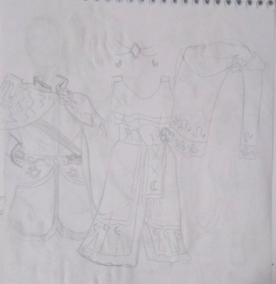
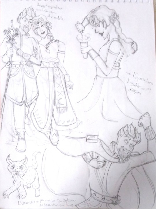
This first one, very faded, are Magnificent and Amable's clothes (designed by @uva124, for the characters in @annymation's rewrite of Wish "The Kingdom of Wishes"). The drawings that Aled did are very complex, I don't judge her for that, in fact I thank her, she gave beautiful clothes to the centuries-old Disney villains and they are perfect. I really wish I could draw them with all the details, but I will do everything by hand, alone and seeking a minimally professional quality (I want to be a comic artist/book illustrator one day. This comic is my first step Lmao, and I want to do something that conveys the best I can give at the moment), so I need to make some things easier for myself. The costumes are one of those things.
" Better something simple and well done than complex and poorly done." — This is my motto for this Comic and for my life.
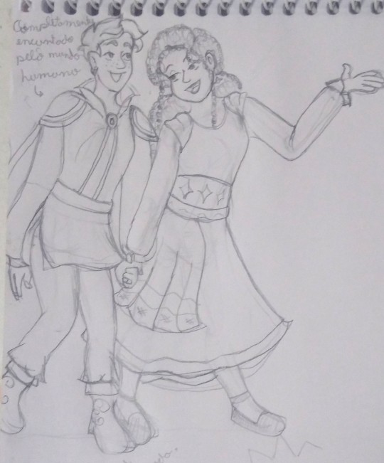
The next sketches are related to aesthetics. I've been watching a lot of "Analyzing the Art" videos of some Disney films and I was inspired to adopt some "Disney Style" features in my arts for this comic (not everything obviously, because I don't want to be sued by Disney lmao).
What you'll see next is me trying to mix this influence with my own style in some KoW character sketches.
(this last art specifically references a meme in which @rascalentertainments tagged me, Thanks for that, by the way! <3 )
(credits to the artist, I don't know who it is because I was just tagged in this meme and I was busy So I didn't look for more information, but I'll leave the post link and you can check the official credits)
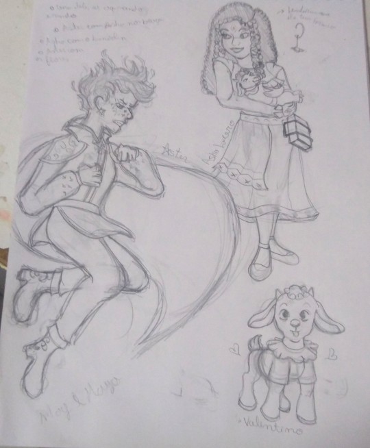
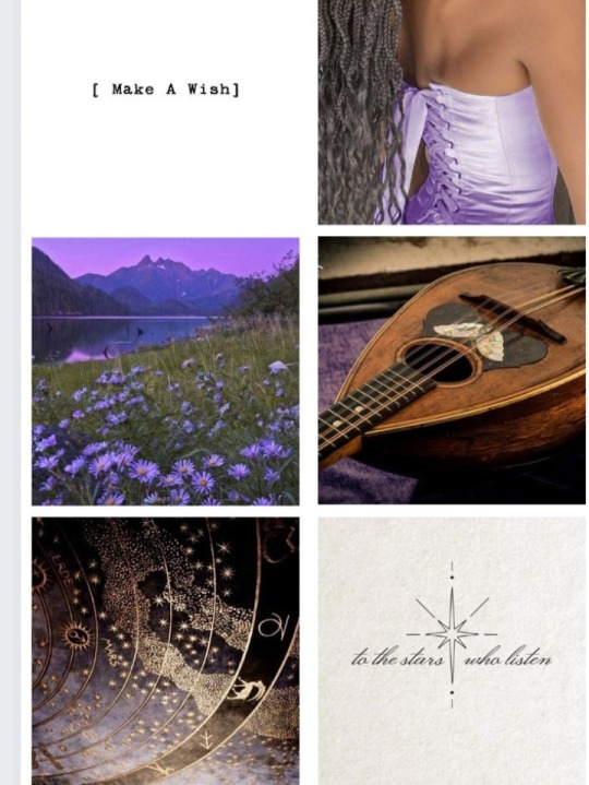
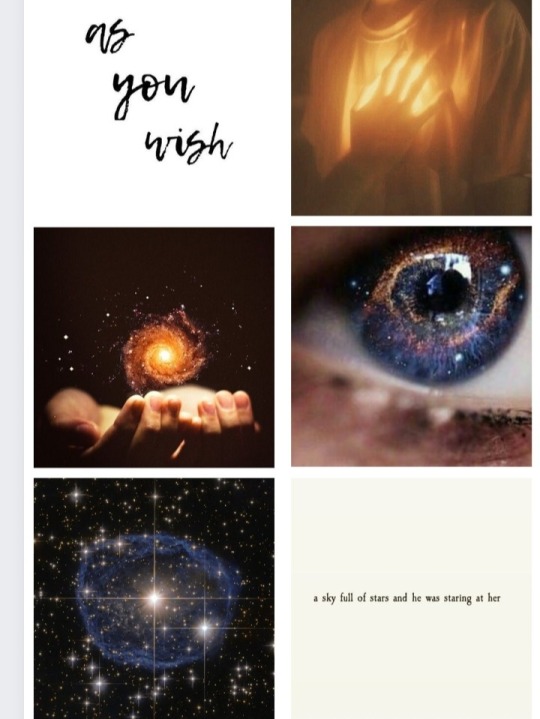
Speaking of aesthetics. Anny received Chiara's aesthetic from someone — the north star, "daughter of Aster", created by his magic at the very end of Anny's fanfic. This Aesthetic inspired me to create an aesthetic for Asha and Aster too and these were the results:
What's your favorite?
Lmao, It took a lot of work to make Aster's. There are almost no things for "starboys" on Pinterest.
I'm leaving this up to you to share as you wish, consider it a gift to the fandom!
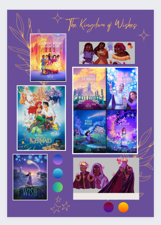
Lastly, I want to say that the artistic analysis videos They also inspired me to put together a moodboard for KoW and I'll be leaving it here. Not even Anny and Aled know about this and I can't wait to see their reactions! I wish I could print this painting and leave it on the wall, but unfortunately I don't have a printer T-T.
This moodboard is helping me with the artistic direction of colors, style and is a visual motivation to stay active at work.
I hope you like it too!
That's it for today, it's already midnight in Brazil and I should be sleeping instead of posting crazy things on the internet. I'm going to tag my friends and go to sleep, Lmao.
Kisses full of light and stars!
~ Emy
@wings-of-sapphire @flicklikesstuff @frogcoven88 @chillwildwave @gracebethartacc @gracebethartacc @kstarsarts @oh-shtars Come and get your therapies after the anguish caused by certain publications by Anny!
#kingdom of wishes#wish reimagined#wish rewrite#wish 2023#disney wish#artists on tumblr#asha wish#starboy#starsha#the kingdom of wishes desings#the kingdom of wishes au comic#the kingdom of wishes au#behind the papers?#behind the scenes#aesthetic#scketchbook#scketchs#please write tags for me when reblogging#I am feeling lazy
29 notes
·
View notes
Text
teensy update on that DTIYS i wanted to do. after much deliberation i have settled on what i want the reference illustration to be. now i just have to get my shit together and Draw it lol. its gonna be kind of fun and special in a way i shant reveal yet. and also the time limit will probably be a month at least maybe more cause i want people to be able to participate even if autumn is a busy season (as it is for me) :3
9 notes
·
View notes
Note
Too shy to send off anon, BUT!! As someone also going through severe OC thoughts rn, thought these might be fun, though no pressure to answer if you are unsure about any of these!
• Do any of your guys have a major turning point of their character arc, or maybe just some other fun moment that you'd really love to illustrate but haven't gotten to yet?
• Your color palettes and designs for them are really gorgeous!! Do you have any deeper reasoning for some color/design elements? Curious since the Greek Mythology inspo in the form of your latest obsession with Epic makes me wonder, but if its also mostly just going with what personally appeals to you in a design I 100% understand and respect, same
• Sort of silly question, but have you ever thought of what an "evil/reverse" version of these characters would be? As in, how different might they be if a major component of their character (visual or storywise) were changed to be the opposite? [Thinking of those memes like "evil crush 40 be like: die and forget" fhhfhfhf]
These are just some things I thought of, I hope they're okay! I've quietly been observing some of your OC things over here and been too shy to speak up and say much but hell yeah, keep doing what ur doing!! 🫶
~ 🧁
SOBBING AND CRYING ACTUALLY THANK U THESE ARE SO FUN I OWE U MY LIFE HOLD ON TIGHT ITS A LONG ONE
okay okay!!! so for turning point scenes i REALLY wanna draw the death of the king ( adriero , their son!) we kinda have this doodled out but its old (and the wrong son, we changed who dies so its out dated 💔)


it leads to iiros's character and his role (kidnapped, adriero's replacement!)
for colors its kind of a mix between symbolism and just what i like!

gala is mainly purple, for his affinity for night and sleep, originally we were gonna make him a shiny white like a star, but purple is akin to arrogance and childishness which was more his personality along with emotional!

iiros is primarily yellow because of his connection to day and warmth, but we used it also as a way to show he's a light, or like hope! and after looking into it its also a color for mourning!

izuna's is harder because we tried to appropriate his pre design into this one but nothing really fit he's been redesigned like 5 times so rn he's just for aesthetic lol, except his red which we used as a nod to his preexisting design, to mean passion and anger! and his white hair to show his loss of color/happiness!

euyco is really under developed but plays a HUGE role in their world! hes the catalyst that starts EVERYTHING and most character development! but he's one we don't draw much cuz bros dead, but i wanted to give him a bit of a free spirit vibe! the green and red for rebirth and passion, while the blue for flexibility and change

and flura is soooo aesthetic mainly because PRETTY!!! but!!!! his roses are his symbolism >:), they're yellow for danger and caution they draw attention to his face and his eyes (he's our antagonist EHEHEHEHEE)
okay last thing and I'll stop!!! i aint really got a evil version or anything considering flura is already the 'bad guy" and looks how he does, but i DO have a concept of izuna if flura hadn't caused euyco's death >:)c

before euyco died and everything he WAS the creator of beauty after all >;9
#EHEHEHEHEHEH#SORRY I KINDA POPPED OFF#GAH I JUST FUCKIN LOVE THESE LITTLE GUYS MAN#JUST BARK BARK BARK BARK BARK#THANK U SMMMM#wood wide web#oc stuff#mycel doodles
8 notes
·
View notes
Note
BEL..... if i ask nicely will u tell me about what kind of manga chiyo either has made or wanted to make ✨ it's essential. daisuke's a die hard shoujo manga enjoyer he'll want an autograph immediately 'cause he believes in her n her dreams. no matter the verse or place
unprompted | @dnangelic gets a kiss from me <3

i would tell you even if you asked rudely tsun <3 chiyo's never tried her hand at a full-length shoujo manga, but she did publish a few one-shots at the encouragement of one of her seniors. they were pre-cursors to a full-length shounen manga she ended up writing; while they focused on romance, both took place in a historical fantasy setting she would continue to develop and turn into her first series!
her first series may be categorized as a shounen, but the protagonist is still female, and there is an emphasis on cultivating relationships. there's even some romance, though chiyo sure does draw out the tension :' ) the series had a relatively short run but ended exactly where chiyo wanted it to.
chiyo has illustrated a horror one-shot that's released around halloween each year for the past two years, but she doesn't write those stories. she's not as good at that sort of storytelling, but she has a lot of fun working with other writers! and prior to writing her current series, she tended to take on a lot of lil projects, illustrating the graphic novelization of games, books, etc. she'll still do it on occasion, but not nearly as much.
her current long-running series is again a shounen manga, and it's considered a " sequel " to her previous series, though the cast of characters is mostly different with a few returning characters. it's meant to be its own contained story that can be enjoyed without having read her other work, but ofc chiyo puts easter eggs for any old fans <3
#dnangelic#ngl i might've started to ramble a bit here asdf i had to stop myself before i kept going :' ))#thank you so much for being curious bc it was such a cute and fun surprise!!#also daisuke and chiyo friendship when!! she'll get him into see all the shoujo authors' panels at conventions and whatnot <3#i sit before flowers & hope they will train me in the art of opening up | headcanons
8 notes
·
View notes
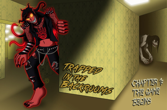
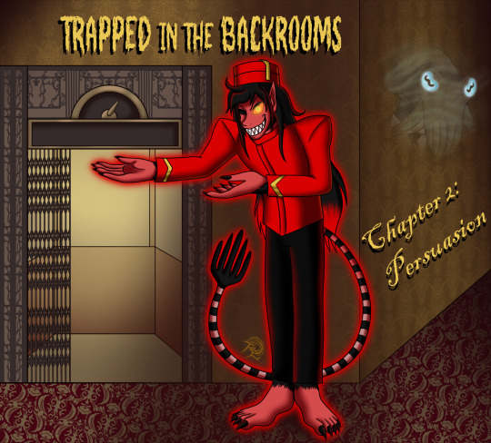
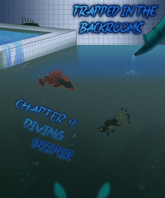
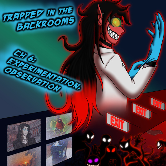
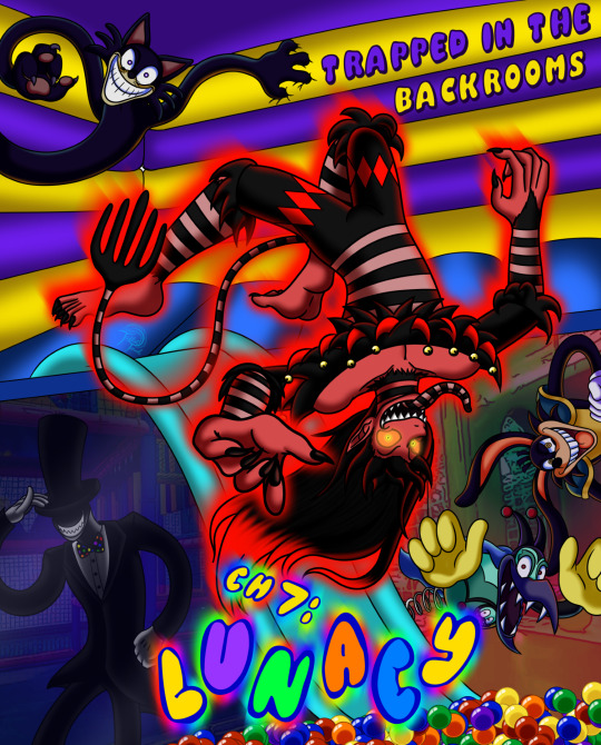
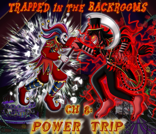
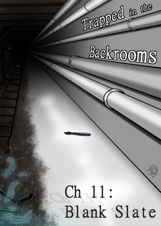
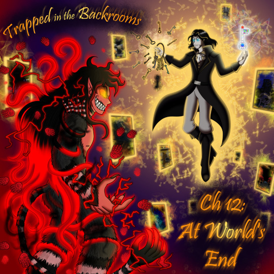
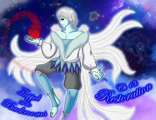
Text


Decided to post my Backrooms chapter illustrations separately. The links to all the (SFW) chapters can be found here:
I really wanted to push myself not just as a writer, but also as a digital artist for this story.
You can read some rambles about my art process for each illustration below the cut.
Ch 1: For this chapter cover, I wanted to do my best to replicate the eerie, sickly vibe of Level Zero. And that resulted me in really playing around with the lighting and shadows in a way that I hadn't before. I also wanted to give it a bit of wonky perspective and feel a bit like an illusion-house.
Ch 2: Lookit this cheeky fucker. Totally isn't a Tower of Terror employee luring you into a false sense of security. 😁 My initial idea for this illustration was to make it look as if the Manager's cuttlefish head was really morphing & bowing out from within the wallpaper. I tried a couple drafts where I attempted to line up his tentacles and facial patterns with the wallpaper patterns. And idk, it just didn't end up looking as cool as it did in my head. (Also hallelujiah for Clip pattern brushes, they helped me make the trim around the elevator.)
Ch 3: Fun fact: This chapter was originally going to be the second half of my hotel chapter. But I'm glad it became its own thing, cause otherwise it would've robbed me of the chance to draw Rags acting like a supervillain in a construction helmet and flannel 👍
also Clip Studio Assets are a godsend, they prevent me from having to draw out an entire freakin warehouse floorplan. I did color it all myself though.
Ch 4: I remember this drawing taking me longer than I would've liked.Then again I've always struggled to draw somewhat realistic-looking water. The shadow off-shooting below the smaller cube pool into the deeper water was actually a complete accident.
And in case anyone was wanting to see a close-up of Lionfish Rags:
And again, Spike and Drake are temporary names for the sake of this AU setting until I think of actual names (for if and when I ever get around to making a Mer-Nautica AU like I've been wanting to). The silhouettes show how big they were when I first saw them in my dreams:

Ch 5: I had visuals in mind for a group of Wanderers/ Survivors since before I wrote this chapter, and grew even more attached to them as I wrote them. I was originally going to just have them depicted here, but I also couldn't get the stupid image of Rags and his megaphone out of my head and decided it needed to be shared 👌
Ch 6: When I tell yall that it was a struggle to get through drawing this. And not because of genuine art struggles; No, because of the pure Lee Panik that gripped my soul when having to zoom in close on Rags' sadistic unhinged Ler face hhhhhhfdhdfjgkfghl-
This was one of the chapters I was most looking forward to writing. It's still one of my favs in terms of pure unbridled ruthless gang-tickling, the culmination of my pred/prey/chasing fantasies revolving around laughter-hungry monsters, along with some good ol Mad Scientist roleplay.
...Oh and the first official introduction of the final antagonist, there's that too 😛
Ch 7: Yall have no idea the absolute childlike glee I felt when discovering that there's a freaking Bouncehouse/McDonalds Playplace level of the Backrooms. But holy hell, drawing the Toon Monsters was more of a challenge than I thought. There's a surprising amount of finesse in depicting that wacky, slightly-unnerving/uncanny toony charm. (Ballpit brush is best brush, change mymind)
Ch 8: Since this chapter was more or less meant to be a sort of mid-series Climax, a hint of what the battle with the Keymaster would be like, I really wanted to push myself with making this chapter cover truly stand out. It was fun to come up with a full-body design for the Court Jester (based on his Wiki interpretation of course), and it was fun to experiment with the ideas I had in mind for his magic visuals.
Once again, Clip Studio assets are a lifesaver, you can catch me actually attempting to draw a rollercoaster or carousel when I'm six feet under 👌
Ch 9: I was both excited about, and dreading, the chance to play around with various different light colors & sources. I wasn't sure how I was going to make neon blues, purples and magentas work in contrast to Rags' color palette, but I'm very happy with what I came up with.
The Dark Sovereign was also a chance for me to play around with chiaroscuro, an art technique that I've always admired (and actually really liked to do with chalk & pastel back in college). As much as I'm a slut for bright colors, I love stark contrasting black & white.
Ch 10: I went through about three iterations of sketches for this chapter cover. I felt like I just couldn't figure out how to angle the perspective of the treeline in comparison to the Giant. I'm still not even sure if I thoroughly pulled off the proper perspective of the greenhouse in the far distance. But once I added all the pretty, spooky fog effects, I became much happier with it.
Unfortunately I do not have a standalone drawing of Naga!Rags. It will definitely happen one of these days.
Ch 11: For this chapter, I wanted to draw a very cramped, stark, foreboding stretch of environment: Basically, a quintessential scene that one would see in the Backrooms if they were wandering through them alone. This is meant to be a much more down-to-earth chapter than the rest, with an air of melancholy and uncertainty. Turns out it actually lined up quite well with some of my own mental and emotional struggles that I was going through at the time.
Ch 12: For the final hurrah, I really wanted to push myself as a digital artist for this piece. (Though that doesn't mean I was about to draw all those goddamn keys from scratch, lmaoo you can thank Clip Assets for that key ring.) I wanted to try and find a way to make the Keymaster the more imposing figure in the piece, despite the fact that Rags is fully powered-up and closest to the viewer. I'm not sure if I entirely succeeded, since my end solution for making him stand out more was "MOAR GLOWY KEYS!!!"
But it was still fun, and very rewarding to get it completed.
Ch 13: I was very happy to finally get the chance to fully render Kenni for this fic. As much as shading his tendrils still drives me up the wall, it felt nice drawing the good soff boi. And I was happy to give an idea of how his Dream realm looks, with all its pastel clouds and close proximity to the Astral plane.
#backrooms#backrooms fanart#tickling#tickle fic#oc#original character#original characters#monster#monster boy#tickle monster#artoftt
14 notes
·
View notes
Text
some artists have a really distinct and appealing consistent style they bust out every time they gotta do comms or art for other people in general, like they use the same palettes and lineart and shading styles and it all looks super unfied, and im always low key jealous of those types ._. cause its nice to have this signature look that says "look, its me, and im making art for someone else and my fingerprints are all over it!" i kinda wanna develop a style like that sometimes, but also it kinds goes against my personal ideology. i dont really like having a hyper-unified body of work, i dont really want every drawing i make to look the same. i think having some stylistic dexterity is important to me, thats why i try breaking up my furries with humans and my cel shades stuff with paintings and i try to vary up my color palettes in illustrations. or idk maybe im failing and all my stuff looks samey anyways, i cant really judge my own work lol. idk. trying to do one look over and over again just makes me feel like im trying to shapeshift myself into other artists who do that kinda look and its not fun or interesting for me, and it makes me feel like... hm... theres art i wanna make, but im forcing myself down a different road in pursuit of consistency over exploration and self enjoyment. still it would be very fun to have that "signature" look... just so i can have a pretty standard aesthetic to advertise my art fights and comms as looking like. maybe ill find it someday
34 notes
·
View notes