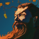
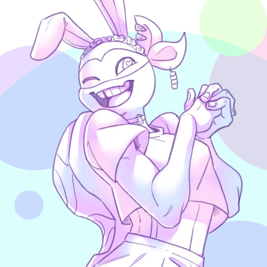
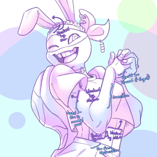
#i don't usually use that many colours and some of them are very saturated and i couldn't balance the values well???
Explore tagged Tumblr posts
Visit Tumblr Blog
Explore Tumblr blogs with no restrictions, modern design and the best experience.
Last Seen Tumblr Blogs


Fun Fact
Tumblr Inc. has $15.1M in annual revenue.
Text

Finally done with this piece, wohoo! :D It took me so long that I don't even know what to say about it anymore but I'm glad I persevered!
#mydrawings#mycharacters#harpy#i posted a WIP in MAY and finished it in December oTL#took multiple pauses. tried so many versions#mostly the colours gave me so. much. trouble#i don't usually use that many colours and some of them are very saturated and i couldn't balance the values well???#so this does not look like how i initally envisioned it but you know what it looks good
20 notes
·
View notes
Text
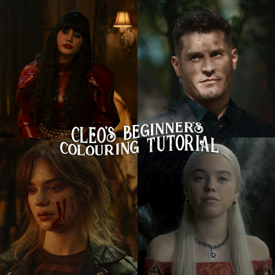
here is the colouring tutorial i promised to go with my beginner's gifmaking tutorial.
to save image space, i've written up a simple explanation of how each adjustment layer works here, so i'm just going to over my colouring for these 4 different gifs.
as always, very image heavy underneath
there are many ways to get the same results and i'll use various methods usually just based on what i'm feeling at the moment. some of it is a little convoluted, but hopefully this will give you a rounded idea of how it all works so you feel more comfortable playing around with your own colouring
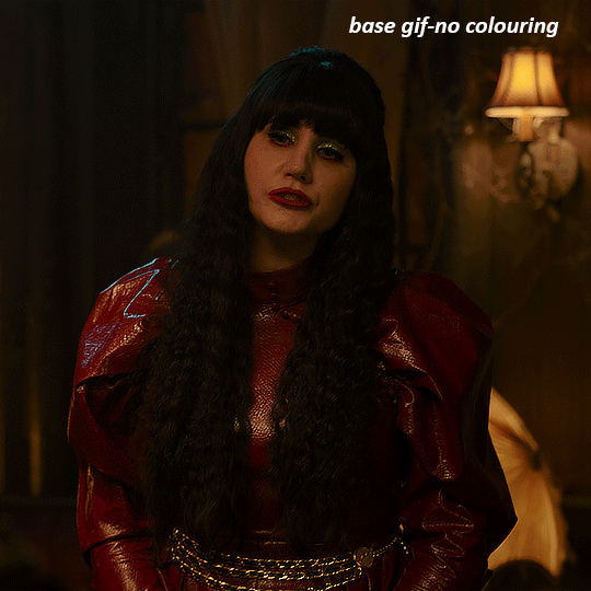
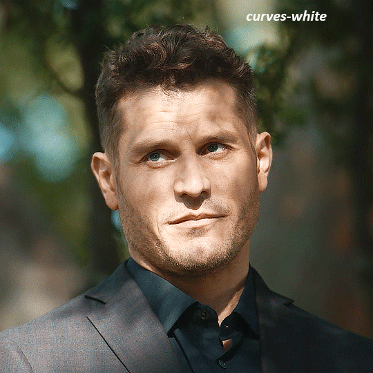
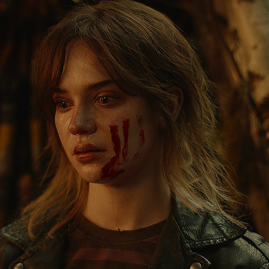
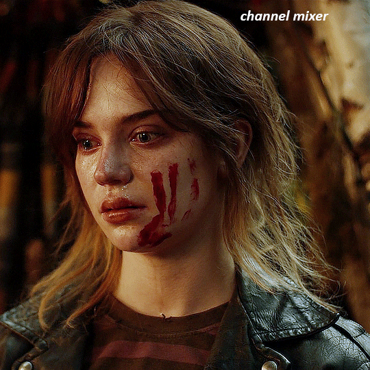
NADJA
this is the base gif with zero colouring adjustments, just resized and sharpened.
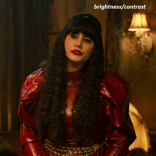
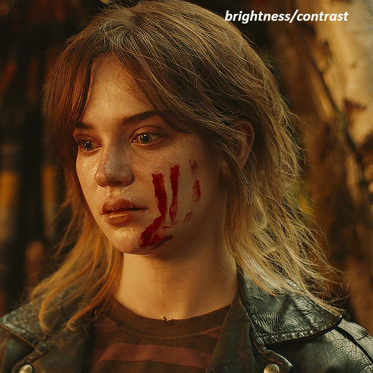
unless the base gif is already very bright, which doesn't often happen because directors nowadays are allergic to light, the first layer i add is always a brightness/contrast layer. i don't adjust any of the sliders, i just change the blending mode to "screen", and then adjust the opacity if needed. this gif was pretty dark, so i left it at 100%,
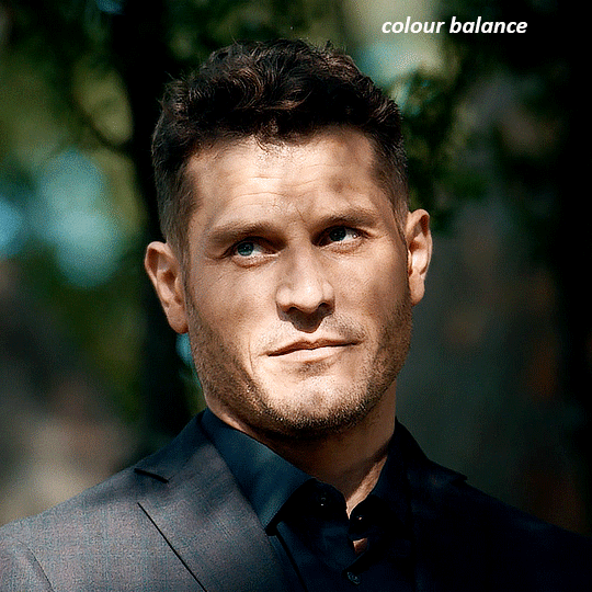
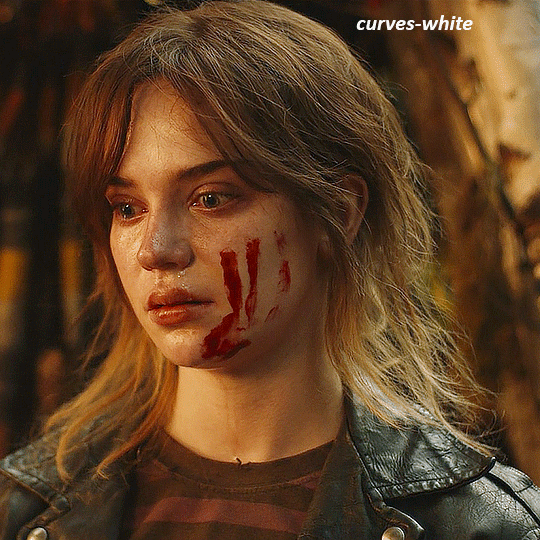
my next layers are always curves to even out the white and blacks. i use two curves layers, one for white and one for black. i used the white drop-picker and selected just below the lightshade on the lamp behind her, and for the black drop-picker i selected her hair near her neck which gives us this
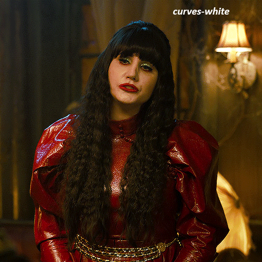
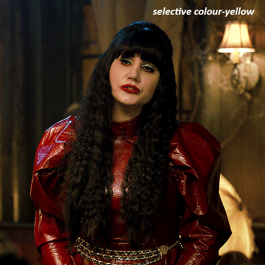
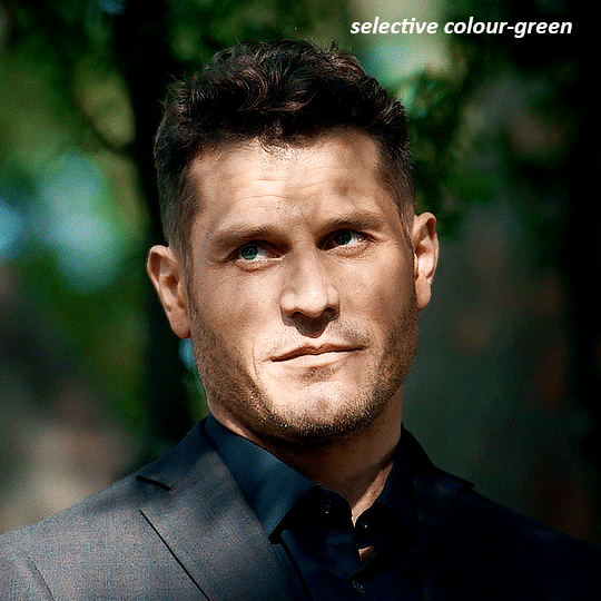
it's already looking much better, it's not as green tinted, but i want to make the red of her dress pop a bit more. in order to do that without making her face too red, i'm gonna remove some of the yellow. so next i'm gonna add a selective colour layer, and under the yellow channel i moved the yellow slider to -5 and the black slider to -52. now
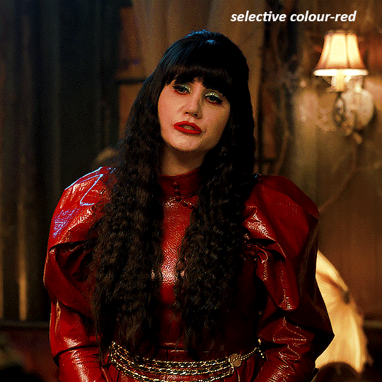
now that the yellow is reduced, i add another selective layer, and under the red i move the cyan slider to -66 and the black slider to +29. now the red of her dress pops and her face is still a realistic tone. when i first made the gif, i added the red selective layer first, then added another selective layer under it and adjusted the yellows to offset it. you can always shift layers around or add a new layer underneath as you go.
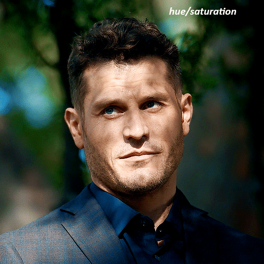
voila
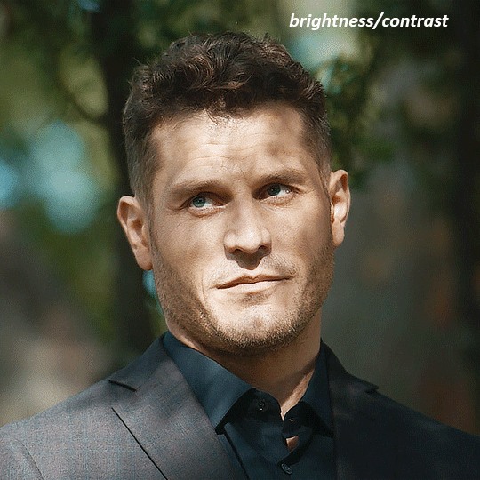
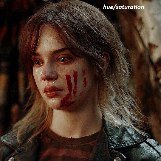
TOMMY
here is our base gif

this scene is better lit than the nadja one, but i prefer bright and colourful gifs, so i'm gonna once again add a brightness/contrast level and keep it at 100%
and then the curves layers to even it all out. since there isn't a spot that is immediately noticeable as white, you can hold the alt button with the white dropper selected and it will highlight all the white/very near white pixels. you can also zoom real close in to select specific pixels. i selected a from the white area around his chin/mouth. the same process works for finding a black spot with the black dropper, and for that i selected from a dark spot in his hair
the curves layers evened it out but also made the gif a bit more red and warm toned, and since i've decided i want the end result to be more blue/green, so i'm gonna add a colour balance layer. in the shadows channel i moved the cyan/red slider to -16, and the yellow/blue slider to +11
now the gif already looks great, it's bright, skin tone is accurate, he's not washed out, but like i said i like my gifs colourful, so i'm gonna add two more selective colour layers. in the first i'm gonna adjust the greens, bringing the magenta slider to -87, and the black slider to +81. in the second layer i'm gonna adjust both the blues and cyans, because when you see blue in a gif it's rarely ever straight blue or straight cyan, so always adjust both. (you could adjust the blue and green in the same layer, but i prefer to do them separately in case i need to move the layers around)
now finally i'm gonna add a hue/saturation layer because i think the blue of his suit is too blue when the sky behind him is more cyan. (also, since you only have 256 different colours to work with, you don't want too many different colours otherwise it will distort the colouring.) in the blue channel i move the hue slider to -12 to make the blue a bit more cyan, and i also move the saturation to +38 to make it pop more
and voila
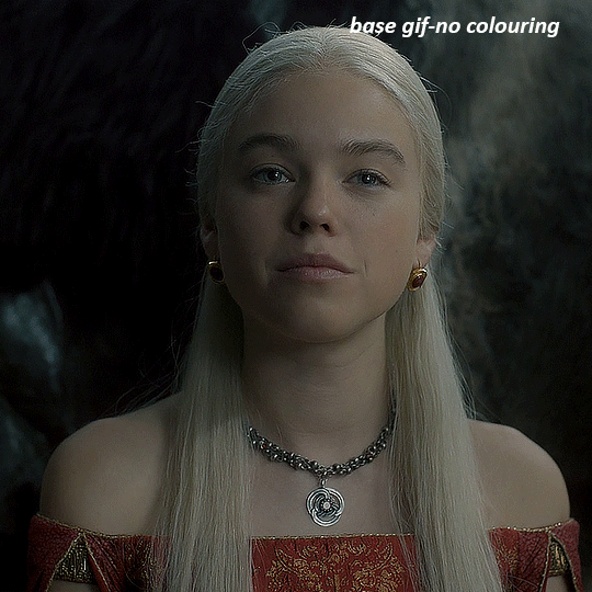
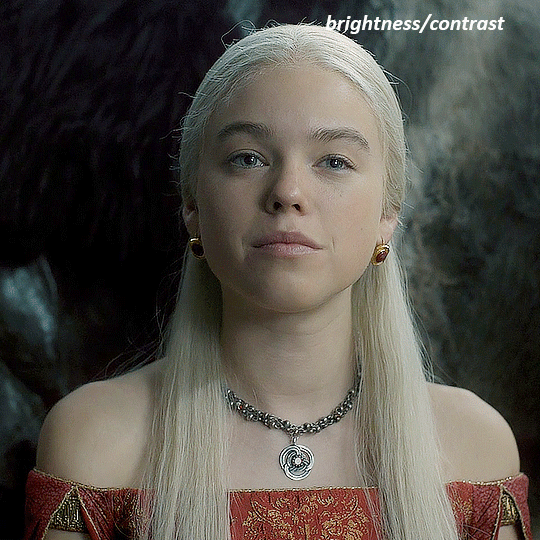
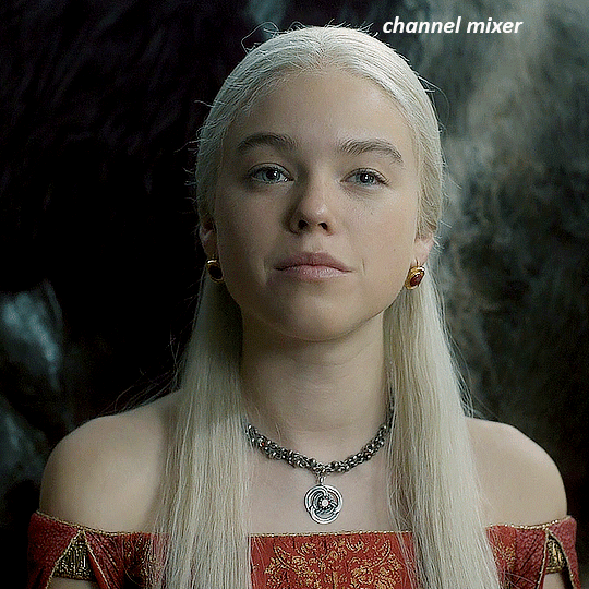
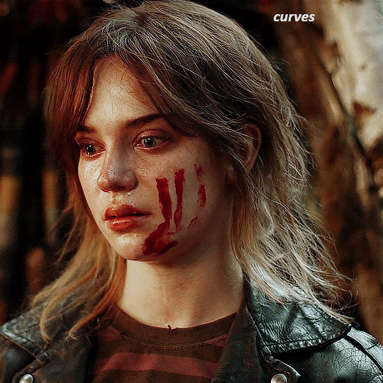
RHAENYRA
here is the base gif (this one is going to get very convoluted and imo best exemplifies what colouring gifs is like most of the time)
as always, a brightening layer set to screen
now the curves layers. for the white i clicked on her hair at the top of her head, and for the black i i clicked in the shadows to the left of her.
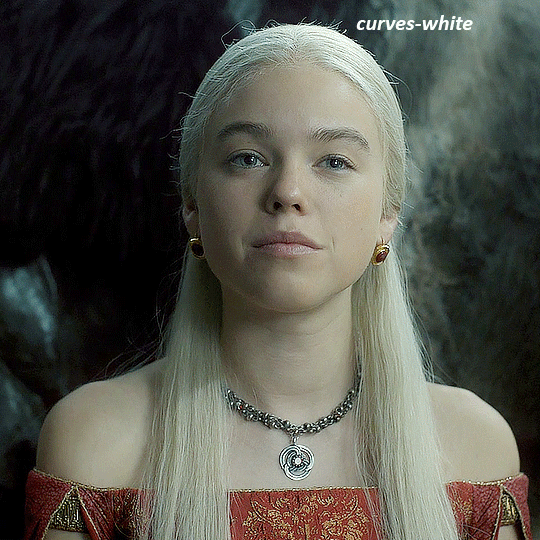
but as you can see, while it added contrast, it also made the gif more green tinted than it was. you could click around more, or manually adjust the red, green, and blue lines on the curves until it looks better but i decided to add a channel mixer layer instead. in the green channel i set the greens to -95, and in the blue channel i set the blue to -97
next i wanted to add a little contrast, but i find that using the contrast in brightness/contrast can saturate it too much, so instead i added a levels layer. first i adjusted the bottom bar, moving the right slider to 230 which reduces the overall brightness of the gif, so when i adjust the top bar it doesn't brighten the gif too much. on the top bar, i moved the right slider to 212, and the left slider to 9
now, i'd like it to be not exactly warm toned, but less cool, and while i could use colour balance or a photo filter, i'm instead going to add a gradient map, using the default gradient pink 08, and setting it to blend mode soft light at 50% opacity

next i just want to increase the blacks a little, so i'm gonna add a selective colour layer and under black i'm gonna set the black slider to +10
it's still not as warm as i'd like, so i'm gonna add a colour balance layer, in the midtones setting the cyan/red to +10 and the yellow/blue to -5
we're almost done, but i want to make her dress pop a bit more, so first i'm gonna add another selective colour to bring the yellows down a bit, setting the black slider to -15

and finally one more selective colour layer, in the reds, setting the cyan slider to -50, the yellow slider to +10, and the black slider to +15
voila
NATALIE
here's the base gif
as always the brightness/contrast layer set the screen
now the curves layer. for the white, i zoomed in and selected a pixel on her cheek under her right eye. for the black i the dark spot just above her head
now she's very yellow, so i added a channel mixer layer. in the red channel i set the reds to +88. in the blue channel i set the reds to +10
she's still a little too yellow for my liking, so i'm gonna add a hue/saturation layer, and under the yellows i'm gonna adjust the saturation to -60
finally, i want her to be a it brighter, so i'm gonna add another curves layer, but instead of using the drop, i'm going to manually adjust it. the two points along the line are where i selected it and then i dragged until it looked how i wanted. i start with the upper dot, which made it brighter and moved the line into an arch, and then selected at the lower end of the line and dragged in back closer to centre to add some darkness and contrast
voila
and that's how i do my colouring. it's generally all trial and error, using a layer to fix one thing and then needing another layer to fix something the previous layer did.
play around, have fun, see what works for you and what doesn't. it will take a while for you to develop your own method and style, and even then you'll come across scenes that make you question if you have any sills at all. you do, directors just hate us
have fun and feel free to ask any questions
#tutorial#gif tutorial#colouring tutorial#photoshop tutorial#gifmakerresource#completeresources#*tutorials
164 notes
·
View notes
Note
i love your magical girl designs for the seablings, could we get some more info on the choices of colour and stuff? i'm super into character design and love seeing peoples thought on stuff like that ^^
Sure!
A big influence was precure, obviously, as a fan. Many palettes aren't too far off from various precure if you look for them. I am generaly a bit unhappy with the mishmash of 20 different colours used in modern cures, but they did help me be a bit bolder with choices as I'll talk about later. I also tossed out their "avoid green as a main colour" rule like everyone else. I have no idea what sort of wack marketting advice convinced every girls show that girls don't like green and we probably will never know. Irrelevant...
My first step was assigning each mode its own colour. Since they're a duo I was tempted to do either contrasting or complimentary colours, but that went out the window quick. E1 seablings already had very distinctly assigned colours of green and purple, and they were the easiest that I already had ideas for, so I tossed that and just tried to not have them overlap. I still ended up with green, cyan, AND blue as main colours but I adjusted it with the secondary colours.
For the e1 seablings outfits it was primarily colour picked from my actual designs for the codfather and ocean queen, but tweaked to be more saturated, so their main colour theme is green (pink secondary) and purple (blue secondary). It's also when I decided to give them a highlight colour in their hair, as is popular with modern magical girls, since my codfather design already has this. (Also I stole the veil from cure Spicy. Her little veil/napkin hat I immediately fell in love with and thought it would work as a lily pad like hat on Jimmy when designing him, and it fit well with the slight wedding theme I gave them.)
Lizzie's colours are pretty much just various shades of purple and and blue based on her axolotl ocean goddess design. Jimmy's colours are supposed to be like a water lily, of course, and I made the greens less sickly than his codfather design which are meant to be more swampy and go with the browns of the cod. Both the seablings' secondary coloura are references to each other in this btw, as is the case in my codfather design to designate him as the ocean queen's family. Jimmy isn't inherently associated with blue in this au but I did manage to slip it into all three designs since outside of it he is.
The life series designs were veeery easy for Jimmy and much more difficult for Lizzie, but the actual colour choices were both easy once I worked out a design. Lizzie never had an actual skin for her faerie fort self, and her base skin is purple just like the ocean queen, which is also the case for her clothes in e2, so this is where I started taking liberties with her and assigned her other things and desided to throw out the idea of the colour palettes being in neat little boxes. This is the closest to a rainbow cure they get, but I made Lizzie's official main colour cyan and secondary green. Jimmy by contrast is the most monochromatic he gets here, with a main colour of blue and secondary yellow.
Butterfly Lizzie is actually the only time I had multiple palette ideas that I had to make a hard choice between because I liked them all so much, usually I was struggling to find shades I enjoyed being paired since I don't usually work with such saturated palettes. I guess it's fitting, since cyan/teal is minecraft's bets colour that's easy to slap on any build to make it look elegant. Jimmy's palette itself was pretty easy, took a lot of notes from cure sky for him in colour AND design, but it was a matter of where to put what colours. I think I changed the colour of his shorts more times than any other article.
E2 designs were the first I actually designed and thenthe last ones I made palettes for. Their main colours were red and orange... which are quite difficult to work with in such high saturation, and especially with trying to avoid overlaping. I ended up using very unconventional palettes way out of my comfort zone. Brown in general is very unconventional for a magical girl, but there's been a few curea like cure chocolat and cure wing that utilized it that gave the inspiration. It was an easy decision to make her hair and ears based on her calico design after that, though I had trouble deciding exactly where to incorperate the brown into her actual outfit. The purple just came very natural after that. I often use purple instead of actual brown for dark browns so it made sense to me, at least. It was a nice pop against the orange and also contrast the yellow.
E2 Jimmy is the one I am least satisfied with. It was the only one that was not based off his skin the same way Lizzie's weren't. I still look at it and think if theres anything else I could try. By far the most difficult. Red's a very bold colour so it's hard to match without just using different tones of red, and the wrong shade would make the whole rhing look off. I also already knew I wanted yellow/orange in the design because of the sherrif star, but I didn't want it to be his life design with a different primary colour. I decided to try incorperating his blue, and I like it in concept but I still am not sure about the specific shade. After that I thought to add green to make it that classic childish primaries colour, make the design like a space cowboy almost. The star on his hat, the hat in general actually, ended up being the biggest help to decide.
At one point I experimented with a full on rainbow theme but it did not work out. I think it could have with a slightly different design and somekne better at picking colours, but I scrapped it. I also decided to use a lot of darker shades since red is already so bold and bright. Still unhappy with the pants, but white was just a bit too bright and the secondaries were too bold to use. This was the only time I actually messed with the design itself to try and help make colours work, but it didn't work out. I'd say overall I'm happy enough with it but I could have done a lot better.
Also I decided to adjust Lizzie's pink hair slightly with each to match the palettes. I was trying to avoid it, but it's so pink and there's so much it really affected the rest of her design a lot, so I made her e2 hair a more salmon pink and her life design a more bubblegum pink.
As for their wands I just went with an unobtrusive white and pastel rainbow colour scheme. The white matches their outfits and the rainbow doesn't clash too hard with anything. Joel I obbiously just made green and Norman was a bit more awkward but I went with a grey to match the real Norman since a full blue palette made him look like a generic cat faerie and not specifically Norman.
44 notes
·
View notes
Note
What is your thought process when it comes to colour selection? Your palettes are mesmerizing!
First of all, thank you!! Usually I don't have any palette decided bafore shading, unless references to bg are very specific and there isn't much room for improvising In situations where I don't have that many restrictions I ususlly try to go from character or some kind of main thing which should be on the drawing, and to showcase it I try to use colours which would be opposite of it or will contrast nicely (basically just colour theory) Other than that, I really like blue / pink so I have a tendency to slap some kind of hue of these colours whenever I can and I really don't like brownish / greyish hues so I avoid them a lot (and sometimes I honestly feel that my drawings a little too bright / saturated because of that). I have a bad habit of rethinking the whole palette for a drawing in the midst of shading / rendering, making a lot of dumb mistakes along the way, so at this point I don't really plan ahead much and hope it will look ok in the end
50 notes
·
View notes
Note
hello just a lil question! how do you design your flags?
like how do you find colors that fit together as well as match the overall theme of the term?
Oh god I'm so sorry this answer might suck, just warning you. Long post ahead (also sorry this took so long I have spent a lot of time thinking about the best way to word it)
I am an artist (shameless plug), and a massive linguistics nerd, most of my flags are based around a certain colour theme that has pre existing connotations and then I work with this main colour to find a colour palette. I usually work within the same colour family or two colours where one is primary and one is secondary. I also tend to just make them based on vibes. But basically I know a lot about colour theory, and I tend to avoid certain colours (saturated reds and greens) because I am colour blind.
Okay so have some examples:
Here are the folkloretive and venlaet flags, we are going to dissect each of them.


Folkloretive : I did a lot of research into what colours have meanings in different cultures and their historic beliefs, because that's what folklore tends to means. I came out of that research knowing that red, blue and green were very commonly used. I chose red and green because I don't like my flags to have to many colour families and they contrast which creates visual interest. I also knew I was going to have the neutral browns in order to have visual cohesion. With the size of the stripes, I knew I wanted to show a lot of different shades of each colour to show the difference between the symbolism in each culture. Then it was just making the flag equally sized writing the alt text.
Venlaet : I knew I wanted it to have a matching version but for a negative outlook on sex so I knew I needed to make it very bright and positive. I used these dark pinks in various saturations to represent sexual acts and the overall positive vibe of the flag. I then included a pale gold and a white to show positivity and peace and to bring in a neutral colour to the palette.
Hacks I use:
If I'm really struggling for the flag to look cohesive I will take a desaturated version of one of the colours and colour the entire flag with it and then bring the opacity down.
If I'm struggling to come up with any ideas, I'll look at other people's flags for some ideas, and then I credit them if I've taken inspiration from their specific flag.
I use the mirror tool (horizontal) and the ruler tool to make my flags have a composition that is equal and makes sense.
I think that's it but if you have any more questions just ask them!
#endos dni#did community#flag making#talking to anons#taking to anon#not a term#important#flag coining#flag design#vexillology#colour theory
3 notes
·
View notes
Note
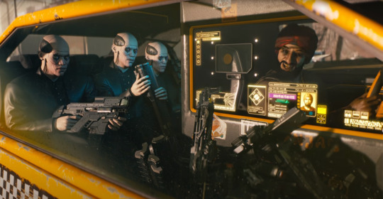
Omg your V is so pretty! Also wow you are good at using photo mode, I've had this game for like...4 years (I'm bad at time math) and still haven't figured out how to make it look nice lol. Also WHERE DID YOU GET THAT TOP it's so my vibe but I struggle finding pretty tops that go with pants🥲 (can you tell I'm bad at games yet lol)
Thank you! I'm sure yours is really pretty, I would love to see them!
Honestly about the pictures, I was the same. Playing infinity nikki gave me some experience and luckily its photography system is very similar to cyberpunk's!
I got that top from this store highlighted in blue on the map, in Wellsprings.


For taking pictures, my advice is to aim for dramatic angles. Play around with contrast, exposure, highlights and the ingame filters. I think one of them is a grey filter so you can use it as a saturation slide!
For example:
Mid/high contrast + low exposure + low highlights + mid saturation = realistic pictures.
Colours aren't vivid irl, neither is lighting always smooth. In fact, the world is usually dim and grey.


High contrast + mid/high exposure + high highlights + mid/high saturation = Sleek pictures.
They look like they belong in ads, clean, perfect lighting, artifical and too smooth.


Low contrast + low exposure + high highlights + low saturation + intense filter = dream-like pictures
They can appear dreamy and hazy with cool tones, and vintage with warm tones.


Lastly, focal length aka "field of view" ingame. It can take a picture from this

to this

I usually move back with the camera and then zoom in with the FOV at around 15.
When I'm up close and want to take personal pictures of small details, I zoom in with the FOV.

But when I'm up close and want to include many elements in the picture, I zoom out with the FOV. Kinda creates a peephole like view.

You can zoom out while far away with the camera as well. It creates a reverse peephole situation

I used vintage effect here to focus the viewer attention on V and Johnny.
As for the composition, don't aim for symmetry. Instead, try to create a flow, shapes at the corners, a silhouette almost.

And if you want the picture to look authentic and down to earth, purposely misalign important elements to fabricate a flaw. This way, it looks accidently pretty in a "oh my friend took this on go lol" way

And don't be afraid to use stickers and be silly! it adds a lot of charm to the picture.

6 notes
·
View notes
Text
how i make gifs using filmora x (for anon ❤️)
read under the cut!
hey!! thanks for reading this! just a few notes before i explain about my editing process:
filmora x works very differently from photoshop. it's a video-editing software anyways, so treat it like that!
always use high-quality sources!! most of my issues with grainy gifs come from using low-quality sources. so, i always ensure to use sources at 1080p, at least!
if i'm creating multiple gifs from one match, i usually download the entire match (which is a hugeeee file 😵💫 but it's so worth it!!). but if it's only a scene or two, i screen record them! i have an astro supersport subscription and a beinsports account, so i don't have an issue screen recording clips, as their content are always in high-quality! but if you're using other sources or streams, then do ensure the quality is good!!
if the only available source is of low-quality, my trick is to make smaller gifs! for smaller gifs, i usually keep a 1:1 or 4:3 size ratio, and post them side-by-side in a single post - usually two in a row!
general colouring stuff applies here as well, you can check out the photoshop guide i've linked in the ask!
remember, there isn't one "correct" way to gif, you can gif however you like!
and now without further ado:-
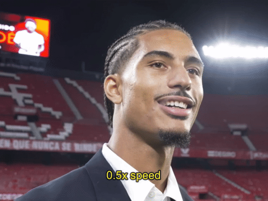
step one: adjust video settings, speed and length after importing the clip into filmora, setting the aspect ratio, resolution and frame rate according to preference, the first thing i'd do is to adjust the speed of the clip. i like to slow them down, so i usually go for a 0.5x speed. you can always adjust the speed to your preference!
i like to keep my gifs within a 3 to 5-second length, depending on the content, so i'll trim the clip or adjust the speed as desired. if the clip is shaky, i usually add stabilization at about 10%, but you can adjust as you like! here's an example of a clip before and after speed reduction:

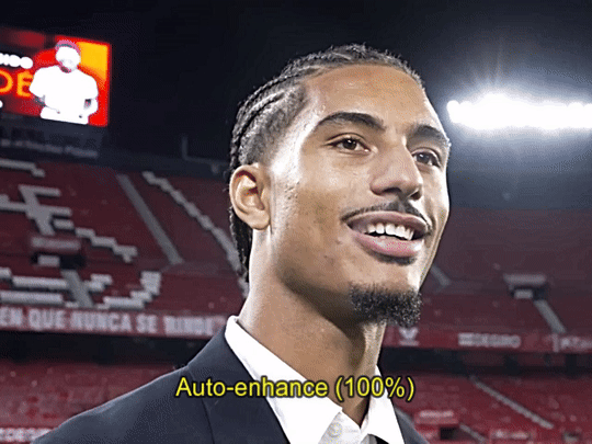
step two: auto-enhance once the clip is at your preferred length, size and speed, now it's time to make it look pretty! in filmora, there's an 'auto-enhance' feature, so i usually begin with that, setting it somewhere between 50% to 100%. here's an example of how it looks like before and after auto-enhancing at 100%:
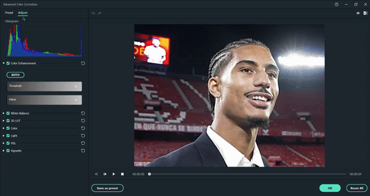
step three: colour correction head over to 'advanced colour correction', where you can use either the given presets, or manually adjust to your liking. i always manually adjust them!! you can also start off with a preset and make additional manual adjustments as I did below! what i did here was to darken it, then adjust the colour enhancement, white balance (hue and tint), colour (exposure, brightness, contrast, vibrance, saturation), lighting (highlight, shadow, black, white), and hsl (for this example, i adjusted only the red).
you can also save your adjustments as custom presets so that you can use them again in the future!
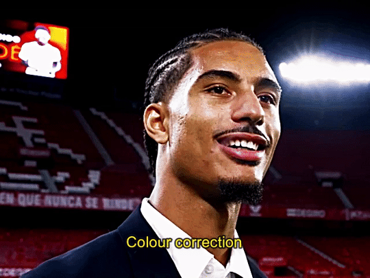
here's a quick look at how i do the colouring! from the before and after colour correction examples, you can see that this is the important part of the whole process!!
step four: sharpen once i'm satisfied with my colouring, i sharpen them by adding the 'luma sharp' effect (usually at 50% or 70% alpha and 50% intensity)
here's how it looks like before and after sharpening:
step five: final touches and exporting before i export, i make some final tweaks to the brightness, contrast and saturation, etc., ... and voila!! there also many other effects available for you to add (grainy effect, blur effect, etc.) so feel free to play around!

once you're satisfied with your result, it's time to export! now, video-editing softwares HATE gifs. you can always just export as gif from filmora directly, but i don't really like the way it turns out 😭 so, i export them as video (.mp4) and use external gifmakers (like ezgif!) to convert them from video to gif!
aaaand that's all!! here's a comparison of the original clip vs the end result!
final note: remember to size your gifs correctly for tumblr (540px for full width, and 268px for half), and keep each gif within the size limit of 10mb!! if you find that your gifs exceed the size limit, try reducing the number of frames or removing duplicate frames, increasing the contrast, or you may also crop the height if necessary.
if you have any questions about making gifs using filmora, feel free to reach out! thank you for reading, mwah mwah!! 💞
10 notes
·
View notes
Note
I love the way you draw fire though! and your colouring is beautiful, I was wondering if there are any tips you could give for colouring?
OMG THANK YOU SO SO MUCH!!! ;A; i'm still figuring out how drawing fire works tho and the feedback i got was super helpfull and got me a step closer to it i think!! during my last 2 drawings i've always had some super helpful feedback about the fire so i feel really blessed about that~ as for the colouring tips, well these are some of the tricks and methods i use;
1- instead of using a darker colour for the shading i just use a more saturated colour, kinda like this;

the added saturation makes the colour appear darker when in reality it's not! think about it like colouring traditionally with colour pencils. when you use a colour pencil the places where you added a lot of pressure look much darker than the places where you added only very little pressure - despite it being one and the same colour! done with the same pencil! the reason it appears darker is because it simply just has more pigment. that's what we're doing here too, we're making the color appear darker by adding more pigment.
BUT
if we just simply stick with the exact same hue then the colouring would look bright and vivid - but still be horribly boring. so i play around with the hue too!!
the circle determines the hue you're selecting and the colors you see there are all at 0% darkness but 100% saturation despite them, technically, being equally light/dark according to the software they still look differently dark rotate the hue in the direction of blue/purple for the shadows and in the direction for yellow to select the colours for the highlights
blue, purple and red are the best colours to shade white with, for black however it'd stick to blue or else it stops looking like black and starts looking like a very dark colour instead
2- give each colour it's own layer.
that way, if you notice halfway through that the colours you've chosen don't look so good together you can still make adjustements and edit every single colour without losing any of the progress you've done with the shading (note: do all of the shading on the same!!! layer as the base colour tho!!!)
many artists solve this issue by using predetermined colour palettes, that way they're guaranteed that the colours look good toghether but colour palettes save absolutely no time at all (adjusting the colours of a layer takes only a few seconds) and are extremely limiting when colouring so i just don't see any benefit to them
3- USE THE RIGHT BRUSH!!!! your choice of brushes can honestly make or break the colouring. the impact they have should not be underestimated, it's huge. which brush is best for you depends on your artstyle but personally i think brushes that simulate either watercolours or copic markers are the best ones.
if you use a software where it's possible to use custom brushes made by fellow artists then PLEASE do that. most art software comes with awful default brushes, and even for those that come with decent default brushes (such as photoshop) most free custom brushes made by fellow artists are still so much better than the default brushes that they're worlds apart Clip Studio Paint (the software i use) has an assets "store" where you can download brushes made by fellow users. for other art software i'd recommend checking out deviantart for user made custom brushes if it's a software that existed before the downfall of deviantart. it's a huge goldmine filled with insanely amazing brushes for many different types of software. personally i use a brush called froggy pencil for the colouring 4- add overlay layers to your art after finishing with the colouring. they can make a drawing really come to live and it's insane just HOW much they add to a drawing. usually i always either use a gradient, a solid colour or a soft airbrushed colour on the overlays and let them do their magic.
to show just how much of a difference overlay layers make; here's a comparision between my most recent drawing - and a version of the same drawing where i removed all overlay layers. see the difference?

...soo uhhh ... that's all the tips and tricks i have up my sleeve lol hope it helped a bit?
31 notes
·
View notes
Text
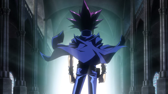
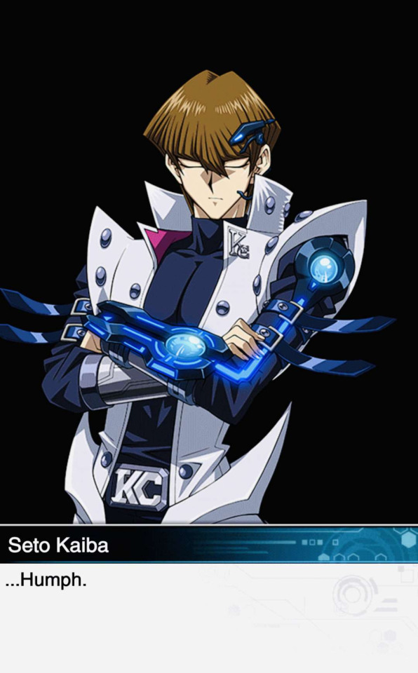
【YGO DM】 Kaiba Seto 🍄🐉💙


Kaiba Seto 🍄🐉💙
My first time drawing the maniac gay man 🥰🌈🏳️🌈
Doodled this really quickly
I tried drawing Kaiba for the first time in my life 👍
My fave YGO DM chara~ Gay autistic meow meow mf man 💞
Kaiba is so Sen-core~
(No one is surprised)
I've been experimenting with drawing his eyes!
First two have influences from YGO's art style, 3rd is a mix of both my usual style and influenced from YGO's art style, and the last one is closer to how I usually draw.
Not gonna tag this cuz I plan on drawing the rest later
KaiYami (Kaiba/Yami) has been my fave YGO ship ever since I was a kid. I have such a huge soft spot for YGO DM…
I'm also into the YGO spin-off series, YGO GX and YGO 5Ds. I grew up with those three during my childhood.
Admittedly, YGO designs are really hard for me to draw cuz YGO designs are always so detailed and complex and sharp and angular and really geometric, too… And I'm not really used to drawing those kinds of designs. I'll be practicing more in the future!
I've seen many artists who draw YGO charas in their art style soften the shapes, so I'm still experimenting and trying to decide how I want to draw YGO charas.
I took some influences from the YGO art style and drew with sharper shapes and a sharper brush than I normally would, cuz it felt more fitting. I'm not as used to this brush yet.
I saw YGO EA KaiYami/AteKai artists represent them with the star and mushroom emojis cuz of their hair… I'm gonna cry LMFAOOO 😭😂
Starfish and mushroom? ⭐🍄
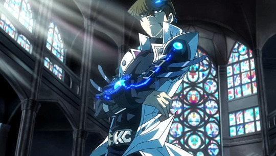
YGO: DSOD
(YGO DM & DSOD: Spoilers)
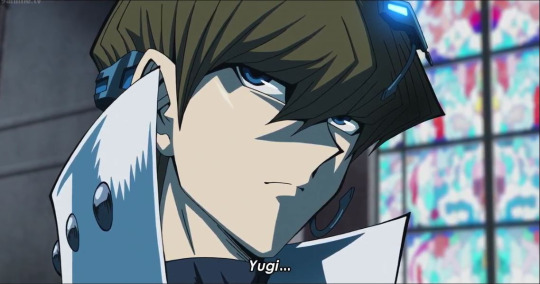
My friend Cinna has been reading YGO DM lately for the first time, and I got reminded of my obsession for these two. I really want to reread the YGO DM manga and rewatch YGO: DSOD for THEM…
YGO: DSOD (Yu-Gi-Oh! The Dark Side of Dimensions) is a movie that takes place after the end of the YGO DM manga (after Atem passes onto the afterlife).
Kaiba's inability to move on from the lack of closure, and his gay brooding, yearning, and obsession…
It was co-written by Kazuki Takahashi, the YGO mangaka, so this movie is canon. Bless his heart. I hope he rests in peace 🙏
2 hours of Kaiba's gay yearning, baby!!!
YGO: DSOD has really pretty colours…
(These are old screenshots so some of the ones I've saved are super saturated or in low res. I need to rewatch the movie to take new screenshots)


Me: Kaiba has issues but that makes the ship sexy. Next.
The mental illness is what makes him [Kaiba] interesting.
C: Yeah like Kaiba is just dysfunctional AKA average late 90s/2000s anime rival
Me: LITERALLY I swear like almost Rivals/Enemies to Lovers ship goes like this Kaiba is just. More obsessed than most This is on like Douman (FGO) levels tbh
C: Kaiba is a prime example of "So obsessed with someone they want to fight that it's gay"
C: Enzan (MMBN/EXE), Kaiba (YGO DM), Hibari (KHR), etc.
C: If you think about the rivals from that era, from 90s and 2000s animanga, they're all either unintentionally autistic vibed, or generally horribly dysfunctional socially.
C: Ren (SK) is pretty much the typical Rival Chara Type B (Aggressive and rash), as opposed to Rival Type A (Calm and collected), but like, genuinely well written and complex enough to work
Makes me sad Ren is still robbed of SO MUCH writing potential tho cuz of frigging SK's writing tho
Me: YEAH EXACTLY
LMAO
Me: Like the Rival Type A that is very cold, aloof, stoic, cool, calm and collected… Kaiba, Enzan, Hibari
C: DKFKSKDLSKDKSK I WAS SO RIGHT FOR THIS
Me: Hibari (KHR) is not explicitly a rival figure since he's a deuteragonist (protag's side ally) in KHR but he does conveniently slot into the "rival figure" role
Kaiba is rival type A, the very cold, aloof, stoic, cool, calm and collected type…
...


Source: (X)
Kaiba/Yami line in Duel Links (YGO mobile game) 🌈
I know Kaiba/Yami's ship name is Prideshipping in YGO's EN fandom, and it fits them so well because of their pride as Duelists, and coincidentally Gay Pride, but that ship name is so long, I don't want to have to type that everytime. KaiYami it is! Kaiba/Yami also has a good ring to it.
KaiYami/KaiAte and YamiKai/AteKai are what EA ship fans use for them.
I was, and am still insane about this ship, like there's SO much.
Kaiba is OBSESSED with Yami Yuugi (Atem)
THE DUEL LINKS LINES MAKE ME BLOW UP /POS
C: Homosexual. Why is he so gay.
They need to kiss so bad
C: Kaiba is a prime example of "So obsessed with someone they want to fight/defeat that it's gay"
Me: YEAH LMFAO
Not surprising but I find it wild how the dudebros try to insist that Kaiba is straight.
There's not a single heterosexual cell in this man's body. It's so funny.
YGO is so unintentionally gay. YGO is gayer than most shounen???
Cuz just in general, the shounen genre is infamous for unintentional homoeroticism. The shounen staple where an author/series is so homophobic and misogynistic/sexist that it actually cycles back around to being gay/homoerotic
KaiYami is a subtext based ship but the subtext with them is so good. YGO DM feeds us SO MUCH
...

Me: I should reread the YGO: DM manga and rewatch YGO: DSOD. This movie is so fucking pretty man. 2 hours of Kaiba's gay yearning!
Also I find it so funny how YGO: DSOD made Kaiba muscular. Like he was a twink in the OG YGO DM manga
S: WTF HE LOOKS SO PRETTY IN THE MOVIE
C: Two hours of gay fucking yearning Buffed up!
Me: YEA THE COLOURS ARE FRICKING GORGEOUS God I'm so glad the YGO: DSOD movie keeps YGO's sharp black lineart and saturated colours. It's honestly defining to the YGO art style
Cuz so many anime reboots nowadays have flat and bland ass colours unless they're super high end productions (ie. Fate anime productions, etc.)
C: Agghh yeah
...
S: “I hope the reboot of your favorite anime softens up the characters appearance with a new style and makes the colors look washed out“ is terrifying and it’s already happened
Me: My gay sons in their gorgeous glory thank god the colours in this movie are phenomenal
C: Why is Atem yellow though
Me: I think it's just cuz these edited screenshots have super high saturation/contrast 😭 Couldn't find clearer ones
...
S: The blue glow on his arm is making me blow up and act like I don’t know nobody
Me: OH yeah it's from DSOD Kaiba's Duel Disk that holds his deck
F: (CW: NSFW joke)
Kaiba has such a revenge/hate boner for Yami-- Wait no I mean a regular boner
Me: LMFAO. Both lmfao
F: FR THO
S: LOL
C: Canon
F: Btw I never watched that movie, now I GOTTAAAAA …..Oh man and now I wanna draw Yami Yuugi ;;
...
(YGO DM: Summary)
Me: Just gonna put this summary for my non-YGO mutuals and those who haven't seen YGO: DSOD so they can follow along with the rambles if they're curious
Also it's been a long time since I read YGO DM and watched YGO: DSOD so I'm mostly going off memory
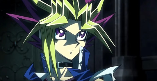
3000 years ago, Atem was sealed away in the Millenium Puzzle and lost his memories and name. Mutou Yuugi solved the Millenium Puzzle, causing the spirit of an ancient Pharaoh, Yami Yuugi (true name: Atem), to take over his body to protect Yuugi and his friends. Eventually, others learn of Atem's existence.
Kaiba is the arch-rival of Yami Yuugi (Atem) who is hate obsessed with him after losing to him because he wants to get revenge and defeat him, thinking of him as his nemesis and rival.
(YGO DSOD: Summary)
YGO: DSOD takes place after the end of the YGO DM manga where Yami Yuugi (Atem) passed onto the afterlife. Kaiba, who was unable to find closure, and in his own way of mourning, was looking for 6 months to find a way to meet Atem again.
Kaiba Corporation (KC) develops Duel Links, a virtual reality system that links the consciousness of people around the world to play Duel Monsters.
At the start of the DSOD movie (or at least near the beginning), Kaiba recreates a perfect holographic reconstruction of Atem, down to Atem's deck, voice, appearance, and personality, but isn't satisfied because it's not the real Atem and lacks Atem's soul.
Kaiba has a whole ass space station developed, orders the Millennium Puzzle to be dug up from the excavation site it was buried in, and secures it in his space station for it to be reassembled with the highest quality tech, in the fastest time possible, heavily guarded (like encased in glass and surrounded by lasers and shit), in a safe place only he can access, to try and reach Atem in the afterlife.
F: OMG HFJFJD YEAHHH that's gay af
YGO DM: The infamous episode preview card
(YGO DM: SPOILERS)
Me: Y'ALL ARE NOT PREPARED FOR THIS VIDEO
THE MUSIC AND INFAMOUS EPISODE PREVIEW K*LLS ME LMFAO
(This one's read by Yami Yuugi)
S: I need that one video of a Yu-Gi-Oh character telling someone to not die and the title card pops in right after saying "[Character name] dies!"
Me: THAT SOUNDS LIKE JONOUCHI/JOEY FROM YU-GI-OH DUEL MONSTERS (YGO DM) WHDHHSHSHSD
S: YEAH HIM LMFAOOOOO
Me: HELP I FOUND IT
I'm downloading this video
I didn't edit a single thing, guys, this is exactly what happens 😭😂
This will always be the fucking funniest thing in YGO DM, LMFAO
S: HELPPPPPPP
This is exactly what I needed
C: JONOUCHI DIES 😭
...
youtube
Me: This scene became so popular that the infamous episode preview scene lines were read out by Kaiba and Marik's VAs at live events.
Anzu's, Kaiba's, and Marik's in order
Kaiba's VA, Kenjirou Tsuda, reads out the "Please don't die, Jonouchi! Next episode: Jonouchi dies!"
Kenjirou Tsuda is also the VA of TYL Lambo (KHR), Sigurd (FGO), Dainsleif (Genshin)
Jonouchi's VA: THIS GUY [KAIBA] ACTUALLY WANTS ME TO DIE
S: ANISBSIBSISBISBA
Me: Kenjirou Tsuda's deep voice is so good man
I LOVE YOU KAIBA AKLDSKLDSKLSDKL
Gay autistic son!
C: LMAOOO
Amazing
I love how the "Duel- standby!" is read out 😭
By Kaiba
God
C: You are valid
#Not gonna tag this one cuz my doodles are still a huge WIP#I'm still experimenting with how to draw him...#sen's rambles
3 notes
·
View notes
Text
Cyberpunk 2077
I'd have to say the one game that made me think the concept design looked better than the gameplay graphics would have to be Cyberpunk 2077.

Cyberpunk 2077 is an open-world action-adventure role-playing video game set in an anti-utopian future filled with cyberpunk technology and a deeply fractured society, where the elite rule from the heights of the skyscrapers of the City of Night, as well as a multitude of gangs Those who roam the city streets. A mercenary who lives in the fictional Californian city of Night City, where they deal with the aftermath of a robbery.
I remember that in 2022, the cyberpunk style was very popular in China, and many companies began to produce cyberpunk games. Including some pixel games, "Anno Mutation" and "Wheel of Life and Death" all look great. I really like the contrasting colours and cool neon lights. But what’s most fascinating is cyberpunk’s bipolar worldview.


Cyberpunk visual elements, neon lights, rainy nights, damp and narrow alleys. High contrast and high saturation flashing billboard. Towering buildings, ruins, androgynous lights, high technology and slums. The dystopian atmosphere and pessimistic colours of neon cityscapes are the simplest visual elements to express the chaos and loss of control of the world.
It follows that cyberpunk works usually construct two different dimensions, one of lightness and weirdness, and one of dilapidated identity, with gloomy, constricted slums where it rains heavily, and post-modern futuristic metropolises where skyscrapers tower over the city.
The concept designer I'm following, James Daly III, is different from the other Cyberpunk 2077 concept designers in that the images I've found of him are in the early sketching stages as if I'm looking at the world as it was first constructed, slowly getting darker and heavier.


I really like this draft, the absurdity of the design is so real in the context of the story. Whose idea is it that a man who is speaking has his brain replaced?

James Daly III's drawings have a strong storytelling and associative quality, which not only makes me think of exploring the philosophical meaning behind cyberpunk and what humans really are. Humans began to transform themselves, replacing their original limbs and organs with machines, and the emergence of transformed half-human, half-cyborgs blurred the boundaries between humans and machines, which made us think What is a real human being? The emergence of cyberpunk, it's as if it's magnified the present world 50 times over.

I really like his early exploratory concept art, and I feel like the fun of concept design is to keep pushing the worldview. Seeing that these architectural styles don't appear in the game makes them feel even more familiar, so maybe cyberpunk has its own revolutionary significance, hh. And I think looking at the initial drafts of the game wallpaper, it's like you can visualise how their styles have evolved, which I think is very meaningful to me in terms of constructing my own concept art.
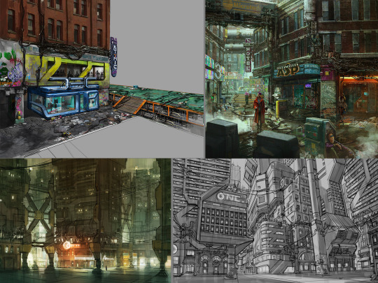
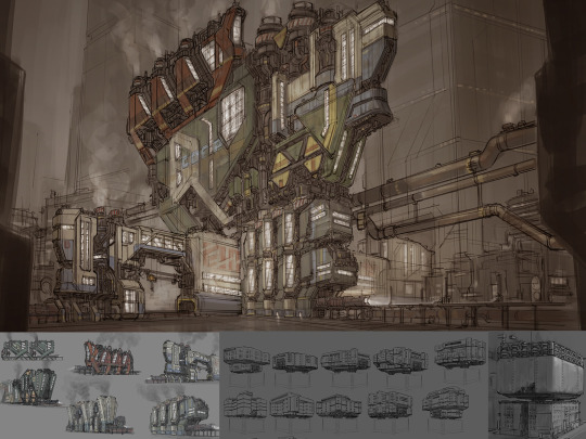

Whilst the concept art for James Daly III has not been updated for a while, the game is still being updated. In the world of cyberpunk, we can see a clear multicultural fusion, with many international cities where East meets West. Reflecting its prosperity and congestion, wealth and poverty, this dichotomy of setting and background history reflects its exploration of the laws of aesthetics. Secondly, the futurists, in an era of highly advanced technology and seemingly peaceful and beautiful times, hide the festering of civilisation and the destruction of humanity. "Cyberpunk 2077: Ultimate Edition" will be released on 5 December - experience the full story of V with panoramic ray tracing, ray reconstruction and Reflex. On a side note, I think Cyberpunk: Edgerunners is pretty good too hh!

References:
CD Projekt Red. Cyberpunk 2077 [Website]. Retrieved from https://www.cyberpunk.net/gb/zh-cn/cyberpunk-2077
ZerowolfZX. (2023, March 20). Cyberpunk 2077 — Next-Gen Update [Video]. YouTube. https://www.youtube.com/watch?v=c1lgKA-AP4I
IGN China. (2022, February 28). Cyberpunk 2077 — Official PlayStation 5 Gameplay [Video]. YouTube. https://www.youtube.com/watch?v=g56D5PZ7_Ew
NVIDIA. (Year, if available). Cyberpunk 2077 Ultimate Edition: DLSS, Reflex & Ray Tracing. Retrieved from https://www.nvidia.cn/geforce/news/cyberpunk-2077-ultimate-edition-dlss-reflex-ray-tracing/
0 notes
Note
How do you color your gifs? They look so natural!
thank you! honestly, i've been making gifs for years and i look at a bunch of tutorials. i don't really use set psds for gifs because all sets are different. even in the same gifset i'm altering something depending on the colouring, lighting, etc. you just have to find what works for you! 💙 my typical colouring format once i have the gif made and sharpened is:
curves layer (use the lightest dropper and select the lightest point on your gif and the darkest dropper to select darkest point on your gif or even just an auto curves layer and adjust from there if need be)
levels layer
exposure layer
if i'm going to use a channel mixer layer this is absolutely where i put it every time so i can see what it looks like before i do anything else that's really going to touch the colouring process of a gif
colour balance layer (this is another one where you really just have to play around with it and hope something works out to your liking. you don't want to mess around with this too much unless you're hoping for a more colourful gif but it does work to even out skin tones before you add selective colour layer. at least, that's what i use it for. and to balance the actual full scenes colouring since warmer scenes need some coolness to really make them work and cooler scenes need some warmth. this is a great tool to bring that back in where it's lacking)
sometimes i go in with a brightness and contrast layer here if there's anything i want to fix up before i start dealing with the actual colouring but i usually like to save that until later on which is just a preference of mine because if i can avoid using the brightness i will but at some point i always add some contrast at least. i only usually put a brightness and contrast layer in this spot if the scene is particularly dark so i can see what i'm working with.
selective colour layer (very specifically the whites and blacks which i usually turn the whites to anywhere from -75 to -92 but it depends on the scene and the blacks are usually no higher than +7)
selective colour layer (here i mess around with the yellows and reds mostly for the skin tone purposes and play around with it until it looks the way i want which is usually more on the natural side or at least as natural as i can get it)
now i may go in with another selective colour layer here for all the other shades depending on the scene and/or if i want certain colours in the background or on the clothing to pop which i usually do and it's mostly blues and greens i play around with. i never, ever touch the neutrals option except on very rare occasions if i want to change the entire colour of the gif.
hue/saturation layer (i use this about 50% of the time and mainly just turn the saturation up but usually i don't go above like... +5)
sometimes i'll add a gradient map layer here of some aqua/blue shade, set it to soft light, and turn the opacity down to about 10-20%) OR i'll add a black and white layer and do the same. mostly, it's the latter of these two.
lastly (well, kinda) this is 95% of the time where i'll put my brightness and contrast layer if the scene isn't particularly dark. if it is, i'll usually add another here as well as the one listed above. regardless - i usually end up with one in this position. never too much but again just to whatever your personal preference is.
other options: another curves layer (if i add one here it's typically an auto curves) or you can add a vibrance layer (which is my personal preference)
i actually have no idea what i'm doing so please don't take my word as holy grail! i appreciate the compliment, but i promise you - there are so many people who have made so many beautiful tutorials and i highly recommend sifting through the colouring tutorial tags for more comprehensible, in depth versions. this is just what works for me 💙💙💙💙💙💙💙💙
0 notes
Note
Oh heck, my apologies (for not proofreading and/or being specific)
I was thinking more about like how do you figure out lighting, colour picking and the methods you use to finish up a piece. I was also really curious about your favourite anatomy tips and how you do so many dynamic poses.
Uhh tl;dr
I am fuckin stupid and I'm sorry
Lighting, colour picking, methods for putting the colours down, anatomy tips, and how do you do dynamic posing so well??
I only draw busts and it's making me mad :D
HMM lets see: I don't color pick unfortunately, it's not a method I use so I can't help u there sadly. As for lighting and shading, I don't really use any tutorials but I just apply the same types of questions to it that I would to any other part of my work while drawing, which are broad question types like : - where is my light source - is this piece calling for any unique light source? (universal/generic lighting is just fine to keep using!) - how MANY light sources do i have, and what are their distances to my figure - what's the MOOD of the piece, is dramatic lighting necessary - if im just here to have a bop and do an art what light source do I want to play with for practice If it was something like a more polished and finished piece I'd definitely be thinking on these questions harder, or multiple revisions and potential references would be pulled up. But normally for references I just refer to my memory of shows that I've seen, since it's a LOT of visual library, and animated or live action, light source is heavily calculated. So you'll get a good display of these ranges you can apply. Lately I've been watching The Bad Batch and I'll always recommend that and clone wars as good examples of environmental lighting, especially given the style of animation they do with how shapely their figures are. It's a good simplified breakdown of the planes of a figure, so paired with their hard lighting choices u get an even exaggerated easier format to look at for guessing light source. (very reminiscent of comics like the more stylized/cartoon you get in art the more u can push and pull these dynamics. or like easier to spot then live action)
SO UHH, im disclaimer: not in any industry and im sure gonna be missing some terminology, but I just nabbed some random images off the google of bad batch to show case a few broad categories of lighting:
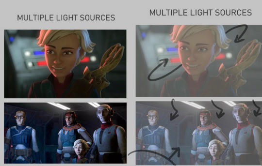
Multiple light sources are ur most common type, and to me the most fun especially when it's like Two light sources. U can often play with the fun lighting types like rim lighting, u often have a warm side and a cold side for contrast/directions sake. The distance of the light determines how sharp or broadly lit something will be, and the size of the light can determine how much of that light hits the figures. So Omega here is surrounded by the lights on their ship, there's likely a very broad top light that's gently lighting the entire area, but the reds and blues of the buttons and screens around her are what's shaping the figure more dramatically. You can see the blue is coming from the top/behind her, where the red is more in front/bottom side to her, since it's the way she's facing and looking at you/the viewer. The second one, still on their ship, features the more broad top down lighting, but the screens in front of them are more important as they're all facing it. both lights in this image are broad wide lighting, so there isn't much of a sharp focus.
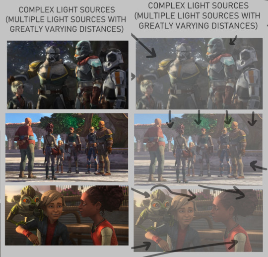
COMPLEX LIGHTING to me usually just means 'there are many light sources of greatly varying distances and brightness' or that there's a lot of figures in the image so it's got a lot more to organize so that the whole image may look readable at the end. You get a lot of environmental lighting for these types, meaning like hey the SUN is one of ur major light sources. it is super fucking bright but it is also FAR away, it's lighting EVERYTHING. and closer to sunset/sunrise u get more direct, highly saturated light from it because of the angle it's often shining- there's a lot to play with for just an outdoor lighting! The three images I picked here are a more morning shot, a mid day shot, and an evening shot. Talking about the angle of the sun especially at the last image with the grookey on Omega's shoulder, which casts a shadow over her and her friend. But her friend is positioned in a way so that she's not entirely over shadowed, because we're here to look at all three figures, and their faces matter in this shot. VS the middle images which is more about the scene/setting as a whole, and the figures are all more or less equally lit/shaded according to just standing in bright daylight.

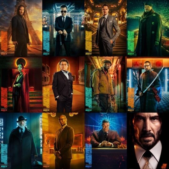
there's also this fun lighting type, singular light sources can usually add a WIDE RANGE of emotion to the piece, depending where you flash the light. You've probably seen tons of light study gifs or shots where a face is shown with one light passing around their entire face and it highlighting the different planes that illuminate based on where the light is. So the first image, the classic Morticia Addams eye drama light, is focused hard on the figures, and what they're looking at. The second image of crosshair is another type of foreboding emotion, but instead with the eyes in the dark. Singular light sources aren't always for drama or asking you to focus on one specific thing but I feel like end of the day, the sharper and closer the one light source is, the more the artist is usually asking you to focus on the scene for. There's also some examples here of multiple light sources being used for the same storytelling dramatic effect. There's crosshair's entire front lit up to focus on not just him but by extension the rifle he's holding, with a backlight to catch the edge of his helmet and the barrel, because those are where we want you to look. They're the most important parts of the image, and they wanted to make lighting appropriate for reading that. With the last image there's what's his face (bro i forget my b) looming over him in a common type of dominant lighting. With how the lighting is assigned to this scene his face is shadowed, vs crosshair's who is partially under that shadow. IDK IM RAMBLING NOW i doubt this is the concise easy to read tips anyone's asking for sorrY I am not a teacher. IN SHORT FOR LIGHTING I JUST think about shows I've watched. I won't go into anymore but I think a GREAT example of super well done lighting in all categories of art are the John Wick films. They're both lively, highly direct, and superficially colored to fit the mood of each character and scene. I'll suck these movies dicks i'm obsessed:
Anatomy I always generically recommend people continue loose study/education from skeletal and muscular anatomy cause if you can build a figure from the inside out, the surface is going to be loads easier. And then when I'm too lazy to look up any muscular break down cause I sure don't remember every part at every angle I kind of just fudge it which is super common, like how many of us draw an ear correctly to it's bends and shapes. I sure as hell don't I just like to draw them the way I'm familiar with lining it (unless it's some really polished piece) cause end of the day my ear is still getting interpreted as an ear. So If I can't recall which muscle overlaps the other given a certain angle I just take a guess and usually it's not something blaring if I threw it down confidently enough. Studying not just muscle though, but how all body types sit and tense and move is crucial. Like fat is obviously going to have a much different type of hang and sit on the body, and then there's deciding how much fat to muscle you want on a figure. There's also skin to consider- older skin is looser, scarred skin has a tighter more custom pull to the areas, skin otherwise is just a big elastic band around ur body. So when that becomes overstretched or cut in any irregular way it's going to have a much different look to the muscles and bones it wraps around. Muscle reference I don't have anything specfic to refer other then using actual anatomy charts. Some 3d modelers have made great reference to body parts with full turn arounds i'd suggest. Since big fantasy muscles can be exaggerated so much (and they should!) it's the only reason why id only Lightly suggest for observing other artists individual drawings of buff characters. cause lotta us are fudging parts and u will end up picking up an incorrect anatomical trait (we literally all do it, just a silly unlearning process once ur hand is so familiar and used to drawing something a certain way) I think something specifically that's really helped me slowly gain a very diverse understanding of the fat to muscle ratio is getting into sumo wrestling. (NOT TO PUSH MY FAVORITE SPORT BUT I HAVE SOURCES IF U WANNA HEAR ABOUT IT/FIND A SPOT TO WATCH) In sumo there's no weight division like other forms of wrestling, and because of that you can have a very diverse set of ways to go about your own style of fighting. Entirely setting aside the fighting STYLES, there's broadly the categories of how much fat do you want to put on and the advantages that has against your opponents, vs how much muscle, or where that muscle needs to build on your figure, height and the like also play into it but basically 'what is my body shape, how can i build/ play it to the advantages of how i fight my opponents'
so like terunofuji is a fucking MOUNTAIN of a man, he's the current yokozuna (top banana rank) and his sheer height and weight plays greatly into his fight style. All of them are fucking jacked and watching Sumo has been a great general visual library builder because: - its a huge sport so it has a lot of coverage and footage on high def cameras - they're mostly nude and you're getting incredible displays of muscles in slow mo as they collide, fight, and throw each other. s2g you'll have an entirely new appreciation for the human body and just how many ways it can shape itself from watching this sport.
Always a ton of fucking leg muscle but Takayasu is one of my faves i gotta show him.
with no weight limitations not only are you seeing all the different levels of weight to fat, but you're getting an excellent display of how fat builds and forms on different people. there is no one way to gain fat, its pretty cool how diverse it can form, where it prefers to store fat, how quickly someone might gain weight vs overtime, genetics, what types of fats you're storing, lots of shit to look up on! this last image is ichinojo vs enho who are like usually one of the biggest and the smallest wrestlers, and both play to their size and shape and have become very high ranked. ANYWAY THIS POST REALLY WENT PLACES HUH idek if i answered the questions right i think i gave more questions back but i tried to touch a little on my thought process and where ive specifically gone in the art study journey. For poses I really don't look up anything I just try to think of the figure and do a lot of preliminary sketches. No i don't have the 'picture a perfect apple in my head' noggin i too suffer from looking at a blurry void when i try to think of shit so yes im hitting a brick wall by not utilizing all the model posing references that are probably out there hsuogjdhk
97 notes
·
View notes
Text
HEADCANONS, PART TWO:
🇮🇪
(God help me when I have to write part 3...)
No worries about misgendering this guy... because they don't know. They would've forgotten it long ago anyways at this point, so they just don't give a crap what gender they are.
Their name is Kelsey Windsor. It used to be Dermot Windsor but they had it legally changed.
As a human, they're a very pale-skinned person of average height(5' 9"), with curly, blondish-red hair(yes it's a weird colour, but they manage to pull off the look). And they're absolutely saturated with freckles. Everywhere you look, it's just freckles, freckles and more freckles.
Usually wears Aran knit sweaters, jeans, bomber jackets and flannel shirts. They're still living in the early to mid-2000s fashion-wise.
This motherf***er is BUILT. Seriously, they might be neutral but God almighty are they stacked. They'll be up for anything, from US-led invasions to UN peacekeeping missions. For any large military operations they usually serve with America or UK, but they're always happy to just do peacekeeping work. More about this later.
Tiny scars are dotted across their neck and shoulder. Those are the remnants of a shrapnel bomb that exploded behind them during one of his many tours in the Troubles. There's more scars from where they've been grazed by bullets, beaten by batons and worse. They wear them like bravery medals though- each scar is a sign of their continuous luck.
Speaking of luck, they HATE it if you say "luck of the Irish" in a positive light. He is extremely self-conscious of the term's origins.
Much of their history has been them trying to rebel against England, and latterly, UK. As a result their relations could be described from a historical context as "strained"(top 10 greatest understatements in history coming up). However, since the 1960s, they've gotten along with each other and have left their previous animosity behind them... for now. Brexit has not gone over well with Ireland, it must be said(!).
The Famine screwed up their body greatly- mainly, they can't eat specific foods because of the irreversible damage to their digestive system caused by hunger. Mainly, they have to stay away from most fast food and fizzy drinks(although they've never liked the former much).
But, thanks be to the Lord, alcohol is on the safe list. They've said many a time that they wouldn't know what to do were it not for Guinness. As is to be expected, they drink like there's no tomorrow. One time they got so drunk that a SWAT team had to be called to contain them. But usually it ends up in him passing out in the street or having a one night stand with some other country.
They like to travel. A lot. And I mean A LOT.
Absolutely has PTSD from the amount of wars they've been in, plus the abuse from England, etc.
Tea addict. UK's influence definitely rubbed off on them in this aspect.
Jewellery. Oh my lord the jewellery. This fucker absolutely LOVES jewellery and anything gold or silver. They have ear piercings, they've got gold necklaces, silver rings, etc. Bling is this person's passion.
Also a good singer. Has recorded a few albums, which have found rather unlikely success internationally. As a result of this they work with South Korea and Japan on music projects a lot.
The music fame has also landed them roles in a good few movies.
Was a Formula One driver for a few years during the late 1970s and early 1980s, and again in the 1990s. Surprisingly good at it, too.
Has multiple Irish wolfhounds.
If you confuse them with Ivory Coast, Italy or Mexico... well God help ya.
(related to a previous statement) They've been in the wars. Surprisingly often, as it turns out, because they were in both world wars, Iraq, Afghanistan, the Falklands, Vietnam- name a war in the past 100 years and they've probably been fighting in it at some stage.
They and Northern Ireland are estranged. They don't talk to each other WHATSOEVER.
Generally regarded as the "partier" of the EU, and has gained notoriety within the organisation for their drunken exploits.
Good friends with America, Canada, Chile, Japan, South Korea, Australia, Germany, Austria, France, Italy, Finland and Sweden. And all the ex-commie Central European countries.
Knows English, Irish, Polish, Lithuanian, Romanian, Czech, Finnish and Latvian. Currently learning Spanish so they can stop embarrassing themselves while on holiday in the Canary Islands.
In a relationship with Finland’s twin sister(will explain later). They met at a party in Helsinki back in the 1970s and have been together since.
Always has the best Halloween parties. Yes, it sounds childish, but they've been hosting those parties since the beginning of time. And everyone attends for the party, the dressing up... and the copious amounts of alcohol consumed at these events.
23 notes
·
View notes
Note
how long does it take you to draw and colour? since you post everyday which is great for me :D any tips for colouring cause Im still tryna figure all that out
hmm welllll, i don't exactly time how long it takes to draw but my partner said that sometimes i'll be working on a piece when they go to sleep and i'll still be working on it when they wake up 7 hours later so...my guess is anywhere from 3-8 hours each depending on complexity? at least for the art that i normally post, most of which is relatively simple.
not entirely sure what kind of tips you were looking for, but i'll just throw out some of my thought processes and stuff i try to keep in mind whenever i color. i'm gonna try and keep these relatively to the point so i won't go into much detail on art terms n whatnot, BUT i am also pretty terrible at explaining things so if you need clarification on anything, feel free to ask!
(sorry it's so longggg, i got carried away. i am...very wordy when it comes to art lol)
i like to block in the colors during the sketching stage before i do the lineart, especially for pieces where i know i want to do something funky with the color palette. you can see this in a lot of my process shots. doing colors in the planning stage just gives me a lot more freedom to focus purely on the colors and shading and how they work with the composition, without having to worry about the minute details like making sure the colors are inside the lines.
in order to save time while coloring, i'll usually just select the negative space (after making sure all the lineart is closed) > expand selection by 1 pixel (to make sure the edges are hidden within the liineart) > invert selection > fill bucket, then use clipping layers above that to color individual areas.
layer modes are your friend! i use multiply, overlay, and glow dodge (this one may be specific to mangastudio?) in almost every one of my drawings, but it's definitely worth playing around with all of the modes just to familiarize yourself with them if you haven't already.
color is honestly SO subjective. i'm never a fan of color picking (from source material or my own refs or whatever) bc while it may have its uses when it comes to consistency, imo it's much more fun to make them up as i go. you get a lot more variety from piece to piece while also familiarizing yourself with the character's palette that way. usually i'll start by deciding on the overall mood/palette (cool/warm, de-saturated, neon, pastel, etc), filling in the background color, then picking the characters' colors based on that. like with this venti pic, i started with a purple background and based my colors around that purple so they all fit the specific look i was going for. i could maybe get a similar effect by starting with the normal colors and using filters, shading, layer modes, etc to get the funky colors, but it will be much harder/more work and doesn't get as drastic of an effect imo.
on that note, don't be afraid to use shades/colors that may seem odd! you'd be surprised how many times i've used gray in place of blue, orange, purple..basically any color. in the above example, you can see just how different the colors ended up being from the original. after i decide on my palette + bg color, i'll just throw down the color i think will work and then (bc that first guess is usually wrong and meant only as a ballpark estimate) see if it needs to be warmer or cooler/darker or lighter/more or less saturated/etc and adjust accordingly. it's like mixing paint or tuning an instrument! it takes a little bit of practice, but after a while you start to get the hang of what colors will look like in which color palettes. white is usually the easiest to start with bc it will always just be tinted whatever color your palette is (like how the "white" in the above example is just a light purple).
this and the next point are more about shading but i include it as part of the coloring process: the easiest way i've learned to do shading is to darken the entire image/character/part you want to shade (usually with a solid color multiply layer) then add in the lighting either by erasing parts of the multiply layer or by using a separate layer set to overlay or glow dodge (or a similar lightening layer mode). it works a lot better than drawing the shadows imo because it kind of mimics how light works in real life; things are dark by default until you let light in and it hits what it can while leaving the rest still dark.
if you want to blend shadows, i usually still use the above method, but just blur certain areas of it and when i'm deciding which parts to blur (bc i don't just do so indiscriminately) i'll mentally sort all of the shadows into 2 categories:
shadows created by light being blocked by an object: like putting your hand in front of a flashlight. these shadows will retain their sharp edge, but can transition into the 2nd category if they are far enough from the obstruction, like how your hand's shadow will become blurrier the further you move it from the flashlight. the more distance between a light source and the surface it's projecting onto, the more chances for the light to scatter = softer edges
shadows created by light "rolling" off the surface: like the shadows on a ball or rounded surface. these will get blurred and i usually like to put a little bit of color along the blurred edge (a different and usually brighter/more saturated color than the rest of the shadows) just to add some life to the shadows.
here's an annotated version of this mikey pic with just the shadows so it's a lot easier to see :) sorry im bad at annotating..
aaaand this post has probably gotten way longer than you were hoping for so i'll cut it off here 😭 hope this has been at least somewhat useful, and good luck with your art!
27 notes
·
View notes
Text
I drew something about my alternate universe "Wings of the Ravens".
DO NOT REPOST OR USE. 😠

Last time I mainly talked about lines with the same thickness (@liangrexy 's 6th post), and this time I used more lines with different thickness. I basically drew lines with ink painting, calligraphy and pen drawing methods. You can see the strokes pretty clearly I suppose. Some ends of the lines, which were where I stop moving the pencil, look obvious, because I was imitating how I paint and write on actual paper. Although I don't paint very often and I really need to improve my skills, I know how it works and what I probably want. The brush I mainly used was the felt-tip pen tool, and honestly the lines has something to do with how hard I pressed the pencil against the device. When painting with an actual brush, I can hang the brush and let the tip of the brush stay on the end of a line for a little bit longer so that the water and ink can leave a pattern on the paper (to draw some lines I also need to rotate my brush). And I need to write strokes as well. As for the lineart in this post, I used techniques that are usually seen in landscape paintings. For example I drew dot leaves (pine tree needles here), which are groups of lines, to represent hair and other stuff, and I used tree branches and fabric wrinkles to draw shapes and outlines. Usually I don't colour my line drawings, so it will be nice if the lines are smooth and well-organized. If I want to colour my lineart, I can draw rougher lines theoretically (I don't really enjoy colouring my lineart now! ! ! ). 😂😂😂
I did colour something. Most of the colours I used were low-saturated. The bottom right Danny is in blue while the whole scene is basically in a red tone, so in order to achieve colour harmony, the saturation of the blue colours had to drop. The same goes for the bottom left little Dark Danny. I used the oil painting brush tool (I guess), the felt-tip pen tool, the eraser tool, and some other brushes. I drew the colours with methods of oil painting, watercolour and acrylic painting, and I didn't use that many lines. I left some brushstrokes and drew different kinds of edges because of my personal preference. Last year I often used the magic wand tool to draw this kind of art but now I realize that I can draw more quickly with brushes, although the bottom right Danny with a background still took me over two hours to draw. 😂😂😂 I think the coloured ones kind of look like prints and paper cuttings.
All plants in the picture are fictional. I just wanted to test something. I designed foliage's shapes and decorated them with branches. I have observed Cinnamomum camphora, Ficus microcarpa and some other species, and drawn a few line drawings. So I remembered something about how the branches grow, but sadly I didn't draw things very accurately. I will draw real species later I guess. 😂😂😂 SunnyTP (Lofter and Twitter) said that the dark red bushes were too saturated when we talked about colours, so I changed the bushes' colours.
The bottom left Danny's sketch doesn't have blood, and when I was colouring, I realized that I wanted to draw blood and a crying child again. I released feelings and it was cool. The blood is Dark Danny's, and I did use some horror stuff elements but I drew things in a mild way since the point was not showing something actually scary. I mix the features of several materials like hair/ fur, fire, liquid (water), clouds/ mist, plant textures and some other things together to design Danny's hair. So I can make his hair look convincing and at the same time it's clear that the character is fictional. Drawing the colourful smoke were interesting, too. One side of a wisp of smoke could have some twists while the other side could be drawn smoother.
The middle left Dannys: @suekis-stuff said my AU Dannys can lick each other and I thought that would be fine to draw so I drew the boys being friendly (or maybe not really).
There will be a few coloured chapters in the AU's comic, so I need to find proper ways to colour.
And here's one more piece of art: something about the Far Frozen people.
@liang-rexy 嘅第130篇原创文章。
于2021年9月24日发布。
#无厘头羽王龙#liang rexy's works#渡鸦之翼#wings of the ravens#danny phantom au#danny phantom#danny fenton#dark danny#dan phantom#text post#长文章#the far frozen people
242 notes
·
View notes
Note
1, 7, 34 💛
What are your top 3 favorite sets you’ve made?
Answered that here!
Who are your top 3 gif makers?
Raven this is so mean, how could you make me choose!!! I can't pick a top three, that would feel mean. Instead I'm just gonna hand out some compliments to tua gifmakers off the top of my head. If I forget anyone, don't take it personally, it's just my brain failing me.
Starting off with you, Raven, I genuinely don't know what magic you put into your colouring, but you can make this show look so bright and so well-lit, you have such good grasp on colour in your gifsets, they are stunning.
@capinejghafa is like. A comfort gifmaker. She makes so many sets and they are usually like these little moments that I might have missed and then get to appreciate, but sometimes she busts out some incredible blending skills, it's great.
@seance an uncomfort gifmaker? literally every time she posts a set it makes me lose my mind a little and i have to yell at her in the tags. an absolute artist in combining imagery and poetry in increasingly mindblowing templates.
@viktorhargreeves has made it her mission to chronicle every single thing luther and/or viktor have done across three seasons. she colours this goddamn uncolourable show in the most fun colour combinations and has a knack to make these great dynamics gifsets that I love to bits.
@i-seeaspaceshipinthe-sky makes such good gifsets that dive into Klaus, little moments, little parallels, theirs is the first blog I go to if I am looking for specific Klaus moments because chances are they giffed them somewhere. And they have this incredibly distinct colouring that's so easily recognisable and makes the greens in this show look good (somehow. miraculously.).
@yenvengerberg is just an incredibly gifted giffer with colours, she can make this show look so good it boggles the mind. I'm still thinking about that gifset where she condensed the entire S3 trailer into one gifset with an incredible layout and really cool typography, I'm still in awe of that gifset.
@sohoseance has been doing some incredible work with these really big, colourful, almost psychedelic gifs and really bold, fun typography that I love, with colour combinations I rarely see used, she makes pink and neon green work somehow for this swamp-coloured show.
@hargreevcs makes these very cool, bold gifsets with very bright, saturated blocks of colour and fun typography that are always great tributes to the characters they are about
Shout-out to the lovely Artemis @fiveviktorklaus, I hope you're doing well and I miss your wonderful gifs.
And of course, someone I keep tagging in my gifsets in an old habit or a mournful plea, I'm not really sure, but tumblr user Tess @ogaferoga brought such a gust of fresh wind into the fandom when they crashed into it after S2, and I miss their mind-blowing creations, they really pushed gifmaking to a whole new territory (Tess, if you ever read this, I miss you).
I CAN'T BELIEVE THAT MY BRAIN LITERALLY BARRELLED THESE OUT AFTER I ALREADY HIT POST. EMBARRASSING.
@lilapittss who literally suffers to colour scenes I've given up on and can make these really big, beautiful gifs, and is always there to appreciate the TUA ladies in gifmaking form.
@fivehargreve my fellow Five and S1 appreciator whose gifs are just lovely and who has a knack for big formats that are somehow incredibly sharp.
@anthonysharma away on hiatus but always in my heart, makes the most wonderful sibling appreciation posts with her really soft, warm-toned colouring
A set that took you a long time/was really hard but you’re really proud of how it came out?
I called it the mammoth project because it genuinely took me a month or so to complete. It was just a love letter to Five and the range the kiddo gives him, and it really was a chore to figure out, but I'm still very happy with it.
17 notes
·
View notes