#i do also like to play with my friends lasso tool and gradient from time to time
Explore tagged Tumblr posts
Photo

✧ TEXTURES – A TUTORIAL BY EVANSYHELP.
In this (long and image-heavy) tutorial, I’ll be showing you how I make textures, as requested by a very kind anon. I use Photoshop CC 2019 but you should be able to replicate my methods on most editing software. Please like or reblog this post if you find this helpful!
Index.
Ethically Sourcing Your Images.
Finding The Right Image.
Making Your Texture.
Other Tricks I Use.
Quick Recap.
Making Textures Without Images: Speedrun.
Outro.
Ethically Sourcing Your Images.
I will be explaining a couple quick ways to make textures without any images at the end of the tutorial, but since my personal favourite way involves images and that’s specifically what the anon requested, that’s what the majority of the tutorial will be focused on.
The first step, naturally, is finding an image to use. My personal favourite site is Unsplash, but there are plenty of options out there.
What you need to keep in mind is what kind of license the images have. Unsplash is free for personal and commercial use with no attribution required, which makes it perfect for things like this. There are more sites like this in my free for commercial use masterlist (linked at the end of the post), but unless you’re using them in products you’re selling (like graphic commissions), the commercial aspect isn’t something you need to worry about. Just check the site/photographer’s rules to make sure you’re allowed to edit the images for personal use, and whether attribution (credit) is required.
Another important thing to keep in mind is that these sites typically never allow you to redistribute the images as they are. That means you can’t just go to Unsplash’s texture category, save the images without any changes, and reupload them in a texture pack on Tumblr. That’s stealing. We don’t do that.
Finding The Right Image.
Knowing what kinds of images will make good textures is a learning curve. My first couple texture packs are rough compared to what I make now, because I basically taught myself with no guidance and learned through trial and error. But with practice, I learned what worked and what didn’t.
You want your images to be HQ, either with no ‘subject’ (ie. a person) or with a large background. Higher contrast is better but not super necessary. You should hopefully be able to envision what kind of texture you want to make before you even touch the image.
Making Your Texture.
For the majority of the tutorial, this is the image I’ll be working with. Credits can be found in the link at the end of the post.

Open your canvas. You can make specialised textures, like 100px for icons or 540px for Tumblr graphics, but I personally prefer to make them large for versatility. I’m using 800px in this tutorial. Once you’ve chosen your size, upload your full-size image into the canvas. This is where the fun begins!
Drag the image around into a nice position. Or use Edit > Transform to rotate, flip, and warp the image in different ways. Or use Edit > Free Transform (Ctrl+T) to change the size or the angle more precisely. Or probably some combination of all three! With Free Transform, make sure this aspect ratio anchor is selected so you don’t butcher the quality of the image, unless you’re warping it intentionally:

This is all very individual to each image you use. You might want to flip one, shrink another, put another at a 30 degree angle. Just experiment until you end up with something you think would look awesome as a texture. For the sake of providing a good example, I flipped this image vertically, shrunk it to 80% its original size, and rotated it until it looked like the smoke/cloud was coming from the bottom right corner. This is what we have:
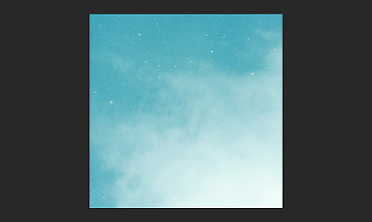
Then we move onto enhancing. Textures work best when there’s a lot of contrast because it’s easier to manipulate the blending modes. So if your image isn’t already high contrast, these adjustment layers (Brightness/Contrast, Levels, and Selective Colour) are your new best friends:

If you don’t see this on your Photoshop, go to Window > Adjustments and it should pop up. Again, just experiment, because different images will require different things. Essentially, you want to make the darks darker and the lights lighter. Something I like to do is add a Selective Colour layer and use the Black slider. Pick out the primary colour of the image, and then Whites, in the drop-down menu, and move the bottom slider (left to lighten, right to darken) until you’re satisfied. Like so:
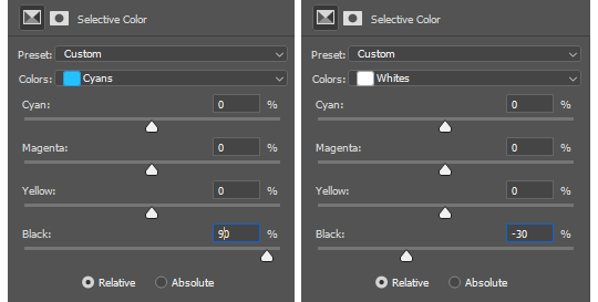
So with those Selective Colour settings and the following Levels settings, here’s the before and after of my image.


Much better contrast! If you want to end here, you can, but I personally prefer grayscale textures a lot of the time because it makes it more versatile. Instead of being forced to make a blue graphic because this image is blue, I can make any colour graphic I want with one simple black and white Gradient layer. Photoshop does have a default Black & White adjustment feature, but I prefer using Gradients.
Pro tip: if your image doesn’t have a pure black, you can keep the darkest parts of your image dark by using the left slider, shown below.


A lot of the time, I’ll also decrease the opacity of that Gradient layer, to somewhere between 80% and 95%, so just a hint of the original colour comes through. This gives it more dimension in my opinion, while still keeping it mostly neutral. Here’s 100% vs. 85%:
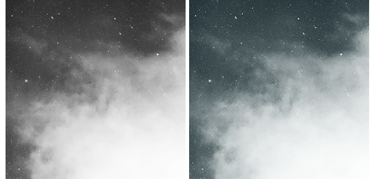
You may find that you want to add a little more contrast after. With this texture, I decided to grab another Selective Colour layer, pick ‘Black’ in the drop-down menu, and pull the Black slider up to +40. I also settled on 95% opacity for the Gradient. And here’s the final product!

Other Tricks I Use.
That covers how I make a lot of my easier textures, but here’s a quick run-through of other, slightly more complex tricks. I’ll be working with this image (again, credit at the end of the post):
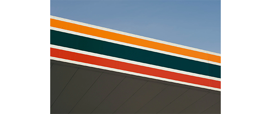
This, of course, is not as obviously texture-worthy as the previous example, but I love textures with strong lines, so here’s how the magic happens! I wanted to get rid of the detail on the bottom half, so I used the Polygonal Lasso tool to select it:

Then I used the eyedropper tool (the 4th symbol under the polygonal lasso in the image above) to select the blue of the sky and, on a new layer, painted that selection completely blue. I decreased the opacity to 90% just so it wasn’t a total block colour, but not enough that you can really see the lines. I repeated this process for the sky, so it looked more consistent with the bottom half.
Then, using the eyedropper tool again and making a new layer for every colour, I went in with a small soft paintbrush and painted out the harsh vertical lines on each segment of the stripes. I didn’t want to make them totally perfect, but I painted over the bulkiest interruptions.
I added a black and white Gradient layer, using the slider tool I showed you before to darken the darks and lighten the lights, and decreased it to 50% so that it wasn’t totally black and white but still more neutral than the original. Here’s the result:
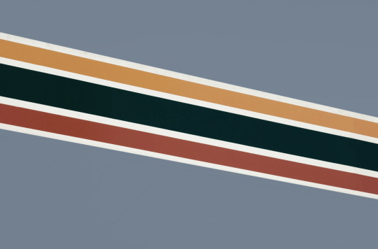
Another fun way to shake things up, which unfortunately will require Photoshop (CS6 should be fine, not sure about earlier versions), is the Filter Gallery. Go to Filter > Filter Gallery, and you’ll find a TON of effects that change your image drastically. Most of the default settings are nightmarish, but you can play around with the settings panel on the right.

Here’s just a few results that are possible with the Filter Gallery, labelled for convenience. You can view the HQ versions in the link at the end of the post.

Quick Recap.
So you don’t have to reread this obnoxiously large tutorial every time you want to reference it in the future:
Choose a HQ image.
Resize, rotate, flip, and/or warp.
Enhance the contrast.
Black and white!
Paint over problem areas!
Filter > Filter Gallery.
Making Textures Without Images: Speedrun.
We’re almost done! There are some tools built directly into Photoshop that can allow you to make textures completely from scratch, and I’ll briefly cover my favourites here.
The first is pattern fill layers. I spent too many years not appreciating the patterns feature in Photoshop, but they’re great. Go to Layer > New Fill Layer > Pattern, click ‘OK’ on the box that pops up, and another box will pop up to let you choose your pattern.
By themselves, they are UGLY. It can take a while to figure out how to use them. But if you change the scale, change the blending mode, and change the opacity, you have thousands of textures at your fingertips. And if you add two or three together? Billions of possibilities. I can do a more in-depth tutorial on patterns if y’all are interested, but here’s two examples I just whipped up in a matter of minutes, using two patterns on each:

The next feature is gradient fill layers, and the gradient tool. Go to Layer > New Fill Layer > Gradient… to select a gradient (or make your own!) and an angle, OR use the gradient tool (featured below) to drag the gradient across your canvas manually. On its own, boom, that’s a gradient texture. Paired with a pattern or put through the Filter Gallery? Even better!


The last is brushes. Brushes can be great for textures because there are so many kinds. You want to make a paint splatter texture? Paint splatter brush sets are everywhere! You want to make a smoky texture? You can get brushes that look like smoke! Smudged? Scratchy? Grunge? Halftone? Light leaks? Torn paper? Brushes have your back.

With all of these features (and things like actions, too!), your saving grace is going to be this little cog wheel shown below, and the list you’ll find under the Reset/Save/Load section. There are SO many more options built directly into Photoshop that you don’t even see right away, because you have to add them manually from this little cog wheel.

And you can download countless more patterns, gradients, and brushes from sites like Brusheezy and DeviantART. A couple tutorials on downloading and installing them can be found in the link at the end of the post, but remember, download these things ethically. If you want to sell products that use a custom brush, it’s your responsibility to find brushes that are free for commercial use. If you don’t want to credit the creator, it’s your responsibility to find resources that don’t require attribution.
Outro.
I think that’s everything, guys! If you found this tutorial helpful or otherwise enjoy my content, please consider supporting me on Ko-fi! I offer exclusive rewards, like custom graphics, to everyone who donates.
Due to Tumblr’s latest rules about links, you can find the credits list, the promised bonus tutorials, other important links, and the full-size HQ versions of the textures made in this tutorial over here.
Thanks for reading!
#rph#allresources#completeresources#itsphotoshop#chaoticresources#photoshop tutorial#photoshop resources#photoshop help#ps resources#ps tutorial#eh#eh: tutorial#tutorial#ps help#texture#*100#*250
371 notes
·
View notes
Note
Can I ask how you usually go about your TTS edits? Particularly how much you edit pre-existing frames together vs. drawing new elements in.
I will preface this by saying I suck at explaining but I will Do My Best™
For the record, I use photoshop, but I will crack open SAI if I absolutely need to.
So! It does really depend on what you want to be doing. Are we mashing two characters together? Putting them in a new background? Both?
We’ll go with both.
SO what I usually do first is go through the catalogue of screenshots I have; I’ve usually got a bunch of PSD files that have screencaps that I pick out myself, so I’ll scrub through those, particularly if I KNOW there’s a frame in mind that I want to use. A lot of the time I make edits off the cuff, or I’ll only have a vague idea of what I want it to KINDA look like, and then do my best. A lot of the time I end up going UGH and i have to scrub through certain episodes again if I need a particular pose/expression/what have you. It’s really best to make sure you have EVERYTHING you need, otherwise you’ll waste more time in the middle of your edit, trying to hunt something down, and it’ll be a huge pain.
ONTO THE STARTING POINT.
We’ll start with the actually Super Important Part: Background.
They’re usually the easiest part to work with, too, and if you need a particular background, you can frankenstein it. Do you like a particular background but there’s always a character somewhere on it? Wait until they move. Sew the two halves together. Bam.
I do recommend a background where at least one of the characters already matches the lighting!! It’ll save you some trouble later, so you won’t have to tweak both characters.
Example a: Hector was already in this scene, just in a different shot. His lighting is juuuust fine.
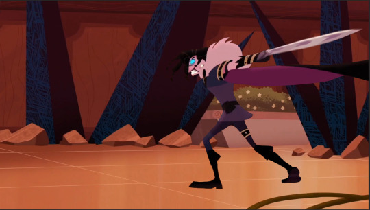
I cut him out from one of the screenshots I got, and just. Plapped him onto the background. He’s on his own layer, so he can be moved and size adjusted if I need him to be.
Cutting them out is... Easy? If not tedious. The magic wand and magnetic lasso tool are the best for it, but don’t forget to hit ‘select and mask’ (if using PS) so you can clean up the edges a bit more before hand. It’ll help smooth out jagged edges too so I really can’t suggest it enough.
After that, it’s really just cleaning up edges and the bits you couldn’t select with the eraser tool, your brush of choice, and color picker.
Also, try to get both characters in the same kind of shot (I.E fullbody and fullbody, or bust shot and bust shot.) That stuff does matter, and no amount of resizing will be able to help you make it look like it’s meant to be that way. Unless, of course, you’re doing a sort of ehh stacked??? shot, like so.
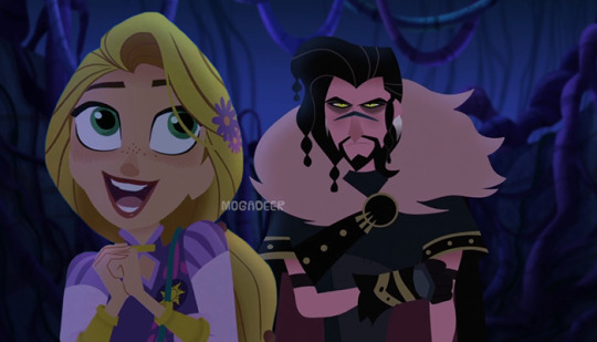
Also keep the horizon line in mind, because that’ll also stop it from looking funny, even if a character is shorter than the other, no matter what kind of shot it is.
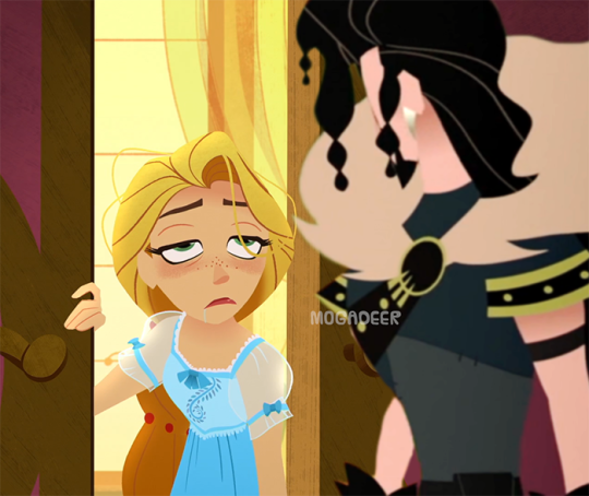
Rapunzel is on her own layer too, and she’s the one with the biggest amount of editing.
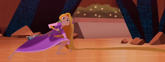
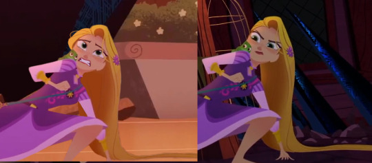
The edit
vs the screenshot(s) she was taken from
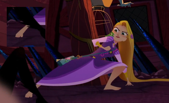
I merged all the parts I added to her, so I can’t show you all of those individually, but her mouth and eyes were taken from another episode all together, from a bigger screenshot. With expression changing, it’s really just better to get a clearer image and then size it down to where you need it. Also, I DO recommend you keep everything on it’s own separate layer for as long as possible, including each eyeball on it’s own.
The only parts I really drew in myself was her hair, for this. I fluffed it out on the right side of her head a bit and then added more length to what was on the floor so the edit wouldn’t be really boxed in and tight. I try to NOT draw in a whole lot, and keep drawing in my own elements for when I absolutely need to. If I can get what I need from another screenshot, I will.
For drawing it in, I do have a tablet and it is honestly my best friend. TTS thankfully doesn’t really have any outlines, so adding more to something or taking something away is generally pretty easy and doesn’t look weird as long as you keep your lines and edges relatively clean.
I color pick the item I’m adding onto and, on it’s own layer, start adding and erasing as needed. If something has a gradient or slight shadows, as TTS often does, I’ll color pick more than once, try to line them up right, and just blur the crap out of it.
It’s also super handy for softening edges that MAYBE look a BIT too hard and clean as opposed to the rest if the edit.
The blur tool is your friend. Love it. Embrace it. Marry it.
To me the most finicky part is adjusting the lighting and tones on a character. This one is a little trickier for me to explain, since I pretty much play around with brightness, contrast, and different colored filters until I feel like I’ve got a match for the other character.
Once I’ve got all that done, and I’ve made sure they’re sized about right, everything looks homogeneous... BAM I’m done. I usually save it as a smaller resolution than what I worked with it as, to hide any “seams” or the like i couldn’t fix.
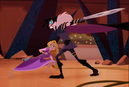
I HOPE THIS EXPLAINS A LITTLE??? I’m really more of a show person than a tell person, but I hope it helped a little.
13 notes
·
View notes
Text
Hey, so a little bit ago someone asked me if i would do a tutorial type thing on how to achieve realistic drawings and although this would probably fair better as a video my voice is shit and i can make sure i get everything down if i type it out.
I think the best way to do this is take you through one of my drawings? My latest Brian drawing i saved a decent amount throughout it so i can kind of comment on each process of the drawing. For the this drawing i drew it on Photoshop CS5 which is important bc i do utilise a lot of the tools there so if you use smth different then im sorry but im sure there are alternatives! I’m going to talk you through this drawing:
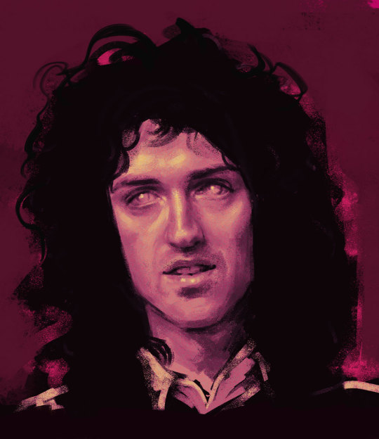
Because i dont use natural skin colours in my drawings i start drawings in black and white because i find that easier to control the tones? and then i can colour the drawing afterwards in whatever colour and play about with it instead of sticking with a colour from the get go.
I start with painting the entire background a light ish grey because 1) its nice to work highlights and shade into a mid tone and 2) having pure white as a background can be a bit uninspiring? even with my sketchbooks i always make backgrounds before i do anything on them.
I then take a large brush, i use a mid-dark toned grey for this, i don’t like going in super dark super fast, and kind of mark out where everything goes super loosely, precision and proportions really don’t matter at this point, it will probably look bad but that’s fine! you’ll refine it as you go on! the brush i use for this stage is usually just a soft non textured brush, but i don’t think the brush you use at this point really matters. My drawing will kind of look like this at this point:

I then go in with a smaller brush with a darker colour and kind of refine the face a little bit, i really take in the shapes of the face i’m drawing and try and get a good base to then really work on the shading/highlighting. Again, although this is your base to work on the proportions aren’t super important, it may still look bad but whatever is wrong with it you can just draw right over it to correct it! This is why i try and not give up on drawings even if they aren’t going the way i’d like it to because you can always correct it! my drawings never look amazing when i start them but i like to work into them as much as i can and i usually end up with something i’m proud of! anyways lmao, this is what my drawing will look like at this point:

This is when i start the proper like working into the drawing with highlighting and shading and things. I also change my brush at this point! Honestly any brush will do but i really like the aesthetic of having a super textured brush, I do sometimes change up my brush every so often but the brush ive been using more often than not is this brush:

Also at this point i try and not use pure black or pure white, if you’re trying to go for a realistic look then i feel pure white n black really don’t factor into a face.I also think if you use more mid tone colours then there’s more of a natural gradient? which looks more realistic i feel. Of course if you like the aesthetic of having a high contrast then go for it! this is just how i personally like to do it.
I know a lot of people work by gradually working the whole face, like do loose highlights and dark tones on the whole face and then refining it but i like to do each part of the face one by one and i usually always start with the nose, this isn’t important lmao i just enjoy drawing noses so it’s what i start with. i think the use of highlight is super important to utilise when drawing the nose because its what suggests form,, this is my drawing will look like at this point:

I do end up darkening the shadow on the right side of his nose and the bottom of his nose but i usually get to this point and then move on and then once i do more ill go back and try and bring more dimension to the drawing.
Also! one of the best tools on photoshop that you can utilise and in some of my drawings it’s my saving grace is the liquify tool. Basically if you do the drawing and get to a point it would be hard to paint over then u can use liquify, as i was doing other parts of the face i realised that the nose was supposed to be a little to the left and the eyebrows had to be lower down so you if you open up liquify you can just click and drag the nose to where you want it to be so:
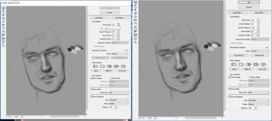
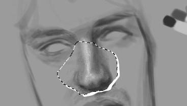
it’s a super helpful tool that really helps you get the facial features exactly where you need it, i used it a couple times throughout this drawing. I don’t think sai has it but you can use the lasso tool and rotate it or whatever and just draw over the little break it makes in the canvas:
so the next thing i do is the eyes and eyebrows. I’m usually not the greatest at getting the exact eye shape but again, liquify is your best friend. An important thing to note is the angle of the eyebrows in relation to the middle of the nose, Brian’s eyebrows are quite straight so i tried to keep them that way. I also started darkening up the drawing, i didn’t quite go full black, the darkest colour i used is like just off black. This is what i have so far:
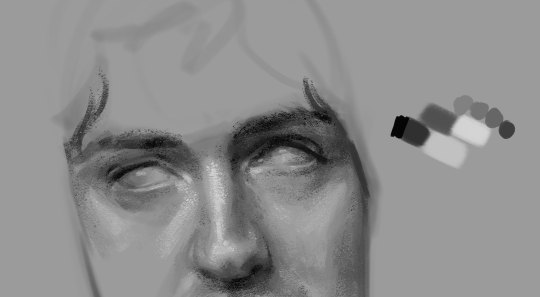
Also another important thing to remember is the lighting of the image, in the image the right side of his face is more shadowed so the shadow on the left side of his nose wont be as intense as the right side and things like the bags under his eye on the right side would be slightly more prominent. Also because of the brow bone, theres more highlight on top of the brows and usually a shadow underneath because the brows are more elevated and the eyes are sunken in a lil bit. There will be a lil bit of highlight on the inner corner of the eyes though.
In the next part of the drawing i just add a little bit to the forehead and cheeks :

I think by this time i had adjusted a couple of things like the angle his face was at was a little bit too tiled in my original draw so i just free transformed it and fixed the angle and the face i think was a little bit too wide so i just pulled it in a little bit. I think another thing to remember that places like the cheeks and forehead wont be pure highlight, especially with like men and older faces there will be more subtleties, with Brian he has highlight on the top of his cheekbones but the highlight is kind of broken up with the line that comes down under his eye and the forehead isnt a smooth bump above the eyebrows, especially with the lighting of the image the highlights get broken up a little bit.
The next drawing is a little fast forward, i forgot to save in between but ill try and talk through everything:

When finishing up I realised the left eye/eyebrow was a little too high so i liquified that baby up to bring it down just a little bit. Another thing i sometimes struggle with is getting the exact shape of the face and angle of the jaw but you can just keep on drawing on top of it until it looks vaguely right.
For the lips and mouth i think its kind of just a matter of trying to get a sense of the shape, look at the cupids bow and the length between the top lip and the bottom of the nose and how far the lips come out in relation to the nose as well, i think as well the shadow underneath the bottom lip is usually all you need to suggest the shape of the lip, it doesnt look all too natural if theres like a solid like to show the shape of the lip, the top lip though, because of the way the light is sitting on his face is almost completely shadowed, so the highlight on the cupids bow that goes down to the edge of the mouth is what helps give the mouth form. With teeth because they’re in his mouth so they’re not going to be super bright so i didnt add any highlight to them and just used a dark tone to outline the shape of them at the bottom and used a little bit of shading in between them to differentiate between them.
For the eyes i usually just leave them without the pupils because it’s my brand but it wasnt looking quite right to me so i added a little outline of the pupils, i didnt want to do the full pupil because i like adding a lil smth interesting in the eyes but i like the way they turned out!
The jaw you can usually bring out with the shadow of the neck. I didnt really feel like drawing the outfit so i kind of just did a couple of lines so show that he was wearing a shirt with a collar.
Also for brian because he has so much hair i more often than not just use flat colour for his hair and because his hair is so dark it usually works fine but with people like Roger who has lighter hair is doesnt usually work out well? especially with a more realistically drawn face. I was originally going to keep the entire background that colour but it wasnt looking quite how i wanted to. I coloured first though, and tbh my colouring process really doesnt take me that long, the longest part is just working out what colours id like to use and what looks good with the drawing I've made.
So for colouring i use the gradient tool, you have have a gradient thats two colours that will make your drawings look like this
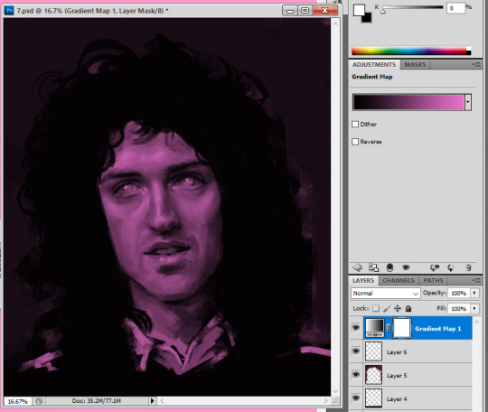
but recently ive started using the gradients with three colours so the highlighted sections will be a different colour to the base colour, i really like the way this comes out, without any other editing itll look smth like this:
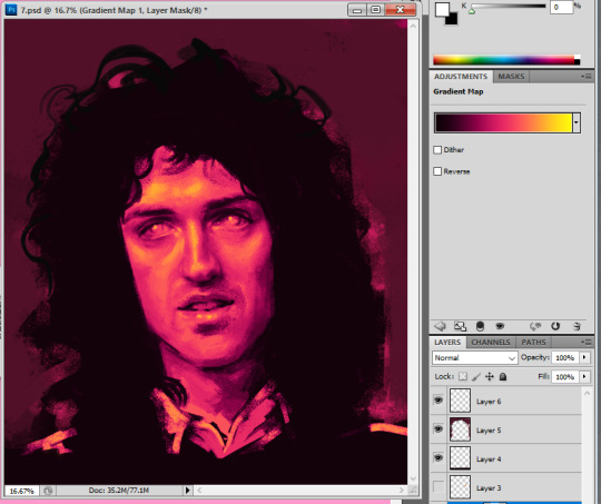
I like to play about with the settings a little bit because i do enjoy the way this looks but it’s kind of a bit overpowering and i think sometimes the details of the drawing can get lost when you overdo it a bit?
If you go through this itll give you many different versions of that gradient and i like to go through it and see which i feel compliments the drawing

heres a couple examples

The one i ended up going for was dissolve but it was a bit too intense so i turned the opacity down to 57%

which gave it a kind of static feel which i was in to, to finish it up i added a tiny bit to show some shoulders and then i wanted to add a tiny bit of a background so i used a flat pinky colour and put that around his hair and then on top of the background i added a little bit more into the hair.

and added so more vibrant pink into it as well just to spice her up a little bit.
124 notes
·
View notes
Note
Oh my oh my oh my I love the wallpapers/backgrounds you make! I’m really really shy and would love to ask you to make some for one of my favorite players (not blacklisted!) but I’m too shy to even say on anon :/ is it okay if I ask you how you make them so I can make some of my own? :)
hey there!! first of all you don’t have to be shy! i’ve made some real weird stuff by request on this blog so honestly this is a v open space lmao. either way i can def give you a condensed version of how to make wallpapers, let me know if you’d like anything in more detail! LONG POST UNDER THE CUT for anyone interested
(also i use GIMP not photoshop, so Your Experience May Differ)
1. find the image you’d like to make a background of. i use players or logos but it can really just be whatever. if you can, look for PNG images, as those are already “cut out” and don’t have backgrounds you’ll need to remove. If you need to remove a background from an image i’ll cover that later lol
2. find some images to use as backgrounds, if you’d like. there are tons of places online to find FREE and non-copyright backgrounds to use in edits! google is your friend here. i like watercolor backgrounds, florals, etc, but it’s really up to you and the Vibes you’re trying to achieve. Save all of these in separate folders so everything is easy to find later!
3. open the editing software you have access to and open a New File in the size you need for whatever lockscreen you’re making (you can google the specific size for whatever phone you have).
4. if necessary, open your JPEG file that needs to be “cut out” of its background in a separate window. I like to use the “lasso” tool to cut my images out, and everyone has different methods of doing this to look the best so experiment and see what works for you! You can then copy/paste the selected image you’ve cut out and place it on your lockscreen-sized background.
5. add backgrounds behind your newly cut out image by using the Open as Layers command, that way you can change the background image/colors at will without having to start over every time. I like to use the Gradient Tool and various paintbrushes if i’m not loading in an image as the background. Layering multiple backgrounds and/or colors and then messing with the Opacity of the layer is also a good way to make things look interesting!
6. play around with the Burn Tool to manipulate the image you’re using as the Main Picture, and don’t forget that you can Resize and Move it with the tools available to you in the Toolbox! (you can always google how to use whatever tool it is that you want to use, it’s super easy to look up “how to use _____ tool in GIMP/Photoshop”)
This is obviously a SUPER condensed version of how i do things, and doesn’t have the millions of tiny things i do to make everything look the way i want it to and is more of a General Overview. If you have any specific questions about things pls let me know!! :)
#a not so great how to guide#let me know if this was even a little bit useful#or if i need to elaborate and use pics lol#Anonymous
2 notes
·
View notes