#i do a lot of diptychs with these two
Explore tagged Tumblr posts
Text
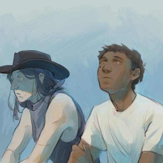
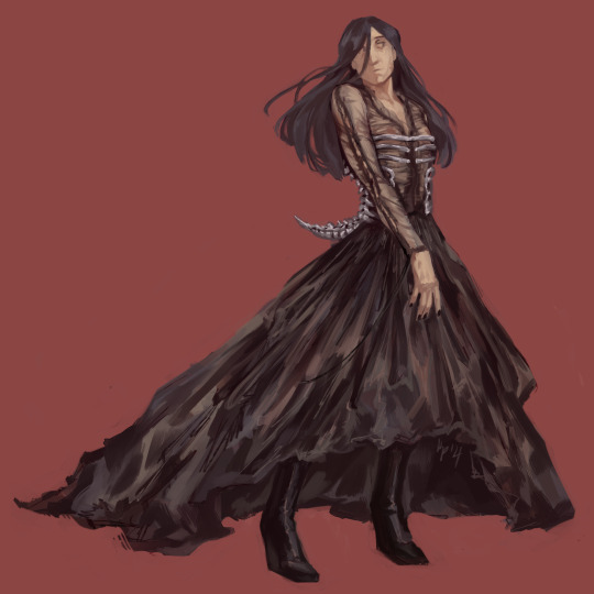
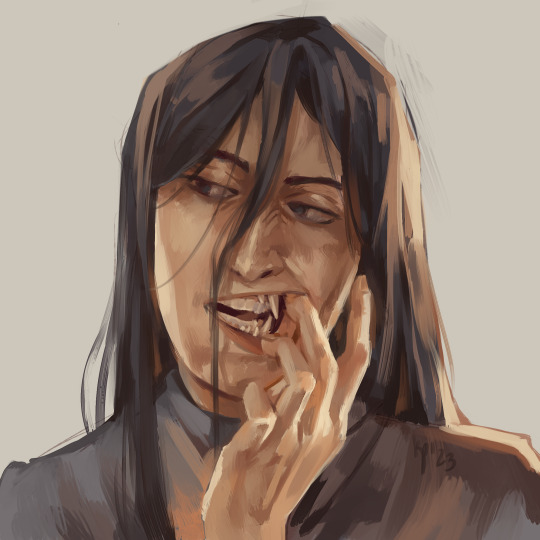
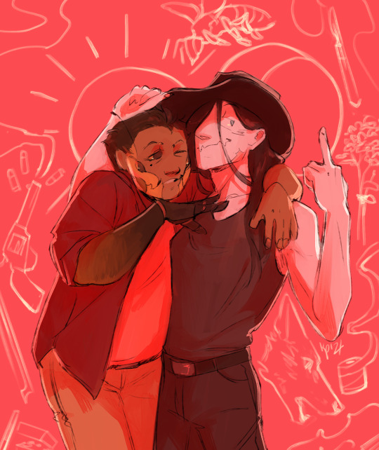
honeybee odds and ends
#art#digital#drawing#ocs#digital art#honeybee#grimm#yarrow#my art#these pieces are all in that sort of funky limbo of 'these are finished but they don't have enough to them to post on their own'#but also they're not sketches so i didn't wanna throw them in my sketch comps idk#i do a lot of diptychs with these two#the first one is from yesterday. the third one is almost a year old hklfghfdhg#also in the second one grimm's wearing alexander mcqueen stuff it was for a art discord prompt hehe
123 notes
·
View notes
Note
hello!! this is kit. happy birthday!!! you don't have to answer all of these but
🎞️if you could change one scene from any of the movies, which one would you change and how?
⏲️what time period would you want marty to travel to and what would you want him to do? for fun or for something serious?
💫if you have any bttf related wips, here's the oppurtunity to ramble about them! (<-PLEASEPLEASEPLEASEPLSEPLSPEL)
Thank you!!
🎞️ - If you could change one scene from any of the movies, which one would you change and how?
Oof, just one scene is difficult, because the thing I'd like to change most would be how Jennifer's plot was handled in the second movie, and that requires a bit more overhauling. I think you could still make it better with a little tweaking though -- maybe she doesn't get knocked out and is simply told to stay watch the DeLorean, which still ends up being a problem when she tries to lure someone away from it, or something like that.
I guess that still modifies more like two scenes, but you get the idea! Anything to make her feel like she's got a little more agency. Because I like her a lot and it bothers me that the BttF movies aren't even that terrible at writing women (Lorraine and Clara are both really interesting characters!), but sidelined her anyways.
⏲️- What time period would you want Marty to travel to and what would you want him to do? For fun or for something serious?
Already answered this one but since there are plenty of time periods to choose from I will simply pick another. As someone who studies the history of science, I think that Doc and Marty could get up to some peak shenanigans in Enlightenment-era America (thinking late 18th and early 19th century here) when everyone was obsessed with the phenomena of electricity. I want to unleash Doc Brown on the people that thought lightning rods defied the will of God.
💫- If you have any BttF related WIPs, here's the opportunity to ramble about them!
OH BOY DO I
So, four years ago I started a diptych of stories I am yet to finish but that are some of the fics nearest and dearest to my heart, surrounding the idea of Marty being transgender. (I once called them my love-letter to transmasculinity, which is a little dramatic, but genuinely a bit how I feel about them)
The first is from Doc's perspective, and deals with the fact that, when Marty was first born, the version of him who'd been visited by 17 year-old Marty back in 1955 must've had an absolute heart attack at first. It features a very confused Doc and (eventually) a younger Marty figuring some important things out about himself, and is probably about half-written at uh. Almost 9k words.
The second, companion piece is from Marty's perspective, and set post-trilogy, dealing with him navigating questions of identity as someone who is trans and who now grew up in a different timeline. It follows his relationships with the important people in his life, his dueling existential crises, and the isolating feeling that maybe there's no one who understands you in the entire world -- and the relief that comes from learning that you're wrong.
I've done a truly monster amount of research for these fics--including having a librarian friend help me track down digitized historical documents during lockdown back in 2020--and am contemplating diving into the historical queer archive where I currently work for a second round, though we'll see what I can find. Regardless, I really want to finally finish these stories now that I've circled back around to having a lot of Back to the Future feelings again.
(Also to show the BttF fandom that I'm a much better writer when I'm not churning out only-mildly-edited 1-2k fics every day for a writing challenge, rip, although I'm honored people have been enjoying those ones, too! Just, you know. I can do better.)
#also it barely even qualifies as a wip because i've only loosely outlined it. but related to my first answer#someday i will write the 'jen and clara have to team up to save their idiot partners from danger' fic i've had percolating for a while#that's much further in the future though. the other WIPs have like. partial drafts and a lot more development and research done#f: your future is whatever you make it
7 notes
·
View notes
Note
no shortage of good fic in f1 but. the diptych is the best one I read with mine own two eyes. you guys are cooking with the writing and the research fr. max, seb, lewis, charles, fernando, the writing oh my god. these fics make me feel someway. the meditative insistence? the interiority?? the presence??? the humor? the passion?? the grit?? the nuance? incendiary top shelf work. my favorite f1 fancontent after rush. kudos to you
Yay! <3 Definitely tell the author on AO3 if you haven't already <3
E is one of my all time faves. They have a super distinct writing style haunting/powerful/precise and they can execute seriously massive scope without losing emotional connect.
The research was a lot of work and a lot of fun. My wayback machine game really leveled up. Super happy I got to work on this one. Burned out by the intensity but definitely happy. I have a whole, new appreciation for longfic writers esp folks who are doing this with a lot of other RL things going on <3
2 notes
·
View notes
Photo

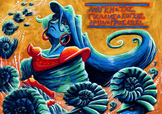
FR [Diptyque Ocean Stones, Ammonite n° 1 & 2] Heyyy ! Je suis enfin arrivée à bout de ces deux illustrations ! A la base je ne voulais en faire qu’une seule mais comme j’hésitais trop entre la composition de ces deux-ci, j’ai finalement décidé de faire un diptyque.. 😂 C’est la première fois que j’en fais un et je me suis bien amusée ! En ce qui concerne les écritures en latin et en grec ancien, je les ai « élaborées » et écrites moi-même ; bon c’est sans doute un peu maladroit mais ça fait le taff. Je voulais aussi donner une impression de peinture murale antique mais c’est pas trop ça.. Tant pis Finalement, vous le voyez, le thème de ce diptyque est l’ammonite, un mollusque aujourd’hui éteint mais qui pullulait dans tous les océans il y a des de milliers d’années ; malgré leur très long règne sur Terre (du Dévonien à la fin du Crétacé), il ne reste de ces animaux à notre époque que les fossiles de leur coquille, petites pierres d’océan témoins d’un passé lointain. Je les ai liées à la mère de Jolyne (my beloved) car je me suis rendue compte que j’avais tendance à dessiner ses cheveux toujours de plus en plus en spirale et ça a finit par me rappeler la coquille des ammonites ! Sachez donc que désormais, ceci 🐚 sera mon « Jolyne’s mom emoji » _ _ _ _ _ _ _ _ _ _ _ _ _ _ _ _ _ _ _ _ _ _ _ _ _ _ _ _ _ _ _ _ _ _ _
🇬🇧 [Ocean Stones diptych, Ammonite no. 1 & 2] Heyyy! I’m finally done with these two illustrations! At first I wanted to do only one but I couldn’t choose between these two compositions so I eventually decided to do a diptych.. 😂 It’s my first one and I had a lot of fun! Concerning the short texts in Latin and ancient Greek, I “created” and wrote them both on my own; well, it’s probably a bit approximative but it’s good enough. I also wanted to give an “ancient mural painting” vibe but it didn’t really turned out this way.. Well it’s fine Finally, as you can see, the theme of this diptych was the ammonite, a now extinct mollusc that used to proliferate in all oceans of the world thousands of years ago; despite their very long reign on Earth (from the Devonian period to the end of the Cretaceous period), only the fossils of their shells – small ocean stones, witnesses of a distant past – remain today. I associated them with Jolyne’s mom (my beloved) because I realised that I have the tendency to draw her hair more and more like a spiral, which reminded me of ammonites’ shells! Know then that from now on, this 🐚 will be my “Jolyne’s mom emoji”
#watercolor#watercolour#artists on tumblr#ammonite#fossil#jjba#JoJo's Bizarre Adventure#jojos bizarre adventure#Jojo no Kimyou na Bouken#Stone Ocean#jolyne's mom#jotawife#mrs kujo
42 notes
·
View notes
Note
Have you answered Q21 and 30 yet? Would love to hear your thoughts on those :o
21. Art styles nothing like your own but you like anyways
hi chiko!
I think I tried so many different styles over the years, and bc of art school I can probably draw in cartoony or anime styles pretty alright, so I won't pick any kind of animation adjacent styles for this one!
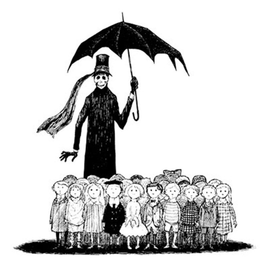

Edward Gorey, Ronald Searle


Norman Rockwell, J.C. Leyendecker
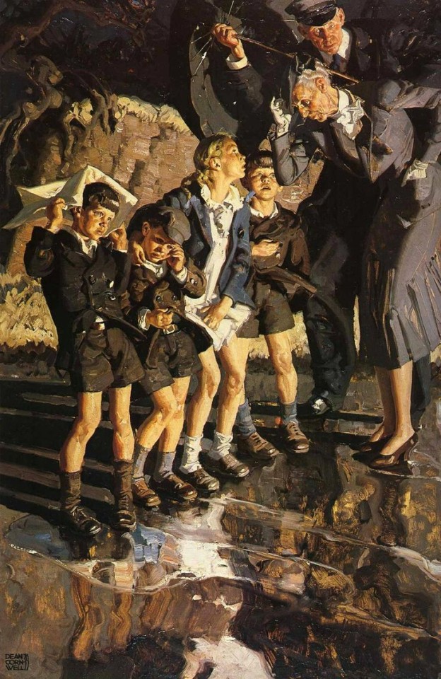
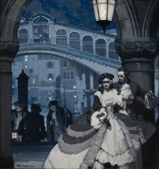
Dean Cornwall, Mead Schaeffer
30. What piece of yours do you think is underrated
this one is tough! as I haven't been drawing a lot of full pieces/posting very very sporadically this year.
like what is considered "underrated"? is it notes? funny enough I think before the pandemic my art used to get more notes, so, would someone consider my recent works "underrated" in that sense? it's tricky. 🤔 I know it's easy to blame the algorithm but there are so many factors at play that we cannot qualitatively control for. being on the right platform at the right time, drawing for the right fandom at the right time, catering to a suitable audience, how you format the post (like do you show closeups or just post the full illust or crop your art? do you just post a video instead??), and a suitable caption (e.g. something witty, relatable, funny, or just something basic like emojis or just 1 word)
for me I consider a work "underrated" or underperforming (I think is a better word for it), is if the drawing is not interesting enough that nothing is said about it. either about either subject matter or artistic techniques. for me connecting to others through art is so integral to the artist experience. if a post gets 1000 notes but it gets 0 comments, then i consider it a failure. if something gets 100 notes but it gets many comments, i would consider it the opposite of "underrated'.
like would original drawings be more underrated than fanart? 🤔 people have trouble connecting to ocs since they don't know the source material, so often those kinds of posts would get less notes or less comments. just interesting things to think about.
it's easy to go into the archive and look at the older stuff that possibly didn't get seen around as much, but i'll try to pull some more recent pieces.
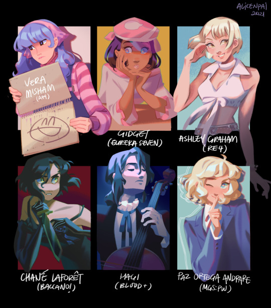
I think this 6 fanarts did badly in comparison to other works because the trend appeared in 2020 but I wasn't able to complete this that year ^__T and the trend didn't come back in 2021... guess I'm not a trend setter..................... sighs 😔 haha
I do want to try this kind of fanart compilation again though! I'm bad at drawing under pressure though so I would have to come up with my own prompts...
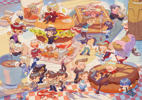
this Kekkai Sensen x Trigun piece! I think the crossover alienated fans of both series bc you had to enjoy both T__T and I also didn't draw characters from either series interacting so I don't think it ended up that interesting? bc I wanted to make this a diptych (it's clear that there's a middle divide now that I mention it) but the triptych didn't end up happening!
besides both being created by Yasuhiro Nightow, I haven't come across that many fans who are fans of both, actually...? it's not in the case where the author's work is more or less similar in tone (or same universe), like Baccano x Durarara, Pandora Hearts x Vanitas no Carte, Higurashi x Umineko. I think something like trigun x cowboy bebop would have worked better because people are always unfortunately comparing the two hahahaha.
21 notes
·
View notes
Text
First Lines Meme
Tagged by @tiredassmage
Tagging: @queen-scribbles @eorzeashan @shynmighty @the-sith-in-the-sky-with-diamond @reliciron annnd @chaoticspacefam -- no pressure and apologies if you were already tagged. If anyone wants to join in that has not been tagged, consider this an invite!
Rules: post the first sentence of your last ten fics. If you haven't written ten fics, share as many first-sentences as you have.
Ok, so I’m going to not count things I wrote for events like theme weeks, Fluffy February, or Fictober -- otherwise, this list would be done in no time at all! This is me writing spontaneously or for other people (gifts).
10. Theron Shan watched the Grand Master’s back as she departed from their morning caf meeting. (The Taste of Ashes aka the Ziost fic, current work)
9. Lana Beniko stalked through the path in the jungle, hacked by the crew of Virtue’s Thief. (The Planter of Trees and Other Tales from Yavin 4 aka the Yavin fic, which is, in my defense, shorter than Les Miserables.)
8. …it was time to move on. He’d reached that decision less than a week before Life Day rolled around at Odessen. (Time to Move On, a gift fic for @thelealinhypehouse )
7. Carth Onasi may not have been able to use the Force, but he sure was able to resist any suggestion better than most sentients that Triya Dolyani had ever encountered. (That Guy, a KOTOR gift fic for @alyssalenko)
6. Theron stared around the apartment. (The Death of Potential//The Potential of Death, a diptych thingy I did as a two-shot)
5. The silence in the room was never-ending. (Maybe, the angsty medical crisis one that ends happily with Baby!Shan news)
4. “In or out, Greydon, what’s it gonna be?” The lady called Risha demanded a response from him, the dealer’s deck in her hand. (The Balance Sheet, a gift fic for @empire-at-war)
3. The longest day of the year arrived. (The Grand Reveal, aka the Rishi fic)
2. “How can you forget you have an entire hold?” Theron asked, staring down into the darkness. (An Old Love Story, one of like 5 fics about Hylo/Gault -- I’m proud of it, even though it doesn’t get a lot of attention. Technically, yes, it was from Fluffy Feb, but it was so different from everything else I’d written, it stands alone)
1. “What do you want for Life Day?” (The Second First Life Day, Theron and Eva’s first Life Day on Odessen)
9 notes
·
View notes
Note
Ship it/Don't ship it:
Steve/Bucky
Steve/Tony
Steve/Peggy
Loki/Tony
Stucky
What made me ship it: Chris Evans and Sebastian Stan's longing glances and general chemistry. Before that, it was a side dirtybuthot ship. Taking away the inherent power imbalance really made it take off in general--people are very reluctant to ship hero/kid sidekick that openly right now--and it gave them a sense of shared history and interdependence that a Bucky who met Steve when he was bulked up wouldn't have.
What I like about it: I had a lot of crushes on my friends when I was a kid, and the idea that someone could have reciprocated that as deeply as Steve and Bucky is a nice one. It's really cozy to pair someone with their best friend growing up. And there's a lot to be said about someone who has seen you at your least appealing and still adores that version of you.
My unpopular opinion: Steve would never, ever have been the first one to make a move. He's aware that he's not a conventionally appealing partner, he sees Bucky as a brotherly type he has a guilty crush on, and he doesn't want to do the wrong thing and change things, so he's always going to repress the shit out of it until Bucky makes a clear move. I think Bucky's a lot more okay with his own feelings for Steve than Steve is with his feelings, and tbh I think Bucky sees Steve as a lot more--what are the kids calling it?--babygirl-coded. You know, when you want to act like you're someone's partner, but you're not actually together, so you just treat them kind of like it? And sometimes it can be toxic, or can be sweet and loving, depending on how self-aware you are and how well you deal with your feelings.
Steve/Tony
Why I got into it: It was one of the many, many ships surrounding Tony in the wake of the first wave of Marvel movies and before the Avengers movie. There wasn't that much good fic with Rhodey, I was the only person who liked Justin Hammer, everyone was writing Stony because they had been such good friends for so long in the comics. Nobody thought Joss was going to... Joss that.
What I like about it: JOSS WHEDON TOOK IT FROM ME. *deep breath* Okay. I like all the shit I liked before Avengers (2012) and their stupid bickering. I like the idea that Steve can help Tony get past his daddy issues by existing in the flesh as a person who stands in opposition to all the lies that Howard told Tony. And I like when Tony delights in introducing Steve to modernity and treats him to a lifestyle that boggles him. I like that they help each other heal from the past and understand the future. But I also like messy party monster Tony who can't keep it in his pants and enjoys going wild to relax and is one manic coke binge away from building a death ray, and I like clean-living, frugal Steve seeing the good in Tony past all of that.
My complicated opinion on it: My wife had this boyfriend who was a lapsed Catholic asshole. He had a lot of Catholic problems, like the whole guilt over feeling good about literally anything problem, and a stupidly rigid moral standard by which he would judge others without communicating it until he blew up about it, but he also had this whole transcendent artist's mystique that my wife really liked. He had a messiah complex, too. I mean, the people I know who thought, "Hmm, I wonder if I'm the second coming of Jesus", including myself, I could count on two hands. But this dude fucking externalized it, you know what I mean? And his girlfriend (not my wife, his live-in girlfriend) was this loud, sarcastic, ebullient bipolar alcoholic who was a lot of fun sometimes and just unstable as shit in general. She shipped Stony really hard and had framed pictures of Captain America and Iron Man as a diptych on her wall. It's hard for me not to think about them when I contemplate Stony long-term.
Steve and Peggy
1) I rarely ship the Hero and their Designated Love Interest. Often it doesn't matter, because the Love Interest is portrayed as episodic or incidental. It's really easy to ignore Napoleon Solo loving any girl, because they're all gone by the next episode. Peggy is not that. Peggy is a crucial part of Steve's MCU backstory. She shapes the world Steve wakes into. And he ultimately goes back to her at the end instead of staying with Bucky. I can't avoid Peggy and Steve; it is there, incontrovertible. I cannot discount it; I must ship around it, as it were.
2) Peggy is more than a person in Steve's mind. Peggy is The Girl Who Saw Him. She's like his mother, she's Not Like The Other Girls, she's Home and Country and Winged Victory and Steve's North Star--and oh fuck she's shooting at Steve because the blonde woman kissed him. Oof. I love that even Hayley Atwell figured they'd have massive house-shaking fights and Steve would have to leave to "go fishing" (this IS going to be something that happens in "Every Breath That I Held For You", btw). Likewise, Steve is Peggy's Ideal Man because to her, he is LITERALLY the Ideal Man. Because she's a crypto-fascist. I want them to be so, so unhappy together. I want Steve to feel trapped and to fuck other guys on the down-low and let Peggy whale on him for spilling her tea because he feels guilty for fucking the guys. Everyone assuming the fast-healing bruises are because he stopped a mugging. Y'know? Sometimes I really enjoy reading about people in terribly unhappy relationships, and I just like watching Captain America suffer in general. Endlessly, if possible.
With Bucky the suffering must have an end, and more intense suffering means I can imagine more intense comfort. But Cap must be tortured, mentally, emotionally, endlessly. It is a fight he can never win, the Captain, and the fact that he wins individual battles against foes only serves to obscure the reality of the endlessness of the oppressive systems that he labors inside of, that he ultimately defends. God, is that what they mean by "one must imagine Sisyphus happy"? Am I having a philosophical breakthrough here? I'm starting to understand why Batroc feels so sorry for Cap upon learning that they are but fictional.
3) There is a sense of symmetry to it, a feeling that Steve ended up right where he started. It's not, as the Russos intended, an evolution from selfless to selfish. Instead, it's the story of a person being taken from a body and a time that's small and slowly killing them, finding a new world, shaping that new world to fit them... And then coming right back home, better. It's Dorothy back from Oz, Sam back in the Shire. It feels like going back into the closet. It's a heterosexual narrative, upholding the status quo you escaped from. And there's a sense of meta-narrative closetedness about it because of the sudden change in the way the cast and crew addressed the Stucky vs. Peggy ships as Endgame approached, the storyline spurred on by Disney's corporate concerns.
Wanda is the vehicle by which this change occurs; the dreams she sends to each of the Avengers seems to not just spur their fears into action but also fundamentally change their priorities as people. Wanda, scarred by Tony's bombs, sends him back to his old coping mechanisms, which result in Ultron; Wanda, seeking comfort in the heteronormative sitcoms she watched, gives Steve a sense of longing for a heteronormative and idealized past. Wanda's magic comes from her emotions, from within, instead of Strange's technical and practiced magic--stripped of her science-fictional "probabililty-altering" backstory that made her unique in her original comic appearances, she's just another Disney magical girl, souring from sad princess to wicked witch. Shave your beards, move in on Main Street, learn to square dance, and wish upon a fucking star! Her mind-altering magic represents this algorithmic Disney influence, straightening out the gays and looping the war racketeers back into constant conflict. The Celluloid Closet meets Smedley Butler.
Anyway, I would ship it the normal way a little more if Peggy was actually Cynthia Glass, the Nazi spy, and she repented of her Nazi ways and then DIED about it.
Loki/Tony
Why I started shipping it: Peer pressure!Nah, just kidding, you convinced me :P
Why I like it: I love the idea that Tony thinks he's going to get into this complex, passionate battle of wits and hearts with a centuries-old being who can rival his intellect... and he's dating the developmental equivalent of a spoiled, brilliant, and rather bullied 19-year-old with Daddy issues. Loki can spend an entire month floating around in the pool drinking pina coladas and reading fluffy romance novels. He's not plotting anything, he's just chilling out.
Unpopular Opinion: I already said I like Tony best when he's a messy party monster trying to do good. I love the idea that he's trying to be responsible and clean up his life, but he's STILL dating a teenaged heir(ess) who nearly burns down the city with one good party. I like Loki when he's fucking around, too.
13 notes
·
View notes
Text
I made, though I didn’t yet grout, that mirror with designs and a color scheme based on old computer games for tween girls, and now I’m thinking a lot about a piece that is kind of a joke about the aesthetics of ~Things for Boys~, like the Pottery Barn Teen catalogs my sewing teacher used to get—their bedrooms would be all very pointedly in plaids and navy and army greens, with surfboards and sneakers and such. It’s tricky to think of a way to make that private joke apparent, though, like moving it from just adopting the color scheme to showing that I know what I’m doing and am fucking around.
I did have the idea of having a kind of gradient from the “boyish” color scheme, and maybe some tiles painted with plaids, that would gradually change into a deliberately “girly” set of tess on the “other side.” Or maybe do layers of borders around a central something or somethings where some of the layers are very gendered “boy” and others very gendered “girl.” I like the thought of there being boy-borders and girl-borders in a little diptych around two central mirrors on one piece, so you can choose to look at yourself within either, as it were, and maybe there are a couple tess that are accidents that look like they belong in one section but were put in another. Possibly this is all too on-the-nose though and would seem like I was trying to say something seriously rather than being entertained by the stagey camp quality of something like this

3 notes
·
View notes
Text
PHO 101 Written Critique
Isabel Amos PHO 101 - Written Critique
Enoch -
Enoch really captured lots of nature photos so to see him opening with a tree covered in snow does a nice job of capturing the moment and his overall theme. He also closed with a tree but in spring so it seemed like it was a full circle moment of blooming that could be perceived through his photography progression over time. The theme throughout would be his day to day views from his pov. The flow was consistent in regard to the style which was natural, mostly outdoor views. The first and last photos stand out and the one with the trees and clouds stand out from the shadows and brightness creating an eye catching contrast. The only photo I would recommend removing would be the one of grass with the Dunkin in the background since it seemed a bit weaker.
Joshua -
Joshua's photos had a really bright tone even when in black and white. I really appreciated his statement since it was straight to the point about his purpose. The purpose being his appreciation for the little things that deliver true beauty in life. The common theme was the clear flow from nature and exploring warmer spots to natural landscapes and transitioned into city scapes and ended with things he may have affections for. The ending two photos of an eye and flower give a cool idea for a diptych which I really find to be strong photos. The weakest photo to get rid of would be the close up of his bike since I think the landscape photo of the bike is a better one. The transition of vibrant colors to black and white is another aspect I appreciated.
Lansana -
Lansana's meaning about being in time through his life and joy spent with his son was extremely touching. The idea that his photos meant less when not with a loved one hit a heart string. The cohesiveness of his photos made sense because it reminded me of a week spent with my dad. There are random things you may do possibly on a trip or at an aunt's house but they have a blend of something familiar yet exciting that I appreciated and recognized. The one with the neon colors stood out to me and the foggy one of the street with the trees I appreciated because of the story about getting burgers he coupled with it. The idea of personal memories tied into it makes sense. I really appreciated that he couldn't bear to part with any photos and went over the 20 because of the memories that each one holds so I wouldn't recommend getting rid of any for that reason.
0 notes
Text
WEEK 7 - writing exercise - Reflective Writing
Reflection on research skills
Other than using Pinterest to find inspiration and examples of typography posters, i didn't do much research, as the topic i chose was my personal experience with Piha beach, which was hard to do research on. I could improve my research by looking more into the history and culture of Piha.
Reflection on my creative process
I did some concept sketches digitally on procreate. I implemented a technique similar to the halftone technique we learnt in class, as well as many other smaller tips and tricks. A lot of stuff i created in photoshop first and imported into InDesign, next time i would like to spend more time in InDesign
Reflection on decision making
I struggled to decide on a theme for my poster because ii thought something political or a statistic would be more impactful however, i couldn't find anything spoke to my lived experience in Aotearoa, Which lead me to choosing Piha, which also connects to my topic in a different design class. I decided to choose to make a typeface for poster because i could be more expressive and communicate the theme better, it also caters to my illustrative abilities /strengths as opposed to a pre-made type.
Reflection on the overall progression of my work and learning
Overall i am happy with the final poster, but because my theme was decided last minute, i didn't have much time to experiment with different concepts/ideas. In addition to this, most of the original ideas wouldn't work for the brief, because they don't have type as the sole communicator. In the future i will try to experiment more with as many different ideas/concepts as i can and I will push myself to improve my typography skills.
Ideas for the future
taking advantage of diptych format, create two different posters rather than one design that spreads across two posters.
Make the poster more specific to Piha? think about how to do that with typography only.
change color palette?
simplify, remove elements that are unnecessary.
How can I add motion?
0 notes
Text

Spione 1928 Fitz Lang German movie posters
Fritz Lang, undeniably one of the greatest and most influential film-makers in all of cinema, is one of my favorites and, from his early work � which remains, perhaps, his most important � I only had a few of his surviving films still to catch up with. SPIONE was one of them and, now that I've watched it, I can confirm its stature as one of his very best, if relatively little-known. The film is basically a follow-up to Lang's seminal two-part DR. MABUSE, THE GAMBLER (1922) and, indeed, it's Rudolph Klein-Rogge himself � who originated the role of Mabuse � who plays the evil crimelord here (called Haghi and who is made-up to resemble Lenin!). SPIONE follows much the same pattern of intrigue, thrills and action; however, the film's narrative structure is not straightforward but rather elliptical and, even though ostensibly dealing with the conflict which may arise were a treaty to fall into the wrong hands, several major plot points are left deliberately obscure (in fact, we never get to know what the treaty actually contains � a precursor to Hitchcock's beloved "McGuffin", perhaps � or what Haghi's intentions are, once he gets his hands on it!). In this respect, the social conscience so pronounced in the Mabuse diptych � coming, as it did, on the heels of Germany's defeat in WWI � is largely jettisoned here in favor of romance (between a female spy desired, and being blackmailed, by Haghi and the Secret Service agent who is the mastermind's nemesis), eroticism (the ensnaring of a central political figure by a vamp in Haghi's service) and technical dexterity (ensuring that SPIONE's considerable 2½-hour running-time goes by rapidly and without any longueurs, in my estimation at least, as opposed to the sluggish and rather static Mabuse). It is not inconceivable, therefore, to discern in Lang's fanciful melodrama the germ for all the spy thrillers which followed � from Hitchcock to the James Bond extravaganzas and beyond. As befits a master story-teller like Lang, particularly during this most creative phase of his career, SPIONE is virtually a catalogue of memorable scenes (interestingly enough, the supplementary photo gallery includes shots from sequences that are missing in the main feature!) � chief among them a ghostly visitation, a ritual suicide, a train-wreck, a police raid on a bank and a stage performance by a clown; however � as opposed to the DVD back-cover, which blatantly spells out its most clever twist � in emulation of the film itself, I've refrained from giving too much away about them here.
UFA insisted on the film being made inexpensively, as Fritz's previous film Meteropolis 1927 had brought the studio to near bankruptcy. Lang therefore chose to do most of the shots in narrow settings with lots of close-ups, as no big sets had to be built up for that way of filming. Fortunately "Spione" became a huge success.
1 note
·
View note
Text
POSTER FINAL PRINT + REFLECTION


Here are the final A3 true size printed posters. I printed on a nice 170gsm paper and did 2 A3’s to do justice to the A2 diptych. I was told by multiple lecturers that the 2 A3’s were acceptable for the submission.
Im really happy with how these turned out and I’m glad I made the last changes to the words poster to give everything more room and add some feathers, it makes the two posters feel a lot more connected. It also feels less cramped and claustrophobic with the extra space between paragraphs. I love the mix of line length and the overlapping parts of the poster which really represents my desk which is the space where I do a lot of my creative work. I think these posters speak to me a lot and I’m really happy with the work I’ve done this semester!
0 notes
Text
Week 9: Poster concepts
My initial sketches from the previous weeks were ideas that have been building off of - I am now in the process of focusing on things like layout, colour and overall how I want to present my 20 elements. I have decided I want to mix analogue (hand drawings) with digital as those are the two most used/important methods to me.

Very rough sketches perhaps wouldn't really make sense to others but there are different ways to go about it, I could do one portrait A2 or a Landscape A2 or two separate A3, it is something that will need to be tested to decide what I am wanting to go with. A reminder of what a DIPTYCH is it is an artwork consisting of two pieces of panels that together create a singular piece of art. They can be attached or detached - note from our lecturers we can begin to push the boundaries or explore different methods of presentation, ensuring it doesn't veer too far out.

I started by just placing the photographs around the page and having the text on the same, although I liked the look of this I felt it seemed rather put together compared to my practice and me, I wanted it slightly more jumbled to represent the fragments of me that are all over the place.

Then I am beginning to test different layouts, I am thinking of doing an A2 but landscape as I want it to feel like you are inside a journal of mine, reading or 'seeing' my life in just two pages.
I still have a lot of work to do to finalise a poster, but having a rough layout down has given me more direction by testing layouts. It is important when creating the poster and any other elements in this assignment to go back to the rubric to check myself. Below is a screenshot from the slides to help give me critical feedback.


0 notes
Text
He-Man and She-Ra Power Tour
The lore from the Power Tour, the Masters of the Universe stage show that toured the US and Canada from autumn 1986 to some time in ‘87, was wild.
A long Youtube video with commentary from Powercon 2017 can be found at: https://youtu.be/0hsWqe918Vw
Shorter video without commentary here: https://youtu.be/p6nyQ7OmzBQ
They brought out an Eternian bard named Songster to sing about the origins of the main characters (well, most of them: not Teela, Orko or any of Skeletor’s henchmen). What does an Eternian bard look like?
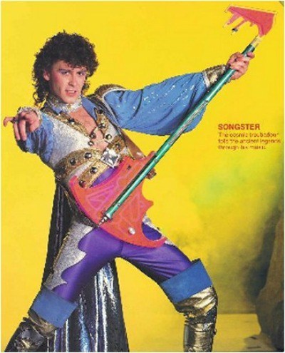
It’s the eiiiiiightiiiiiies! Do a lot of coke and vote for Keldor Miroson!
His first song was about Eternia before Castle Grayskull. The planet was ruled by five good wizards. They had to keep fighting the disorganized Snake Men, who “lacked but one thing: a leader to lead them! Then one day he appeared! Hordak!”
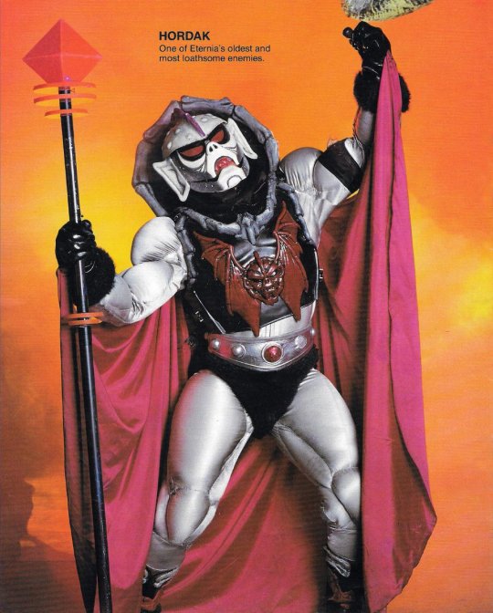
(What, were you expecting King Hiss? Maybe the five good wizards are the Ancients who banished him right before this story.)
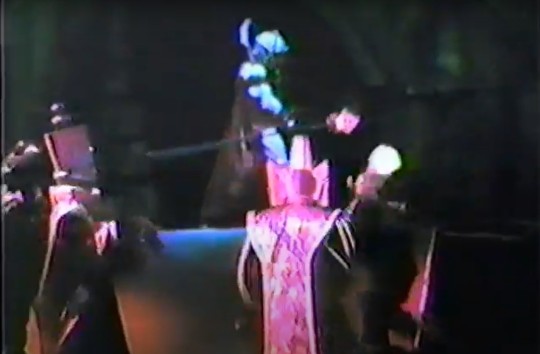
So they fought a war, and the evil forces were defeated. Hordak retreated to another world with some of his Snake Men, swearing that he would one day return and get his revenge.
“Knowing that Hordak would indeed return,” the five ruling wizards decided not to die natural deaths but rather sacrifice themselves setting up a system containing all their power/the power at the Heart of Eternia/the Starseed/whatever.
“ULTIMATE SACRIFICE!”
They transmuted their bodies into the walls of Castle Grayskull! The first Sorceress appeared, to protect the Power Sword.
Fast forward to the time of King Randor. The astronaut Marlena crashes on Eternia. They fall in love, get married and have twins.
Then Hordak returns! Baby Adora is stolen from the nursery and Prince Adam grows up being told that Eternia’s peace and freedom is all up to him. We see him as a young man being trained by Man-At-Arms.
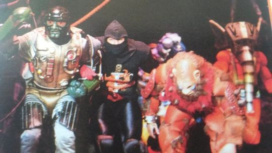
Now here’s an interesting divergence from any other ‘80s version of Hordak’s story: rather than “Skeletor betrayed me many years ago!” or “Hordak abandoned me when the Queen and Man-At-Arms subdued me in the nursery”, the stage presents a diptych where Hordak continues teaching Skeletor while MAA teaches Adam. Skeletor is an apt pupil, while Adam is a complete failure. The Sorceress appears behind him to sing inspiration. But it seems to be of no avail, and even when Hordak’s forces invade Eternia, Adam whines “Father I can’t!”, to which Randor says “Then Eternia is lost” as the royal parents and Duncan go out to fight. But eventually the Sorceress inspires Adam with confidence and he summons the Power of Grayskull through the Sword.
Duncan doesn’t recognize He-Man as Adam, and they briefly fight until he identifies himself as the Prince, not one of Hordak’s champions. They fight Snake Men, then Hordak says “Let’s see if you can face a REAL warrior!” ... the performer playing She-Ra! Grown Adora puts up a better fight than a Snake Man but is still knocked down by the Power of Grayskull. The Sorceress has to tell He-Man not to slay her, for she is his sister. Shamefaced, He-Man splits the sword in two, one half being the Sword of Protection. Adora powers up by the Honor of Grayskull, and that is how He-Man and She-Ra came to be!
That’s all the lore. The show then moved on to silliness like Skeletor challenging the twins to Good vs Evil on roller skates and such.
#motu#classic shera#hordak#skeletor#adora#snake men#prince adam#king randor#queen marlena#songster#sorceress of grayskull#man-at-arms#stageplay
30 notes
·
View notes
Text
Bran I - The Deserter Executed, and The Direwolf Cubs in the Snow


"The morning had dawned clear and cold, with a crispness that hinted at the end of summer."
A project I've been working on for a while, and one I'm SO excited about. I've done a few diorama pieces before, but I've been really wanting to do a specific chapter scene like this.
Like a lot of GRRM's best chapters, Bran I is a contrast between two set-pieces- Ned dealing out the Stark old-way execution of Gared, then Jon talking him into showing mercy to the Direwolf cubs. As such, I wanted to make a diptych of sports, with the two scenes contrasted on either side. GRRM has talked about how the image of this chapter just came to him fully formed, and it does have a certain stained-glass perfection to it.
On Ned's side, we have the execution. Funnily, one of the biggest challenges of this piece was a kneeling man ready for the chop, I basically had to build him from scratch from pieces. ASOIAF has a lot of big portentous executions, and I'm not looking forward to that challenge every time! I also forgot to cut off his ears until the last second, so that took some maneuvering! I know in the book the execution actually takes place in a square in the middle of a holdfast, but I think the show has been too influential in making me picture it outside, besides which it let me do the wall of trees to separate the scenes.
On Bran's side we have the discovery of the Direwolf cubs. We can assume Jon and Robb are just off-screen, but I wanted the simple primal image of the boy in the snow. I always struggle with the North having knee high snow in summer, so I wanted it to look like a patch of snow that escapes melting by being in the shade. I'll do a separate post for the Direwolf sculpt itself, here I'll just note I'm happy with the way the spray of blood around her throat mirrors the Weirwood leaves around Bran. Finally, it's mentioned that the Direwolf is found near a stream, and I thought it would make a nice little visual to have a corner of stream... that throwaway decision ended up taking more time than the rest of the sculpt put together! The various resins and varnishes and gods know what else needed to make that little corner of water nearly killed me, but I do love how it looks in the end.
#while making this i was listening to audiobooks of The Time Machine and The Invisible Man#so now I'm the one person in the world who strongly associates Bran I with HG Wells#this post was long enough without thematic rambling so:#i adore the idea of inteoducing the hero as wrongly executing the hero of a prologue chapter#beautiful way to establish 'this is not a conventional fantasy series'#also saw a great analysis of how this chapter establishes jon as a hero#supportive of bran but willing to challenge the status quo and LITERALLY saves a puppy by self sacrifice#asoiaf#asoiaf fanart#miniatures#minis#cmon#a song of ice and fire#valyrian scrolls#stark#the north#ned stark#bran stark#direwolves#valyrianscrolls
46 notes
·
View notes
Text
Meynnart Wewyck’s workshop-part 4: Henry VII
One again, these are merely my suggestions of which paintings I’d like experts to exhamine in order to determine if they are by Wewyck’s workshop.
This time we are focusing on Henry VII and in part 5 also, because there is damn so many portraits of him! I keep finding more even while searching for portraits of other people!
Straight away we have two very good candidates. Another versions of portrait already proven to be Henry(in the middle) by Wewyck.
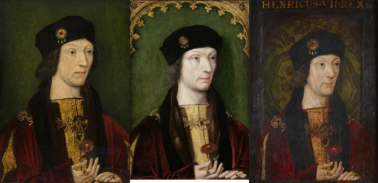
Both of them deserve to be tested imo. Because one might be original from life and remaining posthumous copies. Maybe during thorough exhamination they’d figure out which one. So far most paintings experts identified as Meynnart Wewyck’s workshop are from 1510s. And 1520s style is very different, and it is possible that 1500s style would be also very different. But as i said in part 1, you need to compare a lot of paintings to figure that out and it is entirely possible workshop had 3 or even more stages! Not just 2 we know abbout now.
I.)Henry VII, Anglessey Abbey:
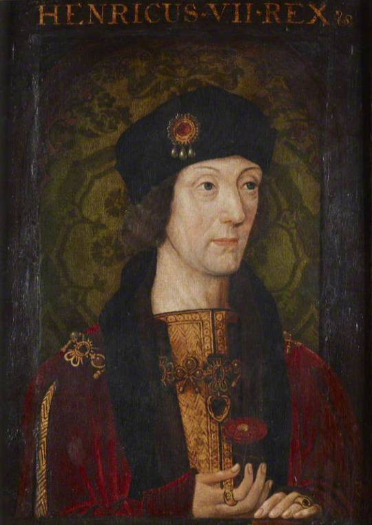
Link:https://www.nationaltrustcollections.org.uk/object/515569
Anglessey Abbey says diptych’s dendrology came with result of 1512-1520, so this should be posthumous painting! But they don’t say if they tested both paintings in the diptych(and each could have been done at different times.) and those two paintings don’t match each other, the other is horribly altered.
This painting was once in different frame and sides and bit under hands is still not cleaned off properly(maybe it is not possible to clean it idk, sometimes it is unsafe to do without damage to the painting.
Imo at least inch or two are missing in lower part of painting.
You can barely spot it but his hands rest of the grey ledge(here looking black) and actually on golden orb just as Elizabeth’s were.

Receuil d’Arras shows Henry VII with golden orb too, though in different hand. I am not sure what is the significance of this gesture, but Henry VIII is depicted like this too(see part 1).
You have to look in different angle to spot that there was once rounded decorative top-matching proven version.

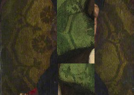
The background gives us the same green damask pattern as in some other paintings, including proven Wewyck’s work:
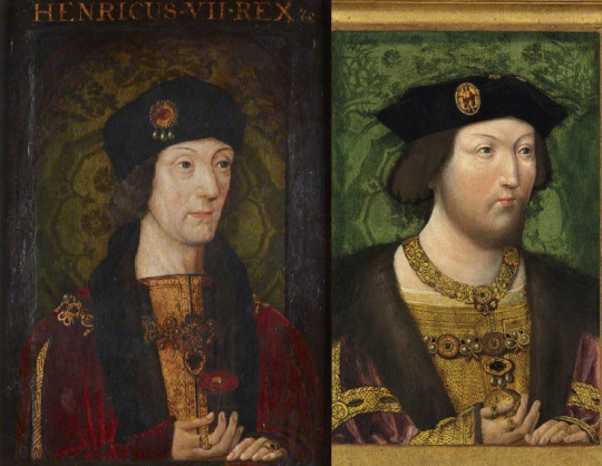
Though emphasise once again, that this was very popular pattern and was used in many paintings outside of England.
But I’d like to point out few easily overlooked similiarities and differences between this painting and version of it already proven to be by Wewyck.

Aside from ledge and orb being missing on proven version, there are:
Pearls and heart shaped pendant on carcanet missing:


Brooch with 3 pearls(on hat)

-with or without ruby. I found many depictions of hat brooch with 3 pearls with ruby and only one other without. So I am not sure if it was gilded over on proven version, or if he had two similiar brooches.
Shape of hat and texture of hair and slightly different shape of nose.
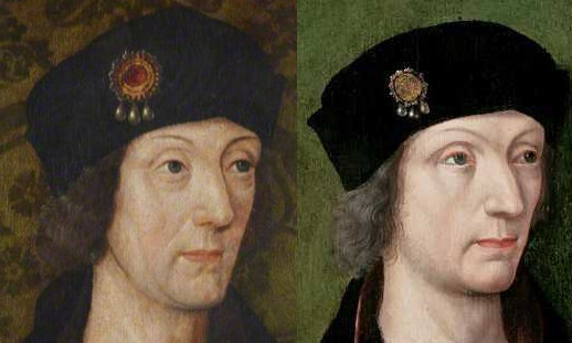
Proven version has much roundish shape and that slight pointy end on forehead is barely there. Hair is of different exture, but still has slight wave to it, in both time is gray going to dark(one more than other), not even close to white hair Virgil described. (Though imo it probably wasn’t white but light grey hair.)
Hands

In Anglesey Abbey’s version his thumb is freekishly long and thin, and his index finger bends slightly differently. Rings are also much larger.
Slight differences in his robes, how fabric twists. But actually that pattern of cloth of gold is on proven version too, just way less visible.
Also both have red velvet trim on egde of their fur, which you can barely spot in both:

And that is important detail, because next version doesn’t have it(maybe due to alterations).
II.) Portrait of Henry VII Cultural Heritage Agency of the Netherlands Art Collection

Link to wikipedia where it is in HD:
https://commons.wikimedia.org/wiki/File:Portrait_of_Henry_VII,_King_of_England_Cultural_Heritage_Agency_of_the_Netherlands_Art_Collection_NK1426.jpg
It’s dated as c.1530 but imo it’s older than that.(i can be wrong.)
The I. and II. way more similar to each other than to proven version. The hair is between dark brown and grey(which could be darkening of pigments), pattern of cloth of gold is more visible, hats are more alike(brooches are same), both have heart-shaped pendants on their carcanets and at least 1 pearl on its end.

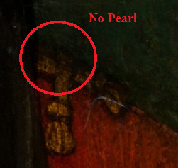
Pearl hiding away(overpainted when background was done or redone).

There are but few differences. Netherlandish is showing of more of cuts on sleeves and clearly has fur lining on those cuts and around wrist(which Anglessey doesn’t have), proven version has mere hint of it.
Rose is different and hands though more shaped as proven version, have thumb of his left hand(on right) showing. That is very odd actually.
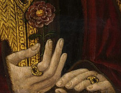
No way his hand merely rests on ledge, the thumb wouldn’t be under rest of the fingers! Those four fingers aren’t so straight either. Try it yourself, but when i twist my hand to such position, it seems to me either as evil witch claw or as if i was grasping something roundish. Perhaps golden orb.
And yet despite all above, the face matches more the proven painting(on right):
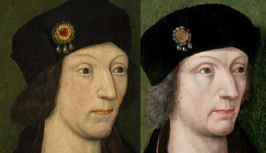
I don’t know what to make of it. Perhaps experts can get us some clarity.
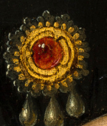
Tbh, i just love details of the hat brooch in II.
There is actually 4th version of this painting. But beware the face is horrendous!
III.)Henry VII (1457-1509), Victoria and Albert Museum:
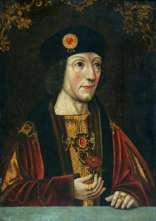
Link: https://collections.vam.ac.uk/item/O128343/henry-vii-1457-1509-oil-painting-unknown/
Those floral decorations on top were also found on portrait of Richard III from National Portrait Gallery(said to be late 16th century work). Idk if these were originally on our Henry too, or if it is later alteration.
VAM’s description simply states this painting is 16th century work-translation:we didn’t test it and don’t know.
You’d think these two are pair, but when you check the dimensions of both, H of hers is just 70% and width just 60% of his, so hers is smaller and narrower!
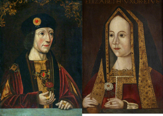
But they probably are at least altered by same painter.
By the way I., II. and III. are only paintings of Henry VII in existence(that I know of) which also have that heart-shaped pendant.
I won’t point out all the similiarities/ differences with the others again, as you already know what to look at and that ledge is pretty much unmistakable.
But few more differences, which are hard to spot:
Cloth of gold bending up vs down:

In III. the ring is on his middle finger instead of on his ring finger(which can be simply honest mistake by painter, even on original):

The middle of the rose has gilded pattern:

And last thing I am not sure about. It’s the velvet, his shading, how it is painted.
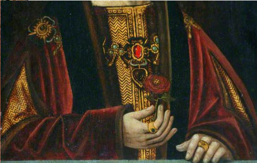
To me it looks very alike as velvet in proven paintings. I can be mistaken though, and even if it is by Wewyck it can also be posthumous.
Problem with it is, that Henry VIII is never painted with grey ledge during his reign. Is it the case his got cut off or there never was any? Does it mean we are looking at copies after his reign? Or the style was prefered prior to his reign?
Could it be the earliest style of Wewyck’s workshop? I wondered. But then the trail went cold and I found nothing similiar for long while and instead focused on gathering versions of well-known paintings of Henry VII(and plenty there are!)
It bothered me, just as Virgil’s description bothered me and fact that somebody overpainted some of these paintings so heavily! Why?!
Perhaps this painting holds answer to that:
IV) Henry VII (Masters) (1457-1509), Society of Antiquaries of London, Burlighton House:
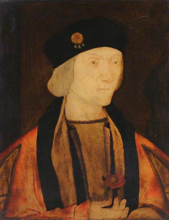
Link to Society of Antiquaries:
https://www.sal.org.uk/collections/explore-our-collections/collections-highlights/henry-vii-masters-1457-1509/
According to Society of Antiquaries it is ‘Likely painted before 1540′
So they don’t know.
But the painting is the worst case of pigment instability I’ve seen.
(Darkening of pigments is also example of pigment instability-at least I call it pigment instability, experts probably use some other term.)
Only the rose is not washed out(and I cannot rule out it is altered). Crimson velvet turned to orange! Light peach colour at some places!
If this happened to other paintings, it might explain the heavy overpainting.
I’ve seen MANY paintings of Henry VII and indeed it is similiar to many of them and could be altered version of some of them.
But what if it isn’t? There is 2nd version of this painting.

Both have cloth of gold lined with fur, different edges of the gown over it, rose with pattern in middle:

Bends on fabric of the sleeves and hand twisting same way(ring missing):

And lighter grey hair:

V: Henry VII in Christ Church, University of Oxford:
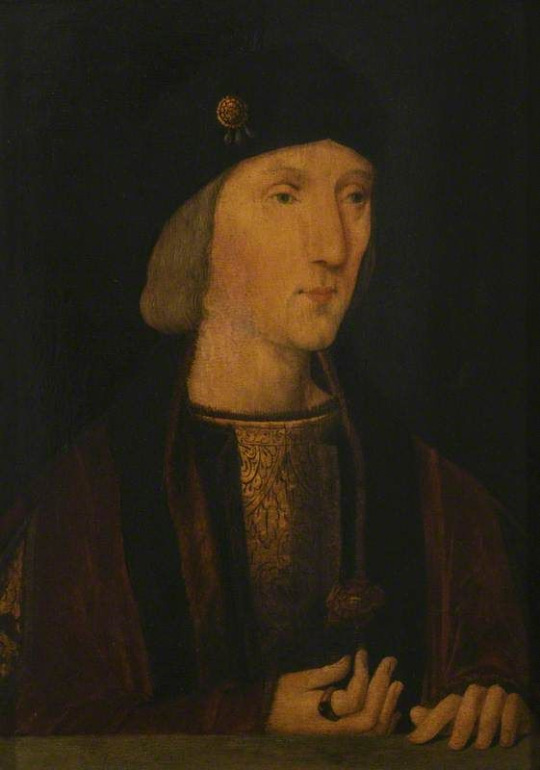
Link: https://artuk.org/discover/artworks/henry-vii-14571509-229296/search/keyword:henry-vii--referrer:global-search/page/2
(Don’t ask me why some univerities put their art collection on Art Uk instead of their webpage. IDK! But gives very few information about the painting.)
Obviously the painting is very dark, but perhaps it was its saving grace, grime protecting the pigments from becoming unstable.
Virgil described Henry VII thus:
His body was slender, but well built and strong; his height above the average. His appearance was remarkably attractive and his face was cheerful, especially when speaking; his eyes were small and blue, his teeth few, poor and blackish; his hair was thin and white; his complexion sallow.
And this is the only painting which fits the description. He is slim, seems to be tall and yet as no weakling/doesn’t look very ill. His hair is lighter grey(with small wave to it), his eyes are small, probably blue and look warm. Not as ice-berg in other versions.
When I say he doesn’t look ill i mean it in terms of his overall figure, his body is still strong despite him going grey. Virgil says Henry is strong but he also says he is sallow. You might think of sallow complexion as of yellowish or dark. But sallow can also mean unhealthy pale. Not everybody has that glow to the skin, we associate with health. Especially people with very pale skin, often can seem to bit sick of us.
Imo this is the difference between having fair white skin-very pale with that healthy glow and sallow white skin-white pale without healthy glow.
(Are you listening Anne Boleyn fans? Your lady probably wasn’t troubled by jaundice nor was dark-skinned/olive-skinned. She just looked bit sick. Which I’d be too if Henry VIII kept persuing me. I’d feel vomit raise up constantly. Ok maybe not early on in his reign, but later yep. I’m preparing entire post decidated to how many people he had killed.)
But you might disagree and think the painting doesn’t show Henry VII’s real features, you’ve seen his paintings and you’ve seen photos of his tomb and it is not him!

But isn’t genetics wonderful thing?


Even if it fools you sometimes.
VI) Henry VII, Hardwick Hall, National Trust Collection:

Links:https://www.nationaltrustcollections.org.uk/object/1129171
https://artuk.org/discover/artworks/henry-vii-14571509-172314/search/keyword:henry-vii-117090/page/8
Often this painting is thought of as young Henry VII.
I’ve seen it years prior and thought that yellow varnish played trick on portrait of Henry VII with light grey hair and created ilusion of blond hair and of much younger Henry VII-which then somebody copied into separate painting.
Problem is, now I’ve seen yellow varnish on light grey hair, and it doesn’t create such ilussion! My assumption was wrong!
So is it truly young Henry VII? Dressed and posed in same style as when he is grey? Not one wrinkle? It’s possible it is copy made to look him this young.
But what if the identity of the sitter is wrong? Remember, there is often great resemblence between family members and often their portraits are mislabelled, mistaken for their relative!
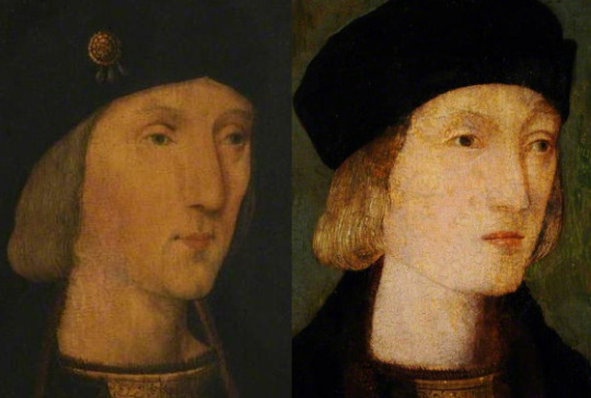
Imo, this is father and son(V and VI), painted at same time. I can’t tell you if VI is young Harry or Arthur. I don’t know. Siblings can be hard to tell apart. Darkening of pigments might have turned Arthur’s hair in known portrait to brown and Henry’s red hair could in childhood be more to golden strawberry blond.
By the way the boy’s hand rest on dark ledge, yet again, and these last 3 paintings are aproximately same size(H 35.5-36.8 cm and W 25.5-27.5 cm, max 2 cm difference). With IV(which doesn’t have ledge and misses few fingertips) being the shortest.
The details in IV, V and IV suggests they are work of same painter. That painter could be Meynnart Wewyck. The differences between these paintings and those already proven to be by his workshop, could simply be that these belong into other stage than the two stages we already knew about.
Hence these could be the oldest paintings by Wewyck, thus oldest Tudor paintings. And if that is not worthy of investigation, idk what is.
I hope you’ve enjoyed it and no, part 5 won’t be arriving as quickly as part 4.
11 notes
·
View notes