#i definitely know that some people are inspired by classical paintings and i think thats fucking swag
Explore tagged Tumblr posts
Note
i'm a little late (oopsies) buuuut if you're still answering 'em, 6 and 14 for the artist asks? ehehe
hi misty!! thank you for stopping by with the artist asks, i'm happy to answer them!
6. Anything that might inspire you subconsciously (i.e. this horse wasn’t supposed to look like the Last Unicorn but I see it)
it took me a bit to come up with an answer for this because stylistically speaking, i try to be very deliberate with what choices i want to try out and yoink from artists...
that said, i think that whenever i do any silly comics, because i'm not too well-versed in the medium, i feel like my expressions end up getting subconsciously inspired by expressions i see passed around a lot... like anya's waku waku expression or MS paint tails...

so basically memes...! im a very silly littel guy. oh and do cats count i swear my expressions are based off of meme cats sometimes.
14. Any favorite motifs
i think in most arts of mine it's very easy to see that i'm so very fond of sparkles... i can't help but insert a little ✨ into my work... i am also very fond of the moon (all phases are cool but i am most drawn to crescent and full moons). this is probably not a surprise whatsoever given that ryoji's one of my favorite characters 🤣
i think i just really like circular motifs in general too... like radial lines? concentric circle? is that what they are called? my vocabulary regarding these are a bit lackluster, so here's an example of what i mean featuring a sylvain concept from may 2023 that will probably not see the light of day </3 (this was supposed to be for his birthday) (being impaled by the lance of ruin is a great birthday gift i know)

for composition heavy things i usually enjoy integrating character motifs... whether if it's very direct (e.g. crests for fe3h characters, the moon for ryoji, water for minato), or just something that i feel reminds me of the subject matter... (i love sprinkling music notes whenever i draw ryomina i just think there's intimacy in sharing music together when you use ur headphones to isolate urself but umm thats very unrelated to this ask.)
i also really enjoy visual motifs being used to make characters look like they are being displayed in a church (see this tweet for examples of characters)... i guess you could say religious imagery? i'm very fond of the art nouveau style and i feel like i'd wanna make a few pieces like that!
#lizzy askbox#thank you for the ask!!! i had a lot of fun reflecting on these#especially number 6 given that i had to think a different angle that wasnt necessarily 'style'#i did briefly consider yosuke as an answer to number 6 (he subconsciously informs my ocs but i cannot fucking explain that#also that's writing and not necessarily drawn art#14 was also fun! it was a nice realization that maybe i would enjoy relearning about art history#ive had some art history classes in 2016 but i dont think i drew a lot at that time to incorporate what i learned from those courses#into my own works... and also thats just a long time ago that i can only remember the general gist haha#like.. relearning about art history to be able to put names to the motifs and styles that were around#i definitely know that some people are inspired by classical paintings and i think thats fucking swag#and i probably would be too if i took a look at them again!#actually the sylvain wips not that bad. maybe i should come back to it. LMAO#i think i stopped because i tried to clean it up and god forbid i clean anything up (hate that shit!!)#anyway im rambling. thank you again! i love talking about art i will still be happy to answer more of these! <3
2 notes
·
View notes
Note
HAHAHAHA Every Turk Family has one of those names and unironically mine does too 🫡 Tell your mother thank you she is a very lovely lady
I know all of the artists you listed below because my dad blasts them on the radio everytime we go out... I call it old people music but hey I never said it was bad, they're awesome and I might have memorised some of the artist's songs from how much I listen to them... Barış Manço is a classic without a doubt! Fun fact my parents were able to go to his concert and got a signed picture with him I will always envy how lucky they were 😭 I love how women in the industry made the most iconic songs I hear them often in weddings too! Or clubs, even though I only went to one once I'm not very fond of them...
My questions were do you have any tips or inspiration with how you draw! I love your art and artstyle and it's honestly what I've been trying to achieve for a while, I can't believe I'm learning how to draw men because of a silly lawyer show it's a disease...
(We are just having a conversation at this point) (I feel like those people who speak out loud in public) (I hope you and anyone who's reading this is having a good day :) be kind to yourself and others everyone)
OH MY GOD i envy them too😭😭 also omg that sounds like heaven to me. the other day i went out partying and i felt sooo out of place because i only knew like 3 songs. omg it was so so bad.
hmmm tips and inspiration…. my number 1 tip would definitely be to look at a lot of other artists you like and analyze what exactly you like. and then try to emulate that in your own work. i try to look for inspiration everywhere - artists online, traditional artists, old masters, 3d artists, even theatre and poetry, etc. - doesnt mean that i am equally inspired by them all (because all these things at once sound so scary and big but they really arent!) but rather, i try to be open for anything and that helps me find inspiration :)
ill try to explain my thoughts more under the cut because this got long:
for me for example, so far i only posted some art i made that was lined (which, i would say makes up maybe half of the art i draw - i mostly sketch and recently have been building up the courage to paint more) and one of my inspirations is meltow. i think if you go over and check out their art youll definitely see it lol. but also i love the clean look some comics have and my friends tell me my art looks like it belongs in a comic which, i guess yeah :) when it comes to colors and composition i LOVE this artists works. i still have a lot to learn and just looking at their works inspires me so much!!!
i will say i have ALWAYS struggled with lineart. its probably the worst thing in the world to me because it never feels right!!! i like lining on paper with harsh inks and stiff ink nibs that allow for like. very little variety in line weight, but i havent done that in over 3 years (i hope i can get back to that). but yes, something about lineart makes me feel so icky when i use any brush that reacts to the pressure you put on your tablet LOL i just hate it. ugh. i havent been able to work it out.
it was only in 2020 i think that i decided to try it out with a thick brush with some texture and no pen pressure. that probably was the first time i got actual lineart that (at the time) i liked done. and then later on, discovering that other artists are able to achieve beautiful drawings with similar brushes AND that lining with a very simple brush can feel so satisfying helped me evolve a lot! until 2022, i actually wasnt able to give my art the kind of finished look that i wanted. so what people consider my style is really just born out of my limits and working with them. that obviously doesnt mean that i dont try to challenge myself as much as i can. i do and i think everyone should! thats what makes art so fun
if theres any good advice i can give to a beginner itd probaaaaably be. okay this is difficult and i feel like im not really qualified for this. as a hobbyist much less so because a lot of the knowledge and skills i acquired was through an intuitive process (i could never stick with habits such as regular studies or warmups or whatever is meant to be good for you) which definitely isnt the most “productive” way but i mean it doesnt have to be. its just a hobby! you dont have to perfect art. but yes, i would definitely say dont stop drawing. youll always be your harshest critic and at the beginning, and especially if you begin at an older age because youve been training your eye your whole life but your drawing skills for only a relatively short time you will notice a lot of mistakes. and youll think you wont achieve the image you have in your head. and maybe you wont (because youll always strive for more and youll never really be satisfied as an artist bla bla) for a while. but you have to keep drawing! try out different strategies, find out how other artists draw, watch speedpaints, try out different papers and pencils, try everything that makes it more fun and keep going! it will all pay off!!
in my eyes theres also no point in saying “i should wait till im better to draw this idea i have” because if inspiration strikes you you should use that. even though i still sometimes catch myself thinking like that. you can always redraw things later on!! if theres anything that will keep you drawing you should use that! like getting into shows and games that make me want to draw helps a ton LOL people are not joking when they say getting obsessed with one character is the quickest way to improve. i 100% agree!!! if you saw my first nachos you wouldnt even recognize him. not kidding wow this got long. thank you for the questions though!! i hope some of my rambling can help you. feel free to talk to me whenever!
2 notes
·
View notes
Note
Hey Kata! How are you? Long time no chat, ive just caught up with your blig and I had some questions if thats okay!So when it comes to canines and your love of mutts would you be against people sharing their mutts with you? Also I noticed you had Gustave Doré on your influence map and can I just say it is SO COOL to see that cause I can totally see how his work has influenced yours and it totally explains one reason I love your work! Any other “famous”/classical artists you love?
BRANN my guy my dude, I’m doing alright, thank you! Living exciting times, I was recently accepted into a university and will be starting my Graphic Design studies in a few weeks. After cleaning hotel rooms for 4 long years, I’m overjoyed to leave everything behind (except for my dog, obviously) and basically start my life over.
But yeah my fave artists ummm let’s see! I have a ton of them but here’s a few I could think of:

I love Francisco Goya’s work, especially the Black Paintings and other witch-y artwork of his. They have been said to satirize people’s fear of the supernatural (note that Goya lived in an era when it was still risky to be accused of witchcraft, so I’d imagine creating surreal and nightmarish pieces might’ve been a daring act). Interesting person, interesting art.

Louis Wain. Not only do I look up to this man for his artistic skills, but also his passion for creating art. To those who don’t know, Wain either had Asperger syndrome or suffered from a serious mental illness. Despite spending his final years in a mental hospital he kept creating amazing art until the end. As someone who has an irrational fear of “going mad” and losing my skills/will to draw, Louis’ work reminds me of the fact that even severe illnesses/disabilities are not always the end of the world (or career).

I think Bragolin’s bizarre artwork of crying children is worth a mention as well! My mum had an obsession with his paintings and after spending a fair portion of my childhood staring at 2 massive prints of these weeping kids, the artist’s work has definitely stuck with me. If I ever get around learning how to paint, Bragolin’s style will definitely be a great inspiration to me.

Not sure if Annie-Claude Martin counts as “classical” artist, but she illustrated A Treasury of Fairy Tales which was my favorite book as a kid. I absolutely love her style, especially the way she drew animals and fur details.
P.S. Everyone pls feel free to send me all the mutt pics (or any pet photos, really, I luv all animals), I can’t publish them all since I try to keep this as an own-art-only type of blog but if that doesn’t bother you, know that I would absolutely love to see photographs of you guys’ animal companions.
514 notes
·
View notes
Text
MR VOORHEES Q&A PART 3: The Past, Present, and Future of Voorhees Glass.
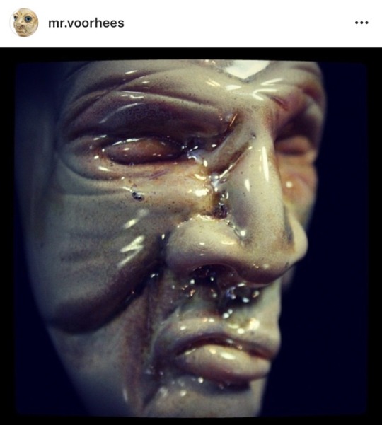
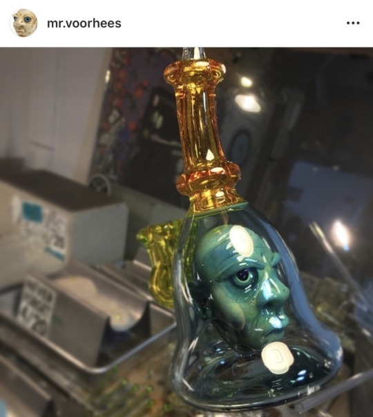
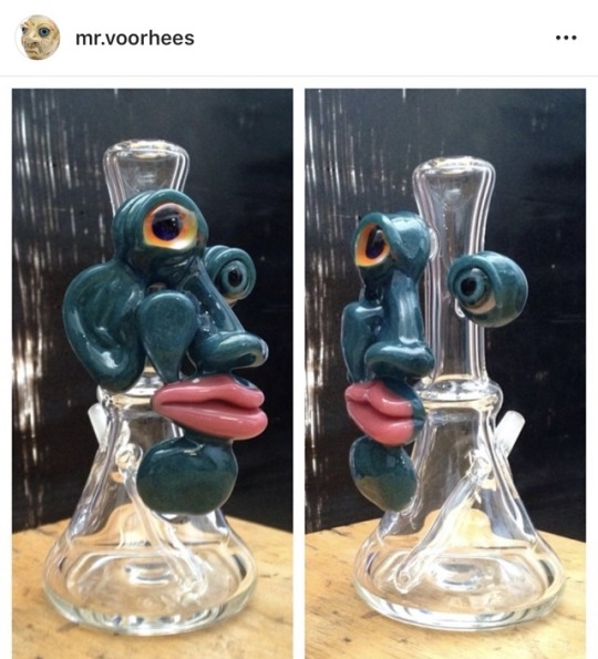
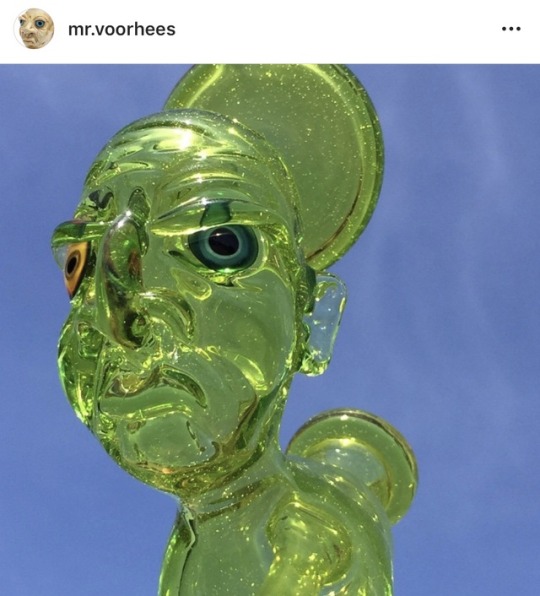
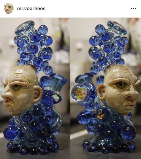
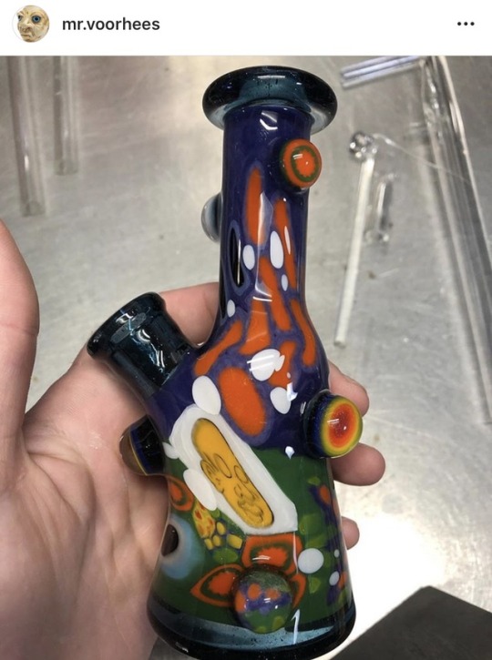
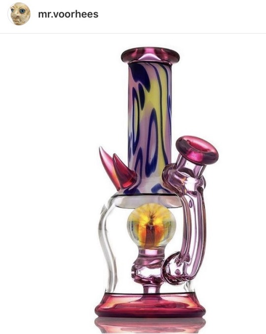
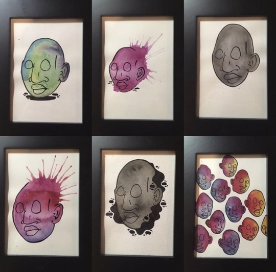
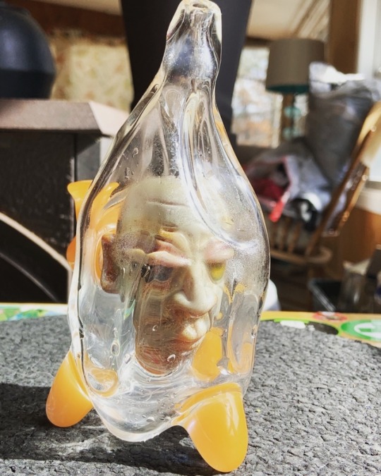
The glass industry has grown exponentially over the last 5 years, with new artists, new techniques, and new colors. We felt it was necessary for the glass community to have some insight on the artists, and what drives their creative engines. It was always in my interest to learn more about an artist that has always had my attention, respect, and admiration. Mr. Voorhees has developed some of the most aesthetically pleasing, and incredibly functioning glass to date. He has never remained static, always pushing the boundaries of his work, and exploring multiple mediums to express his art. We were delighted to have the chance to ask him some questions about the past, present, and what we can expect from his future!
I feel like a good place to start would be simply how did you get into glassblowing, was it a window for your street art and paintings or did you start with a different medium such as graffiti, sketching, etc?
VRHS: I started making glass in 2004 with the help of Adam G who gave me the opportunity to try it out.. since I was a little kid, my dad was always drawing and painting and naturally I wanted to be like him.. that’s where my drive to be an artist came from.
That’s awesome! So where were you born n raised, where did you start and where are you currently blowing glass?
VRHS: I was born and raised in Michigan, that’s where I started.. now I’m in Southern California, been here for the last few years.
So how did you begin the heads? were they originally modeled after anyone in particular?
VRHS: I always drew and painted faces of different types and when I started gathering the skills to sculpt glass it just started happening.. I was super inspired by the pieces I was seeing from Bearclaw and the faces he was making at the time also.. I give a lot of credit to him for the direction my glass went in the beginning. I was also very inspired by the work I saw from Martin Janeky and Ross Richmond, two amazing dog glass sculptors.
That’s an excellent insight! My next question then would be how did you develop function and your line of pieces? The HIB function is iconic.
VRHS: Honestly the function was something that I didn’t even consider.. I was in Philly working at Krushmore and saw Slinger insert a perc through the bottom.. I always wanted to see the head inside the glass, watching Slinger opened that door.
Slinger and you do a lot of work together, who are some of your other favorite artists to work with?
VRHS: Pretty much every one of the people I’ve done collaborations with have been a blast to work with, I’m definitely looking forward to working with Peter Muller again for our show at Piece Of Mind OC in September.
I have to ask for all the vrhs collectors, will the classic HIB series end at 100?
VRHS: That is correct. The solo HIBs will be done at 100. I’ll still do a couple variations (recycler, doublestack) and will make collaboration HIBs for now.
Besides the development of HIB1 What do you think was the most challenging solo HIB to complete, and among all variations of the HIB do you have a favorite? (submitted by IG: @namastay_heady)
VRHS: Oh man, I don’t really know.. learning how to now break the first few was a challenge. It seemed like I was breaking three to get one finished without any problems, after I got my timing down with my moves and the heat they became much easier. My favorites change so often, right now I’m excited to make these last few as nice as I can and end the series with a bang.
You have made the head iconic in your work and yet have reached in so many directions with astounding work such as the abstracts, full bodys, bags, painted techs, and now the new murini stack style. Do you plan on moving forward with all these styles, or do you like to retire some?
VRHS: I get bored really easily, I enjoy the process of making glass and the infinite things you can do with it.. the murini stack pieces are something I’m having the most fun with at the moment, the things you can do with this style of work never ends. It’s making me think about glass in a different way than I ever have before.. I’m definitely planning on moving forward with all styles, combining some and refining them.
Thats really an honest an inspiring approach! I can tell you after speaking with Bump, Chef and from my personal experience with other VRHS collectors, the blend of old and new is something really exciting. It’s not often you see an artist also span multiple mediums so fluidly, I know I myself am dying for the next drop of paintings! Can we expect to see more paintings, clothes, and accessories?
VRHS: Absolutely, I’m always working on paintings here and there, I’ll probably release some this summer along with some new shirts and a hat hopefully, a couple other items too.
Thats exciting news! Are there any artists you havent collabed with yet that you would specifically like to?
VRHS: Too many to name.. There’s artists I’ve been friends with for most of my career that I haven’t worked with yet, and there’s a lot of people that are of the “newer generation” that are making such beautiful and unique work.. the list of people I’d like to collaborate with seems never ending.
I feel that! As a collector myself I’ve noticed how detail oriented you are. I often search VRHS rigs that I meet for UV glazed eyes, or small CFL pieces. I think that its a very dynamic part of your work.
Your work is definitely one of a kind, and regarded as both aesthetically pleasing and of the highest quality function, I just want to say thank you for giving us some insight on your work and Im sure the entire VRHS community thanks you keeping it so real. I know the community is excited as hell for the Muller show and for whats in store for the future of your art! You’re definitely appreciated!
VRHS: I just want to make nice work, nice glass that is sturdy, functions well and looks good.. There are so many boro colors out there, the possibilities are endless. I want to say thank you to my collectors, shops/gallery’s and fellow artists for all the love over the years.. I really appreciate you giving me the chance to speak on my work.. and all the kind words.
Voorhees was such a pleasure to talk to, and I know we are ecstatic to see what he brings to us in the future. At the top pictured is a very early head sculpt, HIB #0, an abstract owned by IG: jahfyahson, the first VRHS I saw in person owned by IG: gucciglob, the blue dream recycler “Doug” owned by IG: heady_bj, his new style “murini stack”, a blend of two new styles “Painted tech” and the new “MIB in a bottle”, some of his paintings, and my personally owned, Head in a Bag #2! Thank you again for all readers! Let us know who you would like to learn about next @glassleaks on Instagram!!
2 notes
·
View notes
Text
hello everyone i realized i wasnt gonna get through today without finding something to keep my brain busy so ive been designing a horror theme park in my head all day here r my ideas so far
- there would be two main theaters, a ghostface theater and a pennywise theater (except. imagine they have creative names, )
- ghostface theater is a 3D show theater modeled in the like NOW SHOWING: STAB (FILMED IN STABOVISION) tacky retro horror aesthetic from the second movie
it would show a park-exclusive Scream 3D short, and also would sometimes be used for upcoming horror sneak previews and other shows, along with indie horror spotlights
sometimes a ghostface park character would sneak in among the guests and sit next to you (all the main slashers would be around as characters to do autographs and pictures and stuff but i think it would b fun for them to also like. peek out of windows or sneak into shows so you never know where they’re gonna be)
- ghostface also gets a corresponding gift shop for Scream as well as just all things retro horror, vintage posters, art stuff made from horror vhs tapes like these, stuff like that
- the pennywise theater is a circus tent that houses a stage show, decorated with vintage style PENNYWISE THE DANCING CLOWN posters, old dusty flickery carnival lights, creepy pennywise fortune teller machines, etc
the stage show features highly elaborate puppetry culminating in a HUGE deadlights pennywise about to consume the audience until the Losers appear at the last second to vanquish him, encouraging the audience to shout him down with them to help defeat him
- also has a babadook photo spot made to look like the pop up illustrations (and sometimes a babadook character actor visits for pictures)
- nearby there’d be a midway with carnival games, maybe those balloon squirter clown games with classic pennywise, something for Us maybe a mirror maze or something. a sandwich shop called The Sand Witch
- im neglecting most of the major slashers bc i dont really care about them lmfao maybe freddy kreuger gets a funhouse or something. all i remember about him is the wiggly arms and the blood geyser thing
- id want to do themed outfits for workers like disney where like everyone in the pennywise area are circus performers and scary clowns, some are vampires some are zombies etc
- i cant think of what to do with childs play, id absolutely want to have a darkride for something but i cant think what would translate best. it’d be cool to have like an interactive animatronic chucky somewhere, like you can ask him questions and stuff (however that roz animatronic and california adventure works, like how she comments on specific guests on the way by so clearly someone’s controlling it but it still sounds like her)
- i dont generally care about fnaf at all but i think it’d be great as a real freddy fazbear pizza place with the animatronics performing “normally” (but slightly Wrong. big inspiration from these voice acting clips where they’re just a little glitchy and sometimes its like ‘wait what did he just say’) but at certain times there would be staged “glitches” where the robots suddenly go rogue and like. the lights go out or a curtain falls when its “not supposed to” or something and one of the animatronics DISAPPEARS!! and its like “uhhh NOT TO WORRY, FOLKS, EVERYTHING’S ABSOLUTELY FINE...I...uh...[stage whispering into a walkie talkie] where is he. FIND that bear, NOW-” [freddy’s little song starts and you see his face flickering in a window right behind them]
maybe have actors planted as “guests” who get dragged off
- then theres the shining’s Overlook Hotel and the Bates Motel and my first thought was to do some kind of walkthrough haunted house attraction in the overlook but maybe those are better suited to just being themed actual hotels connected to the park. definitely want the overlook hedge maze though
- anyway also a graveyard garden ft a garden of poisonous plants and a garden of carnivorous plants complete with an animatronic audrey II and other monster plants but also would have real poisonous/carnivorous plants as well
- and a little witch apothecary shop in there with like. witchy themed candles, teas, bath stuff, etc. an Oddities Emporium somewhere that has weird morbid collectibles from around the world, bones and preserved jar specimens and stuff. some things would be like real collectors items or intricate reconstructions some would be like, models/soap that looks like an alien head in a jar/etc
- there would be a Dracula’s Castle attraction designed like a classic haunted house ride ft the universal monsters, and a corresponding vampire themed fine dining restaurant with live music at night (or. un-live)
- maybe some kind of mad science lab themed bar with drinks in test tubes and beakers and stuff
- jigsaw escape room challenge themed for Saw but obviously not ever putting guests in any real danger, im trying to think of how you could recreate the. like. it’s like an escape room puzzle, but when you figure out the answer there’s that moment of “oh fuck. oh god fucking fuck no” when you realize what you have to do, how could you recreate that in a fictional/for-fun setting where the guests know they aren’t really in danger and you’re not actually putting anyone at risk. like maybe gross but safe challenges. i dont know. maybe some kind of system where if you “die” you’re out of the game and there’s some prize if you “survive” to the end so someone might have to “sacrifice” themself but no one’s actually getting hurt
it’s like how do you balance “you wanna scare people” with “you want them to understand they are in fact actually safe”
- a special effects workshop that showcases some behind the scenes makeup and practical effects, makeup artists doing horror face paint/etc for guests
- a ghostbusters themed blaster ride (the ones where you shoot targets n get points) (we have ‘ghost blasters’ at the boardwalk here lmao im not gonna pretend that wasnt where i got this idea. look up ‘sally corp ghost blasters’ if you’re interested in that)
- i really want to say ‘and a Mrs. Lovett’s Meat Pies restaurant’ but would that be Too gross. like obviously it wouldn’t be a Real Cannibalism Restaurant lmao but would the theming put people off too much
anyway thats what i got hire me to design your theme park i have no experience and no capability of actually realizing any of this but boy do i have ideas
1 note
·
View note
Text
Wreck Room Idol Meet the Performers (Part 1 of 3)
In NO PARTICULAR ORDER, here are the contestants for the comeback of WreckRoom Idol! Do you have early favs?
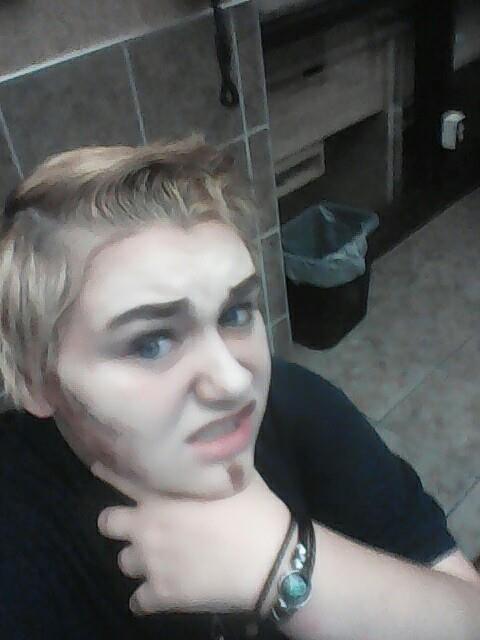
Alexander, age 21
What attracts you to drag? How and why did you start doing drag?:
What attracted me to drag was the Glamour and beauty of everyone even the king's I started doing drag as a queen and found myself as male being transgender female to male it makes me feel like I belong somewhere.
Describe your drag persona. Who and what influences your art?:
My drag Persona is kind of dark kinda nerdy kind of cool he tries too hard to be liked by everyone. My stepdad influence is my drag he's always trying to win the favor of my brother and sister. Also music helps me feel secure.
How has drag impacted your life?:
Drag has impacted my life in helping me gain a family and great friends. It has also helped me become more true to myself and showing me that it doesn't matter who you are or what you do but you can be what you love.
Why did you decide to compete in WreckRoom Idol?:
I wanted to get into Idol because I know I will do well at it I feel like I can showcase myself and be true to myself..
Can you give me a glimpse at what people can expect from you in this competition?:
Expect more than you bargained for with Alexander you will see me and expect some punk rock songs but I will pull pop or even classic rock.
Do you have a favorite WreckRoom Idol? If so, why?:
I haven't honestly watched any of the previous Idols I don't want to psych myself out.
Quick catchphrase: GO!:
My catchphrase would probably have to be “oh shit!” because I don't really pay attention a lot of the time.
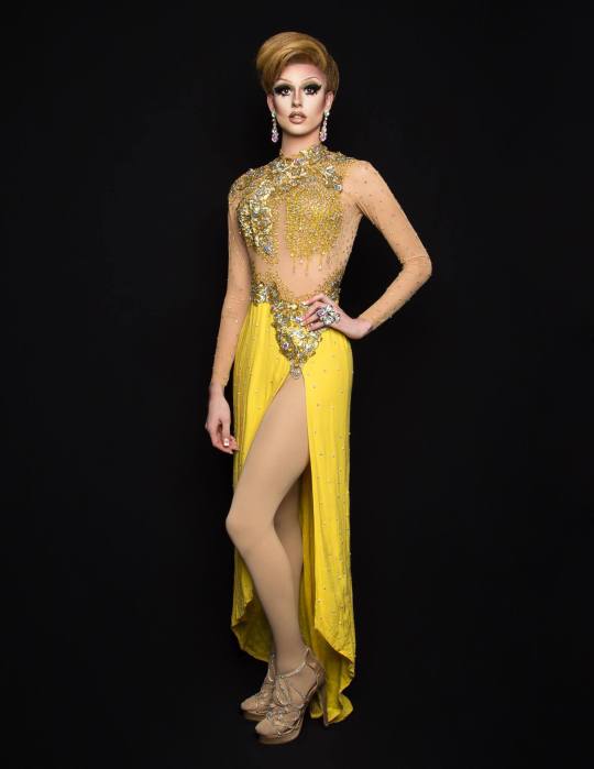
Porcelain Vahjeen, 22
What attracts you to drag? How and why did you start doing drag?:
I’ve always been attracted to drag because of the glamour and because the confidence that the Queen’s exuded. I always wanted to be able to have that confidence and really to be able to push myself and do things that made me uncomfortable and drag was a way for me to be able to do that and also to grow as a person along the way.
Describe your drag persona. Who and what influences your art?:
If I had to describe my drag persona I would say porcelain is a space alien who came down to be a Stepford wife, It didn’t really work out so she took up stripping to raise money for the hungry orphans on her planet. I take a lot of my inspiration from either men or women really who either exuded the confidence that I want to show, had/have a glamorous lifestyle that I want or they’re just particularly funny. I would say other drag queens are where the majority of my inspiration comes from. I don’t particularly look to any specific person or group of people. It’s just always inspiring for me to see a queen go out in an unconventional outfit and a song the audience barely knows and turn it into something beautifully entertaining.
How has drag impacted your life?:
Drag has made me more confident as Tyler, it has also made me more aware of the way women and the LGBT community get treated negatively. I believe because of drag I have learned more of the important political parts of the LGBT community and it has given me a whole new meaning as to why I do drag. It makes me want to get involved and stand out in the community. All to further not only LGBT rights but also women’s rights. Drag has also been a way for me to find other people who are like me and who are interested in the same things that I am. it has built friendships are strong and valuable to me that I never would have had them without some heels and a wig.
Why did you decide to compete in WreckRoom Idol?:
I decided to compete because the Wreckroom is where I started and I would like to show my appreciation for the Wreck. Once it closed myself and other underage queens and Kings really had nowhere to go. I would like to be able to do my part in making the WreckRoom be successful and to stay that safe haven for those underage baby Kings and queens who can’t get into the 21+ bars yet.
. Can you give me a glimpse at what people can expect from you in this competition?:
Do you remember the first time you tried to make an omelette and it turned into scrabbled eggs, but you ate it anyways? I am scrabbled eggs and this is going to be delusions.
Do you have a favorite WreckRoom Idol? If so, who and why?:
Season 3, Alotta Vahjeen. For obvious reasons. Without Alotta I wouldn’t be where I am today. Not only is she my drag mother, but she’s also my roommate and one of my best friends. Without her I don’t believe I would be able to show the confidence that I have now. My face would probably still be a big mess as well.
Quick catchphrase: GO!:
If at first you don't succeed, destroy the evidence...
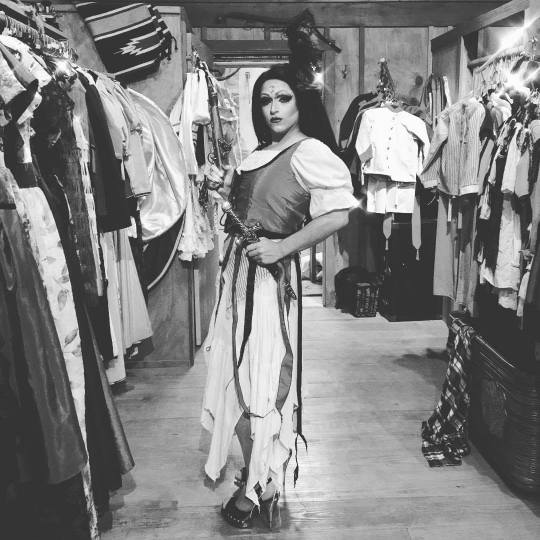
Jupiter Marie Halliwell, 21
What attracts you to drag? How and why did you start doing drag?:
Since I was young I always enjoyed dressing up and being someone I wasn’t. I mean everyone loves playing pretend and playing dress up when they are kids and to me drag is the adult version of that. It’s about letting my creativity shine and spreading love through breaking societal rules. Describe your drag persona. Who and what influences your art?:
My drag persona is a character in and of herself. She’s a character from a novel series I’m writing. She’s queen of a planet who lost her husband on an interstellar honeymoon and got stranded on Earth. Rock and Roll is the bigger influence as far as aesthetic goes. My biggest local influences would be queens like Jak’Kay Monroe and Alotta Vahjeen. Overall, my main inspirations stem from rock and roll artists, like Maria Brink, Lzzy Hale, Dorothy, and tons more.
How has drag impacted your life?:
Its been a negative and a positive, I’ve met a ton of amazing people through drag and I’ve grown some much as a person. On the negative side, I’ve definitely made bad choices spending money I shouldn’t have on drag. Over all it’s been most definitely a positive experience that I wouldn’t ever change.
Why did you decide to compete in WreckRoom Idol?:
it’s been a lot standing dream of mine since I first stepped on the WreckRoom stage in 2015 as Franchesca. I have heard so many amazing stories about the competition and I’ve know plenty of former competitors who have gone on to do amazing things with their drag career. Can you give me a glimpse at what people can expect from you in this competition?:
A glimpse of what people should expect me from? As I said, I love Rock and Roll, but I’m more than meets the eye. As they say, “Expect the unexpected.” Do you have a favorite WreckRoom Idol? If so, who and why?:
Overall, no, specifically because I loved each winner for their own unique reasons, and I can’t say one is better or more my favorite than any of the others.
Quick catchphrase, GO!!: I’m out of my world. I’m out of my mind. Running through space and running through time.
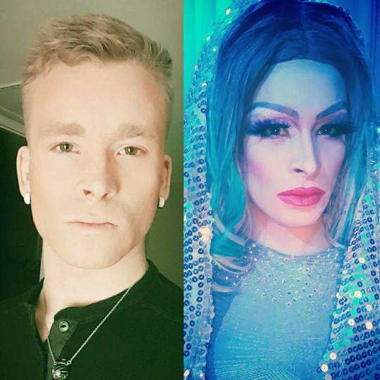
Mikayla Kanielle, 26
What attracts you to drag? How and why did you start doing drag?:
The escape from the "normal" world is why I enjoy it most. I love being different. My friend Phillip, aka Gizele Monáe inspired me to do it most. He painted me for my first show and let me teach myself from there. A main reason why I started and continued doing it is that I want to be leader for the community. To build myself into a respectable entertainer. Thats something I think Gizele has done and I'd like to make her proud and be the best I can be.
Describe your drag persona. Who and what influences your art?:
I say this from time to time but I'm the "Kakashi" of drag. Simply put, anything I see someone do and I want to do it, I will! Most of the inspiration I get comes from my sisters, Lyza LaRue, Krystal Naomi, Shalula Minaj(Queen), and Iman Naomi. Just by watching them I've learned how to better my makeup skills, crafting, and my performances.
. How has drag impacted your life?:
Drag has given me this kind of purpose. I've tried a few other things in my young life but nothing makes me as happy. Crafting and creating things makes me feel almost best. But when it all comes together perfectly on stage, there's no better feeling!
Why did you decide to compete in WreckRoom Idol?:
Having seen Queens and Kings compete, whether they won or lost develop into a better performer. Also building a platform and proving to myself that I can do this. I can rise to the challenge.
Can you give me a glimpse at what people can expect from you in this competition?:
Effort, Vigilance, and Expression.
Do you have a favorite WreckRoom Idol? If so, who and why?:
Mine would definitely be Season 3 winner, Alotta Vahjeen. Even though she calls herself a trash monster she's still consistent, evolved and polished for her craft. She knows she is and her worth as an entertainer while still encouraging us that are still learning.
Quick catchphrase: GO!
"I'm Mikayla Kanielle baby, and I Can·yell"
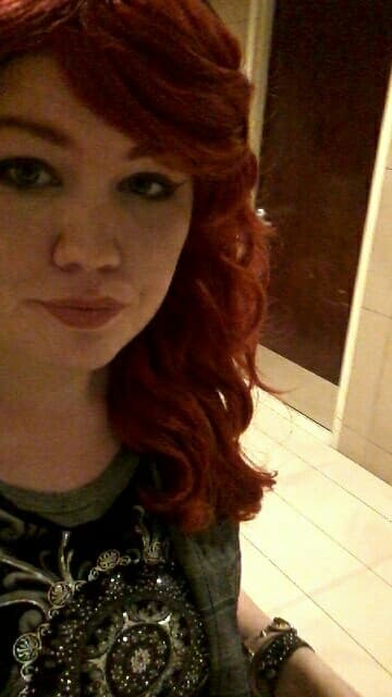
Dahlia Black, 19
What attracts you to drag? How and why did you start doing drag?:
Pretty much the first time I ever got attracted to drag was the Halloween show two years ago. For me it's like for one night a week, I can be whoever I feel like.
Describe your drag persona. Who and what influences your art?:
My drag persona is pretty much a combination of the powerhouses in the pop music industry. You know who they are, Britney spears, Katy Perry, Beyonce, etc.
How has drag impacted your life?:
Drag has impacted my life by boosting my self esteem, also it's a place for me to blow off steam.
Why did you decide to compete in WreckRoom Idol?:
I decided to compete in WreckRoom Idol because I've always had a pep in my step. I figured I could let that rub off on other people.
Can you give me a glimpse at what people can expect from you in this competition?:
Hmmmm.. A glimpse of the competition... color. Lots of color. Oh. And many many many impersonations.
Do you have a favorite WreckRoom Idol? If so, who and why?:
Honestly I don't have a favorite idol, they're all huge influences and it wouldn't be fair to just pick one.
Quick catchphrase, GO!:
Too much glitter in this room I presume.
1 note
·
View note
Text
Less is More and Instagram Beauty
Hello all! In this post, I wanted to cover some observations I’ve made regarding beauty photography. There are many ways to shoot a specific look, but I thought why not share my thoughts on some reoccurring trends in the field.
LESS IS MORE
We all know the cliche “Less is More”, but nothing could be more true when it comes to beauty…at least, beauty photography. I often get asked from fellow photographers who are starting out shooting beauty (however, I still consider myself starting out as well!…fun fact: I have been shooting beauty for only a little over a year now so I still have lots to learn!) if there was one tip that I could share. My biggest tip would be to think in terms of Less is More. Take your concept and simplify it as much as possible. Oftentimes people assume that in order for an image to be considered beauty, it has to include a green lip and blue eyeshadow and huge false lashes and glitter and crazy hair and blush and and and…. *breathe*. Take ONE aspect and focus on that. If you want green eyes, then just do green eyes and keep the lips and skin clean. If you want to do a bold lip, keep the eyes nude with maybe a quick swipe of mascara or some natural-looking falsies. The nice thing about shooting neutral shades is that you are able to play around with both lips AND eyes without it looking too heavy. One benefit of keeping things simple is that it helps the viewer stay focused on one area of the face. Don’t overwhelm your viewer by highlighting too many areas within the frame…it becomes too chaotic.
Some examples of too many things going on at once:

Now, if you want to go crazy and do black lips or a bright eyeshadow, you do you girl. But remember that simple can be just as powerful- if not more - as going over the top.
Here are some examples of bold looks executed in a clean and simple manner:
(image by the talented Ben Hassett)
image
(Image by Ruo Bing Li)
image
(Image by Ben Hassett)
These images obviously still pack a punch visually, but they have a very high-end, minimal feel.
Again, go crazy! Have fun with colors and paint strokes and glitter! But remember to pace yourself and keep your audience interested in one focal point.
INSTAGRAM BEAUTY VS. EDITORIAL BEAUTY
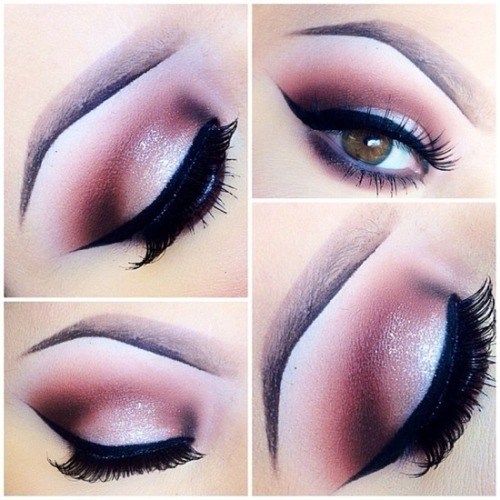
Another trend I’ve noticed is the Instagram makeup artist (often times these are talented freelance makeup artists who practice on themselves) posting images of gorgeous eyeshadows and sharp eyebrows. While this look is very popular, I wanted to bring this up because there is a stark difference between this particular look vs. what is expected of an editorial beauty photographer. I have noticed more and more photographers and makeup artists approaching these types of looks and using them for beauty editorials. While this is definitely a subjective matter, I don’t see this becoming a trend in major publications or beauty campaigns. What do I mean by this?
Example of Instagram Beauty
Clearly these are 2 completely different looks, but the execution and style is distinctly different. The modern trend of sharp eyebrows and heavy glam is not something that I predict will catch on in the editorial world. With that said, I find it best to keep the beauty looks for editorial creative and fun! Not something you would necessarily wear out and about. Editorial gives you the opportunity to play around and be messy! Don’t stick to the cookie-cutter eyebrows and thick lashes. Try starting natural and glowy and moving up to something edgy and crazy (while still keeping in mind Less is More). Keep the ultra-glam eyeshadows and lashes for the club or a night out on the town. One look that ALWAYS looks great when starting out shooting beauty is just a simple red lip and just a little mascara. No eyeliner or blush. This is a modern take on a classic look, and is flattering on pretty much any face.
“Fresh Finish”- Concept Development
This is my first post of my new BTS (behind the scenes) blog!! I hope that through this blog, myself and fellow photographers alike, will learn and grow through my experiments and..ahem..mistakes. In this blog, I will be sharing photos, lighting diagrams, concept building and random tidbits relating to shoots! Now, lets get on to the nitty gritty..
For this first post, I want to focus on the concept building of a shoot. This isn’t the most exciting part for some…but for me it is almost like a high. When a concept is developing in my head, my excitement is comparable to the feeling a child gets on Christmas Eve. I love it!
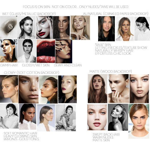
I recently shot a personal editorial that I titled “Fresh Finish”, focusing on 4 different skin finishes: matte, natural, glowy and wet. Usually when starting out with a concept, the idea develops from either an outside influence or image that inspires me. The funny thing about inspiration is that it can totally change direction once you get going with the brainstorming process. Inspiration can also come from literally anywhere, and this instance it came from photos on h&m’s home line:
See? I told you it could come from anywhere. Anyways, what intrigued me about these photos is the use of different elements to create a soft, tranquil backdrop for the bedding. I wanted to take this idea and apply it to beauty (my main focus of work), so I thought it would be neat to create a story matching skincare to a different backdrop: wet look on brushed metallic, matte on woodgrain, natural on crinkled paper and glowy on soft draped cotton.
I passed the idea by my friend and one of my primary makeup artists Jadyn Ngo, who loved the idea! Next step was to research images for makeup/hair/model/vibe to create a moodboard. Many of you will know this, but if you are like me (who moved to LA without any clue what a moodboard was lol), a moodboard (or storyboard) creates a mood and showcases different looks to show the client/team when putting together a shoot. A moodboard helps develop the story more and guides the team into creating looks more accurately based on the overall theme. I usually find that Pinterest or beauty/fashion specific sites like fashiongonerogue.com or whowhatwear.com are great places to get inspiration photos. I also like collecting clippings from magazines like Harpers Bazaar and Elle for makeup ideas.
Here is the moodboard that I put together for this particular shoot-
Usually my moodboards will be a bit jumbled and chaotic, but with this shoot I felt it was important to separate it by looks so that on the day of the shoot I wouldn’t suddenly have a brain fart and forget which look goes with which backdrop. As you can see, the images aren’t just for the makeup and hair stylist, it is also a good preview for the types of angles/poses I’d like to go for. I also like to add in brief descriptions of each look to pass along to the agencies when I’m reaching out about testing with them. Agents get TONS of emails, so I want to make sure I stand out from the rest by creating a story that is not only well thought out and unique, but also beneficial to the model and the agency. When I moved to L.A., I had the aspiration to continue shooting conceptual work that I was used to shooting in Arkansas (conceptual in this case meaning extremely outlandish and creative, oftentimes pulling from surrealism or theme specific ideas). I quickly learned through one rejection after another that not only was conceptual work not wanted in the model’s portfolio, it was actually almost impossible to book any work because no one wanted it. I had to readjust and refocus my sights on something that would allow me to get work in L.A….and here we are! Anyways, a moodboard is crucial to a successful shoot. I think I have shot maybe 3 shoots since moving here without a moodboard, and each have been a little confusing when it comes to describing looks and mood.
After creating a moodboard and sending it out to various agencies, an agency will either say yes and send me a “package” of models who are available and testing, or will politely say that they are not interested in the concept not send a package. When a rejection does happen, it is hard and painful, but don’t give up! Keep pushing on, think of reasons why the concept may be a bit too specific for the agency, and try again.
From there, a model is selected based on the look I’m going for, a date and time for the shoot is made and a callsheet is sent out with all of the info for the shoot. Here is what my callsheet looks like:
From there, I get confirmations from everyone on the team and then we are good to shoot come the shoot date!
Preparation for this particular shoot was crucial, as I had to purchase the specific materials for each look (which again were metal, wood, cotton and paper). I began at Home Depot and picked up a large piece of brushed sheet metal and a large piece of wood that had some beautiful grain. I bought the fabric at the craft store, as well as a large roll of craft paper. When I got home, I realized I wanted the fabric and paper to be a beige rather than stark white, so I tea stained the materials to the desired color. After soaking the paper in the tea, I laid it in a wrinkled pattern on a drying rack, which created some awesome texture. In the end, the metal didn’t really work out so much because the light reflected way too much in it, despite changing the location of the light. So in the images, the backdrop looks a bit flat in the wet looks, but thats okay! I am taking it as a learning experience and will keep practicing with different methods of shooting on metal. If you have any suggestions, please feel free to share!
Here is the finished product. I wanted to put the images in a layout similar to what you would see in a major magazine, so I created a titlepage and little captions for each look (thanks to Jadyn for the help!). I am super pleased with how all of this turned out, and I can’t wait to share more concept processes with you!
I hope some of this was of some use to those of you curious about what I do, or are pursuing photography yourself! Thanks for reading :)
“Fresh Finish”
Model: Emily Tender @ Nous Models
Makeup/hair: Jadyn Ngo (jadynngo.com)
Photography: Jenn Collins (jenn-collins.com)
BONUS PHOTO
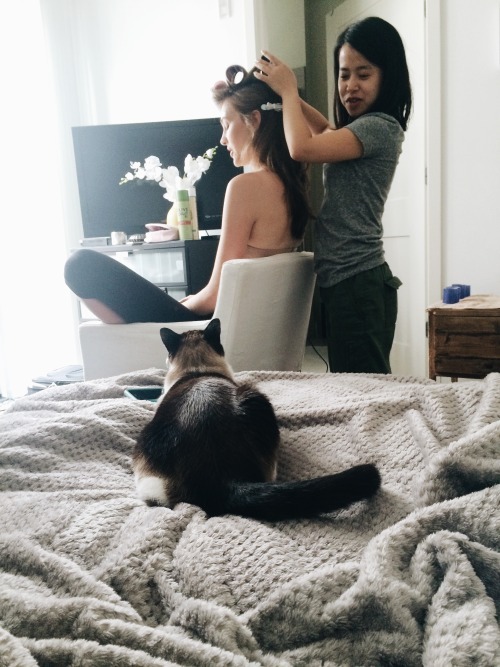
Jadyn and model Emily preparing a look, while Bandit looks on adoringly. :)
0 notes
Photo


Yes i put 3 pictures instead of one, it just feels like by putting only one picture you wont understand entirely why i chose each artist so i chose to put 3 pictures, if it is crucial that its only 1 please inform me and i will correct it immediately!
I dont know how important this research is to the outcome of our final project but i know to always assume the worst so i took it VERY seriously. I did a ton of research using the library and my own knowledge and i am ALMOST sure that these are the people i want to choose.
I tried to stay out of thing i already like ( for example tommy hilfiger is known to have very nice interior designs to some of their stores) and CHANEL is by far my favourite when it comes to vintage and royal lookin fashion BUT i stayed away from it. I think i should note that i didnt move towards fashion at all at first, i went to architecture but i found a ton of books on the interior designs and architecture of BOUTIQUES. I Feel like thats the best choice for me because a stores boutique is definitely always something made to attract customers but also it reflects the artistry that goes in the fashion of what’s sold.
When i asked for if the artists etc have to have a consistent theme the professor told me that its up to me so i decided to go with two themes that could co-exist in one ( they do in my imagination).
ONE is the more futuristic Audrey Lynn, Dale Chihuly, AB Rogers Design looking ones. I like the neon colours and the weird things added in the space and i also LOVE it when an environment has a monotone colourscheme, when its different shades of only one or two colours. Every one that’s mentioned in my moodboards i found by just searching the library except from Audrey Lynn who i found a while ago in a blog and i really liked how weird and strangely realistic- but not so much- her designs where.
SECOND is the more classy, vintage ones like Bulgari and Issey miyake. Honestly speaking Issey’s interior design excites me because it looks exactly like his clothes to, it has Pleats all over and looks like a glowy sea shell. Bulgari is a mostly jewellery making designer, ( Now that im writing this i realise that almost everything i chose has a milky, glossy shine to it), everything and everyone who wears bulgari is given elegance and looks more Chic.
I left Rembrandt for last ( he is the only artist im using that i already know much about) because he is a classic artist, maybe he is basic but i think that he gives me inspiration to honour the basics, like how much attention he gives to lights and shadows and how his paintings have almost always a brown tone and not many vivid colours ( just like the Bulgari boutique i show in my moodboards).
I have not decided on my poets or philosophers yet because im not sure about my choices and i don’t want to just choose one to be over with it.
0 notes
Text
How to dress indie - for free!!
Hello All!
So if you're reading this post you probably either are indie/alternative or you are trying to be, I know when I had decided I wanted to be alternative all I knew was that I was fed up with looking the same as everyone else and I was desperate to change my style. However I had no clue at all about where to start and how I even wanted look, tbh I still don’t but thats the fun in it. Hopefully this post will give you a few ideas about how to get started with your new look without having to spend your life savings on a new wardrobe, all these indie looks can be done for free!! However if you do want to buy a couple of new pieces I will have a list of indie clothing brands up here in a couple of weeks so stay updated.
1. Layering
Now when you break down classic “indie” looks down to their core components (wow sounds sciencey) most the pieces are quite ordinary. For example Hayley Williams, one of my all time favourite style icons, has a wardrobe largely made up of top shop clothing items but its the way she styles them that makes her look different. To try looking a bit different you could wear a simple long-sleeved top with a t-shirt or a vest on top. Or you could wear a polo neck under a simple t-shirt or jumper to give off some 90’s vibes. You could also try wearing a simple t-shirt with a flannel or elegant blouse on top, but leave the blouse or shirt undone to show your t-shirt. You could go subtle by wearing similar colours or you could layer contrasting colours. You could mix edgy t-shirts with elegant blouses or elegant vests with grungy flannels - the possibilities are endless. You could also layer t-shirts under strappy dresses such as slip dresses and maxi dresses. Tops aren't the only thing that can be layered, you can add some interesting contrast of fishnet short leggings under shorts or skirts. Here are some of my favourite layered looks/items that I have found.

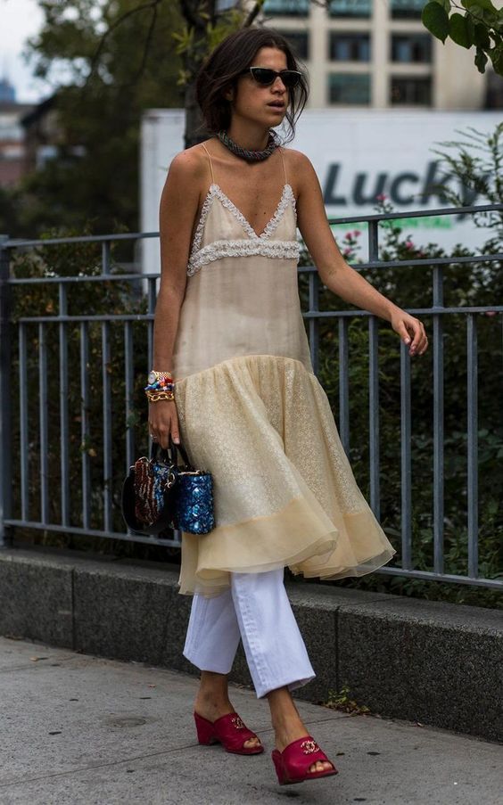

2. Wear only one colour
Now I’m fully going to admit this idea was really not my own, I was inspired by a singer/rap artist who goes by the name of Girli who only wears pink All her songs have really great and meaningful lyrics and well as being hella catchy so I definitely recommend giving her a listen. However when you think about it hardly anyone only wears one colour, except all black of course. So when you go out dressed head to toe in one colour people begin to notice. You could dress in all one neon colour to really stand out, pastels to keep it sweet and and gentle, or elegant colours such as navy blue or red to keep it classy. If you don't have any clothes all the same colour you can try matching the items that you do have together and tie them together with accessories. For example if you had a red skirt or a skirt with predominately red on but no red top to go with it you could still make a red outfit by wearing red shoes and red accessories such as red socks, hats, jewellery basically anything red you can find. You can also try matching patterns eg wearing only florals or only polka dots. Once again here are some of my favourite looks (mainly Girls tbh).


3. Embellish and Diy
To make a look more unique you can add some personal flairs for example you can buy some iron on patches on ebay for a really cheap price, that you could iron on to practically anything to make it look more indie, just search for iron on patches on google and loads will come up. For example you could iron on some heart patches onto a denim skirt or jeans (I mean who really has the money to spend £80 on some ragged priest patch jeans), or you could iron on some floral patches onto a simple white t-shirt to give it some flair, there are so many options. One of my favourite things to do is sew buttons onto my denim jackets, t-shirts and skirts. This gives items a really cute and unusual looks. I also like to sew mini appliqué roses onto my skirts (which you can buy here:) and t-shirts and sometimes my fishnet tights, maybe ill do a Diy post for this, they look really sweet and feminine and I’ve never seen anyone wear anything similar. If you have more artistic talent than me you can try painting unusual and creative designs onto jeans, t-shirts and denim jackets. Fear not if you’re like me and struggle with anything arty as there are millions on images on the internet that you can print and then cut out to use as a template.


4. Add accessories
Accessories are the finishing touches to any outfit and can really “make an outfit”. A simple bandanna in your hair can add a 70’s vibe as well as layering as many necklaces and bracelets as you can. Knee high socks add interest when wearing a skirt (if you're more creative than me you could embellish your knee high socks by embroidering something on or sewing on some sequins). Braiding ribbons in your hair and adding scrunchies and hair clips can also give you a boho vibe, whilst a simple scarf could give you a classy exotic look. As per usual here are some examples:


If you’ve read down this far I just want to say thank you so so so much for reading, if you have anymore suggestions feel free to leave your ideas See you soon and lots of love, Evie x
(none of the images are mine, no copyright infringement intended)
#indie#clothing#indieclothing#indieclothes#clothes#alternative#aesthetic#howtodressindie#vintage#vintageclothing
0 notes
Text
Introductory Questions
My name is Katie Lang; I am a sophomore sculpture major, former photo major, and I’m from Leesburg, VA, which is about two hours north of Richmond. I’m excited about sculpture for the freedom of expression that I can enjoy in this department. I’m also looking forward to making art that doesn't involve sitting in front of a computer for long hours while I edit photographs and export massive files for printing those photographs. I didn’t realize I would miss getting my hands dirty quite this much.
What is something in your life that you want to empower and why? - I suppose my drive to continue creating, because sometimes I question if my art is worth anyone’s time other than my own. But for myself I don’t know how I would exist without it.
What is something in the world that you want to further empower and why? - My answer to the last question could probably be applied here as well.
In what aspects of your work so far do you feel strongest? - I feel that the concepts and ideas behind my work are pretty strong. Also my drive to pursue ambitious projects.
In what aspects of your work do you feel the weakest? - Communicating those concepts and ideas to an audience/viewer. The ideas behind my work are typically pretty complex, and sometimes during crit the class doesn’t quite catch all of it. At the same time, I like the idea of obscuring things from the viewer and communicating with what I don’t show them; I want them to do some work to get meaning out of the piece. I also like the idea of the meaning being different for every viewer; partially because it makes it more interesting and partially because it’s impossible for it not to mean something different to everyone. However, I have been criticized for not taking a rigid enough position on the meaning of my work.
Who would you list as the five artists who interest you? - Joseph Beuys; I watched an interview of him being grilled by a panel of intellectuals who wanted him to explain to them the meaning behind his performance piece “How to Explain Pictures to a Dead Hare” with plain words. He told them in multiple different ways that if it could be explained with words then he would have just written about it instead. He went on to tell them that art is meant to be understood with our “sensory organs”, and not in the same way that we understand the meaning in words. I found this to be incredibly inspirational. Teiji Furuhashi; I recently saw one of his installation pieces at the MoMA and found it enchanting. I want to look for more of his work. Rene Magritte; His paintings make so much sense and don’t make any sense at the same time. Out of all surrealists I think he captures a dream the best. A couple of them I actually have trouble describing with words. Yayoi Kusama; I like the simplicity and chaos in her use of repetition. Somehow her work manages to be meditative while also being humorous. Shana Lutker; In her expansive sculpture installations, each part of them is its own piece with its own meaning, but put together they tell a story. I feel as though I need to quickly mention Agnes Martin and Brittany Nelson.
Name two of the favorite artworks you have ever seen - “God” by Ragnar Kjartansson, and “The Seducer” by Rene Magritte
Are you indoorsy or outdoorsy? - Both without a doubt. Indoors wise, I take the composition of my space very seriously. Every object in my room and where it is in my room is considered with extreme care. Feng Shui is very important to me and I can’t stand when my room doesn’t feel right. Because of that my room is always neat. There are many ways in which I lean toward connecting my indoor space to outside. To me, windows are the most important feature of an indoor space. I have a lot of plants that I’m proud of and very attached to. I’m not sure how to explain how I’ve thrived outdoors, but I enjoy them.
What subjects in the world outside of art most interest you? - Definitely sciences. I geek out about science. I’ve always loved biology; even though most of what I learned in AP Bio isn’t particularly useful in my life, I greatly value understanding how life works and knowing about the other living things on this planet. I’m also very into history in a similar way. My knowledge of world history isn’t used in my everyday life but I enjoy knowing about things I’ll never see or experience just because I can.
Name three people that are no longer living and are not artists that interest you and why? - Rosalind Franklin, because she was one of those women who were successful before women were supposed to succeed.
How is your work political? - I really can’t think of any way that my work is political.
How do you use social media in your life? Do you want more or less? - I almost exclusively use instagram. I like the simplicity (although it becomes more complex with every update) and having something to do with all the pictures I take with my phone thats quick, easy, and free. My instagram page is a visual representation of myself that changes as I do without me having to put much of a conscious effort into it. It could be a way of getting myself out there but I dont think I take it seriously enough for that. It’s also a way to find new art and artists. I wouldn’t say I want more or less of it. Maybe less at times when I feel that it’s distracting.
If everything goes the way you wish it would at this moment, what will you be doing two years after you graduate? - Living in New York, working with other artists in some way, showing at a gallery, and making something important.
Does gender play a conscious role in your work? - Not often. I tend to stay away from making work about myself, and gender would be a difficult topic to make work about unless it’s about oneself.
How does your race and issues surrounding race influence your work? - The biggest effect being white has on my work is that I don’t make work about racial issues. I don’t see it as my work to make.
What is a physical material that you have worked with that feels more powerful than your body? - Light
What is a social material that you have worked with that feels more powerful than your autobiographical experience? - I rarely work with my autobiographical experience but I don’t think I use very powerful social materials because I don’t feel that my work is particularly powerful yet.
Is your sexual orientation something that figures into your work? - Almost not at all. I wouldn’t even bother labeling my sexual orientation, and I’ve never had a conflict with it or felt the need to show people work about it.
How do current events affect the way you make art? - Conventional current events don’t factor into my work very much. It’s funny that I avoid making work directly about myself, but my own current events have been inspiration for a project. My final for digital imaging last semester was a series of outdoor still lifes that I left out for days in an attempt to attract a possum that I had once accidentally attracted to our deck.
Do you use art history as an ingredient in your work? - Yes, particularly in the still lifes I was making last semester. I often referenced the themes of classical painting still lifes.
Does your lack of sleep make you feel stronger or weaker? - that mostly depends on what I’m doing and it goes through a bell curve. If I’m taking notes in a lecture class or doing something sedentary - weaker. While if I’m generating ideas or actively making a piece, I’ll start out feeling weaker but after a point feel great and then gradually decline into total exhaustion.
What is your fantasy studio? - Big windows, high ceilings, spacious, and lots of plants. It would either have to be in a large city on a floor high enough to muffle some noise, or out in the mountains but not too far from a city.
Do you want to make a lot of money in your life? - If I’m being honest, yes. Enough to travel, have nice things that aren’t essential, and not worry constantly.
How do you think about your diet? - My diet is the way it is for convenience, effectiveness, and cost efficiency. I have almost no time to cook and not enough money to get food that does much other than make me full. I’d consider these personal choices. That being said, it really isn't too bad. It’s also extremely irregular. I always eat breakfast and it’s the only part of my diet that isn’t unpredictable; it usually consists of some variation on a couple eggs and some toast. The rest of the day is comprised of things that keep for a long time and are fast. I don’t drink much other than water, coffee, tea, and an occasional red bull. I’m also a vegetarian, which is both a personal and social choice.
Three specific experiences in your life that you would be curious to feed into an artwork? - Some recent experiences could be inspiration, like the one I mentioned with the possum. However I can’t name specific ones right now.
Identify aspects of your past work that people have challenged that you want to confront this semester - I want to better communicate my concepts to the viewer while also balancing my interest in strategically hiding things from them. Another balance I want to strike is between allowing the viewer to make their own meaning out of the piece and holding true to what I intended it to mean.
What general conversations about peers work have you felt lacking and want to pursue? - I am definitely interested in the conversation of materials and the process by which the work was made.
Do future technological developments excite or scare you? Or both? How? - Both, I think countless and unimaginable good and bad can come technological developments.
Name several artists that you have come across in the past year that you want to learn more about? - Teiji Furuhashi, Yayoi Kusama, Steve Reinke, Shana Lutker
What kinds of learning environments are/have been most exciting for you? - Lots of freedom but with an idea to push off from with project assignments. Honest feedback. Emphasis on concept development but learning new technical skills too.
List five questions that you want to fuel your work? - I have a hard time answering this because I’m not sure of what kind of work I want to make. I’m stumped here. (to be answered at a later date)
If you were to conceive of one art assignment/prompt for yourself what would that be? - A full room installation that communicates through what the audience can’t see.
0 notes