#i could post like. my traditional sketches but i dont have a scanner and my phone camera sucks
Explore tagged Tumblr posts
Text
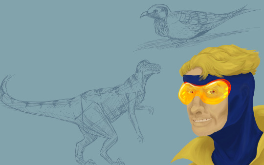
idk how me sketching animals from an old How To Draw book turned into "realism painting of booster" but sure ill post that I Guess
#booster gold#micheal jon carter#dc comics#dc fanart#i probably should like. actually post my dc art more often but i hate posting traditional stuff bc i dont have a scanner#maybe ill do some JLI sketches or smth. or panel redraws from the comics i just bought. hm. we shall see#anyway WOW I HATE DRAWING/PAINTING HUMAN FACES IN REALISM! THERES SMTH ABOUT MOUTHS/LIPS THAT MAKE THEM JUST FEEL OFF-PUTTING NO MATTER WHA#and yet it still looks better than some Official Comics Artists i could name <3 and they do that for their JOBS for MONEY so.#sorry not sorry to reblog the boy you also have to reblog my bird practice
9 notes
·
View notes
Text
thinking about my f/os constantly and forever but lack the energy to post anything !!! many such cases
#sweet talks 💕#i could post like. my traditional sketches but i dont have a scanner and my phone camera sucks#pain and suffering
0 notes
Text
hey im gonna have my tablet working again tomorrow so feel free to send in some pride month themed requests maybe like, pride flag themed pokemon maybe something else ?? id love to draw something nice n gay now that im getting my drawing tablet back on track
#text#i lost the wireless usb thing !!! i need to take better care of the new one#im gonna get it from the post office tomorrow!#so soon its back to digital art babes!#ive been doing some traditional sketches meanwhile but its nothing too special i might post some if anyones interested tho#i did some really cool paintings in painting class but i dont think my phone camera would do them justice#i dont have a scanner ;v;#but i'll see if i can post those somehow too#i really wanna show them bc im real proud of my work!! my teacher really liked them too!#she said i could have a future painting with watercolors!!!!#oh yeah just a heads up i. prob wont do all requests but i'll see whats interesting!!#see ya babes!
8 notes
·
View notes
Text
Digital developments inspired by David Carson & Saul Bass
In this blog post I will be reflecting on my practical experimentation which was taken from the ‘Out Here In The Field’ workshop. I will be giving you a detailed overview in how I produced this outcome and what designers inspired me along the way. The final stage of this post will involve me comparing and contrasting my work against my inspirations pieces but also including peer feedback to allow me to gain ideas for future practical developments.
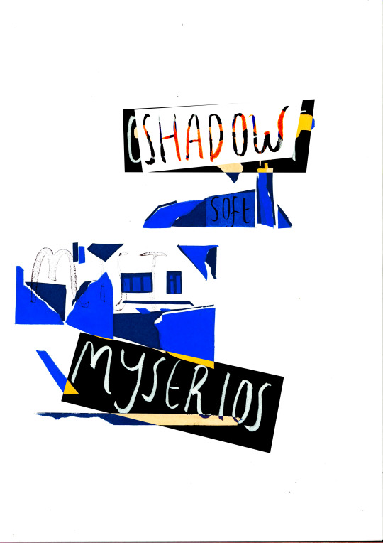
Final Digital Development
My aims for this development was to create a poster which shows type and image being composed together to cause the audience to question the message/meaning. Working with the developments created earlier in the week I wanted to add a range of words which I gathered off my peers; I asked them to write the first five words which came to their mind when studying my work which acted as my primary source for this development. What my aim was for the typography I was going to use was to excite the audience whilst still mentally challenging them which was going to accomplished through scale, colour, leading and kerning.
The designers I looked at for inspiration before embarking on my development were the following, David Carson and Saul Bass. These two artists both work within poster design and have many different qualities which I feel when combined could create something interesting. The principles I am taking from David Carson’s work is his use of abstract and chaotic text which creates a blurred pathway in his posters. This is what first caught my eye about his work and I would like to involve these characteristics within my practical experimentations. David Carson is also know for his use of simple and subtle illustrations which complements his use of abstract text, I feel as this has a very strong connection to Saul Bass who has created some very iconic and successful poster and title sequences. Moving onto Saul Bass, his minimal poster designs have inspired me because of the impact it has on the viewer which instantly gives you relevant information behind the message being portrayed. What I want to take from Saul Bass's posters is his use of negative space which isolates the illustration which is being used, I want to do this because it will show more meaning behind my message and draw the audience into the relationship between text and image.
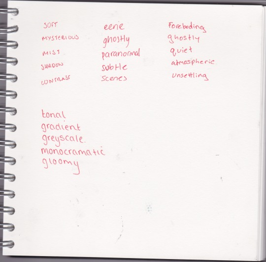
Primary Words Collected By Peers
Method:
After taking my earlier development through the traditional process of print I wanted to widen my processes used so decided to explore some digital terms. I did this so I can compare the outcomes against each other to discuss the similarities and differences between the two processes.
To begin this process I gathered all my prints from the print room and placed them out in front of me. I did this because I wanted to selected the cleanest print which clearly shows the geometric shapes being layered onto one an other to show highlight and tone. Once this was chosen I had to scan in my image which I found to be a challenge, this was because of the scale I chose to do my prints in which ended up being bigger than the scanner. After some thinking the solution which I used was to scan my image using the photocopier, this didn't capture the best image but this could be edited through the image levels and saturations. What this technique did was make the colours captured more bold and elusive which was what I wanted to achieve in the original scan and this visual quality connects back to colour schemes Saul Bass and David Carson use on regular basis.
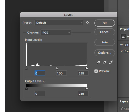
Adjusting the image levels
What my next step involved was beginning to plan and construct my words which I was going to take from my primary research gathered from my fellow peers. Before completing anything digitally I wanted to explore different hand-rendered fonts which would form a base for my typography used in this practical experiment. What this technique will gain me in my outcome is rough and textured font which holds a organic and personal style to it which connects the poster to me. The fonts I wanted to explore varied a lot, so I created some experiments in my sketchbook which focused on fluid movement and a broad stature. I wanted to do this so I had a broad range of reverences to work from but also to enable me to create more outcomes using different compositions and styles. What I could do next time is gather different fonts from peers which will feed primary research into my practical outcome and work along side my own personal style.
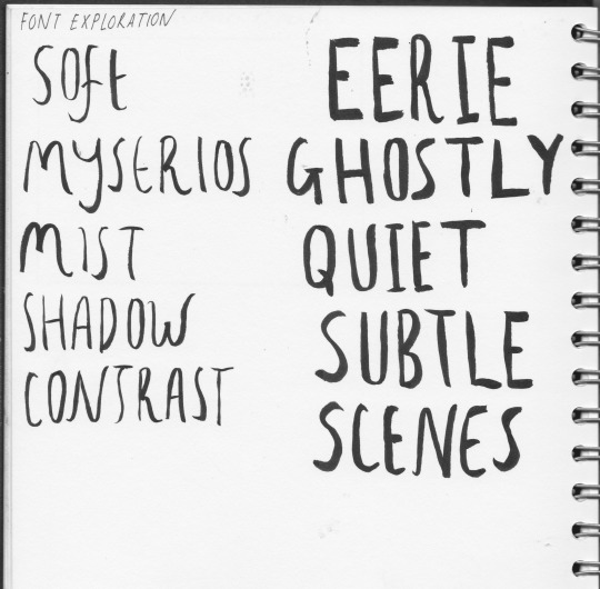
font experimentation
The final step of this development involved me composing my text alongside my image/print. I wanted to be playful with this and explore different techniques which create new and exciting visuals when being layered. What I did with each individual scan was use the polygonal lasso tool and select the word by creating an abstract shape around it. Once this was done I copied and pasted it onto the print and started to layer them alongside each other. What I found worked well with these technique was exploring the layer filters and decided to show a range of these in the poster. One of my favorite filter was the expand, this was because it collaborated with the layered colour and created a nice, fiery orange which really gave my poster more importance and recognition.
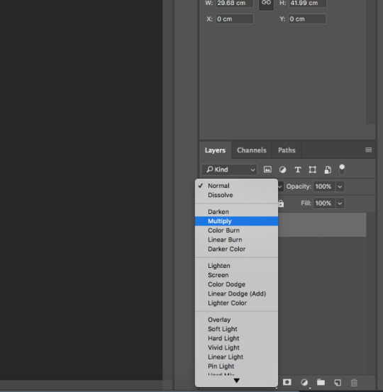
Filter exploration within levels
Review and Comparison:
When looking at my finished practical experiment I was very statified with the end results, What I feel is the greatest success is the use of negitive space which instatly draws the audience into the cenetre of the poster which I aimed to do at the start of this development process. What I feel went well in this experiment is the use of layer filters which created contrast between the text and image (print). This was shown through different means of colour and tonal values which was added to the illistration through this unique process. Another good feature in this poster is the relation back to the workshop ‘Out Here In The Field’ and how it celarly shows relevent to my primary observational sketches but also shows exploration through new and exotic meduims.
How I think my outcomes relate and connect to the work of Saul Bass and David Carson is through the visuals created in the text. This is mainly towards David Crason and his style, I think this because of the way David Carson composes his phrases which come together to create a image for the audience. I dont think my poster creates this affect but adopts the style of abstract composition which Carson uses to make his work playful and exciting. However I do see a strong relation in my work and teh designers Saul Bass, this is because of the similar thought behind use of negitive space but also adopting a subtle illistration to work from to work alongside the negitive space. I also see comparisions between the anatomy of a murder poster in which the text is cut out and taken from the illistration, I have tried to carry this style in my work to make it more subtle.
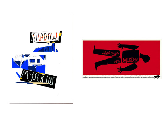
Comparison between Saul Bass and practical outcome
During this devlopment I came arcoss a range of things which turned out unsuccessful during the build up of this devlopment but also elements involved in the finished practical development. What I could change in this poster would be the colour scheme used, I would do this so I could show a relation to my concept but also influential artists such as Saul Bass and Dface. The final thing I would also change is the use of primary text, this is only so I could compare the outcomes and have a clean text to work from.
Peer Review:
Actions:
> Begin to consider developemnts towards my project concept.
> Research artsists such as Dface and Ace to give me new means of development.
> Compare this outcome aginst a fellow peers and ask for constructive critizim.
0 notes