#i can picture a cohesive aesthetic so clearly
Explore tagged Tumblr posts
Note
pokemon that should be turned into fat anthros:
the classics - gengar, snorlax, dragonite, appletun
personal picks - lairon, shaymin (land), simisear (see: beta sprite), yamper/boltund

okay so i dont know pokemon but i do know fat anthros so i will try my hardest for you here. the pictures are more for me than you - i assume basically all tumblr users know these encyclopedically. note we are talking about anthropomorphic versions of these creatures not the creatures themselves, etc etc...


gengar - i like his strange face, but unclear whether to make the head and the body separate entities. but then... that's the beauty of the fat guy "neck ambiguo" now isn't it. 8/10
snorlax - it's all there. 10/10


dragonite - okay. too many ways this can go:
fully (fat) human-shaped save for the funny head - strange. 5/10
fat human-shaped + furry head + digitigrade - an improvement. i don't normally care about digitigrade legs vs. not, but here it just makes him feel more cohesive in a way i like. 7/10
all-the-way dragonite - most of the appeal of the fat furry is that i want to bang him, and i wouldn't bang this cause that's just dragonite. but we could hang out. 10/10 - platonically...
appletun - this one confuses me... when you push in on the pie parts of him do they feel like pie? or like flesh? i don't know... and i don't think making him fatfur will address my grievances. 4/10
lairon - this guy seems like a brute. i like it. 8/10


shaymin - i can imagine a wholesome animal (e.g. giraffe) as an anthro. i can imagine a small (e.g. mouse) animal as an anthro. but i really can't imagine a small wholesome animal as an anthro. i can't conjure this. 🌫/10
simisear - there's too much here... i don't like that he's got hands. i don't know... i can tell you on a purely conceptual level that an anthro version of him would look good in a leather jacket smoking a cigarette which he lit on himself (he looks fire themed so i assume) with like a good amount of piercings on each of those bigass ears but asymmetrically. that's an okay idea. that works. 7/10


yamper - its little flotation device thing would make such a good asset to a fat anthro design. just a suggestion i have i think it would be funny if he were masc despite his abject stubbiness. 10/10
boltund - this i don't see as clearly, but the dog anthro is my type through and through. 8/10
ampharos - a "muscle-chub" isn't my thing but i know enough about character design, shape language etc to know that's the most aesthetically befitting shape you could give an anthro version of this thing. i'm very impartial this way. i think that could work well... nonetheless, it's not really my thing. 5/10
18 notes
·
View notes
Text
I'm back to be annoying about it. I was doing a lot of thinking today to try to drown out the screaming matches my supervisors were having with each other :)
Imagine, if you will, a scrapbook of the best summer you ever experienced. Imagine flipping through it, looking at each badly-focused, blurry photo and fondly remembering the exact moment it was taken. Glittery stickers adorn the corners of the pages, handwritten notes from your friends fill the space between pictures...
Sufficiently nostalgic? Good. That's the aesthetic I want the Halo University AU to have.
Anyway. As a 'no plot, just vibes' AU (so far?), I THINK what I'm gonna do is just write it as a collection of snapshot scenes that form a loosely-connected narrative, and I was not joking about the Carly Rae Jepsen soundtrack, so each one is going to be themed around/inspired by a song.
(If I had sufficient art skills, I'd make a cute little fake polaroid for each chapter too.)
And! Since it's a fun, no-pressure writing exercise for me to work on when the mood hits, I think it'd be cool to make it a little. idk. interactive? I want to use it to explore dynamics I might not normally think about, so feel free to suggest two or more characters (doesn't have to be a ship) and/or a Carly Rae song and I'll see what I can do with it! I have a FEW ideas already cooking that I'll probably start with but. go wild, if you're interested.
#i can picture a cohesive aesthetic so clearly#it's grabbing me by the throat and shaking me#i'm honestly surprised i haven't done more song-related fics#considering how often a song will put an entire fully-formed scene in my head#work is gonna be so stressful for the next month#and i just want to write something fluffy and low stakes#also . i may have to do some character research#if someone suggests a character i don't have a lot of knowledge about/exposure to#but i will do my best to honor any requests#spartan university#i've also been coming up with irrelevant worldbuilding details for it#go figure#building the scenes around songs gives me easy chapter titles too :)#writing hack
5 notes
·
View notes
Text
Jimin - Muse (2024)
3/5 ☆
I thought it'd get me several days to come back here with some thoughts on Muse, but it proved it's not necessary.
Who as title track makes complete sense. We're still into 90s nostalgia, but it's a recipe that works. Not just in kpop, but pop in general. Looking at the charts, it paints a pretty clear picture for the last couple of years. Add the zoomer idea of a what a Y2K aesthetic is like and we get the recipe for today's music and concept. Repeat, reuse, recycle. How fitting for postmodernism.
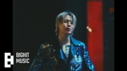
Who is a really catchy tune, with lyrics easy to remember and sing out loud. A tad more commercial-sounding than Like Crazy, but that's Muse overall anyway. The truth is, I have the song on loop (streamers can't come for me, lol). I think Jimin's style of singing and the melody itself are a good fit. Lyric wise, it's sort of basic, but this is pop music made for mass consumption. I don't mind it. It's also radio friendly and definitely has the potential for summer hit, but I'm 99% sure it won't turn into one. BH won't move a finger to send it to radio and it's another song that will fall victim to fandom mass streaming to chart high for one week. I've seen this all before.
It's also a shame to have this released when an artist is away, without being able to properly promote it. In my non-expert opinion, it could have been released as a single a few months later after Face and scratch the rest of Muse or keep it in the drafts.
As to the other songs, perhaps Rebirth (Intro) is the only other song on the album that has something to it, it stands out a bit more and it also bridges the two albums, despite the connection being sort of flimsy.
Having Sofia Carson on Slow Dance had brought nothing to the song. It could have been a full Jimin track all the way. Her style of singing does not stand out and I find it a failed pair because there's no contrast or voices complementing each other. Jimin can sing just like her. If a collab is really wanted/needed/necessary, then I'd wish for a pairing that also makes sense vocal-wise.
Be Mine is ok, but it sounds too much like that one TXT song and I simply can't get over past it. It's afro beat and latino influence which has been all the rage in the past few years, which Hybe has been pushing a lot. It explains the song.
SGMB and Closer Than This were previously released and I'm not covering them again.
I think it's difficult for me to not make comparisons to Face, considering both albums were produced around the same period, without much time left in between them. One is simply more cohesive and has a depth that showcases a first solo attempt, while the other one is clearly going a more commercial route with less of a personal signature.
Despite Muse being promoted as another conceptual album, I find that umbrella to be a bit forced given that the theme of finding love is really a generic one. Perhaps way too generic with not much individuality. Does it show Jimin's vocal range? Yes. Does it show him trying various genres? Yes. In this case, perhaps Muse is a bit similar to Golden in some aspects, with the difference that Jimin gets producing and writing credits in 5/6 songs. So his involvement is greater, but the scope of the album is in the same category as Golden, which is another production that had this LOVE as an overarching theme. But without much more to it that would make it stand out lyrically. The focus on both is genre diversity and vocal capability.
In short: I like Who (I also like Ace of Base songs and all those silly 90s pop songs, so my music taste is most likely considered bad, but I don't care). I think Muse overall is an amalgam of whatever is trendy at the moment, without being able to truly stand out and say more about Jimin, apart from his capabilities as idol/performer. Perhaps that was the point too.
P.S. My inbox has been closed for anonymous asks since I reblogged a few days ago my post about using lyrics as clues for personal life. It seems that it invited homophobia and I won't have that here.
I'm keeping it that way for now because I'm sure my personal "review" on Muse will either be seen as an invitation for people to either bash me for not thinking it's the album of the year or to be seen as an opportunity for others to talk shit about Jimin, Who and the album overall. I found that usually there is no middle ground with kpop stans/army/Jimin stans, etc.
42 notes
·
View notes
Text
hi lovelies! Final results for #shortcake : the event is in!
I had soooo much fun making this event im so glad you guys liked it! I loved all the mood boards a lot, please don't be discouraged if you didnt get picked. I'll probably host another event at 300 (and we're already at 240!) but more creative, so you always have more chances :33
if you don't dm me to claim your prizes, I'm not responsible for remembering to give you your rewards. (Scroll to the end for prizes)
anyway the winners areeee:
( i tagged all the mbs and then like only two of the links saved and im lazy to do it all again cuz its a lot..aorwy TvT)
1st place
🍒 : @p-oisn 's ADORABLE Cherry Jam and Rei moodboard!! OKAY, LISTEN TO ME GUYS BEFORE YOU THINK: "But Ari, this is clearly rigged! You cant pick your pookies first just cuz u wanna!" I swear this is all fair play, JUST. LOOK. AT. THE. MOODBOARD. LIKE OMGG ARE YOU FRRR?? ITS SO FRIGIN GOOD!!!!!!! icons match great, everything looks cohesive, and for a strawberry shortcake event, the dark theme stood out in a good way! Still matched the theme, met my expectations and exceeded it even, and overall deserves the win <33
🍑 : @dollries 's little appricot and chaewon mb! I'm so fr, the color and vibe are everything squeeeaaaal! Matches perfectly, the hues are literally in sync, I love this one a lot :3
🍨 : @wcnbear 's cute suzette crepe and yena moodboard! I immediately fell in love! Maybe I'm just a sucker for pink, but the cute sweet vibe i got and the icons fitting together like puzzle pieces making a pretty picture. I heart this mb fr.
2nd place (THESE 2ND PLACE MBS ARE SO CUTE IM FRFR THEY WERE SOOO CLOSE TO 1ST! )
🍎 : @bellelovesyou 's super cute apple dumpling and rei moodboard! Fits adorable together, really honored the theme and made everything work. I admire how the icons were all made to look more pleasant overall!
🫐 : @c-hance 's Blueberry muffin and sakura moodboard! The gif is saur cutieee!! The concept is adorbs. the color of the blue was pretty and consistent, and I loved it :)
❄️ : @jenfaery 's frosty puff and chaewon moodboard! The icons were so 5 the striking blue to match frosty puff's color scheme, combined with the elegant white reminded me of the cold weather outside now and I could feel the season winter in this moodboard :>
3rd place
🍇 : @19kisoir 's giselle and sour grapes moodboard! The purple is stunning, the Taylor swift lyrics made me dizzy on the groundsd!!! Yeah, super cute!
🌱 : @lovveons 's coco calypso and chuu moodboard! The messy aesthetic was done nicely, some subtle green, smart use of colors! There's nothing else to say besides that, it's pretty!!
🌸 : @sakkurify 's hayoung and cherry cutter moodboard! I can clearly see the effort put into this! Cute, not overcrowded or empty. Pleasant to look at, and fits the theme well!
STANDOUT HONORABLE MENTIONS: @jaes1lvr @yuqi-luv @mxlly143 @i0hyein ALL DID AMAZUNG FR EVERYONE DID GREAT :33
1st place:
70 reblogs, follow back, 2 moodboards from me, 2 gifs, or/and headers from me if you choose.
2nd place:
50 reblogs, follow back, 1 mb, a gif, and/or header from me if you choose
3rd place:
30 reblogs, follow back, 1 mb, one gif OR one header if you choose
Honorable mentions:
Fllw back, disclose blog, 20 reblogs
Participants:
5 reblogs
I'll make better prizes next event, and hopefully I can finish all the reblogs and stuff in about a week or so. Tysm all for joining ilyasm <33
#shortcake : the event#y-vna signing out#for now...#tysm to all who joined honestly i love you all so so much
41 notes
·
View notes
Text
It is very difficult to explain to non-artists why artists might not like the palworld-pokemon situation, so here is an example with Stardew Valley
Stardew Valley is a game made by a single developer, Eric Barone, who had little to no artistic experience when he created it.
He went through several phases of sprites when working on the game and developing his style.

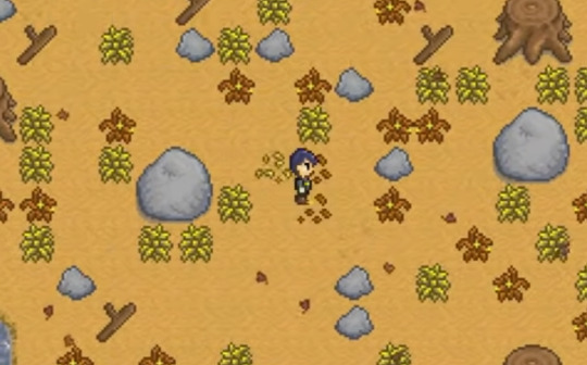
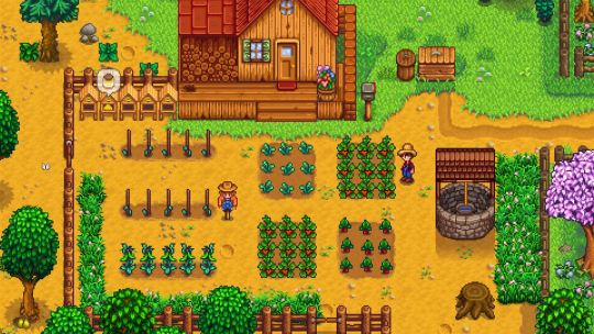
I won't pretend that any of SV's individual sprites are 100% unique, first person in the world to do them, but they have a distinct style and are cohesive and together it builds a distinct picture. They're saturated, there's that bright yellow pathing, the trees have that dense leaf cover, and so on.
ConcernedApe started developing another game, Haunted Chocolatier, and you can tell it has a similar style:
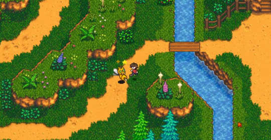
And now here is a game that was embroiled in a controversy several years ago, because, well:
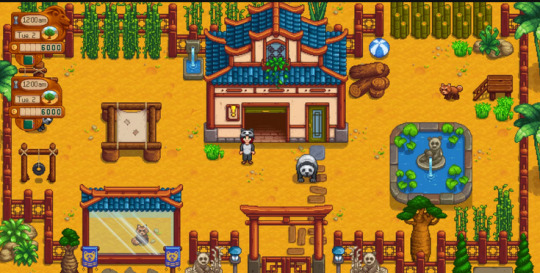
This is "Super Zoo Story", a game produced by a different indie publisher, not ConcernedApe, which a lot of people immediately flagged as looking, well, exactly like a Stardew Valley mod.
Does Eric Barone own the concept of pixel art? No! Does he own the concept of farming sims (or Zoo sims)? No! Is it disrespectful, uncreative, and rude for people to so closely mimic his developed artstyle that it looks like he is associated with the project? Yes. it is.
And are there people who have been inspired by Stardew Valley who made similar games that actually have unique aesthetics? YES.
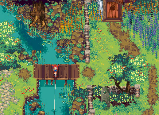
^Above, Kynseed, another pixel art farming RPG.
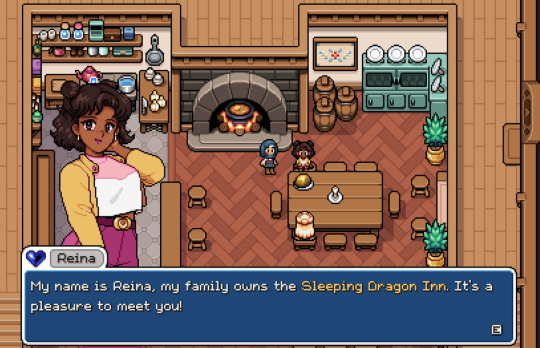
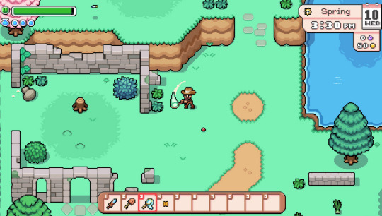
^Above, Fields of Mistria, an adorable farming sim with a cute pixel art style that is clearly inspired by games like Stardew Valley but which has a unique artstyle!
Now, I will say, Super Zoo Story has really evolved in art style, and I hope that part of that was reaction to criticisms for blatantly copying the style of Stardew Valley. I genuinely think they've done a great job improving their style and I wish them the best (very tempting to play it someday because I love zoos and stardew valley).
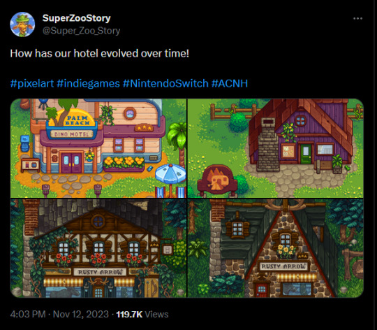
So here's the thing: I don't care if Pokemon "the company" gets stolen from. Pokemon will be fine, there are 12,000 monster games out there already. But normalizing and rewarding that type of really obvious stylistic theft is... it's bad for artists, and it's bad for art. It's bad for indie devs like ConcernedApe, who're getting people piggybacking off of his success.
Games like Ooblets, another monster-collecting game, actually has its own aesthetic. Cassette Beasts is even more obviously Pokemon and a lot of its characters look like they're fakemon but... the thing is they look like FAKEmon, not 1-to-1 with pokemon,
Anyways, I don't really care if people like the game Palworld, but I hate that it's so clearly low-effort in terms of graphics that I can't help but personally dislike it.
14 notes
·
View notes
Text
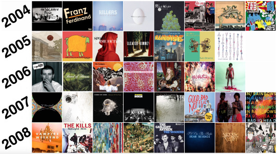
Peak Indie Rock: 2008

Vampire Weekend by Vampire Weekend January 29, 2008 / XL “One difficulty for me, in particular, was—I thought it was so fun and funny to have this concept of a preppy band. One rule that we set early on was ‘No t-shirts.’ Because I just looked and around and everybody was wearing t-shirts all the time….we should just wear button-down shirts. Which of course has a long history, but at the time it felt pretty novel, and especially when there were all these great New York bands like The Strokes and Interpol that just wore t-shirts and leather jackets.” -Ezra Koenig on BBC, 2024
The hate for Vampire Weekend when they arrived on the scene was very real. The crux of it centered around the band being comprised of WASP-y Ivy League grads appropriating African music, which garnered them undeserved indie fame. A lot of it also stemmed from their preppy atire. All this quickly became, like the mythologized Bon Iver For Emma backstory, largely inextricable from the group. The term “cultural imperialists” got thrown around. The Village Voice ran two reviews of their debut, one positive, titled “Please Ignore the Embroidered Dog Sweater” and the other negative titled “Please Ignore This Band.” Clearly though, the music was connecting, as the album sold half a million copies and was a critical favorite of 2008. Vampire Weekend was even the first band to be shot for a Spin cover before releasing an album. If it’s true that any press is good press, then Vampire Weekend was the most successful band of 2008. The music itself, of course, is pretty irresistible. Very few bands release debut albums this cohesive, with a distinct, seemingly fully formed sound and aesthetic. The early aughts gave us plenty of gritty, unpolished, straightforward rock groups, many of them also from New York. But man cannot live by bread alone, and Vampire Weekend brought something fresh and exciting to the culture—smart, elegant, and addictive new wave and Afro-pop influenced tunes. Songs like “Oxford Comma,” “The Kids Don’t Stand a Chance,” and “A-Punk” are nothing short of stone-cold indie classics that still stand as some of the best in their exceptional catalogue. Nation of Heat by Joe Pug February 14, 2008 / Self-released I’m admittedly breaking my own rules here, as Nation of Heat is an EP, not a full album, and probably does not fit the label of “indie rock.” And it’s difficult to pinpoint when this was released. According to Bandcamp it came out in 2008. Wikipedia says 2009. One thing there’s not doubt of is that Joe Pug was about as independent as any artist can be in his approach to recording and distributing Nation of Heat. The project started as a play Pug had been writing as theater major at the University of North Carolina. When he realized he didn’t see much value in the education he was receiving, he dropped out, headed to Chicago, and took a crack at applying the unfinished play's themes to songs instead of stage. Nation of Heat paints a kaleidoscopic picture of America in all its crooked glory. There is clearly strong emotion behind each of these songs; Pug wrestles with his purpose as an artist, the unfulfilled promises of the 1960s’ political and cultural movements, and general disillusionment with so many facets of American society. These weighty topics set to guitar and harmonica, explored in opaquely poetic language naturally call to mind Woody Guthrie and especially early Bob Dylan. Most Dylan acolytes (and there have been oh so many) are just cheap imitators—guys with little in the way of songwriting ability and not much more in terms of actual substance. Joe Pug is one of the rare exceptions. Nation of Heat, sixteen odd years later, is a salient reminder that the personal is political, the country is lost, and it’s on each of us individually to never stop searching. Midnight Boom by The Kills March 10, 2008 / Domino
The Kills’ excellent third album is an underrated career highlight that stands up with some of the best work by the Yeah Yeah Yeahs and, I’ll say it, The White Stripes. These songs are full of slick electro-rock riffs and just-menacing-enough-to-be-cool-as-hell attitude. Highlights include “Tape Song,” “Last Day of Magic,” and “Night Train.”
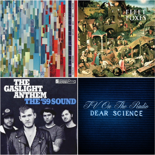
Narrow Stairs by Death Cab for Cutie May 12, 2008 / Atlantic Gradually over the past few years people all across this great land of ours have been coming to a simple but important realization: that the second best Death Cab album is Narrow Stairs. No, it is not Plans (2005), the exhale to Transatlanticism’s pining inhale. It is not We Have The Facts and We’re Voting Yes, a common pick from early fans. It’s not The Photo Album, a crucial level-up album, and the one with an all-time great song that got the band its first sync (and namedrop) in The O.C. No, it is Narrow Stairs, the sixth album by Death Cab for Cutie, which Ben Gibbard has described as “a really fearless record.” He’s also said, “So much of the negativity in my life got funneled into [Narrow Stairs]. I realized after that I didn't want to go any darker. I wanted it to be the bottom for this band and my own emotional spectrum in terms of writing. He’s also described funneling much of his life’s negativity.” Could Zoey Deschanel have had anything to do with all this doom and gloom? It’s a natural question to arrive at, and one I cannot answer. In any case, this one has been dogged by the “dark album” label since it was released, and it seems to have been generally considered “good, not great” for a long while. But time has been favorable to Narrow Stairs. There are of course the songs we all knew were terrific back in 2008. “Bixby Canyon Bridge” remains the hardest ripping Death Cab song and is a contender for the band’s best opening track. “I Will Possess Your Heart” with its jammy bass part and stalker dude vibes is their “Creep.” “Grapevine Fires” is still a painterly reflection on mortality, their “Dust in the Wind.” And then there are songs like “Cath…” that we overlooked. It’s a beautiful and heart-wrenching tale of a miserable bride and all her regrets, ending with an expression of understanding and empathy from Gibbard’s narrator. Or how about “You Can Do Better Than Me” and its plainly stated admission of complacency and inadequacy. To top it all off, “The Ice Is Getting Thinner,” (why not?) a metaphor about a dwindling relationship as climate change. Oh I forgot to mention “Pity and Fear.” That one is about fear and…checks notes…pity. This track is also their “Sopranos finale.” So yes, Narrow Stairs is quite dark. And it’s exceptionally good. Second only to Transatlanticism, and that’s saying a lot. Fleet Foxes by Fleet Foxes June 3, 2008 / Sub Pop
Ah, the great Pacific Northwest. Could Fleet Foxes and this transportive powerhouse of a debut come from anywhere else? I don’t want to get hyperbolic here, but I’d say Fleet Foxes in 2008 did for communing with nature what Nevermind in 1991 for anti-authoritarianism. Primary songwriter Robin Pecknold Pecknold wrote most of the songs in a rural log cabin built by his grandfather in the small town of Plain, Washington. Indeed, the whole record sounds like it came out of some remote mountain town, or was composed in a cliffside European monastery by sixteenth century monks. Its outrageously beautiful harmonies and evocative pastoral imagery make it on of the most exciting debut records of the 2000s. The ’59 Sound by The Gaslight Anthem August 19, 2008 / SideOneDummy A fun (highly dependent on your idea of “fun”) drinking game would be to put on The ’59 Sound and drink every time Brian Fallon makes some classic rock reference. You’d be underway about two minutes into the album on “Great Expectations” when he sings “It's funny how the night moves / Humming a song from 1962.” Then again, some may interpret the first word of the first line “Mary, this station is playing every sad song” as an allusion to the Mary of so many Bruce Springsteen songs. It’s not only impossible to write about The Gasinght Anthem without mentioning The Boss, I believe it’s punishable by death. There’s no Gaslight Anthem without Bruce, but that’s not to say this record is all pastiche. It is a genuinely remarkable heartland punk classic that rightfully earned Fallon the respect of his idol and made his dreams come true. To put it more directly, The ’59 Sound is a no-skips classic that fucking rips. Further reading: The Ringer’s Oral History of The ’59 Sound Dear Science by TV on the Radio September 16, 2008 / 4AD For several summers when I was in high school and college I worked as a lifeguard at a country club. I would sometimes get to control the music that played at the front desk and through the pool deck speaker system. It was typically played at a low volume, meant to be largely ignored, as most background music typically is. Club members never mentioned the music, all of it family friendly and unoffensive, except for two or three separate occasions when various middle-aged suburban dads came to the desk to ask me the name of the song playing. Each time, the song in question was “Love Dog,” the eighth track off TV on the Radio’s Dear Science. What does this mean? Nothing, probably. It’s just a beautiful song that, in a pre-Shazam age, happened to be the one that stood out from the pack, eliciting the urge to ask the gangly teenager folding towels what it’s called. Or perhaps it speaks to something deeper. Something darker. Something at the heart of latent loneliness, middle-aged malaise, and suburban sorrow. We’ll never know.
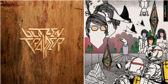
Furr by Blitzentrapper September 23, 2008 / Sub Pop Here’s another pretty unfairly overlooked album from 2008. Nothing crazy here, just really well written folk-country tunes with a woodsy, lived-in sound. The title track is the second best lycanthropic song of the decade (#1 is “Wolf Like Me”…#3 is “She Wolf”). Robin Pecknold had nice things to say about Furr’s closing track “Lady on the Water.” Starfucker by Strfkr September 23, 2008 / Baldman Back then they were known as Starfucker, a group of Portland-based dance rock-loving weirdos with a penchant for including samples of Alan Watts’ philosophical ramblings in songs. In the years since, they’ve dropped the vowels and now sit on a discography of seven pretty terrific electro-pop records. They also put out an ambient album in 2020 that’s not too shabby. Starfucker is their first LP though, and an audaciously odd but thoroughly chill entry into the aughts synth-pop canon. You may have heard in “Rawnald Gregory Erickson the Second” in a Target commercial, but don’t miss standouts “German Love” and “Isabella of Castile.”
0 notes
Text
Preamble: I'm still kinda sick, so if this comes out being incoherent and badly worded, feel free to correct me or put down your own thoughts and stuff. Goes double for Technoblade-fans, anarchists, Zablr – would love to hear your input on this!
This was inspired by a post, that I unfortunately can’t find anymore, where some Technoblade fans explained why Technoblade isn’t a dictator. It’s a post that I think is genuinely helpful (so I’m a little upset that I can’t find it anymore), but I think it misses one point of contention that I have picked up on – because this discussion is flaring up again and again.
I think one of the failings of S2 is that it doesn’t really do a good job of abstracting and differentiating institutionalized power and personal power in a way where it creates a cohesive world.
What I mean is S1 works in a way where we believe L’Manburg and Manburg are actual nations, where the presidents have real institutionalized power (which doesn’t mean that (L’)Manburg works as a fully fleshed-out nation – they’re pastiches from different big-picture political aesthetics and ideas).
Like, Schlatt can exile Wilbur and Tommy even though a considerable number of the actual players are sympathetic to them because the abstraction of institutionalized power works and we can believe that Schlatt has an actual institution at his beck and call … and not just George and (arguably) Punz. (I talk about it more here)
It’s also why we understand that even though Pogtopia had both Dream and Technoblade – the two strongest players on the server – they couldn’t just waltz into Manberg and take everything down. Because Season 1 narratively very clearly differentiated between personal power and institutionalized power – a distinction that inherently can’t exist in the game Minecraft (at least on the level the story of Dream SMP takes place – on a meta level you have admins and stuff, but we’re not talking about that). This distinction is purely within the narrative.
But in S2 that distinction is horribly fudged with – in my opinion. At one-point New L’Manburg is an entire nation like in S1 with the inherent institutionalized power and in the next moment it’s literally just three guys, two of which are decent at PvP.
I think it’s one of the compounding factors that makes Doomsday the mess that it is (among many). Because now, you are at a point where 3 individual people can destroy an entire nation – the distinction between institutionalized power and personal power is completely broken down, because the power struggle is reduced to the level of the game Minecraft, where institutional power doesn’t exist.
Techno’s action would be horrifying, if we were to understand New L’Manburg as an actual nation – because, you know, it would at the very least displace an entire populace of people. But then the obvious and on some level understandable retort is: “There was no populace, New L’Manburg had maybe four members, two of which lived on its premises”.
But then we get back to the problem, where we look at New L’Manburg so literally that it barely works as an abstraction of institutionalized power.
And that’s why – I think, at least – people so often conflate the personal power Technoblade holds with institutional power.
I hope my fevered rant makes sense.
#dream smp#dsmp#dsmpblr#dreamsmp#dream smp analysis#dsmp analysis#dream smp critical#dream smp season 1#dream smp season 2#dream smp doomsday#l'manburg#l'manberg#lmanburg#lmanberg#pogtopia#technoblade#dsmp techno#dsmp technoblade#tubbo#dsmp tubbo#mcyt#mcytblr#quackity#dsmp quackity#long post
199 notes
·
View notes
Note
no ones saying you cant enjoy daniil? people like him as a character but mostly Because he’s an asshole and he’s interesting. the racism and themes of colonization in patho are so blatant
nobody said “by order of Law you are forbidden from enjoying daniil dankovsky in any capacity”, but they did say “if you like daniil dankovsky you are abnormal, problematic, and you should be ashamed of yourself”, so i’d call that an implicit discouragement at the least. not very kind.
regardless, he is a very interesting asshole and we love to make fun of him! but i do not plan to stop seeing his character in an empathetic light when appropriate to do so. we’re all terribly human.
regarding “the racism and themes of colonization in patho”, we’ve gotta have a sit-down for this one because it’s long and difficult. tl;dr here.
i’ve written myself all back and forth and in every direction trying to properly pin down the way i feel about this in a way that is both logically coherent and emotionally honest, but it’s not really working. i debated even responding at all, but i do feel like there are some things worth saying so i’m just going to write a bunch of words, pick a god, and pray it makes some modicum of sense.
the short version: pathologic 2 is a flawed masterwork which i love deeply, but its attempts to be esoteric and challenging have in some ways backfired when it comes to topical discussions such as those surrounding race, which the first game didn’t give its due diligence, and the second game attempted with incomplete success despite its best efforts.
the issue is that when you have a game that is so niche and has these “elevated themes” and draws from all this kind of academic highbrow source material -- the fandom is small, but the fandom consists of people who want to analyze, pathologize, and dissect things as much as possible. so let’s do that.
first: what exactly is racist or colonialist in pathologic? i’m legitimately asking. people at home: by what mechanism does pathologic-the-game inflict racist harm on real people? the fact that the Kin are aesthetically and linguistically inspired by the real-world Buryat people (& adjacent groups) is a potential red flag, but as far as i can tell there’s never any value judgement made about either the fictionalized Kin or the real-world Buryat. the fictional culture is esoteric to the player -- intended to be that way, in fact -- but that’s not an inherently bad thing. it’s a closed practice and they’re minding their business.
does it run the risk of being insensitive with sufficiently aggressive readings? absolutely, but i don’t think that’s racist by itself. they’re just portrayed as a society of human beings (and some magical ones, if you like) that has flaws and incongruences just as the Town does. it’s not idealizing or infantilizing these people, but by no means does it go out of its way to villainize them either. there is no malice in this depiction of the Kin.
is it the fact that characters within both pathologic 1 & 2 are racist? that the player can choose to say racist things when inhabiting those characters? no, because pathologic-the-game doesn’t endorse those things. they’re throwaway characterization lines for assholes. acknowledging that racism exists does not make a media racist. see more here.
however, i find it’s very important to take a moment and divorce the racial discussions in a game like pathologic 2 from the very specific experiences of irl western (particularly american) racism. it’s understandable for such a large chunk of the english-speaking audience to read it that way; it makes sense, but that doesn’t mean it’s correct. although it acknowledges the relevant history to some extent, on account of being set in 1915, pathologic 2 is not intended to be a commentary about race, and especially not current events, and especially especially not current events in america. it’s therefore unfair, in my opinion, to attempt to diagnose it with any concrete ideology or apply its messages to an american racial paradigm.
it definitely still deals with race, but it always, to me, seemed to come back around the exploitation of race as an ultimately arbitrary division of human beings, and the story always strove to be about human beings far more than it was ever about race. does it approach this topic perfectly? no, but it’s clearly making an effort. should we be aware of where it fails to do right by the topic? yes, definitely, but we should also be charitable in our interpretations of what the writers were actually aiming for, rather than reactionarily deeming them unacceptable and leaving it at that. do we really think the writers for pathologic 2 sat down and said “we’re going to go out of our way to be horrible racists today”? i don’t.
IPL’s writing team is a talented lot, and dybowski as lead writer has the kinds of big ideas that elevate a game to a work of art, particularly because he’s not afraid to get personal. on that front, some discussion is inescapable as pathologic 2 deals in a lot of racial and cultural strife, because it’s clearly something near to the his heart, but as i understand it was never really meant to be a narrative “about” race, at least not exclusively so, and especially not in the same sense as the issue is understood by the average American gamer. society isn't a monolith and the contexts are gonna change massively between different cultures who have had, historically, much different relationships with these concepts.
these themes are “so blatant” in pathologic 2 because clearly, on some level, IPL wanted to start a discussion. I think it’s obvious that they wanted to make the audience uncomfortable with the choices they were faced with and the characters they had to inhabit -- invoke a little ostranenie, as it were, and force an emotional breaking point. in the end the game started a conversation and i think that’s something that was done in earnest, despite its moments of obvious clumsiness.
regarding colonialism, this is another thing that the game is just Not About. we see the effects and consequences of colonialism demonstrated in the world of pathologic, and it’s something we’re certainly asked to think about from time to time, but the actual plot/narrative of the game is not about overcoming or confronting explicitly colonialist constructs, etc. i personally regard this as a bit of a missed opportunity, but it’s just not what IPL was going for.
instead they have a huge focus, as discussed somewhat in response to this ask, on the broader idea of powerful people trying to create a “utopia” at the mortal cost of those they disempower, which is almost always topical as far as i’m concerned, and also very Russian.
i think there was some interview where it was said that the second game was much more about “a mechanism that transforms human nature” than the costs of utopia, but it’s still a persistent enough theme to be worth talking about both as an abstraction of colonialism as well as in its more-likely intended context through the lens of wealth inequality, environmental destruction & government corruption as universal human issues faced by the marginalized classes. i think both are important and intelligent readings of the text, and both are worth discussion.
both endings of pathologic 2 involve sacrifice in the name of an “ideal world” where it’s impossible to ever be fully satisfied. in the Diurnal Ending, Artemy is tormented over the fate of the Kin and the euthanasia of his dying god and all her miracles, but he needs to have faith that the children he’s protected will grow up better than their parents and create a world where he and his culture will be immortalized in love. in the Nocturnal Ending, he’s horrified because in preserving the miracle-bound legacy of his people as a collective, he’s un-personed himself to the individuals he loves, but he needs to have faith that the uniqueness and magic of the resurrected Earth was precious enough to be worth that sacrifice. neither ending is fair. it’s not fair that he can’t have both, but that’s the idea. because that “utopia” everyone’s been chasing is an idol that distracts from the important work of being a human being and doing your best in a flawed world.
because pathologic’s themes as a series are so very “Russian turn-of-the-century” and draw a ton of stylistic and topical inspiration from the theatre and literature of that era, i don’t doubt that it’s also inherited some of its inspirational literature’s missteps. however, because the game’s intertextuality is so incredibly dense it’s difficult to construct a super cohesive picture of its actual messaging. a lot of its references and themes will absolutely go over your head if you enter unprepared -- this was true for me, and it ended up taking several passes and a bunch of research to even begin appreciating the breadth of its influences.
(i’d argue this is ultimately a good thing; i would never have gone and picked up Camus or Strugatsky, or even known who Antonin Artaud was at all if i hadn’t gone in with pathologic! my understanding is still woefully incomplete and it’s probably going to take me a lot more effort to get properly fluent in the ideology of the story, but that’s the joy of it, i think. :) i’m very lucky to be able to pursue it in this way.)
anyway yes, pathologic 2 is definitely very flawed in a lot of places, particularly when it tries to tackle race, but i’m happy to see it for better and for worse. the game attempts to discuss several adjacent issues and stumbles as it does so, but insinuating it to be in some way “pro-racist” or “pro-colonialist” or whatever else feels kind of disingenuous to me. they’re clearly trying, however imperfectly, to do something intriguing and meaningful and empathetic with their story.
even all this will probably amount to a very disjointed and incomplete explanation of how pathologic & its messaging makes me feel, but what i want -- as a broader approach, not just for pathologic -- is for people to be willing to interpret things charitably.
sometimes things are made just to be cruel, and those things should be condemned, but not everything is like that. it’s not only possible but necessary to be able to acknowledge flaws or mistakes and still be kind. persecuting something straight away removes any opportunity to examine it and learn from it, and pathologic happens to be ripe with learning experiences.
it’s all about being okay with ugliness, working through difficult nuances with grace, and the strength of the human spirit, and it’s a story about love first and foremost, and i guess we sort of need that right now. it gave me some of its love, so i’m giving it some of my patience.
#meta#discourse#long post#ipl#writing#Anonymous#slight edit for colonialism#untitled plague game#pathologic
112 notes
·
View notes
Text
Ten Things I Learned From Cryptids of Belenon
Cryptids of Belenon is my baby; my first completed custom magic set and a topic I was and still am fascinated by: cryptozoology. It is first and foremost top-down cryptozoology, and I hit as many different tropes and creatures as I could squeeze into 278 cards. Still, it is far from a perfect set, but as a first set it’s always going to be an uphill battle to get it into a shape one might consider good. That is why, after nearly two years of development, I wanted to give some advice to people on how to avoid mistakes that I made when working on it. As always, take my writings with a grain of salt; I’m not infallible, and what worked for me may not work for you. Still, I hope this helps someone, whether or not they’re new to the hobby. Just for clarity’s sake, these are in no particular order and are definitely not least important to most.
1. Kill your darlings
This is a piece of writing advice I’ve adapted to the custom magic space. ‘Kill your darlings’ means, basically, that whatever you think you need you probably don’t. If something becomes unnecessary, whether that be a thematic element, a mechanic, or even a pet card, you should really consider cutting it. When I was first developing Cryptids, the set had a steampunk theme and multiple new and returning mechanics; I ended up abandoning every mechanic the set was pitched with, and traded in the steampunk aesthetic for a more modern thematic. The set is better for this change, even though at the time it was hard.
2. Get the picture
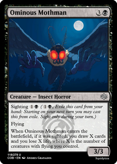
When developing for top-down sets, a unifying theme is very important. This should be obvious, but what isn’t obvious is that everything that contributes to that theme must be recognizable. Top-down sets such as Amonkhet didn’t reference obscure concepts like Egyptian metaphysics of the soul, and instead went for the most recognizable aspects: Mummies, animal-headed gods, jackals, snakes, and iconic imagery like the Luxa (Nile) and pyramids. That isn’t to say nothing obscure wasn’t referenced, but the focus was clearly on what people knew and understood. This is something I didn’t do in earlier versions of Cryptids; I referenced every obscure creature I could find, no matter how recognizable they are, and that hurt the set’s cohesion. Nobody knows what a Nandi bear is, but everyone recognizes Bigfoot and many people have heard of Mothman and a fair few people know what an SCP is.
3. Story time
Cryptids of Belenon does have a story, but it's told poorly through the cards. This isn’t the end of the world, but it makes the whole package feel less interesting and a bit confusing, potentially. Why are the banishers (an analogue for the SCP foundation, or the FBI from the X-Files) keeping everything hidden during an alien invasion? Why is there an alien invasion in the first place? Flavor text can help, but if the story is flawed in execution that can leave the audience even more baffled than without it. With the benefit of hindsight I know more resources should’ve been put into making the story flow more naturally.

Why is this a story spotlight? What even is the story?
4. Playtest, playtest, playtest!
Playtesting is extremely important, as anyone who’s been in the custom magic scene long knows. For me, playtesting was vital for grasping an intuitive knowledge of Cryptids’ mechanics; Sighting looks a little awkward but plays very smoothly, and Mysteries are full of knobs to balance them with. Mysteries in particular are the splashy, attention-grabbing mechanic of Cryptids, so making sure they all played well was the most important part of playtesting for me.
5. Archetypical.
Cryptids of Belenon does have limited archetypes, but its mechanical variance is off-kilter. Why are there one-off sighting rewards in red and white, when sighting is centered in sultai colors? This muddies the draft and can send wrong signals to drafters who aren’t familiar with the set. Sighting appears in all colors, but the archetypes rewarding it should be the main focus for that mechanic. This issue is present in other mechanics; there are flying rewards in blue despite the archetype being focused in white and black, and in general makes drafting more awkward.

6. Art thou ready?
Cryptids of Belenon has an identity problem. Much of the art suggests a modern, low-magic world very much like our own, but a few cards still remain that suggest a different time period. I’ve been slowly whittling away at replacing and reflavoring those cards, but this has hurt the set’s themes a lot in my opinion. Art is the greatest limiter in a lot of custom sets, and figuring out what you can and can’t art is a very important skill to master. Cryptids also just has a few pieces of low-quality art that could stand to be improved on.
7. Constructed applications.
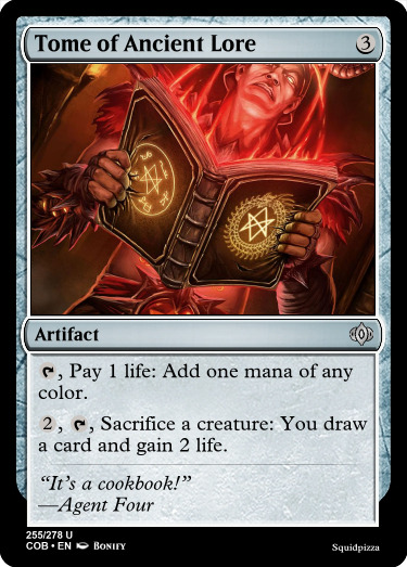
Cryptids of Belenon is a somewhat lower-powered set, mysteries aside. Those are the main buildarounds, and a lot of them are pushed for use in constructed. With that much of the constructed budget eaten up, a lot of other constructed-pushed cards are riffs on existing cards, which is just not as interesting as new, competitively viable and interesting cards.
8. What’s in a name?
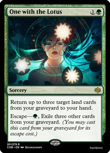
I am terrible at naming things. Straight up, easily the worst part of designing for me. I did very little worldbuilding for Belenon while developing the set; there are few locations named and few important characters with more than a line or two of flavor text each. In a better world, Cryptids of Belenon could’ve been a richer vorthos experience. I want to call particular attention to Anning, named after the real person she’s based off of. Why did I do that? The world may never know.

9. Cut the Chaff
Cryptids of Belenon has a lot of one-off cards and strategies that simply didn’t get the support they needed. There’s a small voltron package in blue and green, and a lifegain one in black and white. These are draft traps, and the set would be better without them. These cards don’t need to exist, and again confuse drafters by signaling archetypes that are not present.
10. Flavor Judgement
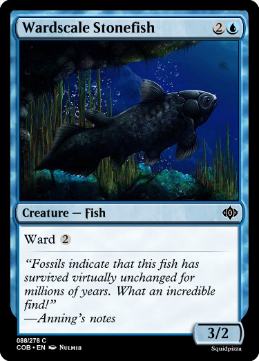
Aside from the overall issue of Cryptids’ story being hard to glean from the cards, a lot of the flavor text is just lacking. It’s quotes from a smattering of characters, most of it is quippy one-liners, and in general it just detracts from the flavor of the cards more than it adds in a lot of cases. This creates a feeling of sameness where there should be a lot of diversity; research reports, eyewitness accounts, et cetera. While I think the set does have a few standout flavor texts (such as Devolve, pictured below), a lot of them are in dire need of improvement or replacement.
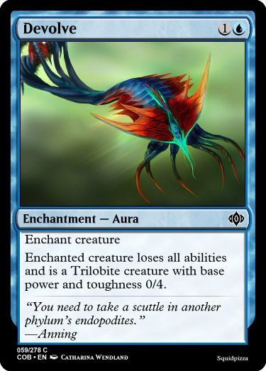
3 notes
·
View notes
Note
Hi! I hope I'm not bothering you, but I love your mood board edits and was wondering if you could explain how you go about making/colouring them? I see lots of places to find gifs but turning them into a set is so hard. Thank you in advance!
hi! first of all thank you so much and second of all it’s not a bother at all! i am happy to give some of my own tips even if my explanation probably isn’t super helpful. i won’t give like a ps tutorial but below the cut (since i included example gifs, it’s VERY long) is my process for my latest jily aesthetic:
i keep track of all my ideas/sets in a spreadsheet (which i won’t show bc there’s a lot of info i’d have to blur/black out) but i always have a list of what scenes i need to gif/what gifs i’m editing and where i’m getting them from. i also include a couple extra ideas in case the gifs i have planned end up being too hard to color or don’t fit in the set. i’ve found it’s best/easiest to start w the list bc there is literally nothing worse than spending hours on a set and then not being able to complete it.
as for actually finding the material, i have a pretty healthy number of scene packs saved in my giffing folder, esp. for things i know i will gif frequently. most of the time i will peruse youtube, vimeo, and instagram for any aesthetic scenes. i also have a lot of gif packs saved specifically for the purpose of making mbs (usually i mix my own gifs w gif packs), if you msg me i’m happy to direct you to some gif packs i use regularly or you can check my #resources tag. a couple tips for finding material:
always opt for download when possible, i used to screen record and the difference when i switched to downloading was astronomical. (it’s easy to lose quality and esp if you’re on mac, quicktime duplicates frames so either you have to manually delete those extras or you get sort of choppy gifs when you load them into ps.)
always use 1080p or better, 720p will work in a pinch for 268px or 177px gifs since you can make up some of that resolution loss with sharpening, but don’t go any lower than that, just love yourself.
for pale sets, look for the right colors. i tend to look for scenes w high color contrast especially if it features poc so it’s easier to color without whitewashing, ie if the subject is a person then i look for light colored or blue/green/violet/white backgrounds. it’ll make your life wayyyyy easier. this also means if you’re making a set try to find scenes with already similar lighting bc you won’t have to work so hard to make it look cohesive.
here’s a quick rundown of what i do before coloring:
import all frames and save all the files in a folder together!!
play around with frame delay so all the gifs are moving at about the same speed, usually keep it between 0.03-0.05s
crop and resize gifs (i use 268x145 most of the time)
convert to timeline
when it comes to coloring it can be really hit or miss, i’ve recently gotten back into my groove but i was having sooo much trouble earlier this year. in general, don’t stress yourself out!! sometimes it’s easier to just find a new scene/gif (hence my list of extras!) than to try too hard to fit a gif into your set. i color all my gifs by scratch (ie no psds) but i tend to follow the same pattern, i’ll explain using these gifs/psd as an example since then i can also explain how to fix white-washing:
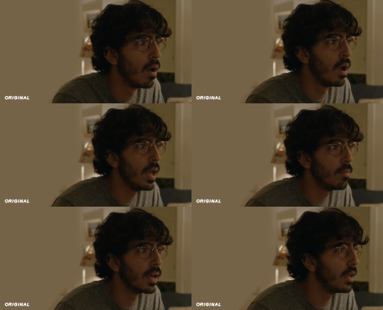

first off when you’re coloring gifs with poc always always always make a layer mask so you can compare the edited and unedited skin tones directly! i use the marquee tool to make a selection in the middle of the character’s face, select the folder of my adjustment layers, and hit ‘add vector mask’ (the third button from the left on the layers panel, it’s a white rectangle with a circle in it).
i almost always begin by using hue/saturation layers to highlight and delete certain colors. here i highlighted red and raised the lightness on yellow by a lot since it’s a very yellow scene. then i use a combination of brightness/contrast, levels, and curves layers to brighten the scene. here’s what i have now:
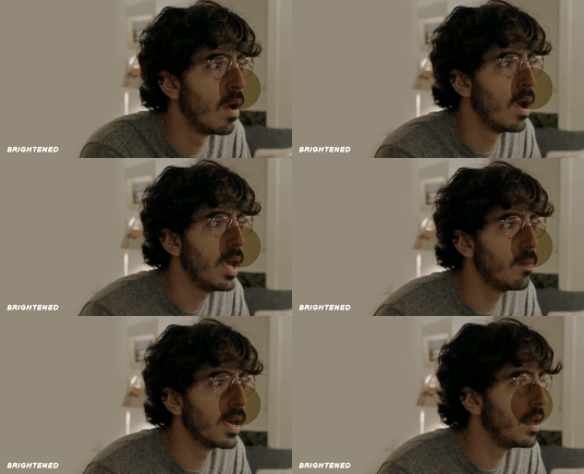
i add a gradient map set to black/white, change the blending to exclusion, and lower the opacity to between 5-10% (depending on the scene) to lighten the contrast further:

then i add back a little depth with selective color in neutrals and blacks:
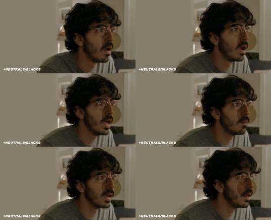
now i have two main goals: 1. add contrast between the background and the subject, and 2. brighten the scene into a pale gif. to do this, i use color balance to tweak the color of the background, taking out the yellows. this step works best if there’s at least some shade difference between your subject and background, otherwise isolating the two will be impossible. here’s what i have after adding color balance:

i use hue/saturation to selectively highlight the background color. in this case i chose to adjust magenta and used the color picker (the first eyedropper on the left) to identify the exact shade i wanted to lighten. now i have a fairly neutral background and a colorful subject, which gives a sort of pale effect:
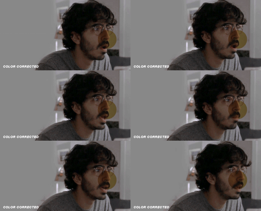
and now i use a curves layer and a selective color (white) layer to brighten further:
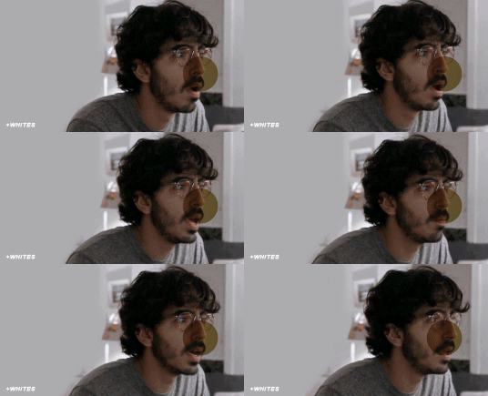

before i go further, i start fixing white-washing. keep in mind that some variance is normal since you are naturally changing the lighting of the scene; this gif shows it rlly clearly bc of how yellow and dim the lighting is, so some lightening is to be expected. however, both because the vector mask shows a lot of whitening and because i’ve giffed dev patel before and have a general idea of what he looks like in this type of lighting, i know what needs to be fixed, so i go back in under the psd/adjustment layers with a combination of selective color (red and neutral) and hue/saturation layers to darken his skin again:

now that some more contrast has been added in, i can go back to working on the psd and use curves and selective color to play around with the background again:

i use another hue/saturation layer and a black/white gradient to tone down oversaturation:


usually i leave those layers on top, so if i want to make any adjustments (like lightening the background more), i go in under those two. in this case i tweaked the whites and reduced the contrast a little to get this:
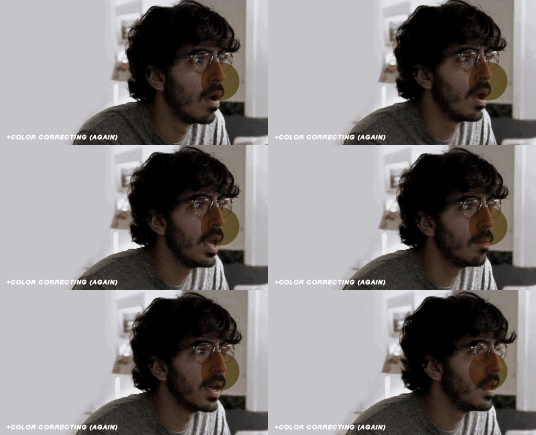

again, you can see his skin tone has changed from the original, but variation is to be expected given how much brighter the room is, the fact that i took out a lot of yellow lighting, and the brightening effect of the computer screen in front of him. some other things to keep in mind when coloring:
when you add layers to correct white-washing, you’re likely to end up with overly red/orange skin tones (red-washing). this can be fixed by upping cyans in the reds, desaturating/darkening the reds, or adding b/w or desaturation later on.
when in doubt, it’s better to be darker than lighter (the issue with white-washing is that it promotes colorism, and there is nothing inherently wrong with a darker skin tone) but really. just put in the effort to color poc correctly.
when changing the lighting a lot it helps to look at pictures of the subject in natural/bright lighting, since you get a better idea of what their normal skin tone is.
don’t try to squeeze all your selective color layers into one. you’ll get less grainy gifs if you separate them out and work one by one.
TURN OFF NIGHT SHIFT/NIGHT MODE! yes i KNOW it’s bad for your eyes (especially if you’re like me and gif at night, when the lighting outside isn’t changing every 20 seconds) but your gifs will look VERY different under f.lux or night mode compared to daytime screens. especially if you’re giffing at different times of day, blue light filters can really change the way your coloring appears. best to keep it consistent.
my sharpening settings vary depending on what i’m giffing but in general i do two layers of smart sharpen (500% with radius between 0.2-0.4, 10% with radius at 10px) and then gaussian blur at 2.5px and adjust the opacity so it’s somewhere between 15-20%. i try to strike a balance between smoothing out the graininess from selective color, and sharpening details like clothes and hair. here’s what i ended up with for the gif above:

then i rinse and repeat for the rest of the gifs in the set! i tend to start with the gifs that i know will be hardest to color, which is usually the darker ones (coloring is limited by how much i can brighten the scene) and those that include poc (again, limited by how much i can brighten and adjust the scene’s lighting without white-washing). then i check set cohesion as i go, using those first few gifs as benchmarks. once i have all 8 (or 9 or 10) gifs, i play around with composition and try to balance and vary the subject, colors, and composition of gifs next to each other. i go back and make a couple of adjustments here and there according to what i observe and what i think might improve the overall appearance.
and that’s pretty much it! i hope this was helpful, if you have other questions feel free to message me and i’d be happy to help/troubleshoot. happy giffing!
#Anonymous#*#resources#answered#sorry this was sO long but i hope it helped on the coloring end#tbh i exceeded my own expectations with the dev gif lol#yeahps#completeresources#chaoticresources#tutorial#coloring tutorial
54 notes
·
View notes
Note
fashion queen! which nct era has the best fashun in ur opinion?? and if u were a designer which neos would u pick as ur models?
I was so excited to answer this that I wrote several pages and it basically turned into a style analysis for each unit so I sure hope you have some time on your hands to read everything I’ve just written! (I did not reread so sorry for any typing mistake)
NCT is known to be experimental in their music and that’s also the case in their styling so there’s a lot for me to get into even though sometimes it’s a miss. One thing I will say though is that when it comes to the styling in mv/teasers, what’s around the clothes is super important because if you have a very specific styling concept, your set design or graphic design needs to complement that and give the audience more clues on how to read all these elements together (the cherry bomb era is a great example of that with all the added graphic elements and the predominance of the colour pink) and recently I’ve found that the creative team has not really gone further than just putting nct in an outfit in front of a basic background so it makes for a pretty underwhelming result
But let’s move on to my favourite styling eras. I’m going to do this per unit (I’ll finish with NCT U) and define an era by its teaser pictures and the mv (and not go through all the performance looks during the promotion period)
I’m putting this under a read more because it’s reaaally long (I put pictures so that it’s not just one big chunk of text)
NCT 127
Easily the most experimental unit when it comes to fashion, especially in their first years where they would wear mix of sportswear, grunge references, avant-garde fashion and a lot of layers. When it comes to their debut “Firetruck”, I think it fitted the song really well but that it didn’t fit all the members equally (especially the younger ones, for me Taeyong and Taeil pulled it off the best – it’s expected of Taeyong but I also think that Taeil always stand out when they go for edgy/unconventional look, I think it really suits him).
Anyway, just to say that they were off to a very strong start and then I’m just going to kindly ignore the Limitless styling and move on to Cherry Bomb!
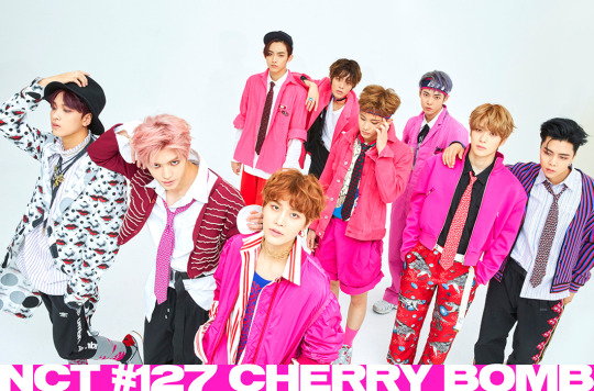
One thing nicely done for CB is how when you look at a group picture they’re clearly all following the same concept but they’re not necessarily matching or giving off the same vibes if you take them individually. I love the use of the colour pink which brings a) a great visual impact (you don’t ever see that much pink at once – especially on men) and b) an harmony despite the shapes and styles of their outfits being so vastly different, you’ve got ties, tousled, shirts, little frilled collars, stripes and all-over prints, sportswear and formal wear… (ex: taeyong’s short jacket is reminiscent of something a little luxurious, even maybe historical/noble with the little added embroidery-like details, it reminds me of these boleros jackets worn by toreros that are often red/gold VS doyoung’s overalls is an outfit that has a much more recent origin as it was first worn by factories workers, it’s usually blue or grey and is meant to be practical rather than pleasing to the eye -> here it fits very well with the general setting of the mv in what looks like an empty industrial storage space)
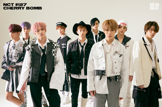
This second look is more of a game on how to deconstruct formal wear (there are less prints and no bold colours, their hair is less messy…) but they don’t just add sportswear like the bomber jacket, you can find rock or more “modern” elements with the leather jackets or the jean jackets. All in black and white so great contrast with the previous looks, although that mix and match concept is still there. My favourite elements are the checkered ones (worn by taeyong, taeil and haechan) as it reminds me of the strategy element of the chess game which fits pretty well with all the weapons and other arms visible in the mv (a bit like a nod to the game battleship)
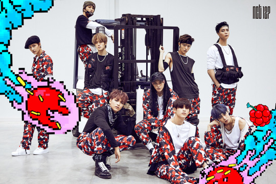
This one I love that they developed their own print, especially since it’s another graphic element used elsewhere (see their album cover), because it’s a great way to really introduce their identity as a group, through the different visual elements they put out in a comeback, it’s like a logo but as a print. And all the teasers and the mv did a great job at mixing 2D/3D contents so that’s another nice way to be cohesive. It’s not my fave look out of the 3 (especially because I do not approve of that belt-suspenders-bag they gave Johnny, it’s like everything you don’t want to put a dancer in and it’s ugly as well) but I still like the fact that’s it’s another nod to the battle/strategy aspect of this comeback, like they’re on a mission to hit the stage and conquer it
Then fast forward to my other favourite one, Simon Says! (No teaser pictures here because they don’t show anything or they show not enough lol)
First of all THE MASKS
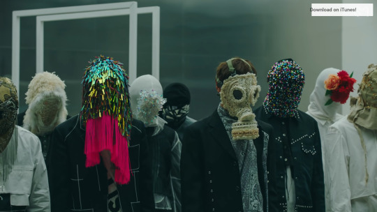
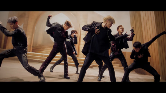
Oh how I wish they could’ve been shown more (imagine teasers with the members wearing them!!! I would’ve loved individual teasers based on each of the masks concepts) Once again, a great to have group concept without making everyone wear the same thing. They’re all super different and full of details. Haechan’s is the only one from what I could who’s mask is actually a mask and not a fully covering hood. The materials and techniques used on these are either evocative of “fragile” things like glass and flowers but theses elements have their own hidden strength. Some others are covered in lace, pearls, fringes or fur…all these things are usually considered to be precious or even luxurious but it covers their faces and their identity and they throw it away in rebellion (and I think it’s also super interesting how Taeyong who takes off his mask first has the least ornamented one)
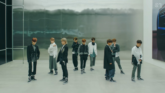
Then the outfits themselves. Simon Says in an interesting MV because unlike most others they wear one outfit for most of the MV (the second one appears quite late in the mv and is lit and staged in a way that makes it less visible). It’s a mostly grey/white set of outfits which is usually a colour combo for office wear or maybe factory workers, it’s not something that can seem very exciting or edgy. The styling in these outfits reminds me of the works of Japanese designers who came to Paris in the 80’s and kind of shook the whole high fashion system by bringing a different type of shapes, aesthetic and purpose to fashion (Rei Kawakubo, Yohji Yamamoto…). These designers went on to become super successful and inspired another wave of “avant-garde” designers nicknamed “the 6 of Anvers” (Anvers is a city in Belgium), this group includes Martin Margiella, Dries Van Noten…And to me the outfits in Simon Says really fit into this aesthetic. Unconventional fits, various layers, it’s not so much mix and match than a work on contrast between structure and fluidity (Yuta’s half skirt with un-trimed edges, Haechan’s long shirt with the long bow and the fitted jacket, Mark’s top with the various see-through layers of different lengths…).
An other interesting details (which to me calls back to the mask and that tension in the song/concept of letting go/being free of expectations), is the way they all have thick strings tied on their feet/ankles. Not holding them back because their feet aren’t tied together but there’s still this clear restriction of the garment itself, a reminder that there are tied to something and not completely free (also an interesting choice when dressing dancers who would need to have no added weight or discomfort in their outfit to dance but visually something is holding their ankles)
Honorable mentions:
Kick It– they managed to create very memorable outfits while taking inspirations from already well known elements (both for the fighting/training outfits and the bomber jackets). The black and white outfits especially are very original as performance outfits/dancing clothes since the og garment they’re inspired by has already such a strong identity outside of the performing arts and I don’t think I’ve ever seen it be used as a stage outfit? Or concept? It’s a nice exemple of how you can take inspiration for something designed to be useful and to be efficient (in fighting) and turn it into an aesthetic.

Truthfully, martial art training outfit was already an “aesthetic” on its own but they made it a performance costume and now I do feel like it’s one of these looks that everyone will remember (like if there was a “most memorable kpop outfits” list it could easily have kick it’s black/white fits). The rest of the outfits for that concept weren’t as memorable/original to me although I feel like it showed a new approach to the styling of nct 127 as a group since they all had very similar outfits this time (especially when wearing the jackets).

Also, interestingly, that shot of Jaehyun that had everyone go “wow” ? Well it’s impactful because it’s him and he looks like that and it’s shot in a very specific way, but it’s also even more impactful because he’s the only one who gets to wear that kind of outfit in the mv. Everyone else has 3 sets of outfits (black and white, shiny black, red jacket and black pants) but he has 4 and that suit is only used in that shot which makes for a greater impact!
And I feel like Kick It in terms of styling opened a new era for NCT 127 has it kind of broke their usual mix and match/edgy concept. This time they were clearly referencing something already well known (either martial arts, the 90s…), and the members were all matching and they kept on doing that with the military jackets in punch, the other 90s concept in nct 2020…
Touch – for the way the outfits match the sets (in all their individual sets their outfits have a detail in a matching colour), the focus on colours !!! You can see that this whole concept was designed with this colour game/colour progression between the outfits and the set in mind. It’s just very pleasing to the eyes and a great contrast to their usual stuffs (also I wrote my graduation paper on colours so I am really into creative use of colours like this)
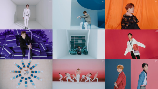
OK now moving on to Dream!!
The interesting thing about Dream compared to NCT 127 is that from the beginning although their outfits had to match the song an the concept of the comeback it also had to match their age. Dream’s a group that had to look young when debuting (to the point where they wore outfits that made them look even younger than they were which is rarely done for boy groups) and then they had to transition into adulthood, and all of that had to be made visible. In that aspect, I really like the styling for We Young and Boom (especially when you look at them at the same time).
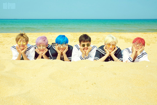
For We Young, the styling is meant to be reminiscent of school/boy scout uniforms but with a marine vibe. It makes for playful outfits that aren’t too childish but that also aren’t grown up. I prefer the “seaside” outfits as I don’t really like school uniforms as a concept for styling and I think it’s really a choice that suited them and the song so well, it really fitted their energy. It’s playful but it also has a vintage touch to it as these outfits with their stripes and their squared flap at the back date back to the XIXth century (I just found out that it all started with the queen Victoria dressing up her kid in an outfit inspired by the royal navy uniforms for a painting after a cruise ).
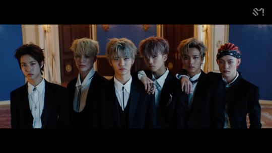
Boom on the other side is their first proper “grown-up” concept. We go up was already more grown up but still very “teenager-ish” and although they were mostly teenagers when they did Boom it was clear that this was supposed to be their first entry into “adulthood” as a group at least. And although they did wear a sportswear/casual outfits which is something that isn’t related to age (and I really like the black and white “skeleton” set which already feels more grown-up and more “stylish” than the other casual outfit) , they wore two other “grown-up” elements: suits and all-jean outfits.
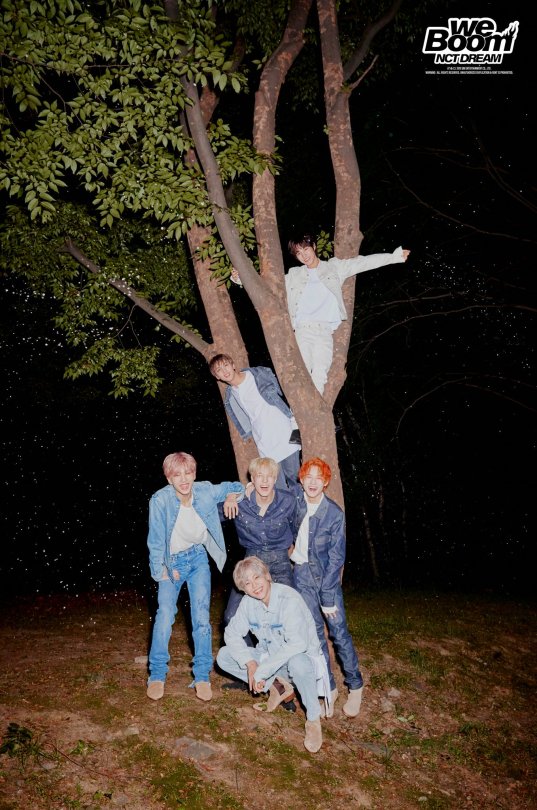
And yeah teenagers, and kids wear jeans too but a full jean-on-jean outfit is more of a “grown-up” fashion choice and it makes them look like young men rather than boys. As for the suits, I just really love when stylists play with the codes of that garment (length of the jacket, tightness of the pants, the way the shirt is tucked in…).
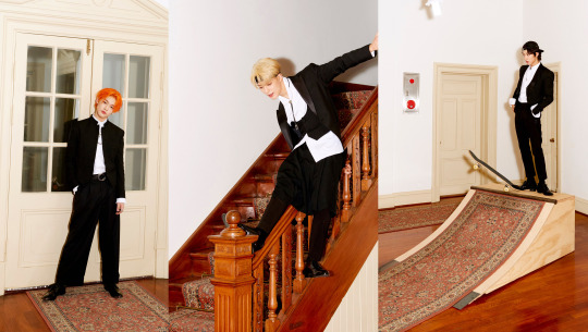
Notice how Renjun has a really short jacket, Chenle’s pants are wide, Jeno has a tail…Once again, a really interesting aspect of Kpop is the variations of the same concept based on the members. In the mv, there is a tension between their more grown up selves (the one in suits, the one with a craft/a path) and their young selves (the one running around in the field, the one laying down in the flowers and eating a cake). And there is also in these outfits and the contrast between them this tension, this contrast…which path should they go? The jeans are the more laide back, innocent outfits, whereas the suits come with responsibilities and status (and you’ll notice that in the scene where jisung is left alone to blow his candle it’s when he’s wearing jeans not when he’s in the suits).
Now on to WayV!!
WayV are different from the two in the sense than when they debuted they couldn’t have an “age” concept or an edgy concept because 127 and dream had already taken those and I feel like for that reason they’re still looking for what makes them stand out visually from the others (and in my opinion it’s not in whatever they were wearing for turn back time!). WayV’s concept is space and time travel, it’s building a new life, a new worl, going beyond anything! In my mind, they’re either supposed to feel a bit “otherworldly” (either spectacular or literally like they’re from another world/another universe, a little bit futuristic maybe?) or to look like explorers/travellers (they have a lot of travel/transportation “gears” references in their outfits). Their MVs also have a very different production than the other nct mvs (the scale and the way it’s filmed, the sets…it’s a different approach and it’s usually much more “grand” for their title tracks). The great thing about WayvV styling is usually that they match the outfits well with the world that the mv is set in (like in Moonwalk for example you get a sense of the world they’re in and the fact that it’s not ours or at least not as we know it now through the way they dress – you can’t really say oh it’s inspired by this era or by this or that because -at least- to me it immediately gives me a vibe of something that could be worn in a sci-fi movie, almost like a costume) or that they allude to travel in their styling.
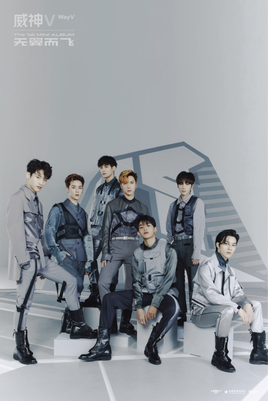
When they debuted with Regular they went for a very sleek and high fashion look which worked really well for them! Even their more “casual” looks were a bit striking and I think that’s very “wayv-like” to me.
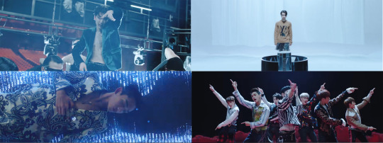
Same goes for Take Off where they mix the individual styles (and I don’t like ten’s leopard fur sleeveless jacket at all) and the group concepts – the “flying” outfits and the “racing” outfits (that last one is my favourite! I love the silhouette it creates with the tight pants and the larger tops with an emphasis on the waist).

There’s something a bit extra to WayV - which is why some of their outfits remind me of costumes more than fashion while at the same time they’re the most “high fashion” unit– like the “flying” outfit in Take Off are recognizable as “flying gear” but you can’t really tell what they’re flying, it feels once again like something that they could wear in like star wars or a similar kind of story.
Imagine a movie about 7 men on another planet trying to come together to overcome the dark forces or whatever’s bad on their planet in a futuristic society with a mix of “traditional” and “trendy” outfits? That’s WayV. The movie the 5th Sense? That’s WayV but on steroids. They’re also the only group with actual characters in their mvs, they’re all supposed to have a backstory or an individual setting and find a way to get together in their mvs.
Anyway all that to say that it’s hard for me to pick an era for them because they’ve only had a few and they still feel like they’re looking to solidify their concept, and since moonwalk and turn back time really set the styling in different worlds than ours, you have to look at how they fit in that world rather than ours and I think Moonwalk does it best since it’s the most cohesive one visually. But then I think Regular had the best individual styling!
Okay this is super long but we’re finally getting to NCT U!!!!
Number one favourite:

The Year Party outfits!!!! I’ve already talked about this but I love when they say we’ll put them in suits and then since they have to make a different one for each of them they cut bits an dpieces of the suits here and there, play with lengths. It’s not a revolutionary concept but in terms of searching for a shape, searching for variations of an already so famous, so well-known garment (everyone has seen a suit, and so many designers have already deconstructed it and then put it back together and so on) it’s so nice, it’s almost like a full collection given how many members there are and it’s just a good tailoring work.It almost feel like an exercise of how many variations of an outfit can you think of? And it looks fun to do! It’s all about the details and the way the layers are set together.
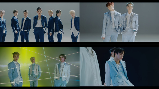
The accessories add to the “formal attire” aspect of it. It almost has a ceremonial look to it. A bit of royalty with the futuristic vibe usually associated with WayV. The dark blue suits were pretty classic, the most interesting details (for me at least) were on the light blue ones. Especially since it’s a rare colour to find in formal wear or in ceremonial wear. In general, I feel like it’s a pretty rare colour in fashion outside of like shirts and baby clothes? I think it was a great styling choice for a content like the year party although I do wish they (either NCT or WayV who’ve touched upon this kind of outfit a bit already) would do a full comeback with this kind of styling (like the lighter version of the black and green outfits in SuperM’s One). It’s not revolutionary but it was something new for NCT and I really hope they use that elegant/futuristic concept once again.
Also in these outfits, the jewelry is super important and adds to the “grand” aspect of these outfits. The concept is that these aren’t ordinary outfits for ordinary men, we’re witnessing something “special” and so they aren’t wearing their usual jewels either (of course the big chains are still there but differently look at that necklace jaehyun is wearing)

Honorable mention:
Boss & Baby Don’t Stop (they’re different but they go together in my mind lol). Look at them in their uniforms! And also they had doyoung wearing these sunglasses
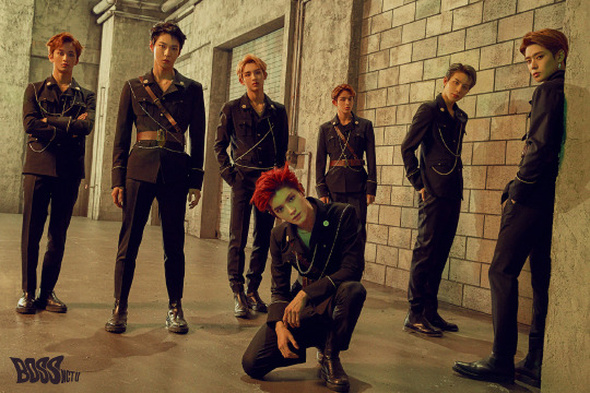
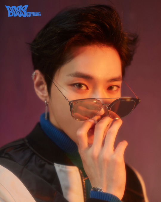
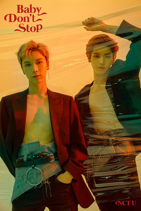
Ok I think I’m done, if you’ve made it this far thank you so much and I hope it was a nice read!!
As for who would I chose as my models…it really depends on what I’d make them wear tbh for menswear the things I’d like to design would either be something like formal wear or knitwear – I’d pick Lucas, Taeyong and Doyoung (I think they’re the most model-like members and could pull off pretty much anything even my non-edgy concept because I can’t do that lol and they pose very well) and then depending on the concept I’d pick between Winwin, Jaehyun, Kun, Jungwoo, Taeil, Haechan and Shotaro (the way I struggled to remember all the members at once…there are too many really)
#this is soooo long omg I didn't know I had that much to say wow#I hope you've managed to read it all and that it was somewhat coherent and clear#now it's time to eat#nct#nct 127#nct dream#wayv#nct 2020#fashion#leemarx#I've got mail#vinformation
34 notes
·
View notes
Text
Mulan (2020): A Scathing Review
Or, an extremely long rant by two extremely mad Chinese girls.
Before we (@hotaruyy and @meow3sensei) watched Mulan (2020), we didn’t expect too much, since the director and screenwriters aren’t Chinese (even though they claimed to want to be more culturally accurate). But holy shit, this film didn’t even fulfill our exceedingly low expectations (and we’re speaking as people who didn’t mind the loss of the musical aspect because look at the Beauty and the Beast live action). Our review will focus on our critiques of the presentation of different aspects of Chinese culture in Mulan (2020).
The Chinese Aspect of the film was especially infuriating to us as a Chinese audience. Disney emphasises that many of the changes made to the film in comparison to the animated film were to accommodate backlash regarding cultural and historical inaccuracies from Chinese audiences, but what we saw on the screen showed otherwise.
On Set Design (By a slightly irritated Architecture student)
Mix and match of architecture from multiple dynasties, which removes a lot of the sense of realism and authenticity from the film
Tang-style architecture is used (and if we’re being specific, Tang with hints of Song Dynasty) in the Imperial City’s set, which one would assume depicts the time period in which the movie is set in. Identified by the wooden balustrades, relatively simple and small dougong, vertical lattice windows, wooden piles for waterfront, organic shapes in landscape architecture etc. (fig. 1)
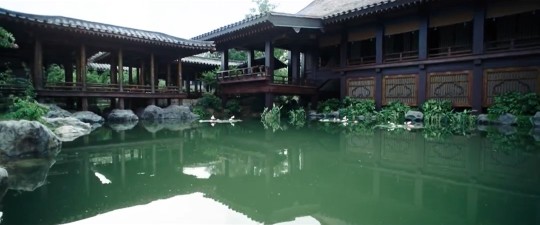
fig. 1 - Scene in film
Understandably, information on architecture before Tang (618-907AD) is scarce, so I do think there was an attempt at referencing the original poem that was written during the Southern and Northern Northern Wei Dynasty 南北朝北魏 (386-581AD). Taking creative liberty here makes sense.
That being said, the film didn’t care for retaining a consistent style of architecture, resulting in a wormhole of a set that somehow spans five different dynasties. Only two examples will be listed to avoid an entire essay :)
Exhibit A. Mulan’s home in Hakka Tulou 客家圍土樓 (fig. 2) (roughly translates to Hakka Mud Towers), which originated in the Song and Yuan dynasties (960-1368AD), and started maturing in the late Ming dynasty. (Why use something that didn’t even exist when the Ballad was written and by doing so, physically place Mulan in Fujian?? Just put her in an ambiguous village like how the animation did??). Somehow Tulou started existing before the Hakka clan migrated down south :) To put it simply the presence of Tulou is a locational and historical bug. The jump from the Hakka Tulou to the Tang-styled Imperial palace (fig. 3, which is strictly speaking a hybrid of different styles but I’d argue still mostly Tang) in the opening scenes is only a taste of the amount of inconsistencies later seen in the film.

fig. 2 Scene in film - Hakka Tulou
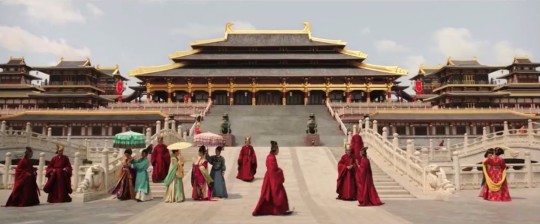
fig. 3 Scene in film - the Imperial Palace
Exhibit B. This scene (1:20:14) showing Qing Dynasty architecture in what is supposed to be a Tang Dynasty setting, identified by more elaborately decorated dougong 斗栱 (fig. 4 a key feature in the structural system in Chinese architecture, referring to the interlocking structure that sits on top of each column; at least three different kinds of dougong from three different dynasties have been spotted in the film).

fig. 4 Examples of different Dougong in Ancient Chinese architecture (top left being a good example of Tang-styled Dougong)
An insignificant building is not supposed to have more glamorous and larger dougong than the Imperial Palace, not to mention the lack of decorative dougong at all during the Tang Dynasty.

fig. 5 Scene in film that features a building with dougong

fig. 6 Shenyang Imperial Palace built in the Qing Dynasty
An actual Qing Dynasty Palace (fig. 6), for reference, and a random scene from the film (fig. 5). Note the larger dougong both fig. 5 and 6 (the ratio of dougong to column is significantly larger) with more layers of interlocking segments, as compared to the Tang-styled dougong that we pointed out earlier.
On Costume Design
Blue fabric on people who are NOT ROYALTY/NOBILITY. Soldiers guarding the imperial gate would not be wearing blue shirts under their armour. There wouldn’t be such a big supply of blue fabric in the first place; blue fabric would absolutely not be mass-produced for soldiers.
Ancient Chinese people made blue dye from crushed butterflies, did no one care enough to consider the sheer amount of wealth it takes to dye blue fabric organically? Soldiers would very simply not be wearing blue fabric because of how expensive these colours were at the time. Artistic liberty is fine but at least make it make sense in a clearly hierarchical society??
The painful inaccuracies in Mulan’s costume in the matchmaking scene (fig. 7). Ah, the scene that managed to translate breathtaking Hanfu (and there are plenty of resources to take inspiration from) into a Western caricature of a Chinese Halloween costume.
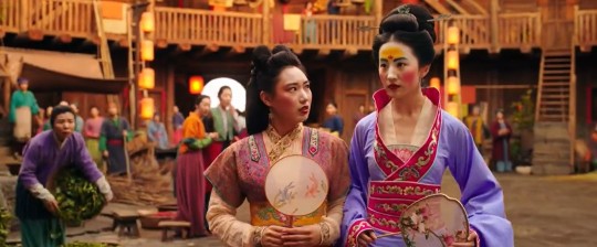
fig. 7 Scene in film featuring Mulan’s Hanfu from the matchmaking sequence
There’s nothing wrong with taking artistic liberties for costumes with a historical context. For instance, exaggerating certain characteristics of the era the story is in, or modernizing certain features so that they align with the character’s more modern way of thinking to contrast with the traditional setting. Good examples that come to mind are the costume designs in Marie Antoinette (2006), or Nirvana in Fire (2015), which also happens to be a Chinese period piece set in a fictional, historically ambiguous era. Inspiration for its costume design is taken from the Han Dynasty and the Southern and Northern Dynasties, so its costumes combine clothing silhouettes from the two periods, and use different characteristics such as colour to reflect class and status, and to represent characters’ personalities. It does a really good job of creating a new style while still giving subtle visual cues to the audience.
But Mulan’s dress can hardly be called an interpretation of traditional Chinese clothing. This is something the animated film did poorly on as well, and this probably contributed to the costume design in this film as an adaptation of the cartoon. The fabric had a shiny sheen that cheapened the costume. Coupled with the strange silhouette of the Hanfu (especially the bottom part of the skirt), this further detaches the audience from any hint of authenticity. The pictures below can speak for themselves. If they’re aiming for ambiguity in terms of the dynasties as seen in the set, then at least make something that is visually pleasing??
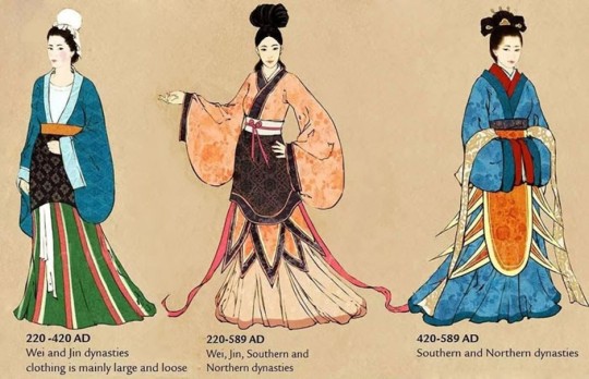
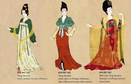
fig. 8 Evolution of Hanfu
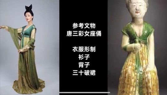
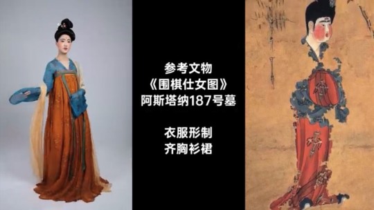
fig. 9 Tang Hanfu recreated with references from Tang artifacts (top: early Tang; bottom: golden era of the Tang period)
For whatever reason it seems like the extras in the background have more accurate costumes than the main character
And as a girl from a farming village why is she being trained like a noble lady??? A question I’ve had since the animated film…
The film wasn’t consistent when taking artistic liberties. Audiences subconsciously make visual connections to historical periods when watching a historical fiction film. It would be visually more cohesive if artistic liberties were taken on elements from one dynasty or by combining elements from dynasties with similar aesthetics, instead of jumping across centuries of very different stylistic approaches.
Basing the set design on the Tang Dynasty, but then including random shots of Qing Dynasty architecture of no particular importance (two very contrasting architectural styles); extras having Tang-style Hanfu, but Mulan not having one that's remotely close to any style of the multiple dynasties the film has taken inspiration from; alluding to the time period in which the ballad was written by painting Mulan’s forehead yellow 黃額妝 (which was poorly done but I digress), a style of makeup used by women of the Six dynasties and the Southern and Northern Dynasties (六朝女子), but everything else alludes to Tang or later. And finally, basing many things off the Tang Dynasty, but the Tang wasn’t in risk of invasion from the Huns or the Rouran??? We’re fucking confused :)
Small details like the ones we’ve listed above are visually off-putting; as an audience member I’m immediately thrown out of whatever universe the film is building due to the contradicting visual cues. If this was Disney’s and the director’s attempt at cultural accuracy, then it’s plainly insulting to the intelligence of their Chinese audience. (Respecting cultural concerns should not be Disney’s scapegoat for producing a bad movie.)
Ultimately, the film is based on a ballad and we wouldn’t say the points we’ve mentioned are considered common knowledge. So let’s treat it as a fictional era and put less significance on historical consistencies and authenticity. Let’s narrow it down to the crude representations (and misrepresentations) of general Chinese culture and society.
On Stereotypes
“Chi”: Why are soldiers receiving chi-related martial arts training, which takes years and years of elite, specialised training and experience? Ordinary soldiers don’t train their chi, they are not Wuxia 武俠 (roughly translates to martial arts chivalry). These people aren’t training for Jianghu martial art contests (江湖俠道的比武), they are training to kill for war, which does not require finesse at all. Even disregarding the lack of logic in training ordinary soldiers in martial arts (especially them teaching Taichi in the film), logistically it is simply not worth the economic and time cost of training entire regiments in martial arts only for them to be mostly killed off in battle. (Sorry, it’s difficult to explain wuxia and jianghu in a few words, but they’re super cool so please search them up if you’re interested!)
Many others on tumblr have commented on how chi itself is not the weird masculine "power" the film made it out to be, which is also very true (it's also actually very interesting so search it up if you want to!)
On Language as a Limitation
Clumsy translations of Chinese idioms and phrases that are just tragic comedy, e.g. 四兩撥千斤 being translated into “four ounces can move a thousand pounds”, which neglects the subtlety and gentle vibe of the original word choice while twisting the concept into something related to brute force or physics (but we guess this specific example is not entirely the screenwriters’ fault, since some English Taichi classes also translate it as that).
Replacing Chinese concepts and mythology directly with Western concepts such as witches, phoenixes rising from the ashes etc.
The single clumsy reference to the original “Ballad of Mulan” 雄兔腳撲朔,雌兔眼迷離;雙兔傍地走,安能辨我是雄雌?(translates to: when being held by the ears off the ground, male rabbits would have fidgeting front legs, while female rabbits close their eyes; who’s to tell male and female apart when the two rabbits are running side by side?) This line is an acknowledgement and compliment to Mulan’s intelligence and capabilities. It also challenges patriarchal beliefs of gender and women.
On Traditional Virtues (or the oversimplification of them, and a continuation of Language as a Limitation)
The film’s traditional values of 忠勇真 (translated as loyal, brave, and true in the film by using the most direct translations possible) and 孝 (translated as "devotion to family" in the film) seem to be a reference to the core values of Confucianism. We assume that the film is referencing these Confucian core values: 仁 (to be humane)、恕 (to forgive)、誠 (to be honest and sincere)、孝 (filial piety) and 尊王道 (to be loyal to the emperor). If the screenwriters were going to use traditional values, it is curious for them to choose only those three specifically, and to grossly simplify the actual values in their choice of Chinese characters (instead of using the conventional characters), then to grossly simplify them again in their English translations, and then to put them together in that order. The film also just briefly goes over the values by plainly listing them out in the form of an oath, thereby erasing the complexities of the values...
In a hilarious weibo post by 十四皮一下特别开心, they point out that the three values of 忠勇真 used in the film actually directly translate and correspond to the FBI motto of “Fidelity, Bravery, Integrity” :)
Let’s talk about 孝, the fourth traditional virtue engraved in the sword gifted to Mulan by the emperor at the end of the film. Over everything else, this is the original ballad’s central moral, and what we believe the film is also trying to evoke, so the weak translation diminishes the story’s message. The animation was smart in not directly translating it and instead demonstrates what it entails through the progression of the plot. The film does the opposite and translates it as “devotion to family”, when they could have just referred to it as filial piety. Care, respect, thankfulness and giving back to one’s parents and elderly family members. While obedience and devotion are part of what the virtue teaches, it's not supposed to sound like an obligation, it’s not something ritualistic, it’s just something everyone does as a “good” human being.
(And if the director and screenwriters were trying to diminish the role and significance of filial piety in the film on purpose because they wanted Mulan to appear “stronger” and “individualistic”, then… I really have no words for how painfully insensitive that is in terms of how white feminism does not and should not apply to or be imposed on other cultures.)
And here’s our list of Things That Also Pissed Us Off that other people on tumblr have talked about already, which is why we’re mentioning them without much elaboration:
On Feminism
We get that Disney was trying to make a female empowerment movie but they really missed the mark? Even with a female director, somehow. Stepping back and ignoring the Chinese aspects of the film, as a female audience this film was equally, if not more, hurtful
Mulan is only seen as “strong” because of her extraordinarily powerful “gift” of chi that led to her being physically more powerful than the men, especially in that scene where she lugs the two buckets of water to the peak of the mountain (which is in sharp contrast to how Mulan in the animated film is strong because she’s intelligent and is able to utilise teamwork and her strengths properly, and doesn’t let her understandable disadvantage in terms of physical strength trip her up)
All female characters are one-dimensional as fuck and are mere caricatures (though to be fair, the male characters aren’t treated much better) BUT PEOPLE, MULAN IS THE MAIN CHARACTER!! Her name is literally the name of the film!!! Maybe give her some character??? And what happened to wanting to produce good Asian representation in Hollywood???
The character of the witch was slightly more complex than everyone else, which, good for her, but then the screenwriters had her killed when she could easily have not been written with that conclusion to her arc?? Seems to us like some bullshit where the witch had to be punished in a narrative sense because she “succumbed” to using her powers (which are again dubiously chi-related) for “evil”, when instead she was merely trying to achieve as much as she could for herself in a patriarchal system designed to punish her
Plus the implication of writing the sequence of the witch sacrificing herself for Mulan is that Mulan is inherently more worthy of protection because she’s more “noble”, which, again, we call bullshit. Mulan achieved (impossible) success and validation in a patriarchal system because she played by their rules of what it means to be a masculine “warrior” and excelled, while the witch is scorned and punished within the story and also in a narrative sense because she doesn’t. Is that really what it means to be noble and good???? Does that really make Mulan superior to the witch?? (Honestly this plot point might have worked if there was more complexity written into the script, but unfortunately there wasn't)
Can’t believe they just threw away what could have been a perfectly complex and compelling relationship between Mulan and the witch because of shitty writing
The way Mulan lets her hair down and dumps her armour as an indication of her female identity (which is irritating to us on so many levels, as explained by various tumblr users)
On Production
Plot and character arcs have no emotional tension; they’re super rushed and super shallow; emotional beats are not hit properly (e.g. Mulan’s loyalty and friendship towards the soldiers, built up with one line from Honghui “you can turn your back on me...but please don’t turn your back on them” kind of bullshit)
The screenwriters would not know character depth or development even if it were shoved in their face
Blatant symbolism and metaphors (e.g. the fucking phoenix, and thank fuck it doesn’t look like a western phoenix) that make the film feel very… low.
Cinematography and editing: some very beautiful and compositionally interesting shots, but the battle scenes lack tension. The jump cuts disrupt the rhythm and intensity of the fighting; in combination with the overuse of slow motion, they drag the pace of the choreography and further slow down the rhythm of the scene. Exaggerated colour toning make certain scenes more fantastical than others, resulting in a mix of realistic landscapes in some scenes and highly saturated unnatural colours in others, which draws the audience in and out of the film’s universe. This is a shame because they actually took the effort to film in real landscapes.

fig. 10 Scene in film
Special effects: lack of blood in battle scenes (which, fine, they want it to be family-friendly) and Mulan’s suddenly clean face after she returns to her female identity visually puts off the audience (and links back to the issues surrounding the visual representation of her femininity)
And here’s the extremely short list of Things That We Liked:
That first fight scene between the witch and mulan when the witch brushes mulan’s hair away from her face with her claw while restraining her because that was gay as fuck and I am but a weak bisexual!!!
Donnie Yen’s action sequences lmao (they’re not even among the better ones he’s done so everyone go watch Ip Man for actually good action sequences and choreography)
Just listening to the soundtrack itself was great, loved the Reflection variations but I was simply too distracted by the other shitty things in the film
All-asian cast (thank fuck) with impressive actors and actresses (who should not be blamed for a shitty script)
TL;DR: This film is not worth your time or money. Inferior to the animated film (which already has a few questionable aspects). If you’re somehow really interested in seeing how badly Disney butchered Chinese culture (and to a certain extent the animated film), then just pirate this film. If you want to know what happened but can’t be bothered to waste your time watching the film, read this amazing and hilarious twitter thread by @XiranJayZhao, which we found right before we posted this review, and pretty much sums up our viewing experience as well.
Disclaimer: At the end of the day we're two girls from a predominantly Chinese society who are used to Chinese period films and dramas, watching Mulan (2020), a film primarily meant for Chinese diaspora and audiences in the West, with the Chinese market in Asia being just a secondary economic opportunity for Disney. We do realise that we aren't this film's target audience, and that we're not at all experts in everything we've discussed in this review. A lot of this is just us nitpicking, and all of it is just our personal (and very emotive) opinions from watching this film. Mostly we're just disappointed that the film was advertised to be relatively realistic and culturally accurate, but… wasn't.
Sigh.
Btw please feel free to ask us for recs of actually good, actually Chinese films and shows lmao.
Finally, all the love to our beta @keekry, for her many suggestions and hilarious comments!!!
#mulan#mulan 2020#mulan 1998#mulan live action#chinese culture#chinese architecture#chinese clothes#chinese costumes#chinese fashion#hanfu#mulan spoilers#long post#film review#disney#as a side note i have no idea why everyone thinks it's pronounced xian lang when in fact it's xian niang
16 notes
·
View notes
Text
3x12 “Bizarrodale” - Riverdale Reaction
Not gonna lie, I was kinda hoping from the title that this episode would have things like terrifying Jughead with a giant carving knife from outtakes of the fever-dream sequence of season one. Or floating babies. What we got was a generally cohesive plot with the minor characters. So like...I’ll take it?
Let’s see some “inspired lunacy,” Riverdale!
“I’ll check my calendar, Sierra” — OOOOOH BURN. They didn’t even tell you the day, Marcus.
Hermione has no investment in procreations now that she’s not getting laid. DO IT YOURSELF is her new go-to response.
Who is this smug bug for finding Kevin and Moose in some random room making out? You want a gold star? A pat on the butt?
Oooof, Josie! Using ‘em and losin’ ‘em while wearing cute clothes! Sweet Pea wants something steady now that he can’t play G&G with his boyfriends on the regular.
Twice-widowed?! Did I miss something??? Maybe there’s a deleted scene of Penelope marrying Tall Boy. Or Malachai (who could be dead for all he’s been in this season). Or Claudius? That seems extra shady.
Is Tom just unemployed and Sierra’s sex bunny now? Because that’s weirdly adorable. Also if people could get more beds in this town so I’m not horrified wondering if it’s the same place Bughead has canoodled that would be great.
So…the main reason Kevin doesn’t want to break up with Moose is because…he doesn’t wanna cruise in the forest? Too much effort to get laid? This episode is not doing their relationship any favors for me, even if they’re both attractive young men. It’s like Kevin has to convince himself he even likes Moose outside of his enormous appendage.
Anyone else get chills when Cheryl reached out to touch Kevin’s hand? I was fairly certain she was going to set him on fire. Maybe that’s just me worrying about Cheryl in general. Let the former fat kid stress-eat!
Did they run out of costumes? Why is that one kid in full ROTC uniform and nobody else is? XD I get it. The metaphorical “divide” between Moose’s dad and their relationship but wow. That hat stands out in a classroom.
Cheryl getting excited for their first fight and then quickly crumbling into pleading is so…sad? I feel like Toni could probably manipulate her really horribly. Or for the better. Um. We’ll see. I’m not holding my breath.
Josie can’t drive? She ran her own band, her mom was mayor, dad’s a jazz star, but no car? No driver’s license? Shoulda taken advantage when she was dating Reggie to get a great deal on a ride! I know the pictured scene is later, but Archie is just so excited to be someone’s date and play music again that I wanted it up here.
Also it’s been 15 minutes without Bughead and I am physically in pain.
Oh good. Veronica finds robbing banks impractical, but she’s all about encouraging “inspired lunacy.” I think that’s how the show would describe itself.
The bad parents club is at it again.
“50 Shades of Blackmail” - the Choni spinoff
“I can’t believe I was shot…” — Reggie, unaware of what happened to Veronica’s “exes.” Honestly, seems like he got let off easy.
Archie - mauled by a bear, branded, buried alive
Nick St. Claire - “Car accident,” multiple ass-kickings
Now THAT’S what I call “dirty money!”
Okay I liked the throwback to the beginning of this season when Kevin surprised Moose with locker kisses
I don’t know how to feel about Choni cheating their way into a broken system. I like their outfits? I don’t care?
Ohhhhh Gladys. “More teenagers.” You and me, both. If only drug dealings could be kept between adults. I’m so annoyed with these people! Stop being involved in shade! Clearly you’re boss bitches and can manage an actual legit business instead of “borrowing” fancy cars and laundering dirty money with a bunch of rowdy teens and gang members. SET AN EXAMPLE, LADIES
Ha. Throwback to the Midnight Club entering through the window is kinda hilarious. What is with this poison-drinking nonsense? Again?!
OH MY GOD they’re setting it up for “jealous” Mason man to be the Gargoyle King. Yep. He is. Okay then.
30 minutes in, I get my shot. I’m crying. The hair. The beauty. I can’t handle it. DON’T STOP. My Bughead heart needs this! They are so lovely! Someone light their face and silence all the phones, k thanks.
Why does Kevin presume Betty would infringe on bunker boinking? She’s probably the one who came up with the damn schedule!
They look so damn satisfied. Can no one have peaceful pillow talk in this town?
What is with all this “gay=weakness” nonsense? Love is love. Sit down, ignorant, self-hating villains.
I squealed when I heard Jughead’s voice and saw him come in. Oh man. And now my heart is broken. Because the Jones girls are faking it. And Jughead’s gonna get his heart broken. NOOOOOO! I knew it the second JB hugged FP.
Good call Sierra and Kevin just keeping a giant cake for themselves with that bizarro topper. Was he sunk into the cake? On his knees? What are you two up to?
Goodbye, Moose! Bon voyage! Kevin seemed proud of him being out but sad he loses another boyfriend to crime in Riverdale.
It’s like this episode wants to highlight all the minors having reasons to cry. Ironically, Reggie was SHOT and was the least teary.
Oh, really?! A new gang/FAMILY? Of strangers?! In leather?! We need more aesthetic options in this damn town. The Pretty Poisons. My guess is if they can get the rights, Cheryl and Toni are gonna dress up as Harley and Ivy. Because they already dressed up like Catwoman.
I’m sorry, Archie and Josie, I can’t hear your duet over the sound of my heart breaking.
I don’t know, was anyone excited about Archie OR Josie dating someone new? Y’all need some time to work on yourselves. Revisit this after some therapy. Time is good. Look what it did for Tom and Sierra. I can’t imagine Julliard is much for aspiring pop stars anyway, but what do I know? She’s about to go to her own spinoff so I’m not emotionally invested.
I don’t know when I’ll get to see my darlings get the short end of the stick again. Oh well. Time for fanfiction, I suppose. Every time I think we’re thinning the ensemble they just swoop in with more. Fingers crossed our favs get to finish spectacularly next time ;)
26 notes
·
View notes
Note
nawar lover no.1 aka user shwhyuk uwu
bloodorangeki said: the lady formerly known as hyuccwoo, shreknu if u will,
send me a tumblr url and ill tell you what i think of them!
hhhhhh ok before i eben launch into this full love essay. i jst wanna say tht u truly are the light at the end of my tunnel sejung,,,,u make me so happy !!! Like i remember when i was losing my mind off of like three sips of pineapple cider and i legitimately felt like i was gonna throw up but then i was like … damn i can’t forget to text shannon and tell her about all this. and then i talked to u for a full hour or so while u called me a liddle babie nd i continuously whined…either way you truly have me under your spell you demon!!
okay so not to be. dramatic but youre so dreamy and pretty you remind me of rain and soft kisses on the cheeks and rose gardens and bouquets of flowers and soft sunlight on flower meadows and like! that feeling you get in your cheeks when you smile too much for too long and you get that permanent blush across your face! god that’s probabaly nonsense and not very cohesive but you have the same sort of colors…soft orange and light pink….you’re like a sunset on the beach right at the start of spring when theres barely anyone on the shore and the whole world feels really big and wide but even though youre all alone you don’t feel lonely because it still feels like the whole world(you) is poised right at the edge of your fingertips.
hhhh that also probably made very little sense but i dont care i love you so much and im very bad at expressing emotion (blame my virgo moon who hasn’t felt any feelings in over 18 years) but i still feel like always showering u in that sweet love and affection, despite the fact that im horrible with words and i have absolutely no consistency. I feel like it’s really rare to meet someone who literally changes your entire perception of the world but … damn here we are!! tlkaing to u is literally a part of my daily life its a part of who i am at this point :/
Anyways, friendships don’t really come naturally to me because I have a very weird perosnality where like. im simultaneously suffocating whilst also being very detached and it turns people off so quickly but..god we mesh so well i truly love you so much. i also tend to not write a lot whenever i make these posts bc im the kind of person who continously says how much i love you throughtout the convo (even thoguh ill ghost most ppl for a few days) so whenever i get around to writing these im like :// but what else do i say :// but this time!!! oooo i have so much to say i can never go into full loving hours with you bc you always turn things around and get me to start talking abotu myself and pretty soon we start talking about how i used to raise rocks as a kid instead of talking about how hot you are :/
so anyways firstly . those were just the intro pragaraphs im finally getting into my loving sejung essay :(( helloooo one of my favortie things about talking to you is how easily the conversation always flows ….us talking about shownus asshole and the questionable consumption of expired jello and orbeez at 3 am is most likely the more demonic things weve done while simultaenously being the more tame things…my head still aches when i remember that giagntic bruise i got from looking at that wonho+tentacles/changkyun+black hole sketch u made… god we somehow always go from topic to topic with absolutely no regard for cohesiveness and yet neither of us ever question it…we’ll spend hours discussing absolutely nothing …like that one night we stayed up for like three hours on rabbit talking about all the different mx stans and which member has the most stans internationally versus domestically and why….icons of developing complex sociocultural theories at 2am while occasionally mentioning “oh wow its late u should go to bed >:/” god its just that I always lose track of time whenever I talk to you…its like im so focused on that I Love Her mood that I don’t even realize its been 4 hours until I look down at my pile of unfinished homework and then back up at my laptop like. This was a Valid choice why would I pick ib math when I have a whole entire sejung talking to me. hhhh its just that talking to you comes so naturally and I always tell you all these quesiotnable things to which you always respond by first calling me a demon and then laughing about it and encouraging my stupidity. it’s also so so endearing that ill tell you about the dumb shit im doing and your first response is always to nag at me to be safe and take care of myself as if ill actually listen to you and clean a cut with alcohol, risking legitimate Pain… anyways sejung? queen of making me feel loved and noticed? MORE LIKELY THAN U THINK!!!!
hhhhh ok moving on now I get to talk about how. sexy u are damn….i remember back when we were first starting to talk and you sent me those pictures of yourself in that button up and I literally. I quite literally almost passed out in the starbucks while the barista was handing me my strawberry lemonade I truly almost lost it…nd right before that I was encouraging you to talk to the boba girl nd flirt nd be all spicie…but then u sent me those pics nd I was like for what reason would she have to impress boba girl when im right here … mouth open so wide in love that all the bobas are spilling out of my mouth :( not to be dramatic yet again when I know ive mentioned those selfies before but damn…those were so hot u unbuttoned like two or three of the top buttons and u looked so hot truly. raw me vore me behind each and every single boba store location hewwwooo u look so intense nd powerful im truly putty in ur hands not only would I lose my mind for u, I have already lost it
hhhhh im very much rambling and making very little sense rn bc its. 2:30 am and im sleebie nd I blocked all social media sites so id do homework bt I kept thiknning abt u so I was like hm the universe clearly wants me to write about sejung more even though ill have to post this in the morning bc tungle is blocked until then :// bt anaywas that also means I get to go into all the other thigns I love about u and all the things u remind me of :(( hhhh its so wild that I never actually aunch into full loving shannon mood bt I talk abt u so much w my friends theyre all. suspicious ,,,,
them: nawar u don’t actually like romance and u hate talking about people r u perhaps dating this girl??me, w hearts in my eyes laughing at smth ure saying on my phone: what
HHHH DJHFKSJDHF TAHST TRULY ME,,,,ALWAYS THIKNING ABT U,,,ALWAYS BEING BIG HEART EYES FR U,,,at any given moment I could be reminded of u :( I see a piece of paper nd im like huh I should do work then again is work necessary to live perhaps not but sejung is necessary to live,,,,me thinking abt u as I procrastinate every single thing ive ever had to do :D Like, ive never understood when people say that they hated a zodiac sign at one point, and then they met one person and they were like oh my god nevermind this sign is perfect but truly,,,I love geminis now ,,,I used to hate them almost as much as cancer nd now? geminis are all good ure so wonderful nd loving nd sweet u being a gemini saved geminis collectively,,
ill also neber stop talking abt how now matter how much I whine and demand attention, youre always jst,,,supplying it without any question like at one point people usually get annoyed, no matter how endeared they were by it at first, bt youre always calling me a baby (even though im older) nd giving me that sweet Love and Attention,,mmmmm my libra sun thrives under ur care :( hhhh also I feel it is important to point out I love. all of u,,,,like I don’t even usually care much for peoples voices or anything unless its like so deep it sounds like the grim reaper bc that’s wild u ,,bt anyways the first moment I heard ur voice I was. breathless I was so shocked like ur voice is so soothing nd warm its like. if the aesthetic of sunlight and honey and warm pies had a voice,,,hhhh im also not the type to really believe in things like fate nd destiny and soulmates and stuff bt that’s kind of what u remind me of ? in a? not weird way hhhhh so I feel like youre just so naturally in tune with people like nothing really catches you off guard and you roll with peoples different personalities and quirks and you always jst. mesh so well with everyone ure like the minhyuk of the internet,,,,nd like!! theres smth abt u that reminds me of balance and maybe its my libra sun always seeking peace and harmony in life but I always feel so relaxed nd steady whenever I talk to you its like . idk how to explain it!!! its jst so comforting!!!
I was originally gonna cut myself off at 1k but its too late for that now and im gonna put this under a read more anyways and its 3am now so I feel like. go Big or go Home!!! now im gonna launch into a long analysis of u! and ur smile!! first of all,,,its so rare nd wild to find someone who likes validating people more than being validated,,,,u finding my libra antics cute???hhhhh tahts so wild,,,,I could pout for hours nd u would call it cute,,,validating!!! nd the fact that you’ve read my writing,,,,excerpts from my demonic wips and youre stil friends with me?? you still talk to me?? damn that’s like. never to be expected any time I make someone read that tangerine fic they ghost me for a good month but I sent you pieces of that tentacle fic and YOU FUCKCING SKETCHED OUT THE LOOK,,,,,MY MUSE,,,nd also you tend to always steer the convo around to focus on the other person n dim a FOOL who almost falls for it every time,,,before I remember and make u tell me thigns…god ive told you so many obscure things from my childhood like that time I tried to eat a brick and yet you still,,,,talk to me,,,,who are u,,,,hhhh ure always so cute nd giving nd caring I feel like I could genuinely truly look like shit nd send u a selfie nd you would still be like WOW GORGEOEUS YOU LOOK SO GOOD THAT’S HOT!!! u,,,going out of ur way to make ppl happy :( anyways im a fool in love w u ,,,also not to be like. one of those old white boy text posts from tumblr but ,,,,hey girl,,,ladie,,,wamen,,,did u know? ur smile lights up my world? ,,,did u know? theres no such thing as u being anything less than perfect,,,why? because its impossible to be anything less than the essence of who you are. hhhh that’s the dumbest thing im ever written im cutting myself off that was too much this is like. 2k words so far and in all honesty I could continue but then id get gushier than that last line and nobody wants to see That,,,hhhh
this started out with. somewhat decent grammar like I used periods and I think I occasionally capitalized the first letter of the sentence but at this point its incoherent rambling it’s the inside of my brain every time I see u or hear frm u its like when spongebobs brain was on fire and all the cabinets and computers were going up in flames and all the little brain spongebobs were losing their mind that’s me right now losing my mind over you I wrote exactly 2k words in that whole essay,,,,im so fucking valid,,,,ananywas I love you if you couldn’t tell nd iim . somewhat satisfied at being able to vent all this love,,,smoochie,,smoochh,,SMOOCHIIE
2 notes
·
View notes
Text
Physical Object
I’d be lying if I said I had a cohesive plan throughout this assignment. The idea of creating a physical object of any sort for an entirely digital project seemed borderline impossible at best and entirely futile at worst. Luckily, my girlfriend happens to be a spectacular DIY artist and walked me through how I’d implement my idea in a zine. I’m the luckiest boyfriend alive on truly all fronts.
To preface, I have no experience with zines, collage, or using oil pastels, all of which are the entirety of my physical object. Moreover, I have essential hand tremors and had to use a very sharp, very precise Exacto knife to get the cuts I sought, so my edges are, put kindly, rough.
I began documenting the project the moment I came home with the necesarry supplies to start it. The original intention for the project was to use an old color printer to print out images fit for inclusion into the zine; I forgot that the printer was about $50 and printed out color images of roughly the same low quality. This radically changed the design parameters and I found myself in another 7-in-7-esque project, using only found materials the attempt to convey an extraordinarily complex topic.
Before mustering the strength to dig through the old Bon Apitite magazines and political pamphlets that made up my entire collage canvas, I wrote the prose that I structured the zine’s flow around. The task at hand was to narrate how I came upon the idea of using an AI to generate audio, emphasizing computational understanding of things like “nature” and “sound” and how these relate to people semantically. The final text is as follows:
Sound was born from nature;
winds whistled before steel creaked.
With industry came machinery came new noise.
With industry came machinery came computation;
came AI.
AI consumes ravenously, feeding from digital artifacts,
neatly organized to avoid indigestion.
What it consumes it can spit out,
what it sees it can paint,
and what it hears
it can sing.
Feed a machine a sample
of a Mockingbird.
What does it hear?
volume
tone
movement
plosives
rhthyms
drones
phrases
loops
stanzas
syllables
clicks…
but never a Mockingbird.
Ask a machine to recreate a sample
of a Mockingbird,
and by all means,
we hear a bird.
What about a voice? A forest? An entire city?
What can we glean from these constructed environments?
We find beauty in machine artifices,
find sense in the senseless,
observe everything we’ve built, in choir, reflected back at us,
our souls gleaming off the film of the digital mire.
When writing this, I was almost certain I would be able to dig up an image of a Mockingbird somewhere among my dozen of birding books. Deciding I held those books too close to my heart to mutilate them in good faith, I turned to abstraction (for better or for worse).
The prose was loosely based off the following storyboard I wrote at roughly the same time. The final prose differed a bit from the placeholder text I used mostly for visualization purposes, but the message is more-or-less the same:
After some proofreading and a bit of cutting to build a little pamphlet out of sketchbook paper, I printed the prose and set out on cutting out each line to best fit the meter I hoped for:
I then put together all the found materials I could muster, from collected magazine scraps to bubble wrap, copper wire, and an old SIM card. I just recently got a new phone after using the same one for 7 years, so some materials are likewise from the new iPhone’s packaging. Of note here is my abstraction of a Mockingbird, using its general wing color and notable white wing bars to make up for the fact that I can’t draw:
After 6 hours of cutting, ripping, meticulous pasting, weaving, taping, ruining, fixing, and ultimately covering my hands in oil pastels, I had the final product and some additional handiwork from my saving grace of a girlfriend to show for. Here are pictures of all pages of the zine, front to back:
As can be clearly seen, my aesthetic’s hand was forced by the natural bleed of pastels, so I elected to commit to oil bleed in the finished product. I use found materials throughout the zine to highlight the nature of datasets, compiled of odds and ends spanning the gambit of tangibility, living and dead. I use a live Pothos leaf collected from a particularly healthy plant of mine for use on the first page, the best possible inclusion of nature I could find that would simultaneously provide an organic texture. Throughout the zine, I use found objects that literally produce sound (like bubble wrap) and weave with copper wire to contrast nature with the man-made, complimented by contrived shreds of old magazines used for their textural value and sparse pops of color. I carry the allegory of the Mockingbird throughout the zine until its last page, featuring a pastel illustration done lovingly by my girlfriend. The Mockingbird holds a special place in the kingdom of birds in its ability to learn and replicate, not unlike machine learning, through exposure and iteration.
I enjoyed executing this project far more than I anticipated, and I feel it does a much better job conveying my curiosity towards AI-generated soundscapes than something like a graphic poster or academic paper could. Though I have a massive mess I still need to clean up, I managed to find a new niche to delve into with collage while, in my opinion, creating the most thorough amalgam of natural and artificial I could.
0 notes
Photo


During quarantine I have started to appreciate walking alone in nature. I've been able to explore more of the minute details in nature and explore them compared to before when I would only leave my house for a purpose rather than enjoyment.
After deciding to walk I bought my camera and instanter decided to take some shots that were complimentary to my persephone shoot as it is springtime.
I chose these 5 images as I feel although there is a cohesion to them they also show different parts of spring.
My first image made me excited to take these pictures, when looking at it I felt like I was being teleported into spring times. I feel like the use of the circle and different depths can create a playful narrative to imagine. The second image I took on my walk because I was impressed by the size of the bush and the bright yellows were mesmerizing. With all the yellow flowers and green background there is a lot happening in the image however it all feels cohesive despite it could be easily overwhelming. This compliments my original image very well - as well as also being its own piece. My third image continues with the overwhelming and coherent theme. Every person is attracted to a sunset, as it is undeniably beautiful, so for fun and aesthetic reasons I took the image. But the image does work in my set. I feel images of sunsets provoke a nostalgia of happiness, warmth and spring/summer.
My forth and fifth images are my favourite. They both clearly convey the springtime aesthetic i wanted the images to have but I really like the semi silhouetted look they have, while still being rich with colour.
0 notes