#i also do usually have a photo reference on hand for the sketches
Explore tagged Tumblr posts
Text
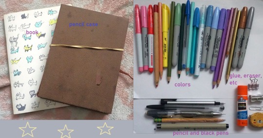


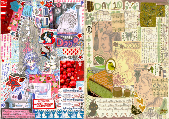


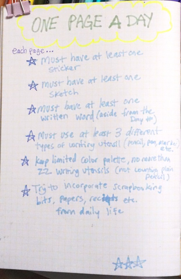
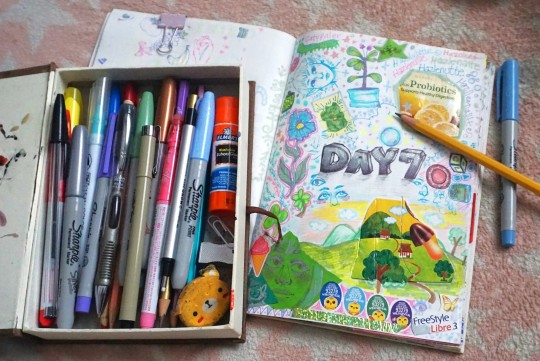
Pages from trying to keep a little sketchbook-scrapbook type thing going for two weeks lol. I gave myself specific rules in hopes they might all end up more cohesive/consistent seeming, but alas, scribbly chaos reigns, it seems
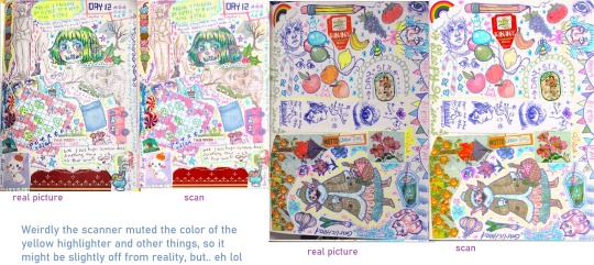
#sketchbook#scrapbook#Actually I feel like these are kind of incomprehensible in photo form like.. In person holding the book its easy to look at#but as images on this scale I feel like there's so much tiny little text and small scribles and stuff you'd have to 'right click > open#image in new browser tab > zoom in' just to actually really see the thing. which for 7 images is excessive lol.. so. probably not the best#medium for sharing really but. I suppose I thought they might look cooler lined up next to each other. The whole part of using a#limited color palette is so that maybe they kind of seem to have more consistent color schemes or something throughout. but I dont#know if they look all that 'related' or not. I think these types of challenges I have always sucked at because I am a being of clutter and#excess. I can't just do like one little simple nice looking design and have that Crisp Neat calligraphy with evenhanded perfect lines#and perfect symmetical composition and etc. etc. Like some poeple post very aesthetically clean and cohesive looking sketch#pages or something but I simply cannot hold back the brain impulse to add more. more. more. Fill every single blank space with color#or a little drawing or a sticker or something. I take away 500 things and there are still a million there. Even when I thik I'm being#'simplistic' I'm still usually being 2x more complicated and cluttered than the standard or whatever lol. I guess thats clear from my#outfits/costumes though too. Like whatever that saying is from that person about something like 'before you leave the house take off one#more accessory. you dont need it' for me is like.. 'before you leave the house. add 10 more accessories. and 6 more layers. and another'#AAANyway. I wonder if also maybe some people would try to plan theirs in a way to look good or something or like.. plot things on the page#before placing them. I did sometimes have a theme for a day kind of (like day 10 I ended up finding a few gold and green things and then#was like.. hey... what if I looked for a few other things and only used these colors today') but aside from that I was just slapping down#stickers randomly and working around them to fill the page. Maybe a lot of neat minimalistic asthetic design is about planning and#having a Vision set ahead of time. instead of just complete random whatever. doodling whilst watching youtube videos or eating lunch. It's#a miracle actually I've managed to not spill any food on the book the whole time. anyway.. I do wish the highlighter really showed up. the#scanner kind of makes the colors look VERY different to irl. But also it got much clearer images than just camera pictures of pages. alas..#..Still oddly enjoy the phrase 'Salisbury Steak gently kissed with industrial pollutants'#probably my favorite section of 'gluing random papers and things onto the page' lol#Also I wonder if it's super obvious that I literally never ever use references when I draw (save for the few freakish looking youtube#face sketches) since everyone is always in the same positions and looking very similar ghhb. This could have been a good opportunity to#work on not solely drawing from my mind and try to do more Dynamic Experimental scribbles. NO. Same exact eye for the 90th time#be upon ye. But I guess it was meant to be casual 'daily doodles'. True 'practice' would make it seem too effortful like a full project. hm#(lol the one decimated pencil in the set... never hand me a writing utensil. i will passively destroy it somehow. shaving the sides of a#pencil off with a knife or snapping a pen in half as a nervous fidget without even realizing i've done it. sorry to the drawing implements)
80 notes
·
View notes
Text
*rubbing hands together like a gremlin* you guys want some stardew headcanons thst have been rotating in my mind like a gas station hotdog? no? well here they are anyway.
* leah has a sketchbook full of candids of people from town. if you choose to romance leah, she has a LOT of sketches of the farmer
* sebastian is trans masculine/nonbinary and uses he/they pronouns
* leah is actually robin's younger sister & moved to pelican town because robin had mentioned how peaceful it was
* sandy is trans feminine (she's also soo wife)
* abby would've absolutely loved among us
* maru secretly has a crush on penny
* jas makes shane play dress up. he acts annoyed but enjoys spending time with jas
* clint is an avid reddit user . do with that what you will.
* i think abby majored in political studies or graphic design
* harvey has a tooth gap and freckles
* elliott has DEFINITELY recreated the fork-hairbrush scene from the little mermaid
* harvey is allergic to cats but he powers through for the farmer
* abby DEFINITELY uses tumblr
* harvey has a little plane nightlight. not because he's scared of the dark but because he thinks it's cool. if you romance him, he puts it in the child(ren)'s bedroom.
* elliott wears hair curlers to bed.
* penny has a collection of drawings that jas and vince made for her. she puts them on her fridge.
* sam is an android user (and yes, it's purely because people kept calling him "samsung")
* wlw haley. that is all.
* haley takes pictures and sometimes lets leah borrow them/use them as a painting reference
* sebby with top scars. ooogh.
* maru has a cluster of freckles on her shoulder shaped like the little dipper.
* abby dyes her hair & once did all rainbow and cosplayed rainbow dash.
* the farmer and haley often call and have late night gossip sessions
* sam's phone wallpaper is a really zoomed in or a 0.5 photo of the farmer / whoever is his partner
* sebastian types in all lower case
* sam types in all caps.
* i think it would be really funny if seb just had sam in his phone as Samson (that grammar and everything) just because it's so unlike his usual typing and he does it to piss sam off
* it's no secret that sam is very forgetful, however i think this helped him become friends with penny. penny is very organized and has every important date (ie birthdays) memorized. --- she NEVER forgets a birthday. --- one day, penny heard sam repeating a phrase to himself so he wouldn't forget what he needed to do. penny encouraged him to write it down and even showed him how to write on a rubber band. sam adopted this and everytime he sees penny he'll smile widely and hold up his wrist (which will have anywhere from 6-10 rubber bands at the time. poor boy).
that's all for now. i may add more later idk. let me know if y'all want me to rack my brain for more of these
#stardew rambles#stardew farmer#stardew valley#stardew headcanon#stardew valley headcanons#sdv#sdv leah#sdv haley#sdv maru#sdv harvey#sdv elliott#sdv jas#sdv penny#stardew#stardew harvey#stardew haley#stardew elliott#stardew bachelors#stardew bachelorettes#stardew sebastian#stardew sam#stardew maru#stardew leah#has elliott always had 2 t's?#am i dumb?#stardew abigail#sdv abigail#pip rambles
285 notes
·
View notes
Text
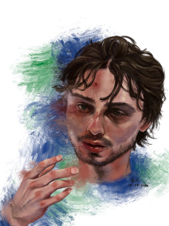
who is #43?
Hello !! First off thank u for visiting. If you clicked read more by accident rip sorry it’s a lot of text. ENJOY!!! <3
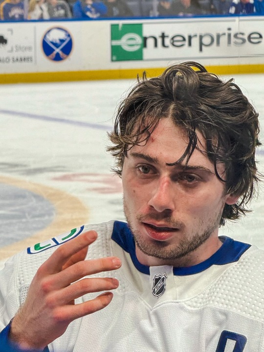
1. This was the photo reference I used. I really did mean it when i said he photographs well!! I really like how scrungly he looks at times lol. v paintable
2. here’s a timelapse for your viewing pleasure in video + gif form <3

3. Process breakdown below. I am not formally trained, so don’t take any of this as professional advice!! The way i paint has been compared to channeling some evil contract with a demon also. So um . Im saying that i dont remotely think that this is efficient or correct, its just whats comfortable for me <3
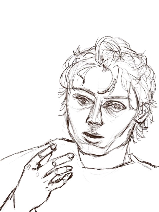
3a) the dreaded lining phase. I have 2 modes of operation when it comes to painting - either i go full-dick with fancy inking/sketching + cel shading (rare, unrefined, haven’t figured out a nice workflow yet) OR i do a very very basic chicken scratch set of lines like so:
It’s less about being realistic here and more about laying down some guide lines for the chaos ahead. If i thought i could get away with it, I would start every rendered painting i do with laying down colours — but unfortchh ive tried that before and it usually ends in really weird proportions. Even with the lines i still need to make adjustments. This is something no people except me would notice but look at the above sketch; the eyes are too big and slightly too far apart, the forehead is too small and thus the hair is also not quite big enough… I have a bad habit of drawing eyes too big on faces, they’re my favourite facial feature to draw.. i barely resisted giving him big cow eyelashes (I love big cow eyelashes… all of my OC’s and most of my more stylised fan art of characters get big cow eyelashes… god…. Big cow eyelashes SAVE ME……….)
Anyway. Structure of the face + hand somewhat established. <3
3b) Underpainting!! Okay stay with me here . Ever since i figured out i dont have to paint in 03925893853 different layers, I’ve joyfully painted on 1 layer as much as possible. I dont have the brain power all the time to be managing layers so I simply dont work with that many layers. For this painting, the skin in its entirety was painted on one layer, the hair on another layer, and the effects on the last layer. There was a placeholder background off-white/grey colour for a while there, and I duplicated the line layer — one for figuring out where to lay colours, and one hidden for later so i could check back to see how accurate to the sketch/proportions were to the actual painting. 6 layers, 2 of which i painted the bulk of the piece on, 1 more at the end.
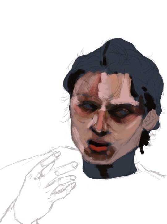
3c) here’s where I started carving out features. I think about objects in terms of volumes and light rather than lines. i love painting and sculpting because of this!! Here you see where I’ve begun to define his features — his eyelids, his bags, his nostrils. Just refining what was there before. The suggestion of facial hair before i gave it up and left it for later (his face is so naked the WHOLE time)
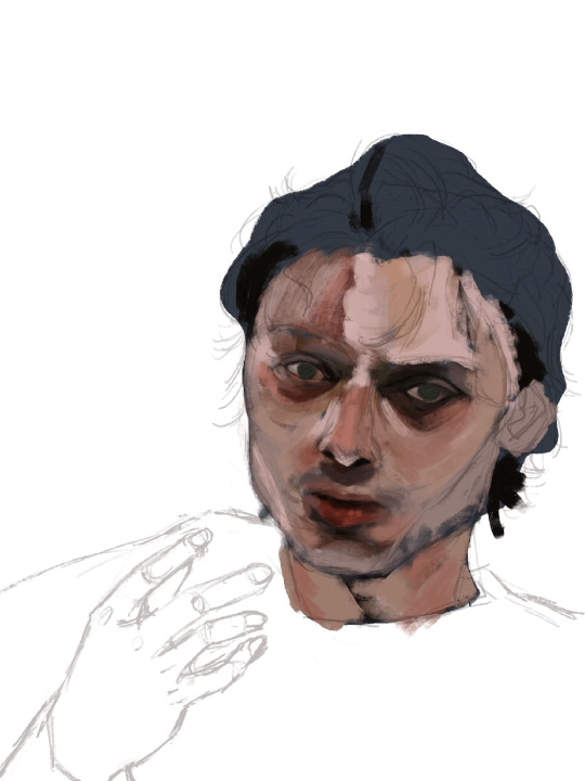
3d) nose bridge highlight, suggesting his eyebrows, a cheek highlight. A touch more coral red and muted yellow pull away from the grey/blue underpainting. Strategically leaving some of it peeking through.
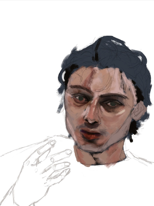
3e) i truly start messing with the fidelity of his features here. Red lipstick <3 and some violet/blue for shadows on the right side of his face.

3f) the part where it starts looking like q.hughes to me (though, my friend said i got his vibe pretty early on which is such a compliment.. waaaaa…..) I love this part of every painting i do. I know it’s definitely not the Correct order since other parts of the entire painting are simply Not Rendered or Done, but whos gonna stop me?? :3
I love love loveeee painting faces. Adding the little shinies to his eyes + lips + upper lip + nose … you don’t know how much of a difference it makes until you do it. Also i snatched his eyebrows
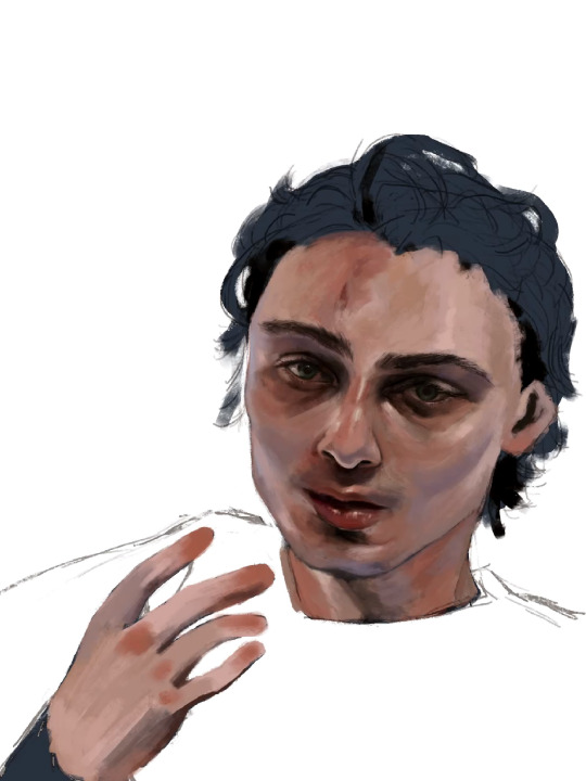
3g) i really pushed the red/coral/ochre/orange here. Note the yellow highlights on his cheekbones, the forehead, and the thin thin line of pink right between where his bottom lip ends and his chin shadow starts <- very important . To ME!!!!!!! Also highlighting his waterline and adding his lashes was so so fun <3
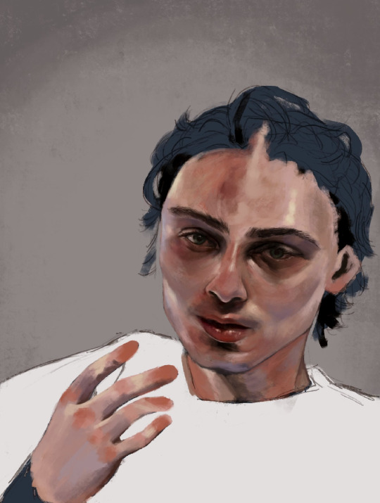
3h) FACIAL HAIR!!! And I started rendering his hand. Some micro adjustments made to his face for proportion check.

3i) i start painting his hair in earnest and realise his forehead is too small so i make the adjustment. I really love how it falls into his eyes in this photo. <3
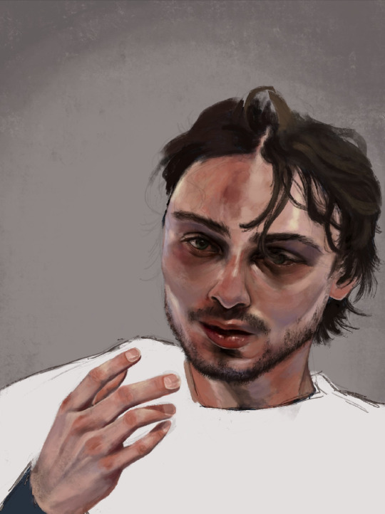
3j) i make some final adjustments to his eyes — a bit smaller, closer together. And i refine the outline of his jaw, push the stylisation of it just a little.
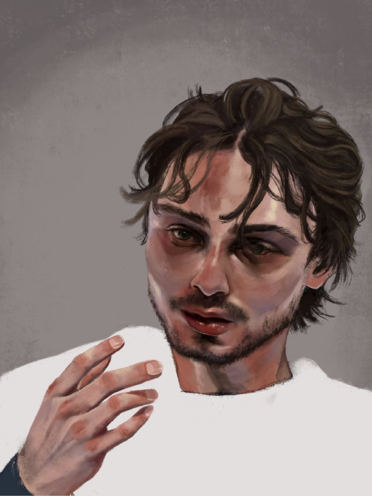
3k) Finishing details; his flyaway hairs, his moles, a bit of texture on his face, shadows cast by his hair, his little forehead cut <3
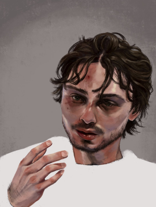
3l) i adjusted his hand here, added more texture to his skin, refined his hair a tiny bit more, and made the decision not to fuck around painting his jersey because i wanted the focus to be his face <3

3m) Canucks blue and green. Captain at 23. His form bleeds into the background. He is the franchise.

theee most fun ive had painting anything. and i finally feel... warmed up? if that makes sense. art for me is like. if i dont do it in a while it feels like nothing goes right when i come back to it. i hate that feeling, and the most difficult hurdle to clear is letting myself feel that until i get back into my Zone. after all this time i feel like im BACK !!!!!!!
i loved painting this fella. hes SO Shaped. <3
Apologies i simply do Not have the energy to write the alt text for all of these so i hope the little blurbs are okay aslkjasdklj. i gotta post and go to bed . if u made it this far, thank you for reading!!
#details and process under the cut ….!#god… it really is like . they let anybody be in their mid 20s these days??? (<- guy in his mid 20s)#quinn hughes#vancouver canucks#hockey art#puckpainting#<- abandoned wet rat of a tag. rarely used
153 notes
·
View notes
Note
your work is so beautiful!! can you share a little bit about your process when working with gouache and india ink?
thank you so much! and of course I can!!!
it’s a long one…details below!
I use gouache just because it’s what I have to hand, but watercolour would work well, if not better.
I start with a sketch, then a wash of the blue, covering the whole page - it can be messy because most of it will be covered with the black ink. at this point I like to go over the shapes with the blue just to vaguely define the forms.
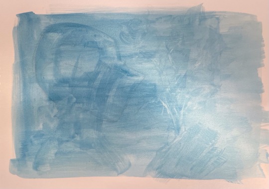
I like to start with the darkest areas! usually this is around the studs, or the ‘seams’ (if there are technical names pls let me know 🙏). I try not to focus on one area too much at once just to keep everything proportional and remind myself of the overall form! India ink is fab because it dries so quickly, and as far as I’m aware it doesn’t lift once dried, so I can go over the fine details to add reflections and shading! when I do the shading, I treat the ink like watercolour - I dilute it heavily, going from light to dark. you can always add more pigment later!
I always forget to take photos as I go along, but hopefully this kind of illustrates what I’m yapping about
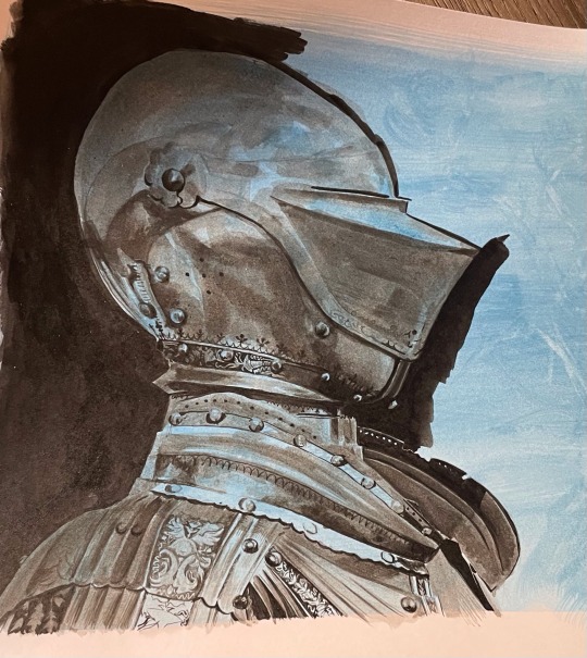
I was very silly and forgot to take my brushes with me to uni… buuuut from memory, I think it’s a ‘round’ brush? it can carry a lot of ink but tapers to a very fine point at the end, allowing for the teeny tiny details on the armour, as well as the larger washes of pigment. this is a4 paper for scale (I think that’s around 8.5 x 11 inches!) I use a bigger round brush for bigger areas! I also loosely sketch out the details in pencil before painting but the drawing is usually more ambitious than what I can realistically achieve at this scale - the squiggly lines were the hardest! I tended to depart from the reference at this point and make up some organic shapes. basically the smaller scale means it’s no biggie if you do make a mistake!
I use bristol paper - super smooth surface that holds the ink really well!
it’s a little different for my first knight though (below)! still started with the blue gouache wash, but I used fine liner pen. I think it’s either 0.5 or 0.3 - leaning towards the latter just because of the smaller details! this is a less forgiving medium imo, but super satisfying. I used black gouache to fill in the background for this one - I didn’t have any inks at this point. I’m working on a5 paper here in a moleskine notebook, so it wasn’t really meant to be damp.
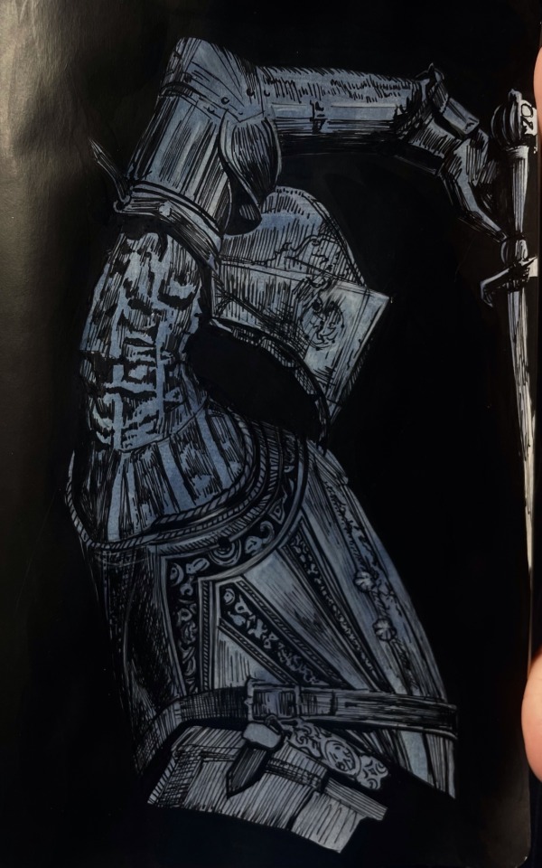
also I am still bad at taking photos of my art - but I am getting better! I scanned the painting, then adjusted the shadows (just using the photos app). literally the only edit is turning ‘shadows’ down to -100, but you can see how much of a difference this makes! I’m including this because it’s always so disheartening when the camera doesn’t pick up the artwork properly. something I struggle with when using ink is getting an even surface with large areas of undiluted black, which is why I tend to adjust the contrast. if anyone has any tips on this I would appreciate it!

apologies for the very long post - if there’s anything else I can clarify please let me know!! I’m quite new to tumblr so sorry if the formatting of this post is a little off.
unfortunately I have just gone back to university, so it will probably be a while before I have some art to post - I also left all my art supplies at home… whoops! maybe this is a chance to improve my digital art!!
and thank you so so much for all the notes on my previous post! I read every tag on reblogs and they always make my day <3
63 notes
·
View notes
Note
OMG I JUST SAW UR REQUESTS R OPEN!!! Hiii!!! I was wondering if you could write (headcanons, or whatever you want!!) of Banhammer and an Artist S/O?? The gender can be neutral!! And like the S/O has a special sketchbook just full of Banhammer, and only him. But the S/O left it out on accident and Banhammer takes a little peek inside it 👀 And theres also like little side notes too!! Like, "Drawing the love again <33" or "Silly guy!! <3" or even like some embarrassing thoughts like, "WHY HE LOOK SO FINE AT 46 ✋" lmao Hope u have a good day!!!! Or night!!!
Banhammer and artist s/o
(No tws, romantic intended, fluffy, gn reader, a bit short..)

If there's anything you found out from being with banhammer, it's that he was, by default, nosy.
You were always drawing him, usually when he was busy working out and you had nothing better to do. You liked being by his side anyhow.
He was covered in sweat when he saw you look up from your sketchbook, then quickly look down once you got your reference. He instantly jumped to your side to see what you were doing.
"Ew, banhammer! You're sweaty!"
You quickly closed the notebook, shielding it with your body as he pouted and asked to see what it was. You always showed him your drawings. Why was this one any different? "Let me see!" He whined, a big paw on your face as he tried to grab your sketchbook. You couldn't help but laugh. You wouldn't dare show him what you drew, your face turning red out of embarassment
He tumbles over his own weight, allowing you time to escape and hide the sketchbook.
He was lucky enough to see a glimpse of it, and the figure looked familiar, but it wasnt enough to satisfy his curiosity.
He didn't bother about it after, which was surprising. After another day of drawing, you huffed as you put down the sketchpad in frustration. It wasn't coming out how you wanted. He pulled you into his lap, gently squeezing you as he purred. It always seemed to calm you down despite being hotheaded. You laid on his chest.
You slowly drifted off to sleep. Banhammer was about to join you when he took notice that your sketchbook was right there, free for the taking. He quickly (but quietly) reaches for it, his hands shook in excitment.
He flipped through the pages impatiently, he saw the ones you had shown him first. Then he found the ones you hadn't, his eyes widened as his face started heat up.
He definitely didn't expect all these drawings of him. It felt like seeing a photo of himself. Each picture felt like a shot to the heart.
He ran one of his clawed fingers gently across the lines of a detailed sketch of himself. The attention to detail made him exasperated. What didn't help was the loving notes on the side of each sketch of him.
"My beloved ♥️"
"Love of my life!!"
"Handsome.."
He was practically a mess reading all of the little doting messages. He let out a small breath of air in an attempt to calm his beating heart. He wanted to pull you into a tight hug and never let go. He continued reading the small messages and the doodles of him doing mundane things. One of them drawn of him after one of his phighting matches. He remembered you eyeing him, at the time he thought maybe you were upset about something.
"How can someone be so perfect?"
He closed the book a bit louder than he meant to, unable to handle the praise.
...
The next time you draw him, you'll think he wasn't paying attention to you. Maybe he lost interest? The relief you felt quickly vanished when he looked at you with a smug smile
"Are you getting my good side?" He said proudly, posing for you.
Your pencil dropped to the floor as you gasped.
"Banhammer!"

170 notes
·
View notes
Note
Hello Botanica I admire your art so much ❤️ do you mind giving tips on how you improved your art over the years? I would also be delighted if you could show us what your drawing process is like a little bit, if not thats cool too🤗 have a great day!!✨
Hey there! (*waves*) Thank you so much for the love <3 I'd be happy to share some insights on the topics you mentioned! (Sorry that it took a while.)
I think I’ve been drawing for almost 20 years now (Whoa!). Honestly, I don’t even know how I made it through, but ever since I was a kid, I knew art was a necessary part of my life. Looking back now, I’m just glad I stuck with it!
This piece is like a visual timeline of my art evolution. It’s wild to think I went from those super basic kid doodles to the style I have now. Growth is real, y’all!
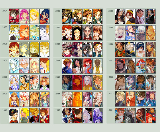
So the tips! (They are mainly for those hobbyist artists, since I don’t have the luck to make it as my career.)
Keep your eyes and mind open to learn from different fields. It’ll spark fresh ideas and enrich your art, but always double-check when diving into unfamiliar territory.
Find tutorials that vibe with you, and collect references IRL.
Use primary sources to avoid distorted or AI-altered refs.
Take your own photos as ref.
Use 3D websites like Sketchfab, Blender for 3D assistance, and posing apps or manikins to help with your art.
Practice consistently. Balance your time between quick sketches and more polished pieces.
Accept where you are now and improve from there. Don't let others' opinions or other artists’ activities throw you off your path.
If art’s your hobby, the goal is to have fun! No pressure to push boundaries unless you’re feeling it.
Let’s move to drawing process. I’ve been doing hand-drawn art for more than a decade, but had to fully switch to digital media after 2016. Now I usually use Procreate for sketches and lines, then use Clip Studio Paint and Photoshop for colors and adjustments.
I’m gonna share two sets of process. One is for generic character art, and the other one is for pieces influenced by environment.
So character art is like:
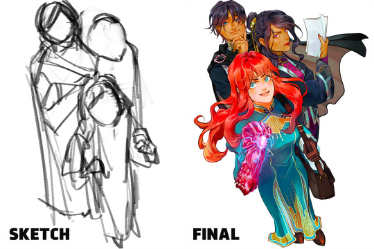
(More under the break.)
Do some (very) rough sketch to locate the characters → Line art
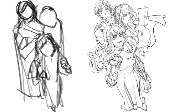
Define coloring section → Do flat basic colors, adjust the tone via gradient map, change line color
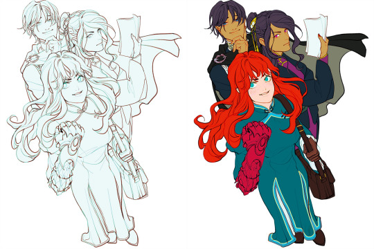
Add more details, use airbrush to shape the volume → Rendering (layer mode: multiply, linear burn)
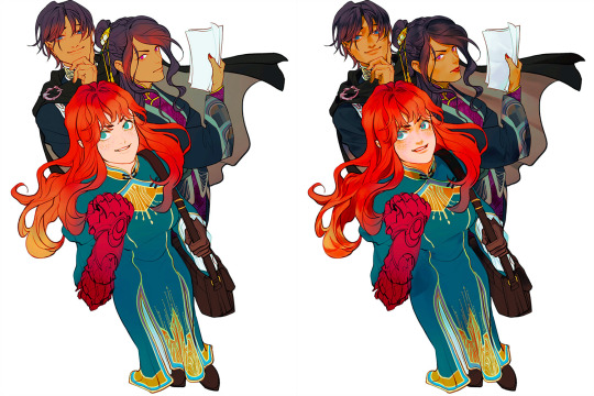
More rendering (layer mode: screen, overlay, soft light) → Post effects
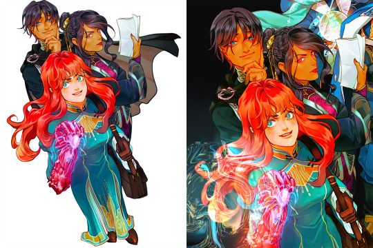
Done!
The next is art influenced by environment:
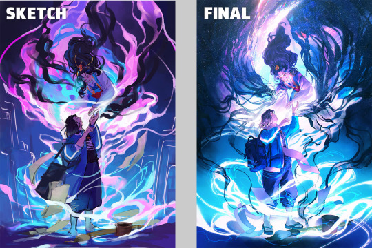
Make a color sketch to set the general tone → Line art
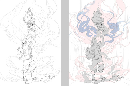
Flat basic colors (background & characters) → Darken the art (layer mode: multiply), add more details
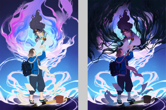
Add more details and begin rendering → More rendering, lighten some parts (layer mode: screen)
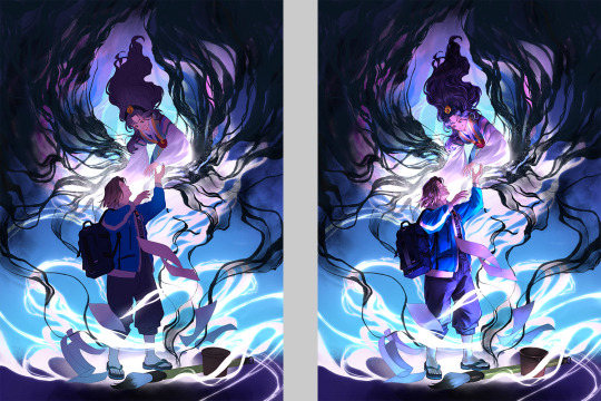
More rendering, use gradient map to adjust the tone → Post effects
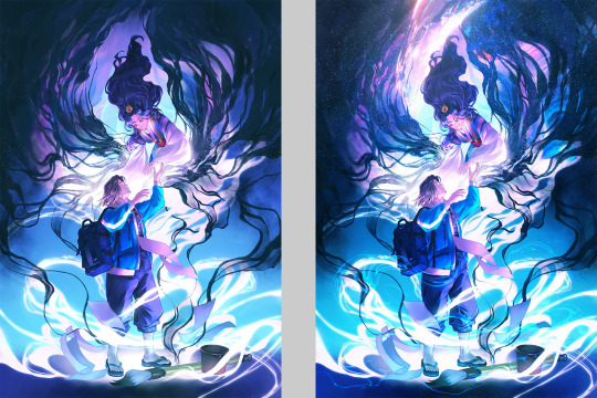
Done!
Wow, this turned into a long post! Hope you found something useful here! Thanks for sticking around till the end! 🙌✨
38 notes
·
View notes
Note
Hii!! Um I’m just curious about how you draw anatomy :D I absolutely LOVELOVELOVEEE your artstyle along with the coloring!! If you’re fine with it, can you give a breakdown how you draw anatomy? Or maybe how you suggest learning how to draw anatomy better- DW I UNDERSTAND IF YOU DON’T WANT TO SHARE THAT‼️ Either way it’s nice looking at your art and learning from it!!
hii!! ty ty that’s very sweet of you to say 😭💕
I’m actually not that good at anatomy myself and if I have to draw parts of naked body I surround myself with references 🥴 in any other case I just use blocks to make a rough sketch which I then dress up like a doll, so it’s not so much about anatomy as it is about proportions and shapes (which I suggest to learn first thing bc that’s what we started with at art school :p)
I really don’t think you need to know the name and exact form of every bone from the bottom to the top to draw people well enough, IMO all you need as a core except for named above are the very general things like the way leg bones connect with pelvic bones, or the rib cage shape and how it can differ, or, for example, those anchor points where the bones are practically not hidden by anything, like the collarbones or upper anterior iliac spine and etc etc. what I’m trying to say is you don’t have to memorise skeleton and all the muscles in all details, especially in the beginning 🤓
in terms or advices I probably won’t say anything new: when I get an annual urge to learn anatomy more or need a reference I go through Anatomy for Sculptores since everything is very clearly shown there or straight to youtube and watch channels like Proko. he actually has a very useful practice in homework to find muscles or bones on a photo and draw it on top/separately. I myself rarely do it and I’m ashamed bc when I actually did it was so helpful for understanding 😭
I also have a few pinterest boards for anatomy and love to look at pics like these, gives me a better understanding of volumes and the way shading should go
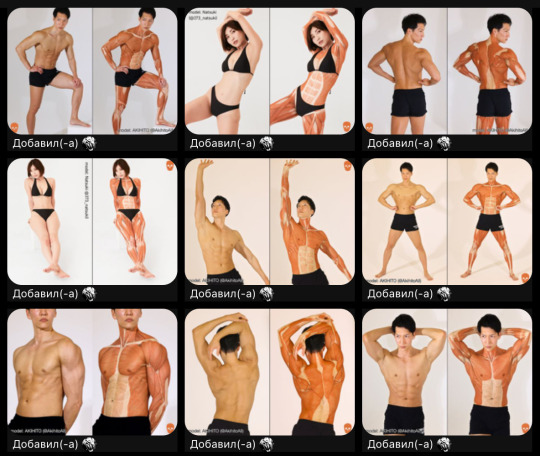
I tried to read Bammes too but it has A LOT of (not so necessary on practice IMO) info (and a lot of typos in russian version) which is too much for my one and only braincell and I can’t remember a single thing for a dear life of mine from there 😭😭😭 schemes are good tho 🤓
heard good things about Figure drawing, Design and Invention by Michael Hampton and Morpho series (especially Simplified Forms) by Michel Lauricella but haven’t gotten my hands on them yet
I actually have this recs from someone on IG, can’t remember who it was sadly

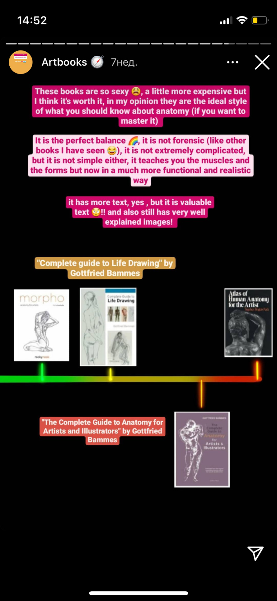

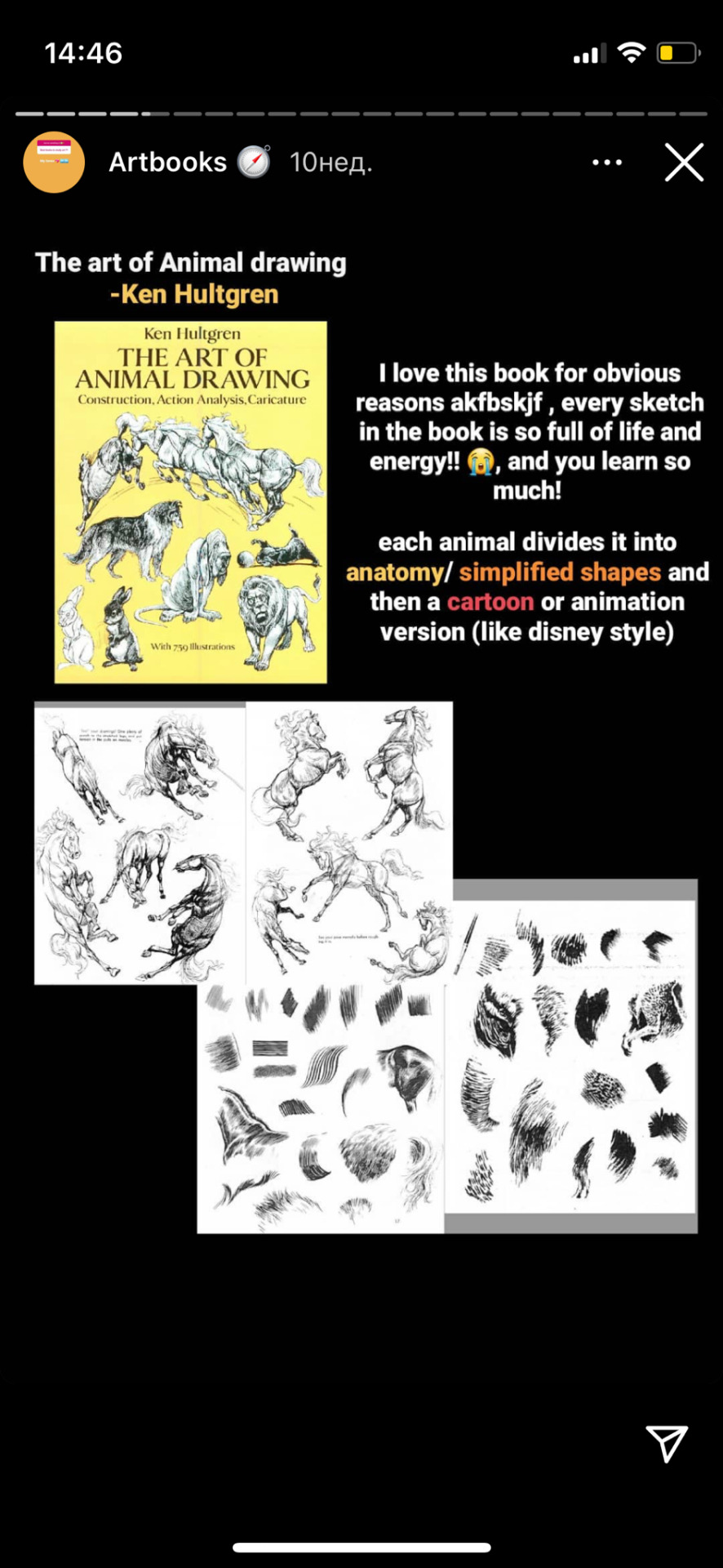


and ofc looking at and drawing real ppl helps not only to understand how anatomy works but also how our body parts can hugely differ, even if it’s the exact same muscle
anyways sorry for a lot of letters, here is an edit of different sketches I have in timelapses, you can see how I usually do them 👀 I also tend to be lazy and sketch things without refs just to get confused on a rendering stage and redo anatomy on top with refs so I added one full timelapse just to show it 🤓
24 notes
·
View notes
Text
Grand fest idols (cw: a bit suggestive clothes i think)
decided to make a grand fest version of my splatoon idols

if you follow me on twitter, you probably saw me bitching and yeah shits bad hand hurts, back hurts, head hurts, its hot in here, i cant stop coughing and its that type of cough that hurts
i dont wanna bring the mood down so im just gonna talk abt other things!

Their name is Hada, fun fact: i never finished the drawing i made so i kinda had to pick some colors in the spot, well, i picked some from the old reference since that was a redesign (you might have seen the one i did of the other) they are based on a big fin squid....
this....
thing...
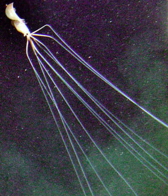
cool! so yeah thats why they are so tall
here is the sketch i made for their normal design
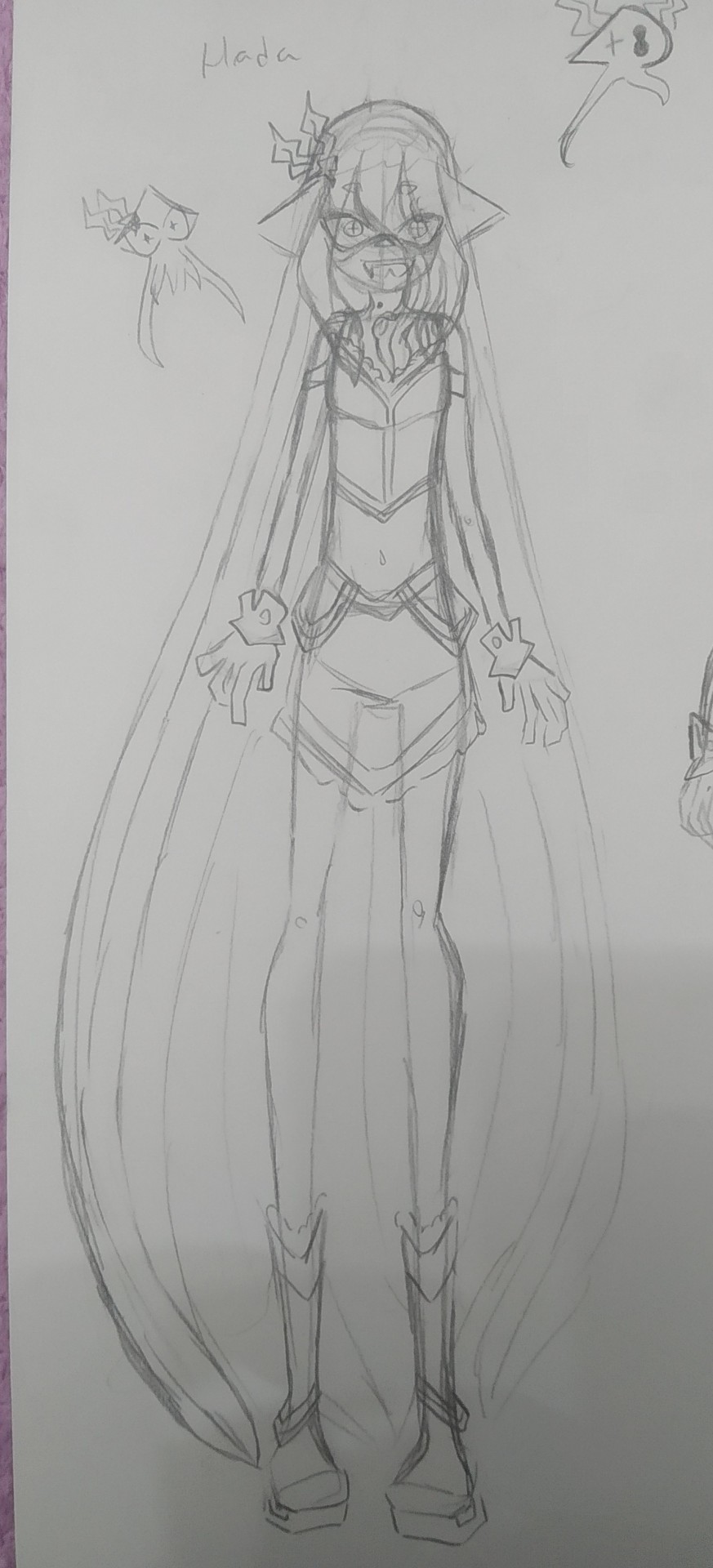
they actually wear goggles usually since they are very sensitive to light, but i didnt draw it there

and here is Lucida! based on a glass octopus (though she used to be an inkling i changed it when i saw that i barely had any octoling ocs (never changed actually, like, always a glass cephalod, so nice that i found out that octopus also have a similar like, species so i didnt have to change her much))
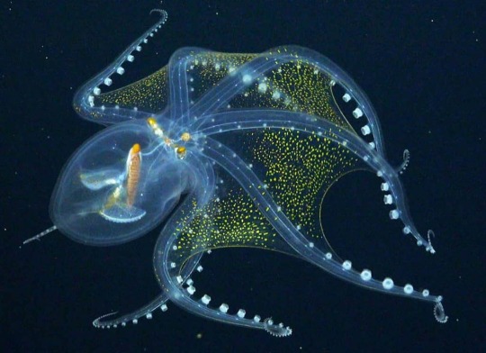
and here is her's! wich i did finish

if you notice i kinda changed her body just because i wanted her to be chubby but i thought my job was bad so i decided to improve it a bit, her freckles also change colors :3
and here is an old design

its not even the oldest, they look REALLY different from those
though, i havent really written down their personalities or anything so its kinda woobly, you can ask about them but just mentioning that so you know they probably will change
i will try to do a team future drawing tomorrow, but now im gonna rest my hand a bit and try to get back onto splatoon as soon as possible, hopefully (the next line is a bit of a leak, skip to the next parentesis if you dont want to read that) when the amiibo concerts are back, you can choose for them to perform at the grand festival stages, or if anything, (you safe now) i want to be able to keep going there after the festival ends, even if the idols arent performing. because i really want to take more photos of deep cut, btw deep cut are my favourites now, callie is still too but not as much as them. uh- yeah- sorry i tend to go off topic a lot, welp, my timing is terrible so i end up taking the pictures some seconds later and it gets fucked up, i might upload all the ones i took after the fest ends
well, i should get going, Jambuhbye!
(forgot to say this but they are over 20 dont worry)
#digital art#firealpaca#traditional art#original character#art#splatoon fanart#splatoon oc#splatoon original character#splatoon 3#splatoon#splatfest#splat3#sploon 3#sploon oc#squid sisters#grandfest#grand festival splatoon 3#grand festival#grand fest splatoon#splatoon idol ocs#oc#oc art#my art#artists on tumblr#drawing#my ocs#ocs#splat ocs#inkling#octoling
30 notes
·
View notes
Note
Do you have any tips for drawing? Anything really
Well, "any tips for drawing" is rather vague, so I'll just offer some general advice for now, which is more about how to learn and improve than how to draw any specific thing. If you'd like some more specific advice, though, I'd love to help where I can!
-.-.-.-.-.-.-.-.-
Use references when you're stuck on something! No artist is ever "too good" to use references when they want to draw a particular thing better. References can be photos or other artists' art (ideally with credit depending on how closely your art resembles the original), though I don't use the latter much because trying to copy another artist's style typically doesn't work as well as just keeping the inspiration in the back of my mind and going with the flow.
Speaking of that, finding an art style is a gradual thing, from what I've experienced. To me, it seems to be a thing that develops over time as a result of how different artists solve different problems. You don't have to stress about getting any one "style" with your art; just focus on solving problems with your drawings, and it'll develop its own unique look by virtue of you being a unique person and consciously or subconsciously adding new things to the solutions you find. If you are looking to emulate a specific style, try to pick one that solves problems you have with drawing or (to go off the previous point) appeals to what you enjoy, or perhaps what specific genre of art you plan to do.
To go further, Always look to solve problems. If you're struggling to draw a particular thing, try to figure out what specific part of the drawing is challenging for you, and look for ways to improve on that aspect. If you realize you struggle drawing hands — or even more specific, you struggle drawing hands in dramatic poses where the fingers are curled — for example, set the goal to find a method to draw hands in those kinds of poses, then relax. I usually find a solution to these kinds of problems within days of setting the goal, and I don't even have to search super hard. In fact, sometimes more comfortable methods of drawing certain things just pop in my mind!
Save any tutorials or references you find especially helpful! I like to bookmark YouTube tutorials I like, as well as the blogs or websites of any artists whose work I find inspiring. I also have a HUGE Pinterest board with tons of tutorials on drawing all sorts of things, so that definitely helps!
This is perhaps one of my biggest tips: try to get in tune with your "artist intuition" in a sense. Recognize what things you already do and don't like to draw, not just in the subject, but the general process you use to think about and draw an image, what parts of said art process you enjoy the most (line art, coloring, shading, sketching, etc.), and what kind of art you want to make in the future or what purpose you plan to use your art for. I've found understanding these things about myself really helps figure out which art tutorials will be more or less useful, and which art styles/processes feel comfortable to me. This is not to say you should never seek to improve, but rather, look for a means of improvement that fits your natural drawing preferences and habits. Maybe the Loomis method isn't the easiest way for you to visualize the human head, and another method works better. As long as you get the result you want, the process can be tailored to fit you specifically, even if that means using a process that's obscure or even exclusive to you.
You will never be perfect, and can never stop improving. So don't worry so much about making sure you're "good enough" to draw the ideas in your head. I know it can be worrying to think you aren't skilled enough in certain aspects to bring your ideas to fruition, but because you can never stop improving, if you need to be "good enough" before you can draw the things you love, you'll be waiting forever. So don't bottle up your ideas just because you think they won't turn out very professional. Instead, just do your best in the moment and note what you can get better at afterwards. And worst-case scenario, you can always come back and redraw the idea once you've improved.
-.-.-.-.-.-.-.-.-
Okay, well, this was the stuff I could think of so far right now. I hope this helps!
22 notes
·
View notes
Note
heyo! i was wondering, do you have any general guidelines or tips on how to make goatfolk/goat-like humanoids? like, things that based on your judgement should be essential to their physiology and/or society. your opinion is highly appreciated and valued! ^^
sure! I'm going with a really standard domestic goat as reference here, but there are many breeds of goat with their own distinct features, so don't take this as the only way to design goat people. some goat breeds don't really have horns or the little beard, or they have floppy ears instead of tall ones, etc. sheep and goats are also very closely related and have a lot of features in common! sometimes what you think is a photo of a goat is actually a breed of sheep! So you kind of have to decide which specific goats you want to use as a reference point.

image description: faded photos of a goat and some close ups on a goat's face and hoof, all outlined in red. notes on the photos point out specific features. horns, short body, horizontal pupils, cleft lip, and even toed hooves. end description.)
I think the facial features here are probably the most important to keep in mind, as they'll be the same for any goat breed. they all have eyes with horizontal pupils and they all have that upper lip with the cleft. I tried to look up another word for that, because cleft lip also refers to a congenital condition in humans and animals where there's a split in the upper lip and possible the palate of the mouth. a lot of animals like goats and rabbits and cats have this sort of line dividing their upper lip into two parts. it's also called a philitrum, but we use that word for the dip between a human lip and nose as well. unfortunately an internet search for "what do you call it when animals have that separated lip thing going on" mostly turned up information on the congenital condition and how to treat it in livestock and pets. so i don't know if there's a better term for it other than a cleft lip. either way, it is a very recognizable feature on goats and I think it helps make a goat humanoid look more goat-like.

(image description: sketches of an anthropomorphic goat, with a close up on their face. They are short and chubby. end description.)
This is a design that leans heavier on the goat features, but you can go for something more humanoid, like a satyr. depends on what your end goal is for the design!
as for their social and cultural aspects, here's a couple of articles on goat behaviors:
article 1
article 2
important details to keep in mind:
goats are foragers, they wander around to find food and they're well known to have very broad diets, including the ability to eat some things other animals avoid, like tough thorny vines.
goats tend to have a lead female, also known as a doe, guiding the herd. a lead male, known as a buck, will usually bring up the rear. the lead female makes decisions about where the herd will go, the lead male guards the back and is very defensive.
a herd of goats usually has a hierarchy going on and they will defend their own places in that hierarchy. age, sex, and horn size are common determining factors.
goats are climbers, and they'll climb anything including each other. baby goats are especially active about this.
goats headbutt each other for various reasons. this includes establishment of hierarchy, defense, and play.
so goat people might have a matriarchal system, with males as guards while females are guides. they may have a culture centered on fighting as a form of social communication and entertainment. they could be nomadic as well. their dance style is probably very acrobatic, jumpy, and reflective of their fighting style.
those are just a handful of ideas off the top of my head! i hope it's helpful and i wish you luck and fun as you design your goat folk!
52 notes
·
View notes
Note
*crawling into your inbox* Smiles do you have any drawing tips? Everything I’ve drawn recently I’ve just not liked at all and I’m strugglin ;-;
-Sky Floor
Yes! I can try to help!
First things first, there’s a YouTuber named Excaliblader who gives AMAZING art tips. He focuses a lot on anatomy but he also talks about sketches, art motivation, and art styles. His tips are super simple and so easy to understand but also incredibly helpful. He’s an nsfw artist so the examples he uses are a little suggestive but they’re not explicit, but he knows what he’s doing and he’s helped me a lot with anatomy.
As for tips from me, experiment! And when I say experiment I mean push yourself to the edge. Draw things you KNOW will suck. Draw with your left hand, play with different face shapes, experiment with crayons, anything to try something new that you can expect to look bad, if that makes sense. The reason why a lot of my art has different brushes and things is because if I do the same thing over and over again I start to hate it. I need something new to do with drawings. And when you find something that you ENJOY doing (like a certain style, a new brush, etc.) you’ll get so motivated to do stuff with it! This may also help you unlock new skills with art because you’re pushing yourself outside your usual domain and discovering new things. Let’s say your characters have the same face, so you decide to experiment with different facial features. You can start small with downward turned eyes, round eyes, or triangle shaped eyes, just anything to make the eyes distinct. Or you can start with noses. Small button noses, long straight noses, bumpy noses, wide noses, all of that. Soon you’ll be able to draw all kinds of features confidently if you keep at it. But that’s just an example. Also drawing old people, people with extreme features, or just copying an art style can help. You’ll never improve if you do the same thing over and over again. You’ll be good at that one thing! And you may improve with some things in there, but if you want to do more, you’ll just have to do it.
Something I always say is to look at all kinds of tutorials on how people draw and experiment with those. Some draw their faces with a T shape, others add a lot of guidelines. See which one works for you. There’s no right way to draw; if it’s quick and efficient for YOU then it works!
And another thing, art isn’t easy. When you’re drawing, it’s hard to tell how much progress you’re making because from your perspective, you can’t see the road you travel on. If you’re feeling unmotivated and feeling bad about your art, turn around and look at the progress you made. Redraw old art and see how much you improved. Comparison is the thief of joy if you compare yourself to others, but if you compare yourself to your past self, it’ll make a world of difference. You’ll be able to see how far you’ve come. You’ll be able to see the things you were able to achieve and improve upon by actively redrawing something old and comparing it. That’s something that helps me a LOT when I’m feeling bad about my art. I cant tell you how motivating it is!
One more thing that really helps is tracing! Now, tracing someone’s art work and then posting it and claiming it as your own is bad. Obviously. But tracing actually helps your brain know WHERE things are supposed to go. Your hand is able to figure it out as you do it! Tracing real life photos help a LOT with anatomy, and if the artists allows it, tracing good art to help you learn is good! Again, don’t post it as your own. But it’s a great way to learn! It’s best if you trace a photo, and then use that trace as a reference photo, cuz you’re learning how to use a reference in two different ways!
Idk how to help with your issue specifically (I’m at work so I can’t sit down and draw something alas) but these things help me when I’m struggling! And even then I barely know what I’m doing XD
#asks#BEEG answer but I hope it’s helpful!#good Luck Peggy :)#your art is really cute so I think you’ll be fine!#you’re probably on the brink of unlocking a new skill or ‘level’ lol
15 notes
·
View notes
Note
Do you use guidelines/have specific shapes memorised to help map out certain parts of the human body (if so what)?
Im trying to practice anatomy but I’m struggling with simplifying different body parts into shapes for something so I’m curious to know what you use :)
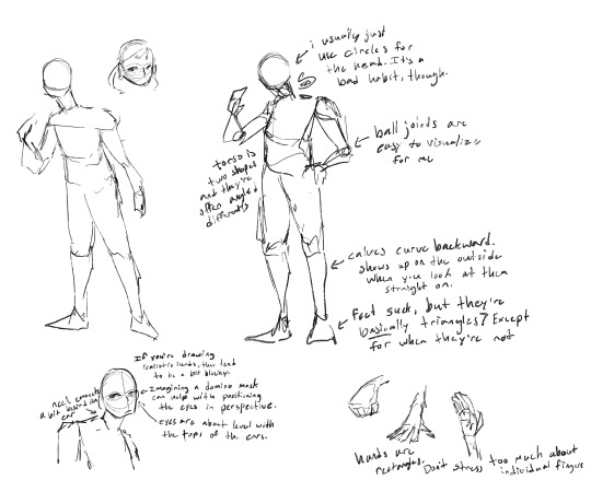
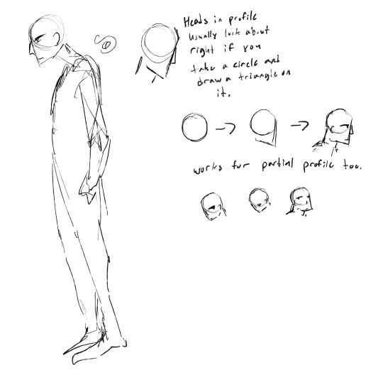
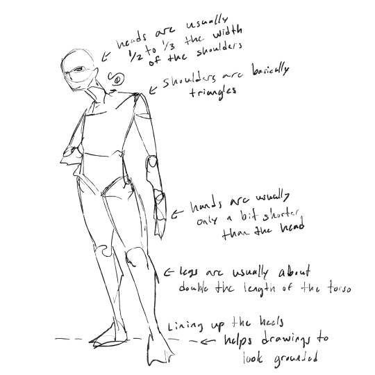
most of these tips are things i’ve picked up from assorted tutorials over the years, so i can’t claim credit for most of them, but this is how i usually break down anatomy. though honestly, my biggest tip would be to pull from real life. pose in the mirror and pay attention to how your body moves. if you’re struggling to figure out how long an arm should be, or big to draw the hands, check where they sit on your own body and base it off that. there are also a lot of good sites for finding photo references for poses.
i’m honestly pretty lazy with my anatomy, and i pretty much never actually draw it out like this. (usually i just draw the character in whatever pose with absolutely no base underneath and it comes out how it comes out lol) i do find it’s good to occasionally do some drawings where i pay a little more attention to anatomy, but even then i usually just do gesture drawings (short drawings where you focus on the Vibes of the pose and completely ignore technical quality. cannot recommend doing these enough they’re very helpful) to loosen up how i’m thinking about the body.
if you ever have the opportunity to do sketches of a live model (ie: a figure drawing class or something similar) i definitely recommend it. it’s not necessary (people will tell you it is, but i was doing art seriously for like four years before i ever tried it) but it’s indescribably helpful for getting the hang of anatomy. otherwise just look at a lot of photos and pay attention to what you see other artists do for stuff you struggle with. it is always morally correct to steal other people’s anatomy tricks!
#again very sorry for letting your asks languish in my inbox for so long. adhd got me 😔#art#sketch#sol answers#art tips#phase 60
16 notes
·
View notes
Note
ok ok I just had a request idea if you don't mind-- gepard with a fem (but I don't mind gn) reader who is good at drawing idk it just seems so silly in my head because of the wanted posters he made 😭 but anyways, tysm in advance and remember to take a break when needed!
↳ pairing(s) : gepard x gender neutral reader
↳ synopsis : request ♡
↳ authors note : hi guys its me (ive been dead for so long) (it will happen again) (sorry about that) (i ate a banana this morning)


You loved art with all your heart, your apartment was full of paintings and drawings you had made over the years and happily pride yourself on your skill.
So when you were on your usual stroll, and pass by a rather.. poorly drawn wanted poster. Those messy squiggly outline and poor form of coloring couldn't have been anyone else.
Walking into your boyfriends apartment, he's not surprised to see you carrying your bag of art supplies inside and plopping it onto a table. Of course, he was more than aware for your passion with the arts (while also finding it very cute) and figured you were just going to his place again to paint.
And so when you gave him an all too familiar glare, the blonde could only laugh nervously as you pull him into the living room and away from the kitchen.
"Gepard Landau." You state, as if a strict parent about to give a four hour long lecture. "..Pfft.. What are these drawings?" The facade breaks and laughter fills the room, not one filled with ill intent or mockery just.. a genuine question with a bit of laughs. Gepard could tell you had nothing critical or rude behind those words, so he smiles at your laugh. Not minding the topic at hand and simply admiring your adorable giggles of joy.
You sit over on his left, a reference photo in hand and two sheets of paper. "It's been 2 years of us together, and in those two years I've given you several art lessons.. you can't even color within the lines?" You chuckle, beginning to sketch as Gepard already knew to follow your steps.
But maybe there's a little white lie in the air, maybe the middle child of the Landau family was in fact a great artist, it wasn't particularly out of character considering the extra classes from private tutors.
Maybe Gepard liked to watch you and your passions, perhaps enough to fake his skills with the arts just so you can come over to his house again and again and show him the skills he knows he's far too talented at for his own good.
Oh well, never hurt to lie if it was in the best interest of the both of you. You get to share your passion, Gepard gets to have his heart race as he watches you do so.
#˚₊· ͟͟͞➳❥ bailu's candy stash#honkai star rail x reader#hsr x reader#gepard hsr x reader#gepard x reader#gepard landau x reader#gepard my cutie patootie
194 notes
·
View notes
Note
Can you share a little bit about your art process? I'm curious to know about how you use references and how you figure out compositions. Your pieces are always so nice to look at and I love how you post a full piece and then a close up, and both of those look really nice on their own.
Love your art <3
(hooo this is long. sorry I love 2 chat.)
well it's multiple factors; in regards to being able to crop a close up and having that work as its own image, that's thanks to the scale the digital medium allows with ease; if these were traditional pencil drawings they would have to be pretty fucking big to have that much detailing on the face, and that in turn would make the drawing process different as you'd be having to step back often, but it's a lot easier digitally to just zoom in back and forth, check things are working from zoomed in and out, flip the image to see things with fresh eyes and make sure things are looking alright etc. I've been drawing on paper for years, and mostly draw/paint in a completely different style to how I do for my fanart, so coming in to digital and seeing it as a hugely different beast actually kinda helps in that sense (tho I'd say most of the time the digital thing really hinders me).
on that digital vs traditional note though, I take pretty much all of my inspiration from traditional artists, so when I'm drawing fanart I'm thinking about how I want the drawing to give me the feeling and sorta composition that those pieces I admire have, whether it's more modern queer and fetish art or old masters and book illustrators. it's having an awareness that the human brain wants to focus in on a face or find eyes, getting as much emotion across in that area but also being conscious and having fun of the potential narrative telling of other details and what the body is doing, sewing in your own symbolism.
for figuring out poses, I have a visual mind, I can see compositions pretty well in my head, so for example; if someone who is commissioning something states the details they would like in a piece, I can usually tell without beggining the sketching stage that, for example, maybe they wouldn't be able to see the hand they want doing something specific if characters were interacting that way and we were seeing their faces as well, or you wouldn't be able to see one of their faces, and if you value seeing their expressions maybe let's chose what you prioritise in terms of what the viewer sees. idk what to give in terms of advice for that, I'm lucky I've got a photographic brain when it comes to stuff like drawing or other boons it grants me irl (but I'm useless with numbers and words so, it balances out).
as for reference I feel like I've touched on this a few times: reference is great! it's important if you're doing the style of drawing I'm doing here (but I also really love work that is more stylised as well, i love folk art and goofy and expressive things) at this point for the likes of Imogen and laudna (and I'm getting there with fearne) - I've drawn them so many times that I just reference myself, and if there's a specific expression I'm needing then I keep a shaving mirror near by and look at myself, same with hands, they're right there, draw straight from em or take a photograph (saying this I am not good at hands lol). other than that yes I will often look for reference of something that roughllly resembles what I wish to draw in terms of posing, and then it's a mixture of kinda treating the reference images like a frankenstein paper doll with metal pin joints and arranging them how I need, but as I've also said before I like to not have a 1:1 reference and duplicate because i want to get my own hand in there, figuring out angles and limbs with lines gives a little bit of movement, proportions being a little off shows what the maker wishes to exaggerate or minimise, these are all enjoyable things to me, I'm not tryna make something photo realistic. so yeah, reference good, reference teach, but your own hand is very important too.
in summary I use a combination of photo/painting/screen cap reference and just my intuition from years of drawing and looking at people for the bodies, and my own drawings and a mirror for the faces. sketching it all out takes quite a bit of time, and I often won't realise until near "the end" (after spending hours colouring caus idk the proper digital ways to do it) that I'm not happy with a thing or two. sometimes I try to "fix" this, sometimes I say "fuck it, it's an excercise and is what it is". people who have commissioned work from me might have had this happen where I've said I'm sending the drawing over and then been like actually can u wait a while I need to tweak some things and spend an hour doing so, caus part of my process is sending the image from my laptop to my phone, and not only is the colour different from my phone to my laptop, but once again it's like seeing it with a new set of eyes and pretty much always reveals a bunch of "mistakes" I've made. the phone thing also goes back to what I said earlier and what you brought up, of that intuition to look at an image both zoomed out in it's full composition, but also pushes our intuition to tap and zoom in (I'm sure there's essays on this shit about viewing art digitally and specifically on phones vs irl) this can be used to your advantage! maybe you have a style that suggests detail but when zoomed in it's very satisfying certain wide strokes of colour, or yeah you can pack in tiny details made with a finer point that you can't see zoomed out. one of the things that sucks about the style I do for my fanart is it's way more obvious when something is wrong. when it's stylised to you it's never gonna be wrong, yknow? uh. anyway. I hope this sorta answers your question. I'm happy to talk about making all day long, I always think what's best is to find what works for you. for me being inspired by things outside of the space youre making things for is really important, and plays part in us all not making similar end results. keep putting your own hand and brain to it and have fun.
thank you❣️
#sorry if this sounds really wanky#that's the last thing I wanna be#this is also me being like hey maybe u think this blog isn't CR fandom related much past my own drawings and fic#but actually all the art and imagery and music I post is stuff that has huge influence on what I make and it's often from the same strain#of brain rot#we are but a cluster of interests and experiences
7 notes
·
View notes
Text
EXALTED SECRET SANTA 2024
Back at it again! For more reference pictures take a look at my character’s tags on my blog.
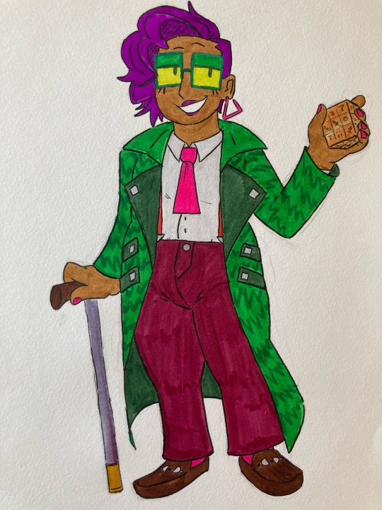
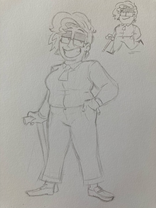
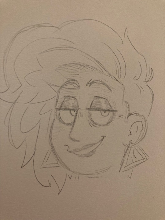
Entry 1: Sarita Ghoshal
Secrets-Caste Sidereal Exalt
Pronouns: She/her
Age: 42 (has been exalted for 2 years)
Ht: 5’7”
Description: A wily huckster from the streets of Champoor, the city of night. Sarita has very easily transitioned into her life with the Celestial Bureaucracy, it’s all just another big scam to her—and she’s great at selling scams. A schemer, a liar, and a relentless control freak, she’s always crafting elaborate plans for her party to enact. Deep down though she has a big heart, even if it’s hidden behind a million layers of lies and the fakest smile this side of the Blessed Isle. Her soft side is the most apparent whenever she interacts with her “henchmen”: a brass legionnaire bodyguard and a pattern spider secretary that are like daughters to her (though she’ll never admit it).
Anima: Sidereal animas are pretty subtle things, doubly so for someone as secretive as Sarita. When it manifests visibly, it appears as if she’s twisting and weaving near-invisible strands of fate, like a spider at the center of her web.
Anatomy Notes: Sarita is on the plumper side, so please don’t draw her skinny. She also has a significant limp in her right leg, and walks with the aid of her Starmetal cane, so keep that in mind if drawing a full-body. She wears green-tinted glasses, though I’ve provided a ref of what she looks like without them (her eye color is green and she wears heavy purple eye shadow). She usually has a very wide and kinda fake-looking smile on, very skeezy car-saleswoman vibes.
Motifs: Green and purple; disguises; loud colors and obnoxious patterns; 80’s office worker couture; masks; webs or string; puzzles; rubik’s cubes (but fantasy)
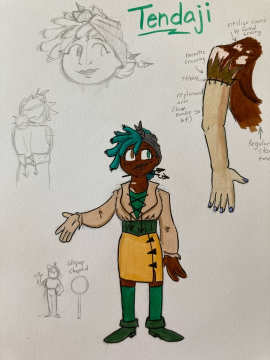
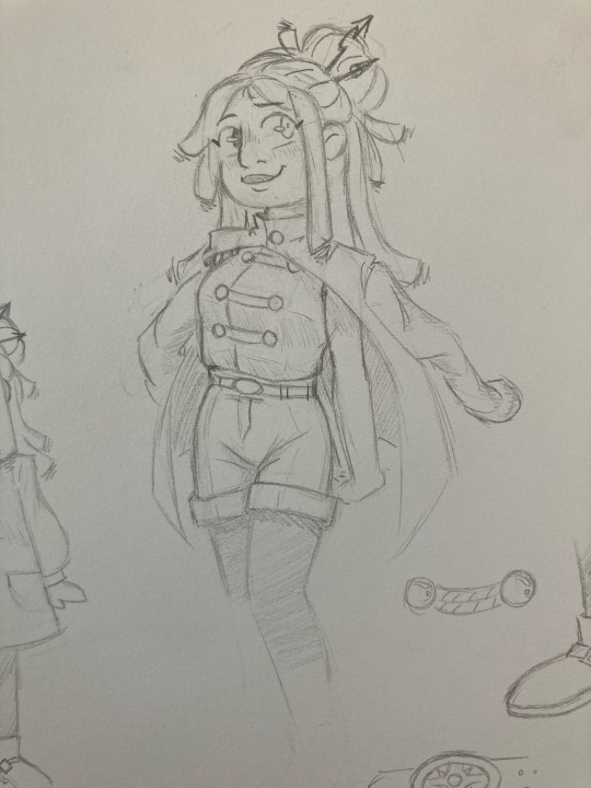
Entry 2: Tendaji Greenwich
Twilight Caste Solar Exalt (Bureaucracy Supernal)
Pronouns: She/Her, Xe/Xyr, or They/Them
Age: 23 (been an exalt for a year and a half)
Ht: 5'8"
Other References: see the links in last years Journal.
Description: My first ever exalted player character! Her game wrapped up a year ago, but she always. She went from being a nervous and timid little nerd to a confident and self-actualized little nerd. I couldn't be prouder of her. The outfit and hairdo in the first two photos are her current appearance, and you can use the general color scheme in the third drawing.
Anima: Instead of appearing on xer forehead, Tendaji's castemark is actually situated on xer left eye, which turned teal upon xer exaltation. They manifest the Sun's command over the cycles of night and day, which essentially means they have time-powers. Tennie doesn't just build things, they push forward the hands of time to a project's completion. They don't just move quickly, they skip through time in a series of glitchy leaps and teal after-images. The nature of their exaltation is a bit overwhelming, and the more they use their powers, the less control they seem to have over what they're doing, slipping into a trance-like state and babbling in First Age tongues.
Anatomy Notes: Tendaji lost xyr right arm in a battle against an Abyssal, and eventually got it replaced thanks to the help of a necrosurgeon and xyr Liminal boyfriend (who donated its arm for grafting). The references in the artwork above depict how it should look, however now the vitiligo patterns have now begun to spread to further parts of Tendaji's body. Another note that hasn't been included in the color refs is that a few of her locks have become stark white due to some mental trauma involving ghostly possession.
Motifs: Teal & Yellow; clocks, watches; hourglasses, sundials and other assorted time imagery; architecture and city layouts; sunflowers & honeybees; paperwork, pens, sketches, and blueprints; when they're having a bad time: glitchiness and intense shadows.
8 notes
·
View notes
Note
help y tf was i not following u 😀 also hi lin gimme a niki hcs rn or forever be bald
mf and i was thinking why my hair fall increased should've known it was you . anw enjoy ur 'ki hcs 😒😒😒😒

ft · nrk
content : established relationship, bullet points
warnings : none that i noticed ( my fluff writing abilities have disappeared )

riki is the type of bf who eats your snacks, for two reasons, of course. first, he's hungry, and second, it gives him more opportunities to buy your favourite snacks and surprise you ( even though it's an old trick now ) sure, it's annoying at first but at some point, it isn't even surprising to see food disappearing from your refrigerator and shelves. you know it's going to be back by the evening, and in more amount.
has a habit of stealing your blanket while sleeping. never sleeps on his side of the bed, he has to turn to your side and hug you to sleep even in peak summers. no, you don't get to have your blanket back and complain. if you push him away, he'll roll back over to you, and in the morning, find him teasing you about how you can't even stay away from him even in sleep, how you're so in love that you always end up on his side of the bed.
riki likes to try new things with you, and even if they're not new, he'd like it if you try things that he likes, be it food, games, songs, dance, shows, just whatever. it makes him feel closer to you, makes him feel like with everything common between the two of you, the distance between you both is vanishing. he simply likes the idea of you enjoying the same things as him, to see you happy doing things that make him happy. it's one of the reasons why he's been excited to have you meet his friends and family. just the idea of you, who is very important to him, meet other people who are important to him as well. just makes him feel reassured, tells him that you're here to stay.
i think he has a habit of whispering in your ear. it doesn't matter if you're in public or by yourself. he will lean down and whisper in your ears if he could— and it's not a secret. his words are mostly about the usual things he notices are you, random compliments, a joke and you both would laugh about in your own little world.
likes to make things for you ! please, i cannot stress how riki-like this is. whether it's a sketch, a short lyric, matching bracelets, food, whatever— he likes to give you gifts and nothing is better than hand-crafting something and pouring every ounce of love he has into it. there's a mini showcase of all the gifts he has ever made for you, ranging from pots he made and painted himself, to the photo frame he made on your first birthday after getting together with him.
remembers every little thing about you, good or bad, embarrassing or not. you'd be surprised to know the things he remembers. sometimes, they're about stuff you'd have forgotten yourself. he'd be like, "i remember you wanted to buy this for so long," and he's referring to a conversation you had months ago. he's so observant, he notices every single thing do you, your preferences, the dress you like the most, your favourite chapstick, the perfume you're wearing. he knows you so well that if it came to a point where in some world, riki hasn't seen you, he would still know it's you.
good morning, good night, hello, good bye and hourly i love you kisses are must or he would be found unconscious on the living room floor.
#LMAO BFF FORGIVE ME IDK HOW TO WRITE HCS ANYMORE#this is bad this is so bad i am losing my Abilities as a writer#anw i hope u like These#enhypen x reader#—approved.#riki x reader#enhypen imagines#enhypen fluff#riki fluff
256 notes
·
View notes