#i added white noise filter i am new to this video editing thing
Explore tagged Tumblr posts
Text
“calcifer let sophie bullied him because he hold howl’s heart and his heart recognized sophie” 😭😭😭😭😭😭
#alucard hellsing#integra hellsing#alutegra#alucard x integra#hellsing#the audio is from howl’s moving castle#i immediately thought of alutegra when i saw sophie bullying calcifer#i took constructive critism#baskerville have floppy ears#like the 2001 gonzoverse#im not sure because the abridged version made baskerville having pointy ears like dobberman that got their ear clipped#i just found out that you can read the tags in the reblogs#receiving so much love and support thank you so much#i added white noise filter i am new to this video editing thing
163 notes
·
View notes
Text
The Ulzzang Project - Part 1 | Jeon Wonwoo
Read part 2
⋅𖥔⋅ ━━ ⋅𖥔⋅ ━━ ⋅𖥔⋅ ━━ ⋅𖥔⋅ ━━ ⋅𖥔⋅
Genre: Fluff, crack (maybe explicit content in the next chapters)
Pairing: Jeon Wonwoo x female reader
Warnings: none
Words: 2.6k
A/N: Hello there! Here’s part 1 of my mini series of you and Wonwoo, the next ulzzang stars hahaha :3 I’d be happy to know your thoughts about it. I’m already working on part 2. I might spice it up in the upcoming chapters. If you don’t like that, scream at me and I will stop hehet. So, have fun! And as always, please remember that English isn’t my first language so excuse my grammar ♡
⋅𖥔⋅ ━━ ⋅𖥔⋅ ━━ ⋅𖥔⋅ ━━ ⋅𖥔⋅ ━━ ⋅𖥔⋅
You sat in Wonwoo’s apartment. It was one of those Saturday nights where you two would order greasy food, have competitive game sessions and cuddle together on his couch or in his huge bed. You’ve known each other ever since your mothers went to driving school together. Both got married to their significant other and soon you two were born, making them joke that you two should end up together when you get older. That didn’t happen obviously. Instead you grew up like siblings, spending nearly all of your free time together, fighting over stupid little things but always making up quickly after. Even studying together, entering the same university and sharing the same group of friends. You two were kind of inseparable.
“Wait, why is the bucket of fried chicken already empty???” You shot a shocked look at the boy beside you who wasn’t paying attention to you but bobbed his head to the music of the band in the youtube video which was playing on his tv screen, licking his fingers clean to get another slice of pizza. Before taking a bite, he gave you a rather emotionless answer, his face dead ass serious. “Dunno. Maybe we ate it?”
You scoffed at his words. Oh Jeon Wonwoo.
More laughing, more jamming to music and more teasing until you were full, halfway lying on the floor while you talked about the new annoying professor at uni that scolded Dokyeom on his very first day and was on bad terms with him from that day on.
After a while you cleaned up and started to play Dead or Alive to ‘relieve some stress’. You two had mastered this game for years now, resulting in you and Wonwoo winning and loosing the same amount of times. While you stick to one character, he switched to different ones but even though you two were always close, you would never grow tired of this game and those competitions with him.
When he left for using the bathroom, you unlocked your phone and scrolled through Instagram, stopping at a specific post of a couple who uploaded a suggestive photo of them without revealing much of their person. You cocked your head to the side and Wonwoo noticed it when he came back. “What are you looking at, y/n?” He sat down beside you and you showed him your phone. “Look, they aren’t doing much and the photo has quite a bad quality - maybe on purpose - but it is still good that I understand why people push the like button. Effortless aesthetic.”
Wonwoo made an annoyed grimace at your words and you raised an eyebrow. “What?” “Anyone can do that.” “Why do you think that?” Your best friend thought for a moment and pulled out his own phone, unlocking it and going through some apps until he held it in front of the two of you. Before you could ask what he was doing, he got closer to you and took a photo. You noticed that the room was silent. Only some faint noises from outside the window could be heard when he showed the photo to you. It was a photo of you two next to each other but other people wouldn’t recognize you two. The photo showed only your lips, chin, neck and a little bit of your shirt. You looked up at him and saw his grin. Wonwoo moved a little so that it seemed like he was going to kiss you. Slightly panicking, you automatically covered your face, asking him what the hell he was doing when you heard the shutter of his phone once again, signalizing that he took another photo.
The room was quiet when you removed your hands, a soft blush on your cheeks when he turned the screen, giving you a better look of the new photo. Wonwoo used a filter that gave your photo a nice vintage look. Blinking, you were kind of impressed. If you didn’t know better, you would say that it was a photo of a famous ulzzang couple from Instagram. Noticing Wonwoo’s pleased smirk, you hit his chest. “Yah, what was that all about, huh?? You can’t just-“ “I’m going to open a new account. I’m curious how many followers and likes we can get in a month.”
You had a hard time to follow, squinting your eyes and opening your mouth like a fish without saying anything. He tapped on his phone happily, completely ignoring your confused state. “W-wait, what did you say? What do you mean? A new account? Followers? What?” You tried to have a better look on his screen but he turned around, chuckling a little so that his round glasses slid down the bridge of his nose a bit in the process. “Jeon Wonwoo! Answer!”
Fighting you off his shoulders, he took his sweet time to do whatever he was doing on his phone and you whined, asking for answers but not getting one at all. Sighing, you gave up after a while, giving his broad back a death glare as you turned around and took your own phone, opening the previous app and pouting while scrolling through the already seen posts. You were facing the other direction, sitting back against back. Hearing Wonwoo chuckle from time to time or giving a thinking noise, he always got your attention but since he never explained what he was doing, you took some selfies, sticking out your tongue and pointing at the boy behind you. After editing it a little more, you uploaded it on your Instagram site with the single word ‘idiot’ and tagged him. Giggling to yourself, you didn’t notice the shuffling noises and the warmth behind you disappearing when Wonwoo literally shoved his phone in your face. Your groan got stuck in your throat when you finally got your answer.
Taking his phone out of his hand, you took a better look. It was a seemingly new Instagram account with one content, zero followers and zero following. Your eyes widen when you click on the only photo in this account. It was you two. The photo from before. You were covering your face while the photo was cut, only showing Wonwoo’s grin against your hands. Your eyes travel lower, silently reading through the hashtags he had added. #cutecouple #shy #ulzzangcouple #saturdaynight and 18 more. It didn’t take long until the first stranger liked your photo and you blinked in disbelief. That’s when you noticed the user icon. It was the sunflower you got Wonwoo when he moved into his apartment. The very first day. You remembered the moment when he stopped you in his door and took a photo of you. Although he cut it, you could still see your hands holding the flowers plus a part of your white dress from that day.
Another notification. Another 3 likes. You turned to Wonwoo, who was awaiting your opinion. Pointing at his phone and the still open app, you asked “Are you serious?” “Totally.” His short remark wasn’t convincing enough and the way Wonwoo continued talking showed you that he understood. “It’s like a little experiment. We take some photos together, upload it and wait. As I said, I’m curious how famous our little site can become. We can delete and close it after a month if you want.”
He watched your face patiently until you met his gaze. “Okay. Fine for me. But I have a question.”
“Go ahead.”
“Are we going to upload cute photos only or.. uhm… other photos also?”
“What do you mean with other photos?”
Oh Jeon Wonwoo don’t play dumb, you thought to yourself but lifted your arm, pulling your collar down a bit to reveal more of your neck and collarbone. “This.”
“Sexy?” Wonwoo smirked at you and you rolled your eyes, giving him a hard push so that he rolled onto his back, laughing at your reaction.
You pouted and crossed your arms in front of your chest in an attempt to distract yourself from the blush on your face. You have seen it often enough. Accounts like that. And you would lie if you say you didn’t like them. Many of them showed their strongly edited faces but some didn’t show their faces at all and you guessed your site would be like the latter. If you are going to include more revealing or suggestive photos, you would care less if no one could see who it actually was.
That’s how you agreed.
The whole night the two of you brainstormed. You collected ideas for your next photos and had lots of fun with it. Even lying in his bed together, giggling about the most common couple poses and making gagging noises when looking them up. At around 3 am you yawned and Wonwoo put his phone and glasses on the little night stand, opening his arms for you to crawl in as you always did. You just loved to sleep in his arms. It was some kind of habit since you were little. You loved his scent and his warmth and sometimes you even found yourself at your own home unable to fall asleep because he wasn’t there.
The warm and bright sun woke Wonwoo up. He wanted to turn around and get some more sleep but decided to open one eye instead, noticing that you weren’t there anymore. So he stretched his limbs in all directions and put on his glasses. After grabbing his phone and getting out of bed, he waddled to the living room and found you in the small kitchen corner, humming a song he knew while preparing breakfast - or according to the time on the clock, lunch.
He was about to join you when he stopped in his tracks and unlocked his phone, quickly taking a photo before putting it away again.
“What is my baby making?”
Facing him, you shot him your infamous death glare. “Baby? Really?”
Wonwoo laughed at your unamused voice and joined you, stopping right behind your small form and looking over your shoulder. “Do you know how I like my omelette?” Snorting loudly, you threatened him with your balled first that he quickly ran to the dining table and took his seat. Like the good and obedient boy that he could be. Sometimes.
He was silent while you added your finishing touches to the late breakfast but when you started to set everything on the table Wonwoo was waiting at, he took another photo, a smile plastered on his face. "What did I do to deserve you, hm?"
You were about to take the first bite of omelette when you stopped in your tracks, fork just inches away from your lips. "Okay, what's going on, Wonwoo? You are super strange today?"
"Is that a surprise to you?"
"Not really... but today you're super super strange so tell me."
He grinned at you and took a sip of the orange juice. "I'm just happy to be with my baby, that's it."
"There!" You pointed at him with your fork. "What is that all about, huh? Since when am I your baby?? Did I miss out on something last night or what??"
The dark haired boy in front of you chuckled as you tried to squeeze an answer out of him, with no success. Slowly worry crept up your spine. "Wait.. I didn't do anything to you, right? Or, I didn't say anything uh... strange, right? I know we had alcohol but... Wonwoo, tell me."
You saw him wiggle with his eye brow at you. "What do you wish did happen between us?"
"Yah! Jeon Wonwoo, I- .... I saw you naked more than one hundred times! I know all your secrets! I know you better than you know yourself! I.... I am just not your baby!"
He leaned back, crossing his arms in front of his chest while watching you pout. "Chill. I'm just trying to get into the mood."
"For what?"
"For sexy photos."
"For what?!"
"For s-"
"I heard you!!"
"Then why are you asking?"
The piece of omelette had fallen down from your fork a long time ago and you weren't sure what was more important in this very moment. The only thing that you were sure about was the fact that your cheeks were burning like fire. "I... why the heck do you want sexy photos?!"
"You wanted sexy photos for our experiment and here I am. The bestest friend that has ever existed is willing to take some with you. Shouldn't you feel all giddy or so?"
"Says who?" You mirrored him, crossing your arms as well, trying to remember your exact words from the day before. You thought you did ask about more revealing photos but it was just a question about the content of your shared Instagram, your little experiment or how Wonwoo had called it. You just wanted to be sure. Never have you imagined to take some with him a day later, today.
"Forget it. I'm not going to do that."
"Now I'm sad."
Snorting, you rolled your eyes, sure he said it only to sound funny.
—
You sat with your friends from uni, poking your lunch with your chopsticks in such boredom that you were more than sure nothing could grab your attention nor lighten up the mood. But you were wrong. Seungkwan hit your shoulder and you were ready to start a fight when he showed you his cellphone screen. "Y/n, what do you think? Yesterday I started a couple Instagram with my girlfriend. It was something I've been thinking about for a while but yeah. How do you find our first post? Pretty nice, huh? We already got 217 likes!"
One chopstick fell out of your hand in surprise but you quickly nodded at your friend. Your own site was a secret. There was no way you would ever tell your friends about it especially if - one day - you would really post less child friendly content. No way. Also, where was Wonwoo?
"W-wow, 217 likes after a day is pretty impressive!"
"To be exact, it's been 20 hours and..... 32 minutes."
"Whatever."
When Seungkwan turned around to the other friends to show them his site, you secretly opened your own with Wonwoo, scrolling through the amount of likes you got until now. That's when you saw the 2 new posts. A photo of you standing in front of the stove, dressed in an oversized white shirt from Wonwoo, bare legs and one from when you set down the food in front of him. Both photos from that morning. Your own face couldn't be seen but they were edited similar like the first post.
Your eyes flew over the texts Wonwoo had added to each of them.
G'morning baby.
My baby is the best.
Looking around, you quickly made sure that your friends didn't notice what you were doing and you tried to get rid of the warm layer that was covering your cheeks. He wrote baby.
Then you remembered the real reason you opened the app. You wanted to see how many likes you got until now. The newest of the food had 7. The one of you cooking breakfast had 38. And the first one from last saturday had 305 likes. Although you had more than your friend, you wanted the gap to be bigger.
Without noticing, your competitive personality came out. You didn't want to lose to Seungkwan and his girlfriend. Opening Kakao Talk, you wrote Wonwoo a message with a lot of cute shouting emoticons you once bought.
[Y/n] We need more photos - today. I'll be at your place at 7. It's urgent.
⋅𖥔⋅ ━━ ⋅𖥔⋅ ━━ ⋅𖥔⋅ ━━ ⋅𖥔⋅ ━━ ⋅𖥔⋅
This gif is literally Wonwoo right before he came up with his genius idea lol

#seventeen scenarios#Seventeen#seventeen au#seventeen fanfic#seventeen imagines#Svt#wonwoo#jeon wonwoo#svt wonwoo#kpop fanfic#kpop ff#seventeen ff#kpop#17#carat#seventeen wonwoo
133 notes
·
View notes
Text
how i edit my gifs: a tutorial
for @prometheuswelsh and anyone else who might be interested!
my process for sharpening changed a bit because i’m now using vapoursynth (thank you @inkorns for linking me that tutorial and motivating me to learn!) but this is what i’ve done for all my gifs up until two days ago basically
1. Sharpening
This is my starting point after loading frames into stacks and cropping. I make my gifs using the frame view instead of video timeline because that’s how I learned and I am very happy with it. I select the timing (usually it’s 0.04 or 0.05) and delete any frame that I don’t need by replaying the gif a few times. After that I can start editing.

I begin by sharpening every frame with smart sharpen by selecting the first frame from the timeline and its corresponding layer from the layers tab and then applying the filter. These are the settings I use:
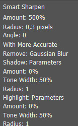
Once it’s done, I repeat the process for frame #2 and layer #2 (you can use ctrl+alt+f and it will apply the last filter you used) and so on. It would be a very long process BUT actions exist! Basically photoshop allows you to record a series of actions and replay them whenever you want. Make sure you can see the actions tab by going to window > actions. You can also download a sharpen all action instead of making your own, I found mine by searching here on tumblr. This is a tutorial on how actions work and how to make one. It’s not a necessary step but it saves a lot of time from manually sharpening every frame.
The most important thing about actions is that they work by reading the names of the layers (es. the action knows to select frame #2 and “layer2″ after sharpening the first one), so you need to make sure that your layers are properly named. Now this won’t happen if you just load them into stacks, so right before sharpening you should flatten frames into layers from the timeline menu.
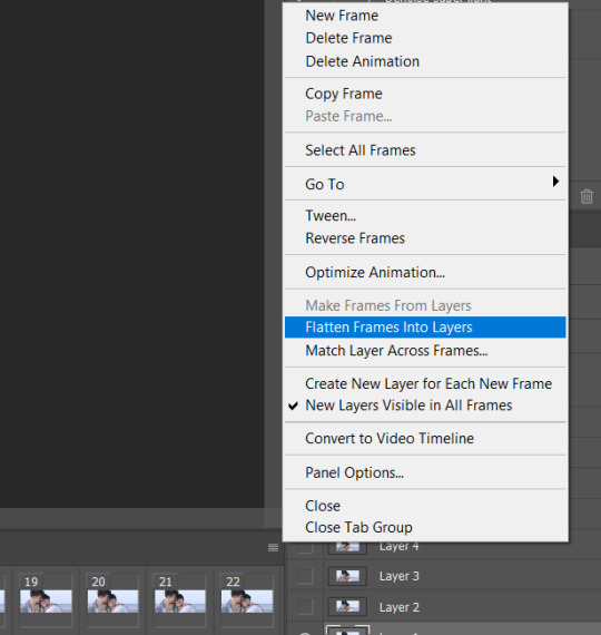
This will link your frames to copies of your layers which will be automatically named layer1, layer2 etc. You can then delete your old layers with the wrong names and use your action, making sure to start with frame 1 and layer 1 selected.
I have been using topaz clean and denoise for some of my gifs. I haven’t found any links so I just used the trial version which is going to expire soon for me so goodbye to that, but they are other filters to make your gifs look smoother and more hd. This is also not a mandatory step so I won’t go into detail, but they work the same way sharpening does.
2. Coloring
I always start with fixing the lighting by using curves and levels. This is the gif I’m going to color, right after sharpening and before adding any adjustment.

I like my gifs to have some contrast and this one looks a bit flat, so I want to make the shadows darker and the whites lighter basically. Make sure you have the topmost layer selected so that your new adjustment will be added on top of all the other layers.
-Curves
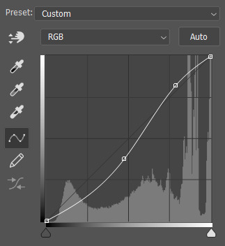
As you can see, I have added two points to the curve. It’s hard to explain how this works but basically moving the curve above the diagonal background line will make things brighter and below darker. If you move the left side of the curve you’re modifying the shadows, if you move the right you’re modifying the lights. Most of my curves tend to look like this unless the gif is already very bright, and then I won’t brighten the lights but just darken the shadows.
-Levels
They also allow you to change the contrast of your gif in a slightly different way. These were my settings:
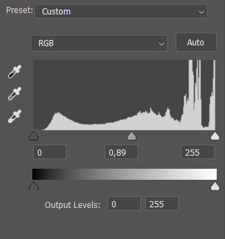
The more you move the first black slider to the middle, the darker your shadows will get, for the white one it’s the opposite. The middle slider regulates the brightness of midtones and I find it very useful, and it’s the only thing I changed for this specific gif.
As for the output levels slider, it works the opposite way. If you move the black arrow it will make the shadows less dark and vice versa. This is useful if you need to make your gif look more muted or lower the contrast, or if you have very bright spots.
Once I have applied these two adjustments, my gif looks like this:

It’s already a lot better, but I want it to be more vibrant and colorful.
-Selective color
The first thing I edit when I make gifs with people in them is skin tone. It often looks too light or too red, and it’s a great starting point to color. By using selective color you can modify the way a certain color looks in your gif. Usually skin tones fall under reds, so I start with them. These are my red settings for this gif:
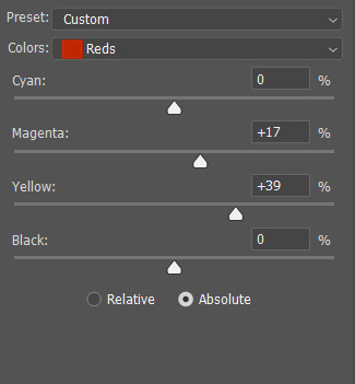
As you can see I have added a lot of yellows and magentas. What that does is it adds a pop of color and saturation to the skin tone. I always try to have more yellow than magenta or else they’ll end up looking sunburnt as heck. If the end result is too much I’ll lower the blacks.
Sometimes though you’ll notice that doing this won’t change the skin tone too much: this usually happens when the gif is very bright or weirdly lit, and the skin won’t fall under the reds category. You can use neutrals instead, but it will be less precise and color more than just the skin parts.
While I’m messing with selective color I’ll often change the whites and blacks as well, especially if there are weird colored reflections or lights that are messing with the overall coloring. I didn’t for this gif, but I did open the blues tab and crank cyan all the way up to add more color to the ocean behind.
This is my end results after selective color:

It’s good, but it still feels a little too yellow and cold, so I will play around with color balance.
-Color balance
This adjustment allows you to affect the way midtones, shadows and highlights look. It’s very effective for coloring gifs a certain tone and I use it a lot, but it’s not as precise as selective color is. it changes the way the whole gif looks instead of just a certain color, so be aware of it. Basically what I do is I just move around each slider until I like what I see. For this gif I barely touched shadows and highlights, but I did edit midtones to make them warmer and redder. These are my final settings:
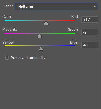
I usually like having more red/magenta/yellow for highlights and midtones, while bluer/more cyan tones for the shadows. Of course it varies from gif to gif but that’s my go to.
Now my gif looks like this:

I am happy with it so I save by going to file > save for web and devices. I try to use adaptive and diffusion as my settings but sometimes noise looks better or it’s too big and I switch to selective.
Other layers I often use are vibrance, but I try not to mess with the saturation slider because it makes everything look to red so I just stick to the actual vibrance slider, and brightness which is a quick way to make your gif look brighter and I will sometimes use it when I’m not happy with how my curves and levels turned out.
21 notes
·
View notes
Photo
One of the most frequent asks I get is “how do you make your gifs?” Previously I had just linked my FAQ where I have some resources on how to gif listed, but I figured to (hopefully) stop receiving the same ask over and over, I’d just make a tutorial on how I personally gif!
* Please note that everyone has different giffing styles and settings preferences, so the following is just how I make my gifs. Other people are likely to do things differently!
This post will be a comprehensive guide that includes details about DOWNLOADING VIDEOS, USING VAPOURSYNTH TO MAKE GIFS, USING PHOTOSHOP TO MAKE GIFS (+ a blurb on TOPAZ), and COLORING.
This post was last updated on July 30, 2020. Keep reading to get started!
DOWNLOADING VIDEOS
I use a number of sources to download videos/get video clips, depending on the origin of the video. In general, I try to gif from videos that are at least 1080p - the higher, the better. It’s almost impossible to make gifs look high quality if they don’t originate from a high quality video! Below are the sources I use:
TS files: kpop24hrs (you need an account), kpopexciting, occasionally torrent links from Google or download links from Twitter (search the group name + date in YYMMDD format + .ts)
Youtube videos: 4K Video Downloader
Vlive videos: Soshistagram
Twitter videos: Twitter Video Downloader
Instagram videos: Dredown
Long videos: If I don’t have the space (or patience) to download a certain video, or if it’s not a downloadable video (e.g. Fanship, paid online concert, etc.) then I screen record with Quicktime Player
(Side question: what’s a TS file? A TS file is essentially a very high quality video that you can find for live show performances and aired music show interviews! TS files are generally 60fps, so they’re how gifmakers can make those super clear and smooth live performance gifs. If a TS file is available for what you want to gif, use it.)
USING VAPOURSYNTH TO MAKE GIFS - OLD AND NEW VERSION
05/2020 update: I have re-installed Vapoursynth to its latest version, so I am including updated instructions/screenshots for both the old version (that I downloaded ~mid-2018) and the latest version.
After I’ve downloaded my video, I use Vapoursynth to crop, resize, sharpen, and denoise gifs. Vapoursynth is like Avisynth in that both programs can be used to crop and resize gifs without losing video quality, but VS has the added capabilities of sharpening and denoise. VS is the reason I don’t need to use Topaz on any of my gifs! You can install Vapoursynth here.
First you drag your video file to the Vapoursynth app installed on your computer. You’ll be prompted to enter a start timestamp in HH:MM:SS format (so if you want the video to start 5 seconds in, you would enter 00:00:05). Then you put the encoding duration also in HH:MM:SS format (if you want the video to be 8 seconds long, you would enter 00:00:08). Generally I’ll look for the exact moment I want to gif and enter the start timestamp 1 second earlier and have the encoding duration be between 3-5 seconds.
After you’ve entered this, a resizer.html window will automatically pop up. Below are screenshots of examples of my normal settings for my performance gif 4sets (ex. here or here) for both the old and new versions of Vapoursynth.
Old version:

New version:
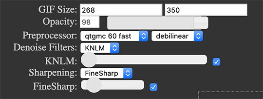
Below is an explanation of the parts:
GIF Size | The gif widths (the first number) recommended for Tumblr:
1 gif per row: 540px
2 gifs per row: 268px
3 gifs per row: 177px
You can use any height, but these are the ones that I tend to use:
1 gif per row: 243px or 300px most frequently, but sometimes I’ll do 220px/201px/400px/450px/540px depending on how large or small I want them
2 gifs per row: 350px
3 gifs per row: 300px, occasionally I’ll do 375px or 400px if it’s a very long video (e.g. some fancams)
Opacity | Don’t worry about this; it just changes how you view the video in the window.
Preprocessor | This refers to how the video will render! Super important because you’ll be given the option of 60 vs. 30 - these numbers refer to frames per second. For live performance gifs, I always use qtgmc 60 fast (slow in theory gives you better quality gifs but I’m far too impatient for that). For all other gifs, I do not use any preprocessing method. A basic rule is that if you’re using a TS file, you should preprocess it because it’ll de-interlace the file. If you’re using an mp4 or mkv or any other file, you don’t need to preprocess.
Extra Sharpening/Sharpening | Pretty self-explanatory. You can move the slider up or down depending on personal preference! I try to keep the sharpening low unless the video quality is especially bad. In the new version, I use FineSharp over VCFreq because I find the latter a little harsh for my tastes.
Denoise/Denoise Filters | Will help remove noise from gifs. In the old version, I almost always used the Light setting unless the video is super grainy, and then I might have chosen Medium instead. In the new version, I use KNLM at its lowest setting. I’ll only bump it up if the original video is quite grainy.
Once you’ve configured all your desired settings, you can copy & paste the output in the resizer.html window to your Vapoursynth editor file and enter the beginning and end frames.
The editor file for the old version:

The editor file for the new version:
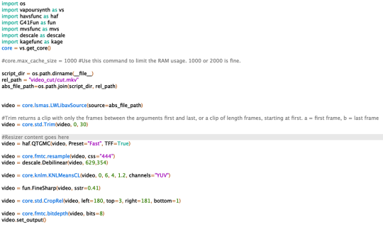
To make the gifs in the old version, just save the file and then wait until everything finishes processing! In the new version, you have to go to Script > Encode video, and then under the gif preset click ‘start.’ Wait until it finishes encoding. On my laptop, this takes anywhere from 20 seconds to 3-4 minutes, so sometimes you have to be patient. This is the end of the Vapoursynth portion of gifmaking.
USING PHOTOSHOP TO MAKE GIFS
To create gifs in Photoshop, go to File > Import > Video Frames to Layers and then select your video file/output file from Vapoursynth (output.mov). These are my settings to create the frame animation:

Once your frames have been imported, you can delete frames and add a coloring psd on top of all your layers.
Photoshop is also where you adjust the timing of your gif. In general, these are my settings:
30fps: 0.04/0.05
60fps: 0.02/0.03/occasionally 0.04 if I want it to be super slo-mo
Honestly, just use whatever timing setting that looks good to you! Some prefer faster gifs, others prefer slower, so just do what you like and things will be okay.
Save through File > Export > Save for Web (Legacy) with these settings (you can play around with selective vs. adaptive or diffusion vs. pattern; they all have slightly different looks, but 256 colors is a must):
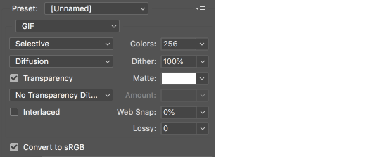
Make sure your gif is under 8mb - to decrease a gif’s size, I usually delete frames and/or use selective color to increase the black percentage for whites, neutrals, and blacks.
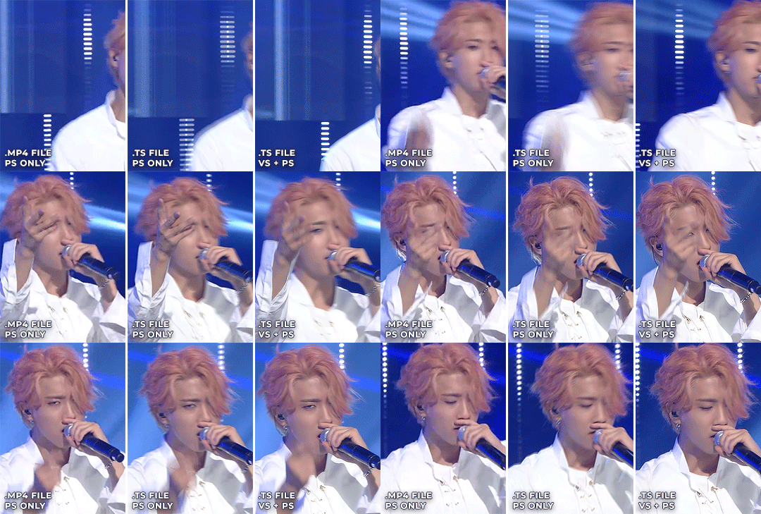
After you save, you’ll have your gif! Below is the same moment giffed in different ways to illustrate how much a difference that file type + giffing style can make. You can tell that the TS file is higher quality and less grainy than the mp4 file, but it really isn’t unless you use Vapoursynth that the gif becomes super sharp and smooth. This is because if you import a TS file straight into Photoshop, it will only import at 30fps because the video itself is interlaced. You have to run it through a de-interlacer (like VS) to actually get a 60fps clip.
With regard to TOPAZ*, I mentioned above that because Vapoursynth has sharpening and denoise functionalities built into the program, I no longer use Topaz. However, if you do not have access to Vapoursynth, then I highly recommend downloading Topaz (download links can be found through quick searches on Tumblr) and using Denoise and Clean to adjust your gifs. A warning: Topaz can take a long time to process and many gifmakers have a love/hate relationship with it, so be prepared for that. The way you apply Topaz is to select all your frames and layers, then do Filter > Convert to Smart Filters. Add the Topaz/smart sharpen adjustments, then Flatten Frames Into Layers. Once that has happened, hit Convert Frames > Flatten Frames to Clips and then Convert Frames > Make Frames from Clips.
COLORING
I get questions a lot on coloring and the truth is that coloring is an art - I by no means consider myself an expert, but I do experiment a fair amount with different settings and layers so I at least have a decent understand of what’s possible when it comes to coloring.
A few tips I’ll give:
Everyone has different coloring preferences! Whatever coloring you like may not be what others like, and that’s okay. Don’t be afraid to experiment!
PSDs are good for learning how to color - download premade ones and look at how other people made them: what layers did they use? in what order did they put them? what blending mode? at what opacity? These are all questions you’ll need to ask yourself when you create your own PSDs. (Remember not to edit others’ PSDs if they do not allow it, and given them due credit when necessary. Also don’t claim as your own!)
Tips to bring out idols’ natural tan/unwhitewash: increase vibrance, decrease brightness + increase contrast, use selective color and decrease cyan and increase black on the reds channel, use a gradient map that goes from a black/dark red to light pink/coral and change the blending mode to soft light or decrease opacity of the layer to 20-40%.
Below are some examples to show how much a difference coloring can make. I’d consider a basic PSD one that has less than 10 coloring layers/doesn’t make much change to the actual coloring of the gif besides lighting adjustments. More complex PSDs generally have 15 or more layers (the ones I used below in have 16-25+) and drastically change the colors in the original gif. You can also mix PSDs too - for a lot of my performance gifs, I’ll first add a basic PSD that increases the contrast of a gif to make the skin glow, and then I’ll add an additional PSD that adjusts colors and other various lighting aspects.

You can see just how much of a difference coloring makes:
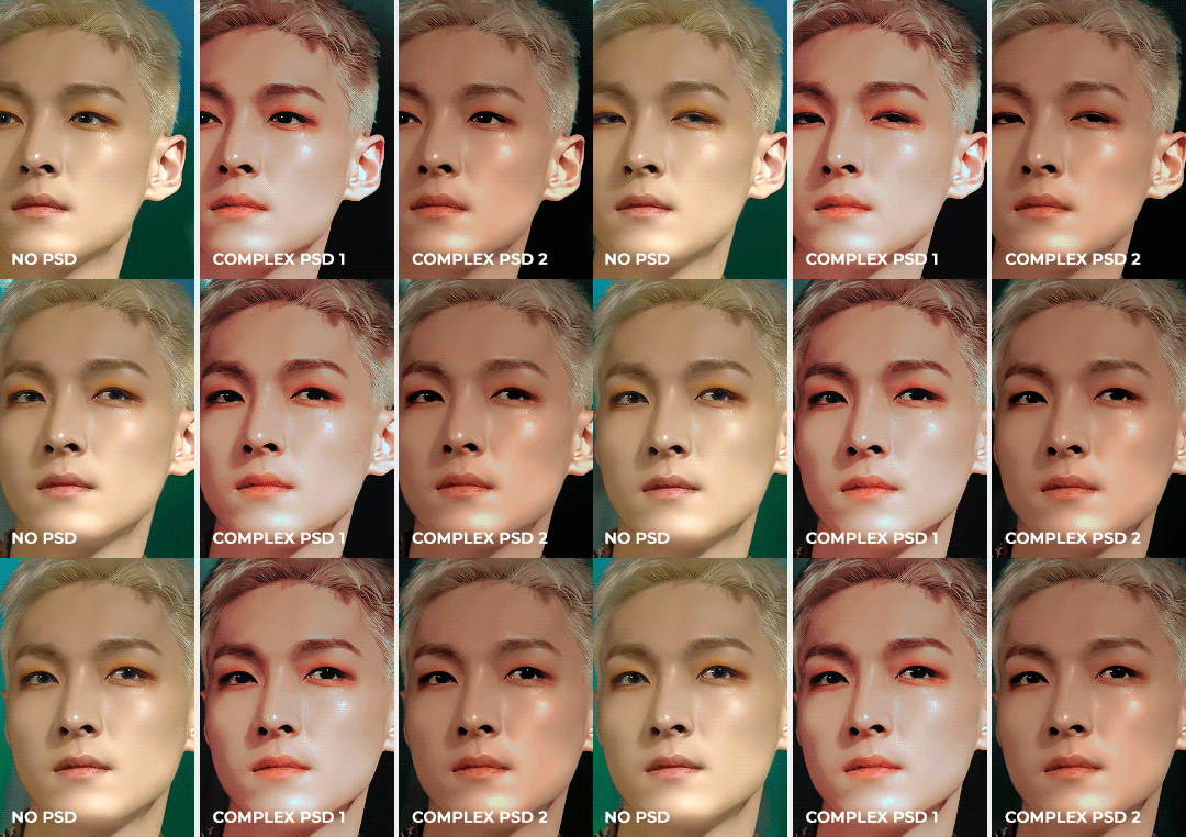
Don’t be afraid to experiment with different layers/styles! Everyone has individual preferences for how they like their gifs to look, and in a sense, coloring is the main way you can make gifs “yours.”
FINAL NOTES
Giffing is hard and requires a lot of patience - you definitely won’t be able to make amazing gifs right when you start! Even though I’ve been giffing for close to a year now, I still dislike many of the gifs I make and think that I can definitely improve. Don’t be afraid to reach out to other gifmakers for advice and help - 99% of the time, they’ll be happy to answer your questions!
I have posted a sped-up version of my gifmaking process here that you can also use as a resource!
Please let me know if I’ve missed something, and feel free to reach out if you still have questions. Good luck!
904 notes
·
View notes
Photo

Not An April Fools Gag; That’s A Game Boy Advance With A GameCube Stick Affixed For Reals
What you're seeing is a modded GBA that I spotted on eBay. It's a real thing! Though it doesn't magically grant analogue control to all the digital input only games on the system, which is all of them for the record (sorry). Then again, it could be argued that the controls in WarioWare Twisted is technically analogue...
That aside aside, welcome to yet another recap of stuff posted over at the Attract Mode Twitter! Though this time it's gonna be a bit on the short side, relatively speaking; even I know covering two entire whole weeks has led to hard to handle Tumblr posts, so I'm going to try concentrating on just one week at a time/attempt weekly updates.
Let's see how well that goes...
Hey, it's SF2 IRL thanks to ARKit (via prostheticknowledge)...
youtube
At the time, when I first tweeted about it, there were only three left of Amanda Visell’s Player One Mario; no idea how many there are now...
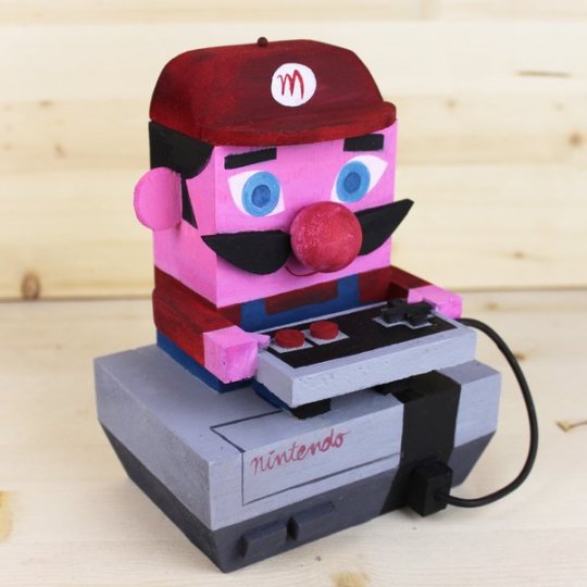
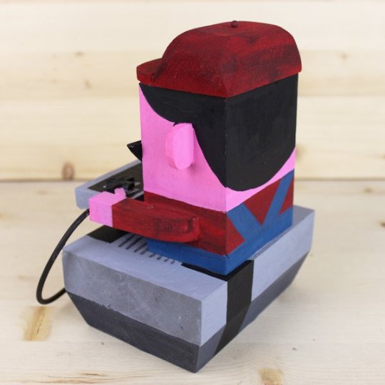
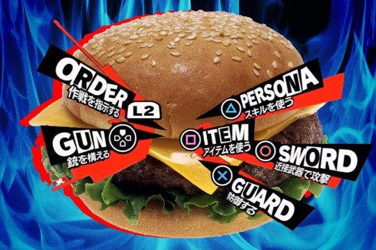
When you can make a decision regarding lunch (via @Mechazawa)....
If you appreciate both the ease of slip-on sneakers and the taste of ghosts, then Games Glorious has something for you (via miki800.com)...


As a connoisseur of video games on the printed page, it is my goal to one day own a copy of Namco's newsletter that was distributed in game centers during the 80s & 90s, NG (via miki800)...
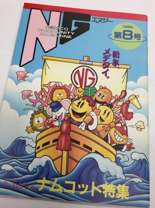
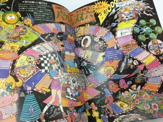
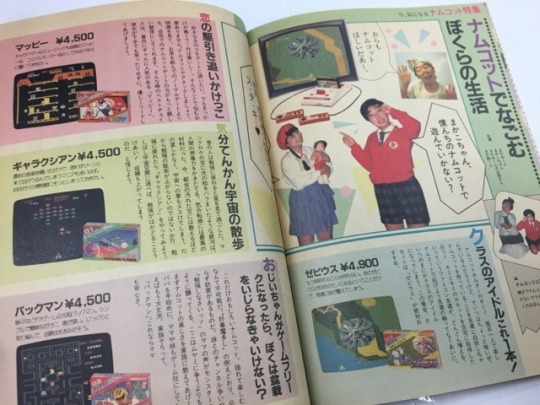
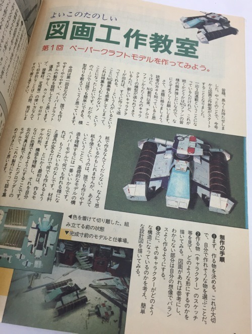

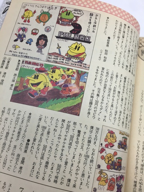
Remember that time Namco got someone from Yellow Magic Orchestra to hawk their wares (via namcomuseum)...
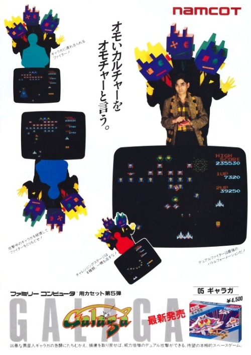

Both in print and on TV…
youtube
The YMO member in question, Haruomi Hosono, also did a Xevious remix album, which longtime readers of the blog will hopefully recall.
Sticking with Namco CMs, there’s a pair of longtime faves that I could have sworn I’ve already posted as well, yet cannot find. Though as noted, many times already, the search functionality here is broken.
So here’s a boy playing with his Famicom in the middle of the woods...
youtube
And here’s a girl playing with his Famicom in the middle of the woods...
youtube
Back to the subject of print, can’t seem to find any info on the Futabasha Fantasy Novel Series, which (I think) was a line of video game novelizations; this one appears to be written by the creator of Xevious himself (via shmups)...

The focus here is supposed to be the Lawson’s reward card with Kirby on it, but I am all about that Space Invaders whatever the heck it is (via miki800)...

Spent MANY hours at Japanese bookstores during my college years, flipping through Sega Saturn Magazine; seeing these VF Kids ads again makes me feel all warm & fuzzy (via thesegasource)...
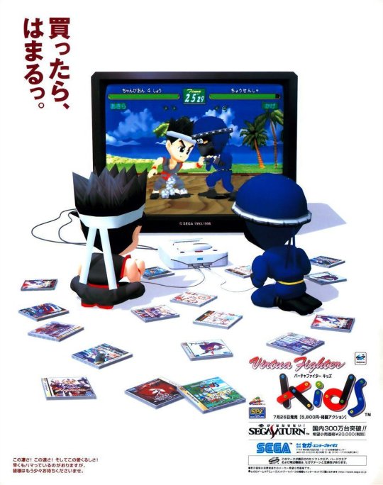
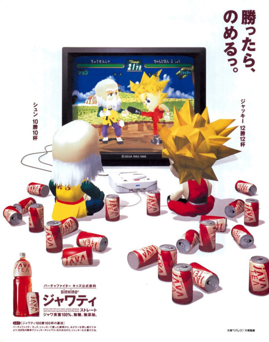

This (what I believe to be a) farewell image of the face of the Saturn from the very first issue of Dreamcast Magazine, also gives me the feels (via oldgamemags)...

BTW, everyone knows the identity of Saturn's pitchman (Segata Sanshiro), but what about the Mega Drive's? (via yokosuka87)...
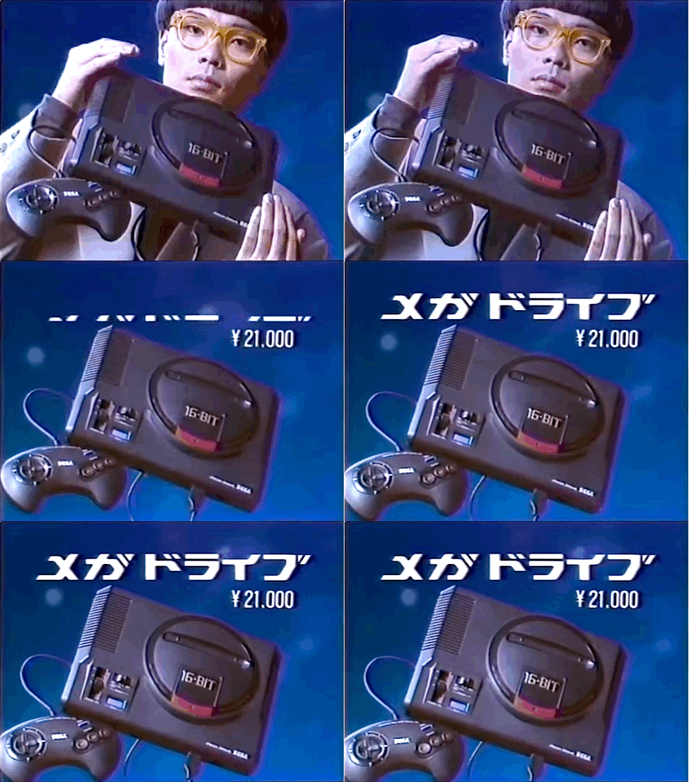
Back to the Saturn; I love how Sega want from Segata Sanshiro to Hidekazu Yukawa for the Dreamcast. This launch edition of the console, btw, was spotted at VideoGamesNewYork...

It's also where they Kira Kira Star Night DX for twice the asking price, as @gamespite)...

Speaking of music, to fully enjoy this animated gif of Eggman running…

… you need to have this song playing (via lunaticobscurity).
And to fully enjoy this image of Eggman on the sax…
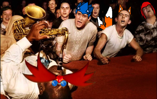
... you need to have this song playing (via very-territorial-oak).
@ondoruragitan sez: "whoever designed that clown lady in ace attorney is probably the most horny artist to ever exist" (it's funny cuz it's true)...

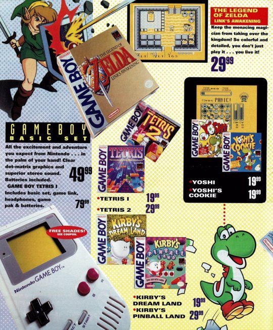
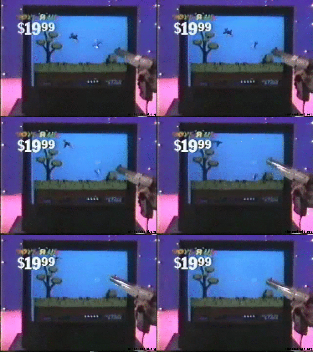
So the big news these past few weeks, especially among video game folk my age, has been the end of the Toys R Us. Many have been sharing artifacts from the glory days, with my fave example being these old flyers, with the obvious highlight seeing all the original MSRP prices (via retrogamerblog)...



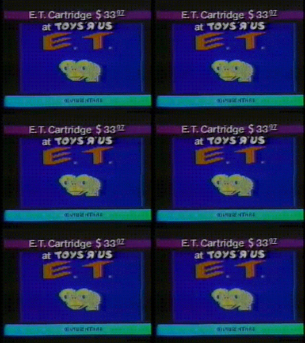
Oh, and don’t forget the gifs (via nintendroid)...

The following are more appropriate for my way, way overdue batch of game culture snapshots, but since we're on the subject of retail anyway; I recently stumbled across Nintendo's collab with Bloomingdale's that I had no idea even existed...

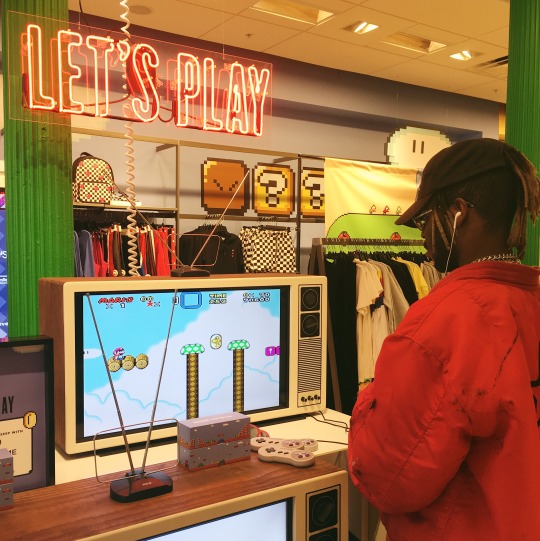
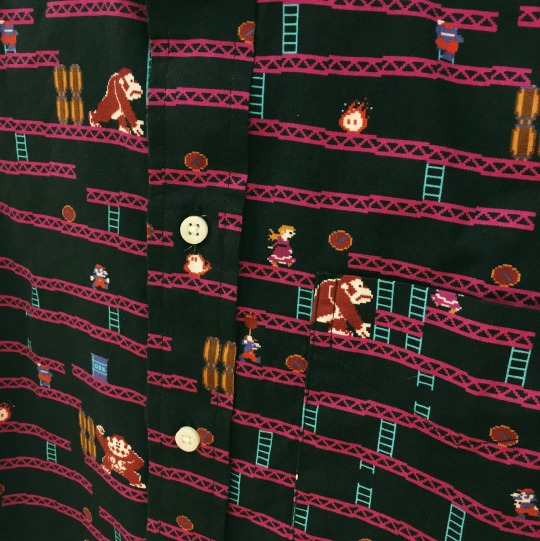
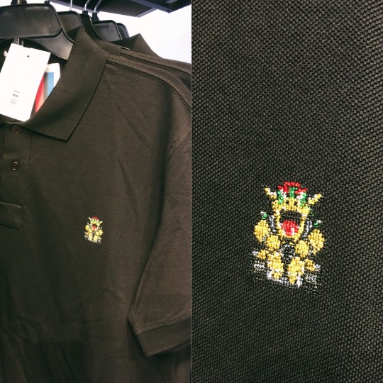
Took a bunch of pics, but unfortunately, due to the harsh lighting at the SoHo store, it was impossible to capture the women’s section, hence the abundance of men’s wear...
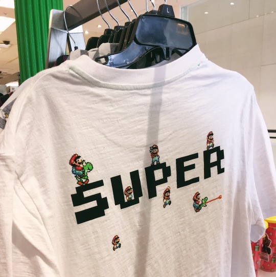
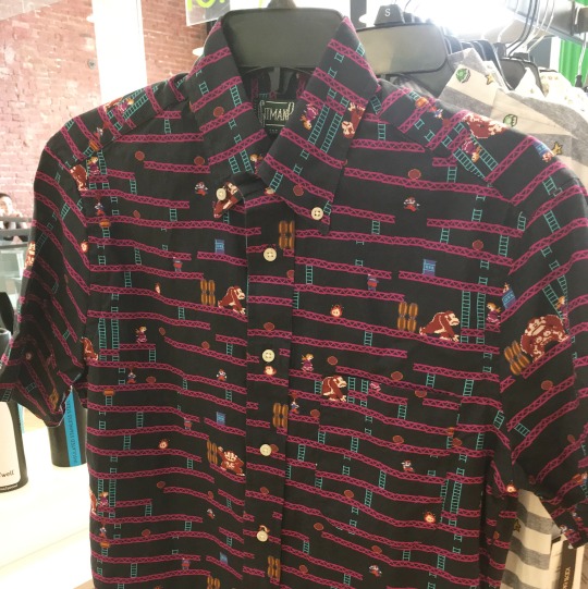
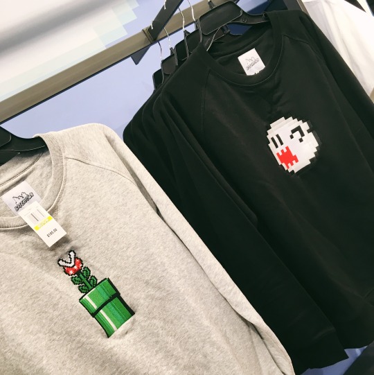
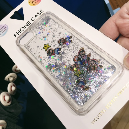
These women's sweatshirts are the best example of the line's overall design sensibilities, or lack thereof; it’s just a bunch of random Nintendo sprites on attire that is available at Bloomingdale's, period. That's all it aspires to be, nothing more...
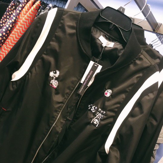
... And that's a real shame, cuz aside from the quality of the clothing itself being high, some of the ho-hum looking designs could be really engaging with a few minor tweaks, like this b&w women's jacket with a very random assortment of b&w Super Mario World sprites...
In addition to clothing, you had accessories, like iPhone cases...
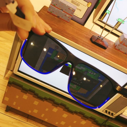
Plus sunglasses, which revealed Super Mario World playing on what appears to the naked eye to be a blank, white screen....
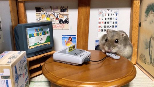
Speaking of Super Mario World, here's a hamster enjoying the game (via @kousuke_teppei)...
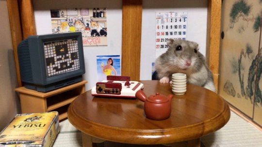
The lil guy also owns an original Famicom, and here we is playing Solomon's Key (thanks to @Topherocious for helping me to identify the game)...
Being that friend who is REALLY into video games means I'm asked a wide variety of questions from folks who are not, like why @beesmygod is "freaking out" over a Sonic & Garfield two pack for the PC...

... I'll be honest, I don't really understand why either.
Here we have a mockup for an ad blocker that replaces banners with GBA screenshots, which I really want to see happen (via @tinycartridge)...

I also really want to see this happen too (via @truongasm)...

Back to Tiny Cart; that's where I found out that you no longer have to play emulated Tiger handheld games sans backgrounds...

Nothing beats a pic of a dimly lit arcade, especially when it's shot on ACTUAL film (via mendelpalace)...

As for this particular arcade show, @kappuru theorizes "it looks like cinestill film, or a filter designed to mimic it." (via parkerwoods)...
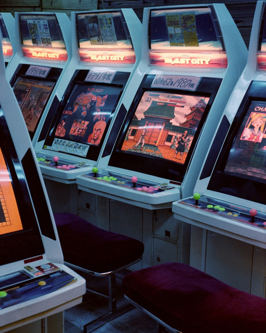
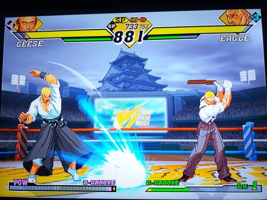
"WHO IS THIS NUN?! WHY DOES SHE LOOK SO SINISTER?" is a great KOF related question (via vice-s-assistant)...

And "BOWL BEFORE ME" is a great KOF related gag (via brondeef)...

"this is the best cosplay i’ve ever seen" is a a great costume play related observation made by lunaticobscurity...

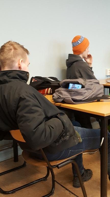
"how to get away with playing super mario odyssey in class" is the caption given by retrogamerblog...
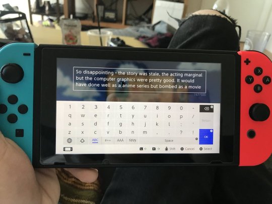
"Stardew Valley gave me 500 characters to use as my farm name, so I put down an entire 1-star amazon review for an Independence Day DVD" is the explanation given by @NoahHafford...
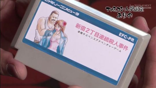
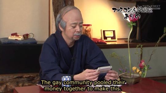
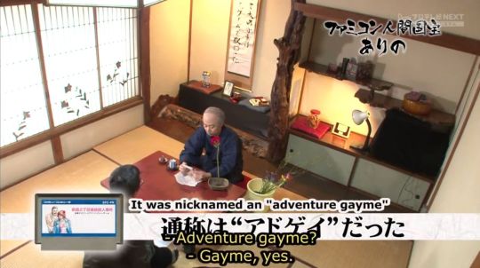
Hey, you never know, maybe one day a homebrew dev might make “Shinjuku-Nichome Gay District Serial Murders” a reality? (via mendelpalace)

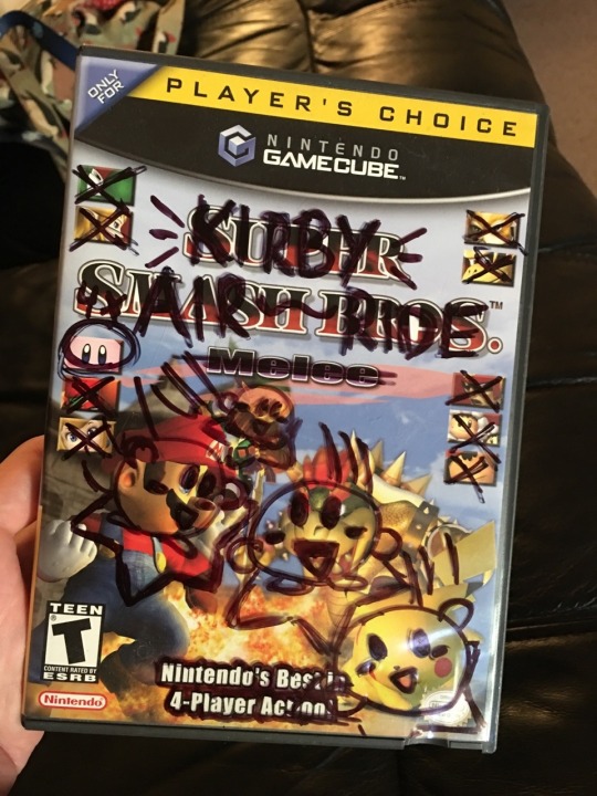
When you’ve got one copy of Melee with two boxes, and one copy of Air Ride with zero boxes… just gotta improvise (via stellatuna)...
When you’ve got a killer Game Genie code but no paper to write it down on... and then you discover the code does something totally different (via theassortment)...

And when I asked what this 4koma featuring a Dreamcast VMU was all about, @JonahD was kind enough to explain: "VMUs are playing hide and seek, Black is seeking. One VMU thinks hiding in the controller would be good but it makes a bunch of noise and they’re found immediately" (via posthumanwanderings)...

Whereas I have yet to find out what all these Sonics are doing at a German airport (via sonicthehedgeblog)...

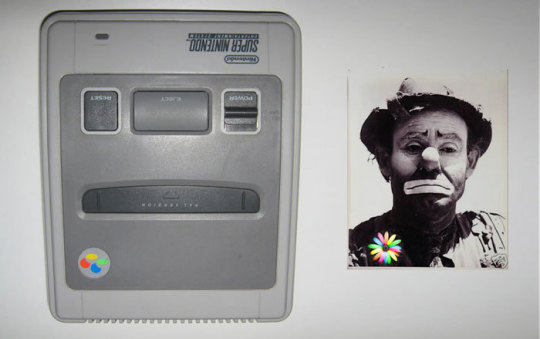
I normally don’t let the weather get to me, yet the constant cold weather in NYC over the past few weeks began taking its toll, to the point that I’m starting to resemble an upside down Super Famicom/European SNES (via sixteen-bit)...
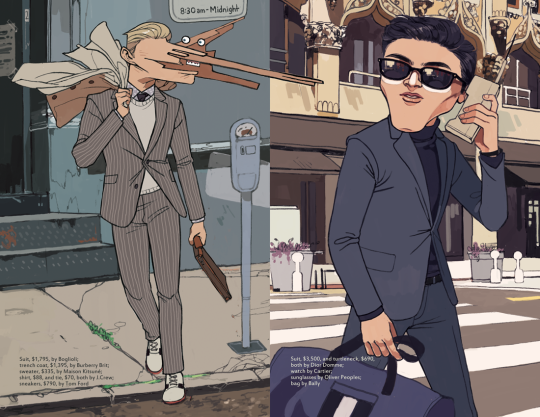
I also really wish I could have checked out Sakura-Con, and not just cuz the weather is so much nicer in Seattle, but to pick up @alexisparade's Monster Factory zine...

I stared at gif illustrating the wacky perspective-related behavior of Super Mario 64’s trees for an entire day, no joke (via suppermariobroth)...

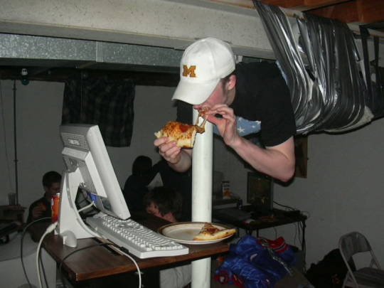
Here we have the rarely seen alternate angle of the internet famous "LAN party gamer duct-taped to the ceiling" photo (via reddit.com)...
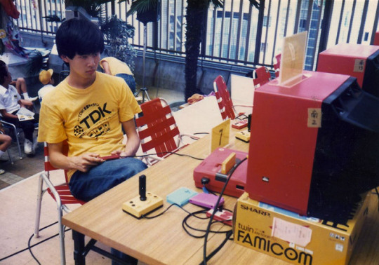
Turning the clock back even further, here's yet another kind of party, one that doesn’t involve first person shooters but shoot ‘em ups; it’s the 1986 Hudson Caravan (via videogamesdensetsu)...

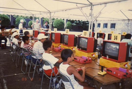
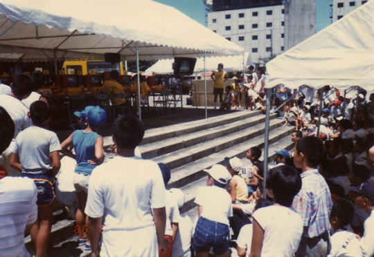
Recently, a modded NES Max controller showed up on Kotaku, in which the cycloid nub has been replaced with an analogue stick...
youtube
... Which actually appeared the day after I spotted that modded GBA at the very top of this page. I am also willing to admit the disappointment over my tweet not catching on as expected/hoped it would, hence why I'm sharing another pic...

At any rate, I was also reminded of my buddy Nick Santaniello's modded Jaguar controller, which allows for arcade perfect Tempest 2000 controls...
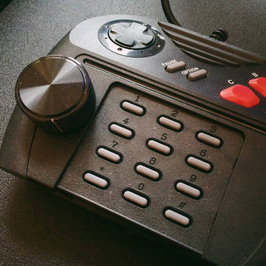
... Which in turned led to me republishing the post from which it hails from originally, my recap of Nick's Shmup Appreciation Night, for Medium (and also sharing additional pics on Twitter)...
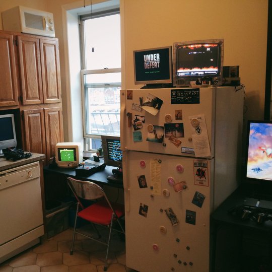
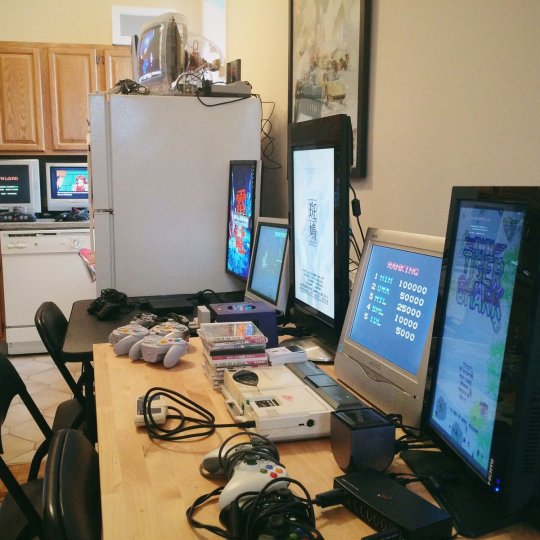
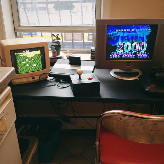
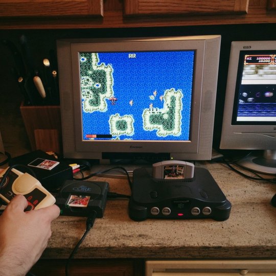
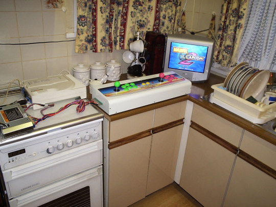
BTW, for those wondering, based upon the last round of tweets; the kitchen isn’t just for playing old Mega Drive & PC Engine shmups… you can also play old Naomi fighting games (via internetflexin)...
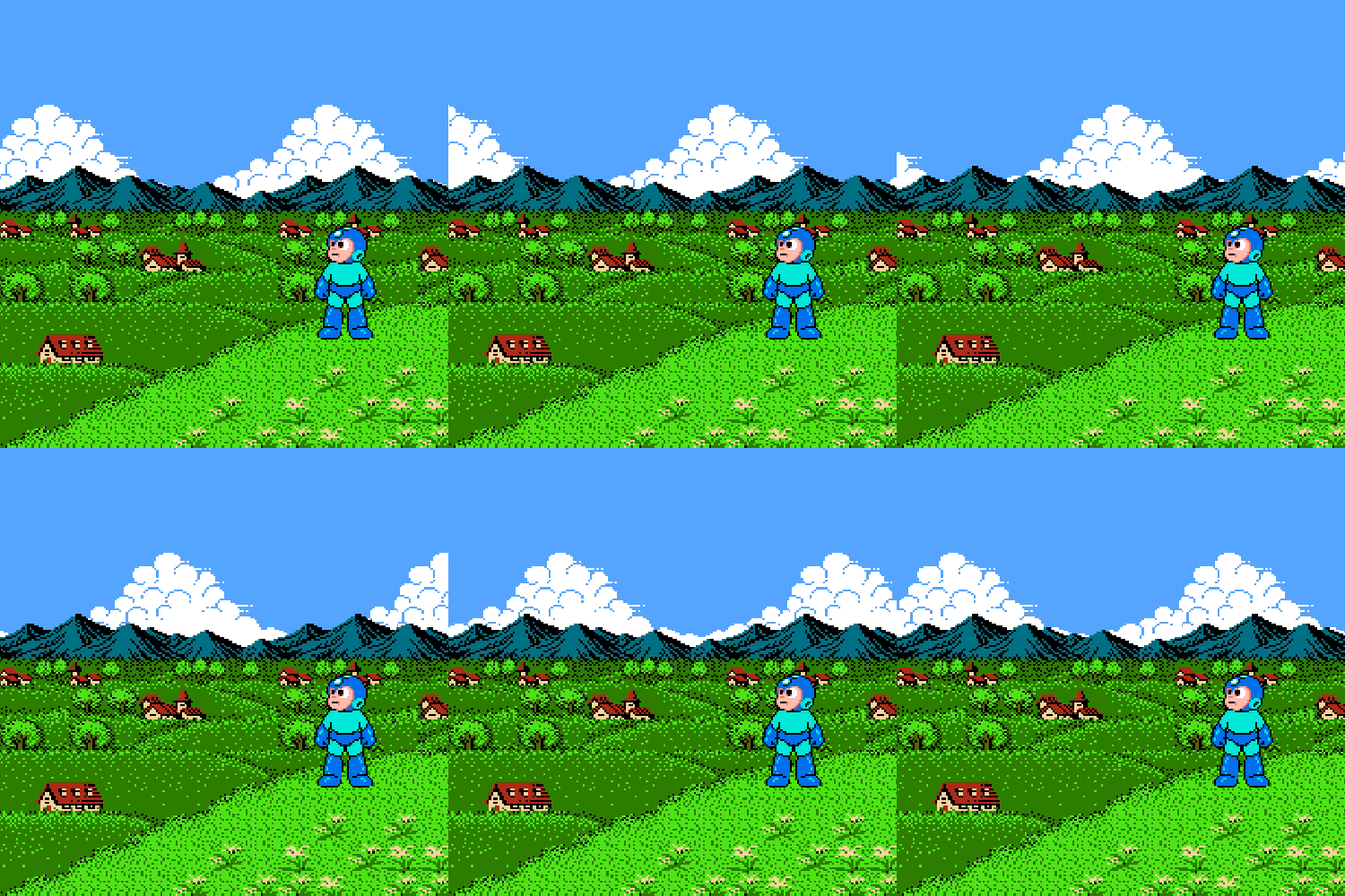
Guess that's it for now? Sorry, but it finally feels like spring in NYC, and I feel the need to step away from the computer & enjoy weather! Just like Mega Man (via arcadequartermaster)...
60 notes
·
View notes
Text
CAVA103 Digital and Online Week 1
Platform ideas https://www.artstation.com/ https://www.flickr.com/ https://www.instagram.com/karen.anita.monique/ https://www.youtube.com/channel/UCqAepbf2Easw7N2qFUXr5mQ?view_as=subscriber
Research Video Art
https://www.tate.org.uk/art/art-terms/v/video-art

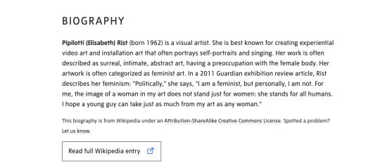
https://www.tate.org.uk/art/artists/pipilotti-rist-5465


https://www.tate.org.uk/art/artists/sanja-ivekovic-7504

https://www.tate.org.uk/art/artists/nam-june-paik-6380

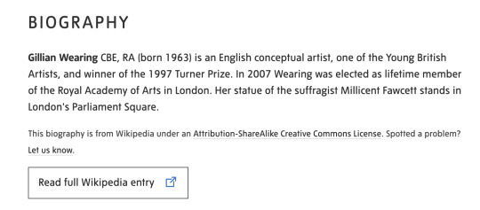
https://www.tate.org.uk/art/artists/gillian-wearing-cbe-2648


https://www.tate.org.uk/art/artists/mona-hatoum-2365
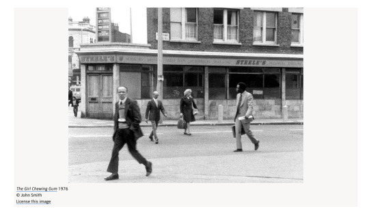
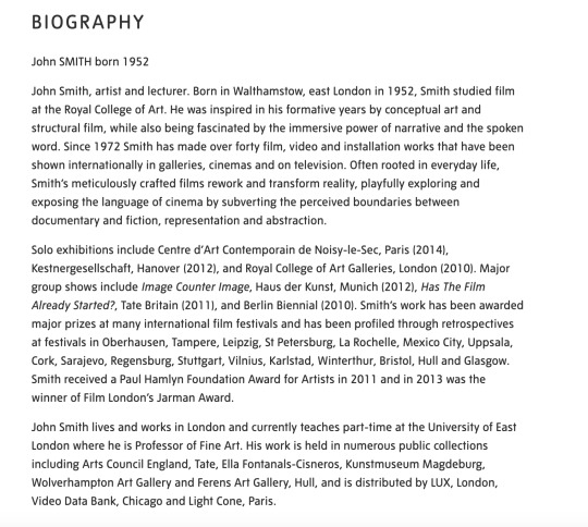
https://www.tate.org.uk/art/artists/john-smith-12243
Artist research - focus of this workshop is not on the art itself but on building an online presence/audience - will come back to this
Discussion with Travis
Peer examples of Video Post:
Bubbles time lapse drawing - Zyner Creative - Andrew Bell (clip studio) - look at Andrew's description - link back to other sites
Beach Bloom - CACS103 Digital Drawing - 21 miles - Maddy (?) (building an aesthetic with music, etc)
Free Stock Music freestockmusic.com
Soundcloud Royalty Free
My Videos - can do as downloadable:
Envato video - short
Shutterstock
How I can edit Video: Premier, After Effects
Road Video - Examples to look at:
Drive 4K - Pacific Coast Highway - USA https://www.youtube.com/watch?v=whXnYIgT4P0
Train Driver's View: Winter is finally here! (Bergen - AI) - https://www.youtube.com/watch?v=jE5DAisHbe8
Could I use ambient noise for video?
Maybe do a rain video? It will be raining on Friday - I can test
Researching sites for photographers:
https://expertphotography.com/social-media-sites-for-photographers/
From the Studio Supplement:
View/read/explore:
Naval Ravikant: The Internet Has Massively Broadened Career Possibilities (2019) [https://nav.al/possible-careers]
Naval Ravikant: Product and Media are New Leverage (2019) [https://nav.al/product-media]
Kevin Kelly: Better Than Free (2007) [https://www.edge.org/conversation/kevin_kelly-better-than-free]
Axel Bruns: Produsage: A Working Definition (2007) [http://produsage.org/node/9]
Affinity Designer [https://affinity.serif.com/en-us/]
SketchBook [https://www.sketchbook.com/education
]Krita [https://krita.org/en/]
Clip Studio [https://www.clipstudio.net/en]Inkscape [https://inkscape.org/]
Photomosh [https://photomosh.com]
GIPHY Creator [https://giphy.com/create/gifmaker]
Creative Commons Content Search [https://search.creativecommons.org/]
Looking at getting image sizes right for instagram https://later.com/blog/instagram-image-size/
Working on Projects:
Canberra Night
Video taken from apartment in Canberra 14SEP19
Didn't take my tripod so had to balance my camera on a toaster and some plastic chopping boards. Tried several sequences, slightly adjusting the viewpoint.
Looked at Adobe After Effects - not what I'm looking for for this video
Going to use Adobe Premium Rush - was thinking about cropping but happy to leave, as I like how it gives context to how the video was shot, ie through a window
Downloaded sound via Envato (Audio Jungle) - 'Sound inside the Car' - purchased a multi use version as I may use again in my road videos.
Having problems with the Audio - back ground noise still playing and can't hear sound audio - will need to do further research.
Found problem - I had muted the audio on one of the video sections but not the other, I had selected mute on the sound audio in error.
Tried to find a way to loop the sound audio - wasn't able to work out. I duplicated the audio instead. There is a slight gap between files - need to work out how to fix this.
Couldn't find a way to do this.. Only references to gaps in Premier Pro - opened exported file in Pro. No gap in audio but there is a dip in sound, this be the 'gap' I am hearing - thinking I may be able to trim this out in rush? No.... didn't work - will need further help.. hoping is possible? I might try to do from scratch in Pro. Doing project in Pro - found this tutorial https://www.youtube.com/watch?v=Rnwelex3F_U - got the audio to work
Had some problems working in the Panels in Pro so watched some tutorials from here https://helpx.adobe.com/au/premiere-pro/how-to/work-explore-panels.html
Looked at https://helpx.adobe.com/au/premiere-pro/how-to/export-video-share-social-media.html for best export format. NB Select program before exporting.. I exported media file from the Source window on the first try. I also need to investigate further the publish features in export - I am experimenting with the You Tube function... also need to research the best way to publish to You Tube using description, tags, etc. Taking a lot longer with publish to You Tube - I had walked away and have come back... upload time sitting at over 24 minutes - it may have taken as long to upload on to You Tube anyway? It worked 🙂 I had to log out and log back into You Tube to see (or could have been a time thing?) https://youtu.be/aCb1fIv9AWw

Downloaded video from drop box onto my phone ....
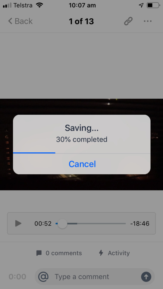
Had a couple of teething problems using cut story - not enough space on my phone...


Posted 1st 1 minute video on instagram - linked instagram to tumblr and twitter accounts

Researching Tags on You Tube
Drive 4K - Pacific Coast Highway - USA

Train Driver's View: Winter is finally here! (Bergen - AI)


Updating advanced settings

Look at peer YouTube Channel Zyner Creative (Andrew Bell) for Description inspiration

My updated settings:

Reviewing/Researching Hashtags for Instagram
Hashtags I have used for video

Added the following tags to YouTube video
Research # on Instagram posts: #video 59,448,124 #videography 5,509,108 #videoart 1,041,608 #videogram 2,128535 #canberra #digitalart 40,687,723 #night 131,352,521 #nightscape 1,344,255 #nightsky 4,121,597 #uow 62,598 #uowcreative 266 (wow...) #wollongongartist 3,384 #australianartist 782,995
Reflection - is it good to use a # where there are a lot of posts so hopefully more reach? But also a lot of competition.. Or is a smaller niche better? But would there be less reach...
https://www.instagram.com/explore/tags/nightscape/

Top post on #nightscape are about stars/night sky but cityscapes are amongst the mix

#nightsky is mostly... about the night sky but there is some city shots


#canberra is a mixed bag.. but there is a lot of focus on Floriade/flowers (?)
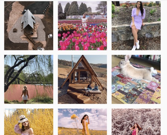
Linked my twitter account (some teething problems with account/password - I'm sure I created account already but had to do again - may have to do with my phone number being linked to another account??) and Tumblr.

Not a very exciting post on Twitter... no image (?)
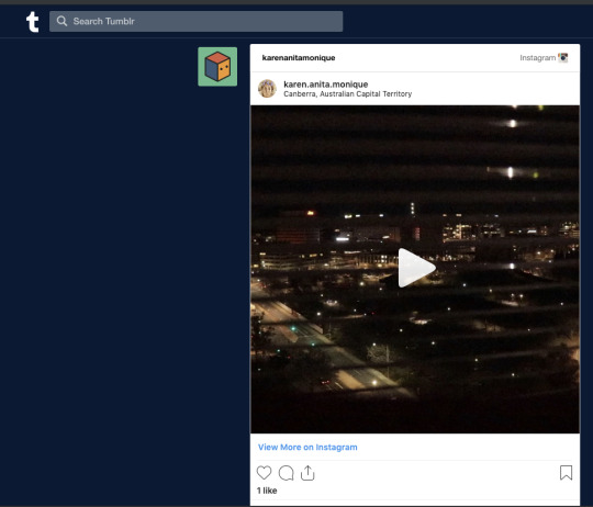
Better on Tumblr...
Not a lot of interest on You Tube or Instagram.... queue existential crisis.. deep breath... my work is not shit....
Instagram


YouTube
youtube

Recorded some rain video and slow shutter images Added another Canberra Nightscape to Instagram (2) - added a black and white filter and less hashtags to experiment with engagement Researched songs on Audio Jungle - looking a Country, rock & rain for my various videos... saved as favourites for later in the week. Something different to post - I took this image on 23SEP19 for Concept & Process

Posted on my iMac via the Flume app
Added post manually to Twitter

And Tumblr
Tried to update Tumblr avatar... unsuccessfully, firstly had problems with the orientation, now the size/crop? I give up for now..


0 notes
Text
Lightroom CC Mobile for iPad Review | Can It Fit Into a Pro Workflow?
Ask a room of professional photographers what they think of Lightroom CC Mobile for iPad and you’ll hear a lot of opinions: “It’s not ready,” “useless for a professional workflow,” “fun for editing a photo here and there.” I’ve heard all of these comments and more, but I wanted to test it for myself. I have a lot to say about Adobe’s other offerings, Lightroom “Classic” and “CC,” which I’ll save for another day.
For this review I wanted to thoroughly test Lightroom Mobile for iPad by attempting to edit a full wedding. This should demonstrate whether it’s possible to use it for professional work or if it’s really only useful for amateur photographers and the occasional quick edit.
importing
Importing photos into Lightroom Mobile is fairly simple. If your photos are in your iPad photo gallery, you can import them from there. Most professional users, however, are probably going to upload their images to a computer first, which is what I do.
I start by importing photos in Lightroom Classic directly to a hard drive. From there, you can select the folder to upload to the cloud by creating a collection. Once your photos are uploaded to Adobe’s Cloud, you’ll be able to access the files in Lightroom Mobile on your iPad. For a wedding with around 5000 photos, it took me about 30 minutes before I was able to access the entire wedding on my iPad. That’s pretty impressive if you ask me! One great thing about this feature is that it gives you an additional backup. The more backups you have, the better.
Also, if you add a preset to your photos on import in Lightroom Classic, you’ll see that preset applied in Lightroom Mobile. From here, you can start culling your photos. So far, so good.
Culling
Culling in Lightroom Mobile is actually really easy and probably my favorite feature. In order to select your favorite photos you tap the star on the bottom right panel and then you simply swipe up to pick a photo and down to reject it. It’s really that easy, and once you’re done, it’ll sync with your other Lightroom applications. It’s great for culling while you’re traveling or just out at a coffee shop.
https://www.slrlounge.com/wp-content/uploads/2019/01/GoRecord1-15-2019.mp4
presets
Lightroom Mobile for iPad will not currently sync with the presets that you have in Lightroom Classic. You can, however, create presets or add them to Lightroom CC and they’ll port over to Lightroom Mobile. When you create a new preset in Lightroom CC, it’lll be added automatically to Lightroom Mobile within seconds. One negative here is that, as I understand it, Lightroom CC/Mobile are not compatible with custom profiles. So for now, you’re stuck with the Adobe color profiles. So if you have a fancy preset pack that you’re trying to install, just keep that in mind.
editing
I’ve found editing in Lightroom Mobile to be a mixed bag. On the positive side, most of the controls that you could want are available, including features like split toning, tone curve, noise reduction, radial/gradient filters, etc. The adjustments are all there for a professional to use LR Mobile to edit photos as well. And using them is fairly easy.
To make an adjustment, you just select the correct category, which opens up an adjustment menu, and then move the slider left or right to make the adjustment. In real use, however, this process is very slow and if you forget what setting is under which category, it might take you a while to find it. For example, the HSL adjustment is found in a little color wheel hidden to the right of the Color category drop down. It’s actually fairly hard to find and should really just be available when you open the color tab to begin with.
The problem really comes when editing large numbers of images. So far I haven’t found a way to batch edit large groups of images, or copy settings easily from a previous photo to multiple images. If you’re using a keyboard, you can press CMND+C (if you have a keyboard attached) and copy settings and paste them to another photo. Or you can use the “apply from previous photo button” in the side panel.
The problem is it doesn’t appear there is a way to do this for more than one photo at a time. So if your workflow involves making white balance, exposure or other adjustments to more than one photo at a time, you’re out of luck here. That, in my opinion, renders Lightroom Mobile unusable for professionals who will be editing a large number of files, i.e. wedding photographers, travel photographers, sports photographers, etc.
exporting
Exporting a photo from Lightroom Mobile to a file or camera roll is as easy as selecting the photos and then selecting the save to file/save to camera roll option. If you’re trying to export an entire wedding, however, you’re going to want to leave Lightroom Mobile and go back to either Lightroom Classic or CC, wherever your original files are imported. Once there, your photos should sync the edits that you’ve made in Lightroom Mobile and you can then export following your normal workflow.
Final thoughts
Lightroom Mobile for iPad is a fun tool for editing a photo here and there, and is actually fairly useful for culling. It’s a great tool for the amateur photographer looking to make adjustments to a few photos from vacation or something taken on their phone/iPad.
For professional use, however, it simply falls short. The interface is still too clunky. It takes too much time to open each category to make an adjustment and the settings are not intuitively organized, so it’s often hard to find what you’re looking for. And considering that you can’t easily batch process photos with it, it’s pretty useless for editing an entire wedding/event. If you’re a portrait, headshot, or landscape photographer you might find it useful for your workflow, but it’s probably still not going to replace Lightroom Classic.
So who/what is Lightroom Mobile useful for? I think it’s great for amateurs and pros who want to edit a small number of photos on the run. It’s great for making some quick adjustments and adding an image to social media.
All of my criticisms aside, I love that Adobe is moving toward a cloud-based editing system. I am longing for the day that I can seamlessly move from editing on my laptop to my iPad and have everything synced. Adobe is close, but I think we’re still a year or two from seeing it implemented in a way that pros can depend on. If Adobe were to make the editing interface more intuitive, allow shortcuts, add batch processing, enable history and a few other changes, Lightroom Mobile for iPad might just be my ideal editing platform. Until then, however, it’ll probably only be used to cull once in a while and edit the occasional iPhone photo, and that’s just sad.
from SLR Lounge http://bit.ly/2HkKrSl via IFTTT
0 notes
Text
Lightroom CC Mobile for iPad Review | Can It Fit Into a Pro Workflow?
Ask a room of professional photographers what they think of Lightroom CC Mobile for iPad and you’ll hear a lot of opinions: “It’s not ready,” “useless for a professional workflow,” “fun for editing a photo here and there.” I’ve heard all of these comments and more, but I wanted to test it for myself. I have a lot to say about Adobe’s other offerings, Lightroom “Classic” and “CC,” which I’ll save for another day.
For this review I wanted to thoroughly test Lightroom Mobile for iPad by attempting to edit a full wedding. This should demonstrate whether it’s possible to use it for professional work or if it’s really only useful for amateur photographers and the occasional quick edit.
importing
Importing photos into Lightroom Mobile is fairly simple. If your photos are in your iPad photo gallery, you can import them from there. Most professional users, however, are probably going to upload their images to a computer first, which is what I do.
I start by importing photos in Lightroom Classic directly to a hard drive. From there, you can select the folder to upload to the cloud by creating a collection. Once your photos are uploaded to Adobe’s Cloud, you’ll be able to access the files in Lightroom Mobile on your iPad. For a wedding with around 5000 photos, it took me about 30 minutes before I was able to access the entire wedding on my iPad. That’s pretty impressive if you ask me! One great thing about this feature is that it gives you an additional backup. The more backups you have, the better.
Also, if you add a preset to your photos on import in Lightroom Classic, you’ll see that preset applied in Lightroom Mobile. From here, you can start culling your photos. So far, so good.
Culling
Culling in Lightroom Mobile is actually really easy and probably my favorite feature. In order to select your favorite photos you tap the star on the bottom right panel and then you simply swipe up to pick a photo and down to reject it. It’s really that easy, and once you’re done, it’ll sync with your other Lightroom applications. It’s great for culling while you’re traveling or just out at a coffee shop.
https://www.slrlounge.com/wp-content/uploads/2019/01/GoRecord1-15-2019.mp4
presets
Lightroom Mobile for iPad will not currently sync with the presets that you have in Lightroom Classic. You can, however, create presets or add them to Lightroom CC and they’ll port over to Lightroom Mobile. When you create a new preset in Lightroom CC, it’lll be added automatically to Lightroom Mobile within seconds. One negative here is that, as I understand it, Lightroom CC/Mobile are not compatible with custom profiles. So for now, you’re stuck with the Adobe color profiles. So if you have a fancy preset pack that you’re trying to install, just keep that in mind.
editing
I’ve found editing in Lightroom Mobile to be a mixed bag. On the positive side, most of the controls that you could want are available, including features like split toning, tone curve, noise reduction, radial/gradient filters, etc. The adjustments are all there for a professional to use LR Mobile to edit photos as well. And using them is fairly easy.
To make an adjustment, you just select the correct category, which opens up an adjustment menu, and then move the slider left or right to make the adjustment. In real use, however, this process is very slow and if you forget what setting is under which category, it might take you a while to find it. For example, the HSL adjustment is found in a little color wheel hidden to the right of the Color category drop down. It’s actually fairly hard to find and should really just be available when you open the color tab to begin with.
The problem really comes when editing large numbers of images. So far I haven’t found a way to batch edit large groups of images, or copy settings easily from a previous photo to multiple images. If you’re using a keyboard, you can press CMND+C (if you have a keyboard attached) and copy settings and paste them to another photo. Or you can use the “apply from previous photo button” in the side panel.
The problem is it doesn’t appear there is a way to do this for more than one photo at a time. So if your workflow involves making white balance, exposure or other adjustments to more than one photo at a time, you’re out of luck here. That, in my opinion, renders Lightroom Mobile unusable for professionals who will be editing a large number of files, i.e. wedding photographers, travel photographers, sports photographers, etc.
exporting
Exporting a photo from Lightroom Mobile to a file or camera roll is as easy as selecting the photos and then selecting the save to file/save to camera roll option. If you’re trying to export an entire wedding, however, you’re going to want to leave Lightroom Mobile and go back to either Lightroom Classic or CC, wherever your original files are imported. Once there, your photos should sync the edits that you’ve made in Lightroom Mobile and you can then export following your normal workflow.
Final thoughts
Lightroom Mobile for iPad is a fun tool for editing a photo here and there, and is actually fairly useful for culling. It’s a great tool for the amateur photographer looking to make adjustments to a few photos from vacation or something taken on their phone/iPad.
For professional use, however, it simply falls short. The interface is still too clunky. It takes too much time to open each category to make an adjustment and the settings are not intuitively organized, so it’s often hard to find what you’re looking for. And considering that you can’t easily batch process photos with it, it’s pretty useless for editing an entire wedding/event. If you’re a portrait, headshot, or landscape photographer you might find it useful for your workflow, but it’s probably still not going to replace Lightroom Classic.
So who/what is Lightroom Mobile useful for? I think it’s great for amateurs and pros who want to edit a small number of photos on the run. It’s great for making some quick adjustments and adding an image to social media.
All of my criticisms aside, I love that Adobe is moving toward a cloud-based editing system. I am longing for the day that I can seamlessly move from editing on my laptop to my iPad and have everything synced. Adobe is close, but I think we’re still a year or two from seeing it implemented in a way that pros can depend on. If Adobe were to make the editing interface more intuitive, allow shortcuts, add batch processing, enable history and a few other changes, Lightroom Mobile for iPad might just be my ideal editing platform. Until then, however, it’ll probably only be used to cull once in a while and edit the occasional iPhone photo, and that’s just sad.
from SLR Lounge https://www.slrlounge.com/lightroom-cc-mobile-for-ipad-review-can-it-fit-into-a-pro-workflow/ via IFTTT
0 notes