#i actually did an old version of this but then i redrew it since the style was outdated
Explore tagged Tumblr posts
Text
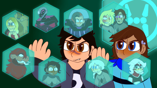
I did a villain hexagon for the villains and antagonists in Phase 3.
Since every season gets a villain hexagon, thought I'd do it for my own story since Phase 3 goes in a different direction than the canon Phase 3
Enjoy!
#heroes of flowers#big hero 6#big hero 6 the series#bh6 the series#hiro hamada#ariel rosemary#bh6 chris#diane amara#di amara#bh6 hardlight#trina aken#galaxian pirate voltrax#galaxian pirate indigo#lonna jettson#bh6 sirque#bh6 ocs#ocs#sparky's art#y'all this took forever#i actually did an old version of this but then i redrew it since the style was outdated#I'm gonna not tag some of the rouges because that'd be spoilers :3
30 notes
·
View notes
Note
Omg dude it’s literally so random but babes how the hell do u get such good saturated colors like ?????
It’s so yummy and sweet it’s so awesome and it’s a genuine question cause i b trynna do stuff like that but it can end up looking like a hot mess, I only know how to use hot pink and that is because hot pink is very hard to mess up :)
Do u got a to go palette?? Is it like color theory or did u just fuck around and find out
PLEASE

^/pos??
ID LOVE TO TALK ABOUT MY COLORS YEA HI

Welcome to bennys color infodump!!!
OKOK so I always start with a base color!!! Sometimes it’s not even a color I’m going to use in the actual drawing I just use it so I don’t have to worry abt coloring outside the lines!!

Don’t mine the sketchy line art I just redrew a really old sketch of mine for the sake of the example🥺
AFTER THAT I use an airbrush in a color closer to the right corner of my color square thing! The colors I circled is the general area I stick to when coloring!! Whenever I shade I like to move my circle down a bit (yellow to orange, or orange to red, red to pink, etc)
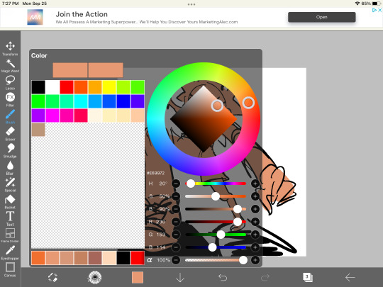


then I put base colors!!! What the base colors are don’t really matter!! I have a habit of using colors near where I circled earlier, but again it doesn’t matter if they’re not as bright as the ones I use

I like to add little highlights and stuff using colors in the very right corner after that!! (It’s my fav area to use for colors all the brightest ones are there)
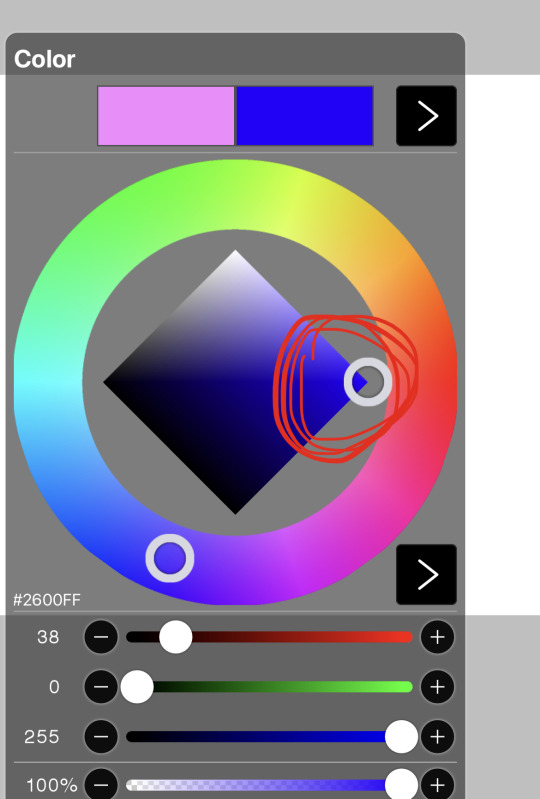

OKAY NOW WE CAN DO THE FUN STUFF!!! PICK A COLOR!! YOUR FAV COLOR IN THAT CORNER I KEEP TALKING ABOUT!!!! I picked pink. Now clip a layer and literally cover the whole art in it.
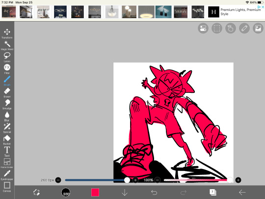
YAY!!!! I usually lower the opacity now!! I don’t like it normal, so I play around with filters to see how it interacts with my colors!! If I like how it looks with all the colors other than that, I go and change that color over this layer. For this piece I used luminosity. I’m not sure how other programs work though👍

OKAY NOW I SHADE FOR REALSIES!! I usually either use bright pink or bright blue for this!! Again, I use colors in my favorite little corner

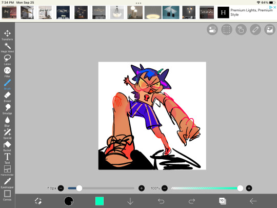
ANNDDD now I get to use filters. I usually duplicate all my layers with color and combine them together so I can filter that version and lower the opacity of it without my colors being invisible


AND WITH THAT IM BASICALLY DONE!! I usually just use effects and clean up! Since this was a quick example it’s a bit of a mess but you get the idea!

Yay!
#art#ask#colors colors colors#not sure if this is color theory exactly or something but!!! It’s how my brain makes sense#casey jones#an old character design for him at least#mutuals <3#aaaa i hope this helps#Ty for the ask I love love love talking abt my process
63 notes
·
View notes
Text

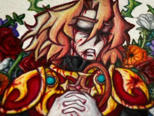

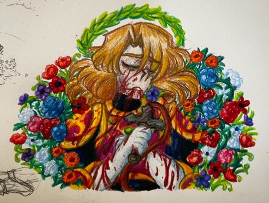
I redrew something from 2022 :3! Yippie, now you guys get to see the old one and the new one next to each other heck yeah.
I’m gonna rant like absolutely bonkers length about Simon’s Quest and the endings and story under a cut for anyone interested:
The original version (the last image) had this like long rant about how I see the endings of the game, but it wasn’t as comprehensive cause I was still kinda new to things and well instagram character limit lol.
The endings of the game are a really really cool topic to me because of how ominous and vague they all are. They’re all left pretty open! But I’ve always gotten some sinking dread even when getting the fastest “red sky” ending. The game really sets up the ending with a lot of empty areas and suspense beforehand, especially with the still present but now more pressing clock still ticking ya know, and the final battle is kinda just there, but it ends off all this tense build up with
A eulogy. One definitely written for Simon too. In every ending.
The first ending (grey sky) is really vague, just a general statement that “Simon you will always be remembered for your bravery and courage” and that “Peace and serenity have been restored to Transylvania and the people are free of Dracula’s curse”. Which is really odd for what would be assumed to be a “bad ending”. This generally sounds like a pretty good outcome and it’s primarily the same in the Japanese version just slightly worded differently. Heck, it’s not even stated in the text outright if he died. But the visuals, oh man. Dreary greyscale and Simon doesn’t even appear on screen in front of Dracula’s grave. Did Dracula even get reburried? It’s some really bleak imagery compared to the otherwise pretty unsuspecting text.
And second ending (blue sky) is very interesting. Simon appears on screen with some nice bright generally cheery colors, but the text deliberately mentions his death in both versions. The English version however says something the Japanese version doesn’t: it says the curse wasn’t broken. The original text says “until a young man to fight against evils like him comes again to this world, Transylvanians will keep praying forever.” Which I guess you could assume means that something went wrong and the curse still exists, but it could also be taken as a general “there’s no cool badass vampire hunter guy to kill any other general threats, so we hope another one comes along”. So, again, it’s so extremely vague.
So far the first and the second don’t really have all that much different as far as implications go: Simon beat Dracula but he died.
So what about the third ending (red sky)? Would it shock you if I said there’s not much difference from the text of the first ending? It’s essentially just another eulogy text with nice things to say about him. It says “Simmon Belmont put an eternal period to the legend of Dracula” (yes the Japanese version says Simmon lol it happens), which is something we know isn’t true because well more games got made later. Also because Dracula’s hand pops out of the ground afterwards! Which is hard to say the meaning of, is it just a teaser like “to be continued” or is it actually meaning that Dracula wasn’t put down properly and will be back really soon? Because that still is in line with things since yeah Drac did kinda sorta come back early in Harmony of Dissonance. Anyway— But it’s just another way of saying “he killed Dracula” and probably “he ended the curse”. The last section is just “his blood and sweat have penetrated into the ground of Transylvania and will bring us full-blown flowers with happiness in next spring”. Which is, again, just a really pretty, poetic way of saying “we’re never gonna forget this guy”. And again, this ending never outright says if he lives or dies!
Which is so!!!!! Weird!!!!!!!!!!! Why have multiple endings in a game if they’re all so vague that they’re almost completely interchangeable and can all be argued to be the ending of the game? You could genuinely make an argument for each of the endings being the canon ending and it would affect essentially nothing. They’re so vague to the point that a lot of people assume that they were mixed up at some point in development, which I find unlikely coming from the dev team of the guy said to want his games to be a cinematic experience. But it’s so strange! Why!?!?!
But I think that this vagueness and sense of idk how to put it— um ya know when something builds something up to get you all excited and convinced it’ll go one way and then it pulls the rug out from under you? Like when it’s set up to where it feels like the protagonist is finally going to get something and then it just doesn’t happen completely unceremoniously? Like a hope crushing twist?
Idk what I mean is, to me, it feels completely intentional. It feels to me like the game is just ramping up the tension and the suspense and the dread just to cut it off with vague, bittersweet endings that just seem to imply sad things and don’t sit right. It’s like as if the game wants you to get the first ending, see that it’s really gloomy, try to figure out the game more and get the second ending, see that that one outright says he’s dead, then try to get something better only to run into another awkward seemingly negative ending and a realization that you can’t do anything about it.
And I was thinking about this again a bit ago and realized that it really fits with the rest of Simon’s story. Simon kinda has this general “hero goes to save the day” plot in the first one with some slight mention of Christopher before him and the fact that this is a clan and a repeating 100 year Dracula cycle right? But things go wrong and he gets cursed and presumably either struggles to figure out what to do or just puts it off for like 6 ish years. Add the general vibes of “will I ever be as good as my ancestors?” and repeating themes of being alone and then compare that with Dracula’s Curse that comes out not long later and this game is suddenly the most “power of friendship” “seeing the good in people” “together we can overcome this” kind of story in the whole series and it hit me: Simon feels like a subversion of the lone hero trope. Like this super uplifting, unlikely band of heroes story coming out right after the solitude if it were personified as a 1600s vampire hunter story feels so so so so important to me. And then The Adventure and Belmont’s Revenge come out and what are they about? Christopher goes into the castle alone and something goes wrong! And I’ve noticed how other Belmonts and protagonists in later games get companions or friends or helpers or somebody else, and oh boy does that make how alone Simon is that much more noticeable.
It just all comes together in a messed up way. I really feel like Simon dies in all of these endings. And I didn’t even get into weird symbolism discussion lol—
And maybe this is just me looking too hard into an old game from a modern used to stories in games being detailed perspective, but idk man, I love the Simon’s Quest because it never fails to baffle me. Honestly so much of Simon’s Quest genuinely haunts me (affectionate), like I’ll just be sitting around and think of another possible answer to something and it’ll end up just as vague and full of holes as any other speculation, it’s wild. This game will have you sitting around looking for answers only to consistently run into dead ends with sad or nonexistent implications. I hope any of this makes sense, this game drives me insane I love it debating replaying and overthinking it again hmmmmmmm—
#castlevania#castlevania games#Castlevania Simon’s quest#simon’s quest#castlevania ii#castlevania ii: simon's quest#akumajou dracula#simon belmont#castlevania fanart#art post#my art#art#fanart#redraw#ahfkshakfjsga i love u Simon’s Quest never change#Simon’s story is such a tragedy man somebody get this guy a friend#shout out to that midnight energy that suddenly compelled me to write multiple pages about an NES game again 💀💀💀💀💀💀#also hehehehe flower symbolism in this one >:3c#have fun piecing the meanings of things together hehe it was fun researching for it#the flowers included are roses marigolds anemones and some teeny tiny forgetmenots hidden in there#also the symbolism surrounding Simon I’ve noticed seems to generally lead back to martyrdom and sacrifice which is hmmmm interesting#the thorns and colors Ayami uses for him in her art of him#the hanging skeletons in the hanged man positions being a reference to him#there’s more I’m just getting sleepy and can’t think of them rn#I made a post about it a loooong time ago tho#anyway that’s just adding on to the other ominous implications of what might have happened to him aaaaa#anyway Simon is one of the characters ever#hopefully this gives somber but ethereal vibes beautiful but tragic ya know#bro puts the slay in vampire slayer like it’s giving dead but he killed it anyway—#incoherent rambling
34 notes
·
View notes
Text
Shadows
Since I've seen a few people posting shadow versions of their muses (though theirs are made in picrew) I thought I'd share this design I made for an event I did on Twitter back in January.

It's actually the original version of my pinned image. I just redrew it to be in his default costume.
I won't get into exactly how and why he had a shadow, as it's kinda complicated, but I do want to talk about the design since I had a TON of fun with this.
The logo on the chest is taken from the black suit in Spectacular Spider-Man, specifically it's final form.

The suit being purple is inspired by the way the symbiote looks in the ultimate comics. I did this because... well Aaron's suit is usually black, and I thought it looked cool.

The eyes are inspired by the way the old animated series drew Venom's eyes. I always really liked the way it looks. It's very menacing, and almost reptilian in a way.

You've probably noticed that I've taken a lot of inspiration from symbiotes. But this ISN'T a symbiote design (I have a completely separate look for that). I mostly just took inspiration from them since they're usually used to show a darker, more threatening side to Spider-Man

Also the yellow on the suit is inspired by shadow's typically having yellow eyes, though you probably guessed that already.
Anyways, that's about all I had to say. I just think he's neat.
3 notes
·
View notes
Text
Long time no see huh
I have a bunch of stuff to post that I don't really feel like going through the hassle of organizing, so instead I’ll post a 30 minute redraw of an eye.
Anyway, since it's been a while since I painted (I can thank uni for that), and I just finished a sketch of a big painting, I wanted to do something to warm up. I remembered a very old drawing of Alies’s eye I did ages ago. I actually redrew it in the past, but i don't think I ever posted it... so ill post everything here.
So the original, from 2017, is one of the oldest digital drawings I still have on my pc. And it shows lol

I think this is actually a screenshot because I didn't know how to export back then. there’s not much to say about this tbh. it’s 6 years old, so obviously it’s pretty meh. But I had to start somewhere.

The next one is from 2018, when I started actually painting (with no lineart). Already the shape are wayyy better, and I learned how to use blending modes, which kinda carry the entire thing lol
now for the 2023 version, Alies’s design changed a lot, so it doesn’t look like the eye of the same person, but I wanted to use his current design bc I like it more.
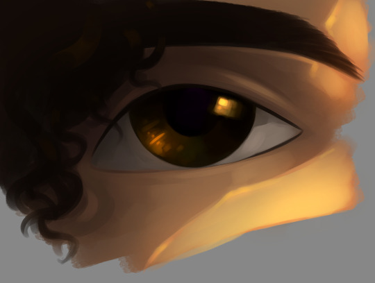
I really like how it turned out. It’s kind of insane to think that these were made by the same person. The 5 year progress is very satisfying.
I added a bit of the old green eye color to the new one, just to carry a bit of it over
#original art#alies alabano#Old Blood#been a while since I used alies's tag#i dont really draw any of them as their usual self#bc theyre cooler when theyre devoted lmao#the painting style im developing kinda reminds me of arcane#and thats very good bc i look the style of it
6 notes
·
View notes
Text
【KagePro】 KuroEne Doodles (NSFW) 🖤💙
Kuroha teases Ene (NSFW)

Kuroha teases Ene with a vibrator 🥰💞
KuroEne NSFW doodle WIP. I am cooking!!!
I didn't have the time to put speech bubbles, so here you go.
I cropped it so I'll put the rest under the cut
I didn't feel like drawing Kuroha's clothes properly since they're just gonna get covered up by Ene anyways
I just wanted to get the basic idea down so these are super rough sketches 🙏
With Text

Without Text

Scribbly

Since the poses are much more complex, this took me the whole day to draw omfg.
CSP's 3D models are saving my life with these cuz the poses are MUCH more complex than what I usually draw
I just filled in parts with white where there was overlap
I didn't post it yesterday cuz I only got the chance to draw Kuroha, but I sketched Ene and then the rest today!
These are SUPER rough sketches. I just wanted to get the basic idea down
I love both of their expressions here.
Sen with the 10 years KuroEne obsession...
It's mental illness, y'all /lh 😔
Redraws
Old (EN)


Old (JP)


Close-ups


I really like Ene's expression on this...
Text Version

Also redrew the doodle I did before of Kuroha teasing Ene with a vibrator while her arms are tied with his black aura spirals
I redrew Kuroha's expression. Updated the expressions on these
I prefer the formatting of the JP text because it just looks better imo
Inspiration

MCA's end card has an embarrassed/flustered Takane around Haruka, and Ene covering her face with her sleeves in front of Konoha 🥺💛💙
My wife is so cute!!! 💞
Ene's habit of covering her face with her sleeves when she's embarrassed is so cute...
So I thought of Ene covering her face with her sleeves slightly in my own doodles
Teehee.
LimGuda and KuroEne Art Ideas (NSFW)
(CW: NSFW TEXT)
I also have an idea to draw KuroEne shibari (Japanese rope bondage) but that's gonna be even more complicated than this one
Cuz I was thinking about Hashira's LimGuda (FGO) shibari NSFW art again and it's SO hot
OMFG
I'll respect EA fandom artists' repost rules by just posting a link to it.
Check it out if you want! This art inspired me! It really makes me want to draw LimGuda shibari and KuroEne shibari...
Source: (X)
...
PLEASEEE WE NEED KUROENE SHIBARI FOR MY GAY ASS!!!
Which means I have to try and draw it. I'll try.
Eventually. Whenever I get the time for it
Shibari (Japanese rope bondage) over the clothes is so good when it's actually aesthetically nice and drawn tastefully. And NOT man misogynists/gooner/incel qorn.
This LimGuda with shibari rope bondage is so hot
BARKINGGGGGGGGGG
I adore this kind of subtle eroticism NSFW
Clothed sex is sexier to me, personally.
Though obviously I appreciate artistic nudity too
I'm ace so I think my personal experiences as someone ace affects a lot of my tastes with NSFW too
I have very vanilla tastes personally. I'm literally so picky with NSFW
I love writing about my faves exploring kink, cuz it's fun.
My stuff is usually heavy on expressions, emotional intimacy, and dialogue. That's how I want it to be.
We need KuroEne shibari rope bondage ASAP!!!
It'd be so cute with Ene considering her big jacket and sleeves.
Imagining Ene with shibari (rope bondage) over her clothes is making me go CRAZY
I'm so gay for my wife!!!
#kagepro#kagerou project#kuroha#ene#enomoto takane#takane enomoto#me ga saeru hebi#saeru hebi#saeru#dark konoha#black konoha#kuroene#saeene#kuroha x ene#black konoha x ene#snake of clearing eyes#clearing snake#dark konoha x ene#saeru x ene#sen's rambles#sen's kuroene au#my art#sen's art
1 note
·
View note
Text
I love looking back at old art of mine. I tried do hard to make it just right and took an obnoxiously long time for every drawing. However, I'm much happier with my art now, with a simpler style and more opportunity for me to actually enjoy it rather than staring at it for so long that I hate it by the time I'm done. (aka art rant time, since I can do that here!!)
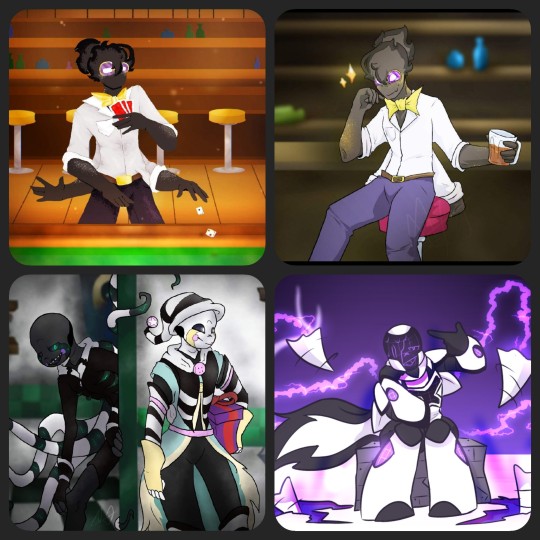
These four drawings are from within a span of at least two years. To explain, the top two are drawings of Catacombtale!Grillby (or Chance). The one on the left was my first version (an entry to a contest to draw Grillbys), the one on the right I redrew later on. The bottom left is something I drew for a crossover contest last year sometime, involving Dream and Nightmare (Jokublog). Lastly, bottom right is another contest drawing for the concept of an X-Tale oc (I used Ec-4o.Nightmare).
The first drawing of Chance is easily a good example of an attempt to make the drawing look fun and inviting. I've got a decently fund pose, the colors are warm, and there's a simple background. However, I did this Lineless. Why? I don't know, but I don't like it. Plain and simple, this is my least favorite of the drawings pictured because I took so long to meticulously shade and color and it still wasn't worth it. Served it's purpose for the time, but that's it.
The second one of Chance is overall better. I used cooler colors, and by now I kinda understood how to put deoth into backgrounds. The style I used for him is fine too. Here, I hate the posing. His composition in comparison to everything else makes him look like he's about to fall off his stool. His second set of arms look stupid too, since I recall I either forgot them or didn't want to draw more hands, so I just folded them unnaturally. Better, but not my favorite.
The Fnaf/UTAU crossover drawing is my favorite in concept. It's not the best drawing style, not the worst. I'd redo the designs slightly if given the chance. However, the composition and background I'd keep almost identical. I really liked how the background came out for this one (minus the doorway) because I started to paint my backgrounds around this time. The character poses, I like Night's more, but Dream's is good enough for it's purpose. The execution of using two characters with brand new designs works well enough here, but as I said, I took too much time with minimal effort for this to be too good. (Also completely skipped shading in favor of darker colored gaussian blur.)
The bottom right, X-Night, is my favorite of these specific four. The body proportions are clearly more rounded and small, the style of lineart and colors are very simple and bold, and most of the real charm cones from the lighting and after affects rather than meticulous shading or complex backgrounds. There were still things I'd change if given the chance, but this is a perfect example of my mindset at the time too. The other three drawings here were fun, but I drew them with other people's expectations in mind. For this piece? I drew what I wanted to, since it was my (relatively speaking) design and my art. I'm not as active or social on the app I drew these for anymore. So, I'm much less inclined to please the overlords that might've gotten it more popular had I drawn it in a more realistic or engaging style.
Don't get me wrong, I loved being on that site and drawing so much. I like all of the pieces I posted on too. However, this is a good chance to reflect on what exactly I've been doing all this time in the UT Fandom and how it helped me improve my art over the course of just barely 3 or 4 years.
More looks back on this, a continuation, will be coming soon. This is gonna be a long rant I'll probably revisit often just to catalog ideas for redraws, as well as notes for myself. (Not all of it is degrading, because I plan my next one to be about what things I have enjoyed drawing and why, followed by a completely redraw-cebtric post!
4 notes
·
View notes
Text
Guys, I have this one pencil WIP I need a bit help with...
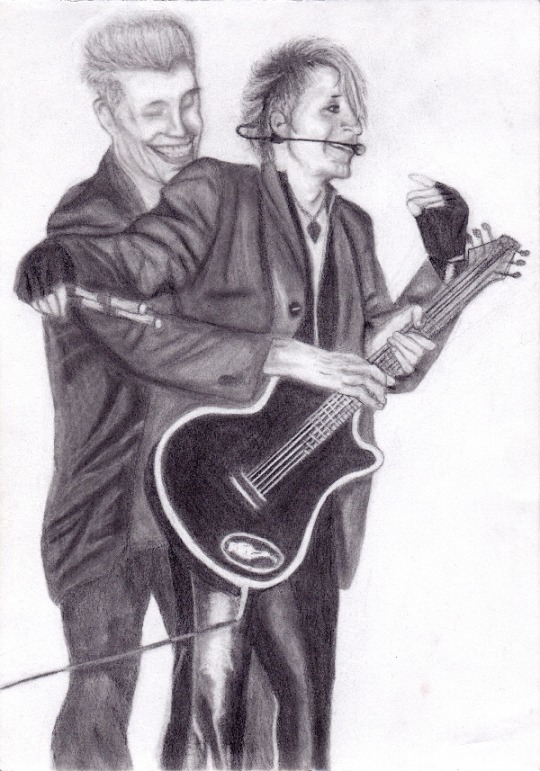
It’s still a WIP as I said but I wanted to ask: what’s wrong with Bela’s face? I can’t see it properly anymore. Does it even look like Bela yet? The reference photo is not the best one and believe me or not - Bela’s eye is the most difficult part in this whole thing. Here’s the reference photo and of course it’s easy to tell from this it’s Bela because why wouldn’t it be him, but it’s super difficult to draw right when this is the original:
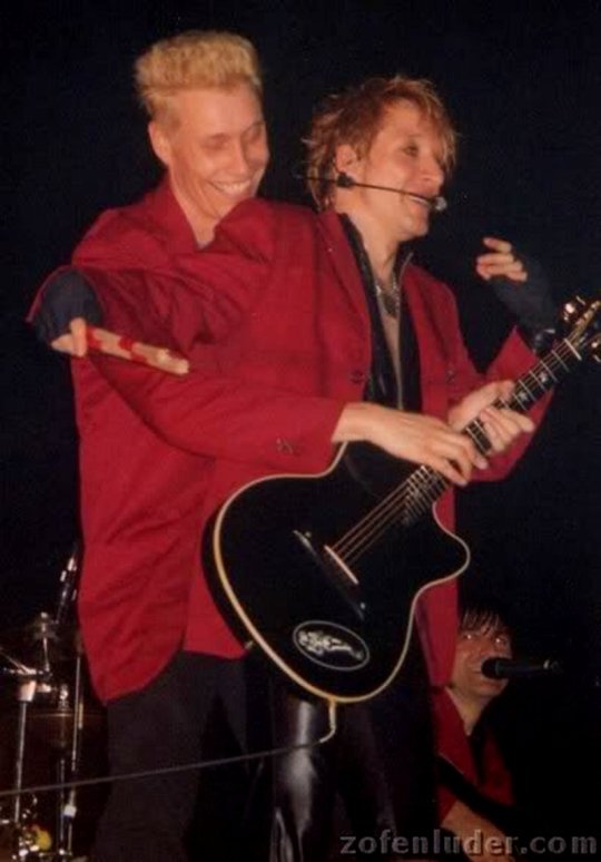
The 21-years-old me really was a genius while choosing this photo to draw. Not.
Based on the eyes of the photobombing Rod (lol), I think also Bela’s eye do the same red-eye thing (how is it called in English? In Finnish it’s just red-eye...) and I tried to draw this without such effect but idk how to draw eyes from that angle. I googled for reference photos but it’s still so small that it’s hard to really draw that way with a pencil (the iris/pupil thing literally the size of the tip of the pencil). Also Bela’s head is slightly tilted and my hand is so good at drawing straight lines even without rulers that it feels almost impossible to draw anything that is even slightly tilted. I sometimes try to tilt the reference photos as well as the paper so that I could still draw not-tilted images but I just struggle at figuring out which way to turn the paper to make it look tilted on the paper, and tilted on the right direction too. I think there’s also something about the shape of Bela’s skull that I need to fix, I’m just not entirely sure what is it... move his forehead forward or make the back of his head bigger? I’m not entirely sure yet.
I also have to point out that this is actually a very old WIP originally. I started it in 2012 (yes I’m old, yes I turned 21 that year...) and I left it as a lineart that I thought I’d never continue, but I did in 2019 but wasn’t happy with the faces which is why I never posted it anywhere but also never used fixative on. (The old scans are under the cut for the first time ever to see.) So, almost everything that you see in today’s WIP is original (at least from the 2019 version) but just blended because I got a bit too much into blending so that I just needed to try that out with this one too and see if they (the eyeshadow applicators mainly) still work like little magic wands. And oh yes, they do indeed.
What I have drawn again or fixed are: the heads, Bela’s right hand (aka the one at Farin’s side), the side/back line of Farin’s jacket and his left leg (right one in the drawing). I might still need to do something about Bela’s legs because they look a bit weird for some reason but as you can see, the background in the reference photo is black so I have had to improvise there a little. That’s also the reason for why the end of the guitar looks really bad - it gets cropped out in the photo, but I might still try to fix that one too eventually.
Talking of the other things wrong in the drawing and what I’m still gonna fix one way or another - Farin’s mouth is too big (woooow). I haven’t had the courage to resize it because I’m afraid it would never look as nice as it does now but I’m afraid I have to do that anyway if I want to make it look correct. His whole head actually ended up being way too big and I have managed to narrow everything else down so far but not the mouth because I haven’t wanted to, yet. Also I have given him this cunning grin instead of just a smile so I need to move his lower jaw backwards a little, I see.
So my question is the same as in the beginning: does Bela look like Bela yet? Or does he at least look like he does in that photo? Is there something in particular that is still way too off that I should fix since I can’t see that? I do have this photo turned into black and white to make it easier to draw, and I’m still going to soften some lines in the final piece but atm I’m just trying to get Bela’s face look correct, as well as Farin’s mouth, and I will be going through everything else in this drawing later on to see if there’s anything else with proportions and such to fix (plus just cleaning up the highlights etc.) before I can call it finished.
Feel free to point out also if there’s something you see that I didn’t mention. Chances are that I either a) haven’t see it myself yet or b) just forgot to mention it.
Here’s the lineart WIP from 2012:
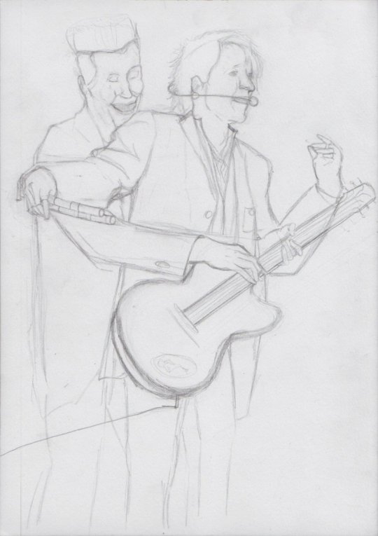
This is how it looked like in 2019 - I redrew almost everything in that original WIP actually:
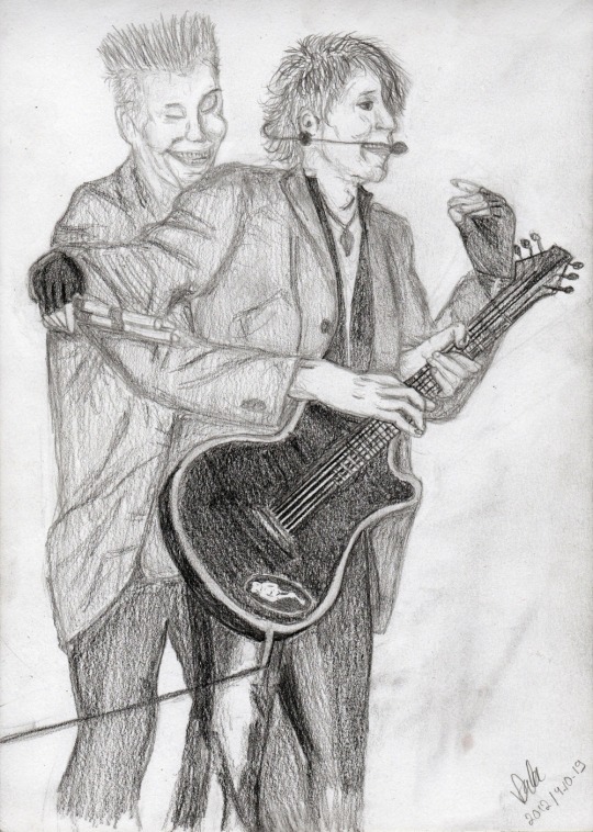
I somehow had completely forgotten about blending because I hadn’t drawn anything in YEARS. So after my previous really successfull attempt with blending, I decided to try with this one again and it alone made already a huge impact on the drawing.
#mcrmadness draws#my wips#dä fanart#die ärzte#belafarin#and I appreciate CONSTRUCTIVE feedback!!!#I wanna know WHAT is wrong with it because 'it already looks good' is not helping! I know it's not good ENOUGH and I wanna know#what is it that I need to do and that is why I'm posting this wip here in the first place!#I usually never post wips because I don't want to 'spoil' anything but this time I need help.
28 notes
·
View notes
Text
Kit’s OC Time {Part 2}
🌼So I got this wonderful ask from @chocolatetwix and I got super excited. There is a lot here so I just decided to make a huge post about it. That and I can save it and work on it too so that’s a bonus. You can’t really do that with asks. This will be in a couple different parts so that it’s not too overwhelming!
Let’s continue!
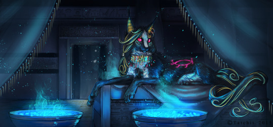
Costume/ CC: Back in my DA days I used to draw a lot of animals and I had a fursona as well. Now I am not sure if I am going to keep her or not but I do actually still like her design. I might just tweak it a tad.
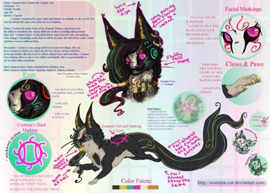
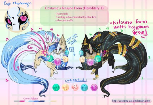
I have an incredible piece of artwork from Nukerooster of her and I just need to share. Go check them out as well (>>>LINK HERE<<<)
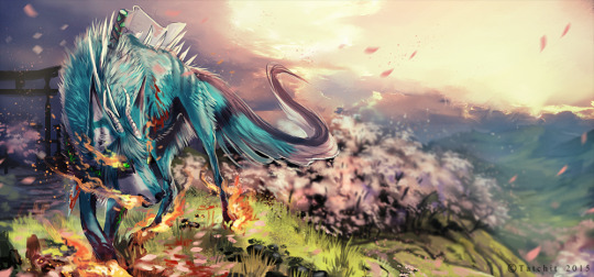
Akuma: Another fluffy boy but I have this OC named Akuma, original... I know. He will most likely make an appearance in my Hell world once I re work him a bit. Basically he was a demon that caused a lot of Chaos and havoc but messed with the wrong village. Mid transformation he got a blessed sword rammed through his chest keeping him that way until the sword is released. It also perpetually bleeds, never heals, and drains his power. Poor demon baby boy. Also I realize that he is old... but like... I still love his design if that is even possible. He used to be red in color which I will post and then I redrew him a few years ago to see how he would look more current. Now he is teal ish.


Nuke also did this incredible one of Akuma.
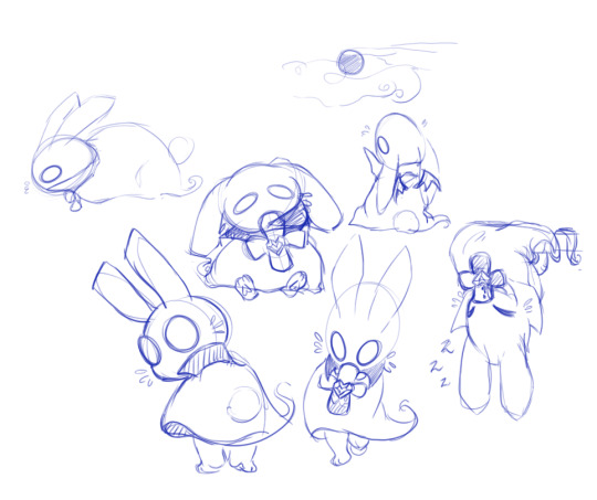
Because of my major I sometimes randomly come up with cute RPG character designs and I really wanted to do one of little monster animals. I created this little guy during one of my classes.
Spip: He is a little vampire ghost bunny. The cross shaped vile around his neck is filled with his HP restore (Blood) If you have a lot the vial will be full but if you don’t have enough it will deplete over time. Poor little Spip just wants to be friends with people but because of what he is they run away. He is kind of my homage to Bunicula if anyone remembers that book. I have ideas for his little buddies too like a Frankenstein cat and so forth. Just a cute little idea.
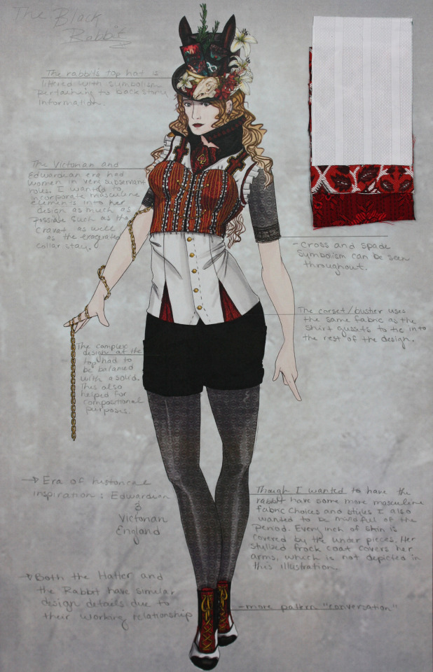
Lastly we have the Infernum (name will probably change I am kind of thinking about calling it Twisted Otherworlds or just Otherworlds) cast which is even larger than the Hell side and I don’t even want to think about that right now X’D It is a little overwhelming. What I do have however are some of the designs I made for them, costume wise. This was back during my fashion degree projects. Think realms with twisted fairytale characters that happen to used to be real people from different periods in time. This is the point I really started to dig into the horror genre and it kind of shows though looking back I think I always kind of have been...
The story is basically a fairytale romp and during the day light hours it’s perfectly fine all zanny and fun but at night is a whole other story. You see the souls that live in these Realms used to be living breathing people. The only thing is that if you end up here though you lose all memory of that life. The Madness which is like a magical curse infects these souls and turns them into their own personal fears or horrors. It’s all back story based and intense so I won’t go into it. There are different monsters and characters and even though it’s an older idea I do think it still has a lot of potential. The realms of the Muses so to speak. Their day and night are switched as well so no matter where you are in the world you dream in the daylight and it’s night there soooo your usually going to get a pretty lucid horrifying nightmare but if you sleep during the night time you will have good dreams. Just don’t fall asleep during the day light hours X’D
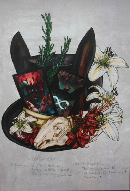
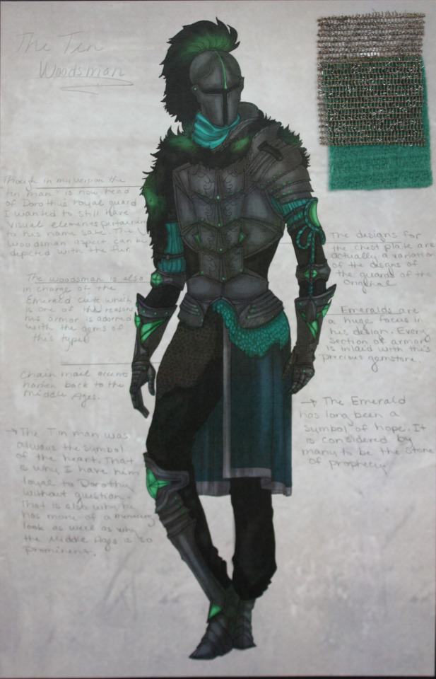
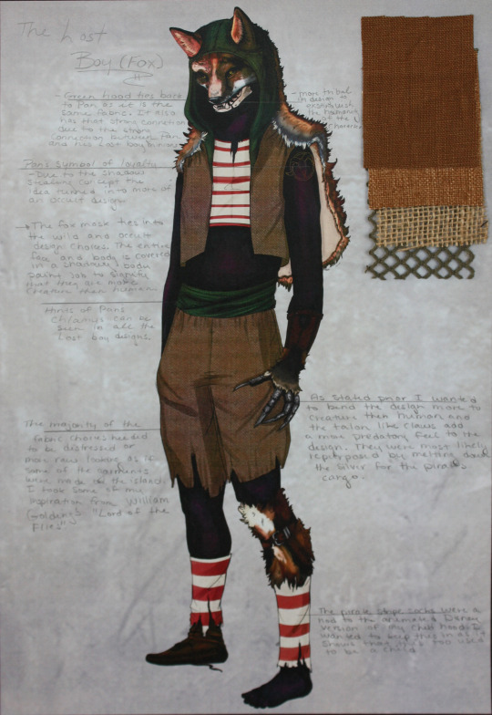
Anywhoo! Here are some of my favorites and again these are really old so their designs will be tweaked for the long run. I also apologize for the quality the actual PSD files are not on my laptop so I have to settle with the project photos I took a long time ago. In order you have the Rae the Black Rabbit, Lucian the Hatter, Ace the Cheshire Cat, Crow (probably change the spelling) the Scarecrow, The Woodsman, and one of Pan’s Lost Boys. I also included the top hats I made for them because I still think they are pretty neat!
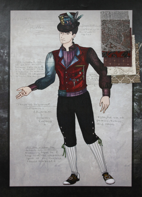
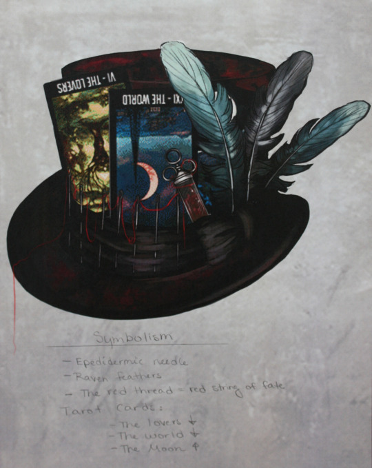
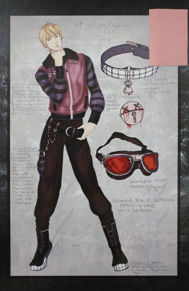
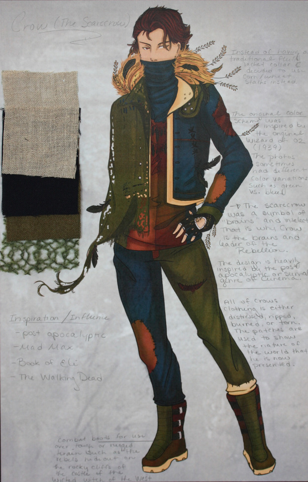
There are also some REALLY old designs for the Twisted Otherworld characters. They had more of an anime flair to them. That said there are a couple characters that I want to share since they are actually important despite the artwork being older than Methuselah.

Maximillian March/ Mad March: Crazy March Hare? I think so. He is a puppet master of sorts in the story and I have to redraw him but he has these deep swirly eyes and sharp teeth. (huh... looks like that design choice happened a long time ago... WELP)

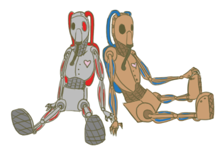
Tweedles: One of my friends was able to pick this out immediately but yea... these are the Tweedles. Their nightmarish 1910′s gas mask Orwellian horror cyborg versions anyway. I have a full image of Dee somewhere that I need to find... (edit) AH there he is... btw I was like 15 when I did this design so I gotta question what the heck was going through my brain.. unless it was that Doctor Who episode with the children that just freaked me out... yeah.. that was probably it. Are those real organs and muscles you ask... yes... yes they are.

#oc#kits asks#nearly a decade of characters#original characters#persona world builds#Otherworlds#species#god I feel old#thank you for asking!#part 2#Rabbit#Hatter#Hare#Cheshire cat#lost boy#woodsman#Crow#Spip#Akuma#CC#OLD fursona#furry?
23 notes
·
View notes
Note
I've never seen this Dylan Dog comic? What's it about and what's making you so happy? I mean, I know it's about a ship, but, could you tell us more?
eeeh you might have not seen it because it’s an italian comic and they translated just selected numbers out of the country and it’s at issue 400 (it’s one issue per month) but basically:
it’s a horror comic about this paranormal investigator who lives in london (that’s dylan) with his assistant groucho (based on groucho marx) and like... they’ve been living together all the time since lmao I mean I shipped them bc they’re an old married couple and they have been since issue #1 so I basically shipped them since then lmao but like... considering that dylan has a different girlfriend each number I never thought they’d actually like ever make that clear
that said it’s an excellent comic because basically the point is that the so-called *monsters* are actually victims of society 90% of the time and especially in the earlier numbers it was very good at doing social critique/commentary on a lot of different topics without being patronizing
also like... it was the first *serious* comic book I ever read, I started when I was like eleven in 1999 and since a lot of issues were quoting/inspired by classic horror movies or lit it actually got me into a lot of stuff I ended up loving later so it’s just really VERY DEAR TO MY HEART OKAY
also it had an a+ cast of secondary characters that would take too long to get into now but like... if you manage to read a few issues it’s 100% worth it, the ones translated in english were the most relevant but PLS try to get a brit version bc in the american they redrew groucho for copyright issues and it’s... not the same
that said I’m behind with it because like........ the sad truth is that I have no space to put comics anymore like physically so I only have bought the important issues for a few years and I missed a lot BUT at this point I’mma get the old ones as soon as I clear some space because i MISS READING IT REGULARLY but like... the moment it turned out that with issue 400 they’re rehauling the entire thing through the apocalypse and IN THE ISSUE BEFORE THAT DYLAN AND GROUCHO ACTUALLY DID GET MARRIED AND IT WASN’T A JOKE I about fell off my chair and bought the box immediately because pal I mean it was not the ship I ever thought I’d see canonized in my entire existence but it happened and I’m delighted
also this is a friendly information for y’all but ITALIAN PUBLISHER OF COMICS SERGIO BONELLI EDITORE IS THE BEST EVER AND THEY HAVE GIVEN ME QUALITY COMICS FOR AGES INCLUDING ANOTHER HORROR ONE WITH MY OT3 OF DREAMS for which they’re actually making a movie next year or smth and that I have to catch up with as well and they actually had a title with a lesbian lead in the mid nineties and they can eat marvel for breakfast that was my ted talk ;)
21 notes
·
View notes
Text
My lengthy defense of the most hated Persona game
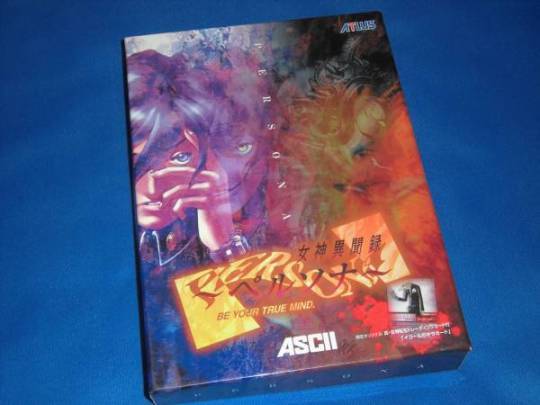
Here’s my grand defense for the most hated game in the series: Persona 1, AKA Revelations: Persona. I know it’s too late to try and rehabilitate the game’s reputation on the internet, but I’m hoping that by rambling in modestly structured form for a bit, at least some folks might be able to look at Persona with a fresh perspective. It would be cool if everyone could try to understand what the game did so well and why it resonated so strongly with me and 2 or so other people. If you are the kind of person that thinks games age and become archaic, then I probably don’t have any hope of reaching you, but still, try to put yourself in the right mindset and approach the game on its own terms, and maybe you’ll discover something quite special.
So, Persona. Persona does very interesting things with choice. As the first Megaten rpg released in America, the negotiation system was a revelation (har har), providing the choice to talk your way out of battles and into rewards is a natural D&D element that never got a foothold in countless videogame conversions of the game, and in the first Persona these elements are at their peak. With every demon having four moods, four series of animation and four sets of voiced sound effects, the expanded options really let you get into the headspace of the demons you’re conversing with, unlike traditional SMT’s more spare binary system. Getting into the thick of things with complex sets of reactions (Joy + Interest, that’s what’s up) makes for a fun simulation.
The theme of choice is also really built into the game’s fabric, it’s the reason why in old usenet postings, Persona was recommended to folks who were fans of Gold Box games, during a time when RPG labels were more porous and that sneaky “J” hadn’t yet latched itself omnipresently to the term. Choice here also extends to the fifth character in your party, a friendly way to promote replay value without new game plus, and certain choices locking you out of giant chunks of the game, an unfriendly way of getting you through the game again. In a world though where developers are desperate to ensure that gamers experience all content (so many buzzwords!), the chutzpah of Persona being willing to lock you out of huge swathes of the game is something I actually admire.
It’s easy to underestimate the impact of the modern day setting in a post Persona 3/TWEWY/Alpha Protocol world, but dungeons that were hospitals and police stations and high school students snarling “EAT THIS” with MIGs in pitched street battles felt revelatory. Exploring the comically low-rent polygonal city (is this another reference to the abstracted icons of SMT1 and 2 world maps?) was actually fun, as ridiculous as waiting for traffic to pass might seem. There are also many complaints about the first person perspective dungeons, even though the rest of the game is third person, but the setting variety is nice and many of the wall patterns are quite evocative (Deva Yuga looks like Persepolis!)
The game also does PSX-era philosophizing in a tasteful and generally thoughtful way, while contemporaries were drawing from Evangelion, Persona looked to Zhuangzi and Jung. Not very high-falutin, true, but at least middle brow enough such that my 14 year old Sophie’s World reading self was entranced. The game has something neat to say about loneliness and identity and the way we construct the world around ourselves (all hinted at in the moody intro. The story is very nice and very Kaneko, even if he’s overestimating the literary quality in this interview, I’m very fond of it and it is my franchise favorite.
Here’s where I alienate the remaining people who might have been on board with me so far: if you ignore the loss of the Snow Queen Quest, a 20 hour alternate version of the story that takes place in a series of SMT:If... like towers, Revelations: Persona is actually the superior game. “Lunarvale,” a hodgepodge of America and Japan cobbled together by localizers attempting to mask the game’s origins, is actually more weird and interesting than the Mikage-cho that appears in Persona PSP. This bizarre mashup, combined with a nonsense translation attempt, somehow manages to better fit the lurid dreamscape vibe the original developers were going for. I can’t undersell how one-of-a-kind and wonderfully unsettling the game’s atmosphere is in the PSX version, and this is helped along of course by the sound.
Here are excerpts from some things I wrote on the music in this game:
Revelations: Persona has the best soundtrack in the franchise, possibly the best soundtrack ever made. In raw quantitative terms it's ridiculous, 113 songs and 3 hours of music without being looped, and all without doing Persona 2's trick of repeated (but still awesome!) remixes. Two majorly sweet leitmotifs for the two major quests, employed creatively and thoughtfully, four fantastic composers on four discs, cohesive and thematically coherent when by all rights it should feel disjointed as fuck, this is a generous OST!
Hidehito Aoki (R.I.P.) composed the dungeon music, which is exquisite. Lengthy songs that are moody, elegant, just plain beautiful and get you PUMPED! The iconic Deva Yuga Monochrome: School Revisited Dream-like, synthy, catchy, beautiful, quintessential Persona sound. Pandora's Den (Deepmost Area): The climax at 1:12! Ice Castle/Black Snow The twists and turns in this one, so effing good. Sebek Music, Karma Palace 90's music is the best!!! Misaki Okibe's range is ridiculous, she composed some of the most memorable, interesting tracks in the whole game. Reverse Dream World: You think you have this song figured out in the first few seconds, but stick around to see where it suddenly veers off to around :30, hilarious and awesome. Theme of Nemurin's Love: The intro! The power of a simple lovely melody, a little Uematsu-esque. Augustia's Wood: The save music, so memorable, I love the grumbling. City 2 Accident: Do you remember wandering the streets in the town, disoriented, listening to this gorgeousness, thinking about how Lunarvale suddenly seemed so scary, like an unsettling dream? Bar Attacked by Harem Queen: A bit of jazzy beauty. And most important of all of course, Misaki Okibe is the composer of the Pharmacy Music, featuring vocals by one Hidehito Aoki of all people. Satomi Tadashi Drugstore Song In our heads forever, teaching us about item use since 1996.
More alienating for readers who have gotten this far: the “whitewashing” character designs were all improvements, Kazuma Kaneko redrew everything himself and it’s easy to tell that a lot of thought was put into the redesigns. Finally, Mark is also >>>> Masao, everyone’s always yelling about the jive-talking but to me he came across as quite smart and savvy. I dunno, maybe this is just a Flavor of Love/Outsourced minorities just wanna see themselves effect operating here, leave me alone you guys! So yes, the franchise’s current fanbase might not be fond of them, but the cast is comprised of characters that are meant to be iconic and not friends you wish you had in real life, a cast that, FFVI-like, is meant to evoke broader themes and not follow the typical arcs of many RPGs these days. Check out the classiness of Yuki’s design, and allow me to quote some more stuff on how Tsuchiya, master of the character theme, nails it for each party member.
The sign of a good character theme is when you can extrapolate from instrument choice and melody to personality. Here Tsuchiya is the man, no one does it better this side of Uematsu. I hear these songs and I've got a perfect picture in my mind of each cast member. It's what I think of when I think of "videogame music" ha, here are my personal favorites, I could listen to these endlessly. Mary/Maki: Cheerful, just a hint of melancholy in the notes, love that slap bass. Yuki: Starts a bit slow, but soon we learn that Yuki's cool but determined. Alana: The song tells me she's brassy, energetic, fun. Chris/Reiji: Dangerous, exciting, a bad-ass delinquent. Ellen/Elly: Classy, elegant, confident.
Some also rag on the dungeon design, but it seems unfair to expect centerpiece labyrinths along the lines of Strange Journey or Etrian Odyssey in a game going for something completely different. Nevertheless, you’ve got tricky mazes with dead ends that test resource allocation skills and provide a sense of accomplishment. Encounters are tough and require thought, careful consideration of when to flee and negotiate is imperative for dungeon survival. This is something that gets lost a bit in the PSP remake as the encounter rate is increased but battles are a bit easier. Exploiting elemental weaknesses isn’t as elegant as in later games, but with a ludicrously high 14 damage types breadth supersedes depth. And there’s even a positioning system to consider that the developers decided to drop from later games rather than refine. In the end, surviving the dungeon and beating the boss is an RPG staple that just plain works, although yes you will probably grit your teeth at some of the loading times.
And finally, you don’t have to take my random word for it. Parish really liked it too! How’s that for an appeal to authority?
For series buffs, it’s fun to trace this game’s historical lineage, as one of the earlier spinoffs of Shin Megami Tensei, it's easy to spot the mainline series influence: the occultism of the opening ritual, the hospital as first dungeon, the first person perspective for dungeon travel, BLUE POINTER MAN, and the omnipresent danger of demons in town and dungeon alike. Revelations: Persona is drawing from a rich and storied history, but manages to recast SMT traditions in interesting new directions. Again, the atmosphere is really unbelievable and something I haven’t come across in other games. It’s more than a simple curiosity and it doesn’t deserve dumb dismissal or sneering derision for its flaws. Revelations: Persona is a real marvel, modern games ought to draw more inspiration from its lessons, and the game belongs in the RPG canon, there I said it!
4 notes
·
View notes
Text
Dr. McNinja Original Art Sale
It’s been about a year since I’ve ended The Adventures of Dr. McNinja, and last night I went through some old pages and picked out a few favorite moments I thought would be nice to sell (because APPARENTLY I can’t pay rent with a stack of bristol in my closet.)
In the past when all of the original art was for sale, pages were priced at $90, but today I have SLASHED that to $45 for this special collection. Here are the pages. Click through to the sale page to see the original artwork.
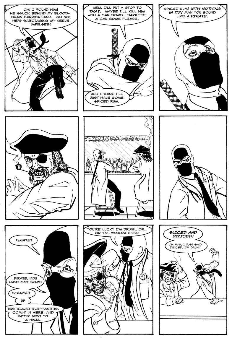
DR. MCNINJA GETS DRUNK WITH A PIRATE - $45 - SOLD
I remember enjoying the drawing of this page so much, I asked Kent to let me ink the faces, which is looking back, incredibly selfish and silly. But you can see there’s a lot of acting in this page with drunky ninja, and you don’t really need the dialogue to understand what’s going on, which makes it ideal for displaying.
See the unlettered art here.

NINJA TRICKS - $45 - SOLD
This is one of my favorite moments of the series because it does several things at once. It’s funny, with Dan McNinja explaining that he just magically stuffs food in his mouth to avoid taking off his mask even a little. It sets up a stupid hand-wavey justification, so anytime I wanted the ninjas to get away with any shenanigans, someone can just say “Ninja tricks!” and that’s the end of it. And... it sets up the ending I knew I would pull the trigger on some day, with Dr. McNinja just taking off his mask and disappearing into anonymity.
See the unlettered and non-shaded art here. SOLD
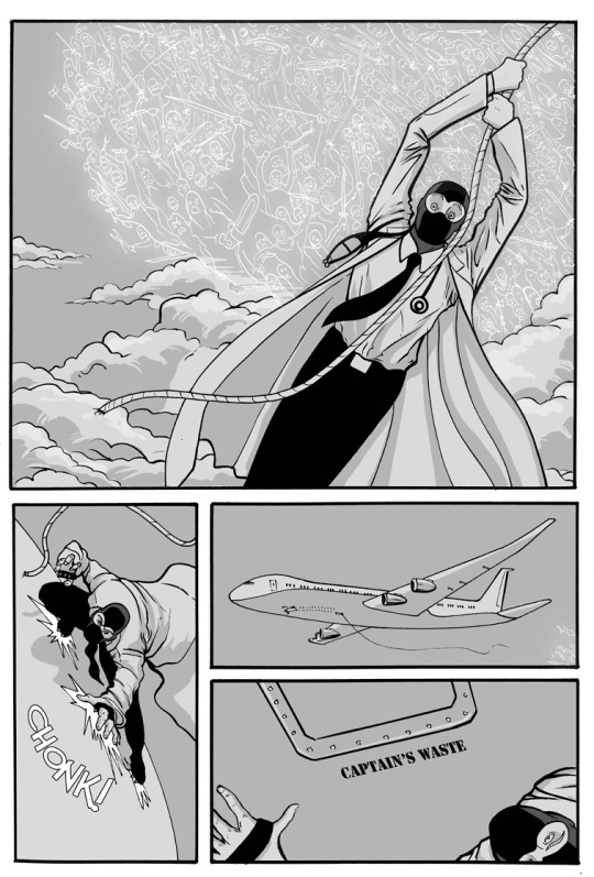
DR. MCNINJA IS CHASED BY A BUNCH OF GHOSTS - $45 SOLD
This one is still just cool to look at. There’s a bunch of ghosts chasing Dr. McNinja, and he’s scaling an airplane in flight to get away from them. Have fun explaining it to your guests.
See the unlettered and non-shaded art here. (SOLD)

GORDITO DOESN’T GET TO COME ALONG -$45 - SOLD
I like this one because it’s a funny little character moment for poor Gordito, who I had no plans for inside of the tennis temple, and I had to just say “Yeah, you’re in the B plot for this one, sorry.” You can tell what’s happening without the dialogue, and like I said, that’s what I like in the comic art I have displayed in MY house.
See the unlettered, black and white art here. SOLD
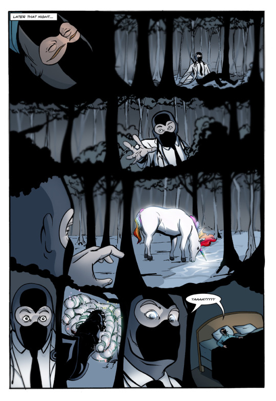
DR. MCNINJA DREAMS OF STEPPING IN UNICORN POO - $45 - SOLD
I love drawing dream sequences, because its an excuse to mess with the medium, which we’ve done here by making the trees of the dream forest into the actual panel borders. It looks particularly striking in the original black and white.
See it here. SOLD
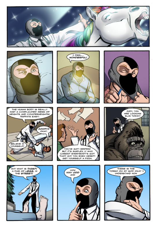
MCNINJA HAS A HAPPY DAY - $45 - SOLD
This is one of those pages I loved to make because it got to jump around the pieces that make McNinja who he is - he’s training Gordito in martial arts through his weirdo brand of science, he’s happily dealing with a patient with a real and normal medical condition, and there’s the quick nod to the gorilla receptionist, who did not get explained for a very long time. Also there’s a unicorn.
But mostly I just enjoy McNinja’s gleeful expressions until he is finally horrified by a body in the street.
See the unlettered black and white version here.
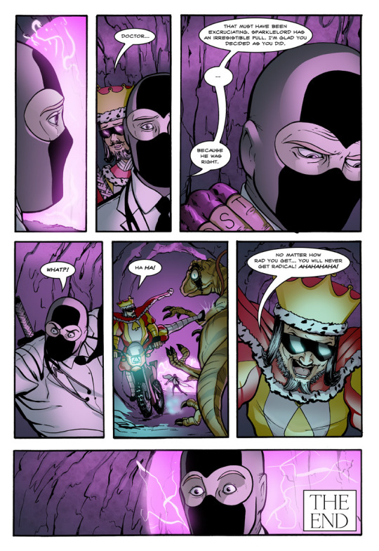
KING RADICAL IS A JERK - $45 - SOLD
This is one of those pages that really sums up a relationship. King Radical respects McNinja, but... he’s still got be himself, you know! And that self is the most radical man in the radical lands. And a twerp.
This page also features a king on a dirt bike kicking a raptor, which is neat.
See the unlettered black and white version here. SOLD

DR. MCNINJA AND HIS CLONE MEET MORE CLONES - $45 - SOLD
Story wise, this page is the start of the big turn in Army of One. Normally we’d assume that clone army was designed to beat Dr. McNinja by forcing him to fight an impossible to defeat larger number of himself. But if they’re all clones... then they wouldn’t WANT to fight him! And Frans knew that, and it was part of the plan. If you’ve read Gwenpool, you know I like to mess with genre tropes, and this is one of the larger examples of that in Dr. McNinja.
Also it looks good in black and white, which is why I’m selling it. See it here.

FRANS RAYNER PUNCHES MCNINJA IN THE FACE - $45 - SOLD
And here’s where Frans explains the plan. Again, just a nice looking page! This was near the end of Kent’s run as our inker, and he’s doing some of his best work.
See the unlettered black and white art here.

YOU HIT THE MAYOR - $45
After a bit of inking warmup on “Judy Gets a Kitten”, this page is probably the first where I start to feel comfortable and good with my own inking, and you can see the style of the comic start to change. I drew this on expensive paper with an expensive brush, and the thick, dark, expensive ink looks excellent in person.
See the unlettered black and white art here.
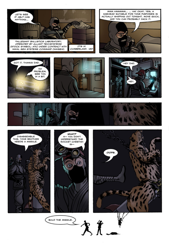
DAN KICKS APART A ROCKET CHEETAH - $45 - SOLD
It’s not too long after this page that I stopped working on paper, finding that Manga Studio just made everything so much easier.
Again, this is one that just looks good in person with nice inks. See it here.
FINALLY, A COUPLE OF SPECIAL FULL PRICE PAGES

JUDY’S FIRST APPEARANCE - $100
First off, considering how much original art I’ve sold over the years of making this comic, I cannot believe I still have this one. Besides being the first appearance of Judy, with some excellent fur work from Kent, there are a few interesting things about this page.
1) I redrew the kid and replaced him digitally, because well... he didn’t really look like a kid at first. The art has the original version.
2) This was originally homework I did at the School of Visual Arts, and on the original page, you can see it was graded a B+ from my professor, Walter Simonson.
See the unlettered original version here.

THE VERY FIRST PAGE OF DR. MCNINJA - $100 - SOLD
It’s the first page of the comic! A collectors item! Get it out of my house.
I will say this page represents when I was first really finding my voice, and it was a thrilling time for me. I was discovering that I could make comics however I wanted, and prior to this, I wasn’t really doing much in terms of comedy. A cheeseburger mayor fountain was hilarious to me, and you know what? It still is.
See the unlettered art here. SOLD
Thank you for taking a look at this collection of art, and I hope you consider taking some home with you! I’ve also got some signed books for sale on my eBay page as well. Happy New Year!
39 notes
·
View notes
Text
Reasons to Support Hakuoki: Kyoto Winds

If you are or ever were feeling skeptical about playing the latest remastered version of the beloved Hakuoki series, I was right there with ya! However, after actually buying and playing Hakuoki: Kyoto Winds for myself, I can honestly say that it is worth supporting.
Mind you, these sentiments are coming from someone who has only played the original Hakuoki ~Demon of the Fleeting Blossom~ when it was first localized in English on PSP back in 2012. I wasn’t really a die-hard fan of Hakuoki so I haven’t played any of the spin-offs or re-releases prior to Kyoto Winds, so I may have been hit by the nostalgia effect. But regardless, this recent remastering of Hakuoki has instilled a new love and adoration for the series that I didn’t have before, what with all the fresh content and updates they added. I can now see the amassing appeal to the series even though I didn’t quite buy into the game all those years ago. If that doesn’t tell you something about how well-done the remastered rendition of the game is, then I can’t tell you what will!
Improved UI: Updated, cleaner, and more visually appealing than before. I am a sucker for sleek and user-friendly UI, so I personally appreciated the modernization.

Improved Visual Effects & Animation:
Transitions between scenes are more fluid
Ambient effects (rain, snow, cherry blossom petals, etc.)
Flashback, character movement/ motion, combat (sword, spear, gun, etc.), & blood effects
Blinking & speaking animation

Stellar New Music: More immersive, convincing, and addicting! Many new pieces were added that correspond well with the mood and scenarios.

New Dialogue: As it sounds, new dialogue was added for old and new characters alike. As a result, the overall plot and character development received more clarity and became more convincing as both were more fleshed out accordingly. If anything, the new dialogue made me love all the characters even more! So much so that I’d like to just point out that the new dialogue for Chizuru gave her much more personality and backbone in comparison to before (WHICH I LOVED because I’m not down for the damsel MC archetype). As for the love interests and side characters, they were also given some extra love that really did an amazing job to flesh out their personalities and relative plot points as well. Reading the story this time around really made me buy into the appeal for this game. If there were to be any real reason to support this remastered version of Hakuoki, the new dialogue would be it!

New CGs: The classic beloved characters were given a few new CGs that followed their new scenarios, which really added to the natural development of the relationship between Chizuru and her potential love interest. I thought it was a nice touch to the original story as it helped bridge the gaps that may have existed with some of the characters where their budding romance felt abrupt or lacking. The new CGs definitely helped fill those gaps with ample SQUEE~! moments. The quality of the new CGs also look so good that I wish they redrew the art of the old CGs as well (I’m sure between then and now, the artist’s style has improved and changed over the years, so the more recent CGs stand out much more than the old CGs -- not that I’m complaining! It was just an observation more than anything). So then what this means for the new characters is that all their CGs were just stunning ☆◡☆

Ryouma Sakamoto (voiced by ♥ Daisuke Ono ♥): Obviously I’m biased but trust me, play his route for yourself and let me know if you just couldn’t help falling in love with this man and his voice ≧ヮ≦

Support Needed in Order to Localize More Otome Games: Yes, Kyoto Winds is only half of the original game (obviously, since it’s named as so), but I know many people out there have had a gripe about the lack of advertisement of such. Honestly, even if you didn’t know that the game is split into two, it’s no excuse to not buy the game or QQ on forums or review pages to deter people from buying the game. After all, the only way that we can hope to get more otome games localized in English is to make it known that there is a lucrative business and growing interest in the niche genre in the West.
TLDR; If you’re interested in Hakuoki, even if it’s only slight, I promise this remastered game is worth your while. And I can also promise that if you enjoy the game during the Shinsengumi’s Kyoto days, then you’ll absolutely love the second half of the game in Edo. Stick the wait out for part two & support this game in the meantime! There is definitely high replay value as you wait, I assure you. Now buy the game if you haven’t already and happy romancing! (ღˇ◡ˇ)~♥
#hakuoki kyoto winds#hakuoki review#minor spoilers#otome games#ryouma sakamoto#reasons to play#reviews
55 notes
·
View notes
Text
Unreleased/Rejected art
(adm: Like I promised, here’s the art I was going to put in the game but didn’t because of reasons lmao here we go:
[I’m putting everything under a cut because this is going to be kinda long
I DO NOT give permission to use anyting shown under the cut!!]

I was going to add this one when the axis/allies gathered together, and the Thing bust inside the room. Japan would say “I wish you the best of luck” in this pic, but IT JUST LOOKS SO WEIRD I--UUUHGHH LMAO I painted this like????!!!! seriously, like 5 times and it still looked weird so I just. Gave up. Lmao
This is actually not the last version I have of this drawing. For many reasons, I had to reinstall windows and I ended up losing everything. That’s what I could save of it.

A very rough sketch that would appear when Japan first found Prussia, when they were waiting for the thing to go away. It’d only appear when you locked the door. This was the first drawing I did for the game and I only drew it to see how it would look in RPG Maker, and since it wasn’t such an important scene I just discarded it.

Earllier version of “Look after me, Old Fritz!!”. I thought it looked weird, and my art changed a lot throughout the 5 months I worked on the game so I just redrew it lmao. Here’s the final version.


Early America icons!


Rejected Germany and Italy icons. Italy looks terrible and Germany looks just... weird lmfao.


Early icons! You can actually see the Prussia one when Italy’s inside his dream when he turns into his oni version lmao. That’s because I was going to use that icon, but later on decided to change how he looked a bit bc I didn’t really like how it turned out and forgot to change the oni icon, so yeah. The Spain and Romano ones were drawn along with the first set of icons. Later on I had improved my art and thought they looked weird so I just redrew them lmfao

Early title screen!! I ended up using this one for the game over screen lol.

THIS WAS MY FIRST ATTEMPT AT A SPRITE LMFAOOO I ACTUALLY TRIED DRAWING IT BY MYSELF [of course with the help of a sprite base]. But no way it would work. I’m glad I bought Game Character Hub lol.
But I guess this is all!! Here are some sketches and earlier versions of drawings used in the game:




and, there you have it! Sorry for the long post, but thanks for reading/seeing! :D)
81 notes
·
View notes