#however i do have two extra sketches that i plan to digitalize too!
Note
More Messmer mpreg pwetty pwease 👉👈
Oh absolutely anon!! ❤💛💚💙💜 More is coming! I have so much I want to do, I'm juggling between writing and drawing it!
If you have a certain drawing or scene of Messmer Mpreg please, feel free to send it in over anon or snag me in dms! I don't bite and I'd love to hear them! 😚💙🔥🔥
#mori speaks#mori answer's an ask#I love drawing and writing messmer mpreg#so im open to requests of messmer mpreg ❤🔥#that is something i will draw endlessly of for free#please send me messmer mpreg 🙏#i so want more idea's for messmer mpreg#i have a comic planned but those are my worst enemy lmao#however i do have two extra sketches that i plan to digitalize too!#i plan to get to those tonight anon- just for you ❤🔥
0 notes
Text
COMMISSIONS OPEN!!
Heya! Wanna throw money at me to make me draw something?? Well, for just $20 an hour, now you can!
Read below for price estimates and FAQs, and if you’re interested, please email me at [email protected] to get started!
PRICING INFO
Because I’m too lazy to come up with complicated price structures, I’ll just be charging a flat rate of $20/hour for any work I do on the art piece. The clock starts when I pick up the pencil or digital stylus and ends when I put it down.
This does mean that prices will vary, depending on how time-consuming each art piece is, but I can give you some rough estimates.
Upper Body Sketch: Approx. 30 min = $10 for one
It takes me about half an hour to draw a bust or upper body sketch. This time can be shortened if I’m already familiar with the character design, or lengthened if I’m drawing an unfamiliar character or doing some weird perspective stuff.
Every additional figure would probably take another half an hour, adding about $10 each.
Full-Body Sketch: Approx. 1 hour = $20 for one
Drawing an entire figure is a little harder than just drawing the upper body, so this one might take longer. Again, this time can be shortened or lengthened depending on my familiarity with the character, how complex the design is, and whether I’m doing any complicated posing or perspective.
Adding additional figures can take anywhere from 30 minutes to 1 hour, adding $10-$20 each.
Animals: Approx. 1.5 hrs = $30 for one
Animals are not my strong suit, though I have gotten better at drawing them over time! However, the extra time studying reference photos and trying to get the anatomy correct can stack up quickly, so you’ll want to be aware of that if you’re commissioning something with an animal involved.
Posters: Minumum 3 hrs = approx. $60
Posters take a little extra time—and usually some trial and error—to plan the layout in a dynamic way. They also take up an entire sketchbook page and tend to include multiple people and some extreme perspective to add visual appeal. You can expect a poster to take about three hours minimum to complete.
Multi-Panel Comics: Minimum 4 hrs a page = $80
Drawing a comic big enough to cover an entire sketchbook page can take me anywhere from 4 to 6 hours of work. If drawing a long-form comic, I will probably divide the work over several days. Brainstorming will happen on the first day, when I’ll plan out how many panels I’ll need for the comic, and then I’ll get in contact with you to tell you an estimated price before I proceed.
Digital Coloring: Minimum 1.5 hrs = add approx. $30
Coloring things digitally takes about double the time it would to sketch; I’ve noticed it takes around two hours to color a simple image, with another hour added for each figure involved. This first image took me about an hour and a half to outline and color, while the second took about five hours.
Add to Redbubble Shop: Subject to Redbubble Pricing
If your commissioned artwork is Lord of the Rings-related, I can put it into my Redbubble shop, where you can have it printed on stickers, t-shirts, journals, mugs, and lots of other products! I won’t charge any extra fee, but you will have to pay whatever price Redbubble asks. Full disclosure: I receive only 10% of the profit from Redbubble sales; the rest goes to the website to cover manufacturing and shipping costs.
FAQ
No NSFW
No nudity or sexual content
Canon ships only
Will draw gore/injuries
Will draw OCs (please provide references)
Will draw for other fandoms (please provide references)
The artist reserves the right to reject any commission without disclosing the reason
The artist will give price and progress updates over the course of the process
You, the commissioner, have the right to terminate the project at any time and for any reason
If the project is terminated halfway, you will be charged for the artist’s time, but the artist might give a discount for incomplete work
Payment will be calculated at the end of the project and rendered using PayPal
Once again, if you’re interested, please email me at [email protected]!
#art commissions#commissions open#my art#HEY GUYS WANNA HELP ME RECOVER FROM A $700 MECHANIC BILL I HAD LAST MONTH?? 8-D#oh and also i wanna get back into art lol#gotta get the ball rolling somehow#love y’all; thanks for your patience on my hiatus 💚
34 notes
·
View notes
Photo
It was late.
It had been a very long day.
A very, very long day.
Scott had been held back at the danger zone by bureaucratic nonsense and a CEO throwing a fit over a couple of Thunderbirds parking in his carpark and the resultant damage to a nearby building.
The insensitivity and self-involvement had John reining Scott in over comms. It wasn’t like he was going to hit the guy, really, no matter how satisfying it might have been. But it had been a gruelling and messy rescue digging people out of a collapsed shopping mall.
He and his brothers had been digging for hours.
Eventually he had to call it and had sent Thunderbird Two back to base.
He had intended to follow shortly after, but…obstacles.
It was just past three in the morning when One streaked into a hover above Tracy Island. The shift to vertical flight was smooth and mostly subconscious. Scott felt his ‘bird in his bones.
As he lowered her through the gap left by the pool, a dim light from the lounge told him he wasn’t the only one awake.
He had his suspicions who it might be and that only had him working through post-flight faster.
It could be Grandma, but chances were it was Virgil waiting for him to come home.
He didn’t always do this. Only after the difficult ones.
And this one had been far from easy.
Scott hurried up to the locker room and, shucking his uniform, washed the sweat and grime from his skin. It felt good to be clean, an extra step further away from the tragedy they had left behind.
He didn’t bother getting dressed other than to throw on some pyjama bottoms and an old t-shirt. he would check on his brother, possibly grab a quick bite of food and a drink, and then hit the sack.
The house was quiet as he made his way to the lounge. No doubt Grandma and Virgil combined were a force that saw the younger Tracys safe in bed. Virgil likely then turned on his partner in crime and bundled her off as well.
He was determined like that.
Sure enough, a quiet step into the lounge and he found his brother in their father’s chair.
Asleep.
Dark curls let loose from their product by a long-ago shower were a hastily combed mess on his forehead as Dad’s chair held Scott’s brother as if it were its owner. The worn upholstery cradling worn out rescue operative ever so gently.
Scott’s bare feet made little sound as he stepped across the hardwood floor. It was a warm night. The open windows let in a soft breeze off the Pacific laced with the honey scent of flowering pōhutukawa trees.
Virgil muttered and shifted in his sleep.
The sound drew Scott’s attention back to his brother. The desk lamp was the only source of light in the room beyond the starlight far above. The moon had already set and outside was almost as dark as it got, the ocean murmuring in the distance.
There was paper on the desk.
Scott didn’t use much in the way of paper himself. Most of his work was digital, often holographic and as ecologically sound as he could get it.
Virgil, however, did keep a stash of different surfaces to art on in his studio. Paper was one of them. Obviously, some had made it out tonight.
Pencil sketches covered the white sheets. Eyes, half drawn faces. Gordon popped up in one corner, a familiar smile on his face. Thunderbird One had her grapple out and was lifting something half-drawn.
He found his own face staring out of the paper. His drawn self was obviously angry and glaring at a faceless head.
Scott arched an eyebrow at the obscenity scratched into the cartridge under the non-person creature.
Virgil had obviously not been happy that Scott had been held up.
There were other words on the page amongst the drawings. Virgil doodling and possibly venting in the process. Even Scott could see the emotion drawn in graphite.
He sighed.
As if agreeing, Virgil snorted and tried to turn over in the chair, a manoeuvre that wasn’t recommended.
Scott caught his brother under his arms as he tried to slide off the leather upholstery.
He earned a grunt for his efforts. Bleary brown eyes opened and stared up at him. “Sc-t?”
“Hey.” A soft smile. “You planning on camping out tonight?”
Another grunt and his brother tried to right himself in the chair. “You took too long. Why didn’t you sic John on ‘em?”
“I did. But not until tomorrow. John needs his sleep as much as you do.”
“Yes. Yes, he does. Tol’ him.” Virgil’s eyes drifted closed again and he began to sink back into the chair.
“Oh, no you don’t. You’re going to bed, little brother.” Scott gripped Virgil a little tighter and pulled him up and out of the chair.
Various limbs pinwheeled a little and Scott ended up with his arms full of dopey brother, but he got the man on to his feet.
Virgil grumbled into his t-shirt and Scott let off a snort of a laugh. His biggest brother was hopeless when his sleep was disturbed. It was an ongoing source of prankdom – at the risk of the perpetrator’s life.
Hell, Gordon had managed to draw in a second pair of eyebrows on Virgil’s forehead once – while the man was supposedly awake and nursing his coffee.
The double-eyebrowed death monster that had resulted once enough coffee had been ingested was of legendary proportions. Grandma had literally roasted Gordon alive and a ban on markers on anyone’s faces had been instituted for all eternity.
Gordon was a multitalented artist, however, and simply switched mediums.
The honey had Scott blowing a circuit.
But dopey Virgil was a familiar and smile-inducing feature of the Tracy household.
Scott found himself grinning.
“Shuddup.”
Well, at least Virgil had managed a couple of neurons worth of thought.
Scott’s smile only got wider.
Virgil groaned and pushed his brother away and stumbled a little. “’M gonna bed.”
“You do that.” Scott had to stick out a hand and steady him as he wobbled into the side of the desk. “Need a hand?”
That triggered some incoherent grumbling that threatened bear territory. Scott couldn’t help himself and just grinned more as Virgil teetered away in the direction of the elevator.
The fact Scott had to save him from falling into the sunken lounge was probably a sign that the answer to his question was a definite ‘yes’.
A hand on his brother’s elbow prompted more grumbling, but the elbow wasn’t yanked away and by the time they made it into the elevator, Virgil had pretty much faceplanted himself into Scott’s shoulder.
The grin turned into a fond smile as he hit the button for the residential levels.
“You neeb togoto bed too.” It was muffled by the sleeve of Scott’s t-shirt.
“That’s the plan.”
“You bedda.”
Scott wrapped an arm around his brother’s shoulders. “Or what?”
More incoherent grumbling.
Scott pulled him in a little tighter as the elevator doors opened.
It was like leading a zombie down the corridor, though Scott could easily empathise. He was looking forward to his own pillow as soon as he saw Virgil to his.
A yawn escaped.
His brother looked up as if the medic had bypassed his brain and booted in safe mode. “You need sleep. Go to bed.”
He gestured towards door to Virgil’s rooms. “After you.”
Virgil frowned. “You first.”
Scott rolled his eyes and, reaching around his brother, activated the door and, with a little manoeuvring, manhandled Virgil into his rooms.
“Hey!”
His hand returned to his brother’s elbow and he marched him into his bedroom, amid protests.
“You need to look after yourself.” Virgil finger was jabbed into Scott’s breastbone.
Was it possible for a human to have one half of his brain awake and the other asleep at the same time? Apparently, some birds could do that. Gordon had gone into great detail that year they spotted some migratory waders landing on their beaches mid-transit.
In any case, Virgil obviously wasn’t all there as Scott backed him up against the end of his bed and pulled back the covers. Virgil continued to nag Scott to bed with varying levels of coherence. Smiling, Scott gave his rambling brother a gentle nudge and their gentle giant went Gulliver, flat on his back.
“Scott?!”
The eldest yanked up the covers and muffled the outraged mutterings. “Yes, Virgil?”
But his protests began to fade away and, as Scott pulled down the covers a little and tucked them in, he realised Virgil’s eyes were already drooping again.
Dopey indeed.
He brushed curls off his brother’s forehead. “Sleep, Virg.”
“Mmm, Sco’, go bed.”
Softly. “I will.”
“Mmmhm.”
Scott couldn’t help but smile a little more as Virgil drifted off.
A final touch to his brother’s hair and Scott straightened, his body creaking enough to remind him, that yes, he needed his bed as well.
He slipped quietly out of Virgil’s room and secured the door. A glance down the corridor, a thought, and he walked quietly down to check on Gordon.
The last he had seen of his fish brother had involved sad eyes and concrete dust. A quiet step into his rooms and he found Gordon as he had suspected he would.
The aquanaut was tangled in his sheets and throttling his pillow.
There was a frown on his face.
Much practised manoeuvring and he managed to straighten the Fish out and untangle him from his bedclothes.
Half asleep protests were halted by a plushie squid that awake Gordon would claim to his death never left the mantle above his bed.
Scott knew better.
His little brother quietened, falling into a deeper sleep.
After that, Scott couldn’t help but check in on Alan. It was probably a fortunate thing, because opening the door found Alan asleep in front of it.
The littlest Tracy had a history of wandering in his sleep. Scott had it checked out and it was directly related to early childhood trauma. Which one was a game of pick one.
It was managed, but occasionally it flared up. One of the most common symptoms was climbing out of bed and sleeping on the floor. Sometimes, the piece of floor chosen was a little inconvenient.
Scott was just happy the piece chosen wasn’t a balcony. Five and now Eos had been tracking Alan while he slept for years and issued alerts if he should wander too far.
Scott slipped into the room sideways and, with cracking knees, lifted his little brother off the floor.
Fortunately or unfortunately, Alan shared his sleep type with Virgil and slept like the dead. So, it was easy to move him over to his specially plush rug and snuggle him up with a pillow and quilt from his bed.
Alan muttered something about Virgil pulling him up, possibly something to do with the day’s rescue.
Scott reached out and touched Alan’s cheek.
His little brother mumbled his name and leant into his hand.
Scott blinked. The emotion that suddenly gripped him was just a sign of how tired he was.
Letting go, he pushed to his feet and slipped from the room. In the corridor, he closed his eyes and leant back against the wall for a moment.
One to go.
He tugged at the collar of his t-shirt. “Eos? You there?”
“Where else would I be?” Despite the smart-ass remark, her voice was quiet. Something she had learnt the hard way.
He ignored the comment. “John’s status?”
“John is currently in REM sleep. No signs of nightmare. Pulse regular, respiration as to be expected, body temperature 36.7 degrees Celsius. John is well, Commander.”
Scott let out a breath. “Thank you, Eos.”
“You’re welcome. Kayo and Mrs Tracy are asleep in their rooms, as is Hiram. Which is a concern, if I may say so, because he left Max on the ceiling.”
A blink. “Again?”
“It would appear so.”
Scott groaned. “Keep him out of the hangars this time.”
“I will try. But you know how he is.”
A grunt and Scott pushed himself off the wall. “I’m going to bed.”
“Good. Virgil was adamant you do exactly that.”
A frown. “Or what?”
“He said ‘or I’ll knock his ass out and drag him there myself’. His tone seemed humorous, however, John said it was a half-truth.” A pause. “Which half, I’m not sure.”
Another grunt. “Both halves, most likely.” To stave off a round of questioning at that, Scott quickly followed up with, “Tracy Island out.”
The house fell quiet after that and he let his shoulders drop, rolling his neck as he made his way to his own quarters. In his rooms lay freedom. A moment where he could just be himself, relax and sleep.
Sleep.
The door clicked shut and exhaustion caught up with him. It was a matter of steps to his bedroom, a modicum of the last of his energy to shove the covers aside, and he let himself fall face first into his pillow.
His body melted into the mattress.
It had been a shitty rescue, but his family was all home, safe, uninjured and resting.
He could let go.
So he did.
-o-o-o-
#thunderbirds are go#thunderbirds#thunderbirds fanfiction#Scott Tracy#Virgil Tracy#nuttyfic reblog#a bit recent I know#but it is fluffy#and has sleepy Virg
55 notes
·
View notes
Text
sprung
genre: suggestive romantic stuff, with a tiny bit of angst
pairing: tattooist!moonbin x reader.
warnings: none ? just a minimal language, and kinda heavy making out... yeah
- summary: sanha, the well known skater, had an older brother. and maybe his best friend y/n was too in love to proper think.
a/n note: this is kinda long and emo, it's just my first time writing in this genre so hfjbfn sorry in advance. gender neutral, also for a special friend who encouraged me to post on her birthday. planning on do stuff for the other boys soon. :)
...
[1:02AM]
putting a bit of effort into it you open your eyes, tired after waking up from what felt like a long nap.
your head still was unsettled, confused, looking around the place you found yourself at. by some point then you manage to recognize the living room and the nice sofa on which you were lying, such things from nothing less nothing more than the comfy, simple house of your best friend, sanha.
honestly no matter how much you tried to recall it on your mind, nothing reminded you of what could have happened for you to wake up there. despite how it was already one habit of yours to often visit this house where the tall, half black half blonde haired boy used to greet you in with his bubbly smile several times, and of course with his extra peculiar style, ripped pants, bandaids and chaotic printed t-shirts you always thought to be funny.
to be friends with a professional skater since high school days wasn't so bad, after all sanha was indeed one of a kind, such a mature and high spirited boy. he was such a nice goofball, always ready to talk about any topic, share taste on music or learn new things, the actual opposite of what people say about someone like him. sanha has always been an amazing friend, making you feel comfortable and your days a lot lighter every time you went to see him after dealing with responsibilities.
whether your short visits were to spend some time for both of you to help each other with things about studies or just when you missed spending time with him, you were already a common guest. for textbooks and notes purposes or for when it'd all turn into laughs, popcorn and your best friend's favorite games, or even in skate competitions he used to bring you with him at the square down street.
or else, when you'd also come to secretly see the black haired handsome man always on his casual clothes living there with your friend, who at the time he was home would stay sometimes in the kitchen, sometimes doing his works outside at the small desk near the garden, sometimes practicing sketches in his own room.
sanha introduced him as his older brother bin, who unlike him was a lover of all kinds of arts. whom you shouldn't pay so much attention to, but before your mind could go against it all of your thoughts were just as they ended up. constantly filled with him, with the need to see him everyday.
however now instead of going on trying to figure out any other possibilities to what could've brought you there, or even letting your thoughts wander over sanha's brother again, you hear calm footsteps approaching and immediately close your eyes, burying yourself on the sofa's recline. there you pretend to be still asleep, yet not understanding why your first reaction was like this, if it could be just your best friend.
for a few minutes the atmosphere remains monotonous, but soon enough turns tense as you feel someone come too close. two strong muscular arms embrace you carefully, bringing a sweet smell of shampoo you instantly could recognize so well. since the time when, in a game match with your best friend and his brother, both you and sanha attacked him with tickles for being the loser, as a form of punishment. you'd never forget it, for how it was your very first time hearing bin's boyish giggles, and touching his so silky, smooth hair, like a thin fabric tinted by the late night hues.
all of this together sent your heart pounding madly, already knowing who was there with you, especially when his jaw's downy skin brushes against your face for the proximity. at first he made a kind of awkward attempt to put you into his arms, in a position you could be carried comfortably. after one more try he gets to pick you up, and just when he easily manages to hold you firmly in bridal style, taking you off the couch like a light plush on his arms, nervousness started taking over you in silence as you couldn't assimilate where he planned to carry you to.
albeit a bit sudden at times and without much control of his own strength, except when you saw him drawing extremely detailed lines with his tattoo needle for customers at the studio he worked in, to where once sanha took you to bring him lunch, albeit he was too broad and intimidating, and his own homemade food didn’t always come out good for that little rough way of his no matter how hard he tried to do something thinking of you and sanha, albeit it all bin was always too gentle, too loving. it was so much whenever he'd open his mouth to talk with such sweetness and even a tiny bit of timidity to express his thoughts, even though how excellent he is with words, all of his little 'eh?'s when he'd be confused or cute neck scratches, you'd never believe he'd be a professional tattooist for years. he could normally work for all kinds of people, from madams to rockers, and do any type of drawings, from small daises to pretty complicated dragons and skulls. you'd have no clue of it if sanha didn't tell you, also about the fact bin always wanted to be a dancer, but because it was just the two of them and life tends to adapt itself according to necessities, he never thought about doing tattoos, yet casually came to work on it with time.
outside his job bin always took good care of his younger brother, though the troubles sanha would occasionally cause or how mischievous he could be even with him, and bin had to hit his head sometimes. all of his gestures were always docile, humble, treating you as if he was also a friend, and always being a real gentleman. not mentioning the countless times he had his crescent moons smile on up his eyes, just utterly enchanting.
all of this inevitably got you even more lovestruck, and your heart weak, no matter how hard you tried to muffle down those feelings. bin remained as the only man whose your mind and its daydreams for hours never grew tired of, the only one who gave new colors to your days. the more you knew him the more you were sure you couldn't be in any other way than hopelessly in love with him, too affected whenever he'd be around.
before you'd notice it you were thinking about this, about all you kept hidden inside for him. so you just settled yourself to forget what would be going on and let him believe you were really asleep, although in fact tension ran down your nape feeling his body's warmth, heat uncontrollably up your face while you leaned against his large chest.
after a few minutes of more footsteps sounds on stairs and doors opening through he carried you, bin stops at a certain point, slowly placing you carefully over another soft material, which you deduced to be of a bed.
you held yourself static, thinking he'd soon leave you there to rest and go, as you figured out sanha's brother probably would do so by his cordiality. nevertheless almost all at once you were simply taken aback when the male leaned on the bed, and slowly on top of you. his elbows and one knee supported him over, in such a way that made you too weak under his figure covering yours up, as if he was like a huge brown bear in charge. shivers hardened your shoulders, as you feel a heavier breath against your face.
"i know you're awake." he says softly, yet his characteristic boyish voice sounding way huskier than normally. you instantly open your eyes in disbelief over what you've heard, and just so your cheeks turns crimson, realizing how both of you were just few centimeters apart. his stunning almond eyes sparkled brightly into the room, dark and hooded while staring deeply at you. every one of his features on his manly face were lined on a serious expression, seeming concentrated, but almost fatal.
"bin.." all you could do was just mutter his name sheepishly over embarrassment, only to get a sigh from him in response. "shh..." his index finger lightly touches your mouth, tracing its tip to the corner of your lips, your hands starting to sweat cold just by the small contact with his digits.
bin then suddenly towered over you, without removing his intense brown irises from yours and rests his arms around your face, so his long fingers would now caress your hair. solely in this move his body quickly cornered you on the bed by his height. butterfly swarms rush into your stomach, as for a few minutes both of you kept quiet, staring intently at each other.
you swallowed hard. any trivial action like breathing now seemed dull, with him there so close to you as never. bin was like the definition of being drop dead gorgeous, every detail, every fiber of him exuded beauty, to almost seem unreal. through these few seconds watching him you couldn't keep your eyes from wandering, over each one of them. his thin, dainty rosy lips, which looked a little swollen, begging for another one's touches. black hair strands resembling the universe's dark matter hovering messy on his slightly sweaty forehead, and over his expressive frowned eyebrows. soft, milky skin which became a little more flushed as he stared at you, thick neck exposed by his t-shirt colar, wide shoulders covered by his cardigan tucked on his elbows.
oh everything about him was, so breathtaking.
although you couldn't understand why he was doing this, for how in your head you wondered why such an attractive man like him, who anyone would want to have, was there looking this way at someone so simple, still you couldn't hold back such things he made you feel. too many things screaming for you to let them out. and it was just the same for him.
"you know what.. damn it.." you heard bin break down the silence with a shaky whisper, and before you'd realize or question anything he placed your noses together in a soft brush and collided your lips with his eagerly, both of you sighing in the contact.
fear still was the main emotion taking over you, even though you closed your eyes right away and gave in to him, millions of beautiful sensations coursing through your veins at once. you simply didn't have any idea on how to act, what you should do in the first place all because of the frozen state his attitude caused, something you'd hardly come up with in your dreams by how far out of your reach you thought it'd be. however now you just put everything aside, gradually melting away with your knees getting weaker, as you felt bin kissing you in an irresistibly slow, delicate way.
not even through any of your deductions with yourself you'd imagine these little things which had your heart to almost explode now, that his nose would be so soft, and his lips would taste so sweet, velvety in their texture extremely hot and moist, pressing and moving gently as if they were massaging yours. easily you were found anesthetized, like one who reaches the ninth cloud. when they started to move more, just a bit hungrier between small sucks created by him and nibblings on your lower lip, you began to gradually further correspond them into the kiss, wherein he lets out quiet sounds, his pulsations so out of control and his cheeks burning red just as, or perhaps even more than you.
bin was still trying to not lose his composure. still trying to keep the feelings he had hidden for you from being all poured out at once, like a waterfall.
since the first time when sanha introduced you to him as his best friend, after he came home from a rough day at work. since then when you smiled saying your name and he could sense flowers blooming all over his chest, stealing the air on top of his lungs. to every time you locked eyes for too long or your hands accidentally touched his when you'd volunteer to help him in the kitchen. every little conversation, every time you patted his shoulders to encourage him when his brother would as well, never looking intimidated, like most people he knew.
he didn't want to show each drop of his honesty so fast in case you wouldn't flinch, but it was too hard when he had you there kissing him back, only the two of you in this moment, feeling you not repress him but otherwise, just wanting his touches as much as he's been longing for yours. he couldn't help but lose his mind more and more into each of your small actions. your hands timidly plugged on his waist, almost embracing it while his warm, long fingers intertwined with your hair strands, that somes mixed a little in his bangs, or your leg unconsciously poking his. in a way that without noticing bin tightened his arms more around you as well as the pressure of his chest, looking for more and more closure to you.
it didn't take long until the male would part his lips like a bud's petals, and so you shudder with his hot tongue there rubbing your lower lip, asking for entrance. you just give in not even being able to think through all the flustering this new sensation sent on you, and bin slowly deepened the kiss, making it fulfilled by all the so suffocated attachment you had for each other.
little by little his tongue slides in intertwining with yours, as the first thing hitting you was the fresh flavor of his chocolate mint cereal bar, which you were used to always see on bin's hands or pockets, and it just added an even better feeling through you explored his mouth. plenty more touches come up between the two of you so that the male, after staying still in the same position for a little while, suddenly slides one of his arms down. his huge veiny hand grips firmly and gives light squeezes on your side what caused you to jump a few times, running it down in a path of pure shivers to your hips, until he catches your hand still on his waist and without any previous warning pulls it in, under his shirt.
air immediately hitched on your throat out of shock, but bin was immersed, focused on only feeling you more. in the intervals his tongue's tip traced your mouth tilting his head for access, and when he brought it back so he'd press and gently suck your lips with his, the male kept the pace guiding your hand on his large back. slowly he also brought it down to the point of his firm, built up abdomen, which caused chills on himself, and moved your palm to make contact with the warmth of his absurdly soft, fragile bare skin inside the fabric. uncontrollable pulsations took over you the moment you get access to this new touch, your head in a fog of only bin.
this one was indeed a little different from the docile person you knew, with his contagious smile behind gloves and a tattoo needle you were so used to see. instead bin showed to be such an intense man, and why not say sexy, full of alluring gestures you didn't know how to handle, solemnly irresistible. over an impulse you make up a little of courage and start moving your hands by yourself, caressing and feeling his muscles, that have always been apparent on his manly athletic body, as each of his proportions under the shirt.
"god.." he suddenly said under his breath in a way sounding too sensual from his gracious, still husky voice among the kiss, melting completely in sensitivity and a cardiac mess because of you. bin then pressed a few more pecks a few more times on your lips, not wanting to pull away but doing so already for running out of air, through both of you parted trying to catch it.
yet you fail miserably, as soon as you see your best friend's brother face, completely flushed and breathless. his coffee colored eyes dripped fondness and loads of tiny stars all together, eyebrows pressed in such a lovely, affectionate expression you swore you never saw anything so endearing in your life. if it wasn't for another beat skipping your chest when you noticed a small amount of saliva, that you could clearly define as traces of the wonderful kiss of a few seconds ago, in the corner of his mouth.
as soon as he notices your widened eyes, bin's face changes and he cleans it by licking his lips seductively, as if he knew how much it affected you. the cardigan he wore falls from over his shoulders and he removes the cloth piece, dropping it on the floor. a small smile sprouted on his captivating features when he looks over at you watching him, as he lowered himself to your neck, putting his lips near your ear.
"keep going.." bin closed his eyelids, feeling the characteristic and comforting smell of fabric softener on your clothes. this smell which he always had on his memories from that day he shyly hugged you on your birthday, that now made him ask sweetly into whispers for your hands on him again, pressing more of his fine body and chest against yours.
his hips suddenly rolled down in a slow move, stimulating waves of electricity and adrenaline onto your stomach, your state now broke into sighs. you squeezed his waist slightly and involuntarily, moved by your latent feelings as he nuzzled against your neck, like a fluffy cat purring. bin was panting still heavily, sending incessant shivers down your spine.
"bin... you.. you're too much.." losing any lasting control over yourself you buried your face deeply on his shoulder and grabbed his huge biceps, letting out any first thing that would come out of your mind.
he smiled against your skin with a muffled chuckle, light and content for how cute you sounded to him, what got you even weaker as well as over the moisturizer perfume on his exposed collarbones by his shirt, before you went to fulfill his request. soon enough your palms were all over his muscular back once more, massaging them in up and down movements. bin took time to appreciate the feeling of having you into his arms, touching your hair, your nape, your lower back, or your cheeks where he decided to put gentle, tender kisses, that got you forgetting even more about the destination of your fingers under his shirt.
they ran all over his torso, sides, down to his beautiful abdomen once again to trace trembling patterns with your fingers under his stomach, running them up to reach the area of his chest, where you accidentally touch one of his nipples. bin stopped when he felt the stimulus, letting what sounded like a frustrated moan resonate in response, and you move your hands right away. yet you didn't expect him to feel so flustered to the point of, having his weight against you, to this time start distributing wet kisses, full of desire onto your neck and jaw.
in the middle of them bin took pauses where he sucked some of your skin to mark it slightly, or moistened each sensitive spot he left with the way too warm texture of his tongue. his hands also return to be entirely over you, one putting stronger, breath taking grips and squeezes on one side of yours as the other entered under the hem of your sweatshirt, his thumb touching your belly's area. each thing he did left you helplessly more and more of a mess for him, while his hips gave another roll once again in an enticing motion, causing you to feel an inevitable friction you tried to ignore but his moves only made it harder and harder, between his thighs wrapped tight by his jeans and yours pressed in the middle of his from jumping so much with his touches.
"sanha, saw you fell asleep, and asked me to take you to a room.. i went to see you and heard, you mutter my name.. saying that you wanted to have me..." for a moment, your eyes widen in realize, and finally you get how you were there.
your mind gets back remembering how sleepy you were before you'd come to see sanha, something which was again the result of another pulled night thinking about life, studies, and about bin constantly, about how incredible would it be if you had the courage to confess to him. but before you could even die of embarrassment for letting your dreams go too high right at your bestfriend's house, right next to him, bin slowly brings another trail of his warm kisses up your neck, eliciting quiet whimpers from you this time, especially when he stroked your waist skin inside your sweatshirt and reached for your earlobe, instantly capturing it in his mouth to suck on the small cartilage.
"do it now.. do whatever you want." you heard him confess with a bit of difficulty on his tone, for the much any response from you for now would mean to him. therefore he stopped, pulling away as he looked at you with sad traces, insecure.
bin needed to know about you, to get a reassurance from you, one more time of you expressing fully whether you were in love with him as much as he was with you to let yourself stay with him more, or if not, as hard as it could be he'd stop there, despite how reciprocal everything was from your side. he didn't want just a make out with you.
uncertainties still bothered him inside, through several sleepless nights spent on his room's desk among all his draft drawings and work notes, but thinking of the stupid, probably one sided attachment he developed for you, growing everyday because of how regularly he could see you. way too quickly you stole a space on his heart, bigger than the passion for art and colorful designs his job gave him. even when his needle did its work putting on pigment, when he found himself alone before a customer would come, he often wondered about what you'd feel, if you saw him only as your best friend's brother, if it'd be too risky to try and tell you what he felt.
there wasn’t one moment in 24 hours all of this didn't cross bin’s mind for once as the days went by, but he was too afraid of being rejected, to the point of thinking his brother could have much more chances with you. though he left all these things aside when he finally heard you demonstrating something for him as simple as saying his name on your sleep was, losing it all while he held you on his arms.
and so you knew you had to get all that fuss of feelings off your chest at once before the chance slipped from your hands. before you had no option but to go back to your routine of sinking in sighs about what could have been, wanting to be in his arms for a day, when you wanted it to be always.
taking a second to comprehend his eyes you raised your arms around the middle of his back to caringly engulf him on them. it caused bin to unhesitatingly lower himself again, resting his chin on your shoulder and hold onto your lower back, his heart rushing loudly, unsure by your action.
"i want what you want, love.." you confessed as well, still feverish for his previous caresses. then you just rested your face on his shoulder, and with all the sincerity within your heart you tightened your arms in a hug, trying to show your intention of making him feel exactly this, your simple embrace.
love.
as he heard you clearly when you hugged him, the moment you loosened the grip bin pulled his body a little away to look at you again. his serene, loving eyes flickered until they were deeply on yours, oceans overflowing with hope and anticipation into them. "did you say.. love?"
"yes, i.. always wanted to call you like that. can i?" your knees flutter with your own question, just by the idea of being able to call him as something that in so long would describe him so well for you.
bin, however, sighed till the bottom of his lungs, both now filled as everything within into a magical warmth, through every inch of his longing feelings were complete over his exhale. he wondered if he was dreaming, if this was finally the pure and graceful joy of touching clouds, or the lightness of blowing dandelions to the wind, of knowing that you felt the same, despite how he still couldn't believe it at all.
"you're so cute, i adore you so much y/n. if you say it like that, i'll be addicted to you.." the male's palm comes back to find itself cupping your cheeks, as his fingertips against your ear. once again you watch his fascinating gaze and face too close to yours, his irises, his lips to his shoulders, as if it turned into a new habit which would give you life. his voice sounds honeyed, like a blanket on winter, yet intimate, breathy.
almost as an immediate response you blinked repeatedly at the main three words on his first sentence, as of it didn't take long until you blushed violently trying to proccess everything, surprising bin while you placed your wrists at your nose's level to hide your face. you were now too caught up on a mixture of inexplicable waves of euphoria and emotions hitting you, too overwhelmed at all of these extremely heartfluttering things he just said so naturally. god, indeed he was too much to handle, but he still was your favorite.
"don't do this, fool! i adore you too.. a lot.." with your wrists still there your embarrassed expression only increase as you let out, but soon you moved them aside when the sound of his soothing laugh echoed into your ears. "wow.. i guess i'm the happiest fool now."
bin was smiling widely, grinning, perhaps in the most angelic, genuine way among all the days you've seen him do through routine. the crescent moons forming his beaming eyes harmonized as his lashes half closed with the curves on his lips up, giving room for two light dimples, forehead aligned with yours, emotions all over that you still couldn't read, as of relief and affection at the same time on his details. to hear him laughing in a tender and so spontaneous tone, his body seeming relaxed, comfortable, and to be a part of it almost like watching stars at midnight, all of this also made you smile along with him.
without being able to express too many feelings at once or what you'd like to say to him now you simply place your fingers against his face, the small, gelid earring on his ear, touching his bangs between them dearly, as if he'd be made of crystalline glass. another silence raised as you both kept looking at each other, like the night stopped passing around you, until bin draws another small smile and breaks the short distance again.
you took a deep breath, grabbing a certain spot on his shirt when you feel all the coziness of his thin lips pressing more kisses on different points of your face all slowly. on the area next to your nose where he placed the most of them, or on your mouth as he initiated another sweet, luscious round of lips on lips, pulling you closer and closer by your lower back, which seemed to be his best choice for a comfort zone.
but it doesn't take long for his attention to turn back to your neck, stopping to scan and softly trace his thumb on the small crimson hickeys he left there.
"some of them, look like tattoos... sorry, i.." bin whispered, trying to explain himself somehow embarrassed, but gets interrupted by you taking the initiative to hold on his back and get closer.
there you bury your face on his neck and kiss him gently, under his jaw to the beginning of his collarbones, as of every inch of his velvety skin flushed hot and sensitive in goosebumps where you explored. still being a bit taken aback bin shut his lashes and rested his cheeks now tinted in shades of pinkish hues against yours, disarmed by your suddenness. the more he felt your timid lips going so intimate on him, the more unrestrained beats and pantings had the best of him at that moment, bin no longer being able to maintain the same calm. you always had that power to leave him like that, definitely. the only one who ever did.
"there's something i always wanted.. but first tell me, if you want me by your side." one of his thick arms hug your waist, a barely audible moan escaping through he said out without thinking at all, just letting himself upon your guidance, locked on your touches.
the moment you proccess bin's words and what they'd mean your fingers slip from curling the silky strands at his nape, also leaving the curve of his shoulder where you planted more confident kisses, as if by magic your heart was sent on another unbalanced marathon. did he really ask it?
"of course.. of course i do." you answered his doubt with your whole chest, and it was all he ever waited to have you saying.
bin didn't know what exactly made him feel so lost on everything about you, wishing to stick to your side more and more. but he knew it was such a thing way too heavenly for him to not want to dive deep in. one drink, or a way too pure cup of water on thirsty times he'd last there appreciating till the last drop, a room wherein he'd feel better than in any other, or even a necklace he'd carry on himself everyday, a permanent tattoo.
any way it all should be, he wouldn't care. as of the moment he heard you a smile flourished across the corners of his lips again, and in a matter of minutes he held your sides pulling you with him as he sat back among the sheets, placing you onto him all too fastly and strongly in a way you had to look for support by putting your trembling palms on his chest.
you were left once more in a loss of words, swallowing hard over another wave of butterflies when you found yourself held sitting on his lap and facing him, through he gave you such a dangerously charming, sexy smirk, gaze so intense it almost knocked you dizzy like you never thought to be. yet less even would you imagine he'd strip off his t-shirt right in front of your eyes, and reveal his toned, absolutely perfect torso, all of his muscles there totally exposed from collarbones to his lower abdomen, where a black butterfly spreading its wings showed up printed on his skin at his side. bin just let your shocked eyes hover on the sight of his whole sculptural half naked body, before he'd glue your foreheads and squeeze your sides excitedly, also giving attention to your right thigh caressing and gripping it with his other hand through he adjusted you on his lap.
"everything i want is us, y/n..."
he couldn't wait to throw aside his stupid composure with you.
#moonbin#astro moonbin#moonbin fluff#moonbin imagine#moonbin scenarios#astro#astro imagine#astro au#astro fluff#mj#eunwoo#jinjin#rocky#sanha#kpop#kpop imagines#kpop scenarios#timestamps#park minhyuk#cha eunwoo#yoon sanha#moon bin#astro fanfic
110 notes
·
View notes
Text
Osora Interview translation (pt.2)
(printed in AnimaniA 4/2018, p.58 - 61 / interview originally given in March 2018 at the Manga-Comic-Con in Leipzig, Germany)
( pt.1 )
The Internet offers Let’s Players, but also all kinds of artists an opportunity for very direct communication with their fans. However, this can also have its downsides when it comes to potentially negative feedback. How do you deal with this issue?
—Sometimes you just stumble across negative feedback that you didn’t want to see, and that can chip away at your motivation and creativity. I try to prevent that by not really looking at reactions in the first place, and when I do happen to see negative feedback, I try to forget about it again as soon as possible. Of course, when I start a new series, I’m curious about the readers’ reactions and go looking for feedback, but if eight out of ten comments are very positive and two are negative, I still tend to get stuck thinking about those two negative comments. There even was a time when that negative feedback made me feel too depressed to draw for a couple of days. But the more often this happens, the more you learn to deal with this criticism. I can stomach it pretty well by now, and I think it’s important to not let negative feedback get to you.
Did your experience regarding interactions with readers change much from Boku to Senpai no Tekken Kousai to The Ones WIthin?
—Digital publications receive a lot more feedback than series that are only released in print - be it via email or via Twitter. Twitter is the main source of comments. With Boku to Senpai no Tekken Kousai, there was much less of a response, and the feedback that we did get was usually in the form of letters. Since readers had to buy the magazine first and then go out of their way to send a letter, that was a lot more complicated. (T/N: i.e. it takes more time to write/send a whole letter than to just send a tweet)
How do you handle responding to messages from your readers? For example, do you set specific times for yourself to reply?
—Since I get the most reader interaction on Twitter, I try to answer questions and comments there when I find the time for it. I always do that myself because I want to respond to my fans in my own words. That doesn’t feel like extra work to me, but rather like a pleasant change of pace. Aside from my personal account, there’s also the official account for The Ones Within, which is mostly for promotional use. My editor retweets my tweets there and forwards any questions that get asked there to me.
Could you describe your usual daily routine when working on The Ones Within?
—I’m a night owl, so I usually get up rather late at around 10 am. After that, I basically work in two rounds. The first lasts the entire day and ends in the evening, around dinner time. Then I take a short break, and the second round starts at around 9 pm and ends at roughly 2 am. If I’m close to a deadline, I sometimes just continue drawing until I pass out. (lol) I never take much time to eat at that point, either.
What advantages are there to drawing digitally in comparison to drawing traditionally?
—Oh, there’s a lot - especially how easy it is to make corrections and adjustments. Your work space is neater and other people can’t stare as easily at what you’re drawing. There’s no need to erase sketches or apply screentones by hand (T/N: see here how screentones are applied traditionally, it’s definitely faster digitally lol), so there’s not as many work steps either and you can finish your work even on your own [without assistants]. And since it’s all data anyway, it’s easy to save as well.
Do you have any advice for artists who are just starting to work digitally?
—Practice makes perfect! I used to have a private page online where I more or less kept a drawing diary, all about original characters. I still kind of do the same thing on Twitter nowadays. It’s important to keep at it and actually draw on a daily basis, that way you’ll get used to it. There’s also live streams from artists on Pixiv and Twitter - it’s helpful to watch those and adapt parts of their progress for your own work.
You’ve shown us a picture of one of your notebooks that you use to jot down your ideas - where do you usually come up with these? (*picture under the cut at the bottom of the post)
—There’s two main places where I tend to draw spontaneously. For one, on the train - usually after meetings with my editor. I can best sort out my thoughts right after those meetings and save some first ideas. Secondly, in bed, right before going to sleep. Ideas flow really easily when you’re sleepy and letting your thoughts wander. Also, I’d feel like I’m wasting my time if I did nothing and just waited to fall asleep, so instead I imagine as many scenarios as possible and jot down the best ones. When I come up with something I especially like, I might also get up again and draw it digitally right away. (lol) I don’t take my notebooks with me everywhere I go, though.
Both Boku to Senpai no Tekken Kousai and The Ones Within combine dark, mysterious elements with more comedic ones. How do you find a balance between these two aspects, and what do you like so much about combining these opposites?
—I like both comedy and serious plots, so I wanted to draw both - in the end, I combined the two without really thinking much about it. I usually just let this come to me naturally while I’m drawing too, although I do keep the timing in mind. For example, it wouldn’t be appropriate to make a joke in the middle of a sad or serious scene, and vice versa. So, I take care not to destroy the atmosphere that I’m trying to convey [in each given scene].
Personally, which character from The Ones Within is your favorite?
—I can’t really “rank” my characters because I love them all! Going by who’s the easiest to draw, it would be Anya. He’s a pretty straight-forward type, so he’s easy to understand. He’s also the only one who looks angry a lot of the time and has eye bags… and his accessories, like the helmet, his iron bar or the chewing gum - they make him stand out and thus easy to draw.
Do you already have an ending planned for The Ones Within or do you still have a few options to choose from?
—The ending is already planned out!
Do you maybe already have a new project in the works that you would like to tell us about?
—For now, I’m just really happy that The Ones Within is getting an anime adaptation and I can finally talk about it, now that it’s getting officially announced this May! I can’t wait to see my characters animated on the screen!
A final word to your fans?
—Thank you so much for reading my manga! There are so many Japanese manga series out there, and I’m really happy that you chose to read mine out of all of them. The Ones Within is getting an anime adaptation, and of course the manga is still ongoing as well, so I hope you will stick around and enjoy it until the end. Thank you!
Osora-sensei, thank you very much for the interview!
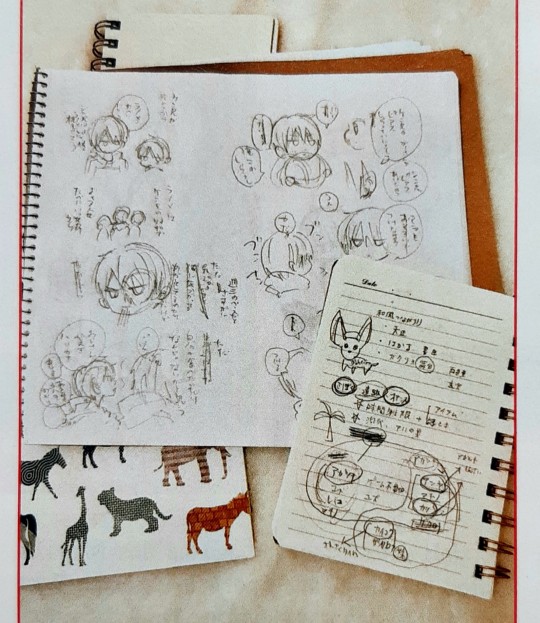
I tried to decipher these but the picture was too small to read much sadly agdjsdvhs
The bigger page seems to be some Kudou bros goodness? They seem to be talking about Shinya having Kenya's piercings (and maybe about Anya getting piercings as well, considering his very resolute "I don't want to." lol) and they're also mentioning ramen at some point from what I can decipher
And the bottom right looks like some kind of character relationship chart / worldbuilding notes,,,
#osora#the ones within#naka no hito genome#nakageno#boku to senpai no tekken kousai#translation#mangaka#mangaka interview#I feel dread knowing that Osora has the ending planned and might drop it on us some day after this hiatus lmao
4 notes
·
View notes
Text
Second Generation Headcanons
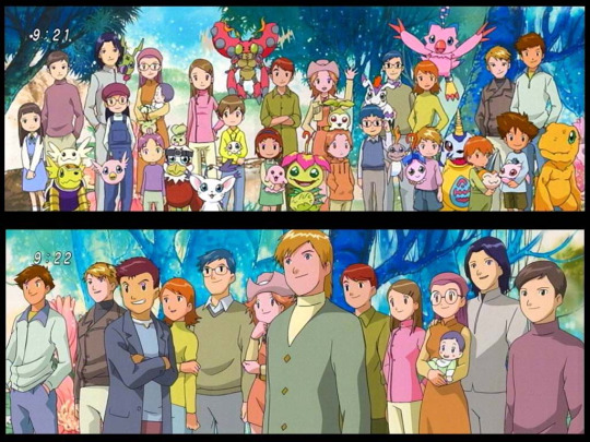
These are my headcanons of how the children from the epilogue would be. I know most folks don´t like the epilogue (For the most part I still don’t know how to feel about it) but I do, however in my head Takari and Koumi are canon (there are people who like the epilogue but don’t like including non explicit canon ships) (I won’t be mentioning them just in case), I really love the design for the kids!!!
Let’s start:
The following fanart is done by the amazing Mishy (who let me use her art for this post) (go check her out x)
Sora and Yamato’s kids: (sorry I suck at naming characters so don’t expect names)
The only ones who were fully planned they waited a while to have kids because:
1. Were busy building successful and time demanding careers.
2. Given their own childhood issues, they both agreed to wait until both were 100% on board and could provide a healthy household for their kids to grow up.
Were scared shitless anyways
Yamato is the cool uncle who is an astronaut, all the kids LOVE him, and he loves all the kids. Always brings every single one of them presents from his travels or science/related ones.
The son:
Tiny baby (the takeru of the group), everyone is so protective of him not only his sister and cousins. His Digimon follows the gabumon line and is really powerful so he doesn’t really need the extra protection (but everyone ignores this)
Inherited the crest of light. He is a ray of sunshine
Ok hear me out. I think the chosen lost/gave up their crest sometime between kizuna and the epilogue and while their kids got the same baby Digimon as their parents, the crest were redistributed according to their own personality traits.
That scared his parents, because they saw how it burdened Hikari. Even if the darkness was placated years ago (whatever was after Hikari is gone), it couldn’t be truly destroyed. Still, this crest carries a lot of power and responsibility.
Hikari came over and took him to the park and over ice cream explained the crest to him and reassured them all that they have nothing to be worried about and they could contact her anytime in case something happens.
The daughter:
Bearer of the crests of Love and Friendship.
Scarily similar to both of her parents.
Loves to play and participate in group activities, but also enjoys being alone sometimes.
Really into art, she is never seen without her sketch book and a pen. All the paintings in her house are painted by her. And her mother also incorporates some of them into her designs or uses them as inspiration.
100% Daddy’s girl. She looks up to Yamato so much, even dresses a little like him and keeps her hair short for a while (she loves it when they tell her she looks like him).
Loves to hang out with Taichi’s son. They are in the same school.
Had an emo phase.
Miyako and Ken’s children:
The babies having babies. I am emo.
They both work a lot, but miyako does it from home (she works with Koushiro, fight me). They still take them to the park a lot and go on family trips all the time.
THE DAUGHTER:
Little shit.
Actual genius. Always doing experiments, don’t be surprised if you see the dog with a phone taped to his collar, she is probably trying something. Loves computers but science is her thing. After all these years they let her be as long as 1. She is home, 2. Doesn’t involve the digimons, 3. Doesn’t involve fire.
One time Yamato gave her a chemistry set. They had to move out to another building. After that, Ken asked him to bring her moon rocks from now on. She also loved the rocks
Loves to roast everyone in the family (mostly Miyako). Ken has to remind her not to be so rude to her mom. She adores her parents, but this brings her joy.
Crest of purity. Mimi is proud of her
Don’t be fooled, she is the goggle kid of this gen.
The son
Actual cinnamon roll, too pure for this world.
Calm personality. It contrasts a little from his sister’s. But if she is up to something, he is the only one 100% aware of it and would follow her to the end of the world.
Miyako thought she was coercing him, but no, he loves his older sister’s ideas and plans.
Crest of Love. He is really in tune with other people’s feelings, it concerns his parents because he can be overly empathetic sometimes and it affects him. He is really open and wears his heart on his sleeve.
He tells everything to his mom, and if something goes wrong, he’s the first one to contact the adults.
Iori’s daughter
Iori was the youngest to have a kid, he knew it, but he really wanted his grandfather to meet his kid and see him happy and married before he died.
He isn’t sappy or overly romantic, but he believes in love at first sight, meet his wife on his first day in college and didn’t look back.
Lives in the same building as takeru. They drink tea together in the afternoons like old british ladies
The kid
Looks like a cinnamon roll but is Little shit 2. Best friends with little shit 1 and Takeru’s son.
Again, Ken has to make sure they aren’t overly mean to Miyako and Iori.
Crests of knowledge. Wants to know everything about the digimons and the digital world.
Has Iori wrapped around her finger since day one, but he is the first one to call her out her BS.
Isn’t into kendo but likes to try different extracurricular activities (still hasn’t found what she likes yet), but Iori is her #1 fan everytime.
Jyou’s son
Jyou moved around the country for a while, so his kid didn’t grow up as close to the others. He still made sure they all hung out together whenever he was in town.
“I have to make sure you don’t miss me”
“oh, it isn’t like you were around much when we were young”
“MIMI-KUN!”
The kid
Gomamon’s biggest fan. He and his own Bukamon were his only friends for a while, he can’t wait for bukamon to digivolve so he can be with TWO gomamons.
When they moved back, He got close to Takeru’s kid. Doesn’t get what the fuss about his father is about.
He knows a lot about digimons but is more into engineering. Doesn’t like blood.
Inherited his father’s lack of chill. Has a little crush on iori’s daughter (hasn’t figured out how to act around her, yet).
Crest of purity/reliability.
Takeru’s son
He is with Hikari and their kids are siblings. Please let me have this.
Takeru really loves his nephew and niece. He totally would spoil them rotten.
Designated Babysitter. Since he is a freelancer, you can say he has a lot of free time (not to his face tho), he likes to take the kids to amusement parks, go for ice cream, etc.…
After his lonely childhood he is loving having such a big family now. I CrY.
The kid.
Grew up listening to his father’s stories every night.
One thing he learned about them was the importance of being prepared all the time and think before he acts. He is thoughtful, so he really related to Jyou.
Not only that, Jyou is his hero. Takeru was really amused at first when his son would ask him questions about him after his bedtime stories. He is fond of his son admiration for his friend, who also saved him when he was younger, and knows that Jyou being away contributed to this.
Carries a backpack with him all the time. You want water? He got it. You need tissues? He has some. Some kid at school is being mean to you? He would show up to walk you home. (doesn’t like violence)
Crests of reliability. The kid was ecstatic.
At first, he got close to Jyou’s son so he could talk about his dad but ended up really liking the kid. (he likes to be friends with everyone)
Best friends with Iori’s daughter. And hella overprotective of his cousins.
Hikari’s son:
Please
Designated babysitter 2. She is really good with kids, tho she also helps organize plans for only the adults.
Tailmon disappeared one day when she was heavily pregnant, she looked for her the whole day and finally found her in her mother’s house. Tailmon told her she was worried that when she had the baby, she wouldn’t like having her around anymore.
Hikari reassured her that she would love them all equally and she will need her now more than ever. They cried and made up, then her water broke.
Taichi totally cried nonstop the day she gave birth. She still teases him about it.
The kid:
Healthy as a horse, athletic and tall. Total opposite from his mother except for his looks. It amuses Taichi to no end.
Behind the scenes leader. He loves to bring out the best in everyone and always makes sure they are all fine. He specially loves to hang out with Miyako’s kids, Daisuke’s son and Takeru’s son his sibling (they have to deal with the shenanigans of LS1 and LS2, god bless them).
Crest of Fate. Hikari always suspected that like her, he wouldn’t get a normal crest, still cautious as to what exactly this one means.
Hates being alone, isn’t used to it. Tailmon slept in his crib with him when he was a baby. He is always with his plotmon and has got in trouble several times for bringing her to school. He hasn’t told anyone but his Nyaromon digivolved because he ran to the street without looking and was almost hit by a car. Plotmon saved him.
Loves having sleepovers at his uncle’s house, despite their age difference he really loves to play with his cousin.
Taichi’s son
Always said he’d rather be a cool uncle than being a father. But the more he thought about it the more he wanted it. He realized he was the only one without a kid, but his travels still made him hesitate.
Still goes over to Yamato and Sora’s house all the time. One time when Sora was pregnant Yamato arrived from work and found Sora sitting in the sofa and Taichi cutting fruit in the kitchen.
Yamato and Taichi sat down, Taichi handed Sora a bowl of fruit and whipped cream and started eating it with her.
“thanks”
“You didn’t bring me a fork?”
“oh, I am sorry, was the baby growing inside you pushing your organs too?” Taichi and Sora laugh.
“no. but then why are you eating?”
“I cut the fruit”
“well, I bought the fruit!”
“GUYS”
“Sorry… but seriously what’s the matter with you lately?”
“I don’t know what are you talking about… hey Sora how did I do it?”
“the fruit? Fine I guess… why?” both Sora and Yamato stared at Taichi waiting for him to spill.
“OHjustfine?ok,bythewayiamhavingababytoo”
One time he got emotional after seeing his little sister’s son taking care of his son.
ANYWAYS, THE KID
CREST OF FRIENDSHIP *not pictured: everyone laughing about it for years.
Baby but doesn’t like being treated as one. Super independent, dresses himself since he is two. Loves to challenge himself.
Instant best friends with everyone he meets. Loves to hangout with the Ishidas. They are his best friends, also his cousin, also is everyone else. Doesn’t mind being around adults as well, often called matured for his age. This amuses Hikari.
Apart from his parents, Hikari is his favorite person in the world. Right now, he wants to be a teacher like her. (Last week he wanted to be a Chef like Mimi)
He and the third Ichijouji kid will probably lead the next gen.
Daisuke’s son
Daisuke travelled a lot, meet a lot of people and ironically, he married one of his neighbors. He went one time to visit his parents and ran into the girl who lived upstairs, whom he knew since he was a kid, but holy shit. He visited his parents everyday for a month until she asked him out.
When she got pregnant, he asked Taichi for his goggles.
The kid:
Prankster. Did you expect anything else? (his chibimon has a really deep voice and he loves to use him to prank people)
Don’t leave him alone with the Ichijouji girl if you value your home or your life.
Crest of Courage. Loves a good adventure, well for him everything is an adventure: from running errands with his aunt to going with his father to one of his restaurants around the world.
He is a handful; however, he has a big heart and is such a happy kid.
Admires the older chosen a lot and it’s always asking them questions about their adventures. Dreams of being an explorer or changing the world. Yamato patiently answers all his questions about space since his own kids don’t seem to be interested.

Mimi’s son:
She totally married koushiro, bear with me on this.
She has a multifaceted career, although not in what you would expect (she wasn’t interested in acting or singing professionally). She ran a lot of business, selling them when she lost interest. Is not afraid of taking risks. This meant she travelled a lot.
Eventually got tired (yes, I know. Mimi, tired? Yes) and came back to Japan. At first, she was promoting her new cooking book in a tv show but she got offered her own show and has been living her best life ever since.
The kid:
He is quiet, introvert but observant.
Ironically, he speaks 4 languages (Japanese, English, French, and Spanish), he is learning german now. He loves reading so that’s why he likes languages a lot.
He bonds with the other kids over the digimons and card games, ends up going to school with most of them and they eventually bring him out of his shell. He and Jyou’s son are kindred spirits.
Calm kid, but if you mess with him or one of his friends… you will see him angry. He is honest and loyal to his friends.
(you know how each baby Digimon has multiple evolution lines? I read in the Digimon wiki that one of Palmon’s ultimate forms is a cherrymon. Imagine Taichi saying something like: “Well kid, one advice: never tell someone to kill their friends” and the kid being like: “…ok?”, whereas Mimi and Yamato glare at him “I’ll fucking end you Taichi”)
Crest of knowledge/courage, of course.
Last but no least:
Koushiro’s Daughter.
By this point You know what’s up
Koushiro first thought when she was handed to him for the first time was: “wow, she looks like me.” What really got to him (even though it shouldn’t) was how he had someone related to him by blood.
He adores her and is really proud of every little thing she does. Remember the “do it for her” scene from the Simpsons? He totally has one like that in his office.
Tentomon didn’t tell anyone that he spent a whole day watching Youtube hair styling tutorials. No, none. He didn’t tell Palmon and Gomamon who told everyone else, no.
The kid:
Actual ray of sunshine. (i know i seem to say this about every kid, but listen they are my kids too)
She is the nicest kid you’ll ever meet. Koushiro says he’s never had to deal with a temper tantrum.
Crest of Kindness. Loves animals, got her dad to donate money to the oceans and animal shelters.
Sora gave her stickers with cute animals and smiley faces for her birthday and now if she sees someone sad, she gives them a sticker. “Dad, you look sad today. Here!” she puts a smiley face on his forehead, he smiles and hugs her. He didn’t take it off and “accidentally” went on a meeting like that. Miyako took pictures and sent them to the group chat.
Closest to Ken’s son and Mimi’s son her brother. Also loves to hangout with Taichi’s son, and Yamato’s kids.
Loves music, actual prodigy. Plays the piano and the violin (she plays violin most of the time). Wants to compose a song for each Digimon. Invites everyone to her concerts.
Ok, this was long. I didn’t talk about the baby, but i think he would be Hope (since he is the last one) (wrote this in an hour and english is not my first language, so yeah. Sorry)
I think these people love each other so much, they might’ve drifted apart in their youth, but with the years they all got close again. Since most of the kids don’t have siblings, they set up playdates, so they don’t feel lonely. They don’t regret the events that brought them together, they knew they had to let their kids experience it when the time came.
#Digimon#digimon adventure#Digimon adventure tri#digimon last evolution#Digimon kizuna#sora takenouchi#digimon adventure 02#mimi tachikawa#takeru takaishi#koushiro izumi#jyou kido#daisuke motomiya#ken ichijouji#miyako inoue#iori hida#holy shit i needed to get this out of my chest#Mishy#thanks a lot!#miyaken#koumi#takari#sorato#hikari yagami#Taichi yagami#yamato ishida#digimon headcanons#kenyako#mine
126 notes
·
View notes
Note
I've got to say, I've just discovered your project and I'm really into the aesthetic you're going for with your game (I dig the juxtaposition of cute bright colors with both subtle and overt unease)! Will the final game be available for free/pay-what-you-want on itch and/or Gamejolt? How many endings can players expect to find when the project is complete? What were your inspirations to create MegaBite (I can see the FNAF and some BatIM influence here)? Will ask more questions soon!
Hi! First of all thank you for your comment! Now to your questions:
The final game will be for pay, between 3 - 5 usd. However, the first level (current demo length) will be free to play in its final quality once the game it’s finished. I plan to have it in both itchi.io and Gamejolt, and hopefully also in Steam, but that last one will be when the game is fully done. Those are my current plans but I’m not sure if it will slightly change in the future.
The game has 3 main endings to the game. One of there is the “True ending” while the other two are alternate endings so to speak. There’s also a fourth ending you can get at the beginning if you decide to not be curious, but it’s more of an extra thing. Aside from that, if you count the dead endings, there will be plenty more (so far there are 3 dead endings in the first level, but I want to add at least 1 or 2 more).
You got it with the FNAF inspiration, FNAF was one of the first indie games that inspired me to work hard, Scott Cawthon achieved so much with the first games, all by himself, it really pushed me to believe I could do a good game on my own! (Even if I do hope to find/make a game dev team in the future). The first inspirations where a bit of an accident, but when I started to see them (Pizzeria - Diner, Animatronics - Obj Robots, this should be a happy place but murder) I took those similarities and tried to take MB a different direction, hence why MB is more of a technology future problem and not supernatural like FNAF.
On the other hand, I don’t think I really got any influence from BATIM, I started working on MB concept about a year before BATIM came out (mostly in notebook notes and some sketches in DA, since I like working on paper before moving to digital). However, I can see some common points, but those are also common points that you can find in other books and games since they are not really new concepts like “the creation turned against their creator” thing.
Some other influences were the webcomic “The Property of Hate” which I found first by looking object heads and just kept reading because it’s so GOOD you should totally check it out if you don’t know it. I love Rock & Roll music so that also influenced the time of the game, plus I don’t know why I used to watch the movie Grease a lot when I was a kid, so that ended up being an inspiration too even if I have still to watch it again. Other inspirations were milkshakes and hamburgers because I just, love milkshakes, as silly as it sounds.
Thank you for your questions, I hope you find this answer interesting or at least, answer what you wanted to know :D
5 notes
·
View notes
Text
Commission Info
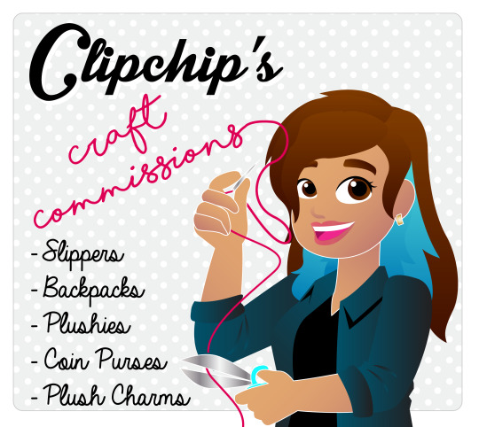
Hi Guys!
Welcome to my new commissions account! Here is where I’ll post about craft projects I’ve completed, open commission slots, and some other crafting stuff, probably, most likely.
Anyway, here’s a general breakdown on prices and commissions with me, also visible on the commissions link on my profile page, which may or may not be visible on mobile.
General Stuff:
I work on commissions in order of whoever pays the materials fee/deposit first. So you can sign up for a commission, but it may take me a bit to get to it. I will let you know when I go buy the materials for your commission, which is basically the signal that your number has been called.
I’m open to all fandoms! I also do OCs, but must have references.
Since I open commissions sporadically, I don’t do holds, rain checks or heads up. I have limited slots as well and I just don’t think it’s fair.
Payment:
So sorry, but I do not offer payment plans.
Payment is through paypal only and is split into two invoices. The first is sent after the design is finalized and is the material’s fee/deposit. If you cancel your commission and materials have already been purchased, you forfeit your deposit! The second invoice involves the remaining cost of the commission + shipping. All shipping is done through the United Sates Postal Service, and since plushies are pretty bulky can run high :( I’m sorry, I have no control over shipping prices. I am willing to ship outside the USA, just keep in mind that international rates are higher.
Contact:
You can message me here on tumblr or at my email [email protected].
I reserve the right to refuse any commission.
Shipping: Please keep in mind that shipping costs varies by location, and is not under my control. I’m limited by what the postal service offers. I ship from California.
Backpacks:
Base price for backpacks, without wings or add-ons is $80. With wings or additional pieces it jumps to $140, because the materials needed for them are a bit pricier.. Prices vary between backpacks however because each one is custom and different. So it could be more it it’s particularly complicated.
Contact me, tell me about what you want. Maybe you just want a backpack made out of some fabric you saw online or at a store, if I can get my hands on it, we’re good to go! If you want a custom character backpack, like my winged transformers bags, give me the character and details.
Select a backpack style. I’ve got multiple styles you can choose from! I’ll send you your options.
After you’ve picked your style, I’ll come up with a digital mock-up to give you an idea of how the backpack will look when it’s finished! After you approve the design we can go to the next step. Don’t forget, you can pick what kind of fabric you’d like inside as well.
Material shopping! I require an $50 materials fee for plain bags, $80 for bags with custom accessories. I’ll send you an invoice on Paypal. Non-refundable unless your commission hasn’t been started.
Construction. I start sewing! Completing a project in full can take up to 3 weeks, because, you know, life :P. But I’ll send you pics of the backpack when it’s finished and then the wings/extras.
Final Payment and Shipping! Another invoice will be sent after I calculate shipping cost, add that to the remaining fee for the backpack, and ship it out!
Slippers:
Base price is $75. May be more if the character gives me a lot of trouble. Made out of fleece and felt, with grip fabric for the bottom of the shoes and a foam interior.
Reach out to me here or at my email :)
There’s only one style of slippers but tell me what character you want! I’m open to any and all, but if something turns out too difficult to work, I’ll let you know.
I’ll make a rough sketch or digital mock up to ok the design if it hasn’t been seen before.
Materials shopping! For these, $30 for materials is needed up front. Non-refundable unless I haven’t bought anything yet.
I get sewing! Please allow up to 3 weeks after I’ve let you know I’ve bought the materials :)
Final Payment and Shipping! Another invoice will be sent after I calculate shipping cost, add that to the remaining fee, and out it goes.
Plushies:
Great news! I now offer two sizes! Small and Large. Made out of felt with a beanbag butt.
Small: These are 9 inches standing, 7 sitting. Cannot be over detailed, so please keep that in mind. Base price: $75. May be more if it’s complicated in design or has a lot of extra kibble or parts. $30 materials fee.
Large: 13 inches tall, sitting. About the size of a baby XD you can snuggle it. Base price is $110. May be more if the character gives me a lot of trouble. $50 materials fee.
Ask about accessories for your plush! $3-$10 - knitted scarves, bags, just little something you give your plush some swagger~
Reach out to me here or email me at [email protected].
Tell me what character you want :D There’s only one style but I’m open to any and all. I’ll let you know if there’s something I can’t do.
I’ll make a rough sketch or digital mock up to ok the design if it hasn’t been seen before.
Materials shopping is up next. I’ll send you an invoice the materials fee. Non-refundable unless I haven’t bought the materials yet.
Sewing! Please allow up to 3 weeks after I’ve let you know I’ve bought the materials :)
Payment and Shipping! A second invoice will be sent after I calculate shipping cost, add that to remaining cost, and out it goes.
Chibi Dolls:
Available in one size at the moment, and limited to human characters only. Made out of craft velour with vinyl face. 1 simple outfit included in price. Additional clothes available for additional fees. 10 inches tall. $100+ shipping.
Perfect if you have a human OC you’d like a plush of! or you love some obscure character (I feel your pain) that there’s no merchandise of.
Coin Purses:
These little guys are $15. Just email me the character you’d like. Faces are flat and made of felt. Minor details. :D $7.50 upfront, remaining due+ shipping when finished.
Palm Pal Plush Charms:
same deal, $15, simple designs, come with key chain ring or phone strap link. $7.50 upfront, remaining due+ shipping when finished.
Custom Fabric Design:
If you want a particular pattern on fabric, like for a cosplay or something, and can’t find something close enough to what you’re looking for, call me up! Send me a pic of what you want, or an idea, and I’ll make a printable pattern, load it up to Spoonflower or a similar site and there you go, custom fabric for all your needs!
This work is hourly though, $10 an hour, since not all patterns are alike.
Great for custom cosplays!
Thanks all~ Let me know if you have any questions!
61 notes
·
View notes
Text
Weekly summaries and evaluation- Folklore collaboration
Weekly summaries and evaluation- Folklore collaboration
Week 1
The first week of the project and we had briefing and Annie asked to work together. I knew I was also working with Eszter so was hesitant to take on a second project but she said she had no one else to collaborate with and was struggling with ideas so I decided to collaborate. Currently not exactly sure what to do yet, only that I wanted to do an anthology. We both like the idea of having lots of tiny stories. I know I want to work in 2d digital and Annie does as well but she prefers mix media animation so we may add in that as well.
I am also collaborating on a side project currently for Glyndebourne and Norwich theatre. Which is taking up a lot of my time as it is due in in two weeks time so I feel I did not spend as much time as I could’ve on the first week of this project.
However I did not want to let Annie down so suggested to meet her next week to discuss the idea further and get a more solid plan.
Week 2
We had our first brainstorm together and from this the notes were
- exploring ghost stories/folk law.
- animating in mixed media
- incorporating photography and doing digital cut out animation as well maybe, but also using the photos in a stop motion way. I want the piece to be fluid in a sense of style and Annie and I have very different styles so this was decided to perhaps be the best way of combining our skills.
- Mixed media -> 2d animation, stop motion, paper cut outs
- Anthology- folklore/ ghost stories.
- Inspiration: Tim Burton, Robert Morgan, Asano Inio, American Horror Story
- Norwich Ghost stories
- Gogol Evenings on a Farm Near Dikanka
- Mental State
- Song of the Sea, Secrets of Kells
Theme - nature
Annie had some style ideas of things she knew she liked but I did feel I was steering the story ideas a bit more and directing the conversation as she wasn’t too sure on ideas.
We then had to make a presentation of our ideas so far and I made the presentation for us and the schedule as well. I am taking more of the director and producer role it seems, although Annie says she wants to be a director as well.
Next week I want to really further the visual research and start looking into some folklore.
Week 3
This week I really went in with all the research and looking into different visual references such as the films of Guillermo del Toro and also American Horror story. I have also begun to look into a lot of different artists and animations on Behance and collecting a lot of different research on my blog. Really researching creepy animations and how they control the atmosphere with colour and sound.
I have begun to look into several folklore from around the world and make a short list of what can be in the animation. I have shared my findings with Annie in another meeting and she likes the research I have done, she hasn’t done much herself yet but informs me she would like to be in charge of the story board. So I agree to this as she seems keen on doing it and I have done most the work so far so it would be fair if she was in charge of this.
The plan is to have a script by next week so that the story board can be done. I have made a short list of all the folklore I ahem found that we will have in the animation.
Week 4
We had a lesson today with Helen and discussed our ideas so far, I pitched our idea to her and she suggested a few things to research and look into which I have made note of on my blog and looked into. The plan is to have the animation be a bit of a factual fantasy, exploring different folklore from around the world and what they do. I find folklore very interesting which is why I came up with this idea and have looking into it so much. I am very excited with the project so far and how it is turning out. I have written and completed the script on my own for our animation and given a copy to Annie with the aim of having a finished story board for next week.
I have begun to sketch out my designs and imagery for the folklore characters I have found and start to think about the visuals for the piece.
Next week I want to develop these designs further and finalise the story/ideas.
Week 5
I have now done in-depth research into each folklore character I have selected for the animation and drawn some line drawings on my computer for each character. I have split the animation up into sections, 1,2 and 3. as we travel through different worlds and I want the colour pallet to change and adapt the further into a dream we go, I have created a mood board and a colour pallet for the animation. Section 1 is real world and grey scale. Section two is first dream layer and muted colours. Then Section three is the final dream layer, a dream within a dream so I want the colours to be very vibrant and psychedelic. Annie hasn’t done the story board this week but assures me she will have it done by next week which is fine, we still have time. But I am starting to feel as though I am doing all of the work while she doesn’t participate. I hope that I am wrong and she proves me wrong but I have a bad feeling that this is going to be all my hard work with her name put on it.
I have also continued the research for the animation looking at the folklore and different artists and film/tv for inspiration. One artist in particular has peaked my interest. I haven’t ever seen their work but they did a folklore series on their instagram and it is exactly how I imagine the Section one to look. The artist Boguskatya on instagram used greyscale and woodland to theme their folklore style images.
Next week i would like to have a story board and start some concept art.
Week 6
I have begun concept art and drawn the Nakki folklore reaching his long creepy arm out of the murky water to grab the child from the edge. I am very happy with the visuals I have created and excited to continue developing the animation. We have allotted who is doing what in the animation, I am animating Section 1 and 2. Annie is doing section three. Unfortunately Annie has still not done the storyboard for the project so I am concerned if she will be able to complete it. I have offered to do the storyboard as well if she can’t do it as I don’t want to have to rush it last minute if she lets me down. I have to be honest, I am very concerned about her affecting my grade if she continues to let me down and do all the work myself. As it isn’t working as as group which I thought was the aim of the project. Again I really hope i am over thinking this all and it’ll be fine but I am not very comfortable with the working dynamic if it continues into next unit.
for next week I am again hoping for a story board from Annie and I will continue some concept art.
Week 7
We had another group meeting this week, this time Annie has shown she she has started ta couple thumbnails of the story board, but she isn’t following the visuals of the script I sent. She forgot there was a script to follow and was doing it from memory so the storyboard is back to nothing. She has suggested we include a spirit world to the animation in her section so I have amended the script to the extra scene.
I have continued my research on the folklore and changed a couple of the characters, getting rid of the Arabian characters and introducing Mara instead as she was more relevant to the story.
This week the script is finished completely as I do not intend on editing it any further and all the folklore are set now too. So I am happy with the progress I have made and have also asked Annie if she can have a storyboard finished by next week before we breakup for Christmas so we can go away and get on with things aside from the collaboration project as it is difficult to communicate with Annie over messages and I won’t be seeing her till the day we submit our work so ideally it would be good to have most of the project finished by week 8.
Week 8
Still no story board from Annie. I am very concerned at this point as she hasn’t done her share of the work throughout the project and I have done all the work to date. I’ve had to take on a leader role in this project otherwise I doubt we would even have an idea. I feel terrible having to write that my partner has let me down so much but I also don’t want her to take all the credit for the work I have done.
Moving forward the plans for over Christmas are:
-Finally get much awaited storyboard from Annie
-Character designs from Annie for her Section three folklore characters
-Finalise my own concept arts for all my folklore
-Make the group Pre Production Document
-Possibly make the storyboard myself
-create title card for animation
I have created a schedule for the rest of my work up to deadline and as I have mostly finished my work on the collaboration and have a lot of my fable animation and essay to complete as of yet. I will be checking in on Annie to see if she is getting on with her drawings for the project or if I will need to help and do those as well.
Christmas break
Week 9, Week 10, Week 11, Week 12
Over the break I became very sick during week 11 and 12 and have lost a fair bit of time to sleeping off a flu/virus type thing with intense migraines. I have been working on designs when I can. I also got a message from Annie on Christmas day to say she can’t do the storyboard and I will have to do it. So I spent a couple hours doing the storyboard for our group project as well as all the other work for our pre production document. I was honestly very let down by reviving her message and just hope that all my hard work has paid off as this is essentially my own individual project at this point.
Submissions week
Week 13
This week I have been finishing off the group document and managed to get a couple of line drawings from Annie for the document of her characters. I am very pleased with my own work in this project as I feel I have gone beyond my share of the work and managed to come out with something I hope to animate next term successfully. It was mostly finishing touches I had to do this week as I had completed all the work mostly a week ago.
Evaluation
This project has unfortunately not been as successful as my other collaboration with Eszter has been, where we shared the work load equally and worked as a team, collaborating ideas. This project has been heavily my own work with little to no help from my partner through out the process. I really had hoped to have a successful collaboration, as Annie is my friend, but I feel that she has taken advantage of this and the fact that she knows I will do the work if she doesn’t. I hope that next term she proves me wrong and redeems herself by putting in 110% to the animation as I believe this is her only collaboration so maybe the work load will be easier for her. However, I have found that I have learnt a lot of leader skills from this task as I have been in charge the whole way through and organised the project start to finish. If the project does go into production next term I am excited to continue to develop the characters and narrative I have created and see where my story can go. I am interested in trying to achieve a creepy aesthetic and narrative to the story I have come up with, which is something I have not attempted before and would like to be able to explore the different genres of animation/storytelling. To conclude I have enjoyed the task of the project and am happy with what I have produced and will animate and continue to develop next term, but it has also put a lot of stress on me to carry the project myself which wasn’t fair.
1 note
·
View note
Text
Responsive Website Stages/Reflection
For my project IXD304, I decided to create a responsive website on Webflow. I already created a digital eBook, so I wanted to enhance my skills at creating websites. At the beginning, before I began researching websites, typography and Illustrations to draw, I already had an idea in my head as to what style I would like website to follow. And that was Art Deco.

I always liked this kind of style, how rich and wealthy it looked. It was more than a style, it was a type of ideology if you like. Highlighting the status of wealth and upper-class. My initial idea/plan was to create an art deco style website surrounding Sherlock Holmes. The reason for this was, that whenever I would see a Sherlock Holmes movie poster or banner etc. they all appear to be quite dark and gritty, which is expected from Sherlock Holmes stories, because its about crime and murder. I have watched quite a lot of Sherlock Holmes movies and TV shows to know this. But during my time viewing these, I have never seen a poster of Sherlock Holmes be associated with the art deco style. To be honest, I wouldn’t expect there to be, but I used this opportunity to do this exact action.
I wanted to combine the art deco style with Sherlock Holmes, as I thought it would be unique and interesting to see once completed. Anyway, the first stage of this was to collect some interesting art deco frames from Pinterest and Google, so I could conduct some Master/Apprentice tasks. As the content itslef was already provided, this saved me a lot of time working on the layout and typography. I was mindful not to collect too many frames, as I didn’t want to bombard my webpage with all these different types of art deco designs. The reason for this is that art deco can be overwhelming and too much to look at when included too many times.
Wireframes
Once my research was conducted and I had collected all the necessary assets needed for the website, I began drawing my design idea. The layout of the design came to me pretty quickly, as when I was researching websites, I’ve seen webpages laid out this way, in a two column layout. I thought this would be suitable for my design as it adds to the simplicity of the site. The bottom sketch is my first ever draft of my website, so there may be some elements which I have changed or improved on from then. I wanted to keep this wireframe quite simple, by mainly focusing on the layout and the illustrations etc. You can check the drawings out to see more detail on the layout.
Which then leads me to my second wireframe. For this one I decided to draw it as two columns to give me and the viewer an idea of what it would be like to scroll through the webpage. I made a few minor changes to this one, by adding extra border frames around images and icons. All the icons you see will be ( and is) created by myself so I can properly say the website is from my own creation. These sketches I thought were very helpful and vital to the organisation and presentation of my final design.
Frames
Once the sketches were complete, I then began using Webflow to make the foundations of my website. The first thing I did was add a frame, which will be the starting point of my banner. To cut it short, I had a few templates saved to my computer for me to trace in Illustrator. And one of these frames I used within my banner, which is shown above. It was nice design that didn’t take too long to create, as it only consists of shapes. I put it all together in Illustrator and added it as an image on Webflow. The links and the content I create in Webflow of course. This was an example of the frames I included in my websites. You will find more as you scroll through it. Each of these templates were created the exact same way in Illustrator, so there is no need to go into much detail about them all. The colours used in them were from examples I found online of posters and banners etc.
Typography
With regards to the typography, I used two types of font throughout the whole website. These were:
Andes
GatsbyFLF Bold.
I obtained these fonts on my research stage at the very beginning. I collected them on dafont.com and Adobe fonts. I simply researched art deco fonts and these were the best I could find. I really liked these two fonts because in places they were similar, however one was thicker/bolder than the other, which was exactly what I was looking for, for headings.
An example of these two fonts (from my website) used together would be this image:
Illustrations
These are like icons, maps and portraits I created in Illustrator to use on my site. There are quite a few Illustrations I made that is evident in my project. The first icon I created was Sherlock Holmes head, which is found on the Life and Times section. And also the map of baker street, which is seen below. This version was actually the first draft. The final design has some animation to it, which I did in Photoshop animation and also the buildings are gold, to correspond with the text colour.

The process to add animation to this image, is probably the hardest challenge I had to face within the website. I was advised by my lecturer to add animation to the image, but this is something I haven’t properly done before. So I had to watch videos on YouTube to see how I can carry out this task. Eventually after quite a lot of attempts I was able to make it into an animation, successfully. The only downfall was that the quality reduced. This was because it changed from a PNG to a GIF. And as GIFs have less colours in them, it appears quite pixelated. This was the only downfall. If I was to create this project again, I would look more into animation and how I could create a better graphic without making it a GIF.
Another illustration I created, which took more time than the others and also is larger, is the 221B Baker Street icon. Again, just like every Illustration I do, is from Adobe Illustrator, created by tracing an image of a front door and simply adding a few lines to indicate bricks and lanterns. Even though it took longer than the others, I still really enjoyed creating it. And if I were to do it again, I would probably add a bit of animation to the lanterns to get a bit of a flashing/diming effect.

With regards to all the other elements used in my website, there is nothing new to say about how they were created or its purpose. Every frame and icons is created the same way and the main purpose of the layout, frames, colour etc. is to add to the overall design of consistency, attraction, user-friendly and so forth.
In conclusion, I am pretty pleased with how the website has turned out. It took up a lot of time to create, but nevertheless its been rewarding. It is always fun to create art deco styled designs, this is a thing this project as taught me. It has taught me creating an appealing website can be very time-consuming and at times challenging if I am not sure about a particular areas which I am trying to accomplish.
If I was to do this project again, the thing I would do differently would be to add some JavaScript to my bar chart, so it appears more interactive, using Chart.js. I was unfamiliar with this application until I received feedback. I was already to begin using chart.js, until I found out that you have to upgrade your package on Webflow to unlock the ability to add CSS, JavaScript or any other code to your website and considering I have the starter package, I was unable to require this code. This was frustrating, as I am already a paying subscriber to Webflow, but not eligible for this action. Nevertheless, this is what I would do differently second time around, if given the chance.
The one thing I wish I learnt before doing this module, was the ability to create animations from static images or graphics. For example, the process with creating my Baker Street map. If I had the knowledge to animate this before, I wouldn’t have to waste time watching videos on YouTube on how to animate, or even the effort of creating the animation several times, until I get it right.
To see the website - click here
0 notes
Text
Designing Front Packaging
Here, I will now be coming up a final design for the front of the label. I think it might be a little easier to do no as I have come up with a back design, but also because I have already started coming up with the main structure, so it now means I just have to add in the smaller details to the piece.
Below is showing the current stage that I’m at, as I created this a few days ago juts to see what my initial ideas looked like when recreating them digitally. It is very simple at the moment, but I’m planning on finalising the design. So from looking at this, I have got the repeat pattern in the background with the colour of this being the same as the logo. Then there is the strip going around, where it will then stop around the back after the circles. I also have this front design where its showing the logo and then another slightly bugger circle around this.
Now that I have relooked at the current state of my work, I will start to add some more elements in.

Before I started, I wanted to see what chocolate spread normally has on their packaging, so I searched up some images of the front of chocolate spread packaging. After comparing mine to theirs, I could I needed to add quite a lot more to my design as I didn't ever realise that I hadn't added to say it was chocolate spread. I think this was because I got so used to just seeing this same design all the time, that I forgot that others wouldn't know what the product actually is. But before I added this, I wanted to find a calories chart that is shown on the front labels of packaging. This is normally very small but is very clear rand easy to read as well. So I Googled something around the idea of ‘PNG calorie chart’, where it took me quite a while to find a suitable one that I was looking for, but managed to find one in the end. I then went to download it, where it all seemed fine, until I went to ‘file’, ‘place embedded’ where it would paste it with the checked background still there, even though this should have disappeared.
So to solve this problem, I had to retrace around the image. Below is showing where I have done this. Although I only did the main section of it as I thought to just retype the information in, where it would actually be calories for chocolate spread. By this I mean that the chart in the image was just a random one as it was very difficult to find any harts at all that were PNG’s. I then chose a font and started typing out the information to fit in the boxes.

Below is now showing the completed chart where I have also placed it into position on my design. As you can see, another thing I have changed from the first screenshot was the colour of the background, to which it is no longer the same colour as the logo. Instead it matches the same light green colour as the back label. I was obviously going to do this as I couldn't have two different shades of background colour on the same label as this would look very odd. Also, I much prefer this lighter, more vibrant shade as helps to make everything pop out.
As well as this, I have decreased the circle and logo in the centre as I felt this was just slightly too big. I think this develops a much more eye catching effect even though it is smaller.
Another thing that has changed is the type in the logo. I have changed the colour of it to white instead of black. This did also show in the previous post as well where I added a smaller version of the logo. I chose to do this as I think it accomplishes a much more modern look, where it stands out more as well. I have kept everything else the same, although I was thing about changing the black stroke. However, this looked very weird as it was almost too bright then.
Next, I tried adding the flavour name and the words ‘chocolate spread’ to the piece. In my hand drawn sketches of my initial ideas I thought to have this information going around this outer circle. So I gathered a font and tried this idea out. At the time, I thought this font looked quite interesting as it had this fun element to it, although not long after I realised that it didn't really work. I felt that the font didn't match anything that I already have on the design.
Then after looking at already existing chocolate spreads, I thought of having something to say that it doesn't contain palm oil just to clearly get the message across the viewers. I thought of placing this on the striped section through the centre.
As well as this, I thought of having it in the shape of a circle as I have this shape running through my packaging so it could work. So, I drew out a circle using the ‘ellipse tool’ and then copied and pasted this, where i then made it slightly smaller than the original. I chose for the outer circle to be the darker green from the outer circle near the logo and the smaller one to be the same colour as the dark brown from the logo. Next, I then got to the stage of typing something out, which I was going to wrap around these circles. I first thought of ‘without extracted palm oils’ as I was going to use this for my slogan at one point. I then thought of having another line saying how good the taste is, so I thought of ‘with an unavoidable taste’.
Although, when I got to the stage where I placed it onto my design, I found that it looked really ineffective, this was because of a few reason. One being that, I had to size it down meaning you couldn't really read it properly. But the other was just the shape as it didn't really fit in with the space that I placed it onto.
So overall, I got rid of this element and tried adding in other things instead.
As you can see below, a lot has changed since the last screenshot, where I managed to add in the important element in which was the words ‘chocolate spread’. I decided to move the whole strip and logo up a little bit so I could fit in another strip going around. I have chose to have this as the orange/light brown shade which is featured in the logo. I thought that having a colour that would brighten up the design but also compliment the green tones too, would work. I then chose for the type that has been placed on top of this colour to be the dark brown as I felt that this would contrast enough to be seen. As you can see the font that I have used for this is very thin, which I did choose on purpose. After getting rid of the previous font and type, I felt that a very thin one could achieve a really engaging look, where it should hopefully fit with the design as it isn't a fancy font.
This is now showing where I have rotated it around so that the whole word is on its side instead. I have wrote this in capitals as I feel it looks a little more tidier like this as otherwise the type is all different sizes and looks very messy.
Here, I am now going to experiment with the composition of how to arrange the chocolate spread phrase and the flavour name too as the two ideas that I have just tried really didn't go to plan at all. I’m hoping by playing around with these few elements, I can find an arrangement that works.
Below is presenting where I have thought to have both these two pieces of information together. I felt that instead of splitting them up around the design, it would be easier for the customer to read at first glance. Although, to make this look effective and show that these are two different pieces of information, I have changed the colour of the flavour name to white. I have also wrote this in capitols as well, although later on I did actually take this away so it was only capitals for the first letter of the word. This is because it doesn't need to be this bold and I would say it probably matches better being the same style as the words ‘chocolate spread’.
Next, I chose to try and separate them again just to see if I can make it look a little more effective than the first ones. So I have decided to make the extra strip smaller again so that its the same height as the type. I then drew another box using the ‘rectangle tool’ so that it fits around the flavour name ‘ENVIROMINT’. I didn't have it going the whole way around like the orange/light brown ones as I thought that there was no need to do so. This also just takes up more space, which is covering up the repeat pattern. As you can see this new box is in the darker colour as this then shows a contrast between the two concepts. After creating this, I could straight away see that the previous layout was a lot more tidier and visually pleasing, to which I felt having this random box placed above the main one, looks slightly odd. Also I don't really feel like there is any need to have it like this as the information was easily readable before and didn't need to be split up so much.

So I then went back to the idea of having both these pieces of information in the same rectangle shape. Although, I had the idea of switching around the colours so that instead of the box being the orange/light brown colour, I could try the dark brown instead. I felt that this colour could achieve an effect where this box doesn't standout as much as before as the colour isn't so bright. Doing this meant that I had to chnage the colour of the words ‘chocolate spread’ to the orange colour instead otherwise this wouldn't have shown up. From looking below, I think this colour blends in more with the other colours. When comparing the effects of both, I would say the white type standout more on this darker shade than the orange as there is more contrast between the two colours. However, I feel that on the orange rectangle, the whole shape is a lot more striking compared to the dark brown colour. To me, it makes more sense to go with the design that is going to make both of the concepts standout and not just one as the information is both important.

In the end, I chose to have this piece below as my final front label design as I think the orange rectangle and the orange icon in the top left corner match really well together, making the piece seem more connected. As well as this, the orange colour is more eye catching as there isn't as much of this colour compared to the dark brown. This is because this shade of colour has been shown all over the repeat pattern, meaning it could look really boring having even more of this colour.
I did say in my initial hand drawn designs that I would have some sections being where the label is transparent so you can see the brown chocolate spread in the jar. When it came to showing this, I wasn't sure how I was going to make this look effective as the mock ups I was be using are se through meaning they wont be the brown colour it should be for that product. Also, I don't know whether this would confuse the design as well. So in the end, I chose to not use this concept in my packaging although I was drawn to this idea as I thought it could look really engaging having a little section where it would juts be this. In my plan, I thought of having it where the circle and rectangle stop, so this would mean there would be a section on the top of the circle and bottom.

Overall, I’m really pleased with this outcome as I think its going to look really striking once I have designed all the chocolate spread flavours where the colours will match the flavour. This is what I will be doing next as once I have competed that task, I have done the labels for the jars, where I can then move onto my next step.
0 notes
Text
Evaluation.
Studio Culture was a branding group project. We had to form a design studio, creating a brand identity and build a personality around us, and our outcomes were brand guideline, studio ethos website and Instagram. Our groups were the same as the Graphic Notation one, only this time we had an extra partner, Emma. We approached the brief by sharing our ideas first. What type of studio we wanted to be part of, and what do we look into a studio. It didn't have to be a possible studio but could be something futuristic. Keeping that in mind, we girls went wild with our ideas, thinking the best things we thought should be there. My idea was a combination of different design fields working under the same studio, which I took inspiration from the Biennale Of Architecture in Venice. Besides this, we would have our studio open for anyone across the world so, we have a diverse community, which could be in an online platform, which will allow people to work with us. Hafsa's idea was to have a studio in nature like a greenhouse and work for ethical clients. Emma wanted her studio to have interns working for charities, and junior and senior designers would train the interns and do the paid projects. In the beginning, we didn't get ideas from the boys, as the communication wasn't working in the group. We girls ended up having tones of ideas, so much that we led the group. Rahem sometimes would help, but from Abid, we barely would get hold of him, and as only they had the programs that didn't help the group at all. Time management was a big issue in our group, followed by communication. In the first week, we couldn't decide on a name for our studio, there were too many ideas, and as we couldn't decide on a concept for the studio, that didn't help. We had different group calls outside the lesson time, which kind of helped us stay on track. Besides the outcomes the brief asked to hand in at the end of the project, I wanted to bring something extra to the project, like designing the studio. I want to link my passion and the subject I want to pursue at university with my current projects, so this was the best idea. After sharing my idea, which the others accepted, I started looking into the existing architecture and combine it with my ideas to produce some sketches. We decided we wanted our studio to be fun, futuristic and eco-friendly and have our studio on an island. Keeping these points in mind, I designed a few different styles of studios. Not having the programs at home made my task difficult, so I mainly concentrated on sketches. When I had the opportunity to use Illustrator, using my drawings, I was able to digitalize everything. Our group work wasn't going that great, as did our ideas. Each group had to re-design an interview in A0 posters, so we decided to divide the essay, and each of us would have to do a part of it. In the beginning, everything was going well. We knew what each other was doing and where we were taking inspiration for our posters. We had a week time to complete the work, so I did my best and finished beforehand. However, that wasn't the same for the rest. As always, we came on the day of the presentation, not knowing how was Abid's work going on. We couldn't get hold of him the whole week, and we came to know that same morning, he had some issues which he didn't share with us. We didn't have to present at the end, so even though he finished after the lesson had started, it wasn't professional and neither fair for the rest of the group who finished in time and had to wait. Besides this, we didn't have a logo until the third week. Each of us did loads of sketches for the logo of our studio, but none felt right. The teachers suggested we should go for a typography-based logo, which we decided to give a try. Hafsa worked on it and created the perfect logo, which we all liked and agreed, represented our studio. Even though at the beginning of the project, we decided the tasks each of us would have done, we had issues following it. This last week we had a presentation before the hand-in. We had to share what we had with the class and get the last minute feedback before the final presentation. By that time, we were behind with our works. I already had done two studio design in digital and had one left. We had our logo and three of the studio rules designed. However, we still didn't have a studio guideline, a website and an Instagram page. We again didn't have any contact from Abid, which meant Rahem had to work alone on the studio guideline, and Hafsa tried to work on the website but had issues. Our first presentation went well, despite the problems we had. We couldn't share the website, so we decided to show our google drive folder with all our works, which we planned to include in our online presence. We tried to ask Abid if he could work on the website, as he already did in the past for Holford Drive, and Hafsa would instead work on Instagram. However, we couldn't get hold of him again, so we had to ask Emma if she could work on it. By that time, I finished our third studio design, Hafsa completed designing our studio rules, Emma finished our flag, and Rahem finished the brand guideline. We had no news of Abid or our Instagram page, and neither our website was going well. After even Emma couldn't work on it and we had the presentation the next day, I decided to give it a try, and if even I couldn't make it in Cargo, we would have used mockups or Wix. In the beginning, it hard to use the website, but after I looked into some tutorial, I managed to do the whole presentation in a few hours. I hoped I started working on it before, so I had more time experimenting with the website. We had a bit of an argument on the day of the presentation, as our Instagram wasn't ready, and Abid wouldn't take anything seriously. I was angry after our presentation. Everything went well, our works when we put everything together came out better than we expected, but the problem was our social media. Abid didn't come to college, and neither did he attend the session online, so we had to present even his part. The posts weren't well laid out, there were repeated works for no reasons, and it was all plain and didn't portrait our studio at all. I know everyone has personal problems, but if you are in a group, you are supposed to collaborate. We did divide all the work between us, but that didn't mean we only do our part, and that is it. I feel like you have to contribute even with your ideas and feedback, so everyone is part of all the works. I hoped we had more communication in the group. I did my best to bring the group together and collaborate but felt like I was chasing for no reason someone who had to do their work share opinions with no success. As much fun as it was at the beginning of the project, I am happy group works are done. I know you can't decide your partners in a real studio, and I am fine with compromising with ideas and roles, but one thing is clear to me now, that I won't work with people who won't do the bare minimum of their work. I felt really stressed for the last two weeks. Not knowing how part of our project is going is annoying and frustrating. There always is a problem in group projects. I had them even before. But this time, I couldn't bear anymore with all the issues they made me lose patience. I think I work better alone, as group projects aren't the best, especially if a part of the group works hard and the other won't do anything. Besides all the issues, I am happy with my works, which helped me think about my FMP. Even though I'm not clear yet on the brief, I have enough materials to work on.
0 notes
Text
SU19 Internship_ Week 1
For my practicum credit (LAR561), I am required to write journals for each week of the internship. While each week has an assigned theme, I like to just muse about everything and use this opportunity as a chance to record my experiences.
This week, I talk about the firm, some tasks I’ve worked on, and a(n ongoing reflection) on skills that are taught in school and how they transfer to practice.
_ the firm
Firma Studio started in 2015 by Scott Dismukes, who has been working as a landscape architect for over 15 years. Scott had worked for 12 years at Olin, one of the very well-known LA firms in North America. Currently the firm has two employees total, Scott and Sarah, who is an alumna of the UTKSoLA program. The range of work is truly wide - so far, I have only worked on non-residential projects, but know that a lot of work is also done on that side. Their website unfortunately only has most of Scott’s former works, but I’ve been told that Firma’s works are finally mature enough to take good photographs - and that would be part of my scope this summer.
_ planting plans + sketching elevations
Skills practiced:
+ creating a planting schedule
+ laying out plants in accordance with recommended spacing
+ (re-)learning popular and appropriate plants in the Southeast and TN
+ handdrawing, a little bit
+ understanding plant height and massing per species
+ learning about picking varieties per height/massing preference
+ AutoCAD, learned a bit more about how to navigate x-refs, and freezing layers (there’s a button)
The first project I’ve started working on is for a small entry way into a church. The current and existing conditions for the limit of work is not very inspiring and has a lot of room for plant work. When I started working, Sarah had already chosen a list of plants and had a rough planting scheme set out. My task was to transfer this idea into the digital space, both as a list of plants (plant schedule and a digital catalog of plants) and actually spacing and drawing them out on AutoCAD.
Afterwards, I was tasked to draw a ‘gestrual’ elevation for the planting, to show the massing and height relationship for all of the plants involved. Scott definitely redrew and took over the task (to create the drawing that would be presented to the clients... see pic above for Scott in action), but it was still a really good chance to get an idea of the drawing standards for this field.

(My scribbles to establish plant height)
Our program promotes hand-drawing as more of a brainstorming tool. Almost all representational outputs are almost always digital renderings. The idea of an “illustrative” drawing- something that’s less 'crisp’ and I guess, more ‘pretty’? - hasn’t been asked of us until this semester (4 out of 6). I hope to practice more hand drawing in this capacity and get to a point where I feel comfortable incorporating it into my own studio process.

(Elevation sketch example from Firma’s website-- fluid and gestural!)
_ product research: artificial turf and outdoor furniture
(1967 Monsanto ad - from this great article about materiality and artificial turf)
Skills practiced:
+ learning about artificial turf
+ research presentation and organization
Product research! At our externship presentation, one of the students (who went to a nationally recognized firm) shared that he spent a whole day or two looking up “litter receptacles,” and we had a good laugh about that. However, product research is probably a very important part of, well, working in the field. I got to spent a few days this week researching artificial turf and outdoor furniture.
Each of them had different motivations for the research: Firma wanted to gain a bigger understanding about artificial turf products through the artificial turf research (expanding the “knowledge base”), while the outdoor furniture one was to offer the client a range of alternatives for “value engineering” -- which seems like a lofty word for “finding something that’s cheaper.”
The products for both tasks are going to be included (after review) into a client presentation to present a few options, their qualities, and their costs, so that the client can review them and make their call (for now?) (--still figuring out this process).
However, I’ve put more weight on creating an internal research document for the artificial turf stuff, including a short history from AstroTurf; while the outdoor furnishing is focused more on getting a range of different chairs, etc. and showing how much they would be per quantity, and as by the budget that was in the proposal.
_ reflection: from school to practice
I had a great conversation with Sarah about whether ‘what’s taught in school’ is mutually exclusive from ‘what’s done in practice.’ The director of our program (whom Sarah has worked with) has been explicit from the beginning that what’s taught at our school won’t be the ‘basic technical skills’ in practice.
This conversation also involved the recent Landscape Architecture Magazine article about the cost of an MLA degree. The article is not published online, but it is literally the front cover of this month’s issue:
Sarah and I have been indoctrinated thoroughly agree that the MLA is not meant to supply those practice-specific skills, i.e. creating planting schedules in AutoCAD, but to really practice and stimulate the creative thinking (”design thinking”) skills via extremely talented design thinkers in the industry. BUT, (I believe this was the stance of the article:) if you have a BLA, pursuing an MLA probably is not worth it, strictly in terms of what (professional) skills you learn or (surprisingly) to increase pay.
1 week into professional work (i.e. I aware that my opinion on this matter may change and develop as the numbers increase) - I am strongly in agreement with both sides. (1), without the “extra” time spent on learning about detail and drafting construction documents, however rudimentary they were, I would not feel comfortable placing plants in equal spacing on AutoCAD on my first week of internship (-- all of this would have been thoroughly taught in a BLA program, I think!) and (2) but without the abstract and academic engagement at the masters level, I would not be able to appreciate and wish to challenge the scope of the profession!
This post has gotten too long already, so I hope to continue this thought and (in-head) discussion at a later time. I’ll be asking around what people think!
_ week ahead
There is a big? client presentation on Tuesday that I will work on tomorrow. I am not sure what the rest of the week looks like, but there seems to be something to do all the time!
0 notes
Text
Section 5
Asset Production
5.1. SOURCING THE MEDIA
All media will be made myself, however some photo and videos will be used from collaborators. The content will be provided by myself which will be taken from my experience of sporting events. All photos must be of high quality to showcase the details within them, it will either be landscape or portrait depending on the display and location of the photos.
Blurb.com
In terms of publishing the magazine, I was recommended the website Blurb.com which has been used by multiple students in the past due to it’s cheap pricing for printing and displaying. Blurb outlined the prizes of the magazine, starting off with £3.99 for a premium magazine with 20 pages (+20p for extra pages). My aim was to do 24-32 pages and it worked out between £4.79 - £6.39 (Premium) and £3.39 - £4.19 (Economy).
After averaging a range between the pages I looked at the paper types and what the GSM of the paper would be when printed. Blurb was helpful in showcasing the size, measurements and the quality of the paper, it helps you compare the differences. Here are the specifications of the magazine:
Blurb inDesign Plugin
I will also be using the indesign plugin from blurb because it already has a magazine template ready for me to edit on, making it easier and quicker for me to start designing and adding necessary content.
*insert screenshot of the blurb*
Logos needed in the Magazine
As for the other medias I will be using; the UPWFC logo will be a main source considering it symbolises the club. It will be the main attraction as it will draw in attention on who the club is. Therefore, I will have to ask the designer of the logo if I’m able to use in the magazine, depending on the quality of the piece I would need to digitally enhance it in order for it to be considered professional. Very simple with a black and white scheme, keeping it easier for myself to work with. If needed, I will use photoshop to change the black to white if the background is a darker colour, so this will make it stand out.

Colour Scheme
After meeting the client I was able to cut down the suggestions of colours to minimum. They allowed me to create a survey (which included the different options) in order to get a second opinion but from the rest of the team. The colour scheme I suggested were:
Purple and White


The different shades of purple shall be discussed and experimented to see which shade would fit the body of the magazine. My client wanted a shade that is closer to their match day tops or a purple that screams UPWFC and Portsmouth Uni. The white will then compliment the strong vivid purple by allowing it to be the main colour attraction, as for the white it acts a background colour that stages other colours.
Navy Blue and White
The navy blue and white is the same as the purple and white. Navy blue has such a bold appearance that the white outlines the vividness of the colour. However, there is no correlation with the colour navy blue and the team so this did not work.
Baby Blue and Purple

This combination was a mix of the main colour and a lighter shade of blue. This did not combine well as they were not on the opposite ends of the colour wheel. The colours would cause a clash within the magazine because of the strong appearance of both colours.
White and Black


This was the most simplest and easiest colour to do considering it will save time on colour and print. It was also cheaper to print. However, this lack interest for the magazine and would merely be seen as a local newspaper rather than a magazine that showcases an interesting topic.
From the surveys, purple and white had the vast majority following with navy blue and white. In the end purple and white was simpler and more effective because it represented the club and the purple was not overpowered by another colour. The white was most effective as it presents the purple to the audience as well as using black which will darken the ambience of the magazine.
Brainstorming Content Ideas
Over the course of planning and scoping out the media, I was able to sit down and create a spider diagram that will me brainstorm different ideas for the content that is added into the magazine. As part of the researching and understanding the needs of my client, I added a suggestion box for the players to add their own suggestion of what else should be included. Then with the given feedback I was able to think more further on what I can use. I made sure that not all suggestions were considered a slot because too much content will lose the audience’s attention.
Brainstorming Content
Once I kept the brainstorming flowing I began to shortlist the contents or combine two sections together. The shortlist consists of:
Content (Compulsory)
Player Profile
This section is focused on the just players and coaches. Players had the opportunity to take part in this data collection, it will include their 1’s,2’s,3’s with a profile photo of every single player along with the coaches. It will be kept simple and clear to understand and included in the beginning of the magazine so that the audience can get a grips of who they’ll be reading about.
Picture/Quizzes about the players/Guess Who
This was suggested by a few players who thought having an interactive section would be great fun for the audience to get to know the players more. One also pitched having embarrassing stories that are anonymous which will bring out a different side that UWPFC doesn’t show.
History of UPWFC
The history of UPWFC will be included in the beginning to give a summary of who the club is. It will mainly focus on the achievements in the past years and recent league and cup results for each team. I’m not sure if I’m going to include past match reviews or create a seperate section for just football.
Life outside of Football
Besides the life inside of football, I thought having a section that takes a break from the football side of the club. Which includes social team events e.g sober socials, dinners, time away, Tour. This will create a variety of content and not just strictly football.
Upcoming Events?
This section will most likely be added towards the end, however I’m still unsure about including it because of the upcoming events that would actually be happening. On the other hand, it will keep the audience and players up to date with what the club has in plans for the future, which may create more exposure for these events.
Pictures
A picture section just dedicated to extra match day photos, along with social photos (including Purple Wednesdays). This section would be like a gallery of all the memories created by the club as if you’re taking a trip down memory lane.
5.2. INTERFACE DESIGN - DESIGN DRAWINGS AND STORYBOARDS
During the design process and before I was able to pick what I was planning to include in the magazine, I took the shortlist and broke it down into six sections. With each sections I created a spider diagram of what I would include. I found this easier for me to get a wider look on what else could be added, however this isn’t the finalised decision, but just a draft to see what I can highlight based on what the client and their club would want to see.
The sections are also not in order, it was just a rough display on what contents I can think of.
*INSERT SPIDER DIAGRAM*
For the first section, I drawn out a quick draft on the layout of the profile pictures and where the photos would be positioned. I imagined the pictures will be in a square shaped in order for them to all fit on the page. Drafting beforehand makes it easier for myself during the production phase since I already have a pre-planned layout of what I would want to do.
*INSERT*
For the rest of the sections I also created a drawing storyboard of what the layout would look like. This will help me get a rough idea on what layout needs to be created so that when I have collected data and files I can easily import them into the magazine.
*INSERT*
As well as the player profile, I also added a committee page to let the audience know about who runs the club besides the coaches. Although I have drawn square boxes, I will in the future, change the shape so that it is recognised and different from the player profile pages. Storyboarding was a great way of planning and drafting because you can see a rough sketch of what your project would look like. And since it is a rough sketch none of the drawings have to be neat, just as long as they are clear and understandable to read.
*INSERT*
These are the other two sections which roughly drawn out.
Storyboarding or design drawing was very beneficial for me because it made it easier for me for when I begin to create the magazine. The drawings were a clear of showing what layout you would to see and then during the editing it can always be improved.
Gathering Visual Content via Media, Images
But other than those drawings I gathered visual content for the magazine via using a 1TB hard drive, containing a folder for the website only.
The files were allocated in a folder under the name of MAGAZINE. Where it had separate folders for the pictures e.g Football, Blur, Purple Wednesday (PW). Making it easier for myself to pick which photo I would need at that moment. Besides that, the inDesign files are also in there, the front and back cover with the pages. All the content and data needed for the magazine were all saved under this folder, which helped keep my stuff organised ensuring that all the materials were easy to find and access.
MAGAZINE - BLUR FOLDER

MAGAZINE - FOOTBALL FOLDER - (includes in action photos, any socials that was related to football

MAGAZINE - PW (PURPLE WEDNESDAY)
This folder includes different pictures from the student night outs. From group photos to individual photos.

5.3. VISUAL EXAMPLES - COLOURS, FONTS, STYLES
I used a website called DaFont which allowed me access different fonts that varied depending on the style you’re looking for. I managed to download a couple which I thought was appropriate for the theme of the magazine.

The first font was bold and big which will stand out, I can use this font when I’m highlighting something in particular. This will create a sense of clarity and loudness which will help emphasise the audience in what they’re reading. It will be effective for headings or subheadings.
However, the font does come across as a cartoon effect which might effect the way the content is presented. The font is precisely too thick to use for the entire magazine, however it can be put into good use for throwing in attention on anything specific.
The other font I found was the “Bebas Kai”. It was thinner than the other one and slimmer which will work in terms of the body text. It’s not too bold and loud but very subtle in its effect. Besides using this for the body text I can also use it for headlines, the slim effective will give the magazine a light and soft look that makes the readers intrigued. The font won’t be too flashy or too much for the human eye to handle.
As for inspiration for my project, I researched on magazines in general but mainly focusing on sports and football. The research findings were slightly difficult considering I tried to look for some, until I was approached with a football programme of my friend’s football club. She kindly allowed me to review it and sent me a copy. The programme was my main inspiration in designing the layout of this magazine.
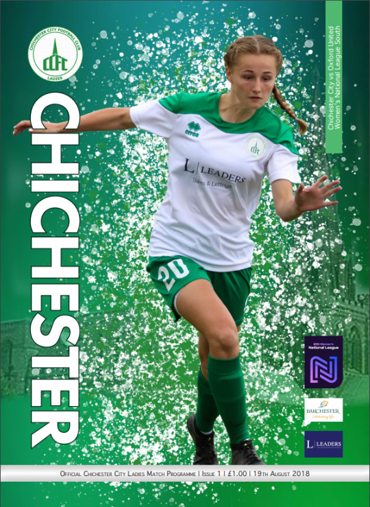
The front cover was very basic and simple, which is something i’m aiming for. So I took that and tried to create something very subtle but effective. They used a full body photo of a player rather than a close-up and cropped the background. Instead they used their team colours as the background to create contrast with the player.
Then looking further into the programme I spotted the player profile page where they’ve included the entire team, but only their photos. My idea was to add a mini biography at the bottom of the photos, so I had to consider the arrangement and sizes of the boxes in order for them to fit like theres. Also, the replacement of the team logo for a players photo is something I will take into account just in case one of the players is available for a profile picture or even so, don’t have an appropriate one that fits the aesthetic of the page layout.
I also looked at their back page to get an idea of how to present the two teams in a smart and subtle way. The team, Chichester, used an effective font that made it simple and clear to look at. The team line up was done neatly and the team’s logo in the background creates a dynamic effect to the text.
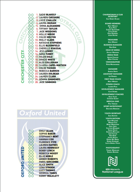
Other than the one football programme I did manage to look at other sporting events like the world cup and Olympics
*image of both pls*
They both had their own unique design, but from the two I took away the olympics had a prestigious design that made it look elite. As for the world cup it was presented as an ordinary football programme. With the likes of the olympics and the theme of it, I would be using its design as inspiration when it comes to adding in my content along with the images and extra details.
The Olympics programme showed style in subtle and neat way. The all white background with a small icon in the middle, makes the audience focus on the icon and it creates peacefulness. The main likes of this programme is the clear the front page, not too much text or big writing to put you off from opening the first page.
0 notes
Text
ITS - WEEK TWO
WEEK TWO
Today we spoke about the Business to Business (B2B) and the Customer to Customer (C2C) models, specifically the development of these models since modern technology became such a large part of everyone's everyday lives. I found this topic very interesting because usually, I wouldn’t assume there would be a relationship between business and interactive technology systems.
Firstly Laurent mentioned, how as humans living in a digital age we are Prosumers. Meaning we produce and consume at the same time. Online we produce content FOR others and ‘in exchange’ consume content FROM others. The more you produce, the more you consume. As humans, we all consume information from teachings and produce information for others to obtain.
The B2B model is the Business to Business Model
Meaning business is conducted between two companies. This creates equal ‘give and take’ between the companies. A model like this is more successful than a Business to Customer or Business to Government Model where transactions tend to be one-sided. (Chen, 2019).
Through the development of new technology the concept of C2C - Customer to Customer Models has emerged. C2C means customers interact with each other to sell and buy products, such as websites and apps like eBay, Etsy and Craigslist.
This Prosumer and C2C concept have been developed in the last 10 years with the growth in technology systems and their ability to allow worldwide consumerism. I did some extra research at it shows the economies steady growth is due to the increase in items being sold, brought and recycled through new platforms. This has the potential to keep growing and in the end, produce less waste on our planet. (Chen, 2019).
ME WE POST OF THE WEEK
image : (June Letters Studio, 2016).

“There is ALWAYS a point when creating a first round logo design that I literally look at my sketches and think "I am shit, how am I EVER going to pull this off. But of course I am always able to pull myself out of that rut and present something I am proud of. By going through the creative process of self-doubt and experimentation I always send off my designs feeling vulnerable because I poured so much of myself in them.“ (June Letters Studio, 2016, p. 01).
This picture sums ups my journey so far in BCT because with every studio project I have this great idea and am full of excitement and motivation, however, as we progress through it becomes harder and harder and I start to self doubt my skills and abilities. But then I have to realise that I have to keep going with it because it is too late to turn back and start again. And somehow, in the end, it all works out perfectly like planned. I think this sort of rollercoaster is important for reflection. It means I can go back to my project and to the weeks of self-doubt and struggle and realise and address the issues I had and why I was having them. It means deeper conclusions and reflections from the project can be made. It means lessons learnt can be executed in the next project.
Was it to do with lack of skills?
Or lack of time management?
Or lack of motivation?
Or lack of planning?
REFERENCES
Chen, J. (2019). Business to Business Model. Retrieved from https://www.investopedia.com/terms/b/btob.asp
June Letters Studio, (2016). The Creative Process. Retrieved from http://www.juneletters.com/blog/2016/7/20/the-creative-process
0 notes
Text
Frequently Asked Questions - 2017 edition, first run
About This Event
What is gen?
Gen fics are, for the purposes of this Bang, stories in which there are no romantic pairings. Not in the background, not in the focus: there are no non-canonical ships. There is leeway allowed for canon relationships (ie Sam and Colleen Holt being married in the fic doesn’t prevent it from being gen), but there are no added relationships at all. The focus instead is on platonic relationships, be that friendship, team, familial or otherwise.
For the olds out there: No Romance On Screen.
Are platonic ships allowed?
Yes, as long as they’re strictly platonic and don’t become shippy. We understand that sometimes the story can change while you’re writing it; if in the process of the draft your pairing becomes shippy, you will not be allowed to use the story for your Mini Bang. Either you will need to drop out or you’ll need to write something else.
How does a Big Bang work?
For a standard Big Bang like this one: fic first, then art. After a few weeks of work, the authors will submit a summary and excerpt of their fics to begin the Claims process. Artists pick their top favorites from this list and submit them to the mods. One of those choices is assigned to the artists, who then create content for that fic. [In a reverse Bang, then the artists would submit what they’re going to draw and the authors write with that in mind.]
Gen Mini-Bang Details + Participation Requirements
How many people can participate?
25 authors and 25 artists. upped to 40 each, after enthusiastic response!
What’s the timeline?
The timeline can be found on the sidebar, and also here.
Who’s running this shindig?
@bosstoaster, @butteredonions and @velkynkarma.
Minimum word count?
5,000 words is the minimum.
Can we have co-authors?
You can have a co-author, but you will be responsible for working together and making sure your fic reaches completion. In fairness to the limited number of slots, once you’ve signed up you will not be allowed to split up the pair: one or both of you will have to drop out. Also, to make it fair, if you have two authors you will be responsible for a 10,000 word story (essentially 5k each).
Maximum word count?
None! Go wild. Just remember that you have to be able to finish it in the scheduled time.
What are the requirements for artists?
Artists will be asked to produce 1 piece of artwork for the fic they’re partnered with after claims. We’ll be asking for progress updates/sketches during the check-ins. The final piece should be completed and ready for turn-in by the July 16th final deadline.
There aren’t any restrictions on what media you use. Traditional and digital are both accepted, and if you have other ideas besides a splash page or comic, we’re open to that too! All we ask is that it’s a fully completed piece, no sketches or WIPs.
Sign-Ups
Can I sign up to both write and create art?
Due to limited space, you can only be part of the initial sign-up for one or the other, unless we have trouble filling up (which is somewhat unlikely, but more possible for the artist side). However, you can be on the wait-list for either side, even if you’re signed up for the other. So if you’d prefer to be an artist, we advise you wait until the 25 slots are full and sign-up as a pitch hitter instead, and then sign-up as an artist in the first wave (or vice versa)
Can I sign up now and drop out later?
Technically we can’t stop you, but please consider the limited number of spaces available for this mini-bang. If you sign up now without the intent of following through, you may be taking that slot away from someone else who wants to participate just as badly. Please check out the timeline and evaluate your own schedule before committing.
I already signed up through the poll Bosstoaster did!
That was an interest poll, not sign-ups themselves. If you filled out this form: 1) thank you!, and 2) you’ll still need to actually sign-up when sign-ups are live.
Is it first-come first serve or an application?
Slots will fill on a first-come, first-serve basis. Authors: Mark your calendars March 20th!
How do I sign up, officially?
Sign-ups are closed! All slots are currently full and we are running on a waitlist.
How much information will i need for sign-ups?
Your tumblr handle (or other social media), as well as an active email address.
When exactly will sign-ups open?
Author sign-ups opened at exactly 12:00am, March 20th, EST. Sign-ups remained open for one week.
Artist sign-ups opened at exactly 12:00am, March 27th, EST. Sign-ups remained open for one week.
What if I miss the window?
Mark your calendars! If you miss it, you’ll have to wait for another time.
All the slots are full!
Yes, they are! You can sign up on either waitlist in case of drop-outs.
Author Waitlist
Artist Waitlist
Are you going to add more slots?
The current cap remains 25 authors and 25 artists. Please see this post for more information.
ETA: Due to exceptional and enthusiastic interest, we have upped the cap to 40 authors and 40 artists, for a total of 80 participants.
Check-Ins and Claims
What are check-ins?
Check-ins are when we look into the progress of authors and artists to make sure everything is coming along on schedule. You will be responsible for showing how you’re progressed in your work at these times, usually by sending us your most current rough draft. More specific requirements may be posted as we draw closer to those dates.
The first check-in comes pretty quick! What do I need to have ready?
Check-in 1 will be to make sure you still want to participate and that you’re working on your claims. It’s there so if we have any early drop-outs, we catch them earlier so that we can give our back-ups time to make their summary before claims, rather than demanding one on the day of.
What are claims?
Claims are named that because it’s when the artists decide which story they want to write for. Authors submit details to us such as a summary, rating, and an excerpt, along with the tags they’d plan on using for AO3. We’ll number those submissions and post them anonymously for artists to peruse; artists in turn give us a list of which of those submissions they want to draw. We then assign them and pair everyone up.
Can I be late to claims?
No. If you are late to claims you will be dropped and replaced. No exceptions.
What happens if I miss a check-in?
Shiro never comes back from the astral plane.
Content Queries
My work is ‘technically’ gen? but it might be kind of shippy if people want to read it that way.
Ultimately, you know your content best. We recommend that if there’s any doubt if your content is gen you do not use it for this Bang.
Can I have NSFW content?
All NSFW content is acceptable (except if it involves a ship), but please remember to tag your fics appropriately for any NSFW content.
Are AUs allowed?
Allowed, but please consider it may alienate artists if your niche is too specific (i.e. a Fantasy AU is one thing, a Dresden Files AU is another).
Can I continue a WIP?
No. All material created for this mini-bang must be new material; the exception is a sequel to a previously-completed story. No posting new chapters of a WIP. The only exception is a WIP you’ve begun working on, but have not yet published anywhere yet.
Are sequels allowed?
This is fine, as long as you are writing a sequel for a previously-completed story. You cannot continue posting a currently half-published WIP.
Can I use an idea I’ve already loosely posted about on my blog? (i.e. I’ve talked about a basic plot, headcanon, meta, etc.)
Yes. Previously posted ideas, snippets or hints are perfectly fine. If you’re considering making it your Bang Fic, please hold off on posting further details about your plot so that claims are as anonymous as possible. However, as long as the fic itself is not posted anywhere prior to claims, you’re good to go.
Posting
What are the multi-chapter posting rules?
The entirety of your fic must be posted on your assigned day. If you have multiple chapters, all chapters must be posted on the same day. This is in fairness to everyone on the posting schedule. It’s not fair if some people get a chapter posted every day for weeks while others get only the one post.
If your fic exceeds 30k, please message us and we can consider exceptions on a case-by-case basis.
Can I post my work on my account?
Do not post your work anywhere before your assigned posting date. You can post little snippets or previews, but the work as a whole should be a surprise until the posting date.
The only exception is if you’ve already loosely posted about the idea on your blog prior to Sunday, March 12th, 2017. Loose posts include ideas such as a basic plot, snippets, meta, headcanons, etc., that you’re now planning to expand into your Mini-Bang fic. If this is the case please hold off on posting further details about your plot through claims so that the process is as anonymous as possible.
Where will we post our fics for Posting Day?
All fics will also be posted to your own AO3 or Tumblr. After that, send a link to us and we’ll post it. More information will be provided as we draw closer to the deadline.
Will I need the story to be totally completed by the deadline?
All fic and art must be completed by the final deadline of Sunday, July 16th. Absolutely. Period.
Can fics be edited between the Final Deadline of July 16th and posting on August 1st?
Yes. We just require that the story be finished. If you need a final read-over for editing, we’d much rather you do that than leave in mistakes because you think you’re not supposed to touch it. We absolutely encourage you use those extra couple of weeks of organization to polish.
How do I post my artist’s images to my fic on AO3?
Check out our tutorial post on this here.
Additional/Misc.
I have a question not covered on this post!
Please swing by our askbox. Thanks!
4 notes
·
View notes
Last Seen Blogs

azuaymeencanta
Azuay_me_encanta
carpathianweakling
CW's Vinyl Blog
jonquilete
//

fredagsslik-blog
Untitled

colossalsquidiot
فني ستلايت الشويخ السكنية