#how to create html tables
Explore tagged Tumblr posts
Text
HTML Tables with examples: A Comprehensive Guide for Web Developers on Creating, Formatting, and Displaying Data
I. Introduction In this article, we will explore the world of HTML tables and their importance in web design. HTML tables are an essential part of building websites, as they allow developers to organize data and information in a structured and visually appealing way. They enable users to present information in a tabular format, making it easier to read and understand. HTML tables are used in a…

View On WordPress
#complex html table#complex tables html#create html table javascript#display table html#how to create a table in html#html attributes#html table code#html table formatting#html table structure#html tables#html tags#properties of table in html#table elements html#table html#table in web design#table of contents html code#table rows in html#table with pictures html#tables example#tables in html
0 notes
Text
The moral injury of having your work enshittified

This Monday (November 27), I'm appearing at the Toronto Metro Reference Library with Facebook whistleblower Frances Haugen.
On November 29, I'm at NYC's Strand Books with my novel The Lost Cause, a solarpunk tale of hope and danger that Rebecca Solnit called "completely delightful."

This week, I wrote about how the Great Enshittening – in which all the digital services we rely on become unusable, extractive piles of shit – did not result from the decay of the morals of tech company leadership, but rather, from the collapse of the forces that discipline corporate wrongdoing:
https://locusmag.com/2023/11/commentary-by-cory-doctorow-dont-be-evil/
The failure to enforce competition law allowed a few companies to buy out their rivals, or sell goods below cost until their rivals collapsed, or bribe key parts of their supply chain not to allow rivals to participate:
https://www.engadget.com/google-reportedly-pays-apple-36-percent-of-ad-search-revenues-from-safari-191730783.html
The resulting concentration of the tech sector meant that the surviving firms were stupendously wealthy, and cozy enough that they could agree on a common legislative agenda. That regulatory capture has allowed tech companies to violate labor, privacy and consumer protection laws by arguing that the law doesn't apply when you use an app to violate it:
https://pluralistic.net/2023/04/12/algorithmic-wage-discrimination/#fishers-of-men
But the regulatory capture isn't just about preventing regulation: it's also about creating regulation – laws that make it illegal to reverse-engineer, scrape, and otherwise mod, hack or reconfigure existing services to claw back value that has been taken away from users and business customers. This gives rise to Jay Freeman's perfectly named doctrine of "felony contempt of business-model," in which it is illegal to use your own property in ways that anger the shareholders of the company that sold it to you:
https://pluralistic.net/2023/11/09/lead-me-not-into-temptation/#chamberlain
Undisciplined by the threat of competition, regulation, or unilateral modification by users, companies are free to enshittify their products. But what does that actually look like? I say that enshittification is always precipitated by a lost argument.
It starts when someone around a board-room table proposes doing something that's bad for users but good for the company. If the company faces the discipline of competition, regulation or self-help measures, then the workers who are disgusted by this course of action can say, "I think doing this would be gross, and what's more, it's going to make the company poorer," and so they win the argument.
But when you take away that discipline, the argument gets reduced to, "Don't do this because it would make me ashamed to work here, even though it will make the company richer." Money talks, bullshit walks. Let the enshittification begin!
https://pluralistic.net/2023/11/22/who-wins-the-argument/#corporations-are-people-my-friend
But why do workers care at all? That's where phrases like "don't be evil" come into the picture. Until very recently, tech workers participated in one of history's tightest labor markets, in which multiple companies with gigantic war-chests bid on their labor. Even low-level employees routinely fielded calls from recruiters who dangled offers of higher salaries and larger stock grants if they would jump ship for a company's rival.
Employers built "campuses" filled with lavish perks: massages, sports facilities, daycare, gourmet cafeterias. They offered workers generous benefit packages, including exotic health benefits like having your eggs frozen so you could delay fertility while offsetting the risks normally associated with conceiving at a later age.
But all of this was a transparent ruse: the business-case for free meals, gyms, dry-cleaning, catering and massages was to keep workers at their laptops for 10, 12, or even 16 hours per day. That egg-freezing perk wasn't about helping workers plan their families: it was about thumbing the scales in favor of working through your entire twenties and thirties without taking any parental leave.
In other words, tech employers valued their employees as a means to an end: they wanted to get the best geeks on the payroll and then work them like government mules. The perks and pay weren't the result of comradeship between management and labor: they were the result of the discipline of competition for labor.
This wasn't really a secret, of course. Big Tech workers are split into two camps: blue badges (salaried employees) and green badges (contractors). Whenever there is a slack labor market for a specific job or skill, it is converted from a blue badge job to a green badge job. Green badges don't get the food or the massages or the kombucha. They don't get stock or daycare. They don't get to freeze their eggs. They also work long hours, but they are incentivized by the fear of poverty.
Tech giants went to great lengths to shield blue badges from green badges – at some Google campuses, these workforces actually used different entrances and worked in different facilities or on different floors. Sometimes, green badge working hours would be staggered so that the armies of ragged clickworkers would not be lined up to badge in when their social betters swanned off the luxury bus and into their airy adult kindergartens.
But Big Tech worked hard to convince those blue badges that they were truly valued. Companies hosted regular town halls where employees could ask impertinent questions of their CEOs. They maintained freewheeling internal social media sites where techies could rail against corporate foolishness and make Dilbert references.
And they came up with mottoes.
Apple told its employees it was a sound environmental steward that cared about privacy. Apple also deliberately turned old devices into e-waste by shredding them to ensure that they wouldn't be repaired and compete with new devices:
https://pluralistic.net/2023/09/22/vin-locking/#thought-differently
And even as they were blocking Facebook's surveillance tools, they quietly built their own nonconsensual mass surveillance program and lied to customers about it:
https://pluralistic.net/2022/11/14/luxury-surveillance/#liar-liar
Facebook told employees they were on a "mission to connect every person in the world," but instead deliberately sowed discontent among its users and trapped them in silos that meant that anyone who left Facebook lost all their friends:
https://www.eff.org/deeplinks/2021/08/facebooks-secret-war-switching-costs
And Google promised its employees that they would not "be evil" if they worked at Google. For many googlers, that mattered. They wanted to do something good with their lives, and they had a choice about who they would work for. What's more, they did make things that were good. At their high points, Google Maps, Google Mail, and of course, Google Search were incredible.
My own life was totally transformed by Maps: I have very poor spatial sense, need to actually stop and think to tell my right from my left, and I spent more of my life at least a little lost and often very lost. Google Maps is the cognitive prosthesis I needed to become someone who can go anywhere. I'm profoundly grateful to the people who built that service.
There's a name for phenomenon in which you care so much about your job that you endure poor conditions and abuse: it's called "vocational awe," as coined by Fobazi Ettarh:
https://www.inthelibrarywiththeleadpipe.org/2018/vocational-awe/
Ettarh uses the term to apply to traditionally low-waged workers like librarians, teachers and nurses. In our book Chokepoint Capitalism, Rebecca Giblin and I talked about how it applies to artists and other creative workers, too:
https://chokepointcapitalism.com/
But vocational awe is also omnipresent in tech. The grandiose claims to be on a mission to make the world a better place are not just puffery – they're a vital means of motivating workers who can easily quit their jobs and find a new one to put in 16-hour days. The massages and kombucha and egg-freezing are not framed as perks, but as logistical supports, provided so that techies on an important mission can pursue a shared social goal without being distracted by their balky, inconvenient meatsuits.
Steve Jobs was a master of instilling vocational awe. He was full of aphorisms like "we're here to make a dent in the universe, otherwise why even be here?" Or his infamous line to John Sculley, whom he lured away from Pepsi: "Do you want to sell sugar water for the rest of your life or come with me and change the world?"
Vocational awe cuts both ways. If your workforce actually believes in all that high-minded stuff, if they actually sacrifice their health, family lives and self-care to further the mission, they will defend it. That brings me back to enshittification, and the argument: "If we do this bad thing to the product I work on, it will make me hate myself."
The decline in market discipline for large tech companies has been accompanied by a decline in labor discipline, as the market for technical work grew less and less competitive. Since the dotcom collapse, the ability of tech giants to starve new entrants of market oxygen has shrunk techies' dreams.
Tech workers once dreamed of working for a big, unwieldy firm for a few years before setting out on their own to topple it with a startup. Then, the dream shrank: work for that big, clumsy firm for a few years, then do a fake startup that makes a fake product that is acquihired by your old employer, as an incredibly inefficient and roundabout way to get a raise and a bonus.
Then the dream shrank again: work for a big, ugly firm for life, but get those perks, the massages and the kombucha and the stock options and the gourmet cafeteria and the egg-freezing. Then it shrank again: work for Google for a while, but then get laid off along with 12,000 co-workers, just months after the company does a stock buyback that would cover all those salaries for the next 27 years:
https://pluralistic.net/2023/09/10/the-proletarianization-of-tech-workers/
Tech workers' power was fundamentally individual. In a tight labor market, tech workers could personally stand up to their bosses. They got "workplace democracy" by mouthing off at town hall meetings. They didn't have a union, and they thought they didn't need one. Of course, they did need one, because there were limits to individual power, even for the most in-demand workers, especially when it came to ghastly, long-running sexual abuse from high-ranking executives:
https://www.nytimes.com/2018/10/25/technology/google-sexual-harassment-andy-rubin.html
Today, atomized tech workers who are ordered to enshittify the products they take pride in are losing the argument. Workers who put in long hours, missed funerals and school plays and little league games and anniversaries and family vacations are being ordered to flush that sacrifice down the toilet to grind out a few basis points towards a KPI.
It's a form of moral injury, and it's palpable in the first-person accounts of former workers who've exited these large firms or the entire field. The viral "Reflecting on 18 years at Google," written by Ian Hixie, vibrates with it:
https://ln.hixie.ch/?start=1700627373
Hixie describes the sense of mission he brought to his job, the workplace democracy he experienced as employees' views were both solicited and heeded. He describes the positive contributions he was able to make to a commons of technical standards that rippled out beyond Google – and then, he says, "Google's culture eroded":
Decisions went from being made for the benefit of users, to the benefit of Google, to the benefit of whoever was making the decision.
In other words, techies started losing the argument. Layoffs weakened worker power – not just to defend their own interest, but to defend the users interests. Worker power is always about more than workers – think of how the 2019 LA teachers' strike won greenspace for every school, a ban on immigration sweeps of students' parents at the school gates and other community benefits:
https://pluralistic.net/2023/04/23/a-collective-bargain/
Hixie attributes the changes to a change in leadership, but I respectfully disagree. Hixie points to the original shareholder letter from the Google founders, in which they informed investors contemplating their IPO that they were retaining a controlling interest in the company's governance so that they could ignore their shareholders' priorities in favor of a vision of Google as a positive force in the world:
https://abc.xyz/investor/founders-letters/ipo-letter/
Hixie says that the leadership that succeeded the founders lost sight of this vision – but the whole point of that letter is that the founders never fully ceded control to subsequent executive teams. Yes, those executive teams were accountable to the shareholders, but the largest block of voting shares were retained by the founders.
I don't think the enshittification of Google was due to a change in leadership – I think it was due to a change in discipline, the discipline imposed by competition, regulation and the threat of self-help measures. Take ads: when Google had to contend with one-click adblocker installation, it had to constantly balance the risk of making users so fed up that they googled "how do I block ads?" and then never saw another ad ever again.
But once Google seized the majority of the mobile market, it was able to funnel users into apps, and reverse-engineering an app is a felony (felony contempt of business-model) under Section 1201 of the Digital Millennium Copyright Act. An app is just a web-page wrapped in enough IP to make it a crime to install an ad-blocker.
And as Google acquired control over the browser market, it was likewise able to reduce the self-help measures available to browser users who found ads sufficiently obnoxious to trigger googling "how do I block ads?" The apotheosis of this is the yearslong campaign to block adblockers in Chrome, which the company has sworn it will finally do this coming June:
https://www.tumblr.com/tevruden/734352367416410112/you-have-until-june-to-dump-chrome
My contention here is not that Google's enshittification was precipitated by a change in personnel via the promotion of managers who have shitty ideas. Google's enshittification was precipitated by a change in discipline, as the negative consequences of heeding those shitty ideas were abolished thanks to monopoly.
This is bad news for people like me, who rely on services like Google Maps as cognitive prostheses. Elizabeth Laraki, one of the original Google Maps designers, has published a scorching critique of the latest GMaps design:
https://twitter.com/elizlaraki/status/1727351922254852182
Laraki calls out numerous enshittificatory design-choices that have left Maps screens covered in "crud" – multiple revenue-maximizing elements that come at the expense of usability, shifting value from users to Google.
What Laraki doesn't say is that these UI elements are auctioned off to merchants, which means that the business that gives Google the most money gets the greatest prominence in Maps, even if it's not the best merchant. That's a recurring motif in enshittified tech platforms, most notoriously Amazon, which makes $31b/year auctioning off top search placement to companies whose products aren't relevant enough to your query to command that position on their own:
https://pluralistic.net/2023/04/25/greedflation/#commissar-bezos
Enshittification begets enshittification. To succeed on Amazon, you must divert funds from product quality to auction placement, which means that the top results are the worst products:
https://pluralistic.net/2023/11/06/attention-rents/#consumer-welfare-queens
The exception is searches for Apple products: Apple and Amazon have a cozy arrangement that means that searches for Apple products are a timewarp back to the pre-enshittification Amazon, when the company worried enough about losing your business to heed the employees who objected to sacrificing search quality as part of a merchant extortion racket:
https://www.businessinsider.com/amazon-gives-apple-special-treatment-while-others-suffer-junk-ads-2023-11
Not every tech worker is a tech bro, in other words. Many workers care deeply about making your life better. But the microeconomics of the boardroom in a monopolized tech sector rewards the worst people and continuously promotes them. Forget the Peter Principle: tech is ruled by the Sam Principle.
As OpenAI went through four CEOs in a single week, lots of commentators remarked on Sam Altman's rise and fall and rise, but I only found one commentator who really had Altman's number. Writing in Today in Tabs, Rusty Foster nailed Altman to the wall:
https://www.todayintabs.com/p/defective-accelerationism
Altman's history goes like this: first, he founded a useless startup that raised $30m, only to be acquired and shuttered. Then Altman got a job running Y Combinator, where he somehow failed at taking huge tranches of equity from "every Stanford dropout with an idea for software to replace something Mommy used to do." After that, he founded OpenAI, a company that he claims to believe presents an existential risk to the entire human risk – which he structured so incompetently that he was then forced out of it.
His reward for this string of farcical, mounting failures? He was put back in charge of the company he mis-structured despite his claimed belief that it will destroy the human race if not properly managed.
Altman's been around for a long time. He founded his startup in 2005. There've always been Sams – of both the Bankman-Fried varietal and the Altman genus – in tech. But they didn't get to run amok. They were disciplined by their competitors, regulators, users and workers. The collapse of competition led to an across-the-board collapse in all of those forms of discipline, revealing the executives for the mediocre sociopaths they always were, and exposing tech workers' vocational awe for the shabby trick it was from the start.

If you'd like an essay-formatted version of this post to read or share, here's a link to it on pluralistic.net, my surveillance-free, ad-free, tracker-free blog:
https://pluralistic.net/2023/11/25/moral-injury/#enshittification
#pluralistic#moral injury#enshittification#worker power#google#dont be evil#monopoly#sam altman#openai#vocational awe#making a dent in the universe
561 notes
·
View notes
Text
Alright, so bear with me.
Humans have three cone cells in our eyes that are how we perceive color in the world. I often think red, green, and blue, but apparently people studying them use Long, Medium, and Short to be unambiguous (just for one example, if you activate M really strongly and not L or S, the color people report seeing is yellow-green). Each type activates at different strengths to different wavelengths of light. Here's a lovely graphic from Wikipedia showing response levels of each cone type to different wavelengths:

So you can see that if some light activates L some, but not M, we'll perceive deep red, activates them both a bit, we see orange or yellow, depending on the specific amount.
It's interesting that some effect (a specific mix of pigments, or some structural coloration) could be producing some mostly 495nm light, or a blend of some slightly higher and slightly lower wavelengths, and either way we see cyan. (And a good thing, too, otherwise our display technology would be extremely unconvincing.)
Of course, then there's what happens when we get activation of L and S at once, but not M, our eye-brain systems don't infer "yellow-green", because green is specifically what's missing from there: we generate magenta, a non-spectral color. (And when all three activate we get white, of course.)
I found myself thinking about birds, with their four cones.

They're more evenly spaced too, the bastards. (These bastards are specifically finches but I'm under the impression that most birds are similar.)
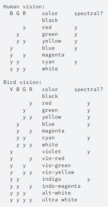
(Of course, "violet" actually means ultra-violet here. Look at the graphic, their UV cone stops responding where our S cone starts. I would edit this, but spent like half an hour discovering that tumblr doesn't support table under html or code/"preserve formatting" under markdown anymore; so you get a screencap of what I sent on discord.)
Birds could see "vio-green" (accepting name suggestions) as a color region as distinct from blue/indigo as green is from purple/magenta.
Look at that. Two whole ass independent spectral color divisions we don't have, and six non-spectral inferences. Eight whole categories of visual perception more than us. Decadent.
The heart quails to imagine what the 16 color receptors of a mantis shrimp would create. I mean, okay, it doesn't because we've studied their eyes and brains and they don't blend colors the way we do, smooshing them down to a much simpler set of perceptions.
But imagine if we rebuilt our eyes and brains for it! Color indicates chemistry, with that level of subtle blending of characteristics, would vision become like tasting everything we look at?
Please pet the bear that is with me on your way out.
#original#transhumanism#long post#I have not actually studied the perceptual systems of birds in any detail so take this with a grain of salt#regretting alt-white now that I've said it aloud in my head#edited: spat this out so fast I miswrote something under the bird spectrum image; also missed a 'd' in 'spaced'
66 notes
·
View notes
Note
GIRL CODED JASON !!!!! HI HELLO OMG TUMBLR USER AND AMAZING AO3 WRITER GHOST BIRD YOUR POSTS AND STORIES JUST ACTIVATE BRAINWORMS IN MY HEAD 😭😭😭😭 holy fuck hi I'm too shy to come off anon but I love the discussions you've been having, so just chipping in !!!
I love the many many looks on how people interpret him being girl-coded, exploring his feelings towards domestic violence, towards victims, women etc, extremely good points that you brought up ! And I'd like to bring up that on a more meta level, the way his character is treated by DC and by people in canon as a whole is also so... girl-coded ? Going to try my best to articulate since eng is my 3rd language 😔😔 Sorry if it's not consise 😭😭 I have FEELINGS AAAAAAAAAAAA
I think the core of this "girl-codedness" stems from a few things, two things I can point to currently are how he's treated as a victim and fridging. Fridging is the easier one to see imo, it's something that's usually associated with female characters but fits Jason a lot. It's not about him and his trauma/pain being feminine inherently (nothing can be categorised in that way honestly) but how it's dealt with by people and the narrative.
Let's take a look at its counterpart which is 'Dead Men Defrosting' trope coined by John Barton. Here's the source for that: https://www.lby3.com/wir/r-jbartol2.html, and a quote from the Women in Refridgerators website I feel is really encapsulates this whole situation.
"...women heroes are altered again and never allowed, as male heroes usually are, the chance to return to their original heroic states. And that's where we begin to see the difference."
Sounds familiar, doesn't it? Additionally, the grief that his death bought is made to be even more objectifying than it should have been. It's made to be Bruce's and everyone else's more than it is Jason's. The image of the dead character is, by necessity, distorted and is served as fuel towards a different character. He's reduced to his death and the pain associated with it is milked for like... 16 yearsish??? A perverted memorial, a perverted memory, an altered legacy. He was just 15. A boy. (Still, I wouldn't say Jason was fridged per say, as the term is created in reference to female characters and they have little to no agency in their stories there, but that 'feel' is there. So I understand where the girl-codedness comes from!)
It’s that the way a lot of characters treat him and a lot of the tropes used on him are things that are typically associated with feminine characters. It's also about how he's treated since he's not a perfect victim. Every attempt Jason has made to express his pain and his anger just gets him labelled as emotional, unreasonable and hysterical (which are again, unfortunately terms associated with women.)
There's many different points people have brought up about Jason, such as his bleeding compassion as Robin, the tears at the end of UTRH, and so on. Nonetheless, I think there's a lot of nuance that comes with gender discussions, since these things are deeply personal to people, and there's disagreements to be had. And that's cool !! There's many points loads of other people also being to the table that I love !! Contradictions too !!
Anyhow, so many cool PPL and analysis these days,,, ILY ANON WHO BROUGHT UP TITANS TOWER (anonanonanon pls chip in again and my life will be URS) Also ILY TUMBLR USER MAGIC-CRAZY-AS-THIS FOR PUTTING THE WEDDING DRESS IMAGERY IN MY HEAD, ALSO ILY GHOSTBIRD FOR THAT AMAZING REPLY AND ANALYSIS,, I LOVE THIS LITTLE POCKET OF COMMUNITY U HAVE CREATED this is so beloved 🥺🥺🥺💞💞💞💞
All very good points!
I don’t have much to add here except perhaps the argument with the memorial case. You’re absolutely right. I never realized how similar it is to the classic hero trope of protagonist mourning their dead love interest/family and dedicating their entire life to a memory of them, citing the actions they take to be in honor of the dead person.
On one hand, I tend to enjoy that trope. On the other hand with Jason, it all became horribly twisted so very quickly and lead to a hard downward spiral of Bruce having a real assholish phase.
But yeah that’s a whole other can of worms better left unopened for now ksksks.
I’m very happy you’re enjoying this blog 💚 it’s honestly super rewarding to hear people say that when it was one of the main goals to have this be a safe and harmonious space for everyone 💚💚✨
#ghost talks#personal opinion#by no way right or wrong just… existing#obviously it’s also to okay if someone here doesn’t like Jason at all!#totally valid#although with how much I gush about Jason very unlikely around here kskskskks#fandom and ship positivity#harmonious vibes#and a healthy approach to fiction and online interaction#batfamily
32 notes
·
View notes
Text
You know that spreadsheet I made? It's got an upgrade. Same information (with some errors fixed), but actually presentable now! Because surprisingly, it turns out that my friend, who is actually knowledgable about IT and used proper web design tools, can make a better looking site than I did by creating an Excel spreadsheet, copying the text into Notepad, adding HTML tags, and uploading the table to some free site that will let you host a single HTML page there.
Seriously, it's awesome. I'm quite enjoying looking at it. It's got a search function that lets you narrow results and actually works. All the links are still there. The text is way more readable, with things like different colours involved (I was going to put colour on my HTML page, but it seemed like too much effort to figure out).
And once again, I would like to say, to Andy Zaltzman, who came on The Bugle and announced that he'd looked up the Chocolate Milk Gang and was confused by the result: the work's been done for you, Andy! And for anyone else who wants it! No one else needs to spend dozens and dozens of hours across several years Googling this odd niche, because I've already done it! And I have a friend who knows how to do websites, so now it's even readable:
This page is going along with a larger archive that's currently under construction, but the whole thing is going to be really cool, archiving comedy is cool and useful. Although if Kitson ever manages to stumble across it, I will deny having any involvement with that archive, or, in fact, ever having heard of Kaniel Ditson.
10 notes
·
View notes
Text
There is something very weird about the relatively short nature of the culture surrounding website creation. As in, like, internet-user-created websites have been around for like 30-31 years at this point, and the culture surrounding them has changed so very much.
People used to create websites left and right for their own needs, their little shops and their little blogs about what they liked. Some websites of course housing horrible content since their dawn, and some being as mundane but as unique as the person behind its code. I have seen older sites, archived, that promoted creating your own site, and that was interesting to see. That culture of creating your own website and of sharing that knowledge on a still-growing facet of communication.
And then at some point social media appeared, and that was interesting, because now everyone was able to quickly present themselves without the need of a website, but that didn't mean people stopped making websites. I mean, hell, Geocities died in 2009, so a lot of people were creating their own websites for free before that time, no need to pay for domain names or hosting. And even without Geocities, there were other website hosting things that yes, while not as customizable, were still a resource for people to work with them. There's still a website floating around that I made when I was a kid using one of these services. Cool stuff.
All this to say that I do feel a weird sense of dread looking back and cross-referencing with the present and seeing things like "website creator powered by AI" and shit like that, because just ?? How did it go plummeting so quickly. There is a weird feeling of having lost a developing culture to corporations making quick access to posting things that, as corporations' nature dictates, are used to sell data or to train models or what have you. Similarly, we get pretty same-y looking pages because of the need to be slick or whatever with designs that just leaves everything looking the same. ALSO, the loss of spaces for kids, or just the gradual lowering of them in favor of cocomelons and whatever else the devil's machine has spawned is like watching an apple decay before having ripened. I do feel like there is this phenomenon in which how to make a site has been lost in the notion of "making a website falls into the realm of evil and scary coding and I could never be a programmer, plus who would look at it, plus we have tools to make them," etc etc etc. Here is a little secret: website creation is not exactly hard to pick up at all. You might say it's very similar to using a rich text editor like Word or a notes app or whatever you use. Similarly, have you used markdown for things like messages or D iscord messages, you know, with the asterisks for bold text and the likes? Markdown is based on html's structures. And truly, you do not have to even learn to code using Javascript if you don't want to, you can just go full html + css and structure your things as you go, adding your little images and your updates. Because guess what !! Html and css are not programming languages, they're a markup language and a stylesheet language respectively, which is a fancy way to say "you make the structure of your page with the first one and make it pretty with the second one". This includes cool stuff like tables, lists, grids, colors, transitions, etc. All of that without any programming. (That being said, if you are interested in programming, Javascript isn't too bad to pick up. The language itself *is* kind of evil, but using it in conjunction with html is not too difficult). I do have to say though, I am glad that there is a push to making your own websites and things, especially with Neocities sprawling a huge community of avid website creators, as well as the huge amount of tutorials and stuff making the push forward with making sites and online spaces and experiences more widely available. Hopefully this becomes a trend that keeps going up, considering the state of seemingly every single social media that has existed since the 2000s- 2010s.
#web#website#old web#dog discourse#ramblings#internet#computer#tech#but for real what the fuck#it's very bizarre to see this just pop in and out
7 notes
·
View notes
Text
How to Prevent Amazon from Ruining Your Life
(a.k.a. how to sell ebooks on places that aren’t Kindle)
Let’s face it, Amazon has a history of screwing people over. Especially those people who depend on Amazon to make a living. If you sell ebooks on Kindle and you want to insulate yourself from whatever raw deal those maniacs come up with next, you should make sure your ebook is also being sold elsewhere. And by “elsewhere” I mean “everywhere.”
Please note: following this guide will make you ineligible for KDP Select. If you’re mostly dependent on revenue from KDP Select, this guide will not be helpful to you. But Amazon will ruin your life someday.
Step 1: Make an EPUB
KDP, and certain other services like it, allow you to upload a Word document and automatically convert it to an eBook. If you really want to sell your ebook everywhere, though, you’ll need an EPUB file.
EPUB is a near-universal ebook file standard. Most ebook apps and eReaders can read EPUBs, and every vendor will accept an EPUB file for upload. You can even use an EPUB instead of a Word document on KDP.
You can create an EPUB file for your ebook using Sigil, which is a free and open-source ebook editor with extensive documentation. EPUB files are formatted in XHTML, so a quick education on HTML basics from W3C would serve you well here.
Don’t forget to include a cover and table of contents within your EPUB, as well as metadata tags for your book’s title and your name. Most vendors require them.
Optional: Convert to MOBI and PDF
Newer Kindles can apparently read EPUBs. Older Kindles might not. In the event someone with a Kindle wants to buy your book from a vendor that isn’t Amazon, you can package your EPUB with a MOBI file.
You can convert your EPUB to MOBI using Calibre. Calibre can also help you convert your ebook to a PDF, although I wouldn’t recommend using a Calibre-generated PDF for any print-on-demand services.
Step 2: Upload Everywhere
Here’s a list of vendors I upload my ebooks to:
DriveThruFiction (also does print-on-demand)
Gumroad
itch.io
Ko-fi (using the Shop feature)
Payhip
Smashwords (will, if you meet certain formatting standards, automatically distribute your book to Apple, Barnes & Noble, and Kobo, among others)
None of these sites have exclusivity agreements, meaning you can upload your ebook to all of them at once. Remember to check whether a vendor has submission guidelines for ebooks, and make sure yours fits those guidelines.
Once your ebook is uploaded to these other vendors, you can use Books2Read’s Universal Link feature to centralize most of your book’s URLs into one link.
And now, the next time Amazon nukes an entire department or shadowbans an entire genre, you can send your readers elsewhere to buy your books.
53 notes
·
View notes
Text
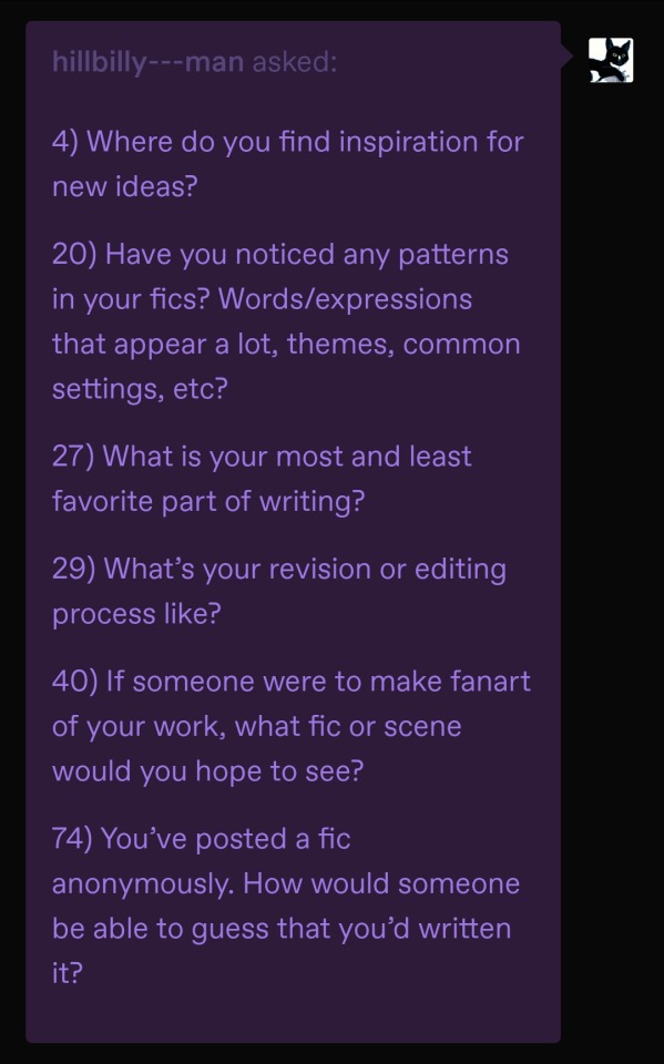
4) Where do you find inspiration for new ideas?
hsfjdlshfks I generally don't go looking for new ideas, they just break into my house and start squatting there lol. Aside from the spontaneously generated ones, I actually take a lot of inspiration from other fans! Blorbo discussions especially tend to spark interesting thoughts that lead to headcanons and stories. Sometimes fanart (all kinds) causes me to go down a different thought path than before - like, I recently saw some truly banger torisai art that changed the planned ending of a WIP lol. It's never direct inspiration though, like I genuinely wouldn't bother making something that already exists unless I thought I could bring something radically different to the table. I'm making the stuff that I wish existed but doesn't!
20) Have you noticed any patterns in your fics? Words/expressions that appear a lot, themes, common settings, etc?
Lol. Yeah all my romantic stuff is sweet and cozy and heartfelt because I'm cheesy and love that stuff. Even my most deranged lemons are super affectionate <3 I'll leave it as an exercise for the reader to call me out on other patterns lol.
27) What is your most and least favorite part of writing?
The best parts are the initial concept & brainstorming, plus writing blorbo dialogue. I'm sure it's extremely obvious that I love writing Akechi dialogue in particular – the less hinged, the better!
Worst part is the post-posting creative slump, where I've gone through all the effort of creation & posting and then there's no feedback and it just feels bad. Hate having to wait out stupid human feelings to get back to creating. It doesn't always happen (I was actually really pleasantly surprised by the reception of the toilet blog lol) but it's just a real bummer when it does!
29) What’s your revision or editing process like?
Not too intensive for me since I kinda edit as I go along. Before I get started writing, I always go over the last part (sometimes all of it), to get back in my groove, and I'll tweak it if it needs it. Once I'm done writing, if I have a beta I'll send it over, and either way I'll wait a few days before giving a final read-through and posting. Naturally a few months later I'll be reading the fic on AO3 and find typos or grammatically weird sentences, but that shit happens to professional authors too so whatever lol. Update it and carry on...
40) If someone were to make fanart of your work, what fic or scene would you hope to see?
All fanart is definitely welcome lol, but generally the romantic fics are nearer and dearer to my heart so shippy drawings inspired by my fics would have a same-type-attack-bonus on my heart!
74) You’ve posted a fic anonymously. How would someone be able to guess that you’d written it?
The CSS/HTML probably lmfaoooo.
Otherwise, probably the pairing if it's one of my captained ships, and the way I write my dialogue and don't spend any time describing shit like settings or clothing lmao.
Thanks for the ask @hillbilly---man!! 💜💜💜
[Context] <- still open for these!
6 notes
·
View notes
Text
Why I Contributed to FujoGuide
If you follow me here or mastodon you may have noticed that I've been reblogging/boosting a lot of posts for something called The Fujoshi Guide to Web Development (@fujowebdev). There's a good chance you followed me or know me from the Dragon Age fandom where I run communities, events, and zines and write fanfic, and you might be wondering why the sudden and drastic departure from my normal content. Why would a writer contribute to something related to webdev? Why have you stopped seeing thirst for Dragon Age characters and started seeing… whatever a FujoGuide is?
The answers to those questions (and more!) are below the cut.
My Coding Journey
I wrote my first lines of code in 1996 (yes, I'm old AF). It was the early days of the internet and tutorials for how to make your own websites were literally everywhere. You couldn't go more than two clicks without finding a how-to written in plain language. But it was painstaking and tedious. CSS didn't exist yet (literally, I started coding about six months before it was released) and even when it appeared it wasn't widely adopted or supported.
It was the "glory days" of Geocities, Myspace themes, Neopets, and Livejournal. If there was a cool site, you could use HTML and/or CSS to customize it. I honed my skills by coding so many tables character profiles for RPs, creating themes, painstakingly laying out user info pages, and building my own site.
Gradually, things changed. Web 2.0 showed up with locked down profiles and feeds you couldn't customize, free website hosts became more difficult to find, and point and click page builders became the way of the web. Shortly after, I took a long break from fandom; frustrated and disappointed with site closures, lost communities, and general fandom wank… it felt like it just wasn't worth it anymore.
I eventually came back, and when I did it meant customizing themes, figuring out how to create tools for my communities, coding tumblr pages (and learning they're not really supported on mobile), and looking at automations for my common tasks. One day, I woke up and thought, "I'm going to make a Discord bot… it can't be that hard."
So, I did it.
An Unexpected Friendship
About a month after I launched my bot to the public, I received a random Discord message from @essential-randomness. A friend had told her about my bot, and she was working on BobaBoard which needed volunteers. I was shocked. First, people were talking about my bot. Second, I wasn't a real coder. I didn't know anything! I just googled a bunch of stuff and got something working. I had no idea what I was doing.
She assured me it was okay. She was willing to teach me what I didn't know - and most of all, that she wanted my help. I took a day or two to think it over, and fatefully filled out the volunteer form. I didn't know if I could be useful or how I could be useful, but I wanted to try.
Programming Is Awful
In the years months that followed, I spent a lot of time in @essential-randomness' DMs complaining about programming… at least once I realized she wouldn't judge me. I was still very much doing things the hard way, taking hours to update a site to add a single link on all the pages. I knew there were easier methods, but I either couldn't find them or once I found them, they were filled with dense jargon which was terrifying.
"An all-in-one zero-javascript frontend architecture framework!" Is that even English? "A headless open-source CMS." Cool. Sounds good. "A full-stack SSG based on Jamstack extending React and integrating Rust-based JS." Those sure are words. With meanings. That someone knows. Not me, though.
I spent so much time looking at what sites claimed was documentation and losing my mind because I had no idea where to even start most of the time. With @essential-randomness' encouragement, I kept at it, experimenting with new things, and jumping in headfirst even when I had no idea what I was doing. And I was so glad. Where I used to struggle keeping one website updated, last year I managed to deploy and update 7 websites. Yeah, you read that right. It was amazing.
The new stuff made it all much, much easier.
An Idea Is Born
Meanwhile, we spent hours discussing why it was difficult to get fandom to try coding. Part of the barrier was the belief you must be some sort of genius or know math or that creative/humanities people can't do it. It is also partially coding communities being unfriendly to newbies and hobbyists; a culture which often thrives on debasing people's choices, deriding them for not understanding, and shouting rtfm (read the fucking manual) and lmgtfy (let me google that for you)- all of which are unhelpful at best and humiliating and abusive at worst. The tech dudebro culture can be unforgiving and mean.
The number of coding-based Discords I've left far outnumbers the ones I've stayed in.
We determined what fandom needed was a place for coders of all skill levels to come together to help and support one another; where they could learn to code and how to join open-source projects they love, and where they could make friends and connections and show off their projects whether they were new or experienced programmers.
And thus… Fandom Coders was born.
What About FujoGuide?
Of course, running a coding group and working on BobaBoard together means we spent a lot of time talking about the state of the web. We both lamented over poor documentation, jargon-rich tutorials, and guides which assume a baseline of knowledge most people don't have. What we needed to do was provide tutorials which start at the beginning… from the ground up (what is a terminal and how do I open it?) without skipping steps. What we needed to do was make those tutorials fun and appealing.
I don't remember exactly the journey it took to get us here if I'm honest. I have no clue who said it first. But I do remember I first started thinking about anthropomorphizing programming languages when we attempted to cast the languages as the Ouran High School boys… and again when I suggested we do a [TOP SECRET IN CASE WE DO IT] group project in Fandom Coders to help people learn about programming.
What I do know is that as last year ended, @essential-randomness became laser-focused on creating our gijinka and moving forward with FujoGuide… and I couldn't say no.
Okay, But… Why Contribute?
To be honest, it's not just that I was around for the birth of the idea. It's ALL of the things in this post - the culmination of three years of frustration trying to figure out what I'm doing with coding, of wading through dense documentation, of wanting to give up before I even start. It's three years of dipping my toes into toxic techbro culture before running away. All added to decades of watching the web become corporate-sanitized, frustratingly difficult to customize, increasingly less fun, and overtly hostile to fans who dare enjoy sexual content.
To sum all of this up, it's the firm belief that we desperately need a resource like this. Something that's for us, by us. Something that builds fans up, instead of tears them down; that empowers them to create for themselves and their communities what no one is creating for them. It is a project I'm deeply passionate about.
And I can't wait until we can bring it to life for you all.
23 notes
·
View notes
Text
How do you publish a comic on ComicFury? A beginner's overview
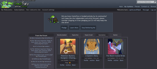
So, you're on ComicFury, see all these cool comics and think you want to make one of your own? Worry not, it's actually pretty easy :D When you have signed up, got accostumed, even subscribed to a few comics, you can go to the "new webcomic site" page to get started
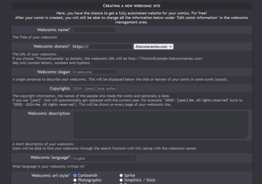
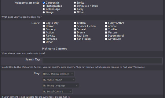
The screenshots cover the whole page, but I will summarize for you: you can chose title, description, slogan, language, style & genre, tags, content warnings and moderation settings (such as allowing comments and ratings)
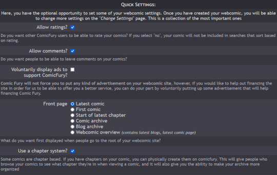

Additionally, you have five different domain options to pick from: .thecomicseries.com, .the-comic.org, .thecomicstrip.org, .webcomic.ws, and .cfw.me

Akin to tumblr's range of default themes to pick from, here you have to pick one default layout you will be able to customize later on (you can also work on the html if you're crafty enough)
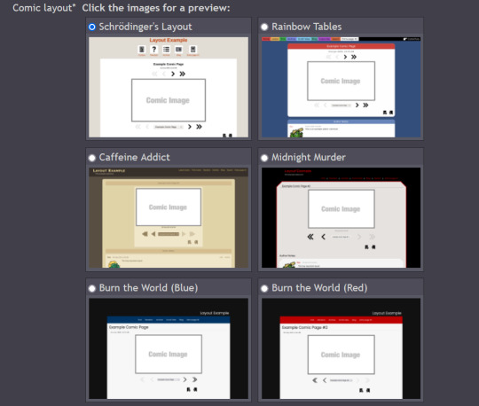
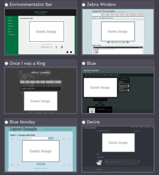
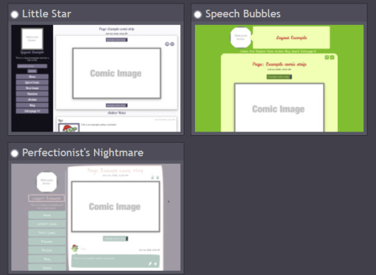
I personally picked "Rainbow Tables" because it already fits well enough the vibes of Wacky Races XD

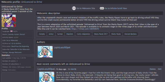
Once you're done, you will find your webcomic or webcomics (there's no limit on how many webcomic sites you can open as far as I know) in the "My Webcomics" page. Your webcomic will have, in addition, a profile page which will be the first thing people will see when they browse on comicfury
By clicking on "manage webcomic", you can do many things ranging from uploading/editing/scheduling pages to changing the website's layout
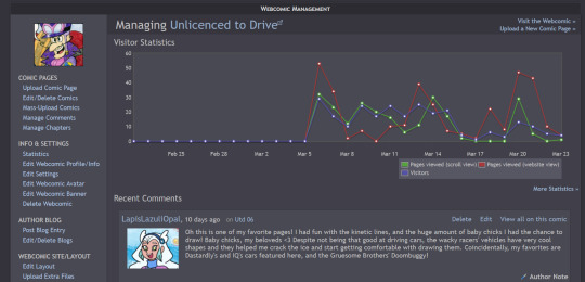
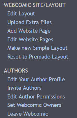
So now you want to upload some pages, right? Here we goooo
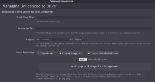
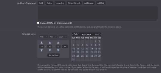
You have to pick a title for the page (could even be just Utd 01, 02 and so on), you can chose a chapter it will belong to (if you want to create chapters) then you can upload up to 12 images in the same page! But remember there's size limits: for multiple images it's maximum 2MB each, for a single image it's maxmimum 5MB. It supports png, gif, jpg and jpeg formats. After putting it some keywords that will make your comic easier to find and adding a transcript of the page if you want, you can upload your page!

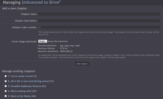
Here's how you can create chapters by clicking on "manage chapters", you pick a name and you can add a description and a cover (that's optional though) As you can see, I have five chapters on my comic for example
Now that you know the basis you can try it out yourself!! Mind you, it doesn't even have to be a comic, I've seen people create websites to host illustrations made for monthly challenges as well, or other webcomics can be made by photographing action figures, it can really be whatever you want! Have fun out there :D

#ComicFury#webcomics#how to use comicfury#I hope this can help anyone who wants to try out making a webcomic!#comic#webcomic#artists on tumblr#indie comics
4 notes
·
View notes
Text
Prompt Examples for Learning Web Development

Coding is both an art and a science. It’s about creatively solving problems, bringing ideas to life, and constantly learning and adapting.
Because technology advances at such a rapid pace, it is essential to be fluent in a variety of languages, tools, and domains.
Sometimes it’s difficult to pick up the right resources from the ocean of tutorials, demos, and resources.
And on top of that, sometimes we have to learn and apply so fast due to tight deadlines of the projects. In this case, we need a friend who can help us learn and work faster and better. And thanks to AI by this, our learning becomes faster and more fun.
Today, we’ll look at how learning prompts that AI drives can change the way you learn web development.
How you can craft prompt engineering for web development, the difference between a generic prompt and a bit tweaked prompt can eventually change your desired results and make your learning journey more smooth and more enjoyable.
You can also use this knowledge to learn other fields more quickly and interactively.
Table of Contents
Learning Prompts
HTML Prompt Examples
CSS Prompt Examples
Debugging Prompts
Testing Prompts
Crafting Better Prompts
Further Reading and Resources
🎯Learning Prompts
Prompts are at the heart of AI-powered learning. Prompts are questions or commands that guide AI models like GPT-3 or GPT-4 to generate the desired responses. They act as a springboard for the AI to dive into the knowledge it’s been trained on and come up with relevant outputs.
You can use AI’s capabilities in a variety of scenarios in web development, including debugging, code generation, and even learning new web development concepts.
Now, we’ll go through some basic prompts and their outputs, as well as a little tweaking of the prompt commands to see how the output is becoming more result oriented, giving you a sense of how you may build your prompt commands for better results.
Prompt Commands for Learning HTML Basics
Learning the basics of web development involves understanding the structure and syntax of HTML, CSS, and JavaScript. Here are some prompt examples you can use:
Create a simple HTML structure with a header, main content section, and footer.
This prompt returns a simple HTML skeleton. But if you want a more detailed structure, you could modify the prompt to include specific HTML elements. For example:
Create a simple HTML structure with a header containing a navigation bar, a main content section with a paragraph and an image, and a footer with copyright information.
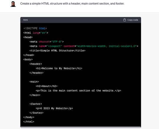
Curious to know more? Visit our blog for the complete post and dive deeper into Learning Web Development with AI Prompts.
3 notes
·
View notes
Text
HTML 101: The Ultimate Beginner's Guide to Writing, Learning & Using HTML

HTML serves as the backbone of every web page, allowing us to structure content with paragraphs, headings, images, links, forms, and more. If you're eager to delve into web development or explore the world of coding, mastering HTML is a fantastic starting point.
Join us on webtutor.dev as we unveil the ultimate guide to HTML for beginners. In this comprehensive tutorial, we'll demystify HTML, explore its diverse applications, and equip you with the skills to write your own HTML code. From essential elements to crucial attributes, we'll cover it all.
Get ready to embark on your HTML journey with webtutor.dev – your go-to resource for empowering web development education. Let us dive in and unlock the potential of HTML together.
Join us now on webtutor.dev!
What is HTML?
First published by Tim Berners-Lee in 1989, HTML is now used by 94% of all websites, and probably all the ones you visit. But what is it, exactly?
HTML, short for HyperText Markup Language, is the backbone of the web. It is a markup language that structures the content of web pages. HTML utilizes tags to define the elements and their attributes, such as headings, paragraphs, images, links, lists, forms, and more. These tags instruct web browsers on how to display and render the content to users. With HTML, developers can create interactive and visually appealing web pages. It plays a vital role in creating a seamless browsing experience by allowing users to navigate through hyperlinks and access information across different websites. HTML is the foundation upon which websites are built, providing the structure and organization for displaying text, multimedia, and interactive elements. By learning HTML, individuals can gain the skills to create and customize web pages, making their mark in the digital landscape.
Is HTML a programming language?
No, HTML (Hypertext Markup Language) is not considered a programming language. It is a markup language used for structuring the content and presenting information on web pages. HTML provides a set of tags that define the structure and semantics of the content, such as headings, paragraphs, links, images, and more.
While HTML is essential for web development, it primarily focuses on the presentation and organization of data rather than the logic and functionality found in programming languages. To add interactivity and dynamic behavior to web pages, programming languages like JavaScript are commonly used in conjunction with HTML.
What is HTML Used for?
HTML (Hypertext Markup Language) is used for creating and structuring the content of web pages. It provides a set of tags that define the elements and their layout within a web page. Here are some of the key uses of HTML:
Web page structure: HTML is used to define the structure of a web page, including headings, paragraphs, lists, tables, forms, and other elements. It allows you to organize and present content in a hierarchical manner.
Text formatting: HTML provides tags for formatting text, such as bold, italic, underline, headings of different levels, and more. These tags help in emphasizing and styling specific parts of the content.
HTML Hyperlinks: HTML enables the creation of hyperlinks, allowing you to connect different web pages together or link to external resources. Links are defined using the <a> tag and provide navigation within a website or to other websites.
Images and media: HTML allows you to embed images, videos, audio files, and other media elements into web pages. It provides tags like <img>, <video>, and <audio> for adding visual and multimedia content.
Forms and user input: HTML provides form elements, such as text fields, checkboxes, radio buttons, dropdown menus, and buttons, allowing users to enter and submit data. Form data can be processed using server-side technologies.
Semantic markup: HTML includes semantic elements that provide meaning and structure to the content. Examples of semantic elements are <header>, <nav>, <article>, <section>, <footer>, which help define the purpose and role of specific parts of a web page.
Accessibility: HTML supports accessibility features, such as providing alternative text for images, using proper heading structure, using semantic elements, and other attributes that make web content more accessible to users with disabilities.
Overall, HTML serves as the foundation of web development, providing the structure and presentation of content on the World Wide Web. It is often complemented by other technologies like CSS (Cascading Style Sheets) for styling and JavaScript for interactivity and dynamic behavior.
How to Write HTML?
<!DOCTYPE html><html><head><title>My Page</title></head><body><h1>Hello, World!</h1></body></html>
Explanation:
<!DOCTYPE html>: Specifies the HTML version.
<html>: Opening tag for the HTML document.
<head>: Contains metadata about the page.
<title>: Sets the title of the page displayed in the browser's title bar or tab.
<body>: Contains the visible content of the page.
<h1>: Defines a heading level 1.
Hello, World!: The actual content to be displayed.
Please note that this example is a very basic HTML structure, and for more complex pages, additional tags and attributes would be required.
How to Create an HTML File
To create an HTML file, you can follow these steps:
Open a text editor: Open a text editor of your choice, such as Notepad (Windows), TextEdit (Mac), Sublime Text, Visual Studio Code, or any other editor that allows you to create plain text files.
Start with the HTML doctype: At the beginning of your file, add the HTML doctype declaration, which tells the browser that the file is an HTML document. Use the following line:
<!DOCTYPE html>
Create the HTML structure: After the doctype declaration, add the opening and closing <html> tags to enclose the entire HTML document.
Add the head section: Inside the <html> tags, include the <head> section. This is where you define metadata and include any external resources like stylesheets or scripts. For now, let's add a <title> element to set the title of your page:
<head>
<title>My First HTML Page</title>
</head>
Create the body: Within the <html> tags, include the <body> section. This is where you place the visible content of your web page. You can add various HTML tags here to structure and format your content. For example, let's add a heading and a paragraph:
<body>
<h1>Welcome to My Page</h1>
<p>This is my first HTML file.</p>
</body>
Save the file: Save the file with an .html extension, such as myfile.html. Choose a suitable location on your computer to save the file.
Open the HTML file in a browser: Double-click on the HTML file you just saved. It will open in your default web browser, and you will see the content displayed according to the HTML tags you added.
Congratulations! You have created an HTML file. You can now edit the file in your text editor, add more HTML elements, styles, scripts, and save the changes to see them reflected in the browser.
Common HTML Attributes
<input type="text" name="username" placeholder="Enter your username" required>
<img src="image.jpg" alt="Image description">
<a href="https://example.com" target="_blank">Link to Example</a>
<div id="container" class="box">
<button onclick="myFunction()">Click me</button>
<table border="1">
<form action="submit.php" method="POST">
<select name="color">
<option value="red">Red</option>
<option value="blue">Blue</option>
</select>
Explanation:
<input>: Attributes like type define the input type (text, checkbox, etc.), name sets the input's name for form submission, placeholder provides a hint to the user, and required specifies that the input is mandatory.
<img>: src specifies the image source URL, and alt provides alternative text for the image (useful for accessibility).
<a>: href sets the hyperlink URL, and target="_blank" opens the link in a new tab or window.
<div>: id assigns an identifier to the element, and class adds a CSS class for styling or JavaScript targeting.
<button>: onclick triggers a JavaScript function when the button is clicked.
<table>: border adds a border to the table.
<form>: action specifies the form submission URL, and method sets the HTTP method (GET or POST).
<select>: name assigns the name for the selection input, and <option> defines the selectable options within the dropdown menu.
These are just a few examples, and there are many more HTML attributes available for different elements, each serving specific purposes.
#learn to code for free#coding course online#Online Web Tutorial#learn coding for free#online tutorial#learn code#learn code for free#introduction to coding#learn html#programming training courses#best way to learn coding#how long does it take to learn coding#learn coding for beginners#best online platform for learning coding#best place to learn to code online
4 notes
·
View notes
Text
Now that I've been on the other side of the table, I have some advice!
Do you have a friend or acquaintance who works at the company? Ask them to put in a word for you. The hiring manager will tell the recruiter to put you forward.
There are multiple assumptions here: the hiring manager has reason to trust the person who's already at the company: they know the culture, they know the team, and ultimately, they don't want to make their own job harder. A recommendation also means there's a built-in mentor who will make sure you get up to speed.
Don't know anyone? The magic words are just the things that prove you've done the job before.
Trying to get an admin role with a company that organizes events, but you've never worked for an event organizer? If you were responsible for organizing a couple major meetings at a past company, even if it was a minor duty, put it on your resume as a bullet point under that position.
The hiring manager wants to know the work isn't going to scare you away in a month. Someone who's been doing the same thing already knows what to expect. They're a safe hire because they've done the tasks that might intimidate someone else. Give them a reason to imagine you doing the tasks that need to be done.
Does the listing emphasize a personality trait or skill that seems unusual, but they haven't made it a requirement? They've probably been burned by a bad hire and just want to ensure it won't happen again.
They need someone to manage schedules, but require HTML? You'll probably be sending emails with custom HTML that someone else created, and they want to make sure they don't hire someone whose eyes will glaze over or someone who will panic when they see it come through.
That type of person likely won't take to the job, and will create problems that everyone else has to fix for them. If you've worked with custom HTML emails, add it as a bullet point. Doesn't matter if you can write your own; you can ask about it in the interview and they'll let you know the context. That gives you a chance to figure out if it's a requirement you can meet or not.
Other odd skills probably have a similar rationale.
This one sucks because it's really not for everyone, but it has to be mentioned: if you're able to, freelance. Preferably with the help of an agency who will get you gigs at multiple companies. Why?
When you apply for a permanent role, there are a few things in your favor. If the client likes your work, they're going to ask you to apply for the opening. That means you're guaranteed an interview. It also means it's going to be a very comfortable interview for you: they know you, they like your work, and they want you to work with them. It's the best case scenario!
If they don't ask you to apply--maybe there are rules against soliciting your application--they're going to still give you an interview and treat you favorably. Why? A regular freelancer already knows the culture. Already provides work output that meets the company's standards. Already fits in with the team. Already commands some level of respect. It's an extremely safe hiring decision!
And if you're with an agency that helps you get gigs at multiple companies, eventually you'll have this same best case scenario across job listings from multiple companies.
What are the magic words at the interview? It really depends. But you need to remember: they're interviewing other people, too. It's not always enough to use the magic words. If 10 people all use the magic words, why are they going to hire you instead of one of your 9 clones?
Every one of them wants the company to "just take a chance, because I need it." Why should it be you over someone just like you? No one wants to pick the nice guy anymore, amiright? If everyone is nice, then "nice" isn't the feature that's going to get you selected.
Here's the thing about interviews: they already liked your qualifications. They're assessing a few things, and a major component of that is how you say things, as much as what you say.
They want to know you're going to be able to work with the team, without being a source of conflict. i.e. They're not going to hire you if you're just going to make everyone else's job harder; that's a risky hiring decision because it might make other people leave.
Some of that you have control over. Do you have a hobby that your peers at that company likely share? If you're applying for work at an AV company, it's a safe bet that your colleagues are going to be musicians and filmmakers. Find a reason to discuss the instrument you play; they'll start comparing you, positively, to the team.
Other things will be out of your control. They may have had a past employee who made everyone miserable, and they're looking to avoid the same traits and habits. You likely won't know what that is.
But be candid. You get all this advice about making the best impression and telling them what they want to hear. But it's going to work against you. If they can't trust their impression of you, you're a risky hire. If they're looking to avoid a trait and catch you lying to hide that you behave that way, you're not likely to get a second chance at the company.
Being candid doesn't mean oversharing, though. One applicant answered a question like this, "I think it would take some adjustment, and I might be a little hesitant at first, but I think I could enjoy working in that environment."
It was about a component of our workplace culture that strongly signifies success or failure in our environment. We hired this candidate over the one who pretended it's the ideal workplace culture for them. Because we were able to get a read on what their true feelings were and how much effort it would take to ensure they adjusted well.
Also, show some awareness of how the type of role you're applying to, is structured. Is it something that's almost exclusively collaborative, or something where you'll be working alone most of the time?
Demonstrate that you're accustomed to that kind of environment. You don't need to pretend to like it. You just need to convey that you'll get the job done, and that it's not going to have you looking for something new in a couple months.
Hiring someone who must work alone, for a collaborative role, is going to make it harder for the coworkers to do their jobs; it'll cause conflict, and most likely lead to more mistakes that need to be cleaned up. In this case, the person with less work experience but who excels in a collaborative environment is the more qualified candidate.
The more you can be aware of these nuances and address them, the more likely you are to be hired.
But there's still the factor of the other candidates. You don't know who they are. Do they have more experience than you? Did they work at this company before, and came back after a growth opportunity? Did they freelance with the team previously? Are they well known from a higher position and decided to take a step back?
You can't control any of that. But they're competing with you. You can nail the interview but if a superstar employee is coming back from a growth opportunity, they're probably getting the role.
But what you can control is how you present yourself. You know how to do the job, so you should be confident. You should show that you've given thought to how the role is structured, and ask questions about the day to day job. Even little things like, "the listing says I'll be supporting a VP. Will it be the same one, or will I be assisting a few on a rotating basis?" Just ask something.
Because you're supposed to interview the company back. You like working alone? Ask about the balance between solo and collaborative tasks. You prefer working a few hours during the day, and a couple at night when it's quiet? Ask if there will be opportunities to do that. Hated a particular task in a similar role? Ask how frequently you'll need to do it in the new role.
You're going to be perceived more positively if you're honestly trying to assess if the role is a good fit for you, as much as they're trying to determine if you're a good fit for the role. Because that really is your main job at an interview: figure out if you even want this job. If they're only judging you and not vice-versa, then you didn't have the great interview you thought you did.
And here's where you should be encouraged: if you actually nail the things that are important at an interview, you could be hired over someone with more experience. I was a panelist once, for a client-facing technical role.
We interviewed people who did similar roles, but none of them made us feel confident that we could put them in front of clients. The reasons varied. Personality. Couldn't convey complex technical ideas in layman's terms. Seemed combative. Etc.
But then we had a candidate without the technical skills. They worked in a related environment that exposed them to the technical skills, so it wasn't a huge leap. Very conversational demeanor; easy to see them making a client comfortable. They could grasp the technical concepts and convey them simply. They were eager to learn. Exuded confidence. Clearly motivated. But importantly, his attitude was genuine.
He's easily one of our top performers. Now that I manage him, I'm also seeing how much he keeps growing and developing in the role.
It really came down to his ability to inspire our confidence in him. Seeing him portray the traits most valuable to the underlying goals of the role. As a candidate, that requires understanding the context more than just the duties.
You apply for 20 jobs on Indeed. The silence is deafening.
You apply for 20 jobs on Indeed. Half of them require you to create an account on the company website. You leave a trail of ghost accounts that will be used once and never again. You never receive a response.
You apply for 20 jobs on Indeed. One employer offers an interview, but it's so rare for you to receive any response that you forget to check the website and you miss the time.
You apply for 20 jobs on Indeed. One employer offers an interview, but you don't know the magic words that signal to the esoteric mind of an interviewer that you're fit for the job.
You apply for 20 jobs on Indeed. One employer e-mails you saying that 'unfortunately, you do not have the qualifications we are looking for'. You check the job again and see you applied to be a menial labourer.
You apply for 20 jobs on Indeed. Half of them require a car. No one stops to ask how you're supposed to afford one with no job.
You apply for 20 jobs on Indeed. One employer offers a job. The commute makes you want to die in your sleep.
You call the HR manager for the workplace in hopes of arranging an interview more directly. They don't even have an answering machine.
Employers complain that no one wants to work anymore.
66K notes
·
View notes
Text
Best CMS Developer: What Sets an Expert Apart?
Choosing the best CMS developer for your website is essential to creating a site that’s not only functional but also scalable and optimized for growth. While there are many developers out there, a true expert brings unique skills and qualities to the table. Here’s what sets an expert CMS developer apart from the rest.
1. Deep Knowledge of Multiple CMS Platforms
An expert CMS developer isn’t limited to just one CMS platform. They possess a broad understanding of various platforms like WordPress, Joomla, Drupal, and others. This allows them to choose the right CMS for your business needs and customize it effectively. They can also guide you through the advantages and limitations of each platform, ensuring you make the right decision for your website.
2. Strong Technical Expertise
A CMS developer’s technical skills are critical for creating a website that works seamlessly. Experts have a solid understanding of coding languages such as HTML, CSS, JavaScript, PHP, and SQL. Their knowledge extends to both front-end and back-end development, allowing them to handle complex tasks such as:
Custom theme development
Plugin and module creation
Integration with third-party tools and APIs
This level of expertise enables them to build websites with custom functionalities tailored to your business requirements.
3. Focus on Performance and Optimization
An expert CMS developer knows that website performance is key to user experience and SEO. They prioritize optimizing your site for faster loading times, mobile responsiveness, and smooth navigation. From optimizing images to implementing caching and minification techniques, they ensure your site runs efficiently, even as it grows.
4. Expertise in SEO Best Practices
SEO isn’t just about keywords; it’s about having a website structure that’s optimized for search engines. An expert CMS developer knows how to create SEO-friendly websites by:
Structuring URLs, headings, and metadata properly
Implementing proper internal linking
Ensuring clean, optimized code
Setting up and optimizing sitemaps and robots.txt files
Their SEO expertise ensures your website ranks well in search engine results, attracting more organic traffic.
5. Customization and Flexibility
An expert CMS developer excels at tailoring the CMS to fit your unique needs. Unlike basic developers who may rely solely on pre-built templates and themes, an expert can create custom designs, features, and functionalities that align with your business goals. Whether you need an e-commerce platform, a membership site, or a custom content management solution, a seasoned developer will make it happen.
6. Focus on Security
Website security is more critical than ever. A top CMS developer knows how to protect your site from potential threats by implementing best practices such as:
Regular software updates
Secure login systems
Anti-malware measures
Backup systems
Their experience with security ensures your website remains safe from hackers, data breaches, and other online threats.
7. Commitment to Ongoing Support and Maintenance
A top CMS developer doesn’t just build and leave. They offer ongoing support and maintenance, ensuring your website stays updated, secure, and functional. Whether it’s handling bug fixes, adding new features, or providing software updates, they remain committed to keeping your site in top shape long after it’s launched.
8. Good Communication and Collaboration Skills
An expert CMS developer understands the importance of communication and collaboration. They don’t just code in isolation; they actively involve you in the process. They listen to your ideas, offer suggestions, and explain complex technical concepts in a way you can understand. Their communication ensures that you are always aligned with the project and satisfied with the results.
9. Strong Problem-Solving Abilities
When technical issues arise, an expert CMS developer can quickly identify the problem and come up with a solution. Their experience allows them to troubleshoot effectively, whether it’s a performance issue, a bug, or a compatibility problem. Their ability to solve complex problems efficiently ensures that your website continues to function without major disruptions.
10. A Portfolio of Successful Projects
An expert CMS developer will have a proven track record of successful projects. Their portfolio showcases a variety of websites they’ve built, demonstrating their range of skills, attention to detail, and ability to deliver high-quality work. Looking through their portfolio gives you confidence that they can handle your project with the same level of expertise.
Conclusion
What sets an expert CMS developer apart is their combination of technical expertise, problem-solving abilities, and a deep understanding of CMS platforms. They create customized, high-performance websites that are secure, scalable, and optimized for SEO. With a focus on collaboration and ongoing support, they ensure that your website serves your business needs both now and in the future.
0 notes
Note
I'm not sure about how Notion works, beyond what I have just read in this post. But I feel that the principles of this method could be adapted to other writing software. In my case, it could be adapted to Obsidian.
How I imagine that happening is that one creates a table within a note in Obsidian with the same columns as what is described, then simply create new notes that are linked to the names in the table. Obsidian also has the ability to allow for the rearranging of rows and columns as well as html support to customize the table as a whole.
Hello!! I hope you're having a good day ^^ I came across your post about writing non-linearly on Notion and I'm excited to try it out because the advice resonated with me! Though, I'm really new to using the app and, if possible, need help with how to do this part: 'where every scene is a separate table entry and the scene is written in the page inside that entry.' ;v;
Hello! Thank you so much for messaging!!! Since that post about writing non-linearly (linked for context) blew up roughly ten thousand times as much as anything I've ever posted, I've been kind of meaning to make a followup post explaining more about how I use Notion for writing non-linearly, but, you know, ADHD, so I haven't done it yet. XD In the meantime, I'll post a couple screenshots of my current long fic with some explanations! I'd make this post shorter, but I'm unable to not be Chatty. XD (just ask my poor readers how long my author notes are...) (There is a phone app as well which syncs with the desktop/browser versions, but I work predominantly in the desktop app so that's what I'm gonna be showing)
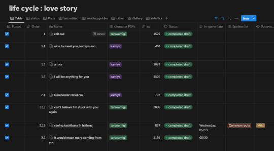
(the table keeps going off the right side of the image but it's a bunch of unimportant stuff tbh) So this is more complicated than what you'll probably start with because I'm Normal and add a bunch of details that you might not need depending on what you're doing. For example, my fic switches POVs so I have a column for tracking that, and my fic follows a canon timeline so I have a column for dates so I can keep track of them, and I also made columns for things like if a scene had spoilers or certain content readers may want to avoid, which they can access in my spoiler and content guide for the fic. (As I said, I'm Normal.) I also do some complicated stuff using Status and estimated wordcount stuff to get an idea of how long I predict the content to be, but again, not necessary. Anyway, you don't need any of that. For the purposes of this explanation, we're just gonna look at the columns I have called Name, Order, and Status. (And one called Part, but we'll get into that later) Columns in Notion have different types, such as Text, Numbers, Select, Date, etc, so make sure to use the type that works best for the purpose of each column! For example, here I'm using Select for Character POVs, Number for Order and WC (wordcount), and Text for the In-Game Date. Okay let's get into it! Name is a column that comes in a Notion table by default, and you can't get rid of it (which drives me up the wall for some purposes but works totally fine for what we're doing here). As you can see on the scene I've labeled 'roll call', if you hover over a Name entry, a little button called 'Open' appears, which you click on to open the document that's inside the table. That's all default, you don't have to set anything up for it. Here's a screenshot of what it looks like when I click the one titled 'I will be anything for you' (I've scrolled down in the screenshot so you can see the text, but all the data fields also appear at the top of the page)
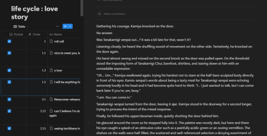
(This view is called 'side peek' meaning the document opens on one side and you can still see the table under it on the left, which is what mine defaults to. But you can set it to 'center peek' or 'full page' as well.) All my scenes have their own entry like this! Note that I've said scenes, not chapters. I decide the chapters later by combining the scenes in whatever combination feels right, which means I can often decide in advance where my chapter endings will be. This helps me consciously give most of my endings more impact than I was usually able to do when I tried to write linearly. So hopefully that gives you an idea of what I mean by writing inside the table and treating the table as a living outline. The 'Status' column is also pretty straightforward, and might require a little setup for whatever your needs are. This is another default column type Notion has which is similar to a Select but has a few more specialized features. This is how mine is set up:
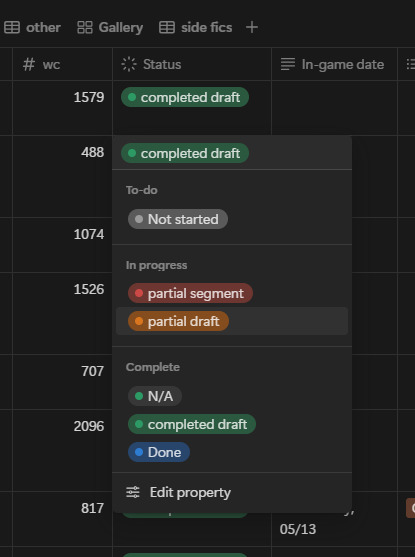
(I don't actually use 'Done', idk why I left it there. Probably I should replace it with 'Posted' and use that instead of the checkmark on the far left? whatever, don't let anyone tell you I'm organized. XDD)
Pretty straightforward, it just lets me see easily what's complete and what still needs work. (You'll notice there's no status for editing, because like I mentioned in my other post, I don't ever sit down to consciously edit, I just let it happen as I reread) Obviously tailor this to your own needs! The Order column is sneakily important, because this is what makes it easy for me to keep the scenes organized. I set the Sort on the table to use the Order to keep the scene ordered chronologically. When I make the initial list of scenes I know the fic will have, I give all of them a whole number to put them in order of events. Then as I write and come up with new scene ideas, the new scenes get a number with a decimal point to put them in the spot they fit in the timeline. (you can't see it here, but some of them have a decimal three or four digits deep, lol). Technically you can drag them to the correct spot manually, but if you ever create another View in your table (you can see I have eight Views in this one, they're right under the title) it won't keep your sorting in the new View and you'll hate yourself when it jumbles all your scenes. XD (And if you get more comfortable with Notion, you probably will at some point desire to make more Views) The Part column isn't necessary, but I found that as the fic grew longer, I was naturally separating the scenes into different points along the timeline by changes in status quo, etc. (ex. "this is before they go overseas" "this is after they speak for the first time", stuff like that) in my mind. To make it easier to decide where to place new scenes in the timeline, I formalized this into Parts, which initially I named with short summaries of the current status quo, and later changed to actual titles because I decided it would be cool to actually use them in the fic itself. Since it's not in the screenshots above, here's what the dropdown for it looks like:
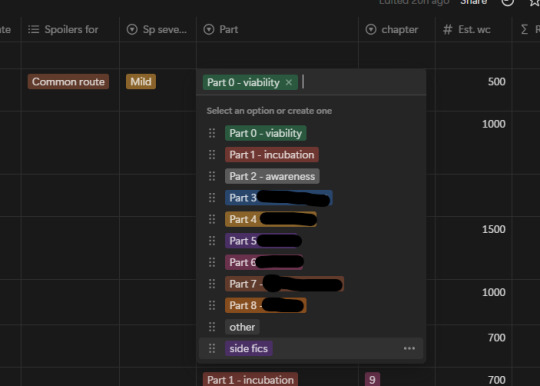
(I've blocked some of the titles out for spoiler reasons)
Basically I only mention the Parts thing because I found it was a useful organizational tool for me and I was naturally doing it in my head anyway. Anyway, I could keep talking about this for a really long time because I love Notion (don't get me started on how I use toggle blocks for hiding content I've edited out without deleting it) but that should be enough to get started and I should really, you know, not make this another insanely long post. XDD And if anybody is curious about how the final results look, the fic can be found here.
#writing#writing advice#fiction writing#fic writing#fanfic writing#fanfiction writing#writing resource#writing resources#writeblr#writers on tumblr#fanfic#fanfiction#fiction#fic
502 notes
·
View notes
Text
Tips for Optimizing Software Performance
Optimizing software performance is a critical aspect of software development, ensuring applications run efficiently and provide users with a seamless experience. Poorly performing software can lead to user dissatisfaction, higher operational costs, and scalability issues. This article outlines actionable tips and best practices for enhancing software performance.
1. Understand Software Performance
Software performance refers to how efficiently an application utilizes system resources to deliver results. Key aspects include:
Speed: How quickly the application performs tasks.
Scalability: The ability to handle increased loads.
Resource Utilization: Efficient use of CPU, memory, and storage.
Responsiveness: How the application responds to user interactions.
2. Identify Performance Bottlenecks
Before optimizing, identify the root causes of performance issues. Common bottlenecks include:
Slow Database Queries: Inefficient queries can significantly impact performance.
Excessive Network Requests: Overuse of APIs or poorly managed requests can cause latency.
Memory Leaks: Unreleased memory can degrade performance over time.
Inefficient Code: Poorly written or unoptimized code can slow down applications.
Use profiling tools like New Relic, AppDynamics, or VisualVM to detect bottlenecks.
3. Optimize Code Efficiency
Efficient code is the foundation of a high-performing application. Follow these practices:
a. Write Clean Code
Avoid redundant operations.
Use meaningful variable names and modular functions.
b. Use Efficient Algorithms
Choose algorithms with better time and space complexity.
Example: Replace nested loops with hash tables for faster lookups.
c. Minimize Loops and Conditions
Avoid unnecessary loops and complex conditional statements.
Combine similar operations where possible.
4. Optimize Database Performance
Databases are often the backbone of applications. Optimize their performance with these strategies:
a. Indexing
Index frequently queried columns to speed up retrieval.
b. Query Optimization
Use optimized SQL queries to minimize execution time.
Avoid SELECT *; retrieve only required columns.
c. Caching
Use caching tools like Redis or Memcached to store frequently accessed data.
d. Connection Pooling
Reuse database connections instead of creating new ones for each request.
5. Leverage Caching
Caching reduces the need to recompute or fetch data repeatedly.
Browser Caching: Store static assets like images and scripts on the client side.
Server-Side Caching: Cache API responses and database query results.
CDNs (Content Delivery Networks): Use CDNs to cache and deliver content from servers closer to users.
6. Optimize Front-End Performance
Front-end optimization directly impacts user experience. Here’s how to improve it:
a. Minify Resources
Minify CSS, JavaScript, and HTML files to reduce file size.
Use tools like UglifyJS and CSSNano.
b. Optimize Images
Compress images using tools like TinyPNG or ImageOptim.
Use modern formats like WebP for better compression.
c. Asynchronous Loading
Load scripts and assets asynchronously to prevent blocking.
d. Lazy Loading
Load images and other resources only when they are needed.
7. Monitor and Profile Regularly
Continuous monitoring ensures you catch performance issues early. Use these tools:
APM Tools: Application Performance Monitoring tools like Dynatrace and Datadog.
Profilers: Analyze resource usage with profilers like Chrome DevTools for front-end and PyCharm Profiler for Python.
Logs: Implement robust logging to identify errors and performance trends.
8. Use Multithreading and Parallel Processing
For computationally intensive tasks:
Multithreading: Divide tasks into smaller threads to run concurrently.
Parallel Processing: Distribute tasks across multiple cores or machines.
Use frameworks like OpenMP for C++ or Concurrent Futures in Python.
9. Optimize Resource Management
Efficient resource management prevents slowdowns and crashes.
Garbage Collection: Use garbage collection to reclaim unused memory.
Pooling: Reuse expensive resources like threads and connections.
Compression: Compress data before transmission to save bandwidth.
10. Adopt Cloud Scalability
Cloud services offer scalability and resource optimization:
Use auto-scaling features to handle varying loads.
Distribute workloads using load balancers like AWS ELB or NGINX.
Utilize managed services for databases, storage, and caching.
11. Test for Scalability
Scalability testing ensures the application performs well under increased loads.
Load Testing: Simulate high user traffic using tools like Apache JMeter or LoadRunner.
Stress Testing: Test the application’s limits by overwhelming it with traffic.
Capacity Planning: Plan resources for peak loads to prevent outages.
12. Best Practices for Long-Term Performance Optimization
a. Adopt a Performance-First Culture
Encourage teams to prioritize performance during development.
Include performance benchmarks in design and code reviews.
b. Automate Performance Testing
Integrate performance tests into CI/CD pipelines.
Use tools like Gatling or K6 for automated load testing.
c. Keep Dependencies Updated
Regularly update libraries and frameworks to benefit from performance improvements.
d. Document Performance Metrics
Maintain records of performance metrics to identify trends and plan improvements.
Conclusion
Optimizing software performance is an ongoing process that requires attention to detail, proactive monitoring, and adherence to best practices. By addressing bottlenecks, writing efficient code, leveraging caching, and adopting modern tools and methodologies, developers can deliver fast, reliable, and scalable applications. Embrace a performance-first mindset to ensure your software not only meets but exceeds user expectations.
0 notes