#hot metal typesetting
Explore tagged Tumblr posts
Note
Do you have any computer keyboards laid out like a linotype? I wanna bring back etoain shrdlu
I kinda made a joke one once

But really, the thing is, I don't want to make one. I'm a monotype girl. Besides the fact that they were so much safer than linotypes, look at the sexiness of this keyboard:

That's a keyboard that I want to make out with. I don't know how that'd even work, but I do. It's so beautiful.
Compare that with a linotype keyboard:

Does that fuck? Not even a little. Okay maybe a tiny bit: The way that you've got lowercase left-hand and uppercase right-hand is kinda cool.
But still, monotype machines never spilled molten lead in your lap, and could be easily modified to print in different fonts and have symbols added... that's why they hung on for so long, they were invaluable for non-english printing in english-majority areas, and mathematical printing. You can easily stick a ≤, ∞, or ∫ into your monotype, but doing that for a linotype? no way.
134 notes
·
View notes
Text
FTH Fanbinding: "Concord" by Deastar
@youhideastar won my FTH auction and gave me a great gift: She wanted me to bind her CQL fic "Concord" including the thorough author's commentary she'd done. I was so happy when she chose this fic because I'd loved it so much and had pondered doing a fanbinding of it at some point anyway. 😄
Now that the book has finally arrived (spending two days in the air even, I guess, at least when one looks at the tracking info 😆), I can show it off here!
I tried some new stuff on this bind and also some things that I'd only done once before and that definitely need some, uh, perfecting. 😅 But overall, I'm very pleased with how this book turned out, as it's pretty close to what I'd imagined when I started it.
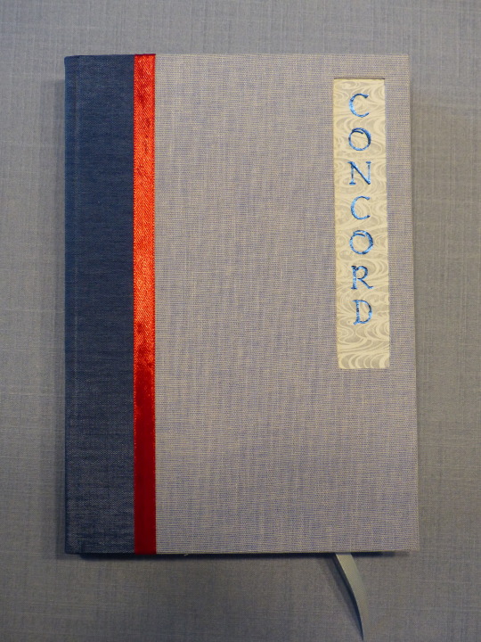
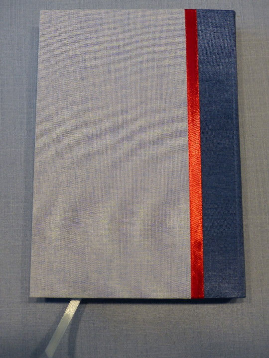
The fic is set in Cloud Recesses and Dea and I agreed that the colour blue should be prominent in the design, as it not only fits the setting, but also is of significance in the story itself. As the rules and traditions of the Lan sect also are quite important, I wanted a very clean, simple style for the case, a bit reminiscent of traditional Chinese bindings.
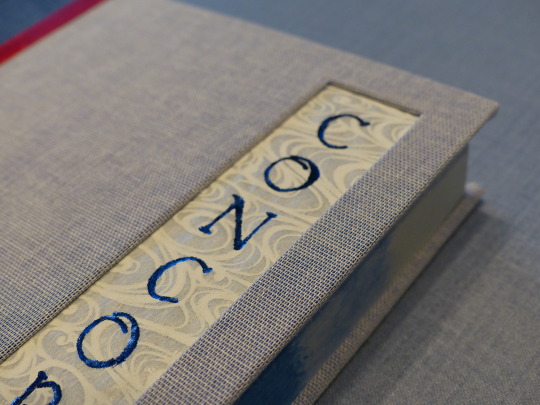
I did the title as a cut-out and used Japanese transparent paper for some extra flavour. The paper shows up inside the book as well early on and I liked the recurring motive of it. I'm also really pleased how well the hot foil came out on it! I was a bit scared that it might rip or something, but it's quite sturdy, after all.
I thought about doing a faux stab binding with red thread to get even more of a traditional feel, but then decided against it as I'd wanted to use two different blue book cloths and I felt that it might get too busy. Instead, I used the red ribbon as a nod to Wei Wuxian.
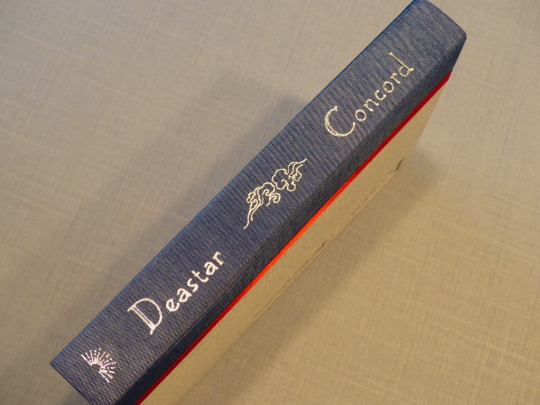
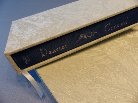
The little cloud illustration is used several times in the typeset and I like how it comes out in the title. I didn't even mess up this title, yay! (Mine's got a few tiny blotches but uh well, better mine than Dea's!)
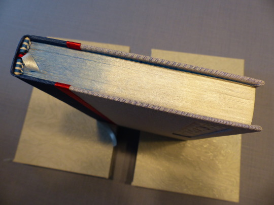
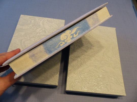
I painted the edges with metallic watercolours - the second time I tried painting edges, but this time with several colours and trying to do a little illustration as well. Big thanks to @zhalfirin who quickly answered my question about how to get the paint to actually stick. 😆 I'd read several posts about how awesome water colours are for foreedge painting, but none mentioned that this kind of paint just rubs off again (I am no artist and have no knowledge of different kinds of paint). Zhalfirin told me to mix in glue and also wax the edges afterwards, which I both did and I think it's fine now. At least my fingers didn't turn blue. 😅
I really love how the shading came out on the head/tail; it could've been better on the foreedge and it looked great while the paint was still wet. Steep learning curve, this thing. I also died trying to sand the edges and I didn't get them completely smooth, but at least smooth enough to work with. That also needs some more work, I guess.
First time I sewed endbands with four different colours! I think they came out quite well! I also forgot the second row of dark blue on Dea's book and had to unravel half the endband again when I noticed at the very end... 🤦♀️
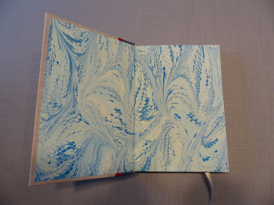
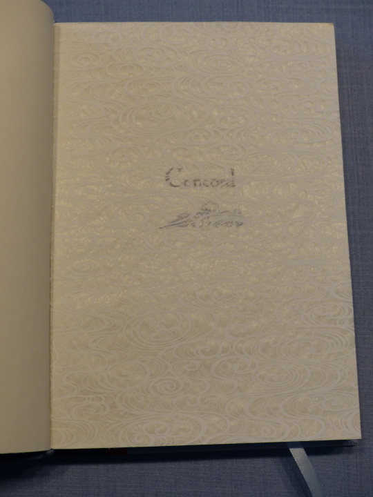
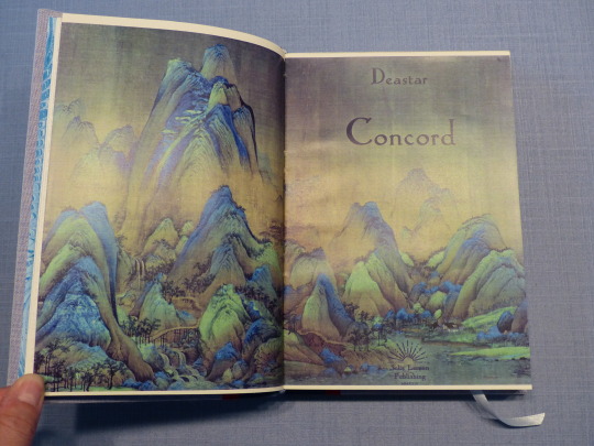
Nice marbled endpapers. For the title page spread, I used part a very famous Chinese painting, as it not only reminds me of the Gusu mountains but also, again, is very traditional. I played around with the colours to give the picture a bit of a bluer tinge.
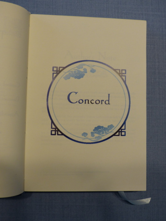
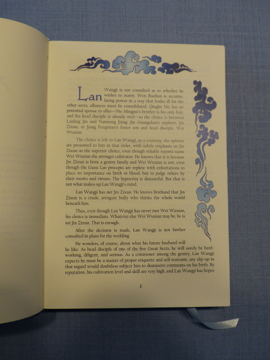
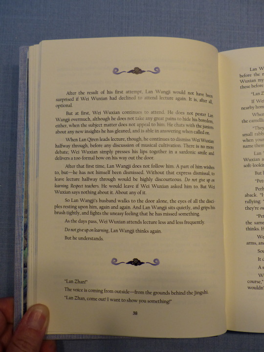
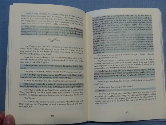

The typeset itself was very straight-forward. There's the fic without commentary, and then the second part with it. I used a grey background for the comment parts to make it stand out from the actual story.
I had lots of printer issues with this fic (my copy actually had even more issues because the printer treated every page as an image for unknown reasons and therefore it not only took forever, it's also a tiny bit blurry. Hmpf.) and the greys tended to have a bit of a blue tinge, which was not my intention. But at least it works with the overall theme, I guess! 😅
I also did an extensive Appendix with all the meta links mentioned in the commentary as well as cut scenes and a little "praise for the author" section.
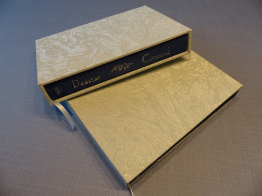
Last but not least, I decided to try making a slipcase for the first time! DAS_Bookbinding on youtube has good tutorials on that and I used one of them. It worked well on the first try. The second try, I used sturdier cardboard and should've added a few millimetres to the width, because the book didn't fit - the ribbon got stuck and I feared that it might get damaged. So I had to redo the case and then it was perfect.
I used wallpaper as cover material. 😄 The one you see on the outside? That's my living room wallpaper, a light blue with a lovely pattern and soft shimmer to it. My camera unfortunately is refusing to get the colour right.🤷♂️
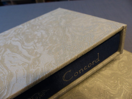
The assembling process went well, for the most part. I'd forgotten to shorten the endpapers a bit which I only realised after I'd started casing in my copy. I carefully separated the textblock from the case again and then, in a moment of complete mental blackout, tried to cut the wet paper. 🤦♀️ That didn't go well. I managed to salvage it, mostly, and of course didn't repeat the mistake with Dea's copy, but ugh. 😆
This was a super fun project and I'm very happy with it! Thank you again, Dea, for your faith in me and your super generous donation! 💙
Materials used:
Printed on Clairefontaine DCP 100g
Case and endpapers:
booklinen Colibri cornflower
booklinen Paradise aqua
marbled paper 120g
transparent Japanese paper
Hot Foil (Memory Keepers)
Slipcase:
fleece wallpaper Newroom Nisa lightblue
fleece wallpaper grey glitter
#my fanbinding#fanbinding#fth#fth crafts bazaar#fandom trumps hate#arts and crafts#the untamed#cql fanfiction#the untamed fanfiction#mdzs#mdzs fanfiction#wangxian
103 notes
·
View notes
Text

Sachi's book! I'm 2.2/3 for the giveaway I ran in December. This was the first of those books finished.
From patreon:
"Grommets are the devil so I finally just hot glued the metal on for the corset ties. I did Sachi's giveaway first because I already had the typeset and just had to print it.
The ribbon is interchangeable so she can undo it and pull it out and lace up a black one if she wants.
This is a double fan perfectbound paperback! The cover is cardstock/scrapbook paper with two pieces of faux leather to be the corset. Paperbacks don't usually have end pages but I like to add them sometimes.
Sachi received this in the mail so I can share pics now! It was a surprise what I did with the cover, so I kept quiet about it until she got it.
Now on to the other two!"


The book is designed to look like a corset. I had a lot of fun with this one!
84 notes
·
View notes
Text
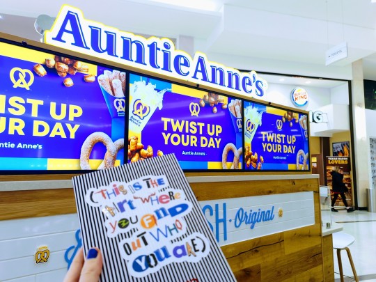
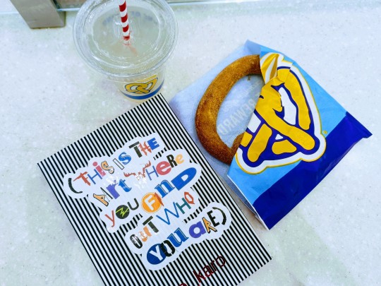
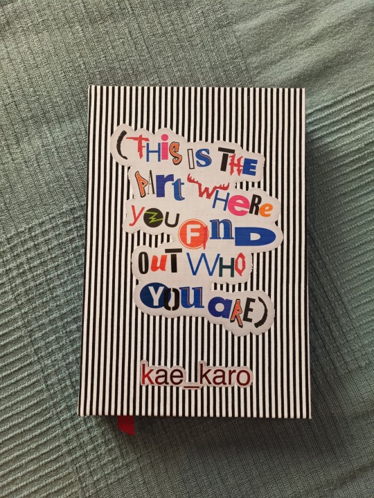
(this is the part where you find out who you are) - @kae-karo
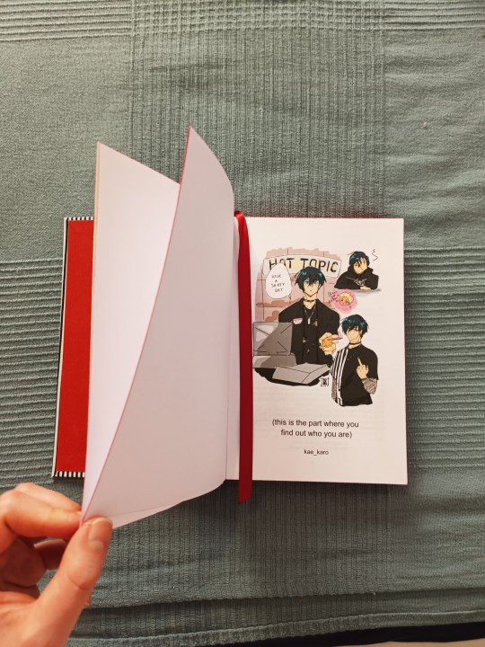
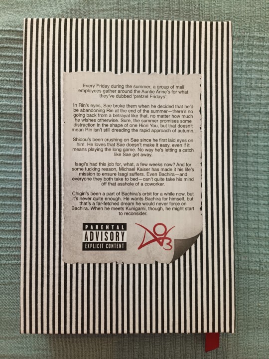
A fanbinding of this hilarious & heartwarming Blue Lock Mall AU: thanks again to kae-karo for agreeing to let me make this! After I'd finished, I took my copy to an Auntie Anne's to mark the occasion 🥨 only recently learned that she sells pretzels across the Atlantic!
The bind includes an illustration of Hot Topic Employee Rin by nanabee ✨
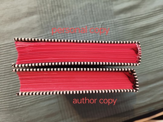
This was my first time making two copies of a fic, and I ended up refining the typeset and design elements midway. The bindings are siblings rather than twins as a result, but I'm very pleased with them both. Went for a Hot Topic/2000s grunge vibe.

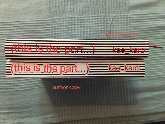
The cover title is a collage of lettering from the stores that the characters work at in the fic + a few others that would be familiar to American mall goers. I used printable vinyl sticker paper for the author copy, covered it with transparent film then layered metallic red HTV on top.
The personal copy has regular sticker paper for the title while the HTV is unbacked. It's hard to read on the stripy bookcloth, hence the adjustment.
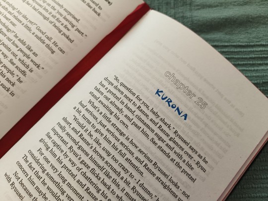
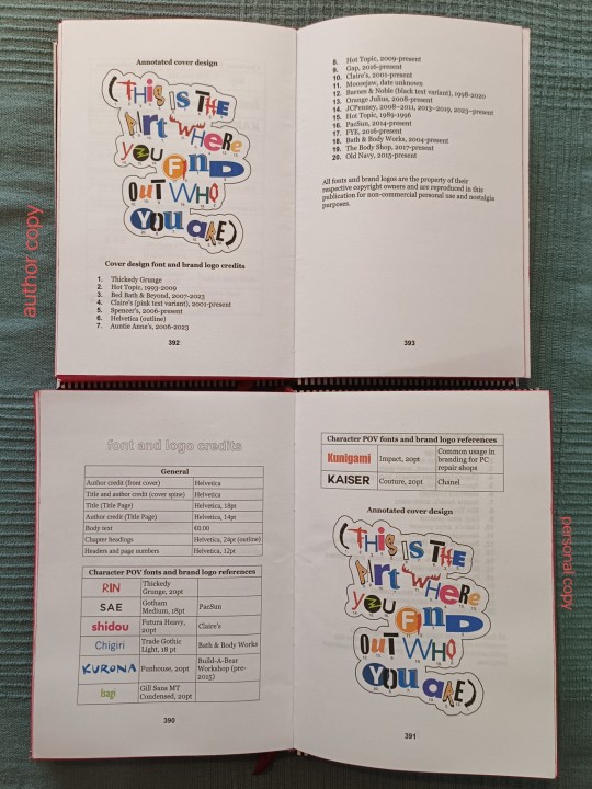
clock the typo on the personal copy idk how that happened :(
This is the most thought I've put into a typeset so far. The chapters have unique character POV headings based on their employer's branding or their personal vibes (e.g. since Kaiser makes me think "expensive & European", he has a Chanel-inspired POV font). The fonts have their own credit section at the end.
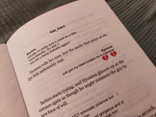
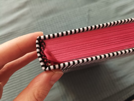
Technical details:
A5 binding with rounded spine.
13 signatures of 8 sheets, for an overall page count of 416.
Glitter card stock endpaper for the author copy, regular cardstock for the personal copy.
Handsewn headbands with a ribbon bookmark.
Homemade bookcloth (heat 'n' bond method) made from a fat quarter for emo/Beetlejuice flair.
Edge painted with red metallic gouache. This stained the interior in places but, y'know, 𝖆𝖊𝖘𝖙𝖍𝖊𝖙𝖎𝖈.
One final difference between the two copies is that the author copy benefitted from the arrival of my 20-sheet guillotine. While not perfect, the edges look much more even on the author copy. This will be my main method of edge trimming going forward.
#bookbinding#fanbinding#ficbinding#blue lock#bllk#(this is the part where you find out who you are)#boin de bindery#renegade bindery#hiorin#ryusae#kunigiri#kaisagi#bachisagirona
30 notes
·
View notes
Text
youtube
Farewell, Etaoin Shrdlu (1978)
The last day of hot metal typesetting at the New York Times.
Well worth a watch. The Linotype machine was a genuine, mechanical wonder.
21 notes
·
View notes
Text



to catch a sunbeam with white moonlight
Author: orphan_account [this work has been orphaned and is no longer associated with it's author]
Fandom: 全职高手 | The King's Avatar
Rating: General Audiences
Category: F/M, Gen, M/M
Words: 55,720
At a Glory convention, Dai Yanqi meets Ye Xiu who is helping Su Mucheng buy her favorite doujinshi. They surprisingly hit it off as they browse through all the doujinshi about their peers and talk about Glory.
About the book
FONTS: EB Garamond (body text, title), Roboto (body text - electronic), Bebas Neue (title, headings), Alfie (title), Segoe UI Symbol (scene breaks - 'gear without hub')
IMAGES: Sunflower (Rawpixel, ID: 2687359), lightning (Rawpixel, ID:10200699)
MATERIALS: Domtar Earthchoice (textblock - 20lb, cream, 11x17 cut down to 8.5x11), Recollections paper pad (endpapers - Dark Watercolor Florals), Iris bookcloth (covers - Eggplant), Verona bookcloth (covers - Hot Toffee), Ribbon (covers - 1/4", shell grey), embroidery floss (endbands - 209 Very Dark Lavender), leather cording (endbands - 1.4mm), Ceramcoat acrylic paint (painted edges - metallic silver), Anita's acrylic paint (painted edges - 11038 Purple), Reeves acrylic paint (painted edges - Violet & Crimson & Blue Lake, Payne's Gray), waxed linen thread (sewing textblock - 30/3, white), Books by Hand (glue - pH neutral PVA)
PROGRAMS USED: Affinity Publisher (typesetting), Affinity Designer and Affinity Photo, LibreOffice Writer (QR codes), Bookbinder-JS (PDF imposer)
BINDING STYLE: Split-board binding, French double-core endbands
(Belated) Binderary Book 2024
My first year participating in Binderary and I'm 2/2 with my goals, albeit slightly late (even with the added leap day).
Goal No. 1: Bind a book!
This fic is an orphaned work, with no author available for me to reach out to. Convenient, since it was a last-minute decision.
Goal No. 2: Finish typesetting the fic that got me into this whole bookbinding/fanbinding hobby!
Bad Boys JEDI Style is a 217 chapter, 908k word "comedy of errors: in which our heroes are recruited to film a reality holo-drama". Much to my despair, the fic I loved had been deleted from every site it was uploaded to, and I was left kicking myself for not having downloaded a copy from AO3.
Shout out to Kam and Lofe, whose wonderful Binderary demos were put to use in the making of this book! Kam's French Double-Core endbands demo was super helpful, sizing up the 'textblock' and components made it easy to actually see what's happening with the sewing. Loffe's demo introduced me to the split-board binding technique and, sleep-deprived hiccup notwithstanding, I think I might find it easier then bradel style binding! Need to bind more books to know for sure (such a hardship 😔).
In other new-s, I took my dad's recent workshop baby for a spin. The bookbinding plough works like a dream! I tried a hidden fore-edge painting for the first time (just a solid colour), but the purple is lost under the Payne's Gray basecoat I applied to the silver painted edges. Adding ribbon to the cover was also new (mostly due to the fact that I never remember until the endpapers are already pasted down).
On the Design
Cover
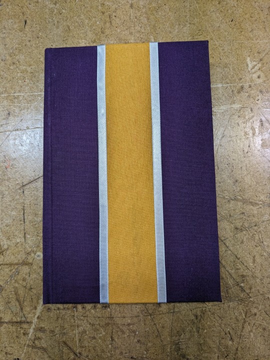
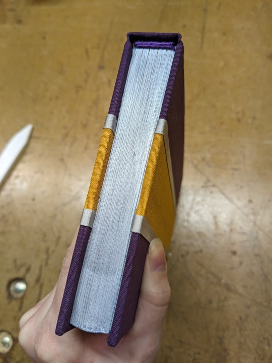
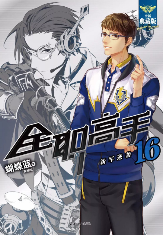
This is a Team Thunderclap!Ye Xiu AU, so the cover was based on Team Thunderclap's uniforms from the donghua (from the one screencap of the team I found, see below): purple across the shoulders and forearms of their jackets with a yellow stripe down the centre. I added silver ribbon as a nod to the white of the jackets as well as the grey gear of the team's logo. Also in reference to the title: yellow=sunlight, silver=moonlight.
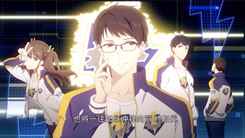
Title Page
The title page stumped me for a while. While brainstorming title page design ideas, I thought about what the title means. In English it's poetic but nonsensical, so I wondered if maybe it held some meaning in Chinese?
As it turns out, it does. Kind of. Maybe. (If I stretch and reach for it, it makes sense). According to a quick search of one webpage for each query, "'White Moonlight' usually refers to a person or thing that is elusive in the heart, has always been loved, but cannot be touched" or "an 'unforgettable first love'." The sunbeam itself might be Ye Xiu, the figurative ray of light, the hero, the gaming idol. Or 'catching a sunbeam' could refer to how "sunflowers turn their heads to catch every sunbeam."
The potential meaning I have cobbled together is how Dai Yanqi turns Ye Xiu's head and captures his heart by sharing the (SanXiu-ified) story of Su Muqiu, the aforementioned white moonlight. Is this what the author intended? Who knows. But it does seem plausible enough to inspire me.
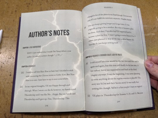
I ended up using both the idea of sunflowers and Thunderclap's uniforms (again). Lightning referencing the team's logo, and also the white colour of a flash of lightning which is kind of like moonlight. The logo's background is blue, as is the uniform as seen on the cover of the manhua featuring the captain Xiao Shiqin (see below), so I made the background blue-purple.
Endpapers
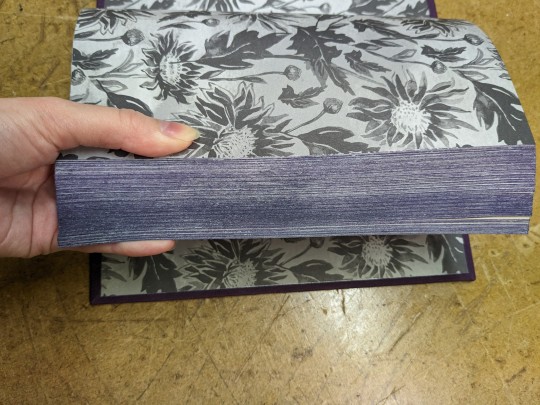
The (not-actually-)sunflowers carried over to the endpapers, as well as the grey colour from the gear in Thunderclap's logo.
Endbands
Kept these simple. A solid purple, as close as I could get to the bookcloth. I didn't want to draw attention away from the stripes on the covers or the silver edges.
Probably could've gone for thicker cores.
The text
For the scene breaks I used a special character of a gear. The cog also looks like a sun. Which is fun because it can reference Thunderclap, the title (sunbeam), and my design choice of sunflowers.
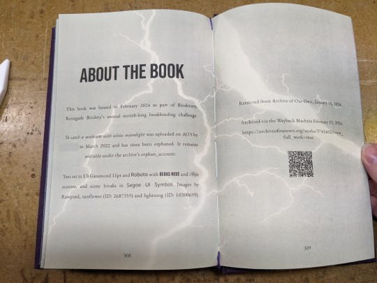
I reused the lightning image at 50% opacity as a background to set apart the backmatter.
Misc.
Recently, I've begun to increase my efforts of preseving fanfiction and safeguarding the stories I love from purges and takedowns. (Sparked by the December 2023 scandal about Sony announcing an upcoming removal of content including the movies and TV shows that people have purchased).
This fic has been archived via the Wayback Machine at https://web.archive.org/web/20240215155152/https://archiveofourown.org/works/37414021?view_full_work=true.
Also, curses be upon Rawpixel. Since the time that I had downloaded the images, they have now be placed behind the premium user paywall (along with a number of other graphics and elements that used to be free).
51 notes
·
View notes
Text
Happy Star Wars day!
MAY THE FOURTH BE WITH YOU! bound this little sneaky cheeky bind just in time for Star Wars day.
Yet another blind bind - leftover from Binderary. This bind is Remedial Jedi Theology by MarbleGlove.
Beautiful typeset was made by Aether from Renegade for the Bind Renegade Exchange last year.


Statistics:
51,336 words || 155 pages
Cover titling font: Tw Cen MT Condensed
I still haven't read this fic, though I kind of skimmed it enough to get a sense of the point of view. Exasperated Obi-Wan Kenobi seemed to be a prime feature, so despite not knowing very much about lightsaber designs in general, I decided to find the closest image vector I could find to Obi-Wan's lightsaber, which i wanted to use as a focal point of this bind.
This which i absolutely fucked within 5 minutes of applying HTV because I IRONED IT ON THE WRONG WAY AROUND - contemplated leaving it but I could not do it (I know enough hardcore Star Wars fans and they would definitely notice). Fast forward to 3 hours later where me and a tweezer had an intensely hot date where I flipped my book a million times while trying to get a grip on the last dastardly bits of HTV that were really hard to get off. I mostly succeeded, and here we are.
LESSON LEARNT - DO NOT IRON ON HTV WHEN TIRED.
I loved the half-title page designed by Aether, and I wanted a strong counterpoint to it for the cover titling, with a bold dramatic (but relatively simple) font and hence decided in the end to stick with something sans serif. I love this particular holographic HTV, it is absolutely one of my favourites, other than the metallics.
Endbands are yet again, me trying my best to practice my french double core with silk. They are getting better, slowly. I frequently never remember but I think this bookcloth is Hollanders Japanese bookcloth in wine. Lastly endpapers are from my stash from Renato Crepaldi.
Noun project icons from Vectors Market and Joe Wisneski.
Now that we are in May proper, my plan is to finally target all the author binds I've been meaning to do, as well as finish a couple of important projects I need to get done by end July. Am very excited for an event that's coming up soon!
#bookbinding#fanbinding#my books#renegade bindery#star wars#obi-wan kenobi#anakin skywalker#ficbinding#marbleglove
115 notes
·
View notes
Photo
Also, this:
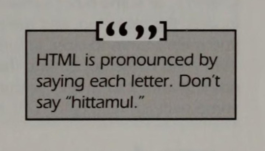
HoTMetaL is an early commercial HTML-authoring software program, released in 1994 by SoftQuad Software of Toronto, Canada. [...] The capital letters in HoTMetaL spell HTML. The term comes from hot metal typesetting which involves melting alloys into the shape of letters so they can be used by Linotype machines to print words on paper.
39K notes
·
View notes
Text
HELLO HERE IS THE FIRST DRAFT OF AN ESSAY ON THE EVOLUTION OF THE DESIGN OF MUSIC PUBLICATIONS
I'm planning on adding a lot more information and detail, alongside bringing in more analysis, reference imagery and theory. I referenced Walter Benjamin and would like to go into his theories and their relevance to my topic in much greater detail. I'd also like to focus more on cultural movements, technology changes in sections other than the beginning, and key figures in design for music. Including primary sources is a big goal for improving this work in the future, and i'd like to talk to creatives involved in the field. Throughout the piece I'd like to have a stronger voice to my own opinion running throughout and really place the history of the industry in the frame of the current climate, contextualising it for the reader, and having a more critical take on the systems that have led to the downfall of one of our formerly great cultural objects. weee genuinely love this topic so much i love print media and design and writing and music.
Introduction
The 21st century presents a complex time for music magazines. Once-dominant publications grapple with declining sales and a rapidly evolving media landscape. One can’t help but wonder if there is still a space for music magazines at all, let alone in print. Amidst this decline, however, there appears to be a resurgence of physical media, fueled by a growing distrust in technology. Is there an opportunity for independent publishers to revive the industry with a focus on aesthetics, quality design, and reader-focused business models? Looking at magazine design through a music specific lens gives a unique view on its history, allowing us to gain a deeper understanding of how it has been shaped through social movements and technological advancements. By examining this progression, we gain nuanced analysis of the music magazine, from its inception to the present day.
The Beginning
The first true music-specific publication is widely considered to be Melody Maker, established in 1926 by Lawrence Wright. Recognising the potential of the magazine publishing market, which had grown largely due to an increase in advertising revenue, and the potential to promote his own songwriting, Wright would go on to found one of the major players in the music magazine market for many decades. However, Melody Maker would soon find a challenger in New Musical Express (NME).
In 1952, facing financial difficulties, the paper known as Musical Express was looking for a buyer. Maurice Kinn, a promoter who had advertised in the paper, saw an opportunity and purchased it, starting a new venture into publishing. The paper relaunched as New Musical Express, a direct challenger to Melody Maker, even poaching staff of the older magazine. Despite initially being seen as a paper that wouldn't last longer than a few months, NME went on to dominate the market for music weeklies, becoming one of the most prominent music magazines in the UK throughout history. NME broke from the existing format by understanding there was a gap in the market for a music paper with richer visual content and a more interactive experience, expanding the paper, utilising an image based cover, and moving reader letters to the front of the issue.
These early magazines looked not dissimilar to newspapers of the time, printed on broadsheet to tabloid size paper. Design was highly influenced by the technology used, that being a relief process of printing, generally hot metal type machines such as the linotype. These machines required a worker to input one line of type at a time, creating a mould in the process, into which the machine would pour liquid metal. This machine greatly sped up typesetting and printing, an incredible improvement from older hot metal machines or using moveable type presses for large bodies of text. Linotype machines were limited to one typeface at a time, the process of switching requiring taking out the entire set of characters and replacing them with another. This led to magazines keeping their body text in the same typeface, which helped define each magazine's look, and despite the wide variety of typefaces available today most magazines continue that tradition, tending to stick to a limited number of fonts throughout. Headlines were still created with moveable type, which allowed for a little more variation in type size and style. These headlines would be locked into a frame alongside the lines of body text, advertisements, photos and all other components of a magazine. This block of components would then be inked and printed, finally forming one page of the publication. Images were included via the relief halftone process, which involved exposing images through a type of screen that would break the image up into dots. Via various mechanical and chemical processes this exposed image could be used to create a metal plate where the dots were raised and able to be inked alongside the text of a magazine. Whilst cheap and quick to make compared to alternative methods of reproducing photos, relief halftones were limited to a certain quality, halftone images not hugely advancing until offset printers became the standard technology.
The quality of visuals of music papers in particular would become increasingly essential with time however, a way of differentiating and standing out from the competition, or offering an exclusive experience. The importance of imagery is perhaps most evident in cover designs throughout the years, going back to NME’s relaunch in 1952. Disc embraced a reliance on cover star photography, while Record Mirror set itself apart from other music weeklies by being one of the first to feature a full colour front page.
The effectiveness of quality visuals is also clear in the near obsoletion of letterpress processes in magazine printing by the 1970s, the market overtaken by offset lithography. This is a planographic process, where a rubber roller picks up ink from a flat surface, then transfers it to the paper. Offset lithography allowed for higher quality photographs as it could replicate halftone images that had finer dots of a much greater count than relief halftones could manage. It also encouraged more experimentation with colour as the rubber material used to print onto the page could create an incredibly even solid colour. This method of printing also didn’t warp the paper like the impression of a letterpress block did, the resulting lack of alignment issues meaning four colour processes could be perfected.
These advances in technology enabled the creation of graphics that could fully reflect music alongside the fashion and cultural movements surrounding it, their decreasing price point leading to a surge in underground publications and fanzines.
The Underground Press
Underground publications that covered music really took off in the 1960s, with many started by contributors to sci-fi zines, which were a more established genre. Crawdaddy, which was launched by Paul Williams as a fanzine in 1966 contained critical writing on rock music. Williams had previously contributed to sci-fi zines such as Within. The zine transformed into one of the more notable rock magazines in America, predating both Rolling Stone and Creem, and often sharing writers with them too, notably Lester Bangs, the defining voice of Creem magazine for many years. Creem itself was an independent magazine, influenced by zine style layouts, “The layout was of the slap-it-down/ move-it-out school” as Kenneth Fitzgerald puts it. The magazine closed down in the 1980s, and while a couple editions were produced in the 1990s with a more sophisticated design initiated by Marvin Jarrett, the attempt didn’t regain the former success of Creem’s earlier days and was once more discontinued, Jarrett moving on to found Ray Gun. Today Creem lives on as a small independent operation, led by JJ Kramer, son of Barry Kramer, the magazine’s original publisher.
Back in the UK, International Times was launched as a counter cultural magazine in the same year as crawdaddy, 1966. The launch of the paper was celebrated by an event at the roundhouse in London, headlined by Pink Floyd. The magazine covered politics and underground music that went unacknowledged by the mainstream music press. After IT had laid the groundwork countless more would follow, 70s punk fanzines taking clear inspiration.
Oz in particular is of note when talking about the underground press, its prolific use of colour, psychedelic visuals and an obscenity trial setting it apart from the rest. Frequent intervention by the authorities such as the trial faced by those that ran Oz magazine, among other issues with the format led to the underground press losing coherence and impact over time. Nevertheless these independent publications had massively changed the industry, inspiring greater coverage of media and culture in the mainstream press and pushing design in music magazines forward.
Popular music
Following the lead of underground publications, larger magazines began to adopt more creative layouts and a more informal tone, but as they relied entirely on advertiser funding and ran an overall more expensive operation, could not afford to be nearly as controversial as certain underground papers. The artistic essence of independent magazines was lost somewhat in the process, in line with Walter Benjamin’s theories of mass production altering perception of media. New independent magazines were still being created that pushed boundaries though, the 90s saw the launch of Ray Gun, a chaotic and challengingly designed magazine that covered alternative rock. The magazine was founded by Marvin Jarret and designed by David Carson, whose distressed type and layout design gave Ray Gun a unique appeal. Still, larger papers offered space for professional writers and developed opinions. With writing critically about pop and rock music no longer a foreign concept, this style of content flourished in the majors for a good number of years. However, a change began brewing with the arrival of the internet.
Rise of the Internet
With the growing prevalence of the internet many music magazines started to diversify their content, opening themselves up to a wider range of advertisers and attempting to draw in more readers with a more mass appeal. As advertisers withdrew from magazines in favour of cheaper, targeted marketing offered by the internet, the money in publishing dwindled, leading to many publications closing down, even the legendary Melody Maker, who rather ironically was merged with longstanding rival NME. The majority of publications launched websites and started to discontinue print editions, however a few magazines on the other end of the spectrum pursued the luxury appeal of well designed, high quality magazines. Accepting new formats and ways of communicating content was essential for magazines to persist at the turn of the century, and this greatly impacted the visuals. Clean, simple and navigable designs generally dominate music magazine website design, based on the most effective way to get the content to the reader efficiently. Magazines also use social media accounts to promote articles, usually with photography of artists or events. Creativity in major publications has been somewhat lost with the adoption of the internet, the types and variety of visuals becoming reduced. Despite this there are a number of smaller and newer magazines doing things differently today, and this is possibly the most interesting area of the industry in the present day.
Physical Media Revival
As we move further into a tech saturated world a growing number of people have a desire for media in a more tangible format. This has led to the success of independent publications in print such as So Young, a magazine and record label with a focus on emerging talent. The layout design of So Young Magazine is relatively simple yet incredibly appealing in its nostalgic look and use of colour. The magazine is usually composed of interviews with artists, paired with an illustration. So Young uses a wide variety of illustrators, resulting in a huge diversity of visual content. Full colour pages with reversed out text are a frequent occurrence, and photography used tends to have a grainy film quality, adding to the nostalgia appeal. One off pieces and interviews with visual artists make occasional appearances too. Outside of the print magazine So Young also sells merchandise, organises events, and runs a label. These other activities highlight a key change within the magazine industry with the adoption of the internet, the fact that with so much content being available online, magazines could no longer rely on exclusive photography or interviews to get sales, and instead have to market themselves as unique brands, able to be applied to multiple ventures. Dork magazine launched their own radio, featuring a variety of shows and interviews with artists. Smaller magazines of a higher quality can also rely on reader purchases more than advertisers, providing a cleaner, more enjoyable experience.
Whilst the internet resulted in a lot of websites being launched to replace discontinuing print issues, it has also provided the opportunity for the opposite process, smaller magazines gathering a supportive audience first, then launching a print edition funded by readers, such as electric sound, a magazine that started as an interactive ipad app. Brands in other areas of music are getting involved in print too, a number of labels having started their own publications. State51, a record label and music company launched greedmag, a magazine with incredibly unique design, that provides sold out editions available in full on their website.It would seem that print is not dead, it just needed to slow down, the breakneck pace of music weeklies no longer a sustainable option. Even NME, which had ceased its print edition in 2018, is back in print as of 2023, as a sleek bi-monthly magazine. Perhaps scaling back is a better approach for music magazines, allowing them to become closer to the fans and artists together.
Conclusion
The cultural movements led by music have greatly impacted magazine design, leading to the creation of underground zines which pushed design in a more expressive direction, or the rise of celebrities and an increasing interest in their lives leading to greater photography coverage throughout magazines. The importance of advertising to music magazines is not to be underestimated either. By initially bringing more money into magazines, Advertisers increased the amount of competition as more people wanted in on the money to be made in publishing, and that competition drove visual innovation and a higher level of music criticism as ways to stand out. The changes in writing style would also influence the design of the pages, Lester Bangs rough and ready takes complementing the scrappy design of Creem magazine perfectly. Technology has also evidently had a great impact on the music press and its design in the past century, and continues to change it as the market pivots to something more indie and reader funded. This change in my eyes is the best turning point in the industry, and something I hope continues. I think the diversification of magazines into brands and multimedia platforms will create more spaces for people working in the industry to grow, the magazine itself no longer being the main product but its surrounding community, ideas and direction.
0 notes
Text
vimeo
A film created by Carl Schlesinger and David Loeb Weiss documenting the last day of hot metal typesetting at The New York Times. This film shows the entire newspaper production process from hot-metal typesetting to creating stereo moulds to high-speed press operation. At the end of the film, the new typesetting and photographic production process is shown in contrast to the old ways.
There are interviews with workers at NYT that are for and against the new technology. In fact, one typesetter is retiring on this final day as he does not want to learn the new process and technology.
0 notes
Text
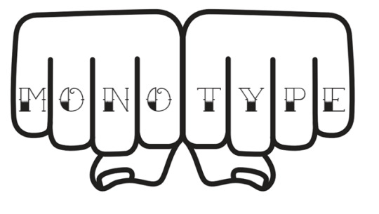
gonna get knuckle tats to show which side of the great hot-metal typesetting war I'm on
421 notes
·
View notes
Text
Mid-1800s is before hot metal typesetting, so they just did manual typesetting. Drawings are usually woodcuts (which are usually monochrome), but it was possible to do multiple colors if you are careful with registration.


We have just digitized our copy of The First Six Books of Euclid by Oliver Byrne (1847) which uses diagrams of intense color as an aid to learning geometry. Although it sold poorly at the time of publication, it's recognized today as a masterpiece of design and printing.
Typ 805.47.3730
Houghton Library, Harvard University
3K notes
·
View notes
Photo

Instead of manually setting individual characters or small groups of characters, the Linotype machine allowed for the casting of entire lines of text using hot metal types.
This innovation significantly increased the speed and efficiency of typesetting, transforming the printing industry at the time.
https://dl.machinedalal.com/PXS6
#machinedalal #printingfacts #sellprintingequipment #sellprintingequipment #printingindustry #printingmachinefacts
0 notes
Text
Major Project - Typeface Choice
I wanted to use a serif typeface as I feel like gives me more to work with in terms of altering the letters to give them behaviour.

Sabon is an old-style serif typeface designed by the German-born typographer and designer Jan Tschichold (1902–1974) in the period 1964–1967. It was released jointly by the Linotype, Monotype, and Stempel type foundries in 1967. The design of the roman is based on types by Claude Garamond. The italics are based on types designed by a contemporary of Garamond's, Robert Granjon. It is effectively a Garamond revival, though a different name was chosen as many other modern typefaces already carry this name.
A classic typeface for body text, Sabon's longstanding popularity has transcended its origin as a commission to fit a tight set of business requirements. Tschichold was commissioned by a coalition of German printers to create a typeface that could be printed identically on Linotype, Monotype or letterpress equipment, simplifying the process of planning lines and pagination when printing a book. The italic and bold styles were to take up exactly as much space as the roman, a feature imposed by the duplexing system of Linotype hot metal typesetting machines of the period. Finally, the new font was to be five per cent narrower than their existing Monotype Garamond, in order to save space and money.
I chose to use Sabon for an array of reasons.
The release of the typeface historically matches up with when the term “parentification” was introduced by family systems theorist Salvador Minuchin: in 1967.
Sabon was also originally designed to fit within very specific parameters. The italic and bold styles were to take up exactly as much space as the roman. It also needed to print identically on Linotype, Monotype or letterpress equipment. This feels reflective of the very specific height pressure conditions which a parentified child is forced to grow up in, and specific behaviour required of them.

I test printeed various options for bodycopy type size of Sabon before committing to it as my chosen typeface, mainly because Sabon is very limited, it only comes in two weights, and I didn't want this to cause issues later down the line when creating my editorial piece and process book.
1 note
·
View note
Text
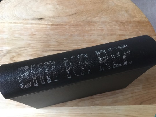
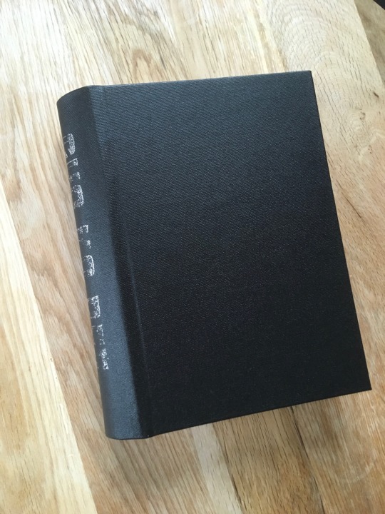
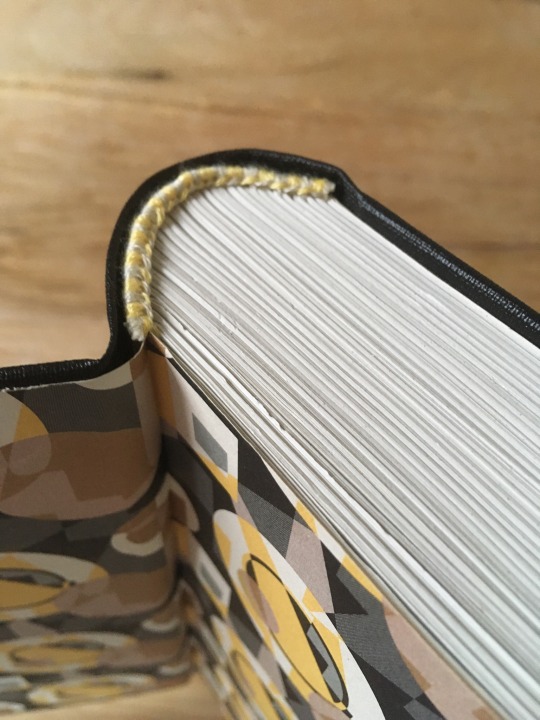
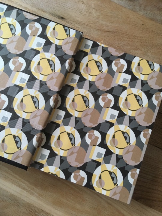
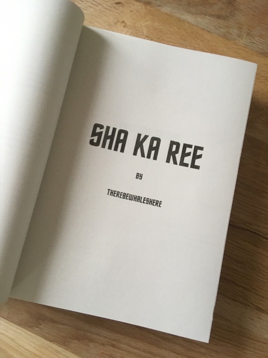

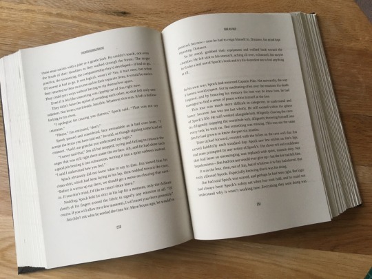
Sha Ka Ree by ThereBeWhalesHere
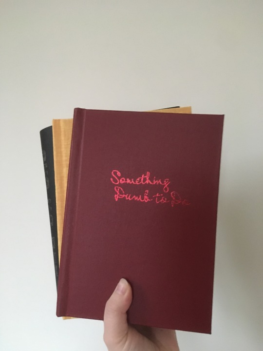
Third and final binding for Annamon (ABT Fanbinding) for the 2022 @renegadepublishing binding exchange ! This is another Kirk/Spock fic, this time they’re stranded together on a planet as well in time.
A 600 page chonker, this is a rounded A5 HB bound in metallic charcoal bookclouth with the title done in silver foil and hot foil quill. I knew I wouldn’t be able to get a sharp and crisply foiled title on there so I decided to lean into the aesthetic and deliberately aim for a tarnished silver look to go with the theme of the fic. The endpapers are pepin press Art Deco, chosen to match the book cloth and because the motif makes me think of search lights. Headbands match the endpapers. I used the same typesetting as for the previous binding but with small adjustments, mainly I used only one Star Trek typeface for titles & running headers/footers. I’m really happy with how this came out!
Bonus: all three books pictured together:

346 notes
·
View notes
Text
youtube
I unbox incredibly beautiful books...
679 notes
·
View notes