#hope the quality is ok they were in the background so i had to crop a bit
Explore tagged Tumblr posts
Text
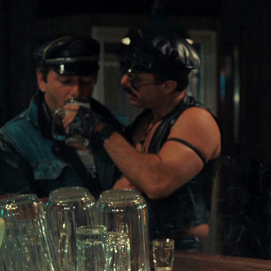
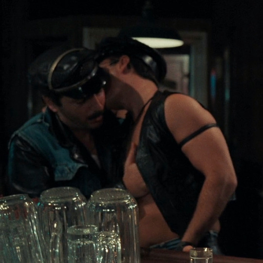
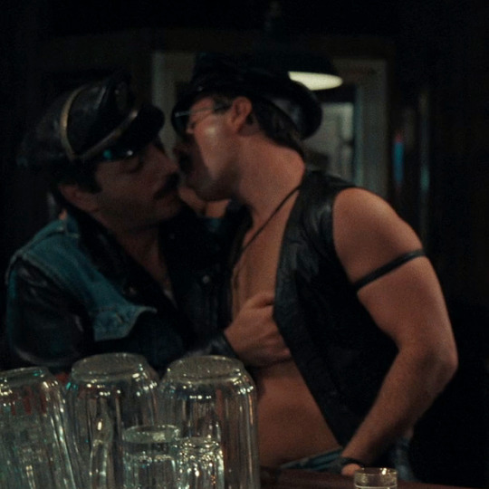
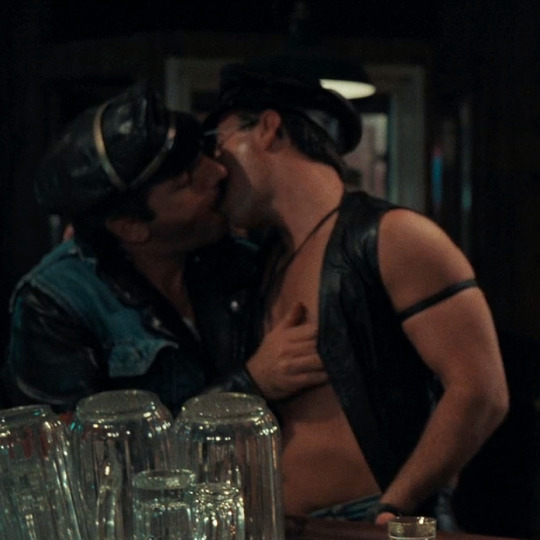
After Hours dir. Martin Scorsese (1985)
#after hours#martin scorsese#j#usermichi#&*#hope the quality is ok they were in the background so i had to crop a bit
2K notes
·
View notes
Note
Its a lot harder to do with traditional art but I'd love to see progress shots of your colored pencil stuff its so neat
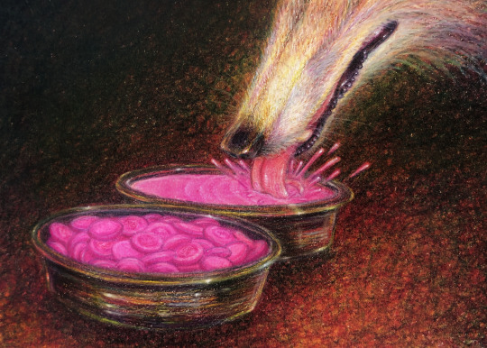
I wanted to wait until I had progress shots to show before answering this and I took some as soon as I was starting a new colored pencil illustration, which was the Pepto Bismol one I just posted. Gonna put a keep reading cut here bc this’ll probably be a bit of a long post lol.
I don’t have any kind of strict process I always follow, I just do whatever works best for each specific drawing, so I kind of just took a pic whenever I finished anything that felt like it could be it’s own “step.” Also keep in mind I worked on this during different days, different times of day, and different locations, so the lighting will be pretty different throughout the pics here which will affect how the colors look and the overall quality of the photos, I did the best I could with the changing lighting.
First step is the graphite sketch. Since I’m focusing on the colored pencil part of the process I didn’t document the process of sketching, just the final outcome
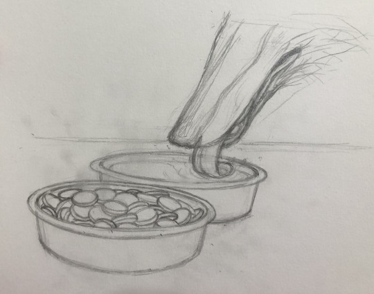
I go over the sketch with a colored pencil, I usually use a lighter color so that the lines you’ll see in the next step are lighter and not going to be noticeable when the drawing is all done, and I’ll go with a color that would be found in the illustration so that it doesn’t look unnatural wherever it may show through (I chose pink because, Pepto Bismol)
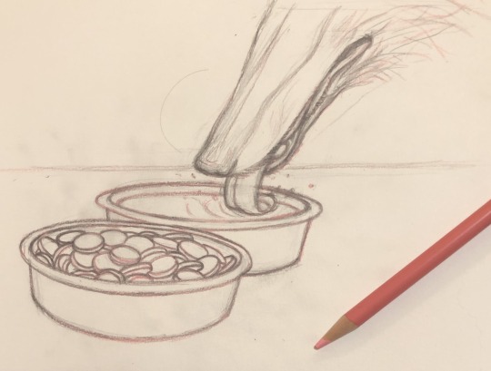
then I go over the whole thing with an eraser, only the graphite erases completely while the colored pencil stays, even though it dulls a bit. This is so I can still have a sort of outline to color in without having to worry about graphite mixing with the lighter color pencil colors and muddying everything up (it also just cleans up the sketch a lot which makes everything easier to work with)
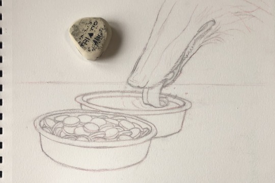
then I start putting some of the colors down while also adding some basic detail that I’ll color and shade along later. I also go over the lines again just to make sure everything is shaped correctly, but I’m using the base colors of whatever the object is because I don’t actually want things to have outlines later on
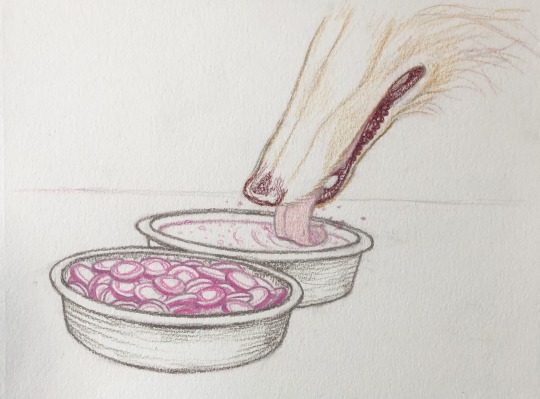
I’m kind of mapping out the colors now as well as shadows
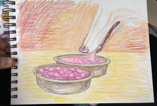
(also I finally found a use for this super bright neon pink colored pencil I have lol)
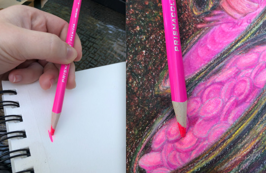
I’m basically just continuously layering on more color and detail, making sure to go light to dark. I mostly work on everything evenly rather than meticulously finishing one area after another but I was a bit more meticulous with the pepto bismol tablets just because they were the most detailed part of the illustration
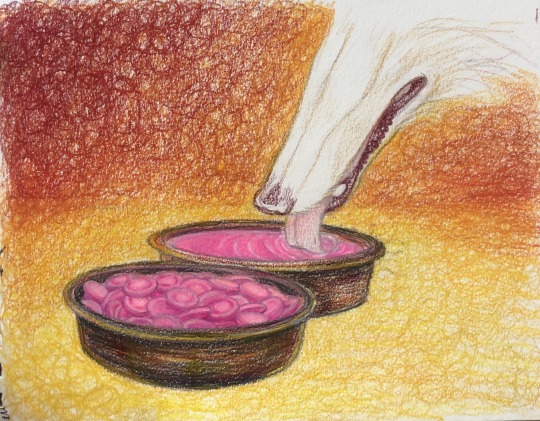
I pretty much color the borzoi last because it’s the one white thing in this image and I want it to sort of “reflect” all the colors that will be around it and you can see I’m still adding new colors to the background as I go along
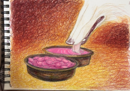
adding some green, Im basically trying to get a black without using black by layering opposing (is that the right word?) colors over each other, it makes it so that the black still looks like a natural part of the image because it’s made up of the colors in it, and it gradients toward the foreground better. I’m also doing the same for the nose and lips of the borzoi
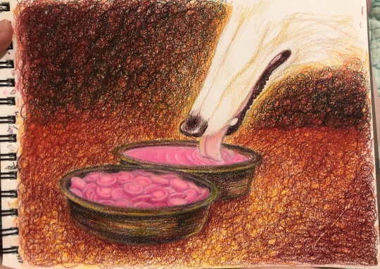
finally putting some more color down on the borzoi, both giving it a base color and making the shading more defined
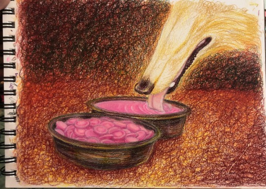
added the pepto splash before I layer any more color on the background. Also in just about every step here I’m continuously touching up the pepto bismol tablets, maybe a bit too obsessively
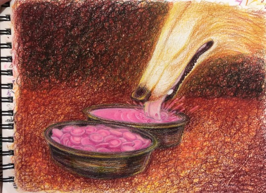
adding more colors from the background to the borzoi as well as shading it some more
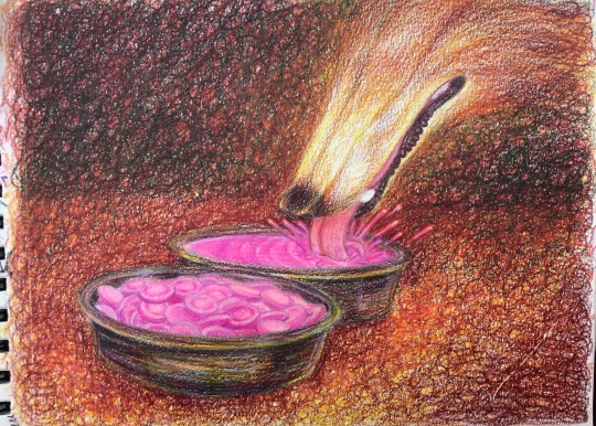
adding more green (and some dark blue) to the background and floor to darken it some more, and again to the borzoi
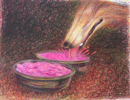
I blend some of the lighter areas with orange-yellow, dunno if this is a real technique I just like the kind of glow effect it has and I do it a lot in my drawings (basically layering light colors over dark ones and sort of pressing harder with the strokes to blend/smooth everything together while giving it an almost glowing undertone of that light color)
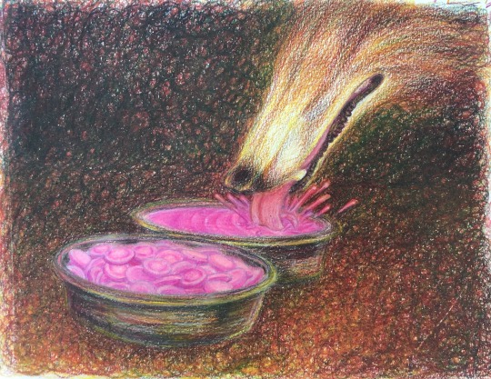
still layering colors to darken everything up
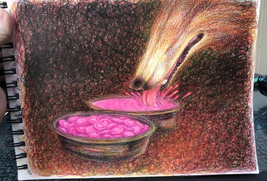
Only at the very end I use a white colored pencil, I haven’t used it at all so far. I give the borzoi it’s fur texture + its whiskers, basically using the same method as earlier when I blended the yellow into darker colors by pressing harder with the strokes, here the strokes are just fur-shaped. I also add some highlights to the metal bowls, the splash of pepto bismol, and the nose and mouth of the borzoi with white colored pencil and a tiiiiny bit of white gel pen (a really tiny bit, basically a few little dots here and there)
oh and I added the “Pepto Bismol” writing to the pepto bismol tablets (or as close to writing as I could get)
also at some point in this step a mysterious black line appeared on the drawing that I couldn’t get rid of :( but its ok I just removed it in photoshop later lol
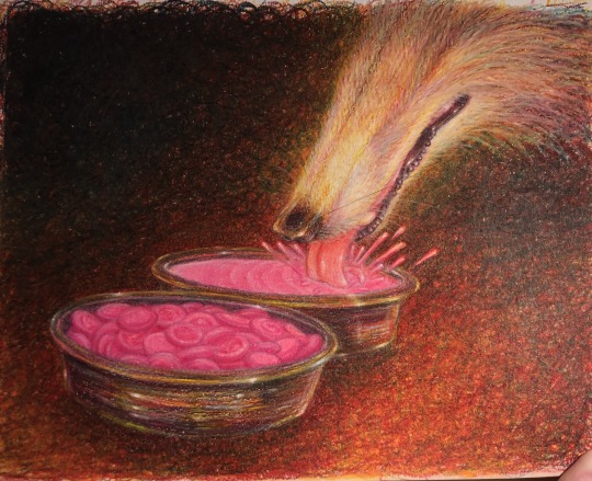
then I just take as good a pic as I can and touch it up in photoshop, this is for getting rid of flaws like that weird black line as well as to make the photo resemble what the drawing looks like irl as closely as possible, I’ll usually have the drawing next to me so I can reference it while editing the photo to make sure it looks like the real thing.
also in this step I usually crop the image both to hide the messy edges and to give it a better composition.
you can see how different all these pics look from each other (in terms of lighting and quality) let alone from the final piece, which is why the editing step is important lol
hope this is helpful!
513 notes
·
View notes
Text
Making Normal Channels in GIMP (with njob)
Hello everyone! I was explaining how to do this in the Sims of History discord server and realized how much of this process I learned through trial and error. There isn’t really a good step-by-step tutorial about how to do this in GIMP, only in Photoshop (at least no text-based tutorials). While I use both Photoshop and GIMP for various things, I prefer to make my normal channels in GIMP. This tutorial will walk you through the process and hopefully demystify normal channels in GIMP.
Normal channels (bump maps) add additional depth beyond your mesh, which is useful for things like folds, painted on pockets, and buttons.
This tutorial is particularly for how to make Create-a-Sim items, not objects, but a lot of steps should be transferable.
You will need (all free programs):
GIMP
njob
Sims4Studio and/or CAS Tools

First, open your diffuse texture in GIMP. I often try to use the light/base texture rather than one I have colored already, but if you have already colored it and didn’t save a base, don’t worry, it doesn’t make much of a difference. Don’t use an image which has a pattern applied to it, as that will create a bump on the pattern and appear like applique or something along those lines (unless that is your goal).
I recommend doing this step after you have tested your diffuse texture image and mesh (if applicable) in the game. If you have any last minute changes to either of these, you will probably need to re-do your normal from scratch.
If your image is in layers for recoloring, or not, choose to flatten the image. Transparency isn’t helpful in making normal channels, so get rid of it so you won’t have to worry about it later.
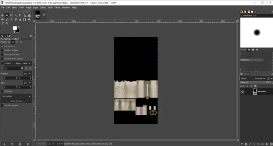
Once you have flattened it, the background usually turns either black or white. It doesn’t really matter which one, it won’t make much of a difference in njob.
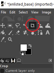
Now, select the crop tool. You can see the current dimensions of the image in the “aspect ratio” box. For a CAS items, the original will be 1024:2048, which is 1 x 2. We will need to crop the image into a 1 x 1, or perfect square.
To have your normal channel as high quality as possible, you should use 1024:1024. This will work for clothing items like full body outfits, tops, bottoms, gloves, socks, and tights (basically anything mapped in this bottom portion of the UV map). For all of these items, you must use a square and cannot crop it to be smaller. For shoes, this means a very large blank area.
For accessory items like jewelry and hats, the cropping is different. For instance, a hat would be 512:256. If you are unsure of the dimensions to use, export the normal channel on the maxis item and copy its dimensions. The following instructions will assume you are making a clothing item and not an accessory item.
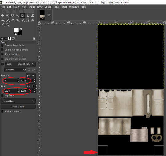
Click anywhere on the image while you have the crop tool active, then adjust your dimensions in the box to the left. You can manually type it in or drag the box and follow the size in the box as you drag.
The box should be perfectly aligned with the bottom and have no space below. If you have space below, just drag it as far to the bottom as you can. GIMP will stop you from dragging it outside of your current dimensions. If a little is sticking out at the top, that is okay. Nothing can be mapped outside of the 1024:1024 dimensions, so it is probably just bleed over or space filler that you are cropping off.
Press “Enter” on your keyboard to complete the crop.
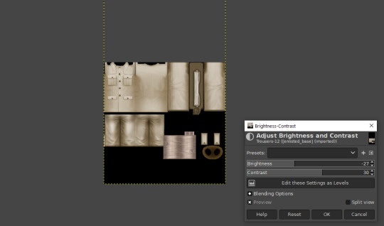
Optional Step: If you desire, you may want to decrease the brightness and increase the contrast on your image so there will be more for njob to pick up. If you already have a lot of contrast, you may not need to do this.
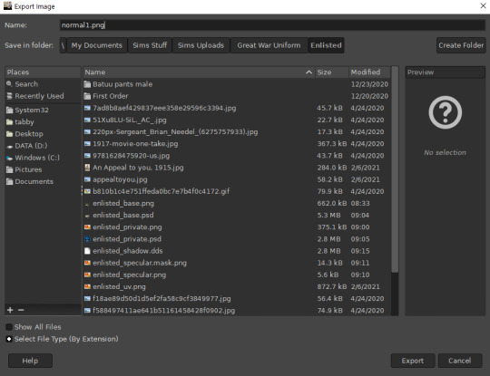
Next, export your image as a PNG or BMP. Be sure to not overwrite your original diffuse texture.
You can now close GIMP, though you will need to open it again later.
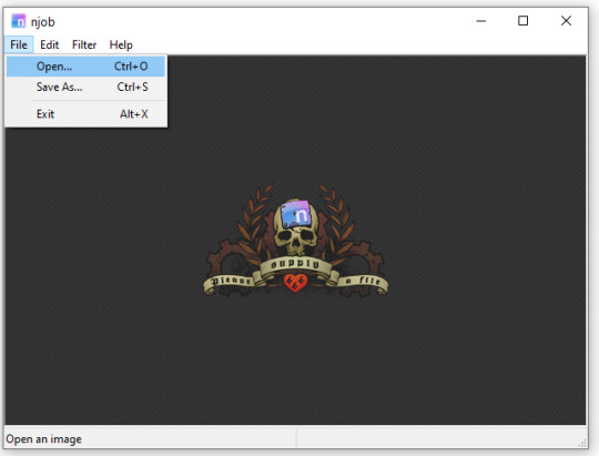
Open njob, then your saved, cropped image.
Maximize your screen so you can see what you’re doing.

Go to Filter > Diffusemap > Heightmap and select that option.
The screen will pause to load for a bit before opening up a new box.

Your image will convert to black and white and may look a bit strange. The first step is to change your “Course Detail” setting to the lowest (or close to the lowest) setting and your “Fine Detail” to the highest setting. I generally play around with the “Mid Detail” and “Scale” until I get what I want. Try to have what you want to be visible stand out, while folds should be soft and fuzzy but still somewhat distinguishable.
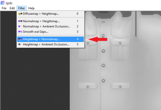
Once you have what you need, click OK and go to Filter > Heightmap > Normalmap

There are two settings, “Scale” and “Blur Radius.” Neither of them have “ideal” settings, so you will need to adjust as you need. “Scale” controls the depth of the contrast and “Blur Radius” impacts the softness of the image. If your edges are too harsh, your normal map may look odd in game.
You will probably also have lines in areas in no texture. This is normal, and I will go over how to remove those later.
Once you are satisfied with how things look, save the image as a bitmap.
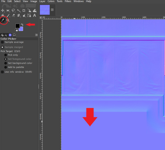
Now, open your bitmap image in GIMP. It is time to clean up the image and get rid of the artifacts. Unfortunately, unlike a specular, a normal map doesn’t have a mask to prevent bleed over onto skin or other textures. The unused areas need to be a midrange, solid grey. It is easier to edit at this step before you create your transparency.
Select a midrange blue color from one of the blank areas with your color selector and make it your background color by using the arrow button between the foreground and background colors.
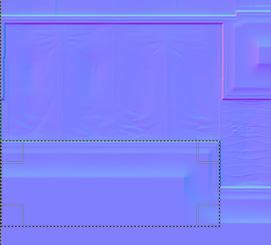
Select the areas that should be blank and delete them, which will replace the lines with a solid blue color. This would be areas around the neck, wrists and ankles, and also places like the filler beneath skirts and tops that doesn’t need texturing. Be sure to select the odd lines around the image, which are usually a bright teal or hot pink color. Those can be very visible.
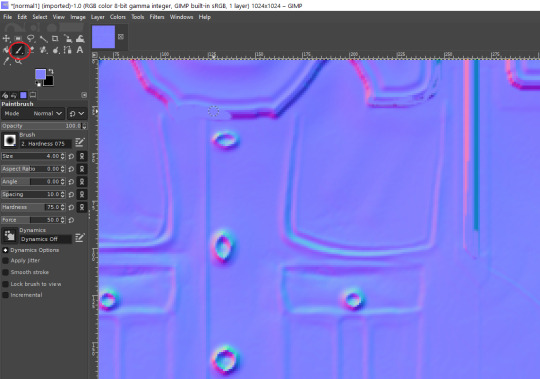
Sometimes, you may need to take your paintbrush and clean up the artifacts if they are in curved or very small areas. If anything looks too sharp, you can also use the smudge brush to smooth it out (very lightly). But don’t move anything around too much.
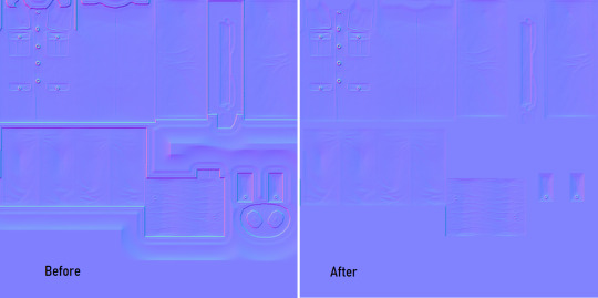
Once you have cleaned up your image, export it again as a bitmap. This is just so you can go back to it if you make a mistake later or need to modify it. Usually I save it as a new image, but you can overwrite the old one if you are feeling confident.
I have to point out that sometimes you can get away with not cleaning the artifacts from your image. But I have had too many issues with it in the past to skip this step.
Now it is time to make the normal map. Finally!

In the layers area, right click on your single layer and add an alpha channel to it. There is also a small button at the bottom you can use to add an alpha channel. You will need this transparency for the next step.
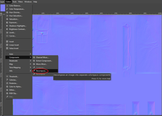
Next, go to Colors > Components > Decompose.

A small box will open up. Change your color model from RGB to RGBA to enable the alpha channel as a separate channel (layer).

Now, a new image will open that is your bitmap but greyscale. You will see four layers on the side called red, green, blue and alpha.
Select the red layer and click CTRL + A on your keyboard to select the entire layer. Then, click CTRL + C to copy the layer. (If you don’t have a keyboard, you can do “Select all” and “Copy” but this takes longer).
Now, go to your layer named alpha and press CTRL + V (paste) and CTRL + H (to anchor the layer). Now, you have replaced the alpha channel with the red channel.
Next, go to the green layer and select and copy it. Paste and anchor it into the red and blue layers, just as you did before with the red layer and alpha layer.

Your image won’t look too much different right now, it will just look like the green alpha channel rather than the visible red alpha channel when you opened it. Go back to the top bar and choose Colors > Components > Recompose. This will alter your original image, so the one you have open in layers will stay open. Go back up to the top and select the original image to go back to it, or close your layered image.

Now, your image should have changed from mostly blue to a transparent, mid-range gray with only a few elements visible. This is how it is supposed to look. If you don’t have transparency or it looks very different, then you probably messed up somewhere. Generally, I find it easier to go back to the original cleaned up bitmap (that you saved for future use) and start from scratch rather than trying to figure out where I messed up. That is usually faster.
Next, export your single-layer image as a PNG or DDS file (your preference). You will need a DDS plugin to save DDS files.
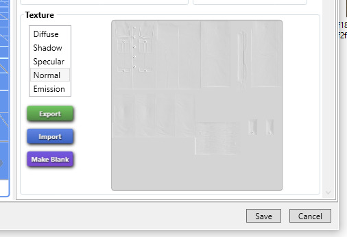
Open your item in Sims4Studio and import your new image file in the normal texture category. You will see a small preview in the box, which will probably show more details than you were able to see in GIMP. If it looks correct, save it and go to check it in game or in CASTools (which has a feature for previewing bumpmaps that can help you check for alignment problems). CASTools can be particularly useful if your computer doesn’t open the Sims quickly and you want to preview multiple bumpmaps. The only issue with CASTools is that it doesn’t really look much like it will look in game.
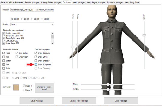
In CASTools. You have to select to see the bumpmap in the Previewer tab.
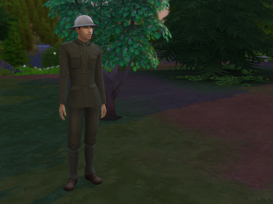
In game.
As I have only been making normal channels for a few months now, it’s possible I have missed some things, so if you know an easier or better way let me know and I can update the tutorial. I hope this is useful to you!
93 notes
·
View notes
Text
Farmer Jaune #1
AN: here’s a little background for you people, places, or things, I love Stardew Valley... That’s all.
Summary: Jaune takes a bet with his father that if he can get the old family farm up in running he’ll have shown enough dedication to be a huntsman.
Forteen year old Jaune stood in front of ‘The Club’ at lunch time carrying large crate of assorted fruits on his left shoulder for this Junior guy to try, while in his right he played on his scroll while the two bouncers out front refused to let him in.
Sure, he could barge in, but that’d be rude and create a bad impression on a potential buyer. So the stuck up suits could glare at him all they wanted, he’d wait till Junior saw him or picked up his scroll, or they finally let him in.
Huh, who knew Spruce Willis liked to garden, another reason to look to the guy as a man among men.
The two suits kept a steady glare on the boy with bangs covering the his right eye, only leaving a single blue orb to stare at his scroll. He was all lean muscle, tanned skin, and sun-bleached hair package up in a dirt stained tee and blue jeans.
They’re were sure that they could take him, and there were no notices about a fruit shipments, so they were ready to put down a scam-artist if they had too. Though, if he was a scam-artist he really was easy going.
“So, ‘Mr. Arc’,” One of the suits said as sarcastically as possible.
“Just Jaune.” Jaune said boredom, hoping Junior wasn’t messing with him, if he was he’d have to sic dad on him.
The guards snicker. “Ok Just Jaune,” Jaune rolls his single visible eye. “What do you got in the crate?” “Are you mugging me? Because if you are that’s just lame, it’s a crate full of fruit, how poor are you if need to mug a man for fruit? Delicious, juicy fruit sure, but just fruit.” Jaune say rapid-fire without looking up from him scroll.
The suit who spoke up went flush with anger at the insinuation, he worked for the damn mob! He made very good illegal money! He didn’t even recorded it to the irs that’s how bad he was!
Suit two just snickered at his friend. “I think what my buddy meant was what do have in the box to sell to the boss, and why do you think he’d buy from you over importing from Mistral or bulk buying from the Agri-Dis?”
Jaune rolled his eye again. “For the fourth time he asked me to bring him a crate, which I would have delivered to him by now, and gotten some lunch to if you two lumper didn’t get in the way.”
“And for the fourth time your not on the list, so try sell us on your product and we might let you in!” The first suit said exsperated. “Also why not just eat some produce?”
Jaune shrugged. “Same reason, I’m going to refuse to sell any to you two right now, cause I have things called standards. I always include a little extra on the orders so that people know their appreciated! If I took that away, it’d ruin the magic!”
Jaune then said with a smile, “That said if you’re interested, I can give my website to place an order, and little peak of the goods too.” Jaune said wiggling an eyebrow.
The second suit let out a tired sigh, knowing that this would be long day already. “Ok, back to my second question first, why would anyone buy from you some dirty looking kid from outside the city walls, instead of the nice clean stalls at the Agri-Dis? Also, I make good money wouldn’t I just import good food from Mistral or Vacuo?”
“Ok, find you’ve worn me down fine. Ok first, the Agric-Dis’s food is abysmal grown for two thing!” Jaune said putting away his scroll, and then holding up two finger making them glow with the light of his soul, making both guards jump at the realization this boy was also a hunter in training. “Bulk production, and fast regrowth speed, they inject Earth dust into the soil to make it more fertile, and genetically mod the plants so they grow as fast as possible and big as possible with account for taste! Which to be fair isn’t a bad thing, the city is overpopulated as is, and the Agri-Dis needs to feed everyone, and neither dust usage or gene mods are intrinsically bad, just that bulk produce doesn’t always taste as good as growing something with love and care!”
The two suits inched back in shock at Jaunes passionate rant, and the first suit recovered faster and asked. “Alright, you’ve made a good point. But what about outsourcing production to Mistral or Oasis in Vacuo? They’re food is really good!”
Jaune held a finger as he regained his breath.
“Ok, that’s a fair point, Vacuo has a warmer climate than Vale so it’s easier to grow more crop in season there in certain areas, and Mistral has the same benefit, but, it’s not the food that bad but the prices, and time you have to wait in between shipments.”
The suits leaned in with interest.
“This also has a couple problems, compared to my products.” Jaune holding up his free hand, letting it glow freely to attract the suits attention. “First, is the price you’d paying is roughly three time as much as my own for virtually the same product.” Jaune said slowly and methodically, letting it sink into the mens minds, he’d never let a potential customer get away, even if they were goons.
“Second is bidding, when you order from out of kingdom your have to compete with everyone else who wants that food, which also is reason the price is higher they can afford to hike it because it’s in demand, so since it’s in demand that means people want it, which implies scarcity, so even if you place an order there no garuntee that they’ll have any left for you.“ “I never thought of that way when I saw the restock sign...” “Most people don’t, in fact most people don’t care about the quality of the food long as it’s good and edible. So like I said limited supply, right? Well, right now I have tons of food to sell, I won’t be running out either,” Jaune said with a smirk, “but for how long? Anyway, another problem if your foods coming from outside the kingdom means that it’s coming outside the kingdom, this is two probelm. One, you’re weakening the local market, while strengthening foreign market, and you don’t want freaking Vacuo to be stronger than Vale in anyway right?” Jaune asked slyly.
“No..”
“The other problems with outsourcing from out of kingdom, is the shorter shelf lift, shipping takes time, you know this, you’re smart guys right?”Jaune asked the men, who quickly nodded. “Well, you should know that caravans only come so often, there could be month in-between you ordering your product and actually getting it! So your food could be moldy and black!”
The suits looked at each other, remembering the bosses fits of rage about a ruined order of fruit, and their own bad experiences with outsourcing. Conveinently forgeting this only happened once or twice, out of the hundreds of times they’ve ordered.
Jaune continued, “The final problem is it’s outside the kingdom anything can happen! Bandits, grimm, White Fang, Then Bam!” Jaune punctuating by slamming his hand against the crate. “You just lost three hundred lien by ordering from freaking Vacuo, what the hell you’d expect from ordering from those them, it’s all gone now! And it’s all your fault from ordering from Vacuo!” Jaune said quickly, and almost out of breath.
The men scowled at the idea of letting Vacuo pull a fast one on proud Valemen like themselves.
“Now, on the other hand my produce is loved and cared for only a mere half hour away in hunter protected settlement of Stardew Valley. Barring in-climate weather, or Grimm, I will have your product, if it’s ready for shipping out, to you within a week or you get the shipping free! Bam!” Jaune slammed his hand on the box again. “You just cut your grocery bill by a two-thirds!”
Silence then filled the gap again.
“So, did I answer you gentlemen’s questions?” Jaune asked with a slightly sore throat.
“I think I’ll be taking a look at your scrollsite later today,” The second suit said, then smiles thinly. “I just hope you’re not exaggerating, but regardless you got me rethinking my spending habits!”
The men and boy let out a little chuckle.
“Alright how about I let you two see what it’s in the crate to see proof of product.” Jaune said easing the crate on two the ground, easily being twice as wide as his waist, and coming up to his torso.
The men gave a shrug.
Jaune undid the latch on the crate and opened it up, assulting the men with sweet, starchy, and delcious smells of produce, their mouths involuntarily starting to water at the sight of fresh cherries, ripe melons, golden-yellow corn, full and juicy blackberries, tart and sweet blueberries, the spicy red hot peppers, ripe to bursting tomatos, and the most robust coffee they’ve ever smelt.
Jaune then slammed the lid closed a minute later, and put the crate onto his shoulder.
“Arc! What are you doing here? I told you to meet me at noon, and I’d meet you at the Club, not for you to wait for me outside the Club for an hour.”
“Dad say “If you’re early you’re on time, if you’re on time you’re late, if you’re late, everybody’s dead and you’ve lost your huntsman license.”
“Whatever, just follow me in, and we’ll hash out the deal today.” Junior looked at his men. “I’m not mad, you did well.”
“I’m not mad either, just bored.” Jaune said slipping in.
.....
“So, you wanna go half in, on a order?” “Why not? All that talking got me hungry.”
#Jaune Arc#Farmer Jaune AU#I have no idea about economics#I just typed what ever to feel smart#I have no regrets.#Junior#Stardew Valley
28 notes
·
View notes
Text
Tips on creating fun fanfic headers!

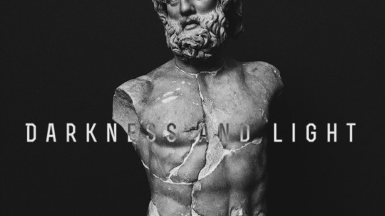
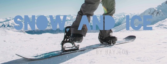

i had so much fun writing the fanfic writing tips yesterday and i got a few more questions about header-making, and so i decided to make one more of these! i hope these tips help somebody out there! hope you enjoy :)
p.s. these tips won’t require any hard editing skills or photoshop skills, nor any expensive tablets/apps!
typically i spend around ~5-10 min creating one header, and that’s either after i think of/finish a fic. i have so much fun doing it and sharing it with you that i figured i’d share how i do it!
why headers?
as I talked about in my fic tips, one of the most eye-catching things about fics are headers. when i’m scrolling through a rec page, my home page, a tag, or even someone’s masterlist, i’m immediately drawn to well-made headers. that’s what captures my attention, and then i’m more drawn in by the content. so, you can say that headers is your own version of an ad for your own fic, or an extension of it (like the cover of a novel!)
if you were writing your own book, imagine how much time you’d spend figuring out what you wanted your cover to look like. i try to have as much fun and invest as much time making my own headers because it’s just the cherry on top to my finished product :)
disclaimer: BUT HEADERS ARE NOT NECESSARY/DO OR DIE! if you don’t feel like you want to do this, then keep writing! its ok! this is just a suggestion. i’ve seen plenty of well-written fics without headers at all, so don’t beat yourself up over not having one/not wanting to do one. this is truly just a fun, extra kind of thing, and only keep reading if you want to learn how i do it! :)
tips for people who don’t want to make headers: if you still want something to make your fic stand out, use gifs! i use them in my drabbles a lot! this will at least give ur fic a lil boost!
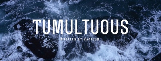
how to find pictures
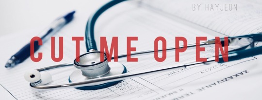
I typically use unsplash, which is a free website in which photographers upload their HQ pics for free use. the pics are really high quality, typically stock photos, and don’t have any logos on them like other ones on google. unfortunately, you won’t find any pics of the members or anything, but you’ll find beautiful stock photos of typical scenes like “ocean scene” or “desert scene.” I found the stock photo for cut me open (shown below) on that site by just looking up “medical” or “doctor”.
i used to use google a lot and just use keywords like “desert scene HQ” and edit the search settings to deliver HQ pics, and a minimum # of pixels, but unplash is definitely better in terms of quality, more aesthetic photos, and no logos/watermarks.

on some occasions, i will screenshot some scenes of youtube videos, turning up the quality to 1080p or 4k and zooming in so that the pixelation is as crisp as possible, and then editing it later to look good (which i’ll explain in a second!)
the above photo was a scene from the specific characters from the drama, “100 Days My Prince” that I screenshotted from a youtube video that TvN uploaded, recapping the drama. I cropped it just right so that their faces were left out, which i’ll also mention soon!
things to look for when picking pictures:
you want the picture to reflect a specific motif/theme from your fic! if its a moody fic, then try to find a moody scene that you can edit with filters/lighting to look even moodier; or if the characters’ jobs are a big portion of the fic (like cut me open/doctor theme) try to look for stock photos with that shown very clearly!
make sure its high quality: tumblr really dumbs down the quality of the photo when uploading it, so try your best to find something with a lot of pixels in it so that when you start editing, you don’t sacrifice too much of the quality already
try to look for something simple/clean: a picture with too much subject (ie. people in the background, or too much detail) may end up taking away from the main point of your header, which is your title. so find pics without too much clutter!
try to make sure its landscape: which will help during editing to save some of the quality better.
editing your pictures
now that you have a specific photo you want to use, now its time to edit! I use VSCO CAM (free app) and my own apple photos cropping tool for faster crops.
crop/adjust: if your picture is too large/wide, crop it to at least a 16:9 ratio. i’d say aim for skinnier if you can, so that you don’t take up too much space (especially if you’re planning to add headers to your masterlist). also crop out any faces, any clutter, any unnecessary details, so you have a nice, clean slate to work on when adding text.
contrast/sharpen/clarity/white balance/etc.: i’m not gonna give you a lesson on photography, but i’ll tell you I learned like 80% of everything that i know just by fiddling with it on VSCO! So just try it out and play with the app, see what you can make of it. i’d say a rule of thumb to follow is that you want happier fics with a brighter tone, and moodier/angsty fics with a darker tone so that it can reflect the nature of the fic further, without saying anything!

if you wanna be extra af like me, then go a step further and photoshop your pics. this one is a good example; when i screenshotted this scene from another youtube video for my fic One Year My Love part 2, i was specifically looking for a scene that would showcase the ornate/regal details of their clothing/environment in contrast to part 1′s modest clothing/scene (the first header in this post).
i found this scene, but actually, this scene portrays the Crown Prince and the Princess, not y/n. So, the actors weren’t smiling at all! They were actually frowning at eachother in this scene, to portray the tension between the two characters and their marriage.
So, I took the extra step, adjusting the pic with VSCO so that their shoulders/chins were at the same level, cropped off their faces up until their lips, and then used the adobe photoshop free app to photoshop their lips to be SMILING at eachother!!!! subtle, but important!
call me crazy for taking that much time but i’m so proud of how it turned out and i loved every second of making this one. that way, this scene makes it portray the happy ending for Jungkook and y/n!
adding text to your header
you can use any app out there, but i really like Font Candy! I actually ended up buying the 2$ version of this and never regretted it, but you can actually find a lot of their basic fonts on the free version; I tend to use the fonts: OSTRICH SANS, BEBAS, TREND, and INTRO the most! these are pretty clean-looking, block letters that look good whenever i put them as my titles.
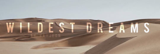
I love this app too cause you can easily control the spacing between letters to make them take up more space, add shadows, or even make them contrast their background using the overlay feature; like this one i made for wildest dreams (see how the text changes depending on what part of the photo its on? amazing! it’s literally with a click of a button!!)
And i’ll always add “written by HAYJEON” or “by HAYEJON”, space it out, and add it somewhere underneath as my own branding.
orrrrrr
if you want to be more creative, you can even go a step further and use whatever you have on hand to enhance whatever you’re trying to portray.
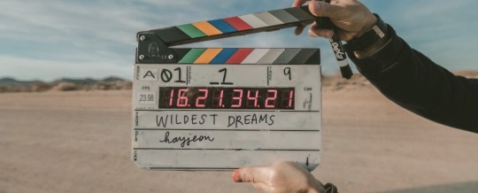
for this one, i ended up finding this amazing photo on unsplash and i thought it would do a create job of portraying the “movie-set” quality of what wildest dreams is going to be about. this stock photo had someone else’s names on it, so i used my ipad, and used instagram to just erase the existing writing with the color of the background, and then wrote in my own title and url with my own handwriting/apple pen!!!
i thought this was pretty cool because it’s like wildest dreams is its own movie/has its own movie set, which, once it’s out, you guys will see that it’s supposed to be!
saving/uploading
this is pretty easy/obvious, but i figured i’d mention it. all the apps i mentioned are available on the appstore, and they will save directly to your photos. after doing that, i’ll just upload them into a special folder i have on my google drive so that when i’m finished writing a fic on tumblr using my laptop, i can easily download the photos without sacrificing quality. easy!
and that way, i can save them forever; even if i have to delete them from my computer, i can always redownload them!
side note: making text separators
i just recently started doing this, but ever since tumblr took down their text separators, i’ve just been cropping the bottom like 5-10 pixels of the header to use as my text separators! (with my laptop)
i saw some other writer doing it and thought that it looked better than what i had used previously (a cropped photo of a random line i found on google); i found that doing this tied my fics together a little better and just looked better aesthetically;
so there it is! hope you enjoyed! :) i would love to see what other tips you guys have been using, feel free to send me an ask or reply to this post; and if you end up using any of my tips, please let me know! I love to hear from you guys all the time <3
lots of love, especially during these times,
hay <3
156 notes
·
View notes