#here's some Actual Artwork that isn't a pokemon finally
Explore tagged Tumblr posts
Text
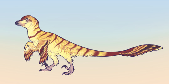
Velociraptor mongoliensis with colouration inspired by the Jurassic Park novel's description of the raptors as yellow with reddish-brown stripes. also gave attention to body feather distribution, referencing roadrunners and various accipitrids
#art#illustration#paleoart#creatures#dinosaur#velociraptor#velociraptor mongoliensis#palaeoart#here's some Actual Artwork that isn't a pokemon finally#thank you for sticking around
976 notes
·
View notes
Text
I'm mad about Jynx again (The Pokémon)
Okay so most people who have even been residually exposed to the Pokémon franchise are familiar with Jynx, the Psychic/Ice type Pokémon introduced in the first generation. Either for the controversies early on, or just because it's a good example of a strange looking design. Due to the reasons I just stated, and/or due to the fact that it's an ice type - a type typically seldom seen until very late game in most entries - I'm willing to bet most of you have never bothered to use one, either. To be fair to it, It's no as awful as it looks! It's got paper-thin physical defense, but decent speed and pretty good special attack that pair perfectly with it's typing! It's an interesting pick if you're looking for a run with mons you've never used before... But this isn't a post about convincing you to use Jynx, I'm here to rant about an aspect of it's design that has driven me completely fucking nuts for the past decade or more.
Looking at the sprites for Jynx in the first three generations, everything looks as you'd expect. Exactly how it looks in the anime, as well as in the manga and other spinoff media.


The problem begins to show itself when we reach the sprites from generation 4.

You see that? You see those strange.... tendrils coming off the dress? Just below the arms? If you wanted to argue in good faith, you could say that this is simply a sprite that poorly communicates depth in the skirt... But then we arrive at generation 5 - where the sprites now have animations and more inherent depth. Generation 5 is where many believe gamefreak had mastered the spriting game and are considered the final sendoff for the sprite style in the franchise.

It's those GOD DAMN TENDRILS. This time, it's very clear that they're not just miscommunicated depth on the skirt and are now actual, un-questionably, tendrils of some sort that jut out of the skirt or create some sort of odd "spike". This sprite is what I consider to be the beginning of what I like to call the "Jynx miscommunication", where -someone, somewhere down the production line - completely misunderstood the sprite and somehow managed to canonize one of the most bizarre design choices I've ever seen. Yeah, I said "Canonize", and I'm not joking. Because it actually happened. Every appearance of Jynx in the 3d games have featured this interpretation of Jynx's dress. ALL OF THEM. Here's an example; pictured below is the model rip from generation 6 and 7; the 3DS games.

Somehow it's become even MORE spikey; as if it's body underneath the skirt has MASSIVE spikes jutting out on each side; the dress isn't draped over it like something implied to be cloth-like in behavior should; it almost reminds me of what the barbs on Corsola look like.

Anyway, my point is mostly made now, but just to drive it home once more... To really just illustrate how deeply ingrained this design "choice" is... I need to explain that every Pokemon in existence was given brand new artwork for the Pokemon transfer service - Pokemon Home. In pretty much every medium outside of the games, Jynx was never depicted to have these weird spikes, so surely they'd refer to previous artwork of Jynx when making the illustration for it in pokemon home, right...? RIGHT...?
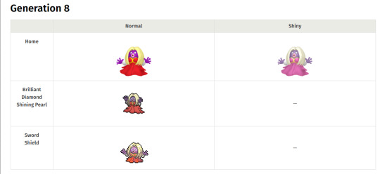
WRONG. Jynx officially has the spikes in it's most recent artwork, it's models, AND it's Gen 4 remake menu "sprite". The most infuriating part about this for me, though is that the Sword/Shield menu sprite Doesn't include the spikes at all. Like holy shit it's model in sword and shield even HAVE the spikes like all the others do! RAAAAAHGHGHGnfjnv....
This situation is just so uniquely fascinating to me because Pokemon is a franchise that - at least contemporarily - is known for it's extremely particular design guidelines and squeaky clean, on-model consistency when it comes to the Pokémon designs. I refuse to believe this was ever an intended design choice for Jynx and that gamefreak just don't think anyone gives enough of a fuck about Jynx to ever notice this. Hell, maybe they didn't notice it themselves. Why this happened is likely never going to be brought to light, but at the very least, Jynx isn't in gen 9 so I don't have to look at it at all! ... for now...
Anyway, I hope this post has enlightened you and made you privy to something that makes an already unpopular Pokémon even more unpopular. I'm usually never one to make elaborate posts like this but this piece of bizarre trivia pisses me off so much I just HAD to make a post about it. Send all of your complaints to gamefreak, thanks.
11 notes
·
View notes
Text
Big rant about my Capsule Zaurus stuff below. Mostly about fanworks, copyright, concept art, and how I use copyrighted material in my stuff.

Before I start the rant- I want to mention that I put a lot of links in here. A few go to my artwork. But most provide extra info and clarification. Some of it is because Capsule Zaurus is a pretty overlooked prototype to Digimon, so not all Digi-fans know what it is. Some of it is because I have been in fandom a long time and I lost track of when people stopped using squick and I don't know what the kids use these days. Feel free to click a link if you're confused about anything.
I want to return to my Capsule Zaurus project because Tomoya (the character in the header) is doing that "character wants attention and occupies your thoughts" thing. I really don't want to focus on fanfic right now (mostly because I'm drowning in WIPs). But I don't know if the project counts as original fic, or to what extent.
For the uninitiated, here is a brief timeline of Capsule Zaurus from conception to today.
Bandai draws concept art for a virtual pet game for boys in 1997
Doesn't use it because it's too similar to Pokemon
Puts it in a drawer
Does NOTHING until 2013
Puts it in an artbook
NEVER mentions it again
Fandom posts translations and then sleeps (you can read all the info in the first two links)
I learn about it almost a year ago at an anime con and get inspired
I draw all this stuff- including some redesigns, but also original Zaurus and human characters
I come up with this batshit insane plot and world to go with the concept art
I find myself in a tangle of mostly original ideas, with vestigial but clear connections to Bandai's work
I'm not sure if it should just go to Ao3 or if I should rework my elements and characters into something else
Bandai's Capsule Zaurus isn't a finalized work. It is concept art. I'm a raccoon digging through the trash and taking things Bandai doesn't even want. But chances are they still hold the copyright for it. Not to mention the name likely comes from Pocket Zaurus, which is published and certainly copyrighted.
Putting the work on Ao3 would be extremely tricky, too. It would have to be tagged as Capsule Zaurus- which is not a fandom at the moment- plus Digimon, plus Original Work. This obtuse collection of fandom tags would likely be confusing, and I doubt anyone would read it.
It doesn't help that the story is T at mildest and M at highest. I don't write E-rated content. But that's what people want over there. I've noticed some authors who write both get a lot more hits on their sexy stuff over their tame or gen work, and good gen writers often go ignored.
So if I don't want my story to rot on Ao3, I'd probably have to remove the Zaurus characters entirely and make it original. This seems counterproductive. But it's the more likely route I'd go to preserve my original stuff. I don't want to do that, since I love Digimon and I like the "what could have been" nature of the concept art. But I really hate filing the serial numbers off of shit without acknowledging it as parody/mentioning the creators which...this isn't.
Below are two examples of me acknowledging parody and playing with copyright. Keep in mind I cut my teeth on 2007-era fanfiction, so people were constantly writing "I do not own this" on their shit.
For my Toon-iverse Saga, I have a Character Who's a Lot Like Tai (Soren, actually- it's more obvious in his backstory). But the back of the book credits Bandai/Toei/everyone I can possibly think of. The books are made of characters like this, and calls back to the source material while doing something unique. You don't need to know the original material to understand the plot, though doing so helps if you're looking for Easter Eggs.
Then, there's Zunru, which is a love letter to and critique of Pokemon. You don't need an in-depth knowledge of Pokemon to understand it (though as with the Toon-iverse Saga, it helps with Easter Egg hunting). The first few chapters even seem like "we live in harmony with these wonderful creatures!". But then the charade falls away, and the story reveals itself to be its own animal. At the end of each of these books, there is a credit to "Satoshi Tajiri, GameFreak, and Associated Parties", indicating that this is parody, I acknowledge the original but this is my own thing, etc., etc. Which is more than Temtem/Palworld did, but that's another story.
These are both instance of fair use, with possibly too much butt-covering spurred on by my fanfiction dot net heritage. They aren't like, say, writing a Twilight fanfiction, changing only the names, publishing it, and deleting the evidence. Which I feel trying to publish Capsule Zaurus as it is right now is pretty close to.
I just don't know what to do for Capsule Zaurus. I don't want to focus on fanfiction right now. But Tomoya is screaming against my skull and banging pots and pans. I'm sure I'll find the solution. It might be as simple as changing a few designs a bit more to make them more unique and not using the word "Zaurus". But that's still filing off the serial numbers.
Dammit, Tomoya.
#writing#fanfiction#copyright#rant#vent#capsule zaurus#tomoya#mention of soren#i have multiple chins because i'm OLD#my art#kinda#that's the topic of this ted talk
1 note
·
View note
Note
what are your thoughts on the cyndaquil line ? cyndaquils my all time favorite pokemon and id love to hear your thoughts on it hctsvkgxjg
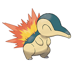
There's a lot of debate over what Cyndaquil is supposed to be–mouse, echidnas, etc. For the record, I always saw them as a neat monster foremost, and a hedgehog/echida hybrid secondly.
Regardless of what it is/isn't supposed to be, I really like its design. First, it's adorable, especially with the perpetually closed eyes. It does a good job of being cute without being overly "cutesy" or baby-ish.
And secondly, the way it has the dark areas on the back to add contrast with both the cream underside but also the flames themselves, making them pop, is so good. Especially with how it runs down that distinctive face shape and stops just short of the tip.
Speaking of those flames, I know there's some controversy on the fact that they're actually retractable. Personally, I actually like this concept a lot; I feel like it's one of the more distinctive parts of the line, and even the red spots in the areas that the flames come from are a nice touch.

However, with that said, I agree that only having the flames out when attacking is terrible; it means that you barely see one of the main features of the design and doesn't make much in-universe sense. Instead, I like the way PLA does it; having the flames out for the entirely of a battle, and only having them out when otherwise outside of its Pokeball. It keeps the retractable idea will still having the flames out most of the time.

Quilava is a bit similar to the rest of the line, but I'll give it a pass because it does change as much as it can—flame placement, marking placement, and overall body structure.
This artwork actually isn't a good representation of Quilava as a whole, as it's actually quadrupedal and only stands on its hind legs like this on rare occasions. It's also obvious when it's on all fours that this thing is long, more of a weasel than a porcupine at this point. This gives it a considerably more unique look than the Typhlosion-esq official art.
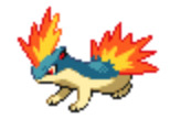
And while I don't like it quite as much as Cyndaquil due to the body shape being less distinct/interesting, it keeps all the good elements, such as the retractable flames and countershading. So, overall, pretty solid.
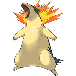
I'm only now noticing that Typhlosion's dark blue is a completely different hue than its pre-evos. Weird.
Anyway, Typhlosion seems to be based on honey badgers, so it's appropriate that it looks so ferocious, as honey badgers Really Want To Kill You at all times. This also makes it feel appropriately powerful for a final evo, and it still retains all the good and unique elements of the line.
However, while Typhlosion is good overall, I do feel like it's probably the weakest of the group. For whatever reason, the flames reduce further and further as the line goes, so at this point there's not as much of the nifty fire porcupine element to it. This also makes the design feel pretty "bare" compared to its pre-evos, as it has more body but less fire proportionally despite that.
And secondly, the markings. They worked well on the pre-evos because they're primarily quadrupedal, so you see the top of their bodies most of the time. With Typhlosion, you see the underside most of the time; thus, it looks somewhat plain and empty. This is something I think the Hisuian form (which I reviewed over here) improves a bit, as it adds a simple black collar around the neck, which helps add contrast to the front of the body and breaks up the cream void a bit.
This is also why the line looks so "naked" without the flames on it. The flames are the only things adding visual interest due to the reduct markings and more generic body shape, so when you take the one point of color away there's not a whole lot left.

As a whole, however, I'd say the line is pretty solid. Cyndaquil has a pretty perfect design, Quilava does its best to be unique while still transition between the two, and while Typhlosion's design is the weakest, it makes up for it with sheer power. Overall, probably my favorite fire-type starter line thus far.
60 notes
·
View notes
Note
List 5 things that make you happy, then put this in the askbox for the last 10 people who reblogged something from you. Learn to know your mutuals and followers ❤
okay ily for sending me this no joke!! this is such a huge infodump i'm actually going to cry
1) just dance + dance central 3,, you DEFINITELY expected this one, i never shut up about how much i love both of these games and how they've helped me get exercise 6 days a week during the pandemic. i don't even OWN a copy of dance central 3 yet (though that might change when i get off my ass and actually spend some time looking at secondhand xbox 360s and kinect sensors) but it was something i was completely obsessed with in my childhood and it feels really nice to be able to talk about how happy it makes me without feeling shameful about it being weird or niche. it's a game where you can time travel using the power of swag dance moves, what's not to love?? on the other hand, i got a digital copy of just dance 2020 on discount not long after i got my switch, and i've managed to get the megastar rating on 95 songs so far! i'm hoping to hit 100 before just dance 2021 releases in two to three days, but even if i don't manage to get it by then, i'm still pretty excited to hit that milestone. i'm also currently trying to memorize the choreography for the alternate routine for lady gaga's bad romance and oof ouch my bones
2) i started watching buzzfeed unsolved true crime about two days ago and i'm absolutely hooked. i have no idea how i've gone so long without watching it (save for one episode that i took a look at because i was curious about the particular case they were talking about), but it's nice finally having something to put on while i eat my meals that isn't pokemon or among us. both games are great, but sometimes you just need to throw something fresh into the mix, y'know? it also feels nice going on a true crime kick again in general, haha.
3) I LOVE MY CHARACTERS AND ART and i've been drawing a lot of humans recently! i feel like i'm actively improving and that i'm gradually becoming more confident with my human artwork. i'm no maestro and i know my work isn't astounding by any means, but doodling my friends' characters and seeing their reactions has helped me push forward and try new things when it comes to art. i don't draw my own characters as often, but i've been working on some new plots and it's slowly coming together and it's giving me that sweet sweet serotonin. tangentially related but my FRIENDS' characters and art also makes me incredibly happy. i'm now going to annoy the hell out of them by tagging them; @/polygarnstars you know i would absolutely die for all of your characters (especially bate and fanael. horrible children) + i swear you know my own characters better than i do, @supernovacity if i had a nickel for every time i drew eyvind i'd probably be able to get a better laptop and drawing tablet by now, @arasolcan YOUR CHARACTER CONCEPTS AND DESIGNS SLAP and i always love when i get a chance to hear about them and doodle them, @kingsmanmechanics the starboys live rent free in my head and our current AU is SO GOOD i love it, @fihyn hello i love elvoth and co., and i should honestly take a shot and drawing more of your characters!! they're so unique and i'm excited to see what you have planned for 'em.
4) my cats,, i have five cats and they all share one brain cell. mochi usually has that brain cell. kiki still doesn't understand that she's not allowed on the bed and i've given up on trying to convey it to her sgdhgnshfkd
5) uhh i'm highkey blanking out because i really gotta go get some sleep but man, i can't believe i'm in university. sure, it's a stressful thing to go through, and i'm not going to pretend that the pandemic isn't making it even harder to socialize and get out of my comfort zone, but a year ago i was thoroughly convinced that i wouldn't get to experience this. the fact that i managed to get here and study the things i'm interested is amazing to me and i don't think i give myself enough credit for that :")
#ask.msg#rey.log#long post#i want to put a readmore here but i don't know if tumblr would let me#so very sorry
4 notes
·
View notes