#her face looks less wonky irl
Explore tagged Tumblr posts
Text
painted my calculator lol
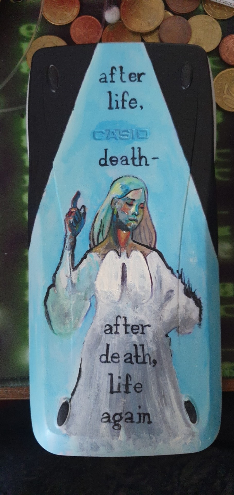
Acrylic paint on Casio fx-9750GII
#disco elysium#dw the animatic is almost done#I've only got like 3 or 4 scenes left that i need to do#i just needed a small break from painting digital#disco elysium dolores dei#dolores dei#calculator#her face looks less wonky irl
53 notes
·
View notes
Text
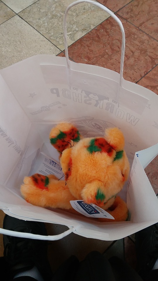
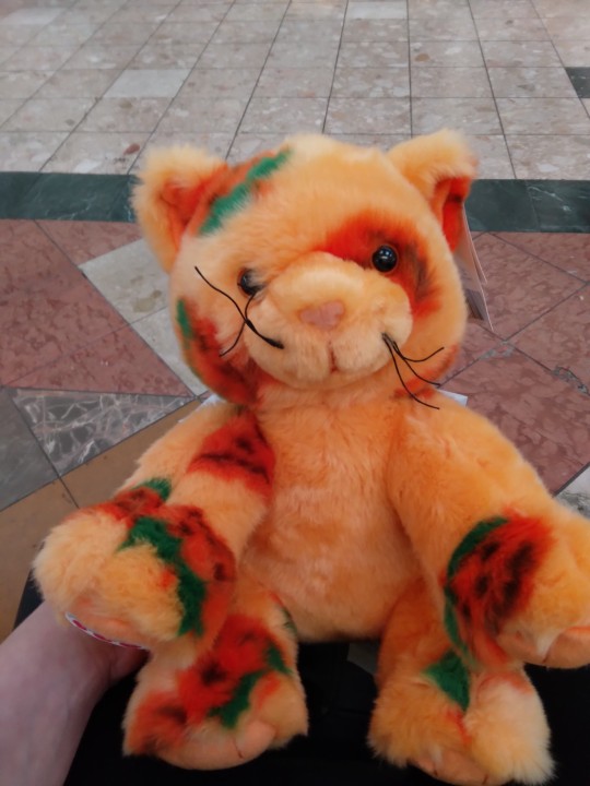
FINALLY!! At long last, I've gotten my hands on a Pumpkin Kitty, after a whole year of wanting and waiting.
Her name is Latte! (Short for Miss Pumpkin Spice Latte) You can also call her Miss Spice!
#I spent 10 minutes picking her out omfg#not even exaggerating. I was deciding between this one and one of the last 3 unstuffed PKs#altogether there was only 5 of them left in the store including the 2 stuffed displays#the other one I was looking at had a nearly perfect pumpkin eye patch but less pumpkins overall#and their face wasn't as nice plus the ears were a bit wonky for my taste.#tho it was really hard to tell which would be better while they were unstuffed and flat#in the end I chose Latte because right away she looked to have a sweet face. her ears were nice and she had better patch placement#including a couple full patches on her tail#tbh if I'd had the money I might have bought both because the decision was hard#the bear builder actually asked if I was alright while I concentrated on studying each of those damn cats#I apologized and explained wtf was up with me. she was very understanding#I've always had this quirk where sometimes it'll take forever for me to pick between plushies I really want#especially if they're both the same exact plush. because then I gitta focus harder on finding out which has the better personality#you get what I mean?#anyways this has been a thing for me even as a real little kid#I remember spending and hour-hour and a half almost every time when my dad took me to choose my monthly webkinz#“my monthly webkinz” god that makes me sound so privileged. it was the nicest/best thing my dad could afford to get me because we were poor#he wanted to spoil me as all good fathers do but that was the most he could afford and I was always so grateful and still am! but I digress#anyways I took way too long to pick which kitty would become my Latte#but I'm glad I had the opportunity to choose yet alone to actually see pumpkin kitty irl available for purchase#what do you guys think of her?#stuffed animals#plushies#plushblr#build a bear#BAB#pumpkin kitty
47 notes
·
View notes
Text
I saw someone ranking Madoka plushies so I thought I'd rank Charlotte/Bebe ones for funsies! I'm not including pouches, bags or head plushes here
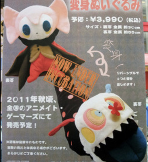
First up is the Charlotte transforming plush. Cute and pretty accurate. Also has the bonus of having a use and featuring both Charlottes. Her hair looks too light in the promotional pic but it's better irl from what I've seen. Sadly has the early Charlotte mistake of missing the dark right side of her jacket top. Sadly seems very rare and expensive nowadays. 4.5/5
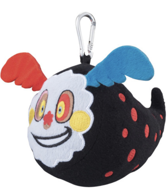
The Wormlotte Ichiban Kuji prize plush. Wins points for looking dumb but in a cute, scrungly way. Works best from the front, it's a little bit of a shame she's so flat from the side so looks a bit odd. 3/5
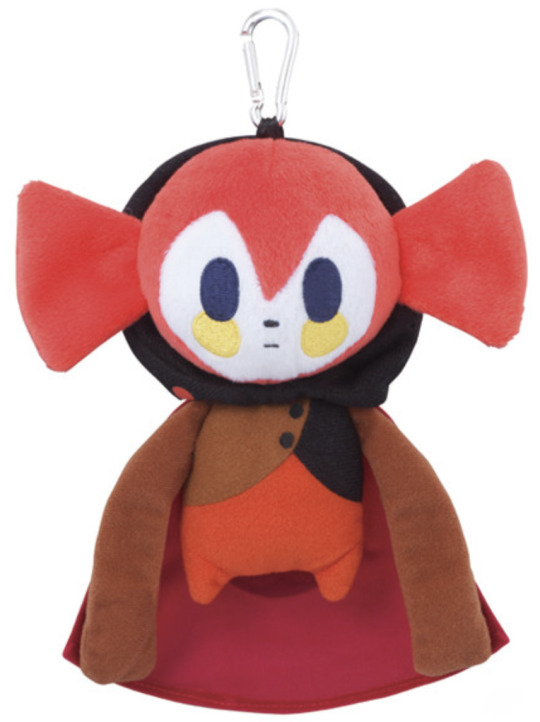
Ichiban Kuji plush from the same set as Wormlotte. This one has already felt a little not great to me. The hair is too bright and you can see it goes under her chin which clearly isn't right. Her trousers are too red as well and she's missing the lining of her cloak. Makes sense she's less detailed because she's a prize plush but you could at least get the colours right. Also loses points cause I always see this one going for so much online and... she's not that great AND she's tiny... 2/5

The SCARF! She's great, so silly and such a good idea. Hair is too light and eyes are too teal but otherwise she's great and scrungly. 4/5
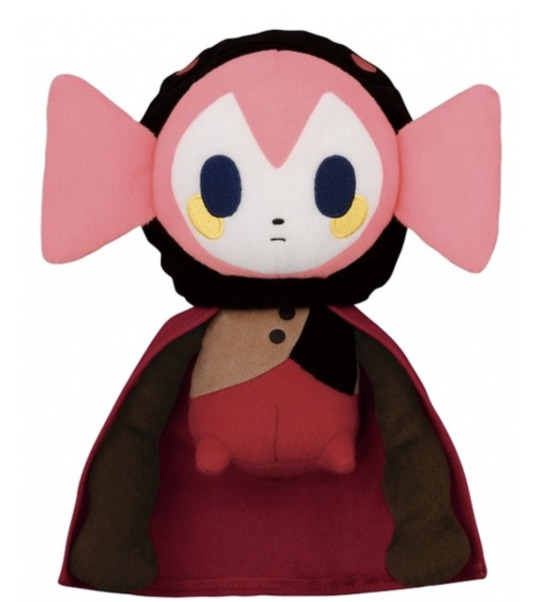
Another Banpresto prize plush. The colours are slightly better than the previous, especially the hair. 3/5
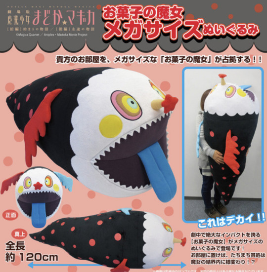
The HUUUGEE wormlotte. Who wouldn't love her?! She's amazing but very expensive, originally at around £150 and I'm sure she'd be lots more now. 4.5/5

Another Banpresto prize and another that's barely changed. It kinda feels like a step back... Green eyes??!! 2/5

The first Bebe plush, another Banpresto gig. She's very cute and silly but her hair looks wonky?? And it doesn't just seem to be the prototype. She's never shown with wonky hair so it just feels like they misunderstood the art... Her cape is missing the black inside too... Otherwise she's decent. 3/5
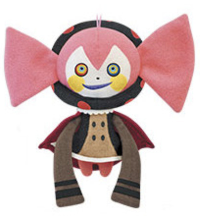
Banpresto prize but smaller. It has the same issues as before... 3/5

Same as the last but the unique pose and expression is very cute. You get bonus points. 4/5
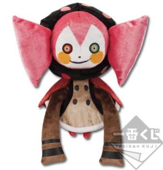
An Ichiban Kuji Premium plush so she's a bit better looking now. Fixed the symmetry but I don't think she has the cape lining (it's hard to see in pictures). I like the velvet look but I know some people don't like that texture. Her fringe looks too triangular honestly, moreso than the last few. 3.5/5

WHY IS HER HAIR STILL WONKY?? Her hair ISNT wonky in official/concept art her head is just tilted, how are the designers so stupid??
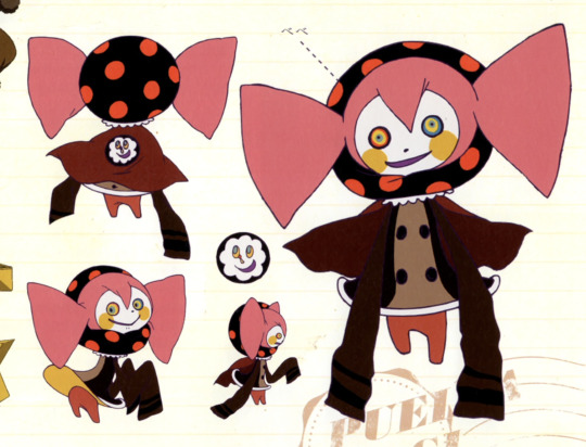
See how it's tilted on the right BECAUSE her head is tilted but from her back view her hair is completely straight. Sigh. It's similar to the first few Bebe plushes. 3/5
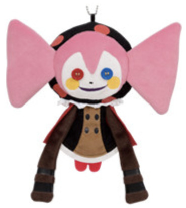
Another Banpresto prize plush. Hair is back to being fixed, thank fuck. I really like how the lace around her collar looks like actual lace. Makes me notice the last few are mostly missing the lace... hmm... I don't like the way the fabric is cut off around the black bits of her sleeves. Makes it look bad. Also I think with the button eyes you're either gonna really like it or really not. I was scarred by Coraline when I was younger so it irks me, I wouldn't get her myself. Improved some bits but fell on others so the score hasn't improved... 3/5

Wormlotte's button version. Bonus points for making a plush of Bebe-Wormlotte cause I kinda love how unique she is. But.... this one's a bit shit... it has such a handmade quality and not in a good way. I don't get why the spots look like they're badly painted on. It's too flat as well and the circular shapes of the body are so badly defined. I like the face details but that's it. Perhaps shouldn't have relied so hard on the artwork. 1/5

Mochi Kororin Wormlotte. This is the kind of plush that I just feel I've seen far too much of... I'm so bored of it. But... she does look silly and I kinda like that. The blue wing is too teal (though it seems it took more from the art than the anime) and her left eye is red instead of pink (which is another art mistake) so it kinda throws off the colours when there's too much red in her face. 3/5

A Movic plush, this certainly feels more obscure. I love her stupid face and the unique pose. The eyes are the wrong colours in numerous places which is a shame but I'm glad the nose is 3D. (actually looking at a non-sample photo they got the eyes right! Must've just been the prototype) I like how the wings are drooped like she's bashful, it's very cute. No complaints! 5/5

I'm so surprised to see this one on My Figure Collection because she looks SO bootleg and this is what the popular bootlegs are based on. The fact they misspelled height really doesn't make me trust it. But at least I can shit on it! Eyes and cheeks are wrong (taking from the incorrect first anime screening), black hood is a weird flower shape, spots are too small, top is too light yellow, buttons are far too far across and cape goes around the front. If I could get her for like, less than £5 I would but otherwise I wouldn't bother. 1/5
How come the first Charlotte was the best and the rest were just kinda downhill? It seems like Wormlotte is harder to screw up. At least they're both pretty simple so you can always make her yourself. I was surprised my top pick was a Wormlotte since I overall just prefer Charlotte but like I said, she wasn't doing too well, even with the Bebes... a shame... let's hope they release better plushies in the future.
#madoka magica#puella magi madoka magica#pmmm#witch#madoka magica witch#charlotte#bebe#merchandise#plush
70 notes
·
View notes
Text
I forced myself to draw a little bit because it's been a while since I've drawn anything (mainly because of lack of motivation), so here's concept designs for Dovewing and Brightheart
Their designs will almost definitely change noticeably whenever it is that I draw them again, these are more of just me getting the basic ideas out and seeing what about those ideas works and what doesn't
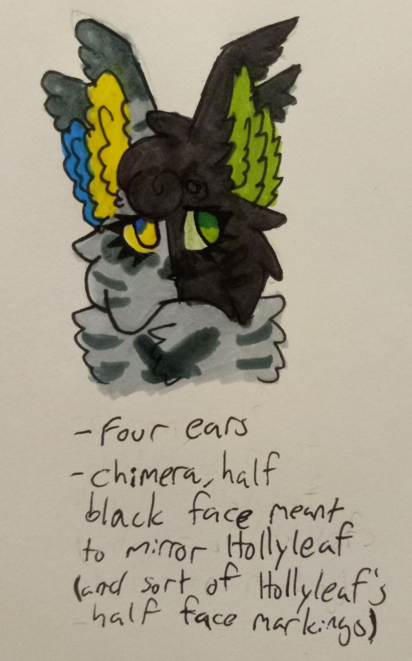
I love Dovewing designs where she's got funky looking eyes. Some people looked at the Dovewing Eye Color Debate and decided that her eye color was "yes" and I just love that for her
I definitely knew that I wanted her to have four ears (a mutation in real cats where they'll have extra skin flaps, though that extra set of "ears" doesn't lead to any organs so they technically aren't ears. Also the way I drew it isn't really accurate to how it actually appears irl but shhh creative liberties)
Four eared Dovewing is a fun design, I think :)
While it's not something I've shown or gone into detail about yet (mostly because it's in the Po3 design post I've been making but Jayfeather is really fighting me so that post isn't finished yet), with my designs for the Three, their appearances change a little after they lose their powers in a way meant to symbolize the loss of their powers (if that makes any sense)
I didn't draw it here, but my Post-OotS Dovewing design has her ears kinda torn (something mainly from the battle against the Dark Forest), with her second set of ears (the non functional skin flaps) being almost completely gone. The two sets of ears were meant to be symbolic of her super hearing, so without that second set of ears (without her power) she's just a normal cat, y'know?
Anyways I thought it would be fun if she was a chimera and half of her face (& probably a few patches on her body) was black and the eye on that side of her face was green. To Lionblaze & Jayfeather, it would be a constant reminder of Hollyleaf and how they thought she was the third cat in the prophecy. It doesn't help that the black side of Dovewing's face is the same side that was ginger on Hollyleaf's
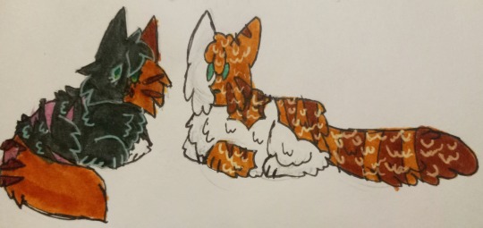
Here's a tiny doodle of Hollyleaf's (& Fallen Leaves but he's not important here) design that I've already shared, just so it's more clear what I'm talking about
Also her ears are super fluffy and sort of meant to look like wings and make her look a little angelic
Can you tell that I intend to go nuts with her design lol
Her final design will probably have more white spotting
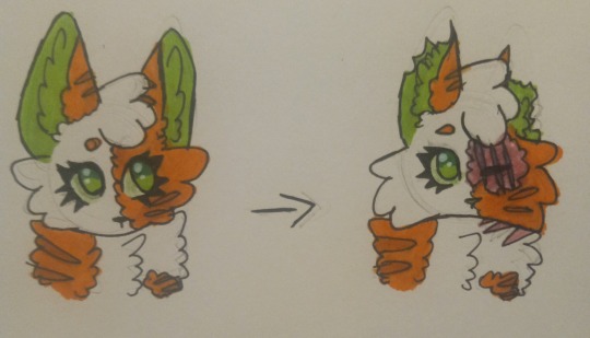
I have less to say about my Brightheart design tbh
I'm proud of the torn ears, though!
Her eyes turned out a little wonky but that's not a big deal because this is a concept design
The shape of her markings will probably change a bit, but I've basically got her design down pretty clear unless I randomly decide to change something
Anyways I have a bit of a headcanon that Brightbeart used to try to hide the scarred part of her face (through various ways, such as wearing some sort of accessory that at least partially covered her face, hiding partially behind things, and not directly facing anyone) but as she grew more confident in herself, she would show more and more of her face until she eventually just stopped trying to hide her face at all
#When it comes to my opinion on Dovewing I first must say ''I'm sorry women''#When I was middle school I *hated* Dovewing. I thought she was whiney and annoying#I've grown as a person since then and obviously I no longer hold that opinion but it's still kinda embarrassing to look back on#I started interacting with the fandom online around the time I started reading OotS#So I think you can easily figure out where younger me got that opinion from#warrior cats#warrior cats designs#dovewing#brightheart#and because I did toss in that little doodle#hollyleaf#fallen leaves wc#rain's art corner
10 notes
·
View notes
Text
(woah, first ever tumblr post after years of knowing this site exists!)
so i have these official winx figurines i got impulsively years ago. they are believix shaped and their colors make me regret owning them every time i look at them.
youtube
not my video, but mine are exactly the same, with purple-haired bloom and blonde flora and missing paint on roxy and everyone having the exact same skin color. i think their eyes are less detailed irl, not nightmare material, just very wonky. i also have four knockoff believix figurines of a different kind and those are way cuter but have the same skin color problem :/ (stella, musa, aisha and tecna. i should try completing the set someday)
i sometimes think of repainting all of them, but that's not something i've ever done and i don't have the funds or control over my adhd to start right now. however i can think of color palettes that i like more in the meantime. luckily i'm not redesigning the shapes, so i can just use coloring pages for this :D

so this is bloom. her main color is turquoise like in her base transformation, but some elements are a darker teal and an even darker blue that looks slightly violet next to the teal.
the heart on her chest is yellow, just like the gem in her base transformation. i imagine they're the same gem. my biggest winx disappointment was the gem not having any lore behind it.
her arm warmers and socks are light warm green which is a shade of yellow you have to use when you don't want the believix to look exactly like her iconic civilian outfit.
there are a lot of squiggles on fabric edges that represent a fancy pattern that i won't be able to reproduce on a tiny figurine anyway. yellow and dark blue next to each other remind me of sailor uranus a bit too much but also look cool as fuck. i might put some actual green there later.
the gradient on the sleeves is a bit misaligned and i'm not sure if i like it, but it also matches the skirt so it's fine as long as i don't look at it too closely. i'm not super happy with the lace i drew on her corset either. i'll need to look at actual corsets and shirts to see how i can improve that.
the streaks in her hair are now purple as a reference to the figurine's original hair color. i'm very happy to have found a shade of purple that works. the color picker says it's a desaturated magenta. i never studied colors so i get amazed every time i succeed like this
not sure if i want the figurine to look exactly like this, but it wouldn't transfer 1 to 1 and my main requirement for my winx dolls is their faces looking sweet and not scary anyway... it's definitely a good start!
#the winx figurines that suck ass#winx#winx club#winx bloom#bloom winx#winx believix#winx recolor#winx edit#winx redesign
6 notes
·
View notes
Text
Thoughts on black panther 2 under the cut
The movie is an open wound for better and worse. It's a beautiful, raw lament on grief that hits like a brick and operates with deft grace when it comes to that fickle diegesis of what happened IRL vs what the characters struggle with in context of the story. The bookends, especially, work very-very hard to shed the trappings of genre and get to the very heart of grief, of finding a way through it and into a form of catharsis both bitter and liberating. Coogler's direction and choices are incredible in these moments; he's reaching impossibly deep into parts of us that are vulnerable and tender, ready to trigger and unbalance at a moment's notice, frightened at being touched; yet he cradles them gently, guiding us through his pain with grace and comfort, never letting us down with even a single false note or misstep. In these moments, the promise of cinema feels fulfilled.
It becomes clear that Coogler is a master at reinterpreting his own humanity into a filmic experience without losing a single thing in the transition. The type of storyteller entire nations should cherish.
In-between those bookends though, we have the story proper. We see the depths of unprocessed trauma driving people and nations apart. The narrative ping-pongs between some plots that share in this ethos and others that do not, ending up in a wonky edit that still works in the moment despite itself. The story, however, in its attempts to weave grief into a meaningful plot catalyst, ends up in such murky waters that my face heats up remembering it. It's something of a peeve of mine at this point, and I really hoped not to see it here.
But first, some of the good: it undoubtedly tells a story that gets very dark very fast, and editorial rewrites are welcome additions; riri williams and the hydra lady are clear additions to balance out the tone of the primary conflict with some MCU charm, a move that seems regrettable on paper but ends up something of a saving grace for the fucking runtime (there is a version of this story you can competently tell in less than 2:40 hrs, I'd stake my life on it). And they mostly work! Riri is a delight, Okoye gets an incredible range of emotions to play with, M'Baku rules as expected, and the US stuff is negligible. And as difficult as it was to watch miss Anti-Vaxx Supreme wear the black panther suit and talk about science, her acting chops were annoyingly above reproach. And truth told the dramatic weight of the filmmaking overpowered my real-world biases more times than I expected, so that's something I guess.
The presentation is similarly stunning. The DP finds incredibly visceral ways into intimate moments that are impossible to look away from. The music soars, quietly elevating but never taking control of the rhythm, something that's often a death knell for drama but not in Coogler's capable hands. They introduce new sounds and instruments to the palette, creating a trance of leitmotifs that inspire awe and reverence. The set design, the props, the costumes. My god the costumes are a feast to drink in and appreciate. I would selfishly hope for the camera to linger on them just a few seconds more. The audio-visual artistry is firing on all cylinders.
Which is why what irked me the most falls squarely outside of them and smack-dab on the story department.
Namor and Talocan are, once again, triumphs of character and set design, but his story is yet another in a long line of ugly decisions by the MCU to portray anti-colonialist sentiment as almost inherently genocidal. They're just all murderous autocrats, these pesky indigenous folk whose feelings got hurt that one time. And I know this isn't like, super evident in the noise of the film's plotting, but looking back in hindsight it does drive me up the wall. Knowing that they pulled that shit again.
Let me defend myself a bit here. I get the writing instincts, I'm not stupid. It's a baseline flaw in Namor that needs to be foiled and tempered by Shuri so his own unprocessed grief can end the death march he has set his nation on. It's a starting point, of course it is, I'm not about to launch into the semiotics of behavior modeling in media, down that road lies madness. But like, I'm sorry; the optics of heightening the stakes due to his childhood trauma are still weird as hell when seen in all of their loaded context, in the entire breadth of their start and end points. There are ways of ferreting a gentler conflict of character out of that predicament. Why flip him into evil tyrant mode again? Why do that. Who benefits from doing that. Whose feelings are being carefully protected when doing that. The moment they arrived at his ultimatum I visibly winced in my seat. Again. They did this again.
Why go for this centrist parable when you've done it once already? And pulled off a minor miracle in not making it overtly gross? Why tempt fate twice? I'm not gonna spell it out, but it is evident that the true nuance of these narratives remains a real tough sell for the mouse house.
It sucks even worse here because there really are those ample grounds for personal, character-centric conflict to drive the plot, but instead we see hints of it until suddenly we get killmonger 2.0 with even less thematic clarity and direct engagement with the protagonist's flaws. Another progressive ruler *incidentally* obsessed with mass murder, going against a girl refusing to process her grief and meeting his violence halfway. And sure, yeah, their individual traumas are expositioned multiple times, they exchange philosophies, arrive at the root of their conflict, yada-yada... and then they punch about it. Nothing is learned, nothing is gained, one of them eventually strong-arms the other long enough for them to have unmotivated flashbacks, and then some both-sides bullshit argument gets made and everyone kisses and makes up.
Licking the boot of the status quo while wearing the aesthetics of African brilliance and Mesoamerican perseverance. I don't know, man. Maybe I'm out of line but it genuinely sucks. And I understand what the greater, out-of-text meanings of seeing this alliance be forged on screen can be, I don't deny that incredibly valid read. It's just how we get there, and with what. The optics. It's the progressive tyrant, again. Can we fucking not anymore.
We all know what you are saying with this.
(a tiny side complaint irt to this whole issue is an unfortunate failure to show-not-tell Talocan's allegedly unbeatable military might - their water superiority is not in doubt, but betrays unremarkable adaptability to their opponents. killmonger articulated specific plans to smuggle undetectable vibranium tech to saboteur cells around the world before inciting his hostile takeover. No such plan is clearly stated by Namor, no scalable ground-level threat is demonstrated, and it ends up feeling like his crusade is doomed both in ethos and feasibility - further diminishing his image by tacitly portraying him as incompetent and incapable of tactical foresight. this is a nitpick, but can compound the flaw in some cases)
Ultimately what is most regrettable here is that the rest of the movie fucking rules. Truly. The film oozes love and reverence for Boseman and it bleeds into every nook and cranny of camera language and musical cue. It looks and sounds gorgeous. The levity is partitioned out of its essential moments where sadness is present and needed; and Coogler is hurting bad in the driver's seat, it is as palpable as anything happening to the characters, so where he then arrives at the end feels like a true multi-faceted catharsis bringing a smile to anyone with a heart.
It's an open wound. And we all know what it's like to have one of those.
Just wish it showed better craft at placing that wound within the tale of a nation.
#it's a mixed bag for me fellas sorry but i can't deal with That Trope anymore#i guess there's spoilers here? discussing story optics mostly#I'm sorry if this feels scathing I mostly focus on that one thing that annoys me. there's a lot to love here#and I cannot stress that enough. even moreso than BP1 this feels like a purposeful film#probably good for kids to see more than anything so there's that top mark for it
15 notes
·
View notes
Note
Don't you feel like Cas is getting smaller? I mean, I was sure before that he and Dean where almost the same heigh but Dean was a little taller than him, and last episode when I saw them standing in front of each Dean looked a lot more taller than Cas
That’s an interesting question. IRL, Misha is a strapping lad [183 cm], only 3 cm shorter than Jensen [186 cm] (and, well, much shorter than Jared [193 cm], but then again, isn’t everyone?), but the show has a habit of framing him so he looks a bit smaller than that.
Like, this is them IRL -
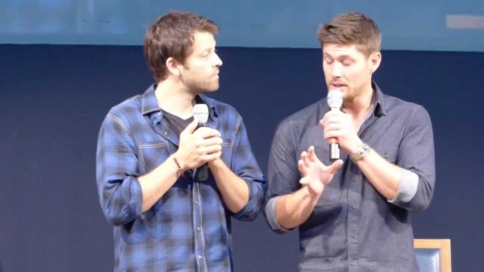
- and here is a normal shot from S12.
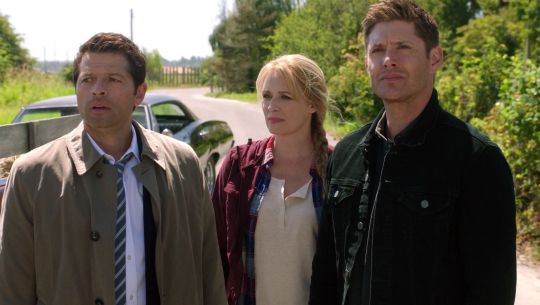
There are, of course, a number of reasons to cheat with how tall or short actors are, and some have to do with the general framing of the scene, not with the narrative itself. That said, you’re right - this SPN 12x19 thing was almost ridiculously out of proportion.

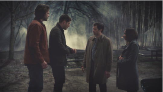
And the thing is, this is deliberate and meaningful, especially if we consider how carefully arranged other shots in this episode were - from Kelly’s face disappearing into the dark mirror (making her a identity-less baby bump) from Dean and Cas isolated inside that circle, Amanda Tapping has been super attentive and done a wonderful job. In this case, what is most apparent is the symmetry (two groups, isolated down the middle), the white light between Dean and Cas (which draws the attention of the viewer, is in the dead centre of the scene and also a perfect symbol of that distance forming between them), and the almost perfect descent in height of the characters themselves.
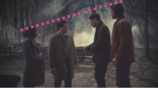
This creates a very neat visual effect and it messes with our psychology, because traditionally in Western visual arts the winners go left to right (it’s possible this has to do with our writing system, since in Etruscan art, it’s the opposite way around), as you can see on every Greek vase ever painted -
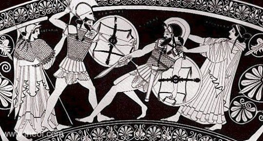
- but here, even though Cas has just defeated Dagon, we know something is not right and we know Sam and Dean are the ones being reasonable, so our brains instantly go, Wait, what? and this straight line from Sam to Kelly makes things even worse, because it’s a strong indication that there’s some kind of falling down and degeneration involved, and it makes Cas and Kelly look like they’re wrong BUT THEY’RE ON THE LEFT SIDE OF THE FRAME (*siren blaring*) and there’s an office inside your brain that’s busy busy busy trying to unscramble wtf is going on.
But - and here is where the magic happens - if you frame this shot in the ‘right’ way, the meaning changes and the thing becomes much less effective.
Here it is, respecting the actors’ heights (excuse the background, it’s way too late here to try and photoshop it right) -
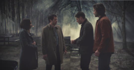
- looking all wonky because Cas and Dean are roughly the same height but Sam and Kelly aren’t, and goodbye symmetry; and here it is with the characters going in the ‘right’ direction -
- this looks way too threatening, doesn’t it, especially considering that’s a pregnant lady on the far end -
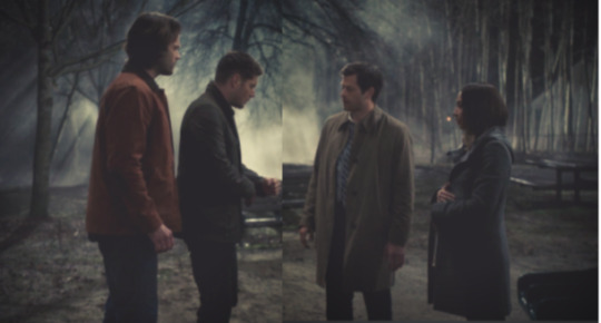
- and this looks - again, it’s inelegant because there are no straight lines anywhere, also Dean should be looking directly at Cas, which would take away the ‘looking down’ part (narratively important, because Dean is right and Cas is acting weird), plus our brains will naturally understand what’s going on and therefore not stop and think about the scene at all - and this is why many paintings and movie shots are framed in a weird way: because we see so many things every day, our brains will only work hard on those things which are ‘abnormal’ or don’t make sense in some way, and just smile benignly at everything else (ie, ignore the fuck out of it), so if you want to be noticed in some way, to draw the audience’s attention on something, making your things ‘not quite right’ is the quickest way to do it. And it works, doesn’t it? You asked yourself that question, and I wondered at it too when I saw it, and so did others.
So, yes - I think that, in general, Misha’s physical features are played down, because we mostly see Cas as Dean (our POV character for most of the time, and especially when Cas is involved) sees him: as a ‘dorky little guy’ - and therefore, Misha’s fitness and his alarmingly bulging muscles would be a disadvantage in the story. In fact, they’ll be kept hidden and be disregarded until Dean himself, our lens into what Cas is, suddenly notices Cas has body and man, it’s a Good One (*lights candle to any god who’s listening*). And in some shots, I think they also play with the fact that Cas looks completely inoffensive and boring (hence the outfit, the dad hair, and Jensen standing on apple boxes next to him) while in reality, he’s anything but. Like, right in this scene we’ve just watched him annihilate a Prince of Hell, but when facing Sam and Dean, he’s almost a child compared to their bulk and imposing figures, which probably has also to do with the fact that he’s not being himself, and he’s making the wrong choice, and all that.
In any case, a beautiful shot.
#ask#spn 12x19#cas#castiel#spn cinematography#amanda tapping#how you frame a scene#i learned this stuff#in art history#so cinema is probably a bit different#if someone's an expert of some kind#please pitch in#:)
218 notes
·
View notes
Note
Is it just me, or Peebee got really prettified in the recent promos (n7 day trailer, CES trailer)? I mean, her face seems rounder, her skin got smoother, her expressions are toned down from what we saw on first screenshots. Or is it just the lightning etc?
Hmm.. some images included for easy reference and the sake of comparison.. Top - first time we saw her. Bottom - CES vid (left), I forget where the one on the right is from but see references to it in relation to the official site.


In the first instance it’s not just you who’s noticed a change, I’ve seen a couple people express the sentiment! For me personally (this is my entirely subjective opinion though so take it with a grain of salt) - especially comparing her first appearance to the way she looks in the CES vid, yeah she does seem a bit different. Slightly slimmer nose, less pronounced nasolabial lines, slightly fuller mouth, softer smaller jaw, smoother skin. But I think the changes I’m seeing are probably due to a combination of factors?
The first image is from earlier in development (when most things in a general sense are not as good as they are later on; rougher, less polished and less refined);
Character models naturally change a lot during development cycles anyway, as concepts & ideas evolve and grow and things are tweaked;
It’s also a kind of unflattering image in itself, to me - it was an extreme close-up, I feel like the angle kind of emphasized her jaw, I feel like the lighting was harsh/unflattering in the way it hit and lit her face (made her look washed out almost, and sorta floodlit tiny skin imperfections such as bumps the way harsh bathroom overhead lighting does irl);
She was in motion, making a decidedly.. non-neutral expression. Her expression was goofy depending on opinion, and definitely wonky/off (in a technical sort of way, not a criticism of her facial features/appearance sort of way) - Mac Walters and Mike Gamble have tweeted that lip sync and facial animations are still being polished, and Aaryn Flynn mentioned a facial performance bug. Flynn’s comment was in relation to Sara Ryder in the vid when she meets Sloane Kelley, but it goes to show they’re still ironing things out on that front.
So I think she has changed some - been tweaked a bit, but also the technical stuff with her expression didn’t help her in that first shot at all, and of course lighting and angles can have a dramatic impact on headshots in terms of how flattering/unflattering they are. Think the change in lighting had the most impact on how her skin looks, and reckon a toning down of expressions is due to work polishing facial animations and maybe also sorting facial performance bugs?
I see less complaints about her appearance now but that’s hardly an objective measure of how classically aesthetically pleasing a character is - could be that it’s died down because with the passing of time it’s grown on people, or they’ve just gotten used to it, or something else caught their attention to complain about (lol, there’s always something).. Still, I do still see some complaints about her (poor Peebs), both on the way her facial features are and the expressions we’ve seen her making. Btw by “complaints” here I mean the “she’s ugly/manly/too unattractive” variety.
For the record I like the way she looks and looked and have no problems with it, I thought she looked pretty then and I think she looks pretty now. She has character and she’s cute. ◡‿◡ ✿ got no time for ppl sayin she’s “ugly” or “not pretty enough”.
tl;dr yeah I think she does look different to an extent, and its a combination of actual tweaks to her model and things like angle, lighting, expression etc. what do you guys think?
((Sort of related: if you haven’t seen that post from askagamedev, I thought it was a pretty interesting read on this sort of subject.))
#slooowly getting through some messages#bioware#mass effect#mass effect: andromeda#mjs mailbag#anonymous#video games#mj and the world
35 notes
·
View notes