#hello steeper than expected learning curve
Explore tagged Tumblr posts
Text

Welcome to the niche corner I’m learning how to make thread today
#hello steeper than expected learning curve#spinning#flax#much like Bernadette Banner I congratulated myself before realizing this is a single#I’ll get there
170 notes
·
View notes
Note
Hello! I saw your tags saying I could leave you an ask about makeup and I have a couple questions if you don't mind! The main things I want to look into are eyeliner and eye shadow, and maybe lipstick, but I'm more interested in eye makeup right now. I've always wanted to do eye makeup but it seems complicated so I haven't tried it out much.
For eyeliner, what type is best for someone who has pretty much never used it before? I looked it up and found out there's a lot more types than I thought, but I'm mainly talking about pencil and liquid eyeliner. Is there a general price range I should shoot for that's going to get me decent eyeliner but not cost a lot? Good brands to look out for?
For eyeshadow, it's pretty much the same questions as above. I'd love to do colorful types, it just seems very complicated to me. What's the process for applying it, do you need other things as well?
This got a bit longer than I expected so I'll stop there! Thanks for letting me know I could send an ask :)
hi!! questions are more than ok, i love talking about makeup ☺️
eyeliner:
i find pens the easiest to use and learn with! i swear by the NYX eyeliner pens, which are pretty affordable (they're on the drugstore side of ulta and available at target but that's only helpful if you live in the states lol). there's two that i like:
the "That's the Point" eyeliner pen is felt tip and very thin, i liked that when i was still learning because it made such thin lines that i wasn't as stressed about messing up
the "Epic Ink" eyeliner pen is what i use now, it's a brush tip not felt tip which has a slightly steeper learning curve imo but so worth it! i love this one and it's 100% my go to now.
eyeshadow:
eyeshadow seems scarier than it actually is i promise you!! here are my tips for applying it:
it will have a stage where it looks awful and you think it's irredeemable and you'll want to wipe it off. DON'T. it always go through that stage, keep blending and you will make it out the other side
dark -> medium -> light is the holy grail order for blending eyeshadow. start with a small, dense brush and the darkest shade. then use a slightly larger fluffier brush to do the medium shade. and finally a bigger fluffier brush with the lightest shade.
you don't need a super heavy hand when it comes to eyeshadow. lightly blending usually goes better than putting a lot of pressure on the brush
blending out the edges of your eyeshadow with a pressed powder/powder foundation makes it look extra blended and nice!
i think eyeshadow is easier to apply if you have an eye base. this can be a dedicated "eye primer" but i just use concealer. it helps with color payoff
the only tools you really need are a couple brushes. i'd get a small dense brush for packing color on. a larger fluffier brush for blending. and a thinner, flatter brush for putting eyeshadow under your eye
my favorite eyeshadow brand is Juvia's Place. their products are super pigmented, not too expensive, and very blendable. the glitters in their pallets are also exquisite!! morphe's eyeshadows are ok, and i have a lot of friends who like Colorpop but i've never used them myself
for brush brands i have a collection of Morphe, Eco Tools, and Ulta Beauty. i like all of them but morphe and ulta are my favs.
i hope this was helpful! drop another ask or reblog if you have any more questions :)
6 notes
·
View notes
Text
Dev Blog - April 2017
Justin - Creative Director
It’s been bloody mental here at Dream Harvest this month and the rush hasn't even let down one bit!

I had the clever idea of wanting to demo Failure at three events this month while trying to move to a new house half way across the country. What could go wrong?
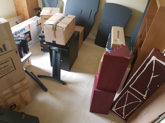
I type this update currently surrounded by boxes and acoustic foam as we had to fly out to Croatia the day all of my studio equipment was delivered by the removal firm and since getting back on Wednesday morning it's been full steam ahead while we prepare to move into our new office, did I say new Office?
Yep, so we're finally going to have a place to call home, next month, as the funding from certain sources come in later this month, yay!


We'll be sharing more about our new Studio setup, including lots of photos and videos as we move into the new space. I'm super excited to finally be working with a large portion of the team in the same building rather than online and this will allow us to pick up the pace on development immensely as several members of the team move into full-time work with Dream Harvest.

Anyway, for now, I wanted to share some of the feedback we received from the three events we went to over the past month:
First up was the monthly WeGeek event. This is always a fun little event held at a number of the WeWork offices around London. Unfortunately, this one wasn't really the right crowd for us this time around and I made the big mistake of only bringing a single laptop with me so demoing the core focus of our game, multiplayer, was almost impossible.
The small number of people that sat down and played Failure: NeuroSlicers seemed to really enjoy it, but I very quickly realised that there were some usability and readability issues; things that we actually already knew about, but in the process of fixing for the next two events we were due to attended this month, Intel Buzz and Reboot Develop.
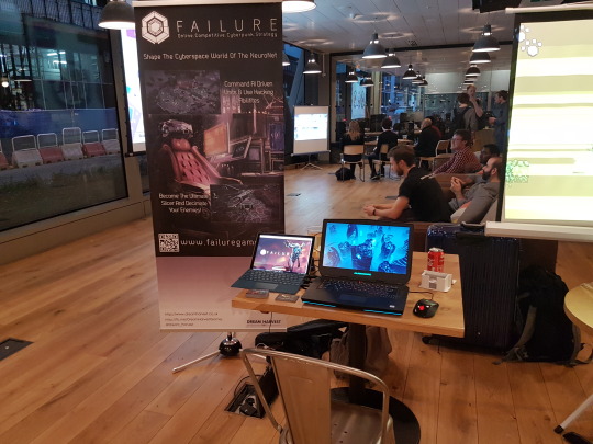
The Intel Buzz event was a completely different story.
We had quite a few people coming to play the game. I even had to pitch the game with our new teaser trailer in front of a big audience of people in the main hall.
The demo we were showing off still lacked the tutorial we were building for Reboot Develop and there was still some issues with player's struggling with new game-play concepts that we'd introduced.
Although Failure: NeuroSlicers is a Real Time Strategy (RTS) at heart there are quite a number of new mechanics and systems which are new to this genre and without a tutorial, the learning curve is a bit steeper than we'd like.
What we've found though is that once players understand these new concepts they really enjoyed the fresh experience we're giving them with the game. We're even finding players who aren't normally competitive gamers really getting into the matches.

Last up and by far the coolest experience of last month was Reboot Develop in Dubrovnik Croatia. What a mind-blowingly, beautiful place to have a game conference.
We met some amazingly cool people creating some really amazing games; the quality level from some of the teams in Eastern Europe is amazing.
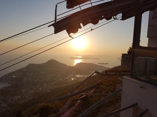
Milcho and I spent three days at the conference and was happily joined by Amelie and her boyfriend Charlie (who's developing a super cool Portal like first person puzzle / space game) in a great spot which allowed us to really observe people playing through our work in progress tutorial and then play a couple of multiplayer matches, either between Milcho or I or even other attendees.
We had several people come back again and again over the three days to play more matches with some even telling us that "they could play the game all day!" - it was a really lovely thing to hear.
My one regret was not putting us forward for the Reboot Indie Game Awards as several people came up to us after saying that we would have had a good chance of possibly winning some of the categories or at least being nominated. Well, there's always next year!

Anyway, if you want to check out some of the photos from the event check out the Reboot Develop section of this month’s newsletter where you can see some nice shots of both the Conference and magical city of Dubrovnik.
Until next month - Keep Gaming!
Sven - CTO / Lead Programmer
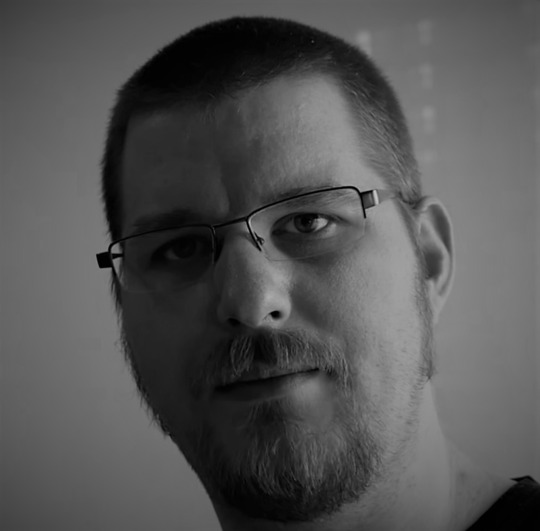
So what happened in the last month? I got a year older, had some non Failure related changes in my life so I was a bit busy outside of working on Failure.non Failure related changes in my life so I was a bit busy outside of working on Failure.
As we had Reboot coming up I was mostly working on smaller improvements and bugfixes as I didn’t want to mess up the build we did for Reboot. Not much else to say about that, nothing really new, just less bugs, minor graphical improvements etc.
While it didn’t make it into the build for reboot I was also investigating some graphical effects for level loading. A good example for the stuff I did is this little test
youtube
Also, we upgraded the project to Unity 5.6, so I’m currently looking into existing code/shaders etc. to see if we can make use of some of the improvements that came with 5.6.
The most useful feature so far has been the additions to the frame debugger as they helped me to detect a few possible performance issues as some stuff isn’t exactly working as it’s supposed to. I'm also looking forward to seeing what Kelvin can do with the new particle system stuff when he’s back working on effects.
Milcho - Lead Designer / Programmer

Justin had the astonishing idea to sign us up for three events in one month while having an incomplete game. Yeah… you can imagine how that went for the poor soul that had to prepare a build for all of them. Oh, you thought that poor soul was someone else? Of course not.
Apart from my suffering, the rest of the team did a great job of fixing issues and polishing different aspects of the game – UI/UX, VFX, Environment etc. The main feature of the builds was a newly designed tutorial which eased people into our core systems and gave them a good chance to compete in a multiplayer match.
Plenty of people were able to enjoy the game because of it, which fills me with confidence that we’re making something that not only we enjoy playing, but also and there’s market for it. All-in-all it went smoother than I would’ve ever expected – the only downsides being a lack of sleep and exhaustion. The only thing we need to do next works restlessly until and after final release – it’s all good.

Now that all the excitement is beginning to settle down, we’re planning lots of changes based on the feedback and observations from those events – from small UX tweaks to big system changes. We’re in full production force here, so expect lots of content in the near future. I’ll leave you with the rest of the team now, because (as we all know) people love talking about themselves.
Loic - Art Director / Designer
This month the art focus has been on cards for our user interface and polishing our main level to show the game at Reboot Develop.

so I sculpted on-board fixed blockers to replace the placeholders we had before, with real-time lights that gives much more volume to the center of the board.


I then created more environment assets to have a wider diversity in the city-scape to create a symmetrical layout instead of the chaotic one we had before.

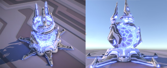
Lastly, I created the Access Node, which is your base building, from modeling to animation so we can emulate the feeling of the player jacking into the level and being ejected or destroyed when the Access Node loses all its Hit Points (HP).
Kelvin - VFX Artist

Hello all, for me this month it’s been a lot of UI work with some FX fixes sprinkled in. Reboot was around the corner and there was a lot we wanted to get done so that the players could give us feedback on it. Along with some fixes to the Transmission tower FX, I've been doing a ton of UI iterations.
We built a look for the script cards (both small and large versions), resource visuals, and general in-game UI. The most challenging task, besides reformatting my brain to think of UI again, was creating the script cards. We really had to find the balance between visually appealing cards and the amount of information given to the player.
youtube
I lean more towards giving the player a little bit less information and making the UI more appealing. This way, new players will have an easier time trying to adjust to the UI. You can't give them every piece of information and expect them to look through the UI thoroughly. So by putting less information, the players will be able to adapt to the game easier in the beginning and then look for more detailed information later down the line.
Also, by putting less information, this will keep the UI looking clean in the long run. Once players become veterans of the game, they need less information on the screen anyway. Although the current UI is still a WIP, I think the route we're going is heading in a good direction.
Amelie – UX Designer & Writer

Hey, everyone! So this month we focused a lot on the UI and the UX in order to show the best possible version of the game at Reboot Develop. The dynamic of the team was great and everybody was really motivated to iterate on the UX.
Our main interrogations were mostly about how to fit all that info on the cards that describe the scripts but still keep them easy to read, we need to prioritize information between the mini version of the card that remains visible at the bottom of the deck and the larger version of the card that you can access by hovering over it.
Other aspects we've worked on and are still investigating are how to make the link between data and territory more obvious and how to make your tech resource really intuitive to read when you're purchasing new scripts.
What we've got is much better than our previous version, I think, but there are still some tweaks we need to test. Apart from that, we worked on a first version of the tutorial. It was really valuable at Reboot to have this because we can now analyse the data we collected in our observations and interviews with the players and see where we need to focus more or how the steps and pace of the tutorial flow.
I wrote a questionnaire that our players filled in after playing which also allows us to set our next priorities regarding the improvement of the UX.
Last but not least I started to work on the narrative, this is probably the most exciting part for me. I just love the cyberpunk atmosphere that the team is bringing with this game and the really deep and contemporary questions that we want to broach on in Failure.
I believe that the narrative is going to be a central part of the game identity and so everybody's expectations are quite high with this, it's very challenging but when we'll get to the nitty gritty part it's going to be very rewarding as well. Maybe the title of the game even will take an even deeper meaning then...
Anyway, I have loads of ideas. I'm reading Snow Crash at the moment and it's the perfect inspiration, the characters are in my opinion very compelling and the themes are tackled in a subtle way, I'm also a big fan of Ghost In the Shell, the original anime and the comics. Using those masterpieces and others help me organize my thoughts and think about how we want to approach this question of the link between our access to unlimited information and the definition of our humanity.
When Ghost in the shell came out in 1995, it was a completely different context, the internet was a very new thing, and it's within this context that they questioned the definition of our humanity, through the dilemma of the body and the mind.
Today we're glued to our phones, we are connected almost constantly even if it's not yet through implants but I believe this relation to information and our ability to verify what is true or false instantly without relying on each other so much creates a whole new environment to look at this same old question.
We already started to work on an intro and we're going to iterate on that probably ten times before we get it right! I'm reusing the timeline that Anthony wrote for us when he could work on the project and of course, the work done on the factions from David but my focus now is to develop our main character.
What is his or her motivation at the start, what brings him into this slicers universe and how will this evolve as we progress in our investigation and understand what brought humanity to this state? Work on the antagonist force as well, our conflict, our controlling idea, the values and the emotions we want to manipulate, oh dear.... there is so much to do I should probably get back to it!
Ciao ciao
Daniel - Composer
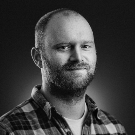
This month we say a warm welcome to our latest member of the Dream Harvest Team, Daniel Elms. We’ll let his impressive bio speak for itself because it helps solidify his thoughts on the world of Failure: NeuroSlicers.
Composer of humanist, post-minimal music. Daniel crafts emotive soundscapes from intricate orchestral textures that are bursting with geometric rhythms and patterns; this rich orchestral language is interwoven with the electroacoustic instruments and urban sounds synonymous with his hometown, Hull, which together create a unique voice in the world of contemporary composition. He uses his music to make intimate commentaries on the plight of the individual, and to address the social and economic inequalities of his home, taking inspiration from the ideologies and philosophies of anarcho-syndicalist and progressive literature.
As well as creating music for both expansive and intimate performance venues, Daniel has a large and varied repertoire of collaborative works across feature film and theatre, including: the BAFTA- nominated ‘Ralph’, the Academy-Award-nominated ‘Library of Burned Books’, ‘Plaques and Tangles’ at Royal Court Theatre, and additional music for ‘Taboo’ by Ridley Scott and Tom Hardy, for which he worked closely with fellow composer Max Richter. In 2016, Daniel was commissioned by the British Film Institute to create a new work to celebrate his hometown as part of Hull City of Culture 2017 and was awarded Performing Right Society Foundation’s New Music Biennial Award as part of the commission; he was the recipient of the Musicians’ Benevolent Fund Emerging Excellence Award in 2013.
In 2017, Daniel will record and release his debut album of concert material, ‘Islandia’: an album of new music written for chamber orchestra and electronics in which expansive sonic landscapes are interspersed with driving rhythms and expressive textures. His BFI/PRS Foundation commission ‘Bethia’ will premiere as part of Hull City of Culture 2017 and will be performed in Hull and at the Royal Festival Hall, London, with a recorded broadcast by BBC Radio 3. Daniel will also be working on a soundtrack for the computer game ‘Failure: NeuroSlicers’ by game developer Dream Harvest Games, create the score for Abner Pastoll’s second feature film ‘A Good Woman is Hard to Find’, and record and produce various musical artists from his hometown, Hull, as part of City of Culture 2017.
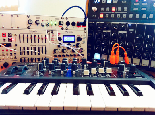
ON FAILURE: NEUROSLICERS
Beneath the awesome visual styling and game mechanics of Failure, there are a lot of pertinent questions being asked by the story that can — and should — be applied to our own lives in the face of recent political, social, and technological upheavals. What this means for me as a composer is that there is a vast amount of content within the game that has the potential to bring relatable questions and commentary to the fore for those playing it and that there is the opportunity to blur the lines of distinction between our world and the world of Failure.
1 note
·
View note