#hardtmuth
Explore tagged Tumblr posts
Text
Ode alla matita
Ma quanto è bello scrivere con la matita! Quella classica, di legno, con il suo inconfondibile profumo che evoca ricordi da quando zia Nanda mi insegnò a scrivere quando avevo solo quattro anni, per poi diventare più tardi il mio primo strumento di scrittura a scuola.Con quel suo tratto grigio elegante ho riempito pagine e pagine di quaderni, dapprima con le aste poi con le lettere in corsivo…

View On WordPress
#asburgo#aste#berlino#calligrafia#crocemaltese#disegni#elisabethboweslyon#grafite#hardtmuth#kohinoorhardtmuth#lapis#matita#montagnadiluce#norisstaedtler#pensieri#scarabocchi#temperamatite#torredilondra
0 notes
Text
I need to buy black pencils cause the last one i have is literally 2cm long but i cant afford

0 notes
Text
How to save your brain from being eaten by AI (maybe): keep a sketchbook
At the beginning of May I started bookmarking photographers who are using AI in interesting ways, to add to my Instagram collection of digital art references (#artdirectionneversleeps). Later that month I did my own first experiments using NightCafe to visualise ideas for a client. It was entertaining and frustrating, partly because of my lack of prompt skills, and partly because the "styles" you could apply to your "artwork" looked exactly like bad fantasy art from the 1980s.
However, by June, photographers I was working with were using Midjourney to conceptualise setups – still with a bit of that tacky SciFi book cover feel, but it was proving genuinely useful to talk about how sets might be designed, for instance. By July, I was seeing film directors use AI for pitching storyboards, and my lovely students at Condé Nast College of Fashion and Design using it for presentation mock-ups.
That's just three months. From AI being a "what?" to becoming a completely logical, natural part of the image-making process, for at least some parts of the creative industries. The speed of change is head-spinning. And this is just the beginning.
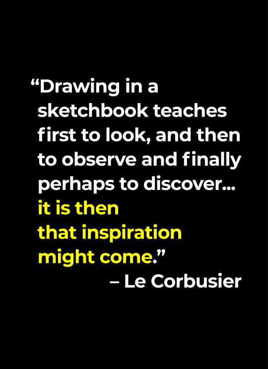
Meanwhile, also in May, I was teaching at CNC on a really fun module about Brand Identity Design. Part of this involved the students keeping a sketchbook, to explore and develop their ideas. One of my lectures was about WHY people keep sketchbooks, and I illustrated several points with quotes from designers, architects and artists, and pages from my own sketchbooks from waaaaay back in the day.
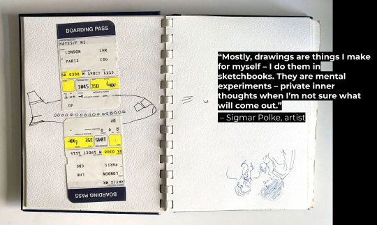
Because WBITD, when I was an art student, I kept sketchbooks constantly. Not only was it a course requirement, for me it was also a way to stave off boredom and depression: it's hard to think negative thoughts when your brain is absorbed in analysing the curves of a hand or a coffee cup or a flower. When my best friend and I used to Interrail around Italy, I would draw our cafe tables and the local streets, and we'd get rewarded with extra drinks and desserts by kindly waiters.
Somewhere around the mid 90s I gave up sketching, partly because life got more hectic, and partly because smartphones got invented. When Emma and I started the BID course this summer, it had been a very long time indeed since I cracked open a sketchbook. And, erm, even though I did buy one – a lovely, spiral-bound, hard covered book with wonderful heavyweight paper, from Seawhite of Brighton – it took me another few months to start using it.
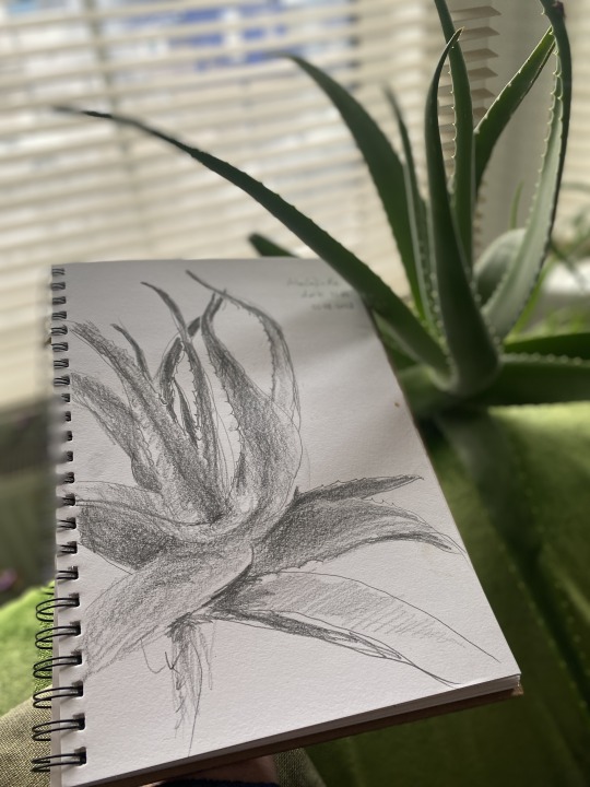
Two things pushed me into finally starting: firstly, it's #drawugst and I thought I should try a drawing a day, every day, during August. I started on Tuesday, August 1st, with a graphite pencil sketch of my aloe plant. I did it in semi-darkness, around 9pm, and my hand-eye coordination felt a but rusty, but following the heavy curves of the plant was satisfying.
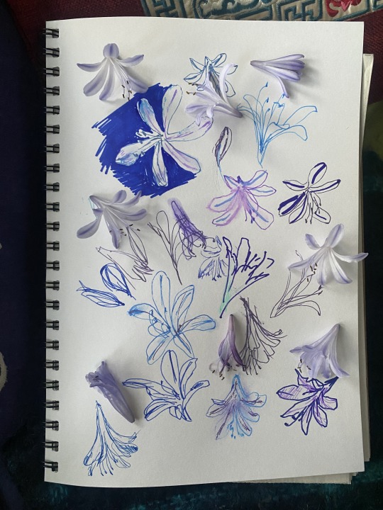
On Wednesday I drew fallen agapanthus blossoms, playing with coloured marker pens (of which I have a ridiculously huge collection, almost never used). This was a reminder of the importance of not trying to control the end result while you're sketching. Because you just can't.
Yesterday evening I scribbled our messy after-dinner table. I used the graphite pencil, a Koh-I-Noor Hardtmuth charcoal pencil, and an Edding 1225 calligraphy pen – and blackberries. The fruit, not the redundant communication device. Blackberry juice is a fabulous art material – it gives this beautiful purple inky result, and it's such a pleasure to smear all over the paper. I'd picked the berries earlier this evening on Wormwood Scrubs, just to add to the satisfaction of the whole experience. (And this morning I made almond milk smoothies with the rest of them.)
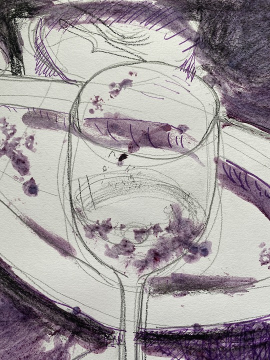
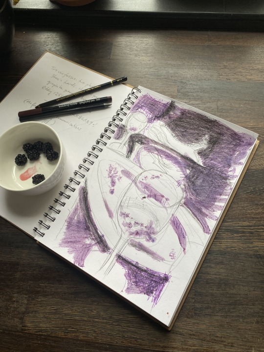
The other thing which made me finally restart a sketchbook after all this time is AI. I can see that it is just going to get bigger, more powerful, and more indispensable in my industry. I'm not going to worry about losing my job to a bot (I don't have "a job", anyhow), but I am concerned about what it will do to our creativity.
When you use one tool extensively it starts to train your brain, you develop habits and shortcuts. It's one thing to have tricks for making the most of Photoshop, or to have routines when you set up an InDesign document. But when you're trying to generate ideas you need to keep an open mind. To look at things from different angles. To look again, look harder. Try wacky ideas. Draw with your food. Stick things onto the pages. Doodle. Take a line for a walk. Write notes to self. Be creative. Be messy. Be human.
4 notes
·
View notes
Photo

Two days late, but it's Friday so let's celebrate 4 years of SKAM France season 3 episode 1 ❤️. I will try to draw a scene from each episode every week ❤️. . . . . Bruynzeel graphite and Koh-i-Noor hardtmuth (B6) on paper, A4 size. I'm saving up for new materials, so this one is for sale. DM to purchase 💘. https://www.instagram.com/p/Cn7UJOAr6IJ/?igshid=NGJjMDIxMWI=
2 notes
·
View notes
Video
youtube
Why Are Pencils Painted Yellow?
Sep 9, 2024 #EducationalVideos #SchoolSupplies #KohINoor Have you ever wondered why most pencils are painted yellow? In this video, we dive deep into the fascinating history behind the yellow pencil, tracing it back to global trade, royalty, and marketing strategies. Learn how a simple design choice made over a century ago still influences the pencils we use today. Discover the story of Joseph Hardtmuth, Koh-i-Noor, and how the connection to China shaped the future of the pencil industry.
Timestamps: 00:16 - Introduction 00:57 - The Early History of Pencils 02:05 - Why Are Pencils Painted Yellow? 02:46 - Who Started the Yellow Pencil Trend? 03:32 - American Influence on the Yellow Pencil 05:54 - The Modern Yellow Pencil 06:37 - Conclusion & Outro
1 note
·
View note
Text
Old Vienna
Anno 1954
Fließender Verkehr in der Kärntnerstrasse


Bei der Einmündung der Weihburggasse, an der Ecke das bekannte Papierfachgeschäft Theyer & Hardtmuth.
0 notes
Link
Check out this listing I just added to my Poshmark closet: Vintage Pencils Stenographic Use L & C Hardtmuth Outline Pencils 5 count.
0 notes
Text
Adventní soboty v Národním technickém muzeu
Adventní soboty v Národním technickém muzeu
Národní technické muzeum zve na zajímavý program na adventní soboty, při kterém si návštěvníci můžou zpestřit čekání na Vánoce. Pro děti jsou připraveny hravé aktivity ve výstavě „Hardtmuth: od uhlu k tužkařskému impériu“, dospělí zájemci si mohou projít muzeum s průvodcem a specialitou pro skupiny je možnost natočit vánoční pozdrav z expozice Televizní studio. V sobotu 10. prosince se mohou děti…

View On WordPress
0 notes
Text
Okay there is no new art or anything today (the how i do stuff is w.i.p.) but i got a few new pencils and a pen last week and i wanted to do a new comparison.
I'm putting it under a cut because it is really not scientific nor professional, simply a random observation from someone who draws as a hobby and i know there is a limited amount of people who would be interested in that.
The pencils in question:
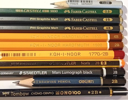
Faber-Castell (triangle) 2B Faber-Castell 9000 2B Faber-Castell Pitt Matt 2B Faber-Castell Pitt-Matt 4B Koh-i-Noor Hardtmuth 1500 4B Koh-i-Noor Hardtmuth 1500 2B Koh-i-Noor 1770 2B Staedtler Noris 2B Staedtler Mars Lumograph black 2B Deli 2B Tombow Mono100 2B
The pens in question:
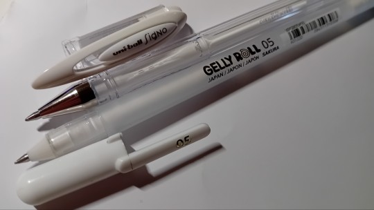
uni-ball Signo white Sakura Gelly Roll 0.5 white
The comparison
The upper white line is the GellyRoll, the lower white line is the uni-ball. The blended column was blended with one of those woodless white pencils, not a paper blender stump or anything. Also please just ignore how bad i am with the layout

I mainly kept to the 2B hardness, i'll explain why there is two 4B-s included when i get to them. So let's go over them one-by one.
Faber-Castell (triangle) 2B Trusted friend. Slightly lighter than the usual 2B pencils but it is reliable, looses sharpness somewhat slower than most. Smudges less then most. Mid range price.
Faber-Castell 9000 2B Cool stuff. It is very smooth, blends very nicely, the smudgeing isn't too bad. Upper mid range price.
Faber-Castell Pitt Matt 2B Novelty but for what. I first bought this because i was excited about the supposedly less shine this has over other graphite pencils. Which is exciting, needing less editing after scanning. What i did not know at the time, that for the same saturation you have to purches 2 up to get the same result. So initially i was utterly disappointed with the 2B because i just wasn't able to get the level of depth and darkness that i like. Upper mid range price, not sure i would recommend, but it is fun to try once. Upper range price.
Faber-Castell Pitt-Matt 4B Enter 4B version. This is what a 2B pencil is. This one redeemed the 2B one. It actually is about the same result as the F-C 9000. They are fun but.. not really that special. Yes there is somewhat less shine to them but i don't think they worth the price just for that. Upper range price.
Koh-i-Noor Hardtmuth 1500 4B Only included to serve as comparison to the Pitt Matt 4B. Low price range.
Koh-i-Noor Hardtmuth 1500 2B Reliable. Reasonably smooth, nothing special but in a good way. Low price range. Holds sharpness relatively well. Low price range.
Koh-i-Noor 1770 2B My oldest friend. Bit scratchier than the K-i-N 1500 but nothing too abrasive. Holds sharpness relatively well. Worst blendability. Cheap.
Staedtler Noris 2B An oldie but a goodie. I know this is many people's favourite, and not without reason. It's nice, reasonably smooth. For my tastes it looses sharpness a bit faster than i'd like. Cheap.
Staedtler Mars Lumograph black 2B Now this one is a new one for me and i am not that floored by it. It is a nice and smooth feeling pencil but i don't feel the step up in price is bigger than the step up in how it feels to use. Upper range price.
Deli 2B This feels very close to the Lumograph actually. I would not be surprised if the goal was a more accessable alternative. It is nice and smooth, very nice blendability. Cheap.
Tombow Mono100 2B Now this. To be honest this is the one where i actually felt like a significant difference. This one is nice to hold, feels so good on paper, it is smooth, blends nicely. I'm loving everything about it. I'd consider this an expensive one, but i'm not mad about it. This one actually has ther shits to cost more than the rest.
For the two white pens, you can see how well they work on graphite. Both is pretty nice, they don't really differ in price either. I am more partial towards the GellyRoll, because it has a bit more opacity to it, but honestly the uni-ball is almost as good and the application of that is much much smoother. So they are about on equal grounds. It all comes down to preference really.
So yeah, that's me for today i guess. ✌🏻
8 notes
·
View notes
Text
When it comes to pencil, I only like one brand. Koh-i-noor Hardtmuth, Czech pencil. Steadler is too oily, not really vibe with Faber. So yeah, it’s a pain when I want to buy more pencils, they don’t sell it in the country that I’m studying in. THAT PAIN IS INSANE
You know what is ass. When you sharpen your pencil but you don’t use pencil sharpener, you use paper knife. After 2-3 three times you will only have a tiny piece of pencil, but imagine you drop it or sit on it. Like I have 5-6 pencils, same type, same thickness and I have used most of them in the past one month, 2B pencil to be precise.
2 notes
·
View notes
Photo

Progress Shot.... I do what I love and I love what I do✏️🦋🖌️ . #annorokatajoshua #artshare #artist #pencilart #charcoalpencils #artcollective #realismart #realismartist #realismart #realismdrawing #artrealism #pencildrawing #charcoal #charcoaldrawing #charcoalpencil #koh-i-noor #KOH-I-NOOR #hardtmuth #hardtmuthpencils #hardtmuthpencil @kohinoor_hardtmuth @kohinoor.hardtmuth.rus https://www.instagram.com/p/CSyx9t1qXfR/?utm_medium=tumblr
#annorokatajoshua#artshare#artist#pencilart#charcoalpencils#artcollective#realismart#realismartist#realismdrawing#artrealism#pencildrawing#charcoal#charcoaldrawing#charcoalpencil#koh#hardtmuth#hardtmuthpencils#hardtmuthpencil
1 note
·
View note
Text
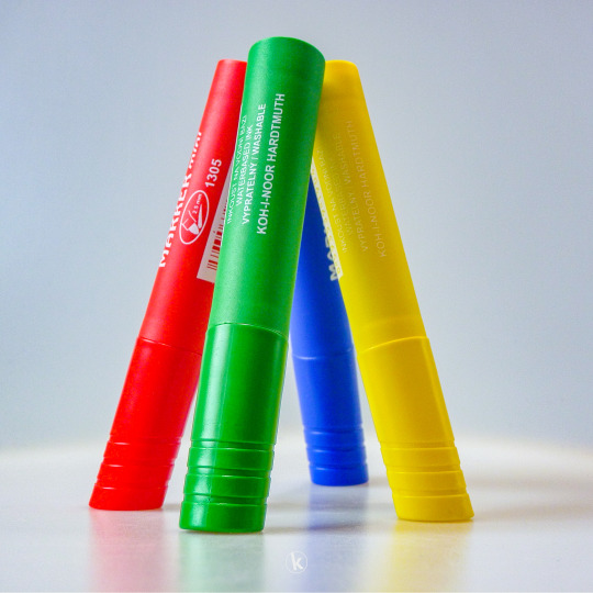
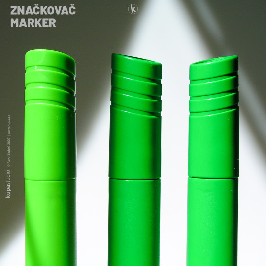
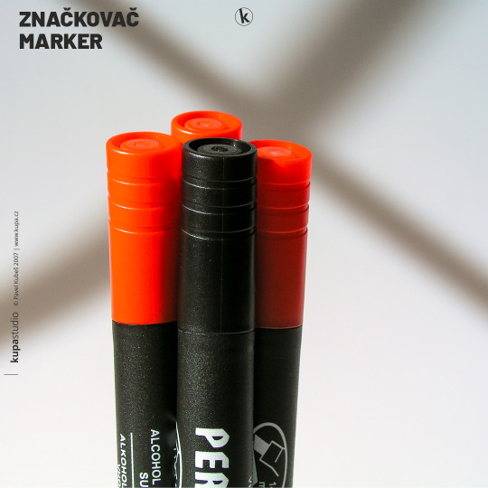
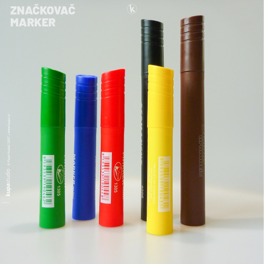
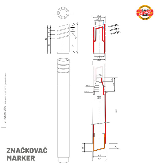

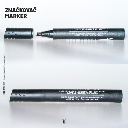
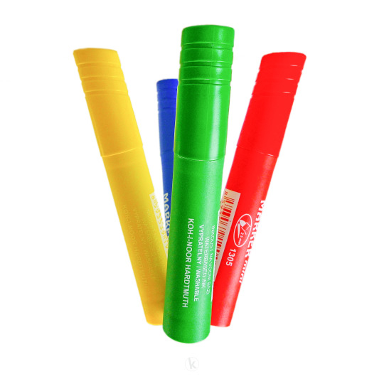
KOH-I-NOOR HARDTMUTH MARKERS 🇨🇿
Průmyslový design. Návrh popisovačů (značkovačů, zvýrazňovačů) s širokým plochým nebo kulatým hrotem. Podobně jako školních popisovačů ergomarker, i zde šlo o návrh designu víčka a zátky, tělo popisovače zůstalo z ekonomických a technologických důvodů původní.
Návrh má stejné charakteristické znaky jako školní ergonomické popisovače ergomarker - zkosené čelo víčka a zátky, tři drážky ve stejném sklonu jako zkosení. Také prošel procesem optimalizace ve spolupráci s výrobcem formy pro plastové odlitky (nástrojářská sekce holdingu KOH-I-NOOR PONAS) a vlastním výrobcem popisovačů, bulharskou společností KOH-I-NOOR HemusMark.
KOH-I-NOOR HARDTMUTH MARKERS 🇬🇧
Industrial design. Design of markers (markers, highlighters) with a wide flat or round tip. As with the the ergomarker school markers, I have designed the protector cover and the plug, the body of the marker remained the same for economic and technological reasons.
These markers have the same design characteristics as the ergomarker school markers - bevelled front part of the protective cover and the plug, three grooves in the same inclination as the bevel. The design was optimized in cooperation with the mould manufacturer (company PONAS, part of the KOH-I-NOOR holding) and the marker manufacturer, Bulgarian company KOH-I-NOOR HemusMark.
1 note
·
View note
Photo

Love it #talens #sketchbook #mondeluz #hardtmuth #kohinoor #aquarelle #colouredpencils #art #sketch #waterbrush #szkicownik #kredki #kredkiakwarelowe #sztuka #szkic #rysunek #pędzelwodny #drawing (w: Pogorzel, Warszawa, Poland) https://www.instagram.com/p/BulqxI6gS7n/?utm_source=ig_tumblr_share&igshid=baof3sdnjowd
#talens#sketchbook#mondeluz#hardtmuth#kohinoor#aquarelle#colouredpencils#art#sketch#waterbrush#szkicownik#kredki#kredkiakwarelowe#sztuka#szkic#rysunek#pędzelwodny#drawing
1 note
·
View note
Text
@mekare-art hi! I used watercolor as a base and then koh-i-noor hardtmuth watercolor pencils on top of that. + white pen for lighter details and black markers for blacks. Here are some wip pictures:


The background was supposed to be brown but i didn't like the look of it. Here's some close ups of the finished thing, might be easier to see the materials used:


I don't know if i'll ever finish this cause drawing is hard but look they're so in love ur honor 😭
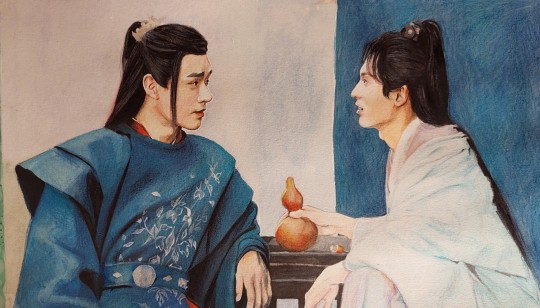
#oh theres very little glitter in wkxs hair lmao cause i got bored#thats watercolor as well - coliro pearlcolor. its very nice i use their golds a lot in other drawings#you cant really see it in this light but if you look from the side he's a shiny man 😆#anyways hope this helps#long post#i should think of a tag for my stuff
325 notes
·
View notes


