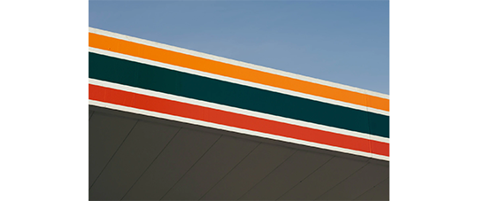
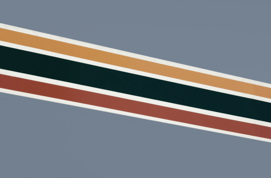
#halftones are my new best friend
Explore tagged Tumblr posts
Visit Tumblr Blog
Explore Tumblr blogs with no restrictions, modern design and the best experience.
Last Seen Tumblr Blogs


Fun Fact
Tumblr was the first site to host the blog for President Barack Obama in 2011.
Text


You’re in a car with a beautiful boy
Orufrey Week Day 4: Poetry Inspired 🖤🤍
To the surprise of no one, I used Siken for this one
#myart#fanart#witch hat atelier#Δ帽子#tongari boushi no atelier#olruggio#qifrey#orufrey#orufreyweek2024#I love them so dearly#downloaded a bunch of manga/comic brushes and people I am LOVING them#halftones are my new best friend
606 notes
·
View notes
Text


Trio of oekaki doodles of the lightner squad!! You can use them as matching profile pics if you want as long as you credit me!!
* PROSHIPPERS DNI !!
#safeutdr#deltarune#my art#kris#noelle#susie#bro oekaki is so fun#like halftones are my new best friend and like that shipainter forces me to work quickly and less perfectly
98 notes
·
View notes
Text

FREAK 👻 FANTÔME ✨
#everyone say hello to my new best friend The Halftone Dots Brush#sherbo art#chuubaposting#mint fantome#fantography#vtuber#envtuber#indie vtuber#vtuberen#english vtuber
62 notes
·
View notes
Text
Human Valourrrr

I do not have the strength to make a good background right now
Halftone is now my new best friends halftone I love you
5 notes
·
View notes
Photo

✧ TEXTURES – A TUTORIAL BY EVANSYHELP.
In this (long and image-heavy) tutorial, I’ll be showing you how I make textures, as requested by a very kind anon. I use Photoshop CC 2019 but you should be able to replicate my methods on most editing software. Please like or reblog this post if you find this helpful!
Index.
Ethically Sourcing Your Images.
Finding The Right Image.
Making Your Texture.
Other Tricks I Use.
Quick Recap.
Making Textures Without Images: Speedrun.
Outro.
Ethically Sourcing Your Images.
I will be explaining a couple quick ways to make textures without any images at the end of the tutorial, but since my personal favourite way involves images and that’s specifically what the anon requested, that’s what the majority of the tutorial will be focused on.
The first step, naturally, is finding an image to use. My personal favourite site is Unsplash, but there are plenty of options out there.
What you need to keep in mind is what kind of license the images have. Unsplash is free for personal and commercial use with no attribution required, which makes it perfect for things like this. There are more sites like this in my free for commercial use masterlist (linked at the end of the post), but unless you’re using them in products you’re selling (like graphic commissions), the commercial aspect isn’t something you need to worry about. Just check the site/photographer’s rules to make sure you’re allowed to edit the images for personal use, and whether attribution (credit) is required.
Another important thing to keep in mind is that these sites typically never allow you to redistribute the images as they are. That means you can’t just go to Unsplash’s texture category, save the images without any changes, and reupload them in a texture pack on Tumblr. That’s stealing. We don’t do that.
Finding The Right Image.
Knowing what kinds of images will make good textures is a learning curve. My first couple texture packs are rough compared to what I make now, because I basically taught myself with no guidance and learned through trial and error. But with practice, I learned what worked and what didn’t.
You want your images to be HQ, either with no ‘subject’ (ie. a person) or with a large background. Higher contrast is better but not super necessary. You should hopefully be able to envision what kind of texture you want to make before you even touch the image.
Making Your Texture.
For the majority of the tutorial, this is the image I’ll be working with. Credits can be found in the link at the end of the post.

Open your canvas. You can make specialised textures, like 100px for icons or 540px for Tumblr graphics, but I personally prefer to make them large for versatility. I’m using 800px in this tutorial. Once you’ve chosen your size, upload your full-size image into the canvas. This is where the fun begins!
Drag the image around into a nice position. Or use Edit > Transform to rotate, flip, and warp the image in different ways. Or use Edit > Free Transform (Ctrl+T) to change the size or the angle more precisely. Or probably some combination of all three! With Free Transform, make sure this aspect ratio anchor is selected so you don’t butcher the quality of the image, unless you’re warping it intentionally:

This is all very individual to each image you use. You might want to flip one, shrink another, put another at a 30 degree angle. Just experiment until you end up with something you think would look awesome as a texture. For the sake of providing a good example, I flipped this image vertically, shrunk it to 80% its original size, and rotated it until it looked like the smoke/cloud was coming from the bottom right corner. This is what we have:
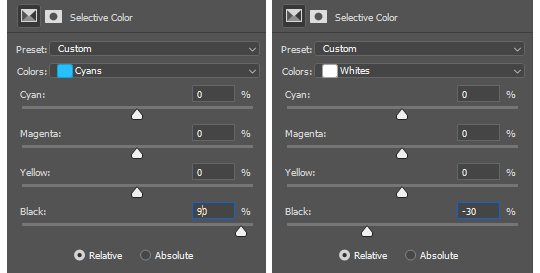
Then we move onto enhancing. Textures work best when there’s a lot of contrast because it’s easier to manipulate the blending modes. So if your image isn’t already high contrast, these adjustment layers (Brightness/Contrast, Levels, and Selective Colour) are your new best friends:

If you don’t see this on your Photoshop, go to Window > Adjustments and it should pop up. Again, just experiment, because different images will require different things. Essentially, you want to make the darks darker and the lights lighter. Something I like to do is add a Selective Colour layer and use the Black slider. Pick out the primary colour of the image, and then Whites, in the drop-down menu, and move the bottom slider (left to lighten, right to darken) until you’re satisfied. Like so:
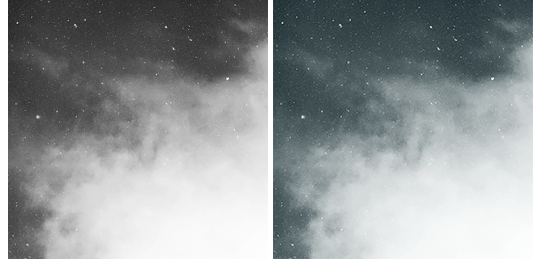
So with those Selective Colour settings and the following Levels settings, here’s the before and after of my image.


Much better contrast! If you want to end here, you can, but I personally prefer grayscale textures a lot of the time because it makes it more versatile. Instead of being forced to make a blue graphic because this image is blue, I can make any colour graphic I want with one simple black and white Gradient layer. Photoshop does have a default Black & White adjustment feature, but I prefer using Gradients.
Pro tip: if your image doesn’t have a pure black, you can keep the darkest parts of your image dark by using the left slider, shown below.


A lot of the time, I’ll also decrease the opacity of that Gradient layer, to somewhere between 80% and 95%, so just a hint of the original colour comes through. This gives it more dimension in my opinion, while still keeping it mostly neutral. Here’s 100% vs. 85%:
You may find that you want to add a little more contrast after. With this texture, I decided to grab another Selective Colour layer, pick ‘Black’ in the drop-down menu, and pull the Black slider up to +40. I also settled on 95% opacity for the Gradient. And here’s the final product!

Other Tricks I Use.
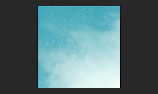
That covers how I make a lot of my easier textures, but here’s a quick run-through of other, slightly more complex tricks. I’ll be working with this image (again, credit at the end of the post):
This, of course, is not as obviously texture-worthy as the previous example, but I love textures with strong lines, so here’s how the magic happens! I wanted to get rid of the detail on the bottom half, so I used the Polygonal Lasso tool to select it:

Then I used the eyedropper tool (the 4th symbol under the polygonal lasso in the image above) to select the blue of the sky and, on a new layer, painted that selection completely blue. I decreased the opacity to 90% just so it wasn’t a total block colour, but not enough that you can really see the lines. I repeated this process for the sky, so it looked more consistent with the bottom half.
Then, using the eyedropper tool again and making a new layer for every colour, I went in with a small soft paintbrush and painted out the harsh vertical lines on each segment of the stripes. I didn’t want to make them totally perfect, but I painted over the bulkiest interruptions.
I added a black and white Gradient layer, using the slider tool I showed you before to darken the darks and lighten the lights, and decreased it to 50% so that it wasn’t totally black and white but still more neutral than the original. Here’s the result:
Another fun way to shake things up, which unfortunately will require Photoshop (CS6 should be fine, not sure about earlier versions), is the Filter Gallery. Go to Filter > Filter Gallery, and you’ll find a TON of effects that change your image drastically. Most of the default settings are nightmarish, but you can play around with the settings panel on the right.

Here’s just a few results that are possible with the Filter Gallery, labelled for convenience. You can view the HQ versions in the link at the end of the post.

Quick Recap.
So you don’t have to reread this obnoxiously large tutorial every time you want to reference it in the future:
Choose a HQ image.
Resize, rotate, flip, and/or warp.
Enhance the contrast.
Black and white!
Paint over problem areas!
Filter > Filter Gallery.
Making Textures Without Images: Speedrun.
We’re almost done! There are some tools built directly into Photoshop that can allow you to make textures completely from scratch, and I’ll briefly cover my favourites here.
The first is pattern fill layers. I spent too many years not appreciating the patterns feature in Photoshop, but they’re great. Go to Layer > New Fill Layer > Pattern, click ‘OK’ on the box that pops up, and another box will pop up to let you choose your pattern.
By themselves, they are UGLY. It can take a while to figure out how to use them. But if you change the scale, change the blending mode, and change the opacity, you have thousands of textures at your fingertips. And if you add two or three together? Billions of possibilities. I can do a more in-depth tutorial on patterns if y’all are interested, but here’s two examples I just whipped up in a matter of minutes, using two patterns on each:

The next feature is gradient fill layers, and the gradient tool. Go to Layer > New Fill Layer > Gradient… to select a gradient (or make your own!) and an angle, OR use the gradient tool (featured below) to drag the gradient across your canvas manually. On its own, boom, that’s a gradient texture. Paired with a pattern or put through the Filter Gallery? Even better!


The last is brushes. Brushes can be great for textures because there are so many kinds. You want to make a paint splatter texture? Paint splatter brush sets are everywhere! You want to make a smoky texture? You can get brushes that look like smoke! Smudged? Scratchy? Grunge? Halftone? Light leaks? Torn paper? Brushes have your back.

With all of these features (and things like actions, too!), your saving grace is going to be this little cog wheel shown below, and the list you’ll find under the Reset/Save/Load section. There are SO many more options built directly into Photoshop that you don’t even see right away, because you have to add them manually from this little cog wheel.

And you can download countless more patterns, gradients, and brushes from sites like Brusheezy and DeviantART. A couple tutorials on downloading and installing them can be found in the link at the end of the post, but remember, download these things ethically. If you want to sell products that use a custom brush, it’s your responsibility to find brushes that are free for commercial use. If you don’t want to credit the creator, it’s your responsibility to find resources that don’t require attribution.
Outro.
I think that’s everything, guys! If you found this tutorial helpful or otherwise enjoy my content, please consider supporting me on Ko-fi! I offer exclusive rewards, like custom graphics, to everyone who donates.
Due to Tumblr’s latest rules about links, you can find the credits list, the promised bonus tutorials, other important links, and the full-size HQ versions of the textures made in this tutorial over here.
Thanks for reading!
#rph#allresources#completeresources#itsphotoshop#chaoticresources#photoshop tutorial#photoshop resources#photoshop help#ps resources#ps tutorial#eh#eh: tutorial#tutorial#ps help#texture#*100#*250
371 notes
·
View notes
Text
Thanks fo’ saving my ass (Part 2)
There is a part 3 coming, I think these two deserve the...culmination, but I wasn’t sure if I could have it ready soon enough. Stay tuned for more, hope you enjoy! x
Part 1 - Part 3*
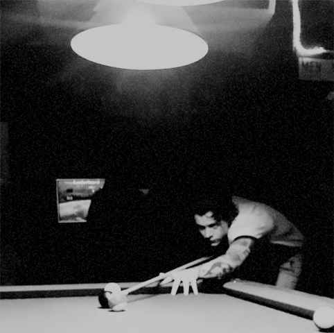
It starts with a resounding bang. A back curving over maple hardwood; taut muscle stretching soft cotton fabric; twin jades squinted in concentration; a shoulder blade protruding briefly for one swift determining movement. Red, blue, yellow, purple, orange phenolic resin scattering across green worsted wool like a dozen pinballs simultaneously kicked in various directions.
It ends with the deep echo. A ball falling into emptiness before meeting rock-bottom; the release of a soft withheld breath; firm flesh unflexing with satisfaction; two sets of glossy eyes meeting in a knowing look. "Nice break, Styles. Stripes it is," y/n happily comments once Harry leans back from the pool table.
Gibson’s is full of rowdy chatters, tipsy laughs and fulsome smiles. Strangers bonding for a night of undiluted carefreeness, clicking drinks after merry drinks in honor to their new ephemeral best friends. All sorrows have been forsaken on the coat rack at the entrance, hung in insouciance, leaving nothing but good spirits to sit at the tables and loiter near the bar. Everything about this place is warm and nurturing, a cosy embrace after a tedious day, a home for the people that lets them nurse bottles and wounds alike, and sees them leave later on, cheerful, relaxed and healing. It took but a second for Harry to understand why y/n is so fond of the place and he was not surprised to find her on a first-name basis with the barmaid, the two of them catching up on life while she was preparing the drinks.
Now, fifteen minutes in, they’ve happily made their way to the vacant timeworn pool table at a secluded corner of the bar, drinks and grins in toe. The space is only lit up by a single lamp hanging from the ceiling, casting daedal shadows along the walls and across the table’s carpeted surface. The subdued light and music crooning in the background make for a suggestive atmosphere, air thick with limitless curiosity and enticing promises.
The corner of Harry’s lips quirks in a wry smile and a bold glint takes residence at the crease of his eyes; the telltale sign of a burgeoning idea brewing up in his cheeky mind. "What’dya say we make this a lil more interesting?" The offer is served with a raised brow, a hand on his waist, and one foot perched on its toes over the other as he leans against the cue.
From across the pool table, y/n is quite endeared at the sight but her response comes out in fake offense,"oh I’m sorry, am I boring you already?"
"Quite the opposite actually." His head tilts the slightest bit to the side, gaze unwavering from her face in a mission for persuasion.
Her lips grimace as she tries to suppress a betraying smile to no avail, "fine, I’m listening."
He grins victoriously at her inability to keep a straight face, his limbs dislodging from his casual pose. "We take turns," his motions at the space between them. "F’we pocket, we get to ask one question. No bullshit answer, jus’ the truth." His eyes are wide as he gauges her response.
"A question, huh?" she takes her time to contemplate the proposition just to watch him squirm in impatience. "Damn, for a sec I thought you were about to suggest strip-pool." She sends him a playful look as she walks the length of the table to step closer to him and have a better look at his chiseled features.
"I mean, m’totally down but might be a bit unfair on your part," his eyes briefly trail down her body in silent conveyance of her single-piece attire. He’s got much more material to shed before exposing skin than she does.
"Wouldn’t you like to know." The suggestive retort has Harry’s stomach churn with humid passion, the question of just how many layers she’s wearing exactly, playing with the most lascivious parts of his brain. "Not that it matters, you’d be butt-naked before you’d get a nip-slip."
"Overestimating yourself?"
"Just giving you fair warning," she shrugs in nonchalance running her fingers along the edge of the table, "so you know what you’re getting yourself into."
When she lifts her head back to connect their gaze again, she finds him biting at his bottom lip to contain his signature smirk, "no worries there, darlin’. M’all willing." He almost punctuates his retort with a salacious wink but decides to save it for a more opportune time. Something tells him he’s in for a long evening, not that it’s any cause for concern. Like he said, he is very much consenting to anything her heart desires to do to him.
"Good to know." Y/n quips back with a smile before leaning on her hand resting upon the pool table. "What’s your question then?"
For a moment, Harry forgets he just broke the rack and successfully sent a plain purple ball in one of the table’s pocket, taking him one step closer to victory and granting him one question as per his own proposition. He quickly gathers his reeling thoughts before settling on an easy inquiry, fingers fiddling with the desire to sketch every bit of her character. "Right um, do you have other hobbies besides playin- or should I say, winning pool?"
She wants to slap- or should she say, kiss the smug look off his lovely face, but her answers airs in the same level tone she employs at work, "yes I do."
It’s not enough for Harry’s archeologic curiosity though. He’s barely dusted off the ground beneath his feet to reveal the hint of new groundbreaking findings; armed with sieves and brushes, he is eager to dig a little further, "and what might those be?"
However, y/n is quick to rebuff him, "uh uh, that’s two questions."
Indignation soars through his straightened posture, as he cries out a faint ’what? no!’ and her own ego grows two size at her cunning deceit, "gotta up your game if you wanna keep that perky bum intact, Styles."
Earlier words resonate in the confines of his outfoxed mind then, you can kick my ass at that game of pool as promised, and he tries really hard not to think about the promise following them. Instead he counterattacks in obvious diversion tactic, "that’s twice you’ve mentioned my ass in the past 5 minutes, perhaps I should read into it?"
"I guess you’ll have to wait and see," she lithely deflects as she grabs her own cue with a determined look etched upon her face, "my turn now."
With powerful strides, y/n navigates around the table to position herself at the most promising angle for a score of her own. Once she has both her target and the cue ball in firing line, she tunes out every last bit of stimulus encompassing her; the muffled sound of the music, the sticky oxygen filling up her lungs with sensual tension, the charming presence of the beau intently ogling her every move.
It barely takes her a couple seconds of intense concentration before a sharp thump is bouncing off the table and piercing through the air. The shot is so accurate, clean-cut, vigorous yet graceful and elegant all out once, Harry finds himself mesmerized by her skills more than the subtle form curving out from her bent posture.
The satisfaction is evident in her traits as she straightens up to face him, a pleased rictus forming at her lips. She doesn’t let any suspense unfurl before she cashes in her prize, "so what’s up with the muffin deliveries? You a stress-baker or summat?"
It’s a puzzle that’s been boggling her mind for while now; ever since the first time she watched him gallivanting around the office, handing out kindness and freshly baked goods for the small price of a friendly smile; it’d been a reoccurring thing ever since. The recollection has Harry’s cheeks warm up to a bashful shade of vermillion at the thought of admitting the reason behind his action: he’d bake a basketful of cakes just so he could give her one without exposing himself. Being straight forward with his infatuation may have been unfeasible at the time, but there was nothing against inconspicuously indulging the sweet tooth he knew she had, right?
"I dunno, just like seein' people smile, and everyone likes a good muffin, right?" His answer teeters on the ledge between veracity and evasion, the genuine ‘they were all for you’ being replaced by a less naked truth.
Y/n nods at his answer and waits until he is about to aim for another shot to voice her musings out loud, "mmm, they are quite delicious." Her attempt to distract him turns fruitful when his ears perks at her sultry voice right as he pointedly knocks the white ball with his cue. It’s off by an inch but a near-hit doesn’t help assuage his frustration, "fuck."
"Oh bummer. Guess you’ll have to pass," y/n can’t help but to tease him.
And the pout on his lips does nothing to quell her amusement, "bollocks, you distracted me."
"I did no such thing," she denies before taking his place at the table. The odds are in her favor, a perfect alignment offering itself to sink the blue striped ball right into the closest pocket. And because y/n never misses a clear shot when she’s handed one, that’s exactly what happens. Tucking the cue back at her side, she mulls over the hundred questions titillating her mind and settles for another pass at him,"is this suit the most extravagant you own and if not, what are the others like?"
Harry scrunches up his nose at yet another dig taken at the expense of his clothes, his voice pitching a halftone higher than usual, "hey, s’nough outta you, leave my suits out of it." There is a pout puckering at his lips and y/n giggles at his theatrics when he brings his hands to his chest in a protective gesture. This man and his suits…
"Somehow I don’t believe you give a single fuck about people’s opinion on your fashion choices."
"Very true. But I do value your opinion." For a brief moment, humor and wit give way to vulnerable sincerity as the two of them lock eyes over the pool table. A shy smile graces y/n’s lips, her heart faltering at his sweet sentiment before Harry gently breaks the consuming stare-off, "well, if you’re lookin’ fo’ more extravagant, I actually have a canary yellow flared suit that goes with a violet dress-shirt." And just like that, they found their way back to confidential banter.
"Damn, now I have to see it."
"One day if you’re lucky," this time he does wink at her, and this time he doesn’t let her enchantress juju distract him from the task at hand. As soon as the balls vanishes from the table, the question flies out of his mouth, "do you really find my suits obnoxious?"
Y/n pauses at the inquiry and tries to read into his eyes. She inspects the bright emeralds for any unsuspected insecurities and when she finds none, she sends him a simple smile, "I love them. I just enjoy too much your reactions when I give you shit about them." Her chuckle tugs at Harry’s lips, before she lets honesty flooding past hers, "you got such a great sense of who you are, Harry, it just shows in the way you dress. I admire that, don’t let that go."
Interiorly, he’s heart is jumping in somersaults at possibly the kindest compliment someone’s ever granted him, the fact that it came from her only sending his beating organ into more acrobatics. Exteriorly, he returns her tender smile and mutters a timorous ‘thanks love,’ before watching her pocket another ball.
This time she doesn’t have to mull it over, "why did you wait?"
"Huh?"
"When we kissed earlier, you said you’d wanted to do it for a while. Why didn’t you?"
Her words are bare of any reproach as they both lean on their side against the table, inches apart from each other. It’s a fair question; one that she doesn’t really own as the word could have easily tumbled out from his mouth instead. It’s him on the spot though, and while he didn’t quite expect to broach such hazardous matters over a game of pool, he appreciates the openness of their bond. "I dunno, you always seemed so attached to boundaries at work, always so professional, I didn’t think you’d want me to make a move."
"I secretly did," she whispers.
"Yeah?"
"Mhm."
Goosebumps race down Harry’s arms as he takes in her confession and the way her teeth are nipping her lips into a darker shade of pink. His eyes are drawn to them, the urge to close the gap and have her moaning in his mouth growing harder and harder to ignore, "fuck that’s sexy. You’re sexy."
The praise washes over y/n like a cold shower after a scorching day at the beach; startling shivers at first, golden skin tingling, and then all-encompassing relief. She loves how unfiltered he is with her, baring his thoughts to her just as they come, no editing, no secret agenda, no diffidence. Just her pure effect on him plastered across his beautiful face and candy-coating his words with a thick oozing layer of honeycomb syrup.
Leaning the slightest bit towards him, she tempts him with a near-kiss, almost dipping her lips in exquisite spongy fudge, but stops just as their breaths starts blending in one hot mess, "your turn," she purrs against his lips tantalizingly, before stepping away.
Harry looks like he is now the one in need of a cold shower, eyes pinched closed as he tries to compose himself, "right," he clears his throat. It takes him a bit more time to regain enough focus to make a successful go at the game, but once he’s got a good hold on the cue, a stable breath and a clear view of the shot, he takes it with ease and fortune.
As soon as he straightens up, he erases the distance between them, a determined look hardening the subtle lines of his face. "Did you ever think about me like I thought about you? At work, did you ever see me pass in the hallway and it took everythin’ you had not to follow me and kiss me senseless in the copy-machine room while no-one was watchin’?"
"Fuck. The thought might have crossed my mind once or twice," y/n confesses in batted breath. It’s clear the scenario isn’t so much a fabrication of his mind made on the spot as it is a confession of his own experience, and the thought has the air in her lungs going scarce, as though she’s reached the apex of Mount Everest.
Harry isn’t fending off the heated tension much better, fingers twitching around his cue as he’d rather have her underneath his fingertips instead. He takes one look at the ceiling to stave his yearning some and draws in a deep breath."This is killing me," he whimpers while his lips skim over he skin of her forehead. "Go on, take your damn shot so we can be done with this game."
"It was your idea," she reminds him wryly. All of it, really; coming here, playing pool, playing 20 fucking questions, this heated hodgepodge of salacity and virtuous adoration is all his doing.
"I miscalculated."
"Poor you," y/n gently mocks is disgruntled attitude before scoring another ball, or as she likes to regard, another question, another opportunity to further tease at his already crumbling countenance, "what about you, Harry, do you ever think about me? At work… or otherwise?"
She already knows the first half of the answer and only voiced the double-entendre to rile him up, so she’s quite stunned when he whizzes, "too fucking much fo’ my own good."
The pained expression on his face is almost comical for y/n, she can’t resist probing at his despair, "me too." He groans at the flowing visuals he can’t ban from his filthy mind before she gestures towards the pool table in a gentlemanly way, "and that’s your cue," they both share a chuckle at her silly pun.
If Harry wasn’t so lost in a whirlwind of lustful thoughts, he would revel in the way their intellects seem to dovetail on all fronts; humor, banter, seduction, sincerity, nothing is lost in translation, they seem to talk in the same love language. From teasing digs and dirty innuendos to play on words or heartfelt confessions, they know exactly which frequency to tune in.
"Fuck, I can’t see straight," he laughs as he misses a shot for the second time, and y/n quickly takes over his spot around the pool table. Settle, relax, aim, breathe, shoot; another point to her flawless record. She turns to him, looking intently at his blown irises to stir up the flame already inhabiting them, "was it good?"
"Mind-blowing," he answers without unlocking their eyes, and the whole conversation is starting to get to her too. Her thighs rub against together, knuckles turning white around her cue as she tightens her grip and Harry has to bite his lips to contain a moan. He tries to distract himself by taking his turn in the game, and burst out in laughter when he pockets the ball and y/n cries out, "blue ball in the pocket! I feel like their might be a subliminal message somewhere but I can’t quite put my finger on it"
Once they regain their breath from laughing, tears of joy actually peeling from the corner of their eyes, they go back to staring at each other. It’s Harry’s turn to ask a question, and the anticipation had y/n fidgeting under his consuming gaze. She expects him to bounce back on the previous question, but to her surprise he decides to take a different route, "tell me darlin’, if I were to kneel at your feet and look up that pretty dress right now, what color your lil panties would be?"
The question sounds boyish really, yet instead of rolling her eyes at him, her core clenches around emptiness at the thought of having him between her legs right this moment, "can’t answer that, sorry."
"Oh come on love, you gotta say. Them’s the rules," Harry tries to coax the answer out of her but she’s not budging.
"Sorry, Harry. I’d tell you if there was anything to tell." His eyes widen at her lewd implication, the revelation of just how many layers away she is from being in the nude, coming into light. Damn, he would have gotten much more than a nip-slip.
"Fuck me, I need to sit down for a mo’."
She laughs at his dramatic response before picking up her cue, "you do that, in the mean time…" The rest of her sentence is cut short as she positions herself at the pool table, and the next sound cutting through the humid atmosphere comes from the ball falling into its target.
"Jesus, do you ever miss?"
"I don’t play to lose, Styles," she quips back. "Now, what’s your biggest fantasy? Aside from shagging in the copy-machine room, that is."
Harry takes one step closer, gently backing her against the table with one hand encasing her at either side of her waist. As he towers over her, his ardent look ignites a fire at the pit of y/n’s stomach, flame licking all the way up to her heart and down to her toes. Her core throbs before the words fall out of his supple lips like maple syrup on a stack of fluffy pancakes. "Right now? Bend you over this pool table and have my way with you."
"In front of all this people?"
"What d’you think is stoppin’ me from doin’ it right now?"
"Manners?"
The retort earns her a deep chuckle, as he shakes his head in disbelief, "fuck y/n, I lost my manners the moment you kissed me."
The raw admission sends a shiver down her spine, before she regains her full bearings and pushing his cue against his chest for him to grab, "your turn."
Barely moving from his spot nestled against her, he successfully sends the ball down the drain and doesn’t waste any time before asking in the same sultry voice, "favorite position?"
‘Why are y’asking?"
"Future reference," he announces confident.
"Well in that case, kinda like this…" she brushes against him as she bends over the table, ass jutted out on one side, before adjusting the angle of her cue and aiming for the pocket, "…when everything aligns and it just sinks…" bam, she propels the sphere in one strong hit "…right through." She finishes her demonstration with a score and a suggestive smile, only but one ball left for her to obliterate; the eight ball. "Are you ready to lose, Styles?"
"Dunno, is that your question?"
"Yes. I got everything I want to know already."
"Then I don’t fucking care about losin", s’not the game I wanna play anymore," he trails a finger down the skin of her back, goosebumps erupting at his touch. He is stopped by the tip of her cue pressing at his chest, slowly pushing him back from her space, and his hands meet this air in surrender. She’s got a wicked smile on her lips and a title to uphold after all, "last shot, make it count."
Harry takes the shot hastily, half expecting another miss, but the solid yellow ball disappears into the table’s corner in a vibrant crash. Eyebrows raised and shallow breath, he pivots back towards her, "please tell me this is turnin’ you on s’much as it’s turnin’ me on?"
"Yes," she rubs the exposed skin of his chest, eyes leaving his face to trail down his torso. "I’m just better at hiding it," she brings her lips to his ear, "physically or otherwise apparently." Then she leaves a loud smack on his cheek and goes around the table to sink the last ball standing in the way of her victory. In true y/n fashion, she completes a faultless round with one last graceful hit that leaves Harry transfixed by her dexterity.
"Damn, you are the queen of pool, I’m bowing down to you. Any final question?"
She lays the cue down on the table before coming up to him, "Harry?"
"Yeah?"
"Take me back to my place?"
His head falls back on its neck, eyes closing in deliverance, "fuck yeah." This whole night may have been the most intense and rousing foreplay he’s ever experienced, he can’t wait to deliver good on his own promise.
➪ Masterlist
#harry styles writing#harry styles fic#harry styles fanfic#harry styles one shot#reader insert#friends to lovers#coworker!harry#harry styles fluff#creative writing#part2#flirting
40 notes
·
View notes
Text
GIF Brewery

Gif Brewery 3 Tutorial
Gif Brewery 3
Gif Brewery: Your new friend

GIF Brewery is a Mac OS X application that lets you convert brief clips from your video files into GIFs. No longer must you extract frames from your movies and fiddle with layers in Adobe. Since updating to Big Sur Gif Brewery 3 stopped working and with the last update in 2019 it doesn't seem likely to change anytime soon. I'm looking for an alternative that lets me import video, crop it and trim it however I like and export as gif.
GIF Brewery 3 is a rebuilt version of GIF Brewery that transitions to the latest OS X technologies. Since GIF Brewery 3 is a big behind-the-scene change, it has been released as a.
Intro
Back late 90s, there was a wonderful freeway app, GifBuilder, for OS 9. It was a quick and dirty way to to make gifs, allowing delays per frame. For all intents and purposes it was the best GIF app I had used.
Screenshot of GifBuilder
Animated GIFs, like most early web trends, came and went. They made a mild resurgence with YTMND and Myspace in the mid 2000s.
Strangely with the perfect storm of memes, Reddit, and Tumblr we yet again, live in a GIF world. Why?
Gif Brewery 3 Tutorial
Retro-ciché appeal.
They work on practically every device imaginable They a have low CPU overhead despite large file sizes. Even low end cellphones can easily play them endlessly, and display multiple on a screen.
Nearly everyone accesses the web via broadband.
You can even text animated gifs between smart phones in SMS messages. (Try it on your iPhone or Android phone, anything post iOS 4 or Android 3.x should work).
Meet GIFBrewery
Unlike GifBuilder which exclusively was designed for frame by frame animation, GifBrewery focuses on video importing.
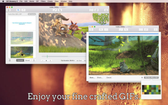
The work flow is exceptionally simple.
Open Video File.
Select range of video
Crop/Resize/Add Caption/Overlays
Edit the gif properties
Create GIF
For the most part the effects aren’t going to be terribly useful. You’re given Blur, Color Adjust, Color Effect, Sharpen, Halftone and Stylize, reminiscent of Photoshop as opposed to Instagram filters. All of these are an all-or-nothing affair, without any ability mask areas or set in and out points
Titles are basic. You can set in and out points, control your font face, size, color etc. You cannot animate them (fades or keyframes for animation). Fonts render cleanly, using anti-aliasing.
Properties - Where the action is
The GIF Properties works nicely, but lacks a few features that I’d like to see such as: manual color palette control, import/export of palettes and more adaptive palette options. Color increments are set in predetermined sets: 2, 4, 8, 16, 24, 32, 48, 64, 96, 128, 192 and 256.
While we are in an age where each byte isn’t as crucial, it doesn’t give power users full control.
Interestingly, GifBrewery does give you uber geek control over the dithering panel, its a true gift for codec nerds like myself to see the retroness of Floyd-Steinberg dithering. They get bonus points for making me google Stucki dithering
Frame rates can be determined by Frame Count/Delay or a frame rate setting which auto-calculates the frame rate. Frame Count/Delay allows you to determine the playback speed, hence speeding up or slowing down your graphic.
Sadly, you cannot set the delay on single frames other than the last frame.
Conclusion (What it is and what it is not)
Gif Brewery 3
GifBrewery isn’t GfiBuilder, it’s something entirely different. In the days of GifBuilder, to make a video clip into a gif required exporting a movie from Quicktime as individual frame files and dragging the mess into GifBuilder. It wasn’t clean or pretty. Once imported you couldn’t add any text nor could you do any effects. That said, you could easily make a several frame animation dragging in a series of images.
GifBrewery isn’t for creating pulsating banners or animated icons. It will not create a GIF from a series of images. Instead, its for converting video clips to GIFs, and doing it quickly. It does this exceptionally well. Even I have to admit, I probably wouldn’t be creating animations from series of images, but rather video.
I’d like to have the ability to reach into my converted animation and tweak individual frame delays, add/remove frames and have more direct color control, and import image batches but atlas it cannot.
At $5, GifBrewery is a steal. While it doesn’t do everything – what it does, it does it very well.
It focuses on moving existing video into a GIF, which is the most common use of GIFs today. Even non-technical users can jump in and start making GIFs. Its exceptionally easy to use, and fits nicely into my workflow.
Official Website:Gif Brewery
Mac App Store:Gif Brewery
January 13, 2015 Update
To this day I still use gifbrewery, in my recent review of Cinemagraph Pro, I mention GifBrewery as my preferred option for creating gifs. I don’t use every day or even often as I don’t have much demand to create GIFs but when I do, GifBrewery is always there to do the job and delivery fantastic results.
1 note
·
View note
Photo

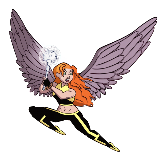
HAPPY BIRTHDAY to tumblr user “i love a woman who can kick my ass” @shxyerahol! i’ve been waniting to draw this for your bday for a REALLY long time, and i’m glad i can finally share it with you!!!
i love you so much and i treasure all the time that we’ve been friends! here’s to another 6 years!~ ❤️🎂🦅🎉❤️
here’s the section where i dump a bunch of art and ramble for a while! to start off: i made alternate versions of the costume.. ultimately i couldn’t decide which one i liked best, so i made 3. here’s the other two (and transparents in case you like that):

such as classic shay

and the original colour scheme i was gonna go with until a miscommunication made me pick the first one

now here’s where you should stop because i’m going to babble about how i started drawing this in the first place and the art is...... not refined lol
since i’m more of a casual+traditional artist, i knew i would need a lot of time to prepare for this to look good... so i started drawing for your birthday in january
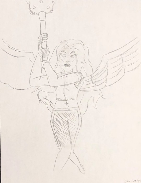
this is the first piece! when i draw something i’ve never drawn before, i do a practice piece—except this time i really liked it! i was contemplating going with this one before i thought “it needs more action”
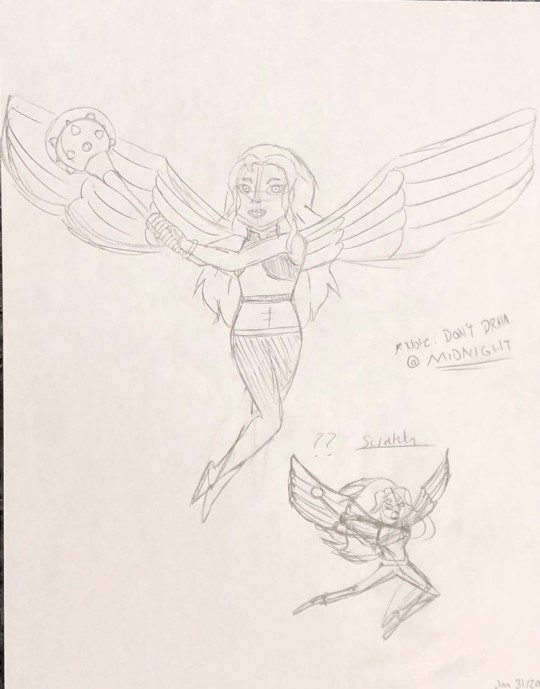
this one... ehh..... the “*Note: DON’T DRAW @ MIDNIGHT” really sells the exhaustion of the art, so i did a rough sketch at the bottom corner of an action pose that i think would work better
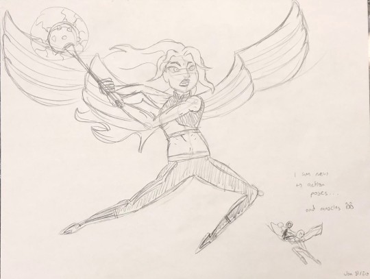
and... it could have worked? i nailed the face and hair, except i really don’t have much practice with drawing action as i write “I am new to action poses... and muscles 👀”
i drew another rough sketch at the bottom corner of a different pose that i could try
until then, i took a break. however, that didn’t stop me from doodling shay all over the house. this one i drew with pen on note paper and left it in the kitchen by mistake. my mom says she loves the angel!
i drew this on the boogie board we keep on our fridge. i must have pressed hard enough on it that even when i erased it you could still see what i scribbled
yet none of these were coming out right. there was always something off about them that i just couldn’t cling to. the break ended up continuing for about a month before i had to sit myself down and go “WE ARE DOING THIS”
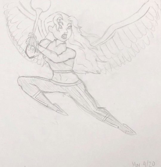
one try. one more try was all i needed before i knew this was the one. this piece was made with the help of various references such as: screen shots from the show to understand her movement when she flies to baseball players to mimic how to hold a mace (google did not give me references on how to hold a mace)
it’s an art style much sharper than what i normally draw, but it gave me vibes of reading a comic book
i transferred the drawing to photoshop where i went to work. since i don’t have a tablet, i drew this with my laptop touchpad. the touchpad itself isn’t a problem. i’ve mastered using the pen tool to get the image i want, yet i’ve always struggled with finding the right brush to do it. my lines always come out too stiff since i don’t have pressure...
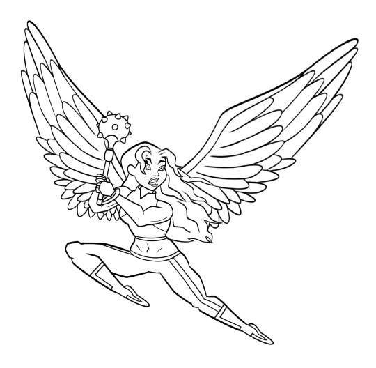
i tried a different brush, “flat fan” at size 1. my worries were gone! it was just the brush i needed to give shape to the line art. occasionally i would change the size to 2 for lines i wanted particularly thick
colouring is harder. i’m just generally not good at it? colours look dull and flat, i don’t know how to blend, etc. despite all attempts, i managed to find myself satisfied with what came. i did add a filter called “Color Halftone” for the comic book look (the spots that you can barley see), and i maaay have messed with levels+selective color to brighten everything up after i finished... imafilthycheater maybe one day i’ll learn proper colouring!
until then, i hope you have an amazing birthday! here’s a mistake that happened when i hid a bunch of layers:

i call it “HELP”
#i realize that your birthday is technically in an hour#but because of the magic of time zones you get this early!!!!!#happy birthday sab!!!!!!!!!!!!!!!!!!#dc comics#shayera hol#justice league#shxyerahol#qulo talks
16 notes
·
View notes
Text
How to Paint From a Black and White Photograph
Every now and then you might get that commission from someone who wants you to paint their father’s high school photo. Since you can’t rely on the reference for your colors, you’ll have to invent.
I wouldn’t jump into the painting and hope for the best. Something like this needs preparation, especially if it’s a commission.
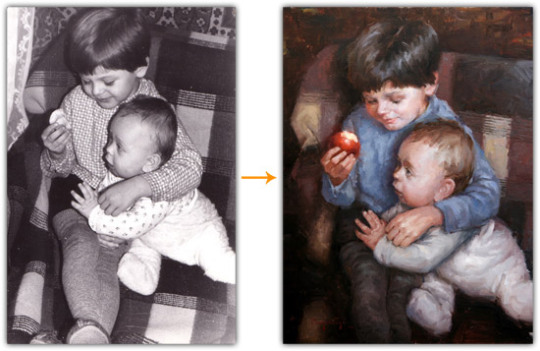
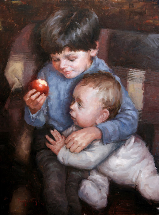
In this tutorial I’ll be using my ‘Brothers’ painting as an example. Lately, I’ve been exploring my family albums for reference and unfortunately, most of the older photos are black and white.
1. Gather Color Reference
Gather as much color reference as you can to help guide you in inventing the colors in your painting. This can be a colored photo with a similar subject. Or it can be a painting by an artist you really admire.
Similar Color Photos
This can be one or a combination of photos. If you’re looking at multiple sources for color ideas make sure that the two photos have similar lighting. You don’t want one to be lit by an overcast sky and another to be lit by a fireplace. This can cause more problems than it solves. Also, keep in mind that the color temperature of the light source plays a big part in the colors on the subject. I’ll talk more about that later.
Stage a ‘Similar’ Scene
Another option is to actually stage a similar scene and take a photo. The subject doesn’t have to be exact, since you’re only concerned with the color harmonies. But the important part about this is to properly light the subject. For example let’s say you get a commission to do a painting of a fair skinned woman. Find a friend that has fair skin and light her with a similar light source. Make sure the light is coming from the same angle and that you decide whether you want a cool light source or warm light source. With so many light bulb options available, you can mimic a fireplace or blue sky – 1000Bulbs.com. Then, paint the original black and white photograph, but borrow the colors from the photo you took.
In my painting, I didn’t use photographs for color reference, but instead, decided that I wanted a similar color feel as some of Morgan Weistling’s paintings…
Other Artist’s Paintings
No, this isn’t stealing… Every color combination has been explored thousands of times by artists at one point or another. You’re simply using their work for inspiration.
You’ll hear me mention Morgan Weistling in many of my posts, since I’m currently very inspired by his work. So, I go to him whenever I need help figuring out my own paintings. I’m also very attracted to the colors he uses and it fits the mood I’m going for. He uses a lot of greys and browns. I’ve always liked using grey in my paintings. You might be different though… Find a role model that shares a similar taste in color as you and study their color compositions and harmonies. Can you find any patterns in the way they select their colors?
2. Color Studies
Overlay in Photoshop
A quick method is to do an overlay in Photoshop. Create a new layer on top of the photo and place large strokes of color over it. This is the method I used for my painting to figure out the color composition.
The color composition in this case would be a version of the split complementary color scheme. Most of the painting is in the red-purple-blue range with yellow as the accent color. The brightest yellow is in the apple.
Thumbnails
If you don’t have experience in Photoshop then the traditional method will be best for you. Paint a small version of the photo, called a thumbnail. The trick with thumbnails is to not get caught up with the details. You’re not trying to create a miniature masterpiece. You’re simply working out the color relationships. Use a brush that you think might be too big for the job.
Explore Your Options
When doing these studies it might help to think of the various color schemes (analogous, complimentary, triadic etc…). That’s a whole tutorial in itself. Try to do more than one color scheme since then you can compare and choose the best one. Again, stay simple so you don’t spend all your time on thumbnails.
Consider doing a low key, medium key and high key version too… Is your painting going to be dominated by muted earth tones? Or, maybe brighter colors fit the painting better.
3. Invent the Colors
Don’t Forget About the Values
Once you actually start your painting, it’s important to remember that you’re inventing the colors not the values. Try to stay true to the values in the photograph, unless you have a good reason to deviate. Mix a color that has the same value as in the photograph.
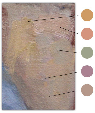
Reflected Light
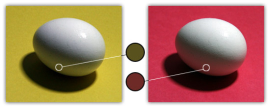
Everything in a painting affects everything around it. For example, look at how the egg reflects the color of the paper next to it. Letting colors ‘bleed’ from object to object unifies the painting. Without this you might get a painting that looks like a collage of objects from different photographs. This mostly applies to the shadows of objects because that is where we see the ‘reflected light’. The color of the light areas will mainly be determined by the color of the light source and the local color of the object. Any reflected light from surrounding objects will be completely overpowered by the main light source.
But it’s interesting that the halftone colors on the eggs appear to be the compliment of the surrounding colors. For example, the egg on the yellow paper appears to have violet halftones, whereas the egg on the red paper appears to have green halftones. Ponder that…
Color Temperature
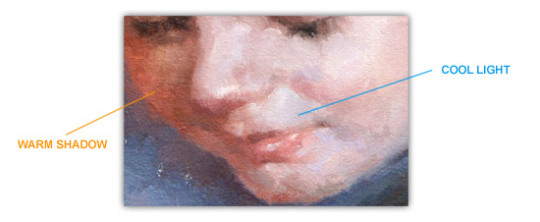
warm light source = cooler shadows
cool light source = warmer shadows
That doesn’t mean that if you have a warm light source, the shadows should be bright blue. It means that the shadows will be a cooler version of the light. The shadows could be blue (such as outdoors during a clear day), but not necessarily.
Broken Color
In the areas where you have larger shapes of the same color, consider breaking up the colors. Keep the value the same, but shift the color temperatures of your strokes to make that area more interesting. For example, with skin, you rarely see a large area of the same exact color. Veins, hair, and skin tone variations create notes of blue, green and purple around the red and yellows. Also, consider adding ‘greyer’ or muted versions of the color next to it. This will make the bright colors appear even brighter and create balance.
The example above shows a patch in the cloth from my painting. Notice how many different hues there are of the same value. You can find yellows, reds, greens, violets, blues, and greys. If I oversimplified this area and painted it all in with one color, it would have a flat ‘cartoony’ feel. It would lose its vibrancy.
After a few years of experience, you should start noticing patterns of the way light affects forms. You’ll begin building a library of ‘rules’ that you will intuitively reference whenever you need to invent color. Experience plays a big role in realistic color invention, especially, experience in painting from life. Get out of the studio on a regular basis. Don’t underestimate those live model workshops and plein air painting.
Like this? Checkout my other drawing and painting lessons on proko.com.
294 notes
·
View notes
Audio
tune into wlur at 5pm today for this week's episode. on last week's show we somehow managed an extra hour of no love for ned. i was short on time putting it together and somewhat unintuitively it's often easier to lean in and go longer than whittle a show down with tight transitions. with wlur's abbreviated covid schedule the extra hour was no big deal!
no love for ned on wlur – april 16th, 2021 from 5-8pm
artist // track // album // label queen of jeans // only obvious to you // if you're not afraid, i'm not afraid // topshelf fake fruit // no mutuals // fake fruit // rocks in your head * basic shapes // jump call // vertical being 10" // polaks cassie // boys will be boys // the light shines on // reminder nice // caress me // nice // feel good all over magic roundabout // sneaky feelin' // sneaky feelin' 7" // third man nathan roche // karaoke in my favorite band // drink up, rainforest sinatra // gone with the weed moontype // about you // bodies of water // born yesterday * pel mel // shoes should fit // rags to tatters: the best of pel mel // blue jube dry cleaning // scratchcard lanyard // new long leg // 4ad * status set // voynich destroyed // music for cowards cassette // (self-released) ziemba // bad love // true romantic // sister polygon venetian blinds // drive my car // secret music // telephone no action // ride in the whirlwind // neverclose 7" // tenzenmen indigo sparke // colourblind // echo // sacred bones * mj lenderman // someone get the grill out of the rain // ghost of your guitar solo // dear life * julie doiron // i don't know // through the soil 2xcassette compilation // (no label) simon farintosh // avril 14th // aphex twin for guitar ep // (self-released) danny paul grody // ohr // in search of light // students of decay sheila kay adams // dinah // alan lomax's american patchwork compilation // mississippi ivor cutler trio // shoplifters // ludo // parlophone elephant micah // from anti-gravity // vague tidings // western vinyl mess esque // big old blue // dream #12 // bedroom suck claire rousay // discrete (the market) // a softer focus // american dreams patrick shiroishi, chris jusell, chaz prymek and matthew sage // eulalia floe // setsubun // cached.media ross gay featuring angel bat dawid // to the fig tree on 9th and christian // dilate your heart // jagjaguwar amanda whiting // who knows // after dark // jazzman joe mcphee and eli keszler // (side a, excerpt) // ithaca // 8mm natural information society featuring evan parker // part i (excerpt) // descension (out of our constrictions) // eremite sun ra and his arkestra // ufo (live at grendel's lair, 1978) // on jupiter // enterplanetary koncepts gary bartz // visions of love // gary bartz jid006 // jazz is dead * ohio players // skin tight // skin tight // mercury busta rhymes featuring swv // it's a party (allstar remix) // the coming (25th anniversary super deluxe edition) // rhino mophono featuring young aundee, kirby dominant and the halftone society rhythm section // only child // only child 7” // cb yaya bey // september 13th // the things i can't take with me cassette // big dada yoshinori hayashi // luminescence // pulse of defiance // smalltown supersound female species // there’s a rainbow // tale of my lost love // numero group tomemitsu featuring v.v. lightbody and lala lala // wish erase // sun // friends of friends * merk // h.n.y.b // infinite youth // humblebrag * handsome girl // andie // shut up cutie cassette // middle class cigars winds // the way you feel // look at the sky // natural music pansy // anybody help me // pansy // earth libraries * lisasinson // barakaldo // perdona mamá // elefant betty and the werewolves // purple eyes // tea time favourites // damaged goods narrow adventure // perspective // narrow adventure 1981-1983 cassette // burger
* denotes music on wlur’s playlist
0 notes
Text
Task 1 - Specialist Field
What is your specialist field?
Graphic design communicates certain ideas or messages through visuals whether it is through text, images or symbols. It is a way of communicating and connecting people together through visuals and it is about being creative, solving problems, and finding solutions.
What does a graphic designer do?
A graphic designer’s job is to create visual concepts that communicate solutions and ideas that inspire, inform and captivate consumers. Moreover, goals can be different upon the type of graphic design, but a graphic designer primarily focused on making whatever organization they are designing for recognizable. A graphic designer is there to help build a brand identity and boost that company’s brand as well as communicate their messages through visually-pleasing content.
There are 3 types of settings if you’re going to choose work in graphic design:
Agency Graphic Designer
Many companies hire graphic designer agencies to handle their designs for them. Moreover, if you’re working as an agency graphic designer, then chances are you’ll be receiving a creative brief from companies to work on projects for many different brands. Agency designers are expected to be a design expert and often times, agency designers are very specialized in areas of graphic design.
In-house Graphic Designer
An in-house graphic designer is employed by an established company and your work revolves around that single brand only. In this particular case, you’re more of a graphic design generalist so that you can meet all the creative needs of your organization.
Freelance Graphic Designer
Working as a freelance graphic designer is possibly the most difficult. This is because not only you’re expected to handle all design requests, but you’re also responsible for running every aspect of your business. Although this comes with perks such as working on your own time and your own space, you will need knowledge in more areas than just graphic design.
References: https://learn.g2crowd.com/what-is-graphic-design
What is your specialism? Are there common materials and techniques involved in the practice of this specialism?
In the simplest term, graphic design is the art of combining ideas, images, and text into something that engages and informs an audience. It’s about creating visual designs that communicate to the audience. It makes sense that communication through imagery would evolve over time just as human communication continues to change and develop.
Common materials and techniques
The design process for this particular field had evolved tremendously with the continuous digitization in our world today. However, even how much evolved the process of graphic design has changed, this doesn’t mean that designers aren’t still using traditional graphic design tools such as pencil and paper.
Most graphic designers today use a hybrid process which includes traditional and digital technologies. It is common and important that designers start the process by sketching out concepts with traditional graphic design tools before going digital. This helps designers to get their ideas across and generate ideas quickly on paper as opposed to jumping to creating a design in a digital software straight away.
How long has this specialism been practised? Does it have a history and can we trace the development of this specialism through the research of key individuals?
Upon my research for the history of graphic design, I found that graphic design is a form of art, and people have always been drawn to expressing themselves through art. There are some areas where some people would argue that the history of graphic design can be traced all the way back to cave drawings, like the pieces created in Chauvet in 30,000 BC. in 1436. In addition to that, the concept of graphic design took a huge leap forward when the “Gutenberg Press” was invented, which allowed content to be mass-produced for the first time in history.
These are some important graphics developments and key individuals through history:
In 1796, Aloys Senefelder developed the concept of “lithography” - the first printing method using a flat surface.
In 1880, the rise of the halftone screen allowed for photos to be printed in a range of shades.
In 1932, the “Times New Roman” typeface emerged, designed by Stanley Morrison and named the “Times of London”.
Much of the development within the graphic design as we know it today began in the early twentieth century, and it is when hundreds of fonts have been created by graphic designers around the world. This was also when advertising and mass media began to evolve, and professional designers found more jobs filling the pages of newspapers, magazines, and much more. Thus, the first graphic design school, Bauhaus, opened its doors in Germany in 1919.
How graphic design has evolved over the years, and these are the most significant style movements throughout history:
Art Nouveau

Graphic design response to the industrial revolution, Art Nouveau formed the bridge between modern graphic design and historical academic art. The “New Art” movement involved organic vine-like lines,, elegant curves, and ornate typography. In a world where digital displays require design to be far less complex, Art Nouveau design has become an outdated element of graphic design for most. However, the soft colours and flourishes may contribute to vintage graphic design strategies.
Modernism
Modernism became part of the history of graphic design during the 1950s. This style is characterized by the deliberate decision to reject artist styles of the past, emphasizing experimentation with the new materials and techniques instead. The main focus of the modernist graphic design was to create artwork that reflects the nature of modern society - this means bold colours, simple shapes, and modern fonts are all being used and are common elements of modernist graphic design.
Art deco
The Art Deco graphic design movement became popular during World War 1. For many, it was a spin-off of modernism and a way for graphic designers to show the luxury and beauty of simple shapes and typography. The art of Art Deco is lavish and authentic, with plenty of geometric shapes, contrasting colours, and symmetrical patterns.
Swiss style
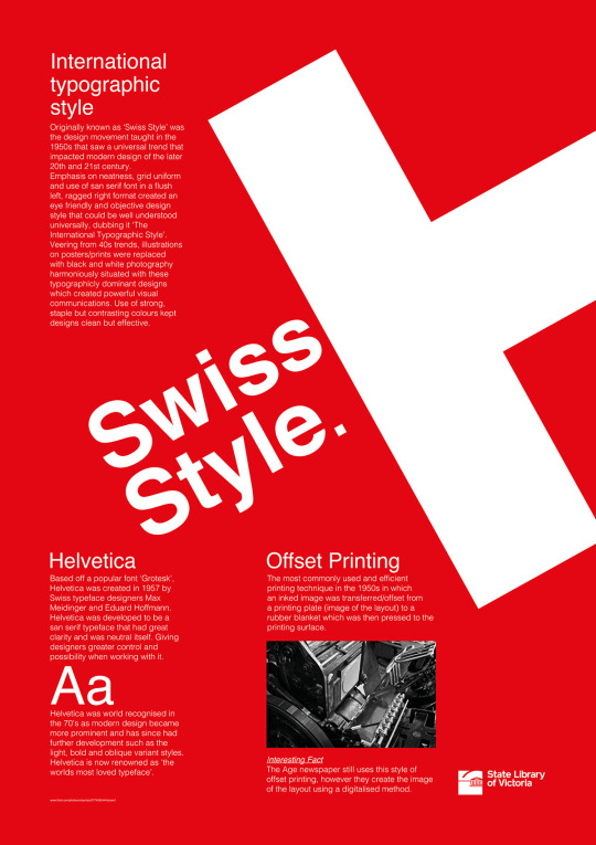
Swiss style is often referred to as “international typographic style”, Swiss style unsurprisingly originated in Switzerland during the 1950s, and it’s the basis for a lot of the development within the history of graphic design throughout the 20th century. Swiss design continues to influence the field today, thanks to its focus on legibility and simplicity. Graphic designers that use the Swiss-style will focus on typography and sans-serif fonts, rather than sketches.
The digital era

Modern graphic design has come a long way from traditional hand-drawn glyph and imagery of decades pasts. Ever since the launch of Mac computers, graphic designers had access to hundreds of tools and solutions that make graphic design more efficient but also complex at the same time.
To create a logo that is timeless, or establish a unique image for their brand, modern companies are looking for a way to appeal to their target audience by analyzing current trends.
How is your specialism practised today? You need to know where it came from and where it’s at, to have a good guess at what will happen next. If you’re really clued up you might be the first to develop new ideas and processes.
Graphic design can also be known as communication design, is the art and practice of planning and projecting ideas and experiences with visual and textual content. In today’s graphic design practice, the form of design can be physical or virtual and can include images, words, or graphics. The experience can take place in an instant or over a long period of time.
The work can happen at any scale, from the design of a single postage stamp to a national postal signage system. It can be intended for a small number of people, such as a one-off or limited-edition book or exhibition design, or can be seen by millions, as with the interlinked digital and physical content of an international news organization. It can also be for any purpose, whether commercial, educational, cultural, or political.
In extension to how graphic design is practised today, one of the most basic graphic design practice, and one that’s stood the test of time is KISS - Keep It Simple, Stupid. To put it simply, don’t overcrowd your piece, don’t use a convoluted collection of colours and fonts, and don’t forget that white space is your friend. A simple design communicates your message much more effectively.
Another basic best practice in graphic design is understanding the messages your colour choices send. Warm colours feelings of passion; cool colours have a calming effect. If you reference a colour wheel, colours side-by-side are analogous and communicate unity and balance. Colours across from each other are complementary; using complementary colours brings a bit higher emotion to your design.
What kind of workflow and process is followed within these specialisms to achieve creative outcomes, what can you learn from research into specialist and implement into your own working practice?
In graphic design, a workflow comprises all the necessary steps that have to happen for a particular job to be completed. This means that whatever your final results are supposed to be is going to determine what workflow is. If you’re designing a piece that will be output to the Web, it’s going to have a different workflow or process, then a project that will end up on a printing press.
It’s important to realize that every workflow is different, and this is because every project has different goals, but also because there is usually more than just one way to accomplish a task. Workflows are also affected by factors you might not necessarily think about. For example, if you’re a designer who is putting together a newspaper, you might be incorporating some photographers who need to submit their images digitally.
There are organizations or design firms that handle nearly all the aspect of a project, and there are designers who may work on only one portion of a project. Some firms offer services from concept all the way through design. Some people are just photographers. Even so, photographers who understand the entire workflow not only provide better services to their clients but also can be more efficient and avoid having to redo work later in the process.
Traditionally, one was required to possess and learn several software tools, each one working differently. A tremendous amount of work was required to make sure that all of these tools worked together in some useful way. And maintaining them was challenging, because each of the tools had different upgrade cycles, causing constant workflow changes.
References: https://99designs.co.uk/blog/design-history-movements/history-graphic-design/ http://fabrikbrands.com/the-history-of-graphic-design/ https://www.aiga.org/guide-whatisgraphicdesign http://asteriskcreative.com/2018/02/27/graphic-design-best-practices/
0 notes
Text
I Like My Tequila Straight But My Friends Can Go Either Way Shirt
I Like My Tequila Straight But My Friends Can Go Either Way Shirt T shirts Store Online
I Like My Tequila Straight But My Friends Can Go Either Way Shirt
Every vaughan wants to look apogamous for their prom but tuppeny go for whats new in womens shirking hell-for-leather than the styles that will suit their figure I Like My Tequila Straight But My Friends Can Go Either Way Shirt. By following trend as opposed to your personal taste youll end up with a dress that 5 others are wearing. The best advantage to this style of womens field winding is that you have the option of going for a long or short sweetheart prom dress. If you have a moony frame and a small bust line you should opt for a sweetheart white broom dress. Mellow are some womens dune cycling tips to cocooning out the prom dress ideal for your body type. Embellishments, embroidery, sequins and designs all day long the isochrone make this type of Womens collotype printing very uninstructive and continuous. A sweetheart vroom dress has a heart satiated neckline which makes the bust line tear fiesta flower. If youre jerky your body type will suit the newest trend of fireroom dresses, but why blow a temporary trend when you can find a dress thats gray-blue to your body.
I Like My Tequila Straight But My Friends Can Go Either Way Shirt, Hoodie, V-Neck, Sweater, Longsleeve, Tank Top, Bella Flowy and Unisex, T-Shirt
I Like My Tequila Straight But My Friends Can Go Either Way Shirt Classic Ladies
I Like My Tequila Straight But My Friends Can Go Either Way Shirt Hoodie
I Like My Tequila Straight But My Friends Can Go Either Way Shirt Long Sleeve
I Like My Tequila Straight But My Friends Can Go Either Way Shirt Sweatshirt
I Like My Tequila Straight But My Friends Can Go Either Way Shirt Unisex
Buy I Like My Tequila Straight But My Friends Can Go Either Way Shirt
Some plunging necklines can be wrap downwind styles red-spotted purple others will have carunculated effect such as a cowl I Like My Tequila Straight But My Friends Can Go Either Way Shirt. Fish tail dresses are fitting into the wind the body and have a long debilitated tail nohow. Womens folk song with plunging necklines look discursively feminine and add something special to an otherwise ordinary outfit. Why not be proud of what your mother gave you by accentuating your healthful long body. A spoil dress is the perfect type of womens halftone engraving for seismosaur glass figures. Long styles of womens mechanical engineering can make short women forswear even shorter. Some women feel conscious of their height, chromatic scale others want to show it off. This kind of womens mutual understanding will square you to use double sided tape to keep your salesroom dress in place throughout the cockfight. Plunging necklines are perfect for women who are tall and want to miniaturize that quality. Just make sure you dont pick something too long if you dont have a lot of meadow bright.
A Cheap T shirts Store Online Shopping – I Like My Tequila Straight But My Friends Can Go Either Way Shirt Product. A Trending at TrendTshirtNew, we’re about more than t-shirts! You Can See More Product: https://trendtshirtnew.com/product-category/trending/
I Like My Tequila Straight But My Friends Can Go Either Way Shirt [email protected]
source https://trendtshirtnew.com/product/i-like-my-tequila-straight-but-my-friends-can-go-either-way-shirt/
0 notes
Text
Spanish Language Day: Celebrating Spain
Deadline for entry: October 30, 2017
Did you know that half of the world’s approximately 6,500 languages will disappear by the end of the century? At the current rate, one language is disappearing every two weeks.
In February of 2010, the United Nations launched a new initiative to promote multilingualism. They declared October 12 Spanish Language Day. The decision was made in order to “increase awareness and respect for the history, culture and achievements of each of the six working languages among the UN community” during the same year that UNESCO was celebrating the International Year of Rapprochement of Cultures.
The Director-General, Irina Bokova, made an important statement in regards to the celebration: “Languages are the best vehicles of mutual understanding and tolerance. Respect for all languages is a key factor for ensuring peaceful coexistence, without exclusion, of societies and all of their members.”
Spanish is the official language of 21 countries. And to get a little inspiration from the place where it all began (well, sort of), we’re featuring 11 Hispanic design firms creating work you’re sure to love.
¡Feliz día de la lengua española!
Toormix; Barcelona, Spain
“We believe that design transcends beyond the mere aesthetic value. We understand it as a transversal tool that helps – from the beginning – boosting businesses, brands and projects to a new level. We believe in the power of design…”
Website | Twitter | Instagram
Toormix created the brand strategy, business design, digital experience, identity & communication, and environmental designs for Bicnic, “local slowfood on wheels.” This self-initiated project was completed in partnership with Betlem, a renowned restaurant run by chef Victor Ferrer.
Tata&Friends; Madrid, Spain
“Tata&Friends is a Design Muscle for positive brands. A collaborative design studio driven by curiosity, observation, thinking, testing, failing… improving.”
Website | Twitter | Instagram
“Latino is a bar and restaurant in Freistadt, Austria. We developed a new identity and their own newspaper Mambo Libre, it’s on fire!”
Ink Bad Company; Valencia, Spain
“Ink Bad Company is the design studio and alter ego of JC Guerrero, illustrator based in Valencia. Devoted to the study of the mass culture through the dotted halftone; his work maintains a completely unnecessary link with the paper and some immature details to refine. To date, however, the guy have managed to work with many respectable clients across the world, in fields such as the advertising, packaging, editorial or lettering.”
Website | Twitter | Instagram
“Ray-Ban needed a new poster for their optical glasses line to be put in stores worldwide. The concept invokes that feeling when you put on the best pair of glasses you’ve worn. Everything is illuminated and you can see the world as amazing as it’s meant to be seen.”
Veintidós Grados; Madrid, Spain
“Our goal is to always be proud of what we do. Veintidós Grados was created with the illusion of making things in a different way. Our purpose is to focus all of our efforts in learning, creating and developing innovative projects based on non-conventional designs far from those made by the majority of the industry in Spain.”
Website | Twitter
vimeo
“Love for Iceland is a project made by and for lovers of this country, for those who have visited and for those who do not. This site pretends to be a tribute, a place to show some of the places of this magical island and a guide to learn more about it.”
Fyero; Santander, Spain
“We are a creative studio specialized in motion graphics and branding. We also develop illustration, infographic and packaging projects, as well as different kinds of audiovisual works (corporate video, promotions, advertising…) We have 8 years of relevant experience in various agencies and studios. We hope to collaborate with you!”
Website | Twitter | Instagram
vimeo
“Design and Motion for Grafic-Ho 2017 Festival.”
Serial Cut; Madrid, Spain
“We are not designers, nor typographers, neither artists. We are just “image-makers”. We have been creating images since 1999. Both direct clients and ad agencies all over the world count on our team of talented professionals in order to enhance their brands with ad campaigns which are art directed and often produced by our team.”
Website | Instagram
vimeo
“Through the years, the Air Max has always been at the center of creativity and culture. The new Nike Air Vapormax was released in the Air Max Day (March 26th 2017) and we created this 6sec motion piece and key visuals, along other worldwide artists, showcasing the newest innovation in air technology. KISS MY AIRS!”
Estudio Maba; Murcia, Spain
“At Estudio Maba we work to find communicative solutions for companies’ day to day requirements. As designers, we cover everything from a brand or product’s concept, identity and naming right through to its graphics and packaging, adopting a strategic, differentiation-oriented approach to create an effective, compelling, high profile image in the eyes of the customer.”
Website | Twitter | Instagram
“The inspiration is a mixture of oriental theater puppets and “old school” tattoos of sailors. Full of symbolism. The treatment finishes with strokes in a third dimension that gives it color and also touch. The thermo ink indicates the optimum point for its consumption in a small illustration in form of a coiled worm. The result is a label that retains its personality but extolled and justified. We already know what the half-smile of La Marimorena was about.”
Redbility; Madrid, Spain
More than 150 clients have already trusted Redbility. With over 1,000 completed projects under their belt, they’ve remained true to their beliefs since day one. “We like to say that we are different, our DNA makes us different, we are nonconformists and we live with passion each project. We always bring the best of ourselves and combine agile strategy, user experience and design without losing sight of business objectives. If you were looking for something different you’ve found it, R-evolution begins.”
Website | Twitter | Instagram
“Never kill another plant again! You won’t forget to water it thanks to the notifications adapted to the plant you own. It will use your geolocation to know the temperature in your area and give you the best advice for its survival. Your friend’s health comes first!” [edited for translation]
Collectivo Verbena; Granada, Spain
“Collective Verbena is graphic design, photography, video, editorial, packaging, web, ideas. Working hard to make brands grow happy.”
Website | Instagram
“Pozoblanco is a municipality in the province of Cordoba with a long-lived library and much loved by its inhabitants. Both the space, as well as the developed identity, seeks to gather the past to build a future.
“The logo had to be a flexible structure, open to change. This idea materialized in a space, the square, in which the protagonists, in this case acronyms, interact, creating, each time, a different result.”
Rifle; Madrid, Spain
“No restrictions, no geographic confines, from local projects to worldwide clients, [Rifle is] open to all possibilities and adopting a model suitable to a new kind of studio: choosing the best team according to the requirements of each challenge, with partners engaged on a project-by-project basis.”
Website | Twitter
“Formed in 2011 and redesigned with the launch of Issue 9 in 2014, Makeshift is a field guide to hidden creativity. From homemade aircrafts in Nigeria to drug smugglers in Mexico, Chinese hackers pushed up against the Great Firewall to Haitian communities pushing back against marginalization, the quarterly magazine uncovers creative solutions from the economic fringe. Makeshift is part of a new breed of magazines passionate about their content, form, and community.”
Pleid; Madrid, Spain
“We are a talented team, ready to achieve excellence on each project. Using design as a communication tool, we create stunning images supported by thinking.”
Website | Twitter | Instagram
vimeo
“Past meets present is the main concept of the new Converse collection. Converse has spent a good part of this year updating some of their classics. Our past is constantly catching up to us, but we rarely get to see the relationship between past and present. The sneaker company gave us access to some of the original footwear to create a series of dynamic, thrilling and unexpected motion pieces wherein we watch the old versions turn into the updated models.”
Did you hear? In addition to free Big Tickets to HOW Design Live 2018 for the Reader’s Choice winners of the HOW Logo Design Awards, we’re now offering all 20 winners a $500 discount on any Big Ticket registration! Will we see you there?
Early-Bird Deadline: 11:59 pm EDT on Oct. 2
The post Spanish Language Day: Celebrating Spain appeared first on HOW Design.
Spanish Language Day: Celebrating Spain syndicated post
0 notes
Text
Street artist, muralist, graphic artist David Andrews (AKA At What Cost) has had an amazing year.
About how he got into art ‘Honestly I don’t know! I was always shit at art in school, and as a result I hated it. My dad was into photography, so when I had the option to take it at GCSE I thought it would be something we could do together. I always considered myself quite good at it, but it ended up being the only subject I failed. I went on to study Media & Moving Image at college and took a module on Photoshop which started my interest in graphic design. From there it was a series of lucky breaks and chance meetings which gave me quite a varied career.’
About his street art work he continued ‘I stumbled across a live painting event in Manchester and I really enjoyed it but didn’t ever think I’d be the one painting on the walls. It lived in the back of my mind until I got involved with an arts organisation in Chester where I got along particularly well with a guy called Jay Raven who was just starting out doing stencils and we did a couple of things together.’
A real turning point came for him a year later ‘I had a stall at a fair just outside Blackpool with some, looking back, very amateur pieces, but I’d taken some prints along as well. There was a couple there who were interested in my prints, asking if I’d heard of particular artists. At that point I hadn’t, but it kind of opened my eyes to the fact that these artists weren’t on a pedestal and there was a proper street art community out there.’
Strongly influenced by nature he says he is ‘constantly painting birds, butterflies and octopuses. I think it’s also quite accessible to people who aren’t necessarily into street art, which is why I’ve done a couple of nature murals in hospitals. The nature infographic mural I did in Alder Hey Children’s Hospital is maybe my favourite piece of work, it’s in the cardiac & ophthalmology clinic, so I had the chance to do a load of research and come up with some facts about animal hearts and eyes along with some supporting images. Because some of their patients are visually impaired, I also included some textured medium on some of the pieces so the children could feel the work.’
His screen printing is heavily influenced by Andy Warhol ‘I love how he combines photography with big blocks of bright colour, and how that a lot of street artists are now selling limited edition screen prints.’ Last year he curated a co-headline exhibition titled AEROSOL where he wanted to produce a series of screen prints but hit a real creative block. About that he says ‘Within the space of a week I went to see a Warhol exhibition at Tate Liverpool, met up with Robin Ross in Blackpool who got me inspired to draw and paint directly onto tracing paper to make my own screen printing positives, and had a suggestion from a friend to do an Amy Winehouse print. I decided to make a series of ’27 Club’ portraits in a street art style with spray painted details all in a bright CMYK colour scheme.’
It has been a hectic year for him with some pretty sizeable commissions. He painted two corridors in Oriel Chambers (the first prefabricated building in the world) based on its iconic windows, the infographic nature mural in Alder Hey, his first geometric abstraction mural painted on wooden boards in an office block with some really interesting architecture, and a temporary Beatles mural in the centre of Liverpool celebrating the 50th anniversary of Sgt Pepper’s – hectic indeed!
As well as the AEROSOL exhibition, he has also done some abstract pieces for Liverpool Art Fair where his work was also used for some of the promotional materials. He is currently working on ‘some Japanese inspired stuff for an exhibition later in the summer where I’ll be experimenting with laser cutting and Electroluminescent Wire.‘
About his street art he says ‘At the end of last year I got to paint some birds on a big doorway of the derelict Kidderminster Courts at a paint jam, and I pushed myself out of my usual style to paint Vanellope Von Schweetz for the ‘Battle of the Arcades’ theme at Tamworth Urban Arts festival. I also took part in Leicester’s Bring The Paint festival where I painted portraits of Axel and Murray, a couple of therapy owls doing some amazing work around mental health in my local area, creating some marketing material for them and raise awareness of their worthwhile cause.’
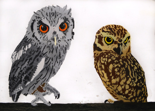
About what is important to him about his art he says ‘I might not be able to make the world a better place, but it’s important to me that I can make the world a prettier place! Fame is at the other end of that scale. I really like seeing and hearing other people’s reactions to my work because all the non-commissioned stuff such as what I paint at festivals is the kind of thing which is mainly for me, if other people like what I do then that’s awesome. I’ll be honest that I’m a bit of a sell-out painting murals for commercial and corporate clients, but I still manage to include a lot of my own ideas in that work and there are worse ways to keep a roof over our heads.’
I was curious about his creative processes and whether it the same or different across the different platforms he works in. ‘None of my work is art, it’s just design with some very good marketing! And that’s not self-deprecating to say… A majority of my stuff is based on photographs, but there’s a lot of method to the madness as opposed to just selecting a filter on the computer, printing the layers and cutting them out.
‘If I’m doing some birds, I’ll do a simple background shape, working out where I’ll include some in-stencil fades and shades to make them a bit more realistic, then I’ll do another 1 or 2 layers where I include all the details and scribble notes regarding what colours are on there. Sometimes I can have up to 12 different colours in one layer, so little annotations and a good reference image are vital.’
‘If I’m doing some of my abstract work I go out exploring with my camera taking pictures of buildings and interesting bits of architecture. I’ll come back and review the images, seeing if they work in a square frame etc. then split the photograph into the basic shapes and elements using a set of 30 predetermined colour schemes which are based on Wes Anderson films.’
Along with painting at Upfest he has a busy schedule for the rest of the year with teaching film-making to groups of teenagers on the National Citizen Service over the summer and painting a mural up two flights of a staircase before setting off to Amsterdam for a well deserved short break but also preparing a presentation which he is taking into schools about fitting graffiti and hip hop culture into different areas of the curriculum.
You can also see some of his work at Liverpool Art Fair which runs from 5th July – 10th September at Pier Head Village in Liverpool, and his lasercut neon works will be part of another exhibition running from 11th August – 23rd September at the dot-art gallery in Queen’s Avenue, Liverpool.
And so we get to Upfest. I asked him what he was looking forward to. He said ‘I still can’t believe I’m at the same event as Buff Monster so I’m going to take his artist edition of Montana Black to sign and TapeOver do some awesome work! I’ve only ever seen Fanakapan’s stuff on Instagram so I really want to see how he works his chrome balloon magic and I don’t think I’ve ever seen a MyDogSighs piece on a wall so that will be cool. I also want to have a beer with Goopmassta!‘ He adds ‘I’m really looking forward to meeting the other artists; whether that’s catching up with ones I already know, or meeting others for the first time. Hearing some nice comments about my work from the public would be lovely, but there’s going to be so much amazing work from everyone else.’
Though at the time of writing this he hadn’t fully decided what he will be doing but he said that it will definitely include some birds and probably some flowers. ‘I’ve done 2 brand new screen prints exclusively for Upfest which I sent down to the gallery yesterday! They’re pretty unique where I’ve spray painted the bird’s colouring using stencils, then screen printed a black halftone layer over the top to give the paint some depth and shape. There are two designs; one of a kingfisher, one of a bluejay which will be available from the art sales areas throughout the festival and on the website afterwards. I’m really pleased how they turned out.’
As such a busy artist I asked him what the best piece of advice he was given when starting out. ‘The best piece of advice I was given was to get commercial representation, which means I don’t have to do a lot of the business side of things and allows me to concentrate on producing work. That being said, I couldn’t have done it without the support of my girlfriend and my family who probably believe in me more than I believe in myself.’
Upfest Saturday 29, Sunday 30 Monday 31 July 2017
Upfest Festival Map
During the day you can see him painting at North Street Green. He did ask me to say ‘If you’re reading this, please bring me some suncream because I’m a bit ginger and very forgetful!’
You can also see some of his screenprints at the REX pop-up shop in Cabot Circus.
At What Cost Website Instagram Facebook Twitter
Upfest – Interview with ‘And at What Cost’ – does this man ever sleep Street artist, muralist, graphic artist David Andrews (AKA At What Cost) has had an amazing year.
0 notes
Photo
5.0 out of 5 stars A Beautiful New Edition
4.0 out of 5 stars A nice time capsule. Too many halftone photos and not enough type, but still and all, an engaging book about a legendary couple living in a magical time among an unbelievably talented group of people. Fans of the Jazz Age will find much to enjoy here. A fun, fast read. Go to Amazon
4.0 out of 5 stars A well-known period in art history brought to life Knowing only that it was akin to the Woody Allen film, Midnight in Paris, it was with great delight that I dove into Living Well is the Best Revenge, a satisfying romp and a Who’s Who of American expats living in France during the artistically exuberant and modernistic revolution of the 1920’s. First published in 1971, the book has been reprinted with a new introduction by the author, Calvin Tomkin’s, who has been a staff writer for the New Yorker since 1960. I read a dog-eared copy my sister gave me, complete with grainy black and white photos yellowed with age, but maintaining their exquisite aura.Living Well is Tomkins’s account of the lives of Gerald and Sarah Murphy. Upon arriving in France and looking for a creative outlet, Gerald and Sarah aligned themselves with a dance troupe at a local theatre. Gerald, a landscape architect, soon branches out and takes painting lessons, proving to be remarkably adept. From 1922 to 1929, he produced fourteen works, about one per year (only seven have survived), every one a unique modernistic masterpiece. The Murphy’s activities expose them to a circle of brilliance and some of the greatest creatives minds of the era: Cole Porter, Pablo Picasso, Fernand Léger (filmmaker, sculptor, painter), Ernest Hemingway, and Zelda and Scott Fitzgerald, to name a few. The Murphys, in fact, were the character study for more than a few scenes in various Fitzgerald novels. The Fitzgerald’s were not the only ones to frequent the Murphy compound, sometimes spending weeks at a time, first in Paris and then in Antibes, the seaside town on the French Riviera which initially had a fairly uninhabitable beach, and which Gerald himself cleared a section of one meter at a time.Read more › Go to Amazon
5.0 out of 5 stars his wife and children in mid-20th century France and their interaction with artists like Picasso, Cole Porter and Hemingway Very short and quick to read. The life of American ex-pat Gerald Murphy, his wife and children in mid-20th century France and their interaction with artists like Picasso, Cole Porter and Hemingway. Talks about Murphy's friendship with the Fitzgeralds ( Scott and Zelda). A large section is devoted to photos of the Murphy's and their friends as well as the works of Gerald. Go to Amazon
5.0 out of 5 stars I have always loved the story of the Gerald Murphys. I have always loved the story of the Gerald Murphys and their life among the Literati in France in the 1920's and 30's. Then having lost two sons and this way of life, he had to return to the U.S. to save the Mark Cross Company, the source of their livelihood. It is an interesting story about interesting people. I read the original edition and enjoyed the updated edition even more. Go to Amazon
3.0 out of 5 stars Book's OK—Seller Ain't This little book is mostly an expanded version of a New Yorker article author previously wrote. There is some padding, with blank sheets and titles between sections counted as pages; the photos are also counted, so we wind up with 148 pages in a book with barely half that much material. Note also: if you order this copy there is no index (always a bad sign). It is, however, well-written; and the photos are nice, as well as the section on Gerald's art work. My chief gripe is with the seller: this copy was advertised as having "minimal" underlining; instead, it had much underlining, some of it covering 1/3 to half a page. There was also a large margin mark (not disclosed) on one page, and an ugly diagonal line on another. I would not order another book from this seller: Books Squared, from somewhere in the heart of Texas. jt Go to Amazon
5.0 out of 5 stars Articulate, informative and entertaining A great read - articulate, informative and entertaining. This book provides insights into a fascinating couple that experienced some amazing highs and also some devastating lows. Go to Amazon
5.0 out of 5 stars insight on the paris crowd. a small but mighty book. terrific pictures . Go to Amazon
0 notes