#had to define his muscle structure because he's gotta look big and intimidating
Explore tagged Tumblr posts
Text
I just realised that I never posted this here, I was scared that it might be too much for tumblr, but technically I posted worse and he’s not doing anything sus, he’s just... there. Being himself. So...
Enjoy

#anatomy study#nothing sus going on here#had to define his muscle structure because he's gotta look big and intimidating#Not saying you can't simp tho#older doodles#cotl au#cotl gang au#cotl red district#red district au#cult of the lamb au#cult of the lamb narinder#cotl narinder
280 notes
·
View notes
Text
Not to be off topic on the main here but as a pretty boy enthusiast and a fan of Guilty Gear; I've gotta say, I'm not entirely thrilled with the decisions made for the Strive designs.
Guilty Gear's always been kinda unique in that it's a fighting game that has a lot of variance in the body types of its characters. Well, specifically its male characters - there's a bit of variation in the female body types as well but this is undermined by the fact that the women of Guilty Gear are all well endowed with a few exceptions like Ramlethal and May but honestly, that's a discussion for another time. In any case, fighting games have historically been a genre where the male characters are either grotesquely buff or slender anime pretty boys and there's little in between.
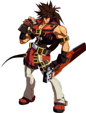
Guilty Gear managed to pretty admirably give a lineup of men who, while they were all muscular, did not have what I lovingly call Street Fighter Syndrome in that they were all the same degree of Totally Jacked. For a few examples just look at the differences between Sol Badguy and Axl Low (I'm going to be using their Xrd/Rev designs)

Sol is top heavy; he has a very defined chest and arm region - which reflects his fighting style as a character whose main weapon is a sword that's much more bludgeoning weapon than anything sharp - and has a notably slender waist with similarly slender hips, legs etc. His 'hourglass' figure's been a part of his design from as early as I can remember but with the turn of Xrd, the artists were able to exaggerate his body type to what I like to think is what was supposed to be its natural extreme.
Contrast that with Axl Low

Who isn't actually particularly muscular but rather just possesses a very average male figure with especially defined legs. Axl isn't buff, he isn't thin, he doesn't look like he exercises religiously outside of maybe being someone who runs/does marathons - but that's okay because it's still an acceptable body type for some random breadass british dude who's having a grand old time figuring out his place in the world. Axl just looks like a guy.
All of that is to say, Strive does away with all of the nuance of these great, varied designs to just make everyone the same flavour of 'stereotypically fighting game buff' and I absolutely despise it. And here's what I mean.
Enter Ky Kiske.

Ky's as generic slender anime pretty boy as you get. Even if he's similar in build to Sol in that they're both more defined in their chests and arms than they are in their legs, Sol is obviously the broader and more muscular of the two. Ky looks, well, pretty. His arms are particularly thick, his neck isn't particularly defined, he has very delicate facial features - thin jaw, fair hair, flowing clothing that accentuates his grace and technique as a swordsman more than it serves to intimidate or display his body. And Ky has always been designed like this. This is his Xrd design, but here are a couple of his older looks as well:


Man had always been a slender figure with his belt pulled a bit too tightly and his general figure loose and unfocused on his non-existent musculature. So, please, please for the love of god tell me why Ky looks like a completely different character for Strive?

THERE IS SO MUCH WRONG HERE I COULD WRITE A BOOK - but the spark notes version:
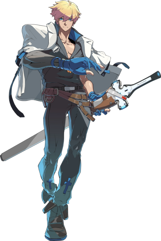
Why is his body so much fuller?? Ky has been a twink since inception, one cannot change their body structure/type to spontaneously develop a broader waist/hip when for the past 20 years, Ky's been sporting notable disparity with these measurements.
Getting rid of the loose flowing silohuette is troubling enough considering that's just kinda the look he's had for a hot minute, but his colour scheme is so wildly off. Black and greys are Sol's colours - and as Sol's contrast character limiting that to just the coat hanging over his shoulders is clever I guess but it is in no way enough to visually discern Ky from Sol from a distance or, indeed, when they're fighting and shit starts getting crazy. Ky's always sported a white and blue motif and if y'all were gonna give him waist fillings the least you could've done was keep his colour palette consistent.
I hate the way they phoned in his cross motif. Ky is a pretty devoutly religious man and that was openly obvious in prior designs. Now his cross motif is limited to the shape of his sword's hilt/guard and two pitiful dark blue crosses above the hem of his pants which aren't even noticable because his pants are fucking dark grey--
HE'S INDISTINGUISHABLE FROM HIS FUCKING SON
And this, ultimately is the big problem I have with the new designs for Strive. Guilty Gear has always had very striking and recognisable silohuettes and designs which made liberal use of things like body type to distinguish and characterise its characters from one another. This sort of bombastic and detailled designwork stopped the characters from blending into each other and it did wonders for keep track of characters when there was a lot going on - even if they mirrored each other or were literally based off of another character from the series.
Ky Kiske and his son, Sin are visually very, very similar. Their physical differences are the only thing we have to distinguish them since they share a colour palette and the character designers for Xrd took advantage of the fact that Ky was much more on the slender side to create visual contrast between him and his son who looks like this.

Sin has a stocky build. He's heavily muscled, his design is built around showing off how jacked he is. He barely has a waist, has arms for days, you could slice cheese on his abs - and because he has short hair, in Xrd, they did a pro gamer move and had Ky grow his out.
Now, however, in Strive - how are you meant to tell the two of them apart? Not only has Ky cut his hair short again, but his body type is no longer slender but rather is the same stocky, heavy set/buff build that Sin has - something that really doesn't suit the aristocratic swordsman that Ky's always been.
By beefing up the characters, the designers for Strive have erased a vital, vital part of the character of their characters and it's a damn shame because Guilty Gear was one of the few fighting games left that had genuine variety in muscular body types and forms without fetishising or exaggerating the human form to disfiguring degrees.
#ginger rambles#guilty gear#guilty gear xrd#guilty gear xrd revelator#guilty gear xrd rev 2#guilty gear strive#discourse#listen y'all gotta be fucked up if you fucking think I'm not still mad about this#DID Y'ALL SEE WHAT THEY DID TO CHIPP#HELLO#HE'S A SHINOBI WHY IS HE SO BULKY WTF#And Ky's always been a twink why not just keep him as a twink#and let's not even talk about what they did to zato and axl#God I get mad everytime I think about it hhh#sol badguy#ky kiske#sin kiske#axl low
44 notes
·
View notes