#gouache is both my favourite and least favourite paint to work with
Explore tagged Tumblr posts
Visit Tumblr Blog
Explore Tumblr blogs with no restrictions, modern design and the best experience.
Last Seen Tumblr Blogs


Fun Fact
US Tumblr user growth rate is estimated to slow down to 4.1%.
Text
🇦🇹 Tony Wegas - Maria Magdalena
#Tony Wegas#Maria Magdalena#Austria esc#Austria eurovision#esc 1993#eurovision 1993#the first Maria Magdalena#gouache is both my favourite and least favourite paint to work with
20 notes
·
View notes
Note
do you have paper recommendations (for both drawings and watercolor paintings)? i want to get back into traditional art and don't really know were to start. also what pencils do you use? and watercolors? or do you use guache? what brushes should i get? sorry i know this is a lot of questions but it is a bit overhwhelming and i really liked you're ghost paintings 😊 and i don't want to buy bad things
oh dear, first of all: thank you, I'm very happy to hear you enjoy my silly stuff! And it is always great to hear people getting back to traditional art, since it seems like almost everyone is doing digital art exclusively these days (this is NOT me shitting on DA, i love you digital art people).
Anyway, yes, there's *a lot* of options out there and it is so, so important to get at least okay-ish quality equipment.
Paper
Paper is, in my opinion the most important factor, especially for watercolour works. switching to good quality paper was an absolute game changer - 0 exaggeration!
Watercolour paper:
I use mostly Hahnemühle Britannia 300g/m² cold pressed with matte surface. it comes with different surface options, depending on the effect you want (rougher surface etc., but i don't vibe with that). it is still relatively affordable, but still, hurts the bank account quite a bit.
If i want to go for some more silly stuff, i use Hahnemühle Burgund 250g/m². because it's thinner it is cheaper (you just can't put as much water and as many layers on it, which, for my use case is usually perfectly fine).
If i want to go full fancy I use the Hahnemühle mould made 300g/m². It's handmade paper, not from trees but with fabric, it is incredible how well the colours work on this stuff. Many people use Arches paper, but that is way too expensive for me. and I'm very happy with the Hahnemühle.
The difference between cheap as shit no-name watercolour paper and some good quality brand paper is, and I cannot express this enough, incredibly big. those ugly rims and splotches and uneven colour fades? that's the cheap paper's fault, not yours. It made me really desperate thinking I'm just too stupid for art, when it wasn't my fault.
For drawings I also use Hahnemühle:
my favourite is Skizze 190: very smooth surface, very white and very affordable!
another is Nostalgie: It feels even smoother in a different way, is less white. at first touch they seem identical, but handle very differently. this one is just as affordable as the Skizze 190 one.
Cheaping out on paper means you'll pay with happiness, really. save your nerves and motivation and spend the money on nice paper. trust me.
I'm not sure, Hahnemühle is available wherever you live, but go to an art supply store (a good one) and ask for help there!
Pencils
I exclusively use Staedtler Mars Lumograph pencils these days. They are very consistent in their...abrasion? there's no hard chunks in the lead, and they cost very little. They also have the Lumograph Black pencils which have a high charcoal level, which is super cool when you have very dark areas, because it won't get super shiny!
Watercolours
I got myself a set of Lukas Studio Watercolours and added a few more that i use often/ needed more than the ones already included in the set. They're not very expensive (compared to other big brands that everyone seems to use) and i like them. I never tried the expensive Windsor etc. paints, though. The price is very attractive and I never had any problems with them.
I also have a Gouache set that I got second hand from my sister by Caran d'Ache. I don't know whether it's good or not, because I rarely use it, mostly for accents on my watercolour paintings.
Brushes
until very recently I used rather cheap but good synthetic brushes for ethical reasons. I accidentally bought a natural hair one and it was....extremely good. With a heavy heart I now switched full time to much more expensive Kolinskis. Ethically this is an absolute nightmare and I will try to buy as few as possible and use them forever before buying new ones. But they are, unfortunately, much better. I wouldn't necessary recommend the brand I used because they're bad at keeping a tip, though.
But if you're just starting: go to an art supply store and get 3 synthetic ones in small, medium and slightly bigger with a nice tip and you'll be very happy for quite a while, i promise!
I also highly recommend getting a Pentel Aquash as a starting tool and for painting outside (don't buy a cheap fake, they're terrible)
alright, I hope i could answer your questions and if you (or anyone else) wants to know more, just ask :)
6 notes
·
View notes
Text
Little white lies
Little white lies is a magazine created with the sole aim of capturing and reviewing movies through out the year normally printing 4 times a year quarterly, though the magazine has become more well known for its independent ethos and iconic, striking illustrative covers created by a new artists each time, deadicating its front section to upcoming theatrical release.
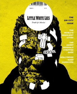
Sin City Issue 2 - Jul/Aug 2005 this one was one of the first early covers that stood out to me, reminiscent of early grunge comic styles used for the gritty Noir/Action graphic novels, fitting for the fact that the movie itself is based of the Sin city comics, the difference for this is that the artist for this cover has taken the features form the actor to then blend it with the style used for comics; heavy sett shadows sonf light shown but blacking out the ares where the shadows are completely in black and leaving the background showing through to show where the light hits, but they still show a lot of texture in the face by using what I can assume is almost like a dry brush texture, roughing up the face implanting the idea that this character is ether rough character or dangerous, the artist also hints at the story itself with smaller type and illustration shown in the form of tattoos hidden under the layers of grime and of what I would assume are plasters, I do like the white negative look off it.
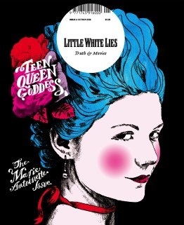
Marie Antoinette Issue 8 - Oct/Nov 2006 I personally like this one because the vibrant colours, hinting most likely to her more risky and existing life before she became romantic heroine that we know now in history, though its nice to at least learn more about the various females throughout history as there stores are normally erased or twisted, so for a historical drama I believe it works well, the one single figure of Marie Antoinette by herself standing out against the flat black background, making the character of Antoinette the main visual point of the illustration, because she is, looking at the portrait itself, id assume they took a image of the actor in their costume and thresholded it and then they most likely multiplied the layer so that they could then drawn underneath, similar to the techniques in the pen tool workshop.
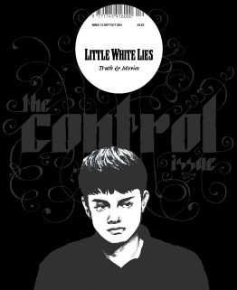
Control Issue 13 - Sep/Oct 2007 the cover for this one I like the monochrome colours and black used, it gives this feeling of hollow pared along side the mood the thresholded image of the actor, I particularly enjoy the typography the font strong and bold in its shapes has these spirals exploding, visually interpreting it as them loosing control which I thinks works very well for a sci-fi mystery thriller film, so meany lose ends left unsolved. the colour palette as I said before is monochrome which I think is a interesting handle on a typical cover the highlighting the character with lighter colours showing the characters important and stands out against the simple darker colour background and text.
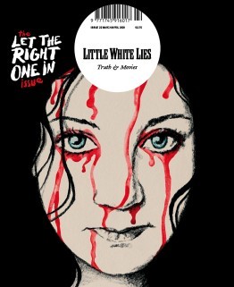
Let the Right One In Issue 22 - Mar/Apr 2009 This Swedish romantic horror film reinvented vampier in the love film, because lets be honest most vampire movie suck, the artist took one of the iconic scenes from the movie and beautify painted it with water colours and pencil/graphite, the iconic light eyes of the character shine through as the, watercolour blood drips down her face ones again reminiscent to the movie itself, I like the use of the hair being used to silhouette the face, the position/placement of the face itself it feels like its looking directly into your soul almost.
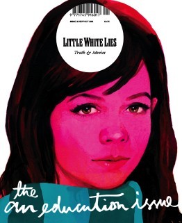
An Education Issue 25 - Sep/Oct 2009 I think this is a brilliant depiction of a coming of age movie, straight away introducing you to the main character, the bright pink hue, brilliantly used to show off the innocences of the character themselves, and that is pushed by the limited about of skin showing. the illustration itself seems to of been done with gouache paints considering the smoothness of the colours working together on the page, the hair, nose and eyes are my favourite, especially with the eyes and nose they have so much detail, you can see the youth in the eyes and the realistic look of them works so well and I love how the artist has used just shadow and light to detail the nose, and I like the hair personally because of the way they got light to reflect onto it as well as how it looks so soft and neat it looked.
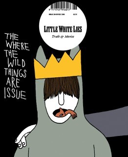
Where the Wild Things Are Issue 26 - Nov/Dec 2009 I wanted to personally wanted to look at this issue was because it relates to the movie/book that I am looking at now, I think this is a brilliant concept for the movie I personally love the childish simple drawing, reminding me of childish drawings, and I like the idea of the ‘wild things’ climbing from in Max’s mouth, I think this is brilliant due to the fact that Max has problems of acting out in such a wild way. it also relates to the original poster for the movie ‘there is one in all of us’, I like the use of the colours are quite depressing in itself, but in the realistic view of the movie where in the ‘real’ world the character maxi is struggling with the divorce of his family.
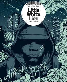
Attack the BlockIssue 34 - Mar/Apr 2011 This one stood out to me both because of the colour pallet and the style of the outline. The outline themselves reminds me primarily of the linocuts, I think it shows the mystery and the lack of empathy for there assailants and how the gang themselves blend together when the character is all one colour. I personally loved the background/the sky it has beautiful speckles of stars and meteorite shower. I don’t particularly understand the Artists use of smoke, id have to assume that it has a impact or relevance to the story itself but it beautify shapes that fit with the Lino style.
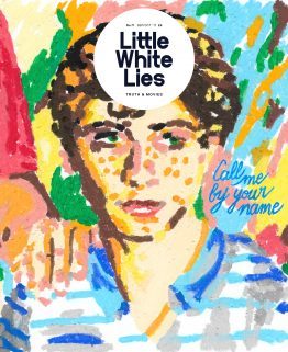
Call me by your name - issue 71- Sep/Oct 2017 I particularly like this illustration for this coming-of-age romantic drama film, though I personally don’t like cinematic worlds use of age gaps between their gay romantic relationships. but this particularly artistic interpretation, the oil pastils drawing dose defiantly scream coming of age movie and it also dose make me think of the link that combines with the main character being half Italian, the background flows but also seems to be pulled away from the page, maybe because of the fact that there is less gaps in the foreground, I also like there use of lighting its done well to be presented coming from the right side of the page. But the type that they used to show the title docent fit for the rest of the image, naturally I believe that the artists probably wanted to remove from the original type from the movie poster.
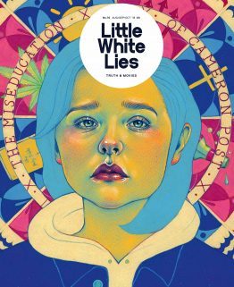
The miseducation of Cameron post Issue 76 - Aug/Sep/Oct 2018 I believe that this depiction of their movie, the colour used for the face is a direct reference to the film poster the yellows, green and pinks. the background gives away so much for the movie and the elements and its relationships with the story of being sent to a conversion camp, and the coping methods that one turns to. The expression on there face is a well done illustration of Chloë Grace Moretz, I honestly recognised her straight away without knowing that it was her in the movie; back to the expression itself shows so much betray, sadness and heartbreak all in one, its an expression that is shown through out the film a common apparition.
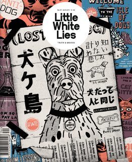
isle of dogs - Issue 74 - Mar/Apr 2018 I personally loved this movie, the entire stile used in the cover in the magazine is in the same style used throughout the movie itself, the movie used these 2D elements through out the stop animation. the posters show off so meany aspects of the movie the setting of the movie ‘the isle of dogs’ the science group trying to find a cure for the ‘dog flu’ it hints to the open scenes that were done in the original Japanese style. This is a common aspect in this imagery it has little elements of the story dotted around this.
2 notes
·
View notes
Text
Drawing Daily in 2018!
Hi, it’s me - Eliza! I decided to draw everyday for 2018 and posted the process in instagram. Each month I did a drawing challenge and each month I tried out a new medium.
January
Creatuary: Mythical Creatures. I was lowkey doing the Creatuanary challenge created by dibujantenocturno, joshuacairos_art, and rafater_official. What’s fun about Creatuanary was that they tell you what the prompt for the day only so you can’t really pre-plan and just have to do things on the spot. I think it’s a really fun exercise. The medium I used for this month was the Zig Brushable Markers. They’re for calligraphy but I like doing art with them, they’re super nice. I highly recommend them to anyone. They’re kind of my go to markers. Though, I haven’t actually experimented with TomBows or the Prismacolors or Copics at all so I’d take what I say with a grain of salt.
February
Faebruary: Fairies! There’s also FaerieFeb hosted by archibald.art and maxineart. This was super fun. This was one of my favourite challenges. I don’t know if it was the medium I used or the subject matter - probably a combination of both! I used watercolours - a Palette of Prang - and I really enjoyed it. I hadn’t used watercolours since I was in high school and I remember not exactly enjoying the experience overall but within three days of painting fairies I’ve gone aboard the watercolour boat and I don’t wanna get down!
March
March of Robots: Robots! Created by chocolatesoop - MoR is super bomb. I used Stabilo Boss Highlighters for this month and my big take is HIGHLIGHTERS DO NOT SCAN WELL. Or at all. Also, I hear they fade. So, it’s not really a medium that has ‘archival quality’. However, it was super fun. I love using bright obnoxious colours. Everything just pops! Also! They give away brand spankin’ new wacom tablets to five lucky participants regardless of skill level! I highly recommend anyone join this!
April
AstroApril: Constellations and planets! I couldn’t really find a monthly drawing challenge I wanted to do this month so I decided to make my own with AstroApril! I love the stars and galaxy art is always great so I figured why not? And - I decided to use coloured pencils - I got a pack of Prismacolors. Two things - one Prismacolors are the best coloured pencils I have ever used ( I’ve only used student quality sets thus far so I might not have the best grasp of the best coloured pencil sets) - they blend well and are so so creamy it’s such a dream! Two - I don’t recommend using coloured pencils when doing galaxy art. It was fun sure - and I have a deep relationship with coloured pencils now that I have never had before but in terms of efficiency, specially with the subject matter - I highly discourage it. It took me a very long time to create each piece. I guess that’s just the way things are with coloured pencil but you can get the galaxy effect very easily with paints.
May
MerMay: Mermaids! Created by tombancroft1 - mermaids were fun! You gotta play with fluidity and it was a fun challenge trying to figure out which pose to do. I also considering it was May - Star Wars Month - enjoyed drawing star wars characters as mermaids. I used gouache for this and wow is gouache great! If you’ve never used gouache before, just imagine what would happen if acrylics and watercolours had a baby. I used a reeves set that was gifted to me. And considering its a student quality kit, it gave me a very nice taste of what could be accomplished with gouache. I’m highly considering investing in a more heftier set of gouache.
June
Journey June: the hero’s journey in art challenge form! This was great because it introduced me to a lot of cool new things like Creative Twitch Streams and the process of conceiving a story. Better yet! It introduced me to cloverkin and galvosaur the pair who created Journey June. They’re super cool hoomans and I recommend you drop by their stream. Also! I made a story! It’s about a hornless unicorn and he goes on an adventure to try and get a horn. I used mechanical pencils with coloured lead to draw my illustrations. They weren’t the greatest to work with considering the lead broke easily. I’d probably use actual pencils for this next time.
July
Julycanthropy: Werewolves! On the high of making a story from Journey June, I thought it would be fun to do another one for Julycanthropy. I used black paper and white charcoal/white coloured pencil for this. White charcoal is more vibrant against the black but white coloured pencil doesn’t smudge. It was a fun challenge to think in reverse and only colour the highlights instead of the shadows.
August
Smaugust - This is probably my least favourite drawing challenge I did this year. I used pentel oil pastels which I liked well enough but I just don’t think dragons are my thing. Also, I wished my country sold oil pastels per piece. My white oil pastel is very very smol.
September
Sketchtember: Sketches all month long! I sketched out hoomans! I’ve always wanted to draw humans but I’ve always been somewhat intimidated. I’m not so sure why anymore, they’re fun! I’m a little bit addicted. I used graphite and this little pilot lead holder - very fun, highly recommend.
October
Inktober: Inks all month long! Does Inktober really need an intro? Made by jakeparker - it’s just all about practicing your inking skills for the month. I drew more humans for inktober - this time with pet familiars! I used faber castell ecco-pigment and I used this fancy bristol paper. This was amazing. A pair made in heaven. I think I’d like to use maybe a brush pen next time to cover up larger areas but all in all no regrets!
November
Huevember: Colours all month long! I used Stabilo Chalk Pastels on Pastel paper! I decided to do the greek gods and goddesses and zodiac women. I’m not sure pastels are my forte to be honest. They’re fun but I guess they’re just not my thing. I really like the pastel paper though. They’re a bit pricy so I shouldn’t really be so surprised at how well they held onto the chalk pastels. However, because the pastel paper I decided to use was multi-coloured it was really difficult to tell the colour gradient between each piece. Kinda ruins the Huevember effect - Still a fun learning experience over all though!
December
Drawcember: Free Draw! There’s no particular prompt list for this monthly challenge it’s just free draw - which is a lot harder is some ways so I decided to make my own list again. I was inspired by the theme of demons and angels. I thought because of the free draw nature of the challenge, to use mixed media. This was very difficult for me. I ended up just doing portions of ink and portions of paint separately but ideally I wanted a more happy marriage of the two. I definitely need more practice in mixing the different mediums. But on the flipside - I was definitely pleased I was painting again. I enjoy painting a lot. Though - skin tones - very difficult to get right. It wasn’t too bad when I was painting demon skin or angel skin - but human skin has a lot going on.
General Thoughts
I honestly can’t believe I managed to do 365+ drawings throughout the whole year. It was both easier and harder than I thought it would be. You have good days and bad. I think for anyone planning to attempt this, take advantage of your good days - pop as much drawings as you can out and go easy on yourself during your bad days - you can always always catch up. Sometimes you just need a little break and that’s okay.
I learned a lot, made a lot of pals, and I’m definitely looking forward to next year.
Woo!
Best, E
#dailydrawing#drawingchallenge#creatuary#faebruary#marchofrobots#astroapril#mermay#journeyjune#junicorn#julycanthropy#smaugust#sketchtember#inktober#huevember#drawcember#artchallenge#artblog#monthlyartchallenge#brushables#zigmarkers#fabercastell#eccopigment#stabiloboss#stabilohighlighters#prismacolor#colouredpencil#art#chalkpastel#traditonalart
6 notes
·
View notes
Text
Christmas Gift Guide for Artists
Accessories/Utensils:
Table Top Easel: This is probably one of the first objects you should buy when beginning art. It helps to support and display your canvas or paper at an approximate 20 degree angle. Traditionally, they have been used to support an artwork while the artist is painting, but they can also be used to display finished artworks. Currently, I don’t usually use an easel, I don’t necessarily like the way I have to vertically paint when using it, and also how I cannot randomly twist and turn my artwork. However, that is something I had to learn on my own, and I definitely suggest at least trying out an easel.
Paint Palette: Now, realistically, this could be any flat surface you come across, many people who use oil paints, for example, use a piece of glass they took out of a large photo frame. However you are able to buy these at an art store that have individual places to put different colours of paint, and then areas where you can mix your paint. This is really helpful if you’re painting at an easel as you are able to be holding every colour you require in your hand, as well as a place to mix those colours when necessary.
Wooden Manikin: This is only really necessary if you’re wanting to draw figures proportionately. This manikin resembles the human form, and gives you various shapes to help you flesh out the proportions and placements of every body part. You can get both male and female manikins, depending on your needs.
Folio/Student Folder: I only say this as I believe you always need somewhere to store your artworks when they’re finished. I typically use watercolour paints, and therefore use flat paper rather than canvases, so I like to store my finished artworks in a folder so I do not lose or harm them.
Palette Knife: A palette knife is primarily used in art in order to mix or apply paint to a canvas. It typically is either metal or plastic, and is a blunt, flexible tool that is very useful for artists. I only recently begun using palette knives, and it honestly makes all the difference when mixing paints as they’re easy to clean rather than using a brush. Note that although these tools have been manufactured without sharpened edges, prolonged use may cause edges to sharpen.
Studio Stand Organiser: having an organiser for you pencils, pens, markers, palette knifes and paint brushes is a fantastic idea, especially if you don’t like using a pencil case (I do not). You could also replace this with a set of draws, and use this tray to dry wet paint brushes after you have cleaned them. I highly recommend purchasing a quality plastic one, as this will be easy to clean under soapy water without damaging the accessory.
Pencil Case Fillers:
Aluminium Double Pencil Sharpener: These sharpeners are honestly the best sharpener. I know what you’re thinking, how can there be a “best” sharpener, they’re all the same? Well, because this sharpener is made out of aluminium, it last a LONG time, and I mean a long time. You don’t have to repurchase a sharpener for quite a while, which is preferable. Plastic ones break easily, while these are sturdy. Also, I suggest getting the double sharpener if you plan to use charcoal, this way you can use one hole for pencils, and one hole for your charcoal so that neither get messy.
Tortillion and Paper Stump/s: If you’re doing grey lead pencil drawings, charcoal, or even coloured pencil drawings, these things are a must. I honestly never liked the look of smudging out lines with my finger or a tissue to create shading in my drawings – I just didn’t think it looked right. So, when my teach showed me these around 2 years ago, I was hooked. I always have like five of these in my pencil case at once. It truly is a necessity in your pencil case.
Steel Ruler: This is similar to the sharpener. Having a steel ruler in your collection with save you money in the long run, because it does not break easily, and is extremely sturdy.
Pencils:
Prismacolour Coloured Pencils: These are my absolute favourite brand of coloured pencils. They are extremely expensive, but completely worth the price. About two years ago, I used a few of my friends, and almost instantly went out and use all of my $300 savings and bought the biggest pack. Because they have been created using such high grade pigments, these pencils are fantastic for blending, shading and rich colour payoff. They helped me really increase my abilities because they made things easier for me because they were so creamy and easy to use. I highly suggest these, because no matter your level of expertise, these will work terrifically, and are well worth the price you pay.
Faber Castell Classic Pencils: I used these pencils for most of my childhood, and for my high school years before buying Prismacolour. Though these art not my favourite, they are very high quality, and perform brilliantly; they have to or else they wouldn’t be so famous. The quality I do dislike about these pencils is that for me, personally, they are very hard and therefore are more difficult to blend together. However, the colour payoff you receive is amazing,
Faber Castell S9000 Lead Pencil: If I’m being honest, these are the only grey lead pencils I use, unless they are not with me, or I am out. I know you may think all grey leads would have to be the same, but I honestly think these are superior to others I have tried.
Canvas/Drawing Pads:
AFC Canvas Panels: These are great for those who just want a small canvas, rather then the bulky, traditional ones. These perform exactly the same as a regular stretched canvas, but they do not provide the 2-3 cm edge, making not only painting, but displaying easier.
Art Culture Stretched Canvas’: Any stretched canvas, really. I recently bought a few canvas’ from the dollar store, and although they were not made to the usual standard of an art store, they perform the same, and the lack-of quality could only be really noticed it the back, where the stapling was badly done, if you have the budget to spend more money, then a high-quality canvas is a must.
Canson Montual Watercolour Traditional Surface Paper: I have been using this brand of watercolour paper pads for around three or four years now. My school used this exact brand, and although since finishing school, I have experimented with different brands, I have recently repurchased these, and believe I will be sticking with them. For their price (A3 for approximately $15 AUD), the quality of the paper is fantastic, and it is the perfect thickness.
Paint Brushes:
Holcroft Brushes: Out of any art product, brushes are the one thing I highly, highly suggest you spend money on; while paints and tools can be of similar quality at varying prices, brushes tend to usually only be really good quality in the medium-high price range. There is not any art product I dislike more than those brushes that feel as if their bristles are made from straw. Not only do the just feel cheap and bad, but they don’t perform well, and they shed, which is not what you want in a paint brush. My boyfriend bought me some Holcroft brushes for my birthday earlier this year, and I was honestly amazed by the quality;though they can be expensive, they are worth it.
Jasart Studio Brush Sets: These brushes are suitable for watercolour, acrylic, gouache and mixed media. I recommend these brushes because I find they are soft, and have good quality synthetic bristles that hold paint well, and clean easily.
Jasart Aqua Brush Pens: According to eckersleys.com.au, these brush pens are a “refillable multipurpose brush that can be filled with water to blend water colours or fill with coloured inks and water soluble paints to create water colour effects.” I only recently purchased one of these, after months of longing, and I honestly am highly impressed. These brushes have flexible nylon brush tips rather than the typical hair brushes, which prevents fraying. This tip was also designed to actually absorb the paint and hold it in so that you can use it for longer. I cannot recommend these brushes enough. - they are a definite must-have.
Paint:
Kaiser craft Kaisercolour Acrylic Paint: Kaiser craft's acrylic paint is actually my current favourite. I have others that are quite think and (for lack of better words) chunky, while I find these are looser and very smooth. I like to use these in more fluid artworks, so it’s watery consistency works perfectly for me, however it can still be used effectively with a paint brush to create other types of artworks.
Reeves Watercolour Pan Sets: According to Eckersleys.com.au, Reeves Watercolours are “made with pure finely ground pigments in a gum solution, which are then formed into convenient tablets.” I particularly like this type of watercolour paints because they’re compact, travel friendly and convenient. The paint provides the same effect and texture as tubed watercolour paint, yet is just formed for convenience and usage.
0 notes
Text
Helpful information to Buying and Using Oil Coloring and Painting Mediums for starters

Helpful information to Buying and Using Oil Coloring and Painting Mediums for starters
oil painting
Given that oil paints feature a certain amount of inconvenience (waiting for the paint layers to dry up, not being able to clean up applying water), why are they still quite popular with artists when various other paints like water-soluble acrylics are available? Oil paint is usually fundamentally different to acrylics, gouache or watercolour because it is not necessarily water-soluble but requires a solvent (oil, turpentine, paint thinner) to dilute or fresh it. Because it dries by way of a process of oxidization instead of normal water evaporation it takes considerably longer than any other types of paints to dry.
oil painting
Effectively firstly, oil colours keep their colour as they dried out without lightening like polymer-bonded or gouache paints. Along with although there's a little bit of waiting around for the layers to dry, I adore the way they remain manipulable for quite a while so that you can work into all of them and make changes. For instance, you are able to apply a layer and permit it begin to partially dried before smoothing and amending it. In other words, it provides for a lot of control. Oil coloring has a lovely, buttery persistence that you won't get along with any other kind of paint. Since fact it really doesn't should be a messy process while some people imagine.
Here is a manual on the BASIC FACTS YOU SHOULD KNOW WITH REGARDS TO OIL PAINTS, which brand names to buy and how to use them.
OLIVE OIL PAINT PRICES - WHICH OFTEN BRANDS TO CHOOSE
When you go to an art form shop to buy oil chemicals you will see that they are priced with a rising scale of 1-4, which will be printed on the tubing as 'Series 1', 'Series 2' and so on. This price tag difference reflects the value of the actual pigments that they contain. When a certain paint that you want is incredibly expensive (Cadmium Red, like which is Series 4) subsequently look for a colour that's signed up a 'hue'. So 'Cadmium Hue' will mimic colour of cadmium, but the color will be made with a cheaper compound.
In terms of brands, and as using types of art equipment, the retail price really does usually reflect really quality and will make a difference towards your work, so buy the best it is possible to afford. In terms of the big manufacturers that you will see in art work shops, my favourite oil shade is Windsor and Newton's 'Artists' Oil Colour' variety. The difference between the more expensive plus the cheaper paints is usually more oil will be added the particular the least expensive brands, making the color less thick and more bright. I like the Artist's Olive oil Colour paints because they get plenty of pigment and are nice stiff and I like the a sense of them. Next in good quality would be the Daler Rowney's 'Georgian' range, which is OK however a little oily and slender. Next down would be Windsor and Newton's 'Winton' collection which is cheaper still yet too thin in my experience rapid it's really their cheap scholar brand.
WATER-SOLUBLE OIL CHEMICALS
This is a new-fangled idea that Need to admit I haven't experimented with yet! The Windsor along with Newton 'Artisan' range is considered the most popular. These paints are generally almost exactly the same as typical oil paints and are a mixture of the pigment (colour) together with linseed or safflower essential oil to bind them. Really the only difference is that one conclusion of the oil molecules has become chemically altered so that it binds loosely with water compounds - in other words, it's a oil that will mix with waters. Being water-soluble you can use drinking water both to thin typically the paints and clean your own personal brushes. They are great for those who find they are allergic for you to solvents, or who dislike the smell of turps or spirits, but I possess no problem painting with oil-based oil paints and so don't have any particular desire to switch. On the other hand people who've tried these seem to speak highly of them. That they seem to have a similar as well as finish to traditional necessary oil paints
DRYING TIMES
Visitors different coloured paints change rather wildly in the length of time they take to dry. I find that mixes of light female paints take the longest to be dried, and darker mixes will need the longest. However you are going to notice other differences involving paints of similar colorings - for instance I see that Titanium White takes for a longer time to dry than Zinc Bright to I use Zinc because under layers.
The other issue you'll notice is that the initial layer takes the top to dry and each subsequent part will dry faster as opposed to previous one. This is because often the oil in the paints basins down and is absorbed with the layers beneath it, rendering it appear dry to the touch much faster.
WAYS TO SPEED DRYING TIMES DURING THE OIL PAINTS
There are several natural oils available in art shops that can speed up the drying time period of oil paints every time a few drops are combined with the oil from the hoses. The traditional types are Machine drying Linseed Oil and Dry skin Poppy Oil. Drying Linseed oil is fine for all tones except whites and very paler colours as it is slightly discolored in colour. Use Drying out Poppy Oil for these colors instead. An alternative to both of these skin oils is a new alkyd-based channel called 'Liquin' from Windsor and Newton. This improves drying speeds very well and definitely will not yellow.
0 notes