#glad to know i still know basic photoshop
Explore tagged Tumblr posts
Text


☼ BUENOS TIEMPOS.
#cyberpunk 2077#virtual photography#cp2077#cyberpunk photomode#oc: vincenzo#HE MOOVEESSSSS#i was missing him ok#haven't made a gif in like a thousand years whew#glad to know i still know basic photoshop
64 notes
·
View notes
Note
Hello, this gifset for pscentral event 37 is really pretty ✨
https://www.tumblr.com/tidescaller/779330612766081024/pscentral-event-37-trios-the-girl-the-boy-and?source=share
would you please consider posting a tutorial on how you made the blending multi gifs and colouring in the first gif?
Hi anon, so glad you liked it! I'll try my best to explain as detailed as I can. Just a small note that I'm not an expert, I'm still pretty new to blending edits in general so I'm learning as well as everyone ૮(˶˃ᆺ˂˶)
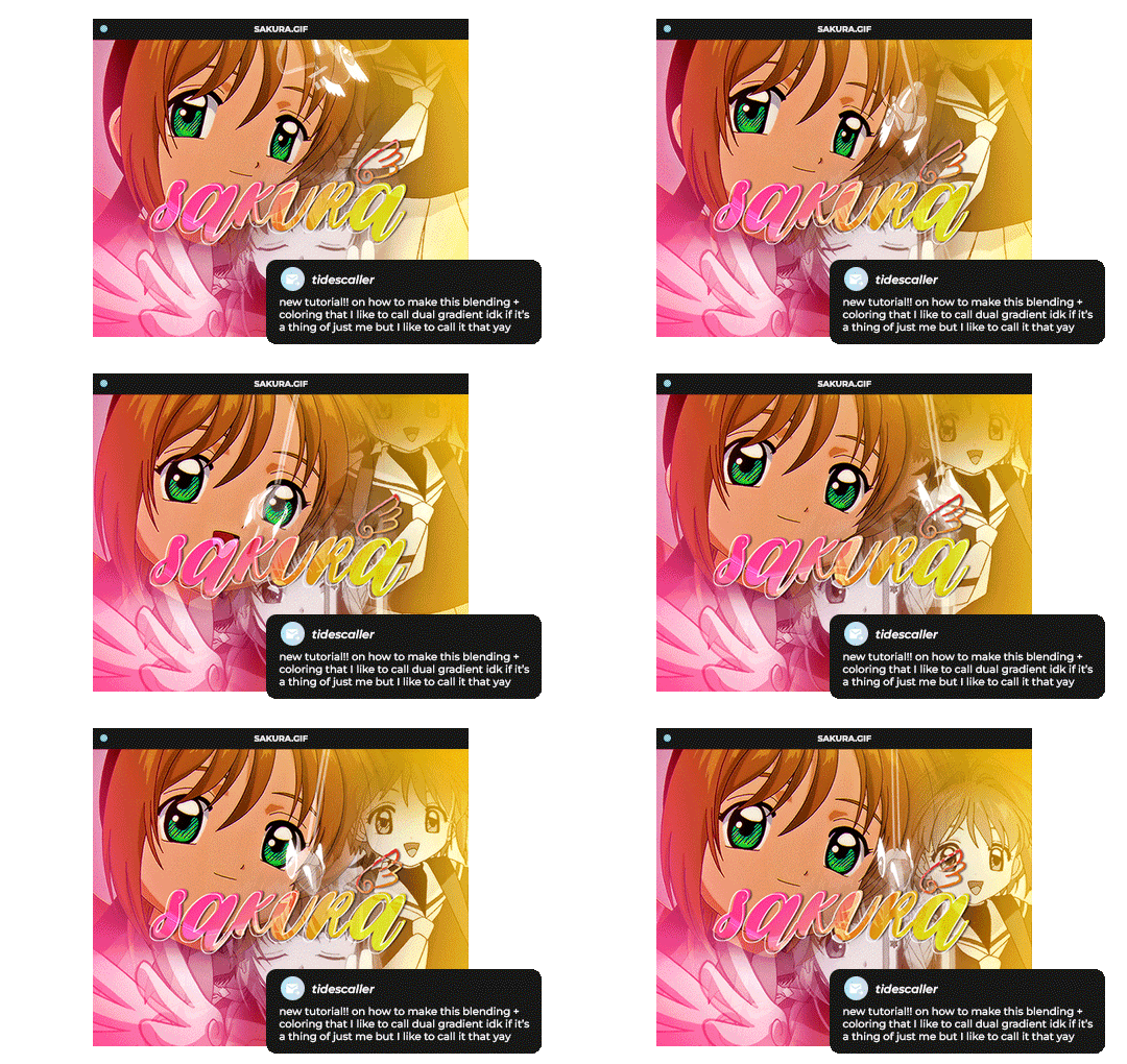
But before that real quick, and if my tutorial isn't enough, I'll leave you a list of amazing tutorials/guides that help me a lot when it comes to everything gifmaking related, so shoutout to them!
basic blending tutorial
coloring tutorial
blend gifs tips
blending, coloring and text effects guide (video)
another one similar to the previous one
gradient text
text outline
HOW TO: Blend multi - gifs / Dual Gradient coloring
You will need any version of Photoshop (I use CC 2019) and basic knowledge on making gifs.
STEP 1: THE BASE
1.1 - Make sure your canvas is 540px width. Mine is 540x450. Choosing which gifs to blend is kinda tricky and no one can tell you what's perfect. Everything depends of the scenary your show, movie, anime whatever you're working on has; but a tip is to use scenes that have dark areas, since it's easier to blend then. 1.2 - Make your individual gifs: crop, color, sharpen, all that, and make sure all of them are the same amount of frames. 1.3 - Before duplicating your gifs into your empty canvas, convert them all into smart objetcs. This will help to simplify stuff, have a much more organized work space and help you load your preview faster.

STEP 2: BRING YOUR GIFS
Now all you have to do is right click on every gif you made, go Duplicate layer… and sent it on your empty document. I would suggest doing one by one, so you can work better. Duplicating them all at once can be a little bit intimidating and might have you confuse how to combine your gifs. Try imagining what you want your gif to look like and where you want each element to be. As an example, I wanted the key scene when it kinda drops to be falling from the top of my gif and also as a separation of the one in color and the one Sakura is roller-skating.
STEP 3: BLENDING
3.1 - Okay, now that you more or less know what you want your gif to look like you can start by changing the blend mode of your gifs. Photoshop has mutiple options on this and it applies to all types of layers. For blending, one of the two (or more) gifs you are working is going to be on top, that's the one you're gonna have to change its blend mode in order to start this process. Generally, Screen is the one to go to.
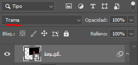
3.2 - Some people group (selecting your layers > ctrl/cmd+g or right click > group) all the gifs so they can then change the group's blend mode into Screen but I personally like to do separately cause if I need a gif to fill some of the background I would keep it as Normal.
STEP 4: LAYER MASK
The key gif works perfect with Screen blend as it has a black background, but of course this won't be the case for most gifs you want to put in the main one. For those unwanted pixels we don't need, we use a Layer Mask. 4.1 - In order to do that, select your gif by clicking on them and next click on the layer mask button.
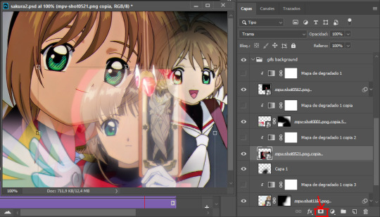
4.2 - Now you'll see a white square next to your gif layer. This will help by reducing the opacity of those things we don't need of your gif. What is white is 100% opacity and what is black 0%. So all you have to do is click on the layer mask, pick the brush tool and paint over what you want to "delete". Pay attention to use a soft brush, and the size of it should be around 200 and 300px. 4.3 - Repeat the process with all the gifs that need it
STEP 5: EXTRA LAYER
Sometimes a gif will look too bright/transparent/softened over the other ones. In order to fix this, you can create a new layer (the button right next to the trash can)
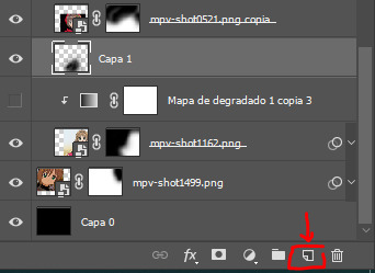
and paint with a black soft brush over the part you need to bring back. I don't know exactly how to explain it properly but I'll try with these before and after images. I'm adjusting the one with Sakura and her card:
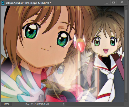
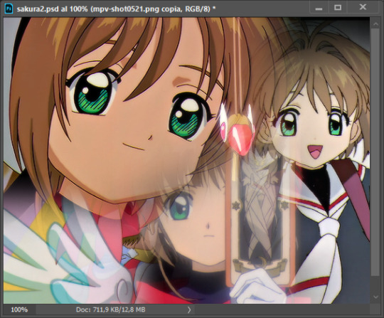
STEP 6: COLORING
6.1 - OKAY, now that we have all that sort out and the gif has a proper structure is time to add some color. As I'm going to do a dual gradient after and leave only one of these 5 gifs with color, I'll use a black and white gradient map and add it to every individual one as a clipping mask (right click on the gradient map > create a clipping mask). Like this:
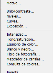
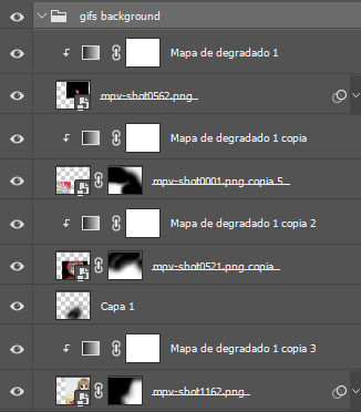
6.2 - Now that we have this I can add my own psd. I started making my own psds for every edit I make and I'm not ready in any way to explain that, but I learn how to do this with this tutorial. With that, my gif now look like this:
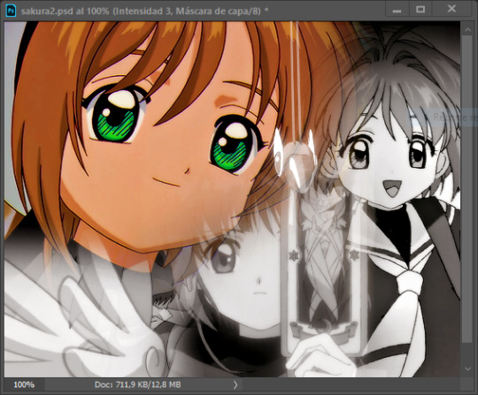
STEP 7: DUAL GRADIENT
Finally for this part I recommend making another group (the folder button next to new layer) and add a new layer for the different colors you add. This is all about painting and playing with the blending modes for these layers. There's no right way to do this, you just have to play around and see what works best for you and the scenes you have. You will end up with something like this:
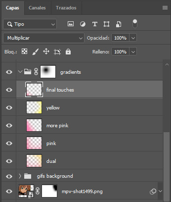
Tips for this step are: 7.1 - Use a soft brush, size it up to 1000px, zoom your gif out and start painting out of the canvas. This will help create that gradient effect we are looking for. 7.2 - Change the layer's opacity/blend mode. This is (again) about playing around with colors. I changed these settings for all my layers that are part of the gradients' group. In order: dual is Screen + 90% opacity, pink Vivid Light + 70%, more pink Lighten + 90%, yellow Hard Light + 70% and final touches Multiply at 100%. I also mixed up the colors, not only staying with certain yellow or pink. 7.3 - The gradient tool works the same way as the brush tool! Just make sure the gradient is any color you're working with + transparent. 7.4 - I also added a layer mask to my gradient's group to erase some of the extra color in Sakura's face. All this will result on this:
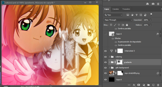
And that's pretty much it! For the text part, I was going to add it but the tutorials I linked at the beginning explain it perfectly so shoutout to them. As always, if you have any other doubt, send me an ask and I will answer it as fast as I can! Always happy to help ⸜(。˃ ᵕ ˂ )⸝♡
#answered#anonymous#*tutorial#photoshop help#gif tutorial#blending tutorial#photoshop tutorial#coloring tutorial
12 notes
·
View notes
Text
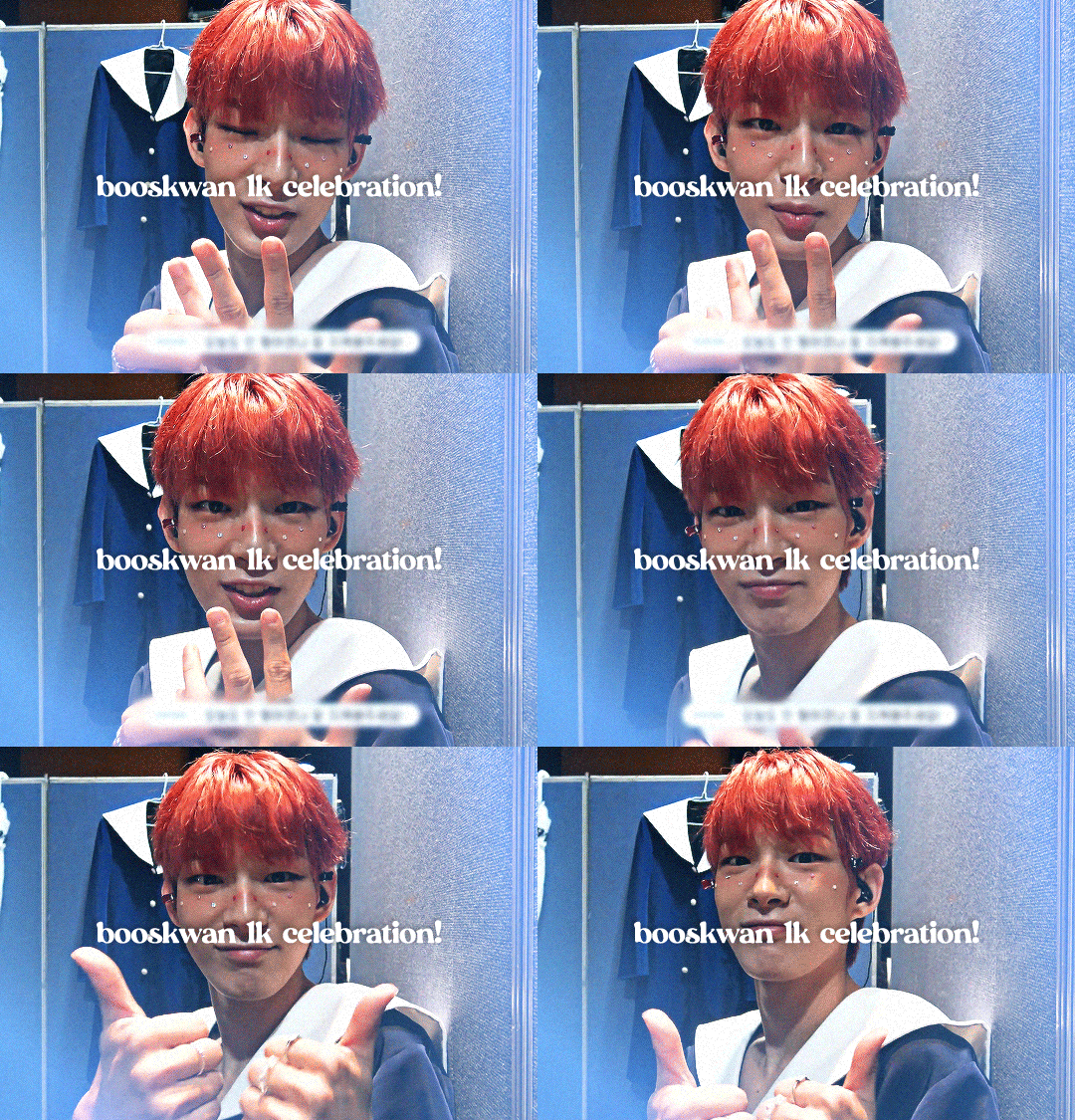
i finally hit 1k!!! (no thanks to tumblr glitching my follower count) i'm really glad so many people like the little images i make☺️ to say thank you i prepared a little something! i've put together all the overlays i have downloaded that i use in my gfx as well as the fonts i've collected over the past couple years (and an updated giffing "tutorial"!) love u all hope november is kind to you<33
for starters here is the mega folder with all of my fonts and pngs! below is my semi-updated giffing process along with some of my actions<3
my process is pretty much the same as my old tutorial but now i've changed how i export gifs! my basic process is outlined in the gif below and and i've added 3 of my actions i use almost every time i gif in this google drive! (explanations below) :]
so after i know what clip i want, i put it into vapoursynth (download tutorial) and once that's saved i screencap it. what i do for screencapping is open the mov in mplayer osx extended and hold down shift+command+s but i know there's way easier ways to do it that i haven't figured out yet lol (tutorial i just found here)
once the screencaps are all on my desktop i delete any extras on either end of the clip i want and put them in a folder just so it's easier to load them in to photoshop. to do that, on the home page of photoshop go to file -> scripts -> load files into stack, then from that menu browse -> select all the screencaps you want to use for the gif and click open then ok
after they're all loaded into photoshop this is where i use my first action which just shortcuts all the way to the sharpening being done. once that's done i go to image -> mode -> 16 bits/contrast. this can help if the background is super pixely or anything like that. then i mess around with sharpening if i feel like it's too much. usually i'll change the opacity of the second sharpen layer to 50 and/or change the settings of the first sharpen layer like 200 to 150 or 0.3 to 0.2, whatever i feel like looks best. something i've also learned over the years is that sometimes you let noise do the heavy lifting and don't worry about making it look too sharp. if the gif is still a little bit unsharpened (?), the noise will make it look fine
then i do coloring which is the fun part! like i said, my process is more or less the same as my old tutorial so i'll just skip over that part and if you want more details feel free to check that one out. once i'm done with that i combine it all to a smart object, add noise (usually 1-1.5 these days), and then use my second action!
after the second action does its thing, i select all frames and set the rate. i usually set it to 0.04 for youtube videos and 0.02 or 0.03 for ts files. then, because vs leaves me with duplicate frames, i run my action for duplicates which selects all of the unwanted frames and then go to the hamburger menu just above the timeline -> delete frames. then it's ready to be saved!
#i tried to find a tutorial for how to put actions in ps but i couldn't find one sorry ㅠㅠ#pls do send me an ask or tell me in a rb if there's anything unclear or if you have any issues with anything!#*tutorials#resources#gif resources#gfx resources
19 notes
·
View notes
Note
Hello there! I'm Eden :D I LOVE your renders! I've been rendering for well over a year at this point, however I only stuck to the super basic stuff since it took me a year before that to even know how to do it at all. I've wanted to up my game and get to where you are now. I'm SO SORRY if this question was asked already (I haven't gotten too far in your posts yet), but;
How do you personally edit your renders? I understand you use photoshop, but how do you do it exactly? Your renders have that kind of digital art style, like you drew them yourself. Feel free to be as descriptive or brief as you'd like!
Hi Eden!!! Thank you so much! 🥹😍♥️
I've followed you back and glad we're moots! I'd love to see some of your work!
I'm not sure if I've answered this before but I'm happy to answer it again! Also I haven't advertised it in a while (and I really need to try to get up a new tut, maybe soon), but my alt account is a Render School where I post tutorials, with plans to post editing tutorials in the future!
But honestly as far as my editing, I really don't do much.
Actions are my secret weapon, and I have a few favorites/go-tos I'll link! A few are by simmers and a few are just action sets. I'm in a family of photographers, so I have access to a wealth of resources for my editing.
Sonder set by @intramoon
Cold Water set by @intramoon
Retro Prime photoshop actions
Indie camera photoshop actions
But my "secret weapon," as it were, and the set of actions that I think most helps me accomplish that digital art style is a set of actions that are sadly expensive and hard to find now.
My favorite set is by Totally Rad! and I think in recent years it's been folded in to this Pixel Sugar product on their website. I know that's a steep price point but it's possible you can find it around the corners of the Internet for less, or if you can't, you might be able to find "dupes" of the better ones, which imo are:
Technicolor dream world
Super Fun Happy
Bullet Tooth
Grandma's Tap Shoes
As for my method, I know a lot of simmers paint over their renders, and I've done that a few times but find I'm too impatient tbh. My goal is always to have to do only minor touchups over my renders and some color/vibe adjustments before the finished product. My "raw" files are always exactly what blender spits out for me, unaltered in any way except to resize them for Tumblr.
To get that digital art style, I'd recommend rendering with alpha details if you don't already. If your computer can't handle alpha cc in the game, DM me and I can give you some pointers (sneak peek info for a future tut lmao) on how to accomplish it without bogging down your game.
When I go into photoshop I adjust the brightness and contrast, as I tend to personally prefer high contrast pieces that contain dark subject matter but you can still see the details. Then I'll paint/blur/clone/adjust anything that needs it, then I'll "stack" and adjust a handful of actions before applying edge blur and vignette and any other color adjustments (levels, curves, etc).
That's a very oversimplified rundown of what I do, but really overall my editing process is simple. The bulk of my work happens in blender itself. I find that the more time I take to perfect the lighting and shadows and angles in blender, the less frustrating the editing process and the happier I am with the end result. So, that said, be sure you're spending a lot of time in blender getting the light and shadows to be exactly where you need/want them to be before running it.
I know this is a bit long I'm sorry! If any of it is super confusing or you'd like a more in-depth look at any of it please let me know! I do plan to do editing tutorials for my side blog, but the latter half of this year has kind of run over me like a train, and for now I'm just trying to get by day by day. But I'm happy to help if you have more specific questions!
& thank you again!! ♥️
#replies#thank you so much this literally made my day#I was having a bad one too ugh I needed this#mini blender tutorial#tutorial ish#sims 4 blender tutorial#sims 4 render tutorial#sims 4 editing tutorial#I can't tell yall how happy it makes me when yall love my work#legit holding back tears#♥️♥️♥️
39 notes
·
View notes
Note
Hey! I’ve been following you for a while and I really love your art, it’s absolutely stunning and I love the way you paint and capture anatomy. I know this is a bit of a broad question but I was wondering if you had any tips on getting better at painting digitally and studying anatomy, maybe more specifically blending, colour picking, and structuring anatomy in a way that looks somewhat realistic?
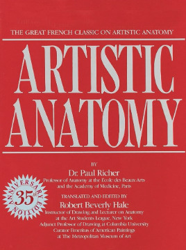
Thanks and I'm glad you enjoy my work long enough to be following me for this long! I definitely love drawing a naked body that's for sure haha. In terms of tips for getting better there's a few things I can mention but it's going to fall broadly in the general answer of "study", because this is the most sure fire way to be able to understand what it is you're trying to emulate in your art. There are different ways to study, and they teach something slightly different. For example, doing studies from life (live drawing classes) help me understand movement in a way studying from a photograph cant, simply because you're seeing the same model in different poses in real time, you can see how the fat and muscle moves around as they shift to different positions. So they're not technically moving the whole time, but you're still seeing some movement there, and understanding what sticks to what while it rotates and bends. Studying from photographs can help give you time to do some real deep dives and investigate where different bones/muscles sit while someone is in a particular position. There's also the opportunity for understanding how shadows may be formed by the body as typically photographers are more conscious of how the subject may be lit than what may be available in a live drawing class. Beware though, as more things are photoshopped than you realise, not all photos represent reality. Especially glam and fashion photos. It doesn't mean its bad to want to have these effects on your work but just be conscious they might not always be anatomy accurate if that's what you're striving for. I sometimes make a conscious decision to go against what is anatomically correct for a certain effect myself. A book I have been recommending for years for anatomy is Dr. Paul RIcher's "Artistic Anatomy". It's great for understanding muscle structure intimately - it's designed specifically for artists, but with the idea of trying to stylise the diagrams as little as possible for the sake of understanding the human form. There's a lot of great info and detail in here, but beware, there is not a lot of variety in body structure (at least not in the edition I have which is missing female anatomy I think already so I'm not sure what else I don't have in here). So you'll be able to understand function a lot from here but you wont be able to learn a lot about fatter body types sadly.
Colour picking is probably the most difficult for me to explain easily, as I have spent a long time winging it, then studying it, then being really experimental with it. I could write a lot a lot about this but to spare making this post any longer I'll refer to another fun book just for getting started on some frequent and common terms called "Color and Light" by James Gurney.
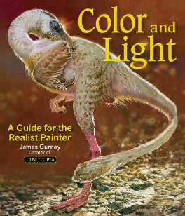
I also love that he uses like, dinosaurs for everything in here lol. It's a great starting point that can give you some go to ideas that you can then experiment from there. It's not very authoritarian (or at least that's what I feel), and doesn't push anything forward as a hard and fast rule, just showing what affects some colour combinations might instil in someone.
As a whole, I've gotten better at painting digitally by studying traditional painting techniques. They theories are basically transferrable one to one with some few exceptions. I tend to blend my colours by simply using a soft round brush in Photoshop with a low opacity. Much the same way I would with a real canvas, with a large round brush and diluted colour. I hope this answers your questions in some way. I tried to be not too specific only because this answer would be at least another 30k words lol because this is something i think a lot about! I love technique! If I ever stream again, feel free to pop in and ask more questions where I might be able to show some stuff in real time! Not sure when that will happen though!
Also the way i do stuff isn't a "correct" way either. I like painting from imagination so this is how I make that work. Some people like to only work with references for every piece, and that is a completely legit way to create stunning art as well. Good luck!
77 notes
·
View notes
Note
Hi! I was wondering if you would be willing to share how do you make this pattern thingy over your gifs? I was trying to learn how to do this for awhile now, but I couldn’t find any tutorials. It’s okay if you don’t wanna share. Love your gifs, have a nice day ✌️
Hi, anon! I don't really mind sharing how I apply patterns to my GIFs. It's easy to do and quite fun once you get the hang of it. And thank you! I really appreciate it. I'm glad you love my GIFs. (°◡°♡)
I use Photoshop 2021 but I think this applies to older versions too. Also, just a disclaimer that I am not a PS expert. This is just how I prefer to edit my GIFs so take whatever I will say here with a grain of salt. Lastly, I apologize if my English is bad and my explanation is lengthy. This is my first time making a tutorial of some sort. (⌒_⌒;)
Please check the steps under the cut.
Find a pattern that you want to apply to your GIF.
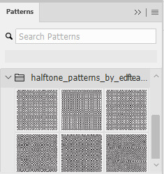
I don't know the link anymore to the actual pattern I am using so I will use a different one that has the same style. So for this example, I will be using Halftone Patterns by EDFTeam that I found from DeviantArt. To download the file, you need to log in to the site. If you want a different pattern but with the same style, just search for halftone patterns.]
Import the .PAT file on PS.
Make sure that Pattern is enabled [Windows > Pattern]. On Patterns tab, click Import Patterns. Find the folder where you saved the .pat file, select the file, and then load it. If loaded successfully, the patterns should appear at the bottom of the list:
Apply one of the patterns above your GIF layer.
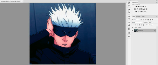
In this example, I made sure that my GIF layer was selected before choosing a pattern. So that when I clicked the pattern, it would automatically be clipped to the GIF layer.
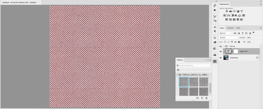
This is how it will look like once you click one of the patterns. In my case, I selected the first one. It looks reddish because of my coloring. This is another reason why I prefer the Pattern layer right after the GIF layer so the pattern will also adopt my coloring.
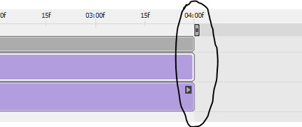
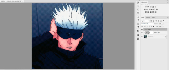
If you are using Video Timeline mode, make sure to adjust the Pattern Fill layer to the other layers to avoid blank layers when saving the GIF file. If you are using Frame Timeline mode, then there's no need to do this.
Change the blend mode of the Pattern Fill to your preferred style.
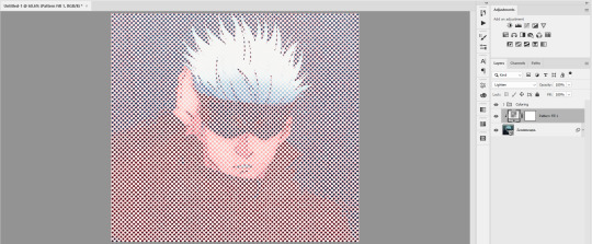
I typically use Darken or Multiply to add a darker shade of pattern fill to my GIF. And if I want to lighten, I use Lighten or Screen. But feel free to explore other blend modes as well. In this example, I used Lighten.
Decrease the opacity of the Pattern Fill.
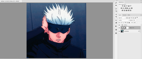
For Lighten/Screen blend mode, I typically set the opacity to 5%. And for Darken/Multiply, I set it to 10%. [This is just my preference though since I want to add a subtle pattern texture that does not interfere with my coloring.]
Make necessary adjustments to your coloring layers (optional).
This is only optional, but if you think your GIF already looks good without readjusting any of the other layers, then you're good to go. In my case, I would make slight changes to the Brightness/Contrast and Levels Adjustment layers.
Posting the GIFs here without and with patterns for comparison:
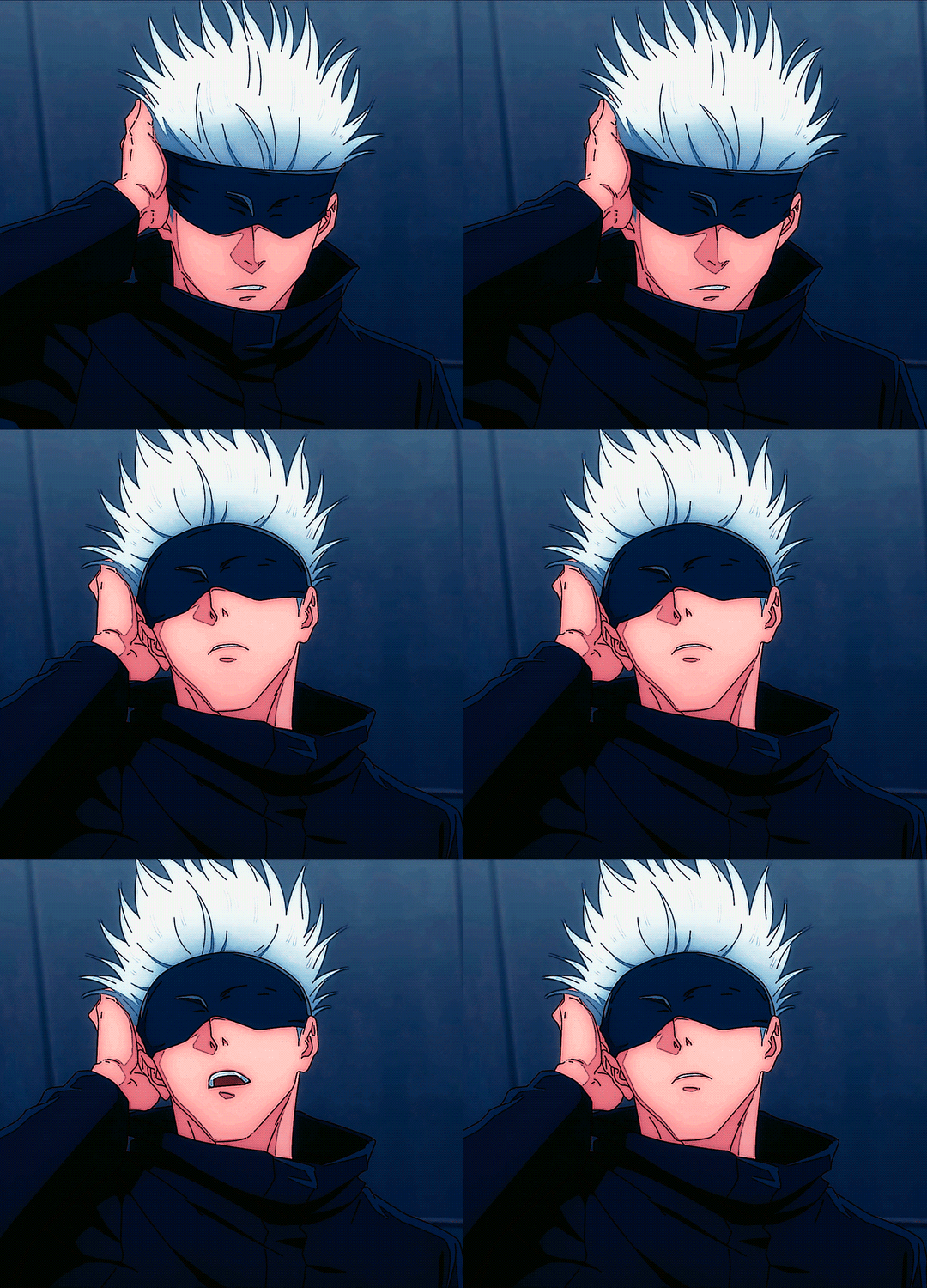
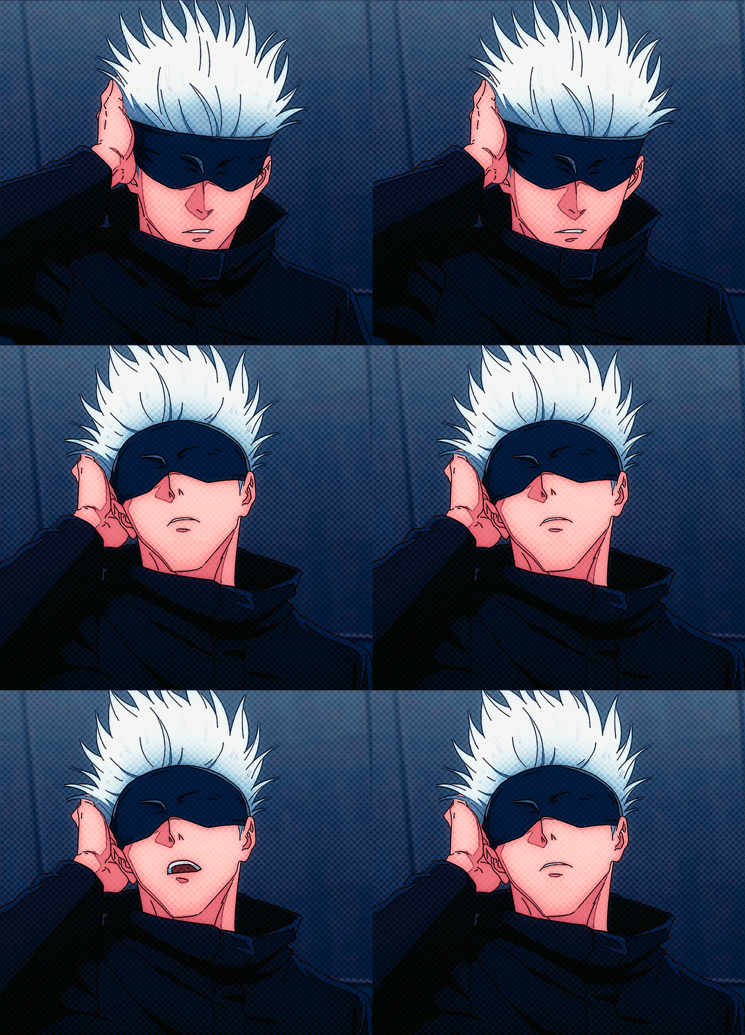
ADDITIONAL TIPS:
You can also adjust the size of your pattern.

Double-click the layer thumbnail of the pattern fill layer. Then change the percentage and click OK. You can go beyond 100% if you want to make the pattern bigger.

This is just my observation but if you are planning to use the GIF as part of a photo set with more than 1 column, you might want to enlarge the pattern so it will still be noticeable.
With 100%, this is how your set GIF is gonna look:


With 150%, this is how your set is gonna look:


As you can see, the pattern is not noticeable at 100% if positioned in 2 columns but it becomes apparent at 150%. So basically, my rule here is a larger pattern size for a smaller GIF display.
You can also clip patterns to shapes and other smart objects other than your GIF layer.
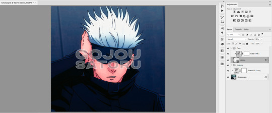
In this example, I chose a heavy font type for the clipping mask so the patterns are visible which I then converted to a smart object. And since the pattern is applied to the text, you can have these layers above your coloring. [I haven't done this before but I thought of including this because it's also a nice way of using patterns.]
And this will be the output:
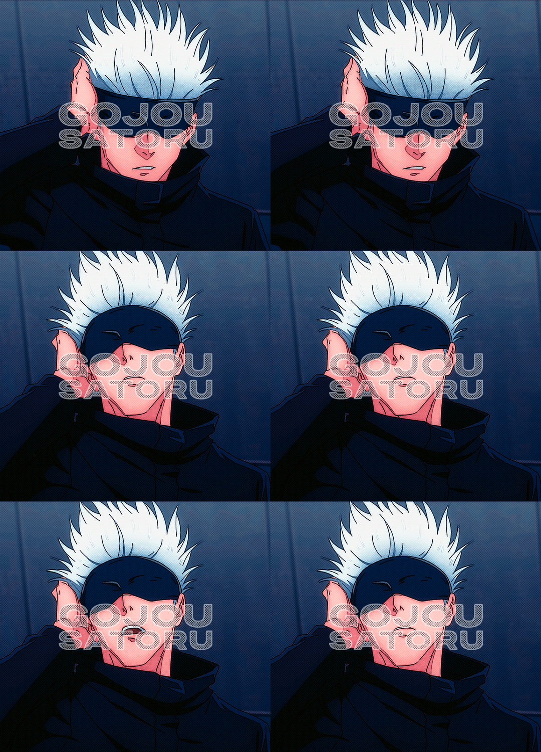
You can also modify the mask of the pattern where it is being applied.

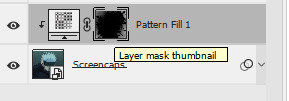
The white space signifies that the entire space of the GIF layer is filled with patterns. You can change this by using the brush tool [set the color to black] to erase the parts you didn't want to be filled with patterns. Make sure the layer mask thumbnail is selected and not the layer thumbnail. You can switch back to white color if you want to erase the result of your brush.
In this example, I tried to erase a lot of white spaces to make it look like a frame. With this, I can go wilder with the pattern. I select Overlay as blend mode and set opacity to 100%.
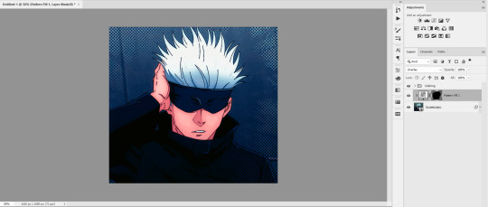
So this is what the actual GIF looks like:
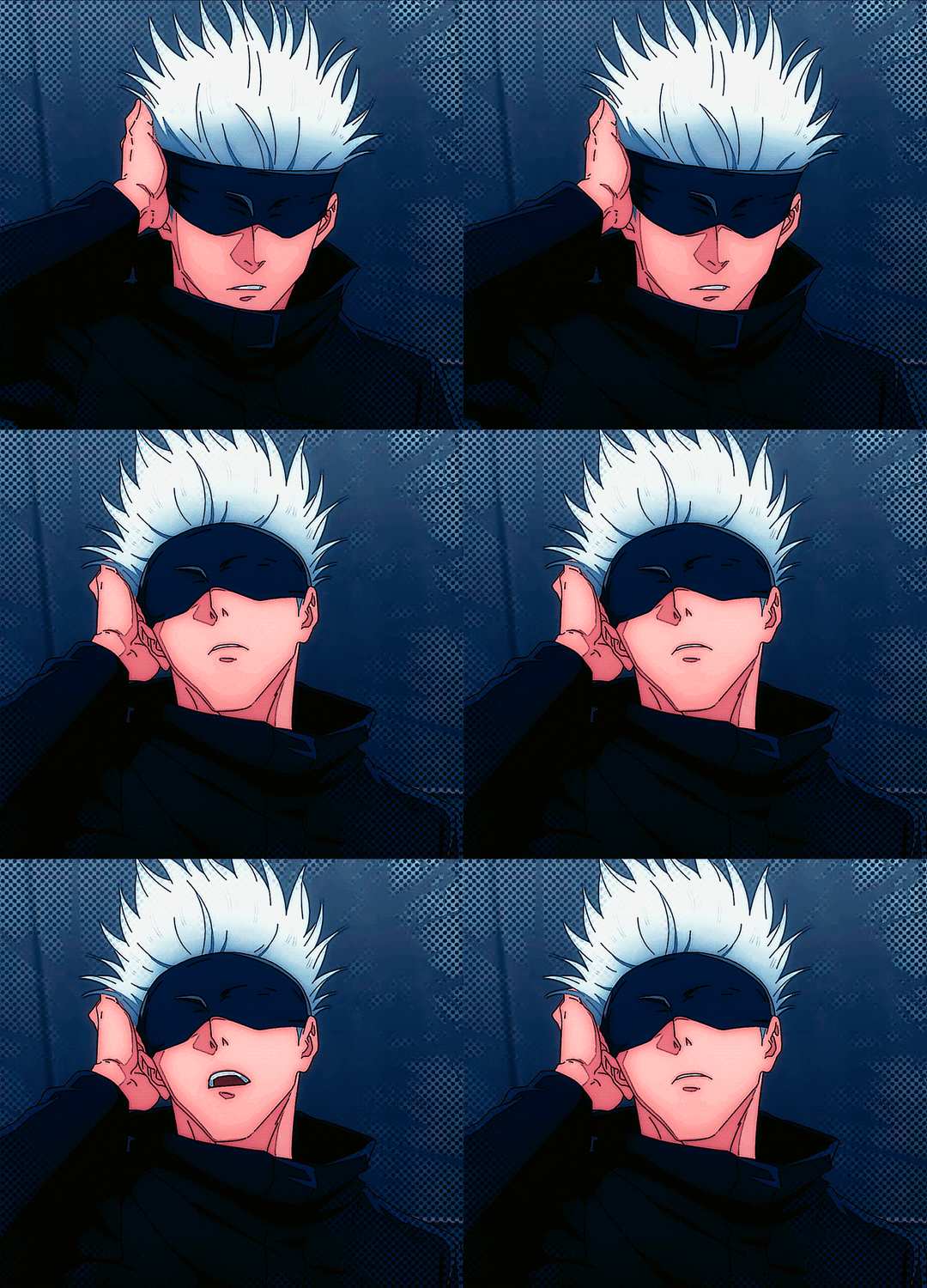
You can also check this post where I used this method.
Again, sorry if the explanation is too lengthy and my English is bad. And I do hope that you are seeing this post my dear anon! And I hope it helps! ( ̄▽ ̄*)ゞ
#art answers#reply#anon#applying patterns in gif#gif tutorial#halftone patterns#using patterns in photoshop#artless#artsresources
27 notes
·
View notes
Text
quotes from a fan's review of the young veins' show in michigan (8 april 2010)
At one point before Dangerous Blues was played Ryan mentioned how its a good song for waltzing to and he suggested everyone go and hold the hand of the girl they've been looking at all night and Jon was kinda like lol wut and then he was like "It's called a waltz".
JON SMELLS AMAZINGLY GOOD, LIKE REALLY. IDC HOW CREEPY THAT SOUNDS.
I got hugs from Jon and he gives the best hugs and he's just so nice. He couldn't hear me well because Foxy was playing so he kept leaning close and his hair was brushing my face and then he'd lean close to me to talk and really I was *_______* on the inside most the time.
I asked Jon if he hung out with Tom at SXSW and he said he did and that he also got to see Tom in New York and I told him I was glad and he was like "I'm glad too :D".
Tom here is Tom Conrad, who was in 504 Plan with Jon and also played guitar in The Academy Is... from 2004-2006. Here is a link for a prettyoddfever post that goes more in depth!
And at one point I had asked him where Ryan was and he was like :O "I thought he already came down." and I told him to text him and he was like "You should text him." Offer me the # next time Jon and I will! also I think he had said that Ryan ignores his texts.
And emmy126 had a pack of starbursts and she was holding them and Jon was taking them and then he was like "oh were you offering?" and he kept eating them and was like "Keep these away from me. I have a sweet-tooth and I haven't had dinner yet."
We had to take my picture with him a bunch of times because my camera was fail and he didn't like his eyes in one and he was like "well you can just photoshop my eyes right, you know?" No, I am not that skilled Jon Walker. He also asked me what was wrong with my camera because the pictures kept file erroring.
I had asked him how often he gets asked about Brendon and Spencer and he was like "five or six times every show." and I said something along the lines of none of it mattering because everyone was happier and as long as they're happy we should be and that's all that matters and he said that he does miss it. he said. "I miss it. I miss it everyday."
Basically Jon Walker is nothing short of amazing perfection, he gives good hugs and he smells fantastic.
Ryan didn't come around for a long, long time. Right before the venue started kicking everyone out. Ryan was strange imo (possibly drunk) but he was still a sweetheart.
We took a picture together and [Ryan] was like "I blinked. I think I blinked." and we looked and sure enough his eyes were closed so we took another and he made some kind of weird face and like some girl had told him to make a game face and he didn't know what it was. And then he went to pull away from me and he got his sharpie stuck in my hair and he was like "ooh I caught you" and he was trying to unhook it and was like "we're messes."
source
9 notes
·
View notes
Text
So after Tumblr finally allowed me to post my recent santhony gifset, I want to take a moment to give myself a short pat on the shoulder here and celebrate my gif-making process^^
I always wanted to learn how to make gifs, but I just never had the patience nor a good program to work with. A bit more than a year ago, I saw a post mentioning photopea as a great alternative to photoshop – and as I always wanted to create gifs, I decided to look up some tutorials on how to make gifs with photopea. My first attempts weren’t that great, but I’m glad that I still chose to share most of my gifs - because now I can look back at them and see the process I made, plus I still received a lot of love on my older gifs.
At the same time, I started watching Bridgerton – and as I became obsessed with that show, I used it to practice my gifmaking skills.
Recently, I saw someone like a gifset I made of that scene where Anthony asks Siena to go to the ball with him. When I first started creating gifs, I often made several gifsets in one day and then just scheduled them – which meant that by the time I opened photopea again, I basically forgot how everything worked lol. But the past months I’ve made gifs more regularly and as I felt that I’ve definitely improved, I thought I could redo that santhony gifset again.
So here’s the same shot from my first attempt a year ago, and below my most recent gif.

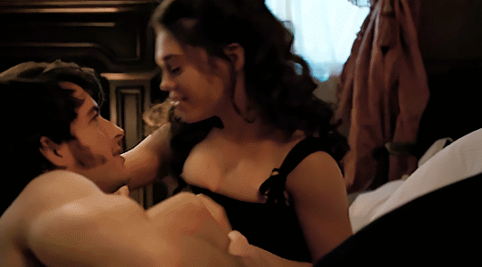
I really love how smooth the new one looks. I’ve never been a fan of grainy gifs, but I often had to use a noise-filter to make the quality appear somewhat better. I’m glad I found a way to make them look less pixelated but not super grainy either.
Also adore the difference in coloring. The second one looks way richer and warmer. I’m not sure whether I even colored the first gif tbh. I was super careful with coloring and lighting in the beginning, because I didn’t want the gifs to look too saturated. And making them too bright usually just showed how awful the quality was lol
So yeah, I’m really happy with the process I made. Also, I feel like learning to create gifs made me appreciate gif-makers more. I mean, I was always impressed by it, but I also always assumed that once they learned how to do it, it must be quite easy – now I know that every gifset is its own struggle lmao
So that’s also a good reminder to always show support to your favorite gifmakers (and gifmakers in general, of course). And if anyone read all that and also always wanted to make gifs: just give it a shot and keep practicing. I’m so glad I gave this a try – not only because I always wanted to, but also because this is just so much fun :D
#at this point i just want to gif *everything*#i know my 15-year-old self would be so happy i can make gifs now :D
5 notes
·
View notes
Text


@yukikorogashi Asked. HELLO MY FRIEND! ❤️ Before this year ends, I just wanna start by saying-- MAN! I'm just so, so glad that I got to meet your wonderful self??? I will say it's certainly one of my highlights during these last few months, meeting a fella as splendid as yourself!
I already mentioned all of this before to you through our IMs, but you bring so much life to my boy here, and just do him so, so much justice! And I thank you, with my hands holding yours, for giving him the love that he so long since deserved! And of course, I absolutely look forward to him and Itsuki interacting, in developing their hilarious lil' Looney Tunes relationship, overtime! It's gonna be so fun, and another thing to look forward to this coming year!
You are just such talented individual too, Mt Beast, like omgoodness??? Your writing, your art, your graphics-- not to mention the fact that you have been such a pleasant chap to get to know. You really are a marvellous bean, and again I'm so glad I found your blog when I did, and look forward to interacting with you more in the near future!
May next year treat you well, my friend. As you so rightfully deserve! Here's to you! 🍷 AUEHAUWHE!!!!
↳ 2023 is almost over! // 𝐀𝐂𝐂𝐄𝐏𝐓𝐈𝐍𝐆

𝐎𝐔𝐓𝐎𝐅𝐂𝐀𝐒𝐇. Y'know, I do not think there are even words to describe the amount of joy and gratitude I felt when reading this. I am SO VERY glad I had the pleasure and opportunity to meet you too Yuki⸺ I can say with much certainty that the feeling is absolutely mutual!
I can't even construct my words right but just that I'm literally grinning from ear to ear! WHWUAHAHA Hearing you say that and think that for my interpretation // portrayal of Wario means so much more than you think it does for me. It's honestly an honor to hear that I am doing him justice. So thank you⸺ Thank you VERY much. I too cannot wait for Itsuki and Wario to interact. I still think about the plot in my head and the things we spoke about with their possible bond, depending on how things go in RP, but it kills me EVERY time. I may not KNOW who Itsuki is, but shoot I dont think I need to. All I know and need to know is you make her an outstanding joy of a character! You give her such personality that if she acted any other way I don't know if I'd enjoy it as much as I do when she's in your hands HWUWHAHAA!
I appreciate you enjoying my writing and my art, I do take a great deal of time in it, especially my writing. Drawing comes more naturally for me so to speak its a lot less brain power as opposed to writing. So to know you favor both and not just one over the other is an honest to god best compliment for me to hear If I'm being honest HAHAAHAH. Also I must give credit where credit is 1000% due, @sangdelune did my graphics, I'd commissioned them to do it. They brought my ideas to life in ways I cannot describe. I do not know the floor from the ceiling when it comes to photoshop or anything remotely in that area, I cannot do that. I'm a writer and an artist--NOT a designer. Best editing I do and can do are my reaction icons. THOSE I DO edit. But that's just the most basic bare minimum knowledge one needs to know to edit the reactions; its nothing supreme or outstanding I'd say. I actually plan on bringing them up in a near future post; once I hit my 100+ follower's count ( which seems to be nearing...) give them a segment because since I was/am so new here in this RPC, I felt me doing it with not much of a following would make them go unnoticed. i.e. no on taking the time to go back to read my first post(s) I made here about them. But for anyone who DOES need anything with graphics GO TO THEM. They were a blessing to work with, I had very VERY specific ways I wanted things done and created to really emphasize how I viewed and seen Wario and I wanted my blog to really exert that. So even if you dont read my writing, you still get the FEEL // aura, per say, that Wario emits when youre on my page and they hit it all on the nail and BLEW my expectations away. Very communicative, quick with getting back to you, good with keeping you in the loop of things, and is just an INCREDIBLE designer and an amazing person to work with. I honestly am grateful and LUCKY to of found them.
SALUTI MY FRIEND! I cannot wait to see what the year to come brings, but I hope whatever it is, it brings a lot more interactions with you!


#。*゚+.*。🧄— $𝐎𝐔𝐓 𝐎𝐅 𝐂𝐀𝐒𝐇;; ooc#。*゚+.*。🧄— $𝐌𝐄𝐌𝐄;;#。*゚+.*。🧄— $𝐒𝐀𝐕𝐄;;#// This made my ENTIRE night.#// saving this for when I wanna look back at it...#// You're far too kind of a person Yuki
3 notes
·
View notes
Note
all of your gifs are amazing!! i was a bit away from this fandom recently but i’m so glad i’m back to all of your amazing edits! 🩵
Wow, thank you so much for saying this 😭😭😭💖💖💖
I’m still a photoshop noob — I only know the strictly necessary to make basic gifs, and I’m never quite sure if my coloring looks all right (sometimes I’m certain it doesn’t), but I’m learning :,) So your message truly means a lot, because all your edits are gorgeous and an inspiration to me 😍😍😍
Welcome back to the fandom!!! I missed your Literati/Gilmore Girls posts 💕
And again, I really, really, really appreciate it 💝
2 notes
·
View notes
Note
Hiya, I’m in love with your painterly pieces, genuinely gorgeous. If you don’t mind me asking, what kinds of brushes do you use?
For context, I’ve been making an effort to get my transitions between values less abrasive (since I got into the habit of leaving them at the roughest stage possible and making up for it with “tactical” overlays) but my end results tend to end up muddy, and when they don’t I can never pinpoint what I did differently. I have a suspicion it’s because I almost exclusively use a very hard oil brush — I do like a coarse look but there’s a line of how much of it is personal style and how much of it is plain poor judgement. Would I be better off using a softer edged brush for that in between stage, or is it just something I need to push through without “blaming the tools”, so to speak?
Hi!! First of all I'm flattered, I'm so glad you like my art 🥺
Keep in mind that I'm using Photoshop, so the brushes only apply to that. For rendering I mostly use Istebrak's skin and blending brushes! She used to sell them in separate packs, now she sells them all in a bundle . I mostly use her angled skin brush and wispy skin brush, those give me the smoothest results. For blocking I use her dry oil brush, though lately I've actually started using a brush that a dear fellow artist was kind enough to send to me! I love to use it for hair especially. For blending and smoothing everything out I use Istebrak's smudging brushes. I've been using her brushes for years and never really switched since they work really well for me, but I'm sure there are tons of other brushes out there that do the same trick!
I'm probably not the best person to ask about this kind of stuff though, because I LOVE when paintings actually look painterly and textured, with visible brush strokes etc, and I've tried to move away from overly rendering and smoothing everything out, but it's difficult for me because as soon as I see a brush stroke my brain yells "smooth it!!!" so yeah, I don't quite know how to balance everything myself yet. Generally I try to preserve the most detail and keep everything smooth around the focal point (so, since I mostly do portraits, that means the face/eyes) and allow myself to keep stuff messier in other areas (the hair, etc). I hope that makes sense?
Basically my process looks like this: I start by blocking in the values with hard brushes (like the dry oil brush) and as I get further into the process I start using the skin brushes on lower opacity in combination with the eye dropper method to slowly blend everything together, and as I'm doing that I also use the smudge brush to blend unwanted edges and creases and make everything look smooth. (for me, smudging is really the key sometimes)
I feel like this is a terrible explanation but I hope it at least helps you a little? Like I said, I feel like I'm still in the process of figuring all of it out myself, it takes some experimentation to learn what works and what doesn't, but I'm sure in the end we'll all get there 💚
5 notes
·
View notes
Text
Internet Culture Art Assignment (Draft)
For this assignment, you will create your own Internet Culture Artworks.
Analyze and question some part of Internet culture ie: how we use the internet in our daily lives and how that experience influences us offline. (this should be more than a simple collage or slideshow )
Create your own Internet Art 3 (minimum) . Note: video/audio works should be no longer than 3 minutes.
For each artwork, explain your intended goals, describe the techniques and tools you used(e.g., Photoshop, apps, video, still images, programs), and evaluate what additional steps you will take to further develop your concepts and finish your work for next week.
Then, respond to 3 classmate's (minimum) post providing feedback peer review on what they have done right and what they can do to improve their work.
6de09c799ee9cc98a01537acd868b3e4d4162a8d-48-vvebcam5webcam.tifDownload 6de09c799ee9cc98a01537acd868b3e4d4162a8d-48-vvebcam5webcam.tif
To be honest, I didn't really know or have any idea of what to do for this project, but I am glad this assignment is a draft, because I feel like maybe I could have done a little better with these. The whole idea of this vibe of project I wanted to do is a computer type thing. Since I am a photographer, I decided to do a little bit of my workspace, but add some type of environment for this project and do it Internet Art wise. If you can see into details, I added a screenshot of my website, since I am a freelance photographer and have a website of my own. My cameras on the side of my workspace, and negatives on the table. I found all these images on google and added them all up on Photoshop to create this final image. What I would do to further this artwork of mine, is maybe somehow see if I can add an effect to it and make it as a gif so the image itself can have something that has to do with movement.
210921222234-7-9th-gen-ipad-review-underscored.tifDownload 210921222234-7-9th-gen-ipad-review-underscored.tif
I think for this second one I decided to do something different and include an iPad to it since I also sometimes work with my iPad when it comes to specific details on images since I am a photographer. I love how I added the notepad on the right side of the image and how I also added the rainbow snapchat effect on the top left, but added a cool filter to it, to make it somehow camouflage with the background itself. I added the background of the iPad with different screens because I feel as if when I work with it, I have so many apps open and I am basically doing so many things at once. I also used google to find the images I wanted to create on this artwork and added them all on Photoshop. I am actually so proud of myself because this is the first time that I actually took my time and created these images from scratch with some help from google images. If I had more time and for my final, I can definitely think outside the box and maybe add a cool effect to this artwork or even make it move somehow.
f974c8dvsbj71.tifDownload f974c8dvsbj71.tif
For the last and final image, in all honesty, this was my second artwork that I did and I'm actually proud of it. It could have done a little more of work and I could have added a couple of more aesthetics, but I feel like I was all out of ideas and wanted to keep it simple. I added a game as the background of the computer and added some errors to give it a little touch. I also added a PC to the artwork because I feel like that would just make the image perfect, as well as a camera on the right side of the image. Now that I see it, it is more on the simpler side, and maybe I could have added a couple of more things, but I felt as though the image was already full because of the computer. I did this artwork also on Photoshop and used google images as well. I could have taken this image a little further and probably could have used Illustrator and other apps from Creative Cloud, but that would mean that I have to do some more digging and create something that I haven't before. Maybe also used a little bit of cool effects and bring the image/artwork out a little bit more. Other than that, I now know for next time that this project/assignment is definitely time consuming and not easy to do under pressure.
0 notes
Text
Current Relevant Developments - 4
I wanted to look into using colour look up tables (LUTs) for post-processing/colour grading footage. I have done some colour grading before but usually only on still image renders and not very extensively at all. I wanted to find out how to do this in Unreal itself. Although I know this is usually reserved for right at the end of creating an environment, I wanted to try something out now in my testing stage to see how feasible it might be later on.
I found a great process breakdown on World of Level Design.
They do discuss the importance of using an otherwise finished scene before doing this to ensure you are achieving the desired look, so I am aware that this process can be made a lot more detailed when it comes to my final scene.
The process initially involves taking a high-quality screenshot or still render from the scene and taking it into Photoshop. Layer adjustments are then used to tweak the image. They discussed a few of the different settings they used but mainly it depends on the image itself and the desired effect.
For mine I tweaked the levels and the saturation until I was happy with that. However, I'm not very confident at colour grading currently and mainly rely on just moving sliders until it looks decent. I wanted to learn more about the basic principles of it, so I decided to watch a video by Film Riot. They discuss the use of different colour spaces, colour correction, and colour grading in cinema. Although there are some difference in terms of process for 3D rendering vs physical camera recording, the principles regarding post-processing footage are the same.
youtube
I used some of these principles to slightly colour grade the image. Then, following the breakdown from World of Level Design, I took the adjustment layers and applied them to an unmodified LUT. I then imported this into UE5 and applied it to the post-process volume.


These are the 3 versions from no editing to editing with no colour grading to editing with colour grading. It's obviously a very rough first try at using LUTs so isn't very refined but it was interesting for me to see how the process works. I want to get better at colour grading before doing the final shots but this was a good start to understand the concepts.
In the breakdown they also discussed some limitations for the LUTs, and how they can be affected by people's monitor capabilities. They explain that it may be better to use the colour grading in UE5 or in a different software after rendering, especially if making a game that people will play on their own systems rather than a pre-rendered cinematic.
I think for my final piece I may use a different software such as DaVinci Resolve to do the post-processing rather than using LUTs, as I will have lots of different shots in the cinematic that may benefit from using different image adjustments rather than one across the whole film. But I'm glad that I've had chance to practice using LUTs and know how simple or complex they can be made depending on the requirements.
References
Film Riot. (2022). "Color Grading 101 - Everything You Need to Know". YouTube. https://www.youtube.com/watch?v=pAh83khT1no. Accessed 24/04/2024
World of Level Design. (2024). "UE5: Complete Guide to Creating and Using LUTs for Color Grading". World of Level Design. https://www.worldofleveldesign.com/categories/ue5/luts-complete-guide.php. Accessed 24/04/2024
0 notes
Note
It's been 8 months and I still haven't been able to get back into editing, so annoyed with myself. I really want to get back into it, but whenever I open photoshop I just sit there even with ideas. I have a couple of ideas but they are parallel text scenes or just text scenes and no actual..I don't know what you call them exactly edits? haha. But yeah I find that most of my blog is just text scenes or just a scene coloured and up close, all the "same" and kinda boring, I guess? I don't know I'm just so stuck with myself and don't know how to get myself past it and make amazing work like you and everybody else, perhaps it's cause I can't picture things in my mind I have to actually see it first? Sorry this is totally random and out of nowhere just needed to rant lol
hey anon, i'm glad you felt comfortable sharing this with me <3
first things first: parallel & scene gifsets are not boring! people love those. the proof: they ALWAYS get more traction than creative gifs, without fail. every single time! they're absolutely edits anyway! coloring and sharpening scenes is not always easy, there's often a fair amount of work put into it.
i've also been lacking inspiration these past couple weeks/months, to be honest. i have a lot of ideas and even requests, but i've pretty much only done the scene gifs and parallels because it's all i can handle right now. that's all i felt like doing, so it's what i did. if it's what you're in the mood for, absolutely go for it. it could very will spark inspiration for more creative sets after some time, too!
it's really hard to picture something, even if you have ideas, when you're lacking inspiration. so i think if you're in the mood for basic gifs, then by all means make these basic gifs. it's still creating! and the inspiration will come back one day.
also who cares if it's "boring", if you like making them! gifmaking is an art form, whatever kind of gif you make, and you should indulge in whatever sparks ideas and inspiration, even if it's more basic stuff. we should always keep in mind that art is art even if it's basic and simple. basic and simple is valid and important too, and it doesn't mean you won't get back to more creative stuff eventually! good luck 🥰
1 note
·
View note
Note
may i ask what you use to make the gifs?
i love all of them you've made 🫶
omg thank you so much 🫶 im still a newbie gifmaker but im glad u like them!!
i use a torrented version adobe photoshop cs6 which is an older version of photoshop but like im used to it and it gets the job done so ¯\_(ツ)_/¯ tho if you can find a more recent version of photoshop then i definitely recc that since a lot of the tutorials im working off of use them. i know a lot of universities also allow students to use adobe products for free so if that's an option for you definitely take advantage of it!
i also know theres other applications you can use to make gifs but ive never tried them so i wouldnt be much help there and a lot of tutorials are geared around photoshop. speaking off, i used this post which compiles a bunch of tutorials by way more experienced gifmakers on the basics of gifmaking and i also used this one for sharpening specifically.
i hope this helped you out a little! if you have more questions, feel free to ask (though, im still a newbie so idk how much help i can be lol)
1 note
·
View note
Text
Reflection
During this course, I learned about and how to use tools, methods and process that are essential when creating something in Illustrator, Photoshop and InDesign. I already have a good understanding of how to use these programmes, I learnt how to use them in high school over a couple years to create design boards for NCEA. I found the classes somewhat helpful, mainly as a good recap to a lot of the basic tools like the pen tool, masking and pages. There were a few classes where I got a bit bored of learning things I already know how to do and preferred the classes where we were able to do some independent work like when we made the graphics for Week 8 (Illustrator Show & Tell).
I struggled with keeping on top of making posts for the workbook and would like to improve on my time management with this next time. I think a good strategy for this is taking some notes as I go and staying back once class is finished to write the post. I also found it helpful to have a writing structure that I can follow to write each post, this ensures that I address the important parts of each class and makes it easier, so I don’t have to think too much about what to write. I did appreciate that the workbook for this class is practical and efficient than the other classes, it is written as a blog post on Tumblr and the posts are about what we did each class/task and my personal reflection of what I learnt and felt about the class. This was helpful as I didn’t have to spend a lot of time trying to make the workbook look good as well as what to write/put in it.
I believe I learned the most in InDesign, I understand pages and parent pages as well as the different tools to make my design look how I want like; text wrap, column/margins, character styles, paragraph styles and linked images. Learning InDesign was really useful for the DT1 class as alongside Fundies we were creating our book designs. I think I struggled the most with Photoshop as the processes/methods used, especially when manipulating an image felt quite complicated and was harder to follow, I did enjoy learning how to use the image adjustment tools as it was satisfying to improve and enhance an image by doing so, they were also simpler processes to understand and in the end I got the hang of it. I believe using selection tools and masks to manipulate an image is a really good skill to learn and would be beneficial in the future with this course and afterwards, so I would like to take more time and practice this.
After the whole course, I still love using Illustrator and prefer it a lot more than Photoshop and InDesign, I think this is because it has so many tools and methods which I am still learning that I can use to be creative and make a range of unique designs. I am glad that we went over the basics of illustrator as it is always good to recap aspects like the pen tool of which I understand a lot better because of this class and know that the pen tool involves different types of anchor points which I didn’t know before. My favourite lesson was probably making the penguin and creating graphics in Week 8, the penguin was a really fun lesson and I found it satisfying to see the penguin take its form, I also thought it was a really good way of showing everyone’s different styles and approaches to making, there is likely none that look the same. In Week 8, we created our own graphics, I really enjoyed this lesson as it allowed us to be a bit more creative and independent as well as helped challenge/test our skills with Illustrator, the second graphic I made was really interesting and through research I learnt a couple new tools/methods to use when creating a vector, the task of placing where you think the anchor points would be was difficult and required a bit of thinking and it was interesting to see if the ‘guesses’ were correct or not.
If I were to do this course again, I would want to spend more time on the workbook and in that sense my time management. I would try to ensure that at least the initial reflection of each class is written after each class, as it would make it a lot easier to remember what we did therefore write it. I think a good mindset for all the workbooks, not just this class is to treat as a diary/journal and write in it every day or at least after every class.
0 notes