#georgia bold italic
Explore tagged Tumblr posts
Text

Guess ft. Billie Eilish - Charli xcx
#guess by charli xcx#charli xcx#billie eilish#album: brat#lyrics#nsft text#gif warning#glitter text#bloggif.com#purple#no outline#47px#georgia font#georgia bold italic
24 notes
·
View notes
Text
September 2024 Reads
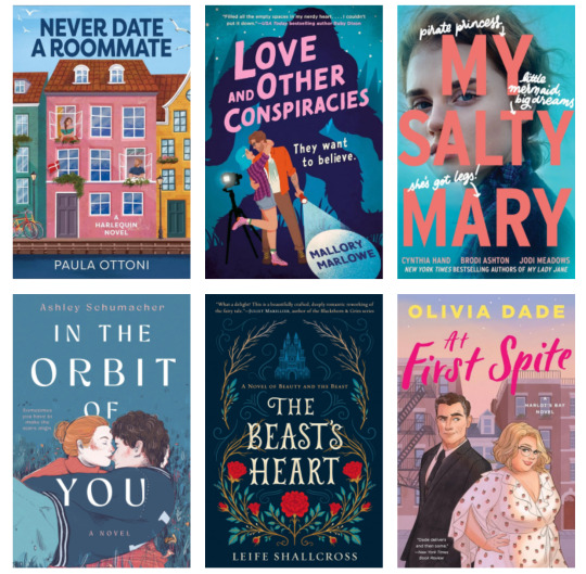

Never Date a Roommate - Paula Ottoni
Love and Other Conspiracies - Mallory Marlowe
My Salty Mary - Cynthia Hand, Brodi Ashton, & Jodi Meadows
In the Orbit of You - Ashley Schumacher
The Beast's Heart - Leife Shallcross
At First Spite - Olivia Dade
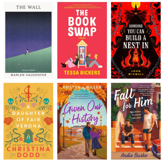
The Wall - Marlen Haushofer
The Book Swap - Tessa Bickers
Someone You Can Build a Nest In - John Wiswell
A Daughter of Fair Verona - Christina Dodd
Given Our History - Kristyn J. Miller
Fall for Him - Andie Burke
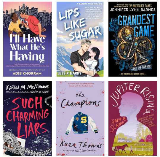
I'll Have What He's Having - Adib Khorram
Lips Like Sugar - Jess K. Hardy
The Grandest Game - Jennifer Lynn Barnes
Such Charming Liars - Karen M. McManus
The Champions - Kara Thomas
Jupiter Rising - Gary D. Schmidt
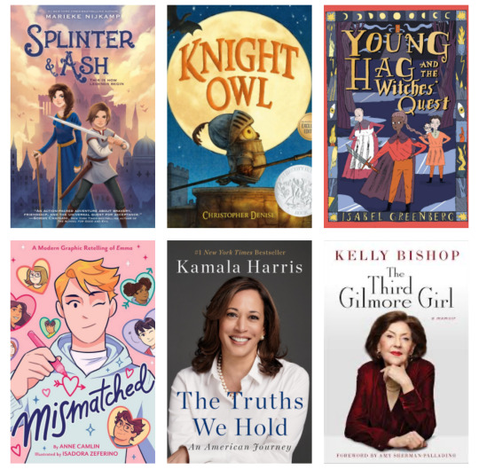
Splinter & Ash - Marieke Nijkamp
Knight Owl - Christopher Denise
Young Hag and the Witches' Quest - Isabel Greenberg
Mismatched - Anne Camlin
The Truths We Hold - Kamala Harris
The Third Gilmore Girl - Kelly Bishop
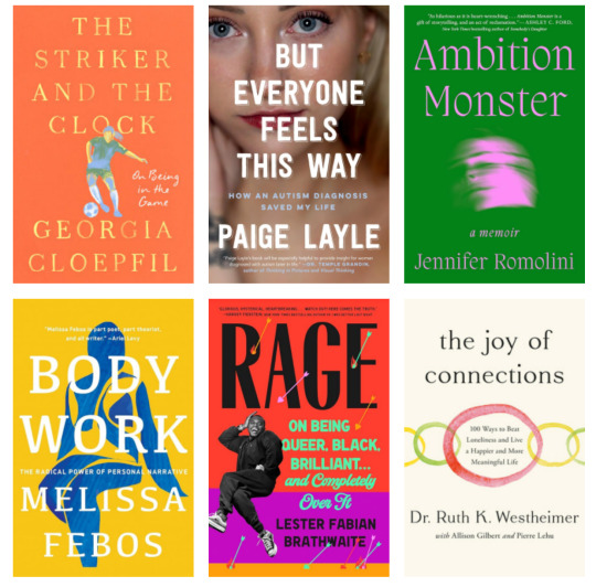
The Striker and the Clock - Georgia Cloepfil
But Everyone Feels This Way - Paige Layle
Ambition Monster - Jennifer Romolini
Body Work - Melissa Febos
Rage - Lester Fabian Brathwaite
The Joy of Connections - Ruth Westheimer
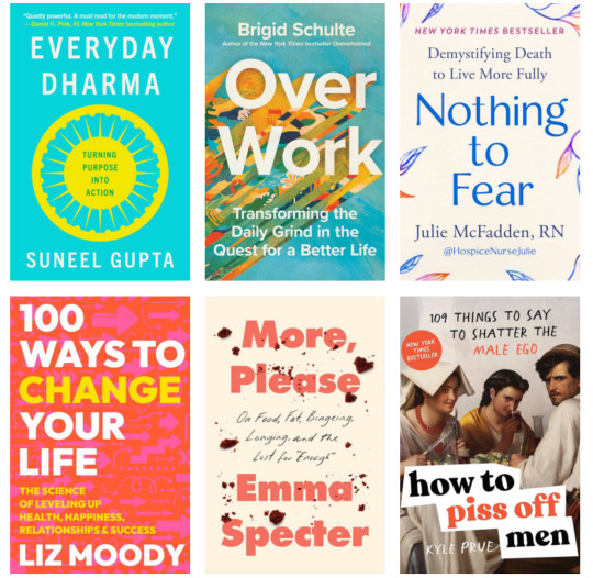
Everyday Dharma - Sunned Gupta
Over Work - Brigid Schulte
Nothing to Fear - Julie McFadden
100 Ways to Change Your Life - Liz Moody
More, Please - Emma Specter
How to Piss Off Men - Kyle Prue
Shitty Craft Club - Sam Reece
Simply Julia - Julia Turshen
Bold = Highly Recommend
Italics = Worth It
Crossed Out = Nope
Thoughts: I'll be thinking about The Wall by Marlen Haushofer for quite some time. It's a feminist, dystopian, survivalist tale with some truly harrowing moments.
Goodreads Goal: 334/400
2017 Reads | 2018 Reads | 2019 Reads | 2020 Reads | 2021 Reads | 2022 Reads | 2023 Reads | 2024 Reads
17 notes
·
View notes
Text
Time Line of Trump Trials:
October 2, 2023: New York State Civil Law Suit
| | | | | | | | | | | | |
January 4, 2024: Federal case against Trump over 2020 election interference
| |
January 15, 2024: Second civil case against Trump over Rape and defamation of E. Jean Carroll
| |
January 29, 2024: Class action lawsuit for fraud and racketeering
| | | | | March 4, 2024: Georgia 2020 election interference and RICO case | | |
March 25, 2024: New York State prosecution in the Hush Money case
| | | | | | | |
May 20, 2024: Federal trail in the classified documents case
dates in bold represent set trial dates, dates in italic represent the prosecutions requested trial date that have not been set by a Judge so are subject to change
22 notes
·
View notes
Text
Font, Display Font, Groovy font, Fancy Font,

font, free fonts, font style, dafonts, fontgenerator, helvetica, whatthefont, graffiti font, calligraphy fonts, cool fonts, font online, find font, cursive fonts, tattoo fonts, letter fonts, handwritten fonts, font aesthetic, find font from image, helvetica font, gothic font, font text, fancy fonts, fancy text, cute fonts, bold fonts, montserrat font, font styles names, stylish text, calligraphy lettering, text style,
Read more here ==>> font style
poppins font, times new roman, bembo, tattoo font styles, font meme, meme font, what de font, font id, bubble lettering, bold text, bold text font, comic sans, comic sans ms, cool text symbols, cool texts, discord font, fancy font style, font poppins, fonts for discord, avenir, gotham font, logo fonts, gilroy font, retro fonts, font creator, modern fonts, vintage fonts, free fonts for commercial use, univers font, custom fonts, font design, script fonts, neon font, helvetica neue, best fonts for websites, wedding fonts, the seasons font, 3d fonts, best fonts for logos, typography design, groovy font, different fonts, frutiger font, best fonts, bubble font, lettering styles, stencil font, christmas fonts, western fonts, luxury fonts, baskerville, lucida, serif fonts, sports fonts, art deco fonts, 70s fonts, typewriter font, font cloud, proxima nova font, nexa font, elegant fonts, avenir font, futuristic fonts, signature font, baseball font, halloween fonts, fancy letters, fun fonts, typography fonts, futura font, proxima nova, varsity font, frutiger, font types, neue haas grotesk, sans serif font, script letters, sans serif, new fonts, professional fonts, 80s fonts, downloadable fonts, fire font, blackletter font, y2k fonts, bubble letter font, 90s fonts, writing fonts, different font styles, number fonts, fonts art, death metal font, gothic letters, optima font, comic book font, times new roman font, fancy writing, fonts style designs, brush font, rounded fonts, star wars font, word fonts, arial font, drip font, display fonts, collegiate font, barcode font, metal font, typeface, bauhaus font, beautiful fonts, grunge fonts, comic font, chalk font, helvetica neue font, block letter font, garamond font, art nouveau font, minimalist fonts, medieval font, free fonts online, cyberpunk font, nice fonts, akzidenz grotesk, tattoo lettering fonts, chalkboard font, stamp font, pretty fonts, heavy metal font, tattoo script font, baskerville font, special fonts, eurostile font, balloon font, metropolis font, different letter fonts, classic fonts, spooky fonts, font styles free, harry potter font, block font, cooper black font, alphabet fonts, rockwell font, punk fonts, pirate font, calibri font, font names, bodoni font, cinematic fonts, tech fonts, water font, friends font, outline font, roman font, brush script font, italic font, calligraphr, copperplate font, gaming fonts, didot font, font style online, different types of fonts, canva fonts, merry christmas font, chicano font, lobster font, century gothic font, glacial indifference font, digital font, garamond, font from image, vogue font, newspaper font, text aesthetic, bookman font, bluey font, cool letters, movie fonts, floral font, akira expanded font, royal fonts, cool text fonts, horror fonts, lettering tattoo, toy story font, trajan pro font, fantasy fonts, great vibes font, myriad pro font, georgia font, square font, roboto, big font, rubber stamp font, tattoo fonts cursive, video game font, lemon milk font, circular font, playfair display font, gangster font, algerian font, flower font, verdana font, spiderman font, gill sans font, best tattoo fonts, impact font, scary fonts, jersey font, pixel font, san francisco font, roboto font, simple fonts, poster fonts, font family, palatino font, super mario font, myriad pro,
2 notes
·
View notes
Text
Significant WAG AA Scores under the 2022-24 Code of Points
This is not a complete list, it's a rough attempt to show where people stand. I have only included domestic meets if I have no other choice to reflect that gymnast but you should take them with a huge heaping of salt. I included a number of juniors who are Paris eligible.
Italics indicate a domestic competition subject to overscoring. Bold are scores from 2023
1 Simone Biles (USA) - 59.100 at 2023 US Classic
2 Rebeca Andrade (BRA) - 57.332 at 2022 Worlds QF
3 Melanie de Jesus dos Santos (FRA) - 56.200 at 2023 US Classic
4 Jordan Chiles (USA) - 55.833 at 2022 Worlds TF
5 Shilese Jones (USA) - 55.766 at 2022 Worlds QF
6 Jessica Gadirova (GBR) - 55.566 at 2023 Euros QF
- Jessica Gadirova (GBR) - 55.199 at 2022 Worlds AA
7 Jade Carey (USA) - 55.132 at 2022 Worlds QF
8 Alice Kinsella (GBR) - 55.065 at 2022 Worlds AA
9 Georgia Godwin (AUS) - 55.066 at 2023 Australian Champs
10 Qiu Qiyuan (CHN) - 54.932 at 2023 Asian Championships
11 Zsofia Kovacs (HUN) - 54.899 at 2023 Euros
12 Ellie Black (CAN) - 54.732 at 2022 Worlds AA
13 Alice D’Amato (ITA) - 54.500 at 2023 Euros
14 Ou Yushan (CHN) - 54.498 at the 2023 University Games
15 Leanne Wong (USA) - 54.100 at 2023 US Classic
16 Joscelyn Roberson (USA) - 54.050 at 2023 US Classic
17 Tiana Sumanasekera (USA) - 53.900 at 2023 Pan Am Champs
18 Helen Kevric (GER) - 53.900 at 2023 EYOF*
19 Hezly Rivera (USA) - 53.350 at 2023 US Winter Cup
20 Sakaguchi Ayaka (JPN) - 53.165 at 2023 University Games
21 Luo Huan (CHN) - 53.765 at 2023 University Games
22 Kaylia Nemour (ALG) - 53.731 at 2023 African Champs
23 Kieryn Finnell (USA) - 52.800 at 2023 US Classic
- Alice Kinsella (GBR) - 52.531 at 2023 Euros QF
24 Yamaguchi Sara (JPN) - 52.065 at 2023 Jr. Worlds QF*
25 Nakamura Haruka (JPN) - 51.765 at 2023 Jr. Worlds AA*
26 Ruby Pass (AUS) - 50.464 at 2023 Oceania Champs
*A junior score delivered under the FIG rules for juniors including a cap on skills at E and without some bonuses such as D dismount. It should be assumed these gymnasts would have higher AA scores if competing as seniors. US junior scoring is not subject to the same FIG rules as international scoring.
6 notes
·
View notes
Text
Typography: Mastering Fonts and Text for the Art of Visual Communication
Typography, the art and science of arranging type, is a fundamental aspect of visual communication. It's more than just choosing a font; it's about understanding how typefaces, spacing, and layout contribute to readability, aesthetics, and the overall message. From books and websites to posters and logos, typography plays a crucial role in how we consume and interpret information. To delvhttps://maacpunesatararoad.com/graphic-designing/e deeper into this fascinating field, consider enrolling in a graphic design institute in Pune.
The Basics of Typography
1. Typeface vs. Font: While often used interchangeably, these terms have distinct meanings. A typeface is the overall design of a set of characters, while a font refers to a specific weight, style, or size within that typeface (e.g., Arial Bold, Times New Roman Italic).
2. Classification of Typefaces: Typefaces are broadly categorized into families, each with distinct characteristics:
Serif: Typefaces with small decorative strokes at the end of letterforms (e.g., Times New Roman, Georgia). They convey tradition, formality, and readability.
Sans-serif: Typefaces without serifs, offering a clean, modern look (e.g., Arial, Helvetica). They convey simplicity, clarity, and contemporary aesthetics.
Script: Typefaces that mimic handwriting, often used for decorative purposes (e.g., Brush Script, Lucida Calligraphy). They convey elegance, creativity, and personality.
Display: Decorative typefaces designed to catch attention, often used for headlines and posters (e.g., Impact, Cooper Black). They convey boldness, uniqueness, and visual impact.
3. Anatomy of Type: Understanding the anatomy of letterforms is crucial for effective typography. Key elements include:
Baseline: The invisible line on which characters sit.
X-height: The height of lowercase letters (excluding ascenders and descenders).
Ascender: The part of a lowercase letter that extends above the x-height.
Descender: The part of a lowercase letter that extends below the baseline.
Kerning: The spacing between individual characters.
Tracking: The overall spacing between letters in a word or line of text.
Leading: The vertical spacing between lines of text.
The Role of Typography
Typography serves multiple purposes in visual communication:
Readability: Choosing legible typefaces and optimizing spacing ensures that text is easy to read and understand.
Aesthetics: Typography contributes to the overall visual appeal and style of a design.
Hierarchy: Using different typefaces, sizes, and weights creates visual hierarchy, guiding the reader's eye and emphasizing key information.
Brand Identity: Typography plays a crucial role in establishing brand recognition and conveying brand personality.
Emotional Impact: Different typefaces evoke different emotions and associations, influencing how the message is perceived.
Typography in Different Media
Typography adapts to different media and contexts:
Print Design: Considerations include paper type, printing techniques, and the physical format of the publication.
Web Design: Factors like screen resolution, responsive design, and web accessibility influence typeface choices and layout.
Mobile Design: Typography needs to be optimized for smaller screens and touch interactions.
Environmental Design: Signage, wayfinding, and public displays require clear and legible typography for effective communication.
Best Practices for Effective Typography
Choose Legible Typefaces: Prioritize readability over decorative styles, especially for large amounts of text.
Optimize Spacing: Adjust kerning, tracking, and leading to create comfortable reading rhythms and visual balance.
Create Contrast: Use different typefaces, sizes, and weights to establish visual hierarchy and emphasize key elements.
Limit the Number of Typefaces: Using too many typefaces can create a cluttered and confusing design.
Consider the Context: Choose typefaces that align with the tone, purpose, and audience of the communication.
Test and Refine: Experiment with different typographic choices and gather feedback to ensure effective communication.
The Future of Typography
Typography continues to evolve with advancements in technology and design trends. We can expect to see:
Variable Fonts: Fonts that offer a wide range of styles and variations within a single file, providing greater flexibility and creativity.
Responsive Typography: Typefaces that adapt to different screen sizes and orientations, ensuring optimal readability on any device.
Interactive Typography: Typography that responds to user interactions, creating dynamic and engaging experiences.
AI-Powered Typography: Tools that automate typographic choices and optimize layouts for specific purposes.
Conclusion
Typography is a powerful tool for visual communication, shaping how we read, interpret, and engage with information. By understanding the fundamentals of typefaces, spacing, and layout, designers can create effective and aesthetically pleasing designs that communicate their message clearly and resonate with their audience. A graphic design institute can equip aspiring designers with the skills and knowledge to master the art of typography. As technology advances and design trends evolve, typography will continue to play a crucial role in how we interact with the world around us.
0 notes
Text
Font Variations and Typography: Exploring the Art of Text Design
Typography is more than just choosing a font; it is an art form that communicates mood, personality, and function through the arrangement of type. One of the most fascinating aspects of typography is the vast array of font variations available.
These variations, from serif to sans-serif, bold to italic, can significantly affect how a message is perceived. In this article, we explore the importance of font variations and how they impact design and readability.
What Are Font Variations?
Font variations refer to the different styles, weights, and sizes that a single typeface can offer. For example, within a type family, you might find regular, bold, italic, and light versions, each with its own unique characteristics. Some fonts even come with additional variations such as condensed or extended forms, which can alter the width and structure of the letters.
The two primary categories of fonts are:
Serif Fonts – These fonts have small lines or decorations at the ends of their letters. They are often considered more traditional and are commonly used in print media like newspapers and books. Examples include Times New Roman and Georgia.
Sans-Serif Fonts – Sans-serif fonts lack the decorative lines found in serif fonts. They offer a cleaner, modern look and are widely used in digital media and on websites. Examples include Helvetica and Arial.
Importance of Font Variations
Font variations enhance readability and convey a certain style or emotion that aligns with the purpose of the text. For instance, bold fonts are often used to highlight key points or to create emphasis, while italicized text can indicate quotes, foreign words, or titles. Meanwhile, light fonts can provide a more elegant, understated look, often seen in luxury branding.
Additionally, font variations are integral to establishing a hierarchy in design. Designers can use different font weights and sizes to guide the viewer's eye and indicate which pieces of information are most important. For example, headings are usually in a larger, bolder font to catch attention, while body text is smaller and easier to read.
The Role of Typography in Branding
Typography plays a crucial role in branding because it helps create a consistent and recognizable identity. By choosing the right combination of fonts, companies can communicate their values, personality, and target audience. A tech company might opt for a sleek, sans-serif typeface to represent innovation, while a luxury brand may choose an elegant serif font to convey sophistication.
Conclusion
Font variations and typography are vital tools in visual communication. They go beyond aesthetic appeal and influence how information is perceived and understood. By carefully selecting and using different fonts and styles, designers can effectively convey messages, enhance readability, and create memorable experiences for their audience.
FAQs
1. What is the difference between serif and sans-serif fonts?
Serif fonts have small decorative lines at the ends of the letters, giving them a more traditional and formal appearance. Sans-serif fonts do not have these lines, making them cleaner and more modern, often preferred for digital content.
2. Why are font variations important in design?
Font variations help establish a visual hierarchy, making it easier for readers to navigate content. They also enhance readability and can convey different emotions or messages, supporting the overall theme of the design.
3. Can typography influence the way we perceive a brand?
Yes, typography plays a significant role in shaping the perception of a brand. The choice of fonts helps communicate the brand's personality, values, and tone, influencing how consumers connect with the brand.
0 notes
Text
Typography as a UI/UX Element: Mastering Font Psychology and Hierarchy in Elementor Design
In the realm of web design, typography is far more than just words on a screen. It's a powerful UI/UX element that can make or break your website's effectiveness. When wielded skillfully, typography can guide users, evoke emotions, and create a memorable brand experience. This is especially true when working with a versatile page builder like Elementor, which offers extensive typographic controls. In this post, we'll delve into the psychology of fonts and the art of typographic hierarchy, providing you with the knowledge to elevate your Elementor designs.
The Psychology of Fonts: More Than Meets the Eye
Every font tells a story and evokes certain emotions. Understanding font psychology is crucial for creating designs that resonate with your target audience.
Serif Fonts: Tradition and Credibility
Serif fonts, characterized by their small lines at the ends of characters, are often associated with tradition, reliability, and respectability. They're excellent choices for brands that want to convey a sense of heritage or academic authority.
In Elementor, you might use a serif font like Georgia or Times New Roman for:
Law firm websites
Academic institutions
Traditional financial services
Sans-Serif Fonts: Modern and Clean
Sans-serif fonts, lacking the small lines of their serif counterparts, are perceived as modern, clean, and straightforward. They're popular in digital interfaces due to their readability on screens.
When designing in Elementor, consider sans-serif fonts like Arial or Roboto for:
Tech startups
Contemporary fashion brands
Minimalist design agencies
Script Fonts: Elegance and Creativity
Script fonts mimic handwriting and calligraphy, evoking feelings of elegance, creativity, and personal touch. However, they should be used sparingly due to potential readability issues.
In Elementor, script fonts like Brush Script or Lobster can be effective for:
Wedding-related websites
High-end restaurants
Artistic portfolios
Display Fonts: Unique and Attention-Grabbing
Display fonts are designed to capture attention and are often used for headlines or short phrases. They can be playful, bold, or decorative, depending on the specific font.
When working in Elementor, you might use display fonts for:
Event posters
Music festival websites
Children's products
Remember, Elementor allows you to easily import custom fonts, expanding your typographic palette beyond the standard web-safe options.
Mastering Typographic Hierarchy in Elementor
Typographic hierarchy is the practice of organizing type in a way that emphasizes the most important information and guides the reader through the content. In Elementor, you have precise control over various typographic elements, allowing you to create clear and effective hierarchies.
1. Size Matters
The most straightforward way to establish hierarchy is through font size. Larger text naturally draws the eye first. In Elementor, you can easily adjust font sizes for different elements:
Use large, bold fonts for main headings (H1)
Gradually decrease size for subheadings (H2, H3, etc.)
Keep body text at a comfortable reading size (typically 16-18px for web)
2. Weight and Style
Font weight (boldness) and style (italic, underline) can also indicate importance:
Use bold text for key points or calls-to-action
Apply italics for emphasis or quotes
Underline sparingly, as it can be confused with hyperlinks
Elementor's Typography controls allow you to fine-tune these aspects for each text element.
3. Color and Contrast
Color can be used to highlight important information and create visual interest:
Use a contrasting color for headings to make them stand out
Ensure sufficient contrast between text and background for readability
Consider using color to group related information
Elementor's color picker and global color swatches make it easy to maintain consistency across your design.
4. Spacing and Layout
The arrangement of text on the page also contributes to hierarchy:
Use white space to separate different sections
Align related content for easy scanning
Consider line height and letter spacing for optimal readability
Elementor's advanced positioning and spacing controls give you pixel-perfect control over your layout.
Practical Tips for Implementing Typography in Elementor
Now that we've covered the fundamentals, let's look at some practical tips for implementing effective typography in your Elementor designs:
Limit Your Font Choices: Stick to 2-3 fonts maximum to maintain consistency. Elementor's Global Fonts feature helps you apply this consistently across your site.
Use Responsive Typography: Elementor allows you to set different font sizes for desktop, tablet, and mobile. Use this to ensure readability across all devices.
Leverage Custom CSS: For advanced typographic effects, you can use Elementor's Custom CSS option to apply specific styles to your text elements.
Create a Type Scale: Establish a consistent scale for your font sizes. Elementor's Global Settings can help you maintain this scale across your site.
Consider Readability: Always prioritize readability over aesthetics. Use Elementor's preview mode to check how your typography looks on different devices.
Use Elementor's Theme Style: This feature allows you to set global typography styles, ensuring consistency across your entire site.
Experiment with Elementor's Text Path Widget: For creative typographic effects, try the Text Path widget to curve text along a custom path.
Conclusion:
Typography is a fundamental aspect of UI/UX design, capable of influencing user perception, guiding navigation, and enhancing overall user experience. With Elementor's robust typography controls, you have the power to create designs that are not only visually appealing but also psychologically impactful and highly usable.
Remember, great typography is often invisible – it does its job so well that users don't even notice it. They simply enjoy a smooth, intuitive experience navigating your website. By mastering font psychology and typographic hierarchy in Elementor, you're not just arranging text; you're crafting experiences, guiding users, and bringing your brand's voice to life.
So the next time you're designing in Elementor, take a moment to consider your typography. Are your font choices reflecting your brand personality? Is your typographic hierarchy guiding users effectively? With the knowledge and tools at your disposal, you have the power to transform simple text into a powerful UI/UX element that elevates your entire design.
Visit my Upwork project catalog : Elementor Developer
0 notes
Text
Vizualinė harmonija: šriftų reikšmė dizaino kūrinyje
Tipografija yra neatsiejama dizaino dalis, kuri lemia ne tik teksto skaitymo patogumą, bet ir viso projekto estetinį poveikį. Šriftai, kaip pagrindinė tipografijos dalis, turi unikalią galią perduoti informaciją, nuotaiką ir net prekės ženklo vertybes. Šiame straipsnyje aptarsime, kaip skirtingi šriftai gali paveikti dizaino estetiką ir kaip pasirinkti tinkamą šriftą jūsų projektui.
Šrifto charakteris ir asmenybė Kiekvienas šriftas turi savo charakterį ir asmenybę, kurią jis perteikia skaitytojui. Pavyzdžiui, serifiniai šriftai, tokie kaip „Times New Roman“ ar „Georgia“, paprastai siejami su tradicijomis, patikimumu ir autoritetu. Tuo tarpu sans-serifiniai šriftai, kaip „Arial“ ar „Helvetica“, dažniausiai perteikia modernumą, švarumą ir paprastumą. Rankraštiniai šriftai gali suteikti dizainui asmeniškumo, kūrybiškumo ir elegancijos, o monospace šriftai – technologiškumo ir funkcionalumo jausmą.
Emocinis poveikis Šriftai gali sukelti įvairias emocijas ir nuotaikas. Pavyzdžiui, apvalesni, draugiškesni šriftai dažnai perteikia šilumą ir prieinamumą, o kampuotesni šriftai – tvirtumą ir profesionalumą. Didesni šriftai su plačiais tarpais gali atrodyti prabangiai, o mažesni ir tankesni šriftai gali sukurti įtampos ar intensyvumo jausmą. Šrifto pasirinkimas yra svarbus kuriant nuotaiką, kuri atitinka jūsų dizaino tikslus ir auditoriją.
Skaitymo patogumas Nepaisant estetikos, svarbu nepamiršti šrifto funkcionalumo – kaip lengvai tekstas bus skaitomas. Skaitant ilgus tekstus, svarbu pasirinkti šriftą, kuris būtų lengvai skaitomas tiek ekrane, tiek spausdintame formate. Paprastai serifiniai šriftai yra laikomi lengviau skaitomais spausdintuose tekstuose, tuo tarpu sans-serifiniai – ekrane. Tačiau šrifto dydis, tarpai tarp raidžių ir eilučių taip pat turi didelę reikšmę skaitomumui.
Šrifto derinimas Vieno šrifto pasirinkimas dažnai nėra pakankamas, ypač sudėtingesniuose projektuose, kur reikia derinti kelis šriftus. Svarbu, kad šriftai tarpusavyje derėtų, o jų kontrastas būtų harmoningas. Pavyzdžiui, galite derinti serifinius ir sans-serifinius šriftus, kad sukurtumėte subtilų, tačiau pastebimą skirtumą tarp antraščių ir pagrindinio teksto. Taip pat svarbu atsižvelgti į šrifto svorį (bold, regular) ir stilių (italic), kad išlaikytumėte nuoseklumą ir aiškumą.
Šrifto įtaka prekės ženklui Šriftai yra viena iš pagrindinių prekės ženklo tapatybės dalių. Tinkamai parinktas šriftas gali padėti sustiprinti prekės ženklo žinutę, išskirti jį iš konkurentų ir sukurti emocinį ryšį su auditorija. Pavyzdžiui, įmonė, kuri siekia perteikti inovatyvumą ir šiuolaikiškumą, gali pasirinkti modernų sans-serifinį šriftą, o įmonė, kuri siekia išlaikyti tradicijas ir patikimumą, gali rinktis klasikinį serifinį šriftą. Išvada apie šią grafinio dizaino paslaugą Tipografija yra daugiau nei tik teksto išdėstymas – tai galingas dizaino įrankis, kuris gali padaryti didelę įtaką bendrai projekto estetikos sėkmei. Pasirinkdami tinkamą šriftą, galite ne tik užtikrinti, kad tekstas bus lengvai skaitomas, bet ir perteikti norimą žinutę bei emociją. Kuriant dizainą, svarbu atsižvelgti į šrifto charakterį, jo emocinį poveikį, skaitomumą ir derinimą, kad sukurtumėte harmoningą ir estetiškai patrauklų rezultatą.
0 notes
Text
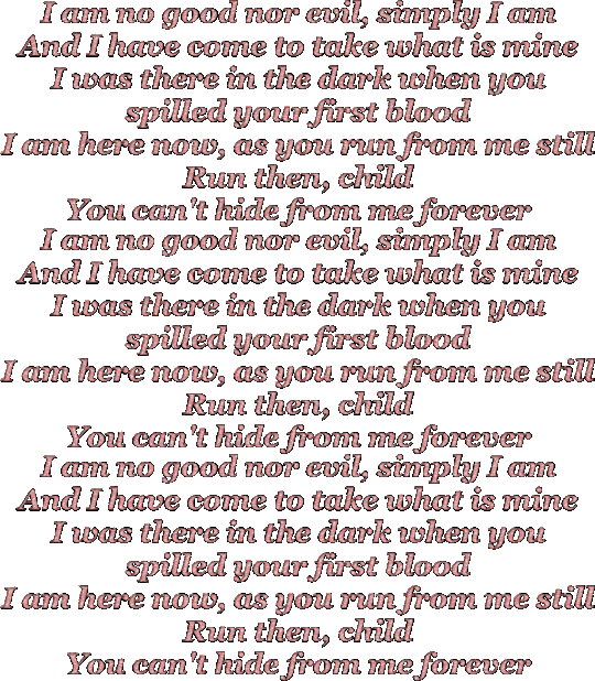
Ptolemaea • Ethel Cain
#ethel cain#Ptolemaea#gif warning#glitter text#georgia bold italic#bloggif.com#pink#lyrics#album: preacher’s daughter
112 notes
·
View notes
Text
October 2024 Reads


The Rom-Commers - Katherine Center
The Ex Vows - Jessica Joyce
How to Hide in Plain Sight - Emma Noyes
Triple Sec - T.J. Alexander
The Merriest Misters - Timothy Janovsky
Most Wonderful - Georgia Clark
The Situationship - Abby Jimenez
Straight - Chuck Tingle
Sorcery and Small Magics - Maiga Doocy
Lake of Souls - Ann Leckie
The Wood at Midwinter - Susanna Clarke
The Agency for Scandal - Laura Wood
Knight Owl and Early Bird - Christopher Denise
The Bakery Dragon - Devin Elle Kurtz
The Millicent Quibb School for Etiquette for Young Ladies of Mad Science - Kate McKinnon
Bye Forever, I Guess - Jodi Meadows
Mabel Wants a Friend - Ariel Bernstein
Into the Uncut Grass - Trevor Noah
Scaredy Squirrel - Melanie Watt
Scaredy Squirrel Makes a Friend - Melanie Watt
Scaredy Squirrel at the Beach - Melanie Watt
Scaredy Squirrel at Night - Melanie Watt
Scaredy Squirrel Has a Birthday Party - Melanie Watt
Scaredy Squirrel Goes Camping - Melanie Watt
CatStronauts: Moon Mission - Drew Brockington
Fangirl, Vol 4 - Rainbow Rowell, Gabi Nam
An Age of License - Lucy Knisley
Going Into Town - Roz Chast
You Can Only Yell at Me for One Thing at a Time - Row Chast
Impossible People - Julia Wertz
Cattitude - Katie Abey
oh no - Alex Norris
Milk & Mocha - Melani Sie
Lovely One - Ketanji Brown Jackson
It Gets Better...Except When It Gets Worse - Nicole Maines
What in the World?! - Leanne Morgan
Democracy in Retrograde - Sami Sage & Emily Amick
Abortion - Jessica Valenti
Anxiety Rx - Russell Kennedy
Still Distracted After All These Years - Kathleen G. Nadeau
You Deserve Good Gelato - Kacie Rose
Big Vegan Flavor - Nisha Vora
Bold = Highly Recommend
Italics = Worth It
Crossed Out = Nope
Thoughts: The Rom-Commers is a standout contemporary romance - really fun. I think Emily Henry fans would like it. I also really enjoyed Bye Forever, I Guess - a middle school You've Got Mail.
Goodreads Goal: 369/400
2017 Reads | 2018 Reads | 2019 Reads | 2020 Reads | 2021 Reads| 2022 Reads | 2023 Reads | 2024 Reads
13 notes
·
View notes
Note
💖
Send a 💖 and I’ll tell you what a relationship would be like with my character:
How likely they are to enter a relationship with them:
1 | 2 | 3 | 4 | 5 | 6 | 7 | 8 | 9 | 10
Would they…
Make the first move? Yes | No Say “I love you” first? Yes | No Cheat on them? Yes | No Be the jealous type? Yes | No Plan the dates? Yes | No Initiate the first kiss? Yes | No Remember anniversaries? Yes | No
BOLD WHAT APPLIES: Their Relationship Is:
friends to lovers | rivals to lovers | enemies to lovers | still just enemies | mutual pining | star crossed lovers | old married couple | perpetual honeymoon phase | stable and boring | stable but not boring | secret lovers | best friends hiding their feelings | and they were roommates | friends with benefits | coworkers avoiding HR | one-sided affection | weird sexual tension | it’s complicated | toxic relationship | a secret affair | an actual dumpster fire | other
PUBLIC Displays of Affection:
hand holding | kiss on the hand | kiss on the cheek | kiss on the forehead | kiss on the lips | cuddling | hugging | affectionate messages or comments | pet names | pictures together | no displays of affection
PRIVATE Displays of Affection:
hand holding | kiss on the hand | kiss on the cheek | kiss on the forehead | kiss on the lips | cuddling | hugging | affectionate messages or comments | pet names | pictures together | no displays of affection
Do they stay together?
yes, this is endgame | yes but someone is gonna die tragically | something is keeping them apart | they part ways as friends | they part ways as enemies | they’re on-again-off-again | they have a super messy breakup | it was just a fling | other
BONUS What terrible pet names would they give each other?
James will have a lot of nicknames relating to Abby's red hair and short height, and probably use the ironic "Amazon" for her. And he'd probably use something Georgia-related, Peaches or Peach or Miss Georgia. I don't think he'd settle on anything. I really am not sure what Abby would say.
--------------------------------------------------------
(Well, they ARE married in one verse, so they automatically get a 10 on that one. I used italics for a few things that may or may not be accurate. James will plan some dates but Abby's probably going to have to do most of it. And she'd have to make the first move since he started as her instructor and that would be awkward, and he's already not great at making initial moves.)
1 note
·
View note
Text
.tabs { position: relative; margin: 40px auto; width: 100%; height: 450px } .tabs input { position: absolute; z-index: 1000; width: 120px; height: 40px; left: 0px; top: 0px; opacity: 0; -ms-filter:"progid:DXImageTransform.Microsoft.Alpha(Opacity=0)"; filter: alpha(opacity=0); cursor: pointer; } .tabs input#tab-2{ left: 120px; } .tabs input#tab-3{ left: 240px; } .tabs input#tab-4{ left: 360px; } .tabs label { background: #5ba4a4; background: -moz-linear-gradient(top, #5ba4a4 0%, #4e8c8a 100%); background: -webkit-gradient(linear, left top, left bottom, color-stop(0%,#5ba4a4), color-stop(100%,#4e8c8a)); background: -webkit-linear-gradient(top, #5ba4a4 0%,#4e8c8a 100%); background: -o-linear-gradient(top, #5ba4a4 0%,#4e8c8a 100%); background: -ms-linear-gradient(top, #5ba4a4 0%,#4e8c8a 100%); background: linear-gradient(top, #5ba4a4 0%,#4e8c8a 100%); font-size: 15px; line-height: 40px; height: 40px; position: relative; padding: 0 20px; float: left; display: block; width: 80px; color: #385c5b; letter-spacing: 1px; text-transform: uppercase; font-weight: bold; text-align: center; text-shadow: 1px 1px 1px rgba(255,255,255,0.3); border-radius: 3px 3px 0 0; box-shadow: 2px 0 2px rgba(0,0,0,0.1), -2px 0 2px rgba(0,0,0,0.1); } .tabs label:after { content: ''; background: #fff; position: absolute; bottom: -2px; left: 0; width: 100%; height: 2px; display: block; } .tabs input:hover + label { background: #5ba4a4; } .tabs label:first-of-type { z-index: 4; box-shadow: 2px 0 2px rgba(0,0,0,0.1); } .tab-label-2 { z-index: 3; } .tab-label-3 { z-index: 2; } .tab-label-4 { z-index: 1; } .tabs input:checked + label { background: #fff; z-index: 6; } .clear-shadow { clear: both; } .content { background: #fff; position: relative; width: 100%; height: 370px; z-index: 5; box-shadow: 0 -2px 3px -2px rgba(0,0,0,0.2), 0 2px 2px rgba(0,0,0,0.1); border-radius: 0 3px 3px 3px; } .content div { position: absolute; top: 0; left: 0; padding: 10px 40px; z-index: 1; opacity: 0; -webkit-transition: opacity linear 0.1s; -moz-transition: opacity linear 0.1s; -o-transition: opacity linear 0.1s; -ms-transition: opacity linear 0.1s; transition: opacity linear 0.1s; } .tabs input.tab-selector-1:checked ~ .content .content-1, .tabs input.tab-selector-2:checked ~ .content .content-2, .tabs input.tab-selector-3:checked ~ .content .content-3, .tabs input.tab-selector-4:checked ~ .content .content-4 { z-index: 100; -ms-filter:"progid:DXImageTransform.Microsoft.Alpha(Opacity=100)"; filter: alpha(opacity=100); opacity: 1; -webkit-transition: opacity ease-out 0.2s 0.1s; -moz-transition: opacity ease-out 0.2s 0.1s; -o-transition: opacity ease-out 0.2s 0.1s; -ms-transition: opacity ease-out 0.2s 0.1s; transition: opacity ease-out 0.2s 0.1s; } .content div h2, .content div h3{ color: #398080; } .content div p { font-size: 14px; line-height: 22px; font-style: italic; text-align: left; margin: 0; color: #777; padding-left: 15px; font-family: Cambria, Georgia, serif; border-left: 8px solid rgba(63,148,148, 0.1); }
OKRU VK NETU
1 note
·
View note
Text
Typography: Understanding Fonts and Text - The Art and Science of Visual Communication
Typography, the art and science of arranging type, is a fundamental aspect of visual communication. It's more than just choosing a font; it's about understanding how typefaces, spacing, and layout contribute to readability, aesthetics, and the overall message. From books and websites to posters and logos, typography plays a crucial role in how we consume and interpret information. To delve deeper into this fascinating field, consider enrolling in a graphic design institute in Pune.
**The Basics of Typography**
1. **Typeface vs. Font:** While often used interchangeably, these terms have distinct meanings. A typeface is the overall design of a set of characters, while a font refers to a specific weight, style, or size within that typeface (e.g., Arial Bold, Times New Roman Italic).
2. **Classification of Typefaces:** Typefaces are broadly categorized into families, each with distinct characteristics:
* **Serif:** Typefaces with small decorative strokes at the end of letterforms (e.g., Times New Roman, Georgia). They convey tradition, formality, and readability.
* **Sans-serif:** Typefaces without serifs, offering a clean, modern look (e.g., Arial, Helvetica). They convey simplicity, clarity, and contemporary aesthetics.
* **Script:** Typefaces that mimic handwriting, often used for decorative purposes (e.g., Brush Script, Lucida Calligraphy). They convey elegance, creativity, and personality.
* **Display:** Decorative typefaces designed to catch attention, often used for headlines and posters (e.g., Impact, Cooper Black). They convey boldness, uniqueness, and visual impact.
3. **Anatomy of Type:** Understanding the anatomy of letterforms is crucial for effective typography. Key elements include:
* **Baseline:** The invisible line on which characters sit.
* **X-height:** The height of lowercase letters (excluding ascenders and descenders).
* **Ascender:** The part of a lowercase letter that extends above the x-height.
* **Descender:** The part of a lowercase letter that extends below the baseline.
* **Kerning:** The spacing between individual characters.
* **Tracking:** The overall spacing between letters in a word or line of text.
* **Leading:** The vertical spacing between lines of text.
**The Role of Typography**
Typography serves multiple purposes in visual communication:
* **Readability:** Choosing legible typefaces and optimizing spacing ensures that text is easy to read and understand.
* **Aesthetics:** Typography contributes to the overall visual appeal and style of a design.
* **Hierarchy:** Using different typefaces, sizes, and weights creates visual hierarchy, guiding the reader's eye and emphasizing key information.
* **Brand Identity:** Typography plays a crucial role in establishing brand recognition and conveying brand personality.
* **Emotional Impact:** Different typefaces evoke different emotions and associations, influencing how the message is perceived.
**Typography in Different Media**
Typography adapts to different media and contexts:
* **Print Design:** Considerations include paper type, printing techniques, and the physical format of the publication.
* **Web Design:** Factors like screen resolution, responsive design, and web accessibility influence typeface choices and layout.
* **Mobile Design:** Typography needs to be optimized for smaller screens and touch interactions.
* **Environmental Design:** Signage, wayfinding, and public displays require clear and legible typography for effective communication.
**Best Practices for Effective Typography**
* **Choose Legible Typefaces:** Prioritize readability over decorative styles, especially for large amounts of text.
* **Optimize Spacing:** Adjust kerning, tracking, and leading to create comfortable reading rhythms and visual balance.
* **Create Contrast:** Use different typefaces, sizes, and weights to establish visual hierarchy and emphasize key elements.
* **Limit the Number of Typefaces:** Using too many typefaces can create a cluttered and confusing design.
* **Consider the Context:** Choose typefaces that align with the tone, purpose, and audience of the communication.
* **Test and Refine:** Experiment with different typographic choices and gather feedback to ensure effective communication.
**The Future of Typography**
Typography continues to evolve with advancements in technology and design trends. We can expect to see:
* **Variable Fonts:** Fonts that offer a wide range of styles and variations within a single file, providing greater flexibility and creativity.
* **Responsive Typography:** Typefaces that adapt to different screen sizes and orientations, ensuring optimal readability on any device.
* **Interactive Typography:** Typography that responds to user interactions, creating dynamic and engaging experiences.
* **AI-Powered Typography:** Tools that automate typographic choices and optimize layouts for specific purposes.
**Conclusion**
Typography is a powerful tool for visual communication, shaping how we read, interpret, and engage with information. By understanding the fundamentals of typefaces, spacing, and layout, designers can create effective and aesthetically pleasing designs that communicate their message clearly and resonate with their audience. A graphic design institute can equip aspiring designers with the skills and knowledge to master the art of typography. As technology advances and design trends evolve, typography will continue to play a crucial role in how we interact with the world around us.
0 notes
Note
oh yeah true whaaat?! wow, georgia is great btw!! underrated 'default' microsoft typography. i use it pretty often. it looks nice in italics and standard. i do sometimes bold for emphasis. i like that the numbers are asymmetrical it's quirky and gives vintage vibes. it has a lot of characters for a serif which is a genre of type i find boring as all get out. oh god i'm such a nerd *hides* or at least a snob when it comes to type haha :) it used to be my default font on instant messenger way back when or typing up documents and i'm tired of times/calibri or whatever default they got. i hate default type. at least georgia has some vibe to it that i can deal with. there's a lot of alternatives to times for serif/sans serif like caliber but people don't know others exist or don't think like me.
you are so real i understand you i use georgia for my professional documents i just think it looks awesome and unpopular opinion i looove using it paired with verdana as a header UGH it’s the perfect serif-non serif combo it just pops .. chefs kiss
1 note
·
View note

