#genuinely i respect his angle so much. so clean. so artful. this is the best thing drakes existence caused on earth
Explore tagged Tumblr posts
Text
kendrick lamar murdering drake live on tv continues


#mypost#kendrick lamar#k.#drake#genuinely i respect his angle so much. so clean. so artful. this is the best thing drakes existence caused on earth#righteous rage kendrick is something else#1k
5K notes
·
View notes
Photo
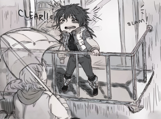
“I heard your voice, so I came... Aoba-san.”
Hooo-boy, if that doesn’t get me emotional every single time. Call it my bias for eccentric bundles of sunshine and softness, or my crippling weakness for the secretly-handsome-and-devastatingly-earnest type, but you can’t change my mind: Clear is, hands down, DMMD’s best love interest. Character development-wise, thematically, romantically, he nails every trial thrown at him, gets his man, and proceeds to break your heart in the tenderest, sincerest way possible. I am hopping with Huge Fan Energy, so this post is gonna be unapologetically long and self-indulgent and grossly enthusiastic. Yeeeee.
————
Look, DMMD meta analysis has been done to death, I get it. This game is old. But I think it stands as testament to its excellent production that it’s still a game worth revisiting years later — especially during these times when social contact is so hard pressed to come by and we all rabidly devour digital media like a horde of screeching feral gremlins. (Have you seen Netflix’s stock value now? The exploding MMO server populations? Astonishing.) It’s pure, simple human nature to want to connect, to cling to members of our network out of biological imperative and our psychological dependency on each other. As cold and primitive at that sounds, social contact also fulfills us on a higher level: the community is always stronger than the individual; genuine trust begets a mutually supportive relationship of exchange and evolution. People learn from each other, and grow into stronger, wiser, better versions of themselves.
Yeah, I’m being deliberately obtuse about this. Of course I’m talking about Clear. Clear, who is a robot. Clear, who is nearly childlike in his insatiable curiosity regarding the human condition.
And it’s a classic literary tactic, using non-human entities to question the intangible constructs of a concept like ‘humanity’ — think Frankenstein, or Tokyo Ghoul, or Detroit: Become Human, among so, so many works in various media — all tackling that question from countless angles, all with varying measures of success. What does it mean to be human? To be good? Who are we, and where do we stand in the grand scheme of things? Is there even a scheme to follow? … Wait, what?
Jokes aside, there are so many ways that the whole approaching-human-yet-not-quite-there schtick can be abused into edgy, joyless existential griping. Nothing wrong with that if it’s what you’re looking for, except that we’re talking about a boys’ love game here. But DMMD neatly, sweetly side steps that particular wrinkle, giving us a wonderfully grounded character to work with as a result.
Character Design — a see-through secret
Let’s start small: Clear’s design and premise. Unlike so many other lost, clueless robo-lambs across media, Clear does have a small guiding presence early on in his life. It takes the form of his grandfather, who teaches Clear about the world while also sheltering him from his origins. It means he learns enough to blend sufficiently into society; it also means that Clear has even more questions that sprout from his limited understanding of the world.
Told that he must never remove his mask lest he expose his identity as a non-human, Clear’s perpetual fear of rejection for what he is drives much of his eccentricity and challenges him throughout much of his route. As for the player, the mystery of what lies underneath his mask is a carrot that the writers get to dangle until the peak moment of emotional payoff. Even if it’s not hard to guess that there’s probably a hottie of legendary proportions stuck under there, there’s still significance in waiting for that good moment to happen. And when it does, it feels great.
His upbringing contextualizes and affirms his odd choice of fashion: deliberately generic, bashfully covered from the public eye, and colored nearly in pure white - the quintessential signal of a blank slate, of innocence. Contrasted with the rest of DMMD’s flashy, colorful crew, Clear is probably the most difficult to read on a superficial scale, not falling into the fiery, bare-chest sex appeal of a womanizer, or the techno-nerd rebel aesthetic that Noiz somehow rocks. Goofy weirdo? Possibly a serial killer? Honestly, both seem plausible at the start.
And that’s the funny thing, because as damn hard as he tries to physically cover himself up from society, Clear is irrepressibly true to his name: transparent to a fault. He’s a walking, talking contradiction, and it’s not hard to realize that this mysterious, masked stranger… is really just an open book. By far the most effusive and straightforward of the entire cast, his actions are wildly unconventional and sometimes wholly inexplicable. But given time to explain himself, he is always, always sincere in his intentions — and unlike the rest of the love interests, naturally inclined to offer bits of himself to Aoba. It doesn’t take the entire character arc to figure out his big, bad secret — our main character gets an inkling about halfway through his route — and what’s even better is that he embraces it, understanding that his abilities also allow him to protect what he cherishes: Aoba.
So what if he doesn’t fit into an easily recognizable box of daydream boyfriend material? He’s contradictory, and contradiction is interesting. Dons a gas mask, but isn’t an edgelord. Blandly dressed, but ridiculously charming. Unreadable and modestly intimidating — until he opens his mouth. Even without the benefit of traversing his route, there’s already so much good stuff to work with, and sure as hell, you’re kept guessing all the way to the end.
Character Development — from reckless devotion into complaisant subservience, complaisant subservience into mutual understanding. And then, of course: free will, and true love.
At its core, DMMD is about a dude with magic mind-melding powers and his merry band of attractive men with — surprise! — crippling emotional baggage. Each route follows the same pattern, simply remixing the individual character interactions and the pace of the program: Aoba finds himself isolated with the love interest, faces various communication issues varying on the scale of frustrating to downright dangerous, wanders into a sketchy section of Platinum Jail, bonds with the love interest over shared duress, breaks into the Oval Tower, faces mental assault by the big bad — and finally, finally, destroys those internal demons plaguing the love interest, releasing the couple onto the path of a real heart-to-heart conversation. And then, you know, the lovey-dovey stuff.
Here’s the thing: as far as romantic progression goes, it’s really not a bad structure. There’s room to bump heads, but also to bond. The Scrap scene is a thematically cohesive and clever way to squeeze in the full breadth of character backstory while simultaneously advancing the plot. In this part, Aoba must become the hero to each of his love interests and save them from themselves. Having become privy to each other’s deepest thoughts and reaching a mutual understanding of each other, their feelings afterwards slide much more naturally into romantic territory. They break free of Oval Tower, make their way home, and have hot, emotionally fulfilling sex or otherwise some variation on the last few steps. The end.
That is, except for Clear.
Clear’s route is refreshing in that he needs none of these things — the climax of his emotional arc actually comes a little after the halfway point of his route. When Clear’s true origins are revealed, he comes entirely clean to Aoba, fighting against his fear of rejection but also trusting that Aoba will listen. It’s a quiet, vulnerable moment, rather than the action-packed tension we normally experience during a Scrap scene.
That doesn’t mean it’s prematurely written in — it simply means that he reaches his potential faster than the other characters. Because of that, he’s free to pursue the next level of his route’s development much, much sooner in the timeline: he overcomes his fears of his appearance, he confesses his love to Aoba, he leaves the confines of a largely dubious master-servant relationship and allows himself to be Aoba’s equal. Clear’s sprite art mirrors his emotional transformation all the way through, exposing him to the literal bone — and Aoba’s affection for him doesn’t change a single bit. Beautiful.
The whammy of incredible moments doesn’t just stop there, though. I don’t exactly recall the order the routes DMMD is ideally meant to be played in, but I believe Clear’s is meant to be last. And if you do, I can guarantee that it becomes a hugely delightful gameplay experience — in order to achieve his good ending, you must do absolutely nothing with Scrap. It doesn’t just subvert our player expectations of proactively clicking and interacting with our love interests; it grabs the story by its thematic reins and yanks it all back to the forefront of our scene.
In every route besides Clear’s, Scrap is a tool used to insert Aoba’s influence into and interfere with his target’s mind. Using his powers of destruction, Aoba is able to prune whatever maligned thoughts are harming his target; in any conventional situation, using Scrap is the right choice.
But one of the central problems in Clear’s route is his conflict between the impulses of his conditioning and his desire to live freely as a human would. Breaking free of Toue’s programming is what initially made him unique; growing beyond the rules imposed by his grandfather is what makes him human. In the final conflict scene, Clear’s decision to destroy his key-lock is an action of true autonomy, made with perfect understanding of the consequences and a sincere, selflessly selfish desire to protect someone he loves. In order to receive his good end, you have to respect his decision. It doesn’t matter which option you pick — by using Scrap, Aoba turns his back on every positive choice he made with Clear and attempts to exert his authority over him. This is Aoba becoming Toue; this is Aoba trying to reinstate himself as ‘Master’ right as he approved Clear as his equal. That’s blatant hypocrisy, and it doesn’t matter if Aoba is trying to do it for Clear’s ‘own good’ — that’s not Aoba’s call to make. If you truly wish to respect Clear’s free will, you will stand by. This is the truth of the moment: Clear has no emotional blockages that Aoba needs to fix. Believe in him, just as he believed in you.
The path to his heart is, and always has been, clear. Scrap was never needed from the start.
While Aoba might be the main character, Clear is undeniably a hero in his own route just as much. Tirelessly earnest and always curious, he leaps headlong into the unknown and emerges with his newfound enlightenment. He’s unafraid of weathering trials, even to the point of accepting death, and returns anew from oblivion to a sweet, cathartic ending. That���s about as textbook hero’s journey as it gets — if that doesn’t make him unquestionably, certifiably, unconditionally human, then I will scream.
And only finally… there is the free end. The final CG is like a throwback to our first impression of him: indistinct, purposefully obscured from proper view. But this time, we know better — and so does Aoba. Looks were never what mattered in Clear’s route. If you were patient, and you were open-minded, and you listened… well, what we realize now is that Clear was doing the exact same thing for you, too.
From a carefree, aimless robot-man with only the gimmick of “eccentric ditz” to carry him forward, we get a supremely more interesting character by the end: a man who has graduated from the well-intentioned but claustrophobic conditioning of his childhood; a weapon who has defied the imperatives placed on him by his creator’s programming; a wanderer who has, through unconditional patience and empathy, discovered love, and striven to become a better person for it. Who was it that ever doubted Clear’s character? He’s the goddamn goodest boy that ever wanted to be a real boy. Of course Clear is human. And in fact, he does it better than every single one of the actually human love interests. You can’t change my mind.
The Romance — kindness is really fucking attractive, okay.
Like I’ve said earlier, I have my Big Fan Blinds stuck on pretty tight. I might be conjuring sparks from thin air. But I think every choice was a deliberate creative decision on the writers’ part, and they deserve all the kudos for it — I’m just the lucky player who gets to enjoy it. But aside from Noiz (who I also think is a perfect darling as well — I could go on and on about him), Clear’s route is a model example for consent and healthy relationships in VN storytelling. This is reciprocated on both sides: never does Aoba infringe on Clear’s boundaries, and neither does Clear. They’re sensitive to each other’s needs and concerns; they ask for permission and stop when it isn’t granted (and when it is, boy do they get frisky — I’m not complaining!) I don’t need to say much more, because I think that consent is both fantastic and yes, incredibly hot (the scene in DMMD is tons more sad, go play Re:connect!). Good writing shows off the massive erotic potential enthusiastic consent puts into intimacy, and Aoba’s and Clear’s relationship is honestly a dream playground. The point is, I think Aoba and Clear genuinely do find equal balance in their relationship by the end of his route (and certainly through Re:connect). If you follow through Re:connect’s storyline, there’s even more thematic richness that comes through in the form of Clear’s greatest asset: communication. The couple get to discuss the long-term implications of them being together; they both offer concerns, points, and assurances to the other, and it’s just a soft, honest moment not so unlike the worries of a real relationship. Hearing is kind of Clear’s motif sense, but it’s really great to see that Aoba also subtly picks it up, really flexes his own communication skills to better engage with Clear.
Point is, Clear’s route spoke to me on a lot of little levels. Design-wise, he’s already got a ton going for him, and his story builds upon it rather than against it, enriching his development and grounding him a little more solidly in the DMMD universe (and in my heart). His route, aside from being emotionally ruinous, carries a pretty solid chunk of world-building (only beaten out by Mink’s and Ren’s, probably), and the romance feels organic, healthy, and realistic. He’s not the only one with an excellent route, but he’s my favorite. If you read through all of this, you’re a real trooper and I’m extremely impressed. Thanks for tuning in. Peace.
#dramatical murder#dmmd#aoba seragaki#clear#dmmd clear#long ass emotional screeching#lOL I FORGOT TO DRAW IN THE UMBRELLA HANDLE ahA#fixed
90 notes
·
View notes
Text
Structure Research
Simon Kennedy
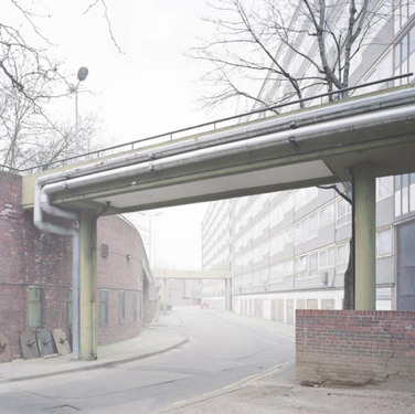
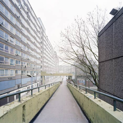
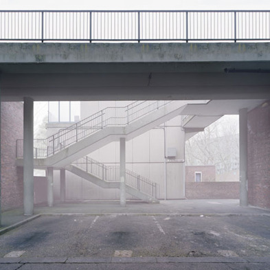
Simon Kennedy’s architectural photography is amazing in showing us not only the function of the structure but the environment it exists in. His study of Heygate estate especially interests me, due to Kennedy’s use of the plain/gloomy light to bring out the character of the area the structure exists in. In fact, he took a risk in using this kind of diffused/overblown light, but due to this project having taken place over the course of many months, I suspect his final images may be multiple exposures together.
https://www.dezeen.com/2010/12/01/heygate-abstracted-by-simon-kennedy/
Nick Guttridge
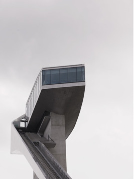

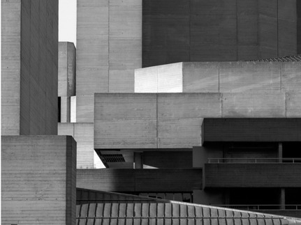
I really enjoy Guttridges style, it’s very clean and modern. In fact, when I look at his work I get a very surreal feeling but not in an obvious or over-bearing way. He seems to have an intense focus when it comes to his leading lines, encouraging the viewer to explore the complex image. I like the fact that in some images Guttridge left in people, as the architecture would not exist without peoples influence and are often built for people.
http://www.nickguttridge.com/lifestyle-travel
Bas Prince
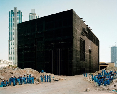
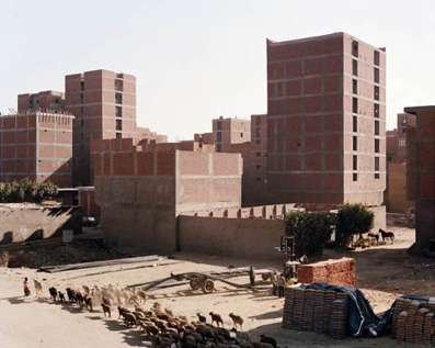
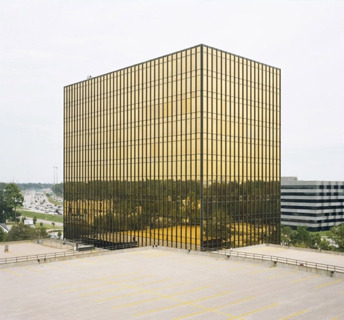
When looking at Bas Prince’s work, I always see landscapes. He truly focuses on the big picture, and really isolates structures within amazingly interesting landscapes and makes them even more interesting and very imposing buildings. I also love his simplistic approach when it comes to geometry, maybe it’s just the subject matter we see above but the simple block buildings are really dominating in the image and steal all the focus of me, the viewer.
http://www.bldgblog.com/tag/bas-princen/
Ralph Graf
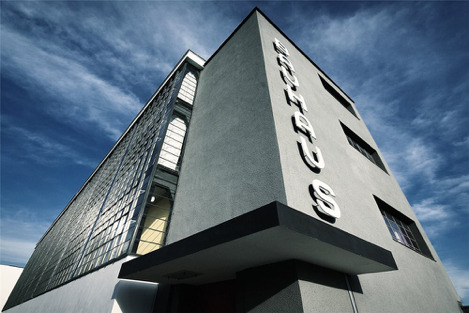


Ralphs Graf’s work in the Bauhaus School of Art is fantastic. He has truly stayed true to the modernistic style of the building and its artistic history in Germany. The square windows, plain colours and hard lines are all captured in such a way that really shows the anti-traditionalist manner of the building.
https://www.dodho.com/bauhaus-ralph-graf/
Julius Shulman
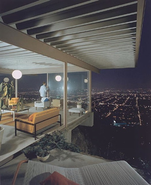
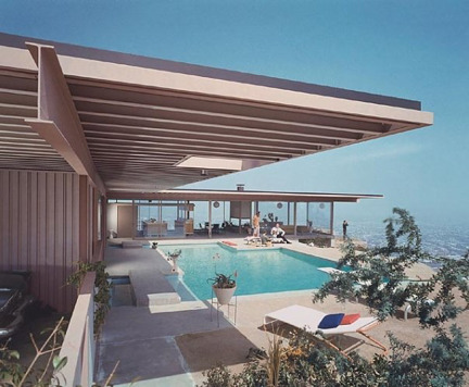
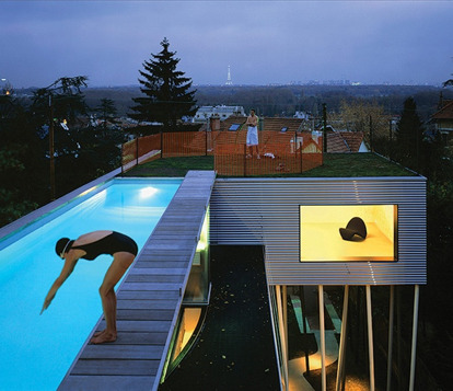
Shulman’s work really shows the lifestyles that come along with some structures. I enjoy the fact that his subject matter in these images are really appealing, expensive structures that accommodate wealthy people, it’s rare in a world driven by sad scenes and dramatic imagery (which I also enjoy). I think the purpose of the building must have been import for him, as he usually shows a valuable asset to the home (pool, view, etc.) and the people enjoying them. I love the stylization of the images to, they almost feel like a movie set or something from a James Bond movie.
https://www.archdaily.com/29457/julius-schulman-1910-2009
Distortion
Distortion in photography can be understood as being an optical illusion or effect is produced as a result of various techniques or processes, where the straight lines in an image appear curved or distorted. The overall effect is that the resulting images appear deformed or radically misshapen or twisted, though the range of effects, and indeed the strength varies depending on which lens is used or which position the camera is placed in, relative to the subject. Within photography, distortion falls into two distinct groups: perspective distortion, and optical distortion. Distinguishing between the various forms and processes of distortion is important, as each effect has a distinctive look, and also a distinctive process which is carried out to achieve it.
Optical Distortions
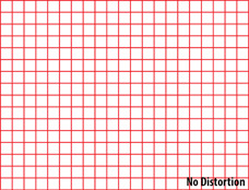
Optical distortion refers to any instance where the distortion results from a lens error, as no lens can completely prevent distortion, given the shape of the lens itself. There are three types of optical distortion; barrel, pincushion and moustache distortion.
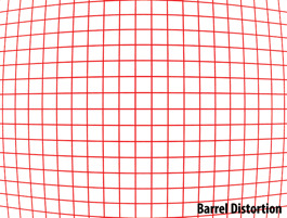
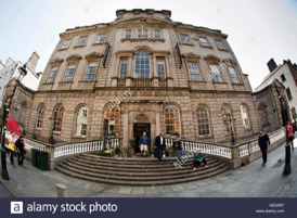
hese images show Barrel Distortion. This type is commonly seen on wide-angle lenses where lines appear curved inwards, reminiscent of the convex shape of a barrel. It results from an image where the field of view of the lens is wider than the image sensor, essentially squeezing the image. Barrel distortion occurs with the majority of wide-angle lenses, as well as with zoom lenses with short focal lengths, though the degree of the distortion is mostly dependent on the distance between the camera and subject.
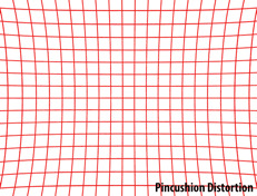
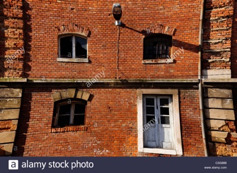
These images show Pincushion Distortion. This is the opposite of barrel distortion, as the lines appear to curve outwards. This results from the lens’ field of view being than the size of the image sensor, and so the image appears stretched. Pincushion distortion occurs primarily with telephoto lenses or zoom lenses, as image magnification in the photo becomes greater towards the edges of the frame. As with barrel distortion, pincushion distortion is also difficult to prevent through changing lens, and can be fixed simply in post-production.
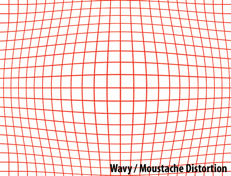
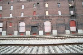
These images show Moustache Distortion. This form is harder to spot, showing a bend towards the centre of the image, as the lines curve both inwards and outwards. Due to this, it is also referred to as ‘complex distortion’. This form is much more difficult to deal with, both in prevention and remedy, as it cannot be dealt with in the same way that the two other optical forms can. If this is attempted, the curves will become much more exaggerated towards the edges or centre respectively, thus specialised software must be used to fix this distortion.
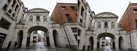
This form of distortion is the most common, resulting even from the human eye. Perspective distortion occurs when an object is situated too close to the camera, as the proximity causes the image to distort when trying to represent the three dimensional proportion of the object in 2D. As such, this is not caused by a lens error, and can be prevented through test shots and varying the composition of your image’s subjects. Although many lenses claim to reduce this effect, they merely force you to change position, altering your image from that on the left, to the image on the right.

Although all distortions can be used deliberately to produce a creative effect, the use of curvilinear lenses is arguably the most recognisable. Whereas Rectilinear Lenses produce a natural effect with straight lines stretched towards the edges of the frame, curvilinear or fish-eye lenses result in a highly distorted image where the lines are unnaturally curved.
Fixing Distortion
There are many ways to fix distortion in your images. Given the wide variety of methods it is useful to categorise them based on the point in your shoot that you use them.
Pre Production
As mentioned, particular lens is advised to avoid particular forms of distortion. For example, To reduce barrel distortion, specific lenses can be used, such as the Nikon 14-24mm f/2.8G, which aids distortion reduction, however it is important to note that this impacts negatively on the weight of this and other wide-angle lenses. Another example of useful lens for reducing distortion is a tilt-shift lens. This lenses optics can be tilted and shifted in relation to the image sensor. Tilt shift lenses also have the ability to swivel, changing the cameras perspective but keeping you unchanged, which reduces distortion. Research into the best lenses for your project should always be undertaken well in advance in order to save time and effort wasted on fixing distortion problems in post production.
Mid Production
The easiest way to reduce distortion during your shoot would simply be to change position. You may be too close to your subject, making features appear big and domineering in the frame, and vice versa. This is particularly important when doing architectural photography, because a change in the scale can result in your subject appearing unfamiliar, which can result in the purpose of your shoot being ruined.
Post Production
Distortion can also be corrected in post-production, using software such as Adobe Photoshop or Lightroom. One tool you can use on Photoshop to correct distortion is the adaptive wide angle tool. This can be found in the filter menu. Using the tool in auto mode you can manually draw lines down your image where you see the edges of a structure becoming distorted. As you click the tool corrects any curved lines, removing the distortion.
Idea
The V & A museum in Dundee is a very interesting building from many different angles, almost resembling a beached wale or some sort of ship. According to the construction company “bam”, the museum is effectively two separate three storey buildings, joined at roof level. Surrounding Scottish cliffs were the inspiration for the outer walls. The curves are formed from a series of concrete panels, each a different profile, inset with lighter coloured pre cast concrete slabs. I think this would be a great building to shoot as we have an amazing building in its entirety to photograph but also many opportunities to get close in detail shots. The contact number is 01382 411611. I plan on shooting this at time different times. The golden hour and the blue hour. I think sunlight could bounce of this building in a very interesting way but I also think the imposing shape and the fact that it is basically a docked building could make the blue hour work even more. A return train ticket to Dundee is around £24.
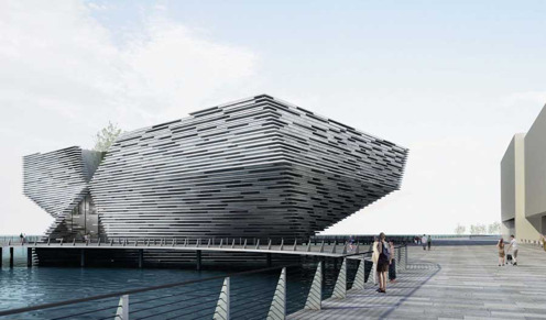
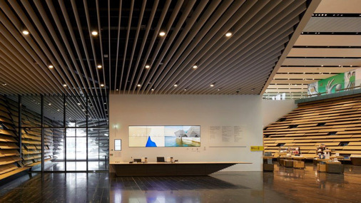
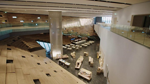
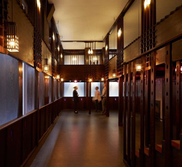
I have emailed asking about access building am waiting for a reply, if I don’t get that I will call and if access if restricted then I’m going to go with the college building itself. It’s easy to get access to, the structure has a lot of elements too it and is genuinely a nice building. Also I know I wont get knocked back from shooting there and I’m getting tired of emailing/phoning places for no result.
https://www.e-architect.co.uk/dundee/v-a-dundee
https://www.bbc.co.uk/news/uk-scotland-tayside-central-45432993
https://www.bbc.co.uk/news/uk-scotland-tayside-central-45432993
https://www.bbc.co.uk/news/uk-scotland-tayside-central-45432993
Structure Evaluation
In this brief we were tasked with capturing five images of architecture. 3 of these shots were exteriors, two included controlled perspectives and one included the complete building, followed by 2 interior shots.
The building that I chose to capture was the City of Glasgow Cathedral Street Campus building. I chose this setting for my shots because I knew I would benefit from a building which was not only architecturally interesting and significant, but which I could gain complete access to. A number of other buildings I had considered were very restricted in what you were able to capture, or didn’t permit photographs at all. I also knew this building pretty well and knew that there were a lot of photographic opportunities there.
Staring with the wide angle exterior shot, I found this to be the hardest of my set of images to complete as it was very difficult to find an angle that would fit the whole building in and look good at the same time. I was using a 18-55mm lens because it gave me the widest angle I could get. I tried to capture my image further down the street to get a better angle, but there were a lot of distractions like bins, lampposts and bus shelters. Cars would also zoom past a lot and obstructed the frame, making it look cluttered at times. I considered doing a longer exposure to get the trails of the car lights in but this to me was a bit unnecessary and I wanted to capture the building during it’s time of use - the early afternoon. I edited my image very simply, removing a few people who stepped in my frame and some bins but very little was done. The perspective control was simply done on Bridge, using the transform tool to auto adjust the perspective control, I used this for all my images but used different settings each time.
I then moved onto to focus on my exterior detail shots. The college building has very interesting shapes and lines, with a certain uniformity to it all so I focused on that. The first wider angle image shows this with a semitropical grid towering down and windows peaking out behind them, I chose to show this because the modernism is really striking and when I first saw the building it gave me a futuristic and very scary feeling but as I grew to know it, it became far more comfortable and I realised it was just a place for structured creativity. I think the building really screams that, and I hope it comes across through my images. The second exterior detail shot was again captured using the lines of the building but this time I wanted to show more of the curvature on the block architecture and how shadows get stuck in very interesting places due to the building’s nature. I really enjoy the light in this image, everything subtle and you can see a lot of individual tones in the layers of glass and metals, and it almost doesn’t look like the same building.
The interior shots were very tricky, the college has a lot of opportunities for great photos but when spoiled for choice I wanted to get the most original shots possible to stand out. One thing I certainly wanted to include in these images were the students, lecturers and/or staff members. This is to convey that this building is vibrant, and filled with individuals that all play a role in the function of the buildings purpose. I thought getting a low angle shot from the top of the main stair case would achieve this as it is the busiest place for people and the leading lines that you can see with the balconies going all the way up is very interesting. I wish I spent a bit more time with this shot and waited for a better moment, although I think some people in this image convey my point, others just make it look busy, they are really standing/walking in positions. For my final interior shot I definitely wanted to get the City of Glasgow sign in, as in my view this is the most iconic aspect of the building and I knew the celling windows would give me a good view of it. Those windows can form excellent shadows at the right time, with the right weather and I wish I had come back again to see if could get anything better with that, but I do enjoy this image. I think the window gives the image more depth and the lines and grids make this photo a perfect fit with the others.
I enjoyed this project more than I thought I would and learned that taking photographs of buildings and architecture is a lot harder than I originally thought. If I were to do this again I’d definitely spend more time with the building and look for a lot more angles. I also think investing in a extremely wider fixed lens would be a good idea.
0 notes