Don't wanna be here? Send us removal request.
Text
Illuminate Evaluation
During my time at college, I have always really enjoyed working with light, especially using long exposures and painting with light. I went into this project feeling really positive about my initial plan, which was to shoot a model in a garden/forest scene which would be lit to accentuate the fairy-like, whimsical scene that I had initially planned.
However, as I began to put my idea into practice, it soon became clear that my idea wasn't going to work as well as I had hoped. As the result of space and the sky line being a bit cluttered, I was originally going to edit most of this out but decided against it because of the time restraints. I should have planned for this along with my other work and recognised that my idea was too much for the time I had.
I eventually settled on working towards creating a very detailed image, which was based around a postbox near to my house. I selected this subject based on both its iconic imagery, as the classic red postbox, but also because in the rain I noticed it had life to it, in the form of some spider's webs.
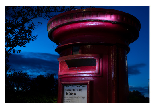
I shot the image with a 18-55mm zoom lens, the image quality is very good for the equipment I used, I wish I should a fixed lens to get that detail even better. I have a 50mm lens that in hindsight would have been better. The postbox was lit by myself, using a small handheld torch. I tried to focus on the curves and shapes of the box, to give my image a more 3D perspective, where you can see the rounded edges as the light bends. I really liked this effect, as although the technique was simple, I feel that its combination with the interesting subject matter and the texture of the paint and metal give the image a gritty quality.
The dark clouds behind the post box is a bit of a distraction for me, I tried to edit it so that the sky would be clearer and more bold with just the deep blue filling the sky. I found this was too hard and it just looked messy. I probably could have edited this out with more time but it would have been a very stressful time.
As I was angling my shot from below, I tried to incorporate the trees across the street from the postbox itself, in order to frame the image and I feel this worked really well. I like that the trees add an extra dimension to my image and give it almost a gothic feel which isn't something I had planned or expected going into the shot, but I feel it really compliments the image overall. With more people or more images, I maybe could have got more detail in these trees but that could take away from the main subject matter. Next time I definitely want some more people to help with this.
I think my favourite aspect of the image however, is the spider hanging to the side of the box itself. I really like this, as I think it adds another element to my image, and I couldn't have posed it better, so to have the spider appear coincidentally as I was filming was really amazing. Although its not the central focus of the image, I wanted to keep it understated, so that in order to find the hidden details, the viewer really has to look closely to be rewarded. I think this is also how I feel about painting with light photography in general, and I think in future it'll help me to manage my expectations better and allow me to focus more on detailed work as opposed to a high-impact 'big picture', which as I found out on this project isn't always the best or most practical plan. I was maybe going to throw some light on the spider but the darkness of it contrasts really well with the rich blue of the sky.
In editing, I used two images, of the top and bottom of the postbox. I layered the first and second images together, using the quick select tool in Photoshop and blended them to give the image a seamless look which I feel worked really well. I then just completed a few adjustments to the contrast and colours in Bridge.
Overall, I'm really surprised with how well this image came out, and I'm really pleased with my work. I actually think that this image is a lot more impactful than what my original idea would have been under the same circumstances and I'm really glad I pushed myself to step out of my comfort zone and work hard to get an image I was really happy with.
1 note
·
View note
Text
Structure Evaluation
In this brief we were tasked with capturing five images of architecture. 3 of these shots were exteriors, two included controlled perspectives and one included the complete building, followed by 2 interior shots.
The building that I chose to capture was the City of Glasgow Cathedral Street Campus building. I chose this setting for my shots because I knew I would benefit from a building which was not only architecturally interesting and significant, but which I could gain complete access to. A number of other buildings I had considered were very restricted in what you were able to capture, or didn’t permit photographs at all. I also knew this building pretty well and knew that there were a lot of photographic opportunities there.
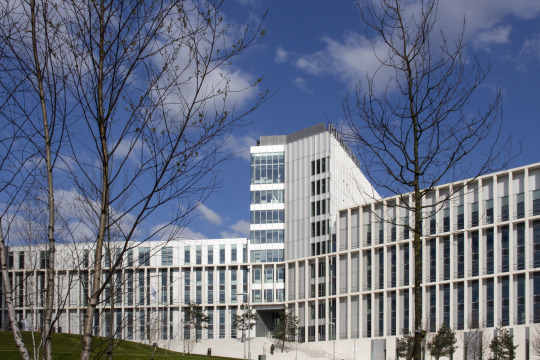
Starting with the wide angle exterior shot, I found this to be the hardest of my set of images to complete as it was very difficult to find an angle that would fit the whole building in and look good at the same time. I was using a 18-55mm lens because it gave me the widest angle I could get. I tried to capture my image further down the street to get a better angle, but there were a lot of distractions like bins, lampposts and bus shelters. Cars would also zoom past a lot and obstructed the frame, making it look cluttered at times. I considered doing a longer exposure to get the trails of the car lights in but this to me was a bit unnecessary and I wanted to capture the building during it’s time of use - the early afternoon. I edited my image very simply, removing a few people who stepped in my frame and some bins but very little was done. The perspective control was simply done on Bridge, using the transform tool to auto adjust the perspective control, I used this for all my images but used different settings each time.

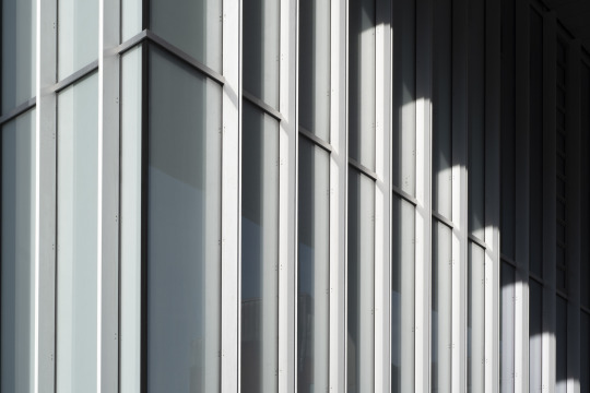
I then moved onto to focus on my exterior detail shots. The college building has very interesting shapes and lines, with a certain uniformity to it all so I focused on that. The first wider angle image shows this with a semitropical grid towering down and windows peaking out behind them, I chose to show this because the modernism is really striking and when I first saw the building it gave me a futuristic and very scary feeling but as I grew to know it, it became far more comfortable and I realised it was just a place for structured creativity. I think the building really screams that, and I hope it comes across through my images. The second exterior detail shot was again captured using the lines of the building but this time I wanted to show more of the curvature on the block architecture and how shadows get stuck in very interesting places due to the building’s nature. I really enjoy the light in this image, everything subtle and you can see a lot of individual tones in the layers of glass and metals, and it almost doesn’t look like the same building.
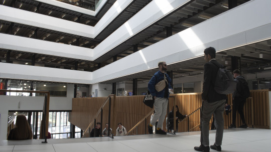
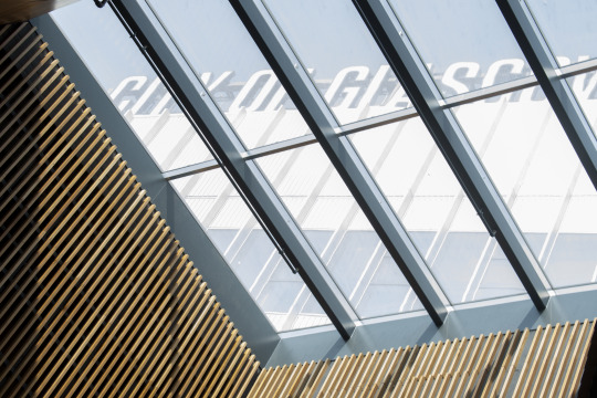
The interior shots were very tricky, the college has a lot of opportunities for great photos but when spoiled for choice I wanted to get the most original shots possible to stand out. One thing I certainly wanted to include in these images were the students, lecturers and/or staff members. This is to convey that this building is vibrant, and filled with individuals that all play a role in the function of the buildings purpose. I thought getting a low angle shot from the top of the main stair case would achieve this as it is the busiest place for people and the leading lines that you can see with the balconies going all the way up is very interesting. I wish I spent a bit more time with this shot and waited for a better moment, although I think some people in this image convey my point, others just make it look busy, they are really standing/walking in positions. For my final interior shot I definitely wanted to get the City of Glasgow sign in, as in my view this is the most iconic aspect of the building and I knew the celling windows would give me a good view of it. Those windows can form excellent shadows at the right time, with the right weather and I wish I had come back again to see if could get anything better with that, but I do enjoy this image. I think the window gives the image more depth and the lines and grids make this photo a perfect fit with the others.
I enjoyed this project more than I thought I would and learned that taking photographs of buildings and architecture is a lot harder than I originally thought. If I were to do this again I’d definitely spend more time with the building and look for a lot more angles. I also think investing in a extremely wider fixed lens would be a good idea.
1 note
·
View note
Text
Peace Research
When thinking of ideas for my peace project, I have went through my thoughts and came up with many different ideas. Personally I think that this project should be more about conveying the idea of peace in a way in which we can all relate, I don’t want to just make it a a personal thing that only I can understand because I am terrible at still life and won’t be able to produce a good image that way.
However, I’ve been told this project is more about that kind of stuff so I have been rummaging through my personal belonging and my dearest memories to find something interesting to match this brief.
My first thought went to a bullet, I know that kind of contradicts this whole project but it depends how you look at it. war has brought peace from it many times in the past and I think we can all agree that some wars had to be fought to bring stability and peace to certain areas and certain times (WW2). Thats the bigger picture added that I wanted and the personal touch is that it was given to me by my brother, a soldier who I see very really and miss very much. looking at it reminds me of him, his values and his reasons.
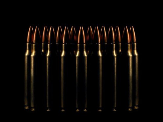
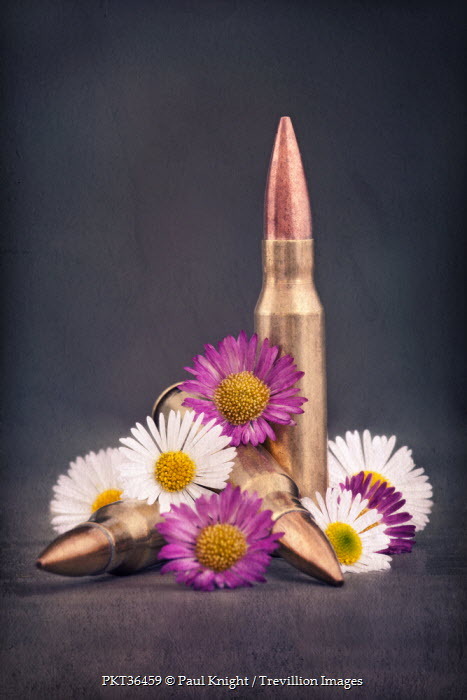
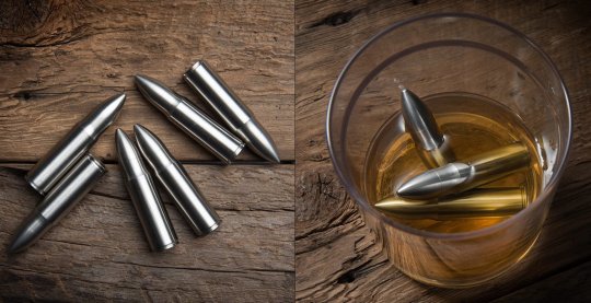
Although I really like this idea, I know it won’t be acceptable because of the angle of violence (even though it contains no gunpowder and could not be fired, posing no danger to my classmates) and it’s just too much of a risk for me and my lecturer to take. Despite that, here are some images of bullets that I enjoyed.
https://www.canva.com/photos/search/bullets/?continuation=100&limit=100
https://www.trevillion.com/stock-photo-bullets-with-flowers-creative-image00066044.html
https://jooinn.com/bullets-3.html
I think the use of a bullet in conjunction with harsh shadows really conveys that peace is fragile and can be gained or destroyed by man and one of it’s most controversial inventions.
As I know this plan isn’t going to happen, I decided to go with my other idea. My gran would always make my jam sandwiches when I was younger, it was my favourite snack as a child hooked on an overload of sugar and would bring great joy. Fortunately for me I live in Scotland where sandwiches are also referred to as a piece. I think this idea is much lighter and has a an element of humour that people can relate too. The only thin I don’t like about this idea is the fact that it involves food. I’ve tried food photography already and it’s a real challenge, a crumb in the wrong place can really just make your image look dumb and it’s a very hard balancing act, especially considering my hatred for still life. I also think this shrinks my audience, of course Scottish people will understand this play on words but to others it’s just going to be a picture of a bit of bread with jam inside, it isn’t as layered and punchy as I would like it to be.
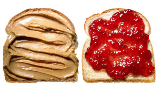
https://www.modahaus.com/delicious-food-photography-terry-heffernan/
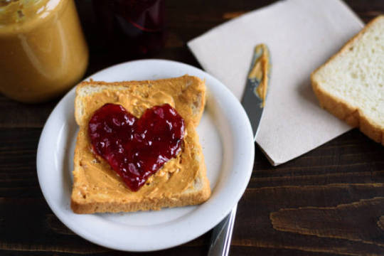
https://www.istockphoto.com/gb/photos/spreading
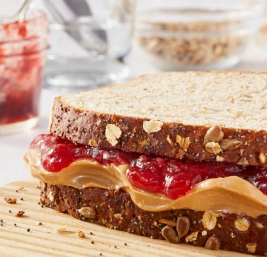
https://www.omsphoto.com/matt-witherspoon/food/
I do enjoy this simplicity of this idea and it is a lot different from my usual dark style of images and ideas, which I’m trying to get away from a bit this time around.
Peace Evaluation
Peace was a project based around, our personal feelings and interpretations on inner peace. To successfully complete this project we had to look to our past and present to consider what gave us peace in our lives.
When looking back on my peace project submission, I can say that I am disappointed with the results. I was a bit confused and admittedly frustrated with how the project was supposed to be delivered at the time. I wanted to focus more on world peace instead of personal peace due to the conversation of the 100 year anniversary of WW1 but now realise that was more of a conversation starter to kick off the project.
I think the incorporation of both world and inner peace that I tried, with the world play on piece really muddled up the intention of my work and dragged it down a bit. I didn’t have a clear focus on what I should do with this project and I should have had longer conversations with my lecturer to clear this up.
I do think that I was ambitious in the a way with going for food photography, considering I am not a good still life photographer and food can often be tricky to photograph and bring some interesting level to the image. In my mind, at the time, the concept was good but looking back it may have been lazy. I should have spent for time thinking about the image as a whole and not just the subject or message.
I really liked the colours in the image, the red on red was a bold move due to lack of contrast but I think it made the image pop more, I was thinking at the time, red is related to blood, blood is related with war and war is sometimes related with peace and the piece/peace angle would tie it all together.
Using a macro lens in this project was a mistake, it’s hard to get a macro shot in focus when you’re limited to such little space when others are also doing their projects around you, but I wanted to really show all the detail in the jam to cast the viewers mind back to when the first saw a parent or caretaker making a jam sandwich for them. It was an exciting experience for me when I was a child and wanted to really throw that in peoples faces. This is something I will have to consider for next.
once again, still life has really been a thorn in my side but it has also taught me that I need to put in more effort to the skills I lack in photography as photographers need to be well rounded and still life is a very sought have to skill in this business. Although I wouldn’t want to be a “still life photographer” I do want to make money and learn more and more in the profession and the only way I am going to do this is by toughing up my weak points.
1 note
·
View note
Text
Structure Research
Simon Kennedy
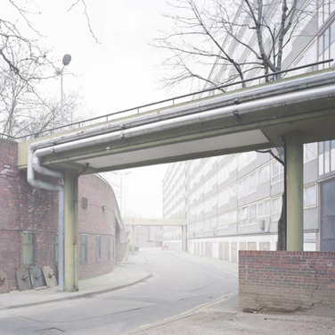
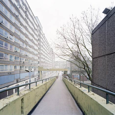
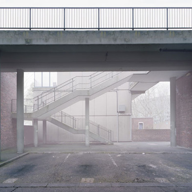
Simon Kennedy’s architectural photography is amazing in showing us not only the function of the structure but the environment it exists in. His study of Heygate estate especially interests me, due to Kennedy’s use of the plain/gloomy light to bring out the character of the area the structure exists in. In fact, he took a risk in using this kind of diffused/overblown light, but due to this project having taken place over the course of many months, I suspect his final images may be multiple exposures together.
https://www.dezeen.com/2010/12/01/heygate-abstracted-by-simon-kennedy/
Nick Guttridge
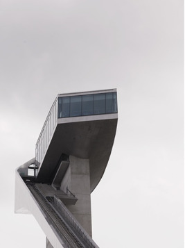
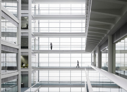
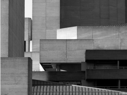
I really enjoy Guttridges style, it’s very clean and modern. In fact, when I look at his work I get a very surreal feeling but not in an obvious or over-bearing way. He seems to have an intense focus when it comes to his leading lines, encouraging the viewer to explore the complex image. I like the fact that in some images Guttridge left in people, as the architecture would not exist without peoples influence and are often built for people.
http://www.nickguttridge.com/lifestyle-travel
Bas Prince
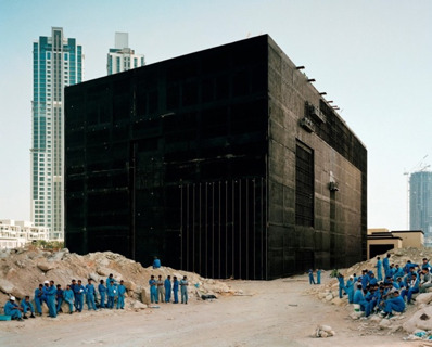
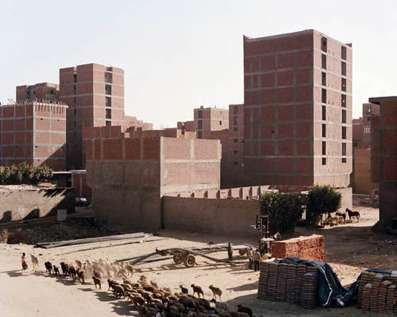
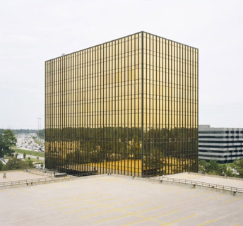
When looking at Bas Prince’s work, I always see landscapes. He truly focuses on the big picture, and really isolates structures within amazingly interesting landscapes and makes them even more interesting and very imposing buildings. I also love his simplistic approach when it comes to geometry, maybe it’s just the subject matter we see above but the simple block buildings are really dominating in the image and steal all the focus of me, the viewer.
http://www.bldgblog.com/tag/bas-princen/
Ralph Graf
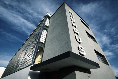
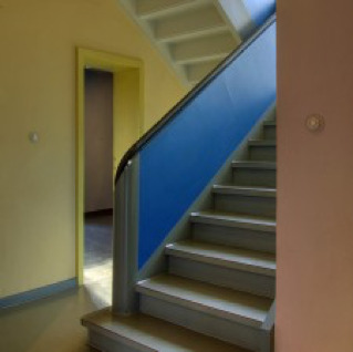
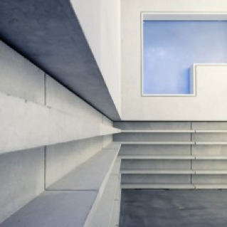
Ralphs Graf’s work in the Bauhaus School of Art is fantastic. He has truly stayed true to the modernistic style of the building and its artistic history in Germany. The square windows, plain colours and hard lines are all captured in such a way that really shows the anti-traditionalist manner of the building.
https://www.dodho.com/bauhaus-ralph-graf/
Julius Shulman
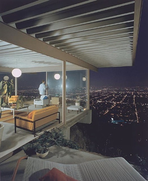
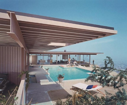
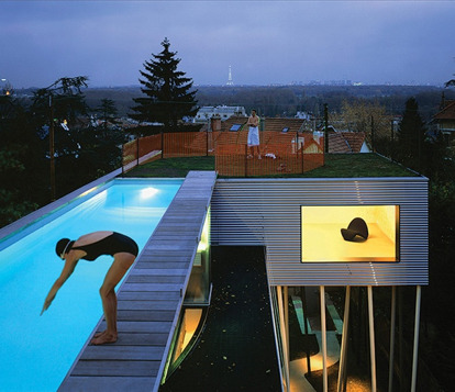
Shulman’s work really shows the lifestyles that come along with some structures. I enjoy the fact that his subject matter in these images are really appealing, expensive structures that accommodate wealthy people, it’s rare in a world driven by sad scenes and dramatic imagery (which I also enjoy). I think the purpose of the building must have been import for him, as he usually shows a valuable asset to the home (pool, view, etc.) and the people enjoying them. I love the stylization of the images to, they almost feel like a movie set or something from a James Bond movie.
https://www.archdaily.com/29457/julius-schulman-1910-2009
Distortion
Distortion in photography can be understood as being an optical illusion or effect is produced as a result of various techniques or processes, where the straight lines in an image appear curved or distorted. The overall effect is that the resulting images appear deformed or radically misshapen or twisted, though the range of effects, and indeed the strength varies depending on which lens is used or which position the camera is placed in, relative to the subject. Within photography, distortion falls into two distinct groups: perspective distortion, and optical distortion. Distinguishing between the various forms and processes of distortion is important, as each effect has a distinctive look, and also a distinctive process which is carried out to achieve it.
Optical Distortions
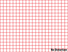
Optical distortion refers to any instance where the distortion results from a lens error, as no lens can completely prevent distortion, given the shape of the lens itself. There are three types of optical distortion; barrel, pincushion and moustache distortion.
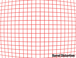
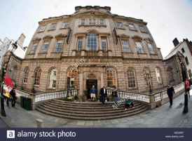
hese images show Barrel Distortion. This type is commonly seen on wide-angle lenses where lines appear curved inwards, reminiscent of the convex shape of a barrel. It results from an image where the field of view of the lens is wider than the image sensor, essentially squeezing the image. Barrel distortion occurs with the majority of wide-angle lenses, as well as with zoom lenses with short focal lengths, though the degree of the distortion is mostly dependent on the distance between the camera and subject.
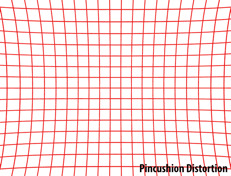
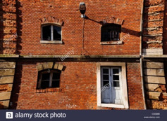
These images show Pincushion Distortion. This is the opposite of barrel distortion, as the lines appear to curve outwards. This results from the lens’ field of view being than the size of the image sensor, and so the image appears stretched. Pincushion distortion occurs primarily with telephoto lenses or zoom lenses, as image magnification in the photo becomes greater towards the edges of the frame. As with barrel distortion, pincushion distortion is also difficult to prevent through changing lens, and can be fixed simply in post-production.
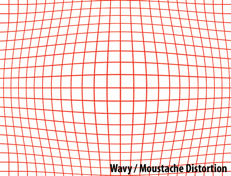
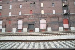
These images show Moustache Distortion. This form is harder to spot, showing a bend towards the centre of the image, as the lines curve both inwards and outwards. Due to this, it is also referred to as ‘complex distortion’. This form is much more difficult to deal with, both in prevention and remedy, as it cannot be dealt with in the same way that the two other optical forms can. If this is attempted, the curves will become much more exaggerated towards the edges or centre respectively, thus specialised software must be used to fix this distortion.
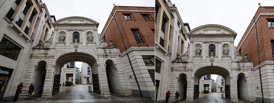
This form of distortion is the most common, resulting even from the human eye. Perspective distortion occurs when an object is situated too close to the camera, as the proximity causes the image to distort when trying to represent the three dimensional proportion of the object in 2D. As such, this is not caused by a lens error, and can be prevented through test shots and varying the composition of your image’s subjects. Although many lenses claim to reduce this effect, they merely force you to change position, altering your image from that on the left, to the image on the right.

Although all distortions can be used deliberately to produce a creative effect, the use of curvilinear lenses is arguably the most recognisable. Whereas Rectilinear Lenses produce a natural effect with straight lines stretched towards the edges of the frame, curvilinear or fish-eye lenses result in a highly distorted image where the lines are unnaturally curved.
Fixing Distortion
There are many ways to fix distortion in your images. Given the wide variety of methods it is useful to categorise them based on the point in your shoot that you use them.
Pre Production
As mentioned, particular lens is advised to avoid particular forms of distortion. For example, To reduce barrel distortion, specific lenses can be used, such as the Nikon 14-24mm f/2.8G, which aids distortion reduction, however it is important to note that this impacts negatively on the weight of this and other wide-angle lenses. Another example of useful lens for reducing distortion is a tilt-shift lens. This lenses optics can be tilted and shifted in relation to the image sensor. Tilt shift lenses also have the ability to swivel, changing the cameras perspective but keeping you unchanged, which reduces distortion. Research into the best lenses for your project should always be undertaken well in advance in order to save time and effort wasted on fixing distortion problems in post production.
Mid Production
The easiest way to reduce distortion during your shoot would simply be to change position. You may be too close to your subject, making features appear big and domineering in the frame, and vice versa. This is particularly important when doing architectural photography, because a change in the scale can result in your subject appearing unfamiliar, which can result in the purpose of your shoot being ruined.
Post Production
Distortion can also be corrected in post-production, using software such as Adobe Photoshop or Lightroom. One tool you can use on Photoshop to correct distortion is the adaptive wide angle tool. This can be found in the filter menu. Using the tool in auto mode you can manually draw lines down your image where you see the edges of a structure becoming distorted. As you click the tool corrects any curved lines, removing the distortion.
Idea
The V & A museum in Dundee is a very interesting building from many different angles, almost resembling a beached wale or some sort of ship. According to the construction company “bam”, the museum is effectively two separate three storey buildings, joined at roof level. Surrounding Scottish cliffs were the inspiration for the outer walls. The curves are formed from a series of concrete panels, each a different profile, inset with lighter coloured pre cast concrete slabs. I think this would be a great building to shoot as we have an amazing building in its entirety to photograph but also many opportunities to get close in detail shots. The contact number is 01382 411611. I plan on shooting this at time different times. The golden hour and the blue hour. I think sunlight could bounce of this building in a very interesting way but I also think the imposing shape and the fact that it is basically a docked building could make the blue hour work even more. A return train ticket to Dundee is around £24.
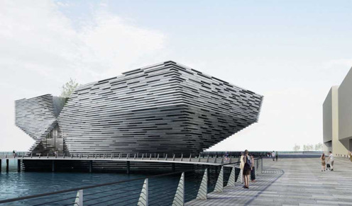
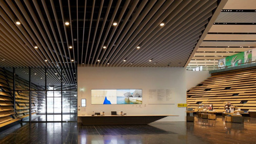
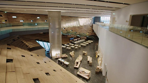
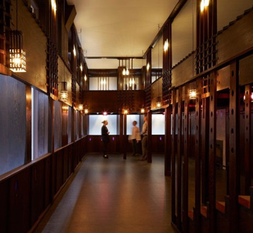
I have emailed asking about access building am waiting for a reply, if I don’t get that I will call and if access if restricted then I’m going to go with the college building itself. It’s easy to get access to, the structure has a lot of elements too it and is genuinely a nice building. Also I know I wont get knocked back from shooting there and I’m getting tired of emailing/phoning places for no result.
https://www.e-architect.co.uk/dundee/v-a-dundee
https://www.bbc.co.uk/news/uk-scotland-tayside-central-45432993
https://www.bbc.co.uk/news/uk-scotland-tayside-central-45432993
https://www.bbc.co.uk/news/uk-scotland-tayside-central-45432993
Structure Evaluation
In this brief we were tasked with capturing five images of architecture. 3 of these shots were exteriors, two included controlled perspectives and one included the complete building, followed by 2 interior shots.
The building that I chose to capture was the City of Glasgow Cathedral Street Campus building. I chose this setting for my shots because I knew I would benefit from a building which was not only architecturally interesting and significant, but which I could gain complete access to. A number of other buildings I had considered were very restricted in what you were able to capture, or didn’t permit photographs at all. I also knew this building pretty well and knew that there were a lot of photographic opportunities there.
Staring with the wide angle exterior shot, I found this to be the hardest of my set of images to complete as it was very difficult to find an angle that would fit the whole building in and look good at the same time. I was using a 18-55mm lens because it gave me the widest angle I could get. I tried to capture my image further down the street to get a better angle, but there were a lot of distractions like bins, lampposts and bus shelters. Cars would also zoom past a lot and obstructed the frame, making it look cluttered at times. I considered doing a longer exposure to get the trails of the car lights in but this to me was a bit unnecessary and I wanted to capture the building during it’s time of use - the early afternoon. I edited my image very simply, removing a few people who stepped in my frame and some bins but very little was done. The perspective control was simply done on Bridge, using the transform tool to auto adjust the perspective control, I used this for all my images but used different settings each time.
I then moved onto to focus on my exterior detail shots. The college building has very interesting shapes and lines, with a certain uniformity to it all so I focused on that. The first wider angle image shows this with a semitropical grid towering down and windows peaking out behind them, I chose to show this because the modernism is really striking and when I first saw the building it gave me a futuristic and very scary feeling but as I grew to know it, it became far more comfortable and I realised it was just a place for structured creativity. I think the building really screams that, and I hope it comes across through my images. The second exterior detail shot was again captured using the lines of the building but this time I wanted to show more of the curvature on the block architecture and how shadows get stuck in very interesting places due to the building’s nature. I really enjoy the light in this image, everything subtle and you can see a lot of individual tones in the layers of glass and metals, and it almost doesn’t look like the same building.
The interior shots were very tricky, the college has a lot of opportunities for great photos but when spoiled for choice I wanted to get the most original shots possible to stand out. One thing I certainly wanted to include in these images were the students, lecturers and/or staff members. This is to convey that this building is vibrant, and filled with individuals that all play a role in the function of the buildings purpose. I thought getting a low angle shot from the top of the main stair case would achieve this as it is the busiest place for people and the leading lines that you can see with the balconies going all the way up is very interesting. I wish I spent a bit more time with this shot and waited for a better moment, although I think some people in this image convey my point, others just make it look busy, they are really standing/walking in positions. For my final interior shot I definitely wanted to get the City of Glasgow sign in, as in my view this is the most iconic aspect of the building and I knew the celling windows would give me a good view of it. Those windows can form excellent shadows at the right time, with the right weather and I wish I had come back again to see if could get anything better with that, but I do enjoy this image. I think the window gives the image more depth and the lines and grids make this photo a perfect fit with the others.
I enjoyed this project more than I thought I would and learned that taking photographs of buildings and architecture is a lot harder than I originally thought. If I were to do this again I’d definitely spend more time with the building and look for a lot more angles. I also think investing in a extremely wider fixed lens would be a good idea.
0 notes
Text
Illuminate Research

This project is capturing moving light when the shutter is open. In order to do this you’re going to have to set your camera to a long shutter speed (exposure time). This can be anywhere between 10 seconds to serval minutes depending on the amount of light you wish to let in/want to “paint” with. The best time of day to shoot using this technique would be twilight, when considering landscapes, as it gives the sky a rich blue. This is the time is usually 20-30 minutes before sunrise and after sunset, this means you have a short window to actually complete your shot, so leaving plenty of time to set up is vital.

When undertaking this project, we must consider the equipment we need to do it correctly. Tripods are always needed to stabilize the camera and prevent shake when shooting at long exposures, however, there are a vast array of light sources to choose from. An on camera flash will give a burst of light that falls directly on to our subject, filling it. Torches can also be used for fine details, with coloured filters to alter the final result. We can also use big LED portable pack lights, these lights have a control over the power output and barn doors to control the direction of the light. It is useful to have an assistant to assist with painting, however remote triggers can also be used.
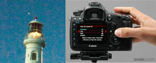
When shooting long exposures, we must consider noise. Noise is produced through heat, when your camera is working hard it heats up and this produces noise. You can reduce noise by;
· Reducing the ISO
· Keep your camera as cool as possible
· Shoot in RAW format
· Reduce the noise in post-production (this is a last resort)
. Use your on camera noise reduction.

I am thinking of composing a shot, in my garden. It is a place full of flowers and furniture, where I could compose a subject to look like they are sitting in a lost garden. I will do this through costume, props and the natural shrubbery/plants around me. I am planning on using a flash to light my subject and then a small torch to light small plant bulbs and details in the framing of the furniture. I may use a lighter to light this.

In this image of an abandoned building, the photographer has used light painting in order to emphasize both the scale of the building, but also the contrast between the bright, garish colours of the graffiti and industrial structure, with the natural elements around it seen in the trees and the gloomy sky. I really enjoy this image, as I feel it presents features similar to what I want to achieve with my own shoot, as despite it being a very different concept, it still creates a very mysterious atmosphere which I would like to emulate.

This image is taken of a couple at a wedding, by a photographer who specialises in wedding photography which is painted with light. I like this image a lot, due to the way the landscape appears secluded but also open and intriguing, making you want to explore the image further. Although the landscape I will work with will be on a smaller and less dramatic scale, I still feel that this image provides a very good example of how painting with light can seem both natural and fantastical.
0 notes
Text
Cheap evaluation
The cheap item I was photographing was ramen noodles. My aim here was to accentuate the flexibility/changeability of the noodles, my method for this was to cook half of the noodles and then hang them, using fishing line and photographing it over time.
I have a hard time with still life, as I find it difficult to bring life to inanimate objects, this project was no different. I found it hard to play with composition in in my studio time, I wanted to use a macro lens to really show the curls and flex of the noodles but find out it hard due to lack of space in the studio. My macro lens is also very cheap, I could have used the in-college store’s lens and camera, it would have helped, on the other hand, I don’t use Canon and would have had to take time to adjust to the difference. It’s something to consider.
I used a green background to bring out the herb seasoning used in the noodle pack, however this did not go well as the seasoning packet was very small and dissipated very fast, I could have added separate seasoning form another source but considered this may take away from the cheap aspect of this project. I also regret not spending more time with this image in Photoshop, I removed a lot of blemishes and things that did not belong in the photograph but have missed some. I guess I just wasn’t interested as much as I would like to have been, but this is my problem that I need to work on.
My opinion on still life has not changed over my time at college, it really doesn’t interest me, but I would like to give it another go. I do enjoy the challenge of this particular area of photography and need to focus on not getting flustered or frustrated for next time, I delve into still life.
0 notes
Text
Poster Project Evaluation
I took my primary inspiration for my poster from the romantic comedy 50 First Dates. This film poster is very bright, humorous , wacky and plastic, in a way. To start, I took a visit to Portencross pier and waited for just before the golden hour. I feel this was the best environment for my image as the blue light in the sky matched that of the poster I had researched (as close as I could considering it’s Scotland) and because over the water you got the view of Milport and the Isle of Cumbrae, I think they help frame the image much more.
I really enjoyed taking my background image as it was a simple landscape, nothing too complicated. I found myself quite comfortable with the process of the image, ensuring the horizon line was level, that the exposure was right, and trying out multiple angles and viewpoints. My post production for this image was also relatively simple, I adjusted the composition of the hills and the clouds a little, using the clone stamp tool, then just took some highlights away and added a fade layer to make the sky seem a bit mistier.
For my in-studio portrait of my subjects, I also found this enjoyable. I liked playing with my subjects’ compositions and expressions, I also got to use a wind machine for the first time so that was cool. I focused on getting the background white with no spill or blown out highlights. Basically, this was just trial and error, taking a photo, checking the histogram, adjusting. As well as that I focused on getting the expression of my subjects face just right, thankfully I had good models. I took both photos of my subjects standing and sitting and ultimately went with a shot of them standing, this was just much easier to cut out and look natural. Although I preferred this composition, I liked the expression in the sitting image, so I took it using the pen tool and clone stamp and stuck it on my preferred image.
In post production I simply selected the quick select tool, clicked select subject, adjusted the selection slightly and then masked. While in the mask, I used the refine edge tool to get rid of some spill I failed to mitigate. After copying my cut subject file over to my background layer and adjusting the size, I proceeded to fix the lighting. I put a curve layer on, locked it to the subject layer and clicked and dragged on the part of the image I wanted adjusted. I also used the burn tool to fix some parts of the skin tone and clothing. Clone stamping was necessary on small parts of the basket and hair and you could see through them to the original studio background.
This was a very challenging project for me, I put in a lot of time and effort when digitally creating this image. However it was very rewarding to see the final product, if I were to do it again, I would be more considerate of were my subjects are in the frame in relation to their props.
0 notes
Text
Cheap Research
Irving Penn
(Source: https://www.phillips.com/detail/IRVING-PENN/UK040108/238)

When I first looked at this image, it really stood out because of the contrast between the bright orange erupting from the monochrome background. I feel that the broken shell frames the yolk really well, and the slight asymmetry adds to the overall success of the image. I think that the background is very interesting, given that it is a colour gradient – atypical for traditional still life.
Marcel Christ
(Source: http://www.marcelchrist.com/non-commissioned)

This is one of my favourite images I have chosen, as it really stands out from the composition, where the photographer has allowed for the ice cream to melt, giving insight into its various elements in its transformative stage. I enjoy the use of pastel colours on a plain background, and I think this was a brave editorial choice, which really highlights the photographer’s skill. I like that the image is shot from above, as though he is looking down onto something he has dropped. This gives the viewer the best overall impression of the object.
Linus Lohoff
(Source: http://www.linuslohoff.com)

This is my favourite image of the ones I have chosen, particularly for its composition. Although I’m not sure whether this image has been photoshopped or whether this is a practical effect, I still think it is a very effective and interesting image. I enjoy the use of a plain almost 2D background which simplifies the image and this is something I would like to emulate in my own.
Neus Pastor
(Source: https://www.saatchiart.com/account/artworks/1031788)

With regards to composition within this image, I really enjoy the fact that the vase has placed at the very edge of the table, adding a somewhat dangerous element to an image which otherwise may have been considered plain, or simple. It seems that the lighting is off centre, which contributes to the image, complementing the asymmetrical nature of the vase and table edge.
Katya Havok
(Source: https://www.shutterstock.com/blog/fresh-modern-still-life-photography)

I really like the colours in this image, they contrast really well and are very eye-catching. I enjoy the geometric effect which has been created with the background, and the shapes of both the bread and the toaster, Again I think the angle is very effective within this image, and the unusual nature of the pink bread really adds to the image’s charm.
2 notes
·
View notes
Text
Movie Poster
Idea 1

I like this idea, and have a model in mind already. In terms of lighting, I think I would need to light from either sides in line with the shadows in the image, however I would wait until I had completed my background shot and met with my lecturer to finalise this. I do want to pursue this image however as I feel like I could create a really good emulation, as well as get an opportunity to develop my photo editing skills with regards to colour. After speaking to Mike, I have been informed that I must have a background with character and not just a blank background, we discussed potential ideas and creating a futuristic background using the architecture of buildings like the armadillo or science centre and manipulating theme through photoshop could work. I would still have to incapsulate the feeling of the original image, also adding in the grime/textured layer.
Idea 2
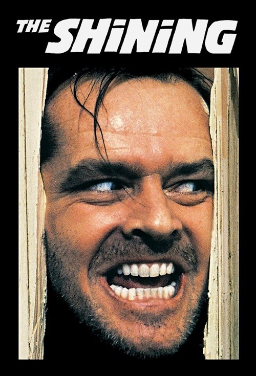
If I can’t go ahead with my original idea, I have also considered this and have a model in mind. This image would require much greater focus on expression and direction, rather than the positioning within a wider shot, so it presents different challenges to the first one. For this I would use some pieces of wood, and Photoshop to make the cuts. Based on the shadows it appears it is lit from top centre left.
Idea 3
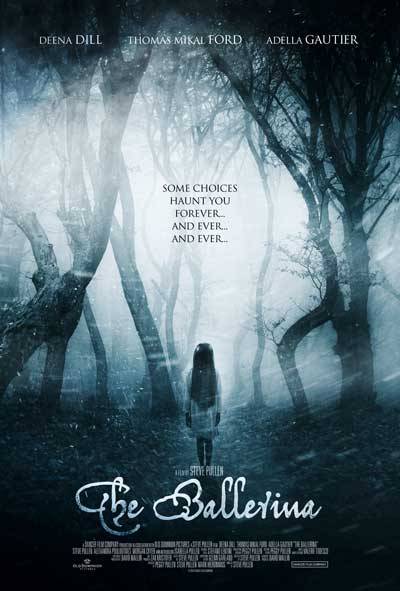
I could also attempt something like this. I live close by to a wooded area but I think I have to warp the trees a bit in Photoshop. The snow will also have to be added in post production and I also feel their is some shake to this image. The light is the thing that escapes me in this, I think it is coming from the back, however that would produce a silhouette.
Idea 4
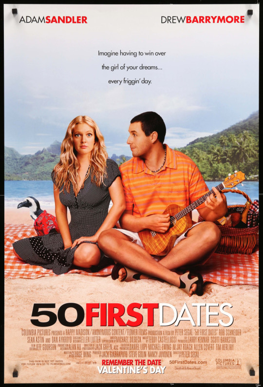
For my 4th idea I thought I would look at something a bit simpler but with an totally different feeling. I could easily merge two photographs together for the background, one of the water from the beach and another of a hilly landscape. I would lose the palms trees sadly but I think it could work. The penguin could be challenge to add in but I’m sure I could figure it out, intact, it seems like a lot of work has been done on this image, especially to Adam Sandler (God) and Drew Barrymores face. The almost seem plastic? I have models in my head for this that are easily contacted!
Sources:
Idea 1 - http://starwars.wikia.com/wiki/File:Adam_Driver_Kylo_Ren_The_Last_Jedi_Teaser_Poster.jpg
Idea 2 - https://www.flicks.co.nz/movie/the-shining/poster/
Idea 3 - http://www.coffeeandcigarettes.co.uk/tag/the-ballerina/
Idea 4 - https://www.grazia.co.in/lifestyle/the-only-15-rom-com-movies-you-need-to-watch-2119.html
3 notes
·
View notes
Text
Artisan Moving Image
1. The Art of Bread Baking in Tajikistan
https://youtu.be/XSocqMT0hr4
I really enjoyed this film, particularly the way it was shot. I found the fact that the cameraperson was very unobtrusive, like a fly on the wall to really benefit the images, as it gives a much more natural quality to the film. I also enjoyed how the use of natural elements such as the birdsong and surroundings were used. Their was a slight panning in this movie but for the most part the camera was stationary. I enjoyed the overhead shots as everything shot, that is being made is laying on the floor.
2. The Sword Maker
https://youtu.be/g2BLg756_4M
My favourite section from the documentary piece was from 1:24, where the image is slowed down to give a theatrical display of how the swords are created, and the shadows created by the fire were also really interesting here. Their were a lot of close ups in this film, panning shots too. The focus pull used on the fire was really appealing to me!
3. The Painter
https://youtu.be/_nN_zJW2EdM
I found this film very interesting, because of the fact that the painter is creating a self portrait, but the cameraperson (0:28) has chosen to film his process in waking up and starting his day, to reflect on the artist himself, as this affects what he paints. The focus pull on the paint was great, showing the paint brush in the pull really helps the mind through the story. The close ups really give the drama to creating a self portrait.
4. Shoe Shining
https://youtu.be/JAr49K8c2-M
I really enjoyed this film, particularly because of the intricate but simple way it is shot. The fast cuts are my favourite aspect of it, as it allows you to see how detailed and quick a process this is and how much skill it takes. The close ups really help with the fast pace, cutting from the shoe to the busy man cleaning them.
5. Wintergatan Marble Machine
https://youtu.be/IvUU8joBb1Q
I found this video really interesting. The way in which it has been filmed really shows how intricate the process of creating and playing this instrument is, with the aerial shots and the shots from inside the machine itself. I also liked how the cuts go to the beat of the music. The wide establishing shot is a really great opener, the lower shots after that show the size of the contraption.
2 notes
·
View notes
Text
Catch Me If You Can Research
Action
One of the key features of capturing sports photography is the process of capturing an ‘action’ shot. While this can involve just movement, within sports photography, it specifically refers to the point at which an important event, or action, has occurred. This can include a goal, punch, or jump etc.
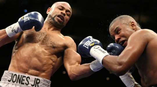
http://www.mightyfighter.com/top-5-advanced-boxing-techniques/
Reaction
Secondly, sports photography considers the capturing of ‘reaction’ shots, in which a subject is shown expressing their reaction to an event, such as a look of disappointment or celebration.

https://www.google.com/url?sa=i&rct=j&q=&esrc=s&source=images&cd=&ved=2ahUKEwiI8LOR6tTeAhVDF8AKHZz1AQQQjhx6BAgBEAM&url=https%3A%2F%2Fwww.walmart.ca%2Fen%2Fip%2Fconnor-mcdavid-edmonton-oilers-1st-game-back-goal-celebration-canvas-frame%2F6000196017491&psig=AOvVaw1nkPtwrI2BEfTwxYMpzJXu&ust=1542317373928175
Arena / Pre-Show Shots
These are shots of the general atmosphere of the events before the event takes place, of the surroundings and the crowd.
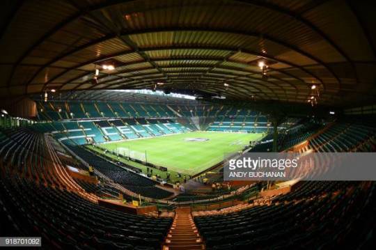
https://www.google.com/url?sa=i&rct=j&q=&esrc=s&source=images&cd=&ved=2ahUKEwietsDv6tTeAhUHI8AKHZUaBScQjhx6BAgBEAM&url=https%3A%2F%2Fwww.gettyimages.co.uk%2Fphotos%2Fandy-buchanan%3Fpage%3D2&psig=AOvVaw3WKvaSyLj3mFEOn5K4MeVF&ust=1542317567572242
Points to Remember
Be clear on what the sport is, and take shots which communicate well with the audience.
Including logos and signs can help with ensuring your brief is fulfilled clearly.
Ensure that all involved participants are included in the frame of a particular action shot.
Walk around the environment to set up the best angles and viewpoints, as well as to test light.
Carry a long (70-200mm) lens, this will be better for shooting far away subjects.
A wider lens (35mm or less) lens can be used for wider shots such as arena images.
Event Details

Contact Sheet
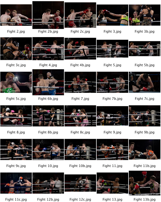
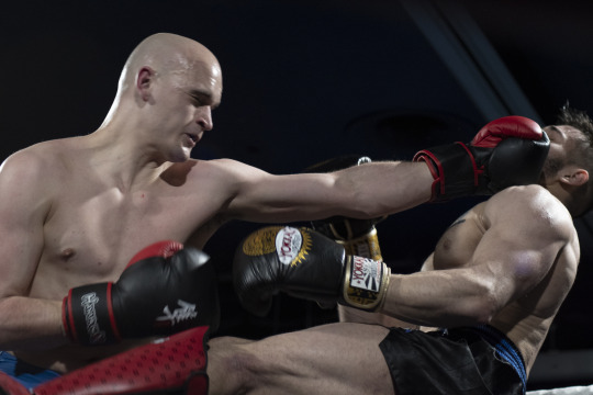
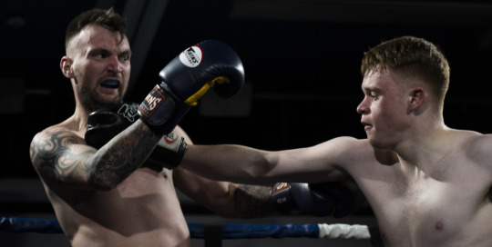
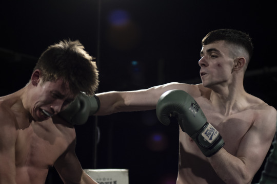
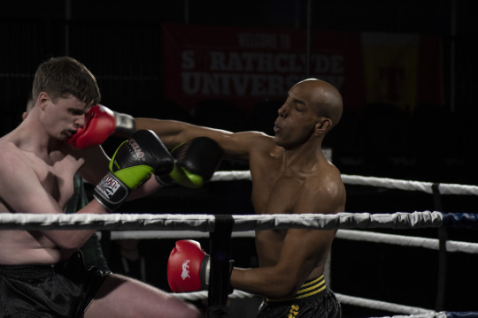
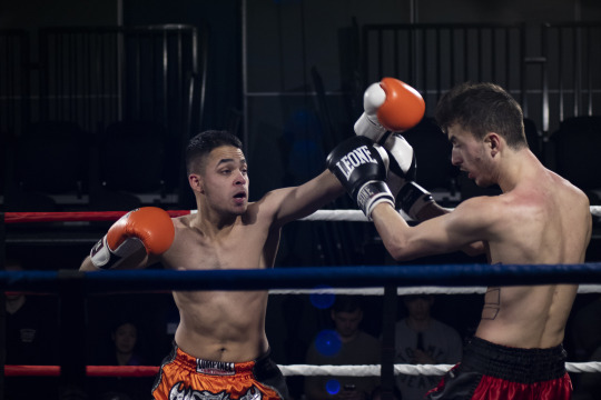
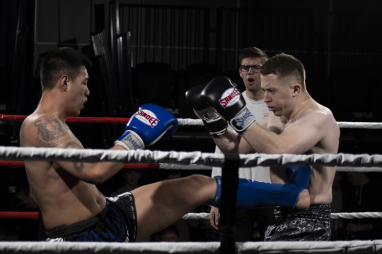
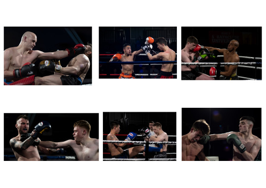
I found the shooting went really well, I captured a lot of the action and showed the best of it with my final six. The lighting was the biggest hassle when working around the ring, a higher ISO was required which made some of the images particularly noisy and weird flares came into my photos, this could make the photographs very distracting but I felt it added to the images making the fights look more cinematic. For example the first image has two flares coming from the punched mans head, making it look, to me, like he is getting his soul punched out his body or he is awakening in some sort of manner. I don’t know if a sports publication would like these aspects of my image but I do. I wish I had an external flash with me when I did this shoot, it was a very dark location and hard to capture some points of the fights, I think an external flash would have added more light to the fighters bodies to show more detail but also get some more of the background in like banners and maybe some of the crowd reactions to the fights. I also wish I did some more experimental shots, like a shallow depth of field shot using the ring ropes or a shot from within the crowd, just to give the images a bit more depth and personality, basically to show what it was like in the hall as a spectator rather than only showing what was in the ring, hindsight is a great thing but at the time I just wanted to get the best shots I could get and not play around, I need to remember to have more confidence in my abilities and reach a little further, even just to see what those other ideas would have looked like if I had went that extra mile. I really enjoy the facial expressions of the fighters, they were really going for it, however the unpredictability of a fight made it hard to focus on the action, I tried auto focus but it simply didn't work. To compensate for this I basically bracketed my focus and clicked away. I think the fact that this sport is very closed in made my job a lot easier, I didn't have to search for shot, simply focus on the two combatants in the ring and they weren't moving very far away from me so a lot worked in my favour. Overall, I really enjoyed this project, the fights were great and the results were similar, in future I would look for my vantage points and angles but this was hard as the space around the ring was limited. Although I did like this, I think a lot of that had to do with my personal interest in the actual sport, I don’t think I would enjoy other sports that are non or limited contact but fighting is something that I love and I’ve found through this project that I also love photographing these fights, this is something that I would love to do professionally and I never thought that would be the case.
Final Images
0 notes
Text
Who Am I Evaluation
IMAGE 1: OBJECT
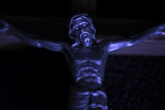
I shot this with a macro lens at 300mm focal length, at a slightly lower angle. This was in order to bring out some detail in the figure, to signify my focus on self-sacrifice and transcendence. The blue tone that is seen throughout these images adds a more surreal or melancholy element in my opinion, plus the colour blue I feel says a lot about me.
IMAGE 2: PORTRAIT
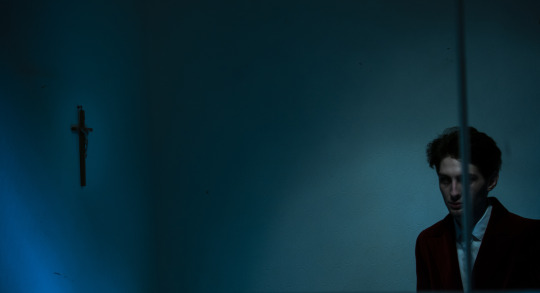
In this image I used the reflection of a mirror as the project is about self-reflection, and I put a lot of effort into making it work well. I enjoy the composition of this image. The distance between me and the cross and the fact that it is behind me shows that there is space between me and my goals/ideals to be travelled. The lighting also shows this as light only hits me and the cross. Although there is light hitting me, my figure is very dark, so much so that my eyes are not visible, conveying that I have still not yet fully achieved my goal of focus. The line that cuts through me also conveys a split in situation and state of mind.
IMAGE 3: LOCATION
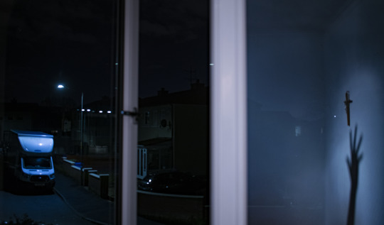
In my final image I showed the view from my bedroom window, again using a reflection to convey my inner thoughts. The conflict here is between discipline and freedom. The street represents travel, escape and adventure, whereas the room reflects a desire for discipline combined with a tendency for self-deprecation and over scrutinising myself. I enjoy the highlights in this image and how it appears to flow.
CONCLUSION
I really enjoyed this project and exploring myself though photography. I didn’t exactly stick to my original plan, but as I took test shots and experimented with composition I began to think more about myself and I ultimately feel that these images reflect me more accurately. I think concept was clearly my best skill in this project and I really enjoyed the opportunity for greater creative freedom in this project.
1 note
·
View note
Text
Seeing Evaluation
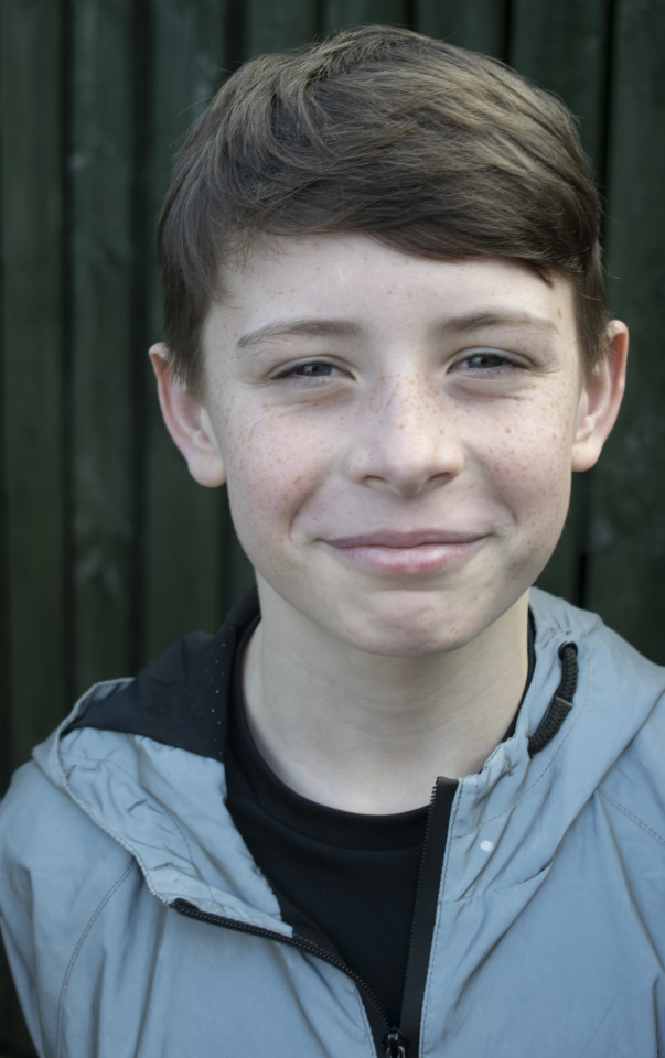
IMAGE 1: In this image I used the very soft light of an overcast day to set up my portrait. The little light that fell onto the subject was diffused with an opaque reflector. I think the soft light works well with the cold, muted tones of the image. I really enjoy the expression on the subjects face, and the viewpoint from above contributes to the overall effect of the shot.
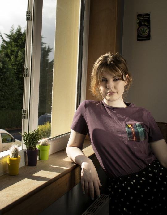
IMAGE 2: This is my environment portrait. I chose to do a windowlight portrait as I have enjoyed working with these in the past. I really enjoy how the light falls on the subject at around a 45 degree angle on the left side, and a reflector has been used to fill the right side of the subject out. This shows some more detail in the face and neck which adds to the overall composition. I like the composition, she looks relaxed and natural, and the background has a lot of geometry in it, which I think makes my portrait interesting. However, I regret not removing the highlight on the nose in the optimization stage.
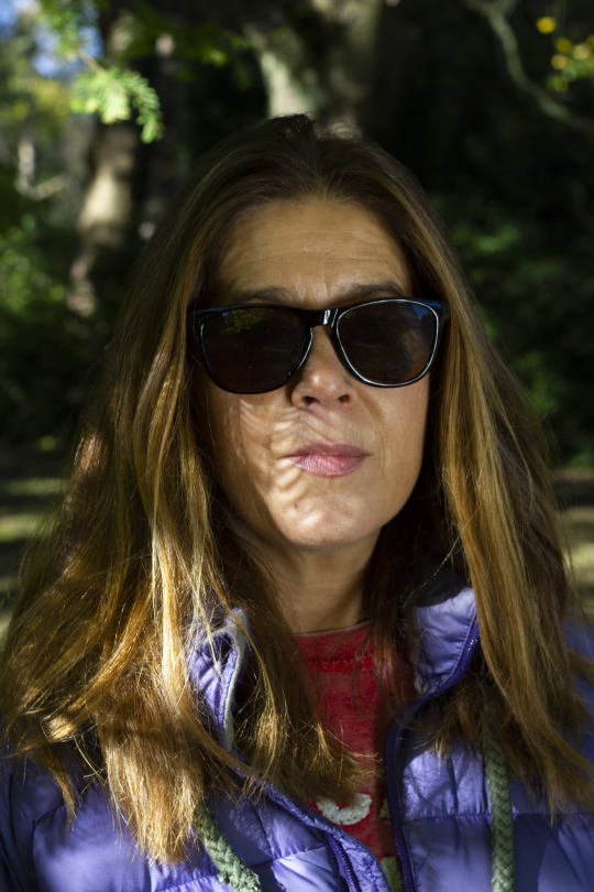
IMAGE 3: In this image, I used the trees to flag some light and I think it has created some interesting shadows. I think the light really goes with the character of this person, it is mysterious and that compliments the blurred background which gives the image an almost ethereal quality. The light bounces off the hair really nicely, showing nice tones. Overall I think this portrait is very simple but also effective at showing the ways light can be used naturally.
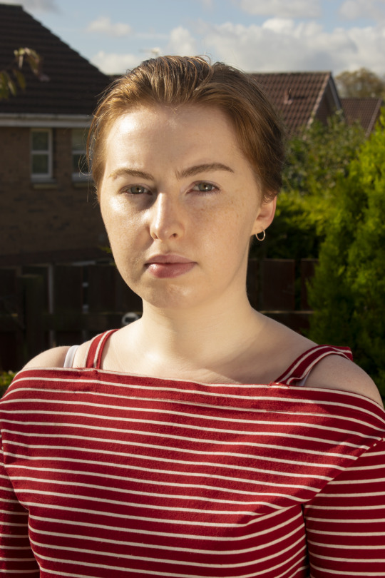
IMAGE 4: I enjoy my final image for its highlights mostly, as they bring out the eyes of the subject, given how bright the sun was on this day. If I were to redo these images, I would like to get a wider range of expressions in my subjects, so this is a goal for future photography work with members of the public.
1 note
·
View note
Text
Clean White Evaluation
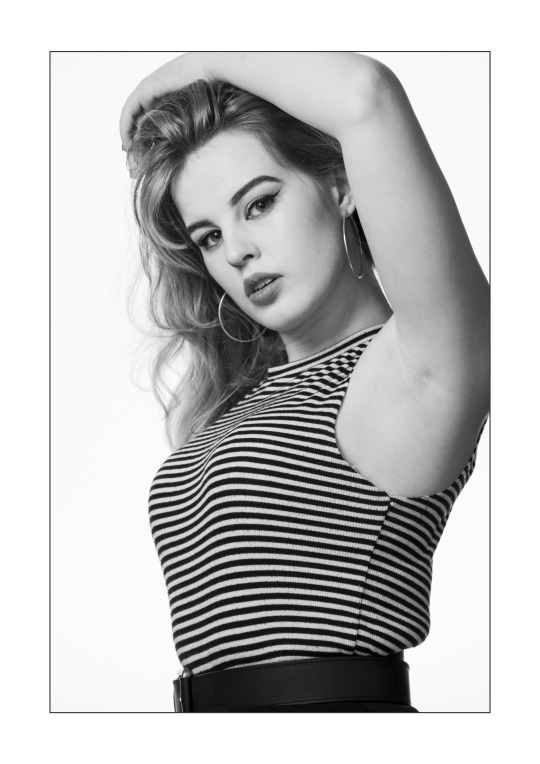
For my clean white, I feel as though I executed the brief very well over all.
With regards to the technique, I feel it was very similar to the original, and I put a lot of work into studying the techniques of the original photographer in order to get my version looking as authentic as possible.
Technique-wise, I am very pleased with the lighting and composition overall, as the background is very evenly white, with absolutely no spill onto the subject, which gives the image a much more professional, high quality look. The composition is very good, I spent a great deal of time with my model and other classmates to ensure that it was as close as possible given the length of time that was spent in the studio. The only drawback I can see if I was to redo this shoot was I would rather the pose was a little more natural, but given that the original was taken as one of a series of natural portraits, and mine was a deliberate imitation, it is always going to look slightly more rehearsed.
In terms of my lighting and flagging, I am very pleased with the shadow which falls onto the arm, as I feel it helps with the crop. However, I would like if the shadow beneath the chin was a little thinner in order to show more of the neck as in the original photo, however I tried several positions of the light and this was the one which turned out closest, as other positions affected my catchlight badly. In future I will consider using a reflector to reduce this. One of my favourite aspects of the image was the tonal range, particularly the tones of silver and grey that appear through the hair that’s falling over her shoulder.
3 notes
·
View notes
Text
Sphere
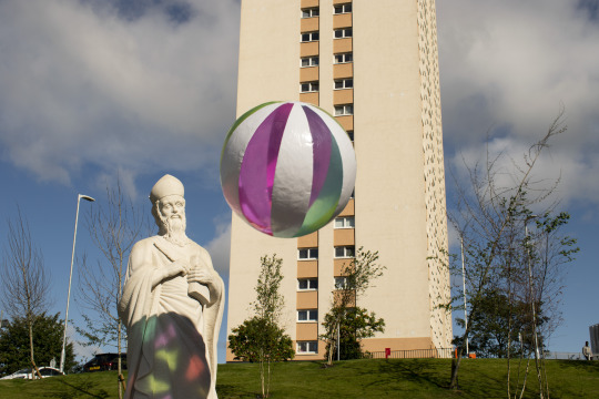
1. Frozen Movement - I found this the easiest of the shots. I like the way the statue is looking at the ball, it makes him more involved in the shot. I also like the shadow the ball has cast on the statue. I wish I had gotten a different angle, the building in the background is very distrating the way it frames the ball.
Shutter speed: 1/320
Aperture: f10
Iso: 100
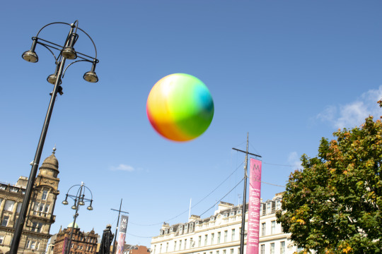
2. Enhanced Movement - This is probably my favourite shot. Where the ball is placed in the shot makes it stand alone. The ball was moving very fast in the shot and I think you can really see it.
Shutter speed: 1/160
Aperture: f8
Iso:100
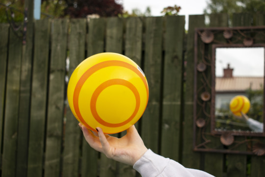
3.Shallow Depth of Field - This shot, to me, is very uninspired. I used the mirror in the back to really just show the shallow depth of field. The background colours and bland, I could have done a better job optimizing.
Shutter speed:1/250
Aperture: f5.6
Iso: 100
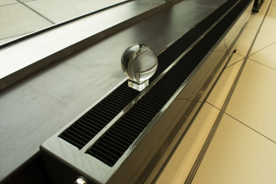
4.Extended Depth of Field - Again, this shot was boring to me, it's only purpose really is to show the depth of field. I could have came at this at a better angle. One that would pull you into the photo more.
Shutter speed: 1.3
Aperture: f20
Iso: 100
5.Panning - I like this panning shot, the ball is clearly seperated from the background but you can still see the movement within the whole shot.
Shutter speed: 1/30
Aperture: f16
Iso: 100
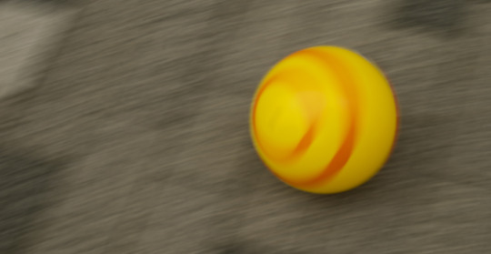
1 note
·
View note
Text
Seeing the Light Research
1. Reflecting Light
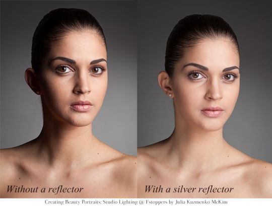
Reflectors are used to re-direct light and fill in shadows, and come in a variety of colours, which re-direct light differently. White reflectors bounce the light, softly. Silver reflectors are similar to white ones, but produce a brighter effect, while gold reflectors make the tone of the subject much warmer. Reflectors are primarily used to fill in shadows on your subject or dark spots in the background. Besides professional reflectors, other white or metallic materials such as paper will bounce light. Distance and where you are in relation to the light matters when using reflectors, the closer you are to your subject, or the light source, the harsher the light.
https://www.pinterest.co.uk/pin/174092341819310198/?lp=true
2. Flagging Light
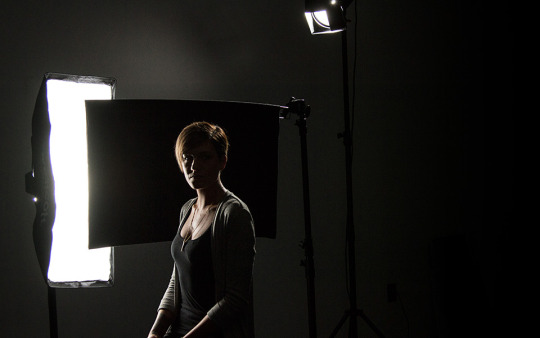
Often, professional reflectors have a lack side, which can be used to flag light. Flagging is when you block the light hitting your subject with something that absorbs light (something black). This is done to create shadows or block overpowering light. Lots of things can block light and create shadows so you have lots of options with flagging.
https://www.fjwestcott.com/fast-flags-black-block
3. Golden Hour
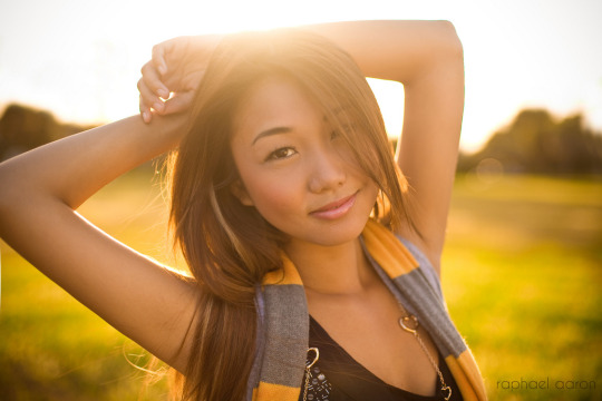
Golden hour is the popular name for the period of day just before sunset or after sunrise, where the warm glow of the sun produces a soft, warm effect for photography without the need for a reflector or filer, though these may enhance the image. https://www.flickr.com/photos/raphaelaaron/4081200474
4. Diffusing Light
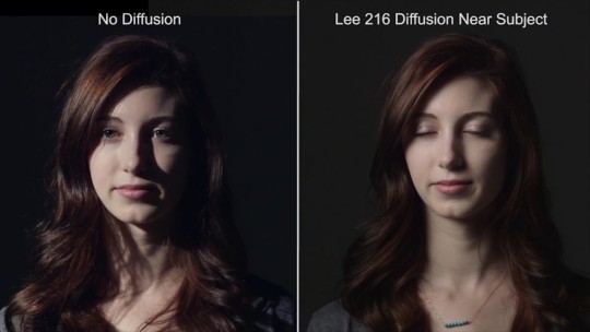
Several sources can be used to diffuse natural light, providing an effect where light is softened without being completely blocked. This can be done naturally with foliage or clouds, or with a portable diffuser or piece of material. The use of a diffuser will result in light being distributed more evenly across the subject, lessening the harsh, blown out look of intense light.
https://novom.ru/en/watch/N1dVzkX_Zds
1 note
·
View note
Text
Clean White Research
Photo I wish to Emulate.

This Portrait of Brigitte Bardot, taken by Sam Levin, 1956, is the photo I will try to emulate. Sam Levin was mainly involved in studio portraits, photographing many cinema stars throughout the 1950′s and 1960′s.
The light quality of the image is very soft, as we can see there is little harsh contrast in the features, and they appear visibly softened. The light direction is coming from the centre left of the subject, and the camera view point is fairly straight-on.
The focal length for this portrait I estimate to be between 70-100mm, because the subject is fairly flat against the background of the shot, thought not fully.
In recreating this photo, I must remember to keep the subject at least 9′ from the background, though this will depend on what I have to work with at the time.
[https://elizabethkarlsson.net/2014/09/28/vintagegal-brigitte-bardot-photographed-by-sam/]
John Ford by Richard Avedon
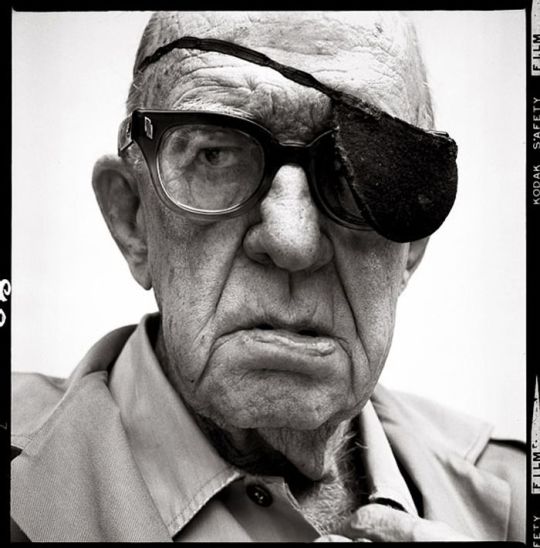
This photograph was taken using very harsh light, I like the way this technique rings out the details of the subject, and how the highlights reflect from the varied texture of his skin.
The lighting of this photo is unusual and complex, potentially with a light from above, bounced onto the bottom of his face and collar - possibly using a reflector.
The camera is positioned straight on in this image, with the subject looking directly down the lens. The focal length for this image I would estimate at around 70-100mm, possibly more, given the depth of the image.
[http://bfox.wordpress.com/2010/04/04/richard-avedon-portraits/]
Steve Jobs by Albert Watson

As noted by Ted Sabarese, “the key light is a white umbrella at f32, high and six feet to camera left. Two umbrellas at f16 1/2 (-1 stop) are placed behind Steve to the left and right.” This allows the background to e lit evenly and for the removal of shadows.
The focal length is around 70-100mm, and using soft lighting.The sharp, characteristic features remain prominent despite this choice, allowing for the subject to be captured in a present but not harsh way.
[http://guessthelighting.com/2012/02/27/albert-watson-lights-steve-jobs-famous-portrait/]
1 note
·
View note