#furniture ads
Explore tagged Tumblr posts
Text

I believe she may have other thoughts in mind...
Brand Names Foundation, 1970
#70s ads#vintage ads#retro ads#innuendo#1970s#70s#1970#seventies#70s advertising#vintage advertising#70s clothing#70s hair#furniture ads#magazine ad#good housekeeping
8 notes
·
View notes
Text

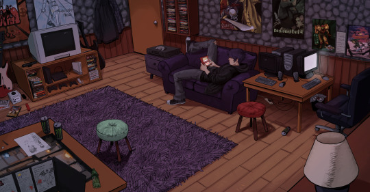
FINALLY FINISHED THIS!! my own interpretation and additions to Sebastian's room in sdv ! Tried to keep anything in the image from the year 2010 or predated. i think theres a few give and takes but i really like the "older brother" early 2000s grunge aesthetic on another level and i thought who better fits it than him. I put a lot of references to stuff i personally like as well ^_^

#my art#sdv#sdv fanart#stardew valley#stardew valley sebastian#stardew#sebastian stardew valley#sdv sebastian#could be ooc in some parts#i added a lot of stuff furniture included#for funsies#referenced almost any media in here from real cases and posters as well
11K notes
·
View notes
Text
Tips To Create Furniture Ads

In this infographic, you will get to know about the Furniture Ads.
0 notes
Text

Enhancing your furniture advertisements can significantly impact your sales and establish your brand as a leader in the industry. In this infographic, you will get to know how to advertise and make your advertisement better.
#furniture ads#furniture advertisement#ads for furniture#furniture advertising examples#Facebook ads for furniture#Facebook ads spy tool
0 notes
Text

ʚїɞ cozy fairy cottage ʚїɞ
#fields of mistria#fom#still a wip bc i need to get the supplies to make the cottage ice box for my kitchen lol#but I’m so obsessed with all the new furniture they added in yesterday’s patch!!!#scrapbook#gaming
719 notes
·
View notes
Text


advertisements for clayton furniture 'space savers,' 1977.
593 notes
·
View notes
Text
TV ad for a furniture shop in Leningrad featuring actor Mikhail Boyarsky (1974)
Boyarsky is 25 here. Interestingly, this ad never aired.
163 notes
·
View notes
Text

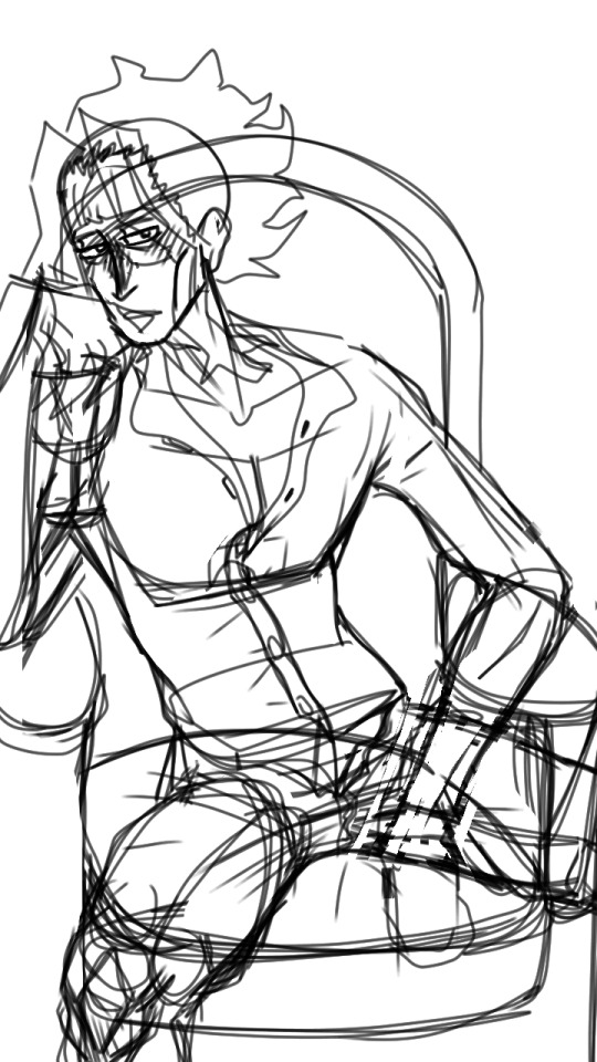
okay, this one's a LIIIIIITTLE different from what i usually draw, hope ya don't mindheheahahahehahaha
4 am sketch under the cUT

#rubyart#mha#mha art#bnha#bnha art#all might#toshinori yagi#yagi toshinori#skrunkly man#is not so skrunkly👀#this took way longer than i wanted it to#oh well#drew that sketch at 4 am a fEW days ago#motivation does me dirty#i love this man so much#gonna draw an ask soon hehehe#how do you draw furniture#i need to get better at it#i aleo need to stop coming back to this and adding more tags😭
170 notes
·
View notes
Text
Hi I'm the heroine of a fantasy webtoon, my name is Maybellyne Pryngles, my wardrobe spans the fashions of 1820-1910, the architecture is both 19th century German Castle Romanticism and Gothic Revival, the furniture is Baroque, the technology is pre-Renaissance, and my hairstyles are extremely 21st century. My love interest is the most generically handsome man you've ever envisioned; he has the hair of a 2019 K-pop artist and a name composed by throwing darts at an eye chart.
#*squints at comic* why are you wearing late-Victorian clothing & Victoria's Secret runway hairstyles in a Neuschwanstein lookalike setting?#why doesn't anyone have guns#we're all Christian-with-the-serial-numbers filed off. Religious leaders have the vestments of the Vatican and the fervor of 1600s Puritans#My Husband Changes Every Night#What the Evil Dragon Lives For#Adopted by a Murderous Duke Family#My In-Laws are Obsessed with Me#Praesepe Outside the Cage#I'm sure there are others but those are the ones I've been reading#occasionally a story will have someone with a somewhat normal name (Elaine) instead of a Boggle-generated smush (Tuariche)#webcomic#*footnote adding the 1950s into the wardrobe part also but specifically when it comes to evening wear#the furniture is ALSO Gothic Revival but the post was getting long#Webtoons#original#text post
86 notes
·
View notes
Text
it's just a matter of time until Dragon City adds the Dan And Phil Bin statue, which opens up when you say "oPeN cAn" and you get 15k gold 30k food and
#phan#dan and phil#I'm rolling w the video's description “thank you for [...] adding all our furniture to your dragon game” lmao
98 notes
·
View notes
Text

Ad for CasketFurniture.com in Rue Morgue Issue 34 (July/August 2003)
42 notes
·
View notes
Text

im so fucking mad. why did i work so hard on this. there isnt even a single gay bitch in this image all i have is latticework and osmanthus studies
#arts#mottau#i mean i did enjoy drawing it. but also what the fuck#this is even sy's actual room yet this is a concept design for a room he will get later#like this is vaguely something i started drawing to conceptualize certain aspects of omega room design in this setting#but like at this point i could have explained more in three regular sentences#due to the potency of an omega's scent particularly in their living quarters certain aspects of their rooms are specially tailored#to contain their scent to the more personal parts of their living space. one could think of it as degrees of intimacy#with their bed area being the place their scent is allowed to fully saturate the space. the room divider here encloses the furniture needed#for dressing and whatnot as well for similar reasons and the curtain falling over it mimicking the canopy of the bed serves two functions#partially trapping in the scent and also adding an additional layer of 'hiding' to the nest area which makes it feel more secure#see? three sentences. that took five minutes to explain#i mean certainly the art looks niceys and all but im just so fucking perplexed. why did i do that
145 notes
·
View notes
Text


one thing about lori is that you WILL be seeing her at the estate sale
also lori at any given time:

#sorry for another apartment post but i just think it’s neat#i always think of lori as an old soul with a modern mind. if that makes sense#she really makes the most of her living space by having older furniture that fits with the decor and then adding some modern touches#a lot of the stuff she found was either through estate sales or maybe the odd thrift#she looooves anything from the late 1800s/early 1900s
38 notes
·
View notes
Text

Samuel Taylor Ltd, 1964
#Mr. Sheen#ad#1964#furniture polish#advertisement#spray and wipe#silicone wax#vintage#1960s#advertising#Mr Sheen#polishing
113 notes
·
View notes
Text

"Modern" Dinette Set, 1949
#1940s#40s#40s dining room#40s decor#40s home#1949#forties#dining room#dinette set#40s furniture#moderne#chrome furniture#ad detail#better homes and gardens
28 notes
·
View notes
