#franquin style
Explore tagged Tumblr posts
Visit Tumblr Blog
Explore Tumblr blogs with no restrictions, modern design and the best experience.
Last Seen Tumblr Blogs


Fun Fact
69% of Tumblr users are millennials.
Text
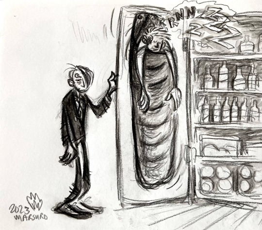
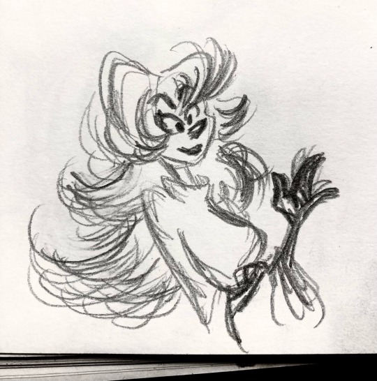
They can’t keep finding him like this
Based on this panel lol
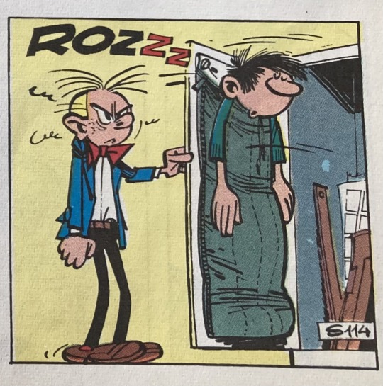
#zoro#roronoa zoro#sanji#black leg sanji#one piece#one piece art#op fanart#one piece fanart#franquin style#gaston comic panel#there’s SO many good gags in these comics#my entire sense of humor was born from those albums#unending inspiration#yea ive got more ideas lol#fav egg
256 notes
·
View notes
Text
Curious about this since the original poll by @wasted-my-time was only 24 hours and I want to include only comics I've personally been recommended by my USAmerican friends.
Honorable mention since it didn't fit on the poll list: Jérôme K. Jérôme Bloche, which I chose to exclude since there are literally only 5 albums in English and I had to cut one of them
Small edit for a common question!
What’s BD? - BD = Bande Dessinée = comics (in the French language). Generally (in English anyway) comics are referred to by their language of origin (ie “manga” for Japanese comics). This is because of shared tropes, references, cultural material, art styles, etc. This does NOT mean that they’re all from France! Just that they’re all written in French!
Asterix and Blueberry are from France; Lucky Luke, Tintin, Spirou & Fantasio, Gaston, the Smurfs, and JKJ Bloche are all Belgian; Yakari is Swiss; and Blacksad is made by Spanish creators but written in French for a French audience and published in France
#asterix#tintin#smurfs#spirou#lucky luke#gaston lagaffe#blacksad#blueberry#yakari#jerome k jerome bloche
2K notes
·
View notes
Text
Inaugurating this acc with a dump of my first (sfw) AA1 drawings !
Have a "Paul Défès" drawn in the style of Belgian comic author Franquin,

A sleepy sketch of Dick,

And some narumitsu stickers I made for the local con !

Hope you enjoy theses ! probably gonna post some Tokyo Rev or Dunmeshi next !! 😎🌸
#sakuralexis#ace attorney#ace attorney 1#larry butz#narumitsu#phoenix wright#miles edgeworth#miles x phoenix#phoenix x miles#silly art#shitpost#andré franquin#gaston lagaffe#bande dessinée#franco belgian comics#black ink#digital illustration#ace attorney fanart#my art#my post#recent art#fanart#my merch#ace attorney merch#digital art#krita#sorry too many tags#i got excited
122 notes
·
View notes
Text
The birth of an icon
Lucky Luke wasn't from the very beginning the icon that everybody knows. To become that, he had to travel a long way. He only got his status after 15 albums. When Morris, in 1946, started Lucky Luke, he still made use of what he had learned before in his previous, short career at the cartoon studio. Compared to Franquin¹, who let this pass by quickly, Morris needed at least 3 Lucky Luke adventures before he listened to the wise lessons of Jijé², who was the mentor of the creatieve process of the post-war Spirou/Robbedoes³. In the beginning of the 1950s, Morris went to live in New York and he couls take a peek behind the scenes of the new, post-war American comic. Compared to the European one, the language of the American comic had way more codes. Because comics in America had a more adult audience, the writers had more artistic freedom. Morris got to know the future group of the magazine MAD⁴ in the time of his American wanderings. This meeting became decisive: Morris would then take distance from the aesthetics of his old friends who had already returned to Europe. While Morris still continued to publish for Spirou/Robbedoes alongside Will⁵, Jijé, Rosy⁶ and Franquin, he diverged with his artstyle from the 'atom style' of the Marcinelle school⁷, as how comics historians were starting to call it in the '70s. From that time, Morris went his own way, independent of the comic families Spirou/Robbedoes, Tintin/Kuifje and Pilote. The meeting with René Goscinny became the end of this process. Goscinny helped Morris keep only the essentials of all his influences that he had gone through - Hergé, Jijé and MAD. Slowly, the hero that Morris had been looking for for 10 years without ever really finding him, started to come. An icon with a disarming charisma, always on the move in a world that continually threatens to slip, but gets on the right track again with a nice twist. A poor lonesome cowboy in a world populated by clowns. This is his story.
[The art of Morris: page 15]
[Picture from Lucky Luke's doppelgänger]

Franquin¹: André Franquin was a Belgian comics artist, mostly known for Gaston and Marsupilami.
Some terms if anyone wants it explained:
MAD⁴: An American magazine.
Jijé²: Jijé is the pen name of the Belgian comics artist Joseph Gillain. He's best known for being a seminal artist for Spirou et Fantasio and the creator of Jerry Spring.
Spirou/Robbedoes³: A Belgian comics magazine. Spirou is French, Robbedoes is Dutch.
Will⁵: Willy Maltaite was a Belgian comics artist. One of his notable works is Tif et Tondu.
Rosy⁶: Maurice Rosy was a Belgians comic writer, one of his notable works being Tif et Tondu.
Marcinelle school⁷: Also known as the École de Marcinelle/School van Marcinelle. A name of a group of Belgian cartoonists formed by Jijé after WWII. The first generation, known as the Bande à quatre(Gang of four), consisted of Jijé and his assistants: Will, Franquin and Morris.
First post:
7 notes
·
View notes
Note
Hii, do you have some recommendations for euro comics that are available in english (aside from moebius' stuff and rabbi's cat)? :)
Die Laughing: Franquin is a household name in "classic" (60/70s) euro comics, while he's mostly known for his children's adventure comics I believe this one is worth reading if for the art alone. They're short stories if not single page comics that are akin to newspaper comic strips if it wasn't for their edgier, pessimistic content.

The Arctic Marauder: Fantastical drama set in the late 19th century that entirely commits to the bit. Drawn like old engravings and with equally inspired paneling, this is a great looking comic. The story might be a bit too weird for the average reader, it's pessimistic and political, and like in all of Tardi's work every character is mean and ugly. I like it there

Black Order Brigade: spoke about this one on here before. A bunch of ageing former spanish facist fighters decide to reunite for a final battle following a terrorist attack. Good thriller that carries the weight of upcoming death throughout it's whole run. If you like martial themes this one's for you

Anything by Druillet, a slightly forgotten king of trippy ass paneling and 70s fantasy stories. If you like the album covers Roger Dean made and ever thought "hm. I wish giant space mechs and reality bending adventures happened in there, and I also wish I could sear off my eyeballs reading comics". You're in luck. Strongly recommend getting the physical editions for these ones

All of these artists are big french names from the same era as Moebius or right after, who while super famous here don't have much name recognition internationally outsides of niche fan circles.
For non french artists, I'm a huge fan of Sergio Toppi (who I discovered pretty recently! With his mythology series. Got the ice themed one). He has very striking style. His work got compiled in collected volumes of shorts which are pretty good

Fpr one last rec, I'm giving this one with a strong disclaimer: this is not very good. While it's interesting to look at and fun at times you'll have to grit your teeth through a lot of fantasy genre cringe compilation classics. If you're ready to suffer in the name of camp, The Mercenary is a spanish comic entirely oil painted with frankly ridiculous detail that I've regularly read when I have no more brain and want to see guns mounted dragons. 70s Sci-fi Art on tumblr has a great collection of the artist's work, mostly illustration, but there's some panels here and there.

That's about all that comes to mind for today :)
#These are all pretty old and politically inclined and kind of edgy I'm sorry for the fun whimsy fans#BD#ask
17 notes
·
View notes
Note
7, 10, 13 for the artist ask game!!
7. Who are some artists that have inspired you?
So many! I started drawing as a kid because I loved comics. I loved the fluid and dynamic style of Franquin. When I started making digital art, I discovered Loish. I loved her feeling for color and mood, and texture. And again, fluidity. I'm also a fan of Egon Schiele, the rawness and texture.
10. How do you deal with art block?
It just sucks sometimes. Nowadays I try to shift to other interests, and I try to keep up some form of creative work. I took up crochet a few years ago. I know now that my creative flow will come back. Although I think it would be better to at least try to practice daily, even if it's silly doodles, or just some life drawing.
13. What kind of art do you personally not see the appeal of, and why?
Oooff. I think I like all kinds of art? Does this question mean "art forms" or "visual art styles"? Anyway, still a hard question! To give some sort of answer, I do appreciate the skill involved in photorealism, but I prefer to see something added by the artist. I love seeing brush strokes, underpaintings, distortions, interpretations.
Thanks for asking! <3
2 notes
·
View notes
Text


In addition to multiple popular characters, André Franquin designed vehicles, mostly cars. Blue and white with headlights that stick out matches the Batmobile that Adam West drove for style. The blue snooted one is my favorite. I’d buy that car.
I’m assuming some of these are by him. The first and last are by Fabrice Tarrin but clearly Franquin designed the cars.


Turbotraction et Fantacoptère (1991)

15 notes
·
View notes
Note
ton blog m'a donné envie de me mettre à spirou. Tu aurais des tomes à conseiller pour commencer ?
Wahh je suis trop contente d’entendre ça ! Et oui bien sûr :3 Sous un read more vu que c’est devenu un peu plus long que prévu
Deja tu peux lire tous les tomes de Spirou et Fantasio sur VK
Je recommande évidemment de commencer par la période Franquin vu que c’est celle qui pose les bases de l’univers. Même si le personnage a eu des aventures avant dessinées par Rob Vel puis Jijé, je trouve que c’est plus intéressant de revenir sur ces périodes une fois qu’on a une vue d’ensemble sur la série.
Les tomes essentiels/préférés pour moi sont :
T2 Il y a un sorcier à Champignac
T4 Les héritiers (Zantafio ❤️)
T7 Le dictateur et le champignon (ZANTAFIOOO 😻)
T9 La mauvaise tête
T15 Z comme Zorglub & T16 L’ombre du Z (c’est un diptyque)
T17 Spirou et les Hommes Bulles (surtout parce que la deuxième aventure c’est Spirou et les petits formats et elle est juste trop mignonne 😭❤️)
T18 QRN a Bretzelburg
Bien sûr si l’univers te plaît tu peux lire le reste des albums de Franquin puisque beaucoup de choses y font référence plus tard dans les albums des autres auteurs. Et puis aussi c’est bien :)
Ensuite dans la période Fournier mes préférés sont :
T22 L’abbaye truquée
T23 Tora Torapa
T28 & T29 Kodo le Tyran et Des haricots partout (un autre diptyque)
Fournier a un style un peu plus fantastique que Franquin, ça se voit surtout dans ses décors que je trouve époustouflants surtout dans ces quatre albums. Le diptyque aussi a des moments trop mignons entre S&F arghhh 😭 ❤️
Tu peux passer la période Nic & Cauvin parce qu’elle est sans plus.
Ensuite la période Tome et Janry (T33 - T46) est juste INCROYABLE je conseille de tout lire. Genre vraiment. Tout est excellent 🔥 Mention spéciale à la Vallée des Bannis et Vito la déveine YAOI COCAINE
La période Morvan et Munuera n’est pas incroyable non plus, je conseille de la zapper. Ils essaient de sortir du moule un peu mais entre les scènes d’action insupportables de Munuera et les romances pourries manufacturées par Morvan ça donne juste un résultat bcp trop tryhard et CRINGE
Après la période Yoann & Vehlmann est cool ils font des trucs intéressants avec les persos mais je ne suis pas vraiment fan du graphisme de Yoann. Il n’y a que 5 tomes et ils sont assez courts donc je conseille de les lire aussi 👍
Le tome 56 la mort de Spirou est vraiment excellent par contre, je le recommande vivement.
Après en dehors de la série principale il a le Spirou c’est une série ou différents auteurs peuvent faire du Spirou à leur sauce. Pas obligé d’avoir lu la série principale pour les lire, voire au contraire puisque la plupart des Spirou de s’éloignent de l’univers ‘classique’ de Spirou.
Je recommande TRÈS CHAUDEMENT!!!!! Le Spirou de Schwartz et Yann (Le Groom vert de gris et La femme léopard partie 1 & 2) parce qu’ils sont top et très touchants et franchement. Yann et Schwartz ship clairement Spirou et Fantasio… ils passent leur temps à se faire des câlins et y a pas 3 pages sans une blague/allusion sur leur statut de couple c’est trop mignon aurghh 😭
J’ai beaucoup aimé aussi le Spirou de Fabrice Tarrin La crypte de Champignac et Spirou chez les Soviets. Je trouve qu’il a vraiment une bonne idée des personnages et j’adore son style de dessin.
Il y a le Spirou d’Emile Bravo (Le journal d’un ingénu et L’espoir malgré tout en 4 tomes) qui est aussi excellent, extrêmement bien écrit. Mais S&F sont assez loin du Spirou et du Fantasio dont on a l’habitude.
J’espère que ça t’aidera désolée pour cet énorme pavé 😭 mais une fois que je suis lancée je peux pas me taire ❤️ j’espère que tu aimeras la série !!!
12 notes
·
View notes
Text

So, the second album, The Master of Roucybeuf, was written pretty early in Peyo's career and you can kinda tell by the art style. So, for curiosity's sake, I figured I'd draw two of the characters, Sir Hughes and his brother, Bertrand, from that story in his much later style.
For comparison's sake, here's a panel from the story in question. Note the much larger proportions. And before that, he kinda went for a semi-realistic style in a sense and you can see how that started to evolve into what we know as his style today.

It's kinda like how Spirou used to be taller and lankier in Franquin's earlier stories with him up until 1970.
36 notes
·
View notes
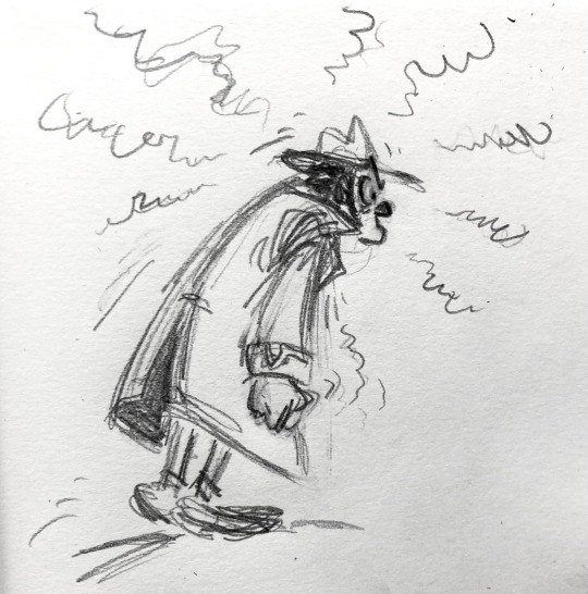
Text


Trying to nail the Franquin art style with this instruction bellow me.
6 notes
·
View notes
Text


You know what. Franquin style
#lupin iii#lupin the third#lupin iii art#franquin#bande dessinee#franco belgian comic style#mostly based on the gaston/spirou et fantasio look#only the first zenigata was ref’d from a panel#(of de mesmaeker lol)#jigen daisuke#fujiko#zenigata#going back to my roots bc franquins comics mean the world to me#and his style is one of my biggest inspirations since very long#my childhood#no worries im still drawing tiger zoro’s :)#he’ll be returning soon!
354 notes
·
View notes
Text
Spirou N°1276, 1962 (André Franquin) ❤️🌸

P. S. J'adore le style de André Franquin...) 😭❤️
6 notes
·
View notes
Text
With 3,500 independent bookstores (as many as the UK and US combined), France is fertile territory for comic-book creators to concoct an unrivalled breadth of styles.
As to why the festival [Angoulême] – the world’s third-largest comic-book festival behind Lucca in Italy and Japan’s Comiket – is held in this pallid-hued provincial city 100km from the Atlantic coast, it comes down to the usual French explanation: gastronomy. In the early 70s, local fanboys began inviting Belgian luminaries such as Hergé, Smurfs creator Peyo and Spirou’s Franquin to come down, drink the regional speciality cognac until the small hours, and sign dedicaces (autographs) for them. The first festival proper took place in 1974 and, with the government seeking to make the Charente département a hub of visual arts, became rapidly professionalised in the 1980s. Now it brings in 200,000 visitors per edition.
The Guardian –‘We didn’t expect this phenomenon to last’: France’s comic-book tradition is hitting new heights
2 notes
·
View notes
Photo
This was always one of my favorite artworks by Toriyama.
The critter Arale is riding on is fanatstic. The style looks almost franco-belgian. Like it was drawn by Franquin.

Akira Toriyama
695 notes
·
View notes
Note
I will say something a bit controversial but as much as I love ryoko kui designs and she inspires me sm in terms of character design I think a lot of people praise her maybe because they don’t see a lot of that in manga? Like I’ve read lots of manga that have peak character designs but maybe not so much in body diversity which is why bare minimum is so applauded but it’s something you learn about in character design 101 classes but so many artist don’t use it especially mainstream dc/marvel comics , when I read European comics I see a lot of designs that are really different from different artists so I wasn’t as “shocked” as other readers were and she isn’t perfect but I will say her dedication to detail is really nice to see I guess
Depends what types of manga and comics you're reading. Like you said, diversity in your cast isn't inherent to good character designs because good character design depends on what you want to achieve. A large part of the european comics that are famous internationally have a comedic intent, their art style is to be efficient at expressivity and fun, and get close to caricature - stuff like Astérix and Lucky Luke. And being caricatures, traits are very exaggerated, leading to strong variety.
This happens in manga too where you get designs like one piece's, but a concern of designers I see in manga more commonly than in BD is being pleasing to the eyes. It's something visible in extremely popular media like Ghibli movies - when stuff looks gross, it's jarring because it's the exception to the rule of the characters and environments looking nice. And a lot of (at least in the franco-belgian sphere) european comic artists don't care about looking nice. If you look at artists like Franquin or Tardi you get the opposite impression that they make everything ugly on purpose.
Ugly and pretty are subjective things though and that's the elephant in the room - when an artist more or less consciously decides on what is pretty or ugly, their tastes and biais show. That's why in aforementioned one piece the female characters have a same face problem most of his goofy male characters don't, because a woman has to be pretty. This is more or less prevalent absolutely everywhere in visual art. Female characters are an obvious one, women having the same face and body type and being expected to be attractive in a specific way is a well known issue, but that logic applies to many more points you could use in your characters. And that biais is guaranteed to happen if attractivity is your goal in character design, biais who's targets and intensity will depend on the author(s).
Where I think Ryoko Kui and dunmesh fare nicely is that DM's art style does, to me, look like it has "looking nice" as a goal. "funny" is another one you see apply in those hugely memed expression panels but the rest is, for the lack of a better word, pretty, and the character designs exist in that. In universe, Senshi and Kabru alike are considered handsome, one's a short stacked bearded man and the other's a twink. "monstrous" characters like the orcs and kobolds aren't drawn to horrify the reader. Characters get to both be nice looking and diverse in their morphologies which is a line an immense amount of visual media does not reach. So why I do agree that it should be the bare minimum, in application...nah we don't see that much anywhere really. If it means it's an overrated aspect or not isn't up to me to decide o7
#looking at you witch hat making your latest villain an old fat balding man x#although to me DM designs are great bc of the thought put into them but that's another story#ask
21 notes
·
View notes
Note
Trademark: Cute noses ~
Ah, the noses. It’s always the noses.
Right! I’ve got a funny story about the noses! (and the artistic inspiration that led to that type of nose)
So it feels like I am known a lot for giving my characters soft squishy noses. But back in the day it feels like I only used to draw one type of nose, and that’s what I’d call my pointy triangle nose.

Three girls.... all with the same nose. Or sometimes it’d be a kind square nose if it was a gruff bulky guy. That was basically the two settings I’d use for ages.
Then a friend introduced me to bande dessinee comics. Specifically the Spirou series as drawn by Andre Franquin. In bande dessinee comics EVERYONE has a big round nose. Noses of all shapes and sizes! Basically, when you try to draw bande dessinee characters you have to learn to draw soft squishy noses. Anime noses just ain’t gotta cut it.

So I basically spent years drawing characters like this and then my noses gradually added more shapes, they became less pointy and way more soft and taking on different shapes.
So now it’s kinda fun that I draw mostly robots and the robots all have these very soft noses despite being made of metal. haha.
I think the silliest thing was just.... ages ago, before getting into these comics I created a character for my own original story. His names is Charles, and he’s meant to be kinda dashing. And at the time my default was a triangle pointy nose but I thought “hey, wouldn’t it be funny if he had this typical bishi face but then a round nose, that’d be fun”. So I drew that and then years later that became the default for how I draw everyone. But I like it and he looks way more soft than he used to. I love it.

#Raax fact#noses#art styles#bande dessinee#Spirou et Fantasio#Andre Franquin#Charles Fortiscew-Smythe#Anonymous
9 notes
·
View notes