#for the most part for me its more realistic/3D but...
Explore tagged Tumblr posts
Text
Tips for wring amputees: its ok if your amputee can't repair their own prosthetics
There's a trope in fiction for amputees to always be these mechanical geniuses who can make and repair their own prosthetics, endlessly tinkering away and improving them. This isn't a particularly trope, and i dont think its harmful or anything, but in reality, prosthetics are REALLY, REALLY complicated, and a lot of amputees cant do their own repairs. And thats ok. Like, prosthetic creation and repair is way, way harder than I think people expect. Well outside the skillset of your standard mechanic, handy man or craftsperson.

People who make and repair prosthetics are called prosthetists. To become a prosthetist, most countries around the world today require you to have completed a bachelor's degree in specifically in prosthetics and orthotics, which covers not only how to make a prosthetics (and orthodics) but a great deal of medical knowledge, physics, how different forces impact "non-standard" bodies, the additional biological wear-and-tear that comes with being an amputee and so much more. This will qualify you to do the job of fitting/making the prosthetic socket (the part that attaches to your body) and putting premade components together to make a functioning device. On top of this, many prosthetists are also expected to have artistic skills, sewing skills, good physical strength and dexterity, IT skills, and more recently, knowledge of 3D modelling and printing.
You want to make all the high-tech components the prosthetists put together to make the full prosthetic? The requirements for that vary country to country, but most will require at least some level study in the field of engineering and/or medicine, on top of what was already required for the prosthetics course.
The reason for all this is because even "basic" prosthetics are extremely finicky, and messing up one thing will have a domino effect on the rest of the body, especially in more complicated prosthetics. It can also result in people getting severally injured if anything is even slightly off. many leg amputees for example end up with spinal issues due to extremely minor issues with their prosthetic that weren't caught until years later, and by then the damage had been done.
Some amputees do learn to do basic repairs. This is most common in places like the US, where a visit to the prosthetist can cost hundred to thousands of dollars (depending on your insurance), but it's also quite common in rural parts of countries like Australia, where cost isn't an issue but access is due to vast distances between major cities. I was personally in this category; as a kid, my nearest prosthetist was 6 hours away. My prosthetist was able to teach my dad, who later taught me, how to do some of the simple repairs, but we still needed to go in every few weeks for the more complex stuff (Kids prosthetic need more adjusting than adults because they're still growing. Also I was rough on my prosthetics and broke them a lot lol).
But even after being taught how to do repairs and having my prosthetics for 20+ years, I only ever did these sorts of repairs to my below-knee prosthetic. I will not do any repairs of any kind to my above knee leg, which is much more technologically complex. Every time I tried, I made it worse to the point where the leg was unusable. I just leave those repairs to the guy who went to university to learn how to do it, and sometimes even he needs to send it off to someone with even more specialist knowledge when it's really badly messed up lol. Last time that happened Australia post lost the package. Not really relevant to this post, I just find the idea of it being sent to the wrong place by accident hilarious, it was one of my more realistic legs too so someone probably had a heart attack when they opened that package lmao.
Anyway, back on track lol.
This isn't even touching on the fact that on some more advanced prosthetics, many features are actually locked behind a security barrier only prosthetists can access. My prosthetic knee has an app on my phone I can pair it to, that allows me to change certain settings and swap between certain modes for different activities that tell the leg to change its behaviour depending on what I'm doing (e.g. a mode for running, a mode for cycling etc). but most of the more in-depth settings I can't access, only my prosthetist can, and he can only gain access to those settings with a security key given to him by the manufacturing company that requires him to provide proof of his credentials to receive it. I don't really agree with this btw, something about being locked out of my own leg's settings makes me feel a bit of an ick, but it's set up like this because people used to be able to access these settings and they would mess with things to the point their leg was virtually unusable. Because altering one setting had a domino effect on all the others, and a lot of folks weren't really paying attention to what they were messing with, all their prosthetists could do was factory reset the whole leg, which causes some issues too. Prosthetic arms are often similarly complex, as I understand it and have similar security barriers in place for more advanced arms. I don't know for sure though, so take that with a grain of salt.
All this to say these are incredibly delicate, finicky and complex pieces of equipment. There's nothing wrong with having a techy amputee character who can do their own repairs, but in reality, that is pretty rare, and its ok to have your character need to see a prosthetist or someone more knowledgeable than them. It's a part of the amputee experience I don't see reflected very often in media. In fact, the only examples I can think of in fiction (meaning not stories based on real people) where this is reflected are Full metal alchemist.
technically I think Subnautica Below Zero also mentions prosthetists are a thing in that world, but its a very "blink and you'll miss it" kind of thing...in fact I did miss it until my last playthrough lol.
#Writing Disability with Cy Cyborg#long post#id in alt text#amputee#writing disability#disability#disabilities#disabled#actually disabled#writing advice#writing#writeblr#writers on tumblr#writerscommunity#disability representation#authors of tumblr#prosthetics#disability aids#mobility aids#amputee life#amputee problems#full metal alchemist#automail#amputee representation
3K notes
·
View notes
Text
"Nawy what do you MEAN quick-ish 3D render it's got scratches and everything and I thought this was real for a minute!!"
Well, first, thank you very much that was the intention ❤, and second, you see, all speed is relative, and between finding my references, modeling, texturing and lighting, on top of having to learn how to make convincing gems, it still took me quite a few hours. I, however, cut corners everywhere for speed, and I wouldn't put this piece in a portfolio in its current state.
But! for the curious, I thought I could do a simple breakdown of how the witchcraft happens, without using too much specialized language to make it more accessible. In short,

In this case, I’m talking about a 3D model that was textured (colours and stuff) and then lit (lights on!) to make a pretty final picture. The objective is not to make a tutorial, but to put in simple terms what a 3D artist does to make something go from this, to that:
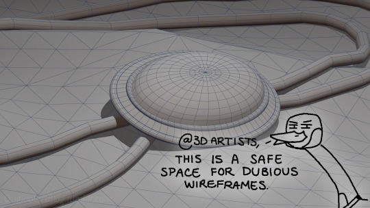

(people curious and/or trying to see if this interests them welcome)
I'm skipping the 3D modeling part altogether, since it isn't where most of the magic happens here. Just know that to be able to add colour and stuff on a 3D object, you have to go through the process or "unwrapping" it, which is like doing those foldable cubes in reverse
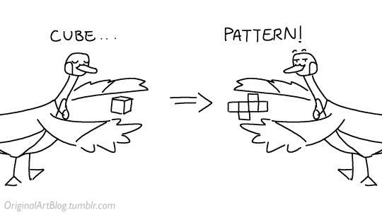
and then we can draw on it!!
Now, the good stuff:
Surfaces (metal, plastic, fabric, wood, skin, etc.) have different looks that make you able to differentiate them on sight. To make something look realistic, you have to try to replicate real life into the 3D world (duh.)
The software developers took care of the hard part (math and coding), so as artists we can play with the parameters available to make something pretty. What those parameters are depend on which "recipe" we're using. One of the most common "recipes" for realistic results is called PBR: Physically Based Rendering, named that way because it's trying to replicate real-life light physics. In this case, the 4 basic parameters are called albedo, roughness, metalness, and normal.
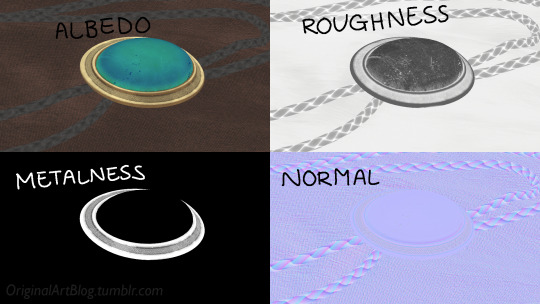
Albedo is the base colour of the surface (easy stuff). Roughness is to determine if a surface is rough or shiny. Metalness is to say if something is made out of metal or not. The normal is there to add all those tiny details you don't want to or can't sculpt on your 3D model (engravings, fabric bumps, etc.)
The roughness and metalness are black and white images because the information you're giving to the software is black = no and white = yes. It's easier to understand in the metalness image, where everything that is NOT a metal is black, and everything that IS a metal is white.
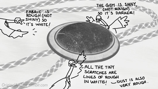
The normal is a bit more complex, but in short, it uses the colours green and red to know what is up/down or left/right, and will help the software fake relief on top of the model. You don't make it by hand; it's computer-generated from other stuff I'm not getting into.

With the technical stuff out of the way, we can actually use these. There are specialized softwares that will let you preview the results of each parameter in real time, so you can see what you're doing easily. This is what I have.
That software comes with some types of surfaces that are already set up, like the fabric in my piece, which was already 85% good for me straight out of the box. Then, it's up to me to use the tools available to decide how shiny a surface is, if there's dust or scratches and where, what colours things are, if there's metal parts, etc. That's where you can see a 3D artist's skills.
And finally, you bring it all together into a specialized software that can render 3D stuff and use those images on the corresponsing parameters, and then light the scene.
Because it all comes down to this: the light! For something realistic, light is vital to get right. You can pour your heart and soul into those tiny scratches, but if you don't light the scene correctly, well...
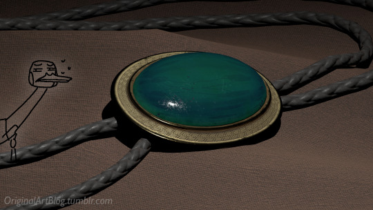
So we carefully light the scene to get some nice highlights to make the textures look good and highlight our subject (it's basically a photography studio inside a computer)
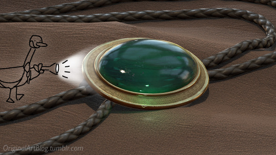
And then we add some camera effects...

and voilà! pretty picture!!
... and if you somehow did notice something different with the bolo tie from my last post, I did find out while taking all these screenshots that I messed up my initial renders in a way that made everything darker than it was supposed to be and that's why my gold looked so muddy...

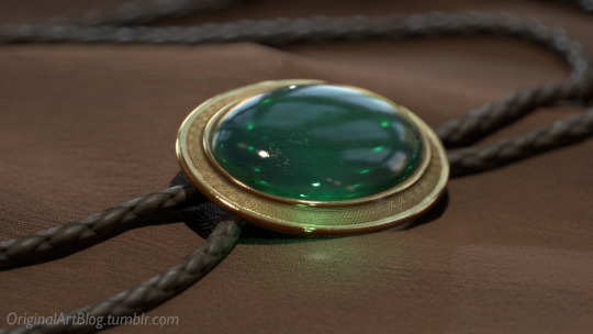
I hope this was interesting and that you learned a thing or two!
#welcome to nawy's 3d school for complete beginners#nawy's 3d#technically not art but... you know...
364 notes
·
View notes
Text
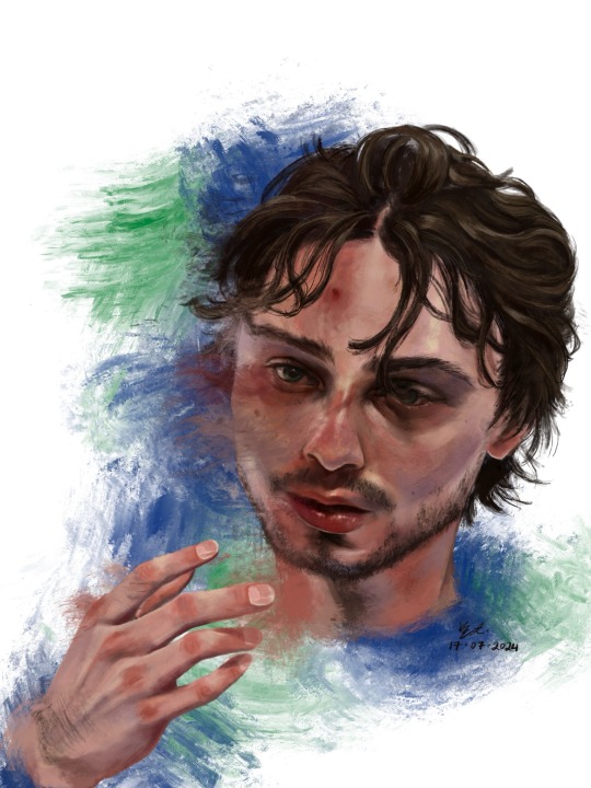
who is #43?
Hello !! First off thank u for visiting. If you clicked read more by accident rip sorry it’s a lot of text. ENJOY!!! <3
1. This was the photo reference I used. I really did mean it when i said he photographs well!! I really like how scrungly he looks at times lol. v paintable

2. here’s a timelapse for your viewing pleasure in video + gif form <3

3. Process breakdown below. I am not formally trained, so don’t take any of this as professional advice!! The way i paint has been compared to channeling some evil contract with a demon also. So um . Im saying that i dont remotely think that this is efficient or correct, its just whats comfortable for me <3
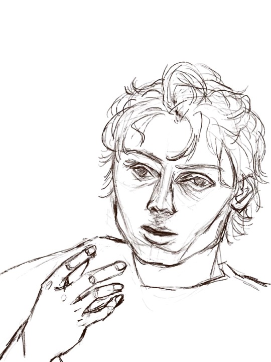
3a) the dreaded lining phase. I have 2 modes of operation when it comes to painting - either i go full-dick with fancy inking/sketching + cel shading (rare, unrefined, haven’t figured out a nice workflow yet) OR i do a very very basic chicken scratch set of lines like so:
It’s less about being realistic here and more about laying down some guide lines for the chaos ahead. If i thought i could get away with it, I would start every rendered painting i do with laying down colours — but unfortchh ive tried that before and it usually ends in really weird proportions. Even with the lines i still need to make adjustments. This is something no people except me would notice but look at the above sketch; the eyes are too big and slightly too far apart, the forehead is too small and thus the hair is also not quite big enough… I have a bad habit of drawing eyes too big on faces, they’re my favourite facial feature to draw.. i barely resisted giving him big cow eyelashes (I love big cow eyelashes… all of my OC’s and most of my more stylised fan art of characters get big cow eyelashes… god…. Big cow eyelashes SAVE ME……….)
Anyway. Structure of the face + hand somewhat established. <3
3b) Underpainting!! Okay stay with me here . Ever since i figured out i dont have to paint in 03925893853 different layers, I’ve joyfully painted on 1 layer as much as possible. I dont have the brain power all the time to be managing layers so I simply dont work with that many layers. For this painting, the skin in its entirety was painted on one layer, the hair on another layer, and the effects on the last layer. There was a placeholder background off-white/grey colour for a while there, and I duplicated the line layer — one for figuring out where to lay colours, and one hidden for later so i could check back to see how accurate to the sketch/proportions were to the actual painting. 6 layers, 2 of which i painted the bulk of the piece on, 1 more at the end.
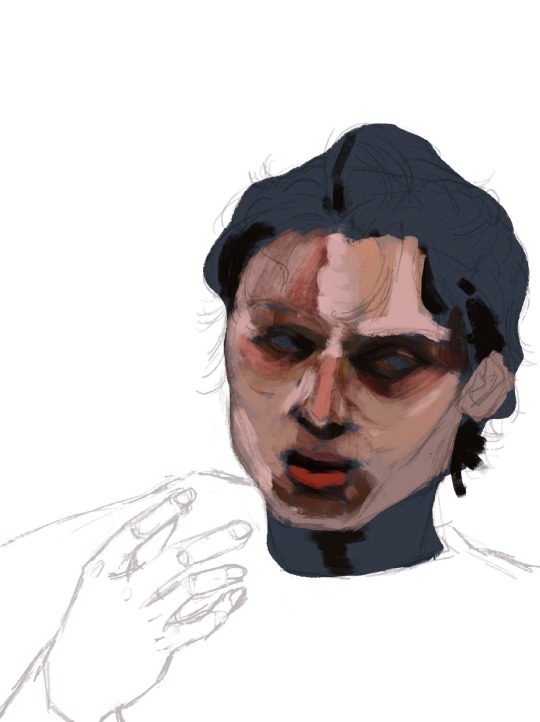
3c) here’s where I started carving out features. I think about objects in terms of volumes and light rather than lines. i love painting and sculpting because of this!! Here you see where I’ve begun to define his features — his eyelids, his bags, his nostrils. Just refining what was there before. The suggestion of facial hair before i gave it up and left it for later (his face is so naked the WHOLE time)
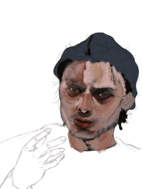
3d) nose bridge highlight, suggesting his eyebrows, a cheek highlight. A touch more coral red and muted yellow pull away from the grey/blue underpainting. Strategically leaving some of it peeking through.
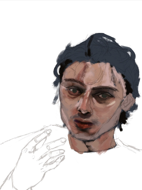
3e) i truly start messing with the fidelity of his features here. Red lipstick <3 and some violet/blue for shadows on the right side of his face.

3f) the part where it starts looking like q.hughes to me (though, my friend said i got his vibe pretty early on which is such a compliment.. waaaaa…..) I love this part of every painting i do. I know it’s definitely not the Correct order since other parts of the entire painting are simply Not Rendered or Done, but whos gonna stop me?? :3
I love love loveeee painting faces. Adding the little shinies to his eyes + lips + upper lip + nose … you don’t know how much of a difference it makes until you do it. Also i snatched his eyebrows
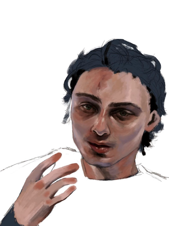
3g) i really pushed the red/coral/ochre/orange here. Note the yellow highlights on his cheekbones, the forehead, and the thin thin line of pink right between where his bottom lip ends and his chin shadow starts <- very important . To ME!!!!!!! Also highlighting his waterline and adding his lashes was so so fun <3
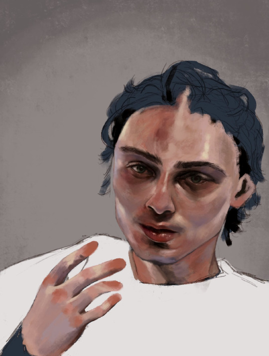
3h) FACIAL HAIR!!! And I started rendering his hand. Some micro adjustments made to his face for proportion check.

3i) i start painting his hair in earnest and realise his forehead is too small so i make the adjustment. I really love how it falls into his eyes in this photo. <3
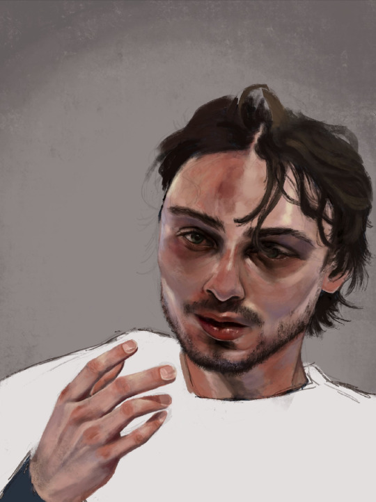
3j) i make some final adjustments to his eyes — a bit smaller, closer together. And i refine the outline of his jaw, push the stylisation of it just a little.
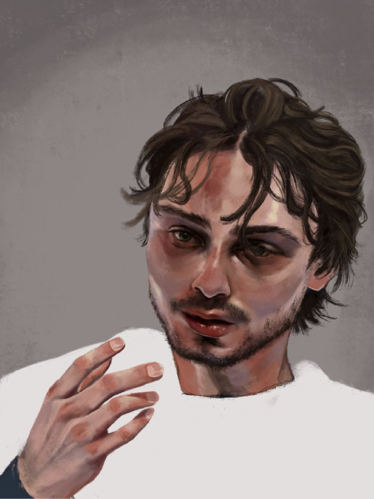
3k) Finishing details; his flyaway hairs, his moles, a bit of texture on his face, shadows cast by his hair, his little forehead cut <3
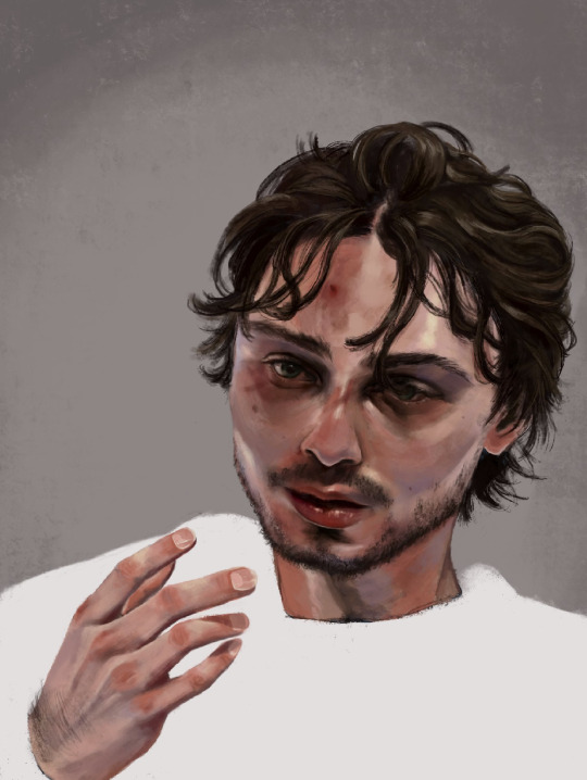
3l) i adjusted his hand here, added more texture to his skin, refined his hair a tiny bit more, and made the decision not to fuck around painting his jersey because i wanted the focus to be his face <3

3m) Canucks blue and green. Captain at 23. His form bleeds into the background. He is the franchise.

theee most fun ive had painting anything. and i finally feel... warmed up? if that makes sense. art for me is like. if i dont do it in a while it feels like nothing goes right when i come back to it. i hate that feeling, and the most difficult hurdle to clear is letting myself feel that until i get back into my Zone. after all this time i feel like im BACK !!!!!!!
i loved painting this fella. hes SO Shaped. <3
Apologies i simply do Not have the energy to write the alt text for all of these so i hope the little blurbs are okay aslkjasdklj. i gotta post and go to bed . if u made it this far, thank you for reading!!
#details and process under the cut ….!#god… it really is like . they let anybody be in their mid 20s these days??? (<- guy in his mid 20s)#quinn hughes#vancouver canucks#hockey art#puckpainting#<- abandoned wet rat of a tag. rarely used
153 notes
·
View notes
Note
hiii your art style is so good!! i got two questions :3
1) any tips for any beginner artists?
2) do you have like, an inprnt or anywhere i could buy your stuff?? i would love to hang some of your art up on my walls bc its so gorgeous :0
haiii thank you so much!
im no teacher by any means and of course don't consider myself a professional, but will try to give you some tips that kinda helped me on my journey ^_^
1. don't focus on artstyle. the way you hold the pen in your hand is already original. you don't have to use same process, same brush, same eyes size and proportions on every drawing. for me, it lead to a burnout and a safe face syndrome. try new things, new brushes, new techniques, play around with proportions, art is about fun, not about putting yourself in a box!
2. anatomy isn't a most important thing. yes, knowing how certain part connect to each other is important and learning is good, but don't focus on anatomy only. learn things as you need them, not everything at once, look for references, break them down and apply to your art. it doesn't have to look exactly like the reference, it's your art, do whatever you want!
3. basics are quite important. shapes, lines, boxes. simple art exercises such as drawing shapes in 3D can help you build a better control of your hand and understanding of space and shapes.
4. gesture drawing is very fun and helps you build more dynamic and realistically looking poses!
5. do not focus on realism if that's not what you're aiming for.
6. give yourself some rest when needed and don't be too harsh. learning curve isn't straight and sometimes you can feel bad about what you're doing, but that's alright, nothing is linear, just keep going and you'll see the result!
as for prints.. i don't think im cool enough and my art is worth printing?? but if you want i could send you full sized pngs of drawings you want if you want to print them yourself or something 🥺
27 notes
·
View notes
Note
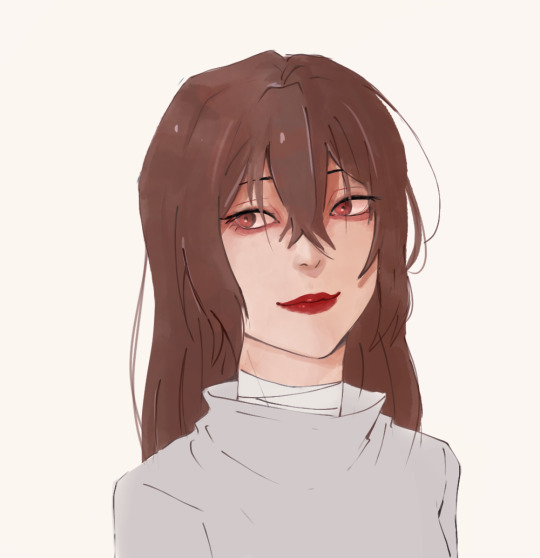
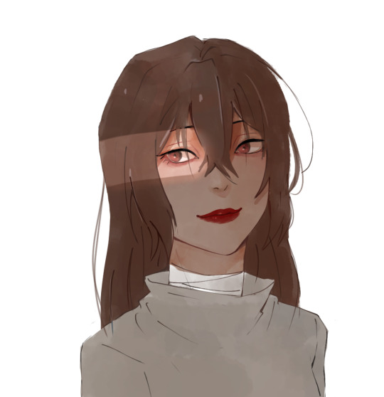
They still feel off specially the eyes i could feel them about to manifest their own life and run off
Even my linework is ... Idk what's wrong and it's the problem maybe I'm staring too much but I don't think so
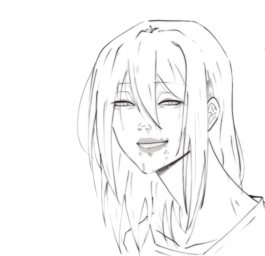
Sorry for bothering alot but i loved your last advice ty
i think the main problem with the first picture has to do with the proportions and anatomy of the lower body area aka the neck and shoulders. i'd make the shoulders wider and add some sort of form to the neck so that it looks believable instead of a flat rectangle shape ( maybe make it slimmer a bit too? although that might be just a stylistic choice so you do you). That's the first thing i'd fix because otherwise the head looks too big in comparison to the rest of the body, and it can throw you off
I actually think you did a great job with the eyes, they have a lot of life and that comes from the fact that they are the most rendered part of your piece, which is not a bad thing. The thing is, while it is true that the eyes are the main focal point of a face and portrait in general, that doesn't mean you can neglect the other parts, so i think it is also a consistency issue or not figuring out exactly what sort of style or rendering you want to go with that holds you back (which is totally fine and normal ofc). So let's pick a semi-realistic stylized rendering style for this since this is the vibe i'm getting from this piece.
If that's the style we're going for, then the face should have a bit more form. You have to remember that our facial features ( eyes, nose, lips) are connected with each other via the planes of the face, right? So, for a semirealistic style, revisit your reference and try to idenitify what those planes are and how they connect to those features, and most importantly, where the shadows hit, and just accentuate them more, because at the moment they look like 3rd forms plastered over a 2d surface which is not right, our skin has form as well. Color-wise, don't be afraid to go darker with the shadows, they really make your drawings pop. Without looking at a reference, i'd def add some shadow under the lips, a bit where the lips connect to the nose, under the neck, and in the lower body area.
I'm really trying to avoid the most basic answer which is " practice anatomy !!1! " because everyone can say that however, at the end of the day, this is the main thing the face lacks. And tbvh you don't have to actually know anatomy, you just gotta know some proportions things that make the face look believable enough. I feel like the features are mostly just drawn from the reference without an understanding of the structure behind it. Something tells me that in the reference picture, the person had their head tilted a bit upwards, but here it's kinda flat and the features are just painted without following the motion. Try to draw over your reference picture the vertical and horizontal lines and make up the head shape behind it to figure out the way it is tilting and facing, because the lips, eyes nose, etc will follow that same sort of flow, they're not stationary. I'd also make the eyes a bit smaller, or maybe make the skull bigger bc i think they are touching the outer edge too much now, and also narrow the distance between the nose and lips just a bit. Kinda hard to explain without actually doing it myself. But really, try to play with that, and try getting comfy with drawing 3d forms i know it's easier said than done but..... there really isn't any shortcut unfortunately As for the lineart drawing, yes it's actually pretty solid, i like that duplicate blur thing you did, i'm familiar with that technique and it def has its perks so that's great. Im not an expert on lineart, however here i think there are too many " unnecessary" lines that could easily be omitted (purple). Less is more and all that~ The hair strands at the end feel too stiff and identical (green). If you notice, they all just end in this " V" shape and they rarely overlap thus making the image look flat. Try to break this pattern by introducing more spontaneity aka random hairflies, making the strands overlap, adding more shape variety etc
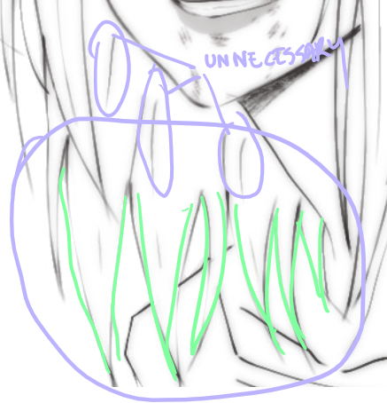
Make sure that the lines connect properly whenever they meet, and also although you already did it and i think that's great, you can make some lines even thicker, go even further and add even more lineweight. As a general thing, usually, the exterior or contour lines are thicker and whatever it is inside is thinner so experiment with that, you can start from the nose- thicker lines for the nostrils thinner for that nose tip i forgot what it's called and also add thin lines that just hint at the form. Lineart is hardd so i don't blame you, but if you're gonna keep the lineart in, try "shading" with black blocks so to speak, make sure the lineart layer can stand on its own, and pay more attention to the lower part area (neck and shoulders) even if it is less exciting to ink
#ok i lied it's long again#these are pretty fun to do can u blame me#ask iztea#you should also check in with other people don't take my word for everything#but since you asked my personal opinion here u go#sorry for any typos if there are any i'll fix them later#long post#ask iztea: art talk
73 notes
·
View notes
Text
Since I'm back into playing Sonic games, I'm also catching some of the news.
Out of all of the Sonic games to remake, seems Sonic 06 is under consideration?
My opinion on remakes in general is that I'd rather have something new.
Right now I'd just like a 3D Sonic game with wholly new levels that are unique and fun to play.
Give me a new list of boost stages or adventure stages or even zones in Frontiers except less generic and messy. The last truly original level themes in 3D were in Colors, which came out 13 years ago. Everything after it was full of increasingly derivative Green Hill/Chemical Plant/Speed Highway imitations or a bunch of generic theming like Winter Zone or Forest Zone.
But if you're going to remake a game, remake one that would gain from it and Sonic 06 is kind of a genius risk/reward idea.
It's still one of the most famous failures in gaming history.
Were it to succeed, we'd have a success story not so unlike Final Fantasy 14's or No Man Sky's.
It would be fantastic publicity/marketing.
But were it to fail or be less than great, they'd double down on the failure.
I'm of the opinion they'd have to overhaul the uncanny hyper-realistic art (particularly character designs) and definitely entirely rewrite the story.
I think Sonic's design philosophy just is not compatible with that hyper-serious and hyper-realistic aesthetic. It has the same issue the initial Sonic movie design had to me: it looks wierd and creepy when it aims to be "realistic".
One counter-argument I've heard in regards of this aesthetic along with storytelling style is that other similar mascot properties can be dark, but I think all of the actually good ones understand how far they can take it before it reaches that uncanny valley, jarring threshold. They understand the limitations of the aesthetics they use.
Sonic can be "serious", but just like everything else, it has always had its own brand of serious.
Scrap Brain Zone, Doomsday Zone and even Hidden Palace are good Sonic serious.
The final stories of Sonic Adventure 1 and 2 are good Sonic serious. Gamma's story is Sonic Adventure 1 is good Sonic serious.
They understand Sonic is a joyful series that has meaningful, darker ideas within, but isn't only those elements.
For example, I think the edgy elements of Shadow are best when they're fully sincere and bombastic, not when telling you how dark, cool and edgy Shadow is and how much you have to think how dark, cool and edgy Shadow is.
(Yes, I am also aware Shadow The Hedgehog's reliance on it is very much a localisation choice, but these elements are still present in everything after it, too. These stories sometimes want you take them so seriously, anything actually fun in there is smothered.
You can argue interpretations, but I think Sonic definitely shouldn't be joyless.)
That's what people who criticise Sonic for having any serious moments also miss: these characters still do have arcs and stories. Most actually good cartoons work that way just like any other stories and people who like Sonic like the sincerity in it along with the dumb cheese.
More on 06, though, I hate the Elise and Sonic romance stuff. I don't find any part of that appealing.
A few fandoms I'm in have a furry contingent, and I find anything to do with it squicky. I guess it's better than some other groups of people who find far worse stuff sexually attractive?
Mascot fursuits at least don't resemble anything human (or even animal, actually, they're hyper-stylised cartoon creatures I'd rather not think about in any sexual sense), so it's better than some of the really, really bad stuff?
I don't want to think about it any deeper than that.
So, I'm 100% for the removal of this aspect.
Gerald and Maria were handled well in Shadow Generations, so maybe just making it a simple friendship is the best solution because Elise is still important to the original story. Also make her a character that's not just an object to be kidnapped every few levels?
But the most important aspect of a potential remake is that Sonic 06 could actually be a really good game because a bunch of the level design is actually solid and there are some really solid gameplay foundations.
They already have it all there, so they don't have to spend time on making stuff up from scratch.
So, an 06 remake does have merit due all of the above points.
Personally, if I had to choose any remake above a completely new game, though, I'd actually like an Heroes remake (or even just remaster, as I don't think it's a fundamentally broken game like Sonic 06 and apparently one is rumoured for it, as well, actually) because I love the variety of level themes and the foundational level design in that game.
A lot of Sonic games are messy in the polish sense, but Heroes is up there.
I think it actually deserves it the most because what ruined it to me were very specifically the glitches.
Awkward controls and stage design you can at least learn to play around, but glitches are sometimes pretty firmly out of your hand and dying to them so often just completely sucked out the fun of the game by the end more than any Sonic game to me.
And Sonic 06's level roster is a lot less unique/fun/cool.
Hang Castle? Frog Forest? Egg Fleet? Even Grand Metropolis and Rail Canyon? The Metal Sonic fight?
Adjust the controls and clean up the glitches and that alone would make for one of the best Sonic games, I think.
#Sonic The Hedgehog#Sonic 06#Shadow The Hedgehog#Sonic Heroes#Shadow Generations#StH#Sonic The Hedgehog (series)#Sonic The Hedgehog (2006)
14 notes
·
View notes
Text
Arcane, S2

I feel the same way about Arcane’s second season as I did about its first: absolutely gorgeous, groundbreaking animation and art, hand-in-hand with incredibly uneven pacing & character writing. But I want to be absolutely clear, here, because sometimes I think I tend to emphasize the negative: Arcane is so consistently and gobsmackingly visually stunning that it’s a treat to watch, no matter my misgivings about its other aspects.

Seriously, it’s still hard for me to fathom that this show looks this good, and is this consistent. To produce 8 feature films worth of animation, and look better than nearly every feature film, is a staggering feat. Given that Arcane S1 dropped in 2021, it’d be easy to peg it as another work inspired by 2018’s breakout Into the Spider-Verse – it certainly shares a lot of visual similarities with that style. But while it’s definitely a part of this movement, and has similar aesthetic goals to the Spider-verse films or Alberto Mielgo’s work, Fortiche has been honing in on this style for nearly a decade.
2013’s Get Jinxed already features Fortiche’s trademark heavy 2D effects animation, as well as matte painted environments; the biggest difference is that the models are rendered in a more traditional 3D style, with more realistic soft lighting and less stylized texturing. Their Rocket & Groot shows experimentation with a more saturated palette and flat lighting, while 2018’s Pop/Stars short applies those same efforts to character models more in line with their current style. The music video for Rise, released later that year, stylistically, might as well be from Arcane: the 2D FX take center stage, the cinematography employs a much more dramatic approach, and the compositing work that manages to corral Fortiche’s 3D models, flat environment painting, modeled backgrounds, and effects into one cohesive look has reached its apex. Right on time for production of Arcane to get fully underway!
Anyway, I just think it’s neat that the two titans of this emerging school of 3D animation seem to be a case of convergent evolution, rather than chasing each other's success.

Is there any point to enumerating why Arcane's visuals are so amazing? I can give it a shot, I guess.
All of the models are great, and the flat textures + lighting trick is still unmatched. The layouts are incredibly clean – even in the midst of the thickest action, what’s going on is never unclear. The background work is drop-dead gorgeous, whether it’s the frequent, lavish matte paintings or the 3D environments with some of the best damn compositing I’ve ever seen. The action animation is kinetic as hell, with energetic, exaggerated keyframes and creative choreography; these are further bolstered by Fortiche’s stellar 2D effects work, which is omnipresent and adds a fluid, organic touch to the aesthetic. The impressive action sequences are not done at the expense of the rest of the show, though, as even the most staid dialogue scenes are filled with interesting camerawork and emotive character acting. And as if nailing their own incredible house style wasn’t enough, in S2 the team has decided to take on a whole litany of alternate styles and techniques, from charcoal and watercolor montages, to the duplication realspace glitching of anomaly-afflicted hextech, to the wild galactic vistas and monolithic demon fortresses of Viktor’s subconscious.


This season also really makes me appreciate how much leeway Fortiche was given with the character designs. Viktor, for example, is almost early-2000s-comic-adaptation level different from his source material, but he now fits into the world more seamlessly, both visually and narratively, than the half-baked cyborg mad scientist ever did. Outside of Vander, whose transformation into a pseudo-Warwick feels incredibly forced, all the character designs feel more cohesive and mature than they ever did in the game. Plus, it’s wild to see women from League of Legends that actually have distinct, recognizable faces. Turns out all Riot needed to do to get rid of sameface once and for all was produce a multimillion dollar animated series.


even the background characters are cool as hell! look at this smoldering bat man!


it's unconscionable how hot they made Viktor this season btw. I think it's all the emotional availability that really does it for me
As for the rest, well… as before, it’s a mixed bag. The characterization is better than it was in the back half of season one, at least, in that each character’s motivations don’t wildly vacillate from scene to scene. The dialogue, while not particularly memorable outside of occasional quips like “bitchmittens”, is decent enough. The pacing and plotting in this season, though, holy shit… it’s absolutely lightning-fast, and rarely does any narrative development feel like it’s given the time it needs to make sense.
Entire plotlines are wrapped up without much ado so that new ones can be started. After Jinx and Vi’s big confrontation in Act 1, they more or less make up over the course of an in-universe hour the very next time they run into each other. The pivot from Viktor as wizard Jesus to Viktor as world-ending villain is not sold well at all – this is the sort of shift that, in a typical story, would have an inciting incident or tragedy to prove to all involved parties that he must be taken seriously. Instead, Jayce holds one council meeting and tells the gathered citizens that he was attacked by a single robot; after hearing this, everyone collectively agrees the threat is so dire, they’ll need to forget Piltover and Zaun’s long-bubbling enmity and impending war, and band together. Arcane is simply trying to fit too many characters and too many arcs into too little time; characters like Singed and Vanderwick, in particular, feel like they were included as a reference to fans rather than to serve the narrative.

The wild thing is, despite such slapdash plotting, the big emotional beats almost always land. Even if there isn’t appropriate build-up, even if what’s going on doesn’t make much sense, the story’s most climactic moments are always girded by such strong animation, impactful cinematography, and vibey music that you feel what they wanted you to feel anyway. It’s funny; much has been said about the comical lack of subtlety in Arcane’s music sequences, and while these complaints are totally valid, the simple fact is that often Arcane is at its best when it drops the melodramatic dialogue scenes and just decides to be a music video for five minutes.

Somewhat gallingly, Fortiche also proves that they know exactly how to fix these storytelling issues, if only they had the time to do so: in Pretend Like It’s the First Time, the season’s stellar seventh episode, the pace is slowed way down, the scope is narrowed to just two points of view, and the characters and narrative are given much-needed room to breathe. This is what Arcane is missing, I think. The big moments always land, but it’s the small moments in between, the moments that let us take it easy and get to know the characters during their day-to-day lives, that Arcane could use more of.

Anyway, this show is a visual feast, and I appreciate the obsessive levels of care and craft put into it by the creators. As far as I’m concerned, League’s lore, concept art, and worldbuilding have always been more interesting than the game itself ever was, so it’s nice to see a project that’s finally leveraging those strengths.


12 notes
·
View notes
Note
How aren't mediums fungible? Any art history class would teach you they very much are.
what, has 'the medium is the message' gone out of fashion now or something?
but to explain what I'm trying to get at, since there's a good chance I misused the word >< - each medium brings its own set of affordances and emphases. if I see a CG animation I pay attention to different things than if I see traditional animation or stop motion or what have you.
for example, we could have a look at the animation of Hiroyuki Okiura - say, the introduction to the Cowboy Bebop movie, or his work in Magnetic Rose. Okiura is one of the most renowned realist animators, someone whose drawing style, camerawork etc. hews very close to live action film. his exceptional sense of perspective and space is remarkable in traditional animation. by contrast, you 'get it for free' in CG and stop motion - you will always have perfect linear perspective unless you go out of your way to break it. however, CG rarely captures the exact qualities of Okiura's animation, which come from the sense of drawing principles - how to simplify shapes, 2D spacing etc. and by making it something constructed, the way characters move through space, the way a drawing can suddenly feel 3D, becomes foregrounded - it's no longer incidental but now a core part of what Okiura's animation is expressing.
so, 'live action into anime' is kinda what the AI style transfer tools are going for. in the technique from the recent paper, you start with a static drawing of a character and some animation data (likely mocap), and the program will generate an animation. that's similar what Corridor Digital attempted a few months ago, using a neural network finetuned on Vampire Hunter D: Bloodlust, and applying 'style transfer' to live action footage they shot. the results were, viewed as rotoscoping, kind of hideous, with shapes constantly flickering and turning into mush. the new paper I linked offers some techniques to improve the temporal consistency of this type of AI rotoscoping which should make it look a lot less bad, though it remains to be seen whether it works in situations other than 'well-lit fullbody shot'.
still, even if Corridor's video was a lot more technically solid (and give AI development a few years to iron out the kinks, I'm sure it will look downright quaint), it doesn't provoke the same response in me as Okiura's animation. the process of drawing something involves a lot of artistic decisions about what to capture, simplify, emphasise; for all that it is 'realist', Okiura's animation likewise has a particular feeling to the way characters move, the way they interact with light, the use of line, etc. which in some large part arises from how it is produced. so much of that is all but impossible to capture in words.
but also - knowing a bit about how it's made, and having my own experiences of animation, gives me an angle to appreciate what Okiura is doing. a drawing of something is a way of drawing attention to the specific details of the subject. two people drawing the same subject will never draw it the exact same way. one of the joys of going to life drawing is seeing how many different ways people can approach the same subject in the same ten minutes - inflected by different media like charcoal or watercolour pencils. one of the great things about anime is the space it gives key animators to bring their own sensibility to a particular shot.
I certainly accept that is inevitable that mediums will evolve with time. anime looks very different today than it did 30 years ago. part of of that is evolving sensibilities, partly the slow-motion collapse of an overstrained industry, but also a lot has do with the fact that every studio has switched to digital compositing and digital background painting. it's possible through painstaking effort to fairly closely imitate the look of cel animation on a computer, but you really have to go out of your way, and it's rare to do that.
and I do feel like something has been lost with the death of cels - qualities of line and colour, the difference between digital bloom and backlight animation. but something has been gained at the same time: maybe we've gradually lost the traditional skills for drawing layouts because the conditions of production made it so that skills weren't passed on to the current generation of animators, which sucks, but we have simultaneously gained the ability to merge 2D and 3D animation with tools like Grease Pencil, to use the camera-like digital compositing effects of directors like Naoko Yamada and Makoto Shinkai. it's not better, just different.
this isn't to make the boring argument that AI art is soulless, or lacks the magic human touch, or whathaveyou. it's just a different medium. nor would it be right to say that there are no connections between media - literally right now I'm modelling an arm, and my experience of drawing arms is directly influencing how I break down the forms and all of that. AI generated images derive in obvious ways from traditional animation and CG and photography and all that, AI engineers study these media in great detail as they develop their programs; our knowledge of those media can inform how we respond to AI.
honestly, CG that aims to replicate the look of traditional animation, such as in the games of ArcSystem Works, or the works of Orange like their Houseki no Kuni, is something I actually find very interesting. not because I think it could or should replace traditional animation; it just reveals fascinating things about both media. the same can be true of AI, I think. like what do you learn from what a neural network is able to capture, and what it isn't? and what does studying neural networks tell us about human brains?
if the development of AI and the accessibility of new tools leads to a flourishing of interesting new animation, I'll be happy. I just don't see it as a replacement for traditional animation and 3DCG. if anything the future of animation will probably look like a hybrid process taking advantage of the best features of all the different media we've invented - insert the usual spiel about Arcane and Spiderverse here. AI is currently very immature, we're still figuring out what it's good for and the hype drowns out everything, but I'm sure it will find a comfortable place, and I'll be interested to see how it all shakes out.
but what I meant with 'not fungible' is that, if you try to replace one medium with another, you will inevitably change the qualities of what you make. nowt wrong with that. like, just because you can adapt books into films (and vice versa) doesn't mean books are obsolete. some things are easier to express in prose, others in film. you can have prose that's informed by film, and film that's informed by prose. everything's talking to everything else, it's great! but the tools you choose are meaningful, and interesting. not just an irrelevant detail to be swapped out when "superior" technology comes along.
#ai#this is all from a very pie in the sky art perspective - not even touching on the implications for industry. labour. etc.#because we don't get free choice of media. nobody will fund a cel animation film now.
37 notes
·
View notes
Text
Games I Played In 2023 And Whether Or Not I Thought They Were Good (Part 1/4)
Once again, a year has passed, and I spent a considerable chunk of it on video games! Here's what I thought about [e: some of] the ones that I played.
1 - [2] - [3] - [4]
Potionomics
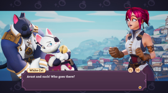
This game is- well, I've never played a Recettear game, but apparently it's a Recettear knockoff? You run a potion shop, and you hire adventurers to go into dungeons to get ingredients for your potion shop, and the whole thing's on a timer where you have to pay off a big debt by the end... apparently there's a formula it's aping that I'm unfamiliar with.
But it's very fun- it's got two main unique mechanics, one of which is a potion-brewing minigame about balancing ingredients in certain ratios which is challenging- and the other of which is an STS-style deckbuilder card game where you haggle with customers in lieu of combat. Both systems have a lot of depth and interesting options and I enjoyed them a lot.
Other standouts: the cast of support characters you can rank up social links with are great (love love love the coffee-addled workaholic moth girl and the comic relief cat pirates with a surprisingly dark backstory), and the fully-animated 3D character portraits are really fun and expressive.
Nitpicks: the time system having one time block reserved for the hour it takes to go home after visiting town is... an awkward choice (holdover from the Recettear structure they're aping?), and lategame you kind of cap out in potion-making capacity and it becomes kind of tricky to progress. Also the story's kinda predictable and the villains who don't later become party members are paper-thin.
Horizon: Forbidden West

God this game pisses me off.
Horizon: Zero Dawn, its predecessor, was a fun open-world game about hunting robot dinosaurs and uncovering the surprisingly elaborate story behind why there are robot dinosaurs. I enjoyed it a lot!
Forbidden West has everything Zero Dawn had... and also mountains of tedious cruft to pad out the game's runtime which all infuriates me to no end.
The story is still quite good! And the robot dinosaur fighting is still quite good! Those are the important parts, and they nailed them... but I have complained at my friends for hours about the bafflingly bad design choices that plague every other aspect of this game constantly. It's... there's so much, I want to like, make a video going into the details, but in short...
The cool and versatile weapons from the last game have been split up into piles of slightly-different weapons with different elements so you have to carry around and upgrade ten times as much crap and are forced to spec into a build that locks you out of effective experimentation
Every little noncombat action in the game has some very realistic and pretty AAA graphics animation that takes too long and wastes your time constantly during basic gameplay and kills flow dead
The very cool procedural climbing mesh thing... gets arbitrarily turned off in inexplicably oiled-up puzzle ruins that very badly want you to push a crate around in every way it's possible to push a crate around in order to waste the maximum amount of your time
Cooking "system" which is the most comprehensively useless thing anyone probably spent dozens of hours implementing in their video game
Item wheel that contains every consumable item in the game regardless of whether you currently have any and is basically unnavigable during tense situations like, say, combat, when you need it
So many repetitive sidequests about some poor fucker who went missing and might be in danger and is every single time dead to a bunch of robot dinosaurs obviously. Lot of missions designed to kill time rather than show you something cool or have interesting story.
There's a lot to like and it's super cool but god there's so much to be mad at. Respects the player's time 0%. I'm gonna go off about this more later for sure.
Disco Elysium

Oh my god, this game. It's... really something. You might be familiar with it from memes on Tumblr, about its comically inept slash deranged protagonist and his partner with the patience of a saint- but it's doing so much more than I expected from the out-of-context screencaps.
Like- yes, it's fucking hilarious. I love that about it. But it's also this incredibly detailed work of worldbuilding that creates this whole setting that's doing... some wild stuff. Like, you've maybe heard it's very political? Well, it is, but about weird alternate universe sci-fi politics that sort of halfway resemble our own, and it's thought through all of these invented social dynamics. And it's got a great sense of atmosphere- it knows when to be funny and when to be solemn and how to blend the two for maximum effect. It's a dark comedy, but it's all built on a dead-serious reality and a really effective story.
And- it is a murder mystery game about solving cases! It works very well on that level! It manages to be open-ended and let you solve things in a variety of different ways using this complex RPG stat system of creatively-designed psychological stats, while making sure the central whodunit (and a bevy of fascinating satellite mysteries) stays on track. Extremely good on a game design level.
(also some shit happens in this game that i was not at all expecting and can't even go into without spoilers, but- but holy fuck, the way this game opens up and the things it manages to hide in plain sight... just mind-boggling. incredibly impressive.)
Tunic
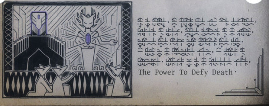
Speaking of hiding things in plain sight- neither this nor Disco Elysium came out this year, so I can't call either of them GotY, but... if they had, I'd have a hard time deciding.
Tunic is incredibly clever. On the surface, it's an isometric soulslike thing with a low-poly Zelda-y aesthetic... but there's not just the surface. There's layers and layers to this thing. The first layer it hits you with is that most of the game's UI is in a made-up rune script, which you have to learn, which is a fun challenge and caused me to spend a few hours making a tool to catalogue and decrypt the damn thing- though I eventually learned to sight-read it. But that's just- that's like, the tip of the iceberg, the most obvious twist to what this game is.
There's, like... I don't want to spoil what there's like. The whole thing is about peeling back the layers and figuring out which seemingly arbitrary aesthetic choices were secretly meaningful, and seeing how the game transforms as you figure out the different sorts of secret structure layered on top of each other. It's actually best compared to The Witness, although there's still a pretty meaty and challenging action-adventure game to tackle while you're uncovering the hidden patterns and deepest lore. It's a fascinating intellectual challenge and highly recommended to anyone who likes giving their noggin something to chew on.
The Legend of Zelda: Tears of the Kingdom

Man, so... this game is very impressive, but it's in a weird place due to some awkward design decisions and cut corners.
This is a direct sequel to smash megahit Breath of the Wild... sort of. It's very weird what it's doing. It really wants to be a self-contained thing, to the point of throwing out major setting elements and story concepts from BotW entirely so it can do its own thing... but on a mechanical level, this is the same game, with some very cool new mechanics and a cool-ish new story bolted on.
(Said story... it has one extremely cool plot twist that's also a gameplay twist, delivered effectively in a nonlinear way that creates this great sense of dawning comprehension. Otherwise... kind of a nothingburger. Ganondorf is boring and has no coherent motivation, there's no explanation or real plot relevance to the [spoilers] that seem like such a central thing, and... the whole thing revolves around a technologically advanced precursor civilization that's completely different from the technologically advanced precursor civilization established by the last game, of which all evidence has been meticulously scrubbed from the world to... I guess avoid confusion? The one huge central plot beat really works, and the rest is... low-effort nonsense.)
So, mechanically... the developers made this very odd choice to... have the game take place in the exact same map from the first game, except warped and remixed by geologic upheaval just enough to force the environment designers to redo every bit of landscape more or less from scratch. Like, all the same recognizable locations, but a step to the left. In theory, not a bad idea- but then they layer on top of that a threefold expansion to the world.
TotK has three world maps- Hyrule, the sky (full of floating islands now), and a third spoilery area that's the same size as both of those. The game's economy is thus weirdly trifurcated- crucial resources are located in all three areas, so you need to go up and down and up and down a lot. And so is the game's content- there's a roughly comparable amount of stuff in BotW and TotK, but TotK splits it across three maps, making each area feel largely empty, with a lot of wasted space.
This effect is especially noticeable in Hyrule, which... if you've played BotW, you won't really find anything new there. It's all the same places with a few tweaks, so there's not much sense of discovery if you played the original. There's a bunch of landmarks and areas that exist purely because they were there before and it'd be weird for them to disappear... except now instead of some secret or loot there, there's just nothing. Wasted space. And both the sky and the other new map are pretty homogeneous and unrewarding to explore once you've seen the four or five types of things they have to offer- they're mainly made up of recycled assets.
TotK is... I think strictly better than BotW, with more content and more fun core mechanics, but it's a worse experience than BotW if you played the first one. If you haven't played BotW, Hyrule will still be fun to explore, and you probably want to jump straight to TotK.
-
I'm... gonna have to break this post up to get to the 21 other games I played this year, otherwise it's gonna be stupid long and take forever. Stay tuned!
1 - [2] - [3] - [4]
37 notes
·
View notes
Text
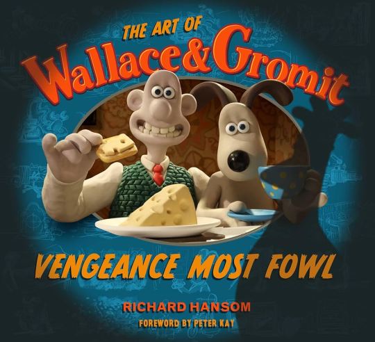
WALLACE & GROMIT: VENGEANCE MOST FOWL/FLOW REVIEW
Thought I might as well shave off the 2 Best Animated Feature nominees I haven't seen yet, since this is another category I'm passionate about. Luckily, just like last year, I don't think there's any bad movies that were nominated. If the weakest of the nominees is a fun Wallace & Gromit movie, then that's how you know you've got a stacked lineup.
This might be heresy to say, but I haven't seen that much of Wallace & Gromit, only Curse of the Were-Rabbit back in high school. I connect more with Aardman's other works, like Arthur Christmas or Shaun the Sheep, but watching this movie, I enjoyed it more than I expected to. I thought I'd need more context on who Feather McGraw is, since it's clear that he was the villain of earlier Wallace & Gromit shorts, but the movie got the exposition and context needed for who he was out of the way pretty early, and the rest of the movie is standalone enough to where I didn't need much context on who this penguin was. I was just able to enjoy his plan to ruin Wallace's reputation by hacking his inventions. McGraw is easily the best part of the whole movie; how is a character that doesn't speak or emote able to have such a distinctly sinister personality? What is this sorcery?
That's not to dissaude from everybody else in the movie, because they're fun as hell too. Wallace and Gromit had a predictable, but satisfying conflict throughout where Gromit got sick of Wallace's inventions. I really hoped that there wouldn't be a plot beat where Wallace blames Gromit for not trusting the Norbot and has a falling out with him, but they get through it quickly enough to where it wasn't too big of an issue. Speaking of the Norbots, I enjoyed those little things. Seeing them enact out McGraw's pretty smart plan is fun, and I loved their little song in the middle of the movie.
This movie isn't perfect, I found that some pacing issues and a few not-well written characters distracted me from calling this a great movie, but it's still a pretty damn good one. Check it out if you're looking for a fun family-friendly movie!
7/10 - THEY GOT THE FARMER TO CAMEO LETS GO
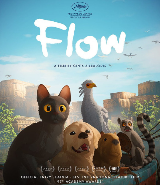
Flow was the only other Best Animated Feature nominee I haven't seen before, and I was really excited to watch it. From the trailers, it looked unlike anything I've ever seen, and it exceeded my expectations.
This is a movie about a cat trying to survive after its home was destroyed by a flood, getting help from a capybara, a lemur, a golden retriever, and a secretarybird along the way. The unique thing about this movie is that none of the animals talk like you'd expect them to; hell, none of them are really anthropomorphized in any way. It's deadass just about 5 realistically-animated animals navigating this flooded world with only their body language to tell us what they're thinking and feeling. The craziest part is that it works wonders. Sometimes I don't need overpaid celebrity's voices saying cringy dialogue to get emotions across, sometimes it's good to let the animals act like animals and show us how they're feeling instead of telling us.
I loved the visual and enviornmental storytelling in this movie, it makes for some great sequences that you don't need words to express. I love how the retriever sticks by the cat the whole movie despite the cat not trusting it; you can even tell early on in the movie when the retriever didn't immediately start hunting the cat for stealing its fish. The lemur was fun with how it took a bunch of man made nick-knacks with it on the boat, the capybara is the most chill thing ever put to screen, and the secretarybird was also a great addition to the cast. I like how it got its wing broken protecting the cat, and that's how they got close as the movie went on.
The animation here is incredible as well. Every single animal moves and behaves so realistically, but it's with an art style that almost looks like a 3D-animated painting. I love how the backgrounds and the environments look too, amazing looking water in this movie. This movie isn't perfect (how did these animals learn how to drive boats), but if you needed something to show that this movie deserved its Oscar nominations, just look up the cat fishing scene. It's so peak. Even though I liked 3 other movies up for Best Animated Feature more than this, I honestly want this one to win because of how unique and grand it felt in comparison to everything else. Disney and Dreamworks get plenty of recognition, we need something for Gint Zilbalodis' Blender-made passion project.
7/10, those dogs were the true villains of the movie.
6 notes
·
View notes
Text
No Joycon Drift, Kirby, and Themes??!!! What I want out of the Nintendo Switch 2!
Hello Gamers and Nintendo-Nerds, welcome back to That Vegetarian Gamer!!! Yesterday, we discussed the very empty and ominous Nintendo Switch 2 reveal. Unfortunately, we don't have much information about the Switch 2, but that just means we have room to theorize and make wishes. So today, I decided to make my wishlist for the Nintendo Switch 2, including things I want fixed, games, and customization.

Fixes
The Switch was an amazing console still selling years after its launch, but it wasn't perfect. There are, of course, always going to be issues in life, but there are absolutely many changes that can and should be made to the new Switch to make it more functional than the last.
Joycon Drift was a huge issue on the Nintendo Switch, even sometimes making it unplayable. Joycon Drift is when the Nintendo Switch controllers (Joycons) essentially move in-game without player input. On the bright side, I have high hopes for the Switch 2 fixing this issue. In the first look trailer, there seems to be a focus on the joysticks, hinting at maybe a fix to this problem.
Bad Quality has been a huge issue these last couple of years. Way too many games lag or buffer, so I'm hoping with the new console, the quality will improve.
The Nintendo E-shop is just a complete mess. It is extremely laggy at first, I thought it was my internet connection, but this seems to be a universal problem. There's little to no quality control of the games Nintendo allows on the shop, with there being many poorly made games on the shop. There's no cart function, meaning you can only purchase games one at a time. This is probably my most unrealistic want, but I'm still praying for changes.
youtube
Games
Of course, this is the most exciting part about new consoles, so let's just get right into it.
Mario Kart 9, The first Switch didn't even get a real new version, just a deluxe of Mario Kart 8, so we are long overdue for a new edition, and from the looks of it, we may get it.
Animal Crossing, it may be hard to believe, but Animal Crossing: New Horizons is almost 5 years old, and the game is kinda dying off. We have gotten a new Animal Crossing for every Nintendo Console since the Nintendo 64 except the Wii U, so I definitely believe we will get a new game soon
Kirby, Kirby games are such a huge comfort to me. Something about that round pink alien hits a soft spot. The last game, Kirby the Forgotten Land, was amazing, and I really hope we get a new game soon.

Customization
I love being able to decorate and customize my tech products. I love buying cute phone cases and finding even cuter wallpapers. Unfortunately, The Nintendo Switch does not allow for this experience, with there being little to no customization options. You can absolutely still find cute cases and charms for your switch, but the actual console only allows for a light or dark mode for your home screen. So here are my wishes for customization for the Nintendo Switch 2.
Wallpapers are a must. This is the most simple customization feature to add, but it allows for so much creativity
A fully customizable home screen. I want to change the position, size, and color of the buttons and app icons. This is honestly very unrealistic, but I still hope the home screen is somewhat customizable
Themes were on the Nintendo 3ds, and I'm still puzzled as to why they didn't bring them back for the Switch. Themes were purchased through the e-shop, and they completely customized your home screen. I have no idea what possessed Nintendo to get rid of them, but they need them back ASAP
Some of these wishes are more realistic than others, but overall, I think these problems will be addressed one way or another in Switch 2. Even if they aren't, I am still going to love the Switch 2. What do you wish for in the Switch 2? Do you think it's realistic? Why or why not? Thank you for reading the daily post, see you, gamers, tomorrow.
2 notes
·
View notes
Text
April Update!
Howdy! Cobalt here, as many of your guys know It’s Showtime and its characters/story are gonna be turned into a horror game by the same title. So for both Gamejolt and this blog I am gonna start trying to do monthly updates on development. I think it’ll be a good way to put into perspective how much progress is being made each month and keep you guys in the know about how things are going. These are gonna be formatted with work made that month going first and then afterwards any other small announcements or thoughts we’d like to share on development. That or things that weren’t created that month that I basically keep stored in case we have months where progress is slow or I can’t show much behind the scenes stuff. These logs will likely contain personal stuff too, since with me and my partner being the main heads of the project. Our well-being or IRL goals are relevant to how much work is being done. Also while developing Showtime I intend to create other games similar to it, to sort of learn and test the waters + Since those ones aren’t tied to an IP I can actually make money off of them. Something I can’t [or at least not without Mike n Meatly’s permission I suppose] with Showtime or its characters.
April was sadly, not my month, I found out I was vitamin D deficient and got a slight fever. So I spent a lot of days tired and recovering from that. Progress has still been made though, mostly on learning 3D modeling more, I’m almost done with a model I’m making for someone else actually and while it is not perfect by any means… I think it looks really awesome for being my maybe fourth or third model and it’ll be my first truly finished model as well. I also have made good progress on writing both dialogue and summaries of Showtime’s story. I did particularly get ideas for a good chunk of Showy's campaign however, which involves a character I was on the fence about including in Encore!... Until very recently... Art wise not too much has been done specifically this month besides some concept art for cycle designs and some progress on textures for the studio. But that’s okay cause we’re not really at a spot where major progress can be made art wise yet. There’s so much more I want to share but I’ll be doing my best to space out those things out between updates. So no update is too long or too short with nothing interesting in there. Also sorry this is all so vague and non-specific I’m gonna try and get in the habit of actually documenting what work is being done on Showtime monthly from now on, so I’ll be able to be more specific about what parts are being chipped away at.
So onto something that didn’t happen this month but is important we have decided to switch to Unity instead of Unreal Engine 4. I’d like to take some time to explain why and also make sure nobodies too anxious over the change. For one thing, not a lot of progress was made on Unreal Engine, you could hear footsteps as you walked, use a buggy animation to enter a miracle station and the map was just a room full of lights. This is due to the fact while working in Unreal Engine was interesting and I learned quite a bit, I found myself often feeling it was not a good fit for Showtime and that trying to make it so was fighting against the engine as opposed to working with it. Unreal Engine seems to be built for realistic, open world or multiplayer FPS type games. That’s not to say you can’t make anything else with it, but finding tutorials for things I wanted to do was. Basically a nightmare because youtube was flooded with videos on how to make those games specifically. Another big aspect however was the general style. Unreal Engine is great if you want very realistic lighting and have a computer that can tank the sort of weight of that too. Neither is true for me however, Showtime’s characters are all very stylized, our humans are cartoony have clear shapes and most of all, I just want Showtime’s overall style to pay loving homage to 1930’s and general 2D Animation. I think both are really underappreciated and god do I love them. Also I’m making this on literally a laptop, a new one and not a janky one by any means, but still not a desktop. Unreal Engine works great for those who know how to use it and want to create the games it was optimized for, but it’s not ideal for my purposes, Godot seems promising but Unity is just great at specifically doing what I want to do with Showtime. It’s great for beginners to Game Development, has plenty of tutorials for all kinds of games and is very flexible in style. Sadly nothing is better at being Unity than Unity right now. I’m still mad about what the CEO did, and I’m glad for those who were able to switch engines to those with better management but it’s not really an option for us currently. Of course, this will put things back a bit but I’ve already been learning how to build a basic map in Unity and so far have only run into a few issues. Still I would love any advice on how to do this, esp from those who had made games similar to BATIM and other mascot horrors. [I have been thinking of building the maps inside Blender first and then importing them into Unity, to see if that’s easier or practical, but mostly I would love to hear what others commonly do to build such intricate interior design in Unity.] Either way while this month wasn’t terribly exciting by no means was no work done, just nothing too fun to show off yet.
#it's showtime#not ask#Devlog#bendy and the dark revival#bendy and the ink machine#batim#batdr#Bendy Encore#Bendy fangame#queer horror#indie horror game#indie horror#mascot horror#mod whirly#I dont know yet if Ill be fully putting all the devlogs in the bendy tags#it feels like a good idea for making sure the posts reach more people but once a month might be annoying to those who are not interested?#but also one post every month doesnt sound too disruptive either so? Im not sure yet#anyways thank u guys for being so supportive so far I swear I am taking this project seriously its just I have other things I am working on#too and since were still in early pre production most of this is just planning and actually putting fun ideas to paper to see how theyll#actually work out yknow?#anyways yeah ty for everyones patience hopefully from now on communication will be a lot more consistent from us <3
4 notes
·
View notes
Note
yeah no fr you get it. i notice so many little things that just feel weird when games try to be too realistic. like modern fallout games? you immediately notice when character's mouths or animations are wonky. tbh i play far too few super-realistic-games to really point out any ones i have flaws with but like!
final fantasy! 15 is pretty realistic but still keeps that anime vibe. prompto's hair is a little silly but hey, its ff! and it fits in the world and doesn't feel off. kh? entirely silly. even in kingdom hearts 3 where there's a lot more like "high-def" textures and stuff, all the characters are so silly and anime-esque that it still just works.
hell i sometimes think ts2 has more polish and personality than ts4, and that came out in approx 2004...
idk man i love my silly anime games and my clunky/chunky/low-poly graphics. realism is fun as are pretty graphics but man. i can look past shitty graphics if the story and characters are fun and i have a reason to care. but if the graphics are slowing my device down and i can barely play? that's just a pain.
on that note why are assassin's creed games so fucking big. i had to dl over 100gb for ac: valhalla awhile ago. is this even necessary anymore...? ngl i like ac4's graphics more than the more modern games sometimes...
sorry im a little passionate abt games. oopsies. ily corks
No, but exactly, that's why i brought up ff. It has a dash of realism to it, but the charas look so stylised in the anime way despite that, that flaws don't jump out as much as they do in the RE engine, to me. I very much remember wonky hair being a thing despite the fact that i played one (1) 3D final fantasy entry, and that was years ago, but it never struck me as odd, because... it was stylised, and it could get explained as part of the style. When you aim for photorealism, even the most minor flaw registers as - a flaw, cannot be explained by saying "it's stylised".
And, yeah, real. I can't tell you for Valhalla or Odyssey - I don't own them and don't really have an urge to get them either (not in an elitist "it's not a proper ac game", but just a bit of a side-eyeing "i play ac for certain reasons, and odyssey and valhalla took a path that removed those reasons"), but from what I hear they have a fuckton of content. I think Origins also took so much to download, it was ridiculous.
(And same tho. I made tumblr bc i wanted to be insane ab elder scrolls somewhere, enstars just kinda took over. But i've always been a video game freak)
#oh asscreed. idk i play it for the ''hey what if this historical event... actually went like this.....'' and then for the weird ass lore#they made but i feel like origins i barely accepted but then after origins it kinda took a nosedive for me#i love fantasy and i love historical fantasy but imo odyssey and valhalla went too far into fantasy and don't really have much on the#historical aspects - as that was my main draw to the franchise i don't feel much of an interest to those newest entries#besides the gameplay change. i'm still not quite used to origins - it just doesn't feel Right in my hands even tho i do prefer RPGs#but well! if it's fun it's fun#but black flag was beautiful#a lotta folks criticised it bc assassins couldn't be pirates#but i could write an essay on how it fits perfectly as an assassin's creed game.#it really is good i love it#throwback to the time i played it so much i developed a welsh accent#<- the charm of being a non-native speaker is that you tend to just absorb whatever accent you listen to the most#or at least such is my experience#asks
13 notes
·
View notes
Text
This is an excellent summary of the problems with AI Art beyond even the legal issues of copyright- though it indirectly addresses them as well- and especially points out why the comparisons between human learning and the algorithm “learning” only show a deep ignorance of the human process— and why relying on the algorithm will create nothing but stagnation.
From Christopher Doehling:
“I’m often accused of not understanding how gen-AI works. Nahh. I understand. Counter: a lot of tech people don’t understand human creativity or learning. I have backgrounds in all three. But mostly in art and creativity. Check my LinkedIn profile.
Before you come at me with “computers learn/create like peoples do” consider: it may be you who are in a strange land. Not me. Before you go running into the jungle, you might want a guide.
For example, ever wonder why it took us so long to learn how to draw and paint "realistically"(to make images that look like what we see)? It's because by default, our brains learn concepts, not visuals. For most, our eyes are used to recognize, not replicate.
It's like our mind throws away the visual information that is explicit, and exchanges it for understanding. I quickly know a cat from any angle I see it. I know that they are furry quadrupeds that purr when you pet them unless they scratch you. I know a cat when I see one.
My eyes also help me quickly understand the 3d space the cat occupies, so that I know where it is in relationship to my body, so that I can pet it or avoid it. My eyes help me understand "cats". Can I draw one? Not easily, because my brain, by default, doesn't care about that.
Unless... I want to care. I want to make images that represent or communicate my understanding of "Cat". Early art is more abstracted/symbolic because we expressed concepts first before explicit visuals. 4 lines= 4 legs. Shape language tells the story, with an arresting style...
Even if the exact visual (what my eyes saw) is not transmitted. Its not that we didn't want to. We didn't know how, any beginning artist experiences the same problem. Your brain wants to express what it knows conceptually, not what the eye sees.
But over time, our concepts and understanding grew to include things like optics, math, color theory. Tools we could (with great effort) apply to our artistic expressions as well.
Filippo Brunelleschi (re?)discovered linear perspective not just by looking at the world around him or at other art, but by application of those concepts. and then, finally, we could (again?)draw and paint what we saw. We could also make others see what we had only imagined.
So, we draw what we know, about what we see. Even if what we see is other art, even if I do a master copy, It comes from a place of concept. We are seeking to understand technique, another's experience, another's knowledge, not just absorb a visual for later source material.
evidence: If you have not gained at least some of the same conceptual understanding that the master did, you probably will not be able to copy their work, at least not convincingly.
"Generative" Ai (as it is) is not only unlike humans in the way that it learns, it is the polar opposite. It can copy what it sees. it can combine what it sees. But it does so without any understanding at all. About anything. At all.
A computer does not know what "cat" is. It may have some pixels->patterns that are keyworded "cat" but that is all it has. It can denoise from those latent images/parts of images, but it will only do so as instructed by our keyword requests and/or randomly seeded math, etc.
The only concepts delivered into an AI gen image are those given by the original artists or photographers. If you see a cat, its because someone else (or many someones) gave you cats to see. All the Ai did was serve it up, blindly combined.
The uniqueness of each of us, our experiences, and the concepts we learn and teach are what makes art evolve. If Ai had "taken over" for us at, say, the medieval period (in Europe), Art movements would have ended there too. Renniassance, Baroque, Impressionism, Cubism,...
Etc. they never would have happened. because no matter what prompt you gave, all you would get would be remixes of Medieval paintings, or anything previous to that time period. Ai doesn't make anything really new. not the way we do. It only (blindly) combines what's already made.
That's what's at stake here. We are on the brink of handing our creativity over to something that isn't creative. Why would we limit ourselves like that? If you think it makes art easy, it doesn't. It's an illusion. All you have is the art made up to this point. and no more.
If you want to be an artist, be one. No matter what your skill level, it's better than this. You are contributing of yourself to the world. You are contributing. period.
P.S. it’s not that Ai doesn’t have valid uses as a real tool. But when we get the idea that it’s a pet pro artist that “does the dirty work for me”, that’s a dark path. The dirty work is what moves us forward. it’s also the fun part, and we are the only ones who can really do it.”
Original post:
https://twitter.com/dolimac/status/1635286958330224641?s=46&t=MInooHF4e3-CHmlyx2cj8w
12 notes
·
View notes
Text
Scunkore Media "Thread" 2023: Part 4
welcome back to the scrunko core
38) Miitopia (Switch, 2021)
Mii games are a dying breed, and honestly I'm not sure why they put this game on Switch when they did, but that's whatever really. It definitely has its fair share of improvements from the 3DS original, with a bit more content and an absolutely fantastic custom makeup tool that lets you make every Mii that much more unique, being put to great use by a whole bunch of creators. The game itself, though... it's still not anything special aside from that, and also its cute story bits and Mii interactions, but those get old well before you actually finish the game. And the game takes a while to get through, too, feeling very repetitive and grindy even while you constantly make progress. Basically, the game does some fun things, but it's not nearly enough to make the whole experience remain interesting throughout. It's just painfully average as an actual game, and I'd really rather have a new Tomodachi Life game, but that seems unlikely at this point. [2.5★]
39) The Super Mario Bros. Movie (Movie, 2023)
I'll never get over the reaction to the casting announcement for this movie, that was the funniest shit to come from that one Nintendo Direct presentation and unfortunately it might be more memorable than the actual movie itself. Chris Pratt Mario is the least of its issues (actually the voice acting is fine) - the plot and indeed most of the characters are pretty half-baked and it feels like they rushed the story through basic plot points between various action pieces, but at the very least that does mean it's never boring. Trouble is, that does mean I can't say the movie is good, despite the really nice-looking visuals and great soundtrack (when it's not using corporate-mandated licensed songs), both clearly made with a lot of love for the series. Sure, it was an entertaining movie, with some fun elements like Jack Black Bowser banging out the tunes, but realistically I think it's pretty average when I'm not giggling at the references - the critics were in fact correct, who knew. Still, does give me some hope for future Nintendo movies, because it was well-made. [3★]
40) The Legend of Zelda: Tears of the Kingdom (Switch, 2023)
Breath of the Wild, one of the biggest and most popular games Nintendo has ever put out, finally got its sequel, and it somehow makes that game look like a demo. Everything new that they added results in Tears of the Kingdom blowing Breath of the Wild out of the water - the world map is about three times the size due to the added cave systems and whole new areas above and below Hyrule, the abilities Link gets to use are so much more complex and fun to use (especially the building mechanics), the enemies/bosses and side quests are more interesting, the list really does go on. It even has an excellent story that, while still unfortunately leaning back into "rescue the princess", delivers a really enjoyable narrative only marred by the fact that you can kind of ruin it by viewing it outside of the intended order, but I guess for an open-world game that's fine. I held off on writing this bit because I didn't really know what to say other than "game good", and now I don't want it to go on too long because I'll start rambling. The game is just really fucking good, man. Sometimes things in it are annoying, but I say that about every game, including Breath of the Wild - it may not be a particularly interesting opinion, but I think this game has just about perfected what it wants to be, and I have no idea what the Zelda team is going to do next. [5★]
41) Sonic Adventure (Dreamcast/PC, 1999/2011)
Next time someone tries to tell me that Sonic "had a rough transition to 3D" and it's clear they're talking about this game specifically, I think I might push them out of the nearest window, because that lie has gone on for far too long, though admittedly the ports of this thing have a couple unique issues and that's kinda why I modded the Steam port to be more in line with the Dreamcast version. But regardless, yes, this game is really good fun. It's a pretty unique 3D platformer with an excellent hub world and several different gameplay styles that each offer something fresh - from speeding through levels to fishing for a kind of annoying frog, I do rather like them all to varying degrees. The general vibes of the game as a whole (mainly down to the locales but also things like the incredible music) are pretty cool too, and the solidly enjoyable story - especially the parts with Gamma - is told in cutscenes that may look a bit awkward now but still have a lot of charm to them. Everything culminates in the classic final fight against Chaos, and that will always be really cool despite the actual gameplay of that fight being a bit of a pain. If you haven't played a "good" 3D Sonic game, open your heart up to this one - but do grab the mod loader if you're playing the Steam release. [4★]
42) Sonic Adventure 2 (Dreamcast/PC, 2001/2012)
The sequel to Sonic Adventure is kind of a few steps forward and a few steps back, and production-wise we know it was a bit rushed, which does explain some issues, but thankfully the subsequent ports ended up having less issues than the prior game's. Adventure 2 takes a hit in not having a cool hub world to explore and instead opting for typical menus separating the two routes that include most of the different level types introduced in the first game, and one of those level types (the emerald hunts) is designed so much worse this time around for god knows what reason. In fact, the game can be a bit more annoying to play in a lot of areas, although plenty of the time it's just because it's deliberately more challenging and not actual bad design. But it makes up for anything that might be worse than in the first game by having even cooler presentation, with a stronger storyline featuring everyone's favourite grumpy hedgehog Shadow and better cutscenes, more banger music, and going right up into space for the supersonic finale. So generally it's both better and worse than the first game, but hey, you live and learn. [4★]
43) Sonic Triple Trouble 16-bit (PC, 2022)
With the upcoming Sonic Superstars set to feature Fang for the first time since the original Triple Trouple, now's as good a time as any to check out the stellar fan remake that turns it into an awesome 16-bit style game mechanically rather similar to Sonic 3, like the more traditional Sonic 4 that we never got. It's a lovingly crafted game that perfectly re-imagines the zones from the original with much cleaner graphics and refreshed music accurate to the hardware it's trying to replicate, and more spectacular setpieces that give it a whole new burst of character, plus it's full of its own fun original gimmicks and surprises too. A full run of the game getting all Chaos Emeralds and defeating the incredibly cool true final boss won't take you very long, but if you're a fan of the classic games you're bound to enjoy the ride and want to replay it with the unlockable characters too. Definitely a really cool fangame that's worth checking out. [4.5★]
44) Pokémon Infinite Fusion V5.X (PC, 2022)
It's the Pokémon fangame that got all the content creators posting YouTube shorts of the funny things they made in it, and of course, it's easy to see why a game with a fusion gimmick would have so much mass appeal - it's a massive undertaking from the people working on the thousands of different sprites required, and the idea of fusing Pokémon together has been popular for over a decade at this point. And that's a gimmick that the game handles really well, every battle presents you with some new cute combination or hybrid abomination and you never know what's coming up next, plus you'll always be mixing and matching with your own stuff to see what happens and if you can make something completely overpowered (I recommend Shedinja + Absol for maximum cheese). Though, I'm not that big on the core adventure itself, because it's just Kanto again with some Johto and the Sevii Islands tacked onto it, along with more Pokémon of course, and the new story elements are just kind of whatever unfortunately. It's also an RPG Maker game, so there's some jank to be seen, but I'm used to that considering the other things I've played. So all in all, it's hard carried by the fusion mechanic, but at least it manages to nail that, and it's still being updated constantly with new sprites to check out. [3.5★]
45) Puzzle Bobble Everybubble! (Switch, 2023)
I don't feel much for this game, so I'll keep it short. I've only really dabbled in Puzzle Bobble once or twice, and so I figured I'd give this one a whirl, but it wasn't that good all things considered. Sure, it gets the core gameplay right, as it should, and the online multiplayer works pretty well, but what I found pretty annoying was the story mode - a lot of the levels are just stupid and a pain in the ass, at least for me, so maybe I'm not a hardcore Bobble-head after all. The characters are rather annoying too, but maybe that's just in this entry, who knows? If there are better iterations of this series then I'd be down to play those as well, I just didn't like this one that much outside of dicking around with non-story mode content, which was decent enough. [2.5★]
46) Nimona (Movie, 2023)
The once-cancelled Blue Sky adaptation of a comic from ND Stevenson, showrunner of that very queer She-Ra series, actually got rescued by Annapurna and actually came out this year, and boy am I glad it did, not least because of how poorly animation tends to get treated by so many of the large corporations. The movie is an incredibly fun and deeply heartfelt story of people society was all too keen to paint as monsters because of an authoritarian regime, and it's definitely pretty clear about its messages in a way that pretty much anyone can understand. It's also quite well-animated and put together really nicely, and although I have heard that it goes for a more family-friendly angle than the original comic did, it still manages to get everything across effectively and hit the right emotional beats, and it uses its runtime as well as one could expect from it. Also, I gotta say, this one's also very queer - the two most important male characters in the story are gay and get to kiss on-screen which is awesome, and I definitely get gender vibes from the titular Nimona, the awesome transforming girl who gets the most action in the movie. Maybe it's a good thing someone other than Disney released it, because I'm not sure how keen they are about gay people and anti-establishment messaging (this isn't even really a joke unfortunately). But anyway, this movie was awesome, and I hope we do see more projects like it. [4.5★]
47) Ghost Trick: Phantom Detective (Switch, 2023)
Ghost Trick has always been one of those really cool and unique DS puzzle games that people have been demanding everyone play for years, and in this case it's easy to see why that's all they were saying about it (in a good way). The story of this game is frankly too good to spoil, with some pretty great twists and turns that it takes, and I highly doubt anyone will be able to predict quite how it ends because that truly blindsided me and I loved it. The excellent cast of characters kind of helped with that too, especially the best boy of all time Missile; it's just very well-written as a whole. Now in terms of gameplay it's no slouch either, delivering some honestly genius puzzles revolving around setting up Rube Goldberg-esque series of movements with various objects that you, a ghost, can take control to prevent people from dying. Some of these puzzles are real head-scratchers, but I think anyone can get through them with enough trial and error, and it is immensely satisfying when you do, so it's a damn good puzzle game. Also worth mentioning, though it goes without saying if you've seen the game before, is that it has a really slick visual style with character designs that pop, and an excellent soundtrack that is very much welcome. Genuinely an incredible game, and I think they should let Shu Takumi do more original projects if this is what he can cook up. [5★]
48-49) Azure Striker Gunvolt: Striker Pack (Switch, 2017)
Had to check out some of Inti Creates' flagship titles when I saw they were doing a Love Live game in a similar style, and yeah, this is a fun type of game that feels inspired by certain Mega Man spinoffs. Both games in this pack have cool run-and-gun gameplay where you can "tag" enemies do deal more damage to them, and of course you kind of have to balance that with avoiding taking damage yourself. Not a problem in the levels themselves, but taking on bosses is where it can get super tricky, especially towards the end of the first game which is just way harder than the rest for some reason (so the first game does seem to require grinding for levels and equipment). So the core gamplay is something I quite like, but I'm not a fan of how it often presents the story as text boxes appearing during the action where you're not going to be paying attention to them because you're busy, and honestly I don't much care for the story and characters anyway (and honestly why are there so many little girls in these games, they even turn characters into them in the second one). I do also enjoy the little gimmick of having straight-up idol music playing at certain times when you're powered up, and the music is just kinda good in general, so there is that. Decently fun games overall, there's not that much left to say about them. [3.5★]
Finally, I'm done catching up on this, future entries will just have their own posts. Hope you enjoy these poorly-made stream-of-consciousness mini-reviews!
Last post
Next post
#scrunkore media 2023#miitopia#super mario#zelda#sonic#pokemon infinite fusion#puzzle bobble#nimona#ghost trick#azure striker gunvolt
16 notes
·
View notes
Text
Art update & 3D Robodi model images
It has been quite a while since I've last really done anything online. I've been heavily burned out and tired constantly since at least December or so (I have done drawings in months prior, but I have never posted them publically). I still do not have a new computer, even though I have enough money (about £1k) to buy the parts or even an entire computer, but there are other factors in life that need more attention being put towards right now.
I'm still in the midst of trying to get a job (damn required experience and driving license listings!), and drawing right now is bottom priority. It feels like a chore and it's not fun when I have rusted from not drawing in so long (making so many mistakes really sets off my anger problems). I really do not like being pressured into trying to do things, and I have been experimenting with 3D, but only to an extent.
So, with that said, I am going to put making newer drawings on hold for an indefinite amount of time until I feel motivated enough to draw. I'm not done with art entirely and I never will be, but I think I really shouldn't pressure myself as if art is some kind of requirement in life. I've been also having drawing tablet issues, and I noticed there's a small crack in my Huion that I haven't been able to use almost ever since I had it (thankfully the thing still works, and the crack is near the top, only half getting on the drawing area).
I may also finally add some images to my empty DeviantArt account. As much as I do not like that website nor its community, I think it would work if I just put my favorite drawings I've worked on there, specifically ones up until the end of 2023. All of the really old and weaker art (mostly from 2018 and 2020, and anything from 2017) I won't be reposting, as they no longer reflect me, and have not done so for a very long time.
-----
Now, for the second topic of this post, and in a much better light; the 3D Robodi model. I'm sure I've talked about this years ago on Twitter. Back in 2020, when I was still in my first year of university, I worked on a 3D model of one of my characters named Robodi, using Cinema 4D. It was never finished, but I did learn quite a bit when working on it. Here's some newer screenshots of him, now that I've managed to pick back up an older version of C4D (I do not like the 2022 UI layout change):
This is the last version of the model to not be animated, from May 2020. The image is rendered using the Sketch & Toon shader with the Standard renderer. A few options were altered to remove unnecessary outlines.
The model in the renderer itself; right is the objects list, bottom are the materials (vertex colors and textures, some with C4D specific features).
The last ever version of this specific model from September 2021, with the FOV heavily reduced to improve the depth. A single black thin cube was added between the eyes to create a fake extra outline. A bit of a hacky effect; I did not know how to do inverted normals, in fact I don't think I knew that was how most computer games handled outlines.
The very first saved version of the model, in Cinema 4D's editor, made earlier in May 2020. The pieces have default names and are not parented, some materials are not added yet, and the shapes are noticeably bigger, especially the base of the head and the torso.
I once experimented with "realistic" materials and shading (including the dreadfully slow Global Illumination), which doesn't make the most sense for a cartoon character. Here you can see the unit plate on the back of his head, which I don't think I have ever shown before. The camera may look close here, but it's actually extremely far away with a very low FOV (dubbed Super-Telescope). Some textures are no longer in the project files, so this looks slightly off from how it did back in 2020.
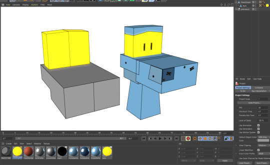
In October 2021, I went back to the older May 2020 model and decided to try and remake it. I realized that using one mesh and extruding it works a lot better with the Sketch & Toon shader, as it does not create unnecessary outlines when the default shader options are left the way they are. The lines in the middle of the eyes and nose are from the shader, rather than a black material cube. Of course, it would be more wise to just duplicate each mesh, enlarge them and invert the normals while applying a pitch black texture to them. I abandoned the model shortly after the progress I made here, and I am not sure why. Maybe I was burned out and lost interest.
I should probably try to attempt making a 3D model of him again and some others, now that I know a lot more than I did nearly 4 years ago (yeah, can you believe it has also been nearly 6 years since my Reville character was created? Robodi was first created in mid-2019; almost 5 years ago! Good things take time and care). It will be a difficult task, but I'll make sure to export whatever I make to a .FBX model, so that it doesn't get lost to C4D licensing Hell. Hopefully, that would make the models work in Blender and such (the materials will have to be baked into textures however, instead of being separate C4D ones. At least .FBX doesn't use an external material file unlike .OBJ, which I and others have had issues with). Maybe I could use them for rotoscoping or somethin'.
Here's hoping to me eventually finding motivation, losing my tiredness, and getting a job with stable income alongside continuing to work on my passion projects, no matter how much time has past since the day I first thought of them. I want to keep doing things, not resting in bed most of my days. Too bad winter is freezing cold where I live, and I suffer from mild hypothermia...
3 notes
·
View notes