#fontposter
Text
this sucks i wish i was a font
#i made this post like a year agao and i can never find it when i need to#so here it is again#DO NOT LOSE.#FAVE#FONT#FONTPOSTING#okay sorry i just need to never lose it this time
69 notes
·
View notes
Text

Font: Camellia, 1972. Designed by Tony Wenman.
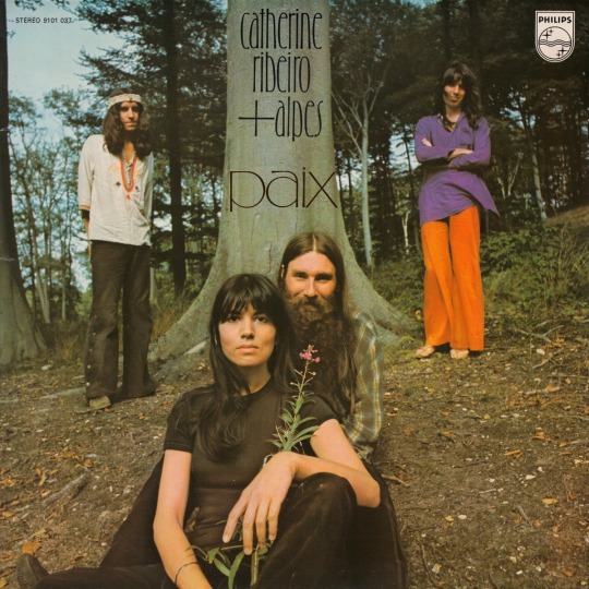
Paix by Catherine Ribeiro + Alpes, 1972.
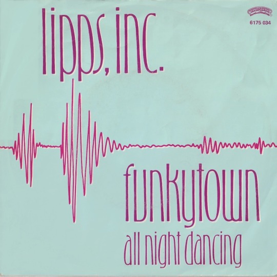
Funkytown / All Night Dancing by Lipps, Inc. Dutch single cover, 1979.
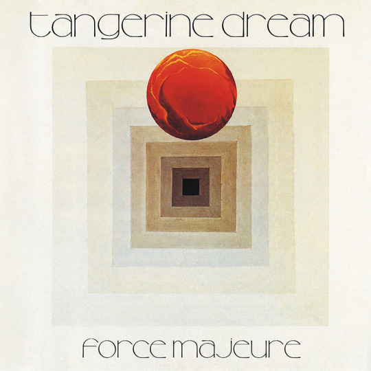
Force Majeure by Tangerine Dream, 1979.
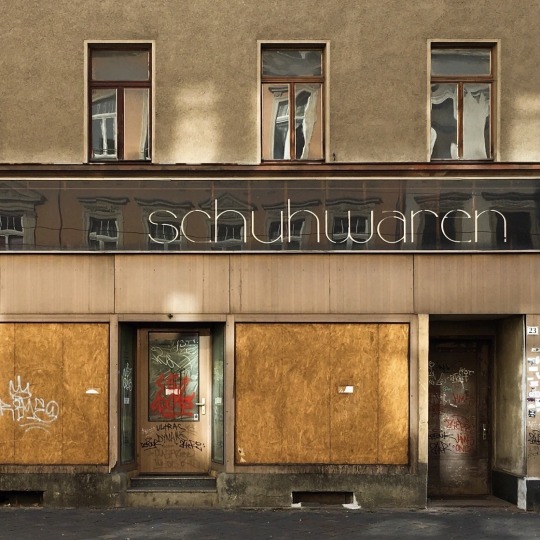
Abandoned storefront in Zwickau, Saxony, 2019. (The original stub ascenders on h were lengthened for better legibility.)
#fontposting now ig#letraset#letragraphica#typography#type#font#1972#1970s#anyone watch linus boman on yt? i recently fell alseep to his letraset catalog stream. a very nice voice on him.#records#graphic design#fave
65 notes
·
View notes
Text

fonts pictured are Lostar, Charley, Monas, and Great Warrior. there's plenty of fonts in this sort of style but its super hard to describe... y'know its like swooshy curvy kind of calligraphic but not really....
0 notes
Text
trajan pro and helvetica bold are two lesbians in a reletively newly founded long term relationship
0 notes
Text


my little bug guy... the first piece was painstakingly drawn with a mouse in photoshop for school
1 note
·
View note
Text
btw i'm a comic sans defender now and forever. if comic sans has 1000 fans i'm one of them if comic sans has 1 fan that's me if comic sans has no fans then that means i have left my mortal vessel etc etc
1 note
·
View note
Photo

HOLLA! Check out my first font poster design.
I have all the elements of design in my font poster except for texture.
1. LINE: As you can see there are 2 yellow lines there in between the body text.
2. SHAPE: The main shape in the poster is the big “e”.
3. SIZE: As you can see the first letter of my short name is the biggest size object in the poster, then you will see i ended up make the”lle” smaller so it could be at the top of the “e” tail.
4. COLOR: My main three colors are yellow, pink and blue. The black color is only for the body cope for it to be visible seen. I’m afraid if i use any other color, the body copy would be less visible and dull.
5. CONTRAST: The contrast is the yellow “elle”.
THE PROCESS OF DESIGNING THIS FONT POSTER
Firstly, i sketched some more than 4 designs but at the end i chose this design because it seems like the others’ design have not been similar to this one. I want the design to be something that the others haven’t come across. Secondly, it took me a while to find the perfect font for this design because i need to find the perfect “e” so that i could put the “lle” on top of the “e” tail. So, i choose Kaneda Gothic because it is the perfect font for my design. Plus, the font is kinda the hottest on the market too and it’s also kinda new since it was released on 2018. Lastly, to choose the perfect colors combination, i struggled a bit regarding this. Whether i want it to be a dark concept, elegant or cute. After i tried all, i kind of font with cute them which the pastel theme. Plus, i have people told me they like the pastel color theme the best. Thus, that is how my font poster design is done!
1 note
·
View note
Photo

Coming soon MONTELLS display font Cek my font shop, link https://linktr.ee/Olexstudio #creativemarket #graphicdesign #graphicdesigner #logo #logos #envato #envatoelements #fonts #fontbundles #posterdesign #fontposter #fontbundles #vintage #vintagefont #vintagedesign #newfont #font2021 #font2022 https://www.instagram.com/p/CYY9UK4ppFu/?utm_medium=tumblr
#creativemarket#graphicdesign#graphicdesigner#logo#logos#envato#envatoelements#fonts#fontbundles#posterdesign#fontposter#vintage#vintagefont#vintagedesign#newfont#font2021#font2022
0 notes
Photo

ARCHIVO . The font of simplistic but complex. The font itself is very straightforward and really easy to understand, but the curves in the alphabets are hard to notice. The element used on this font poster are color, shapes, lines, space, and texture.
The color to differentiate the background, the fonts and the shapes inside the fonts are the colors of black, magenta, pink, and dull red.
The shades of the red color differentiates at the background to produce different shades of the colors for viewers to appreciate.
The shapes in the poster include the manipulation of the fonts inside the “Y” font. the font are stretched and placed in a order to create more interest of the text.
The lines include the top and bottom line between the ARCHIVO’s sets of alphabets and numbers. It works as a set of outline for the words there.
The space includes the optimization of the alphabets to create an even space for more understanding of the font, and for design purposes.
The texture of fancy but classy of the font poster fits the ARCHIVO’s time during the day as it is released recently but taking some of the old characteristics of fonts during the days of the 90s.
0 notes
Text
the perfect sans-serif

Helvetica, known to be perfect, it is celebrated as a work of art. This widely used sans-serif typeface was developed by Swiss designer Max Miedinger in 1957. Notable Helvetica features include a tall x-height and unusually tight spacing between letters. Over the years, a wide range of variants have been released in different weights, widths and sizes. Now, you almost see it everywhere without even realising it.
0 notes
Photo

Incantus✨ #brunoassisoficialle #incantus #edition #music #play #playlist #brincando #fake #colors #color #font #fontposter #design (em Localiza Ai Gente Fina) https://www.instagram.com/p/B7GjGWMgBd9/?igshid=1hon63gao3mwq
#brunoassisoficialle#incantus#edition#music#play#playlist#brincando#fake#colors#color#font#fontposter#design
0 notes
Text
I log off for a day and I come back to eleven new followers because I accidentally designed a font.
14 notes
·
View notes
Text
Trebuchet MS is a good font. Trebuchet MS is the sensible blouse of fonts. It is unexciting and inoffensive and only weird people have strong opinions about it. It is almost definitely my favourite UI font. It's readable. It's distinctive. It's one of the few common core fonts that's broadly dyslexia-friendly.
It was designed by the guy who made Comic Sans and he put a huge amount of work into making fonts that were really good at A Thing, it seems.
Trebuchet MS justifies Microsoft's existence.

39 notes
·
View notes
Photo


海报设计 | 决胜KONGNOK ART
https://www.behance.net/gallery/84344281/FONTPOSTER-DESIGN
0 notes
Text
https://www.behance.net/gallery/84344281/FONTPOSTER-DESIGN
https://www.behance.net/gallery/93860161/_
0 notes
Text


uhhh all of the recent traditional art on my phone. yay!
#artpost#original character#💤.arial#💤.droid#💤.lain#📰.fontposting#📰.rho#rinon (bemani)#(first drawing is of a friends character. @vaehtay on artfight. you should look at their stuff ok bye ^^)
1 note
·
View note
Last Seen Blogs

clowntownlore
hey everybody

whatelisawore
What Elisa Wore

knightress
sugarcane scythe

seandavey
DaveysWaveyGravy

defibpregnat
Sin título