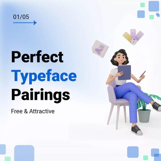
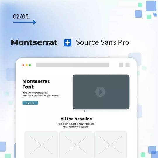
#fontpairing
Explore tagged Tumblr posts
Visit Tumblr Blog
Explore Tumblr blogs with no restrictions, modern design and the best experience.
Last Seen Tumblr Blogs


Fun Fact
Tumblr’s reach among the 26-to-35-year-olds in the US is 11%.
Text
Fonts Are Not Just Pretty Letters—They’re Strategic Tools
Still using the same font as your competitor?
Here’s why that’s a problem 👇 Your font sets the emotional tone of your brand before your audience reads a single word.
Here’s what fonts do for your brand: ✅ Build emotional connection ✅ Improve recall & recognition ✅ Reflect your values (friendly, bold, elegant, etc.) ✅ Increase conversions & engagement ✅ Bring harmony to your digital & print visuals
✨ Want to tell your story before they scroll? Let us help you find a typeface that talks.
📞 Start your branding refresh →
#FontsInBranding#DesignTips#VisualIdentity#iBCScorpBranding#FontPairing#TumblrSmallBiz#DigitalMarketing
0 notes
Text
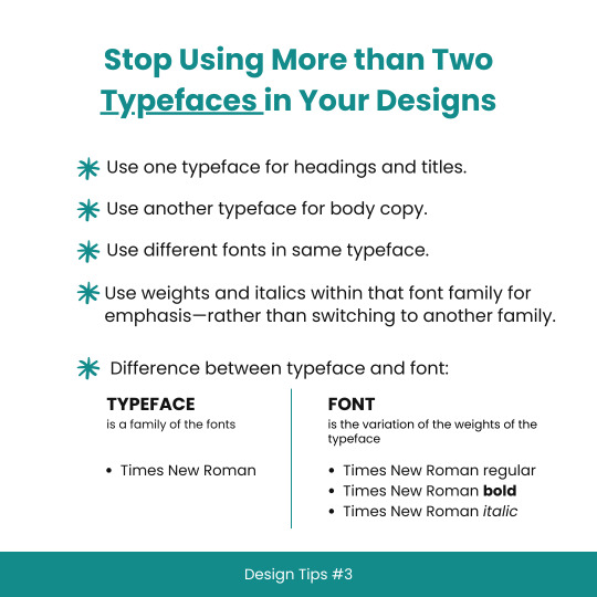
Design Tips #3: Stop Using More than Two Typefaces in Your Designs
#typefaces#fonts#typography#whatsTheDifference#fontKnowledge#typefaceTips#branding101#graphicdesign#learnDesign#improveYourDesigns#typographyMatters#knowYourType#fontOrTypeface#Helvetica#TimesNewRoman#increaseReadability#visualDesign#useLessFonts#fontPairings#maximumLegibility#clearCommunication#styleYourText#textTips#goodDesign#creativeDesign#artOfTypography#textElements#graphicDesign101#beginningDesign#designSchool
8 notes
·
View notes
Text
Crafty Quotes: Making DIY Wall Art with Typography Flair”
Wall art is where interior design meets self-expression. And guess what? You don’t need to be Picasso or a poet to create something striking and meaningful. Today, we dive into making your own DIY wall art with a typographic twist—yes, fonts, lettering, and layouts will take center stage. This is a fantastic project to explore your personality, your favorite quotes, or simply your aesthetic vibes.
📌 Why DIY Wall Art?
Besides the obvious cost-saving benefits, creating your own wall art lets you express your identity. Think of it as personality wallpaper—without the lifetime commitment. Want to hang a bold “Get Stuff Done” in your workspace? Or how about a gentle “Breathe” in your meditation nook? Typography-based wall art lets you convey that message your way.
✂️ Materials You’ll Need:
Blank canvas or heavy art paper
Acrylic paint or watercolor
Paintbrushes or markers (paint pens are magical here)
Pencil and eraser
Ruler and stencil (if you want clean lines)
Optional: vinyl letters, washi tape, or Mod Podge for a layered look
🧠 Design First: Words Matter
Pick a phrase or word that actually means something to you. It could be funny (“Alexa, clean the house”), motivational (“You’ve got this”), or romantic (“Love lives here”). The words will be the focal point—so think about:
Tone: bold vs. elegant vs. playful
Length: shorter phrases tend to pop
Style: all caps, script fonts, or hand lettering?
Here’s where typography kicks in. Choose a font that fits the message. A quote about relaxation? Use a soft brush script. Something inspiring and fierce? Go with a bold sans-serif in all caps. Use online tools like Canva, FontPair, or Google Fonts for typography inspo.
✍️ Layout 101
Once you’ve got your quote, sketch it lightly with pencil. Decide on your alignment: centered, justified, diagonal, circular, etc. Want to go a little rebellious? Try wrapping the text around a shape, or use a mix of font sizes to create contrast and rhythm.
Pro tip: Use a ruler and light guidelines to keep your spacing even. Nothing kills the vibe like a crooked “YOU GOT THIS.”
🎨 Time to Paint (or Ink!)
Whether you’re painting or using paint pens, start slow and steady. Trace your letters before filling them in. Don’t rush—uneven strokes are fine, but smudges? Not so fun. You can also:
Add shadows for a 3D effect
Highlight a word with a contrasting color
Use a dry-brush technique for a rustic look
Fun Fact of the Day 🧠 The first known use of a motivational poster with typography was during World War II. Ever seen that “Keep Calm and Carry On” poster? It was designed in 1939 by the British government to raise morale in case of invasion. It didn’t get popular until the 2000s—talk about a late bloomer!
🪄 Advanced Twist: Mixed Media
For a cool layered effect, try:
Adding printed paper cutouts behind or over your letters
Using washi tape to mask out sections before painting
Adding hand-drawn flourishes or illustrations around the text
And if you're digitally inclined, design it on a tablet, print it out, and mount it with a wood frame for that "designer-on-a-budget" vibe.
🖼️ Show It Off
Frame it. Hang it. Gift it. Post it. Your DIY wall art is now ready for its grand entrance. Whether you go minimal or maximal, modern or vintage, your wall now speaks your language.
https://letterhanna.com/crafty-quotes-making-diy-wall-art-with-typography-flair/
0 notes
Text
Already Brilliant

Extract:
“A great way to describe the path you want to take in life is to write yourself a simple mission statement. A mission statement is a sentence that sums up your values and purpose and explains what you’re about. Companies and brands often use mission statements as a way to explain the values that guide what they are trying to do – Starbucks’ mission statement, for example, is ‘to inspire and nurture the human spirit one person, one cup and one neighbourhood at a time’. Sony’s is: ‘To be a company that inspires and fulfils your curiosity.’
However, missions statements can also be a good way to think about what you stand for personally. Writing one for yourself will not only explain and describe where you are heading, it will also be an easy way to stay focused. The most powerful way for you to benefit from a mission statement is to write one for a specific goal. “
#quotes#alreadybrilliant#rachelbridge#typography#handlettering#graphicdesign#bookcoverdesign#branding#author#journalism#writer#fontpairing#font pairing#starbucks#sony#missionstatement
3 notes
·
View notes
Photo
🔍 Are you tired of using the same old fonts? 🆘 Don't worry, I got you covered! 🎨 Check out these amazing FONT pairs that will take your designs to the next level! 💯 -by @logo.unleashed Follow me: @logo.unleashed for more logos and branding concepts on the gram 😍 ! —— #logounleashed #fonts #typeface #type #fontlibrary #adobefonts #googlefonts #freefonts #commercialuse #usadesign #logomaker #illustrator #typography #visualidentity #logousa #fontpairing #typographylove #graphicdesigninspiration #designfonts #designinspiration #fontcombo #graphicdesigntips #typographydesign #fontduo #typographyinspired #designthinking #typographytips #fontdesign #designblog #graphicdesign —— https://www.instagram.com/p/Cp-nPdpreu5/?igshid=NGJjMDIxMWI=
#logounleashed#fonts#typeface#type#fontlibrary#adobefonts#googlefonts#freefonts#commercialuse#usadesign#logomaker#illustrator#typography#visualidentity#logousa#fontpairing#typographylove#graphicdesigninspiration#designfonts#designinspiration#fontcombo#graphicdesigntips#typographydesign#fontduo#typographyinspired#designthinking#typographytips#fontdesign#designblog#graphicdesign
0 notes
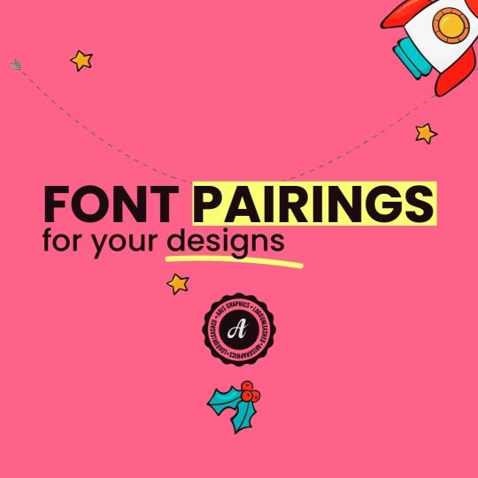
Photo

Good font pairing is important because it shows how professional, readable, and aesthetically pleasing your design is. If you don't combine the right fonts, your design won't look pleasing , and the reader might feel overwhelmed with the choices and simply skip the text. #fontcombinations #fontpairing #typography #fontcombos #designtips https://www.instagram.com/p/CUxaC6ehoXR/?utm_medium=tumblr
0 notes
Photo

⚡️8 Great Font Combinations ⚡️ Hey Creative People, Great font pairings are essential to great design, but picking great fonts can seem like an impossible dark art for most people. So swipe left to check out some of my favourite font combinations to give an idea of how you can pair fonts. FOLLOW @creativeroyale FOLLOW @creativeroyale #font #fonts #typography #fontcombinations #combinations #graphicdesign #logodesigns #graphicdesigner #learntypography #learngraphicdesign #fontpairing #fontcombos #fontcombo #graphicdesignideas #graphicdesigntips https://www.instagram.com/p/CJWajZzA87x/?igshid=37x7ejmvcdea
#font#fonts#typography#fontcombinations#combinations#graphicdesign#logodesigns#graphicdesigner#learntypography#learngraphicdesign#fontpairing#fontcombos#fontcombo#graphicdesignideas#graphicdesigntips
0 notes
Photo


Do you want to change your fonts but don't know how to pair them?Don't know which typefaces go together?Here are some perfect typeface pairings to suit your page/website!Follow @picboot for more Web Development related facts and ideas.
#typeface#typefacepairing#picboot#webdevelopment#fonts#fontpairings#typography#graphicdesign#typedesign#type
2 notes
·
View notes
Photo
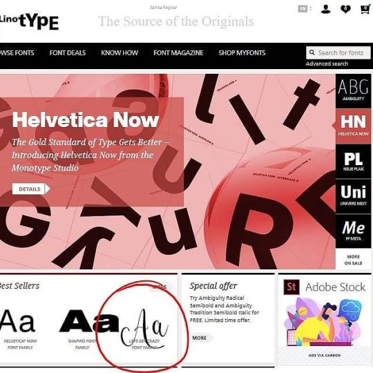
Lets get crazy font duo family, is best seller on linotype 😜🤩 https://www.linotype.com/ www.pedroteixeirafoundry.com #font #fonts #script #typography #typeface #sansserif #fontduo #fontfamily #modernfont #lettering #calligraphy #moderncalligraphy #fontpairing #graphicdesign #designgrafico #promofont #bestseller #linotype #myfonts #fontspring #fontbundles #cursive https://www.instagram.com/p/B2ussGGA99g/?igshid=6ejbi9eodcb0
#font#fonts#script#typography#typeface#sansserif#fontduo#fontfamily#modernfont#lettering#calligraphy#moderncalligraphy#fontpairing#graphicdesign#designgrafico#promofont#bestseller#linotype#myfonts#fontspring#fontbundles#cursive
0 notes
Photo

Bit of a repost but absolutely loved this font combo. After finding out about #adobe font licensing today (probably should have looked into this sooner to be honest) need to start to look at alternatives fonts. Still won’t stop me looking at the pretty adobe fonts ❤️ . . . #fonts #fontpair #fontpairing #googlefonts #adobefonts #type #typography #typeface #digital #uidesigner #uxdesigner #design #designjng #designer #website #websitedesign #agency #agencylife #life https://www.instagram.com/p/By3kDc5AMKL/?igshid=1c0piajdhdjyy
#adobe#fonts#fontpair#fontpairing#googlefonts#adobefonts#type#typography#typeface#digital#uidesigner#uxdesigner#design#designjng#designer#website#websitedesign#agency#agencylife#life
0 notes
Video
instagram
Hey Morning People, damang? Ini dia WORK IN PROGRESS Buku Perdana #CMBDG, Yearbook 2016-2017! "Butuh effort yang luar biasa" adalah ekspresi yang tepat untuk semua insan kreatif, seperti tim CMBDG yang satu ini. Akan diluncurkan Pre Order dan Indiegogonya, segera. Watch this space and your e-mail, you don't want to miss out on this #creativemornings BDG original family event. [#typography #fontpairings #indesign #editorialdesign oleh kru @mb20ft.inc] (at Bandung)
1 note
·
View note
Text
A Guide to Learning How to Code
Based on websites people on Tumblr have recommended, which I have gone through and tried out.
Straight Up Teaching:
1. Khan Academy
Videos paired with challenges. Great for learning the basics and they cover a great deal. I first used Khan Academy for introductions to coding. However I recommend jumping straight into HTML and CSS, and skipping the animation introduction until you’re reading for Javascript.
2. Codecademy
My main tool for learning. You’ll go through the course following the steps they give, and then complete projects on your own. My only complaint is that I’m more of a visual and hands on learner, which is why I used Khan Academy more at first.
3. FreeCodeCamp
I use this less because I learned about it later. Pretty much a barebones Codecademy, but it’s good for refreshing yourself on concepts, or having those concepts explained in a different way. Also they offer certification if you complete their courses.
4.CodeCombat
Turns learning Javascript or Python into a game! It’s similar to an adventure quest mobile game.
Resources:
1. StackOverflow for questions
2. W3C proofreads your code.
3. W3Schools for checking rules, questions, etc. (My go to.)
What I have open when I’m building a website:
1. GoogleFonts has extra fonts you can copy into your HTML/CSS code.
2. FontPair pairs recommended fonts.
3. Palleton for colors
On My List But I Haven’t Tried Them:
1. CodeHS
2. TheOdinProject
3. FullStackOpen (Which I’m about to use to start learning React)
Helpful Images:
52 notes
·
View notes
Text
The Basics of Slidedeck design!
Slides are something that are used in businesses, school, or even fun occasions. But an aesthetically pleasing slideshow can be a hard skill to learn and it can be frustrating if you don’t know what you’re doing. Plus sometimes you want your slideshow to be a little extra special compared to the same themes you’ve seen a hundred times over.
Here are some simple tips that take minimal effort, but can help you customize a stellar presentation!
I. Templates
Picking a good template that fits the theme of your presentation is a great starting place for any slideshow. Here are two of my favorite websites to find hundreds of slideshow themes: Slides go and Slides carnival
You can edit any template by going to Slide > Edit Master in Google Slides (you can do this in PowerPoint too!)
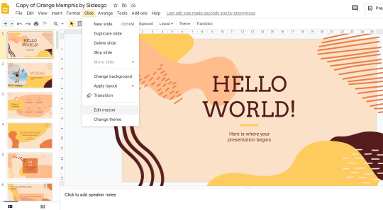
In this window, you can edit fonts/colors/design and it’ll apply to any slide that has that template.
I used an example from Slides go, but if I edited the colors (or even moved, deleted or added shapes if I felt fancy) it would make this basic template be different than other presentations even if someone used the same template as me. Even just editing the colors makes a huge difference! Again, all changes you make in the slide master will automatically appear to all slides that use that template.
II. Pictures/Graphics
Pictures and graphics can help enhance your slideshow, but you shouldn’t put so many that it’s distracting. Most importantly, they should relate to your content as best as you can. Here’s two websites I use that improved my slideshow graphics:
Unsplash.com: Unsplash has high quality images that are free to use. I usually enlarge the pictures to make a gorgeous background on my slide.
Flaticon: Flat icons are my go to in presentations because they help streamline the look of your slides (especially when you have multiple points). You can sign up for a free account and change the colors of any icon!
Here is a slide with images:
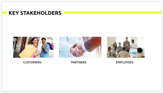
And here is a slide with flat icons:
See the difference?
Although the first slide isn’t too messy in this example (it definitely can get messier in real life with so many different images on one screen), the flat icons can simplify your slide and make it look more cohesive when you have multiple points on one slide.
III. Colors
It’s important to use colors that convey the emotions or relate to the theme of your presentation. For example, if your presentation is about marine biology, dark blues and mint greens can help convey that theme. If you’re not really good at picking cohesive color palettes a good rule of thumb is to stick to 2-3 colors max in your presentation (this includes the background color - which people often make white, but you could definitely experiment with another color!)
Make sure to use colors that compliment each other or an accent color that contrasts to highlight certain points in your slides! If you have trouble coming up with color palettes I always just Google or you can use Coolors.co to generate color palettes with a hit of the space bar.
IV. Fonts
There are two different types of font: Serif font and Sans Serif font.

Serif font has the little tick marks (think Times New Roman!) while Sans Serif has the more modern (no tick) clean look. There are some rules of thumb for when you would use one vs. the other, but it’s kind of in the nitty gritty of typography so I won’t get into it in this post (you can read about it here though if you’re interested!). Serif font gives a more traditional, established look while Sans Serif is more modern. So think about your message or the theme before you decide!
In terms of readability, the rule of thumb is generally serif fonts are better for print (that’s why the New York Times uses it) or for body text because the little ticks help guide your eye. And sans serif fonts are better for titles or text on a screen (often apps will use sans serif font because they’re on a screen!). Here’s another source that explains this in more detail because it can be more nuanced sometimes.
There are hundreds of combinations of fonts so it can be really hard to find the right pairing, but there’s plenty of people who have suggestions for good font pairings already! Here’s my favorite resource for font pairings (FontPair).
...
And there you have it! Four easy things that you can do to your slide shows in a few minutes that will help you customize a beautiful presentation!
I’ll be doing more posts about improving slide deck design and structure so follow my slide deck series if you want to see more!
#studyblr#presentations#tips#advice#student#school advice#slide deck series#intellectys#my-little-studyblr#academiix#littlestudyblrblog#joanna—studies#heysareena#werelivingarts#heypat#seoulightstudies#studycave#heystuhdees
82 notes
·
View notes
Note
hi there! i was just wondering if you had any good tutorials/resources for someone who's wanting to start skinning????
hi anon! this is a brilliant question and i am so humbled that you asked me. this depends a little on your comfort level with coding, i think.
if you are completely new to coding, i would recommend looking at something like codecademy to learn the basics of html and css with their interactive courses. i’ve personally utilised their tutorials and really liked them. if you have some familiarity but just want a good reference for css properties, w3schools is something i almost always have open in another tab or return to frequently. egg design (prev. espoirthemes) does some wonderful tutorial posts that i’ve enjoyed.
if you are comfortable with coding and want to learn things that will help take your coding to the next level, i would recommend learning something like flexbox, which can be done very easily with the in-browser game flexbox froggy. flexbox makes positioning things evenly and precisely very easy~
as for resources that can just be good for getting your creativity going, i like some of the following:
cssgradient.io - gradient backgrounds
fontpair - easy google font pairings
paletteworld - image-based color palettes
coolors - interactive color palettes
siteinspire - web design designated for inspo
fontawesome - my absolute favourite go-to icon font
finally, i know there have been a few base skin releases from various coders in resource sites. i don’t personally know them, but they may be a good way to learn how to make small changes yourself on a skin that is not quite as complex as jcink’s default coding. do note that to my knowledge, none of these base skins are permissive for commission/commercial use, but they are wonderful to tinker with as a learning tool. you can check around the remaining jcink-hosted resource sites for different versions. i hope i’ve helped a little in your search. please feel free to message me privately either here or on discord if you are looking for a specific resource. i don’t currently offer coding support outside of commissions but i’m always happy to spread the knowledge of existing resources.
39 notes
·
View notes
Photo
PIECESINTOPLACES RESOURCE MASTERPOST #1:
I get a lot of asks wondering what resources I use, where I find editing materials, or where I learned certain things, so in order to clear this up and make it easier for everyone, ♫ here are a few of my favorite things. ♫ Like or reblog this post if you found it helpful, and please make sure you like or reblog the posts below if they’re from blogs to support their creators!
Textures & Things:
Paper/vintage textures (1, 2, 3)
Grainy/paper textures (1, 2, 3, 4, 5, 6)
Antique textures
Flower PNG pack
Watercolor PNG pack
Paper/watercolor textures
Brush stroke textures
Header templates
TexturePorn (Literally just a blog of textures!)
Misc. texture downloads (1, 2, 3, 4, 5, 6, 7, 8, 9, 10, 11)
GIF overlays (1, 2, 3, 4, 5, 6, 7, 8)
Fonts:
My font masterpost
Google Fonts
Fontsquirrel (with a handy font identifier if you wanna see what someone else used or fonts like it!)
What the Font (another font identifier!)
ilikefonts (A whole blog of fonts you can download!)
Some useful font masterposts (1, 2, 3, 4)
Fonts in Use (Tells you what fonts were used in really great designs)
FontPair (Shows you what fonts look great together)
Pixel Surplus (Free fonts!)
Tips on combining fonts
Tutorials:
Making GIFs
Multiple GIFs compiled into one GIF
Cropping a background out of a photo
Extended text shadow tutorial
Using gradients (+ combining textures)
Making pastel GIFs
Some fun GIF text animation tutorials (1, 2, 3, 4)
Flat lay graphic tutorial
Vintage coloring tutorial
HQ Royalty-Free Photos:
Unsplash
Pixabay
Free Photos CC
Pexels
ISO Republic
PNG Tree
Misc. Resources:
thatsickbeat Resource Pack (Graphic templates! PSDs! Gradients galore!)
ofabeautifulnight Resource Pack (Fonts! Palettes! Textures! Cutouts!)
swifth Masterpost (Links for typography, font resources, textures, tutorials, etc.)
Web Designer Depot (Lots of freebies like fonts and textures!)
Color Hunt (Lots of great color palettes!)
Coolors (Literally develops a color palette for you! You can pick as many or as few colors that you want to be in the palette, and it will choose ones that go nicely with them!)
Design Seeds (Palettes!)
The Stocks (A great source for tons of design things around the internet)
3K notes
·
View notes
Photo
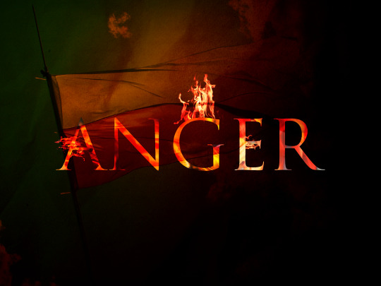
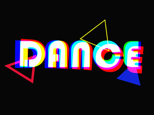
I was practising my Photoshop skills yesterday, in preparation for designing a poster for the Visual Communication module. I am only a beginner, I didn’t get a chance to use Photoshop a lot before, apart from editing photos from time to time, so it can be challenging at times and a lot of research is required. It is all about the practice after all. I made an attempt of RGB split and reflection effect - still a long way to perfection, but it’s all about baby steps. Before starting Interactive Digital Media, I didn’t even realise how many cool stuff you can do with text and shapes in Photoshop!
“Anger” - my first graphic. It represents my feeling toward what is going on in Poland (my home country) at the moment. I used this tutorial, with some adjustments (and losing patience few times along the way!😃)
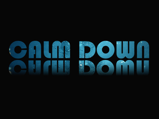
“Calm Down” - my second graphic. I really like text reflection effects so I decided to try to design it myself. It’s actually easier then I thought, I followed a great tutorial shared by Dara, our lecturer, available here. I used a clipping mask to add a photo of water inside the text. I also used gradience tool to make this reflected text blurred.
“Dance” - it’s time to blow off some steam!😊 RGB split is a glitch effect and it’s a fantastic way to add interest and action to motion graphics.
I used this great tutorial, available here: https://www.youtube.com/watch?v=75J6LtuCJJQ&ab_channel=BexarPhoto
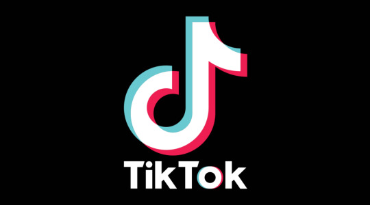
Image: TikTok logo - RGB Split effect
I found a great great article about typography tips and very useful tools: https://uxdesign.cc/awesome-typography-tips-on-how-to-elevate-your-designs-a89dd7dfa6d0
“Typography can make or break your design.”
Here are few main points from this article:
Before choosing a font, establish the purpose of your design. Consider also the medium that your design will be consumed - is it print or a screen. Identify the primary audience of your design.
Legibility and readability are the 2 important principals to consider when settling on the font of your choice.
Legibility is dependent on the font design, readability is dependent on a designers manipulation or handling of the font.
Please don’t arbitrarily choose font sizes. Use the Modular scale method to guide your font size scale.
Pair fonts like a match made in heaven by finding inspiration on Typewolf, FontPair and other online sources.
2 notes
·
View notes