#font; futurist fixed width
Explore tagged Tumblr posts
Photo

HOW TO: Shuffle Text Effect
A long while back someone asked me for a tutorial on the text effects in this set and this set, and a friend recently asked me how I did my url change gif. So, I’m finally doing a tutorial! Disclaimer: This tutorial assumes you have a basic understanding of gif-making in Photoshop. I’ll be demonstrating this effect using Video Timeline, but it’s definitely possible to replicate in Frame Animation!
If you just want to learn about the shuffle step, skip to Phase 3!
PHASE 1: PREPARE YOUR BASE GIF
1.1 – Choosing your frames. The number of frames you use will depend on the number of characters in your final text. This is so you can have a decent amount of time at the end of your gif where the text isn’t shuffling!
The way I do this effect, each “shuffle” lasts 2 frames (0.03 seconds in Timeline). A good rule of thumb is to follow this equation:
Minimum Total Number of Frames = 10 + ((Character Count - 1) x 2) + 20
10 = # of frames with shuffling text at the beginning of the gif before you start revealing letters
Character Count = # of characters in the final text (minus 1 because the final letter will not shuffle & multiplied by 2 since each shuffle lasts 2 frames)
20 = minimum # of additional frames at the end of the gif, without shuffling text. 20 frames or more so the word is static long enough to be readable.
For reference, the final text in this example will say ‘MANDALORE.’ My character count is 9. So the minimum total number of frames I would need is 46.
But I chose to have a lot more end frames with static text. My final gif in this example is a total of 70 frames (26 shuffling, 44 static). If you’re more visual, here are what my final frames look like broken down:

1.2 – Crop, color, etc. as you would. If you’re new to gif-making, I have a basic tutorial here!
PHASE 2: ARRANGE YOUR TEXT
Before we get into shuffling, lay out all your text exactly how you want it to appear at the end of the shuffle.
2.1 – Choose a fixed-width font. You can do this effect with any font, but if you want to do less work and get the smoothest animation, I recommend using a fixed-width font (aka a font where each character is the exact same width no matter what). This will ensure the random letters/numbers you use at the beginning of the shuffle are centered with the final text. Notice how even narrow characters like ‘I’ and ‘1’ stay centered with MANDALORE:
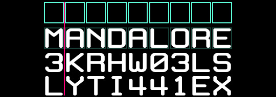
The font I used in this tutorial is called White Rabbit (although I squished it down so it’d be shorter and more square). For my Star Wars gifs, I typically use Aurebesh for the shuffle and Conthrax for the final text (also on dafont), which are not fixed-width fonts.
If you want to use a mixed-width font, I would recommend arranging the letters individually so they line up as close as possible.
2.2 – Arrange the text as you want it to appear after the shuffle. Do your typography as if you were doing any other gif. Here’s how I arranged mine:

2.3 – Optional Text Settings I typically do this effect for Star Wars gifs, so I like to set my text’s blending mode to Exclusion and apply a Gradient Overlay so it looks futuristic. Here are my settings for this gif:

I also like how this effect looks with a semi-transparent black background (60% opacity set to Multiply) and a glowing outer frame, so that’s typically what I do. On the frame, I use the same Exclusion and Gradient Overlay settings as my text and add Outer Glow:

You can let your text stand alone or add any other embellishments you want!
PHASE 3: SHUFFLE THE TEXT
3.1 – Break up your text Timeline into segments. Disclaimer: In step 1.1, I talked about these numbers in terms of Frames — where everything was doubled. Now we’re in Timeline, so we don’t have to multiply anything.
Count how many characters are in your final word. In this gif, I want ‘MANDALORE’ to shuffle — that’s 9 letters. I’m going to add 5 to that for a total of 14 segments. 13 of those segments will shuffle and the final segment will show the static final text.
Use the scissors tool to clip the Timeline at every 0.03 second. This duration will ensure we don’t get any duplicate frames.
Before Segments:

After Segments:

Now I have thirteen 0.03-second clips and one long clip.
3.2 – Input random characters into the new broken up text segments. It’s time to take out your aggression on this set and KEYSMASH. Replace the text in the first 13 segments with random letters or numbers. Make sure they all have the same character count though! Since my final text is 9 characters, all of my random combinations will also be 9 characters.

3.3 – Reveal one letter per segment. Starting with the 6th segment, reveal one letter from your final text. You can either reveal the letters from left to right, like I did to ‘SHUFFLE’ in the preview gif, or reveal them completely randomly like I did in the examples I linked at the beginning and how I’m doing it in my final example (I prefer the way this looks!). The boxes are the “revealed” letters:

Note: Look at the 5th from the bottom, 4INJ5IDSL. Normally, I wouldn’t have a letter in the randomized text match the first letter I’m going to reveal (4INJ5IDSL, N is the first letter I reveal). Tbh, normally, I’m not even using English letters in the shuffle lol. It’s not a big deal, but it’s something to look out for if you notice your shuffle effect doesn’t move the way you want. In this case, it didn’t affect my final gif so I left it alone. But if it was affecting my gif, I’d just go and change that N to another letter or number.
3.4 – Finish with the full text. Your final segment should be the complete static text and it should be visible for a good chunk of your gif so people can read what it’s supposed to say.
If you look back at my other screenshots, you’ll see that the full ‘MANDALORE’ clip takes up more than half of the gif’s entire duration.
PHASE 4: EXPORT
That’s it!! Convert from Timeline back to Frames, export your gif, and here it is:

SHARING TIP: If you send links to your gifs to a Discord server or have followers who turn off auto-playing gifs, here’s how to make sure your gif preview shows the final word and not some random jumbled up text: re-arrange your frames so the last frame is first. Everything will still be in the same order, but anywhere your gif is paused, the final word will be displayed!
If you have specific questions about this tutorial, my ask box is open <3
#gif tutorial#completeresources#tuserssam#usershreyu#useryoshi#userelio#userannalise#userzaynab#userives#usermarsy#usertreena#usercim#userrobin#userkosmos#usersalty#usermills#userhella#alielook#resource*#gfx*#i hope my overexplaining nature didn't make this confusing#bc it's actually super easy and quick to do!
452 notes
·
View notes
Photo


#the 100#bellamy blake#clarke griffin#raven reyes#octavia blake#lexa#lincoln#jasper jordan#the100edit#dailythe100#the100daily#ik theyve lost many more people but i feel like these are the most memorable deaths#or the ones that truly shaped the characters in the long run ya feel#i also know theyre like 1343786 years old now but#this seems relevant to s1-s4 a tthe v least#font; futurist fixed width#2k#3k
6K notes
·
View notes
Note
1, 12, 23, and 34? <3
Hi hello Kris!! 💛
1. How did you get into graphics / gif making?
oh so when 2gether the series came out it was one of the reasons why i came back on tumblr. I always liked creating stuff for fandoms but I'd stop doing art at that time cause being in quarantine really made it hard but I still wanted to create something for 2gether and gif making seemed like a new thing to learn and so I looked up how to make gifs and here we are haha
12.Font(s) you like using
Hmm usually I like using fonts that are pretty simple but also elegant
Abril Fatface (I use this one so much, especially when paired with a smaller delicate?? font it just looks really nice)
Antro Vectra, Silence Rocken, Red Velvet (my favourite cursives)
Futurist Fixed-Width !!
Gotham (for captions, this one's a life saver)
23. What is your biggest improvement in the past month?
I haven't made a lot of gifs this month lol but I think coloring gifs has gotten better over all. Also learning transitions with the graham slider (I still dk what's the original name of that lol) but yeah I'm actually proud of that one cause it seemed so daunting at first.
34. Gif makers, how many frames do you import? (And why!)
At one point I used like over 110 lmao but now it's somewhere around 80-95. The biggest reason is the size cause I had to eventually cut down something in the end while exporting.
Thank you for sending! <333
ask me about gif making
6 notes
·
View notes
Video
youtube
okay so alex / @strawberrywoong started this great little tag to show our process for making a gif~ to take directly from alex’s post:
i think it would be interesting for more people to post a behind-the-scene of a set they made or are thinking of making but you’re not at all obligated to. everyone, please reblog work that you enjoy seeing. we want our content to be seen by others on this website, not to be buried in your likes for eternity.
so anyway! here’s my process for these two ending fairy gifs that i just posted of changmin & younghoon!, i didn’t cut the video at all or speed it up its just 4.53 minutes of normal paced video from yours truly; so excuse the opening part and also the end where the recording cut; but if you wanted to know the font i use for my watermark atm is called ‘futurist fixed-width’ + below the cut are my export settings! the psd i used is my basic one i use for everything; but if you wants tips i’ll be happy to help, i did make a basic kpop psd on my old blog, i’ll try and find it for you if you’d like, just let me know!
if you want to do this, go ahead! you can also just do screenshots if you’d prefer but i’ll tag a few different people to who alex did, you can post on your mains or sideblogs whatever you like!~ @songmingki, @yeeosang, @chwejongho, @minsjoon, @parkjimni, @shuuvee, @haknew, @agustd02, @hwqll, @hoshees, @jung-koook, @jungshiii

#*m#*video#*tut#*res#the people i tagged dw you dont have to do this if you dont want to!#u guys inspire me so...#res#tut#video
120 notes
·
View notes
Note
oieee, qual fonte você usa para fazer as headers???
olá. olá. eu uso várias. então se quiser saber alguma especifica, me fala.
todas eu baixei no site DaFont
para texto de quote: Times New Roman, Cambria, Aliens x Cows, Cinzel e Futurist Fixed-width
cursivas: Amalfi Coast, Beloved, Beauty, Feathery, White Angelica, Shorelines Script Bold, Hello Honey
outras que gosto muito: Bebas Neue, Amstagram
29 notes
·
View notes
Note
Oi, é... então, como você finaliza as suas capas e quais fontes você usa nos créditos? Assim, nas capas com textura principalmente... amo seus designs e espero um dia poder pedir uma capa pra você 😊 (ai meu deus eu estou com vergonha kkkkkk)
ai que delicia de ask gente
bom, ok, vamos por partes, vou tentar explicar tudo bem detalhado, começando com a finalização de capas texturizadas:
normalmente, nas capas com texturas, eu uso um plug-in no photoshop (o meu é o pscs6 portable) chamado topaz clean, que basicamente deixa a capa mais “lisa”, na minha opinião, daí você pode configurar as opções de acordo com o seu design e ver como você acha melhor, mas >>eu<< uso, na maioria das vezes, assim:

na aba “texture”, eu sempre vario dependendo do que eu quero destacar, então você também pode variar. entretanto, normalmente eu deixo no 0.90. o resultado final é esse:
antes
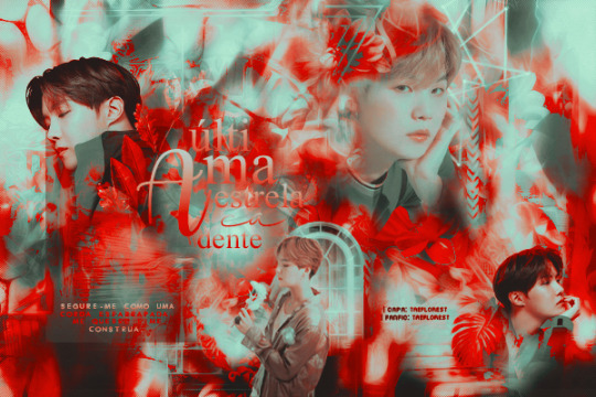
e depois:

espero que tenha dado para notar a diferença sksksksksk. enfim, continuando, em algumas capas (como a última que eu postei) eu aplico, depois do topaz, uma nitidez e o efeito 3d.
para aplicar o 3d é só seguir esses comandos: duplicar camada > definir camada atual > canais (combinando os comandos rgb, você pode definir a cor) > mover camada (eu costumo dar dois/três clicks para a direita ou para a esquerda, dependendo do design) > mesclar camadas.
e para aplicar a nitidez: filtro > tornar nítido. as configurações que >>eu<< uso são:
intensidade: 450
raio: 2px
e tcharam! tá pronta a capinha, mas raramente uso essas últimas opções. normalmente é só topaz mesmo e boa. você também pode baixar actions no deviantart, esse topaz que eu uso por exemplo tem como base um action da ladyvic, mas eu sempre mexo em uma configuração ou outra pra ficar perfeitinho dependendo do design. espero que a explicação não tenha ficado confusa. :)
quanto aos créditos, você se refere ao nome do autor/capista, correto? se sim, eu uso na maioria das vezes as fontes PF Arma Five e Futurist Fixed-width.
bem, eu realmente espero ter ajudado akakshaksjas, se você quiser uma capinha, pode me procurar nos blogs onde eu edito e pedir por preferência, ou senão esperar eu abrir o formulário (que vai demorar infelizmente huehsushs), contudo estarei fazendo uma doação até o final do mês. beijinhos <3
8 notes
·
View notes
Photo


。・ template psd seventy eight, template pack forty by templatepsds ゜+.*
-`. info .’-
+ as requested, here are a few movie poster templates with different styles.
+ there are three total. the first was inspired by action/thriller movie posters. the second one was inspired by comedy movie posters. the third was inspired by romance movie posters. but you can use them for whatever you want, whatever genre you wish.
+ once you add the image/edit to the template, it will really come to life. I was too lazy to make the examples look decent, but hopefully, you get the idea.
+ you can change the fonts, rearrange the positions of things, etc.
+ the fonts that are used are #1: Airstrike, Built Titling, & Futurist Fixed-width. #2: Republica Minor, Roboto Light, & Built Titling. #3: Kunstler Script & Built Titling.
+ not for commercial use or anything like that! just for personal use/to have fun.
+ adjust as much as you want to suit your liking.
+ please like or reblog if you download.
+ message if you have any questions/difficulties!
-`. dl .’-
+ one (orange preview)
+ two (purple preview)
+ three (blue preview)
#completeresources#itsphotoshop#yeahps#templates#template psd#template psds#template#photoshop template#photoshop templates#1#movie#posters#movie poster#psd template#psd templates#template pack#template packs
2K notes
·
View notes
Text
Insa Post Development 1


I started here for my insta post just layout out something super simple trying to layout all the info I wanted to convay. Im really happy with how the I fits into the dip of the D, however it felt like it was missing a little something so I wanted to add a font description

I wrote a little description of the font that felt like something id see in a promotion and also pushing the idea of it looking like a futuristic font fitting in to an almost cyberpunk aesthetic.

the edges of the post were beginning to feel under utilized so I played with the idea of the vertical texts. I also went ahead and roughed out the idea for a name of myth type NIO-NIOR. I choose this name because it one sounds cool bit also continues to reinforce that futuristic I dystopian idea I'm going for as French term, film noir, translates literally to English as "black film", indicating sinister stories often presented in a shadowy cinematographic style

I decided to get rid of the italics now that the text is all smilier even out the sizing of text and bring down the width of the middle line to match the weight of text better.

here I've tired to throw in some texture, im not too sure if Ive used the asset in the correct way so ill have to look up how to use texture more effectively. Ive also noiced quality issues in the big text but as ive made it in illustration that's an easy fix ill worry about later.
0 notes
Note
Acho suas headers lindas, sempre estou dando like e rblog. Voce poderia dizer quao nome das fontes que você usa nas headers de "Mentira perfeita e Frary" por favor? Como eu tenho um blog sobre livros eu acho que ela iriam ficar legal nos banners.
muito obrigada peles likes e reblog anjo 💝💕 e os nomes das fontes q usei nessas headers são essa:futurist fixed-widthsmalltypewhitingengineering plotautumn chant bladog personal usecambria mathJCaguirrep- old typebonoco
4 notes
·
View notes
Photo
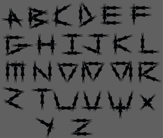
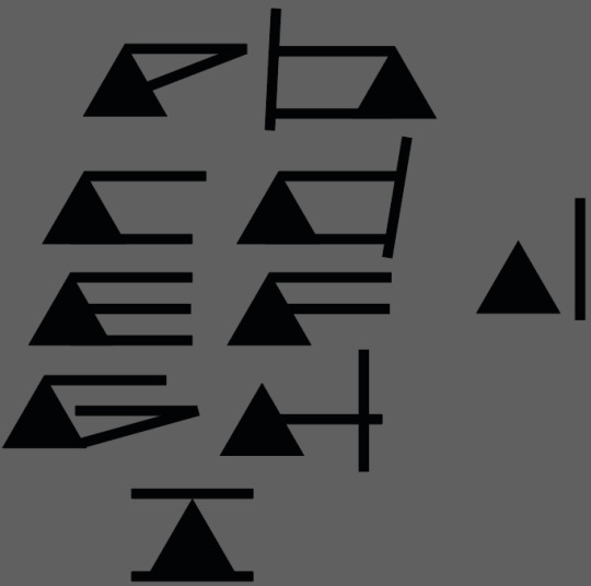
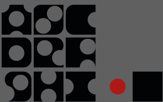
Over the Christmas holidays were given a few tasks to complete in order to get used to making type further before diving into making the ruleset of out own final typeface.
For this task we had to make letters using simple shapes. The first task was subtractive. We had to pick two shapes and take one shape out of the other in order to make letters. So, I went quite simple and chose a square as my base with a circles to cut out. The rules I had were quite lenient as I used the circles to cut whole pieces out while also doing parts going out the square and even using them to round the corners of the squares. The result I got is quite pleasing. The letters are legible and all look like they belong together which is all I really aimed for here but now I think with development it could become quite a fun font as it looks friendly but also interesting enough to not just be a standard type face. I quite like how all the letters are all on the same axis without anything below as normal type doesn’t follow this rule. I may use that thought process when making my own.
Next I made type with two shapes again but instead of removing them I add them. Here, I had an equilateral triangle with a very thin rectangle. I didn’t think much of this at first but as I progressed I quickly began to like how it was looking. Typically, because the rule set is clear by only one triangle is used with the variable being how many rectangles are used. Some letters are quite strong such as D and C but my favourite is the H as it looks very futuristic but also recognisable as it makes me think I've seen it in some sort of future set media somewhere or somewhere fictional. It’s simple but effective. Possibly because the rectangles are all straight without having to rotate making it more of a clean finish as shown on the G rotated letters without any point adjustments don’t look good. The letters go below the X axis here I don’t believe it was intentional but as I couldn’t change the length of the shapes it happened naturally but all the triangles sit along that line which I like. Again, some elements here I could potentially use in my font with the contrast of very wide and thin lines.
Finally, for this shape task an alphabet had to be made using only one shape, So to try and make his more interesting I used the polygon tool and put in a random amount of points (either 7 or 8) then distorted it by changing the width. From then I simply created an alphabet by piecing the duplicated shapes together. As you can see I tried to make sense of some kind of rule by trying to keep the letters one shape high while also using other letters to make new ones to make the letters more of a family. As a result it was somewhat successful as all the letters were legible and some turned out quite well as using triangles to make the circular parts of letters worked well. It seems I messed up the S but that could easily be fixed by flipping the Z. Also, the first few letters could of been revisited as I gradually made more sense of the alphabet but I felt like I should leave this in to show development and show how I adjusted and created this type using the restricted resources I had. In overall, for something so simple it looked fine for what it was but unfortunately I haven’t been inspired by this piece but it was a good brain tester at least.
0 notes
Photo

Reedsroleplayhelp’s 1st Graphic Pack
Normally once I’m done with a roleplay I like to put the graphic design I used up so someone else can make better use of it. So have my first full graphic pack!! The graphics themselves are not too difficult to work with, and only require basic Photoshop skills.
Includes
Biography Template
General Graphic Template
Promo Graphic Template
Important Info
The fonts used are Futurist fixed-width (x) and Blacksword (x)
Download link (xxx)
Please give credit, like if you use, and do not claim as your own!
261 notes
·
View notes
Photo


lately I’ve been winning battles left and right, but even winners get wounded in the fight.
#runaways#nico minoru#karolina dean#alex wilder#gert yorkes#chase stein#molly hernandez#runawaysedit#font; futurist fixed width#theyre meant to sync up but that depends on how cooperative tumblr is being#which on good days is about 2%#1k#2k
3K notes
·
View notes
Note
Hello! Hope you’re well! I was just wondering,what fonts did you use for your recent hannigram gifs? :)
hi! one of them was fortunates december and the other one was futurist fixed-width (i usually use only that one, because i am a sucker for fixed width fonts)
0 notes
Note
sorry to bother you, but would you mind sharing what fonts you used here? ;w; /post/154522614583/i-have-no-past-accomplishments-to-defend
oh no worries, you aren’t a bother! I used futurist fixed-width, microsoft yi baiti, and code bold (✿◠‿◠)
1 note
·
View note
Photo


。・ template psd thirty four by templatepsds ゜+.*
-`. info .’-
+ as requested, i made a tracklist template. it’s only one file, but it has five different styles in different folders.
+ you can have a barcode and/or explicit label, as well.
+ you can change the fonts, positions, colors, etc.
+ all the fonts used in the previews and examples are: “Airstrike”, “Baron Neue”, “Bebas”, “Built Titling”, “Futurist Fixed-width”, “Salome”, “Ana’s Rusty Typewriter”, “Codiac”, “Lovelo”, “All Square Now” and “Zondas”.
+ not for commercial use or anything like that!
+ adjust as much as you want to suit your liking.
+ please like or reblog if you download.
+ mssg if you have any questions/difficulties!
-`. dl .’-
#itsphotoshop#yeahps#completeresources#templates#template psd#template#template psds#Psd Template#Photoshop templates#photoshop#Photoshop resources#Photoshop Template#psd file#psd files#tracklist#simple#1#cd#kind of a font pack if u think abt it
2K notes
·
View notes
Photo

“black roses red”
6/19/2017
colorings: RavenOrlov and valeryscolors
font: futuristic fixed-width
0 notes