#fits the color scheme and the vibe while still being very easy to see in frame
Explore tagged Tumblr posts
Text
I liked the red eyes well enough but if they changed them to orange bc of the backlash, that's also pretty good. The stark contrast between the warm but threatening animatronic eyes and the cold silvery strangeness of spring bonnie's eyes is very good
#if it was a change because of the backlash i think that was a good direction to go#fits the color scheme and the vibe while still being very easy to see in frame#and if they were just glowing white then spingtap (pre squnch) would look as different and strange#i REALLY hope that the animatronics are a bit herky jerky but he moves very smoothly and humanly#that was my favorite thing about help wanted and it would look GREAT on camera imo#fnaf movie
5 notes
·
View notes
Note
i like how clothing ask anon 2's question and your answer to that confirmed my assumptions based on the first answer. good to know, i'll make a mental note of confirmation for that :D
anyway, while the topic is going, i personally always found the delusion outfit having a white shirt to be really interesting from a design perspective (i guess)? while both the playable and delusion outfits have red accents, for differences playable also has black accents and delusion has white/gold accents I suppose. I love the concept because it's a direct swap- the "surface view", so to speak, flipped on its head. literal black and white. which is kind of what's happening at the time, since, well. no longer being a helpful friend, around that moment, huh. anyway, love the idea of the undertones in his outfit. i noticed awhile back (*cough* as a childe main i kinda see him a lot so i sure would hope i've noticed stuff by now), but his playable outfit has a lot more black than i originally noticed - not a huge amount, but definitely more than i first saw, and placed like shadows, so it stands out less. and it's a transition from grey to black, anyway, so that helps it to blend in too. the fact that it's so easy to miss (assuming im not just unobservant, of course,) is already so fitting from a design point of view imo. lurking in the shadows hiding something sneaky vibe. then delusion having the white undertone thanks to the shirt colour change- it kinda feels like a reminder of what he is and isn't, in terms of character. like, the "white" still isn't entirely gone, but it's been buried in that moment. or that could just be me overthinking details which wouldn't be unusual at all. there's also the "oh his playable outfit has a lot of white- no wait that's actually mostly grey-" like there's just a slight difference between grey and white when it comes to meaning huh,,
... anyway, as you could probably tell by now,,, i could go on a whole rant over childe's character and all the little details which i think are Funky though so uh- yes (and that includes music and how it shows his character too. whoever talks to me about childe and his related music would also inevitably hear my hot take of he doesn't have one, nor two battle themes, no, actually, he has three, and no im not counting the whole osial thing-)
anyway, 👍 hope you're having a good day and didn't mind my half-restrained half-not-restrained thought dump which turned into a bit of a ramble at the end there. despite certainly being related at least at the start i feel like it could still be a bit much out of nowhere lmeo
i didn't mind it at all – in fact, i rather enjoyed it! i've always loved that his playable outfit is at first glance all gray, what with the whole gray morality and all that, and also because as far as i remember he's literally the only one with that color scheme? i think. maybe there's someone i'm forgetting, but i'm pretty sure he's the only one that's decked head-to-toe in gray
i never really clocked in that whole white detail buried under all the black and red, but now that you point it out, it seems so obvious,;; you do learn something new everyday hahah
thank you very much for your thought dump! always appreciated. what's a fandom if we can't discuss stuff like this with eachother, anyway?
4 notes
·
View notes
Text
MY TOP 10 F1 HELMETS OF 2020 (AS A GRAPHIC DESIGNER)
With finally that dumb rule about amount of helmet changes out of our system, I’ve been enjoying seeing all these different helmets this season. There have been beauties, some that I’m still thinking about till this day and there have been some uglies.. some also which I’ve been thinking about till this day and literally thinking: WHAT WERE YOU THINKING?!?!? to the drivers that wore them.
As I’m getting my official graphic design ‘papers’ I wanted to give my opinion about my top 10 helmets of this year:
10: Daniil Kvyat Abu Dhabi helmet

This is his last helmet and honestly I’m a fan of this one. It’s a pretty simple design and usually I’m not a big fan of the colour red being used in a helmet. Mostly because I find that colour a bit overdone in helmets. But it being sparkly makes it extremely beautiful and it’s the first Alpha Tauri helmet that I’ve seen that match fully with that big ass logo on there. With most of the Alpha Tauri helmets I feel like the helmets designs have two parts to it, the design and the big ass logo. But with this one I find it matching extremly well. Good job on that, love it.
9: Pierre AustrianGP helmet (fan made)

Oof, the front and the upper part of this helmet is just so fun. I’m a big fan of using a dark background with a very bright color scheme combined and I love the fact that this was a competition where fans could design Pierre’s helmet and that a beautiful design was chosen. I would have loved it even more if the alpha tauri logo wasn’t there. Especially that big. It would have looked so cool and given me an 80′s disco vibe if the whole colourful design was fully around the helmet, without the logo. But I guess with this one I just pretend the logo isn’t there. It's still so good though.
8: Sebastian Vettel Abu Dhabi (ferrari tribute) helmet.

Now I wasn’t sure which helmet of Seb I liked more, this helmet or the Styrian helmet. I decided on this helmet, because it’s such a Seb helmet and reminded me of one of his Red Bull helmet (which is prettier than this one tbh). But also because I think there’s a special concept to this helmet. This obviously could be wrong but to me this helmet is a bit of ‘self reflect’ for Seb. You obviously have the achievements with Ferrari on there and his famous quote ‘grazie ragazzi and the helmet has a bit of a mirror effect. but the colours to me that especially are being used in the number 5 tells me his F1 adventure (past and future). The colours start (in the number 5) with the Redbull colours, than goes into the red(Ferrari) which blends in with a little pink and goes straight to the green(AM). So I really like this little detail even if it wasn’t on purpose, which sorry but I am convinced it is.
7: The pink Hulkenberg helmet

I’m not gonna lie, I kind of had forgotten about this helmet, but as I’ve been looking back at these helmets this one has been really catching my eyes and is so well done. I find Pink a very hard colour to work with anyway, definitley the bright pink that just screams at you. And the fact that the bright pink isn’t overpowering with the pastel pink and white makes this helmet just nice to look at. The things that needs to grab your attention, grabs your attention and the fact that it has stripes going vertically over the helmet is one of my favourite design choices you can do with helmets so I absolutely love that. If a driver is doing a pink helmet, then this is what I love to see. Very beautiful.
6: Jack Aitken Abu Dhabi helmet

Now this one I was pleasent surprised by. Lets just put it this way: It’s a busy helmet well done. This is also a helmet that is just nice to look at it. Using these kinds of shapes that go from small once to big once is not easy to make it not look messy and the way they've done the white spaces inbetween the shapes is really well done. It looks like a puzzle that fits well and I have nothing bad to say about this. The color scheme with this one is just amazing. Really really love this one.
5: Lewis Hamilton purple helmet (bahrain)

I haven’t been a fan of Lewis’s helmets before BUT LET ME TELL YOU, this season he has really been bringing it. I am in love with the use of purple. Such an underrated color in this sport. And why? I have no clue. Purple is creative, magic, rich colour. How has it not been used more? It looks so good on this helmet, especially the Bahrein one with the glitter. Very pretty, good job Lewis. Finally! I have nothing bad to say about this helmet. The stars for his champions, the blm message on it. A good helmet right here.
4: George’s Abu Dhabi GP helmet

I guess a lot of drivers saved their best helmet for last... When I saw this helmet for the first time I was legit in love with it. I love that this helmet is for Frank and Claire and showing the success of Williams which haven’t been showed the last couple of years. But the use of the two dark blue shades with the white lines is complimenting all three colours so beautifully. I really hope George keeps those three colours and make a different kind of design as his main helmet because this looks beautiful to me. I wouldn’t even know anything bad to say about this helmet. Love it.
3: Alex’s Abu Dhabi GP Helmet

Now this one might come as a surprise and I don’t think anyone would’ve picked this one out as a number three BUT HEAR ME OUT. I’m absolutely OBSESSED with the cartoonish design that’s going on with this and it stands out a lot more compared to all the other Red Bull helmets that have been designed since 2015. To me they’ve been all looking kind of the same but this one to me is just so unique while still being a very RedBull helmet. The black outlining makes all of the colours pop out so much more and just the whole cartoon vibe is just right up my alley. If I were to design helmets, the whole cartoon vibe would be what I do and I think that’s one of the main reasons why this helmets speaks to me so much. Like I absolutely love it.
2: Seb’s Tuscan GP helmet
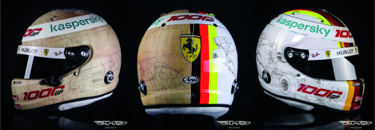
This was the hardest decision, because to me this is a clear number one. I have something with old designs coming back. And I LOVED Seb’s 2019 Monza helmet which was a love letter to the old helmets and I LOVE this helmet for the same reason, but even more so of how creative this is. Obviously it was the 1000GP for Ferrari so there was the inspiration. But I’m just obsessed with the way the old side looks. How they used an old drawing of the old racing car and made it really work. Like it almost looks like an old world map but to a racing driver. I’m obsessed with this side. But also I’m obsessed with the way it goes from the old side to the new with the old looking colours to the vibrant almost neon ‘now’ colours... is just amazing. I probably would’ve loved it even more (if that was possible lmao) if the old side was all around the helmet, but you just have to love this concept. For a 1000gp celebration it’s so good and well thought while still keeping your main design helmet in there. I would love to have this helmet. So cool.
1: Sebastian Vettel diversity helmet

Is it really a surprise that this one is on number one though? Now I’m gonna be honest with you, even though I absolutely love this design, it’s the combination of the design and the extremly strong message this helmet brings to the table that makes this helmet a number one of the season. This helmet is so special I will be thinking about this helmet in probably 10 years still. Now let me talk about the design. The stripes of rainbow where usually the German flag is (which I said before) something I’m obsessed with. I really love a helmet that has stripes going vertically over the helmet. I don’t think a lot of drivers use that and obviously Seb’s Ferrari helmet is known for that design and is so iconic. Your eyes will go straight to the vertically stripes, which in this case are the rainbow colours. But that’s not all. On the side you have all these unique illustrated people. Every character on there is differently that you almost could say you could ‘find yourself’ in there. It really shows the message of this helmet. What I also love and probably is a detail that is a forgotten detail, is how the number five slowly fades with the background. I’m very curious if that’s just a design choice, but I almost would think there’s a concept in that alone. Overall this is just a mind blowing helmet. I have nothing bad to say about it. It’s a beautiful design with an amazing message that should be talked more about in this sport.
#f1#sebastian vettel#Alex Albon#george russell#Lewis Hamilton#Jack Aitken#nico hulkenberg#pierre gasly#daniil kvyat
199 notes
·
View notes
Note
It’s wind anon! (Imagine me as the screeching seagull meme) just pushing through the week. Getting the test out of my mind—it just sucks because there’s always this one test that I completely mess up on—and as someone who has to deal with all honors classes and my grades tend to be good, every time I fail to meet up to expectations my stress skyrockets. (Imagine a world where grades don’t matter and school is learning based rather than mark based...) Family pressures too—okay, wind anon is done ranting.
The update! The drama—I was there the moment it updated and I saw the comments rush in and I was laughing real hard.
But my reaction to the update!
Osamu POV :0!!! The insecurity... “all it did was remind him that he was alone”— I empathize because gosh, that is so real.
The attachment to Meiko though... his emotional state is on a very unstable tightrope. “Osamu had Meiko and he used to have Daichi and Iwaizumi...” that entire section has all my red flags raised. He’s going to completely break when everything comes out.
The loud clang startled me though. I was like “!!!” But it was our YN! Our kind, wonderful YN!! Trying to get snacks wwwwww.
Osamu thinking YN is cute :0 I be having a lot of thoughts about that but him squishing it down is fair. He considers himself to be in a committed relationship (though Meiko does not reciprocate and I am ready to fight regarding that) but I can respect his devotion (even if it is very misguided).
But. “After all, you were the reason Atsumu hated him now and never spoke to him anymore.” My gosh. What do I even say about this? Because the blame is entirely thrown off. I mean, you mentioned before Atsumu had a specific reason for believing in you over Meiko so I’m still waiting for that but Osamu is thinking something wrong but it’s a human action. It’s so easy to blame people to make yourself feel better. And your brain can do it without you realizing the depths of what has been thought.
Osamu being angry (!!!) and being a complete utter douche. YN literally just wanted a bag of chips and you’re here, crowding them in the pantry and being hostile. I don’t have much to say about it because he realized his mistake but by then he already stressed YN really badly and I am...(long sigh).
Atsumu to the rescue. We appreciate Atsumu very very much in this house. It really sucks that Osamu and Atsumu are confronting like this—I mean, Atsumu has been fighting a bit and Osamu had not really been listening to Atsumu on his own end prior to this confrontation so I’m...exhausted and a bit sad in the “It can’t be helped” kind of way.
“Osamu allowed him to, too in shock and ashamed to protest, much less fight back.” It couldn’t be helped considering how everything developed but...it still hurts my chest a bit, y’know? And then Osamu tries to apologize and I’m ready (so so ready) for them to communicate because they desperately need to—
But then Meiko comes in (I am...ready to throw stuff at her. Lots of stuff. Packing peanuts. All squeaky and annoying and bad for the environment just like she is—or something like that, I dunno, I’m half dead because I’m dealing with cramps rn) and all my wishes for them to finally have that much needed conversation where Osamu can finally break down and cry—all my wishes are turned to ash like.
(Angry Wind anon noises)
Meiko rubbing her makeup all over Osamu’s shirt like he is a rag. What in the... And her 4 inch heels please, I cannot, why, I can’t deal with this, I can’t, don’t make me get close to her because I’m like Yachi (stressed out of my mind). Please don’t do this to me. But yeah, Meiko with her poor makeup that doesn’t stay on her face. What the heck....
And Meiko’s scent... gross. Like, brown sugar, cute, nice, baked goods do smell really nice, (ever add a bunch of vanilla extract to a recipe? It like, perfumes around everywhere, it’s insane and wonderful) but chances are (because it’s Meiko), it’s overbearingly sweet. Chinese food (I do not trust her taste in Chinese food to be frank), I happen to come from a Chinese family, I have Chinese food for dinner like everyday, it would take a lot to be able to get that sort of scent on you. And I do mean a lot. And hairspray??? Chemical? I do not,,, I,,, Osamu, why would you breathe that in? It’s gonna be real bad for your lungs? And we already know Meiko smokes as well—your lung health, please value it—
And then the Suna entrance. Wonderfully done fr0ggy!
Final thoughts, I am very much projecting onto Yachi rn. Yachi has been in the house for less than a week and she already has to deal with this. The company should give her a raise. My gosh.
Anyway, might as well do a thoughts/headcanon thing because it’s been a while and my mind is still on gem/jewel stuff (so hope you don’t mind!)
Okay, so Kenma I think would go with a warm colored gemstone, and citrine would work well with him! “Protection against evil thoughts” because we know Meiko has ramped up is insecurity and lowered his self-esteem.
I mentioned this before last time but Sakusa is definitely onyx. That black is iconic, and “sharpening wit” would make sense with his grace for word play and snark.
Akaashi is an interesting one...I think sapphire. I mean, sapphire can have many colors besides the classic dark blue, so that’s one thing, but it’s known for “loyalty and a pledge of trust” which Akaashi gave. I think it’s suitable for him.
Suga...initially I was thinking pearl would match him in terms of appearance, but actually looking at my reference, turquoise would work really really well with him. “Protect from evil, maintain virtue, bring good luck”. Would work well.
For Atsumu and Osamu I wanted something that could represent their duality. My first thought was gold and silver. I mean, it’d fit in terms of appearance but I’m not sure that would be the best comparison. Gold doesn’t rust so it fits Atsumu who never fell for Meiko’s tricks. Silver has been said to vanquish dark/evil beings (vampires, werewolves, the classic silver bullets and stakes). It would be interesting to see if the comparison will apply to today’s update :D!
I like how my brain shut off and couldn’t remember anyone else for a second—anyway, Oikawa... every time I think of him, I want some hue of blue wwww. I guess Aquamarine “soothing influence” would work. Since he joined YN’s side, he has been able to see the big picture and be a voice of reason. He’s thoughtful and I think aquamarine which encourages long relationships is suitable because that is what he wanted. So yes, aquamarine.
Bokuto...is a tough one. I’m trying to still keep with their color schemes a bit. I think carnelian would work. “Health, luck, bold energy, warmth, joy”—it would represent him fine. It’s a bit more orange than I would prefer but it suits him so I think it’s okay.
Iwaizumi... emerald? I mean, he does suit green tones, and “rebirth, regeneration, new hope” would work just fine for him.
Right now my brain is complete mush and I can’t think of anything for Kuroo and Daichi. Like, Kuroo would be red, sure, but the more famous ruby/garnet I think don’t represent him fully because he is still rather contained. Hmm, would need to think about them more.
But I’d like your thoughts on this too :D!!
I wanna do something suitable for all colors for YN, so opal! YN has many different parts and colors and is overall a very vivid person—if you tilt opal, you see more and more faces and things underneath being brought into your eyes. YN may be seen from many different perspectives, but YN is always beautiful and amazing. So opal is what I think YN would be.
Anyway, I’ll end here :D! Need to eat lunch. Much love towards you fr0ggy! Make sure you eat and rest up too~ drink some water or any other fluid to hydrate! And keep warm too. Much love to all the fans and supporters and ask senders too! It’s really awesome seeing and hearing from all of you and seeing new faces with the old. Love the excitement and points you all bring up—makes my brain happy.
MAJDKD I NEED TO POST THE NEW CHAPTER BUT I HAD TO RESPOND TO THIS FIRST BESTIE ILY N I LOVE TUIS — I AM OBSESSED W THE CRYSTAL (??) STUFF??? IVE NEVER UNDERSTOOD IT BUT I THINK YOIVE EXPLAINED EACH GEM N WHY SO BEAUTIFULLY I AM IN LOVE W U KITH KITH UR SO LOVELY HAVE AN AMAZING DAY (sending u good vibes n anti-stress love >333)
31 notes
·
View notes
Text
2021 Megaman Valentine’s Day Contest Results
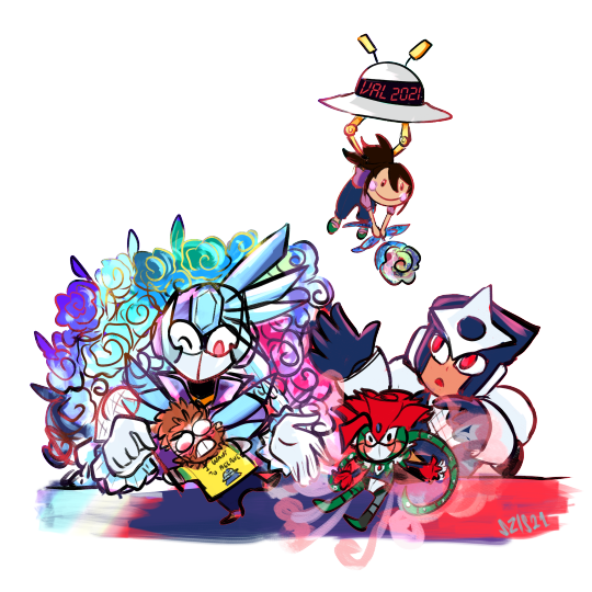
Among the many things this past year or so has tested us with is delays, and I apologize that this year’s Valentine’s Day contest results are included in that. I certainly did not plan on this taking until March to get completed, and I am sincerely sorry to have kept you all waiting. But hopefully it is all worth the wait!!
Thanks once again to every single one of you who participated! I will be contacting the winners soon enough. Work will probably keep me from replying to everyone immediately, but I will send a message about prizes hopefully within 24 hours.
Also, my thanks to @subzeroiceskater for helping out with judging this year. Not to mention the promo pic above and other assorted bonuses that always bring me a big smile. I might say this seemingly every year, but you all made judging this VERY hard. It might have something to do with the themes as well, but I think both of us flipped and rearranged our rankings repeatedly, and even then, it was hard to decide on who would place. XD Each one of you did an amazing job!
After the break, you’ll see the winners for both categories, along with all of the entries. Raffle prize winners will be noted below by their alias, as well.
Category 1: Kiss From a Rosered (Talent)
For our talent category this year, the theme focused on your favorite Megaman characters giving roses to their special someone, along with incorporating the symbolism of specific rose colors within the piece. That rose color was also to be the predominant color within the piece, to the best of your ability.
A grand total of 9 entries were submitted for this category. You can see the full gallery of all entries at full-size [HERE]. Each entrant’s name will also link to their individual pieces at full-size.
1.) Sapphire: *$100 prize*
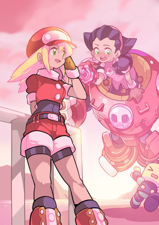
Subzeroiceskater said:
Oooooh, this is so cute and pink! Piiink~ Ehem. I love the depth, angle, and color grading of these—notice how Roll’s black linework is at the forefront of the pic but colors mixes with the lights and colors from the sun further along the pic. There’s a lot to admire about how everything easy to read with so many competing elements like the similar hues and bright lighting.
Pink roses usually mean a gentler sort of love but did you know that different shades of pink could signify different things as well? A darker shade may mean gratitude; medium shade could be about a first love or congratulations while a light shade may mean admiration. Tron holding a singular pink rose with varying shades of pink while literally tripping over herself and a Servbot could only mean—that this is hilarious.
Miyabi said:
From a technical standpoint, I think your piece clearly felt the most polished, crisp and virtually professional of the bunch. But more than that, I felt it also best gave off the vibe of the rose color dominating the piece, but in very subtle, beautiful ways. Where as the pink sunset causes many of the normally white areas, like Roll’s collar/sleeves, parts of Gustaff, and more, to ooze that pink lighting. Even with her klutziness, you still also portrayed the feeling of sweetness, admiration and appreciation that a pink rose conveys. Just so pretty, calming, and joyful to look at!
2.) Forceway: *$75 prize*
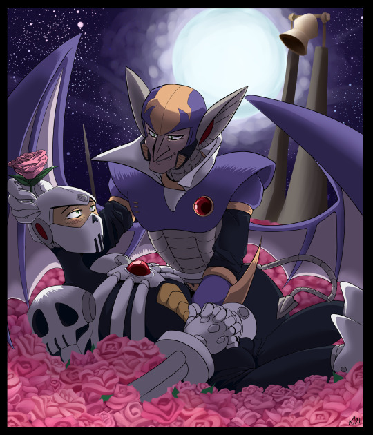
Subzeroiceskater said:
There is a sort of gentle irony with how Skull Man and Shade Man are both robots modeled after horror symbols—skulls and vampires—but are here surrounded by a soft sea of pink roses. The dark night is often depicted as a primal fear because it hides our deepest fears but here—illuminated by the bright shining moon—the night is transformed into a scene of love—perhaps devotion, with how Shade is gently cradling Skull, as well with the church bell in the background. This is a very tender piece mixing the shadows and the sweet.
Miyabi said:
I know most digital art programs have the brushes and shortcuts to make detailing things like roses a lot easier, but your bed of roses certainly look all done by hand on your own, and that alone impressed me a ton! Based off of the Ariga Megamix tale of Skull Man not feeling appreciated or having a family after Cossack stored him away, I felt the pink roses and Shade showing him that he is actually appreciated here was a fantastic conceptual choice. Purples in the sky and Shade’s body split the canvas and contrast with the pink well, including how you used the pink for some of the stars in the sky. Beautiful job!
3.) DigitallyFanged: *$50 prize*
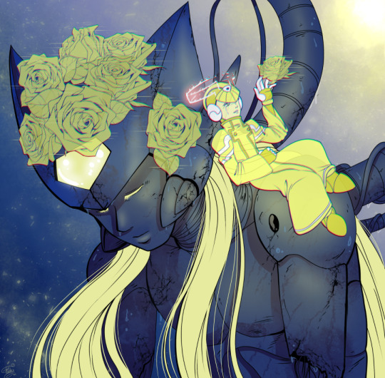
Subzeroiceskater said:
Yellow is a bright color, often evoking the sun, warmth, light, joy and hope. With roses, its positive connotations continue with possible meanings of friendship, care and remembrance. Tabby’s piece seems to evoke the last one the strongest—with Zero, broken and forgotten in a lab—but, not entirely, because of a bond that is stronger than apparent death lives on—even if in this moment, it’s only a memory. Even the roses are not real—just projections of what was once alive. This is fantastic use contrast with the dark, moody blues against the vivid, almost defiant yellows; and the repeated little motifs such as X crying and the water drops falling all over Zero. It stands out from the rest of happy entries with how sad it is but it still manages to be hopeful.
Miyabi said:
Zero’s blonde locks certainly are an iconic part of his design, so playing off of that and focusing on yellow as your rose color fit perfectly. You definitely made this a very emotive piece considering technically, neither of these two are even alive and moving here! As mentioned above, the little details like the water droplets balancing against Cyber Elf X’s tears, the digital lines to make it appear like X has created the cyber-roses for Zero, and Zero’s battle damage caught my eye immediately. You certainly captured the yellow rose symbolism of remembrance and friendly affection beautifully!!
And the rest of the wonderful entries, in alphabetical order by alias:
AbilityField: [Page 1] [Page 2] [Page 3] [Page 4]
*Raffle Prize Winner* Captain N Mega Man Cel


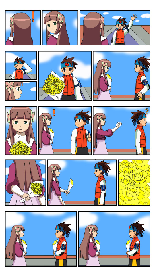

Subzeroiceskater said:
It’s so poetic about how this contest theme is about how the language of flowers is used to communicate feelings beyond just using words; and so, the comic is completely silent, relying on actions to convey its meaning. Yellow roses could mean friendship, care and affection; and it’s shown wonderfully with how Iris and Lan are so thoughtful with one another. It’s so cute how Iris missed Lan only because he was already out buying roses for her. Given how hard comics are to make and how this is fully colored, I really wanted to give this first place—however I felt the color usage of yellow could have been stronger, especially with the last page, where it would have had the most impact. I had to squint and zoom out to even see if the lighting had changed. Still, it’s such a very warm and lovely work.
Miyabi said:
I always appreciate the effort people put into making multiple-page comics for these contests, and this is no exception! Even without dialogue, you did a great job at conveying your story through your art in each panel and it was easily understandable. Another utilizing the yellow rose, I certainly felt the friendship and warmth in your tale. As Subzero mentioned, the only thing keeping it from placing was that the yellow colors weren’t as dominant in other areas of the pic, besides the panel by Sal. Still, your coloring was very crisp and vibrant throughout each page, and it was an awesome submission!
aw-colorcat:
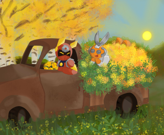
Subzeroiceskater said:
With the red for Metal Man, orange for Cut Man and the explosion of yellow flowers, that’s the trifecta of warm colors. Yellow roses could mean delight and this pic is delightful in all ways. Cut looks so cute practically swimming in the sea of flowers and greenery, as does Metal’s adorable expression—which is a feat since he only shows his eyes. I also really like the juxtaposition and balance of this piece from: the rust-brown car against green-yellow nature running wild, and Metal holding a bouquet meanwhile Cut’s covered with plants. It makes me want to get some fresh air myself!
Miyabi said:
Cut Man looks grateful for being able to ride in that pickup bed of flowers, and I have a feeling the two of them had a wonderful time just snipping and sawing away at all the stems to gather them all. XD Love how the yellow and oranges play off of both character’s color schemes nicely. The subtlety of the yellow flowers in the foreground, along with the sun and tree in the background all play off each other well, too! Just an absolutely cute pic!
Dark-Dullahan:
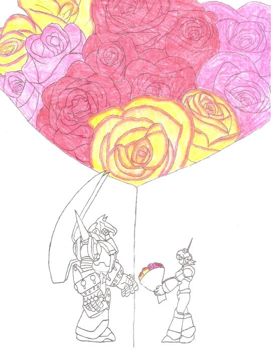
Subzeroiceskater said:
What a fantastic composition. Dark-Dullahan does away with most color, leaving the colors of the mixed-bouquet roses as the main focal point. Classic red for romance, a gentler pink for affection, mixed yellow roses to signify caring and probably so much more—seems like Nana can’t contain her feelings for Massimo. I love how the close up of the bouquet doesn’t just form a kind of heart at the top but serves as the divider between the two, like a diptych. With such a wonderful offering, Massimo would surely accept her feelings.
Miyabi said:
As you brought to my attention, your mixed bouquet had a few different meanings, such as the dark pink representing thanks to Massimo for saving Nana from Silver Horn, and the red tips on the yellow roses to symbolize falling in love. Certainly got those vibes from her shy demeanor, as she sheepishly tries to hand them to him. Also agree with Subzero that the line from the bouquet nicely works as a way to separate them uniquely with the background. Sorry you weren’t able to complete it as fully as you had hoped, but the concept behind it certainly was strong!
Donnie:
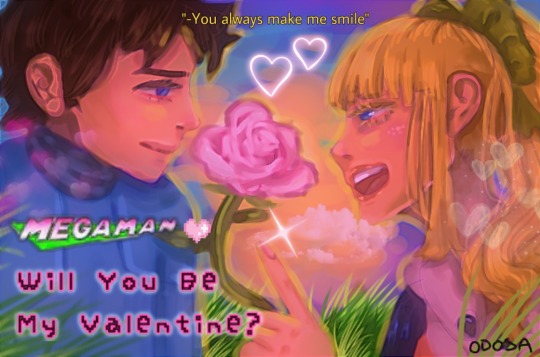
Donnie also sent in an alternate version made during the creative process, in a different artistic style, that I still feel needs to be shared, as well. Fun to see the contrast, yet still have the same feeling and mood to the piece.
Subzeroiceskater said:
Oh, I adore this one. It reminds me of a movie poster with the tagline. I love the extra PINK flourishes of the letterings like with the Mega Man logo color change and cute pixelated font and heart. Both Rock and Roll’s expressions are so cute, too—with his more subdued smile contrasted with her exuberant grin. Much like how the pink rose could mean many things like thoughtfulness, cheer or as a show of appreciation, this piece is positively sparkling with affection, hearts and all. It’s clever how the sunset is giving the picture an overall pinkish-red hue while having the yellow light as an outline. A darling piece.
Miyabi said:
With pink roses again, I truly liked the additional hue adjustments where you can feel the warmth and see the lighter pink mixed into their skintone, or areas normally of white - from eyes to teeth to the Megaman logo - that have taken on the pink in it’s place. With the painterly watercolor style you used, it all blends in nicely. Even in your earlier version, I feel you brought a strong game with the hues, but toned down the red from that version to make it feel much stronger towards pink, with a tighter crop of your canvas. It was fun to see how it evolved, and strengthened your piece in doing so! Fabulous job!
DragonMarquise:

Subzeroiceskater said:
No better way to show how madly in love you are than a bouquet of roses that run the gamut of—I can’t call these warm colors because these passions are running hot. Orange seems to be the dominant color here—which in roses could symbolize a love that’s passionate, fierce and deep. It’s also expressed nicely with the two lovers embracing, engaged in mid kiss, their bodies also forming a subtle heart shape, to emphasize the flurry of hearts around them. The bouquet is not just orange roses, however, but a mixed bouquet of the classic romantic red and the more affectionate pink—it’s a piece that’s bursting with all degrees of love.
Miyabi said:
You also certainly mastered the limited color pallette challenge as you tackled this piece! Orange, the color of passion, is certainly felt in their deep kiss and embrace. I too caught the heart shape their heads essentially form, which is then further enforced with the heart of hearts behind them. I thought that concept was pulled off very well. Perfect for the fiery intensity of Match, this turned out to be a very hot pic!
Mattasaurs:
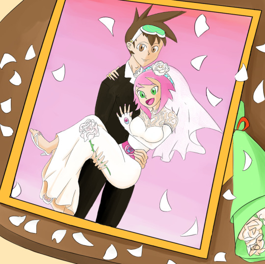
Subzeroiceskater said:
This one has a very clever framing (eh? EH?). The color white is often associated with purity, innocence and hope, and with white roses—weddings and marriage. Sonia dons the classic white wedding dress which has a très élégante design—and the little Lyra on her belt is very cute. The pink background is also very romantic and a nice way to tie in with her theme colors. I dig the lovey-dovey feel of Geo doing the classic bridal carry while clasping a single white rose...but seeing the thorns, I think he better watch his hand!
Miyabi said:
For a theme emphasizing color within the pic, I salute you for taking the biggest challenge in choosing white. In many ways, it could have been the hardest to keep as a predominant color, but still make the pic interesting and visually appealing. Choosing to have the petals all around the frame, with the bouquet nearby was a clever touch. With white often used for weddings and new beginnings, I think the concept of your piece worked just right, where it was subtle, but still incorporated enough other color to give the piece some life.
Category 2: Kawaii-rimi (Humor)
For our humor category this year, the theme focused on your favorite Megaman character gifting the plush form of another Megaman character to their crush, instantly created by a ninja-like character, to play off of the Kawarimi concept from the EXE series.
With just 3 entries in our humor category this time around, every entrant placed. You can see the full gallery of all entries at full-size [HERE]. Each entrant’s name will also link to their individual pieces at full-size.
1.) Mattasaurs: *$100 prize*
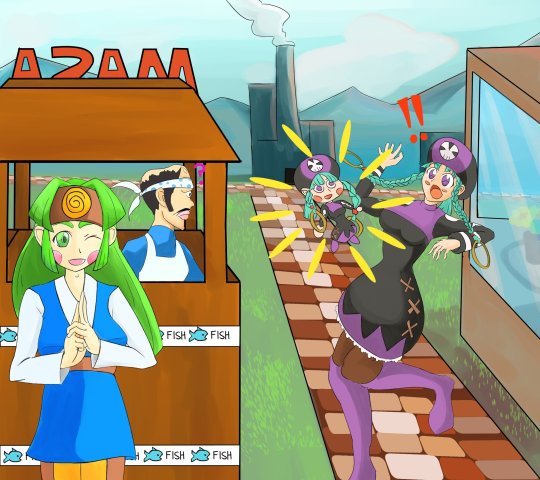
Subzeroiceskater said:
Y’know how blocks of wood are sometimes used by ninjas when they do that whole body switching thing? I think it’s clever how this pic has Sal—Woodman.exe’s operator—conjuring the doll. Everything about the pic is so fun and colorful: from Sal’s mischievous grin of accomplishment, Miyu being completely shocked by her chibi doppelganger (check out that body language!) and Masa’s confused expression.
Miyabi said:
Yes, while to some, Sal might not be the first one they think of when they think ninja in the Megaman Universe, but I certainly thought she still fits the bill in her design. Usually we don’t see this much emotion or shock out of Miyu, so seeing her torque her body, taken aback at a doll of herself, is amusing in it’s own right. Meanwhile, nothing fazes Masa. And a bit of randomness: oh man, seeing Masa’s head in profile, with his bandana...wow, I never realized how much his head shape with the bandana looks like a fish’s. I can’t unsee it now. Anyways, I also agree that the color, polish, and fun vibe made this a worthy winner!
2.) ColeManX: *$75 prize*
*Raffle Prize Winner* Captain N Cutsman Cel
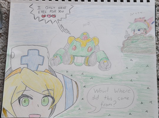
Subzeroiceskater said:
E-Eyes? What did you mean by that, Mr. RT-55J? Although judging from the sparkle on those booblights… I understand, Cinnamon—if that happened to me, I’d be making asides to the camera, like I was in “The Office”, too. Cinnamon’s enthusiastic smile with this whole bizarre scene really sells it for me but shoutout to Marino’s smug satisfaction in the background.
Miyabi said:
🎵 I kind of liked it your way How you shyly placed your eyes on me Did you ever know That I had mine on you?🎵
RT says it only has eyes for Cinny right now, but it’s also known to be a little grabby hands, so I don’t know if I’d fully trust it...but good thing this is just a plush version. Time for the tables to be turned, and Cinnamon to get her claws and paws on it, instead. Very cute, although after the DiVE V-Day event, we all know this is a ruse and your pal boobeyes only belongs to the Ferham Fanclub. XD
3.) Ronin-Apprentice: *$50 prize*

Subzeroiceskater said:
This whole comic is so sweet and fluffy, nya! ~(=^‥^)ノ☆ It’s adorable how Proto brings up his gift first and the surprise is how Shadow handmade his gift. The little cat-eared Blues design is so darling--almost as cute as him fussing how totally NOT a cat he is. “Did you steal my cat.” had me snorting. Now I’m wondering where Tango went off to…
Miyabi said:
FU-SION-HA!
Aside from getting his own Super Adaptor, this is probably the closest we’ve got to seeing Tango and Blues merged as one. LOL I’m sure that plush would have a ton of fans wishing it actually existed. The panels where Blues embarrassingly hides behind his scarf and gets pet like a cat had me laughing! Very cute and adorable comic, that certainly had the most depth in terms of the theme of this category!
32 notes
·
View notes
Note
Physical affection prompts! 21! 25!
Prompt: accidentally knocking your head into someone’s chin + playfully biting someone
Established relationship. Beth and Rio try couples yoga. An injury ensues.
Side note: This is the first time I’ve ever attempted writing from Rio’s POV. Augauahgah!!! I feel like all the straight Mexi-boys I know are mad sappy about the ladies in their lives so… this is Big!Soft. Don’t hate.
On Ao3
A Bit of a Stretch
It goes like this.
Three months ago, a yoga mat shows up in the car. It’s purple (her favorite color), and Elizabeth probably thought it inconspicuous, neatly rolled up and tucked away in the back. But Rio’s only gotten to where he is in life because he’s got a meticulous handle on the details. So he notices, and it makes him pause -- the reminder of who he is these days.
And he likes to think he’s a smart guy, evolved and shit. But, he’s got to admit he likes the thought of it -- his girl, Aphrodite trapped in suburbia (or was it Athena?), rolling up in the Wagon to some bougie yoga studio. Elizabeth would swing ‘round the back to grab her mat, doing that walk she does when she’s feeling herself as the other PTA chicks’ jaws drop. He likes the security of his second pair of keys in her hands, on her keychain.
What did it say about Elizabeth’s hold on him that he fuckin’ delights in this daydreaming?
And it’s complicated -- ‘cause on one hand, when did he become this guy? Actually, he knows. Three years, eight months, and two days ago. He’s not overly-obsessed with his relationship or anything, but a counter runs in his mind -- how long he’s been with her. So much so that he’s been thinking of getting the date of when she robbed him (the first time) on the inside of his wrist, a complement to the bracelets she’d bestowed him, to drag out as A Move during sex or to embarrass her in front of her friends.
And on the other hand, it’s like... damn, it’s been too long since they fucked in the car.
They cohabitate now -- them and all their kids. They still had an absurd amount of sex in public places (and shit, since when had that been his kink?). He still takes great delight in pushing all her buttons and getting her to unspool around his cock, on his mouth, and in his arms.
But, they were a lil’ calmer now, less feral. They had partially domesticated what this was and had fun in doing so. They shared a bed now, were crate-trained as it were.
She and hers are his family.
But, fuck, he’d been a strict no-strings-attached, hit-it-and-quit-it type of dude for years -- all of his adult life. It was what came with his job.
He had tried to do his best by Rhea when he had gotten her knocked up. But, looking back on it, the exercise had been doomed. When Marcus was born, Rio was in his late 20s rocketing to the top of the food chain. It had been a time when all he could do was keep his head down and do the work -- running in the streets, scheming, consolidating power, and ultimately, he had to make a choice.
Was he going to be a boss, a father, or a husband? To be honest, he only had time for one, but he did his best to make fatherhood fit.
It’s what it was all for in the end, right?
And yet, somehow despite all and many odds, here he was toting Elizabeth’s yoga mat around in his car. Mick rolls his eyes when he sees it, and there’s the typical jokes about being pussy-whipped and what not. But, yeah -- he loves her. At this point, he can’t really deny it. So, he laughs along with Mick’s jokes, and then sends him to chauffeur their million kids around, just to make sure he knows what's what.
Anyway, after a few weeks, Rio comes home from the gym and finds her practicing alone in the house, the kids scattered to their other respective households. Elizabeth’s got a video going on her phone, and her back is arched in a way he’s only ever seen in bed and she has to realize is provocative. But, she eyes him, self-conscious and with old defensiveness, as she twists into a few shapes.
He tries to keep it chill, knows about the residual feelings she carries about her body (and Christ, he can’t believe he’s only had the opportunity to shoot her ex-husband once, he should have taken his own advice and emptied the fucking clip). So he settles close to her with his battered copy of Edith Hamilton’s Mythology from highschool that he’s been trying to get back into, and steals glances at her over the pages.
He skims the pages on Athena and then Aphrodite, and he likes the hyperbole of each but neither quite fit.
He eventually comes back to Artemis.
And, yeah, maybe.
He looks up at Elizabeth again and admires her form. He admires her strength -- that reedy cord of tenacity he’s admired for so long making itself more visible through the facade of soft as she finds new ways to hold herself up and get herself stronger. Her hair keeps falling into her face and he itches to crawl on the mat with her and pull it out of her face.
She’s fucking gorgeous.
As she continues, Elizabeth notices him watching, and she starts to get a little playful. Eventually, he lures her off the mat and onto his lap.
Yoga becomes part of her routine on the days she doesn’t feel like driving into the studio. And he gets it. He’s always turned to grounding himself in his body when he’s needed to work through things. His first love had been basketball, soccer while on family vacations (and only with his cousins from Tamaulipas). In high school, it was track, and he still loves running, but with Detroit winters he’s mostly moved on to boxing and tennis. Never yoga, though.
And yeah, he has some reservations, and yeah, it makes him feel their differences. He’s a tad judgemental about the white-owned yoga studios gentrifying the fuck out of his city. Blocks he grew up running in Detroit-propper suddenly got white people eyein’ up his tats and clutching their wallets. And shit, when has yoga ever been for guys like him?
But, life increasingly becomes more complicated.
He can still like that E’s found something that’s for her and he likes the peace it brings her. He appreciates the way it unknots her shoulders, the particular vibe it gives their day afterward when she’s able to let go of some of that stress she carries. He tries to complement it by eating her out and that special type of really good sex that comes from whatever alchemy is between their bodies. And yeah, he likes the headspace it gets her in, how it shifts the way she approaches their work, and the new depth it adds to the way they touch each other when sex isn’t her only form of therapy.
So when she gets a water bottle with the yoga studio’s branding, Rio teases her a bit but he encourages her to go for the membership. Naturally, E being E, it don’t take her long to make nice with the owners. And then Elizabeth comes home excited about how she had just committed to doing a run of the studio’s promotional swag at the store. He and Elizabeth end up with a postcard on their fridge, a color photo of the studio’s abstract mural. The other side has text that advertises an event line up at the studio that includes a fucking “gong-bath”. It takes him a week to let it go.
Actually, he hasn’t. He still brings it up.
But, then a second yoga mat appears -- a green one -- tucked away in the spare bedroom, mostly hidden under some of her crafting materials. He finds it, wonders for a split second why she needs two and has an answering inkling of where this might be going.
The next day, a lil’ custom print for a “partners” yoga event gets pinned next to the first postcard on the fridge.
And like... he loves her and all. But, does it really go that deep?
Rio pauses in front of the fridge, sipping his tea and staring at the picture of a white dude balancing presumably his Black girlfriend in a pose above his head. His eyes track to where Elizabeth sits in the other room knitting and watching the latest episode of her British baking show (he has half the mind to submit her name to the American spin-off). Considering what she’s up to, she sits with her back a lil’ too straight (on edge one might say) clearly waiting for a comment or for him to show her some grace.
And…
Nope. He’s not going to make it that easy for her.
To her credit, after her episode is done, Elizabeth FaceTimes Ruby and asks her first. Then, as if to make a point that she’s rounding out her bases, she calls her sister. And it’s true that Marks’ sisters’ relationship is as close as it's ever been -- their family criming has forced Elizabeth to trust her sister with her life. But, damn, if he knows she don’t trust Annie to do anything remotely acrobatic, much less cartwheel Elizabeth into the air.
He settles at the island in their kitchen with his tea and his work. She’s got the call on speaker in the other room, when Annie asks, “And gang boo?”
“What about him?”
Rio scoffs loud enough to be heard in the other room.
“Why doesn’t he go with you?”
E pauses, probably fiddling with the strand of her knitting yarn on the couch behind him. “It just doesn’t really seem like his thing?”
Annie snorts. “Have you asked him?”
“No,” Elizabeth sighs into the phone, as if she isn’t a few paces away, having a very audible conversation.
“Don’t people usually go with their SO’s to these things? I mean I appreciate that you think I have the upper body strength for this, but you have to know that I will never in my life be able to do a push-up.”
“It was just a thought--”
Annie continues, stuck mid-rant, “And, like there’s no way I can be your counterweight. You have so much more body than me. We’re like completely different proportions. ”
“Well, so are me and Christopher.”
“Yeah, but Christopher actually has body strength. Lots of it. “ Annie retorts. “And he’s going to love you sweaty, and sticking your butt up into the air, bendy and wearing tight clothing--”
He bites at his bottom lip and supposes yeah, he could try it once.
“Okay, fine! I’ll ask him.”
Rio waits for her to come to him as he tries to make headway on his accounting. But, E doesn’t show.
Instead, it comes later -- when they’re in bed. She’s being extra-nice, extra-smiley, and charming, cracking jokes and making him laugh. He hates it except he also loves it -- when she thinks she can get the drop on him like her dumb ass ex-husband. Except, unfortunately for Rio, she really does know her target.
She waits until right after she blows him to ask.
Elizabeth crawls up his spent, panting body, and pins him with hers. She kisses him hotly with her mouth that tastes like his come and he fucking loves when she does that. Then, she retreats to bite playfully at his chin and asks if he’s seen the flyer on the refrigerator.
And he gives her a little shit about it but…
He admires the strategy
------
The couple's yoga class is on a Saturday morning.
It’s the middle of March, and he’s fucking over winter. Detroit, so far from Mexico and so close to being the fucking North Pole.
The temperature means he’s got to get bundled up in sweats, put on his damn parka and snow boots, all to take it back off again when he gets there. Apparently, the studio is heated perennially at 90 degrees. He don’t know how Elizabeth handles it, she’s so bothered by heat. He complains to her, and she reminds him that this is just like when he goes to the gym on his own. Except this time, they’re doing something together. And she’s being all shy in a way she usually isn’t any more around him and she’s fuckin’ happy he’s coming with her.
The night before she had presented the green mat to him. He had said “Thank you” como su mamá lo enseño, and committed to stepping outside of his comfort zone.
“Show me how this goes, darlin’?”
Elizabeth had swelled up with the thrill of explaining something to him, and launched into it, “Yoga’s basis is breathing…”
She had given him the low-down and gotten him started in the basic poses. He liked her hands, soft, and prim and careful, pushing and pulling at him and adjusting his posture. He had ended up fucking her on the mat -- as a proper thank you and to give her a little something to think about in class tomorrow as they contort their bodies in a way she’s adamant is not meant to be sexual.
And he’s not trying to be a dick or ruin the day for her, but he’s dragging his feet a little bit. He don’t really want to be spending his morning off, kid-less, in a room focusing on his breathing surrounded by crunchy, white gentrifiers.
And he might be simmering a choice comment about how it’s ironic that she wants him to focus on his breathing after she was the one who fucking shot him in the lung that one time...
But, he knows she’s not thinking of it like that and he knows if he just told it to her she’d get it. But, he don’t want to make it all about him and the struggle... and he’s rich now ain’t he? And Elizabeth’s excited to have him with her while she does her thing, excited to show him off -- and that gives him enough energy to walk through the door, green mat under one arm, and her hand in his.
Immediately, they’re ensconced in a wave of warmth as they step into the heated studio, and there’s an earthy smell hitting him strong. He zeroes in on the incense lit at the check-in counter and Rio’s nose wrinkles in distaste on its own accord.
Elizabeth squeezes her hand, in a silent reprimand. Behave. Then, she moves around the counter to hug some of the people hanging out back there.
There’s a flurry of introductions, a Bridgid, a Cassandra, Bryce, Patsy, and Tiffany. Tiffany is Black and he thinks Cassandra could be Latina… He ain’t sure. They’re all revealed to be instructors or staff of some kind and E seems to be chummy with all of them. He knows Tiffany is her favorite and will move heaven and hell (and their fucking drop schedule) to make it to class with her.
He isn’t sure exactly why so many of them are but apparently, they like to hang out here? His palms itch and he feels the sweat start to drip under his thick jacket.
E starts to pull off her winter clothes, as she lingers in conversation with Tiffany, asking her about her husband and how Tiffany’s weight training is going. He blinks at his girl and the shit she can pull out of her repertoire.
“I’m so glad you get to finally meet Christopher.”
Tiffany turns to smile wide at him. “Beth has made so much progress in the past few months.”
“It’s nice to meet you,” and she’s got a friendly vibe so he tries to dial up the charm. Smiling, and playing the proper beau, “She talks about y’all all the time.”
Behind them, he clocks that instructor, Brad or Bryce, checking out Elizabeth’s ass when she ain’t looking. And sure he’s about Rio’s height and got some definition on his abs, but his jaw’s too square like it’s never taken a hit, his muscles never used in a fight.
Rio snags the eyes of some chicks looking at him a little too eager. Damn, it’s Saturday morning and these people need to chill.
And he rolls his eyes, tsking, then steps closer and loops a hand around Elizabeth’s waist, drops it down to her ass for a moment. He makes a show of leaving a kiss against her temple and then he bounds towards the cubbies, ready to shed some clothes. His jacket is about to kill him.
As he peels off of the layers, he looks around, and okay -- it’s not as white as he worried it was. There’s other POC settling in for the class, at least one other interracial couple, too. And that Cassandra chick’s sweatshirt says “Chingona AF’ on the back. She’s the same shade of light brown as him, a mid-30s willowy mujer with a queer buzzcut.
He loosens up a bit and settles into the space. This heated shit is nice.
A few moments later, Elizabeth joins him and after they’re done tucking their stuff away, she draws him over to her favorite corner. They roll out their mats -- purple and green -- side-by-side.
They settle on their respective mats and Rio takes the opportunity to give Elizabeth the same once over that asshole did. Her ass really does look great in those pants and she could fill out any shirt. Her eyes linger over him too, tracing his skin, the bar tattoos peeking out from under his t-shirt that she’s seen a million times and then her eyes meet his and she gives him that small, crooked lil’ smile.
He’s not one for religion, but every so often he takes his mom to Spanish mass. All the viejitos and pious Catholic types think he’s a banger but his ma’s still excited to show him off. He sits with her in the pew and when the priest asks for the congregation to give thanks to God, he says a prayer for the riches that have come to him, the health and brilliance of his son, the vitality of the other little ones in his life now, and Elizabeth. And when he thinks of her in those moments, he sees her in his mind’s eye with this exact look on her face.
And to top it all off, the 90-degree heat is already working some kind of magic on the knot he’s been trying to get out of his shoulder for the past two weeks.
He smiles back at her.
“This shit is dope.”
“Yeah?”
He shrugs, playful. “I like the heat.”
She scoffs, still smiling, “Of course, you do. I thought I was going to pass out the first time I came.” He laughs and tallies a point. He called it. E shakes her head, “I had never sweat so much in my life.”
And it goes like that.
Right as class starts, a white guy with dreads and his skinny, blond girlfriend settle in the space next to them. The white dude turns to nod in acknowledgment, but his eyes drop down to take the ink at Rio’s throat. He tries to be subtle about it but he and the girl scoot a few inches away.
And he ain’t even seen all the old bullet wounds yet.
Rio turns to look at Beth. She’s also staring at the couple, her mouth settled in a thin line.
Then she meets his gaze.
One of the instructors starts calling the group in, welcoming them to class, and Elizabeth takes the last opportunity to gently careen into his side, and kiss him deeply.
Then she's back on her mat, listening attentively to the instructor like she didn’t just start some shit.
And yeah-- he and Elizabeth are different. They move through space differently, and she has access to things he never will no matter all the gems, rubies and diamonds, Mercedes and stacks he adds to his hoard of wealth, And Rio has wondered, worried, if there will ever be a day when they look at each other and decide they don’t fit anymore.
But, damn if she don’t make him feel alive like nothing else.
So as the instructor has them sit back-to-back and leads them through an opening meditation. It’s corny as shit and formal meditation is not really his thing, always having relied on sports (and fights and hits) as a substitute in the past.
But, he tries to settle here, in this room warm like a blanket, next to Elizabeth.
The class itself is pretty fun. The instructors are hands-on, demonstrating, and walking them through everything. It’s easy enough to pick up with them (and Elizabeth) giving him adjustments, and he likes the excuse to get his hands on her in a different kind of way.
He helps Elizabeth through some inversions, smirking down at her with this particular view of her cleavage. She gets a few, sneaky passes at him, and he don’t know who she thinks she’s fooling surrounded by a room of people, and a whole team of instructors circling them.
In one particularly nice sequence, Rio curls down into the mat in the child’s pose, Elizabeth had shown him as she stretches on top of him, her whole weight settling along him like a cocoon.
Damn, he’s going to make them take another class like this ain’t he?
The class eventually shifts into what the teachers call aerials.
He lays on his back and lofting E up into the air over him. It takes a little finagling to fully adjust to the distribution of her weight, she’s obviously top-heavy. He stares up at her -- her gorgeous, sweaty face smiling down at him -- and looks over the particular arc of her cleavage. And despite how much time he spends palming at Elizabeth’s tits, he underestimates how much they must hurt her back.
No wonder she needs this shit.
‘Course that’s when Bryce or Blake comes over to “check on their form” and is this guy really going to try to check out his girl’s ass again? Right, the fuck now?
Blake/Bryce pushes at Elizabeth’s shoulders trying to adjust her position and she maintains very apologetic eye contact with Rio. Huh. So, she’s aware.
Then, It all happens real fast. Her balance shifts and her hand, sweaty with the heat, slips across his palm and out of his grasp.
The realization hits him-- She’s gonna fall.
And for a brief, terrible moment, her face freezes above him skewed with panic and fear, and then, as if in slow motion, she floats closer, down to earth.
And he knows better. He fucking knows better from all his fucking years of boxing, the previously-mentioned lifetime of playing sports. But he clenches his damn, fucking jaw just as the crown of her head collides with him.
And there’s a sharp, bolt of pain spearing through his chin.
And in this room, this heated blanket, incense-burning, crunchy, granola room…
He’s knocked the fuck out.
-----
Well, then it’s a fucking show.
In the familiarity of Elizabeth walking into the studio, they hadn’t asked him to sign a liability waiver. Someone procures ice, and he cradles it to his chin as Bryce apologizes and asks if he can call an ambulance.
For a concussion.
And he’s pissed the fuck off but it’s still kind of funny? Because the only thing that had ever put him in a hospital had actually been this girl standing next to him (tal pesadilla when she put three slugs in his chest). But, he has to stop laughin’ because it hurts his jaw and they’re all looking at him like he’s nuts.
Elizabeth grips his free hand like a vice, and he’s nursing a hell of a headache, as he has to swear a million times that he ain’t gonna sue anyone. Then, finally, blessedly, they’re allowed to walk out.
Elizabeth insists on helping him into the car. Tiffany and Cassandra accompany them, helping Elizabeth carry all of their shit.
They stand at the curb watching, concern etched on their faces as Elizabeth reverses out of the snowbank and drives off. And Elizabeth drives because he most definitely has a concussion. And she drives them straight to the fucking ER.
They spend half an hour fighting parked in the lot outside. But, he knows concussions and he knows his limits.
He convinces her to take him home.
-----
The first twenty-four hours of the concussion are the most important. He’s not supposed to look at screens, not supposed to work. He knows his shit but Elizabeth reads at least ten internet articles on her phone as she lies in bed curled next to him.
They spend the childless afternoon with the curtains drawn, lying in their bed, not fucking.
But, the cuddling is good, too.
Elizabeth strokes up and down his arm and talks to him about little nothings to keep him company. She periodically gets up to grab him glasses of water and more ice. And this sucks, but all things considered, this might be the nicest concussion he’s ever had.
Eventually, they wander to the kitchen to figure out food.
Elizabeth pauses staring vacantly at the fridge. Then her shoulders start to shake, and now he’s wondering if she’s okay. But, her hand raises to unpin the flyer from the fridge and he hears the first snicker.
She turns to him, laughter breaking across her face, pointing to that ridiculous picture. He knows enough now to recognize Tiffany lofted in that showy, stupid af aerial pose.
He chuckles and then cringes as the pain at his chin flairs.
Elizabeth pouts but is still laughing to herself. She ambles over to him, wraps her arms loosely around his middle, and lays the softest kiss on his chin.
“I’m sorry, Christopher.”
He shakes his head, just a smidge because movement fucking sucks right now. “It ain’t your fault.”
“It was my idea.”
“It’s okay.”
She curls into him, deflating, crumbling the flyer into her fist. He gingerly rests his head on top of hers.
“I liked it.” He admits.
“You did?”
“Yeah.” The smell of her lavender-shampoo drifts into his orbit. “Liked you curled all around me. Liked touching you like that. Gave me some ideas.”
She nods below him, pulling him tighter. “I liked it, too.”
“You’ve gotten so strong now, Elizabeth.” He kisses her at her temple. “Maybe next time you should do all the lifting.”
She pinches him at the ribs. Then, “Next time?”
“I’ll tell you what.” He shifts back to make eye contact with her. “We get to do a whole lot of private practice.” He gives her a look to make it clear exactly what he means -- sex. “Then, we’re gonna go back and make sure Bryce is really sorry, ‘kay? Make sure he knows I’m still around.”
And Elizabeth beams that crooked little smile at him.
“Okay, but the next time you have to give me your hoodie or something.”
He nods, a smidge but still manages to imbue it with sage, territorial wisdom. “That would help.”
“Well, I meant more for me to...” She looks at him, eyes darting. “Claim you.”
I mean he is living for that but he frowns at her. “But, everyone there was a couple.”
Oh. Oh yes. Now he remembers.
“That doesn’t mean anything.” Elizabeth rolls her eyes. “And I don’t share.”
Her hand drifts low on his back, then lower to curl a firm grip on his ass in the privacy of this home that they share.
Unfortunately, despite all this time, Elizabeth still doesn’t know when to quit when she’s ahead.
“Though, honestly, I don’t know why they kept staring at your butt.” She murmurs, sassing him while he’s down. “There’s nothing here.”
Esta pinche mujer. She’s lucky he loves her.
Fuckin’ adores her, really.
Damn.
#my writing#i have got to stop listening to the weeknd#i blame a choice few in the fandom#beth x rio#brio#nbc good girls#ahhhhhhhhh#please don't hate my soft!Rio
45 notes
·
View notes
Photo


So I finally finished the Friends design set for my Soul Eater Kemono Friends AU. (for those who don't know: Friends in Kemono Friends are animal girls* created when an animal, living or dead, comes in contact with a volcanic substance known as Sandstar, and if eaten by a Cellian/Cerulean, they revert back to being an animal and their lives are "reset" to the point just before they became a Friend, losing all memories of that time. *Crona is still nonbinary in this AU since you know, they're capable of forming/voicing their own identity regardless of assigned labels
If this gets popular, I'll make a set 2 with more characters
Art by TheApatheticKat. Please do not repost or remove/edit caption
Before I list why I chose what species everyone was based on, here's the answer to a question I might get: "where's Blair/Kim/Jackie?" (There's already canon Friends for the domestic cat and the tanuki/raccoon dog, and it wouldn't be right to include Jackie wthout Kim. Actually, you know what, they're researchers and not Friends in this AU. Don't know where Blair goes yet)
Why I chose which species for which character: (note: I only chose species that didn't have canon Kemono Friends characters as of July 2020)
Maka - Domestic Rabbit: Partially because of that one manga panel where Crona hallucinated Maka with a rabbit's face, partially because from rabbit owners I follow, a Maka-like nature is way more common than you'd think. Though I was surprised there was no canon Friend for the domestic rabbit.
Crona - Fancy Rat (Lilac color): So I actually went through more species ideas for Crona's design than any other character. Mostly thinking about animals that were pink or purple in nature so I didn't have to mess with their hair too much, but those colors don't appear often (and unfortunately not in feline species at all). I had considered the Roseate Spoonbill, Galah, Web-footed gecko, Pine Grosbeak, Rusty-spotted cat, Kodkod, Black-footed cat, and the European Wildcat, but I ended up going with the fancy/domestic rat, specifically the lilac color variation. (it's actually warm gray and not truly lilac purple, but...) Because 1) I like rats, they are very cute like Crona; and 2) snake and rat symbolism with Medusa and Crona even though I have no idea how the heck I'd work that dynamic into a Kemono Friends AU considering the fluffy, G-rated nature of that series.
Tsubaki - Kerama Deer: The Will of Nakatsukasa represented itself as a deer. I could have made her based on that, but as The Will of Nakatsukasa is original to Soul Eater's lore and is not a creature from real-world mythology like the canon mythical Friends, I went looking for an actual deer species native to Japan. The Sika deer was the only major one I could find, and it already had a canon Friend, but not all its subspecies did, so that's why I ended up choosing the subspecies known as the Kerama Deer.
Liz - Big Brown Bat: Since the Thompson sisters grew up in Brooklyn, I wanted to use two similar species that live at least somewhere in New York, as Friends of similar/related species in Kemono Friends regard each other as sisters (because aside from a few exceptions, there's only one Friend per species at any given time).
Patty - Little Brown Bat: I thought because of their common names that the big and little brown bats were related species. Turns out they're not even in the same genus, and I had already written the species names on the paper in pen so... oops. They're still sisters by KF logic anyway in this AU because I'm just gonna say so.
Medusa - Ursini Meadow Viper: She had to be a snake. Because her name was lifted from Greek mythology, I wanted to use a snake that lives in Greece, and because of her personality/canon actions, a venomous one was preferable. Luckily there was a snake out there that fit all that criteria. Also the symbolism with Medusa being a venomous snake while Crona being a rat... yeah.
Arachne - Black Widow: The vibes
Eruka - Australian Green Tree Frog: I was looking for a frog species that was a close match to what her frog form looks like in Soul Eater. The Australian Green Tree Frog is predominantly green, has the white underside, and some individuals have the dark facial spots, so it was a perfect fit! In trying to see what frog features are present on frog Friends, I scanned through the wiki to find the only frog Friends are the Keroro/Sgt.Frog crossover Friends, and they had no frog features on them, so I used Eruka's clothes to give her an extra bit of a frog motif.
Mizune - House Mouse: I don't think this one needs explanation
Azusa - Japanese Sparrowhawk: Azusa just has the vibe of a bird of prey to me, so I knew where to start. I also wanted to use a hawk or falcon that is not only Japanese but has enough black/otherwise dark areas that I wouldn't have to change her hair color that much.
Marie - Smooth Newt: Since her jast name (Mjolnir) derives from Norse mythology, I wanted to use an animal that lives in Scandinavia, specifically in/around Norway. And then I found out about the existence of the Smooth Newt. It has a range in Norway, has yellow and black in its color scheme like Marie does, and has an incredibly appealing name. Smooth Newt. (though I did want to use a sheep at one point, all the super fluffy ones were already taken)
Mira - Saharan Striped Polecat: This one was a bit trickier, as nothing really jumped out at me from the start, but because of her name and theming (Mira being close to Miira, the Japanese wourd for mummy, and her wearing bandages all over in combat), I wanted to choose a species that lived in or around Egypt (because that's the first country that comes to peoples minds when they think of mummies). The stripe pattern of the Saharan Striped Polecat also made it easy to incorporate her bandages and create a cohesive design that blended her original design in well.
#soul eater#kemono friends#maka albarn#crona gorgon#crona#tsubaki nakatsukasa#liz thompson#patty thompson#medusa gorgon#medusa soul eater#arachne gorgon#eruka frog#mizune#azusa yumi#marie mjolnir#mira nygus#mira naigus#my art
58 notes
·
View notes
Text
Why people aren’t liking Tim Drake’s soon to be costume
I see people curious as to why people aren’t enjoying Tim Drake’s new costume. The most simple way of explaining is just to say it’s just bad character design.
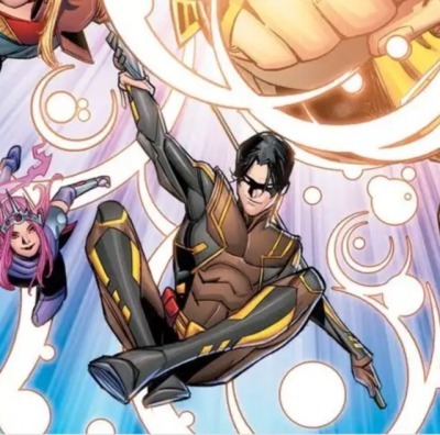
This is the costume people aren’t liking
Even ignoring the color scheme, because the color scheme can work for some characters. It’s worked for characters like Wolverine before. So it’s not that the color of the costume is brown, black (maybe gray), and yellow.
It’s just that it’s not a good character design for Tim.
--
A character design is supposed to let people know a lot about the character when you look at them.
With animated movies or shows it’s a little easier, you can make them look more menacing or sweeter just by the expression on their face, but with live action, and to a certain extent comics, costume design matters a lot.
Not to say how you draw the person doesn’t matter, it matters a heck of a lot, you draw the character in a way that doesn’t represent the character well and you’ve ruined the perception of them, but
costume design matters a heckuva lot too, because comics is a more realistically styled medium of art.
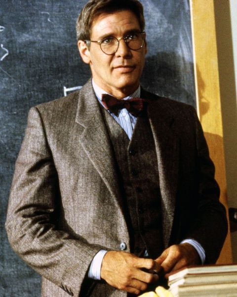
Indiana Jones as a teacher dresses in tweed and smart glasses because he’s highly intelligent.
Indiana Jones as an adventurer wears dusty practical clothes, and carries around a bag to keep his stuff in so it’s on him at all time, because he’s a (mostly) serious and practical adventurer.
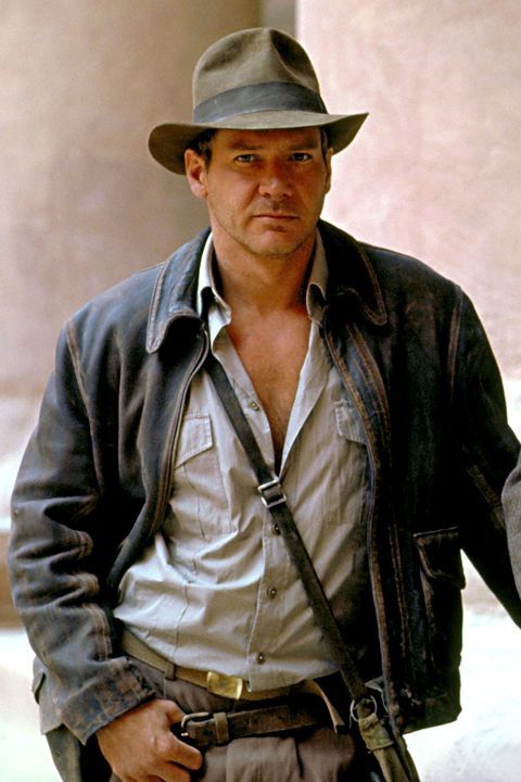
You get a really good idea of who Indiana Jones is just by looking at his costume.
It works the same way for superheroes in their costumes if they’re done well.
With Batman he’s dark, mysterious, and practical. The cowl doesn’t let you see too much of his face, his costume is typically colored to make it easy for him to blend into the shadows, and his cape allows himself to hide himself more. It fits the whole entire aura the character is suppose to give off.
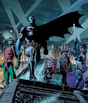
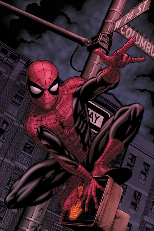
Spider-Man wears a thing full body suit, because he needs to hide his boyish face, and he needs to be able to hide it under his street clothes. It’s also has bright and bombastic colors that allow him to be seen at night because his personality is pretty loud himself. So it’s just very fitting in that way.
--
To use an example of this in the very same comic: Conner Kent has good character design, you feel like you know who he is when you look at him with a leather jacket with spikes, and an overall punk-ish look. You know he’s rebellious and not very shy about himself right away.
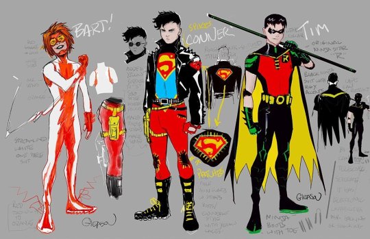
Even with Bart: it’s simplistic, easy to run in, and more or less just features a basic lightning bolt. He’s’s a simple thinker (which matches with the simple design), he’s fast so the tight look works, and he’s full of energy which also works well with the lightning bolt, it just works. It immediately gives you an idea of how Bart conducts himself.

Tim’s last costume even: Boyish with the short sleeves, slick, ninja-esque, with armor. He’s 16, dweeby and acts comparatively average so a boyish look really works for him. He has to be sneaky, he’s been trained to be like a ninja, and isn’t as strong as his other teammates. It had bright enough colors to let you know he wasn’t as shy or mysterious as Batman is, but it’s still dark in the right areas like his cape and tights to show that he’s at least still a little bit mysterious plus good at the sneaky stuff, and it also doubles as making his costume being more practical. It’s excellent character design through and through.
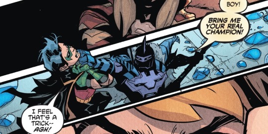
Amethysts costume is pretty much a BAMF princess. That’s her character.
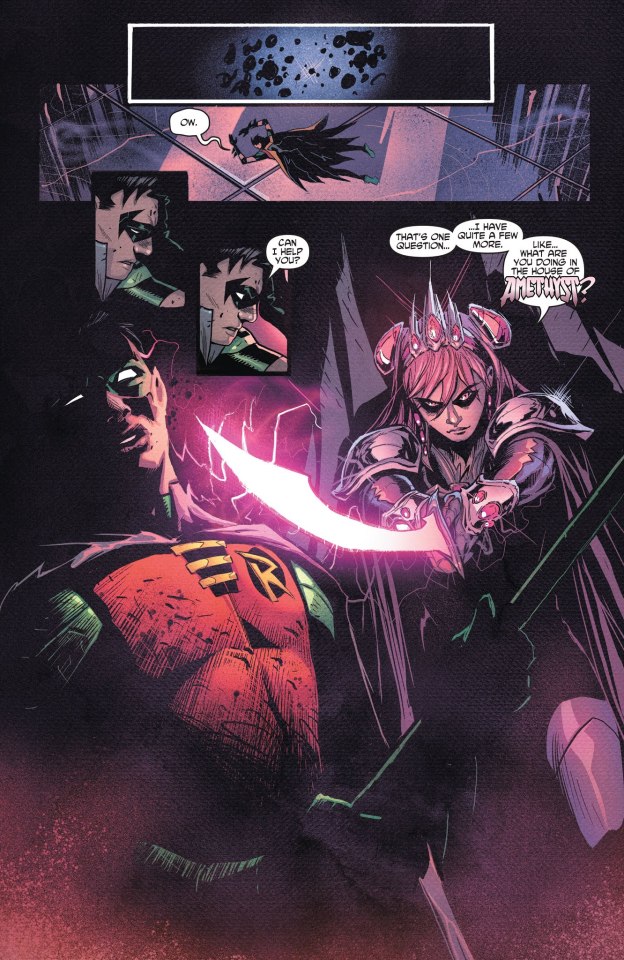
Cassie and Keli are casual, street clothes, with only a shirt that tells people who they are, because they’re pretty freaking casual generally laid-back people (except when you get on their nerves).

and well, Jinny’s a cowgirl, she dresses as a cowgirl.
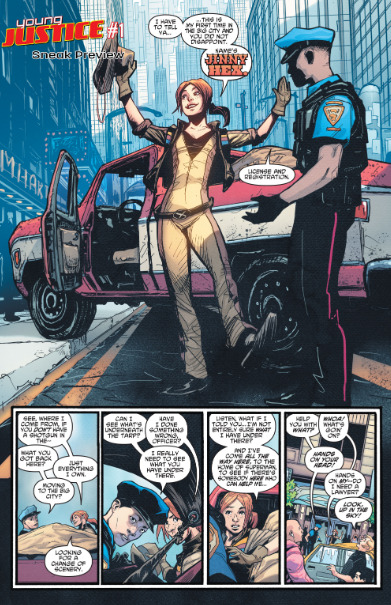
--
With good character design you just feel like you know about them from just one good look at them.
Red Robin was a good costume for Tim at the time of Red Robin even, he wasn’t acting like himself, so he didn’t dress like himself. It was sort of the whole point of the costume and especially the cowl. It worked well because of the story, but not so much the character all the time, as in, that costume wouldn’t work anymore.
Batman’s costume works all the time, because besides minor changes to fit the character at the time or what was the tastes at the time, the dark, mysterious vibe just always fit him. So that’s a different story.
--
Tim’s soon to be costume doesn’t have any character to it, I’ve seen people say it makes him look wiser, older, more dangerous, but that’s not his character right now.
He’s teasing more, he’s 16 still, and besides one page he hasn’t really been all that dangerous either.

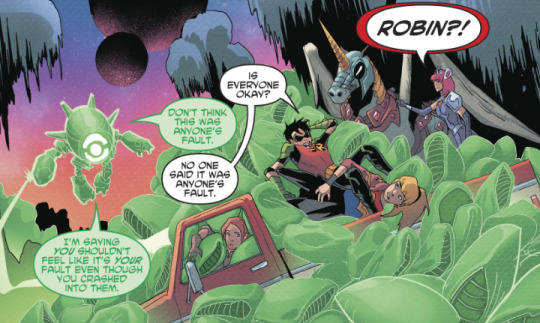
So as a character design it just doesn’t work for who he is at the moment.
--
When you look at Tim’s soon to be costume, it tells you nothing about him. His costume is going to be colored in a way that’s more considered old fashioned, rough, and been around since it’s brown.
Hence why it works for someone like Wolverine, who is all of those things.
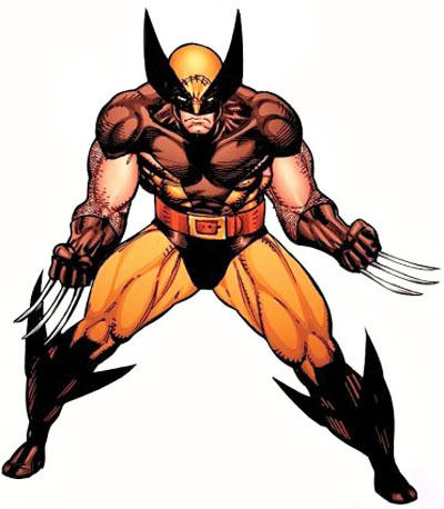
Brown can also mean loyal, safe, and dependable though.
Which does fit Tim quite a bit.
But there’s also the matter of his story now,
because the colors also mean, sad, isolated, and lonely at the same time.
Which is the complete opposite of the personal story he’s in. Which is warm and fuzzy.
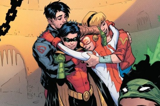
His story is finding his friends, getting his life back, and finally learning to be happy again.
The color brown doesn’t fit what his story or character is, and not enough traits of the color warrant it’s inclusion in his costume.
Making it a really poor choice.
--
Even when looking past the colors and you just look at the costume, there’s nothing to it. It’s a basic modern superhero costume.
It has more noticeable armor to restrict it from looking like the basic tights of a classic superhero costume, and there’s also random yellow lines all over it.
They don’t set up much of a vibe for his character.
It does nothing that a good costume design is suppose to do.
--
When you take away the colors of the other teammates costume it doesn’t change the basic details the design gives them. They work about the same if the comic was colored in nothing but black and whites (or at least for the most part if the style of the comic needed it, the colors are the finishing touches after all).
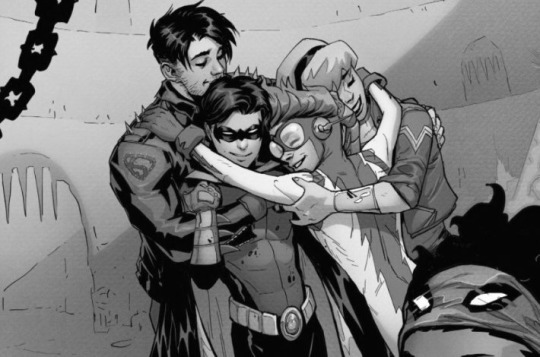
Conner still looks rebellious, Cassie looks casual, Jinny’s still a cowgirl, Amethyst’s a princess, Bart’s simple but hyper, and Keli is practical, while previous Tim was a boyish but slick ninja.
With Tim’s new costume you get nothing out of it one way or another, it’s bizarrely chosen color scheme is the only reason it sticks out to anyone, and the colors don’t work for the character at the moment.
It just has yellow lines. There’s nothing to the design that make it all that good to make it stick out as a character design. It feels like it has nothing to do with Tim, and what you could stretch to feel like Tim is typically because of the color and the color itself presents way more things that make it feel like a terrible Tim color.
So there’s nothing there that works for Tim as his costume. Which is why people really aren’t liking it.
--
The bases of good character design just aren’t there in Tim’s new costume.
It says nothing, and it’s color choices don’t fit the character it was made to be worn by.
Tan works for an old fashioned cowgirl who just lost her mom like Jinny, but it’s not for someone who’s learning to be happy and find his friends again like Tim.
--
If the theories of it being a costume Naomi gave Tim are true, then it could be excused a bit more, but if it’s his permanent costume, it’s still a bad choice of costume for him.
Being the colors of motor-oil and gasoline isn’t a color that should be the first thing people notice about Tim and his costume.
No one involved with the comic is even saying if this is gonna be his permanent costume, but the lack of anyone saying anything else just isn’t pleasant either.
--
Saying “it’s not that bad” doesn’t take away the natural vibes that the color brings to the table, or the lack of any personality to be seen in the costume with it’s detail.
“It’s not that bad” doesn’t make it good. It just means it’s not that bad to you. Which doesn’t take away from how that’s your opinion, but when I’m seeing “it’s not that bad” used to it’s defense, it starts to get annoying, because it feels like a lot of the obvious (or I suppose not so obvious for some) is being ignored.
You can like it though, that’s not why I’m upset, and making this post.
It’s just starting to get annoying because I see ones talking about people being upset at his new look like it’s completely silly to be upset, when there’s enough reasons to not like it.
When you really care about a character, he just had his own best design in years even, and it’s already being taken away after not having it that long to begin with to be replaced for something that really lacks in everything, it’s majorly disappointing.
--
Young Justice seemed really promising when it was first being advertised, and even in it’s first couple of issues, but when you start taking away the things that make it promising, of course people are going to be disappointed.
Don’t treat people like it’s silly to not like a costume just because you don’t think it’s that bad. Not every type of upset equals firey impractical rage.
Sometimes it’s just frustrating disappointment, because it keeps happening too much.
Tim deserved better, and a lot of people just seem to think so.
Even if people get used to this costume, and quiet down because nothing’s changing. That still doesn’t mean they did a good job on the costume, or that it’s good costume design for Tim.
That still sticks.
#Tim Drake#Bat-Family#Bat-Fam#BatFamily#BatFam#DC Comics#Robin#Wonder Comics#Young Justice#Young Just Us
1K notes
·
View notes
Text
2x02 - Never Been Marcused
Here we are on a new recap, sadly we say good bye to the hamptons on this episode, but it seems fitting considering is the start of fall after all.
This one of those episodes were I barely remember what happens except for a few scenes here and there from my first watch, so it almost felt like watching a new episode. Anyway here we go.
As usual recap under the cut:
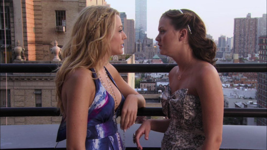
Thoughts I had while watching the episode:
Akward morning after talk between Dan and Serena, not my prefered way for the start of an episode, but what can I do
Well they are kind of cute here, I’ll admit. Though I’m kind of glad Serena’s first instict wasn’t to get back together right there and actually acknoweldging their break up had a lot of reasons behind it.
Blair looks super cute riding that bicycle, so picture perfect. Too bad is only on paper. That Marcus guy is super boring.
Blair can be like “Revenge is so 12 hours ago” but Serena’s is all of us being like “Sure Blair, you totally love Marcus and all of this has nothing to do with Chuck ofc”
I’m not sure if being refered as “ a perfect post Bass palate cleanser” can be taken as a compliment. And just like magic a wild Bass appears.
I’m just here to enjoy the akward moment every single boyfriend of Blair has to endure whenever they realize that Chuck Bass is going to be a relevant part of said relationship.
“For England” Marcus your nation is surely going to be proud of you for acting like a total englishman and accepting to be civil with Chuck Bass, the guy who just totally manipulated you into inserting himself in your date.
“Blair Waldorf a fling... you’re not exactly low maintenance” Serena speaking words of wisdom.
I guess abstinence (on Serena’s side mostly) was hard for Serena and Dan, otherwise I can’t understand why they’re acting as if keeping their hands to themselves is so difficutl, they never seemed that type of couple in S1.
Blair called him Charles, I guess she was pretty mad.
That whole sequence of Dan and Serena fooling around on the Jitney is soooo extra, and so unintentionally funny.
Nate’s family drama is never ending, though imagine the tragedy it must be for any UES to lose their money. Auch.
Surprise! Nate’s fling is actually the Duchess.
This whole dialogue: “No offense but don’t you think you’re a little outmached?” “As a guy. Blair wants to be a princess (>.<) and your greatest achievement is owning part of a burlesque club” and the cherry on top “Oh you know is love when you star talking like an assasin” Oh Nate Archibald, I love you.
Also apparently Chuck did spend tme with Bart from time to time, is kind of hard for me to imagine them playing Squash though.
Chuck keeping noble secrets from Nate. That’s love.
Hi Rufus... and Vanessa
Oh Marcus, giving so much intel to his new “best friend”.Also I kind of like the polo/vest combo Chuck’s wearing there. Weird.
“I have to present myself as crown jewel, sorrounded by other smaller slightly flawed gems, but quality stones nonetheless” this is such Blair thing to say haha.
“If you can’t find common ground wiht a dictator I don’t know who can” The added commentary is really making this episode for me.
I’ve never related more to Blair than this moment where she express how great it is that Serena’s free from Dan.
I just love when we get to see how much Chuck actually cares about Nate, selling his shares of Victrola is no small deal.
Nate and Vanessa! I still can’t believe how much I don’t mind, and actually kind of like this ship.
I kind of would love to see Anne Archibald doing her shopping at Salvation’s Army.
I love the combination of that suit with that shirt Chuck’s wearing, the color really suits him. I don’t know why but I’m noticing his wardobre much more this time around. Figures. I do remember thinking the first time around he was going to try and seduce the duchess. Now that would have been another akward moment of “Sorry Nate”
Serena looks so pretty here, even if I’m not that fan of her outfil.
“So she can warn me about the effects of too much botox” auch. Chuck: 1, Blair: 0. and he’s definately enjoying it.
I so wish Rufus had gone to tour again. He deserved to live that dream to the fullest.
“A lowly Waldorf” wow. Even I was hurt by that.
I love it when the GG voice oveer points out how ridiculous everything is. Case in point: “Chuck and Blair’s dates are mother and son, and Nate and Blair are exces, and Nate and the mother are in a book club?”
I get why Nate is mad at Chuck for not being upfront about the money, because it’s not easy addmitting that kind of problems in their wordl and even less accepting that kind of help, but Chuck’s intentions were good. Fact is he always helps Nate anyway he can.
The fact that Dan and Serena’s plotline this episode was basically just trying to resist each other, and I can’t help but think that this was the show’s way of trying to make them be more “chair like”, you know intense chemistry and sex appeal. As if.
“if the best version of the situation is I’m going to become Blair’s father in law I think is just time to move on” Now imagine that, thanks to Nate for putting that horrifying thought in my head.
And this is the start of Nate Archibald the gigolo.
“Oh my effing God” same Blair, same. Props to Nate for still acting so rightous and being all like “I don’t have anything to explain to you”
Blair telling the Duchess how things are going to be now... You go baby Vamp!
“I’m gonna turned it in a novel” so I guess this throway line was the start of “Inside”
Rufus beyond anything was first a Dad, the Humphrey kids got the best dad in the show, the kind of Dad any of the NJBC would have love to have as a parent, and yet they feel they were the unlucky ones.
That last scene between Chuck and Blair is such a display of chemistry a lot of ships wish they had. and the literal definition of what eye sexing each other means.
I feel so bad for Nate and Vanessa right now... with the add visual bonus of her sadly blowing the candles for a date that wasn’t. Feeling sad for Vanessa, now that’s new for me.

So this episode while there are moments that I really liked and it did kind of move the plot forward in some points, it also fills a lot like a filler episode and like I don’t really have much to say about it. Maybe because these storylines while I don’t hate them I don’t particularly like them either, in particular this chapter of the Serena and Dan saga this episode feels such a waste of time, they’re basically stalling because they really don’t want to have the difficult conversation of why they broke up and how they can fix their issues, and so to keep avoiding they distract themselves with taming their unrestrained need for sleeping with each other... sorry but what?
I’m not saying there’s no chemistry between Dan and Serena, but their relationship in S1 except for like 1 or two scenes was very much rooted in cutesy moments, tenderness, and how Serena was better with Dan (ugh) and how he wanted for her, not only because she was super hot, they never acted like “oh it’s so hard to keep our hands from each other, and we can’t resist this atraction” that couple were Chuck and Blair, so on this episode I just can’t buy it, it seems forced, almost as if the show wanted them to be more exciting and outrageous... to keep them as the main couple of the show as they were suposed to be, after all at this point of the show while Chuck and Blair were getting more traction, they hadn’t really overtook the show as they eventually did. It also felt part of the “omfg” vibe the show was going for, that scene in the Jitney was so extra, though in my case rather than getting me into them just made me laugh.
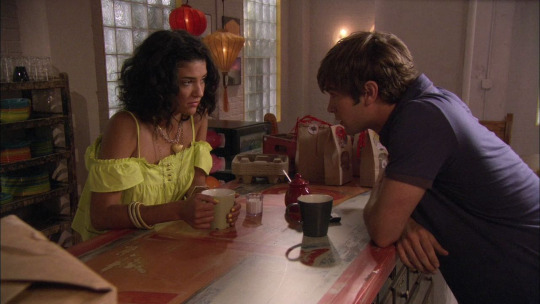
Nate storyline on the other hand is the one that really went places this episodes. It turns out his family is on the brink up bankrupcy because all the legal issues his dad is facing, and because his grandfather won’t help he and his mother are a very precarious situation wich leads Nate to seek help. He tries going to Chuck but on one hand he doesn’t really now how to explaint the situation, and also Chuck’s apparently really busy with scheming his way back to Blair. Except Chuck because he knows Nate is going to refuse him and he can’t help but help him either way sells his shares on Victrola and gives the money to Nate’s mom. Of course when Nate finds out he gets mad, because pride and also because he hates that Chuck lied to him about Victrola and to be fair it hasn’t been that long since they had a big fall out because Chuck wasn’t honest about stuff, so there’s that. Still, I feel I must take a moment to point out how much Nate actually means to Chuck? He loves that club, it’s a place with a lot of sentimental meaning too for a lot of reason and yet Chuck doesn’t hesitate to part with it if meants helping Nate. I know Chuck makes plenty of mistakes and awful things during the show, but these kind of moments are always kind of overlook and I just feel that’s unfair because only focusin on the worst of him, reduces him to this one dimensional villian, and in reality Chuck is one of the most complex characters on this show. These kind of moments are an example of his many layers.
So back to Nate, he ends up going to Vanessa, and I just feel this rewatch is turning me into a Nate and Vanessa shipper. Truth is I never hated this couple, but I was a bit meh to it, in part because Vanessa annoys the hell out of me for the most part, but I always thought she was less annoying with Nate. I like how she just sits and listens to Nate, and I think this is something that his best friends are not always the best at, Chuck tries but he’s more the type of friend that goes into action, he does what is need to do in order help rather than the heart to heart talk, and Nate and Serena’s friendship at this point while getting there, is kind of akward still and also there’s always some crisis going on her life that prevents her for being fully there, and Blair and Nate well.. they weren’t ever the talking type. So Vanessa helps with that, also when the show started Nate wanted in someway to detached himself from the UES and all it’s expectations and so Vannesa was that needed breeze of fresh air, and while she can be as judgy as Dan, I always felt she made more of an effort with Nate to be understanding than Dan ever was with the UES. So I like them, at least for now. Too bad Catherine happens and while Nate was really into the idea of having an affair with her this episode he realizes that’s an awful idea (the fact that she has a step son that’s older than him and is also dating Blair is admiteddly gross) but it’s a desperate time, and she offers him her help... and so we got Nate the gigolo, and that last scene in the taxi when he cancels on Vanessa made me sooo sad.

Lastly we have the Chuck and Blair part of the story, it’s always fun to see them scheming, and Chuck’s tactics these episode are rather sucessful at first and it’s mostly a display of him knowing Blair so well that he’s able to get the upper hand on all of her efforts to get on the Lord and his family good side. I should feel bad for her, in the sense that Chuck’s ruiningin her plans and it’s not fair because if he had showed up to Tuscany everything would be different. And yet I’m kind of glad he gets on her way because truthfully, this is just one of those times that Blair is trying to show herself as something she isnt’ in order to get a guy, and also climb higher in the social hierarchy, and it pains me because at the end of the day is just Blair not accepting herself, like Serena keeps pointing out through all the episode, just show the real Blair sure, she’s anything but low maintainance but there’s a lot of amazing in her that can make her shine to anyone. This plot also reminded me a bit of Blair and the prince storyline and also (because this party was trying to be very pretentious and sofisticated) that saloon thing she did with Dan in Season 5 and just remembering that gives me nightmare. So really not a fan of these particular scenes. In the end she ends up gaining the duchess via blackmail, which I like because I hate the Duchess so I’m all for Blair showing her Queen B side in full display and after this episode I missed it. It’s also the basis of that great moment at the end between her and Chuck in the Van der Bass kitchen, which is easily the most memorable thing in the whole hour and only for that I’m glad this episode exists. The chemistry and sexual tension of this whole scene is amazing and it puts to shame all the Dan and Serena “can’t keep their hand of each ohter” scenes, this is how is done. Sorry Derena.
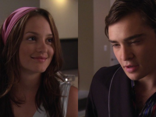
Random bits I noticed:
The Pierces song playing in the background at the start of the episode, “Boy in a Rock and Roll Band” always puts me in a good mood for some reason.
That pearl headband Blair’s wearing at the party were so popular here for a while, I loved it so much back then, I sort of wish I had one now.
I loved the “Summer 08″ collage the Humphrey’s had in their loft. It also had this phrase “ I believe that unarmed truth and unconditional love will have the final word in reality... I still believe that we shall overcome” by Dr. Martin Luther King. Kind of relevant isn’t it?
Having and episode ending with a shot of the NYC skyline at night, while New York, I Love You but You’re Bringing Me Down playing in the background... these are the kind of details I love.
Ending with a Chuck pick because I really like this suit
9 notes
·
View notes
Note
Do you have any advice for someone trying to start their own literate/semi-literate roleplay? (I know yours is fully literate but I'd like to allow short replies sometimes in mine) It's my first time
Hi there! Oh gosh I have so many things I wish I could have told myself seven years ago when this all began. I’ll try to boil it down to some things I think are most important. But, I already know this is going to be a novel lol. So, sorry in advance.
1. Don’t be too overzealous with the amount of characters, factions and locations in the game: When I first started, I set out to make this massive sprawling faerie world with a choose-your-own-adventure feel to it. I wrote new bios alllll the time, and added new interesting groups and organizations whenever they came to mind. We had everything from barmaids in the distant slums, to wild fae youth living in the woods, to princesses living in the capitol. What this turned into was an rp that had literally over 100 (?!?!) characters to choose from, from pretty much everywhere on this huge map. I got to write all these super fun characters and people seemed really intrigued by the variety. In theory this was great. However, I started to realize that it made it more difficult for our members to come up with storylines long-term. Sometimes it was hard to even come up with how to get two characters with vastly different backstories could be in the same place. In 2018 I did a complete revamp that largely involved finding a more central theme for the rp, and cutting a huge number of bios and groups out. What I landed on was a concept that was a fae royal court drama, instead of a story about an entire faerie world. So, now most characters are nobility, or involved with royals. There is now also a central theme of these warring old fae families, and an established history of backstabbing and scandal. It has helped a lot because now characters have tons of parties, royal events, etc. that they can plausibly meet at and even old beefs between families to stir things up. I could have saved so.much.time if I had really tasked myself in the beginning with deciding exactly what I wanted this story to be about and stopping myself when I started over-designing.
2. Find a really solid admin team that you trust: I think in the beginning I felt like this was rp was my baby, and felt like things needed to be done a specific way. I was more resistant to changing things, even when they needed to be. But, over the years I have gotten to work with so many talented people with skills and ideas I could never have dreamed up. The more open I was to other ideas, the better this rp became. To this day some of my favorite things in the rp were not made by me! Also, find people with strengths you don’t have. For example: I find it really difficult to come up with new events, while the other two admins here are very good at them.
3. Make sure maintaining diversity is a constant goal. Many people are tired of seeing white-washed, straight, cis, non-disabled characters over and over. I think it’s our responsibility as rp admins to make sure our characters reflect the true diversity of the world around us. Add diverse faceclaims, and do your research on any group you are trying to represent that you are not very familiar with to make sure it is done with respect. This includes race, gender, sexuality and body diversity (quite honestly, we are still not where I want us to be with every category yet). We somewhat recently made the choice to disallowing people to change the race of a character because of how often people wanted to swap out a POC for a white faceclaim to make sure our diverse choices stay diverse. On a side note, there are a lot of rph’s (roleplay helpers) who will not promote or shoutout your group if your diversity is lacking. So it’s just beneficial all-around to make sure you’re doing it right.
4. Make sure your roleplay feels unpretentious and un-intimidating even for those who may not have participated in a literate rp before, or never rp’d at all. I think literate roleplays can have a (sometimes earned) reputation for being a bit elitist and intimidating. It can feel like a lot, especially when for so many of these roleplays such a large writing sample is asked for. We made an Application Guide that boils down our most important information, and a description of what is expected of an applicant so that people feel like they have a solid jumping off point. We also send a “How to Get Started” guide to all new members that includes a list of which blogs to follow, the link to our member list, and the link to our rp’s discord channel. If someone tells you they are new to this, really go the extra mile to make sure they are settled and comfortable.
5. Promote your rp effectively: Make sure your theme is easy to navigate, your color scheme is easy on the eyes and fits the vibe of the roleplay, and that a navigation page is easily accessible. Try to make your navigation page as intuitive as possible. If you have lots of lore like we do, making sure people can easily find the article that will answer their question. Also make sure a link to the plot, and characters is visible on the main page.
I recommend making sure your rp’s page really matches your setting and story so that it’s immediately apparent what some of the themes of the plot are. We use lots of royal imagery, fantasy imagery and nature imagery for ours. I know obtaining pretty graphics, especially if you may not be as well acquainted with with photoshop, can be difficult. Do the best you can, with what you have and don’t sweat it too much if it doesn’t start out how you want it to. I taught myself photoshop for this roleplay, and made many of my own graphics at first. They weren’t perfect, but I was able to get the idea across. I found the person who made my current graphics through a roleplay that I loved the aesthetic of. There are definitely some rp helpers on here who accept commissions to design graphics. Some charge, others don’t. Decide what works best for you! Also, make sure that the small
I’m not sure if you know about about making a promo blog, and how to use the tags to promote. Let me know if you don’t, and I can PM you way more info on that because there definitely is a bit of a science to it.
6. Don’t get too let down by slow periods: Obviously I am very very stubborn because this rp is old af. But, just know ALL roleplays have slow periods. I have had apps dry up for weeks or even months sometimes. I have had the dash entirely stop moving before, and activity 99.9% die. This used to absolutely panic me. But, now I get that this is just the inevitability of a long-term roleplay sometimes. It is often an indicator that something needs to change. Adding a fun event, or a new plot drop can make all the difference. We recently did an Avatar: The Last Airbender AU that really boosted activity! If that doesn’t help, troubleshoot by messaging rph’s who offer opinions or rp help, or straight up asking your members what they’d like. Both can have great insight on what you can improve. But, be ready to not always hear what you want to.
I hope this was helpful! If you come off anon and send me a message, I would be more than happy to chat with you further in private messages and answer more questions. I am genuinely so jazzed to see new literate/semi-literate roleplays pop up!
- Admin L
4 notes
·
View notes
Text
Miyo’s Anime of the Decade though Actually Just 2019
***Before I start this list, I would like to continue to send out good vibes and hope to all those affected by the Kyoto Animation arson attacks this past summer. It still hurts and I hope things can get better for everyone affected by it, even though I'm sure some things will take a long time to heal, if they ever will. Just know that you will always have me wishing you the best I can and sending out hope for you to recover at your own pace.***
I like writing these things every year. Whether it lets me know if my tastes are changing or staying the same, or if I'm just sentimental, writing about things I like is fun. Anime is good and I like watching it. I watched a good amount of stuff this year even if some seasons I couldn't find anything I say would fit this list.
For example, I started watching the Symphogear series and it's fun but I wouldn't say I liked it as much as any of these shows. Anima Yell is a very cute show but I didn’t have much to say about it, same for Aggretsuko again. I liked the main characters of JoJo part 5, but I wouldn't say I liked watching that, especially as the villain was revealed more and more. Fire Force was fun for me for like 5 episodes or so but then I bailed so take that as you will.
But I don't want to sound too mean here. No, this is for stuff I liked a lot and I wanted to write about things I enjoyed. This year I actually kept track of shows I liked as opposed to figuring out what I'd go on this list at the last moment. Crazy, I know, but this could be a good idea. Don't worry, I didn't take TOO many notes so this will be pretty off the cuff of my head like normal though I'm sure. As always, I will be using whatever title is easier for me to write/preference.
With this bit of text out of the way, let's la GO! In no particular order (as always)...
Mob Psycho 100
This entry counts for both season 1 and season 2. I kind of sped through the first one a little so I could catch up in time for the second one. I feel it stuck with me just as much though. Mob Psycho is a solid action series with very silly things going on in the background of it...and foreground honestly). I suspect ONE is very good at making this sort of series. Honestly though, every character in this show is great and there's so many feel good moments. Mob himself is a wonderful character. The most powerful psychic force in the universe but he just wants to get buff to go out with his crush.
There's a lot to like about this series. The humor is on point and anything with Reigen is going to be hilarious, especially if it takes a while. Animation is consistently top notch, especially in season 2, and I love the psychic effects. They end up looking like an old 90's video filter or trapper keeper or something. However, the most impressive thing this series does is show that maybe fighting isn't the way to do things all the time and that the most important thing you can show isn't just sympathy, but empathy.
Mob is a really good show and both of the OVAs are fun as heck. I dunno why I originally slept on Season 1, but I'm glad I came aboard.
Kaguyasama: Love is War
You probably know this one from that one ending with the pink haired girl dancing, that was going around for a while even though it was only for one episode. This series actually took me a little bit to get into mainly due to being WAY too tired to keep up with it. The set up being that the smartest boy and girl in the most elite high school both want to ask the other out. However, being the one to ask the other out would be to give up all power and admitting defeat. Basically it's a battle of two love struck idiots trying to get the other to ask them out.
As dumb as that sounds, the setups are often hilarious. Seeing the main characters trying to out scheme each other and keep a straight face while watching is a challenge in itself. It's like that 4th dimensional chess but the end result is seeing who will hold the other's hand first. Then throw in the wild card of Chika who seems to both not know what's going on while understanding how easy it is to end up on top in these battles and...look it's very funny ok? Even if sometimes the joke is just "weiner".
Shows that made me tear up count: 1
Kemurikusa
Similar to the Kemono Friends and its big gold star award, I felt like Kemurikusa deserved a shoutout this year. It's still janky like Kemono Friends before it, but after everything that went down with that series, it was definitely telling when this was the better of the two. This is a weird series and only some of that is due to the animation. The studio does a wonderful job of making a world that's both interesting and haunting at the same time. Everything that happens all ties to a big mystery that isn't revealed for quite a while.
The characters are fun enough. From the serious Rin to the caring Ritsu. From the voracious Rinas to the dweeby Wakaba. It's a fun cast going on a road trip throughout the apocalypse as they try to find good water for their big plant friend that drives around their husk of a bus. It can get pretty dark at times even with the neon bright colors the titular kemurikusa shimmering softly in the background. Oh also there's a roomba friend and a girl with sharp teeth so I mean, it's got something for everybody.
Hitoribocchi
This series is a cute little show with a setup which is potentially mean if you think about it. Bocchi's best friend is afraid she won't ever be able to make any other friends since they're going to different middle schools. Because of this, she says they can't be friends again until she befriends everyone in her class. The biggest hurdle to this challenge being Bocchi is horribly shy and socially awkward which just makes things seemingly impossible for her to overcome. Luckily, this is a cute comedy series.
The show is basically about Bocchi trying to make new friends so she can hopefully one day reunite with her bestie from the past. As I said before though, she's kind of bad with knowing how to communicate with people so she has a bad habit of say following friend making tips she read in books or online to a t and not deviating from them. Thankfully she is able to meet with lovable weirdos like blunt Nako, pitiful Aru and ninja girl Sotoka. It's a cute little series that also has a lot of heart, especially if you've ever had to overcome your own social anxieties to interact with others before. It's also funny too so there's a bonus even.
Shows that made me tear up count: 2
Carole and Tuesday
Shhhh. Don't let Netflix know I finished this before they did. Carole and Tuesday is a fun show from the creator of Cowboy Bebop, as evidenced in the fact it takes place on Mars and uses the same currency. It's a fairly simple plot, two girls meet up one day on the streets and start playing music together. One's an orphan who's basically lived alone for most of her life, the other is a rich girl running away from her politician mother (whose politics are a little too close for comfort these days). They just wanna make music man, and with a former big time agent with them, how can they lose!
Carole and Tuesday are fun characters and the show has a fun future sci fi vibe while still being grounded in reality. One of the biggest highlights is definitely the music though with lots of new songs in every episode and a good number of them being certifiable bangers. There's an overarching plot that also hits too close to home at times but the big finale at the end made it all worth it in the end really. This is an easy show to recommend and I am doing so to you right now. Go see these girls trying to make it to the big time!
Shows that made me tear up count: 3
Fruits Basket (2019)
I skipped out on Fruits Basket the first time around. I always told myself I'd go back and check it out but, knowing how I do things, this never actually happened. Part of me is kind of glad I waited to check it out though since I really like the style of the new show compared to the one from the early 00s. What I'm saying is I should have checked this out a lot earlier than I did but I don't feel visually bad for doing so.
Fruits Basket is a show featuring Tohru, the most helpful lovable girl, and a cast of characters who all start to love her because she is the most helpful lovable girl. This might sound like a bad thing but it's not. All of the characters are really fun, save one who I don't know WHY they don't just beat up, and I love seeing all their interactions. I just grew really invested in all of them and keep hoping everything will end up ok for them in the end, while in some cases waiting for a really big shoe to drop and biting my nails in the process.
I dunno if I have a super bunch to say about it other than my favorites are Uo-chan and Hana-chan and I can't wait until part 2 shows up. I am ready to see more of these Zodiac weirdos get hugged by Tohru and become animals and have her solve their problems in that order.
Shows that made me tear up count: 4
....Now, as usual, I will take a break to talk about the Precures I watched this year...
Futari wa Precure
This year, my friend Cheapsteaks and I decided to go after the OG Precure scene by watching the series that started it all. School girls run into fairies being pursued by weird monsters from another dimension/world/whatever and have to become legendary warriors to help them out. It's a story we all know well, just with lots of dropkicks and judo tosses.
As much as I like Honoka and Nagisa, and the opening theme...Futari wa has a lot of growing pains which is to be expected. Being the first one, it feels more like other magical girl series of the time compared to the style of later Pretty Cure series. From the rather uninspired villains, including one named Pissard, to the bland crush of Fuji P-senpai, and especially the obnoxious fairies, this is definitely one of the weaker series in my eyes. Again, it's probably not fair to judge it though since they didn't know what they were doing yet with this series.
That being said, there is a dumb fun to watching the Crunchyroll subs for a nostalgic taste of hard yellow subs and often not great audio. Again, the best parts of this are Honoka and Nagisa and I can see why they still get to be super popular today.
Smile Precure!
The other older series we checked out this year was Smile Precure which is much more my speed. The characters are all really good and they're all super good friends and it just makes me feel good. Like just in general they'rea really good and strong cast and I love all of them. Reika/Cure Beauty is the secret funniest character just by being the straight man on a team of doofuses and it works so well.
Miyuki's desire to make everything around her "Ultra Happy" just makes you feel good seeing a character who just wants others around her to be as happy as she is. All she needs is a smile and that makes me also smile. Akane is fiery and powerful, Yayoi is a big sweetie whose artistic trials and tribulations I SUPER identify with, Nao is a super cool big sister and I already brought up Reika being great. This is really one of my favorite Precures I've watched so far and I'm going to be sad to see it go in a few weeks.
I'd also be remiss if I didn't mention that I love the stupid villain trio. Especially Akaoni. I love you big red oni doofus. (Please see oni times in the link below)
https://www.youtube.com/watch?v=eXA5jfSJz_c&feature=youtu.be
Shows that made me tear up count: 5 (ANY NAO EPISODE AAAA)
Star Twinkle Precure
The newest Precure series! One we also dragged fellow anime friend Metalray into and I feel like it was a fun enough one. Cute alien encounters trying to help space zodiac princesses with a fluff unicorn and a tentacalien? Sign me up my dudes. Star Twinkle is a fun series and has a lot of things going for it, while also having weird similarities to Smile sometimes like soccer related attacks from good big sisters and prim and proper arrow girls.
The characters as always really make the show I feel when it comes to Precure and Lala is adorable enough to carry it entirely herself? But the enthusiasm of Hikaru is always fun because it usually just involves her being really into outer space and everything in it. Hey there's even Elena who is Mexican-Japanese and the show even explores a bit of her growing up being different from others so like, that's pretty cool I think? If it helps little kids learn to accept others and be cool through lil hermit crabs and dog space police officers, I think that's a real good thing.
...Now Precure time is over but I'm looking forward to next year's offering and seeing what old ones we go after next. (Spoilers, we will probably do Max Heart and Fresh!)...
How Heavy are the Dumbbells You Lift?
So this series has some problems in that like...wow sometimes during the exercise segments of the show, it just gets way too horny like...I dunno if I needed to see sensei in nothing but a bedsheet to show off how she worked her lats fellas. But I digress.
The main reason this show is on here is because it affected me enough to actually look at myself and start wanting to become healthier? Like the show is just a framing device for jokes and showing off exercise routines but the characters are all really sincere and the translation of the opening is even moreso? Like I feel this show helped me out a lot and I'm gonna let you all know about it cuz maybe it can help you out too if you need it.
I don't have a whole lot more to say but I will leave you with the opening I mentioned. Turn on the captions for this banger and remember that you can do it too!
https://www.youtube.com/watch?v=qxi2Y4-NNXY
Wasteful Days of High School Girl
Hey, so can I say something amazing? Much like Asobi Asobase last year, this series was a very weird comedy that I absolutely ended up loving a lot in the end. The cast is full of delightful idiots, one aptly named Baka by her friends being the standout moron of the cast. The title pretty much says it all but you will find all sorts of high school girls here just wasting their youth away in their favorite ways.
You want a girl who draws BL doujin while listening to vocaloid tracks? We gotchu. What about a girl who is more invested in micro organisms in Petri dishes than her friends? Yo, we're set. A dipshit chuuni who climbs on top of absolutely anything tall and regularly needs to be rescued/leap out of trees because of it? Yea, that's here too. The show is not afraid to be weird any chance it gets and there's something I can respect about that. This series also had one of my number one laughs in an anime this year in one of the last episodes too and it still makes me laugh as I recall it right now.
Also like Asobi Asobase, it has the plus of having a lovable witch girl who is as pure as she is into weird occult shit. Majo you're a sweetie. Even if your room is creepy.
The Demon Girl Next Door
This show feels like something that should have come out about 5 years ago in terms of animation style, story set up, characters and even the jokes. I don't think this is necessarily a bad thing though because not only is it pleasant and cute, it also knows when to step back from teasing its unfortunate main character. Shamiko, the demon girl formerly known as Yuko by everyone who isn't her family, is a kind of pitiful character and this series could easily just make jokes that punch down and humiliate her way more than it did.
Thankfully, the show actually does it's best to show that she is comic relief but also that she is genuinely a good person. She's not very good at being a demon as she is still learning so maybe she gets easily tricked by resident blase magical girl Momo more than she should. However, she will go out of her way to make sure her rival is eating more than the crappy instant food she frequently microwaves. Like I said, it's ultimately a silly, kind of dated feeling series but the character interactions are nice and it's just genuinely good
hearted to see these girls become friends, even if sometimes it's due to trickier. The show makes sure not to be mean at all times to Shamiko compared to say Satania in Gabriel Dropout's treatment, or the snake girl in that Dropkick show I dropped after one episode. Shamiko is good and hopefully one day she will be able to use her demon powers to rule the world so her family can have a bigger, non cursed, budget to live on.
O Maidens in Your Savage Season
Puberty is hard. Puberty is also maddening, wanting to drive you up the wall with new urges you are not used to. Simple joys like trains are replaced with weird videos you order off websites or somehow get from the back of a video store. Puberty is an inherently frantic time but it's also kind of funny if you think about it enough.
Maidens explores the tales of the Literature Club members as they go through this important stage of life and that's the fun of this series. All of the girls are each trying to find out exactly what it is they want out of a relationship. Is it just friendship? Is it Ess Ee Ecks? There's a lot of fun to be had as the series goes on. Whether it be Kazusa trying to get a bit further with a childhood friend, President Rika questioning her stance on relationships being even proper to have in high school or the writing adventures of HItoha going to sex chatrooms, there is a lot of different things going on in this show.
It's got a very good sense of drama as well; there were more than a few episodes where I found myself worried about what would happen next and hoping things would be ok. Niina's arc is very intense and gave me creeper vibes any time her old mentor appeared. The show is very good in general at just showing emotions and none of it felt like it was shoehorned or phony. The writing is top notch and I love all these girls. Puberty is a weird time but...they got this I'm sure.
Here are a couple of other shows I watched that didn't come out this year but enjoyed a lot!
SSSS.Gridman
Thank God Trigger was able to come back from its previous offering to give us Gridman. At first I was afraid that all of its Transformers color scheme easter eggs were just trying to lure me in with a mediocre show. This was not the case because Gridman just rules hard. A sequel/spinoff to the old 90's series, localized here as Superhuman Samurai Syber-Squad, this show was a love letter from the creators to the show and other tokusatsu shows in general.
Kaiju appear to devastate the city, shown from low angles that just make it seem even more like you're watching an old toku show. The toyetic nature of Gridman's various powerups and the design of Gridman himself just further pay homage to this. There was one Kaiju for a moment I swear you could see a string operating it (for the record, it was not a string but was in fact part of the Kaiju). It's not just a cheap nostalgic trap though because the animation is superb, the action is top notch and the main theme song just kicks ass. This is a really cool series and if you have any passing interest in toku shows, are a Trigger fan, or like seeing Actionmaster Thundercracker's color scheme, go and check this thing out!
Other highlights include another version of Inferno Cop and Rikka's mom who is always fun and good.
Dirty Pair (TV series)
Dirty Pair is a series I watched a good chunk of before but never actually finished. Thanks to the #DirtyDecempair hashtag though, I finally went and did it and well...Dirty Pair is still really good y'all. It's got space babes who kick ass and are not afraid to go after hunks along the way. Seriously, it's great when you watch a show older than you and it lives up to its hype.
Kei and Yuri are really good characters because they will snipe at each other but in the end, they are still besties and will mess up anything that gets in their way. I appreciate that they always try to get more PTO and pay out of their boss. Even more, I appreciate that the chief will put up with all their shit, whether it be the aforementioned blackmailing for vacation or the sheer amount of destruction they leave in their wake, and still is 100% behind them. He knows they're the best he has and nothing will get in their way.
So yea, Dirty Pair. Still a good show over 30 years later. You should check it out next December! Or sooner, whatever!
That abut wraps up my list of anime I watched this year, but I'm also gonna throw a little bonus round on you! Some anime movies I watched and liked! Lightning round go!
Promare Good fucking movie, good fucking soundtrack. Good Trigger things this year. It lives up to its hype for sure. Go see this when it is out on DVD and Bluray!
Sound Euphonium - Our Promise: A Brand New Day This was a nice movie that felt like a good third season condensed into about 2ish hours.
Love Live! Sunshine!! The School Idol Movie: Over the Rainbow I actually like the music from this one more than the movie itself but seeing Ruby's arc gaining confidence is good and I love it.
Bonus Saint Snow Track: https://www.youtube.com/watch?v=oUNNWxK2Dfs
Redline A movie I kept meaning to see and finally did thanks. Stylish and cool as hell, and the dub is really good too.
Dragon Ball Super: Broly They made Broly a compelling character finally, holy shit. Also some good Frieza comedy.
KonoSuba! Legend of Crimson Imagine a village full of dipshit chuuni wizards. This movie was fun and funny as shit. Warning: It does have one awkward joke related to gender but it thankfully passes by it real quick.
So I think this is my list. I hope you enjoy it. The next time you'll see one from me will be in the distant future of 2020! Hopefully things will be cool by that point to go with the good anime.
3 notes
·
View notes
Photo


The Wild Hunt: Chapter Seven
Words: Mike Mignola | Art: Duncan Fegredo | Colours: Dave Stewart | Letters: Clem Robins
Originally published by Dark Horse in Hellboy: The Wild Hunt #7 | October 2009
Collected in Hellboy - Volume 9: The Wild Hunt | Hellboy Library Edition - Volume 5 | Hellboy Omnibus Volume 3: The Wild Hunt
Plot Summary:
Hellboy finds himself in an Ingmar Bergman film, dealing with the revelation of who else he is and the existential cost therein.
Reading Notes:
(Note: Pagination is solely in reference to the chapter itself and is not indicative of anything within the issue or collections.)

pg. 1 - This greatest hits of the past issue is an interesting approach. Little bursts and snippets of memory that feel like a drum pattern hammering away at Hellboy’s psyche...

pg. 2 - ...and reminding him of the looming terror.

pg. 4 - She helped him during Darkness Calls when the hour was darkest, but she’s dead. Or maybe dead again if you consider what Koshchei said about reliving killing her. So you wonder what she’s doing here, and why Alice can’t see her. While not quite as blue as Hellboy’s friends, she does kind of have that deathly pallor coloration that Dave Stewart has been providing for ghosts. You wonder what this warning is for.

pg. 5 - While this fits with Hellboy’s renunciation of fate, the recurring theme of his attitude towards destiny and prophecy since Seed of Destruction, this one kind of feels different. Like a guilty resignation, of giving up out of fatigue and frustration, rather than picking up arms to continue the fight.
It’s also sad that Hellboy can’t talk about his giant fight. The look of disappointment that Duncan Fegredo gives Alice as an expression is spot on.

pg. 6 - An interesting return to the scene from the second chapter, although now with Alice visiting it.
And I’m still amazed by the detail that Fegredo is putting into these figures and the overall shadow and colour scheme of it from Dave Stewart. They almost feel like the HR Giger inspired carvings in the Alien franchise, giving an overall creepy, ominous vibe.

pg. 7 - It’s nice that Alice has faith, but you can tell by the expression on Hellboy’s face that he’s just not having it. Possibly even in shock. He’s been self-medicating with alcohol and friendly ghosts, so an even weightier proclamation of destiny must be driving him insane.

pg. 7-8 - And now it seems we might be getting the actual representation of the title, rather than the arrogant and ineffectual masquerade society version from the Osiris Club.

pg. 9 - Nice reminder about King Vold, but you’ve really got to wonder how mentally healthy it is to be wandering around a castle talking to possibly the ghost of Mordred.

pg. 10 - This seems to be foreshadowing what’s going to be coming for a trip to Hell. Just another form of prophecy for Hellboy to rankle against.

pg. 11 - The reflection with Anung Un Rama is a nice touch as Mordred reiterates the prophecy of Hellboy breaking open the seals of Hell. Although notice that it’s being spoken by the serpent, possibly as temptation for arcane knowledge.
pg. 12 - Fegredo’s interpretation of Hellboy as Anung Un Rama feels very Kirbyesque to me.

pg. 13 - The design for these warriors in Hell are neat.
pg. 14-15 - Hellboy fighting himself here is interesting.

pg. 15 - This panel makes me wonder whether or not this is Mordred. He’s essentially holding a snake staff, making me wonder if this is really Astaroth again pushing Hellboy.

pg. 16 - You’d think saving the world would be the easy choice, but you do wonder at what cost? Hellboy’s hesitation and reluctance to draw the sword might be a good thing.
pg. 17 - The entire castle going up in flame can’t be good.
pg. 18 - Yeah...Hellboy’s definitely losing it.

Final Thoughts:
How do you follow up one of the heaviest chapters in Hellboy history to date? Some would probably suggest a bit of humour to alleviate tension, but not so with this chapter, instead it dives headlong into even headier material with Hellboy’s existential struggle. Like the kind of oblique writing that we saw in “The Island”, this too feels kind of like a dry run for what’s going to be coming in Hellboy in Hell as narrative structures shift further and become a bit more experimental.
That continued feel of something being off, something out of time, continues with this story. It feels out of step with reality, as though even the reader has one foot in an alternate reality.

d. emerson eddy knows that the struggle is real. The struggle for the perfectly proportioned, perfectly prepared, perfectly syruped pancake.
9 notes
·
View notes
Text

♡♡♡ ( CIERRA RAMIREZ, CISFEMALE, SHE/HER ) AUSTIN FLORES was just hired. the TWENTY-TWO year old seems pretty KINDHEARTED and LOYAL, but they’re also CAUTIOUS and a PERFECTIONIST. i heard that they like to WORK ON PHOTOGRAPHY & STUDY when they aren’t working as a MAKEUP ARTIST at Frightland. ♡♡♡
hey hi hello my name’s brenna! i’m a loser 21 year-old from california who hates all things scary but is still a whore for halloween. this is my v old bby coming out of retirement, austin! this is lowkey thrown together solely bc i’m v late to this & i’ll have something more in depth up very soon! also, i’ll change the color scheme up soon to fit the Vibe™. anyways hi ily.
NAME: austin lucia flores
AGE: twenty-two
BIRTHDAY: july 4th
SIGN: cancer
she is from a small town in texas (although she was born in new york). she had a thick accent, but being away from her hometown for a while, it’s died down a lot.
she comes from wealth, her parents both being driven, self-made first generation americans who are paying austin’s way through college with pride.
she has three brothers who she remains incredibly close to, but being the only girl, she was subconsciously spoiled by her parents. although she remains incredibly humble. she’s never been one to flaunt her wealth or anything like that, but she’s a definite trust fund baby.
on top of that, she’s an incredibly smart person. she has an incredible memory and can remember pretty much everything she sees & hears. (she gives off reid from criminal minds smart vibes but not as smart nor nerdy lmao) however, she’s never discovered her limits or even knew if she had any. she skipped a couple of grades and graduated at age 15 (nearly 16 but she’s a summer baby lol). she’s intelligent to an extent that she’s even yet to fathom.
she chose the route of psychology and criminology with her fascination of studies and documentaries on serial killers and things of the like and that all sparked in high school (but she’s not like obsessed w them ok ajkcsnj i wanna make sure that’s clear) – she’s a few credits shy of her masters, but she’s not rushing on finishing.
studying always came easy to her, so she found a lot of time on her hands. with that time, she taught herself her way around more creative makeup through youtube videos. that eventually led to taking classes over the summer leading her to her now second year as a makeup artist for frightland. all for the fun of it. she’s all about that scary shit, even though she’s quite the jumpy person -- she loves it.
also, she does work for a camera store where she mainly just develops film and checks people out, but that always takes a backseat to frightland when the time comes ‘round. she has a lot of time on her hands
(this is more about her personality lol)
she’s such a kind and gentle soul that would genuinely never hurt anyone intentionally. however, once her mind is made up, that’s what she’ll stick to and she’ll try to let you down in the nicest way possible.
she’s a very sentimental person. she has a box of things (key chains, post cards, polaroids, etc.) that she likes to keep with her and add to whenever something, she feels, memorable happens.
she loves literally every genre of music except classical & heavy metal, but even then she’ll sit & listen to it if that’s what you’d like to listen to
her aesthetic is all warm tones tbh: yellows, oranges, reds, pinks. gold jewelry is also something you’ll always find on her person whether it be in the form of rings, earrings (hoops to be specific), necklaces.
she has an anklet with a very small heart charm that you’ll never see her without. it’s one of her favorite things she owns. she sees it as a form of a lucky charm.
OKAY SO PLOTTING!!!! i’m p cool with whatever tbh!! here’s a few i’d dig though!
the bad influence friend -- someone who pushes her nervous ass out of her comfort zone! like going on wild adventures & such! { OPEN TO ANY GENDER }
roommate -- austin hates to be alone, so having a roommate would be very in character for her. i’d imagine them having an apartment or town house, possibly a house, but we could plot that out. { OPEN TO ANY GENDER }
or like we can brainstorm????? love that
N E WAZE ! tbh i’m blanking a little bit, but i’ll definitely have an about page up for her soon. ily! feel free to im me!
#frightintro#i'm srry if this is v messy soakkasm it's nearly 2 am#also add '/mobile' at the end if u need i know my theme is hard 2 read rn sjnklsam
5 notes
·
View notes
Text
The 2021 Polestar 2 is a truly cool EV
New Post has been published on https://appradab.com/the-2021-polestar-2-is-a-truly-cool-ev-2/
The 2021 Polestar 2 is a truly cool EV


The Polestar 2 is one of the coolest EVs on sale.
Daniel Golson/Roadshow
Most new EVs either look too normal to stand out or too strange to entice regular consumers, but the Polestar 2 perfectly lands in that middle ground. To my eyes, this is one of the first truly cool EVs — at least in terms of more affordable cars. And when it comes to new segments and emerging tech, sometimes being cool is the most important thing.
Like
Fantastic stying inside and out
Super quick and fun to drive
Great Google infotainment system
Don’t Like
Less range than Tesla
Only comes in one expensive configuration
Limited servicing network
A real crowd pleaser
I live in Los Angeles, where hybrids and EVs are common — basically every other car you see is a Tesla. But the Polestar really grabs peoples’ attention. Chalk some of that up to it being new and some of it to its lack of badging — either way, most people just don’t know the hell it is. They just know it’s something new and cool, and want to learn more about it.
It’s hard to categorize the Polestar 2. At first glance it looks like a traditional sedan, but it’s got a fastback rear end with a hatch instead of a trunk. The Polestar has a higher ride height than most sedans (it’s an inch taller than a BMW 3 Series but more than 4 inches shorter in length) and SUV-like body cladding, making it a bit of a pseudo-crossover. However you classify it, the Polestar 2 is an extremely handsome car, with minimal body surfacing and great proportions.
It’s obvious the Polestar 2 was originally designed to be a Volvo, but that’s not a bad thing. Still, lots of little details set it apart from other Volvos, like the blocky patterned grille and full-width LED taillight strip. The only badges on the car are body-color Polestar logos on the hood and trunk, as well as subtle stickers on the front doors that denote the model name, battery pack size and power output.
The Volvo influence is obvious in the 2’s interior, but Polestar’s designers really turned the specialness up a notch or two. My test car has the Slate color scheme, which features vegan WeaveTech surfaces that feel like a high-end windbreaker and black ash wood trim. There’s a good amount of head- and legroom for front and rear passengers and the cabin feels airy thanks to the huge standard panoramic sunroof. I wish there was a sunshade for the roof, though, as direct sunlight can still be annoying despite the tinted glass. Another major downside is a lack of storage up front, with only one usable cupholder in the center console (there’s another under the center armrest) and fairly small door pockets. Still, the overall vibe is very Swedish high-end furniture/audio store and it genuinely feels premium.




The Polestar’s Google-based infotainment system is one of our favorites.
Daniel Golson/Roadshow
OK, Google, you rule
The Polestar 2 is the first production car to use Google’s Android Automotive infotainment tech and even for a staunch iPhone user like myself I think it’s easily one of the best systems on the market. (Don’t worry, Apple CarPlay functionality is coming and I don’t even miss it during my time with the car.) The system looks fantastic and the 11-inch screen is super quick and snappy, plus it’s easy to log into my Google account via QR code and download apps like Spotify from the Google Play store. There aren’t too many apps yet and missing ones include Audible and some major podcast platforms, but they’re coming. The Google Assistant voice commands work well too and it can even control things like the seat heaters. The only physical controls are a volume knob and buttons for the heated windshield and rear window, meaning even climate controls are accessed through the screen, but that’s easy to get used to.
The best part of the Android system is that Google Maps is the native navigation. I typically gravitate towards using Google Maps through CarPlay over any built-in nav and it looks even sharper on the Polestar’s display — there’s even a nearly full-screen view for Maps in the 12.3-inch digital gauge cluster. The Google tech has some nice EV-specific features, like showing the estimated range and charge you’ll have at the end of a set journey and providing an info-filled list of charging stations. I do wish you could see a satellite map view, though.
Shirking the EV norms
For now, every Polestar 2 comes the same way; there’s one battery pack size and one motor configuration. There’s an electric motor at each axle for a combined output of 408 horsepower and 487 pound-feet of torque, with all-wheel drive as standard. With a 0-to-60-mph time of 4.5 seconds the Polestar 2 is damn quick. Launches push you back in your seat and the performance doesn’t seem to fade after multiple goes. There’s no sport mode or adjustable power setting, so you’ve always got the full amount of torque no matter what. I do like that you can turn the idle creep function on and off, too — I prefer to leave it off like a brake hold feature.
There are three settings for the steering, the firmest of which is my favorite. It’s really nicely weighted, direct and actually offers a good amount of feedback, which is not the norm for EVs. The Polestar’s chassis is great too and the car feels a lot more nimble than its nearly 5,000-pound weight suggests. An ESC Sport mode reduces the intervention of the stability control, but it doesn’t make a massive difference in the dry. Overall, the Polestar 2 is just as fun to drive in the twisties as it is around town. Impressive.



That subtle styling packs a major punch.
Daniel Golson/Roadshow
But the best part of the Polestar 2 isn’t how it launches or how it corners, it’s how it stops. The 2 has a regenerative braking system that affords true one-pedal driving and once you’ve experienced an EV with a good one-pedal system, it’s hard to go back to anything else. The Polestar lets you select between having the regen fully off, having it in a low setting that won’t bring the car to a complete stop, or keeping it in the standard mode. Keeping the Polestar in the standard mode the whole time, I maybe touch the brake pedal half a dozen times over the course of a week of testing. Even during a very spirited drive on some canyon roads, the regen is so strong and easy to regulate that I never have to tap the brakes.
You can add a $5,000 performance package, but honestly, I wouldn’t. While I love the design of the 20-inch wheels and the gold seatbelts, the Polestar 2’s regenerative braking makes the performance pack’s upgraded front Brembo brakes unnecessary. And as cool as the manually adjustable Öhlins dampers might seem, they’re annoying to adjust and make the car ride worse than with the standard setup. Plus, if you really want bigger wheels, a set of 20-inchers with a sweet 4-spoke design is available for $1,200.
Standard active-safety features include Volvo’s Pilot Assist system (adaptive cruise control with steering assist), automated emergency braking, blind-spot monitoring, rear cross-traffic assist, lane-departure warning, lane-keeping assist, a 360-degree camera and parking sensors. Every Polestar 2 also comes with heated front and rear seats, a heated steering wheel, heated windshield wipers, active LED headlights, a Harman Kardon sound system, ambient interior lighting and a wireless phone charger.



The Polestar 2’s interior reminds me of high-end furniture.
Daniel Golson/Roadshow
Let’s talk about range
The EPA says the Polestar 2 has a range of 233 miles per charge and while I never fully charge or fully deplete the battery pack, the car’s estimated range readout seems accurate if not a little conservative. It only gives the range in 5-mile increments, which I think is fine — I’m never going to get close enough to empty for a super-precise readout to really matter anyway. The Polestar’s range is way more enough for me and it certainly is enough for the majority of consumers, especially those with short commutes. But I wouldn’t hesitate to take it on a long highway trip that would require charging; Polestar says the 2 can gain an 80% charge in just 40 minutes on a 150-kilowatt DC fast charger.
There’s a lot of public charging in Los Angeles, but nearly every time I charged it was at the same location close to my apartment, so I didn’t have to deal with a lot of searching for stations that aren’t either broken or occupied. (There was a massive puddle of oil on the ground next to my parking spot the first time I charged, go figure.) While Polestar has no fast-charging network of its own like Tesla, you can charge it up at third-party stations like those from Electrify America and EVgo. Polestar also recently announced a partnership with ChargePoint in which the companies will launch an in-car app and expand access to all of ChargePoint’s 130,000 chargers.


Rejoice! It’s a hatchback!
Daniel Golson/Roadshow
One configuration fits all
The Polestar 2 starts at $61,200 including destination, but before any incentives. It’s eligible for a federal $7,500 tax credit, which brings the price down to $52,400. With $1,200 Snow paint and the $5,000 performance pack, my test car is $67,400. The only option left on the table is the $4,000 ventilated leather interior that would bring the price to $71,400. So yeah, the Polestar is quite pricey, even among other premium EVs. (Cheaper models with fewer standard features will eventually arrive, though no details have been announced yet.)
The easiest comparison to draw is with the Tesla Model 3, as it’s the only other premium electric sedan in the same size class as the Polestar. The all-wheel-drive Long Range Model 3 starts at $46,690 before any incentives and offers slightly quicker acceleration and a much longer range (353 miles). Then there’s the $54,690 Model 3 Performance, which has a 315-mile range and will hit 60 mph a full second quicker than the Polestar. In terms of performance and value for money, the Model 3 creams the Polestar 2.
I don’t want the Tesla, though. The Polestar 2 is more enjoyable to drive, better to look at and way nicer inside, plus I prefer its tech and the hatchback rear end. And most importantly (at least to me), the Polestar is just more interesting. Even if Teslas weren’t so common where I live, I’d still want to be seen in the Polestar. Driving it feels like I’m at the cutting edge of the industry.
The Polestar 2 is currently available to order online, with test drives, delivery and servicing handled by the brand’s Spaces showrooms. As of right now there are only a few, mostly in California with one in Denver and another in New York City. But Polestar promises that 15 more showrooms will open by the end of 2021 in places like Boston, Seattle, Detroit and Miami. If you’re interested in a premium electric car and have a Polestar Space near you, I highly recommend checking it out. You might end up the coolest person in your neighborhood.
0 notes
Text
Afterthoughts after Ragnarok

So, I had the opportunity to watch both Thor: The Dark World and Thor: Ragnarok as a double-feature at an IMAX cinema yesterday, which was… fangirl heaven, in a nutshell. I can only highly recommend watching the second installment before Ragnarok because it is a nice reminder of the details, basically. And of course, it sets the mood. 😊
I just wanted to quickly type up some initial thoughts on Thor: Ragnarok because I am fangirling hard right now.
THEREFORE – BEWARE OF SPOILER ALERT.

To send this ahead: I went into the movie not having any expectations. I really tried my best to stay clear of great spoilers (other than the clips and scenes that were released as part of the promo). I hoped for a retro-adventure arc from the old days, but I wasn’t holding my breath for it. Though gladly, my hope was not at all disappointed. The bright color schemes, the music, the slapstick moments which are MUCH more prominent in this movie than any of the Thor films… it was what I was hoping for – and more.
Being a proud member of Loki’s Army and a general Hiddlestoner, I obviously have my biases when it comes to what scenes I enjoyed a lot, but overall… the movie did what I wanted it to do (again, I just talk here personal wishes and interests): It made me laugh and took me on a fun ride. That is what I wanted, and this is what I got.
To dig a bit further into the matter, there are some things that I wanna mention that I particularly enjoyed or that interested me:
Obviously, the destruction of Mjölnir alongside Thor unleashing his *true* potential as the God of Thunder is a big theme of this story arc (one that may not be that absolutely original, but that still resonated with the overall theme of what the movie was getting at; to me, it fed in nicely into the narrative and resonated with the Thor movies as a whole). I am actually rather fond of the idea that we see more of the God of Thunder than the God of Hammers (thanks, Odin, for that comment 😉). With this story arc, we reach a new level and a new skillset for Thor to fetch from *and to master,* so I am pretty excited to see what they are going to do with that in Infinity War, and as to where Thor is going to take his newly unleashed powers or where there may be hardships for him.
I do wonder whether Thor will seek *some* sort of replacement. Obviosuly, Mjölnir isn’t going to return in that fashion. It was a unicum and it has been rendered superfluous when it comes to Thor’s thunder powers. However, it *is* the weapon he has been using for… hundreds of years, so it may be that Thor will use *a* hammer alongside his now unleashed true thunder powers. Perhaps a bit of nostalgia or otherwise simply something to use in close combat, which is obviously also part of his fighting style. So, I am pretty hyped to see what may be done with that in the upcoming movies of the franchise.
In that same breath, I suppose it may be worth mentioning that we also saw something with God of Mischief Loki when it comes to new or otherwise not yet made explicit skillsets. Loki touching Valkyrie to dig up the memories she repressed for so long (and drowned it in lots of booze in the most wonderful of fashions ♥), to me, actually fed into the idea of not just introducing new characters and their skillsets or in case of Thor, showing their true potential, but also showing us what already known characters still have in store. While we already knew about Loki’s ability of manipulating and accessing people’s minds, I believe this is the first time we saw him *activate repressed memories* and *witness* them. Yet again, it had me wondering whether that skillset will prove useful in one of the following movies. A random thought I had last night (and please excuse, it was VERY late when I had that thought, hehe) was about whether Loki using that method may prove to be interesting in Bucky’s case and the memories that were deleted/locked away or what not, which may or may not be something of interest in the Infinity War story arc (WHERE ARE YOU, TRAILER???). if said memories were somehow vital to the plot.
Speaking of our favorite trickster, I found his arc a joy. Not only the jokes and the return of the horns, but particularly his trickster-self being back in full swing made me really happy. The previous Thor movie built heavily on Loki’s revenge for Frigga, in general the family problems… which there were… a lot of…, and of course his ongoing wish to lay claims to the throne, out of which he felt cheated once his origin was revealed to him in the first Thor film. The vibe I always had of particularly comic!Loki (though I am not too deeply invested in the comics, I will admit, but from what I have read, that was my general impression) was really this idea of causing, as his name has it, mischief, being the trickster, collaborating with whoever in order to somehow maneuver out of situations, only to be bound to clean up the mess he made (with the Revengers 😉 ). And I found that sort of spirit resonating with Loki in this story arc much more than in previous installments. While I very much enjoyed the idea of revenge and his ongoing battling with his family due to the differences that lie between them, I feared that they would just go on with that instead of giving it a new twist, but I felt like this actually was the twist that suited not just the overall mood of the film but also Loki.
So yeah, I am pretty happy to see Loki back in the role as God of Mischief as much as I enjoy Thor now being in full God of Thunder mode. The story arc had a nice conclusive theme of the two arriving at *who they actually are,* and thereby returning to their roots, which I thought had a nice touch to it.
Other things that have me wondering after having watched the movie: Is Sif to return? She wasn’t one of those who fell *on screen.* Because she may potentially be a bit of a wildcard in the upcoming movies, especially after… Jane and Thor are no more, it seems. But yeah, I don’t know if that was just a filming issue or whatever else. I do hope to see Lady Sif back in all of her glory. Especially since I want to see her interact with Valkyrie! They could bond so wonderfully over being awesome warrior ladies. :3
Speaking of Valkyrie, I really love her. ♥ I love her drinking speed (lol), and for that she is *as for this movie* a secondary character, she had a developed story arc (which of course… is now not the super deep-reaching stuff that you would get at if it were a movie just about her and her origin story in a much more serious setting than the Marvel franchise lays out), Loki’s backflash was gorgeously shot and it really took you into this *epic* moment of defeat when the Valkyries fell against Hela. Another thing I quite enjoyed about how her character was written is the easiness with which she interacts with other characters, she is witty, she is cute, and while hostile towards e.g. Thor and Loki (lol) in the beginning, I found it a joy to see her interact with the Hulk. Since she is so strong, she is unafraid of interacting with him in a friendly manner outside the battlefield, which I found had a nice touch. I hope to see more of her. A lot more.
Now, Hela. Cate Blanchet has the swagger of a Goddess of Death. Holy Shit. I loved the costume, I loved the attitude, and I have no clue how she gets the daggers out of everywhere but she does it majestically, and that is all that matters, lol. While more of a cartoon villain (but that is what fitted the mood best, let’s be real) in many regards, I found some touches of how they framed her return really interesting. While Norse mythology would have something to say about her being made firstborn daughter to Odin when she is actually one of Loki’s children… it was a rather intriguing commentary on how history is made, at least in my reading. Hela has been erased by her own father once she grew too power hungry for him. She was erased from public memory as she was cast into the realm of the dead.
Not only did that shed a rather interesting light on the idea of succession – because now we don't just have one son who was chosen by the father to have the throne as opposed to the son who wanted the throne, but didn’t get entitled to it, but also a female heir who had rights to the throne until she was considered unfit in Odin’s eyes. Actually, the repetition is what intrigued me, because it fed nicely into the idea of Ragnarok on what it is at its core, the Dawn of the Gods and the moment of a self-repeating world. Because Ragnarok is happening over and over, in different forms, and to me, that was the vibe I got from that succession question, too. Loki turned out rather similar to Hela in that way (though with a difference, to which I will return later, so hold on). Hela felt/was entitled to the throne until Odin deemed her unfit due to her violence that did not match his political agenda following the conquest era. Loki felt entitled to the same honor, but was seen as unfit for his ambitions/birth by Odin.
On that same note, I really liked this idea of history being rewritten by the winners (in this case Odin). Odin glossed over Hela’s involvement along with the conquest period (if Hela can be believed) to prevent her danger from reaching further after her banishment. At the same time, he portrayed and literally painted himself in a certain way (not just on the ceiling) that may not have been as reflective of the reality of the origin story of his rule as it could have been.
Similarly, I did find it an interesting way of handling Odin’s legacy after he’s passed away in the early stages of the movie. Odin dies after the conversation with Thor and Loki in which he seemingly tried to make peace with himself and them (and likely with the idea in mind that they arrive at a truce as well, so to have a chance against Hela together). So, the first impression we got was “oh, he leaves this world at peace with himself and everyone else, he is redeemed.” And at first I was a bit like… hm, I don’t expect great narrative arcs in this movie, not the gut-wrenching, complex moral dilemma that… other movies are made for, but that seems rather cheap. However, looking at Odin’s arc in this last movie as a whole, I did find it rather interesting (because yeah, I think he made a good couple of mistakes particularly with Loki that made him prime for some sort of redemption needing to be done). Because after the redeem-momentum, we get this reversal of history narrative via Hela, which gives way and depth to questioning his rule as a whole. And it is concluded when he tells Thor in a vision that he is stronger/better than him, not the other way around. Now of course, protagonist is getting the hype it takes to win over the enemy and unleash new potential and all, but I found *that* as a nice redemptive mode that yet again tied back to the very idea of Ragnarok. Thor, symbolized by having his eye removed like his Father (*cries*), is repeating Odin’s history – but with a difference. He steps up to that legacy, but does so differently from what Odin did. And Odin recognizing that and pinpointing it as the stronger/better way is something that I found hit the point home with the redemptive mode surrounding his death.
Now, this is getting far too long already (I am rambling and I am sorry), but one last thing I wanted to speak of – as a member of Loki’s Army: Loki’s (short but entertaining) reign.
Especially since I started out watching the previous Thor movie before Ragnarok, the question that remained as a sort of cliffhanger was just what kind of rule Loki would pursue. I mean, he was one of the big gun villains in the first Avengers movie, he was the big gun enemy in the first Thor movie, and obviously caused mischief wherever possible. While we knew of Hela taking over, thereby pointing to Loki’s rule not being very long, I personally did wonder what they would have Loki’s rule look like.
He may well have turned out to be the Hela type, kill all the infidels, and be a gigantic asshole with a lot of sass. However, his reign, however short-lived… it was basically one big party. And now of course, it was for comedy for many parts, but I did find it rather interesting and actually resonating with how they set up Loki all the while.
For all his talk and attitude of being the lone wolf and only ever being interested in himself, the God of Mischief has always been seeking the approval of his family, or at the very least, their attention (positive or negative, didn’t matter, so long it was some kind of attention). Ever since learning about his origins, I think the factor that was added to the whole idea of him wanting that throne no matter the costs was that he was seeing the approval of the Asgardians.
And in a way, I find that rather organic storytelling: Loki knew he wouldn’t get the approval of his family after what happened, after what was revealed about him. I mean, he gave that speech (which Hiddleston enacted beautifully, btw) to Odin about how he is now a monster that the children are told about to make them afraid of said monsters. And I think it is rather logical that he sought the approval of the people who are now supposedly afraid o him for his Jotünn roots. Being admired, being accepted by them as king would make him less of a monster, it would get him the approval he could no longer find with his family past a certain point, it would give him the approval he thought he couldn’t get by virtue of his birth. And across the movie narrative, at least that is my impression, that wish did not die down, but actually increased over time.
And now, having seen Ragnarok, I somehow tend to stick to that reading, because Loki relished the approval of himself. But it wasn’t *just* the statue (though it was a matter of heart to him, I am sure), it was that he (as Odin) was partying – with the people. He wasn't just sitting in the throne room feeling powerful. As Thor points out, he didn’t do much of anything with the power he had as King of Asgard for as long as it lasted, but instead… seems to have been partying the whole time. And again, obviously, the comedic moment is quite at the front, but the idea that Loki would spend his reign trying to be friendly with the people, having fun, was not just so very Loki-like (see that theater… damn, I laughed so hard at the play) but also resonated with this overall arc of seeking approval. While all the while claiming not to care what others think of him, Loki seeks it again and again, whether he likes it or not. And in the end, it is and will always be his one family whose approval he is seeking most (as he himself asserted at some point) – he wants Thor’s approval, he wants that guy’s attention, even if it’s just in a negative sense.
While I am most certain that he will turn on Thor again (he did have some fun time before gathering the Eternal Flame with the Tesseract and all), I remain positive that this will simply be status quo now. Thor’s not trusting him is actually, in a way, his trust in him. Thor knows Loki will pull shit, Loki knows that Thor knows… it’s going to be fun to see how they may continue to try to outsmart the other but rather in a friendly manner.
So, to now conclude this way too long rambling: If you want to have a fun Marvel ride, Thor: Ragnarok is your friend. The music, the mood, the story, it flows well and easily. You won’t grow tired or bored, neither are you overloaded with input. The slapstick, to me, was hilarious. And while Norse mythology was very much twisted around to fit into the narrative, I personally found some traces of the idea of Ragnarok not just in the metaphor of it being the people, but also in the way the characters were portrayed and moved through their story arc. It delivers funny, and to me, interesting secondary characters. It may be read as containing some interesting commentary on history making and the question of redemption and legacy alongside the self-repeating world in succession, where legacy ends and characters arriving at where they are meant to be begins.
And finally, I think the movie does something great for both Thor and Loki (and also for Valkyrie and Hulk if in different senses) in that it returns them to their roots. They are now the true God of Thunder and the true God of Mischief again.
And that, to me, is a great way of heading into Infinity War.
It is definitely worth the watch. 😊
36 notes
·
View notes
Text
Ice Cream on mobile

Let’s take a closer look at how all those supermarket ice cream brands fare in a mobile website competition. Here comes my ranking based on my impressions and experiences browsing their websites on my phone:

#6 Häagen-Dazs
One of the big players on the market and unfortunately a letdown when it comes to their mobile optimization. Too often (and often enough right away on their landing page) is the experience interrupted by slow loading times. Some elements provided remind me of an internet marketing 101 crash course: A hashtag suggestion is made at the bottom of the page + a live chat button leads to a separate page that first demands your credentials.
Compared to the competition, the page feels old. The navigation bar is not optimized and requires scrolling; the slow-loading product list requires endless scrolling to find a popular flavor such as vanilla; many pictures feel too big and sometimes even look cut-off on a mobile screen.
Another big marketing issue: Each flavor has its own (unmoderated) review section, filled with rather negative commentary regarding their ice cream product. I wish these reviews were at least commented by the company, this way they just serve as a product warning placed directly on the company’s page.
All in all a rather sad experience. (Time to comfort me with some ice cream...)

#5 Blue Bunny
I like how their website captures the simple design of their packaging (”it’s a blue box”) and just follows suit. Their landing page is pleasing; vibrant colors, strong contrast, not too long to scroll through.
Their navigation button pushes the page to the side and does not give a very mobile-friendly impression: Too many items in the list; grayed out and small social media buttons stuck beneath. Colorful (and bigger) variants of these buttons can be found again at the bottom of the landing page.
Unfortunately, some problems are encountered once we go a layer deeper on this page: The loading times are a tad too long; especially evident in their flavors sections. The product pictures just pop-in while the user is scrolling through this enormous list of 112 results. Why does it even need this huge catalog of flavors on mobile, why not just break them apart into different product groups?
Their whole website also struggles to present their products in an appetizing manner. I understand that it is helpful to present a product in its packaging, easily identifiable for the customer browsing this page while shopping, but let us also see what your ice cream really looks like: I am not buying it for its plastic container.

#4 Tillamook
At first glance, their mobile site is great. Well-optimized, fast load times. Fancy pictures that show each product from its best side. The glaring problem: It is all way too big.
The chosen font is huge and the pictures are not integrated into a scrolling background, which adds to the time spent seeking to find information. Many additional links (such as their links to their social media pages) are found at the footer of the page; the navigation bar icon leads only to a limited list of page links. For my taste, it takes too many touches to get to valuable information, such as the nutrition facts of their ice cream flavors.
What’s great is the fast responsiveness of the website, it invites for exploration. I love the idea of this little heart “Easter egg” button, which can be found on the top-right of many of their pages. It brings us to their dedicated fan section, with a chance to plan your visit to their creamery. How sweet!
This brand could have easily been the winner: sometimes a scoop less is more. The same goes for element sizes on websites.

#3 Ben & Jerry's
There are things to be liked about Ben & Jerry’s mobile website: it is a fast and responsive site that scales well on a mobile screen and offers a quick drop-down navigation menu that at first look is perfectly sized for a mobile experience.
However, the problems are just one touch away. Hitting any menu item transforms it into an unimaginative list of long-worded flavors, a list which also introduces an additional font to be found on this site. Scrolling further reveals a rather outdated website design, culminating in their choice to write the footer in a comic sans-like font. The whole page gives off a cheap vibe.
It’s a bold move by the company to display star ratings in their flavor overview; I doubt many people will feel convinced to give “Chocolate Chip Cookie Dough Core” a chance with its meager 1.8 out of 5 rating. Although, this may be an outlier among many other, high-rated, flavors. A positive is the presence of a little “Details” button, which may save some time for visitors who are looking for a specific service. While I do not approve their choice to hide many product pictures behind slideshow buttons (a spoonful of tasty ice cream would look great as background picture), I appreciate the easily findable ingredients list and nutritional facts. It is also smart of them to link flavor-related news/blog articles/recipes as elements on their dedicated product pages.
Overall I just feel like this brand is desperately in need of a refresh to make their brand and products look modern and delicious again. Don’t let this opportunity melt away Ben and Jerry!

#2 Breyers
I am not a fan of being greeted with pop-up messages when arriving at a landing page, especially not on mobile. While it is a nice feature to suggest delivery options in 2020, I feel like a scrolling banner would have been the better, less obtrusive, choice.
The design of the whole website is solely based on the color scheme of the logo. Unlike Blue Bunny, this choice fails to pop and lacks any form of intriguing detail, it all looks a bit boring.
But let’s talk about the positives: The page load times are decent enough and the site has one of the most optimized navigation bars: It feels very responsive, is perfectly optimized for a mobile screen size and captures the feeling of an OS through animated responses. Thumbs up also for the language selector option and buttons leading to the store pages of their mobile app. I am just surprised at their choice to hide their social media icons as small, gray buttons at the bottom of their landing page, instead of also presenting them within this quick menu bar.
While I miss tasty close-up shots on their individual product pages, I have to point out how nice it is to find a scanned image of their nutrition facts right as the second picture provided. I like their little blend summary, it gives the brand a natural feel and expresses confidence in their ingredients. I am surprised to find again a customer reviews section when scrolling on; but this time with official responses from the company itself. They must really be convinced about the quality they are offering.
All in all it is a decent mobile experience and I think the right content is there and easily findable. Somehow the bland design and lack of close-up ice cream shots just struggles to trigger my taste buds, but one can assume my appetite must be already there when scrolling their website.

#1 Halo Top
Their name gives it away, their mobile-optimized website is in fact top!
The landing page is a swift, smooth experience. The choice of color palette is soothing, it gives off a calm mood and still feels fresh and modern. The design philosophy is simple and to the point. But there are also some design choices I do not wholeheartedly agree with: Why are they hiding their social media pages behind tiny golden icons at the bottom of their site? There would be so much space for them in the prominent drop-down menu. At some instances, the font also does not harmonize with the choice of background color, the text gets lost within the page.
While their site is not rich in content (which may become an SEO problem for them down the road), it feels refreshingly fast to get to the information one may be seeking. I like how they present their flavors, it all fits neatly on a small mobile screen. It is a shame that this brand, defined by calorie count, feels the need to hide their nutrition facts and ingredients behind a small font hyperlink on each product page. It does not express confidence in the quality of the product. However, it is smart how they combine packaging and delicious serving suggestions in one (albeit deceiving) product picture.
While I am not rating their ice cream, I am going to judge their mobile optimization; this was a sweet cherry on top of my sundae.
Conclusion: None got it all right in my book. While this ranking does not represent my taste in ice cream, it surely gives a good impression on what matters to me during a mobile browsing session: fast load times, easy-to-the-eye design choices, thumb-friendly navigation and intuitive placement of information.
While this list may be controversial; let us all remember to keep a cool head and eat some more ice cream.

0 notes